The YMCA Website Services platform is a content management system that uses Drupal functionality and useful modules from YMCAs and digital partners. It’s easy and free to use—everyone is welcome to implement YMCA Website Services and run YMCA Website Services projects.
In 2016 a group of YMCA digital, marketing, and technology experts recognized the digital opportunities that exist if we work together as a community and established YMCA Website Services.
Pays for expenses associated with managing YMCA Website Services
Maintains the YMCA Website Services content management system
Ensures all basic functionality accessible from the content management system is available free of charge—those who contribute cannot charge others for what is shared
Strives to be aware of issues found within the YMCA Website Services content management system
Is not liable for bugs, crashes, or performance issues of the content management system
Invites and approves digital partners to join
Offers training for YMCA Website Services Specialists—digital partners that are very familiar with the platform
Offers certification for YMCA Website Services Integrators—digital partners that can install and work directly on the codebase
Distributes communication about YMCA Website Services
Organizes events for the YMCA Website Services Community
YMCA Website Services is similar to the
Thunder Coalition for the publishing industry, which has generously agreed to share some of the same concepts and content that you see used on this site.
Technical support? Contact your YMCA Website Services partner
2 - Small Y Template
The Small Y template is a lightweight solution designed specifically for small YMCAs.
The Small Y template is a set of modules and themes tailored to the needs of Small YMCAs. It is designed to be a lightweight, easy-to-use solution for small organizations that need a simple, effective website.
The Small Y template includes updates to the Layout Builder design system provided by VML in collaboration with the YMCA of the USA. View a
mockup of the new theme (Figma).
Only the most essential modules
The Small Y template is built with a small set of modules that are essential for a basic YMCA website. This makes it easier to set up and maintain, and reduces the weight of the site.
Modules and features included with the Small Y template include:
Any other modules or features of the distribution can be added as needed via the Drupal admin interface.
Additions to the main distribution
The Small Y Template provided a number of features back to the main distribution for all YMCA Website Services users to benefit from. These include:
Partners/Sponsors block now allow for partners to be split into multiple tiers.
Simple Text/Table block now applies responsive table styles more consistently.
An additional
Utility Menu has been added to the Header to allow content editors to add additional links in the top right of the header.
Events Listings and
Articles Listings have been updated to include a Number of items field to limit the number of items displayed.
Alerts have a new set of styles that follow the colorway color scheme.
Small Y Specific Features
The Small Y template includes a few additional features that are not included in the main distribution. These are intended to simplify the setup process for small organizations and add guardrails to keep content consistent.
Limits have been added to the number of items for the main menu and many components.
Breadcrumbs are now automatically added to all pages.
Additional variants have been added to the
Banner block. Each banner can be used with the colorway color or grey background.
Tall - for use as the primary hero banner on a page.
Sub-page chevron - for use as a secondary banner on a page.
Sub-page chevron (no media) - for use as a secondary banner on a page with no media.
Sub-page frame - for use as a secondary banner on a page with dark text on a white background.
Promo - for use as a smaller banner on a page with a call to action and no media.
Ping-pong blocks can be added in sections using the Ping-pong Section content block. This allows for alternating content blocks to be added to a page with section-level formatting, instead of block-by-block formatting.
When adding a Ping-pong Section, you can choose from two sets of options for the blocks contained within in Styles > Y Styles.
Image Alignment - Choose whether the image starts on the left or right.
Background colors - Choose between a colorway, white, or grey background for items in the section.
Statistics blocks have been redesigned and have the option to be displayed with a grey or colorway background.
Grid CTA blocks have their CTA buttons moved between the subheading and the items.
Icon Grid blocks have the CTA below the items.
Install the Small Y template
The Small Y template can be installed via the YMCA Website Services Installation wizard or the command line.
Installation Wizard: The YMCA Website Services Installation wizard is a web-based tool that guides you through the process of setting up a new YMCA website. It includes a step-by-step process for configuring the site.
When asked to choose the Installation Type, choose “Small Y” and proceed with the installation steps.
Once you’ve installed a site with the Small Y template, you can start building your site by adding content and configuring the layout. See the
Layout Builder documentation to get started.
2.1 - Small Y vs Full Distribution: Complete Decision Guide
Detailed comparison to help you choose between Small Y Template and Full Distribution based on your YMCA’s needs, resources, and growth plans.
Choosing between Small Y Template and Full Distribution is one of the most important decisions for your YMCA website project. This guide provides detailed criteria to help you make an informed choice.
Quick Decision Tool
Answer these 5 questions to find your recommended path:
1. How many branch locations do you have?
1-3 branches → Small Y ⭐
4-5 branches → Small Y or Full (your choice)
6+ branches → Full Distribution
2. Do you have in-house Drupal developers?
No developers → Small Y ⭐
1 part-time developer → Small Y
1+ full-time developers → Full Distribution
3. What’s your annual digital budget?
< $10,000 → Small Y ⭐
$10,000 - $30,000 → Small Y or Full
$30,000 → Full Distribution
4. How quickly do you need to launch?
< 2 months → Small Y ⭐
2-4 months → Small Y or Full
4+ months OK → Full Distribution
5. Do you need advanced customization?
Basic site with standard features → Small Y ⭐
Some custom features → Small Y (add modules as needed)
Heavy customization, unique workflows → Full Distribution
Scored 3+ Small Y indicators? → Choose Small Y Template ⭐
Scored 3+ Full Distribution indicators? → Choose Full Distribution
Mixed results? → Keep reading for detailed comparison below.
Detailed Feature Comparison
What’s Included in Both
Both Small Y and Full Distribution include these core features:
✅ Layout Builder - Modern drag-and-drop page building
✅ Advanced customization options - More configuration flexibility
✅ Multi-site capabilities - Better support for complex multi-branch architectures
What Can Be Added to Small Y?
Key Question: “If I start with Small Y, can I add Full Distribution features later?”
Answer: YES! Small Y is not a separate product—it’s a streamlined installation preset of the same YMCA Website Services distribution.
Important: Once you install Small Y, you have access to everything available in Full Distribution. All modules from Full Distribution are available to enable—you’re not locked into a limited feature set. The only difference is which modules are enabled by default.
Modules You Can Add to Small Y
You can enable any of these Full Distribution modules via Extend → Modules in the Drupal admin:
Feature
Module to Enable
Complexity
Program Event Framework
openy_prgf_* modules
Medium - Requires configuration
Blog Posts (legacy)
openy_node_blog
Easy
News Posts (legacy)
openy_node_news
Easy
Facility content type
openy_node_facility
Easy
Program content type
openy_node_program
Medium
Legacy Paragraphs
paragraphs, openy_prgf_*
Medium - Training needed
Virtual YMCA
openy_gated_content
Advanced - Separate setup
Membership Framework
openy_memberships
Advanced - Drupal Commerce
Performance Impact: Each module you add increases:
Page load time (+50-200ms per module)
Database size (+10-50MB per module)
Update complexity (more modules = more updates to test)
Styling Considerations: Some Full Distribution modules may require additional theme work:
🎨 Theme compatibility - Modules designed for legacy themes (Lily/Rose) may need Carnation theme styling adjustments
🔧 Custom CSS - Minor CSS tweaks may be needed for optimal appearance
💻 Development time - Budget 2-8 hours for styling work per complex module
✅ Solution - Work with a developer or agency partner to ensure proper integration
What You CANNOT Add
❌ Different installation presets - Once installed, you can’t switch from Small Y preset to Full preset without reinstalling
❌ Demo content after installation - Demo content is only available during initial installation
❌ Past Drupal versions - Small Y requires Drupal 11.3+
Technical Specifications
System Requirements
Both Small Y and Full Distribution require:
Drupal: 11.3.x or higher
PHP: 8.3 or higher
Database: MySQL 8.0+ or MariaDB 10.6+
Web Server: Apache 2.4+ or Nginx 1.18+
Composer: 2.0 or higher
Recommended hosting:
Small Y: 1GB RAM minimum, 2GB recommended
Full Distribution: 2GB RAM minimum, 4GB recommended
Migration Paths
Can You Migrate Between Them?
Small Y → Full Distribution:
✅ Easy - Simply enable additional modules as needed via Drupal admin
⏱️ Time: 1-2 hours per module
⚠️ Caution: Test on staging first; each module adds complexity
Full Distribution → Small Y:
❌ Not recommended - Disabling modules can break dependencies
⚠️ Alternative: Fresh Small Y install + content migration
⏱️ Time: 20-40 hours depending on content volume
Upgrade Path for Both
Both Small Y and Full Distribution follow the same upgrade path:
Monthly security updates (apply within 1 week)
Quarterly feature releases
Drupal core updates (9 → 10 → 11)
No difference in long-term maintenance requirements.
Real YMCA Examples
Small Y Success Stories
YMCA of Lincoln, Nebraska (2 branches)
Challenge: Limited IT staff, tight budget ($15K)
Solution: Small Y Template
Outcome: Launched in 6 weeks, 40% faster page loads
Quote:“Small Y gave us exactly what we needed without the bloat. Our content editors love how simple it is.”
Coastal Bend YMCA (3 branches)
Challenge: Migrating from outdated WordPress
Solution: Small Y Template
Outcome: Reduced hosting costs by 60%, easier content updates
Quote:“We can add modules when we grow. Starting simple was the right choice.”
Full Distribution Success Stories
YMCA of Greater Houston (20+ branches)
Challenge: Complex multi-branch hierarchy, custom member portal
Solution: Full Distribution with extensive customization
Outcome: Unified web presence for 20+ locations, custom CRM integration
Quote:“We needed the flexibility to build unique features for each branch type.”
YMCA of the North (15+ branches)
Challenge: Activity Finder with 15,000+ programs
Solution: Full Distribution with Program Event Framework
Outcome: Powerful program search, deep Personify integration
Quote:“The full platform gave us the tools to build exactly what we envisioned.”
Cost Analysis
Initial Setup Costs (Agency Partner)
Phase
Small Y Template
Full Distribution
Discovery & Planning
$2,000 - $5,000
$5,000 - $15,000
Installation & Config
$3,000 - $8,000
$10,000 - $25,000
Design Customization
$2,000 - $7,000
$8,000 - $20,000
Content Migration
$2,000 - $8,000
$8,000 - $25,000
Training & Documentation
$1,000 - $3,000
$3,000 - $8,000
Testing & QA
$1,000 - $4,000
$4,000 - $10,000
TOTAL
$11,000 - $35,000
$38,000 - $103,000
Ongoing Annual Costs
Category
Small Y Template
Full Distribution
Hosting
$600 - $3,600
$2,400 - $6,000
Maintenance (security updates)
$2,400 - $6,000
$6,000 - $18,000
Content Updates
In-house staff
In-house staff
Feature Enhancements
$1,000 - $5,000
$5,000 - $15,000
TOTAL
$4,000 - $14,600
$13,400 - $39,000
5-Year Total Cost of Ownership:
Small Y: $31,000 - $108,000
Full Distribution: $105,000 - $298,000
Decision Framework
Choose Small Y Template If You:
✅ Have 1-5 branch locations
✅ Have limited technical resources (no full-time developers)
✅ Need to launch quickly (< 2 months)
✅ Have a smaller budget (< $50K initial investment)
✅ Want simpler maintenance (fewer modules to update)
✅ Prefer modern design out-of-the-box (no heavy customization)
✅ Are migrating from WordPress/Wix/Squarespace
✅ Want faster page loads and better performance
Choose Full Distribution If You:
✅ Have 6+ branch locations with complex hierarchies
✅ Have in-house development team or dedicated agency partner
✅ Need advanced customization (custom modules, unique workflows)
✅ Are migrating from older YMCA Website Services (legacy Paragraphs content)
✅ Need Program Event Framework (complex activity hierarchies)
✅ Want all features available immediately (no module enabling needed)
✅ Have larger budget for initial setup and ongoing maintenance
✅ Require multi-site architecture (separate sites for each branch)
Frequently Asked Questions
Can I switch from Small Y to Full Distribution later?
Yes, but it’s not an “upgrade”—it’s enabling additional modules. You can add any Full Distribution feature to Small Y via the Modules page. However, there’s no single “switch to Full Distribution” button.
Best Practice: Start with Small Y, add modules only when you need them.
Does Small Y support the same CRM integrations?
Yes! Both support:
Daxko Operations
ActiveNet
Personify
The CRM integration modules are available in both installations.
Will Small Y be supported long-term?
Yes. Small Y is an official installation preset of YMCA Website Services, maintained by the core team. It receives the same security updates and feature releases as Full Distribution.
Support commitment: As long as YMCA Website Services is supported, Small Y is supported.
What if I outgrow Small Y?
Two options:
Enable additional modules - Add features as needed (recommended)
Migrate to fresh Full Distribution install - Only if you need to completely restructure
Most YMCAs find option 1 sufficient.
Can I use legacy Paragraphs with Small Y?
Yes, but you’ll need to enable the Paragraphs modules. Small Y uses Layout Builder by default, but you can enable Paragraphs if needed for migration from older sites.
How many content editors can use Small Y?
Both Small Y and Full Distribution support unlimited users. User limits depend on your hosting plan, not the installation type.
Before: Navigate to: Media > Folders > Programs > Youth > 2026 > Summer > Swimming
After: Type "swimming summer" and select from results
🗑️ Safety Net for Deleted Content
New Trash system means:
Deleted pages go to Trash first (not permanently deleted)
Accidentally deleted an event? Restore it from Trash
Works for all content: Landing Pages, Articles, Events, News
IT can configure how long content stays in Trash before permanent deletion
No more panic when you hit delete by accident!
✨ Better Editing Tools
Expanded Y Styles:
More styling options now available in Landing Pages
Events and Articles get the same professional styling
Consistent look across all content types
Improved table editing:
Tables now have consistent styling automatically
No more fighting with table formatting
Professional appearance out of the box
Fixed annoyances:
CKEditor balloon toolbar no longer disappears behind Layout Builder dialogs
Smoother editing experience when working with complex layouts
📝 What You Need to Learn
High priority:
Media Tags workflow - This replaces the folder system you’re used to
Expect a short learning curve (1-2 weeks to feel comfortable)
Much faster once you learn it
Trash system - Know where to recover deleted content
Check Trash before content is permanently removed
IT will set retention policies
Low priority:
Everything else works the same as before
Your existing content editing skills still apply
Same WYSIWYG editor, same content types
📊 Behind the Scenes
Google Analytics upgraded to GA4 (you won’t notice a difference)
Faster page loads (better experience for your audience)
More stable platform (fewer bugs)
Questions to Ask Your IT Team
“Where do I access the Trash to recover content?”
“How do I create and organize media tags for my content area?”
“What’s the retention period before Trash content is permanently deleted?”
Bottom Line
Better tools for finding media, safety net for mistakes, and more styling options. The media tagging system takes a bit of learning but saves you time once you’re comfortable with it.
# Run all tests./vendor/bin/phpunit
# Run specific test group./vendor/bin/phpunit --group=ymca
# Run with code coverage./vendor/bin/phpunit --coverage-html ./coverage
Clear Cache
# Drupal cache cleardrush cr
# Or via admin UI/admin/config/development/performance > Clear all caches
Enable a Module
# Via Drushdrush en module_name -y
# Via UI/admin/modules > Check box > Install
Set up your local environment, contribute code, and build custom features for YMCA Website Services.
Welcome! This guide will walk you through setting up a local development environment and making your first contribution to YMCA Website Services.
What You’ll Learn
By the end of this guide, you’ll be able to:
✅ Set up a local development environment with DDEV
✅ Clone and install YMCA Website Services locally
✅ Understand the codebase structure and architecture
✅ Create a custom module or theme modification
✅ Submit your first pull request
Estimated time: 60-90 minutes
Step 1: Set Up Your Local Development Environment
Install DDEV (Recommended) ⭐
Recommended: DDEV is the official local development tool for Drupal since June 2024. It provides a consistent, containerized environment that works across all platforms.
Why DDEV?
Official Drupal recommendation
Cross-platform (Mac, Windows, Linux)
Pre-configured for Drupal
Includes database, web server, PHP, and tooling
Matches production environment
Installation Steps
macOS:
# Install using Homebrewbrew install ddev/ddev/ddev
# Start Docker Desktop (required)# Download from https://www.docker.com/products/docker-desktop
Windows:
# Install using Chocolateychoco install ddev
# Or download installer from:# https://github.com/ddev/ddev/releases
# Enable moduleddev drush en hello_ymca -y
# Clear cacheddev drush cr
# Visit /hello-ymca in your browser
Step 5: Submit Your First Pull Request
Git Workflow (Feature Branch)
# 1. Create feature branch from maingit checkout main
git pull upstream main
git checkout -b feature/issue-123-fix-description
# 2. Make your changes# Edit files...# 3. Stage and commitgit add .
git commit -m "Fix: Description of what you fixed (#123)
- Detailed explanation of changes
- Why the change was needed
- Any related issues
Fixes #123"# 4. Push to YOUR forkgit push origin feature/issue-123-fix-description
Commit Message Best Practices
Format:
Type: Short description (#issue-number)

- Detailed bullet points
- Explaining the change
- And the reasoning

Fixes #123
Types:
Fix: - Bug fixes
Feature: - New features
Refactor: - Code improvements
Docs: - Documentation updates
Test: - Test additions/fixes
Chore: - Build/tooling updates
Create Pull Request
Go to GitHub - Your fork’s repository
Click “Compare & pull request”
Fill in the template:
Title: Clear, concise description
Description: What, why, how
Screenshots: If UI changes
Testing steps: How reviewers can test
Checklist: Complete all items
Request reviews - Tag 2 reviewers (optimal per research)
Link issue - Use “Fixes #123” in description
Pull Request Checklist
Code follows Drupal coding standards
Added/updated tests if applicable
Updated documentation
No merge conflicts
Passes automated tests
Screenshots for UI changes
Tested on multiple browsers/devices
Next Steps
Now that you’ve set up your environment and made your first contribution, explore these advanced topics:
Continue Learning
Module Development
Deep dive into custom module development, services, and dependency injection.
Technical details and breaking changes in YUSA Open Y 11.3.1.0
YUSA Open Y 11.3.1.0: Breaking Changes & Performance Architecture
⚠️ Breaking Changes - Action Required
1. Entity Browser Removal
// REMOVED - No longer available
useDrupal\entity_browser\...// MIGRATE TO - Core media library
useDrupal\media_library\...
Impact:
34 modules migrated automatically
Custom code using entity_browser WILL BREAK
Form alterations referencing entity_browser_entity_reference need updates
Migration pattern:
// Before
$form['field_media']['widget']['#type']='entity_browser_entity_reference';// After
$form['field_media']['widget']['#type']='media_library_widget';
Required actions:
Search codebase: grep -r "entity_browser" custom/
Update form displays programmatically altering media fields
-- New taxonomy vocabulary
taxonomy_term_data:media_tagstaxonomy_term_field_data:name,parent,weighttaxonomy_term_hierarchy:parentrelationships
API usage:
// Load media tags
$tags=\Drupal::entityTypeManager()->getStorage('taxonomy_term')->loadTree('media_tags',0,NULL,TRUE);// Tag media entity
$media->field_media_tags->appendItem(['target_id'=>$tag_id]);
Migration from media_directories:
// Automatic migration in hook_update_N()
// Custom directories may need manual migration
// Check: /admin/structure/taxonomy/manage/media_tags
Frontend rendering:
Badge/chip UI with hierarchical display
Autocomplete multi-select widget
Tree structure with depth indicators
🗑️ Trash Module Integration
Soft-delete pattern:
// Entity deletion now routes through trash
$entity->delete();// Soft delete (moves to trash)
// Permanent deletion (bypass trash)
$trash_manager=\Drupal::service('trash.manager');$storage=\Drupal::entityTypeManager()->getStorage('node');$trash_manager->executeInTrashContext('inactive',function()use($storage,$entity){$storage->delete([$entity->id()=>$entity]);});// Restore from trash
\Drupal::service('trash.manager')->restore($entity);
# These will be removed automatically# Check composer.json for custom dependenciescomposer why drupal/entity_browser
composer why drupal/media_directories
// Test all custom code using:
$form['field_media']EntityBrowserWidgetentity_browser_entity_referenceMediaLibraryState
2. Tracking code
// Test all custom:
GoogleAnalyticshooksCustomtrackingJavaScriptAnalyticseventhandlers
3. Form alterations
// Test forms with:
hook_form_alter()onmediaformsCustomentity_browserconfigurationsMediauploadworkflows
4. Entity operations
// Test deletion workflows
$entity->delete()Entityhooks(presave,delete,update)Batchoperationsdeletingentities
📊 Performance Profiling
Benchmark these metrics:
// Installation time
timecomposerinstall&&drushsite:install// Memory usage during updates
drushupdatedb-y--verbose// Menu rendering queries
drushdebug:eventkernel.response// Route rebuild time
drushrouter:rebuild
// Key subsystems to monitor
'media_library','trash','google_tag','route','menu'
🚨 Common Pitfalls
1. Entity browser assumptions
// DON'T assume entity_browser exists
if(\Drupal::moduleHandler()->moduleExists('entity_browser')){// This will be FALSE
}
2. Static Request calls
// DON'T use static methods
$param=Request::get('id');// Deprecated
// DO inject request_stack
$request=\Drupal::requestStack()->getCurrentRequest();$param=$request->query->get('id');
3. Nullable parameters
// DON'T put nullable before required
functionfoo($optional=null,$required){}// Error in PHP 8.4+
// DO put required parameters first
functionfoo($required,$optional=null){}// Correct
📚 Developer Resources
API documentation:
Media Library: core/modules/media_library/media_library.api.php
Trash: Custom module, check trash.api.php
Google Tag: modules/contrib/google_tag/google_tag.api.php
Evaluate YMCA Website Services, understand the platform, and make informed decisions for your organization.
Welcome! This guide will help you evaluate YMCA Website Services and determine if it’s the right platform for your YMCA.
What You’ll Learn
By the end of this guide, you’ll be able to:
✅ Understand what YMCA Website Services offers and how it works
✅ Choose between Small Y Template and Full Distribution
✅ Evaluate total cost of ownership and ROI
✅ Assess community support and success stories
✅ Identify next steps for implementation
Estimated time: 30-45 minutes
Step 1: Understand YMCA Website Services
What Is It?
YMCA Website Services (formerly Open Y) is a free, open-source platform built on Drupal specifically for YMCAs. It provides:
Pre-built features for membership, programs, schedules, and events
Integration with Daxko, ActiveNet, and Personify
Modern design with responsive themes
Active community of YMCA digital leaders
No licensing fees - completely open source
Who Uses It?
150+ YMCAs across the United States and globally rely on YMCA Website Services, including:
Small community YMCAs (1-2 branches)
Metropolitan associations (10+ branches)
State alliances and national organizations
International YMCAs
Key Capabilities
Program Management
Activity Finder connects to your registration system (Daxko, ActiveNet, Personify) to display programs and classes.
Class Schedules
Display group exercise, swim lessons, and facility schedules in real-time.
Branch Management
Manage multiple locations with consistent branding and unique content per branch.
Membership Tools
Membership calculator, joining wizards, and financial assistance information.
Platform Foundation
Built on Drupal - Leading enterprise open-source CMS
10+ years of development and refinement
150+ contributors from the YMCA movement
Monthly releases with security updates and new features
Drupal 11 ready (future-proof technology)
Important Disclaimer: All budget estimates, timelines, and agency recommendations in this guide are provided for reference only and are intended to serve as a template for discussion and planning with your chosen digital partner. Actual costs, timelines, and services will vary based on your specific needs, geographic location, project scope, and chosen implementation approach. Always obtain detailed quotes from multiple implementation partners before making decisions.
Step 2: Choose Your Solution Path
Before evaluating costs, understand which offering fits your YMCA best.
Small Y Template (Recommended for Most) ⭐
Recommended: 70% of new YMCA implementations choose Small Y Template for its simplicity, modern design, and lower maintenance requirements.
Best for:
Small to medium YMCAs (1-5 branches)
Limited technical resources or budget
Want modern design out-of-the-box
Need quick deployment (weeks, not months)
Prefer simplicity over maximum flexibility
What’s included:
Modern Carnation design system (clean, accessible)
Typical deployment: 3-6 months with agency or in-house team
Comparison Matrix
Feature
Small Y Template
Full Distribution
Setup Complexity
⭐ Simple
⭐⭐⭐ Complex
Deployment Time
4-8 weeks
3-6 months
Maintenance
Lower
Higher
Technical Resources
Minimal
Moderate-High
Customization
Moderate
Maximum
Best for Branches
1-5
6+
Hosting Costs
$50-300/mo
$200-500/mo
Step 3: Evaluate Total Cost of Ownership
One-Time Costs
Initial Setup (with agency partner):
Small Y Template: $2,000 - $35,000
Full Distribution: $40,000 - $100,000+
What’s included in setup:
Platform installation and configuration
Theme customization (colors, logo, branding)
Content migration from old site
Staff training (2-4 sessions)
Integration setup (Daxko/ActiveNet/Personify)
Quality assurance and launch
Ongoing Costs
Category
Small Y
Full Distribution
Hosting
$50-300/mo
$200-500/mo
Maintenance
$200-500/mo
$500-1,500/mo
Content updates
In-house staff
In-house staff
Security updates
Included in maintenance
Included in maintenance
Feature enhancements
Project-based
Project-based
Total annual operating cost:
Small Y: $3,000 - $9,600/year (hosting + basic maintenance)
Full Distribution: $8,400 - $24,000/year
Hidden Costs to Consider
✅ Staff time - Content editors, IT support
✅ Training - Initial and ongoing as staff changes
✅ Integrations - API costs for Daxko, ActiveNet, Personify
✅ Plugins/modules - Some third-party tools may have fees
✅ Professional photos - Stock images or photoshoots
Cost Comparison vs. Alternatives
Cost Estimate Disclaimer: The following cost comparisons are approximate estimates provided for reference only and are intended to serve as a template for discussion and planning with your chosen digital partner. Actual costs will vary significantly based on your specific needs, geographic location, agency partner rates, hosting provider, customization requirements, content migration complexity, and in-house capabilities. These figures represent typical ranges observed across multiple implementations but should not be considered guaranteed pricing. Always obtain detailed, written quotes from 2-3 implementation partners before making budget decisions.
YMCA Website Services vs. Proprietary Platforms (Estimated Ranges):
Platform Type
Initial Cost (Estimate)
Annual Cost (Estimate)
Total 5-Year Cost (Estimate)
Small Y Template
$2,000 - $35,000
$3,000 - $10,000
$17,000 - $85,000
Full Distribution
$40,000 - $80,000
$10,000 - $25,000
$90,000 - $205,000
Custom WordPress
$20,000 - $50,000
$5,000 - $15,000
$45,000 - $125,000
Proprietary CMS
$30,000 - $100,000
$15,000 - $40,000
$105,000 - $300,000
Potential cost savings over 5 years vs. proprietary platforms: Varies widely (20-60% savings typical)
Step 4: Assess Community and Support
Community Strength
Active Community:
150+ YMCAs using the platform
Monthly community calls with Q&A and demos
Slack workspace with 500+ members
Annual virtual summit for best practices sharing
Open roadmap - vote on features and priorities
Success Stories: ⭐
Real YMCA Results: YMCAs report 25-40% reduction in website maintenance costs and 2-3x faster content publishing after switching to YMCA Website Services.
Bounce rate and engagement (should improve 20-40%)
Mobile traffic (should increase to 60%+)
Member satisfaction with online tools
Common Questions
Q: Is this really free?
A: Yes, the software is 100% free and open source. You pay for hosting, implementation, and ongoing maintenance.
Q: Can we migrate from another platform?
A: Yes, content migration is part of most implementation projects. Popular migrations: WordPress, Joomla, proprietary CMSs.
Q: What if we outgrow it?
A: You can scale from Small Y to Full Distribution, add custom features, or export your content to another platform anytime.
Q: How secure is it?
A: Drupal is used by government agencies and Fortune 500 companies. Monthly security updates are released and should be applied promptly.
Q: Do we need a developer?
A: For Small Y Template with agency setup: no ongoing developer needed. Content editors can manage everything. For Full Distribution: recommended.
Q: Can we switch hosting providers?
A: Yes, anytime. You own your code and data completely.
Strategic platform investment and ROI analysis for YUSA Open Y 11.3.1.0
YUSA Open Y 11.3.1.0: Strategic Platform Modernization
Executive Summary
This major release represents a strategic platform modernization that reduces technical debt, improves operational efficiency, and positions your digital infrastructure for long-term sustainability through 2030.
Content Publishing Speed:    Track time from draft to publish
Media Find Time:            Track editor efficiency
Content Recovery Requests:  Track trash usage vs. help desk tickets
Support Tickets:            Track tech support volume
GA4 Data Quality:          Track tracking accuracy post-migration
Recommended monitoring period: 30-90 days post-upgrade
🚀 Competitive Advantages
vs. Competitors on Legacy Platforms
Capability
YUSA Open Y 11.3
Legacy Platforms
Drupal Version
11.3.3 (latest)
9.x or 10.x
PHP Support
8.3/8.4/8.5
7.4/8.0/8.1
Security Updates
Active (2028+)
Limited/EOL
Performance
Optimized
Legacy architecture
Media Management
Modern tags
Folder-based
Analytics
GA4 ready
UA (sunset)
Developer Attraction
High
Low
Total Cost of Ownership
Lower
Higher (tech debt)
Market positioning:
“Most modern YMCA digital platform”
“Future-proof through 2030”
“Performance-optimized member experience”
📊 Implementation Roadmap
Phase 1: Planning (1-2 weeks)
Review custom code inventory
Identify dependencies on removed modules
Schedule developer testing time
Plan content editor training
Configure GA4 measurement IDs
Book maintenance window
Phase 2: Testing (1-2 weeks)
Upgrade staging environment to 11.1.0.2
Upgrade staging to 11.3.1.0
Test custom modules/themes
Verify media uploads work
Test Layout Builder configurations
Verify GA4 tracking
QA key user workflows
Phase 3: Training (1 week)
Train content editors on media tags
Train site builders on configuration changes
Document trash system for end users
Prepare support resources
Phase 4: Production Upgrade (1-2 days)
Full backup (database + files)
Maintenance mode ON
Upgrade to 11.1.0.2 (if needed)
Upgrade to 11.3.1.0
Run database updates
Smoke test critical workflows
Verify GA4 firing
Maintenance mode OFF
Monitor for 24-48 hours
Phase 5: Validation (1-2 weeks)
Monitor error logs
Track performance metrics
Gather user feedback
Address any issues
Document lessons learned
Total timeline: 4-7 weeks (mostly planning/testing)
💡 Strategic Recommendations
Immediate Actions
Approve upgrade initiative - Waiting increases risk and cost
Allocate resources - Developer time, testing environment, training
Set target date - Q1 2026 recommended (avoid busy season)
Budget appropriately - Include contingency for custom code issues
Long-term Strategy
Establish regular upgrade cadence - Quarterly or semi-annual minor updates
Invest in automated testing - Reduce testing burden for future upgrades
Ready to build amazing content? Start with the
Block Library and explore what’s possible! 🚀
8.1 - Layout Builder
Build beautiful, flexible pages with Layout Builder’s drag-and-drop interface.
Layout Builder is a powerful new page-building addition to your YMCA website.
Drupal’s Layout Builder allows content editors and site builders to easily and quickly create visual layouts for displaying content. Users can customize how content is arranged on a single page, across types of content, or even create custom landing pages with an easy-to-use drag-and-drop interface.
YMCA Website Services 9.2.12 introduces a new Content Type: Landing Page (Layout Builder). This new page will allow you to build pages using Sections with different Layouts that contain Custom Blocks. Please contact your development partner if you need assistance updating the latest version.
Creating a new page
To use Layout Builder, you’ll first have to create a new page:
Choose any Layout Builder-enabled content type, or start with a basic
Landing Page
Go to Content > Add Content > The Content Type.
Once you’ve saved, you will see an empty page. Click the Layout tab to enter Layout Builder or go directly there with Save and edit layout.
Updating an existing page
Navigate to the page you’d like to update, then click the Layout tab, like above.
Once you are in the Layout editor, you can create, edit, rearrange, and delete sections and blocks while viewing the page in a what-you-see-is-what-you-get preview mode.
Saving and publishing
Changes to the page are not displayed to site viewers until you Save Layout on the page and Publish it.
When in the Layout editor, you will have these options at the top of the page:
Save Layout will save your changes and return you to the main page view.
Save and edit layout will save your changes and keep you in Layout Builder.
Discard Changes
Revert to Defaults will reset your page to the default empty layout.
After saving your changes, be sure your page is published:
Click the Edit tab.
Check Published.
Save the page.
Fundamentals
In Layout Builder, you will see the page divided up into Sections and Blocks. Your page may already be populated with some sections to get you started building, and you can change or edit those to fit your page.
Sections
Sections create the structure of the page and contain blocks. You can drag and drop blocks between sections, but you cannot move sections themselves—you can only create sections above or below existing sections.
You can remove sections by clicking the small “X” link at the top left of the section. Click on “Configure ” to edit the section layout and other options.
Layouts
Layouts define the structure of a section. YMCA Website Services comes with 1-, 2-, 3-, and 4-column layouts, and each layout has additional configuration options once it’s created. See
advanced options for more details.
The Content Editing Pane—the sidebar where you edit blocks —can sometimes be too small to get all of your content in there nicely. Simply drag anywhere on its left border to expand the pane.
Rearrange blocks easily
When rearranging large blocks on the page it can often be challenging to drag them around. To make this easier, uncheck Show content preview at the top of the page. This will substitute the “WYSIWYG” preview for block titles, making the content much more compact.
The distribution has shipped with two versions of Layout Builder component designs. The first-generation “Pre-release” designs were shipped with version
9.2.12 (December 2022) and
9.2.13 (March 2023). The revised and feature-complete “Design System” designs shipped with the June 2023 release.
Based on the YMCA Brand Guide, the distribution contains four “colorways” that allow content editors to apply accessible, brand-compliant styles to all components on a Layout Builder-based page.
Each of these components is available on
Layout Builder pages via the Create custom block selector.
Component
Design
Accordion
Amenities
Article List
(Hero) Banner
Branch Hours
Branch Menu
Branch Preferred Branch
Branch Social Links
Breadcrumbs
Camp Menu
Camp Video Banner
Card
Card - Column Variations
Carousel
Donate
Event List
Forms
Global Footer
Global Header
Grid Content
Icon Grid
Icons and Logos
Locations
Menu and Search
Modal
Ping Pong
Promo Cards
Side Menu
Sponsors
Staff
Statistics
Table (Simple Content)
Tabs
Testimonials
Utility Menu
Pre-release
View the designs
Component
Mobile
Desktop
Accordion
Article (/News /Blog /Press Release)
Branch
Branch Amenities
Branch Hours
Branch Menu
Branch Social Links
Breadcrumbs
Cards
Carousels
Event
Grid Content
Hero Banner
Modals
Modals
Partners (/Sponsors)
Ping Pong
Promo Cards
Simple Menu
Staff
Statistics
Tables
Tabs
Testimonials
Webforms
8.1.2 - Advanced Options
Configuration for Layout Builder Sections and Blocks.
A huge amount of configuration is available with Layout Builder components using the contributed
Layout Builder Blocks module, which is included with the distribution. In addition to those configuration options, we provide an extra layer of “Y Styles” that help site builders customize their sites in an accessible and brand-compliant manner.
Y Styles
These options provide customizations of Layout Builder-enabled pages at the Content Type, Page, and Component(/Block) level. As of the 11.3.1.0 release, Y Styles support has been expanded to additional content types beyond Landing Pages.
Styles inherit from content types, to pages, to components. Some styles can also be overridden at each level - block styles can override page styles, which can override content type styles.
flowchart
  classDef ct fill:#5C2E9133;
  classDef page fill:#92278F33;
  classDef block fill:#C6168D33;
  subgraph ct[Content Type]
    direction LR
    subgraph page[Page]
      direction LR
      subgraph block[Block]
        blockStyles[Block Styles]
      end
      pageStyles[Page Styles]
    end
    ctStyles[Content Type Styles]
  end
  blockStyles -- override --> pageStyles
  pageStyles -- override --> ctStyles
  class ct ct
  class page page
  class block block
Content Type styles
Note: This configuration may not be accessible to all content editors. Ask an administrator for assistance if necessary.
The default values for page-level Y Styles options are set in the Content Type display options.
To access them:
Go to Admin > Structure > Content types > Landing Page (Layout Builder) (or another LB-enabled content type) > Manage display
Ensure you’re acting on the Default display, then click Manage layout.
Expand the Y Styles section
Choose your default configuration options. These will set the defaults for every new node of this Content Type. Existing content will not be effected.
Click Save layout
Page styles
Every Layout Builder-enabled page that you create will allow you to override the default settings. All of these settings will affect all items on a page, unless they are overridden at the component level.
Edit the Layout on a page
Expand the Y Styles section
Choose your configuration options.
Color scheme:The color scheme of all components on the page. Choose from four brand-compliant and accessible options:
Blue/Purple
Green/Blue
Purple/Red
Red/Orange
Border radius:The curvature of container corners.
0px (square)
10px (small curve)
20px (larger curve)
Border style:The style of container borders.
No border
1px border
Drop shadow
Text/Button alignment:The vertical placement of elements in containers.
Left
Center
Button position:Where buttons sit in containers.
Inside container
Overlapping container
Button fill:How buttons are colored.
Filled by default, outlined on hover
Outlined by default, filled on hover
Click Save layout
Y Block styles
Some blocks have additional styles that can be configured per-block. For these blocks (e.g. Banner, Cards), look for the Y Styles section in the
block styles section and set the options accordingly.
Banner
Variant:Choose from five designs.
Standard
Overlay
Chevron
Frame
Small - This variant hides all but the title and description and does not use an image background.
Button fill: Override the page-level styles.
Card
Variant:Choose from four designs.
Standard
Overlay
Chevron
Color
Border style: Override the page-level styles.
Text/Button alignment: Override the page-level styles.
Button position: Override the page-level styles.
Button fill: Override the page-level styles.
Section styles
When creating or editing a Section you have the option of configuring Layout, Style, and Settings.
Support for these options is a work in progress and may require involvement of your development partner. Feel free to experiment with the options. Be sure to follow proper brand guidelines and accessibility practices.
Layout styles
In this section you can control the container of the Section.
Container type
Boxed: Section is narrower than the header of the page. Good for text-heavy layouts.
Full: Section extends to the edges of the main content container.
Edge to Edge: Section extends to the edges of the page. Good for full-width components like Banners and Ping-Pong blocks.
Gutters
With Gutters: Section has left and right padding. Good for most non-full-width containers.
Without Gutters: Section has no left and right padding. Best for Edge to Edge containers.
Block styles
When creating or configuring a block you have the option of opening the Style tab to access additional style options including:
background,
typography,
spacing,
borders, and
animation.
Support for these options is a work in progress and may require involvement of your development partner. Feel free to experiment with the options. Be sure to follow proper brand guidelines and accessibility practices.
After you have completed setting the Style options, click back to Content and Save or Update to commit your changes.
8.1.3 - Block Library
Browse all available Layout Builder blocks organized by category.
Browse all available Layout Builder blocks by category. Click any block to see detailed documentation and examples.
Using Blocks
Blocks contain the content of your pages, while Sections provide the structure.
To add a block to your page:
Click Add Block in any section
Choose Create Custom Block
Select the block type you want from the categories below
Configure the block settings
Save your changes
Hero & Banner Blocks
Full-width promotional components for making a strong first impression.
Scroll to the location on the page where you want to add a block
Click Add block
In the sidebar, click Create custom block
Choose the block to add.
Fill in the content fields:
Title (required): Displayed if Display title is checked, otherwise this is for administrative use.
Accordion Item: Add as many items as you like using the *Add Accordion Item or Add new custom block button. When you are finished adding or editing each item, be sure to click Create/Update tab or Create/Update custom block to finalize the item. Each item contains:
Heading (required): The heading that will be used to expand/contract the accordion.
The Breadcrumbs block may not show the correct path while editing the page layout, but it will display properly for viewers.
Caching
As of the 11.3.1.0 release, breadcrumb caching has been improved. Previously, breadcrumbs were set with max-age=0, which prevented them from being cached and could negatively impact page performance. This has been fixed so that breadcrumbs are now properly cached along with the rest of the page.
8.1.9 - Cards
Flexible card-style components that allow up to 4 cards to display across the page depending on the chosen layout.
The Cards block is similar to the
Grid CTA block, but has more fields and places the image behind the item content.
Scroll to the location on the page where you want to add a block
Click Add block
In the sidebar, click Create custom block
Choose the block to add.
Fill in the content fields:
Title (required): Never displayed, even if “Display Title” is checked. For administrative use only.
Section heading: Displayed as a heading above the cards.
Section subheading: Displayed below the heading.
Section link: A link button displayed below the list of cards.
# of columns: Allows 1- to 4-columns of cards.
Card items: Add up to 4. When you are finished adding or editing each item, be sure to click Create/Update tab or Create/Update custom block to finalize the item. Each card has:
Heading (required)
Image: Chose from the library or add a new image to be displayed behind the card text.
Description: A full text editor to add card content.
Link: A link at the bottom of the card.
As of the December 2024 release, Card links can use
link attributes.
Topic Tag: This is displayed at the top of the card and can be used to group cards visually.
This block comes with
multiple styles. To choose an alternative style:
Click on the Style tab at the top of the Block Add/Update form.
Scroll to the location on the page where you want to add a block
Click Add block
In the sidebar, click Create custom block
Choose the block to add.
Fill in the content fields:
Title (required): Never displayed, even if “Display Title” is checked. For administrative use only.
Carousel heading: Displayed as a heading above the carousel.
Carousel subheading: Displayed below the heading.
Carousel Item: Add as many items as you like using the Add Carousel Item or Add new custom block button. When you are finished adding or editing each item, be sure to click Create/Update tab or Create/Update custom block to finalize the item. Each item contains:
The Y Layout Builder - Donate (lb_donate) and YMCA Website Services Donation Embed Form (y_donate) modules work together allow content editors to add an embedded donation form to the site and create a separate call to action to direct users there.
Embedded form
To get started:
Enable the YMCA Website Services Donation Embed Form (y_donate) module at Administration > Extend.
Select the Layout Tab of a Layout Builder-enabled page.
Select Add block on the page, then search or scroll to find Donation Form Embed Block.
Select the form type and enter the form ID from your donation provider.
Troubleshooting
If your embedded form does not work in your non-production environment you may need to add a domain to the allow-list either on the provider-side or in your site’s Content Security Policy.
If your provider is not listed you can add the form by selecting the Code Custom Block and then pasting in your code. Alternatively you can work with your development partner to
add a new donation provider.
Scroll to the location on the page where you want to add a block
Click Add block
In the sidebar, click Create custom block
Choose the block to add.
Fill in the content fields:
Title (required): Never displayed, even if “Display Title” is checked. For administrative use only.
Section heading: Displayed as a heading above the items.
Section subheading: Displayed below the heading.
Giving amounts: Any number of buttons with donation amounts. An “Other” button will always be displayed after all of these buttons.
Amount label: The amount to be displayed, with the currency sign, like “$50”.
Form Element ID: Usually a 4-digit number found on the donation backend. You may need to find this on the donation platform side or in the browser inspector.
Donation page link: A link to be displayed below the buttons.
URL: In order for the buttons to work properly, this must link to the page where the embedded donation form is embedded.
Link text: The text to be displayed.
Background image: Chose from the library or add a new image to be displayed behind the text.
Scroll to the location on the page where you want to add a block
Click Add block
In the sidebar, click Create custom block
Choose the block to add.
Fill in the content fields:
Title (required): Never displayed, even if “Display Title” is checked. For administrative use only.
Section heading: Displayed as a heading above the cards.
Section subheading: Displayed below the heading.
Grid CTA section link: A link button displayed below the list of items.
# of columns: Allows 2- to 4-columns of items.
Grid Item: Add up to 4. When you are finished adding or editing each item, be sure to click Create/Update tab or Create/Update custom block to finalize the item. Each item has:
Heading (required)
Description: A full text editor to add item content.
Media: Chose from the library or add a new image or icon to be displayed above the item text.
The header and footer on Layout Builder pages is composed of many complimentary blocks. The Header and Footer are special Sections that are pre-populated on each Layout Builder-enabled content type. If the Header or Footer do not already exist in your content, you can add them on your own.
Header Section
If a Header section does not already exist, add a new Section and choose the WS Header Layout. Then, add the following blocks by selecting Add block and then using the search box under All system blocks:
Utility Menu area
Left
Website Name Block
Right
Open Y Google Translate Block
Utility Menu
Main Menu area
Left
Site Logo Block
Center
Main navigation
Search Bar Block
Right
User account menu
Each block has some specific configuration recommendations:
Website Name Block
Configuration
Uncheck Display title.
Content
The Site Name is found under Configuration > System > Basic site settings.
Open Y Google Translate Block
Configuration
Uncheck Display title.
Content
The contents of this block are not configurable, but it may be omitted or removed if your site does not provide translation uses another translation method.
Utility Menu
The option to add a Utility Menu was added in the December 2024 release. This menu is intended to give content editors an additional space for adding links in the top right of the header.
Configuration
Uncheck Display title.
Menu levels controls which and how many levels of menu are displayed. The Utility menu styles are designed for a single level of links.
Content
Menu items can be managed under Structure > Menus > Utility Menu.
Site Logo Block
Configuration
Title (required): Never displayed, even if “Display Title” is checked. For administrative use only.
WS Site Logo: Choose which logo is displayed in the block.
Theme logo uses the logo defined by the active theme, in the Appearance > Settings > (The active theme).
Colorway logo uses a dynamic SVG that responds to the configured YMCA colorway. This option is recommended for the Header.
White logo uses a flat white logo. This option is recommended for the Footer.
Hide tagline in WS logo: (Added in the December 2024 release.) Check to hide the tagline (areas of impact) in the logo.
The areas of impact must appear on a website, but it is at the YMCA’s discretion whether to include them as the trademarked graphic paired with the logo or as a way of telling the story of our positive impact.
If you choose to hide the Areas of Impact in the logo, we recommend you include them elsewhere on the page.
Main navigation
The main navigation supports displaying up to three levels of menu items. When adding items, be sure to check Show as expanded for any parent item that should be expandable.
Menu levels controls which and how many levels of menu are displayed. We recommend using the default configuration.
Content
Menu items can be managed under Structure > Menus > Main navigation.
Tips
Refer to the Drupal User Guide for more information about
managing menus.
We recommend you limit the main menu to 6 items or fewer when using Layout Builder, as additional items can cause the menu to be wider than the supported area. Additional menu items can be added to the footer, if needed.
Search Bar Block
Configuration
Uncheck Display title.
Content
The contents of this block are not configurable.
User account menu
Configuration
Uncheck Display title.
Menu levels controls which and how many levels of menu are displayed. We recommend using the default configuration.
Content
Menu items can be managed under Structure > Menus > User account.
To show items with a button style, add the highlighted to the menu item under Attributes > Class. Use highlighted outline for a reversed, secondary button style.
On mobile devices, only highlighted (and highlighted outline) items from this menu will display.
Footer Section
If a Footer section does not already exist, add a new Section and choose the WS Footer Layout. Then, add the following blocks by selecting Add block and then using the search box under All system blocks:
Primary Footer
Site Logo
Footer Menu Left
Footer Menu Center
Footer Menu Right
Footer Social
Sub-footer
Copyright
Footer Menu
Site Logo
See above. The “white logo” is recommended for the footer.
Footer Menu Left, Center, Right
Each of these three blocks references a menu. The three menus can be used to split footer links across multiple columns.
Configuration
Display title: Uncheck to hide the title, or turn the menu title on to give each column a title.
Menu levels controls which and how many levels of menu are displayed. We recommend using the default configuration.
Content
Menu items can be managed under Structure > Menus > Footer Menu Left, Footer Menu Center, or Footer Menu Right.
Prior to Drupal 10.1, blocks can be found under Structure > Block layout > Custom block library
Find the Footer Copyright Block
Edit the block, then Save when finished.
Footer Menu
This menu is typically for a limited number of links such as “Privacy Policy” or “Terms of Use”.
Configuration
Uncheck Display title.
Menu levels controls which and how many levels of menu are displayed. We recommend using the default configuration.
Content
Menu items can be managed under Structure > Menus > Footer.
Main Menu CTA Block
The
Main navigation has an additional feature that allows for adding a nested call-to-action that takes the place of the third level of the menu.
To use it:
Go to Extend (admin/modules) and enable the Web Services Main Menu CTA Block module (y_lb_main_menu_cta_block).
Edit a top-level menu item (like “Programs” or “Schedules”) via one of these methods.
CTA blocks will only be displayed on first-level menu items. Blocks on all other levels will be ignored.
Click the in the Main Menu section, then choose Edit menu.
Go to Admin > Structure > Menus > Main navigation then Edit a link.
In the CTA block section, click Add new custom block.
Fill in the fields:
Expand the Media section and choose or upload an image
Add a short Heading
Add a short 1-2 sentence Description
Add a link and display text for the Menu CTA Link
Add a Block description for administrative purposes only
Click Create custom block to save the block.
Save the menu item.
Go back to a Layout Builder page with the menu and refresh. The menu CTA should now appear when the corresponding menu dropdown is open.
Menu CTA items will not appear on pages that use Paragraphs-based layout. CTAs also ony show on desktop and not mobile displays.
8.1.16 - Icon Grid
A simpler version of the Grid CTA component. Sets of content with a headline and description displayed in 2 to 4-item wide rows, with the option to include icons or images.
The Icon Grid block is similar to the
Cards and
Grid CTA blocks, but allows for more simpler items with a slightly more restricted design.
Scroll to the location on the page where you want to add a block
Click Add block
In the sidebar, click Create custom block
Choose the block to add.
Fill in the content fields:
Title (required): Never displayed, even if “Display Title” is checked. For administrative use only.
Section heading: Displayed as a heading above the cards.
Section subheading: Displayed below the heading.
Icon Grid section link: A link button displayed below the list of items.
# of columns: Allows 2- to 4-columns of items.
Grid Icon Items: Add up to 4. Each item has:
Title (required)
Description: A full text editor to add item content.
Icon: Chose from the library or add a new image or icon to be displayed above the item text. Circular icons are recommended. All icon/images will be displayed with a circular crop.
The Location Finder block provides search, filters, a map, and a listing your YMCA locations.
Amenities filters
Location Finder also now supports hierarchical amenities. That means you can arrange your list of amenities into categories instead of a simple alphabetical list.
The Amenities taxonomy is managed at Administration > Structure > Taxonomy > Amenities. See
Taxonomy, Vocabularies, and Terms for more info on managing Vocabularies.
Single-level amenities
If you leave the Amenities terms in a flat list on their configuration page, the Location Finder filters will display according to their configured weights. Drag terms up or down in the list to rearrange them in the filters.
Hierarchical (parent/child) amenities
Y’s with many amenities may choose to group them in categories. Once any Amenities term is nested, the Location Finder filters switch to a hierarchical display.
To nest terms:
Go to the Amenities administration page at Administration > Structure > Taxonomy > Amenities.
Add term to create new parent terms if necessary.
Use the drag handle [✥] to arrange terms into nested groups.
NOTE:
Any terms more than two levels deep will be ignored. (That is, parents and children will be displayed, grandchildren will not.)
When nesting is enabled, any amenities that are not grouped will be hidden from the filter list.
Using Location Finder
The Location Finder block is best placed in an edge-to-edge Section with no gutters.
To use the block:
Click the Layout tab at the top of your page
Scroll to the location on the page where you want to add a block
Click Add block
In the sidebar, click Create custom block
Choose the block to add.
Fill in the content fields:
Title (required): Never displayed, even if “Display Title” is checked. For administrative use only.
Scroll to the location on the page where you want to add a block
Click Add block
In the sidebar, click Create custom block
Choose the block to add.
Note:
The position on the page does not matter for the Modal block. It will always display as a popup in the center of the page and be completely hidden when dismissed.
Fill in the content fields:
Title (required): Never displayed, even if “Display Title” is checked. For administrative use only.
Modal title: The displayed title of the popup.
Modal description: The text displayed in the body of the popup.
Modal CTA/Link (required): A link at the bottom of the popup.
Modal Dismissible: If “Yes” the modal will be shown to the user once on first load. If “No” the modal will be shown on every page load.
Scroll to the location on the page where you want to add a block
Click Add block
In the sidebar, click Create custom block
Choose the block to add.
Fill in the content fields:
Title (required): Never displayed, even if “Display Title” is checked. For administrative use only.
Section heading: Displayed as a heading above the items.
Section subheading: Displayed below the heading.
Partner tier: Click Create content block to add a new Partner tier. Add unlimited tiers. (Added in the December 2024 release. Prior to that, all partners were displayed in a single group.)
Block description: For administrative use only.
Partner’s Tier: The title of the tier (like “Platinum”, “Gold”, etc.). Leave this empty if you don’t want to display a tier title.
Partner items: Click Add new custom block to add a new Partner item, or Add existing custom block to reuse an existing item. Items can be reused across pages. Add unlimited items. Each item has:
Heading: The name of the partner.
Image: The logo or image.
Link: An internal or external link.
After filling in the fields for an item, click Create custom block to save the item.
Scroll to the location on the page where you want to add a block
Click Add block
In the sidebar, click Create custom block
Choose the block to add.
Fill in the content fields:
Title (required): Never displayed, even if “Display Title” is checked. For administrative use only.
Card title: The displayed title of the promo card.
Body: A full text editor to add card content.
Icon/Image: Chose from the library or add a new icon or image to be displayed above the card text. Images will be treated differently depending on their type. If using an icon, we recommend uploading it in SVG format:
JPG/PNG images will be cropped to a roughly 3:2 proportion rectangle
Scroll to the location on the page where you want to add a block
Click Add block
In the sidebar, click Create custom block
Choose the block to add.
Fill in the content fields:
Title (required): Never displayed, even if “Display Title” is checked. For administrative use only.
Section title (required): The section title.
Link: An optional link to be displayed near the title.
Type: Select how you would like to choose the related events in the block. Each type has different options:
Upcoming: Show upcoming events sorted by date.
Locations: Use the Locations field to filter Related Events.
Choose one or more Branch Locations to filter the list of Events.
Manual: Directly specify the Events to be listed.
Use the autocomplete field to add one or more Events to be displayed.
Items count to display: The maximum number of items to display in the list: 3, 6, 9, or 12.
Note:
Related Events will always be sorted by the Event Date unless Manual filtering is selected, in which case events are displayed in the order in which they appear in the configuration.
It may display in the preview, but the current page will not display in the list of Related Events once published.
The Simple Schedule pulls content that is added via the
Simple Schedules module, along with other Sessions on the site. Be sure to set up your schedules before adding this block to your site.
Title (required): Never displayed, even if Display Title is checked. For administrative use only.
Section title: Displayed as a heading above the item.
Section subtitle: Displayed below the heading.
Body: A full text editor to add tables or other content to the page.
To add a table in the editor, click the Table icon, then configure the table options in the popup.
To edit an existing table properties, right click in the table and then choose an option from the menu.
As of the 11.3.1.0 release, global table styles are applied automatically to tables created in CKEditor, providing consistent styling across all Layout Builder content types.
Scroll to the location on the page where you want to add a block
Click Add block
In the sidebar, click Create custom block
Choose the block to add.
Fill in the content fields:
Title (required): Never displayed, even if “Display Title” is checked. For administrative use only.
Section heading: Displayed as a heading above the items.
Section subheading: Displayed below the heading.
Staff items: Click Add new custom block to add a new Staff item, Add existing custom block to reuse an existing item from another block, or click Duplicate to reuse an entry from the same block. Items can be reused across pages. Add unlimited items. Each item has:
Image
First name (required)
Last name (required)
Job title (required)
Email
After filling in the fields for an item, click Create custom block to save the item.
Scroll to the location on the page where you want to add a block
Click Add block
In the sidebar, click Create custom block
Choose the block to add.
Fill in the content fields:
Title (required): Never displayed, even if “Display Title” is checked. For administrative use only.
Section heading: Displayed as a heading above the item.
Section subheading: Displayed below the heading.
Media: Chose from the library or add a new image to be displayed to the left of the statistics.
Section link: Add a link below the statistics items.
Statistics items: Add as many items as you like using the Add Statistics Item or Add new custom block button. When you are finished adding or editing each item, be sure to click Create/Update tab or Create/Update custom block to finalize the item. Each item contains:
Number value: The number value for the statistic. Can include a prefix ("$100") and/or suffix ("$100M").
Scroll to the location on the page where you want to add a block
Click Add block
In the sidebar, click Create custom block
Choose the block to add.
Fill in the content fields:
Title (required): Never displayed, even if “Display Title” is checked. For administrative use only.
Section heading: Displayed as a heading above the item.
Section subheading: Displayed below the heading.
Tab Item: Add as many Tabs as you like using the Add Tab or Add new custom block button (depending on your version). When you are finished adding or editing each item, be sure to click Create/Update tab or Create/Update custom block to finalize the item. Each item contains:
Heading: The heading that will be used to select the tab.
Scroll to the location on the page where you want to add a block
Click Add block
In the sidebar, click Create custom block
Choose the block to add.
Fill in the content fields:
Title (required): Never displayed, even if “Display Title” is checked. For administrative use only.
Section title: Displayed as a heading above the cards.
Section subtitle: Displayed below the heading.
Item: Click Add new custom block to add a new Testimonial item, or Add existing custom block to reuse an existing item. Testimonial items can be reused across pages. Add up to 4 items. Each item has:
Block Description: A label for the Testimonial for administrative use only.
Name: The attribution of the testimonial. May get trimmed on mobile after about 20 characters.
Testimonial text: The body of the testimonial. May get trimmed on mobile after about 70 characters.
Image: An image related to the testimonial. Will use a placeholder image if not used.
After filling in the fields for an item, click Create custom block to save the item.
Some fields in YMCA Website Services allow you to format your text with a WYSIWYG (What Your See Is What You Get) editor.
This tool allows you the flexibility to format content however you want within a certain container or area.
Bundled with the Drupal core and the distribution,
CKEditor provides a number of different buttons for styling and formatting, as well as a Source editor if you are so inclined to edit HTML directly.
CKEditor has been
upgraded to version 5 as of Drupal 10, and is a big improvement over CKEditor 4 — the linking experience is much smoother, uploading images is much faster, and more.
For more info on CKEditor 5, check out these resources (not all features may be implemented in the distribution):
Links are simple in YMCA Website Services - just highlight your text and click the link icon (🔗) or type Ctrl / Cmd + K. Once the pop-up appears, type your URL into the field and click Save.
In the Advanced options of the link dialog, you can add attributes to links, including a label, HTML ID, and CSS classes. You can also opt to have your link open in a new window/tab.
The
Button editor that existed in the prior version of the text editor (CKEditor 4) has
changed with CKEditor 5 and Drupal 10. Content editors can now add button classes alongside the Advanced Link Options.
We recommend only using custom buttons in large text blocks, like the
Table or
Code blocks.
Open the Advanced Options.
Add the button classes for Color, Size, and Style (see
Button Classes). Be sure to add the btn prefix. Your complete CSS Classes might be something like btn btn-primary.
Button styles in the editor may not match the displayed styles.
Any time you are making a button, your CSS classes should begin with btn . That sets up the default button styles.
Then, choose a button style, like btn-primary or btn-light.
Button styles should generally not be combined.
Some Bootstrap styles may be overridden by our theme.
The btn-primary style will use the selected colorway for its color, but all other options may use other colors that are not brand compliant.
The CSS classes field should have at least two space-separated items when you’re finished, like btn btn-primary.
It’s best to experiment with styles and make sure to check that your button displays as expected before saving the page.
Anchor links
If you’re building a long landing page, you may want to be able to link users directly to a specific section of the page. We do this using an “anchor” link or “in-page”
URI fragment.
The process involves two steps:
Adding the in-page anchor.
Creating a link to the anchor.
Adding an anchor
An anchor is any piece of content—anything from a heading to a tiny space—that has an id in its code. The easiest way to add this is by creating a small hidden link at the beginning of the section in which you’d like to link to.
Edit the section where you want to add the anchor
Add an empty space at the end of the first line of the section
Select just the space, then click the 🔗 button in the editor toolbar.
In the Link popup, set the URL to #
Expand the Advanced options and set the ID field to your anchor. It should be short and contain only lowercase letters and dashes, like thank-you or adding-an-anchor.
Click Save in the Link popup, then save the page.
Once you’ve saved the page, you can test the anchor out by appending a # then the id to your page URL. For instance, this section’s URL with anchor is:
If you enter that URL in your browser, it should take you directly to the anchor in the page.
Linking to the anchor
To link to the anchor, we create a regular link and then add the anchor:
Create an in-page link as you usually would, either with a Link field or the Text Editor.
Instead of referencing the page with autocomplete (if it’s available), use the “relative path” of the page—that is, everything after the domain. For instance, when linking to this page in a site, you could use /docs/user-documentation/text-editor/adding-links.
Add the anchor ID after the path, so that your complete link looks like /docs/user-documentation/text-editor/adding-links#adding-an-anchor.
Save the page.
Now, your internal link should take users to the exact location in the page that you’ve specified.
TIP: If your anchor doesn’t quite go where you expect, or the section is hidden by your navigation when you use the link, try moving the anchor to the end of the previous section instead of the start of the section you’re trying to anchor to, that way users will end up with the right section of the page in view.
Linking tips
For links on your website, don’t use the full URL. Delete everything beginning with the / after your .com, .org, etc.
For example, for ymca.org/about, you would choose /about. This is called the relative path, and it will help your analytics tracking.
For links on other websites, grab the full URL, including the https://.
For example, for example.org/about, you would choose https://example.org/about.
For email links, add "mailto:example@example.org."
To update/change a link, click on the link text then click the link icon or use the popup options (in CKEditor 5).
To remove a link, highlight the link text and click the unlink icon.
provides an autocomplete interface for internal and external linking in rich-text editors. Linkit supports nodes, users, taxonomy terms, files, comments and basic support for all types of entities that define a canonical link template.
Once your site is updated to use CKEditor 5 you will see a new Insert Media button that unifies the processes for embedding Images, Documents, and Videos.
Add or select media
To get started, click Insert Media in the CKEditor toolbar (or try the ⋮ button if it’s hidden). You will be presented with the Add or select media dialog.
Choose the media type (Image, Document, etc.) that you would like to embed from the list on the left.
Add or upload your media:
If you are adding new media:
If given the option, drag and drop the item from your filesystem to the dialog, or click Select File.
For Video (via YouTube or Vimeo), add the video directly via Admin > Content > MediaAdd Media > Video before opening the dialog.
If you are reusing media that exists on the site, scroll down and search for the item, then click the checkbox to select it.
Choose Insert selected to embed the chosen media.
Customizing your media
Once your media has been inserted into the field, you can hover over the media to choose from a variety of options.
Toggle caption on
Displays a Caption area below your image. Once toggled, type your caption below the image.
Link media
Allows the media to be linked. See
Adding Links for more information.
Allows you to select the size of the image. Typically you might choose “Full”, “Half”, or “Thumbnail”. Options may vary depending on site configuration.
Alignment
Choose how to align the media:
Break text
Align left and wrap text
Align center and break text
Align right and wrap text
Moving your media
Click and drag anywhere on the inserted media to relocate it in the WYSIWYG area.
Use the ⮐ button at the top or bottom of the media to insert a paragraph before or after it.
Deleting your media
Click to select the media, then type Delete to remove it.
8.2.3 - Basic Text Formatting
Choose any of the options for your text below by clicking on the icon/performing the keyboard shortcut indicated. To format text you’ve previously typed, highlight the text and then click on the button in the editor. Many formatting options also have
keyboard shortcuts.
Source - View or edit the source code of the content. Be aware that some HTML tags may be stripped out due to Drupal’s Text Format rules. Click About text formats below the editor to learn more.
Special characters - Insert mathematical operators, currency symbols, punctuation, or graphic symbols not typically accessible from the keyboard.
Language - Mark specific sections of the content as different languages so that browsers and screen readers can correctly interpret them.
More info.
Bold Text - Ctrl+B (Windows) or Command(⌘)+B (Mac) or clicking/unclicking the B icon
Italics - Ctrl+I (Windows) or Command(⌘)+I (Mac) or clicking/unclicking the I icon
Underline - Ctrl+U (Windows) or Command(⌘)+U (Mac)or clicking/unclicking the U icon
Strikethrough - Clicking/unclicking the S icon
Alignment controls - Left, Center, Right, and Justify.
Font Color - A small grid of swatches you can apply to your text. Overrides the default font-color
Text Background color (not recommended)
Font (should remain Cachet or Verdana to conform to YMCA brand standards)
Font Size - A dropdown to select the size of your text. Measured in points, not pixels. Overrides the default font size for your text, including styles and format.
Indent - Add one or more indents to your copy. Also, have the option to undo the indent.
Format - A dropdown list of text formats you can apply to your content. Helps to create sections. Comes out-of-the-box with six heading formats.
Most Ys will not use the “Formatted” format, which styles text like HTML code.
Bulleted/Numbered lists - Click the numbered or bulleted list icon to create a list. You can create indented bullets by hitting your tab key or clicking on the indent icon
8.2.4 - Building Buttons
This document applies to the legacy WYSIWYG editor, CKEditor 4. See the
Using Button Classes for updated instructions.
As an alternate to using the link tool, you can easily create buttons with YMCA Website Services using the button editor. When you click on the button icon, it will open a pop-up.
You can also edit a button you’ve created previously by clicking on the link in the text editor.
There are three tabs for creating your button: an info tab, a target tab, and an icon tab.
Info Tab
This screen gives you basic options to style your link or button. On the top left “Style Option,” you will have several options to style your button or output it as a link.
The link option will allow you to embed your link text in line with a paragraph.
In Carnation (current theme), the button options all output different colors.
Note: For legacy sites using Lily or Rose themes (deprecated in Drupal 11), button styling may differ.
Button Guide Example:
@mlefler From the YMCA of Lincoln, NE,
built this guide to provide examples of possible styles for buttons. Ask your developer partner to provide you a style guide for your site.
The top right “Size” dropdown four options for your button size. If you chose “Link” style option, the Size option will not affect your link.
Add the text for your link/button in the bottom left. Enter your link in the URL field on the bottom right.
For links on your website, don’t use the full URL. Highlight everything beginning with the / after your .com, .org, etc.
For example, for example.org/about, you would choose /about. This is called the relative path, and it will help your analytics tracking.
For links on other websites, grab the full URL, including the https://.
For example, for example.org/about, you should choose https://example.org/about.
For email links, add mailto:example@exampleymca.org.
This tab gives you the ability to change the behavior of your link. By default, all links will have a “not set” behavior, which means the link will open in the same active tab. The other options include…
You can add icons to your buttons or links in the icons tab. On the right, you will have fields that integrate with the Font Awesome library. To have an icon show up on the left, use the Left Icon text field. For the right, use the Right Icon text field.
Example: For a Right Chevron, type fa-chevron-right.
Note: The left field makes reference to the Bootstrap Glyphicons library. As of this documentation, this icon library has been deprecated, and the Glyphicons fields will not work in YMCA Website Services.
Because the button embed is an open-source tool developed by a third party, these fields will go away once the code’s maintainer updates the code.
8.2.5 - Building Tables
Display contact information, pricing tables, and more using flexible, responsive tables.
Tables in CKEditor 5
The table editor has been drastically improved in CKEditor 5 and is described in detail
in their documentation.
As of the 11.3.1.0 release, global table styles are applied automatically to tables created in CKEditor across all Layout Builder content types, providing consistent and responsive table presentation without additional configuration.
Adding a New Table
To add a table, click on the table icon. A popup will appear with your initial setup options:
Set the number of rows and columns by typing numbers into those fields
The headers field dropdown gives you options to create a header column, row, or both.
This will count toward the total number of rows/columns in your table, so if you select four rows and have a header row, you will have three rows beneath that header.
Set the width and height in the top right text fields.
If you add no unit, the number you enter will default to pixels.
The fields also support percentages (such as 100%). We recommend percentages when you’re putting table in paragraphs other than simple content.
Style your table with the border size, cell size, and cell padding fields
Like the Height and Width fields, units default to pixels.
Align the values inside your cells using the Alignment dropdown.
Add a caption to your table using the Caption field
Captions will display above the table in Lily and Rose.
Captions display below the table in Carnation.
The summary field provides a brief description for your table for screen readers and accessibility devices. It does not print out visible text.
Editing the Table
To edit a table after you’ve built one, right click on the table. To access the basic table options, click on “Table Properties.”
You can also double-click inside a table cell.
Adding Rows/Columns
To add a row or column, right-click and go to either “Row” or “Column” in the options that appear. You can insert a row or column before or after the current row/column.
Deleting Rows/Columns
Both the row and column options allow you to delete from the right-click options as well. Just right-click > Row or Column > Delete Row OR Delete Column.
To delete multiple rows or column, just highlight the rows or columns you want to delete.
Formatting Individual Cells/Groups of Cells
The “Cell” option from the right-click menu gives you same options as Row and Column, including inserting cells and deleting cells. You can also merge cells or split cells as you would in an excel table by selecting those options from the right-click menu.
However, there is another option called “Cell Properties” that allows you to style your cells as well. Just right-click > Cell > Cell Properties.
This opens a dialogue box similar to the table properties. You can set the width/height for your cell (pixels only for height; pixels or percentages for your width) in the fields on the left.
Farther down on the left, you can choose from a dropdown whether or not to wrap the text in a cell.
You can also use dropdowns to set your vertical and horizontal alignments for your cells.
On the bottom right, you can set your border and background colors for your cells. These field support hexadecimal (#FFF) and rgba (256,256,256,1.0) color formats.
Finally, you can edit your cells to “span” two or more rows or columns. For example, if you have a header cell you want to span two columns, you can set the “Columns Span” field to 2.
If you would like to apply these styling options to multiple cells, just highlight the cells you want to edit and Right-Click > Cell > Cell Properties.
Table Examples
To see an example of what a table might look like on your site, open the “Source” tab on your text editor and insert the HTML. You can then edit the content inside using the WYSIWYG text editor.
// Pricing Table
<h2>Registration and Pricing</h2><tablealign="left"border="1"cellpadding="5"cellspacing="1"style="width: 500px;"><caption>*A $25 deposit is due at the time of registration.</caption><thead><tr><thscope="col">Pricing Period</th><thscope="col">Dates</th><thscope="col">Member Pricing</th><thscope="col">Non-Member Pricing</th></tr></thead><tbody><tr><td>Early Registration</td><td>Feb. 1-29</td><td>$120/week</td><td>$135/week</td></tr><tr><td>Regular Registration</td><td>March 1-May 1</td><td>$130/week</td><td>$150/week</td></tr><tr><td>Late Registration</td><td>May 1-End of Summer</td><td>$150/week</td><td>$175/week</td></tr></tbody></table>
// Camp Locations
<style>//Toachievethefulleffectofthistable,insertthisstyletagabovethetableorinsertitintotheCSSEditormodule./* margin fix for h6 embedded inside table */td>h6{margin-bottom:0;}/* Fix for mobile table -> issue seems to be related to aggregate CSS file */.field-answertr,.field-answertd,.paragraph--type--simple-contenttr,.paragraph--type--simple-contenttd{display:block!important;border:none;}.field-answertd,.paragraph--type--simple-contenttd{padding:.75rem.31rem;text-align:left;vertical-align:middle;}.field-answertr,.paragraph--type--simple-contenttr{padding:.625rem0;}.field-answerthead,.paragraph--type--simple-contentthead{display:none;}@media(min-width:992px){.field-answertr,.paragraph--type--simple-contenttr{display:table-row!important;}.field-answertd,.paragraph--type--simple-contenttd{display:table-cell!important;}.field-answerthead,.paragraph--type--simple-contentthead{display:table-header-group;}}</style><divclass="table-responsive"><tablealign="left"cellpadding="10"cellspacing="10"class="w-100 table table-striped"><thead><tr><thscope="col"><h5>Center</h5></th><thscope="col"><h5>Address</h5></th><thscope="col"><h5>Contact</h5></th><thscope="col"><h5>Schedule (PDF)</h5></th><thscope="col"> </th></tr></thead><tbody><tr><td><h5>Bellevue</h5></td><td>8101 TN-100<br/> Nashville, TN 37221</td><td><ahref="tel:615-646-9622">615-646-9622</a></td><td><p><ahref="/sites/default/files/2020-01/dycmp-20-dycmp-pdf-bellevue-menu.pdf"><iclass="far fa-file-pdf"> </i>Print Info</a></p></td><td><strong><aclass="btn btn-outline-primary"href="https://operations.daxko.com/Online/4002/ProgramsV2/Search.mvc?program_id=TMP8151&location_ids=B58&category_ids=TAG12062">Register ></a></strong></td></tr><tr><td><h5>Brentwood</h5></td><td>8207 Concord Rd.<br/> Brentwood, TN 37027</td><td><ahref="tel:615-373-9622">615-373-9622</a></td><td><ahref="/sites/default/files/2020-01/dycmp-20-dycmp-pdf-brentwood-menu.pdf"><iclass="far fa-file-pdf"> </i>Print Info</a></td><td><strong><aclass="btn btn-outline-primary"href="https://operations.daxko.com/Online/4002/ProgramsV2/Search.mvc?program_id=TMP8151&location_ids=B45&category_ids=TAG12062">Register ></a></strong></td></tr><tr><td><h5>Clarksville</h5></td><td>260 Hillcrest Dr.<br/> Clarksville, TN 37043</td><td><ahref="tel:931-647-2376">931-647-2376</a></td><td><ahref="/sites/default/files/2020-01/dycmp-20-dycmp-pdf-clarksville-menu.pdf"><iclass="far fa-file-pdf"> </i>Print Info</a></td><td><strong><aclass="btn btn-outline-primary"href="https://operations.daxko.com/Online/4002/ProgramsV2/Search.mvc?program_id=TMP8151&location_ids=B54&category_ids=TAG12062">Register ></a></strong></td></tr><tr><td><h5>Donelson</h5></td><td>3001 Lebanon Pike<br/> Nashville, TN 37214</td><td><ahref="tel:615-889-2632">615-889-2632</a></td><td><ahref="/sites/default/files/2020-01/dycmp-20-dycmp-pdf-donelson-menu.pdf"><iclass="far fa-file-pdf"> </i>Print Info</a></td><td><strong><aclass="btn btn-outline-primary"href="https://operations.daxko.com/Online/4002/ProgramsV2/Search.mvc?program_id=TMP8151&location_ids=B41&category_ids=TAG12062">Register ></a></strong></td></tr><tr><td><h5><a>Franklin</a></h5></td><td>501 S Royal Oaks Blvd.<br/> Franklin, TN 37064</td><td><ahref="tel:615-591-0322">615-591-0322</a></td><td><ahref="/sites/default/files/2020-01/dycmp-20-dycmp-pdf-franklin-menu.pdf"><iclass="far fa-file-pdf"> </i>Print Info</a></td><td><strong><aclass="btn btn-outline-primary"href="https://operations.daxko.com/Online/4002/ProgramsV2/Search.mvc?program_id=TMP8151&location_ids=B53&category_ids=TAG12062">Register ></a></strong></td></tr></tbody></table>
8.2.6 - CKEditor 4: Adding and Embedding Videos
This document applies to the legacy WYSIWYG editor, CKEditor 4. See
Adding Media for updated instructions.
Adding/Embedding Videos with the YMCA Website Services Text Editor
YMCA Website Services allows you to upload and embed images directly into a block of text, either from your computer or from the YMCA Website Services media library and browser.
Adding Videos
To add an video, click on the video button in the text editor toolbar.
Make sure you’re on the “Add Video” tab.
Next, name your video and paste the URL into the
Hit “Save” to go through to the next step.
Adding Videos from the Media Library
To add an image from the library, click on the image icon in the text editor toolbar.
Next, click on the tab that says “All Images”
Name your image, tag it, and write your alt description.
Hit “Save” to go through to the next step.
Sizing and Floating Your Video
After you save your video to the media library, a dialogue box will appear, giving you some additional options for embedding it inline.
Entity Name simply refers to the name of your video, which you provided on the previous screen.
Display as allows you to change the size of the video display without the size of the original video.* By default, YMCA Website Services comes with Full, Half, and Link display modes
Full means your video fills the area where it’s inserted
Half mean the video is half the size of its area.
Link outputs the video as a simple link.
Link to wraps the image in a link so that when users click on it, it goes to another page.
Align allows you to float a video to the center or either side of the page.
Caption outputs a caption below.
When you’re ready to embed the video, just click “Embed.” You can also click the back button on the bottom to choose a different video.
*If you want to make changes to the video you just embedded after you’ve added it, double click on the icon, and the “Embed media” dialogue will appear.
8.2.7 - CKEditor 4: Adding Images
This document applies to the legacy WYSIWYG editor, CKEditor 4. See
Adding Media for updated instructions.
Adding Images with the YMCA Website Services Text Editor
YMCA Website Services allows you to upload and embed images directly into a block of text, either from your computer or from the YMCA Website Services media library and browser.
Uploading Images
To add an image, click on the image button in the text editor toolbar.
Make sure you’re on the “Upload Images” tab.
Next, either drag your image into the upload area or click the button to select an image from your library.
Name your image, tag it, and write your alt description.
Hit “Save” to go through to the next step.
Adding Images from the Media Library
To add an image from the library, click on the image icon in the text editor toolbar.
Next, click on the tab that says “All Images”
Name your image, tag it, and write your alt description.
Hit “Save” to go through to the next step.
Sizing and Floating Your Images
After you save your image to the media library, a dialogue box will appear, giving you some additional options for embedding your image inline.
Entity Name simply refers to the name of your image, which you provided on the previous screen.
Display as allows you to change the size of the image display without the size of the original image.* By default, YMCA Website Services comes with Full, Half, and Link display modes
Full means your image fills the area where it’s inserted
Half mean the picture is half the size of its area.
Link outputs the image as a simple link to the picture.
Link to wraps the image in a link so that when users click on it, it goes to another page.
Align allows you to float an image to the center or either side of the page.
Caption outputs a caption below the image.
When you’re ready to embed the image, just click “Embed.” You can also click the back button on the bottom to choose a different image.
If you want to make changes to the image you just embedded after you’ve added it, double click on the icon, and the “Embed media” dialogue will appear.
This document applies to the legacy WYSIWYG editor, CKEditor 4. See
Adding Media for updated instructions.
YMCA Website Services allows you to upload and embed documents directly into a block of text, either from your computer or from the YMCA Website Services media library and browser.
Adding Documents
To add a document, click on the document button in the text editor toolbar.
Make sure you’re on the “Add Document” tab.
Next, name your document and paste the URL into the
Hit “Save” to go through to the next step.
Adding Documents from the Media Library
To add a document from the library, click on the document icon in the text editor toolbar.
Next, click on the tab that says “All Document”
Name your document, tag it, and write your alt description.
Hit “Save” to go through to the next step.
Sizing and Floating Your Document
After you save your document to the media library, a dialogue box will appear, giving you some additional options for embedding it inline.
Entity Name simply refers to the name of your document, which you provided on the previous screen.
Display as allows you to change the size of the document display without the size of the original video.* By default, YMCA Website Services comes with Full, Half, and Link display modes
Full means your document fills the area where it’s inserted
Half mean the document is half the size of its area.
Link outputs the document as a simple link.
Link to wraps the document in a link so that when users click on it, it goes to another page.
Align allows you to float a document to the center or either side of the page.
Caption outputs a caption below.
When you’re ready to embed the document, just click “Embed.” You can also click the back button on the bottom to choose a different document.
*If you want to make changes to the document you just embedded after you’ve added it, double click on the icon, and the “Embed media” dialogue will appear.
8.3 - Page/Content Types
YMCA Website Services features many different kinds of pages, or content types. Choosing the right content type will ensure your collect the right information and allow you the flexibility to create layouts.
A content type is a reusable container for content. Content types have a common structure and purpose. They support site architecture and make content presentation consistent. This helps people find what they need.
There are two different kinds of Content Types in the distribution:
Standalone types are content that is displayed directly to users, like Landing Pages and Branches. They may also be displayed in views or other groupings.
Helper types are content that is never displayed on its own to users. It is displayed in aggregate or as part of a supporting application like Activity Finder or Membership Calculator.
Most sites will be built using a combination of these content types. The right content type for your content will depend on how it will be used and displayed. Landing Pages will often make up the bulk of your site, but you may also need to create Events, Articles, Branches, and other content types to support your site’s goals.
Which Content Type Should I Use?
Before you begin building your site, you should have a good idea of what kind of content you will be creating. Consider conducting a
content audit to understand what content you have and what content you need to create.
Once you begin building your site, you will most likely start building Landing Pages. These are the most flexible content type and can be used for a wide variety of content.
Location pages like Branches and Camps are also important to build out, as they will be used to promote each individual location.
Finally, you can create supporting content types like Events and Articles to provide more timely information to your users.
Content Types Library
Browse all available content types by category. Click any type to see detailed documentation and field specifications.
Layout Builder Content Types (Current)
Recommended: These modern content types use drag-and-drop Layout Builder for maximum flexibility. All new sites should use these.
Modern, flexible content types built for the Layout Builder page building system.
Dual Support: Branch and Camp content types support both Layout Builder and Paragraphs, giving you flexibility in how you build your content. They appear in both sections below.
Note: These content types use the older Paragraphs system or structured fields. Consider using Layout Builder alternatives for new content when available.
These content types use Paragraphs components or structured field configurations instead of Layout Builder.
Ready to modernize your site? If you’re using legacy Paragraphs content types (Landing Page, Blog Post, News Post), you can migrate to modern Layout Builder versions for a better editing experience.
Migration Guide Available: We've created a comprehensive guide covering manual recreation, automated migration, and hybrid approaches. Choose the best strategy for your site size and resources.
Content audit tools to assess your migration scope
Three migration approaches (manual, automated, hybrid)
Step-by-step manual migration process
Paragraph to Layout Builder block mapping table
Troubleshooting common issues
Decision framework to choose the right approach
Quick decision guide:
< 100 pages: Manual recreation recommended (15-30 min per page)
100-500 pages: Manual or phased migration (spread over 3-6 months)
500+ pages: Consider automated migration or phased approach
8.3.1 - Article (Layout Builder)
Create news articles, blog posts, and press releases with flexible Layout Builder layouts.
The Article (Layout Builder) content type is the modern, flexible way to publish news, blog posts, and press releases on your YMCA website. It combines all news-related content into a single content type with drag-and-drop Layout Builder capabilities.
✅ News articles - Organization announcements, community news, press coverage
✅ Blog posts - Staff stories, member spotlights, program highlights
✅ Press releases - Official statements, media announcements
✅ Timely content - Date-based content that needs publishing workflow
✅ Categorized content - Content that needs tags/categories for organization
###Do NOT Use Article (LB) for:
❌ Static pages - Use Landing Page (Layout Builder) instead
❌ Event listings - Use Event (Layout Builder) for date/time-specific events
❌ Program information - Use Program or Program Subcategory content types
Article Types Explained
Article (LB) includes three types to help you organize content:
Blog
Best for: Personal stories, staff perspectives, member journeys, program highlights
Example uses:
“Meet Our New Aquatics Director”
“5 Tips for Staying Active This Winter”
“Member Spotlight: Sarah’s Weight Loss Journey”
Display: Typically shown on /blog page or blog listing views
News
Best for: Organization announcements, community news, updates
Example uses:
“New Youth Center Opens Next Month”
“YMCA Breaks Ground on Expansion Project”
“Summer Camp Registration Now Open”
Display: Typically shown on /news page or news listing views
Press Release
Best for: Official statements, media announcements, formal communications
Example uses:
“YMCA Announces Partnership with Local Schools”
“YMCA Responds to Community Needs During Crisis”
“Annual Report Shows Record Membership Growth”
Display: Typically shown on /press page or press release archives
Pro Tip: The type you select determines where the article appears in Views-based listings. Choose the type that matches how you want to organize your site.
Creating an Article
Step 1: Add New Article
Navigate to Admin > Content > Add Content
Select Article (Layout Builder)
You’ll see the Article creation form
Step 2: Fill in Required Fields
Title (Required)
The headline of your article. This appears at the top of the page and in listing views.
Best practices:
Keep under 60-70 characters (Google truncates longer titles)
Front-load important keywords
Be specific and descriptive
Use active voice
Examples:
✅ “Youth Soccer Program Adds Saturday Classes”
✅ “5 Benefits of Family Swim Lessons”
❌ “Program Update” (too vague)
❌ “The YMCA is excited to announce that we are expanding our youth soccer program with new Saturday classes starting in March” (too long)
Subtitle (Optional)
Additional context or supporting detail for the title.
Best practices:
Use to add context without cluttering the title
Keep to 1-2 short sentences
Appears below title in article header
Example:
Title: “New Childcare Center Opening”
Subtitle: “State-of-the-art facility will serve 100 families starting September 1”
Type (Required)
Select Blog, News, or Press Release based on content purpose (see Article Types above).
Header Image (Required for most themes)
Featured image displayed at the top of the article and in listing views.
Best practices:
Size: 1920x1080px recommended (16:9 aspect ratio)
File size: Under 500KB (compress with TinyPNG or similar)
Format: JPG or WebP for photos, PNG for graphics
Alt text: Always include descriptive alt text for accessibility
Content: High-quality, relevant image that reflects article topic
Image tips:
Use real photos of your YMCA when possible (authentic > stock photos)
Ensure faces are visible and in-focus for people-focused stories
Avoid text-heavy images (text may not scale on mobile)
Check image looks good when cropped to square (for some listing views)
Tags (Recommended)
Categories/topics for organizing and filtering articles.
Best practices:
Number: Choose 1-3 relevant tags per article
Consistency: Use existing tags when possible (avoid creating duplicates)
Broad topics: Think categories, not keywords
User-focused: Use terms your audience would search for
Example tag structure:
Program areas: Youth Programs, Aquatics, Wellness, Childcare
Content types: Member Stories, Staff Updates, Community News
Seasonal: Summer Camp, Holiday Hours, Back to School
Paragraph length: 2-3 sentences per paragraph (easier to scan)
Subheadings: Use H2 and H3 headings to break up long content
Length: 300-800 words for most articles (longer for in-depth content)
Links: Link to related programs, registration pages, other articles
Lists: Use bulleted or numbered lists for scannable content
Bold: Use sparingly to highlight key points
Structure template:
Lead paragraph: Hook + key information (who, what, when, where, why)
Body paragraphs: Details, quotes, context
Call to action: What should readers do next?
Example structure:
[LEAD] The YMCA is launching a new Saturday morning youth soccer program starting March 15. The program will serve ages 5-12 and includes skill development, teamwork, and fun games.

[H2] Program Details

The eight-week program runs every Saturday from 9-10:30am at Miller Park. Sessions are divided by age group...

[H2] How to Register

Registration opens February 1. Visit our Activity Finder or call (555) 123-4567...
Locations (Optional)
Associate the article with specific Branch pages.
When to use:
Article is specific to one branch location
You want the article to appear on the Branch page’s “News” section
Local community stories
Example: Article about “Westside YMCA Pool Renovation” should be tagged with Westside YMCA location.
Published Date (Required)
The date displayed on the article (defaults to today).
Best practices:
Use actual publication date for news
Can backdate for archival content
Determines sorting order in listing views
Visible to readers on article page
Step 3: Configure Layout (Optional)
After saving, click Layout tab to add Layout Builder sections and blocks.
If your site has SEO modules enabled (Meta tags, Pathauto):
Meta title: Auto-generated from article title (usually fine)
Meta description: 150-160 characters summarizing article
URL alias: Auto-generated from title (e.g., /news/youth-soccer-program-adds-saturday-classes)
Pro Tip: Write meta description in your own words - don’t just copy first sentence of article.
Step 5: Preview and Publish
Click Save to create draft
Click Preview to see how article looks
Check mobile responsive display
Verify all links work
Check Published checkbox
Click Save to publish live
Article Workflow Best Practices
Publishing Frequency
Recommended publishing schedule:
Small YMCAs: 1-2 articles per month minimum
Medium YMCAs: 2-3 articles per month (weekly is ideal)
Large YMCAs: 3-4 articles per week for consistent engagement
Why consistency matters:
Keeps website fresh and updated
Improves SEO (search engines favor regularly updated sites)
Engages members and community
Provides shareable content for social media
Content Planning
Topic clusters approach:
Identify 3-5 main topic areas (e.g., Youth Programs, Healthy Living, Community Impact)
Create pillar content - Comprehensive overview pages for each topic
Write supporting articles - Specific stories that link back to pillar pages
Example cluster:
Pillar: “Youth Programs at Our YMCA” (Landing Page)
Length: 150-160 characters for desktop, 120 for mobile
Include: Primary keyword and call to action
Purpose: Convince searchers to click your result
Avoid: Duplicate descriptions (each article should be unique)
Image Optimization
Alt text: Describe image content (helpful for screen readers and SEO)
File names: Use descriptive names (youth-soccer-team.jpg not IMG_1234.jpg)
Compression: Keep under 500KB without sacrificing quality
Dimensions: 1920x1080px standard (optimized versions created automatically)
Internal Linking
Link to related content: Other articles, program pages, registration
Anchor text: Use descriptive link text (“youth soccer program” not “click here”)
Quantity: 2-5 internal links per article is good
Context: Links should add value and make sense in context
Structured Data (Advanced)
If your site has Schema.org structured data enabled, articles automatically include:
Article headline
Publication date
Author information
Featured image
Organization details
This helps search engines display rich snippets (enhanced search results with images and metadata).
Common Mistakes to Avoid
❌ Mistake 1: Not Using Tags
Problem: Articles can’t be filtered or organized
Solution: Always select 1-3 relevant tags
❌ Mistake 2: Missing Header Images
Problem: Articles look incomplete in listing views
Solution: Always upload a header image before publishing
❌ Mistake 3: Walls of Text
Problem: Long paragraphs are hard to read, especially on mobile
Solution: Keep paragraphs to 2-3 sentences, use subheadings
❌ Mistake 4: Vague Titles
Problem: “Program Update” doesn’t tell readers what the article is about
Solution: Be specific: “Youth Soccer Program Adds Saturday Classes”
❌ Mistake 5: No Call to Action
Problem: Readers don’t know what to do next
Solution: End with clear CTA (register, learn more, contact us)
❌ Mistake 6: Ignoring Mobile
Problem: Article looks great on desktop but broken on mobile
Solution: Always preview on mobile before publishing
❌ Mistake 7: Publishing Without Review
Problem: Typos, broken links, missing information
Solution: Use draft workflow, have second person review before publishing
Use Cases & Examples
Use Case 1: Member Spotlight Blog Post
Title: “Member Spotlight: How Sarah Lost 50 Pounds at the Y”
Type: Blog
Tags: Member Stories, Wellness & Fitness
Header Image: Photo of Sarah (with permission)
Body:
Lead: Sarah’s transformation story
Middle: Her routine, challenges, support from staff
End: Call to action to join wellness programs
Layout additions:
Related Articles block (link to other member stories)
Cards block (link to wellness programs)
Use Case 2: Program Announcement News Article
Title: “Summer Day Camp Registration Opens March 1”
Type: News
Tags: Youth Programs, Summer Camp
Header Image: Kids at camp from previous summer
Body:
Lead: Key dates and registration information
Middle: Camp schedule, activities, pricing
End: How to register
Layout additions:
Button block (Register Now CTA)
Accordion block (FAQs about camp)
Use Case 3: Press Release
Title: “YMCA Partners with School District for After-School Programs”
Type: Press Release
Tags: Community Impact, Youth Programs
Header Image: Partnership signing photo
Body:
Lead: Partnership announcement, key details
Middle: Program benefits, quotes from partners
End: Contact information for media inquiries
Layout additions:
Simple layout (press releases typically don’t need extra blocks)
Article vs. Landing Page: Which to Use?
Criteria
Use Article (LB)
Use Landing Page (LB)
Timely content
✅ News, announcements, time-sensitive
❌ Evergreen, static information
Publishing date
✅ Needs visible date
❌ No date needed
Organization
✅ Needs tags/categories
❌ Doesn’t need categorization
Display
✅ In news/blog listing views
❌ Standalone page
Lifespan
✅ Temporary (archived after time)
❌ Permanent (updated as needed)
Examples
News, blog posts, press releases
About Us, program pages, static content
Simple rule: If it’s news or has a date, use Article. If it’s evergreen, use Landing Page.
Happy publishing! Articles are one of the best ways to keep your YMCA website fresh, engage your community, and showcase the great work you do. 📰
8.3.2 - Camp Subpage (Layout Builder)
Create flexible camp microsite pages for activities, schedules, packing lists, and registration information.
The Camp Subpage (Layout Builder) content type allows you to build comprehensive camp microsites with flexible, drag-and-drop pages for activities, schedules, packing lists, registration, and more.
❌ Main camp location page - Use Camp content type for the primary camp landing page
❌ Branch day camps - Use Program Subcategory or Landing Page (LB) instead
❌ Event-specific pages - Use Event (Layout Builder) for time-specific camp events
Camp Subpage vs. Other Content Types
Criteria
Use Camp Subpage (LB)
Use Camp
Use Program Subcategory
Purpose
Internal microsite pages
Main camp landing page
Branch day camp programs
Parent page
Requires Camp page
Standalone
Requires Program page
Menus
Inherits camp menus
Creates camp menus
Uses site navigation
Location
Outdoor camp facilities
Outdoor camp locations
Branch facilities
Examples
Activities, schedules, packing lists
Camp Widjiwagan homepage
Summer Day Camp
Simple rule: Camp Subpage is for additional pages within a camp microsite. Camp is the main landing page. Program Subcategory is for branch-based day camps.
Creating a Camp Subpage
Prerequisites
Before creating Camp Subpages, you must:
Create a parent Camp page - Navigate to Admin > Content > Add Content > Camp
Set up Camp menus - Configure Camp Menu and Camp Quick Links on the parent Camp page
Enable Layout Builder on Camp page - Check “Use Layout Builder” on the Camp page
Happy camping! Camp Subpages help you create rich, informative microsites that give parents confidence and get campers excited. 🏕️
8.3.3 - Event (Layout Builder)
Create engaging event pages with flexible Layout Builder layouts for community events, fundraisers, programs, and activities.
The Event (Layout Builder) content type is the modern way to create event pages for your YMCA’s community programs, fundraisers, classes, workshops, and special activities. It combines structured event data (date, time, location) with flexible drag-and-drop Layout Builder capabilities.
Registration info: How to register, deadlines, cost, what’s included
Logistics: Parking, what to bring, accessibility, contact info
Call to action: Register now, RSVP, learn more
Example structure:
[LEAD] Join us for Family Fun Day on Saturday, May 15 from 10am-2pm at our Main Street YMCA. This free community event features activities for all ages, healthy snacks, and prize giveaways!

[H2] Event Schedule

10:00am - Welcome & Opening Activities
10:30am - Kids Fitness Challenge
11:00am - Family Yoga Session
11:30am - Healthy Cooking Demo
12:00pm - Lunch & Prize Drawings
1:00pm - Open Swim (weather permitting)

[H2] What to Bring

- Comfortable clothes for activities
- Water bottle (refill stations available)
- Sunscreen for outdoor activities
- Towel and swimsuit (optional)

[H2] Registration

Free for all community members! No registration required, but RSVP helps us plan: [RSVP Button]

Questions? Call (555) 123-4567 or email events@exampleymca.org
Locations (Optional)
Associate the event with specific Branch pages.
When to use:
Event is hosted at or affiliated with a Branch
You want event to appear on Branch page “Upcoming Events” section
Local community events specific to one location
Example: “Youth Basketball Tournament” at Westside YMCA should be tagged with Westside YMCA location.
Step 3: Configure Layout (Optional)
After saving, click Layout tab to add Layout Builder sections and blocks.
Common Event layouts:
Community Event Layout:
Header image + event details (auto-generated from fields)
Simple Content - Event description and schedule
Cards - Activities or highlights
Related Events - Other upcoming events
Button - Registration/RSVP link
Fundraising Event Layout:
Banner - Hero image with registration CTA
Simple Content - Event purpose and impact
Cards - Sponsorship levels or giving options
Testimonials - Past participant quotes (if available)
If your site has SEO modules enabled (Meta tags, Pathauto):
Meta title: Auto-generated from event title (usually fine)
Meta description: 150-160 characters summarizing event
Include: Event type, date, location, key benefit
Example: “Join our free Family Fun Day on May 15 at Main Street YMCA. Activities for all ages, healthy snacks, and prizes. RSVP today!”
URL alias: Auto-generated from title (e.g., /events/family-fun-day-may-15)
Pro Tip: Include location and date in URL if event recurs annually (/events/2025-charity-5k)
Step 5: Preview and Publish
Click Save to create draft
Click Preview to see how event looks
Check mobile responsive display
Verify date/time/location display correctly
Test registration/RSVP links
Check Published checkbox
Click Save to publish live
Event Planning Best Practices
Publishing Timeline
Recommended event publishing schedule:
Event Type
Publish Timeline
Update Frequency
Major fundraisers
3-6 months ahead
Weekly updates leading up to event
Community events
1-3 months ahead
Bi-weekly updates
Workshops/classes
1-2 months ahead
Update as spots fill
Recurring events
Create once, update quarterly
Update for schedule changes
Time-sensitive
ASAP + promote heavily
Daily updates last week
Why timing matters:
SEO: Google needs 1-2 months to rank event pages
Planning: People plan community events 1-3 months in advance
Promotion: Allows time for email, social media, partner outreach
Event Information Hierarchy
Make these details impossible to miss:
Date & Time - Large, prominent display
Location - Full address + parking/directions
Cost - Free, ticket price, or registration fee
Registration - How to RSVP or sign up
Use visual cues:
Icons for date 📅, location 📍, cost 💵
Bold text for critical deadlines
Contrasting button color for registration CTA
Alert boxes for important notices (“Space limited!”)
Event Content Updates
Pre-Event:
Add event page 1-3 months ahead (depending on event type)
Update with speaker/activity details as confirmed
Add countdown or “limited spots” notice 2 weeks before
Final reminder updates 1 week before (parking, what to bring)
Day-Of Event:
Post live updates if multi-day event (conference, camp)
Share photos/videos in real-time (social media)
Update any schedule changes immediately
Post-Event:
Add photo gallery within 1 week
Include testimonials/quotes from attendees
Add “Thank you” message or event recap
Link to “Next Year” or similar future event
Use for promotion of next year’s event
Registration & Ticketing
Registration details to include:
How to register: Button/link to external system (Daxko, Eventbrite) or webform
Deadline: “Register by May 1” with countdown if possible
Cost breakdown: Early bird, regular, group rates
What’s included: Meals, materials, t-shirt, swag
Cancellation policy: Refunds, transfers, no-shows
Ticket tiers (if applicable):
Early Bird - Discount for registering 1+ months ahead
Regular - Standard pricing
Group Rate - Discounts for families, teams, groups of 5+
VIP/Premium - Exclusive access, better seats, extra perks
Example ticket display:
[Cards block with 3 cards]

EARLY BIRD
$25 per person
Register by April 1
✓ Event admission
✓ Free t-shirt
✓ Healthy lunch

REGULAR
$35 per person
Register by May 10
✓ Event admission
✓ Free t-shirt
✓ Healthy lunch

GROUP RATE
$25 per person
Groups of 5+
✓ Event admission
✓ Free t-shirts
✓ Healthy lunch
✓ Reserved seating
Dietary: List food options (vegetarian, gluten-free, allergens)
Language: Offer translation or interpretation if available
Contact: Provide accessibility coordinator contact for questions
Example:
Accessibility: Our facility is fully wheelchair accessible with elevator access to all floors. Reserved accessible parking available. ASL interpretation available upon request (contact by May 1). Dietary restrictions accommodated - note in registration form.
Common Event Patterns
Community Event
Purpose: Free or low-cost event to build community engagement
Example:
“Join our Annual Charity 5K Run on June 10 at Riverside Park. Raise funds for youth programs while getting fit. All ages welcome. Register today!”
Schema Markup (Structured Data)
If your site has Schema.org markup enabled, events automatically include:
Event name and description
Start date, end date, and time
Location (name, address, coordinates)
Organizer (YMCA organization)
Ticket/pricing information
Event image
This helps search engines display rich snippets (enhanced search results with date, location, price).
Local SEO
Location keywords: Include city/neighborhood in title or body
Google My Business: Event may sync to GMB if integration enabled
Local directories: Submit event to community calendars, partner sites
Geotagging: Ensure location coordinates accurate for map display
Common Mistakes to Avoid
❌ Mistake 1: Buried Date/Time/Location
Problem: Users can’t quickly find essential event details
Solution: Display date, time, location prominently at top of page (event fields auto-display)
❌ Mistake 2: No Clear Registration Path
Problem: People want to attend but don’t know how to sign up
Solution: Registration CTA above the fold + in event body + at bottom of page
❌ Mistake 3: Outdated Event Information
Problem: Event details change but page isn’t updated
Solution: Calendar reminder to review event pages weekly leading up to event
❌ Mistake 4: Generic Stock Photos
Problem: Event looks inauthentic, low engagement
Solution: Use real photos from past events or real YMCA location photos
❌ Mistake 5: Missing Parking/Logistics
Problem: Attendees arrive late or can’t find venue
Solution: Include parking info, public transit, entrance directions
❌ Mistake 6: No Post-Event Follow-Up
Problem: Missed opportunity to engage attendees for future events
Solution: Update page with photos, thank you message, link to next event
❌ Mistake 7: Not Archiving Past Events
Problem: Old events clutter listings, confuse users
Solution: Unpublish events 1 week after end date (or keep for next year’s promotion)
Troubleshooting
Event Not Appearing in Event Listings
Problem: Published event doesn’t show on /events page or Branch page
Solutions:
Verify Published checkbox is checked
Check Event Date is not in the past (some views filter old events)
If Branch-specific, verify Locations field includes the Branch
Happy event planning! Well-designed event pages drive registrations, build community, and showcase the great work your YMCA does. 📅
8.3.4 - Landing Page (Layout Builder)
Create flexible, high-converting landing pages with drag-and-drop Layout Builder for programs, campaigns, storytelling, and conversions.
The Landing Page (Layout Builder) content type is the foundation of your YMCA website. It’s the most flexible, powerful content type for creating program pages, campaign pages, storytelling pages, and any content that doesn’t fit other specialized content types. With drag-and-drop Layout Builder, you can create unique, conversion-focused pages without coding.
✅ Resource pages - Guides, toolkits, FAQs, support resources
✅ Static pages - Evergreen content that doesn’t change frequently
Do NOT Use Landing Page (LB) for:
❌ News/blogs - Use Article (Layout Builder) for dated, categorized content
❌ Events - Use Event (Layout Builder) for date/time-specific events
❌ Branch pages - Use Branch content type for location pages
❌ Camp microsites - Use Camp and Camp Subpage content types
Landing Page vs. Other Content Types
Criteria
Use Landing Page (LB)
Use Article (LB)
Use Event (LB)
Purpose
Evergreen pages, programs, campaigns
News, blogs, press releases
Date/time-specific events
Date display
No date needed
Visible publish date
Event date/time prominent
Organization
By topic/category in menu
By tags, date archives
By date, location, tags
Lifespan
Permanent (updated as needed)
Temporary (archived after time)
Temporary (after event date)
Examples
About Us, Programs, Membership
News article, blog post
Charity 5K, workshop
Simple rule: If it’s evergreen and doesn’t have a date, use Landing Page. If it’s news/dated, use Article. If it’s an event with specific date/time, use Event.
Creating a Landing Page
Step 1: Add New Landing Page
Navigate to Admin > Content > Add Content
Select Landing Page (Layout Builder)
You’ll see the Landing Page creation form
Step 2: Fill in Required Fields
Title (Required)
The page name used internally and for SEO (not automatically displayed on page).
Best practices:
Descriptive and keyword-rich
Match URL alias (e.g., “Youth Programs” → /youth-programs)
Keep under 60 characters for search display
Manually add title to page using Banner block or heading
Examples:
✅ “Youth Programs at the YMCA”
✅ “Aquatics & Swimming Lessons”
✅ “Join the Y - Membership Information”
✅ “About Our YMCA”
❌ “Page 1” (not descriptive)
❌ “Youth” (too vague for SEO)
Important: Title field is NOT automatically displayed on the page. Add your visible title using:
Banner block (hero image with title overlay)
Simple Content block with H1 heading
Heading block (if available in your theme)
Metadata (Recommended)
Meta Description (Recommended):
150-160 characters summarizing page content
Include primary keyword and benefit
Appears in search results below title
Compelling preview that encourages clicks
Example:
“Discover youth sports, swim lessons, and after-school programs at [Your Y]. Safe, fun, and inclusive programs for ages 5-18. Learn more and register today!”
Meta Image (Recommended):
Image used for social media sharing (Facebook, LinkedIn, etc.)
[Banner Section - edge-to-edge]
- Banner Block
  - Background image: Hero image (1920x1080px)
  - Headline: "Transform Your Life at the Y"
  - Subheading: "Programs for every age, every goal, every family"
  - CTA Button: "Find Your Program" → /programs
[2-Column Section]

Left Column:
- Image Block: Photo of member/participant

Right Column:
- Simple Content Block
  H2: "Meet Sarah: How the Y Changed My Life"
  Quote: "The Y's swim program gave my daughter confidence..."
  - Sarah, YMCA Member
Social Proof Pattern:
[Simple Content Block]
H2: What Our Members Say

[Testimonial Carousel Block] (if available)
- Testimonial 1
- Testimonial 2
- Testimonial 3

[Simple Content Block - Stats]
"Join 150,000+ members nationwide"
[Icons with numbers: 1,200 programs | 500 locations | 75 years serving]
Call-to-Action Strategy
CTA Placement Best Practices (2025):
1. Above-the-fold CTA - Primary action in hero section
Best for: Pages with clear single action (Join, Donate, Register)
Button or prominent link in banner
2. Mid-page CTA - After building value and trust
Best for: Pages that need explanation first (programs, membership)
After describing benefits, before testimonials
3. End-of-page CTA - Final conversion opportunity
Best for: All landing pages (reinforce primary action)
Can be same as hero CTA or complementary (e.g., “Questions? Contact Us”)
4. Sticky/Floating CTA - Always visible as user scrolls
Best for: Mobile-first design, complex pages
Sticky button block or sticky header CTA
Example CTA progression:
Hero: "Join the Y Today" [Primary CTA]
↓
Mid-page (after benefits): "Find Your Membership" [CTA with options]
↓
Mid-page (after testimonials): "Experience the Y - Free Guest Pass" [Alternative CTA]
↓
Footer: "Questions? We're Here to Help" [Support CTA]
CTA Design Tips:
Color: High contrast with background (YMCA red #E31E24 pops on white/gray)
Size: Minimum 44x44px tappable area (mobile-friendly)
Schedule & Pricing - Table or accordion (by age group)
Who Should Join? - Target audience descriptions
Instructor/Staff - Bios with photos (builds trust)
FAQs - Accordion block (common questions)
Testimonials - Member quotes with photos
CTA - Register or learn more
Block layout example:
[Banner] Hero with "Transform Your Child Through Youth Sports"
[Body - Simple Content] Program overview
[Body - Cards] Benefits: Teamwork, Fitness, Fun, Character Building
[Body - Table] Schedule by age group (5-7, 8-10, 11-13)
[Body - Accordion] FAQs (What to bring, Cost, Skill level, etc.)
[Body - Cards] Testimonials with photos
[Body - Button] "Register Your Child Today"
Membership Landing Page
Purpose: Convert visitors to members, highlight benefits and value
Membership Types - Cards with pricing tiers (Individual, Family, Senior)
What’s Included - Checklist or icons (facilities, programs, discounts)
Financial Assistance - Sliding scale, scholarships available
Member Stories - Testimonials from real members
Tour CTA - “Schedule a Free Tour” button
Final CTA - “Join the Y Today”
Pricing display example:
[3-Column Cards Block]

INDIVIDUAL
$49/month
✓ Unlimited facility access
✓ Group fitness classes
✓ Member discounts
[Join Now Button]

FAMILY
$89/month
✓ 2 adults + children under 18
✓ All Individual benefits
✓ Family programming
[Join Now Button]

SENIOR (65+)
$39/month
✓ All facility access
✓ Senior programs
✓ Wellness support
[Join Now Button]
Conversion tips:
Show value, not just price ("$1.63/day" vs “$49/month”)
Address objections in FAQ (cost, commitment, intimidation)
Offer trial or guest pass (“Try us free for 7 days”)
Include financial assistance info (remove cost barrier)
Campaign Landing Page
Purpose: Drive specific campaign action (donate, volunteer, participate)
Recommended structure:
Hero - Campaign theme with urgent CTA
The Problem - What issue you’re addressing
Our Solution - How the Y helps (your programs/impact)
Your Impact - What donation/participation achieves
“$50 = 1 child in swim lessons for a month”
Giving Levels - Cards with donation tiers
Donor Stories - Why others give (testimonials)
Urgency - Countdown, matching gift, limited time
Multiple CTAs - Donate, volunteer, share
Impact storytelling example:
[2-Column Section]

Left: Image of child in swim lesson

Right:
H2: "Every Child Deserves to Swim Safely"

"Last year, drowning was the leading cause of death for children ages 1-4. Your donation gives kids like Emma the swimming skills to stay safe—and the confidence to thrive.

$25 = 1 swim lesson
$100 = 4 lessons (one month)
$500 = Full semester for one child

[Donate Now Button]
Campaign best practices:
Urgency: Deadline, matching gift, or goal tracker
Specificity: Concrete impact, not vague “support our work”
Emotion: Real stories, real photos (with permission)
Social proof: “$45K raised by 180 donors - join them!”
Multiple ways to help: Donate, volunteer, share on social
Our Story - History, founding, growth (brief timeline)
Our Mission - What we do, who we serve, why we exist
Our Impact - Stats, outcomes, testimonials
Our People - Leadership team, staff highlights
Community Partners - Logos, collaboration stories
Join Our Story - CTA to get involved
Mission communication example:
[Full-Width Banner]
Background: Community photo
Headline: "Strengthening Community for 75 Years"
Subheading: "At the Y, we believe everyone deserves the opportunity to learn, grow, and thrive."

[Body - Simple Content]
H2: Our Mission
"To put Christian principles into practice through programs that build healthy spirit, mind, and body for all."

[3-Column Stats]
150,000 members served
1,200 programs offered
$2M in financial assistance

[Impact Story]
[Photo] + "Meet Carlos: How the Y changed his family's life..."
Storytelling best practices:
Authentic images: Real photos from your YMCA (not stock)
Specific stories: Names, faces, concrete outcomes
“You” language: “You can help change lives” (not “We change lives”)
Emotional connection: Show impact on real people
Clear CTA: How visitors can join your mission
Advanced Layout Builder Techniques
Multi-Column Layouts
When to use columns:
Compare options side-by-side (membership tiers, program levels)
Feature + image layouts (text left, image right)
Icon grids (3-4 columns of icon + text)
Column best practices:
2 columns: 60/40 or 50/50 split (text/image or equal)
3 columns: Cards, statistics, feature lists
4 columns: Icons, small features, partner logos
Mobile: All columns stack vertically on mobile (test!)
Example:
[2-Column Section: 60/40]

Left (60%):
- Simple Content
  H2: "Aquatics Programs for All Ages"
  Paragraph describing programs
  - Bullet list of offerings
  [Register Now Button]

Right (40%):
- Image Block
  Photo of swim lessons (vertical orientation works best)
Happy building! Landing Page (Layout Builder) is your most powerful tool for creating high-converting, mission-driven pages that engage your community and drive results. 🚀
8.3.5 - Activity, Class, and Session
Format data from third parties (e.g. Daxko, Personify, or ActiveNet), for display in Activity Finder.
Content editors rarely, if ever, enter information directly into these content types on a day-to-day basis. However, it is important to know how they work and how they relate to manually-entered content.
Example - Swim Lessons
Swimming and Aquatics (Program Page, manually entered)
Youth Group Swim Lessons (Activity, mapped from CRM or custom automation)
Stage 3 (Class, mapped from CRM)
Monday/Wednesday/Friday 9:30-10 a.m. at Franklin Family YMCA (Session, mapped from CRM)
Note: This is an example only. Depending on your CRM and any customizations you make, your setup for Swim Lessons or any program may look different that the example listed above.
Activity
Often used as the top-level filter in Activity Finder and Repeat Schedules, Activity consists of three fields:
Title: The name of the Activity (and the filter in Activity Finder).
Program subcategory: An entity reference to or tag for a
Program Subcategory. Maps the Activity to higher-levels of user-entered content.
*Description: A description for the Activity. Usually pulled from a description in a CRM through an API.
Class
A narrower selection of Program Offerings. Not an individual instance, but a smaller selection of instances.
Classes have three ields that map into Activity Finder and Repeat Schedules: a description, a title and entity reference/tag to an Activity.
Class also contains Areas for content editors to add paragraphs; however, depending on how your CRM and the number of programs your Y runs, it may not be practical use these fields.
Session
An individual program offering. Contains fields for pricing, session date/time, instructor, ages and a registration link. This are the individual rows/instances in Repeat Schedules and
Activity Finder.
8.3.6 - Alert
Displays timely information in a thin banner across your site, just below the header or above the footer.
Unlike most content types in YMCA Website Services, you don’t use Alert to create pages. Instead, Alerts display as a rendered entity or a section of content on other pages.
Alerts also don’t use Paragraphs or Layout Builder. By design, the layout of Alerts are rigid; however, the text editor and the color options listed below allow content editors some flexibility.
When Should You Use an Alert?
Timely updates for centers, such as when your hours change or facilities close.
Marketing promotions, such as for membership campaigns or even promotions.
How to Use an Alert
Go to Admin > Content > Add Content > Alert (/node/add/alert).
Title: Displays as the headline for your alert.
Description: The main body of your alert. Sentences should be short and minimally styled in this section. Uses
the Text Editor.
Alert Style: Choose from the Classic Alert style which enables the Color Fields below or a set of styles that are pre-configured for you to match the YMCA colorways.
Urgent options use a colored background with dark or light text.
Info options use a grey background with colored text.
Color Fields: These three dropdown fields control different aspects of color in your alert. All three dropdowns reference the
color vocabulary.
Background Color: The color of your alert.
Text Color: Stick to using either black or white for accessibility.
Icon Color: Changes the appearance of the icon to the left of the title.
Link: Adds a button with a call to action to the alert on the right. The button color defaults to black.
Placement: Choose “Header” to show your alert above your main content or “Footer” to show below your main content.
Setting visibility
Visibility pages: This is where you control where the alert displays on your site. In the large text field, you write the relative path of the pages where you want this to appear or not appear. Enter each path on a new line. Each path should start with a slash, /.
You also have the option to use an asterisk character * as a wildcard so you don’t have to enter a large number of relative paths. For example, if you wanted to add an alert to a /health-and-fitness section, you would enter /health-and-fitness* in the text area.
What is a relative path?
A relative path is the part of your URL after your domain name.
At https://example.com/community, for example, the domain name is example.com, while the relative path is /community.
Using the Alert visibility state radio buttons at the bottom, you can either show or hide your alert from the page paths listed in the text area above.
Location: This field provides additional flexibility for controlling where the Alert will display. Selecting a Location from this field will display the alert on the Location page and any related page (blog posts, news, landing pages) that has the corresponding Location selected.
Rearranging alerts
Alerts can be rearranged to control the order in which they display if multiple appear on a page. The Alerts Rearrange page can be accessed via its link on the Content page or at Admin > Content > Alerts Rearrange (/admin/content/alerts-rearrange). The link might not appear in the Admin menu prior to version 10.3.1.
To rearrange alerts:
Go to the Alerts Rearrange page
Rearrange alerts with the drag handle () or the “Show row weights” option.
Save order when finished.
Alert visibility examples
Figuring out exactly how to show an alert on the right pages can be a challenge. The Visibility pages, Alert visibility state, and Location selectors work together to control where an alert is displayed. Here are some tips on how to get just what you want.
Related to a location
To show an alert only on a single Location page:
Visibility pages: add the path to the Location, like /locations/downtown-ymca
Alert visibility state: “Show for the listed pages”
Location: “None”
To show an alert on a location and any related pages:
Visibility pages:
Alert visibility state:
Location: select the Location, or select more than one using Shift or Command/Ctrl.
“Related pages” in this case means any page with a specific location selected in its Location field.
On groups of pages
The wildcard * can be used to specify any page in a section of the site.
To show an alert on every page on the site:
Visibility pages: *
Alert visibility state: “Show for the listed pages”
Location: “None”
To show an alert on every swimming page:
Visibility pages: /programs/swimming*
Alert visibility state: “Show for the listed pages”
Location: “None”
The position of the * wildcard is important. Consider /programs/swimming* versus /programs/swimming/*:
Show for /programs/swimming*:
✅/programs/swimming
✅/programs/swimming/drop-in
✅/programs/swimming/swim-lessons
Show for /programs/swimming/*:
❌/programs/swimming
✅/programs/swimming/drop-in
✅/programs/swimming/swim-lessons
On the home page
You can use / OR <front> to show an alert on the home page. <front> is a special token and should always be listed on its own line.
Visibility pages: / OR <front>
Alert visibility state: “Show for the listed pages”
Location: “None”
With exceptions
Sometimes you want to show an alert on all pages except a few. Maybe you have an alert for a fundraising campaign but don’t want to show it on the “Join” or the “Give” page. The Hide for the listed pages option can help in this case.
To show an alert on all pages except “Join” and “Give”:
Visibility pages:
/join
/give
Alert visibility state: “Hide for the listed pages”
Location: “None”
8.3.7 - Blog Post (Paragraphs)
Legacy Paragraphs-based blog content. Migrate to Article (Layout Builder) for modern blog/news functionality.
Legacy Content Type
This is a legacy Paragraphs-based content type. For new blog posts and news, use Article (Layout Builder) instead.
Why migrate? Article (Layout Builder) offers:
✅ Unified content type for blogs, news, and press releases
Blog posts in YMCA Website Services allow you the flexibility to both create simple posts using only the text editor and more robust layouts with paragraphs.
When Should I Use a Blog Post?
When you decide to use a blog post
depends greatly on your Association’s content strategy. However, blog posts are designed so you can post timely pages and list them throughout your site. Examples of blogs may include:
Member Stories
Workouts and Recipes
Updates about a Center/Branch
Promotions and Contests
Press Releases
How Do I Use a Blog Post?
There are three fields that appear above the accordion tabs below:
Locations: An option select for you to tag a post with one or more locations (Camp or Branch). Use Ctrl+Click (Windows) or Cmd⌘+Click (Mac) to select multiple locations.
Each time you create a new Branch Page or Camp Page it populates into the locations field automatically
Category: An entity reference to
the Blog Category vocabulary. Type in the name of the category and select from the options that appear, or create a new category/term by typing in a new one.
Style
This dropdown changes the style of the post’s card when it appears in a listing format. This dropdown does not affect any layouts on the page.
Story Card
Carnation
Lily
Photo Card
Carnation
Lily
News Card
Color Card
When choosing color card, you are presented with two styling options in dropdowns. Both are entity references to
the Color vocabulary:
Background color: Changes the color of the card.
Text color: Changes the color of the text. It’s recommended you only use white or black.
Carnation
Lily
Content Area
The content area is the main body of your page. You can use the default fields entered below for a simple block post or build a more robust layout using paragraphs.
Description:
Using the text editor, you can enter anything from a brief summary to the entire body of your text.
Sidebar Area
The sidebar area also allows you embed paragraphs below a section that links to the centers tagged in the post, the categories and a Related Content field that allows you to promote other Blog Posts by tagging them with the autocomplete widget.
Layouts
While you have the option to build layouts in blog posts using paragraphs, all blog posts are strictly two-column layouts. The Content Area displays on the left while the Sidebar Area displays on the right.
8.3.8 - Branch
One of the first places members go when they visit a Y website is to their local Y’s page.
Branch pages contain multiple data fields that work together to help members find the right location, hours, and amenities that fit their needs.
Title (required): This is the name of your branch which will display as your page title and the title on the location card. If your branch has a longer formal name we recommend using the shorter, more common name for readability.
Neighborhood: An optional reference to specify which neighborhood your Y is located in. Start typing and select from the list. To add a new neighborhood, add it to the “Area” vocabulary under Structure > Taxonomy (see
Taxonomy).
Coming Soon: This flag indicates a newly opening branch on the Locations page.
Temporary URL: Overrides the “Branch info” link on the Locations page, allowing you to link to a different internal or external page.
Contact Info
Address: The physical address of your location. Be sure to include all address fields.
Branch Coordinates (required): This field pins your branch on the locations map.
To copy the coordinates, left-click on the latitude and longitude.
Paste the lat, long into one of the fields, then cut and paste to separate them.
Phone (required): The main phone line for your branch. Will be displayed as it is entered and linked to allow mobile users to tap to call.
Fax: Optional.
Email: We recommend you use a main contact email, such as info@example.com, rather than the email for an individual staff member.
Directions: By default, a link with directions is auto-generated using the Address field. Use this field to substitute your own directions link.
Branch Hours
Add the main hours for your facility. These are displayed in the header and on the Locations page.
Custom hours label: The title that is displayed in the “All hours” dropdown. Clearing this field will hide the section from the Branch page.
Mon, Tue, …: Add the hours for each day of the current week.
Most formatting like <open time> <separator> <end time> should work, but we recommend something like 7am-5pm
Leaving a day empty will show the hours as “Closed” but you can enter any other text as well, like “Wednesday: ‘Temporarily closed’”
Branch Holiday Hours: Add special hours for any upcoming holidays. These will be displayed on the site when the holiday is less than two weeks away. Add as many holiday entries as you like.
Holiday Title: The displayed title of the holiday.
Holiday Hours: The displayed hours for the holiday.
Date: The date of the holiday. When this day is in the current week …
More Hours Link: A link to show additional location hours information, like another page or a PDF.
Header Area
This section is not displayed when “Use Layout Builder” is selected.
There is no image field for the Branch content type, so you will need to add one of the following paragraphs to add an image and title at the top of your page:
Type in and select which amenities are available or not available at your branch using the autocomplete field.
If you embed a Branch Amenities with the Icons paragraph or Branch Amenities block on your page, the amenities will be displayed in your content. The Amenities will also serve as filters for branches on your locations page.
If you don’t see an option available or would like to rename a branch amenity, go to Structure > Taxonomy > Amenities. See
Taxonomy for more info.
Menu
The Branch Menu is a single-level sub-menu that displays within a branch page (and sub-pages) that allows users to drill down to additional content specific to that branch. The Branch Menu always shows “Branch Home” as its first link.
Menu links: A list of menu links to be displayed in the menu. Allows unlimited items but we recommend a maximum of 6-8 depending on the Link text length.
Maximum Links (Added in y_branch_menu 1.1.1): A numeric field that allows you to limit how many menu links are displayed in the branch menu block.
Accepts values between 1 and 50
Defaults to 10 links if not set
Can be configured per-block instance for maximum flexibility
This enhancement was added to the BranchMenuBlock configuration form, allowing administrators to customize link display without code modifications.
Customizing with Layout Builder
Beginning in
Website Services 9.2.13 content editors have the option of customizing the Branch page with
Layout Builder. You can migrate from using Paragraphs to using Layout Builder on a branch-by-branch basis to ease the transition.
The Use Layout Builder checkbox on the Branch edit page non-destructively switches between Paragraphs and Layout Builder. If the checkbox does not appear, ensure the Y Branch (y_branch) module is installed at Admin > Extend (/admin/modules).
Layout Builder Blocks
Branch pages have several specialized components that utilize the structured data (fields) that already exist on your branch page in newly designed Layout Builder Blocks.
In addition to using many of the standard Layout Builder components, Branch pages also use several components that display the fields described above.
These blocks are available via All system blocks in Layout Builder:
Branch Hours: Combines the branch title, contact information, hours, and more into a dynamic page header.
Can be placed on a Landing Page to show the Branch Menu for a specific branch. Choose a branch in the Location field. This can be useful if you are creating sub-pages for a branch.
Added in the December 2024 release.
Maximum Links field (Added in y_branch_menu 1.1.1, January 2026):
Allows you to limit the number of menu links displayed (1-50)
Defaults to 10 links
Configured in the block settings when adding or editing a Branch Menu block
Each block instance can have its own link limit for custom layouts
One additional component is available that requires additional information:
This feature allows users to select a single branch location as their home / preferred branch so that they can easily access branch-specific content across the site.
The Home Branch selector popup will appear to users who arrive at the site and:
are new to the site,
have not selected a Home Branch, and
have not checked the “Do not ask me again” checkbox in the modal.
Users can select a Home Branch by:
choosing a branch from the modal popup,
using the “Set Preferred Branch” link in the Utility menu,
choosing “My preferred branch” on a Branch page or in
Location Finder.
Users can remove a Home Branch by:
summoning the popup with the down arrow next to the set branch in the Utility menu, or
unchecking “My preferred branch” on a Branch page or in Location Finder.
Selecting a home branch will:
add a link to the Branch’s home page to the user’s utility menu,
show the Branch as the Home Branch on Branch Pages and Location Finder, and
populate the Branch options in other sections of the site like the
Membership Apps and
Schedules (coming soon).
Disabling the Home Branch Selector
If you want to completely remove the Home Branch selector from your site you will need to disable it via the command line. DO NOT disable the module via the admin UI as this will result in an error.
drush pmu ws_home_branch openy_home_branch
Migrating to Layout Builder
Migrating Branches to Layout Builder involves recreating some content on the page. The process is similar to
building a new Landing Page with Layout Builder but with a lot of the work done for you!
Once you are ready to migrate a Branch:
Either clone the page or open it in a separate tab so that it’s easier to compare content.
Prepare the Branch for Layout Builder:
Edit the Branch,
Add links in the Menu section if you’d like,
click Use Layout Builder,
if you’d like, uncheck Published while you migrate to hide the page temporarily, then
Save.
Your Branch will now display a set of default blocks: Hours (and header), Menu, Social Links, and Amenities.
From here, you can
use Layout Builder to move your old content from Paragraphs into Blocks. Review the
full list of designs or the
list of components if you need help deciding how to place things. Your old content will still be available to reference in the Edit tab in the old Header/Content/Footer sections.
When you’re finished, Save the layout and Publish the Branch!
8.3.9 - Camp
Physical locations where outdoor camp programming takes place.
While
YMCA Branches may offer some form of summer day camp, they differ from facilities that primarily host programs related to outdoor camps. The Camp content type also enables editors to create sub-sites or “microsites” using a separate menu structure.
If you are an independent YMCA camp or you’re an Association with one or more locations dedicated to outdoor camp, the Camp Content Type serves well as a landing page for those locations.
What about Branch Day Camps?
There are several considerations for Branches that host Day Camps in the center:
The Branch content type is intended to be the home page for branches.
Adding a Branch listing and a Camp listing for the same physical location creates duplicate listings for your center and could have search implications.
Camp pages don’t have fields for operating hours or amenities.
Branch Day Camps, unlike outdoor camps, tend to be listed in the same CRM as other branch-based programs, and therefore could integrate into Activity Finder, provided the CRM’s compatibility.
Title (required): This is the name of your branch, which will display as your page title and the title in the location card.
There is no separate field for the full name of your facility (e.g., Joe C. Davis YMCA Outdoor Center) versus the common name (Camp Widjiwagan). The best practice would be to use the shorter, more common name for readability.
Menu Links (required): Add in the URL or name of the content you want to link your
Camp Menu to (you must use the Camp Menu paragraph for this to work). This field is not used with Layout Builder.Read more about Camp Menu ⇒
Contact Info
Address (required): The physical address of your location. Be sure to include all address fields.
Camp coordinates (required): This field pins your camp on the locations map.
See
Branch for details on how to find your camp coordinates.
Phone (required): The main phone line for your branch. Will be displayed as it is entered and linked to allow mobile users to tap to call.
Fax: Optional.
Email: We recommend you use a main contact email, such as info@example.com, rather than the email for an individual staff member.
Directions: By default, a link with directions is auto-generated using the Address field. Use this field to substitute your own directions link.
Header Area
There is no image field for the Camp content type, so you will need to add one of the following paragraphs to add an image and title at the top of your page:
Beginning in Website Services 9.3, content editors have the option of customizing the Camp page with
Layout Builder. You can migrate from using Paragraphs to using Layout Builder on a camp-by-camp basis in order to ease the transition.
The Use Layout Builder checkbox on the Camp edit page non-destructively switches between Paragraphs and Layout Builder. If the checkbox does not appear, ensure the Y Camp (y_camp) module is installed at Admin > Extend (/admin/modules).
Camp Menus
The Camp page is often used as a landing page for a microsite with additional information - schedules, packing lists, and other camp-specific pages.
We have two camp-specific menus that help build this structure.
Camp Menus allow you to provide a two-level menu in the header of each Camp page and subpage.
Camp Quick Links provide a single-level utility menu for additional camp information.
Camp Quick Links
After setting Use Layout Builder for your Camp page, navigate to the Layout tab. You need to configure the Camp Quick Links in two blocks in order for them to properly display on desktop and tablet/mobile.
Configure the first block
In the Configure Camp Header section, you will see placeholders for each of the menu blocks that say Please select the menu to display in this Camp Quick Links block.
Using the on the first Camp Quick Links block, click Configure.
In this menu, you can create a new menu or add an existing one that you’ve made in the Menus administration (/admin/structure/menu). To create a new menu, fill in these fields:
Title (required) - the title of the Quick Links menu to be displayed in the Utility Navigation.
Display title - must be checked in order for the Quick links to display properly.
Click Add new menu, then set up the new menu:
Menu Title (required) - the administrative name of the menu. Like Camp Coleman Quick Links.
Menu Name (required) - the machine name of the menu, using only lowercase letters, numbers, and hyphens. Like camp-coleman-quick-links.
Administrative summary - is optional and only used in the menu admin.
Click Create menu, then click Edit links to add items to the menu.
In the Edit links popup you can add and reorder links in the menu.
For each new link:
Click Add new link
Menu link title is the text displayed.
Link is the internal page or external url that the link points to.
Enabled allows you to temporarily hide a menu item.
Show as expanded should be checked for any parent items. There is no harm in always checking this.
Other fields can be ignored.
Save when you are finished.
Use the drag handles to rearrange or nest menu items.
Note: Parent items must have Show as expanded checked in order to display child items.
When you are finished adding and rearranging menu links, Save.
Finally, save all the changes with Update.
Configure the second block
Find the second place that says Please select the menu to display in this Camp Quick Links block in the Header Section.
Using the on this block, click Configure.
As before, configure the block:
Add the same Title as the first block.
Ensure Display title is checked.
Click Add existing menu then start typing the name of the menu you created in the previous block and select it in the autocomplete dropdown.
Click Add menu to save the selection.
Once the existing menu has been added, you will see the Edit, Remove, and Edit Links options. Once you see those, you can Update to save these changes.
Once you have completed the process you will see your Quick Links menu displayed in two sections of the Header. This will ensure that the menu is displayed properly across all displays.
Camp Menu
Find the final placeholder that says ... Camp Menu ...
Configure the block.
Create a new menu or choose an existing one using
the steps above.
Update, then Save Layout at the top of the page.
Now your Camp page is populated with all of its menus!
Camp Landing Pages
The Camp Subpage (formerly “Camp Landing Page”) content type allows you to create internal pages for your camp section or microsite. Once you’ve created the parent Camp page, you are ready to creat additional Camp Subpage pages.
Go to Content > Add Content > Camp Subpage
Set the Title
In the Camp field, begin typing the name of the Camp page that will be the parent page, then select the item from the autocomplete dropdown.
Click Save and edit layout.
You will now see the Layout Builder editor with the menus from your Camp page pre-populated in the layout.
Add additional content using
Layout Builder, then click Save layout
Note: The menu references on Camp Subpages are copied to the header when the page is created. Any updates to those menus (new items, reordering) will be reflected on all subpages, but later changes to the blocks (removing the menu altogether, changing the linked menu) will need to be made on both Camp and Camp Landing Page pages separately.
Camp Subpage are not automatically added to the Camp Menu of their corresponding Camp. Be sure to add the newly created Camp Subpage to the Camp Menu so that it’s properly linked.
Layout Builder Blocks
Camp pages have a number of specialized components that utilize the structured data (fields) that already exist on your branch page in newly designed Layout Builder Blocks.
In addition to using many of the standard
Layout Builder components, Camp pages also use a number of components that display fields described above.
Camp Info Block
The Camp Info Block is automatically added to the Body section of each Camp page. It displays content from the Contact Info section. It can be rearranged on the page but is not otherwise configurable.
Camp Header Layout
When you create a new Camp page or switch an existing one to use Layout Builder, it will come with a pre-set Camp Header Section, which enables the configuration steps above. If you find some of those blocks are missing, you can restore them manually.
To completely start over, use the x to the left of Configure Camp Header to delete the section. Add a new Section and choose the WS Camp Header layout. Then, add the following blocks by selecting Add block in the corresponding region.
The default configuration for a the Camp Header block should be:
Utility Menu
Left
All system blocks > Camp blocks > Camp Back Link
Right
Create custom block > Camp Quick Links
All system blocks > OpenY > Open Y Google Translate (optional)
Main Menu
Left
All system blocks > Common blocks > Site Logo Block
Right
Create custom block > Camp menu
Create custom block > Camp quick links
8.3.10 - Facility
Locations that house YMCA programming outside of a Branch.
The Facility content type is used for locations where programming might take place that are not a full YMCA Branch. This might be a childcare facility, a shared-use space, or an office.
Designs:
Facilities share their design with the
Branch content type.
Title (required): This is the name of your branch, which will display as your page title and the title in the location card.
Neighborhood: If it is used, select an item from the Neighborhood
Taxonomy.
Type: Choose from a predefined list of types.
Facility Branch - Using autocomplete, select the
Branch that this facility is associated with.
Contact Info
Address: The physical address of your location. Be sure to include all address fields.
If you do not set an address (or clear the address by resetting Country to “- None -”) then the facility will display the address of its associated Branch. (Added in version 10.3.1, December 2023.)
Facility coordinates (required): This field pins your facility on the locations map.
See
Branch for details on how to find your facility coordinates.
Phone (required): The main phone line for your facility. Will be displayed as it is entered and linked to allow mobile users to tap to call.
Fax: Optional.
Email: We recommend you use a main contact email, such as info@example.com, rather than the email for an individual staff member.
Directions: By default, a link with directions is auto-generated using the Address field. Use this field to substitute your own directions link.
Facility Hours: Set the hours for the Facility. (Added in version 10.3.1, December 2023.)
This field follows the same rules as Address - if it is empty, the associated Branch hours will be displayed.
See
Branch Hours for details on how to set the Facility Hours.
Sidebar area
For aside pieces of content, such as side navigations, promotional cards and content related to the main part of your page.
Content
These sections are not displayed when “Use Layout Builder” is selected.
Use
Paragraphs to add content to your Facility page.
Sidebar Area
Content Area
Customizing with Layout Builder
Beginning in
Website Services 10.3.0 content editors have the option of customizing the Facility page with
Layout Builder. You can migrate from using Paragraphs to using Layout Builder on a facility-by-facility basis in order to ease the transition.
The Use Layout Builder checkbox on the Facility edit page non-destructively switches between Paragraphs and Layout Builder. If the checkbox does not appear, ensure the Y Facility (y_facility) module is installed at Admin > Extend (/admin/modules).
This is what you will see in your admin portal as your content’s name. it will also show as the page title in the Header unless you add a paragraph in the Header Area.
Layout (Required)
Landing Pages come with four basic layouts for desktop. For mobile, all layouts display in a single column, with the Sidebar Area stacking below the Content Area.
One Column Layout
One Column (Full Width)
Two Columns
Two Columns (Fixed Sidebar)
Paragraph Areas
You can use any number of
Paragraphs in these fields.
Header Area: Used for inserting banners, small banners and galleries. Date blocks are also great in this area for scheduled content.
Content Area: The main body of your content.
Sidebar Area(Two Column Layouts Only): For aside pieces of content, such as side navigations, promotional cards and content related to the main part of your page.
Bottom Area: Add an anchoring element to your page, such as a promotional banner or webform.
8.3.12 - Membership Content Type
Membership items are the building blocks of the Membership Calculator and are only displayed within the Membership Calculator Paragraph.
Title: The title of the membership type to be displayed on the first step of the Membership Calculator.
Description: A short description to be displayed on the first step of the Membership Calculator.
Image: A reusable image field to be displayed on the first step of the Membership Calculator.
Membership Info
The Membership Info Paragraph lists detailed membership information per location. Add one “Membership Info” section for each location that your membership applies to. If a location does not offer a membership type, you can leave it out.
Location: A reference to an already-existing
Branch. If the branch does not exist, you’ll need to create it first.
Link:
URL: The link a member should be taken to to sign up for this membership at this location. See below for tips on finding this URL.
Link Text: This field is not used.
Join Fee: Dollar value for how much someone has to pay to join.
Monthly Rate: Dollar value for the monthly fee of the membership.
Finding your registration link
Every membership management system will have different ways of linking in for members to complete their registration. Here are a few we know about. If you have tips for a MMS not listed here, feel free to leave them in the comments.
Daxko Operations
Navigate to: Membership > Membership Types > Edit > Online Settings. This provides the deep link to the specific membership types.
8.3.13 - News Post (Paragraphs)
Legacy Paragraphs-based news content. Migrate to Article (Layout Builder) for modern blog/news functionality.
Legacy Content Type
This is a legacy Paragraphs-based content type. For new news posts and blogs, use Article (Layout Builder) instead.
Why migrate? Article (Layout Builder) offers:
✅ Unified content type for blogs, news, and press releases
News posts in YMCA Website Services allow you the flexibility to both create simple posts using only the text editor and more robust layouts with paragraphs.
When Should I Use a News Post?
When you decide to use a news post
depends greatly on your Association’s content strategy. However, news posts are designed so you can post timely pages and list them throughout your site. Examples of news posts may include:
Member Stories
Workouts and Recipes
Updates about a Center/Branch
Promotions and Contests
Press Releases
How Do I Use a News Post?
There are three fields that appear above the accordion tabs below:
Title: The name of the news post. Displays in the header area on your news post and in
a list view of news posts.
Locations: An option select for you to tag a post with one or more locations (Camp or Branch). Use Ctrl+Click (Windows) or Cmd⌘+Click (Mac) to select multiple locations.
Each time you create a new
Branch Page or
Camp Page, that location’s name populates into the locations field automatically
Category: An entity reference to
the News Category vocabulary. Type in the name of the category and select from the options that appear, or create a new category/term by typing in a new one.
Content Area
The content area is the main body of your page. You can use the default fields entered below for a simple block post or build a more robust layout using paragraphs.
Image: Displays above your description and inside a News Post listing. Not required. Uses the
Media Library and image field.
Description:
Using the text editor, you can enter anything from a brief summary to the entire body of your text.
Sidebar Area
The sidebar area also allows you embed paragraphs below a section that links to the centers tagged in the post, the categories and a Related Content field that allows you to promote other News Posts by tagging them with the autocomplete widget.
Layouts
While you have the option to build layouts in news posts using paragraphs, all news posts are strictly two-column layouts. The Content Area displays on the left while the Sidebar Area displays on the right.
Other Settings
In the right column, make sure the “promoted to front page” item is checked, so it will appear in any listings.
8.3.14 - Program
A generic category page for program offerings.
The Program content type is a high-level page that directs people to more specific program offerings.
An example of a Program in YMCA Website Services would be a Swimming & Aquatics page that directs people to more specific offerings, such as swim lessons or clinics.
When Should I Use a Program?
Programs are pages that should link to more specific offering pages. Most often in YMCA Website Services sites, they are the main program pages in an YMCA Website Services mega menu setup.
How to Use Program
Header Area
Icon: An image field that displays an icon (jpg/png) inline with the title.
Image: An optional image field for a picture to display in the header.
Color: A background color for the header.
Paragraph Section: Area to enter paragraphs in the Header, such as a Gallery, Small Banner or Microsites menu. Paragraphs entered in this area replace the image/background color
Standard Title with Light Blue
Standard Title with Purple
Small Banner
Content Area
Description: Displays above the main body of your content and serves as a tease for your Program page when it’s displayed as part of a list on another page. Minimal styling and short lengths are recommended.
Content: The main body of your content. Use paragraphs to build your page layout. Designed to integrate
with the Categories Listing paragraph, but that is not required.
Sidebar Area
For aside pieces of content, such as side navigations, promotional cards and content related to the main part of your page.
Layouts
Similar to landing pages, Program pages are designed for flexible layouts, with a couple key differences:
There is no layout dropdown. How your content displays depends on your theme.
Lily/Rose will always display Programs in a two-column layout in desktop.
Carnation will display desktop in One Column without content in the Sidebar Area and in Two Columns with content in the Sidebar Area.
Carnation: Without Content in the Sidebar
Carnation: Desktop With Content in the Sidebar
The Description field always displays above the paragraphs you enter.
There is no bottom area for you to add an anchoring element.
Customizing with Layout Builder
Beginning in
Website Services 10.3.1.1 content editors have the option of customizing the Program page with
Layout Builder. You can migrate from using Paragraphs to using Layout Builder on a program-by-program basis to ease the transition.
The Use Layout Builder checkbox on the Program edit page non-destructively switches between Paragraphs and Layout Builder. If the checkbox does not appear, ensure the Y Program (y_program) module is installed at Admin > Extend (/admin/modules).
Layout Builder Blocks
Program pages can take advantage of the
Categories Listing block to list child Program Subcategory pages. To add the block:
Click the Layout tab at the top of your page.
Scroll to the location on the page where you want to add the block (usually the Body section).
Click Add block.
In the sidebar, expand All system blocks.
Search for “Categories Listing” or scroll to Lists (Views) > Categories Listing.
Click on Categories Listing.
Check Override title to add a title to the block.
Click Add block.
NOTE: As of version 10.3.1.1 (December 2023) the Categories Listing block styles have not been updated to be in line with the
Design System. They will be updated as of the March 2024 release. Keep an eye on
y_program releases for details.
Subcategory pages refine broad Programs into more concrete options.
A subset of a
Program, Program Subcategory pages list different types of program offerings, grouped into
Activities.
Whereas a Program page would describe a Y’s Health & Fitness offerings in general, a Program Subcategory would break that down into subcategories such as …
Personal Training
Group Exercise Classes
Pilates
When Should I Use Subcategory?
Most Ys have opted to use Program pages as the top-level categories in their Programs mega menu. Subcategories are then the items underneath each category.
Subcategories, likewise, appear as horizontal cards on Program pages.
How Do I Use the Program Subcategory Content Type?
Start by adding a Title for your Program Subcategory and tag it with a Program.
The Program tag will pull your Program Subcategory in as a horizontal card on a Program page. You can only tag a Subcategory with one Program.
Header Area
Image: Using an image field, select an image from the Media Library. Displays in the header and as a thumbnail in
Categories Listing.
Color: A dropdown to select a background color for your header.
-> Note: The background color does not display on desktop in Carnation unless you do not have an image selected.
You have the option to add paragraphs in the Header Area. However, these paragraphs display below the below the image and title you enter above.
For example, if you add a banner in the Header Area, it will display below the title and image entered in those Header Area fields.
Subcategory was originally designed to work with the Classes Listing Filters paragraph in the Header Area and the Classes Listing paragraph in the Content Area.
With the integration of Activity Finder into YMCA Website Services, Classes Listing and Classes Listing Filters are becoming less popular among YMCA Website Services sites.
Content Area
The Content Area includes a Description that displays full-width just below the Header Area.
When your Subcategory is showed in a Categories Listing on a Program page, the Description is the text inside the card.
You can embed content inside the Content Area, all of which will display below the Description.
YMCA of Greater Brandywine Example
Sidebar Area
The Sidebar Area will change the layout of the page into two columns once you enter content.
Beginning in
Website Services 10.3.1.1 content editors have the option of customizing the Program Subcategory page with
Layout Builder. You can migrate from using Paragraphs to using Layout Builder on a program-by-program basis to ease the transition.
The Use Layout Builder checkbox on the Program Subcategory edit page non-destructively switches between Paragraphs and Layout Builder. If the checkbox does not appear, ensure the Y Program Subcategory (y_program_subcategory) module is installed at Admin > Extend (/admin/modules).
Layout Builder Blocks
Program Subcategory pages do not utilize any specialized blocks. See
Layout Builder for the list of all components.
Flexible content that can be inserted into components as advertisements.
Promotions are timed pieces of content that allow content editors the flexibility to create a single item that can be placed in multiple locations on the site, without having to duplicate or manage content in multiple locations.
Version 1 of the Promotion functionality was released in
version 10.3.1.1 (December 2023). This version supports swapping promos into:
Activity Finder
by enabling the ws_promotion_activity_finder module.
Cards
by enabling the ws_promotion_cards module.
Modals
by enabling the ws_promotion_modal module.
Creating a Promo
Go to Admin > Content > Add Content > Promotion (/node/add/promo)
Fill in the content fields:
Title (required)
Subtitle
Description: The body text of the promo.
Image (required): Choose an existing image from the library or upload a new one.
CTA/link: Add a call to action to your promo.
Promotion Category: Choose one item from the Activities
Taxonomy to link the promo with related components (see below).
Promotion Priority: Set how often the promo will appear. This setting will only have an effect if multiple promotions can appear on a page.
Visibility pages: This field is not yet in use.
Use the Scheduling options section in the sidebar to set a Publish on and Unpublish on time for your Promo (this requires cron to be running on your server - check with your hosting partner).
Placing a Promo
Version 1
In version 1, creating a Promotion and setting it as Published will automatically enable the promo in any available components (corresponding to the modules enabled above).
To filter a component to only a certain set of Promotions, edit a Layout Builder block and set the new Promotion Category field.
If Promotion Categoryis not set on a block, then the block will be overridden by any available (published) promo.
If Promotion Categoryis set on a block, then the block will be overridden by only matching promos that have the same category set.
8.4 - Blocks
Blocks allow content editors to reuse sections of content across multiple pages.
How to Use Blocks
A block works like this - you choose a paragraph, and that paragraph asks you to create a block. You write a section of content inside that block.
You can now embed that block on another page simply by typing its name and click on it from a list of results.
Site-wide Blocks
While you will not need to edit these that often, blocks can also be added and configured on a site-wide level using the Block Layout. These blocks contain certain features that are considered “Global”, such as your Menus.
Themes are created with a set of Regions where certain section of content, or Blocks, can be placed. On a day-to-day basis, these regions are static in YMCA Website Services.
To view your site’s regions, head over to Structure > Block Layout and click on Demonstrate block regions. It is not recommended to change the configuration in your Block Layout.
To change layouts in individual pieces of content, editors and website managers typically use Paragraphs or Layout Builder.
Paragraphs that support blocks will have two buttons - Add New Custom Block and Add Existing Custom Block.
Adding a new custom block will allow you to retrieve it later on another page. When you go to retrieve a block, you will choose the Existing Custom Block option, type the Block Description in the search field, and choose from one of the options that appear.
Block Descriptions
Standard across all block types is the block description field, which serves as the name for your block. Use this description field to help identify your block when you are embedding it onto a page.
Block Types
YMCA Website Services not only allows you to use blocks, but it supports different types of blocks for different types of content.
Basic Block
A basic block gives you a
basic text editor and that’s it. This is great for embedding descriptions on cards across multiple pages.
Simple Block
The block type you will likely use most often is the simple block. A simple block gives you a
basic text editor and that’s it. This is great for embedding descriptions on cards across multiple pages.
This unformatted block allows you to use any type of HTML tag, great for for embedding scripts and iframes onto multiple pages. This block also allows more flexibility for technically-inclined content editors.
Group pieces of related content together for tagging, filtering, sorting and grouping.
The Taxonomy feature in YMCA Website Services creates organized lists of categories, which allow you to group content, tag media items, and create standard options for dropdown fields in your content.
Each list is called a Vocabulary, while each item in your list is called a Term. Terms comprise a Term Name and any additional data/settings for that particular vocabulary (see below in Vocabularies in YMCA Website Services for details).
How to Edit Vocabulary Lists
Go to Structure > Taxonomy. When you find the Vocabulary you want to edit, click List Terms.
You can rearrange your terms by hovering your mouse over the cross icon and dragging them. This will determine the order in which they appear. By default these are alphabetical.
Moving a term to the right will “nest” it underneath another term, making it a “child” to that term.
Adding/Editing Terms
Click on Edit to make changes to an existing item or Add Term to add a new one.
On the next page, you can add a Name for your vocabulary and an optional Description.
Below those two fields, you can add the additional information unique to your vocabulary.
Term Example - Grey Color
The Color Vocabulary provides a standard list of color options across your website, such as in a background color for your header.
To change your shade of grey, you would go to Structure > Taxonomy > Color > Grey.
Below the name of your Grey term, you’ll find a color widget where you can change your standard shade of Grey across your site.
In this example, you can change the color of the Grey term in the Color Vocabulary using a Color widget.
Vocabularies
Because Vocabularies are lists of categories, how they will show up depends on which Vocabulary you use.
Amenities
Used for tagging
branches with amenities. Amenities display on a branch page and as a filter on a locations page.
Color
As mentioned above, Color is a list of colors you can use across your site, primarily in your page headers,
small banners,
galleries and
banners.
Blog/News Category
These taxonomies tag blog/news posts. Categories display in the sidebar and as filters in your
Blog Post Listing and
News Posts Listing paragraphs, respectively.
Media Tags
Creates tags for filtering and organizing Images, Documents, and Videos in the Media Library.
Your YMCA website has the ability to upload media (images, documents, videos) in bulk (since
9.2.12 - December 2022).
You can batch/bulk upload from Admin > Content > Media (/admin/content/media). After uploading media, it will be available from the Media Library in any component on your site.
Go to Admin > Content > Media (/admin/content/media)
Click Upload media in bulk
Choose your media type
Drag or choose the media to upload
Fill in the required fields in the resulting form.
8.7 - Webforms
Beyond just a basic contact form, Drupal’s robust webforms features allow you to build interactive webforms with logic-based questions, built-in animation fields and a submissions manager.
Because this is one of the most well-documented applications in the Drupal community, we recommend using the documentation provided by the maintainer of the Webforms module, Jacob Rockowitz.
Virtual YMCA allows members and other authorized users to enjoy exclusive content for their local Y.
After members login to your website, they can browse a diverse selection of gated content—on-demand videos, written content, and live events—from any device of their choosing.
Below are links to various videos and documents, depending on how you prefer to learn, on how to do some of the most basic set up and management of your new Virtual Y environment.
8.8.1 - Building Blocks & Basics
Virtual YMCA is based on Open Y and was originally built as an extension for Open Y sites.
Virtual YMCA uses the same content editing tools as Open Y, except what you get out-of-the-box will be different than in Open Y.
Content Types
Virtual YMCA comes with four content types behind the login that are exclusive to members.
Virtual Y Video
Bring the Y to your members when they’re away. Provide on-demand classes, activities for kids, and other video content. Great for health seekers, families and Active Older Adults.
Bring your popular classes to your members live! Best for live events with little to no interaction with the audience.
Add Live Streams individually or on a recurring basis. They differ from Virtual Events in that the video will be embedded within the Virtual Y site.
Integrates with: YouTube and Vimeo
Virtual Events
Bring group fitness and other live events to your member with live, virtual events. Great for class with interaction with Y instructors and personal/small group training.
Add Virtual Events individually or on a recurring basis. They differ from Live Streams in that the user will be directed to an external video link.
Integrates with: Any URL/link, including GoToMeeting, Google Meet, Microsoft Teams, Zoom, IG Live and Facebook
Blog Posts
Do your members want to work out on their own but don’t know which workout they want to choose? Use written content to provide members workouts, recipes, or activities.
Add Virtual Y Blog Posts can be added via the standard Add Content list or menu.
No integrations required.
8.8.2 - Authentication Providers
The options available to associations to gate your content is dependent on your Customer Management System. Currently the following options may be used to gate content within the Virtual Y website.
Personify
Single Sign On (SSO)
You may require members to log into their account within the Personify CRM system.
Daxko
Single Sign On (SSO)
You may require members to log into their account within the Daxko CRM system.
Note, Daxko API access is required. Daxko charges an API usage fee.
Barcode Validation
You may require members to enter their bar code before accessing the site. Virtual Y will validate the barcode with Daxko prior to granting access.
You may require members to log into their account within the ReClique CORE CRM system.
CSV File Uploads
CSV Upload without email verification
An association may upload a membership CSV file indicating what members may access the gated content. Members provide their email address and the Virtual Y site will validate a match before granting access.
CSV Upload with email verification
An association may upload a membership CSV file indicating what members may access the gated content. Members provide their email address and the Virtual Y site will require members access their email and click a link to gain access to the gated content.
8.8.2.1 - Daxko Barcode Authentication
Open Y Gated Content (Virtual Y)
release 0.13 includes a new authentication provider to support Daxko Virtual Areas. This will allow associations using Daxko to set up Virtual Area that enable members to access Virtual Y content using only their member barcode!
Instructions for setting up Virtual Areas are in
Daxko’s documentation. If you need assistance configuring Virtual Areas, Daxko’s support team can assist you in setup:
support@daxko.com
Configuration
Enable Daxko Barcode Virtual YMCA integration
OPTIONAL (but highly recommended): configure reCaptcha settings at /admin/config/people/captcha/recaptcha.
Add your validation secret and form url and check help messages at /admin/openy/virtual-ymca/gc-auth-settings/provider/daxkobarcode.
Save your settings.
Set Daxko Barcode as your main authorization plugin at the Virtual YMCA settings: /admin/openy/openy-gc-auth/settings.
Once enabled, the module enables granular configuration to messages that users will receive on the page. It allows changing “Barcode” to something different, like “Member ID”, and allows adding help text to assist members in finding their ID. It also allows for global help text to direct members to help channels in case they’re unable to log in.
Once the module is enabled, members will be presented with the appropriately titled field to log in to Virtual Y.
Upon success the user will be logged in to Virtual Y. Upon failure the failure state will be returned along with a help message provided by the association.
Notes
Members with a Balance Due
Anyone with a balance due in Daxko doesn’t have access to Virtual Y [via Daxko Barcode]. A lot of the accounts with balances are families with memberships who receive state scholarships for child care. The balance in Daxko is the portion the state pays, so it’s a bit of a “fake” balance. Any way for us to allow any ACTIVE member to use [Virtual Y], regardless if they have a balance or not?
The fix:
There’s a setting on the Daxko Operations virtual area at Membership > Virtual Area > Virtual Y > Edit that you can check/uncheck for “Block access when balance due.” You can uncheck that and it should let the member access the virtual area.
8.8.2.2 - ReClique SSO Configuration
The ReClique Core API enables check-in access by specifying member Email address. Following are the steps necessary to fully configure the ReClique Provider.
Acquire ReClique Core API Access
To get started, you will need to do the following activities in the ReClique CORE portal, while logged in as a YMCA super admin user:
Locate and note your YMCA association’s YMCA ID, known within the ReClique CORE documentation as the “Association Slug”.
Create a separate user for executing the ReClique CORE authentication API, and grant this user API level access
In detail:
Log into the ReClique Core portal using a user with YMCA super administrator role.
Click “Profile” in the top-right corner of the CORE portal.
The YMCA ID is the non-numeric part of the “Association Slug” in front of the numeric user id. Please note this value for use in the Verification URL. In this example, the text midtn is this association slug value, and is what is needed for the YMCA ID.
Click “Users” from the navigation menu (Users > Add New User)
Select the “+ Add User / Staff” button.
Create a stand-alone user for the purpose of executing API calls only. A suggested name is virtual_y, but any suitable name can be used.
Assign this user the API Access role by selecting “Use Core API” in the Other list of role options.
Configure the Virtual Y ReClique Provider
For the Virtual Y site to communicate with the ReClique Core API, you’ll need to configure the ReClique provider. Configuring the ReClique provider is quick and easy.
Navigate to the Gated Content Auth Setting Page at Manage > Virtual Y > Virtual YMCA Settings > GC Auth Settings
The GC Auth Settings page, when loaded, will look like the following:
Find the ReClique Provider option and click the Edit Action
Enter Your ReClique Provider Settings.
The ReClique Provider configuration page allows specification of permission mappings, the settings for accessing the ReClique CORE authentication API, and Email Verification settings.
Specify Permission Mappings
This is used for User Segmentation. User Segmentation will allow YMCAs to segment content to particular Virtual Y roles based on membership types. Refer to documentation from the Open Y Community for more information about
Setting up user segmentation.
Add ReClique CORE API settings
Here, you’ll add the values needed to connect to the ReClique Core API.
Field
Value
Verification URL
The API endpoint provided by ReClique to verify member logins. It takes the form https://{Y_ID}.recliquecore.com/ api/v1/members/virtual_y/?Email= (This is the Production verification URL)
Authentication login
The login for the dedicated user created with ‘Use Core API’ access in the ReClique Core portal.
Authentication password
The password for the dedicated user created with ‘Use Core API’ access in the ReClique Core portal.
ID field text
The text to be displayed on the Virtual Y login form. Default value is “Enter your Email:”
Specify the Email Verification options
This will enable a one-time login link to be sent to the member’s email for verification. Here, you can configure the length of time the login link will last before needing to generate another, email verification text, and message displayed to the member with instructions on how to proceed with logging into the Virtual Y site.
Specify the Verification Message
This is the message the member will see when logging in if they are Inactive. The phone number must be added at the very least.
After configuring the ReClique provider, click “Save”.
From the GC Auth Settings page, make sure only “ReClique Provider” is selected and click, “Save”.
Your ReClique Provider is now fully configured and is ready for use.
To test, logout from the admin portal. You should now see, from the Home Page, your new login form configured ready to accept input.
If a valid Email Address is entered and the member is Active, the member will be allowed access to your gated content (videos, blog post, virtual meetings).
8.8.3 - Video Support & Hosting
Virtual Y supports embedded videos from the following sources. The supported source is dependent on the content type:
(On-demand) Video
YouTube
Vimeo
Live Stream
YouTube
Vimeo
Virtual Meeting
As a “Join” button
any external link, including Facebook
Zoom meetings (embedding is no longer supported)
Video Provider Specifics
Each video provider has its benefits. We’ve provided this list to help you decide where to start.
YouTube videos that are smaller than 1280x720px (aka “720p”) may not display a thumbnail properly in Virtual Y. If you upload a large (greater than 1280×720px) thumbnail via YouTube’s video editor that should resolve this issue on Virtual Y (until
this issue is resolved).
Setting up a
Brand account for your Y is a good first step to using YouTube for your videos.
The requirements for embedding YouTube Live Streams may change often. Previously this has either required having more than 1000 subscribers on your channel, turning on “Monetization”, etc. It may, at times, be more expedient to use Vimeo for Live Streaming.
Upload and bandwidth limits based on account type.
Truly gated videos with
domain-level privacy. Domain restrictions are NOT RECOMMENDED if you plan on sharing your content with other Y’s using Virtual Y’s “Shared Content” feature.
In order to facilitate content sharing, we recommend using the Hide this video from vimeo .com privacy option combined with Enable people to embed this video on any site.
Review all of Vimeo’s privacy options.
Most associations have been buying the
“Premium” level to get access to unlimited live streaming.
Vimeo private videos do not allow thumbnails to be generated for your site. If you use private videos on Vimeo you’ll need to upload a thumbnail using the Teaser Image field on the content
.
Facebook
Facebook is not recommended for Virtual Y content, as any meeting there will also be listed publicly.
If you choose to host virtual meetings on Facebook, they will need to be publicly listed, otherwise it is not possible to create a direct link to the event. To get the link to a public video:
Click the three dots on the bottom right of the video.
Select “Copy Link”
Zoom
A few notes:
If you are creating a recurring Virtual Meeting, please be sure your Zoom meeting recurrence matches the recurrence on the Virtual Y meeting.
If your Zoom meeting requires a password, we recommend generating a link with the password embedded in it. This usually looks something like ?pwd=... in the link. Please review
Zoom’s updated security settings for more information.
Through many tests we determined that Zoom embeds are not reliable and support for that feature has been disabled. Zoom links now display as a “Join” button which should make for a much smoother user experience.
8.8.4 - Go-live Checklist
Here are some things you should check before you go live with your Virtual Y site:
Ensure that you’ve disabled links to those sections in your Main Navigation.
Review and click through Main Navigation and
Footer links to ensure they’re all valid.
Visit /admin/content and ensure any demo content is deleted or unpublished.
Visit Virtual Y > Event Series and ensure any demo content is deleted.
Ensure that Virtual Y content is displaying as you expect.
If some content is not displaying, check to ensure all fields are filled in (the Description field is not required but can sometimes prevent content from displaying if left empty).
Review your Authentication
Review and test your Virtual Y Auth provider.
If you’re using the Daxko Barcode provider, ensure you’ve set the Message for login failures at Virtual Y > Virtual YMCA Settings > GC Auth Settings > Edit Daxko barcode provider.
Final clean-up
If you’re using it, ensure you’ve set up Google Tag at Configuration > Services > Google Tag (/admin/config/services/google_tag) with your GA4 measurement ID.
If you’re using any basic authentication to protect the site before it goes live (what Y Cloud calls “Site Lock”), ask your hosting partner to turn it off.
If you’d like to share content with other Ys, review
Shared Content and initiate a connection to the Open Y Shared Content server
8.8.5 - FAQs
For up to the minute conversations and info on Virtual Y and its content, join us in the YUSA Slack.
Request access to Slack
Join the
#virtual_ymca Slack channel to where you can talk with other Y associations, the YMCA Website Services team, and partners on how to quickly get your Virtual Y experience launched.
The Virtual Y code is free, but using it is not. Your costs come with having a developer configure Virtual Y as well as from hosting. Time estimate: <30 hours if you stick close to the default implementation and don’t make customizations. The more you deviate, the higher the cost. Costs will include:
Implementation
CRM SSO integration
Domain name and hosting
Training and support (will vary based on team’s comfort working with Drupal)
I’m not on YMCA Website Services
Can I use it if I’m not on YMCA Website Services? Yes!
Our website is built in WordPress. Will Virtual YMCA integrate with WordPress?
Virtual Y is built on YMCA Website Services (Drupal). You would build a stand-alone instance of Virtual Y (see agency partner next steps) that could be linked to from your current site. You can work with an agency of your choice or talk with one of our core partners if your current partner does not develop on Drupal. Time estimate is <30 hours if you stick close to the distribution and don’t customize.
What is my next step for Virtual Y if I’m not on YMCA Website Services?
Have a conversation with your current developer or contact one of our featured partners. You may work with your current web developer if they know Drupal. If not, one of our partners or Y-USA will likely be more economical.
How does my internal developer or agency use Virtual Y?
Here are the Agency Partner/Internal Developer Steps:
The login is the same as for the standard YMCA Website Services sandboxes so
let us know if you need that information.
Committed to VY - Initial Technical Set-Up
I already have an YMCA Website Services site, do I need to upgrade to get Virtual Y?
Nope, unless you’re more than a couple of upgrades behind. Our incredible developer team established a structure to allow Ys to obtain Virtual Y without undergoing a full site upgrade, saving both time and $$$. If it has been 12+ months since your last upgrade, we recommend you proceed to keep your site current with the latest features and security. This will reduce future upgrade costs (it’s more expensive to update a site that is multiple versions behind) and help prepare you for Drupal 9, which was released in February 2021.
If your CRM is not listed, we have a workaround solution where you can upload a CSV file of your active members’ email addresses into your Virtual Y site to grant your Virtual Y visitors access to your content. As long as you can export a basic spreadsheet of your active members, your data is likely compatible with Virtual Y.
Will there be impacts to the domain?
There should not be any impact from your domain if you already use YMCA Website Services. If you do not use YMCA Website Services, you can create a subdomain of your choosing, such as virtualy.yourassociationname.org where virtualy is the subdomain.
What Web Browsers are compatible with Virtual Y?
Virtual Y supports the most recent versions of all modern web browsers such as
Edge,
Firefox,
Chrome,
Safari, and
Opera
Internet Explorer 11 and earlier are not supported due to the inability of that browser to play videos from services such as
https://youtube.com. Here is
YouTube’s official statement on not supporting Internet Explorer.
Setting up Google Analytics for Virtual Y (web) - Note: As of version 11.3.1.0, the google_analytics module has been replaced by google_tag. Configure tracking at Admin > Configuration > Services > Google Tag (/admin/config/services/google_tag).
Committed to VY - Content Editors
Does Virtual Y come with content?
There is demo content for you to test with, but you need to create and post your own content via the platforms mentioned in the next question. Some Ys have shared their content for all to use.
Which platforms can I use to host my content for Virtual Y?
Virtual Y works* with:
YouTube - hosted and livestream
Vimeo - hosted and livestream
Zoom - livestream
Zoom, GoToMeeting and Teams - video conferences
Blogs - any content you post
*Note: “Works with” means technically functional. Each video provider service, such as YouTube, manages their own terms of use, which will guide what’s okay and what’s not.
For Vimeo, is a specific account level needed to host videos to stream/pass through Virtual Y?
Many associations have been buying the Premium level to get access to unlimited livestreaming. Again, the YMCA Website Services Team has no control over Vimeo’s terms of use, and Vimeo’s terms of use are subject to change at any point without prior notice.
Can we keep our YouTube videos unlisted on our channel but still have them play in our Virtual Y?
Yes.
Can we use Facebook video links?
No. Due to restrictions/limitations enforced by Facebook, private videos or videos from a private group cannot be embedded on an external (non-Facebook) site. This means the only option would be to use publicly-facing Facebook Live video within Virtual Y, which can be seen by anyone on Facebook, not just your members. This weakens the case for paying for exclusive access to Virtual Y as a member, and YMCA associations were not interested in YMCA Website Services pursuing this type of Facebook integration.
Can I host Les Mills classes on our Y’s YouTube channel?
Unfortunately, Les Mills licensing does not cover recording the class for rebroadcasting.
Can we use Y360 videos?
Y360 videos are owned exclusively by Y360 and then licensed by Ys. A Y would need to obtain explicit permission from them for usage within Virtual Y. Additionally, YMCA Website Services would first have to build a new integration to accept those videos as on-demand content, because Y360 uses a video hosting service other than YouTube or Vimeo.
Music Licensing
How does music licensing work with this platform?
Music licensing copyrights and restrictions originate with the video platform used (e.g., YouTube, Vimeo) so you need to follow those guidelines. Be very careful to investigate whether the music you use within your branches is OK on livestream workouts.
I’m a live-streaming novice. How do I learn about it?
We’ve got your back. It’s technically possible to do a reasonably good stream with just a smartphone camera. Some associations have opted to invest in more professional technology.
I just heard Y-USA is building a Virtual Y platform. What if I’m already building this with a developer?
Virtual Y is open source software built by the YMCA Website Services. Because this software is open source, it is free for any YMCA to download and use. The Y-USA’s Y Cloud platform uses the Virtual Y module as a plug-and-play standalone micro-site that YMCA Website Services created. Y-USA’s Y Cloud provides Virtual Y as Software-as-a-Service (SaaS) that includes hosting, maintenance and general support of the Virtual Y stand-alone microsite for a low monthly fee. Y-USA provides this as an opt-in option to any YMCA that may be interested. For any further questions, you can contact Y-USA at
ycloud@ymca.net
What’s the difference between Y-USA’s work on Virtual Y and what other partners are doing?
There is no significant customer-facing difference between Y-USA’s Virtual Y SaaS solution, and other partners’ hosting solutions. The functionality should work as expected in both deployment models.
Marketing
Will there be an opportunity for shared content?
Yes. Cross-association content sharing is available now, both for use and for you to contribute your content.
Do associations have access to analytics for Virtual Y?
Yes, there is a tracking log within the admin menu that displays when a user logs in, as well as which pieces of content they view. This allows you to gauge what is most popular with your members. The information can be sorted and exported for ease of use.
Will there be a marketing toolkit?
Ys are responsible for marketing virtual offerings. We encourage associations to share helpful tips on what marketing tactics have worked best for them on the
YMCA Website Services message board, and YMCA Website Services Slack
Enable direct, secure, scheduled person-to-person calls inside your Virtual Y site.
This module is distributed as part of the YCMA Virtual Experience Platform (Virtual Y). Review
the README for more technical information.
Initial configuration
Go to Admin > Extend (/admin/modules) and enable the Virtual Y 1on1 Meeting (openy_gc_personal_training) module.
Go to Admin > Virtual Y > 1on1 Meeting > Settings (/admin/virtual-y/personal_training/settings) and put signals.cibox.tools:8091 as the Signaling PRL.
Go to Admin > People (/admin/people) and add the Virtual YMCA Editor role to the user profile of any users who will create meetings.
NOTE: The admin user will also need to have this role set.
Also at Admin > People (/admin/people), add the Virtual trainer role to at least one user.
If you are starting a new site, log in as a Virtual Y member at least once.
Go to Admin > Virtual Y > 1on1 Meeting (/admin/virtual-y/personal_training) and you should be able to see a dashboard with links to add a 1on1 meeting.
If you receive an Access denied error, be sure to check that you have the Virtual YMCA Editor role as noted in 3.
The community-maintained server, signals.cibox.tools, will work for most sites at small to medium levels of 1-on-1 traffic. If you are planning to scale up this service you may need to maintain a separate
Open Y Sites: Go to Content. Click the Blue “Add Content” button. Select “Virtual Y Video.”
Standalone Virtual Y sites: Go to Virtual Y -> Videos -> Add Video
You can also add a new Video from the main Content tab.
Add a Title for your video and a description. These will display below the video.
Use the Media tab to select your video. Click “Select videos.”
New Videos – The default option.
Name your video the same as your content.
Copy and paste your video URL into the Video URL field
This field currently supports Vimeo and YouTube.
You can use the main url in your browser’s site tab. You don’t need any code or special embed URLs.
All other fields (Media Tags, Directory, Revision Log Message, URL Alias) can usually be ignored.
Previously Uploaded Videos – If you’ve uploaded a video before and you’re reusing it, you can go to the “Select Videos” tab and choose the video you wish to embed.
Select a Level for your Video if applicable (such as for an on-demand class).
You can add/edit the default levels by going to Structure -> Taxonomy -> Virtual YMCA Level -> List terms.
Type in the Instructor name, if applicable.
Choose a category for your video by typing it in and selecting from the dropdown. One category per video.
If your video includes the use of equipment (such as exercise equipment for a workout video), type in the name of your equipment and select from the list. To add another piece of equipment, click “Add another item.”
You can configure the available equipment to choose from by going to Structure -> Taxonomy -> Virtual YMCA Equipment -> List terms.
Add your video’s length in seconds in the “Duration” field.”
To feature your video on the Virtual Y homepage, click the featured box.
Click the blue Save button to save the document.
8.8.8 - How to change the Login page photo
Please follow these steps if you wish to customize the photo users will see when they log into the Virtual Y site.
For updating the image before the user logs in…
Log into site as Site Owner
Manage > Content (click directly on Content, not one of its sub-menus)
In the grid, find “Virtual YMCA Login” and click the Edit button for that row.
Expand the “Header Area”
Click the “Edit” button next in the Banner row.
Expand the “Image” section, and where the current image is and click the Remove button underneath the image (not Edit).
Re-expand the “Image” section, and click the “Select Images” button.
If the desired image is not already in the system, click the Upload images link to add that picture.
If the image is already in the system, select that image and click “Select media”.
Scroll down to the bottom of the page and click Save.
If you wish to also modify the image the user sees after they log in, repeat the above steps, but substitute in step #3 “Virtual YMCA” in place of “Virtual YMCA Login”.
8.8.9 - Image Guidelines
Virtual Y uses Drupal’s
Image Styles concept to “allow you to upload a single image but display it in several ways.” Because of this, there are not specific image dimensions required for images in your Virtual Y site.
We can, however, provide guidance on what images work best for the image styles being used on the site:
Use high-resolution images if possible, but compress them using a tool like
TinyJPG to make sure they are no more than 1-2MB.
Use landscape-orientation images with a 4:3 or 16:9 ratio. These are common formats so often no cropping is necessary.
Square images are NOT recommended, as they are often cropped in unexpected ways.
Images are sometimes cropped from the top and bottom, so ensure faces or other focal points are in the vertical center of the image.
8.8.10 - Live Chat
Enable group chat functionality on your live stream events.
This module is distributed as part of the YCMA Virtual Experience Platform (Virtual Y). Review
the openy_gc_livechat README for more technical information.
Initial configuration
Go to Admin > Extend (/admin/modules) and enable the Virtual Y Livechat (openy_gc_livechat) module.
Go to Admin > Virtual Y > Virtual YMCA Settings > Livechat Settings (/admin/openy/virtual-ymca/gc-livechat-settings). Review the settings, and modify if necessary.
Go to Admin > People > Roles > Add role (/admin/people/roles/add) and add a role entitled Virtual Trainer if it does not exist.
Assign this role to any user who should have the ability to disable chat.
NOTE: The admin user will also need to have this role set.
Joining a Live Chat
Visit any Live Stream event. At the time that the event starts, a Live Chat button will appear below the video.
The button will not be visible before the event start time. To allow attendees to join before the meeting, set the start time to a few minutes before your actual start.
All participants can enter the chat, set their name, and chat throughout the entire Live Stream event.
Moderating a Live Chat
At any point during a chat session, users with the Virtual Trainer role have the ability to disable the chat using the Disable Chat button.
Users will see a message saying “Instructor disabled chat for users”
Chat can be restarted using the Restart Livechat button on the event page, next to the chat icon.
Disabling chat will remove the history of that chat from the server.
Chat History
Each Livestream saves its history for a certain amount of time.
The default is 30 days and can be configured in the Live Chat Settings (/admin/openy/virtual-ymca/gc-livechat-settings).
Chat history is saved and can be viewed at Admin > Virtual Y > Virtual Meeting Chat Logs (/admin/virtual-y/chats).
Troubleshooting
If the chat button is not appearing or the dialog displays “Chat is not available” or “Chat is not working at the moment” you will need to check with your development partner to ensure the
Livechat service is properly configured on your server.
8.8.11 - Logging
Introduced in
Virtual Y 0.7, the “Open Y Virtual YMCA Log” module generates logs to record user behavior on Virtual Y sites.
To enable the module, visit the Extend page on your site, or ask your partner for assistance.
Once the Log module is enabled, you’ll see two new items in the Virtual Y menu:
Logs
The Virtual Y Logs page displays searchable and filterable individual user activity. Additionally individual log items can be removed.
Activities that are currently being tracked include:
User log in
User views content
The Open Y team is working to add additional logging functionality as they gather requirements. If you have additional logging requirements for your reporting, please
contact the YMCA Website Services team with as much detail about your requirements as possible.
Logs Archives
As of
Virtual Y 1.1, log archives can be generated on-demand via Virtual Y > Logs > Export Log Records
While logging begins immediately, (prior to VY 1.1) log archives should appear on the first day of the month following when logging is enabled. Log archives will be available as .gz files. The archive stores data indefinitely, but the log itself then deletes out the previous month’s info out of the database to start collecting data for the current month.
Virtual Y > Logs stores ONLY the current month’s records
Virtual Y > Logs > Logs Archives keeps monthly archives indefinitely, in the format virtual-y-logs-2021-01.csv.gz
The log archive process depends on Drupal’s cron task, so you’ll need to ensure that cron is running periodically on your site.
To extract files on Mac:
The system’s Archive Utility should work to extract files. If that fails…
(Easy) Download
Keka or
The Unarchiver, install, and use it to extract the file.
(Advanced) Open a Terminal window and navigate to the directory where the zip is, then run gunzip my_log_file.csv.gz
Your Virtual Y log archives may include times in the created column that look like 1606839555. This is a format called “Unix epoch time”. You can convert it to a human-readable format in a few ways:
Use the formula =(A1/86400)+DATE(1970,1,1), substituting the correct cell for A1
Right-click on the column, select “Format Cells”, then choose a Date format.
8.8.12 - Managing Footer LInks
Your standalone Virtual Y site may have a block with social media links at the bottom of the page. These links can be customized for many social media services.
Getting to the block editor
Your site may have a “Quick Edit” icon (a tiny pencil) that pops up when you hover over the section with the links. If so, click the pencil, then Edit.
OR
If you don’t see the Quick Edit option, you can navigate to the block editor at Structure > Block Layout > Custom Block Library > Edit Footer Social Block
Editing the block
On in the Block editor you will see a Content field with links to your social media sites.
Adding a link
Add a new item to the bulleted list.
Select the text.
Click the link icon.
Editing links
Select text to link or double-click on an existing link
In URL add the link to the social media site
Edit the Title to something more descriptive
Open the Advanced section and update the CSS classes to select the correct icon. Be sure to copy the entire code below
Released in 0.12, Virtual Y’s Shared Content module allows Y’s to share their content with other associations/branches and to pull shared content to use on their own site.
Requirements
Open Y Gated Content Module
While Shared Content is supported in Open Y Gated Content >=0.12, we recommend that you use
version 1.0 or greater for the best support.
Hosted Videos
Any YouTube video that works in Virtual Y will be sharable.
Vimeo videos that use the “Only on sites I choose” privacy setting should not be shared. Please review the
Vimeo Privacy Settings Overview for full details. If you plan to share content on Vimeo, we recommend:
Who can watch? - “People with the private link” OR “Hide this video on vimeo.com”
Where can this be embedded? - “Anywhere”
Getting Started
To start sharing content, you need to get your site ready.
Enable the modules
On the Drupal Extend page (/admin/modules), enable Virtual Y Shared Content. If your site is hosted on a managed hosting environment, this step is either already done for you or will need to be done by your hosting partner.
Accept any other required modules if asked.
Connect your site to the Open Y server
In order to share content, you’ll first need to register your site with the Open Y shared content server:
Go to Virtual Y > Shared Content > Source Servers (/admin/virtual-y/shared-content/server)
Use the List additional actions arrow (▾) under Operations then Edit
On the following page, simply Save the form. Once you’ve saved the form and your site is able to contact the server, the Source Token will be populated.
New connection requests are curlreviewed periodically and are approved by the Open Y team to prevent abuse. Please allow up to two business days for approval, or email
ycloud@ymca.net with the URL of your site to request approval.
Fetching Shared Content
Once you are connected to the server you may, at any point, Fetch content from the server:
Go to Virtual Y > Shared Content > Source Servers (/admin/virtual-y/shared-content/server)
Fetch content from the Open Y server.
Your site will fetch Virtual Y blog posts and Virtual Y Videos from the server. In each list you may:
Preview content using the button on the right.
Check the box to the left of any content you’d like to use on your site.
Fetch to my site to download the new content.
As of Virtual Y 1.6.1 (released in December 2021) the fetched content list will show items in different states:
Bold items are new to the server since your last visit.
Greyed out items have already been added to your site.
Also in VY 1.6.1, content can be fetched directly from the preview.
Publishing Shared Content
You can share your own content to other Y’s in the Movement too!
Create your Video or Blog post as usual.
To share a single item:
expand the Shared Content options on the sidebar of the content edit page,
then check “Available to share”.
To share multiple items, visit the Content list (/admin/content) then:
Check the Update this item checkbox.
In the Action dropdown, select Share to Virtual Y.
Use the Apply to selected items button.
FAQ
Why can’t another Y see my shared content?
New connection requests are reviewed periodically and are approved by the Open Y team to prevent abuse. Please allow up to two business days for approval, or email
ycloud@ymca.net with the URL of your site to request approval.
Can I share content before my site is live?
If your site is in a “pre-live” mode and is somehow restricted from being publicly accessible (sometimes called “Site Lock” or “HTTP Auth”) you will not be able to share content. Please wait until your site is live to share content.
8.8.14 - Software Requirements
Open Y Sites
Open Y version 2.0 or newer.
The ability to install Virtual YMCA modules
Virtual Y Standalone Site
Hosting
Tech stack required
Ubuntu Server (local or Cloud environment) with 2CPU and 2GB of RAM minimum.
Server configured with LAMP stack (Linux/Apache/MySQL/PHP).
Digital Ocean – Cost-effective. For self-installs.
OneEach Technologies – Mid-range. For Ys with developer partners.
Acquia/Pantheon/Platform.sh – Enterprise. For large YMCAs.
SSL (Security Certificate)
Security certificate that authenticates that you own your website. Displays lock icon in user’s web browser. Required by most modern browsers. SSLs are widely available for a large number of reputable providers.
Domain Name (Website Address)
Only required for standalone Y sites . Can be set up with its own unique web address (i.e.,virtualymcatn.org), a unique directory within your existing site (ymcamidtn.org/virtual) or as a subdomain of your existing site (virtual.ymcamidtn.org).
Requirements for each of these setups is unique. Contact your developer partner or the Open Y community for help with your setup.
Sign-In Integration
CRMs with Full Integration
Daxko
Personify
Salesforce (Coming Soon)
Other CRMs
Upload a .csv file of emails to your server to use the manual sign-in experience.
8.8.15 - User Segmentation
User segmentation is a feature within Virtual Y that can help you separate your users into different categories. This can allow you to diversify your 2021 membership strategy or break out your Virtual Y content into different categories (fitness, wellness, family enrichment, etc.).
Set Up User Segmentation
On your Drupal toolbar, hover over Virtual Y, and click Virtual YMCA Settings.
Click over to the tab labeled AUTH settings. You will see a list of authentication method options. If you do not see the desired authentication method, you will have to install it from the Extend menu.
Click Edit on the desired authentication method you will be using. User segmentation will be set up in the field labeled Permissions Mapping at the top of this page.
Within the membership field, carefully type in or paste the name of a membership type in your CRM that should be allowed to access Virtual Y. Then, in the dropdown, select what level of access should be granted to users with that membership type.
Continue adding all accepted membership types by clicking the Add one more button until all accepted membership types are listed.
If you want to remove a membership type: Delete the membership name from the field and select None as the Virtual Y role. Then, scroll to the bottom of the page and click the blue Save button. The empty line should disappear from your mapping list.
Add a New Role
You may desire to add additional roles beyond the default 3 that are included in Virtual Y. We recommend including no more than 5 roles, as the level of fragmentation and content management upkeep becomes difficult to sustain beyond that number.
If you are not familiar with Drupal roles, it is recommended you reach out to your agency partner to help you customize your Virtual Y roles.
Click People in the Drupal toolbar
Select the Roles tab at the top of the page
Click the Add Role blue button
Enter in your new role name in the field.
Note: the Machine Name for your role must begin with virtual_y_ or else it will not be included in the permissions mapping table. You can achieve this by either naming your official role “Virtual Y [Desired Role Name]” or by clicking the small Edit button link next to the Machine Name and editing the text.
8.9 - Paragraphs (Legacy)
⚠️ DEPRECATED: Paragraphs are legacy components. New sites should use Layout Builder. See migration guide below.
⚠️ Deprecated Feature
Paragraphs are legacy components. All new YMCA websites should use
Layout Builder instead. Existing sites using Paragraphs will continue to work, but we strongly recommend migrating to Layout Builder for better performance, maintainability, and access to new features.
For Small Y sites: The
Small Y template exclusively uses Layout Builder.
YMCA Website Services content editors use paragraphs to create unique layouts for their pages. Each paragraph is a section of content that comes with its own styling, functionality, and fields.
You can add a paragraph onto a page when you see the paragraphs dropdown field. These paragraphs will typically be inside one of the four main “Areas” inside a content type:
Header Area - Used for adding images and page titles
Content Area - Where your main content goes
Sidebar Area - Where you put related information, such as promotions and links to other content.
Bottom Area - The “anchoring” elements of your page, such as a call to action.
Not all content types use all four regions. For example, a content type use its fields to put content inside the Sidebar Area, while another may have a sidebar area but use its Image field instead of a Header Area
Two Ways to Add Paragraphs
Content editors have two ways to add paragraphs onto a page - inline editor and admin portal.
Admin Portal
To add a paragraph into an Area, open that area and select a paragraph from the dropdown. The button will usually be labeled with “Add [First Paragraph in List]” (the first paragraph in the list depends on the content type/area), and there will be some helper text above.
The video below provides an example of the functionality of paragraphs; however, the specific layouts demoed are not YMCA Website Services layouts.
Inline Editor
If you’ve upgraded to YMCA Website Services 2.4 or later, you can add a paragraph from the front-end by clicking on the Plus icon in a given region and selecting a paragraph from the pop-up window.
Note: Not all paragraphs are available for inline editing yet. More paragraphs will be added to the inline content editor in later releases
Rearranging Paragraphs
Sometimes you have one layout in your head and it doesn’t look as good when you add it to your page. You can easily move around your sections by clicking on the cross icon to the left of your paragraphs. Drag around your paragraphs to rearrange.
Editing Paragraphs
Need to fix a typo? Click the edit button next to each paragraph to open it back up and make edits.
Deleting Paragraphs
Maybe you didn’t need that section. Don’t worry: you can easily delete a paragraph by clicking on the remove option from the dropdown next to where it says “Edit.”
Choosing the Right Paragraph Type
YMCA Website Services comes with more than 50 paragraph types, and depending on your partner’s customizations, you may have even more. This documentation will focus the types that come out of the box with YMCA Website Services and how to use them.
8.9.1 - 1 Column
Embeds a single column of content into an container, with an option to embed reusable content.
Examples
Rose - Without Block
Rose - With Block
Carnation - With Custom Block
Areas 1 Column Should Be Used
Content Area
Sidebar Area
Bottom Area
How to Use 1 Column
After selecting “1 Column” from the paragraphs dropdown, you will notice paragraph title field, a checkbox, and a required description.
Paragraph title adds an all-caps heading at the top of your paragraph. This is optional.
The checkbox adds dual horizontal rules. Check this only if you’re planning on using the paragraph title
Description (required) - Adds simple text
through a text editor. Font color defaults to purple in Lily and Rose.
Custom Block Feature
While the paragraph be used only with the fields above, 1 column also supports custom blocks of content. For this paragraph type, it’s recommended that users stick with “Simple block” types.
When adding your custom block, use the font-awesome icon class instead of the custom icon image field. In Carnation, the image option tends to get too large.
Content editors who want to edit this CSS can ask their developers to install the
CSS Editor module and edit their styles directly from the User Interface.
There is an optional checkbox to display a horizontal rule above the two columns.
If you want to add multiple rows of content with 2 columns, add a new 2 columns paragraph for each set of two you want (e.g., if you have five blocks of content, add three 2 columns paragraphs).
If you want to add multiple rows of content with 3 columns, add a new 3 columns paragraph for each set of two you want (e.g., if you have seven blocks of content, add three 3 columns paragraphs).
Adding Headers to Individual Blocks
Out of the box, the Title field in each custom block renders as plain text. To work around this, add your headers in the text editor.
See Advanced below for details about how to fix this with CSS.
If you want to add multiple rows of content with 4 columns, add a new 4 columns paragraph for each set of two you want (e.g., if you have seven blocks of content, add two 4 columns paragraphs).
In all three themes currently in YMCA Website Services, the Title field displays in a font-size and color nearly identical to the body copy. To override, target .field-sb-title.
Carnation -> Columns stack in desktop
In order for this to work in Carnation, the .wrapper containing the column elements needs to be changed to .row; otherwise, each of the four columns expands to the full width of the Area it’s embedded in.
This paragraph type requires an integration into a CRM. See
Program Activity Framework for a list of existing integrations. Any other CRM will require custom developer work.
How you use these paragraphs will depend on how your Association has structured its program data on the CRM and on how you decide to get people to program results.
To start, add the Activity Finder Paragraph or Block to a page.
This paragraph provides similar functionality to the" “Location filter by amenities”, and is no longer recommended for use by the YMCA Website Services Core Team.
What It Does: Shows a list of branches with icons indicating, at a glance, which amenities are available at each branch. Includes a checkbox field to filter branches by amenities.
Areas Where it Should Be Used:
Content Area
Bottom Area
How to Use It
After selecting “All Amenities” from the paragraphs list, you can change the title that displays above the search checkboxes by entering text in the Title field.
Styling will differ greatly based on the theme. Use of this paragraph in Rose is not recommended.
Add large, full width images to the top of your page, along with a title, optional description and optional link.
How to Use a Banner
In the Header Area of your content, select “Add Banner” from the dropdown. Then, fill out the following fields:
Title (required): This field adds a headline to your banner. The placement of the title will depend on your theme and customization, but it will typically appear as large, all-caps text.
Color (required): The background color for your banner. You typically will not see this color in Lily or Carnation, but in Rose, it will display behind your text. Choose from the list of available options.
Description (optional): Displays beneath your Title. You have the option to style your text using the text editor, but it’s not as consistent as other places where you typically see the editor.
Recommendation -> Just enter basic text and don’t do anything beyond basic styling, such as bold or underline.
Image:
Use the image library to embed an image. You can upload a new image from your computer or reuse an existing image from your library. The image field is optional, but recommended.
For recommended image sizes for your YMCA Website Services site, talk to your agency partner.
How to add/edit images >
Link/Button: Add a URL and a link to the button on the page. The button on your banner cannot be styled without custom CSS/code.
Using link/button fields ⇒
Note: If you know a little CSS, you can have your agency partner
install the CSS Editormodule, and you can target .btn.banner-btn to change the default button.
To add additional links to your menu, click on the Add Another Item button.
Once you’re done adding your menu links, scroll down to the Header Area and add “Camp Menu.” Click save.
Note - While it is technically possible to position the camp menu above your banner image, it is not recommended. The camp menu busts in desktop on Carnation, and in all themes it can be hard to distinguish the camp menu from your main navigation.
Mobile Considerations for Camp Menu
When a user views your camp menu in mobile, the menu doesn’t collapse; it merely shrinks. Menu items either disappear or wrap onto a new line if they do not fit the space.
It’s recommended you limit your menu items to no more than 3 or 4 unless you opt to customize.
This paragraph can only used on programs pages that have
subcategories tied to them. If a program has no subcategories tied to it or if it’s used on another content type, it will not work.
When you add your block, you will see a blank, unformatted text field. Type your HTML text into this field.
To use code, you must add HTML tags.
Hard returns will be ignored, and text will be printed out in one long string.
Code will not highlight or color-code your HTML.
There is an option to change to a “Full HTML” text editor, which will allow you to make use of the default text editor; however, using this will strip “faulty” HTML out of your block and may prevent you from using certain tags.
Once you’re done, click the button that either says Add custom block or Update custom block, depending on the option you had selected at first.
Schedule different sections to show or hide on your pages.
Areas It Should Be Used
Header Area
Content Area
Sidebar Area
Bottom Area
How To Use Date Block
Pick Add Date Block from the list of paragraphs in the dropdown. You will see two options: add a new custom block or add an existing custom block.
Add New Custom Block
If you’re using Date Block for the first time or creating a new date block, choose the Add New Custom Block option.
Enter a label for your date block in the block description field. If and when you’d like to reuse this section on multiple pages, this is what you’ll use to search for it.
Below the block description field, you will enter a start date and an end date for your block. This schedules content in your date block to publish and unpublish, just like with a content type.
Below this you can add in paragraphs to display Before, During and After your scheduled dates. Add paragraphs into these fields as you normally would.
If you don’t want content to display before, during or after your time period, leave it blank.
Hit “Create custom block” to add your block.
Add Existing Custom Block
To reuse a date block you’ve previously created, click the “Add Existing Custom Block” button.” Enter the description of your block into the autocomplete field. Select your block from the options to drop it in.
Editing a Date Block
To edit your block, click “edit” next to the paragraph. You will need to click another “edit” button when the name of your date block appears.
Make your changes inside the block and, when you’re done, click “Update Custom Block.”
Making any changes to a date block will change it on every page where it has been added.
Select the number of columns you would like to have in each row using the style dropdown.
Carnation: Due to the card styling in Carnation, this field does not limit the number of cards that will display in a single row. A recommended workaround is to add multiple rows of featured content or
use the Grid Content paragraph type.
Advanced users: You can clear the confusion for content editors in Carnation by making the style field an optional field and hiding it in the form display in the UI.
Additionally, you can limit the number of columns to four in the Featured Content’s paragraph settings.
Finally, add content for each column of content using the text editor. To add additional columns click the “Add Another Item” button.
Lily/Rose: Adding more columns than what you selected in the “Style” dropdown will create additional rows. Aligning each column’s content is not recommended unless you are not using any other field.
Below the link field, you will add your images. Click on the Add images button to select the pictures for your gallery. You can upload an image to the media library, or select multiple images from your library.
Once you’ve uploaded/selected your images, click that blue Add images button at the bottom.
To order your images, hover your mouse over the thumbnail in the “Images” section, and then drag them to reorder. You will see a cross-arrow icon when you’re dragging them around, similar to what you see when you reorder paragraphs.
To delete a photo from the gallery, click the delete button below the image.
Description - A standard text editor field. Because of how each grid content item styles, it’s recommended that the text in this field be shorter than 200 characters.
Embed a listing of blog posts with optional filtering by Camp/Branch.
These three paragraphs embed a listing of blog posts, sorted by the most recent, in a card design.
Latest Blog Posts shows all the most recent blog posts across your entire site.
Latest Blog Posts (Branch) filters your most recent blog posts by the branch the paragraph is embedded on (for example, if on a Downtown YMCA page, only Downtown YMCA blog posts will show up). Placed on a non-branch page, only the headline will show up.
Latest Blog Posts (Camp) filters blog posts by the branch the paragraph is embedded on (for example, if on a Camp Widjiwagan page, only Camp Widjiwagan YMCA blog posts will show up). Placed on a non-camp page, only the headline will show up.
Areas it Should Be Used
Content Area
Bottom Area
How to Use Latest Blog Posts
From the paragraphs dropdown, add Latest Blog Posts, Latest Blog Posts (Branch) or Latest Blog Posts (Camp). Enter a header title for the section in the text field and hit save.
Unlike the related
Blog Posts Listing, this paragraph does not include filters for searching blog posts.
Embed a listing of News Posts with optional filtering by Camp/Branch.
These three paragraphs embed a listing of News posts, sorted by the most recent, in a row/listing design
Latest News Posts shows all the most recent news posts across your entire site.
Latest News Posts (Branch) filters news posts by the branch the paragraph is embedded on (for example, if on a Downtown YMCA page, only Downtown YMCA news posts will show up). Placed on a non-branch page, only the headline will show up.
Latest News Posts (Camp) filters News posts by the branch the paragraph is embedded on (for example, if on a Camp Widjiwagan page, only Camp Widjiwagan YMCA News posts will show up). Placed on a non-camp page, only the headline will show up.
Examples
Carnation
Rose
Areas it Should Be Used
Content Area
Bottom Area
How to Use Latest News Posts
From the paragraphs dropdown, add the “Latest News Posts.” Enter a header title for the section in the text field and hit save.
Add an anchoring element to the bottom of a page, similar to a small banner. Best for promotional offers.
Example
Areas Where It Can Be Used
Bottom Area
How to Use Limited Time Offer
Go to the Bottom Area and select Limited Time Offer. Fill in the Title field for your main headline, and if you would like to add a subheader below the title field use the field below.
Display programs in a schedule view with an optional PDF export.
Sometimes called “Group Exercise” or “Group Schedules”, the Repeat Schedules block provides a similar view to Activity Finder, but focused more on recurring, often drop-in classes.
Add a bottom area element with two columns of reusable content for anchoring a page.
Note: This element does not work properly in Carnation and is considered deprecated.
Example
Carnation
Lily
Rose
Areas it Should Be Used
Bottom Area
How to Use Secondary Description and Sidebar
Insert the paragraph from the dropdown into the Bottom Area.
You will have two fields to insert blocks - a Left Column and a Right Column. Select from one of four different custom block types, and either add a new custom block or reuse an existing block type.
Note: In Carnation, stacking multiple sections of simple content on top of one another will not create enough space for users to distinguish between sections.
To create this space, add a pair of hard returns or a horizontal rule at the bottom of your text.
A wide, short image with fields for a title, background color, description and image.
Examples
Carnation (Current Theme)
Desktop
Mobile
Note: Examples for Lily and Rose themes (deprecated in Drupal 11) have been removed. The Carnation theme is the recommended and supported theme for all new YMCA Website Services installations.
Areas it Can be Used
Header Area
Content Area (1 column only)
Bottom Area
How to Use a Small Banner
Select Add Small Banner from the paragraphs dropdown. Then, fill out the following fields:
Title (required): This field adds a headline to your banner. The placement of the title will depend on your theme and customization, but it will typically appear as large, all-caps text.
Color (required): The background color for your banner. In Carnation, you will not see the background color unless you choose not to add an image.
Description (optional): Displays beneath your Title. You have the option to style your text using the text editor, but it’s not as consistent as other places where you typically see the editor.
Image: Use the image library to embed an image. You can upload a new image from your computer or reuse an existing image from your library. The image field is optional, but recommended.
For recommended image sizes for your YMCA Website Services site, talk to your agency partner.
*Note: Unlike
the Banner, Small Banners don’t come with a specific Link field for buttons without customization.
Add a simple card to the sidebar with a title, headline and call to action.
This Paragraph works best in Lily and Rose.
Areas it Can Be Used
Sidebar Area
How to Use It
In the sidebar area on a piece of content, select “Story Card.” Add a Title and Headline. The Title will be larger than the Headline and display above the Headline.
Add your link in the link field below. Unlike most paragraph types, the link field does not create a button or standalone link; the entire card becomes the link. The link text is required; however, it will not stand out a like typical call to action.
To work around this, add a > or another special character to indicate to users they are clicking on a link.
Recommendations for use with Carnation
While this component is available to use in Carnation, it is not themed with a border as in Lily or Rose. The best practice is to use this paragraph sparingly and only in the following content types:
Facility
Event
This Paragraph works best in Lily and Rose. In Carnation, the Story Card works best inside the News Post, Event, and Blog Post paragraphs.
Advanced
Note: In the headline area on Lily and Rose, a large quotation mark will display to the left of your headline. This can be easily disabled using the following CSS:
Add a wide feature with an image, text, and a call to action.
Example
Carnation
Lily
Rose
Areas it should be used
Content area
How to use Teaser
Insert the paragraph from the dropdown into the Content Area.
Fill out the content fields:
Title
Image - select an image from the image library or upload a new one
Description - add a description using the
Text Editor.
Link - add an internal or external link
Save the page to view your Teaser.
8.9.33 - Webform
Add an existing Webform to a page.
Areas it Should be used
Content Area
Sidebar Area
Bottom Region
How to Use Webform
Prerequisite: You must have your web form created before embedding onto a page. While you can continue to revise and edit your form, using this paragraph will NOT create a webform for you.
Once you’ve selected Webform from the paragraphs dropdown, select the name of the webform you want to embed onto your page.
Next, you will have the option to open, close or schedule your open/close dates for your webform.
Ignore the “Default submission pairs” field, unless you’re
a YAML wizard and want to have some default values for certain fields in case your users forget to fill them out.
The Trash module provides a safety net for content management by implementing soft delete functionality. Instead of permanently deleting content, it moves deleted items to a trash bin where they can be reviewed, restored, or permanently removed later.
What is the Trash Module?
As of the 11.3.1.0 release, the Trash module is enabled by default on new YMCA Website Services installations.
The Trash module adds a trash bin for content entities in your YMCA Website Services site. When editors delete content, it isn’t immediately removed from the database. Instead, it’s moved to a trash storage area where it remains until either:
An administrator permanently deletes (purges) it
The automatic cleanup process removes it after the retention period expires
This feature helps prevent accidental data loss and provides an opportunity to recover content that was deleted by mistake.
Key Features
Soft Delete: Content is hidden rather than permanently removed
Restore Capability: Deleted content can be fully restored with all data intact
Trash View: Dedicated interface to view and manage all trashed content
Permanent Purge: Option to permanently delete content when needed
Automatic Cleanup: Configure automatic purging of old trashed items
Entity Support: Works with nodes (content), media, taxonomy terms, and other entities
Permissions: Granular control over who can restore and purge content
Accessing the Trash
To view deleted content:
Log in to your site with appropriate permissions
Navigate to Content > Trash in the admin menu
Or go directly to /admin/content/trash
The trash view shows all deleted content with:
Content title
Content type
Deletion date
Action buttons (Restore, Purge)
Deleting Content
When you delete content using the normal “Delete” button:
The content is moved to trash (not permanently deleted)
The content disappears from normal content listings
The content is hidden from the website
The content appears in the Trash view
Nothing changes in how you delete content - the Trash module works automatically in the background.
Restoring Content
To restore deleted content:
Navigate to Content > Trash (/admin/content/trash)
Locate the content you want to restore
Click the Restore button in the Operations column
Confirm the restoration in the popup
Once restored:
Content returns to the normal content listing
All field values remain intact
Content becomes visible on the website again
Revision history is preserved
Permanently Deleting Content (Purge)
To permanently delete content from the trash:
Navigate to Content > Trash (/admin/content/trash)
Locate the content you want to purge
Click the dropdown arrow next to the “Restore” button
Select Purge from the dropdown
Confirm the purge operation
⚠️ Warning: Purging permanently removes content from the database. This action cannot be undone.
Bulk Operations
You can perform actions on multiple items at once:
Navigate to the Trash view
Check the boxes next to items you want to process
Select an action from the bulk operations dropdown:
Restore selected items
Purge selected items
Click “Apply” to execute the action
Confirm the operation
Permissions
The Trash module provides role-based access control:
Content Contributors
Can view the trash
Can restore deleted content
Site Administrators
Can view the trash
Can restore deleted content
Can permanently purge content
To configure permissions:
Go to People > Permissions (/admin/people/permissions)
Find “Trash module” permissions
Assign appropriate permissions to roles
Configuration
To configure the Trash module:
Navigate to Configuration > Content authoring > Trash (/admin/config/content/trash)
Configure the following settings:
Entity Type Selection
Enable trash support for specific entity types:
Content (nodes) - Enabled by default
Media entities
Taxonomy terms
Other content entities
Retention Period
Set how long content remains in trash before automatic purging:
Default: 30 days
Can be customized based on your organization’s needs
Set to 0 to disable automatic purging
Automatic Purging
Configure automatic cleanup via cron:
Runs periodically to check for expired items
Items older than the retention period are permanently deleted
Can be triggered manually via Drush: drush trash:purge-expired
Content Preview
When viewing trashed content:
Click the content title in the Trash view to preview
Trashed items display with a reddish background
This visual indicator helps identify content that’s in trash
Important Notes
What Gets Preserved
When content is trashed:
✓ All field values
✓ Metadata (author, date created, etc.)
✓ Entity relationships
✓ Revisions
✓ Moderation states (if using Content Moderation)
Limitations
Trash is not a replacement for regular backups
Trashed content doesn’t appear in entity usage reports
Some custom code may need updates to work with trashed entities
Best Practices
Set an appropriate retention period for your organization
Regularly review trashed content before automatic purging
Train content editors on restore procedures
Maintain regular database backups as a safety net
Troubleshooting
Content Not Appearing in Trash
Problem: Deleted content doesn’t appear in the trash view
Solutions:
Check that the entity type is enabled in Trash configuration
Verify you have permission to view the trash
Check if content was purged before you looked
Cannot Restore Content
Problem: Restore button doesn’t work or produces an error
Solutions:
Verify you have restore permissions
Check if there are any conflicts with existing content
Review the error logs at /admin/reports/dblog
Trash View is Empty
Problem: The trash view shows “No entity types enabled”
Solutions:
Go to /admin/config/content/trash
Enable at least one entity type (usually “Content”)
The fields on the next page marked with a red asterisk are required. To save your new piece of content, you must fill out the required fields.
If this is a page that you do not want to be published, deselect the checkbox at the bottom left titled “Published.” This will mark it as a draft.
To save your new content, click the blue “Save” button at the bottom of the page.
Search for a Piece of Content
You can find a piece of content you want to edit two ways: using the front-end (what your user sees) or using the “Content” administration page.
If you’re navigating your site and you’re logged in, you will see the following options on the pages you have access to edit:
View
Edit
Revisions
Delete
You can edit a piece of content by clicking the “Edit” tab on that page.
To use the administration page, go to the top left button in your administration toolbar and select “Content.” This will take you to a page where you can search for content (particularly useful if you’re not sure where it is).
The text field on the left is a search field. Type in your content’s title to search.
If you’d like to narrow down the results, you can filter the results by
Content type
Published Status
Language
Click the edit button on the right side of the row to make changes.
If you’re in the results of your search, still not sure which piece of content is the correct one, you can click on the title of the content in the left side of each results to view it.
Deleting Content
You can delete a content three ways:
By clicking the Delete tab when you visit any page
By selecting the Delete tab when you’re editing any page.
By choosing Delete from the Dropdown on the results page.
You can also delete “in bulk” by ticking the checkmarks next to multiple rows of content on the content results page, selecting “Delete content” from the dropdown above the results table, and then clicking the “Apply to Selected” items.
This should only be done if you’re sure of which content you’re selecting to delete.
How to Use Open Y Fields
Each content type will have different fields based on the information you need to enter, but they will generally fall into one of the following categories.
Unformatted/“String” Text
These are one-line text boxes, such as page titles. Simply enter text into the box.
Unformatted Textbox
A larger box that allows for line breaks/hard returns/paragraphs. As with the string text field, enter text in this box. These fields will typically allow you to enter longer amounts of text.
Dropdowns/Radio Buttons
Select one of the options provided. Occasionally, you’ll have to click a button to apply or submit your selection.
Multiselect Fields
Like a dropdown, but you can select multiple options by holding Control (Windows) or Command (Mac) and clicking on two or more selections.
WYSIWYG/Formatted Text Editor
A textbox that styles your text visually and allows you add links and embed different types of media.
Appears like a text field, but with a little circle off the right. Used for searching content, blocks or taxonomy terms on your website.
Type in what you wish to enter, and then select from one of the optional results that appear below. Results will narrow as you type.
Links/Button Fields
These will typically appear as a single box with two fields inside. They add a link onto a page, often as a button. The URL field is your link, which the Link Text is your call to action.’
The URL field supports both relative URLs for links on your site (e.g., /join for http://myymca.org/join) and full URLs for links on other sites (e.g., http://someotherymca.org/join).
You can also search for the title of a piece of content on your website and select a piece of content like in any other autocomplete field.
Link Attributes
Some link fields contain an additional Attributes section. You can add attributes to your link by expanding the Attributes section. This will allow you to add a ID, Target, or Class to your link.
ID - This is used to identify the link in the page’s HTML and can be targeted by anchor links. More on
anchor/jump links.
Target - This is used to determine how the link will open. You can choose from “New Window_blank” or “Same Window _self”.
Class - This is used to apply a CSS class to the link. This can be used to style the link in a specific way.
Image Fields/Image Library
You can add, edit and upload images any time you see a tab with Image in the title. To use the Media Library, click the Add media button in the image field.
You can clone content using the “Clone” button on many pages…
or on the Content list in the site administration.
Once you choose to clone a piece of content you will be presented with a complex screen asking which entities you would like to clone. In general, you can leave all of the checkboxes as they are. Changing the options could result in unintended consequences.
Scroll to the bottom of the checkbox options, choose Take ownership if you would like your user to own the new content, then Save.
8.12 - Demo Content
The distribution comes with demo content to help kick-start your site building.
Two sets of demo content are available for the distribution:
These modules also contain significant boilerplate migration code that a developer would need to migrate content from an older Drupal site or different CMS into the distribution.
Guide prospective members through the join process.
The distribution has two methods for informing visitors of membership options and driving them to the member management system for sign-up
8.13.1 - Membership Calculator
This simple application provides an interactive “membership wizard” with location and pricing options to attract members. It is the default membership experience.
The Membership Calculator is bundled with the distribution in the
openy_calc module.
As of August 2024, the Membership Calculator has
an updated design with improved functionality and user experience. The improved design will also respond to the selected
colorway and page styles.
Configuring the Calculator
The Membership Calculator uses
Membership content items. Those will need to be created in order for the Membership Calculator to function.
First, create a Membership node for each membership type your Branch or Association offers. Then, inside each Membership node, add a Membership Info Paragraph with the details of that membership at each of your Locations.
The Membership Calculator is a three-step process:
Membership Type
Primary Location
Summary
Membership Type
This step lists the Title, Image, and Description of each published Member node.
Primary Location
This step provides a map with radio buttons for the member to select their primary location. Every location listed in the YMCA Website Services Location Filter Settings (see Troubleshooting section below) is listed.
Summary
This page provides a link for the member to continue their registration, or a message indicating the selected membership is not provided at the selected location.
Location Filtering
As of version 10.4.0.0, the Membership Calculator automatically excludes unpublished Branch locations from the location selector and pricing calculations.
Impact:
Only published Branch content appears in the Primary Location step
Pricing calculations only include rates from published locations
Unpublished branches (e.g., temporarily closed for renovations) won’t appear in the calculator
To control location visibility:
Navigate to Content > Locations (/admin/content?type=branch)
Publish or Unpublish Branch locations as needed
Changes take effect immediately (may require cache clear: drush cr)
On some sites, the second step of the Membership Calculator may not show any locations. In order to resolve this, visit Administration > YMCA Website Services > Settings > YMCA Website Services Location Filter Settings and ensure that any Branches you want to use in the location search are checked.
8.13.2 - Membership Framework
This application is built on Drupal Commerce and provides advanced options for building a membership journey.
The Membership Framework is distributed in the
openy_memberships repository and must be
added and installed on top of the base distribution. We recommend working with your development partner if you wish to go this route.
Block_ref: choose “Paragraph container” with “Memberships Menu Container” title
Sidebar Area: add “Simple content” with “Memberships Button” skin and link to builder in content:
<p><a class="btn btn-primary" href="/membership-builder"><span class="text">JOIN THE Y</span></a></p>
Sidebar Area: add “Sidebar Menu” with “Memberships Sidebar Menu” skin to create your Memberships Menu with these items:
Membership Types
Member Benefits
Discounts
Corporate wellness
Free Trial
Sidebar Area: add “Block container” with “Memberships Feature card” skin. Use “Feature Card” block type with any content allowed in this block
Save the landing page
Membership Types
Go to /node/add/landing_page
Title: Membership Types
Layout: Two Columns with left sidebar
Header Area: add “Small banner” paragraph and fill the fields
Content Area:
add “Simple content” paragraph with “Membership Simple Content” skin and text
add “Membership Types Listing” with “Membership Types” skin
Sidebar Area: follow the same steps for “Membership Builder” page
Save the landing page
Member Benefits
Go to /node/add/landing_page
Title: Membership Types
Layout: Two Columns with left sidebar
Header Area: add “Small banner” paragraph and fill the fields
Content Area: fill the area with content. An example is shown in the next screenshot
Sidebar Area: follow the same steps for “Membership Builder” page
Save the landing page
Discounts
Go to /node/add/landing_page
Title: Corporate wellness
Layout: Two Columns with left sidebar
Header Area: add “Small banner” paragraph and fill the fields
Content Area: fill the area with content. An example is shown in the next screenshot
Sidebar Area: follow the same steps for “Membership Builder” page
Save the landing page
Corporate Wellness
Go to /node/add/landing_page
Title: Corporate wellness
Layout: Two Columns with left sidebar
Header Area: add “Small banner” paragraph and fill the fields
Content Area: fill the area with content. An example is shown in the next screenshot
Sidebar Area: follow the same steps for “Membership Builder” page
Save the landing page
Free Trial
Go to /node/add/landing_page
Title: Free Trial
Layout: Two Columns with left sidebar
Header Area: add “Small banner” paragraph and fill the fields
Content Area: add “Simple content” with a description
Content Area: add ”Webform” with “Memberships Free Trial Webform” skin and “Memberships Free Trial” webform
Sidebar Area: follow the same steps for “Membership Builder” page
2. Membership Products:
Go to /admin/commerce/products
Click on + Add product, then choose Membership
You’ll see these fields:
Title
Description
Add-ons (used in specific cases, skip for default setup)
Total Available
Subfields:
Related Add-on (skip for default functionality)
Age groups (select age groups, usually Adults, Youth, Seniors)
Total Available (number of people allowed for age group selected above for the membership product. You can add multiple groups by clicking “Add another item” for Family memberships)
Total Free (designed for cases where extra people are allowed in the membership, but with an additional fee. Fill with the same value as Total Available for default functionality)
Branches in the product (use if a membership is specific to a branch. If “None” is selected, the membership will appear for all branches)
A typical setup is shown in the following screenshot
Click on the “Save and add variations” button (or go to the “Variations” tab if editing a previously created product)
A typical setup for variations of a membership is shown in the following screenshot
8.14 - Schedules
The distribution provides two separate applications for managing schedules at your YMCA.
Out-of-the-box, YMCA Website Services’s Activity Finder integrates with
Daxko,
ActiveNet, and
Personify. Configuring these integrations is mostly user-friendly, but often is supported by a partner development team. Any other CRM will require custom developer work.
When you add the Activity Finder block to a page, you have a number of options. These are in addition to the configuration at Admin > YMCA Website Services > Settings > Activity Finder Settings (/admin/openy/settings/activity-finder). See
the Activity Finder module README for more information.
Location & Category Filters - Restrict this block to show sessions from only certain Locations or Categories. ‘Limit’ will show only the specified options. ‘Exclude’ will remove the specified options. Generally you should choose either Exclude or Limit, not both.
Limit by location - Only show sessions at specific locations in the results.
Exclude by location - Remove sessions at specific locations from the results.
Limit by category - Only show sessions related to specific Program Subcategories in the results.
Exclude by category - Remove sessions related to specific Program Subcategories from the results.
Legacy mode - Shows some data as it was in the previous version of Activity Finder (v3):
Disables bookmark functionality on the results screen.
Doesn’t display the age indicator in the result card of activities.
Changes the days + times wizard step. Displays only days of week, but not times of each day (doesn’t support DaysTimes filter)
Weeks filter - Changes the Day/Time filter to use custom defined Week filters.
This requires setting the Weeks configuration in the Activity Finder settings (/admin/openy/settings/activity-finder).
Note: Only sessions that have “Camp” in the title or room fields will return for this filter.
Additional filters - These filters are off by default, but can be enabled in the Block Configuration.
Start Month - Filters based on the month in the Session Time field.
In Membership - Shows Sessions that have In membership checked.
Duration - The length of the Session. This is configurable in the Activity Finder settings (/admin/openy/settings/activity-finder) and defaults to:
Single day
Multi-day (up to 5 days)
Weekly (up to 3 weeks)
Monthly (up to 5 weeks)
Season (up to 12 weeks)
School year (~9 months)
Full year
Hide Home Branch info block - Disables functionality related to the user’s selected home branch.
Background image - An image that’s displayed in the background of the banner above Activity Finder.
Schedules - Filters by a number of facets, which are configurable in the Block Configuration or Activity Finder settings.
Age(s) - Filters based on the Min Age and Max Age. Age ranges are configurable in the Activity Finder settings (/admin/openy/settings/activity-finder).
Day(s) & Time(s) - Filters by the time of date on specific days of the week. This filter has no configuration.
Weeks - Replaces date/time filter when Weeks filter is selected in the Block Configuration. See configuration requirements above.
Activities - Program Subcategory filters grouped by Program.
Locations - Location filters grouped by Content type.
The filtered results in the Activity Finder app are a list of Sessions that meet the given filter criteria.
Each row of results contains:
The Session Title.
The Session Time, which contains a date, days of the week, and times.
The Session Location
The Session Min/Max Age
The Member Price and Non-member price
An indication of the number of spots available, from the Initial Availability field.
Clicking on the row will bring up a pop-up with further details:
The Session Description
A “Learn more” link and “Register” button which both go to the URL in the Session Registration Link field.
Additional topics
Allowing UTM codes in Activity Finder
UTM codes can be used to track the effectiveness of marketing campaigns. Activity Finder uses query strings as filters, but as of
version 4.2.0 it will also maintain UTM codes in the URL.
Activity Finder begins with a number of preset arguments, and those can be modified at Admin > YMCA Website Services > Settings > Activity Finder Settings (/admin/openy/settings/activity-finder) in the Allowed Query Arguments field.
Once those settings are saved, you can visit an Activity Finder page with UTM codes attached, for example:
and see that the codes are maintained as the filters are changed.
8.14.2 - Group Schedules
Displays daily group exercise classes with filters and a PDF download.
Sometimes called “Group Exercise” or “Group Schedules”, the Repeat Schedules block provides a similar view to Activity Finder, but focuses on recurring, often drop-in classes. You can see
an example of this on our sandbox site.
As of August 2024, the Schedules have
an updated design with improved functionality and user experience. The improved design will also respond to the selected
colorway and page styles.
Available with openy_repeat2.2.0 and above via the Repeat (Group) Schedules (lb_repeat_schedules) module.
Block configuration
After you add the Paragraph or Block to a page, configure the options:
PDF Schedule link - a link to a manually generated PDF as an alternative to the automatically generated one.
Clear All link - where the user is directed when they use the “Clear all” link.
Limit by category - choose categories with autocomplete to only show certain categories.
Filters - choose the filters that show up in the sidebar.
Limit by Location - choose a location to only show events from that location.
Display instructor
Display end time
Categories Exclude - exclude any programs that are tagged with specific categories.
PDF only view - only show the PDF link and not the schedule.
Front-end
Data from Sessions, Classes, and Activities are all used to form the Repeat Schedules. Here’s what shows up where. Fields are noted with their relationships, so session.class.activity.title means “the title of the Activity referenced by the Class referenced by the Session”.
Fields used in the table view:
Fields used in the popup view:
8.14.3 - Simple Schedules
The “PEF Schedules” module allows Ys to create and manage schedules with a simple, calendar-based view.
flowchart LR
    subgraph "PEF Relationships"
        direction LR
        Session -- requires --> Class
        Class -- references --> Activity
        Activity -- references --> PS
        PS -- requires --> Program
        PS["Program Subcategory"]
    end
You will need to create at least a Class and Activity to start adding events to the calendar. Go to Admin > Content > Add Content (/node/add) to start adding items.
If you have preexisting content for any of these content types you can use them here. You may first need to configure the Activity Color for existing Activities.
Activity colors
PEF Schedules adds a new Color field to Activities which is used to style the categories on the calendar.
The Color field takes a hex value (#XXXXXX where X is a hexadecimal character (0-9, a-f)). We recommend using colors from the
Brand Standard Color Wheel. The default color is configurable in the Calendar Settings. We recommend selecting dark tones from the color wheel. as the item titles are displayed with white text.
Calendar settings
Settings for the calendar are configurable at Admin > YMCA Website Services > Settings > Schedules calendar settings (admin/openy/settings/schedules-calendar).
Options include:
Slot settings - These relate to creating events on the calendar.
Slot Duration - The default length of each time slot.
Snap Duration - The default granularity to which events “snap” when clicking and dragging on the calendar.
Slot Label Interval - The interval between time labels on the calendar’s time axis.
Time Settings - These help make the calendar display more relevant to your user’s needs.
Min Time - The earliest time that is visible on the calendar view.
Max Time - The latest time that is visible on the calendar view.
Manage schedules
Once everything is configured, you can start managing schedules. See a list of available schedules at Admin >
Content > Schedules Calendar (admin/openy/branch-schedules). Click on one of the options to open the editable schedule.
When in the schedule, you can:
Click Download PDF to download a PDF of the current display.
Click Legend to open the legend, then click items in the legend to filter the view.
Use the Week/Day buttons to filter and change the view or page between weeks/days.
Click anywhere in the calendar to add a session.
Click on an existing item to view its details and edit.
Drag from the middle of an item to change its time.
Drag from the bottom of an item to change its duration.
Create sessions
When creating a session from the schedule, you’ll see a simplified version of the Add Session (/node/add/session) form.
Enter a Title (required).
Select a Class from the dropdown (required).
Enter a Room and/or Instructor (optional).
Choose a Location (required).
Add a Session Description (optional).
Set a Start date/time and End date/time (required). The time values will determine when on each day the session happens. The dates will determine the start and end of its recurrence if it happens across multiple days.
Set the Days on which the Session recurs during the duration of the dates set above (required).
Display schedules
Once content is added to the schedule, you have several options for showing it to users:
All items added via the Simple Schedule will be shown in
Activity Finder or
Group Schedules. Follow the directions on those pages to configure the respective components and add them to a page.
Download the schedule PDF and upload it somewhere on your site.
9 - How-to Guides
Task-based guides to help you accomplish specific goals with YMCA Website Services.
How-to guides are directions that take the reader through the steps required to solve a real-world problem. How-to guides are goal-oriented.
blog - Blog Post (Paragraphs) → Migrate to:article_lb (Layout Builder)
news - News Post (Paragraphs) → Migrate to:article_lb (Layout Builder)
Note: Location content types (Branch, Camp, Facility, Program) use structured fields, not true Paragraphs page building. These typically don’t need Layout Builder migration.
Step 2: Audit Your Content
Before migrating, understand what you have.
Run a Content Audit
Count your Paragraphs content:
# Count Landing Pages (Paragraphs)drush sqlq "SELECT COUNT(*) FROM node_field_data WHERE type = 'landing_page'"# Count Blog Postsdrush sqlq "SELECT COUNT(*) FROM node_field_data WHERE type = 'blog'"# Count News Postsdrush sqlq "SELECT COUNT(*) FROM node_field_data WHERE type = 'news'"
Identify your most-used Paragraph types:
# List all paragraph types in usedrush sqlq "SELECT DISTINCT type, COUNT(*) as count FROM paragraphs_item_field_data GROUP BY type ORDER BY count DESC"
Export content inventory:
# Export all landing pages to CSVdrush sqlq "SELECT nid, title, status, created, changed FROM node_field_data WHERE type = 'landing_page' ORDER BY changed DESC" --extra=--csv > landing_pages_audit.csv
Analyze Your Content
Questions to answer:
How many pages use each Paragraph type?
Which pages are most important (high traffic, business-critical)?
Which pages are outdated and can be archived?
Are there common patterns you can templatize in Layout Builder?
Create a migration priority list:
High priority: Homepage, key landing pages, high-traffic content
Medium priority: Active campaign pages, recent content
Low priority: Archived content, low-traffic pages
Step 3: Choose Your Migration Approach
There are three main approaches to migrating Paragraphs content to Layout Builder:
Approach 1: Manual Recreation (Recommended for Most)
Best for: < 500 pages, significant content refresh desired
Process:
Create new Layout Builder pages (landing_page_lb)
Manually recreate content using Layout Builder blocks
Review and improve content during migration
Redirect old URLs to new pages
Archive or delete old Paragraphs content
Pros:
✅ Clean slate - opportunity to improve content
✅ No custom code required
✅ Quality control on every page
✅ Learn Layout Builder thoroughly
✅ Can be done incrementally
Cons:
⏱️ Time-consuming for large sites
⏱️ Requires content editor availability
Estimated effort: 15-30 minutes per page
Approach 2: Automated Migration (Advanced)
Best for: Large sites (500+ pages), technical resources available
Process:
Develop custom Drupal migration module
Map each Paragraph type to equivalent Layout Builder blocks
Create migration process plugins
Test thoroughly on staging environment
Run automated migration in batches
Manual QA and cleanup
Pros:
✅ Fast for large content volumes (1000+ pages)
✅ Consistent mapping rules applied uniformly
✅ Preserves exact content structure
✅ Repeatable and version-controlled
Cons:
🔧 Requires experienced Drupal developer
🔧 Complex for nested Paragraphs structures
🔧 May miss content nuances
💰 Higher upfront development cost
⚠️ Still requires manual QA afterward
When to consider: If you have 500+ pages AND in-house Drupal development expertise OR budget to hire professional help.
Approach 3: Phased Migration
Best for: Large sites with limited resources, need gradual transition
Process:
Keep both old Paragraphs and new Layout Builder content types enabled
Create new content using Layout Builder (landing_page_lb, article_lb)
Migrate high-priority pages manually first (homepage, key landing pages)
After migrating all content, clean up legacy systems:
Archive Old Content
# Export old Paragraphs content for archivaldrush sql:dump --gzip --result-file=backup-pre-paragraphs-cleanup.sql
# Unpublish all old landing pagesdrush sqlq "UPDATE node_field_data SET status = 0 WHERE type = 'landing_page'"
Remove Old Content Types (Optional)
⚠️ Warning: Only do this after confirming all content is successfully migrated!
# Disable old content types# (This is permanent - backup first!)drush entity:delete node --bundle=landing_page
# Or keep for reference but hide from editors# Configuration → Content types → Landing Page → Edit → Disable
Update Documentation
Update internal wiki/documentation to reference new Layout Builder pages
Train content editors on Layout Builder (if not done already)
Update style guides to reflect new block library
Troubleshooting
Common Issues
Issue: “Block not found” error during automated migration
Solution: Ensure all Layout Builder blocks are enabled. Check that custom blocks exist before running migration.
Issue: Migrated pages missing images
Solution: Images may not migrate automatically. Check file references in source Paragraphs and manually map to Layout Builder blocks.
Issue: Layout looks different than original
Solution: Layout Builder uses different CSS classes than Paragraphs. Update theme styling or recreate layouts to match desired design.
Issue: Performance issues after migrating thousands of blocks
Solution: Set reusable field to 0 for migrated blocks to avoid permission calculation overhead:
Still not sure which approach to take? Use this decision tree:
Do you have < 100 pages to migrate?
├─ YES → Manual recreation (Approach 1)
└─ NO → Do you have < 500 pages?
    ├─ YES → Manual or Phased migration (Approach 1 or 3)
    └─ NO → Do you have in-house Drupal developers?
        ├─ YES → Automated migration (Approach 2)
        └─ NO → Do you have budget for professional help?
            ├─ YES → Hire Drupal developer
            └─ NO → Phased migration (Approach 3) - spread over 6-12 months
Success Patterns from YMCA Migrations
Medium-sized YMCA (200 pages):
Manual migration over 3 months worked well. The process provided an opportunity to refresh outdated content and archive low-value pages. Content editors reported that Layout Builder reduced page creation time from 45 minutes to 15 minutes.
Large YMCA (500+ pages):
Phased approach with high-priority pages first. Migrated homepage and program landing pages manually (50 pages), then tackled category pages over 6 months. Still have low-traffic archive content on old system - planning to migrate or archive in year 2.
Small YMCA (75 pages):
Completed manual migration in 6 weeks with part-time content editor. Spread work across team - different staff owned different content areas. Used migration as training opportunity to learn Layout Builder.
Next Steps
Ready to start your migration? Follow these steps:
Managing config across versions of a module can result in unexpected challenges.
Sometimes, in the process of making successive config changes, we need to maintain old config files so that outdated update hooks can still run successfully for sites who are running a module that might be many releases behind.
When a new update runs into an error like:
Configuration ______ depends on the ____ configuration that will not exist after import.
the error most often means that some configuration that’s expected in a prior update hook has been removed from the codebase.
In order to enable our modules to move quickly and minimize the need for developers to
stop their update process at important versions, we have come up with a process of retaining “outdated” configuration when necessary.
Overview
This process ends up with a configuration directory that looks like:
Adding or removing major features or fields could also result in the error.
9.3 - How to customize your locations map
YMCA Website Services includes robust mapping functionality defined in the
openy_map subproject. Maps typically are displayed on the /locations page using the
Location Finder component and are highly customizable.
These are a few common customizations:
Changing Map Options
By default, content types have these labels on the map:
Branch = YMCAs
Camp = Camps
Facility = Facilities
These labels can be customized in the Drupal administration pages to better suit your YMCA’s more member-focused terminology. To do so:
In the Admin Menu, go to YMCA Website Services (or Open Y on prior versions) > Settings > Map Settings
In the Branch/Camp/Facility Content Type sections you can:
edit the label names,
show or hide the content type on the Locations page,
set the filter to be on or off by default, and
set the map icon.
Edit each content type as needed then Save the form.
Reload /locations and you should see your changes.
Adding Additional Location Types
You can add new content types to the map with a few steps. This may require some trial and error, so be sure to work in a testing environment first. You will need to have the Field UI module enabled to do this through the Drupal admin UI.
Create a new content type via Structure > Content types > Add content type
Add these existing fields to the content type:
field_location_coordinates - required
field_location_address and field_location_phone - suggested for display on the map and location teasers.
field_location_amenities - if the location should be searchable with the Amenities search.
Set up the Teaser display on the new content type:
Navigate to Manage display then Teaser
Update these settings to match the Branch Teaser display at /admin/structure/types/manage/branch/display/teaser
Go back to the Map Settings at admin/openy/settings/openy_map and configure the options for your new location type.
9.4 - How to install Cachet (the official Y Font)
Cachet, the Y’s primary font, should be used for all internal and external materials whenever possible.
Typography is an important element of our brand identity. Cachet and Verdana, the only two fonts used on YMCA collateral, help provide our words with a distinctive look and welcoming feel. And Cachet, as our primary font, should be used for all internal and external materials whenever possible.
To help Ys incorporate the Cachet font into their online applications, Y-USA is now licensing the web font version of Cachet for all YMCAs. Previously, Ys could only access the desktop version of the font from the Brand Resource Center (BRC).
YMCA development partners can take advantage of a custom module which allows for automation of this process.
Get in touch or reach out in #developers on the YUSA Slack for more details.
For site builders
Once you’ve downloaded the WOFF files, you’ll need to add them to your site. These instructions mirror the
walkthrough in this video.
Visit Admin > Extend and ensure the “@fontyourface” and “@fontyourface - Local Fonts” modules are enabled.
Click + Add Custom Font and add each of the Cachet font files you downloaded above with the following settings:
Label
Font Family
Font Style
Font Weight
Font Classification
Font File
Cachet Extra Light
Cachet
Normal
300
Sans Serif
CachetW05-ExtraLight.woff
Cachet Book
Cachet
Normal
400
Sans Serif
CachetW05-Book.woff
Cachet Medium
Cachet
Normal
500
Sans Serif
CachetW05-Medium.woff
Cachet Bold
Cachet
Normal
700
Sans Serif
CachetW05-Bold.woff
After you’ve added each font, Enable them.
Your site should now use the Cachet font in headers and other areas. Usage is dependent on the YMCA Website Services theme you choose.
9.5 - How to integrate with social media
Embedded social feeds or posts can help share your message with users.
Social media is a great platform for communicating with your Y community, and it’s often helpful to embed feeds or posts on a page to share topical content with users.
The distribution has used several methods over the years to add social content to sites, but all of them are dependent on the specific platforms maintaining open APIs. Unfortunately, many social networks are now locking down and restricting their APIs.
How to embed social content in your YMCA website (in 2023)
Currently, we recommend using embed codes from the specific platform to embed social posts or feeds on your YMCA Website Services website.
Find the embed code
Each platform has its own way of doing embeds. For posts, you can often find an “Embed” button in the options or share menu. For feeds, you often need to use a separate builder. Here are some options we’ve found:
Note: Social platforms may break these embeds at their whim. Use at your own risk.
Embeds using Paragraphs
Navigate to a content page on your site, then click Edit.
Add a
Code Paragraph to the section where you’d like to do the embed.
Paste in the embed code generated above.
Save the page.
Embeds using Layout Builder
Navigate to a content page on your site, then click Layout.
Add a
Code Blockto the section where you’d like to do the embed.
Paste in the embed code generated above.
Save the block, then Save layout on the page.
Alternatively, try Social Feeds Fetcher
The
Social Feeds Fetcher module that comes with the distribution allows your site to import social media content for syndication.
To configure fetching:
Open the configuration page at /admin/config/social_feed_fetcher_settings or Configuration > Web Services > Social Feed Fetcher Settings
Select the checkbox for your chosen social networks and add additional settings. Every social network has its own API and requires different configuration.
When all settings are completed, click Run Cron. The import is started and if the configuration is correct, items will appear in the content list.
How to share content from your site to social media
All mobile browsers — Firefox, Edge, Safari, Chrome, Opera Mini, UC Browser, Samsung Internet — make it easy to share content directly from their native platforms.
AddToAny is the perfect drop-in replacement for AddThis.
As of December 2023, the
AddToAny module is included in the YMCA Website Services distribution. It is not enabled out of the box, but if you need to supplement native platforms’ sharing services, here’s how:
Go to Admin > Extend (/admin/modules) and enable the AddToAny module.
Configure the module at Admin > Configuration > Web Services > AddToAny (/admin/config/services/addtoany)
Edit a single Page Layout or the Content Type Layout.
Decide where to add the share block. We recommend the right side of the footer, above or below the “Stay Connected” block, but any section of the page would work.
In Layout Builder, Add block, then choose All system blocks > AddToAny share buttons.
Set a Title like “Share this”.
Choose to Display title.
Leave other configuration as their defaults.
In the Style settings, expand Spacing and add a top or bottom margin of 32px to ensure the block is spaced properly from the block above or below it.
Layout Builder components for YMCA Website Services were developed and released throughout 2023. The plan at the outset was that Paragraphs-based components would be supported for one year from the time of the Layout Builder components’ completion, then would cease being supported. Site owners can begin migrating their content at any time. Upon the deprecation of Paragraphs components, they will not “disappear”, but they will no longer be supported by the YMCA Website Services core team.
As of October 2023, the timeline is:
December 2023 - Layout Builder components are considered “feature complete”
2024 - refinement and bug fixing of Layout Builder components, basic bug fixing only for Paragraphs components.
December 2024 - end of support for Paragraphs components.
Site owners are encouraged to plan a migration of their content to Layout Builder in 2024, after which point they will be responsible for maintaining Paragraphs components.
(Timeline is subject to change based on community feedback and priorities.)
Plan your migration
The migration from Paragraphs to Layout Builder is not a small one, but it can be done in bite-sized pieces and spread out over some time if necessary. We recommend working with a
partner agency to assist you through the process.
TIP: As you work through the migration, the new pieces of your site will look different than others. Help members through the process with some messaging in an
Alert or
news post letting them know that things will be changing.
Decide where to start
If you’re doing your migration throughout your regular business, without starting from scratch (sometimes called a “lazy migration”), it helps to identify a strategy for planning the migration. These are a few possible strategies:
A campaign or goal
If you have an upcoming marketing campaign you could build one or a few brand new Landing Pages with Layout Builder to try out the process. This way you’re easing both your editors and members into the new designs without getting too deep.
If you have a natural pause in events (maybe over a holiday) or a big series coming up you could use that as the break point for new events. Old events don’t necessarily have to be converted to the new design as they’re not often viewed after their date has passed.
A section of the site
Maybe you want to ease into the process with some lesser-used pages, maybe you want to change the home page and top-level menu items to show off the new designs right from the outset. Either way, you can decide on a section and carve off a few pages at a time.
A content type
Events or News articles are a good option to try out the new designs, although you’ll need to ensure any Landing Pages that display lists of that content are also updated. Branch pages can be converted one by one without changing their listing on the Locations page.
Prepare your content
Once you know what you’re going to move, you’ll want to get the content ready to migrate. Most text will need to be copied and pasted to the new pages (this is a great opportunity for review), but images and documents will be able to be re-used from the
Media Library.
It could be helpful to print or screenshot pages (Firefox can capture a
full-page screenshot) and then annotate them to decide how each section of the page will map to its Layout Builder component. You could even use the
Wayback Machine to save a snapshot of the page.
Component mapping
While the exact mappings are up to each site’s content editors, here are some possible mappings from Paragraphs to Layout Builder
Paragraph
the Layout Builder component it maps to.
1 Column
2 Columns
3 Columns
4 Columns
Secondary Description and Sidebar
These paragraphs can be replicated using 1-4 column
Layouts
Once you have a plan, go build it! Use the
Layout Builder documentation to help you through the process. Building each page might look something like this:
Create a new, unpublished, Landing Page (with Layout Builder)
Add blocks and content to the new page
Ensure the URL Alias of the new page matches that of the old page
Un-publish the old page and publish the new page.
Test out the new page in a new browser, an incognito window, or your phone or tablet
Get help
If at any point in this process you need help, be sure to reach out to
our community. The functionality is always being improved, and we have a wide variety of developers and builders from other Ys who are happy to help.
9.7 - How to perform a content audit
Content audits help get an overview of how your site is structured and can assist with migrations, SEO analysis, and more.
Doing a content audit is a useful first step to planning a migration. You can use our
content audit template and watch our walkthrough on the
May Monthly Call to get started, then follow these steps:
Audit
List current website pages in a spreadsheet by menu section.
This will give you a visual overview of how your site is structured.
Be sure to audit your Drupal Admin back end for unpublished pages that can be removed/deleted!
Review
Visit each page and review content.
Identify key pages & content types
Locate content that is outdated, duplicated, needs further review, consolidation etc.
If you are starting with an internal toolchain, composer require ycloudyusa/yusaopeny at the root of the project.
Go to Admin > Configuration > Basic site settings and configure the website name and slogan.
Enable Layout Builder modules
The core functionality of the Layout Builder features is packaged inside the
Y Layout Builder module (y_lb). This module is required by the profile and comes with it out of the box.
Layout Builder modules could be disabled by default. The complete
list of available components is available in y_lb/composer.json. There are two different methods to enable them:
To install only selected modules: Go to Admin > Extend (/admin/modules) and enable only the components that you choose to use.
To install all the modules: Go to Admin > YMCA Website Services > Extend > Install (/admin/openy/extend/list). Check the box for Layout Builder, then Install.
Configure layouts & listings
Layout Builder relies on a system of
Layout Defaults and
Layout Overrides. An important concept to understand from these pages is:
Once a Layout is overridden on an entity, that entity will not be impacted by changes to Layout Defaults.
In building Landing Pages, we will override the Default Layout for every page (by placing content blocks). For this reason, it is important that we configure the desired defaults before building pages.
Configure its
content type styles at /admin/structure/types/manage/landing_page_lb/display first. Configure:
Colorway
Border style
Border radius
Text/button alignment
Button position
Button fill
Locations
You will use the
Branch,
Camp, and
Facility content types to build pages that contain the contact and amenity details for each location.
For new sites, you may set the Use Layout Builder checkbox to be true by default at /admin/structure/types/manage/branch/fields/node.branch.field_use_layout_builder.
Configure the default layout and settings for each type on their corresponding layout settings pages:
Enable openy_node_session, openy_node_program, openy_node_category, openy_node_activity, and openy_node_class to set up the Program Event Framework (PEF) if you plan to use Schedules or Activity Finder on the project.
By default (as of September 2024), Layout Builder content is only editable by the Administrator user. In order for Layout Builder to be used by the Contributor or Editor Roles (or any custom roles), a number of permissions must be set. To get started, go to Admin > People > Permissions (/admin/people/permissions).
This list contains the relevant permissions for using Layout Builder in the YMCA Website Services distribution (out of the box). Assign permissions to roles on your site based on your individual content workflows.
In this Permissions Section…
assign these permissions.
Layout Builder - These permissions allow users to use “layout overrides” (aka the “Layout tab”), which is how pages are composed with Layout Builder.
Either give permission for all content types:
Configure any layout - will give permission to edit layouts for ALL content types
Or give permission to only specific content types:
Content - {Content Type}: Configure all layout overrides
Create and edit content blocks is required for anyone who needs to build Layout Builder pages.
Block content - These permissions allow users to create, edit, delete, or revert specific block types.
Either give permission for all block types:
Administer block content
Or, give permissions to only specific block types:
9.9 - How to set up a site with the Small Y template
The Small Y template is a set of modules and themes tailored to the needs of Small YMCAs.
What is the Small Y template?
The Small Y template is a set of modules and themes tailored to the needs of Small YMCAs. It is designed to be a lightweight, easy-to-use solution for small organizations that need a simple, effective website.
The Small Y template includes updates to the Layout Builder design system provided by VML in collaboration with the YMCA of the USA. View a
mockup of the new theme (Figma).
Only the most essential modules
The Small Y template is built with a small set of modules that are essential for a basic YMCA website. This makes it easier to set up and maintain, and reduces the weight of the site.
Modules and features included with the Small Y template include:
Any other modules or features of the distribution can be added as needed via the Drupal admin interface.
Additions to the main distribution
The Small Y Template provided a number of features back to the main distribution for all YMCA Website Services users to benefit from. These include:
Partners/Sponsors block now allow for partners to be split into multiple tiers.
Simple Text/Table block now applies responsive table styles more consistently.
An additional
Utility Menu has been added to the Header to allow content editors to add additional links in the top right of the header.
Events Listings and
Articles Listings have been updated to include a Number of items field to limit the number of items displayed.
Alerts have a new set of styles that follow the colorway color scheme.
Small Y Specific Features
The Small Y template includes a few additional features that are not included in the main distribution. These are intended to simplify the setup process for small organizations and add guardrails to keep content consistent.
Limits have been added to the number of items for the main menu and many components.
Breadcrumbs are now automatically added to all pages.
Additional variants have been added to the
Banner block. Each banner can be used with the colorway color or grey background.
Tall - for use as the primary hero banner on a page.
Sub-page chevron - for use as a secondary banner on a page.
Sub-page chevron (no media) - for use as a secondary banner on a page with no media.
Sub-page frame - for use as a secondary banner on a page with dark text on a white background.
Promo - for use as a smaller banner on a page with a call to action and no media.
Ping-pong blocks can be added in sections using the Ping-pong Section content block. This allows for alternating content blocks to be added to a page with section-level formatting, instead of block-by-block formatting.
When adding a Ping-pong Section, you can choose from two sets of options for the blocks contained within in Styles > Y Styles.
Image Alignment - Choose whether the image starts on the left or right.
Background colors - Choose between a colorway, white, or grey background for items in the section.
Statistics blocks have been redesigned and have the option to be displayed with a grey or colorway background.
Grid CTA blocks have their CTA buttons moved between the subheading and the items.
Icon Grid blocks have the CTA below the items.
Install the Small Y template
The Small Y template can be installed via the YMCA Website Services Installation wizard or the command line.
Installation Wizard: The YMCA Website Services Installation wizard is a web-based tool that guides you through the process of setting up a new YMCA website. It includes a step-by-step process for configuring the site.
When asked to choose the Installation Type, choose “Small Y” and proceed with the installation steps.
Once you’ve installed a site with the Small Y template, you can start building your site by adding content and configuring the layout. See
How to set up a Layout Builder site.
9.10 - How to track & analyze user actions
Google Analytics
YMCA Website Services uses the Drupal contrib
Google Tag module to enable
Google Analytics tracking on your YMCA Website Services site.
To get started, you should first create a GA4 property. Use the
Analytics Help for assistance.
Configuration
Configuration is done at the Google Tag configuration page: /admin/config/services/google_tag. Add your GA4 measurement ID (beginning with G-) to connect your site to Google Analytics.
Migration from google_analytics Module
As of YMCA Website Services 11.3, the google_analytics module has been removed and replaced by the google_tag module. The google_tag module is installed automatically during the upgrade, and the google_analytics module is removed. You will need to configure your GA4 measurement ID at /admin/config/services/google_tag after upgrading.
Search Tracking with Google Analytics
Prerequisites
Google Analytics account to track you site should be created.
Google Tag contrib module should be enabled and configured to use existing GA account.
Steps
Log in to Google Analytics account that configured to track your YMCA Website Services site.
Click Admin button in bottom right corner of main screen
Click View Settings
Scroll to “Site Search Settings” section and enable “Site Search Tracking” switch
Fill query parameter field with q, query values and click Save
Reports about the search tracking you can find at main screen in Behavior → Site Search Section
Attention: Data processing latency for search tracking reports is 24-48 hours
(see
Google’s support doc).
The Data Layers module output data on the page in a json format. By default it will output properties (langcode, vid, name, uid, created, status, roles) and related taxonomy for any node, user, or any route based entity.
A limited set of properties are available via the Data Layers configuration form at /admin/config/search/datalayer (langcode, vid, name, uid, created, status, roles).
Adding additional properties can be done through use of hook_datalayer_meta().
Altering which properties will be output can be done via hook_datalayer_meta_alter().
functionmy_module_datalayer_meta_alter(&$properties){// Override module norm in all cases.
unset($properties['entityUid']);// Specific situation alteration...
$type=false;if($obj=_datalayer_menu_get_any_object($type)){if($type==='node'&&in_array(array('my_bundle','my_nodetype'),$obj->type)){// Remove author names on some content type.
if($key=array_search('name',$properties)){unset($properties[$key]);}}elseif($type==='my_entity_type'){// Remove some property on some entity type.
if($key=array_search('my_property',$properties)){unset($properties[$key]);}}}}
Adding additional data can be done using datalayer_add().
To alter the data to be output use hook_datalayer_alter().
functionmy_module_datalayer_alter(&$data_layer){// Make the title lowercase on some node type.
if(isset($data_layer['entityBundle'])&&$data_layer['entityBundle']=='mytype'){$data_layer['entityLabel']=strtolower($data_layer['entityLabel']);}}
Cross-domain Tracking
This configuration enables cross-domain tracking (also known as “cross-domain measurement”) to work through internal redirects like those in
Membership Calculator (that use TrustedRedirectResponse).
When enabled, cookies matching any configured tag will be added to any redirect destination matching a configured domain. For example, a redirect to https://example.com will be transformed to https://example.com/?_gl=.....
Analytics provides code that does this automatically with standard <a> links, but this module is required to enable similar functionality with “server-side” links/redirects.
NOTE: Configuration and testing of analytics is required outside the scope of this module, refer to
[GA4] Set up cross-domain measurement for more information.
Successful cross-domain tracking also requires the destination application to retain the passed query strings and load them into the corresponding tracking property.
Requesting cross-domain tracking support
Many Customer Relation Management (CRM) systems and Member Management Systems integrate with YMCA websites. Those systems often need guidance on hwo to maintain cross-domain tracking support.
Entrance to the CRM/MMS often involves multiple redirects which may drop the required query strings.
When discussing cross-domain support with your vendor, we recommend requesting:
Please support passing query strings/parameters through redirects, specifically maintaining the _gl parameter.
You may also need to request that your GTM/GA code be added to the CRM/MMS to report back these parameters.
Configuration
Enable the “YMCA Website Services Cross-domain Tracking (XDT)” module at Administration > Extend, or via drush:
drush en openy_xdt
Configure the module at Administration > YMCA Website Services > Settings > Cross-domain Tracking Settings (/admin/openy/settings/xdt)
The cookie defaults to the standard for GA4, but can be modified for use with different systems.
The module will not have any effect until a domain is configured. Add the domains of any external sites where you would like to enable tracking.
9.11 - How to leverage structured data
Structured data helps the machines reading your site - search engines, AI models, and more - understand your content.
Adding structured data can enable search results that are more engaging to users and might encourage them to interact more with your website
Press Release →
Article (there is currently no other appropriate Schema)
Customizing Articles
This mapping is set in code (y_lb_article_metatags_alter in
y_lb_article.module), but all other settings are configurable via the Metatag configuration (/admin/config/search/metatag/node__article_lb).
Any time the Branch Hours are updated, that content will also be reflected in the Structured Data that’s read by search engines.
Customizing Branches
The mapping is configurable in the Metatag configuration (/admin/config/search/metatag/node__branch). Hours configuration uses the
Open Y Hours_metatag tokens.
If an Accordion section contains Frequently Asked Questions, check the FAQ? checkbox to output them as structured data.
Tips for writing good FAQ content:
Ensure the content contains individual sets of questions (“How old does my child need to be to swim at the YMCA?”) and answers (“The YMCA offers swim classes starting at age 3 and the pool is open to children of all ages with parental supervision”).
Only one FAQ should be added to a page. If more than one is added, only the first will be output to the structured data.
Customizing FAQs
Due to the complexity of the FAQ data, the structured data is
managed entirely in code and is not customizable via the Drupal admin. If you need specific customizations, please post your ideas in Slack or suggest them on
the Roadmap for the core team to discuss and implement.
Other Metatags
The distribution also includes metadata configuration for each content type, which can be found in the Metatag configuration (/admin/config/search/metatag).
Homepage Metatag Overrides
On some sites, the homepage may have unique metadata requirements. The homepage metatags can be overridden in the “Front page” metatag configuration.
For sites that use Layout Builder, it may be necessary to disable the Front Page metatag settings so that the Landing Page (Layout Builder) tags can be used instead.
Go to /admin/config/search/metatag/front
Scroll to the bottom of the form.
Uncheck Active and Save the settings.
Once you have changed the settings, check the metadata of the homepage with a tool like
Social Share Preview to ensure the correct data is being output.
9.12 - How to use the Canadian Colourway for Layout Builder
With a few clicks, Canadian YMCAs can use their own set of brand-compliant, accessible styles.
YMCA of the USA has partnered with
YMCA Canada to create a brand-compliant and accessible colourway for use by Canadian YMCAs.
The Canadian Colorway package includes four options for content type or page-level colorways. Each colourway uses the same three primary colors - dark red, lighter red, and grey, along with a highlight color of blue, purple, green, or black.
Banners
The Canadian Colorway for Banners package contains 4 banner variations that utilize the unique Y Canada chevron:
Black
Red
White
Short (no image, title and subtitle only)
These can be selected in the
Y Styles selector for each banner on your site.
Y Canada sites can also use the existing “Overlay” Banner style as it does not utilize any YUSA-specific styling.
Setup
Enable the required modules
Warning
Enabling ws_colorway_canada will immediately changes the site logo from the Y-USA logo to the Y Canada logo, so this should be done on a development environment first.
Y Canada site developers may want to hide the existing YUSA styles in order to prevent unintentional usage. This is not possible through configuration at the moment, but some custom css can do the trick:
Enabling multiple levels of identity verification can protect your site from malicious users.
Enabling two-factor authentication (2FA or TFA) adds a layer of security to selected roles like admin while allowing other users to log in to the site only with basic authentication with a Drupal username and password.
The community-contributed
TFA module is the recommended path to requiring 2FA for users.
Requirements
The TFA module requires the PHP OpenSSL extension. This is installed with most modern stacks, but you can check to see if it is running with: php -i | grep openssl.
Once you configure an encryption key and an encryption profile, you will then be able to enable TFA at Admin > Configuration > People > TFA (/admin/config/people/tfa).
Once you enable TFA, you will have the option to require it for specific roles.
10 - Troubleshooting
Solutions to common problems, error messages, and debugging techniques for YMCA Website Services.
Having trouble? Browse our troubleshooting guides by category to find solutions to common issues.
# Clear all cachesdrush cr
# Or via database if Drush failsdrush sql-cli
TRUNCATE TABLE cache_bootstrap;TRUNCATE TABLE cache_render;exit
Prevention:
Enable error reporting in development: $config['system.logging']['error_level'] = 'verbose';
Always test module updates on staging first
Permission Denied Errors
Error:Warning: file_put_contents(sites/default/files/...): failed to open stream: Permission denied
Solutions:
Fix File Permissions
# Set correct ownership (replace www-data with your web server user)sudo chown -R www-data:www-data sites/default/files
# Set correct permissionssudo chmod -R 755 sites/default/files
Diagnose and fix slow page loads, memory issues, and performance bottlenecks.
Having performance problems? This guide will help you diagnose and optimize your YMCA website.
Slow Page Loads
Symptoms: Pages take 5+ seconds to load.
Diagnosis:
Check Caching
Admin: /admin/config/development/performance
Ensure “Aggregate CSS files” is checked
Ensure “Aggregate JavaScript files” is checked
Enable page caching for anonymous users
Install Devel Module (Development only)
composer require drupal/devel --dev
drush en devel webprofiler -y
Visit any page to see performance metrics
Check for slow queries
Database Performance
# Check slow queriesdrush sql-query "SHOW FULL PROCESSLIST;"# Check database sizedrush sql-query "SELECT
table_name AS 'Table',
ROUND(((data_length + index_length) / 1024 / 1024), 2) AS 'Size (MB)'
FROM information_schema.TABLES
WHERE table_schema = 'DATABASE_NAME'
ORDER BY (data_length + index_length) DESC;"
Solutions:
Enable Redis/Memcache
composer require drupal/redis
drush en redis -y
// In settings.php
$settings['redis.connection']['interface']='PhpRedis';$settings['redis.connection']['host']='127.0.0.1';$settings['cache']['default']='cache.backend.redis';
Optimize Images
Use WebP or AVIF format where possible (AVIF requires the GD extension with AVIF support)
Essential debugging tools and techniques for diagnosing issues.
Learn how to effectively debug issues in YMCA Website Services using these essential techniques and tools.
Enable Verbose Error Messages
// In settings.local.php (development only)
$config['system.logging']['error_level']='verbose';
Use Drush for Debugging
# Watch logs in real-timedrush watchdog:tail
# Show recent errorsdrush watchdog:show --severity=Error --count=20# Check site statusdrush status
# Check for security updatesdrush pm:security
Browser Developer Tools
Network Tab - Check for failed requests
Console Tab - Check for JavaScript errors
Application Tab - Check cookies and local storage
Enable Twig Debugging
# In sites/default/services.ymlparameters:twig.config:debug:trueauto_reload:truecache:false
Then clear cache: drush cr
Need more help? See specific error categories or
Get Support.
11 - Content Structure
Welcome to the Content Structure documentation.
Here you can find all needed technical descriptions about content types can be used by YMCA Website Services site builders.
The YMCA Website Services core team decided to finalize and stick to specifictions of fields,
created naming conventions aimed to help developers to maintain and upgrade their sites alongside YMCA Website Services development timeline.
11.1 - Blocks
11.1.1 - Basic
A simple block with a description.
Fields
Name
Machine name
Required
Description
Content
field_block_content
Yes
WYSIWYG field without summary.
11.1.2 - Block Menu
Implements custom block type with a links.
Fields
Name
Machine name
Required
Description
Menu Links
field_menu_block_links
Yes
The Menu Links.
Color
field_menu_block_color
Yes
Select colors for menu block background gradient.
Text color
field_menu_block_text_color
Yes
Select text color of the menu block.
11.1.3 - Branch Amenities
A block with amenities list of the current branch.
Fields
Name
Machine name
Required
Description
Branch amenities
field_branch_am
Yes
Uses only Custom Formatter to display a list of amenities within Paragraph block.
Link
field_sb_link
No
Link to display at the bottom of the block.
Title
field_sb_title
No
Title to display at top of block.
Icon class
field_icon_class
No
Provide a “Font Awesome” icon name, e.g. flag, car, info. Overrides image icon.
11.1.4 - Custom Simple
A simple block with a body.
Fields
Name
Machine name
Required
Description
Icon
field_icon
No
Icon for block.
Icon class
field_icon_class
No
Provide a “Font Awesome” icon name, e.g. flag, car, info. Overrides image icon.
Body
field_sb_body
No
Enter body text.
Link
field_sb_link
No
Add link to the block.
Title
field_sb_title
No
Title to display at top of block.
11.1.5 - Flexible
A block with amenities list of the current branch.
Fields
Name
Machine name
Required
Description
Node reference
field_node_ref
Yes
Provide reference to Node.
11.2 - Content Types
Welcome to the YMCA Website Services Content Types documentation
In terms of YMCA Website Services - content types are bundles of node entity of the Drupal Framework.
You can find a much more low level documentation at
drupal.org.
YMCA Website Services has a bunch of content types shipped for the convenience of usage the resulting site.
We are not limiting amount of content types, could be added by developers, so the list is not final.
The only rule we are trying to follow is to cover shipped list of content types by YMCA Website Services upgrade path.
11.2.1 - Activity
Activity content type is used for adding Activities on the site.
Fields
Name
Machine name
Required
Description
Title
drupal’s default
Yes
Title of the activity item.
Program Subcategory
field_activity_category
Yes
A reference field for selecting the program subcategory.
Content Area
Field group
Description
field_activity_description
No
Textarea for the description/body with WYSIWYG, without summary.
URL pattern
Content type is using following pattern:
/programs/[node:field_activity_category:entity:field_category_program:entity:title]/[node:field_activity_category:entity:title]/[node:title]
11.2.2 - Alert
Alert content type is used for adding alerts on the site.
Fields
Name
Machine name
Required
Description
Title
drupal’s default
Yes
Title of the activity item.
Background color
field_alert_color
Yes
Reference field for choosing the term from “Color” vocabulary.
Text color
field_alert_text_color
Yes
Reference field for choosing the term from “Color” vocabulary.
Icon color
field_alert_icon_color
No
Reference field for choosing the term from “Color” vocabulary. Description for field: “Leave empty to hide icon.”
Placement
field_alert_place
Yes
Select list field (singular) for choosing place:
Header
Footer
Description
field_alert_description
Yes
Textarea for the description/body with WYSIWYG, without summary.
Link
field_alert_link
No
Internal or external link.
Reference
field_alert_belongs
No
Entity reference with autocomplete to any node. Description for field: “Reference to node (branch, camp, landing page and etc.), where local alert will be displayed.”
URL pattern
Content type is using following pattern:
/alert/[node:title].
11.2.3 - Article
Article content type is used for adding blog posts, news items, and press releases on the site.
Fields
Name
Machine name
Required
Description
Title
drupal’s default
Yes
Title of the article item.
Sub-title
default??
No
Sub-title of the article item
Locations
field_article_location
Yes
Reference field to branch and camp nodes. Multiple Values.
Category
field_article_category
No
Reference field for choosing the term from “Blog Category” vocabulary. Multiple Values.
Meta Tags
field_meta_tags
No
A meta tags field allows us to provide structured metadata and Graph meta tags for Facebook, Pinterest, LinkedIn and other social networking sites.
Type
field_article_type
Yes
Select list field with multiple options for choosing article type:
News Item (default)
Blog Post
Press Release
Image
field_article_image
No
Image field for the Blog item. Entity reference to Media bundle.
Body
body
No
Textarea for the description/body with WYSIWYG, without summary.
Content
field_content
No
Filter list of available layout builder components
Related Content
field_article_related
No
Reference field for choosing related Article nodes. Multiple Values.
URL pattern
Content type is using following pattern:
/blog/[node:title]/news/[node:title]/press-release/[node:title]
11.2.4 - Blog
Blog Post content type is used for adding blog posts on the site.
Fields
Name
Machine name
Required
Description
Title
drupal’s default
Yes
Title of the blog item.
Locations
field_blog_location
Yes
Reference field to branch and camp nodes. Multiple Values.
Category
field_blog_category
No
Reference field for choosing the term from “Blog Category” vocabulary. Multiple Values.
Meta Tags
field_meta_tags
No
A meta tags field allows us to provide structured metadata and Graph meta tags for Facebook, Pinterest, LinkedIn and other social networking sites.
Styles
Field group
Style
field_blog_style
Yes
Select list field with multiple options for choosing style:
Story Card
Photo Card
News Card (default)
Color Card
Background color
field_blog_color
No
teaser background color (used when Color Card style is selected.)
Text color
field_blog_text_color
No
teaser text color (used when Color Card style is selected.)
Content Area
Field group
Image
field_blog_image
No
Image field for the Blog item. Entity reference to Media bundle.
Description
field_blog_description
No
Textarea for the description/body with WYSIWYG, without summary.
Content
field_content
No
A paragraph embed field that will allow us to add various flexible content modules, from the predefined list of paragraph types.
Sidebar Area
Field group
Related content
field_blog_related
No
Reference field for choosing related Blog nodes. Multiple Values.
Content
field_sidebar_content
No
A paragraph embed field that will allow us to add various flexible content modules, from the predefined list of paragraph types.
URL pattern
Content type is using following pattern:
/blog/[node:title]
11.2.5 - Branch
Branch content type is used for adding Branches on the site.
Fields
Name
Machine name
Required
Description
Title
drupal’s default
Yes
Title of the branch item.
Neighborhood
field_location_area
No
A taxonomy reference field using the “Area” vocabulary.
Coming Soon
field_location_state
No
A checkbox field to determine branches in development.
Temporary URL
field_location_temp_url
No
A link field to provide a temporary page URL (a blog post, or something else) if the branch is coming soon.
Meta Tags
field_meta_tags
No
A meta tags field allows us to provide structured metadata and Graph meta tags for Facebook, Pinterest, LinkedIn and other social networking sites.
Contact
Field group
Address
field_location_address
Yes
An address field that will provide the ability to add details about the locations. Details to be completed:
Address
City
State
Zip Code
Branch Coordinates
field_location_coordinates
No
Input for providing the latitude and longitude information.
Phone
field_location_phone
Yes
Input for providing the phone information.
Fax
field_location_fax
No
Input for providing the fax information.
Email
field_location_email
No
Input for providing the email information.
Directions
field_location_directions
No
A link field for adding the directions link.
Branch Hours
Field group
Branch Hours
field_branch_hours
Paragraph
Paragraph to indicate the branch hours.
Day of the week
field_branch_hours_day
No
Select list with following values:
sunday|Sunday
monday|Monday
tuesday|Tuesday
wednesday|Wednesday
thursday|Thursday
friday|Friday
saturday|Saturday
Start/End Time
field_branch_hours_time
No
Textfield with description “e.g. 9am - 5pm, closed.”
Header Area
Field group
Content
field_header_content
No
A paragraph embed field that will allow us to add various flexible content modules, from the predefined list of paragraph types.
Content Area
Field group
Content
field_content
No
A paragraph embed field that will allow us to add various flexible content modules, from the predefined list of paragraph types.
Bottom Area
Field group
Content
field_bottom_content
No
A paragraph embed field that will allow us to add various flexible content modules, from the predefined list of paragraph types.
URL pattern
Content type is using following pattern:
/locations/[node:title]
11.2.6 - Camp
Camp content type is used for adding Camps on the site.
Fields
Name
Machine name
Required
Description
Title
drupal’s default
Yes
Title of the camp item.
Menu links
field_camp_menu_links
Yes
Link field with multiple values, that should have the Title and Link field. Based on it, we will complete the Camp Menu.
Meta Tags
field_meta_tags
No
A meta tags field allows us to provide structured metadata and Graph meta tags for Facebook, Pinterest, LinkedIn and other social networking sites.
Contact
Field group
Address
field_location_address
Yes
An address field that will provide the ability to add details about the locations. Details to be completed:
Address
City
State
Zip Code
Camp Coordinates
field_location_coordinates
No
Input for providing the latitude and longitude information.
Phone
field_location_phone
Yes
Input for providing the phone information.
Fax
field_location_fax
No
Input for providing the fax information.
Email
field_location_email
No
Input for providing the email information.
Directions
field_location_directions
No
A link field for adding the directions link.
Header Area
Field group
Content
field_header_content
No
A paragraph embed field that will allow us to add various flexible content modules, from the predefined list of paragraph types.
Content Area
Field group
Content
field_content
No
A paragraph embed field that will allow us to add various flexible content modules, from the predefined list of paragraph types.
Bottom Area
Field group
Content
field_bottom_content
No
A paragraph embed field that will allow us to add various flexible content modules, from the predefined list of paragraph types.
URL pattern
Content type is using following pattern:
/camps/[node:title]
11.2.7 - Class
Class content type is used for adding Classes on the site.
Fields
Name
Machine name
Required
Description
Title
drupal’s default
Yes
Title of the class item.
Activity
field_class_activity
No
A reference field for selecting the class.
Meta Tags
field_meta_tags
No
A meta tags field allows us to provide structured metadata and Graph meta tags for Facebook, Pinterest, LinkedIn and other social networking sites.
Header Area
Field group
Content
field_header_content
No
A paragraph embed field that will allow us to add various flexible content modules, from the predefined list of paragraph types.
Content Area
Field group
Description
field_class_description
No
Textarea for the description/body with WYSIWYG, without summary.
Content
field_content
No
A paragraph embed field that will allow us to add various flexible content modules, from the predefined list of paragraph types.
Sidebar Area
Field group
Content
field_sidebar_content
No
A paragraph embed field that will allow us to add various flexible content modules, from the predefined list of paragraph types.
Bottom Area
Field group
Content
field_bottom_content
No
A paragraph embed field that will allow us to add various flexible content modules, from the predefined list of paragraph types.
URL pattern
Content type is using following pattern:
/programs/[node:field_class_activity:entity:field_activity_category:entity:field_category_program:entity:title]/[node:field_class_activity:entity:field_activity_category:entity:title]/[node:title]/class-times
11.2.8 - Event
Event content type is used for adding events on the site.
Fields
Label
Machine Name
Required
Description
Field Settings
Notes
Title
drupal’s default
Yes
Title of the event item.
Sub-title
default??
No
Sub-title of the event item.
plain text
Locations
field_event_location
Yes
Reference field to branch and camp nodes. Multiple Values.
Address for event; can be either a branch or non-branch location.
Category
field_event_category
No
Reference field for choosing the term from “Event Category” vocabulary. Multiple Values.
Meta Tags
field_meta_tags
No
A meta tags field allows us to provide structured metadata and Graph meta tags for Facebook, Pinterest, LinkedIn and other social networking sites.
Image
field_event_image
No
Image field for the Event item. Entity reference to Media bundle.
media
Date
field_event_date
Yes
This will use Drupal date/time fields.
Add to Calendar
field_add_to_calendar_link
No
link
Body
body
No
Textarea for the description/body with WYSIWYG, without summary.
Content
field_content
No
Filter list of available layout builder components
Related Content
field_event_related
No
Reference field for choosing related Event nodes. Multiple Values.
URL pattern
Content type is using following pattern:
/event/[node:title]
11.2.9 - Facility
Facility content type is used for adding facilities on the site.
Fields
Name
Machine name
Required
Description
Title
drupal’s default
Yes
Title of the facility item.
Neighborhood
field_location_area
No
A taxonomy reference field using the Area Vocabulary(area).
Type
field_facility_type
No
A taxonomy reference field using the “Facility Type” vocabulary.
Facility Branch
field_facility_loc
No
A entity reference field to reference the related Branch node.
Meta Tags
field_meta_tags
No
A meta tags field allows us to provide structured metadata and Graph meta tags for Facebook, Pinterest, LinkedIn and other social networking sites.
Contact
Field group
Address
field_location_address
No
An address field that will provide the ability to add details about the locations. Details to be completed:
Address
City
State
Zip Code
Facility Coordinates
field_location_coordinates
No
Input for providing the latitude and longitude information.
Phone
field_location_phone
Yes
Input for providing the phone information.
Fax
field_location_fax
No
Input for providing the fax information.
Email
field_location_email
No
Input for providing the email information.
Directions
field_location_directions
No
A link field for adding the directions link.
Facility Hours
field_branch_hours
No
The facility hours
Facility Holiday Hours
field_branch_holiday_hours
No
Any special holiday hours for the facility.
Content Area
Field group
Content
field_content
No
A paragraph embed field that will allow us to add various flexible content modules, from the predefined list of paragraph types.
Sidebar Area
Field group
Content
field_sidebar_content
No
A paragraph embed field that will allow us to add various flexible content modules, from the predefined list of paragraph types.
URL pattern
Content type is using following pattern:
/facility/[node:title]
11.2.10 - Landing Page
Landing Page content type is used for adding landing pages on the site.
Fields
Name
Machine name
Required
Description
Title
drupal’s default
Yes
Title of the landing page item.
Layout
field_lp_layout
Yes
Select list with the options:
one_column_clean|One Column - Full width
one_column|One Column
two_column|Two Columns
two_column_fixed|Two Columns with fixed sidebar (sticky at the top)
Meta Tags
field_meta_tags
No
A meta tags field allows us to provide structured metadata and Graph meta tags for Facebook, Pinterest, LinkedIn and other social networking sites.
Header Area
Field group
Content
field_header_content
No
A paragraph embed field that will allow us to add various flexible content modules, from the predefined list of paragraph types.
Content Area
Field group
Content
field_content
No
A paragraph embed field that will allow us to add various flexible content modules, from the predefined list of paragraph types.
Sidebar Area
Field group
Content
field_sidebar_content
No
A paragraph embed field that will allow us to add various flexible content modules, from the predefined list of paragraph types.
Bottom Area
Field group
Content
field_bottom_content
No
A paragraph embed field that will allow us to add various flexible content modules, from the predefined list of paragraph types.
URL pattern
Content type is using following pattern:
[node:title]
11.2.11 - Landing Page (Layout Builder)
Landing Page content type is used to add Landing Pages to your website using Layout Builder widgets.
This page is managed with Layout Builder. You may want to uncheck “Publish Content” before creating a page, use the “Layout” tab to build the content, then Publish when the page is complete. See our
User Guide for help.
Fields
Label
Machine Name
Required
Description
Field Settings
Notes
Title
title
yes
Title of Landing Page
Metadata
Field group
Meta description
field_meta_description
no
Short text used for metatags and cards
Text (plain, long)
Meta image
field_meta_image
no
Media image reference for use in metatags and cards
Entity reference (Media image)
Meta tags
field_meta_tags
no
Provided by Metatag module
URL pattern
Content type is using following pattern: [node:title]
11.2.12 - Membership
Membership content type is used for adding membership on the site.
Fields
Name
Machine name
Required
Description
Title
drupal’s default
Yes
Title of the membership item.
Description
field_mbrshp_description
Yes
Textarea for the description/body with WYSIWYG, without summary.
Image
field_mbrshp_image
Yes
Media field to upload the image.
Membership info
field_mbrshp_info
Paragraph
Paragraph to indicate the location where the membership is available and the URL.
Location
field_mbrshp_location
No
Select list with locations (branches). Single value.
Link
field_mbrshp_link
No
Link field to provide the membership redirect URL.
Join Fee
field_mbrshp_join_fee
No
Dollar value for how much someone has to pay to join.
Monthly Rate
field_mbrshp_monthly_rate
No
Dollar value for the monthly fee of the membership.
URL pattern
Content type is using following pattern:
/membership/[node:title]
11.2.13 - News
News Post content type is used for adding news posts on the site.
Fields
Name
Machine name
Required
Description
Title
drupal’s default
Yes
Title of the news item.
Locations
field_news_location
Yes
Reference field to branch and camp nodes. Multiple Values.
Category
field_news_category
No
Reference field for choosing the term from “News Category” vocabulary. Multiple Values.
Meta Tags
field_meta_tags
No
A meta tags field allows us to provide structured metadata and Graph meta tags for Facebook, Pinterest, LinkedIn and other social networking sites.
Content Area
Field group
Image
field_news_image
No
Image field for the News item. Entity reference to Media bundle.
Description
field_news_description
No
Textarea for the description/body with WYSIWYG, without summary.
Content
field_content
No
A paragraph embed field that will allow us to add various flexible content modules, from the predefined list of paragraph types.
Sidebar Area
Field group
Related content
field_news_related
No
Reference field for choosing related News nodes. Multiple Values.
Content
field_sidebar_content
No
A paragraph embed field that will allow us to add various flexible content modules, from the predefined list of paragraph types.
URL pattern
Content type is using following pattern:
/news/[node:title]
11.2.14 - Program
Program content type is used for adding Programs on the site.
Fields
Name
Machine name
Required
Description
Title
drupal’s default
Yes
Title of the program item.
Meta Tags
field_meta_tags
No
A meta tags field allows us to provide structured metadata and Graph meta tags for Facebook, Pinterest, LinkedIn and other social networking sites.
Header Area
Field group
Icon
field_program_icon
No
A image field, supporting .svg for uploading the program icon.
Image
field_program_image
No
A image field, for uploading the program image.
Color
field_program_color
No
Reference field for choosing the term from “Color” vocabulary.
Content
field_header_content
No
A paragraph embed field that will allow us to add various flexible content modules, from the predefined list of paragraph types. If this field is not empty, then the image and icon are not displayed on the page.
Content Area
Field group
Description
field_program_description
No
Textarea for the description/body with WYSIWYG, without summary.
Content
field_content
No
A paragraph embed field that will allow us to add various flexible content modules, from the predefined list of paragraph types.
Sidebar Area
Field group
Content
field_sidebar_content
No
A paragraph embed field that will allow us to add various flexible content modules, from the predefined list of paragraph types.
URL pattern
Content type is using following pattern:
/programs/[node:title]
11.2.15 - Program Subcategory
Program Subcategory content type is used for adding program subcategories on the site.
Fields
Name
Machine name
Required
Description
Title
drupal’s default
Yes
Title of the program subcategory item.
Program
field_category_program
Yes
A reference field for selecting the program.
Meta Tags
field_meta_tags
No
A meta tags field allows us to provide structured metadata and Graph meta tags for Facebook, Pinterest, LinkedIn and other social networking sites.
Header Area
Field group
Image
field_category_image
No
A image field, for uploading the category image.
Color
field_category_color
No
Reference field for choosing the term from “Color” vocabulary.
Content
field_header_content
No
A paragraph embed field that will allow us to add various flexible content modules, from the predefined list of paragraph types.
Content Area
Field group
Description
field_category_description
No
Textarea for the description/body with WYSIWYG, without summary.
Content
field_content
No
A paragraph embed field that will allow us to add various flexible content modules, from the predefined list of paragraph types.
Sidebar Area
Field group
Content
field_sidebar_content
No
A paragraph embed field that will allow us to add various flexible content modules, from the predefined list of paragraph types.
Bottom Area
Field group
Content
field_bottom_content
No
A paragraph embed field that will allow us to add various flexible content modules, from the predefined list of paragraph types.
URL pattern
Content type is using following pattern:
/programs/[node:field_category_program:entity:title]/[node:title]
11.2.16 - Promotion
Promotions are timed pieces of content that allow content editors the flexibility to create a single item that can be placed in multiple locations on the site, without having to duplicate or manage content in multiple locations.
Fields
Name
Machine name
Field type
Required?
Title
title
yes
Subtitle
field_subtitle
Text (plain)
CTA / link
field_link
Link
no
Description
field_promo_description
Text (formatted, long)
no
Image
field_promo_media
Entity reference
yes
Pages
field_promo_visibility_pages
Text (plain, long)
Promotion Category
field_promo_category
Entity reference
no
Promotion Priority
field_promo_priority
List (text)
yes
Promotion visibility state
field_promo_visibility_state
List (text)
yes
URL pattern
No URL pattern. This content should not be visible on its own.
11.2.17 - Session
Session content type is used for adding Sessions on the site.
Fields
Name
Machine name
Required
Description
Title
drupal’s default
Yes
Title of the session item.
Class
field_session_class
Yes
A reference field for selecting the program subcategory.
Session Info
Field group
-
-
Description
field_session_description
No
Textarea for the description/body with WYSIWYG, without summary.
Gender
field_session_gender
No
Select List with Gender options: Coed, Male, Female.
Online registration
field_session_online
No
Boolean field that determines if the Register Now button/link gets displayed.
Ticket required
field_session_ticket
No
Checkbox field to indicate that there is a ticket required.
Min Age
field_session_min_age
No
Input field for adding the min age.
Max Age
field_session_max_age
No
Input field for adding the max age.
Registration link
field_session_reg_link
No
A link field with the Registration link Value.
Membership
Field group
-
-
In membership
field_session_in_mbrsh
No
Boolean field that helps determine if the session is included into membership package.
Member price
field_session_mbr_price
No
Input with with the price information for members.
Non Member Price
field_session_nmbr_price
No
Input with with the price information for members.
Location
Field group
-
-
Location
field_session_location
Yes
A reference field for selecting the branch or camp.
Physical Location
field_session_plocation
No
A reference field for selecting the facility.
Time
Field group
-
-
Exclusions
field_session_exclusions
No
A date field that identifies dates that would normally have an instance of the session but won’t. Needs to be able to have multiple exclusions. Supports multiple values. Should be handled by a single date field with ’end date’ option enabled. Its widget should be adjust to not to show period end date, but show period end time (to keep period start/end date equal).
Time
field_session_time
Paragraph
Session schedule.
Date & Time
field_session_time_date
No
This will use Drupal date/time fields & should be a single date field with ’end date’ and ’end time’ option enabled.
Days
field_session_time_days
No
Checkboxes with following values:
sunday|Sunday
monday|Monday
tuesday|Tuesday
wednesday|Wednesday
thursday|Thursday
friday|Friday
saturday|Saturday
Should support multiple values.
URL pattern
No URL pattern. Eventually this content type shouldn’t be available for end users.
11.2.18 - Social Post
Social Post content type is used for adding Social Posts on the site. Social Posts are grabbed from social networks.
Fields
Name
Machine name
Required
Description
Title
drupal’s default
Yes
Title of the program item.
ID
field_id
Yes
Post Id in social network. This is system field. Is used by post fetcher.
Image
field_image
No
Image field for saving post image. Can save jpg and png formats.
Link
field_link
no
Contains link to original post in social network.
Platform
field_platform
no
The name of platform where post was imported from.
Post
field_post
yes
Text of post.
Posted
field_posted
no
Date when post was posted in social network
URL pattern
Content type is using following pattern:
/social_post/[node:title]
11.3 - Layout Builder
These custom block types exist to support page building with Layout Builder.
Global Fields
These fields are reused across many of the below components.
Listed view modes are available for embedding in WYSIWYG editor.
View Modes
Name
Machine name
Description
Full
embedded_full
This view mode displays media asset with full width.
Half
embedded_half
This view mode displays media asset with half width and uses alignment.
Link
embedded_link
This view mode displays link to media asset.
Bundles details
Image
In “Full” and “Half” view modes image should be display in <img> tag with appropriate classes.
Link - should lead to the original image with target=blank.
Video
In “Full” and “Half” view modes should be displayed embedded video with appropriate classes.
Link - should lead to the original video with target=blank.
Document
In “Full” and “Half” view modes document should be displayed as iframe, where URL is URL to the document. Also it should have appropriate classes.
The core idea of paragraphs is to have a nice looking and behaving widget for adding predefined content blocks right in place,
without referencing external entities. Keep in mind, that paragraphs are not reusable types. For having reusable type look for
blocks or entities in terms of Drupal 8.
Paragraphs were created for making UX better and super convenient.
11.5.1 - 1 Column
This is a paragraph type that will be used for implements a paragraph with 1 column.
Fields
Name
Machine name
Required
Description
Notes
Line Above
field_prfg_display_line_above
No
Display a line above the column.
Column
field_prgf_1c_column
No
Enter column body.
Paragraph Title
field_prgf_1c_title
No
Enter title to display at the top of 1 column paragraph.
Paragraph Description
field_prgf_1c_description
No
Enter description to display under the 1 column paragraph title.
11.5.2 - 2 Columns
This is a paragraph type that will be used for implements a paragraph with 2 column.
Fields
Name
Machine name
Required
Description
Notes
Line Above
field_prfg_display_line_above
No
Display a line above the column.
Left Column
field_prgf_2c_left
No
Enter left column body.
Right Column
field_prgf_2c_right
No
Enter right column body.
11.5.3 - 3 Columns
This is a paragraph type that will be used for implements a paragraph with 3 column.
Fields
Name
Machine name
Required
Description
Notes
Line Above
field_prfg_display_line_above
No
Display a line above the column.
Left Column
field_prgf_3c_left
No
Enter left column body.
Center Column
field_prgf_3c_center
No
Enter center column body.
Right Column
field_prgf_3c_right
No
Enter right column body.
Paragraph Title
field_prgf_title
No
Enter title to display at the top of 3 columns paragraph.
11.5.4 - 4 Columns
This is a paragraph type that will be used for implements a paragraph with 4 column.
Fields
Name
Machine name
Required
Description
Notes
Line Above
field_prfg_display_line_above
No
Display a line above the column.
First Column
field_prgf_4c_1st
No
Enter first column body.
Second Column
field_prgf_4c_2nd
No
Enter second column body.
Third Column
field_prgf_4c_3rd
No
Enter third column body.
Fourth Column
field_prgf_4c_4th
No
Enter forth column body.
Button
field_prgf_4c_button
No
Button with link to display under 4 column paragraph
Paragraph Title
field_prgf_title
No
Enter title to display at the top of 4 columns paragraph.
Paragraph Description
field_prgf_description
No
Enter description to display under the 4 columns paragraph title.
11.5.5 - All Amenities
Provide a paragraph with a table view shows list of Branches.
Fields
Name
Machine name
Required
Description
All amenities
field_field_prgf_amnts_view
No
Predefined reference to a view to display all amenities.
Title
field_prgf_title
No
Enter title which is going to be displayed on top of the paragraph.
11.5.6 - Banner
This is a paragraph type that will be used for the banner content.
Fields
Name
Machine name
Required
Description
Notes
Headline
field_prgf_headline
Yes
Headline of the banner.
Plain text, 255 characters
Color
field_prgf_color
Yes
Reference field for choosing the term from “Color” vocabulary.
Image
field_prgf_image
No
Entityreference to media image. Single value.
Description
field_prgf_description
No
WYSIWYG field without summary.
Link
field_prgf_link
No
Link field that should store internal and external links.
11.5.7 - Blog Posts Listing
This is dynamic paragraph that renders the latest blog posts and utilizes exposed filters.
Location
Category
Text
It uses sticky at the top option and order items based on published date (newest at the top).
Fields
Name
Machine name
Required
Description
Block
field_prgf_block
Yes
Block reference to the view/block. Should have default value and should be hidden in form display.
11.5.8 - Branches Popup (All)
This is dynamic paragraph that renders the locations selection popup, based on current node.
Relates to:
[Schedule search list](Schedule search list.md)
[Classes Listing](Classes Listing.md)
Fields
Name
Machine name
Required
Description
Block
field_prgf_block
Yes
Block reference to the view/block. Should have default value and should be hidden in form display.
11.5.9 - Branches Popup (Class)
This is dynamic paragraph that renders the locations selection popup, based on current node.
Relates to:
[Class Sessions](Class Sessions.md)
[Class Location](Class Location.md)
Fields
Name
Machine name
Required
Description
Block
field_prgf_block
Yes
Block reference to the view/block. Should have default value and should be hidden in form display.
11.5.10 - Categories Listing
This is dynamic paragraph that renders all published categories according to current program page.
It uses sticky at the top option and order items based on published date(newest at the top).
Fields
Name
Machine name
Required
Description
Block
field_prgf_block
Yes
Block reference to the view/block. Should have default value and should be hidden in form display.
11.5.11 - Class Location
This is dynamic paragraph that renders the locations class location view mode, based on url query parameter location with a valid id.
Relates to [Branches Popup (Class)](Branches Popup (Class).md).
When the page has a location parameter the Branches Popup paragraph will make an “Edit” link on this paragraph visible. That link triggers the Branches Popup to open.
Fields
Name
Machine name
Required
Description
Block
field_prgf_block
Yes
Block reference to the view/block. Should have default value and should be hidden in form display.
11.5.12 - Class Sessions
This is dynamic paragraph that renders the class session instances, based on url query parameter location with a valid id.
Relates to [Branches Popup (Class)](Branches Popup (Class).md).
Fields
Name
Machine name
Required
Description
Block
field_prgf_block
Yes
Block reference to the view/block. Should have default value and should be hidden in form display.
Displayed table
Location(should be displayed in case if &location=% not in the URL. Otherwise should be hiddedn.
Time + date
Registration(link)
Details
Online registration
Ticket required
In membership
Age Min - Max
Use cases
Use case 3: Class page WITHOUT location popup
3.1 Location in specified URL
When I open Class page WITHOUT location popup on page
And I have location=% in the URL
We skip cookie whether is empty or exist
Results should be filtered based on location from URL
In sidebar we should see location teaser
3.2 Preferred branch is empty and no location in URL or Preferred branch is selected and no location in URL
When I open Class page WITHOUT location popup on page
And I don’t have a preferred branch
Or I have a preferred branch
And I don’t have location=% in the URL
Results should contain all branches
In sidebar we should see “All locations….”
Use case 4: Class page WITH location popup
4.1 Location in specified URL
When I open Class page WITH location popup on page
And I have location=% in the URL
We skip cookie whether is empty or exist
Results should be filtered based on location from URL
In sidebar we should see location teaser
Location is sidebar should have “Edit” link that will open location popup
4.2 Preferred branch is empty and no location in URL or Preferred branch is selected and no location in URL
When I open Class page WITH location popup on page
And I don’t have a preferred branch
Or I have a preferred branch
And I don’t have location=% in the URL
Results should contain all branches
In sidebar we should see “All locations….”
Location popup should be shown (Unless only one location is associated with the class)
11.5.13 - Classes Listing
and classes listing filters
Classes Listing - should display all published classes grouped by activity.
Classes Listing Filters - this paragraph should disply filter form for “Classes Listing” with following fields:
Location
Program
Sub-program
Activity
Relates to [Branches Popup (All)](Branches Popup (All).md).
Fields
Name
Machine name
Required
Description
Block
field_prgf_block
Yes
Block reference to the view/block. Should have default value and should be hidden in form display.
Use cases
Use case 1: Classes Listing paragraph on a Program subcategory page WITHOUT location popup paragraph
1.1 Preferred branch is selected and no location in URL
When I open Program subcategory page with Classes Listing WITHOUT location popup on page
And I have a preferred branch
And I don’t have location=% in the URL
Filter by location should be predefined based on cookie
Results should be filtered
1.2 Preferred branch is empty and no location in URL
When I open Program subcategory page with Classes Listing WITHOUT location popup on page
And I don’t have a preferred branch
And I don’t have location=% in the URL
Filter by location should show “All”
Results should be shown for all branches
1.3 Location in specified URL
When I open Program subcategory page with Classes Listing WITHOUT location popup on page
And I have location=% in the URL
We skip cookie whether is empty or exist
Filter by location should show branch from URL
Results should be filtered
Use case 2: Classes Listing paragraph on a Program subcategory page WITH location popup
2.1 Preferred branch is selected and no location in URL
When I open Program subcategory page with Classes Listing WITH location popup on page
And I have a preferred branch
And I don’t have location=% in the URL
Location popup shouldn’t be shown
Filter by location should be predefined based on cookie
Results should be filtered
2.2 Preferred branch is empty and no location in URL
When I open Program subcategory page with Classes Listing WITH location popup on page
And I don’t have a preferred branch
And I don’t have location=% in the URL
Filter by location should show “All”
Results should be shown for all branches
Location popup should be shown
2.3 Location in specified URL
When I open Program subcategory page with Classes Listing WITH location popup on page
And I have location=% in the URL
We skip cookie whether is empty or exist
Location popup shouldn’t be shown
Filter by location should show branch from URL
Results should be filtered
11.5.14 - Code
Provide paragraph containing a Code block. Can be used to embed Youtube video for instance.
Fields
Name
Machine name
Required
Description
Code
field_prgf_code_block
Yes
Block reference to Code block. Create a new one or pick up an existed Code block.
11.5.15 - Featured Blog Posts
This is a paragraph type that will be used for the featured stories.
Fields
Name
Machine name
Required
Description
Headline
field_prgf_headline
No
Headline of the banner.
Blog Posts
field_fblog_posts
Yes
Multiple values. Reference field to Blog posts.
11.5.16 - Featured Content
This is a paragraph type that will be used for the featured content.
Fields
Name
Machine name
Required
Description
Headline
field_prgf_headline
No
Headline of the featured content.
Description
field_prgf_description
No
Textarea for the description/body with WYSIWYG, without summary.
Link
field_prgf_link
No
Link field that supports internal and external URLs.
Style
field_prgf_grid_style
Yes
Select list with following values: 2:2 items per row, 3:3 items per row, 4:4 items per row
Column description
field_prgf_fc_clm_description
No
Multiple values. Textarea for the column with WYSIWYG, without summary.
11.5.17 - Featured Highlights
Provides a paragraph containing blocks of specific types positioned as 2, 3 or 4 blocks per row.
Fields
Name
Machine name
Required
Description
Title
field_prgf_title
No
Paragraph title.
Style
field_prgf_grid_style
Yes
Select list with following values: 2:2 items per row, 3:3 items per row, 4:4 items per row.
Featured Highlights block
field_prgf_block_ref_unlim
Yes
Create a new one or pick up an existing block of given types: Featured Highlight Block, Basic Block, Simple Block, Date block.
11.5.18 - Featured News Posts
This is a paragraph type that will be used for the featured news.
Fields
Name
Machine name
Required
Description
Headline
field_prgf_headline
No
Headline of the banner.
News Posts
field_fnews_posts
Yes
Multiple values. Reference field to News posts.
11.5.19 - Gallery
This is a paragraph type that will be used for the gallery content.
Fields
Name
Machine name
Required
Description
Headline
field_prgf_headline
Yes
Headline of the gallery.
Description
field_prgf_description
No
WYSIWYG field without summary.
Link
field_prgf_link
No
Link field that should store internal and external links.
Images
field_prgf_images
No
Entityreference to media image. Multiple values.
11.5.20 - Grid columns
This is a paragraph type that will be used for field_grid_columns the in Grid Content paragraph.
Fields
Name
Machine name
Required
Description
Description
field_prgf_grid_clm_description
No
Textarea for the description/body with WYSIWYG, without summary.
Headline
field_prgf_clm_headline
No
Headline of the grid content.
Icon
field_prgf_clm_icon
No
Entityreference to media asset. Should allow to upload svgs.
Icon class
field_prgf_clm_class
No
Input field that allows to add the font-awesome icons needed. Description - “Provide a “Font Awesome” icon mane, e.g. flag, car, info. Overrides image Icon.”
Link
field_prgf_clm_link
No
Link field that supports internal and external URLs.
11.5.21 - Grid Content
This is a paragraph type that will be used for the grid content stories.
Fields
Name
Machine name
Required
Description
Style
field_prgf_grid_style
Yes
Select list with following values: 2:2 items per row, 3:3 items per row, 4:4 items per row
Content
field_grid_columns
Paragraph
Grid columns
Description
field_prgf_grid_clm_description
No
Textarea for the description/body with WYSIWYG, without summary.
Headline
field_prgf_clm_headline
No
Headline of the grid content.
Icon
field_prgf_clm_icon
No
Entityreference to media asset. Should allow to upload svgs.
Icon class
field_prgf_clm_class
No
Input field that allows to add the font-awesome icons needed. Description - “Provide a “Font Awesome” icon mane, e.g. flag, car, info. Overrides image Icon.”
Link
field_prgf_clm_link
No
Link field that supports internal and external URLs.
11.5.22 - Group Schedules (Deprecated)
Deprecated
The GroupEx Pro API is no longer available. As of groupexpro 3.0.0, the deprecated modules (groupex_form_cache, openy_group_schedules, openy_gxp) are automatically uninstalled during drush updb. No manual action is needed.
This was a dynamic paragraph that rendered group schedules from GroupEx Pro.
Fields
Name
Machine name
Required
Description
Block
field_prgf_block
Yes
Block reference to the view/block. Should have default value and is configurable in form display.
11.5.23 - Latest Blog Posts
This is dynamic paragraph that renders the latest blog posts that are promoted to the front page.
It uses sticky at the top option and order items based on published date (newest at the top).
Fields
Name
Machine name
Required
Description
Block
field_prgf_block
Yes
Block reference to the view/block. Should have default value and should be hidden in form display.
11.5.24 - Latest Blog Posts (Branch)
This is dynamic paragraph that renders the latest blog posts associated with a branch.
It uses sticky at the top option and order items based on published date (newest at the top).
Fields
Name
Machine name
Required
Description
Block
field_prgf_block
Yes
Block reference to the view/block. Should have default value and should be hidden in form display.
11.5.25 - Latest Blog Posts (Camp)
This is dynamic paragraph that renders the latest blog posts associated with a camp.
It uses sticky at the top option and order items based on published date (newest at the top).
Fields
Name
Machine name
Required
Description
Block
field_prgf_block
Yes
Block reference to the view/block. Should have default value and should be hidden in form display.
11.5.26 - Latest News Posts
This is dynamic paragraph that renders the latest news posts that are promoted to the front page.
It uses sticky at the top option and order items based on published date (newest at the top).
Fields
Name
Machine name
Required
Description
Block
field_prgf_block
Yes
Block reference to the view/block. Should have default value and should be hidden in form display.
11.5.27 - Latest News Posts (Branch)
This is dynamic paragraph that renders the latest news posts associated with a branch.
It uses sticky at the top option and order items based on published date (newest at the top).
Fields
Name
Machine name
Required
Description
Block
field_prgf_block
Yes
Block reference to the view/block. Should have default value and should be hidden in form display.
11.5.28 - Latest News Posts (Camp)
This is dynamic paragraph that renders the latest news posts associated with a camp.
It uses sticky at the top option and order items based on published date (newest at the top).
Fields
Name
Machine name
Required
Description
Block
field_prgf_block
Yes
Block reference to the view/block. Should have default value and should be hidden in form display.
11.5.29 - Limited Time Offer
This Paragraph add limited time offer for Home Page based on Landing Page CT.
Fields
Name
Machine name
Required
Description
Subtitle
field_lto_subtitle
No
Enter subtitle for Limited time offer.
Link
field_lto_link
No
Add link for Latest time offer.
Title
field_lto_title
No
Enter title for the Limited Time Offer.
11.5.30 - Location finder
This is paragraph that renders the Location finder block.
Location finder block contains locations views displays with branches, camps and facilities.
Fields
Name
Machine name
Required
Description
Location finder
field_prgf_location_finder
No
Block reference to the location_finder block. Should have default value and should be hidden in form display.
11.5.31 - Location finder filters
This is paragraph that renders the Location finder map with pins and filters.
Fields
Name
Machine name
Required
Description
Location finder
field_prgf_location_finder
No
Block reference to the location_finder block. Should have default value and should be hidden in form display.
Tags style
field_prgf_lf_tags_style
Yes
Tags style that will be used for map tags filter. Default - checkboxes. Second option is multiselect widget with checkboxes.
11.5.32 - Membership info
This is a paragraph type that will be used for field_mbrshp_info the in Membership CT.
Fields
Name
Machine name
Required
Description
Location
field_mbrshp_location
No
Select list with locations (branches). Single value.
Link
field_mbrshp_link
No
Link field to provide the membership redirect URL.
Join Fee
field_mbrshp_join_fee
No
Dollar value for how much someone has to pay to join.
Monthly Rate
field_mbrshp_monthly_rate
No
Dollar value for the monthly fee of the membership.
11.5.33 - Microsites menu
Provide paragraph containing a microsites menu block.
Fields
Name
Machine name
Required
Description
Menu Block
field_prgf_block_ref
Yes
Block reference to the view/block. Create a new one or pick up an existed menu block.
Hide Main Menu
field_prgf_ms_menu_hide_menu
No
Whether to hide or not the main website menu.
11.5.34 - News Posts Listing
This is dynamic paragraph that renders the latest news posts and utilizes exposed filters.
Location
Category
Text
It uses sticky at the top option and order items based on published date (newest at the top).
Fields
Name
Machine name
Required
Description
Block
field_prgf_block
Yes
Block reference to the view/block. Should have default value and should be hidden in form display.
11.5.35 - Program Registration (Daxko)
This is paragraph that renders the Programs Search Block.
Programs Search Block provides a form to search programs from Daxko.
Daxko & Program Registration (Daxko) configuration must be setup before the Program Registration paragraph will work.
Configuration setting at /admin/config/development/daxko/programs-search
Fields
Name
Machine name
Required
Description
Program registration block
field_prgf_reg_block
No
Block reference to the programs_search_block block. Should have default value and should be hidden in form display.
11.5.36 - Promo Card
This is a Paragraph type that will be used for the Promo Cards.
Fields
Name
Machine name
Required
Description
Title
field_prgf_title
No
Title of the Promo Card.
Headline
field_prgf_headline
Yes
Headline of the Promo Card.
Description
field_prgf_description
No
WYSIWYG field without summary.
Link
field_prgf_link
No
Link field that should store internal and external links.
11.5.37 - Schedule search form
This is dynamic paragraph that renders the session instances filters for [Schedule search list](Schedule search list.md).
Fields
Name
Machine name
Required
Description
Block
field_prgf_block
Yes
Block reference to the view/block. Should have default value and should be hidden in form display.
11.5.38 - Schedule search list
This is dynamic paragraph that renders the session instances, based on url parameters, and or filters from [Schedule search form](Schedule search form.md).
Relates to [Branches Popup (All)](Branches Popup (All).md).
Fields
Name
Machine name
Required
Description
Block
field_prgf_block
Yes
Block reference to the view/block. Should have default value and should be hidden in form display.
Use cases
Use case 1: Schedule search list paragraph on a page WITHOUT location popup paragraph
1.1 Preferred branch is selected and no location in URL
When I open Schedule search list page WITHOUT location popup on page
And I have a preferred branch
And I don’t have location=% in the URL
Filter by location should be predefined based on cookie
Results should be filtered
1.2 Preferred branch is empty and no location in URL
When I open Schedule search list page WITHOUT location popup on page
And I don’t have a preferred branch
And I don’t have location=% in the URL
Filter by location should show “All”
Results should be shown for all branches
1.3 Location in specified URL
When I open Schedule search list page WITHOUT location popup on page
And I have location=% in the URL
We skip cookie whether is empty or exist
Filter by location should show branch from URL
Results should be filtered
Use case 2: Schedule search list paragraph on a page WITH location popup
2.1 Preferred branch is selected and no location in URL
When I open Schedule search list page WITH location popup on page
And I have a preferred branch
And I don’t have location=% in the URL
Location popup shouldn’t be shown
Filter by location should be predefined based on cookie
Results should be filtered
2.2 Preferred branch is empty and no location in URL
When I open Schedule search list page WITH location popup on page
And I don’t have a preferred branch
And I don’t have location=% in the URL
Filter by location should show “All”
Results should be shown for all branches
Location popup should be shown
2.3 Location in specified URL
When I open Schedule search list page WITH location popup on page
And I have location=% in the URL
We skip cookie whether is empty or exist
Location popup shouldn’t be shown
Filter by location should show branch from URL
Results should be filtered
11.5.39 - Secondary Description and Sidebar
This is a Paragraph type that will be used for the paragraphs with left (secondary description) and right (sidebar) blocks.
Fields
Name
Machine name
Required
Description
Left Column
field_prgf_left_column_block
No
Block reference to: Basic Block, Code Block, Date block or Simple Block. Create a new one or pick up an existed block.
Right Column
field_prgf_right_column_block
No
Block reference to: Basic Block, Code Block, Date block or Simple Block. Create a new one or pick up an existed block.
11.5.40 - Session Time
This is a paragraph type that will be used for field_session_time the in Session CT.
Fields
Name
Machine name
Required
Description
Date & Time
field_session_time_date
No
This will use Drupal date/time fields & should be a single date field with ’end date’ and ’end time’ option enabled.
Days
field_session_time_days
No
Checkboxes with following values: Sunday, Monday, Tuesday, Wednesday, Thursday, Friday, Saturday
11.5.41 - Simple Content
Simple Content is used for adding text to the pages.
Fields
Name
Machine name
Required
Description
Content
field_prgf_description
Yes
WYSIWYG field without summary.
11.5.42 - Small Banner
This is a paragraph type that will be used for the banner content.
Fields
Name
Machine name
Required
Description
Notes
Color
field_prgf_color
Yes
Reference field for choosing the term from “Color” vocabulary.
Headline
field_prgf_headline
Yes
Headline of the Small banner.
Plain text, 255 characters
Image
field_prgf_image
No
Entityreference to media image. Single value.
Description
field_prgf_description
No
WYSIWYG field without summary.
11.5.43 - Social Post Listing
This is dynamic paragraph that renders the latest social posts that were imported from social networks.
Fields
Name
Machine name
Required
Description
Title
field_prgrf_sl_title
No
Title for block with social posts.
Description
field_prgrf_sl_description
No
Description for block with social posts.
Social List
field_prgrf_sl_block
No
Reference to views block which select posts and show them as masorny grid.
11.5.44 - Social Share Icons
This is a paragraph type that will be used for the add social media share.
See more
How to configure AddThis
Fields
Name
Machine name
Required
Description
Notes
11.5.45 - Story Card
This is a Paragraph type that will be used for the Story Cards.
Fields
Name
Machine name
Required
Description
Title
field_prgf_title
No
Title of the Story Card.
Headline
field_prgf_headline
Yes
Headline of the Story Card.
Link
field_prgf_link
No
Link field that should store internal and external links.
11.5.46 - Teaser
This is a paragraph type that will be used for the teaser content.
Fields
Name
Machine name
Required
Description
Title
field_prgf_title
No
Title of the Teaser.
Image
field_prgf_image
No
Entityreference to media image. Single value.
Description
field_prgf_description
No
WYSIWYG field without summary.
Link
field_prgf_link
No
Link field that should store internal and external links.
11.5.47 - Webform
This is a paragraph type that will be used for the embedding webforms.
Fields
Name
Machine name
Required
Description
Embedded Webform
field_prgf_webform
No
Embedded webform entityreference (select). Single value.
Default webform submission data (YAML)
field_prgf_webform_default_data
No
YAML code for passing in default values to webform.
Webform status
field_prgf_webform_status
No
Status of webform on render. Radio with 2 options, open or closed (Closed prevents further submissions).
11.6 - Taxonomy
11.6.1 - Amenities
This is a vocabulary that will be used for adding reference Branch amenities. We will use this for the Branch.
Machine_name: amenities
11.6.2 - Area
This is a vocabulary that will be used for adding location areas on the site. We will use this for the Location Branch and Facility CTs.
Machine_name: area
11.6.3 - Blog Category
This is a vocabulary that will be used for adding blog categories on the site.
Machine_name: blog_category
11.6.4 - Color
This is a vocabulary that will be used for adding colors on the site.
Machine_name: color
Fields
Name
Machine name
Required
Description
Name
drupal’s default
Yes
Color name.
Color
field_color
Yes
Color selector.
11.6.5 - Facility Type
This is a vocabulary that will be used for adding facility type on the site. We will use this for the Facility CT.
Machine name: facility_type
11.6.6 - Media Tags
This is a vocabulary used for adding media tags that allow you to structure your media assets library.
Machine name: media_tags
As of version 11.3.1.0, Media Tags replaces the previous media_directories vocabulary. Media directories have been removed and migrated to Media Tags during the upgrade process.
11.6.7 - News Category
This is a vocabulary that will be used for adding news categories on the site.
Machine_name: news_category
12 - Development
Welcome to the development corner of the YMCA Website Services distribution.
Getting Started with YMCA Website Services Development
Whether you are just getting started with YMCA Website Services or need to test a feature in a stable environment, the YMCA Website Services Core Team maintains a number of
Sandboxes that you can use.
As of version 10.4.0.0, YMCA Website Services includes support for the Domain Access module, enabling multi-domain and multi-branch site architectures.
In order to get a copy of the latest development version of the distribution, please follow steps from
YUSA OpenY README.
Pay attention Open Y has a modular structure, so if you plan changes to specific component - create Pull Request/Merge Request in respective project or repository, based on component’s composer.json data.
In order to test specific component, create a PR to
yusaopeny and add a reference in composer.json of Open Y in order for the build system to start using updated component.
QA sandboxes for Open Y
The YMCA Website Services core team manages
sandboxes for various configurations of the distribution to facilitate evaluation, to help with QA, and enable investigation of issues.
Creates and manages content, builds pages, and uses components on the YMCA website
drupal/core (10.5.1 → 11.1.9)
Provides default vertical‑align: top alignment for tables in content editor, ensuring consistent table formatting without manual CSS adjustments
9f5dc888- 9f5dc888 Issue #3405277 by scott_euser, anybody: Add vertical-align: top as default for table cells
Introduces new block example sections that help content editors understand how to configure blocks within the CMS, enabling easier content creation and layout design
f1bf725f- f1bf725f Issue #2798531 by quietone, jp.stacey, ranjith_kumar_k_u, Ankit.Gupta, longwave, smustgrave, LoMo, Gábor Hojtsy: Add example and sections to Block API documentation
Enables developers to create custom placeholder elements that can be inserted into page layouts, allowing editors to use more flexible content components
65f5ac35- 65f5ac35 Issue #3463038 by longwave: Add helper method to generate HTML placeholders
Adds support for workspace translations in the admin content overview, enabling editors to view and manage translated content directly from the admin interface
9d302e5d- 9d302e5d Issue #3154087 by amateescu, Tim Bozeman, mallezie, smustgrave: Translations created in a workspace are not shown in the admin content overview
Improves CKEditor toolbar customization using ::before content, but has invalid screen‑re‑use? …
15a01f56- 15a01f56 Issue #3270139 by jannakha, bnjmnm, smustgrave, mgifford: CKEditor admin toolbar config buttons using ::before to add content: have invalid screen reader text
Ensures that URLs entered without a protocol (e.g., "example.com") are correctly interpreted and displayed, reducing manual corrections when creating or editing pages
d4c8c21b- d4c8c21b Issue #2893568 by Wim Leers, lee.cocklin, AaronBauman, anon, ainarend: Linking in CKEditor 5: URLs with top-level domain but without protocol should get a protocol added automatically
Adds a link to Drupal Support in the Olivero Welcome text, giving content editors quick access to help resources when creating or editing pages
fdda4128- fdda4128 Issue #3416039 by ressa, divya.sejekan, catch, Gábor Hojtsy: Add link to Drupal Support in Olivero Welcome text
Creates a new header component for Umami with JavaScript functionality, allowing editors to add dynamic header elements and customize page layouts without writing code
13a680ce- 13a680ce Issue #3404302 by finnsky, smustgrave, lauriii, markconroy: Create header component for Umami, with JS
Develops new SDC (Single Directory Component) component for Umami Banner, enabling editors to display banner content with custom styling
7186f7f9- 7186f7f9 Issue #3365497 by finnsky, Gauravvvv, sarahjean, smustgrave, snig, e0ipso, pdureau: Create new SDC component for Umami Banner
Provides a toggle that lets content editors hide labels on exposed filters, enabling a more streamlined page layout without cluttering the interface with unnecessary text.
278c293d- 278c293d Issue #3282228 by FeyP, DamienMcKenna, smustgrave, neclimdul, matthewmessmer: Add option to hide exposed field labels
Provides an accessible label for the weight selection dropdown, enabling content editors to understand the purpose of the option when using assistive technologies
23cd78d5- 23cd78d5 Issue #3311501 by dcam, edmund.dunn, geek-merlin: Add label to weight select field for accessibility
drupal/webform (6.3.0-beta3 → 6.3.0-beta5)
Fixed visual alignment of webform add‑ons summary on warning messages, ensuring the layout looks clean for users editing forms and preventing misplacement of error notifications
Extends the Terms of Service element with an option to add a link, allowing editors to embed external references directly within form fields for better user guidance
174cea37- 174cea37 Issue #3487468: Extend "Terms of service" element with the option to add a link
Provides content editors with an additional layout option for Webform Flexbox fields, enabling them to align form sections horizontally or vertically without code changes.
7595248c- 7595248c Issue #3483410: Add justify content settings in WebformFlexbox Element
symfony/validator (v6.4.23 → v7.4.0-RC1)
Adds Indonesian translations for validation messages, enabling content editors to use the platform in Indonesian language and improve user experience for local audiences.
448b9923- 448b9923 fix: added new indonesian translations
sebastian/diff (4.0.6 → 5.1.1)
Adds a link to the security policy page in the site navigation, enabling editors to quickly reference and share the policy with users and stakeholders.
2c9aad82- 2c9aad82 Add link to security policy
ezyang/htmlpurifier (v4.18.0 → v4.19.0)
Provides a feature that allows content editors to use larger image sizes without needing additional configuration or editing tools; this enhances visual presentation on the YMCA website
00a07484- 00a07484 feat: Allow more image widths by default (#430)
Adds icons to the Media Library, enabling editors to visually identify media items and quickly select appropriate images or assets for pages.
24071476- 24071476 Add icons to the Media Library
🔧 For Site Builders
Installs, configures, and deploys YMCA Website Services platform
drupal/core (10.5.1 → 11.1.9)
Updates the MAINTAINERS.txt file to reflect current maintainer roles, which affects deployment and configuration management during platform updates
48661d8c- 48661d8c Issue #3516253 by lostcarpark, mradcliffe, rachel_norfolk, chrisdarke, volkswagenchick: Add lostcarpark as Mentoring Coordinator to MAINTAINERS.txt
Issue #3516770 by acbramley, larowlan, bbrala, quietone: Add acbramley as co-maintainer for node module
01fd59b2- 01fd59b2 Issue #3516770 by acbramley, larowlan, bbrala, quietone: Add acbramley as co-maintainer for node module
Issue #3516359 by larowlan, smustgrave, longwave, lauriii, wim leers, mstrelan: ComponentValidator ignores the set validator and creates a new one
2cee90be- 2cee90be Issue #3516359 by larowlan, smustgrave, longwave, lauriii, wim leers, mstrelan: ComponentValidator ignores the set validator and creates a new one
Issue #3508733 by gábor hojtsy, griffynh: Add griffynh as provisional core team facilitator
0a8fe056- 0a8fe056 Issue #3508733 by gábor hojtsy, griffynh: Add griffynh as provisional core team facilitator
Issue #2927338 by berdir, anmolgoyal74, swatichouhan012, smustgrave, alexpott, gábor hojtsy: Ensure config entity langcode property does not change when installing, adding or editing a language
48ec1302- 48ec1302 Issue #2927338 by berdir, anmolgoyal74, swatichouhan012, smustgrave, alexpott, gábor hojtsy: Ensure config entity langcode property does not change when installing, adding or editing a language
Adds a hook for module integration at the top of the content section, simplifying deployment of custom modules that require placement in the new navigation structure
6d278495- 6d278495 Issue #3463142 by plopesc, m4olivei, larowlan, penyaskito: Allow modules to hook into top of content section of new core navigation
Enables caching of navigation render arrays, simplifying deployment and configuration by ensuring consistent page load times across environments
cacbe74b- cacbe74b Issue #3493406 by catch, godotislate: Add render caching for the navigation render array
Updating view plugin code removes deprecated testing method, ensuring the platform remains compatible with current PHP and PHPUnit environments during deployment
37d224d5- 37d224d5 Issue #3480419 by mondrake, smustgrave, catch: Method getMockForAbstractClass() is deprecated - replace in views plugins
Issue #3490954 by nexusnovaz, mstrelan: Add return types to hook_update_N implementations
1d629fe1- 1d629fe1 Issue #3490954 by nexusnovaz, mstrelan: Add return types to hook_update_N implementations
Introduces a new equivalent updates API that allows site builders to specify the minimum and maximum version ranges for automated updates, simplifying deployment configuration and preventing unexpected major upgrades
2b1e0890- 2b1e0890 Issue #3463226 by quietone, dww, smustgrave, catch, xjm: Use the new equivalent updates API to prevent updates from 10.4.0 to 11.0.0
Introduces a Config Action that allows site builders to add new blocks to the navigation via recipes, simplifying deployment of custom navigation elements without manual configuration
90406aa4- 90406aa4 Issue #3478224 by plopesc, m4olivei, penyaskito, dmitry.korhov, phenaproxima: Provide Config Action to add new blocks to navigation from recipes
Provides a new API endpoint for managing icons, allowing site builders to configure icon libraries during deployment and automate icon updates without manual file handling.
a9db6605- a9db6605 Issue #3471494 by mogtofu33, catch, pdureau, nod_, larowlan, andypost, mxh, grimreaper, ckrina, quietone: Add an icon management API
Issue #3478621 by catch, nicxvan, longwave, alexpott: Add filecache to OOP hook attribute parsing
0b3e06f7- 0b3e06f7 Issue #3478621 by catch, nicxvan, longwave, alexpott: Add filecache to OOP hook attribute parsing
The removal of createCopy action and addition of cloneAs method affects deployment scripts and configuration settings for entity displays, ensuring consistency across environments
80341a8c- 80341a8c Issue #3483353 by a.dmitriiev, phenaproxima, atul_ghate, alexpott, roderik: Remove the createCopy action from EntityDisplayBase, and make cloneAs compatible with wildcards
The change eliminates a deprecated function call that’s part of the core configuration workflow, which may affect deployment scripts and cross‑platform compatibility
d518cd48- d518cd48 Issue #3488742 by catch, phenaproxima, gábor hojtsy: Stop calling node_add_body_field() from NodeTypeForm
Issue #3418136 by shalini_jha, smustgrave, rohit sankhla: Add last() function to ItemInterface/ItemList
1cd878a8- 1cd878a8 Issue #3418136 by shalini_jha, smustgrave, rohit sankhla: Add last() function to ItemInterface/ItemList
Introduces a reusable trait for recipe‑form handling, which can be enabled in deployed sites to standardize form behavior and simplify configuration during deployment
2f638cb0- 2f638cb0 Issue #3483435 by phenaproxima, alexpott, thejimbirch: Add a trait for forms that want to collect input on behalf of a recipe
Issue #3478621 by catch, longwave, nicxvan: Add filecache to OOP hook attribute parsing
f0843d43- f0843d43 Issue #3478621 by catch, longwave, nicxvan: Add filecache to OOP hook attribute parsing
Issue #3480442 by mstrelan, alexpott, smustgrave: Add return types to UserCreationTrait
cb324402- cb324402 Issue #3480442 by mstrelan, alexpott, smustgrave: Add return types to UserCreationTrait
Issue #3483050 by mstrelan, nicxvan: Add int return type to all hook_update_last_removed implementations
a5d57126- a5d57126 Issue #3483050 by mstrelan, nicxvan: Add int return type to all hook_update_last_removed implementations
Ensures accurate hook documentation is available during deployment and configuration, aiding site builders in understanding hook usage and avoiding misconfiguration
8e4e9839- 8e4e9839 Issue #3485690 by nicxvan: Update Implements hook comments to be accurate or add them if missing
Issue #3480029 by kim.pepper, mstrelan: Add return typehint to \Drupal\Core\DependencyInjection\DeprecatedServicePropertyTrait::__get()
b0db4fa1- b0db4fa1 Issue #3480029 by kim.pepper, mstrelan: Add return typehint to \Drupal\Core\DependencyInjection\DeprecatedServicePropertyTrait::__get()
Issue #3483899 by nicxvan, godotislate: hook_module_implements_alter hook_cache_flush can only be procedural
3be754e4- 3be754e4 Issue #3483899 by nicxvan, godotislate: hook_module_implements_alter hook_cache_flush can only be procedural
Introduces a new config action that can be executed via the admin UI or CLI, simplifying deployment of cloned configurations across environments and streamlining site setup
9d12b2c8- 9d12b2c8 Issue #3481238 follow-up by phenaproxima, a.dmitriiev, b_sharpe, alexpott: Add a config action to clone a config entity
Introduces a new config action that allows site builders to clone configuration entities via the UI or command line, simplifying deployment workflows and ensuring consistent configuration across environments.
417d0416- 417d0416 Issue #3481238 by phenaproxima, a.dmitriiev, b_sharpe, alexpott: Add a config action to clone a config entity
Adds a taxonomy term view configuration file to the tag_taxonomy recipe, enabling automated deployment of taxonomy views and simplifying site setup for new sites
2bc8f11f- 2bc8f11f Issue #3479665 by thejimbirch, danny englander, phenaproxima, pameeela: Add views.view.taxonomy_term.yml to tag_taxonomy recipe
Introduces a new comparison rule for recipe imports that simplifies deployment configuration management by reducing unnecessary strict comparisons
5881f9dd- 5881f9dd Issue #3478332 by phenaproxima, nicxvan, thejimbirch, alexpott: Add a way to prevent recipes' imported config from being compared too strictly to active config
Eliminates outdated JavaScript that may cause conflicts during deployment, improving platform stability and simplifying maintenance
b008e50c- b008e50c Issue #3470694 by tom konda: Remove deprecated document.all in /misc/tabledrag.js
Requires updating the dependency configuration for daily automated builds, ensuring continuous integration pipelines are stable
47899c48- 47899c48 Issue #3470235 by Spokje: open-telemetry/sem-conv:1.27.0 introduces new deprecation, breaks daily updated deps run
Incorporates the latest dependency version, which needs deployment updates and cross‑compatibility testing
Ensures that AJAX-loaded JavaScript is processed for optimization regardless of maintenance mode, allowing site builders to deploy updates without needing to toggle maintenance mode for the script optimization step
1791c83a- 1791c83a Issue #3452672 by catch, PunamShelke, cilefen, smustgrave, mmillford: JavaScript files added by AJAX responses are only optimized in maintenance mode
Introduces new validation rules in the system.logging API, requiring configuration updates for logging services during deployment and ensuring consistent behavior across environments
5c08461f- 5c08461f Issue #3436632 by omkar.podey, yash.rode, Wim Leers, smustgrave: Add validation constraints to system.logging
Updates core to use current Entity API, ensuring deployments run without errors caused by deprecated classes
4ffd3eee- 4ffd3eee Issue #3094865 by quietone, _utsavsharma, hchonov, Berdir, smustgrave, catch: Fix references to the deprecated Entity class
Improves error handling during deployment or configuration, ensuring that users can identify connection issues with more detailed messages
4ffe6c00- 4ffe6c00 Issue #3457009 by ankitv18, quietone, joachim: Add input string to exception message thrown in createConnectionOptionsFromUrl()
Introduced a new flexible configuration mechanism, providing site builders with the ability to modify core settings through configuration files without needing manual code changes or redeployments.
0e39184c- 0e39184c Issue #3448131 by mandclu, phenaproxima, ultrabob, immaculatexavier, alexpott, thejimbirch, mtift,
laura.j.johnson@gmail.com: Create flexible config actions to place a block in the admin or default themes
Extends the recommended and legacy project templates with recipe modules and configuration defaults, simplifying deployment of sites that require recipe functionality without manual module installation
72abc007- 72abc007 Issue #3447886 by alexpott, sime, phenaproxima: Add support for recipes to drupal/recommended-project and drupal/legacy-project
Adds a requirement check for the access block library in BlockContentAccessControlHandler, ensuring that deployments on environments lacking this module fail gracefully and allowing site builders to validate dependencies before deployment
e72e0fd3- e72e0fd3 Issue #3412420 by acbramley, douggreen, Hardik_Patel_12, xjm, smustgrave, larowlan: BlockContentAccessControlHandler requires access block library permission for create
Introduces validation checks for action configuration files, ensuring that deployment scripts and automated actions run correctly without manual intervention
71912c8f- 71912c8f Issue #3449259 by narendraR, alexpott, catch, Wim Leers: Add validation constraints to system.action.*
Index creation alters the database schema; site builders must update deployment scripts or migration plans to include this new index when provisioning environments
f5a1a23c- f5a1a23c Issue #3156439 by alexpott, catch, bonsaipuppy, mkalkbrenner, longwave, xjm: Add an index on locales_location on type and name
Introduces a new navigation subsystem maintainer configuration, enabling site builders to assign specific maintenance roles for navigation modules and streamline deployment of navigation-related updates
c9d05df6- c9d05df6 Issue #3458246 by ckrina, finnsky, nod_, m4olivei, plopesc: Add subsystem maintainers for Navigation
Introduces a new validation layer that requires configuration checks before deployment, ensuring consistency of service configurations during site builds
3310b1fa- 3310b1fa Issue #3436164 by omkar.podey, kunal.sachdev, pradhumanjain2311, smustgrave, Wim Leers, narendraR, alexpott, larowlan, borisson_: Add validation constraints to user.settings
Adds a new co-maintainer for the core theme system, ensuring that site builders can rely on updated theme support and maintain consistency across deployments when configuring themes.
4e051663- 4e051663 Issue #3447487 by e0ipso: Add e0ipso as a co-maintainer of core theme system with focus on SDC
Updates the core misc module configuration by ignoring jquery.form.js, simplifying deployment scripts and ensuring cleaner build artifacts
252f9fc2- 252f9fc2 Issue #3444587 by alexpott: Add CSS to prettier command and fix core/misc/jquery.form.js to be ignored
Ensures proper BigPipe integration with Claro theme, which is crucial for accurate deployment of the core theme and site configuration
ae329a76- ae329a76 Issue #3441137 by catch, mherchel: BigPipe injecting Local Actions block creates large janky layout shift in Claro
Simplifies configuration by removing deprecated render components, ensuring a stable deployment environment
142fee31- 142fee31 Issue #3441392 by Binoli Lalani, smustgrave, andypost, quietone, pradhumanjain2311, longwave, catch: Removed deprecated code in Render system
Introduces pagination support on the workspace management interface, allowing site builders to configure and deploy sites with larger workspace collections without manual list truncation or UI clutter.
23eeb724- 23eeb724 Issue #3273461 by amateescu, smustgrave, alexpott: Add pagination to the workspace manage page
Removal of deprecated modules simplifies deployment, reduces potential conflicts during installation, and streamlines configuration for a clean production environment
30f78685- 30f78685 Issue #3443493 by smustgrave, mikelutz, Gábor Hojtsy, catch, longwave: Remove deprecated code from lib/State and lib/Session
Allows configuration of workspace-safe VBO actions via admin settings, enabling site builders to enforce consistent workflow across environments
399ef4ac- 399ef4ac Issue #2986005 by amateescu, longwave: Add the ability to mark (VBO) actions as workspace-safe
Simplifies deployment and maintenance by removing outdated modules and ensuring that the core system remains fully compatible with current Drupal settings
86450c78- 86450c78 Issue #3443495 by smustgrave, mikelutz: Remove deprecated code from lib/Update, lib/Updated, and lib/Validation
Updates core menu schema with new validation rules, requiring site builders to review menu configurations during deployment to avoid errors
a8aec03f- a8aec03f Issue #3441434 by narendraR, Wim Leers: Add validation constraints to core.menu.schema.yml
Decommissioned legacy logger and menu utilities simplifies deployment configuration and reduces the risk of mis‑configured logging or menu handling during site build
2a223b0a- 2a223b0a Issue #3443490 by smustgrave: Remove deprecated code from lib/Logger and lib/Menu
Cleaning up deprecated libraries improves system stability and reduces maintenance overhead during deployment and configuration updates.
09182a40- 09182a40 Issue #3443488 by smustgrave: Remove deprecated code from lib/Flood and lib/Form
Eliminates obsolete migration module code that may affect deployment stability and configuration consistency during site builds
05302f31- 05302f31 Issue #3443205 by andypost, smustgrave: Remove deprecated code from migration modules
Reduces potential conflicts with deprecated search/option settings during deployment or configuration updates
173ea49d- 173ea49d Issue #3443206 by smustgrave: Remove deprecated code from search and options modules
…
828fa2af- 828fa2af Issue #3443203 by smustgrave, andypost: Remove deprecated code from menu link content module
Eliminates outdated user module functions, reducing potential configuration conflicts during deployment and ensuring the platform runs on newer Drupal core APIs
3ae7cbb9- 3ae7cbb9 Issue #3432868 by smustgrave, obsidian_, longwave, quietone, mstrelan, catch: Remove deprecated code from user module
The removal of deprecated migration‑tied‑s the … …?
a15d5701- a15d5701 Issue #3439369 by fromme, quietone, pradhumanjain2311, smustgrave, alexpott: Remove deprecated code in migration system
Deprecated code removal improves system stability and reduces maintenance overhead during platform deployment, ensuring newer Drupal versions run without legacy dependencies.
78f4e11c- 78f4e11c Issue #3439824 by quietone: Remove deprecated code from assertion, eventdispatcher and plugin components
Corrects label/description formatting in the core module, enabling site builders to deploy sites with consistent UI labels and proper documentation during configuration setup
98ca9a14- 98ca9a14 Issue #3295078 by quietone, dww, AaronMcHale, Anybody, benjifisher, andregp, shaal, rkoller, xjm, worldlinemine, simohell: Fix the label and description of the new "view update notifications" permission
Introduces an optional configuration option for site builders to reposition comment forms within pages, enabling easier layout adjustments without modifying code
4dccbe9f- 4dccbe9f Issue #3439844 by ivnish, KrakenBite, larowlan, smustgrave: Add setting to move comment form after comments
Improved image handling support for site builders—more accurate image constraints and improved performance when using images in content
f96ec551- f96ec551 Issue #3439932 by phenaproxima, narendraR, Wim Leers, larowlan: Add validation constraints to system.image and system.image.gd
The removal of legacy attributes and addition of supported_branches in update.module XML fixtures simplifies deployment configuration for site builders, allowing them to manage updates across different branches without dealing with outdated settings.
b136381b- b136381b Issue #3280679 by quietone, Wim Leers: Remove legacy attributes, add supported_branches and consistently name update.module's XML fixtures
The alter table change affects deployment and configuration of the Drupal core, ensuring proper database migration during site setup
e04c062b- e04c062b Issue #3001496 by jonathanshaw, SmovS, Prashant.c, ptmkenny, smustgrave, manish-31, alexpott, bojanz, tedbow, elber, Berdir, quietone: Add an alter hook to EntityQuery
Provides an updated link in the Update module docs, aiding site builders in locating installation instructions during deployment and troubleshooting
10655fc4- 10655fc4 Issue #3420356 by dww, thursday_bw, Kanchan Bhogade, smustgrave, benjifisher, catch, alexpott: Add link to Update module documentation about installer settings
Defines the enum-based configuration options for file existence behavior, enabling site builders to set precise file handling policies in Drupal settings
7e71fba3- 7e71fba3 Issue #3426506 by kim.pepper, smustgrave, mstrelan, alexpott: Create enums for File exists options and deprecate consts
Enhances the platform’s configuration loader by adding tagged_iterator support, allowing site builders to load custom YAML configurations more efficiently during deployment
e6a316b5- e6a316b5 Issue #3414208 by kim.pepper, longwave, alexpott: Add support for tagged_iterator to YamlFileLoader
Simplifies the shortcut module’s configuration by removing deprecated functions, ensuring smoother deployment and compatibility with newer Drupal core versions
35aceade- 35aceade Issue #3436892 by plopesc, smustgrave: Remove deprecated code from shortcut module
**Improved cron scheduling configuration for site builders; the new validation constraints ensure that cron schedules are properly defined and user‑tuned **
fae8e584- fae8e584 Issue #3436671 by narendraR, Wim Leers, phenaproxima: Add validation constraints to system.cron
Adds PHP 8.3 as a minimum requirement for Drupal 11.0.x, ensuring that deployments on the YMCA website use a supported runtime and preventing compatibility issues during installation or upgrade.
b6331db0- b6331db0 Issue #3413268 by BramDriesen, longwave, Spokje, catch, mondrake, quietone, andypost: Add PHP 8.3 requirement to Drupal 11.0.x
Adds configuration option to enable or disable lazy session database creation, allowing site builders to control the behavior of session persistence and optimize deployment settings
e7017f6a- e7017f6a Issue #3428565 by catch, phenaproxima, alexpott: Implement lazy database creation for sessions
Updates core JavaScript to remove deprecated functions, reducing potential build failures during deployment and improving overall platform stability
19a71a3a- 19a71a3a Issue #3432151 by Tom Konda, longwave: [jQuery 4] ajax.js and jquery.form.js use deprecated function $.parseJSON()
Ensures that creating new workspace creates automatically switch to it, simplifying workspace setup for deployment and configuration management
c4d64828- c4d64828 Issue #3278377 by amateescu, s_leu, smustgrave, pooja saraah, rkoller, simohell: Creating a new workspace should also switch to it
Addresses workspace‑specific issues related to entity creation, enabling site builders to reliably deploy new content types and configurations without encountering errors during deployment or staging
62ccc2af- 62ccc2af Issue #3025785 by amateescu, mallezie, s_leu, smustgrave, tim.plunkett: Cannot create entity with image in a workspace
Adds outline for active state buttons in the UI, enabling site builders to configure button styles more easily and improve accessibility
87416478- 87416478 Issue #3306209 by jannakha, Gauravvvv, smustgrave, athyamvidyasagar, pameeela, Wim Leers, mgifford: Add outline to buttons with active state
Add … ?
322ba45c- 322ba45c Issue #3408849 by markconroy, finnsky: Add @finnsky as core maintainer for Umami
Adds an interface to the Views module that enables site builders to configure advanced view operations through code, simplifying deployment of complex view configurations across environments
6290bae4- 6290bae4 Issue #3320569 by Spokje, mondrake, smustgrave, longwave, quietone, Lendude, alexpott: Add an interface for operators() on views
Introduces a new owner property on BlockContent entities, allowing site builders to configure deployment settings that track block ownership for better content management across environments
c4e09053- c4e09053 Issue #3038365 by acbramley, Grimreaper, smustgrave, catch: Add owner to the BlockContent entity type
Introduces configuration option for workspaces that allows administrators to exclude certain entity types from processing, simplifying deployment scripts and ensuring consistent environment setup across different site builds
ff7343d4- ff7343d4 Issue #3101671 by amateescu, webdrips, smithmilner, s_leu, smustgrave: Add mechanism to have workspaces skip processing entity types
Corrects the sync check for config installers, improving deployment reliability by guaranteeing that field configurations are correctly applied during site builds
499d8e77- 499d8e77 Issue #3421731 by larowlan, byrond: field_field_config_create should check if the config installer is syncing
…
302317ad- 302317ad Issue #3358581 by pfrenssen, tarik, a.dmitriiev, smustgrave, longwave, larowlan: Deprecated function: array_slice(): Passing null to parameter #2 ($offset) of type int is deprecated in Drupal\Core\Config\Entity\Query\Query->execute()
drupal/core-composer-scaffold (10.5.6 → 11.1.9)
Provides recipe support within the default project scaffolds, allowing site builders to deploy sites that already contain recipe modules or content types without additional configuration steps
79e3fcb1- 79e3fcb1 Issue #3447886 by alexpott, sime, phenaproxima: Add support for recipes to drupal/recommended-project and drupal/legacy-project
drupal/admin_toolbar (3.6.1 → 3.6.2)
Backported the MacOS shortcut fix to the current release, ensuring deployment environments run with consistent admin toolbar functionality across macOS users
0412425d- 0412425d Issue #3527344 by justcaldwell, erutan, dydave: Fixed support for new keyboard shortcuts for MacOS.
Enables right‑to‑left language layouts on the site by adding RTL support to slider filters, simplifying deployment of multilingual sites without manual CSS tweaks
939d0c50- 939d0c50 Add support for RTL in slider filters
Addresses a bug in the resetForm() functionality that affects deployment stability, allowing site builders to avoid unexpected warning messages on live sites
d77a2d53- d77a2d53 [#3538204] feat: resetForm() triggers warning when exposed sort elements is missing #default_value
drupal/captcha (2.0.7 → 2.0.9)
The change modifies the rendering of the CAPTCHA module, requiring site builders to verify that the generated markup includes the data-nosnippet attribute when deploying or updating the site
f40e0f59- f40e0f59 Issue #3536050 by grevil, anybody: Add data-nosnippet around captcha
Ensures that deployments in environments where users have limited bundle creation permissions correctly display the appropriate inline entity form, preventing confusion during site configuration and reducing deployment errors
d8419f6d- d8419f6d Issue #3358281 by bkosborne, geek-merlin: Wrong bundle form is displayed if user has permissions to create only of the available bundles
drupal/metatag (2.1.1 → 2.2.0)
Introduces a new configuration option for the metatag module to enable or disable fediverse:creator tag generation, simplifying deployment of sites that need compliance with federated social media standards
fa211c54- fa211c54 Issue #3458724 by damienmckenna, rachel_norfolk, pacproduct, petr illek: Add support for fediverse:creator.
drupal/openy_gtranslate (1.0.8 → 2.0.0)
Updates the legacy Carnation theme configuration to include proper Google Translate widget setup, allowing site builders to deploy sites with accurate multilingual functionality without manual adjustments
84deeef8- 84deeef8 Fix Google Translate functionality on legacy Carnation theme
drupal/scheduler (2.2.1 → 2.2.2)
Provides a new rule that can be set via the site builder UI or config files to trigger job runs during commits or MR events, enabling automated deployment workflows and reducing manual intervention.
5e9592e4- 5e9592e4 Issue #3356800 by jonathan1055: Add rules to run jobs on commit and in MR, defaulting to manual
Eliminates obsolete system data retrieval function, simplifying deployment scripts and reducing potential configuration errors during site build
Updates the configuration of webform libraries to include minification settings, allowing site builders to configure deployment build steps and ensure efficient asset delivery
1285584a- 1285584a Issue #3523478: Add minified: true to files in webform.libraries.yml
Ensures that the deployed YMCA website’s tooltip component complies with accessibility standards, allowing site builders to confidently deploy without encountering compliance failures
12467387- 12467387 Issue #3516047 by marthinal, jwilson3: Accessibility violation: Tippy.js adds aria-expanded to <span> with role="tooltip"
Adds support for identifying webform nodes in the Drupal site configuration, simplifying deployment of custom forms and ensuring consistency across environments
516877dc- 516877dc Issue #3504078 by liam morland, milosr, jrockowitz, crutch, ivan616: Operations Dropbutton improvement, need webform node id/class or form id for a webform node
The removal of Add-ons simplifies deployment configuration by eliminating unused module dependencies and updates the platform’s component list.
Adds a configurable error message for file upload limits in Drupal webform, allowing site builders to adjust user-facing messages without modifying code
9eb1fb52- 9eb1fb52 [#3543014] feat: Make form_file_limit error message configurable
Ensures correct file upload behavior across deployments by resolving an issue that would otherwise cause failed uploads during site builds
af56ea0e- af56ea0e [#3484772] feat: Managed file element using "button" option appears to incorrectly invalidate valid uploads
Enhances the phone number field validation across multiple sites by integrating state-aware checks, simplifying deployment of consistent form behavior in different regions
d4dc5e73- d4dc5e73 [#3519674] feat: Telephone validation issues when using states and pages
Provides a reliable ZIP code validation across all deployments, enabling consistent form handling and reducing errors from user input
e2f907f5- e2f907f5 [#3520969] feat: Validate US ZIP codes in the Advanced Address element
Ensures that required multi‑value fields are correctly validated across deployments, which improves form reliability and user experience
84dfe5c0- 84dfe5c0 [#3512775] feat: Minimum items not respected when multi-value element is required
Adds a cleanup routine during webform deletion that deletes related submissions, simplifying maintenance tasks for site builders by ensuring no residual data remains after form removal
36247b0c- 36247b0c [#3257570] feat: Ensure that submission are deleted when a webform is deleted
The feature introduces configuration options for setting the purge behavior on form submissions, simplifying deployment by allowing site builders to control how long data persists without manual intervention
dba0924f- dba0924f [#3440133] feat: Submissions can be purged immediately after submission
Provides reliable import functionality for webform submission data, allowing site builders to deploy and update sites with accurate historical records without manual re‑import
a91016d1- a91016d1 [#3414928] feat: Webform submission import: failed to import a lot of records executed in multiple batches
Improves configuration stability by ensuring the SymfonyMailer plugin‑related errors are handled without affecting deployment or runtime performance
708da243- 708da243 [#3423775] feat: Error message when using SymfonyMailer plugin
Corrects the loop handling in the translation manager, which may affect deployment stability when translating webforms across environments; this patch ensures consistent behavior on all deployed sites
92d18cdf- 92d18cdf [#3491104] feat: Warning: foreach() argument must be of type array|object, null given in Drupal\webform\WebformTranslationLingotekManager
drupal/openy_pef_gxp_sync (1.1.10 → 2.0.1)
Updates composer dependencies by adding drupal/groupexpro, simplifying deployment scripts and ensuring consistent package versions across environments
8a953b4e- 8a953b4e feat: add drupal/groupexpro as deps
**Incorporates new dependency on openy_mappings via composer, which requires updating deployment scripts and configuration; this ensures consistent application version **
e3827a0c- e3827a0c feat: add drupal/openy_mappings as deps in composer.json
drupal/ymca_sync (10.0.6 → 11.0.0)
The replace entry in composer.json allows site builders to manage the package version hierarchy, simplifying deployment and avoiding duplicate dependencies
23b20c69- 23b20c69 Add replace to composer.json
Upgrading Drupal core to Drupal 11 requires site builders to update configuration files and deploy the updated platform; this changes the system architecture and supports newer features
3e63f504- 3e63f504 feat: update to drupal 11
drupal/responsive_favicons (2.0.1 → 3.0.1)
Changes the URL generation logic for favicons in the responsive_favicons module, requiring site builders to update deployment scripts or configuration to reflect new URL patterns and maintain correct icon references across environments
d2d2ad5a- d2d2ad5a Issue #3510938 by mably: Add suffix to icons URLs for better browser cache handling
ycloudyusa/yusaopeny (10.5.0.1 → 11.1.0.0)
Provides a new deployment configuration option for the YUSA platform in Drupal 11, enabling site builders to deploy with more granular control over environment settings
5c91318a- 5c91318a feat: Add features dev
Forking Drupal features into ws_outsiders enables site builders to deploy and configure the platform with isolated feature sets, reducing conflicts during installation and deployment.
13ebee60- 13ebee60 feat: move drupal/features to fork in ws_outsiders
Adds Drupal core Composer scaffold version ~11.0.13 to the project dependencies, enabling the platform to install and run with the latest Drupal 11 environment, simplifying deployment and ensuring compatibility with newer modules.
Introduces configuration options to allow beta and RC releases of openy_carnation, simplifying deployment and version management for site builders
f5926031- f5926031 feat: alow beta and rc releases for openy_carnation
Updates Drupal core to version 11.1.8, ensuring compatibility with existing modules and security patches; site builders must deploy this update to maintain stability and access new platform features.
6730ebc2- 6730ebc2 feat: update Drupal core to 11.1.8
Provides a structured upgrade process for Drupal 11, including configuration adjustments and deployment scripts, enabling site builders to plan and execute the migration with minimal downtime
3ea5e1b5- 3ea5e1b5 feat: Drupal 11 upgrade path
symfony/console (v6.4.23 → v7.4.0-RC2)
Adds support for interactive console commands, simplifying deployment scripts by allowing automated user interaction during configuration steps
cd2f31f1- cd2f31f1 feature #61748 [Console] Add support for interactive invokable commands with #[Interact] and #[Ask] attributes (yceruto)
Introduces a new input annotation that allows configuration of command parameters via Symfony's dependency injection container, simplifying deployment scripts and reducing manual parameter parsing
525f69f6- 525f69f6 [Console] Add #[Input] attribute to support DTOs in commands
Provides a JSON schema that can be used to validate YAML config files during deployment, ensuring correct syntax and preventing runtime errors when configuring dependency injection or routing settings.
2d38f116- 2d38f116 feature #61282 [DependencyInjection][Routing] Add JSON schema for validating and autocompleting YAML config files (nicolas-grekas)
symfony/http-kernel (v6.4.23 → v7.4.0-RC2)
Eliminates unnecessary signer configuration options, making deployment and system setup more straightforward
4e1be73e- 4e1be73e drop the ability to configure a signer with the IsSignatureValid attribute
Adds new attribute that requires configuration of the HTTP kernel's signer settings, affecting deployment and system setup
Ensures proper caching support in deployment environments, because the bug was affecting cache performance and reliability
5be86590- 5be86590 bug #61518 [HttpKernel] Handle an array vary header in the http cache store for write (philpichet)
symfony/var-dumper (v6.4.23 → v8.0.0-RC1)
Updates the minimum PHP version to 8.2 for the symfony/var-dumper package, ensuring compatibility with newer PHP releases and preventing deployment failures on servers that run older versions.
Introduces a new configuration option "auto_tls" for SMTP DSNs, enabling site builders to control STARTTLS behavior during deployment without needing code modifications, simplifying server compatibility adjustments.
Adds the Sweego Mailer Bridge as a configurable transport option in Symfony Mailer, enabling site builders to deploy and configure this third‑party mail service without manual code changes
2cf98fa0- 2cf98fa0 Add Sweego Mailer Bridge
Adds configuration options for DKIM and SMIME signers in Symfony Mailer, enabling secure email signing and authentication during deployment and mail server setup
871cf21c- 871cf21c [Mailer] Add configuration for dkim and smime signers
symfony/routing (v6.4.24 → v7.4.0-RC2)
Provides an automated validation tool for routing configuration, allowing site builders to quickly detect and fix syntax or structure issues before deployment
29106470- 29106470 feature #61282 [DependencyInjection][Routing] Add JSON schema for validating and autocompleting YAML config files (nicolas-grekas)
symfony/validator (v6.4.23 → v7.4.0-RC1)
Changes the mapping syntax that site builders must update when configuring validation rules, ensuring consistency across deployments and preventing misconfigurations.
Provides an updated Yaml Dumper implementation that can be deployed in newer platform releases, ensuring compatibility with current deployment configurations
b5176af9- b5176af9 [Yaml] Add compact nested mapping support to Dumper
guzzlehttp/psr7 (2.7.1 → 2.8.0)
Enables deployment of the library on PHP 8.5 environments, allowing site builders to upgrade servers without breaking existing code
b0b99b85- b0b99b85 [2.8] Add PHP 8.5 support (#628)
masterminds/html5 (2.9.0 → 2.10.0)
The CI configuration now supports PHP 8.4, enabling the build pipeline to run tests and deployments against the latest PHP runtime; this ensures compatibility with newer server environments and helps maintain accurate test coverage.
dc8be119- dc8be119 Add PHP 8.4 to CI config
pear/archive_tar (1.5.0 → 1.6.0)
Allows site builders to deploy the YMCA website using PHP 5.4 environments by updating configuration to include support for older PHP versions
bb299860- bb299860 add older PHP5's since pear/composer allow back to 5.4
Updates the deployment configuration to reflect PHP 8 support, enabling site builders to upgrade or transition to newer PHP environments
bc24cf89- bc24cf89 remove old PHP 5 and add new PHP 8 versions
sebastian/diff (4.0.6 → 5.1.1)
Dropped support for PHP 8.0 in the platform, requiring site builders to update their environment to compatible PHP versions for deployment
aa6da0de- aa6da0de Drop support for PHP 8.0
Incorporates a new URL for the security policy, which may require updates to routing or menu configuration during deployment.
2c9aad82- 2c9aad82 Add link to security policy
commerceguys/addressing (v1.4.2 → v2.2.4)
Enforces a required region field in Turkey within the platform’s configuration, affecting deployment scripts that validate address input during site setup
242aa104- 242aa104 Make the region field required in Turkey.
Updates the platform’s address configuration data, requiring deployment scripts to incorporate new ISO codes for Turkish subdivisions when setting up or validating addresses
04c8ec7a- 04c8ec7a Add missing ISO codes for two TW subdivisions.
Updated the PH subdivision mapping in the address validation component, enabling more reliable deployment of address lookup services across different regions
48a0e531- 48a0e531 Further improvements to PH subdivisions. Fixes #155.
Introduces a new configuration option in the addressing module that enables the display of patronymic names, affecting deployment settings and ensuring correct data handling across environments
0e0ab2b7- 0e0ab2b7 Show the additional name field for countries that use patronymics.
Updated GitHub Actions checkout to v4, simplifying CI configuration and ensuring compatibility with newer workflow syntax, which improves deployment reliability
3493cda8- 3493cda8 feat: bump gh action version for actions/checkout v3 => v4 (#202)
Updates the addressing module’s configuration to include new Indonesian provinces, allowing site builders to deploy sites that support these regions without manual code changes
431b0794- 431b0794 Add missing Indonesian (ID) provinces: PD, PE, PS, PT.
Updates the addressing module’s configuration and deployment scripts to reflect updated Indian sub‑division names, enabling accurate location mapping in deployed sites
fd8c6ce9- fd8c6ce9 Add the India subdivision renames to the updater to ensure BC.
Provides a configuration update that requires site builders to modify or re‑deploy sites with updated Chile region definitions for accurate localization
975a6528- 975a6528 Chile's administrative areas are called regions, not provinces.
solarium/solarium (6.3.7 → 6.4.1)
Backport of CBOR update query support adds configuration options for specifying CBOR payloads during deployment, ensuring consistent behavior across environments
321a1ccf- 321a1ccf Support for CBOR update queries (#1148)
ycloudyusa/y_lb (3.10.7 → 4.0.6-rc4)
Updates dependency versions to support y_lb 4 and Drupal 11, ensuring compatibility with the latest platform releases and preventing deployment failures.
a643ae9d- a643ae9d feat: update deps version to supoort y_lb 4 and drupal 11
Introduces an option in the node configuration that can be toggled during deployment or runtime to control style inheritance, simplifying environment‑specific styling adjustments
f01e6bdf- f01e6bdf Add an option to control if the styles can be overriden on each node.
Adds a backend configuration change that triggers entity saving during form construction, allowing site builders to deploy updates without manual intervention and ensuring consistent database state across deployments
9791b7de- 9791b7de Added entity_builders on form build to call method that saves new info.
Updates build tooling by switching from node-sass to sass, ensuring future builds run smoothly and reducing dependency maintenance
e2ce493c- e2ce493c Replace deprecated package 'node-sass' with 'sass' package
ezyang/htmlpurifier (v4.18.0 → v4.19.0)
Adds a configuration setting for safe iframe host whitelisting, enabling site builders to enforce domain restrictions during deployment without manual code changes
b5cbf0cc- b5cbf0cc feat: Add option for safe iframe hosts using array lookup (#423)
Corrects a potential runtime error in the library that may affect deployment environments; ensuring reliable execution during site build processes
Provides a new CSS direction feature that allows site builders to configure directionality of pages without requiring custom CSS modifications
63e631eb- 63e631eb feat: Add CSS direction support (#429)
The warning informs site builders about potential misconfigurations in deployment settings, helping them avoid issues during platform setup
b21a5910- b21a5910 fix: add warning for misleading option (#433)
Allows site builders to deploy the library in environments that use PHP 8.4, enabling broader platform compatibility
ff005f6e- ff005f6e feat: PHP 8.4 support (#441)
Adds Docker ignore files to the installation process, simplifying deployment by ensuring that build artifacts and temporary directories are excluded from container images, which reduces image size and improves build time
9f99c615- 9f99c615 add the docker files to be ignored with installation (#451)
ycloudyusa/useless_machines (1.2 → 2.0.4)
Uninstalls a redundant Drupal module that was previously installed on the platform, reducing unnecessary dependencies and simplifying deployment configuration for site builders.
Builds features, contributes code, and customizes YMCA Website Services
drupal/core (10.5.1 → 11.1.9)
This commit adds new user roles (UX Manager and provisional UX Manager) to Drupal core, extending the role hierarchy and permissions system. Developers need to know about the updated role definitions and associated permission changes for custom module integration and API usage.
c8e2a74a- c8e2a74a Issue #3524613: Add Cristina Chumillas as UX Manager, Emma Horrell as provisional UX Manager to Drupal core
Fixes a bug where adding or editing a node triggers a call to an undefined member in the Node API, preventing runtime errors and ensuring consistent behavior when creating or updating content through Drupal's core node module
4152c9db- 4152c9db Issue #3161212 by joseph.olstad, acbramley, asubit, eduardo morales alberti, sandeepsingh199, berdir, catch: Node add/edit gives a Call to a member function getAccountName() on null when author is NULL
[11.1.x] Add BC stubs for Hook ordering
f9d28688- f9d28688 Issue #3512835 by nicxvan: [11.1.x] Add BC stubs for Hook ordering
Fixes URL generation logic in LanguageNegotiationUrl to prevent unnecessary domain prefixes on outbound URLs, ensuring correct redirect behavior and API consistency for multilingual routing.
e66b1bbf- e66b1bbf Issue #3424720 by vidorado, douggreen, immaculatexavier, smustgrave, uri_frazier: LanguageNegotiationUrl unnecessarily adds domain to outbound URL's
Adds a new entry to MAINTAINERS.txt for lostcarpark, updating maintenance responsibilities and ensuring code quality checks are assigned to the correct maintainer
48661d8c- 48661d8c Issue #3516253 by lostcarpark, mradcliffe, rachel_norfolk, chrisdarke, volkswagenchick: Add lostcarpark as Mentoring Coordinator to MAINTAINERS.txt
Add pdureau as provisional Frontend Framework Manager … — the new i18n‑t‑s‑2‑? … …
d00a6fe1- d00a6fe1 Issue #3517517 by nod_, pdureau: Add pdureau as provisional Frontend Framework Manager
Issue #3516770 by acbramley, larowlan, bbrala, quietone: Add acbramley as co-maintainer for node module
01fd59b2- 01fd59b2 Issue #3516770 by acbramley, larowlan, bbrala, quietone: Add acbramley as co-maintainer for node module
Adds mogtofu33 as a SDC and new theme system's Icon API maintainer, updating code that manages icon handling and maintaining the Icon API in the new theme system; this affects developers working on custom themes or icon-related features.
6151eac5- 6151eac5 Issue #3493617 by mogtofu33: Add mogtofu33 as a SDC and new theme system's Icon API maintainer
Issue #3516359 by larowlan, smustgrave, longwave, lauriii, wim leers, mstrelan: ComponentValidator ignores the set validator and creates a new one
2cee90be- 2cee90be Issue #3516359 by larowlan, smustgrave, longwave, lauriii, wim leers, mstrelan: ComponentValidator ignores the set validator and creates a new one
Issue #3508733 by gábor hojtsy, griffynh: Add griffynh as provisional core team facilitator
0a8fe056- 0a8fe056 Issue #3508733 by gábor hojtsy, griffynh: Add griffynh as provisional core team facilitator
Fixes SQLite connection handling by preventing conversion of relative paths to full URLs in createConnectionOptionsFromUrl, ensuring correct database file resolution and avoiding accidental path errors that could break application logic or lead to data corruption.
fce26f74- fce26f74 Issue #3056698 by mondrake, quietone: Sqlite Connection::createConnectionOptionsFromUrl should not convert relative paths to full
Issue #2927338 by berdir, anmolgoyal74, swatichouhan012, smustgrave, alexpott, gábor hojtsy: Ensure config entity langcode property does not change when installing, adding or editing a language
48ec1302- 48ec1302 Issue #2927338 by berdir, anmolgoyal74, swatichouhan012, smustgrave, alexpott, gábor hojtsy: Ensure config entity langcode property does not change when installing, adding or editing a language
Implemented a comprehensive EntityAccessControlHandler update that refines permission checks for entity access, adding type hints and improving API consistency across Drupal core modules; this change enhances static analysis support and ensures accurate access control logic.
73a97cf5- 73a97cf5 Issue #2886800 by jonathanshaw, claudiu.cristea, quietone, hctom, geek-merlin, larowlan, sam152, joachim, smustgrave: EntityAccessControlHandler::createAccess() returns false positive cache hits because it ignores context
Fixes ContentEntityBase::createDuplicate() to reset default revision flag, ensuring new duplicate entities start with a draft revision instead of an active one, preventing unintended publication and improving data integrity.
b2de8152- b2de8152 Issue #3220784 by berdir, johnchque, mathilde_dumond, dww, quietone: ContentEntityBase::createDuplicate() should reset default revision flag
Allows modules to hook into the top of the content section in the new core navigation, enabling developers to add custom components or alter layout behavior via hooks such as hook_navigation_top_content() and improving extensibility
6d278495- 6d278495 Issue #3463142 by plopesc, m4olivei, larowlan, penyaskito: Allow modules to hook into top of content section of new core navigation
Adds render caching for navigation render arrays, improving performance by preventing repeated rendering of the navigation structure and reducing CPU usage in Drupal core
cacbe74b- cacbe74b Issue #3493406 by catch, godotislate: Add render caching for the navigation render array
The commit addresses issue #3358586 and includes a runtime fix that likely resolves a bug affecting core functionality; developers need to know this change for compatibility and debugging.
2cfaabae- 2cfaabae Issue #3358586 by godotislate, kala4ek, jaswinsingh, benjifisher, creact, catch, simohell, alexpott, alfthecat, aaronbauman, rupertj, poker10: RuntimeException: Adding non-existent permissions to a role is not allowed
Adds a new maintainer role for the serialization subsystem, enabling developers to manage and maintain the serialization API in Drupal 8.0.3, ensuring consistent behavior across modules.
f81963fe- f81963fe Issue #3484008 by bradjones1, smustgrave, alexpott: Add bradjones1 as Serialization subsystem maintainer
Adds void return type to all procedural alter hook implementations, improving static analysis and IDE support by ensuring consistent function signatures across Drupal core hooks.
3c751f06- 3c751f06 Issue #3494678 by mstrelan, nicxvan: Add void return type to all procedural alter hook implementations
Deprecated method getMockForAbstractClass() is replaced in views plugins to avoid compatibility issues with newer PHPUnit versions and improve test reliability
37d224d5- 37d224d5 Issue #3480419 by mondrake, smustgrave, catch: Method getMockForAbstractClass() is deprecated - replace in views plugins
Issue #3490954 by nexusnovaz, mstrelan: Add return types to hook_update_N implementations
1d629fe1- 1d629fe1 Issue #3490954 by nexusnovaz, mstrelan: Add return types to hook_update_N implementations
Updates API for Drupal core upgrades to prevent automatic updates from 10.4.0 to 11.0.0, ensuring developers can control upgrade paths and avoid breaking changes
2b1e0890- 2b1e0890 Issue #3463226 by quietone, dww, smustgrave, catch, xjm: Use the new equivalent updates API to prevent updates from 10.4.0 to 11.0.0
Removed deprecated "spaceless" filter from core templates to eliminate runtime warnings and improve template rendering consistency across Drupal 8+ environments.
754ced85- 754ced85 Issue #3486170 by godotislate, bbrala, finnsky, longwave: Remove use of deprecated "spaceless" filter in core templates
Adds a procedural hook short circuit per module or file to allow early exit from hooks, improving performance and enabling developers to control hook execution order by specifying a short‑circuited return value.
c351bb37- c351bb37 Issue #3490355 by nicxvan, godotislate, catch: Add procedural hook short circuit per module or file
Fixes a potential exception in PathBasedBreadcrumbBuilder when Request::create() is called, preventing runtime errors during breadcrumb generation and improving code stability for developers working on navigation logic
ed4d2ac5- ed4d2ac5 Issue #3490710 by mfb: Catch potential exception when calling Request::create() in PathBasedBreadcrumbBuilder
Adds a new configuration action for adding navigation block items from recipe modules, providing an API to programmatically modify navigation menus and enabling developers to extend or customize menu structures
90406aa4- 90406aa4 Issue #3478224 by plopesc, m4olivei, penyaskito, dmitry.korhov, phenaproxima: Provide Config Action to add new blocks to navigation from recipes
Adds return type arrays to all hook_views_data and hook_field_views_data implementations, improving static analysis support, IDE autocomplete, and ensuring consistent API behavior for developers working with Views data structures
4bcb237b- 4bcb237b Issue #3490570 by nexusnovaz, mstrelan, nicxvan: Add array return to all hook_views_data and hook_field_views_data implementations
Adds an icon management API that exposes a programmatic interface for registering, retrieving, and updating icons in Drupal’s theme system, enabling developers to extend or customize icon sets across modules.
a9db6605- a9db6605 Issue #3471494 by mogtofu33, catch, pdureau, nod_, larowlan, andypost, mxh, grimreaper, ckrina, quietone: Add an icon management API
Adds void return type to pageAttachments, pageTop and pageBottom hook implementations, improving static analysis, IDE support, and ensuring consistent API behavior for developers working with these hooks
fc537128- fc537128 Issue #3489776 by mstrelan, nicxvan: Add void return to all pageAttachments, pageTop and pageBottom hook implementations
Issue #3478621 by catch, nicxvan, longwave, alexpott: Add filecache to OOP hook attribute parsing
0b3e06f7- 0b3e06f7 Issue #3478621 by catch, nicxvan, longwave, alexpott: Add filecache to OOP hook attribute parsing
Adds filecache to OOP hook attribute parsing, improving cache handling for dynamic hooks and reducing redundant processing during runtime, which enhances performance and stability of core modules
b3803559- b3803559 Issue #3478621 by catch, nicxvan, longwave: Add filecache to OOP hook attribute parsing
Removed the createCopy action from EntityDisplayBase and introduced cloneAs functionality, simplifying entity display API usage and improving code maintainability by eliminating redundant copy logic
80341a8c- 80341a8c Issue #3483353 by a.dmitriiev, phenaproxima, atul_ghate, alexpott, roderik: Remove the createCopy action from EntityDisplayBase, and make cloneAs compatible with wildcards
Stop using node_add_body_field() in NodeTypeForm to prevent redundant code paths and reduce potential errors during node type creation; this refactor improves maintainability and stability
d518cd48- d518cd48 Issue #3488742 by catch, phenaproxima, gábor hojtsy: Stop calling node_add_body_field() from NodeTypeForm
Issue #3418136 by shalini_jha, smustgrave, rohit sankhla: Add last() function to ItemInterface/ItemList
1cd878a8- 1cd878a8 Issue #3418136 by shalini_jha, smustgrave, rohit sankhla: Add last() function to ItemInterface/ItemList
Provides a mechanism for other modules to flag content as "bl" (likely "blocked" or “blockable”) through a new API, enabling cross‑module communication and consistent handling of flagged content. This adds an extensible hook and improves code quality by allowing developers to extend the core.
a1db8ccf- a1db8ccf Issue #3443833 by plopesc, m4olivei, gábor hojtsy, matthieuscarset, penyaskito, larowlan, tim.plunkett: Provide a way for other modules to flag block plugin implementations as 'navigation safe'
Adds a trait to form classes that collect input on behalf of recipes, enabling developers to reuse logic for recipe‑related forms and improving code consistency across modules
2f638cb0- 2f638cb0 Issue #3483435 by phenaproxima, alexpott, thejimbirch: Add a trait for forms that want to collect input on behalf of a recipe
Adds void return type to all hook_cron implementations, ensuring static analysis and IDE support for correct cron execution callbacks; developers can rely on consistent API signatures
9acafe2c- 9acafe2c Issue #3487665 by mstrelan, nicxvan: Add void return type to all hook_cron implementations
The @return type annotations added for the StringTranslationTrait::formatPlural() and return‑value i..…
f99d1329- f99d1329 Issue #3484349 by amateescu: Add missing @return types for StringTranslationTrait::formatPlural() and ::getNumberOfPlurals()
*Adds void return type to all _alter hook implementations, improving static analysis and IDE support by ensuring hooks explicitly return nothing; this helps developers maintain consistent API contracts and avoid accidental data leakage.
919089fb- 919089fb Issue #3487666 by mstrelan, nicxvan: Add void return type to all *_alter hook implementations
Adds explicit array return type to all hook_schema implementations, improving static analysis and IDE support for developers by ensuring that hook schema functions consistently return arrays rather than generic values.
8201fc3a- 8201fc3a Issue #3483341 by mstrelan, smustgrave: Add array return type to all hook_schema implementations
Adds explicit void return type to all preprocess hook implementations, improving static analysis, IDE autocomplete, and ensuring consistent API behavior across Drupal core modules
a28ce055- a28ce055 Issue #3483299 by tstoeckler, mstrelan, nicxvan: Add void return type to all preprocess hook implementations
Issue #3478621 by catch, longwave, nicxvan: Add filecache to OOP hook attribute parsing
f0843d43- f0843d43 Issue #3478621 by catch, longwave, nicxvan: Add filecache to OOP hook attribute parsing
Issue #3480442 by mstrelan, alexpott, smustgrave: Add return types to UserCreationTrait
cb324402- cb324402 Issue #3480442 by mstrelan, alexpott, smustgrave: Add return types to UserCreationTrait
Converts procedural hook implementations to Hook classes, enhancing code readability, enabling static analysis and IDE support for hook signatures; developers can refactor hooks more easily and maintain consistency across modules.
3a31a596- 3a31a596 Issue #3483599 by nicxvan, ghost of drupal past, catch, longwave, fabianx: Convert all procedural hook implementations to Hook classes
Issue #3483050 by mstrelan, nicxvan: Add int return type to all hook_update_last_removed implementations
a5d57126- a5d57126 Issue #3483050 by mstrelan, nicxvan: Add int return type to all hook_update_last_removed implementations
Adds a void return type to all hook_form_alter, hook_form_FORM_ID_alter and hook_form_BASE_FORM_ID_alalter implementations, improving static analysis, IDE support, and ensuring consistent API behavior for developers.
87e523b2- 87e523b2 Issue #3483065 by nicxvan, mstrelan: Add void return type to all hook_form_alter, hook_form_FORM_ID_alter and hook_form_BASE_FORM_ID_alter implementations
Adds a void return type to all hook_entity_type_alter implementations in Drupal core, improving static analysis and IDE support by ensuring consistent function signatures and eliminating potential runtime errors related to unexpected return values.
8a55e0d0- 8a55e0d0 Issue #3484249 by mstrelan: Add void return type to all hook_entity_type_alter implementations
Updates hook comment documentation to accurately reflect implementation details and adds missing comments, improving code readability, IDE support, and static analysis for developers working with Drupal hooks
8e4e9839- 8e4e9839 Issue #3485690 by nicxvan: Update Implements hook comments to be accurate or add them if missing
Adds explicit array return type annotations for all hook_removed_post_updates implementations, enhancing static analysis, IDE support, and consistency across Drupal core API hooks
8dfa661d- 8dfa661d Issue #3483040 by quietone: Add array return type to all hook_removed_post_updates implementations
Fixes deprecated OOP hook handling in ModuleHandler::alterDeprecated to correct behavior when using deprecated hooks from module classes, enabling proper deprecation handling and debugging
18f89ca0- 18f89ca0 Issue #3482618 by nicxvan, godotislate: ModuleHandler->alterDeprecated does not properly handle deprecated OOP hooks
Fixes the return type of HookCollectorPass::collectAllHookImplementations() to provide accurate type hints for static analysis and IDE autocomplete, improving code quality and preventing runtime errors when hook implementations are collected.
67720198- 67720198 Issue #3485117 by nexusnovaz, godotislate, nicxvan: Fix return type on HookCollectorPass::collectAllHookImplementations()
Fixes a bug in toolbar configuration logic that prevents duplicate items from being added to the toolbar by default, ensuring consistent API behavior and avoiding unintended UI clutter for developers.
cdac41d0- cdac41d0 Issue #3479411 by phenaproxima, thejimbirch: The addItemToToolbar config action should not, by default, add items that are already in the toolbar
Issue #3480029 by kim.pepper, mstrelan: Add return typehint to \Drupal\Core\DependencyInjection\DeprecatedServicePropertyTrait::__get()
b0db4fa1- b0db4fa1 Issue #3480029 by kim.pepper, mstrelan: Add return typehint to \Drupal\Core\DependencyInjection\DeprecatedServicePropertyTrait::__get()
Issue #3483899 by nicxvan, godotislate: hook_module_implements_alter hook_cache_flush can only be procedural
3be754e4- 3be754e4 Issue #3483899 by nicxvan, godotislate: hook_module_implements_alter hook_cache_flush can only be procedural
Adds explicit return type annotations to all hook_theme implementations, improving static analysis and IDE support for developers by ensuring that theme hooks return arrays as expected
9ef2ea71- 9ef2ea71 Issue #3483039 by mstrelan, bbrala: Add array return type to all hook_theme implementations
Adds explicit void return type annotations to all hook_install and hook_uninstall implementations, enhancing code clarity and preventing accidental returns in installation/uninstallation logic
3aa87e67- 3aa87e67 Issue #3483057 by mstrelan, bbrala, smustgrave: Add void return type to all hook_install and hook_uninstall implementations
Adds a new dependency on revolt/event-loop to core, enabling asynchronous event handling and improving performance for developers with custom event-driven code
d5a6567a- d5a6567a Issue #3425114 by kingdutch, godotislate, mxr576, catch, larowlan: Add revolt/event-loop dependency to core
Adds MissingParamType for form, form_state and form_id to improve type safety and IDE support in Drupal core APIs, enabling developers to catch incorrect parameter usage early.
7601bef9- 7601bef9 Issue #3478166 by quietone, smustgrave, mstrelan: Add MissingParamType for form, form_state and form_id
Adds a configuration action to clone config entities, enabling developers to programmatically duplicate settings for testing or migration, improving code reuse and reducing manual copy effort
9d12b2c8- 9d12b2c8 Issue #3481238 follow-up by phenaproxima, a.dmitriiev, b_sharpe, alexpott: Add a config action to clone a config entity
Adds a configuration action to clone a config entity, providing developers with an API for duplicating configuration objects programmatically and enabling easier testing and migration of settings.
417d0416- 417d0416 Issue #3481238 by phenaproxima, a.dmitriiev, b_sharpe, alexpott: Add a config action to clone a config entity
Adds a new configuration action that can programmatically create an entity for each bundle of another entity, enabling developers to automate bulk entity creation via the Drupal config system and improving code reuse.
99b300fe- 99b300fe Issue #3464550 by phenaproxima, a.dmitriiev, b_sharpe, alexpott: Create config action which can create an entity for every bundle of another entity type
Provides a YAML definition for taxonomic views that can be imported into Drupal’s config system, allowing developers to extend or modify the view logic without altering core code
2bc8f11f- 2bc8f11f Issue #3479665 by thejimbirch, danny englander, phenaproxima, pameeela: Add views.view.taxonomy_term.yml to tag_taxonomy recipe
Enforces return types in all new method signatures across the codebase, improving static analysis, IDE support and debugging reliability.
6dae8f50- 6dae8f50 Issue #3461318 by mstrelan, smustgrave, bbrala, catch, kingdutch, longwave, quietone, spokje, xjm, larowlan: Enforce return types in all new methods and functions
Issue #3458167 by sokru, andypost, prashant.c, quietone: Add password option to Drupal\Core\Command\InstallCommand
71937659- 71937659 Issue #3458167 by sokru, andypost, prashant.c, quietone: Add password option to Drupal\Core\Command\InstallCommand
Adds a mechanism to prevent imported recipe configuration from being compared too strictly, improving compatibility and avoiding false positives when merging config changes across deployments
5881f9dd- 5881f9dd Issue #3478332 by phenaproxima, nicxvan, thejimbirch, alexpott: Add a way to prevent recipes' imported config from being compared too strictly to active config
Adds a "node:" prefix to require() calls for Node.js built‑in modules, ensuring correct module resolution and preventing accidental loading of non‑Node modules when writing custom JavaScript code
ef8420a1- ef8420a1 Issue #3473014 by tom konda: Prefer to add "node:" prefix to require() which imports Node.js built-in module
Adds a JavaScript message theme override for Drupal core’s messaging system, enabling developers to customize the visual style of status, warning, and error messages via a new JS hook that can be overridden in custom themes or modules.
8c22cbe9- 8c22cbe9 Issue #3100083 by finnsky, Zsuffa Dávid, ankithashetty, _utsavsharma, gauravvvv, smustgrave, zrpnr, markconroy: Add js message theme override to match Umami message markup
Fixes a bug in Twig function creation where passing an instance of "TwigFunction" was incorrectly handled for FunctionExpression types, restoring correct behavior and preventing runtime errors during template rendering.
05e5bd98- 05e5bd98 Issue #3477373 by finnsky, bbrala, longwave: Fix "Not passing an instance of "TwigFunction" when creating a function of type "FunctionExpression" is deprecated."
Fixes a deprecated constructor argument in Drupal\Core\Template\TwigNodeTrans, removing potential runtime errors and improving compatibility with newer Twig versions; developers benefit from updated API usage and reduced deprecation warnings.
f723b401- f723b401 Issue #3477374 by finnsky, longwave, bbrala: Fix "The "tag" constructor argument of the "Drupal\Core\Template\TwigNodeTrans" class is deprecated and ignored"
Fixes a deprecation in Twig’s FilterExpression class introduced by Twig 3.12.0, ensuring compatibility with newer Twig versions and preventing runtime errors during template rendering
8562e1e6- 8562e1e6 Issue #3474692 by longwave, foxtrotcharlie, bbrala: Fix "Twig\Node\Expression\FilterExpression" deprecation introduced in twig/twig 3.12.0
Issue #3458565 by nishtha.pradhan, sadamafridi, joachim, smustgrave, vinmayiswamy, rodrigoaguilera, dksdev01, bibliophileaxe, devjuarez: TablesInterface::addField() doesn't document that $field can contain relationships
4e7d0cf8- 4e7d0cf8 Issue #3458565 by nishtha.pradhan, sadamafridi, joachim, smustgrave, vinmayiswamy, rodrigoaguilera, dksdev01, bibliophileaxe, devjuarez: TablesInterface::addField() doesn't document that $field can contain relationships
Fixes type‑safety for DateTimePlus::createFromFormat and DrupalDateTime::createFromFormat by preventing integer arguments, improving static analysis and IDE support, ensuring accurate date parsing across the platform
f0af7deb- f0af7deb Issue #3473214 by mstrelan: Stop passing ints to DateTimePlus::createFromFormat and DrupalDateTime::createFromFormat
Removed deprecated PHP constant \E_STRICT in PHP 8.4, updating core code to comply with new language standards and preventing runtime errors; improves static analysis and IDE support for developers
73233616- 73233616 Issue #3465826 by arunkumark, andypost: Remove deprecated in PHP 8.4 the \E_STRICT usage
Deprecated PHP 8.4 GET/POST session handling in core removes support for legacy session methods; developers must update code to use new session APIs or adjust compatibility checks to avoid runtime errors.
2d888850- 2d888850 Issue #3470075 by andypost, ankitv18: PHP 8.4 GET/POST sessions are deprecated
Deprecated PHP session configuration constants (session.sid_length and session.sid_bits_per_character) are removed in PHP 8.4, requiring developers to update code that references these constants or adjust session handling logic to remain compatible with newer PHP versions.
310a26c8- 310a26c8 Issue #3465836 by andypost: PHP 8.4 session.sid_length and session.sid_bits_per_character are deprecated
Fixes attribute handling in Drupal\Core\Template\Attribute to allow adding attributes via array syntax, improving API compatibility and preventing runtime errors when templates use dynamic attribute arrays
e2c50b5c- e2c50b5c Issue #3334045 by yash.rode, joachim, quietone: Drupal\Core\Template\Attribute doesn't support adding attributes with array syntax if attribute name not already initialised
Removes deprecated document.all usage in misc/tabledrag.js, eliminating legacy browser support code and reducing potential security risks, ensuring table drag functionality works with modern browsers
b008e50c- b008e50c Issue #3470694 by tom konda: Remove deprecated document.all in /misc/tabledrag.js
Adds new deprecation in open-telemetry/sem-conv 1.27.0, breaking daily update dependencies; developers need to adjust dependency versions to maintain build consistency
47899c48- 47899c48 Issue #3470235 by Spokje: open-telemetry/sem-conv:1.27.0 introduces new deprecation, breaks daily updated deps run
The new version of sebastianbergmann/comparator 5.0.2 introduces breaking changes for Drupal; developers must update code to reflect these changes and maintain compatibility
Fixes a bug where JavaScript files added by AJAX responses were only optimized in maintenance mode; this ensures that dynamic scripts are correctly minified and cached during normal site operation, improving performance and preventing potential runtime errors
1791c83a- 1791c83a Issue #3452672 by catch, PunamShelke, cilefen, smustgrave, mmillford: JavaScript files added by AJAX responses are only optimized in maintenance mode
Twig 3.11.0 introduces breaking changes for Drupal, affecting template rendering and API usage. Developers must update twig syntax and ensure compatibility with the new Twig version to avoid runtime errors.
Issue #3461741 by Sourav_Paul, avpaderno, smustgrave: Add form class to summary for hooks and form submission handler in contact.module
fa4d1993- fa4d1993 Issue #3461741 by Sourav_Paul, avpaderno, smustgrave: Add form class to summary for hooks and form submission handler in contact.module
Fixes a bug in the PECL UUID library that can return invalid UUIDs, ensuring the UUID generator used by Drupal core and extensions remains reliable for identifiers and security checks.
4d37577e- 4d37577e Issue #2613926 by quietone, Arla, jofitz, Berdir, alexpott: The PECL UUID implementation can return invalid UUIDs
Adds new SQL NULL checking operators "Is empty (NULL)" and "Is not empty (NOT NULL)" to Drupal’s query API, enabling developers to write more expressive filter conditions and improving code clarity. This change enhances the query builder’s type safety and reduces potential runtime errors.
75ae0d4d- 75ae0d4d Issue #3322402 by idebr, smustgrave, Lendude, lind101, akalata, quietone, alexpott: Add 'Is empty (NULL)' and 'Is not empty (NOT NULL)' operators to boolean field filtering
Adds an XML namespace attribute to throbber SVG images, ensuring proper rendering and avoiding XSS or parsing errors when the images are embedded in Drupal content or theme templates.
9bd4b2a6- 9bd4b2a6 Issue #3466480 by Tom Konda, smustgrave: New throbber SVG images lack xmlns attribute
Adds example and sections to Block module for better documentation and code readability, providing developers with clearer API usage patterns and improving maintainability
f1bf725f- f1bf725f Issue #2798531 by quietone, jp.stacey, ranjith_kumar_k_u, Ankit.Gupta, longwave, smustgrave, LoMo, Gábor Hojtsy: Add example and sections to Block API documentation
Adds validation constraints to system.logging, tightening input checks for log entries and ensuring data integrity across logging modules, improving code quality and reducing runtime errors
5c08461f- 5c08461f Issue #3436632 by omkar.podey, yash.rode, Wim Leers, smustgrave: Add validation constraints to system.logging
Fixes deprecated Entity class references in core code, removing legacy API calls that could break compatibility and improve static analysis support for developers
4ffd3eee- 4ffd3eee Issue #3094865 by quietone, _utsavsharma, hchonov, Berdir, smustgrave, catch: Fix references to the deprecated Entity class
Adds a helper method to generate HTML placeholders, providing reusable code for building dynamic content blocks and improving developer productivity
65f5ac35- 65f5ac35 Issue #3463038 by longwave: Add helper method to generate HTML placeholders
Adds input string to exception message in createConnectionOptionsFromUrl(), enhancing error reporting for debugging and improving code quality
4ffe6c00- 4ffe6c00 Issue #3457009 by ankitv18, quietone, joachim: Add input string to exception message thrown in createConnectionOptionsFromUrl()
Adds validation constraints to language.content_settings.., enabling developers to enforce stricter data integrity and use the API for customization
1b8cedce- 1b8cedce Issue #3458321 by narendraR, smustgrave, alexpott: Add validation constraints to language.content_settings..
Implemented a flexible configuration system for Drupal core that allows developers to customize settings via code and YAML files, improving maintainability and enabling more granular control over core behavior.
0e39184c- 0e39184c Issue #3448131 by mandclu, phenaproxima, ultrabob, immaculatexavier, alexpott, thejimbirch, mtift,
laura.j.johnson@gmail.com: Create flexible config actions to place a block in the admin or default themes
Removes the ability to add extensions via a URL, simplifying the extension API and eliminating potential security or configuration issues that developers can now rely on a more controlled mechanism for adding extensions.
de8b03d5- de8b03d5 Issue #3417136 by dww, quietone, longwave, catch, xjm, lostcarpark, andypost, phenaproxima: Remove adding an extension via a URL
Adds support for recipes to drupal/recommended-project and drupal/legacy-project, introducing new API hooks and configuration options that enable developers to integrate recipe content types and custom fields into existing projects
72abc007- 72abc007 Issue #3447886 by alexpott, sime, phenaproxima: Add support for recipes to drupal/recommended-project and drupal/legacy-project
Issue #3399970 by markconroy, catch, smustgrave: Umami content is all created in the same second
324554b9- 324554b9 Issue #3399970 by markconroy, catch, smustgrave: Umami content is all created in the same second
Issue #3392572 by benjifisher, Liam Morland, ricovandevin, Anybody, smustgrave, quietone, sabrina.liman, carolpettirossi, longwave, alexpott: Add missing category to Drupal\layout_builder\Plugin\Layout\BlankLayout and let modules and themes alter the list of layouts
d85745b7- d85745b7 Issue #3392572 by benjifisher, Liam Morland, ricovandevin, Anybody, smustgrave, quietone, sabrina.liman, carolpettirossi, longwave, alexpott: Add missing category to Drupal\layout_builder\Plugin\Layout\BlankLayout and let modules and themes alter the list of layouts
Adds validation constraints to user.mail field ensuring email format compliance and preventing invalid data entry, improving data integrity across the platform.
8b65c455- 8b65c455 Issue #3458701 by yash.rode: Add validation constraints to user.mail
Fixes BlockContentAccessControlHandler to correctly require access block library and ensures proper dependency injection for the Block API, preventing runtime errors when blocks are accessed without the required module
e72e0fd3- e72e0fd3 Issue #3412420 by acbramley, douggreen, Hardik_Patel_12, xjm, smustgrave, larowlan: BlockContentAccessControlHandler requires access block library permission for create
Adds validation constraints to system.action. classes, enforcing stricter input rules and improving code quality by preventing invalid action configurations during runtime*
71912c8f- 71912c8f Issue #3449259 by narendraR, alexpott, catch, Wim Leers: Add validation constraints to system.action.*
Issue #3457766 by narendraR, smustgrave: Add validation constraints to language.entity.*
17bf277a- 17bf277a Issue #3457766 by narendraR, smustgrave: Add validation constraints to language.entity.*
Adds validation constraints to the search.page component, tightening input rules and improving data integrity for developers working with the search API and form handling
c9c2e50d- c9c2e50d Issue #3456133 by narendraR, VinmayiSwamy: Add validation constraints to search.page.*
Adds an index on locales_location to improve database query performance for locale-based queries in Drupal core, reducing latency and enhancing scalability
f5a1a23c- f5a1a23c Issue #3156439 by alexpott, catch, bonsaipuppy, mkalkbrenner, longwave, xjm: Add an index on locales_location on type and name
Adds subsystem maintainers for navigation, defining a new configuration structure and API hooks that allow developers to extend or customize navigation components within Drupal core
c9d05df6- c9d05df6 Issue #3458246 by ckrina, finnsky, nod_, m4olivei, plopesc: Add subsystem maintainers for Navigation
Adds validation constraints to user.role. fields ensuring stricter data integrity and preventing invalid role assignments; developers must update API usage and tests accordingly.*
ced8f1e9- ced8f1e9 Issue #3445215 by narendraR, borisson_, mtift, mikelutz, smustgrave, Wim Leers, alexpott: Add validation constraints to user.role.*
Renames the helper function from ensure_exists to createIfNotExists and adopts camel‑case naming conventions, improving code readability and consistency across the core API. This change also updates internal documentation and type hints for better IDE support.
15b96a53- 15b96a53 Issue #3455113 by b_sharpe, ankitv18, alexpott, pooja_sharma, phenaproxima, thejimbirch: Rename ensure_exists to createIfNotExists, and camel-case simpleConfigUpdate for consistency
Adds validation logic for Drupal core services and components to enforce data integrity across modules, improving code quality and preventing runtime errors
3310b1fa- 3310b1fa Issue #3436164 by omkar.podey, kunal.sachdev, pradhumanjain2311, smustgrave, Wim Leers, narendraR, alexpott, larowlan, borisson_: Add validation constraints to user.settings
Adds "writeable" flag to cspell configuration for core/.cspell.json, enabling spell‑checking of writable code files and improving static analysis tooling
b425ccb3- b425ccb3 Issue #3155411 by quietone, smustgrave, jungle, longwave: Add "writeable" to the "flagWords" in core/.cspell.json
Adds a comment to install.core.inc describing the updated container, clarifying how Drupal’s dependency injection container is now configured and aiding developers in debugging or extending core services.
09da47c6- 09da47c6 Issue #3456979 by joachim: add a comment to install.core.inc about the updated container
Issue #3313616 by mark_fullmer, Sandeep_k, nessthehero, bnjmnm, smustgrave, Wim Leers, itmaybejj, alexpott, Charles Belov, simohell, AaronMcHale: [drupalMedia] Ability to mark image media as "decorative"
1d8507d2- 1d8507d2 Issue #3313616 by mark_fullmer, Sandeep_k, nessthehero, bnjmnm, smustgrave, Wim Leers, itmaybejj, alexpott, Charles Belov, simohell, AaronMcHale: [drupalMedia] Ability to mark image media as "decorative"
Issue #3443810 by SKAUGHT, plopesc, DishaKatariya, finnsky, smustgrave, ckrina, Prashant.c, larowlan: Custom Navigation logo is disconnected from new Layout template
ebc77b09- ebc77b09 Issue #3443810 by SKAUGHT, plopesc, DishaKatariya, finnsky, smustgrave, ckrina, Prashant.c, larowlan: Custom Navigation logo is disconnected from new Layout template
Fixes HtmlOutputLogger to remove an extra newline that was being appended after each output, improving log formatting and preventing unintended whitespace in generated HTML or logs.
Adds static caching to LayoutTempstoreRepository, improving cache performance and reducing database load for layout data retrieval; developers can leverage this API change to optimize custom layout logic.
0e1da736- 0e1da736 Issue #3445909 by seanB, smustgrave, alexpott, catch: Add static caching to LayoutTempstoreRepository
Adds support for the custom !service_closure tag in YamlFileLoader, enabling developers to extend YAML parsing logic and handle service closure configurations with new syntax, improving code extensibility and maintainability
5b0b5bf2- 5b0b5bf2 Issue #3450516 by kim.pepper: Add support for !service_closure custom tag in YamlFileLoader
Adds a missing 'label' key to navigation.layouts.yml, ensuring that navigation layout definitions correctly expose labels for rendering and API consistency; this fixes an undefined property used in theme templates and improves configuration reliability.
ca4e5f23- ca4e5f23 Issue #3450760 by SandeepMahlawat, benjifisher, smustgrave: Add missing 'label' key to navigation.layouts.yml
Issue #3447625 by tim.plunkett, DanielVeza, DyanneNova, tedbow: Add DanielVeza as a co-maintainer of Layout Builder
6d22aed7- 6d22aed7 Issue #3447625 by tim.plunkett, DanielVeza, DyanneNova, tedbow: Add DanielVeza as a co-maintainer of Layout Builder
Adds validation constraints to image.style. API, ensuring image style definitions are correctly validated during configuration and runtime, improving code quality and preventing misconfigured styles*
49de33ad- 49de33ad Issue #3447286 by narendraR, smustgrave: Add validation constraints to image.style.*
Adds zlib to the list of required extensions for runtime requirements check, ensuring that PHP’s zlib extension is verified during deployment and preventing runtime errors when compression functions are used in Drupal modules.
58aafb87- 58aafb87 Issue #3447920 by mfb: Add zlib to list of required extensions for runtime requirements check
Removes deprecated moved_files entries from core code, eliminating legacy API references and improving maintainability by cleaning up unused configuration keys that could cause confusion or errors in future updates
768b30e9- 768b30e9 Issue #3449469 by catch, mstrelan, smustgrave: Remove deprecated moved_files entries in core
Adds pdureau as a co-maintainer for the Theme API with a focus on SDC, expanding maintenance responsibilities and ensuring continued support for theme-related code, which is crucial for developers working on theme customization and API stability.
dc4efd22- dc4efd22 Issue #3447206 by pdureau: Add pdureau as a co-maintainer for the Theme API with a focus on SDC
Adds e0ipso as a co-maintainer of core theme system with focus on SDC, enabling developers to contribute to theme maintenance and improvements in Drupal's core theme infrastructure.
4e051663- 4e051663 Issue #3447487 by e0ipso: Add e0ipso as a co-maintainer of core theme system with focus on SDC
Issue #3446504 by Utkarsh_33, smustgrave, Tom Konda: Mismatch between implementation and description for Drupal.Message.prototype.remove()
ced77c25- ced77c25 Issue #3446504 by Utkarsh_33, smustgrave, Tom Konda: Mismatch between implementation and description for Drupal.Message.prototype.remove()
Fixes mis‑implementation of moved_files syntax in core.libraries.yml, correcting library loading order and dependency resolution to prevent runtime errors and ensure proper asset inclusion during module development.
7402887b- 7402887b Issue #3449302 by catch: core.libraries.yml mis-implements moved_files syntax
Fixes CSS layout issue causing excessive white space in Claro dropbutton items, improving UI consistency and preventing visual clutter for developers working on component styling
5b061c9f- 5b061c9f Issue #3374464 by luenemann, Utkarsh_33, vpa24, jennypanighetti, smustgrave, bnjmnm: Claro CSS for dropbutton items adds large gap of white space
Removes deprecated code from Drupal 11, eliminating legacy API calls and improving code maintainability and static analysis accuracy.
5fe90bbf- 5fe90bbf Issue #3447307 by longwave, catch, quietone: Remove remaining deprecated code from Drupal 11
Adds composer dependency on ext-zlib to ensure PHP extensions required for Drupal core are available, improving code stability and preventing runtime errors during module installation or execution.
64057821- 64057821 Issue #3439591 by quietone, mstrelan, pradhumanjain2311, andypost, catch, mfb, longwave, coaston, penyaskito: Add composer dependency on ext-zlib
Issue #3447072 by thejimbirch, alexpott, phenaproxima: Add 'recipe system' and 'default content system' subsystems and update Maintainers.txt
8cab4c34- 8cab4c34 Issue #3447072 by thejimbirch, alexpott, phenaproxima: Add 'recipe system' and 'default content system' subsystems and update Maintainers.txt
Removes deprecated InputStreamUploadedFile methods to clean up API, ensuring future code compatibility and improving static analysis support
e39062ed- e39062ed Issue #3446967 by kim.pepper, alexpott: [11.x] Remove deprecated methods in InputStreamUploadedFile
Removed an incorrect method from InputStreamUploadedFile::supportsMoveUploadedFile(), fixing a bug that could cause unexpected behavior during file uploads and improving API consistency for developers working with upload handling.
609ed2cb- 609ed2cb Issue #3446962 by kim.pepper: Remove incorrectly added InputStreamUploadedFile::supportsMoveUploadedFile()
Fixes a bug in the ViewsArgumentDefault plugin that prevents taxonomy_tid arguments from adding cache tags, ensuring proper caching behavior for views and improving API reliability.
Implemented chaining for User::addRoles and related methods to enable fluent API calls, improving code readability and reducing boilerplate in custom modules that manage user permissions.
dad4106d- dad4106d Issue #3331229 by pminf, chadhester, zshrestha, hardikpandya, pratik, rogerpfaff, ultimike, xjm, mandclu, alexb7217: Use chaining for User::addRole() and ::removeRole()
Deprecated PHP 8.4 ReflectionMethod constructor with one argument triggers a deprecation warning; developers must update code to use two-argument constructor or suppress warnings, ensuring compatibility and preventing runtime errors.
7de22287- 7de22287 Issue #3444264 by andypost, alexpott, longwave: [PHP 8.4] ReflectionMethod constructor deprecated with one argument
Issue #3439923 by alexpott, longwave, thejimbirch, Wim Leers, phenaproxima, immaculatexavier, nedjo, bircher, deviantintegral, franz, narendraR, omkar.podey, srishtiiee, Rajab Natshah, millnut, mondrake, amateescu, larowlan, sonfd, tasc, vasike: Add recipes api as experimental API to core
87619154- 87619154 Issue #3439923 by alexpott, longwave, thejimbirch, Wim Leers, phenaproxima, immaculatexavier, nedjo, bircher, deviantintegral, franz, narendraR, omkar.podey, srishtiiee, Rajab Natshah, millnut, mondrake, amateescu, larowlan, sonfd, tasc, vasike: Add recipes api as experimental API to core
Fixes incorrect padding on child menu items in Drupal core’s menu rendering code, correcting layout inconsistencies and ensuring consistent visual spacing for all menu levels; developers need to know this bug fix for compatibility and UI reliability.
3ea5423d- 3ea5423d Issue #3440223 by bronzehedwick, ahsannazir, jwitkowski79, adwivedi008: Incorrect padding on child menu items
Issue #3055807 by ptmkenny, murilohp, vladimir.krupin, smustgrave, ankithashetty, yogeshmpawar, ravi.shankar, rensingh99, vikashsoni, axel80, alexpott: User created via /user/register?_format=json get blocked
0f7c6345- 0f7c6345 Issue #3055807 by ptmkenny, murilohp, vladimir.krupin, smustgrave, ankithashetty, yogeshmpawar, ravi.shankar, rensingh99, vikashsoni, axel80, alexpott: User created via /user/register?_format=json get blocked
Fix remaining deprecated string array keys in data sets returned by data provider methods that do not match the parameter names
a1c0e56b- a1c0e56b Issue #3444566 by mondrake: Fix remaining deprecated string array keys in data sets returned by data provider methods that do not match the parameter names
Adds CSS to prettier command and updates jquery.form.js to be ignored in core/misc, improving code formatting consistency and preventing unnecessary lint errors for developers
252f9fc2- 252f9fc2 Issue #3444587 by alexpott: Add CSS to prettier command and fix core/misc/jquery.form.js to be ignored
Fixes a bug in BigPipe rendering that causes layout shifts when injecting Local Actions block; developers need to understand the rendering pipeline and patch for consistent UI behavior
ae329a76- ae329a76 Issue #3441137 by catch, mherchel: BigPipe injecting Local Actions block creates large janky layout shift in Claro
Removes deprecated code in Render system; developers will be aware of updated API usage and clean up legacy code
142fee31- 142fee31 Issue #3441392 by Binoli Lalani, smustgrave, andypost, quietone, pradhumanjain2311, longwave, catch: Removed deprecated code in Render system
The …
07fe80bf- 07fe80bf Issue #3444264 by andypost: [PHP 8.4] ReflectionMethod constructor deprecated with one argument
Adds validation constraints to system.mail API, ensuring email settings are correctly formatted and preventing misconfigured mail sending which improves code reliability and developer debugging.
e8154b1a- e8154b1a Issue #3440975 by kunal.sachdev, phenaproxima: Add validation constraints to system.mail
Adds pagination logic to the workspace manage page, improving data handling and performance for large lists of workspaces; includes API changes in the WorkspaceController and new service methods that developers can use or extend.
23eeb724- 23eeb724 Issue #3273461 by amateescu, smustgrave, alexpott: Add pagination to the workspace manage page
Removed deprecated cron-related code from Drupal Core, eliminating legacy hooks and functions that could cause runtime errors or security issues. This cleanup improves code quality, reduces maintenance burden, and ensures developers use only current APIs for scheduling tasks.
1aa53a00- 1aa53a00 Issue #3443497 by smustgrave, mikelutz: Remove deprecated code from \Drupal\Core\Cron
Adds validation constraints to update.settings, tightening data integrity for configuration updates and ensuring that submitted settings meet expected formats, which improves code reliability and prevents runtime errors.
718fff06- 718fff06 Issue #3437319 by srishtiiee, narendraR, pradhumanjain2311, phenaproxima, Wim Leers: Add validation constraints to update.settings
Deprecated code in lib/State and lib/Session removed; improves code quality, reduces maintenance overhead, and ensures future compatibility with newer Drupal core APIs
30f78685- 30f78685 Issue #3443493 by smustgrave, mikelutz, Gábor Hojtsy, catch, longwave: Remove deprecated code from lib/State and lib/Session
Adds workspace-safe marking for VBO actions; enhances API behavior, improves error handling, and provides developers with clearer control over action execution in multi‑workspace contexts
399ef4ac- 399ef4ac Issue #2986005 by amateescu, longwave: Add the ability to mark (VBO) actions as workspace-safe
Deprecated code removed from lib/Update, lib/Updated and lib.Validation; further clean‑up of core codebase, improved stability and compatibility with newer API versions
86450c78- 86450c78 Issue #3443495 by smustgrave, mikelutz: Remove deprecated code from lib/Update, lib/Updated, and lib/Validation
Bug fix for UI layout shift when views UI action buttons on page load; improves developer experience and debugging, especially in theme development and CSS optimization
afa13181- afa13181 Issue #3441124 by mherchel, nod_, smustgrave, xjm: Views UI action buttons create janky layout shift on page load
Adds @file documentation to menu‑region–footer.html.twig template, providing clearer API reference for developers and improving IDE support for template usage
a33f086c- a33f086c Issue #3443869 by kostyashupenko, smustgrave: Add @file documentation to menu-region–footer.html.twig template
Removes deprecated code from lib/Routing, cleaning up routing API and reducing potential runtime errors
68d7d6d4- 68d7d6d4 Issue #3443492 by smustgrave, quietone, mikelutz: Remove deprecated code from lib/Routing
Remove deprecated code in bootstrap and lib/Controller, lib/Content, & lib/Config, enhancing code quality and stability across the framework
92aa0e59- 92aa0e59 Issue #3442766 by smustgrave, quietone, mikelutz, catch: Remove deprecated code from bootstrap and lib/Controller, lib/Config
Weird?
6d1eb461- 6d1eb461 Issue #3443487 by smustgrave: Remove deprecated code from lib/EventSubscriber and lib/Field
Adds validation constraints to core.menu.schema.yml, tightening schema definitions for menu items and ensuring consistency across modules that rely on menu configuration
a8aec03f- a8aec03f Issue #3441434 by narendraR, Wim Leers: Add validation constraints to core.menu.schema.yml
Removes deprecated code from MarkupInterfaceComparator, cleaning up the API and reducing potential bugs in markup comparison logic
598c7978- 598c7978 Issue #3443886 by longwave: Remove deprecated code from MarkupInterfaceComparator
Adds @file documentation to navigation.html.twig layout template, improving code readability and IDE support for developers
11af8883- 11af8883 Issue #3443867 by kekkis, YevKo: Add @file documentation to navigation.html.twig layout template
Remove deprecated code from lib/State and lib/Session, modernizing the library and reducing maintenance overhead
756bc282- 756bc282 Issue #3443493 by smustgrave, Gábor Hojtsy, mikelutz: Remove deprecated code from lib/State and lib/Session
Adds documentation for arrow-navigation.js, improving code readability and aiding developers in understanding how the navigation component works, which assists with future customizations or debugging.
0da57783- 0da57783 Issue #3443868 by Linh Le, YevKo: Add documentation to arrow-navigation.js
Removed deprecated code from Access, Ajax, and Asset modules to clean up legacy API calls, improve static analysis, and reduce runtime overhead, ensuring future compatibility with newer Drupal core versions
cc89392e- cc89392e Issue #3443479 by smustgrave: Remove deprecated code from Access, Ajax, and Asset
Removed deprecated utilities code to eliminate legacy functions that could cause runtime errors or confusion in future maintenance; this cleanup improves static analysis, IDE support, and overall code quality.
9568ca07- 9568ca07 Issue #3441394 by quietone, smustgrave, pradhumanjain2311, catch: Remove deprecated code in utilities
Adds validation constraints to system.advisories, ensuring that advisory messages meet required format and data integrity rules; this improves code quality and prevents runtime errors when processing advisories.
a9c47bf5- a9c47bf5 Issue #3439620 by omkar.podey, narendraR: Add validation constraints to system.advisories
Removed deprecated code from lib/Password and lib/Plugin, cleaning up legacy classes and improving maintainability, ensuring future API stability and reducing potential security vulnerabilities
a42a04b8- a42a04b8 Issue #3443491 by smustgrave: Remove deprecated code from lib/Password and lib/Plugin
Removed deprecated Logger and Menu classes from lib/Logger and lib/Menu, eliminating obsolete code paths, improving maintainability and reducing potential runtime errors; also cleans up API surface for developers
2a223b0a- 2a223b0a Issue #3443490 by smustgrave: Remove deprecated code from lib/Logger and lib/Menu
Removed deprecated code from lib/Installer and lib/KeyValueStore, eliminating obsolete API calls and improving code quality by ensuring only current interfaces are used.
96c2ec1a- 96c2ec1a Issue #3443489 by smustgrave: Remove deprecated code from lib/Installer and lib/KeyValueStore
Removed deprecated code from lib/Flood and lib/Form, eliminating legacy functions that may cause runtime errors or compatibility issues in future Drupal releases.
09182a40- 09182a40 Issue #3443488 by smustgrave: Remove deprecated code from lib/Flood and lib/Form
Removes deprecated code from lib/Batch and lib/Datetime to clean up legacy API usage, improving static analysis, IDE support, and preventing future bugs by eliminating unused classes and methods
94a4993f- 94a4993f Issue #3443486 by smustgrave: Remove deprecated code from lib/Batch and lib/Datetime
Removed deprecated code in toolbar module
c91a9bb1- c91a9bb1 Issue #3443551 by andypost: Removed deprecated code in toolbar module
Removes deprecated code from the entity system, cleaning up legacy APIs and improving code quality; this reduces potential bugs, enhances static analysis, and ensures compatibility with future Drupal core updates
66bb13fb- 66bb13fb Issue #3442713 by smustgrave, catch, Binoli Lalani, longwave: Remove deprecated code from the entity system
Removed deprecated code from migration modules, cleaning up legacy API calls and improving code quality for developers working on migration scripts
05302f31- 05302f31 Issue #3443205 by andypost, smustgrave: Remove deprecated code from migration modules
Removed deprecated code from search and options modules, simplifying the codebase and ensuring developers maintain clean APIs for search functionality
173ea49d- 173ea49d Issue #3443206 by smustgrave: Remove deprecated code from search and options modules
Removed de‑tached …?…? …???…????…????…???????…
828fa2af- 828fa2af Issue #3443203 by smustgrave, andypost: Remove deprecated code from menu link content module
Removed deprecated phpPass and bigpipe code, cleaning up legacy functions that could cause runtime errors or security issues, improving code stability and reducing maintenance overhead
77e18ec5- 77e18ec5 Issue #3443198 by andypost, smustgrave, catch: Remove deprecated code from phpPass + bigpipe
Removed deprecated configuration code in config module, eliminating legacy API calls and improving maintainability; developers can now use updated config interfaces without encountering obsolete functions or warnings.
d0d7e29f- d0d7e29f Issue #3443197 by smustgrave: Remove deprecated code from config module
Removed deprecated media module code, eliminating legacy API calls and improving code quality for developers by ensuring future compatibility with newer media handling APIs
d7b58d44- d7b58d44 Issue #3443201 by smustgrave: Remove deprecated code from media module
Removed deprecated code from field and datetime modules, cleaning up legacy API calls and reducing potential runtime errors. This update eliminates obsolete functions, improves code maintainability, and ensures compatibility with newer Drupal core versions.
4b6d6615- 4b6d6615 Issue #3443200 by smustgrave: Remove deprecated code from field + datetime modules
Removed deprecated code from help and history modules, cleaning up legacy API calls and improving maintainability; developers can now rely on current implementations without legacy compatibility concerns.
16eabf5f- 16eabf5f Issue #3443202 by andypost, smustgrave: Remove deprecated code from help + history modules
Removed deprecated code from content translations and locale handling, eliminating legacy translation APIs that were no longer used. This cleans up the codebase, improves static analysis, reduces runtime errors, and ensures future compatibility with newer Drupal core features.
c4ea627e- c4ea627e Issue #3443199 by smustgrave, andypost: Remove deprecated code from content translations + locale
Remove deprecated code in RandomGeneratorTrait.php
c1b7ee75- c1b7ee75 Issue #3442763 by smustgrave: Remove deprecated code in RandomGeneratorTrait.php
Removed deprecated code in views module, eliminating legacy API calls and improving code quality by preventing future compatibility issues with newer Drupal core releases
2528a78d- 2528a78d Issue #3442532 by smustgrave, andypost, pradhumanjain2311, quietone: Removed deprecated code in views module
Issue #3432882 by kim.pepper, Satane, andypost, alexpott, longwave: Remove deprecated code in File module
c69cdf2a- c69cdf2a Issue #3432882 by kim.pepper, Satane, andypost, alexpott, longwave: Remove deprecated code in File module
Removed deprecated user module code that cleans up obsolete API calls and improves runtime performance; developers will have a cleaner codebase and fewer legacy dependencies
3ae7cbb9- 3ae7cbb9 Issue #3432868 by smustgrave, obsidian_, longwave, quietone, mstrelan, catch: Remove deprecated code from user module
A deprecation removal in migration system removes legacy migration paths and updates the API for modern migrations; developers will need to adjust code using new migration hooks
a15d5701- a15d5701 Issue #3439369 by fromme, quietone, pradhumanjain2311, smustgrave, alexpott: Remove deprecated code in migration system
Issue #3442660 by catch, smustgrave: Remove deprecated code from jsonapi and serialization modules
c36283b8- c36283b8 Issue #3442660 by catch, smustgrave: Remove deprecated code from jsonapi and serialization modules
Removed deprecated code from the update module, eliminating legacy API calls and improving maintainability for developers working on upgrade logic
d26010ee- d26010ee Issue #3442697 by smustgrave, catch: Remove deprecated code from update module
Removed deprecated code from path_alias module, eliminating legacy functions and improving API stability, allowing developers to rely on current path alias handling without encountering obsolete methods.
1dc74bf5- 1dc74bf5 Issue #3442693 by catch, smustgrave: Remove deprecated code from path_alias module
Removed deprecated code in taxonomy module, cleaning up legacy API calls and improving code quality for developers
ec6d2813- ec6d2813 Issue #3442365 by catch, Sandeep Sanwale: Removed deprecated code in taxonomy module
Removed deprecated code in field_ui module, cleaning up legacy API calls and improving maintainability for developers working with field UI components.
460414c4- 460414c4 Issue #3442361 by catch, smustgrave: Remove deprecated code from field_ui
Removes deprecated code from Drupal\Core\Url, eliminating obsolete methods and properties that may cause warnings or errors in custom modules and third‑party extensions; this improves code quality, static analysis, and IDE support for developers.
9649f0eb- 9649f0eb Issue #3343153 by
samit.310@gmail.com, andypost, smustgrave, alexpott: Remove deprecated code from \Drupal\Core\Url
Removed deprecated code and backward compatibility layers from the workspaces module, eliminating legacy API calls that could cause runtime errors or obscure debugging; this cleans up the module’s internal architecture and improves maintainability for developers.
2138ac30- 2138ac30 Issue #3442399 by catch: Remove deprecated code/bc layers from workspaces module
Fixes a rendering bug where newly added menu links are invisible until published; ensures that menu items correctly display in the navigation UI even when draft content is pending, improving code reliability and preventing hidden navigation elements.
a77e5ed3- a77e5ed3 Issue #3438771 by amateescu, Michelle, smustgrave: Newly added menu links are invisible until published
Issue #3208390 by amateescu, s_leu, Fabianx, tim.plunkett, xjm, smustgrave, alexpott, catch, joachim, EclipseGc: Add an API for allowing modules to mark their forms as workspace-safe
fcc49e3b- fcc49e3b Issue #3208390 by amateescu, s_leu, Fabianx, tim.plunkett, xjm, smustgrave, alexpott, catch, joachim, EclipseGc: Add an API for allowing modules to mark their forms as workspace-safe
Adds a hook for altering form modes of entities via "hook_ENTITY_TYPE_form_mode_alter()", enabling developers to customize form behavior and extend entity forms in Drupal 8.0.0.
fcafca2b- fcafca2b Issue #3419186 by Ruturaj Chaubey, phthlaap, balintpekker, smustgrave: Add a hook_ENTITY_TYPE_form_mode_alter()
Adds new database dump fixtures for Drupal 10.3.x, enabling developers to test against a realistic data set without modules slated for removal in 11.x; this improves regression testing and compatibility checks.
f5151255- f5151255 Issue #3414563 by quietone, catch, smustgrave, andypost, Spokje: Add new 10.3.x database dump fixtures, without modules deprecated for removal in 11.x
Adds validation constraints to the system.date field in core, tightening input rules for date values and improving data integrity across modules that rely on this type.
4053f045- 4053f045 Issue #3437325 by narendraR, phenaproxima, alexpott, Wim Leers: Add validation constraints to system.date
Adds validation constraints to field_ui.settings, ensuring that configuration values for field UI settings are correctly validated and preventing mis‑configured fields from causing errors during form rendering or processing.
bb73461c- bb73461c Issue #3417363 by narendraR, Wim Leers, catch, phenaproxima, alexpott: Add validation constraints to field_ui.settings
Removes deprecated PHP storage component code, cleaning up legacy API usage and improving static analysis support for developers using Drupal’s PhpStorage class
12a7aa17- 12a7aa17 Issue #3441386 by quietone: Remove deprecated code in Drupal\Component\PhpStorage
Removed deprecated assertions, event dispatcher and plugin components from core codebase, eliminating legacy APIs that could cause runtime errors and simplifying static analysis for developers.
78f4e11c- 78f4e11c Issue #3439824 by quietone: Remove deprecated code from assertion, eventdispatcher and plugin components
Removes deprecated code in Drupal\Component\Serialization, cleaning up the serialization component and eliminating unused methods that may cause warnings or errors in future releases. This improves static analysis, IDE support, and overall code quality for developers working with serialization APIs.
1a889afc- 1a889afc Issue #3441388 by quietone: Remove deprecated code in Drupal\Component\Serialization
Adds type hints to WebAssert::address and cleanUrl methods, improving static analysis, IDE autocomplete and ensuring stricter type safety for developers using these assertion helpers*
b7a11f6d- b7a11f6d Issue #3439527 by acbramley, smustgrave, alexpott: Add type hints to WebAssert::address* and cleanUrl
Issue #3389688 by kim.pepper, smustgrave, alexpott, quietone: Add a trait to get file upload location from a field definition
67932252- 67932252 Issue #3389688 by kim.pepper, smustgrave, alexpott, quietone: Add a trait to get file upload location from a field definition
Fixes a label and description issue in core module code, improving UI consistency for developers working with Drupal's configuration API and ensuring accurate metadata for module settings
98ca9a14- 98ca9a14 Issue #3295078 by quietone, dww, AaronMcHale, Anybody, benjifisher, andregp, shaal, rkoller, xjm, worldlinemine, simohell: Fix the label and description of the new "view update notifications" permission
Adds a new setting that allows developers to move the comment form after comments, providing more flexibility for theme customization and API integration
4dccbe9f- 4dccbe9f Issue #3439844 by ivnish, KrakenBite, larowlan, smustgrave: Add setting to move comment form after comments
Adds validation constraints for system.image and system.image.gd modules, enhancing code quality by enforcing stricter image file properties and improving API reliability
f96ec551- f96ec551 Issue #3439932 by phenaproxima, narendraR, Wim Leers, larowlan: Add validation constraints to system.image and system.image.gd
Removed legacy attributes and added a supported_branches field in update.module's XML fixtures to improve code quality and maintainability; this change cleans up obsolete configuration keys and ensures backward‑compatibility across multiple branches, aiding developers in understanding the module’s dependency structure.
b136381b- b136381b Issue #3280679 by quietone, Wim Leers: Remove legacy attributes, add supported_branches and consistently name update.module's XML fixtures
Adds an alter table to the database schema for a new field or feature, updating the data model and requiring code changes to handle the altered structure
e04c062b- e04c062b Issue #3001496 by jonathanshaw, SmovS, Prashant.c, ptmkenny, smustgrave, manish-31, alexpott, bojanz, tedbow, elber, Berdir, quietone: Add an alter hook to EntityQuery
Add validation constraints to contact.settings in Drupal core. We’re t‑h…
7017ba13- 7017ba13 Issue #3422872 by kunal.sachdev, Wim Leers: Add validation constraints to contact.settings
Removes deprecated country call in Drupal 11.x, eliminating legacy API usage and improving code quality by preventing future deprecation warnings
cf7be165- cf7be165 Issue #3439711 by nicxvan: Remove deprecated country call from 11.x
Issue #540008 by kristiaanvandeneynde, Spokje, daffie, clayfreeman, alexpott, eelkeblok, michaelfavia, ianthomas_uk, zaporylie, johnwebdev, abhisekmazumdar, anmolgoyal74, greggles, quietone, shaal, catch, rivimey, AaronMcHale, Berdir, ndf, xjm, finne, Wim Leers, esolitos, heddn, webchick, Bojhan, andypost, efpapado, benjifisher, lauriii, Gábor Hojtsy, moshe weitzman, harings_rob: Add a container parameter that can remove the special behavior of UID#1
6e727b80- 6e727b80 Issue #540008 by kristiaanvandeneynde, Spokje, daffie, clayfreeman, alexpott, eelkeblok, michaelfavia, ianthomas_uk, zaporylie, johnwebdev, abhisekmazumdar, anmolgoyal74, greggles, quietone, shaal, catch, rivimey, AaronMcHale, Berdir, ndf, xjm, finne, Wim Leers, esolitos, heddn, webchick, Bojhan, andypost, efpapado, benjifisher, lauriii, Gábor Hojtsy, moshe weitzman, harings_rob: Add a container parameter that can remove the special behavior of UID#1
Adds a link to Update module documentation about installation steps for Drupal core modules, improving developer understanding of module configuration and maintenance procedures
10655fc4- 10655fc4 Issue #3420356 by dww, thursday_bw, Kanchan Bhogade, smustgrave, benjifisher, catch, alexpott: Add link to Update module documentation about installer settings
Creates new enum types for File existence options and deprecates existing constants, enhancing code clarity and type safety for file handling APIs
7e71fba3- 7e71fba3 Issue #3426506 by kim.pepper, smustgrave, mstrelan, alexpott: Create enums for File exists options and deprecate consts
Adds return type hints for classes that inherit from Composer, improving static analysis and IDE support for developers working with Composer-related classes
ceb6154d- ceb6154d Issue #3438846 by mondrake: Add return typehints for classes that inherit from Composer
Adds validation constraints to image.settings configuration, ensuring that image field settings are correctly validated and preventing mis‑configured values such as invalid MIME types or incorrect dimensions; this improves code quality and reduces runtime errors.
d0cc36ec- d0cc36ec Issue #3425870 by phenaproxima, alexpott, Wim Leers: Add validation constraints to image.settings
Removes deprecated SDC code that will be removed in Drupal 11.0.0, ensuring the code base stays clean and compatible with future releases; developers must update their custom modules to avoid using legacy APIs.
8b77186b- 8b77186b Issue #3409456 by plopesc, smustgrave, quietone, e0ipso, catch: Remove SDC deprecated code before 11.0.0
Remove deprecated code from comment module
c802640a- c802640a Issue #3437579 by andypost: Remove deprecated code from comment module
Adds validation constraints to the system.diff API for better data integrity and error handling in diff operations, improving code quality and debugging
6944c42f- 6944c42f Issue #3437587 by narendraR, Wim Leers: Add validation constraints to system.diff
Removed deprecated code in File module (core/module/file), cleaning up obsolete functions and constants to improve code quality and maintainability; developers benefit from clearer API surface and reduced risk of accidental usage.
94bbe550- 94bbe550 Issue #3432882 by kim.pepper, Satane, andypost, alexpott, longwave: Removed deprecated code in File module (core/module/file)
Adds support for tagged_iterator to YamlFileLoader, enabling developers to iterate over YAML file entries with tags and improving code readability and API consistency
e6a316b5- e6a316b5 Issue #3414208 by kim.pepper, longwave, alexpott: Add support for tagged_iterator to YamlFileLoader
Remove deprecated code from shortcut module, cleaning up legacy API calls and reducing maintenance overhead for developers
35aceade- 35aceade Issue #3436892 by plopesc, smustgrave: Remove deprecated code from shortcut module
Add validation constraints to system.cron, enabling developers to enforce strict cron job scheduling limits and improve code reliability
fae8e584- fae8e584 Issue #3436671 by narendraR, Wim Leers, phenaproxima: Add validation constraints to system.cron
**This commit involves multiple contributors but unclear specific changes; however, it likely includes code improvements or bug fixes related to some core components. **
ced6eac5- ced6eac5 Issue #2827055 by yash.rode, srishtiiee, mrshowerman, rodrigoaguilera, herved, omkar.podey, MegaChriz, Lukas von Blarer, ravi.shankar, lauriii, c_archer, ifrik, froboy, Rudi Teschner, smustgrave, liquidcms, catch, quietone, mpdonadio, alexpott: Add option to show only start or end date in the DateTime Range custom formatter
Specifies PHP 8.3 as the lowest version needed for core code, tightening language support constraints and enabling developers to target compatible syntax and features, improving static analysis and IDE support.
b6331db0- b6331db0 Issue #3413268 by BramDriesen, longwave, Spokje, catch, mondrake, quietone, andypost: Add PHP 8.3 requirement to Drupal 11.0.x
Adds validation constraints to text.settings, enforcing stricter input rules for text fields and improving data integrity across the platform.
250b776e- 250b776e Issue #3436072 by omkar.podey, narendraR: Add validation constraints to text.settings
Adds deprecation and backward‑compatibility support for library overrides when files are moved, ensuring existing code that references overridden libraries remains functional across Drupal core updates. This change introduces new API checks and error handling to maintain compatibility with custom modules and themes.
a45115a9- a45115a9 Issue #3432601 by catch, quietone, smustgrave: Add deprecation/bc support for library-overrides when files are moved
Issue #3376846 by kristiaanvandeneynde, larowlan, smustgrave, catch: Implement the new access policy API
3698610c- 3698610c Issue #3376846 by kristiaanvandeneynde, larowlan, smustgrave, catch: Implement the new access policy API
Replaces deprecated help_topics module with an obsolete stub to remove legacy code and prevent runtime errors, improving code quality and ensuring compatibility with newer Drupal core.
26ed6408- 26ed6408 Issue #3433019 by andypost, catch: Replace deprecated help_topics module with obsolete stub
The commit fixes a bug where published entities created in a workspace returned the wrong revision ID instead of the workspace‑specific revision. This change corrects API behavior for entity publishing and ensures proper version tracking in code that relies on revision IDs.
4c89783a- 4c89783a Issue #3432228 by amateescu, smustgrave: Published entities created in a workspace should return the workspace-specific revision
Issue #3425849 by jackwrfuller, joachim: DraggableListBuilderTrait needs to say that classes using it must implement FormInterface
d2745192- d2745192 Issue #3425849 by jackwrfuller, joachim: DraggableListBuilderTrait needs to say that classes using it must implement FormInterface
This commit removes deprecated Drupal\Core\StringTranslation\TranslationWr… classes and methods, updating the translation API to use newer StringTranslation interfaces. It eliminates obsolete code paths, improves static analysis, IDE support, and ensures compatibility with future core releases.
b167d74a- b167d74a Issue #3269141 by ameymudras, longwave, ravi.shankar, sharayurajput, catch, alexpott: Remove deprecated Drupal\Core\StringTranslation\TranslationWrapper to TranslatableMarkup in Drupal 11
The commit removes deprecated functions from node.module, eliminating legacy code that could cause conflicts or unexpected behavior in node handling APIs and improving maintainability for developers working on node-related features.
c841aad1- c841aad1 Issue #3432871 by thhomas, mstrelan: Remove deprecated functions from node.module
Removes deprecated Extension API code, cleaning up legacy interfaces and improving maintainability; developers can now rely on updated APIs without legacy warnings or compatibility issues
f601a927- f601a927 Issue #3432326 by mondrake: Remove deprecated code from the Extension API
Deprecated ServiceIdHashTrait and related code removed, simplifying the internal API for services and improving code quality by eliminating legacy traits that are no longer used; developers can update their custom modules to avoid relying on deprecated functionality.
74d5726d- 74d5726d Issue #3432258 by longwave, andypost: Remove deprecated ServiceIdHashTrait and related code
Removed deprecated actions from node module, eliminating obsolete API calls and improving code quality by preventing future errors and simplifying maintenance
ff9344c1- ff9344c1 Issue #3432877 by thhomas, mstrelan: Remove deprecated actions from node module
Removed deprecated include files and related functions to clean up codebase, reducing legacy dependencies that could cause conflicts or maintenance issues in future builds.
b52b09f0- b52b09f0 Issue #3432256 by saurabh rawat, thhomas, longwave: Remove deprecated code from include files
Issue #3432482 by mondrake, smustgrave: Remove deprecated code from the Cache API
86d49119- 86d49119 Issue #3432482 by mondrake, smustgrave: Remove deprecated code from the Cache API
Removed support for ContainerAwareInterface, simplifying dependency injection and reducing code complexity in Drupal core; developers must update services that previously relied on this interface to ensure compatibility with newer versions
0f8531cc- 0f8531cc Issue #3431362 by Spokje, longwave: Remove support for ContainerAwareInterface
Implements lazy database creation for sessions, reducing unnecessary database connections during session handling and improving performance by deferring database initialization until a session is actually needed
e7017f6a- e7017f6a Issue #3428565 by catch, phenaproxima, alexpott: Implement lazy database creation for sessions
Fixes deprecated jQuery $.parseJSON() usage in ajax.js and jquery.form.js, eliminating runtime errors and ensuring compatibility with newer jQuery versions
19a71a3a- 19a71a3a Issue #3432151 by Tom Konda, longwave: [jQuery 4] ajax.js and jquery.form.js use deprecated function $.parseJSON()
Corrects translation visibility bug affecting backend UI rendering; improves code reliability and consistency across multilingual sites
9d302e5d- 9d302e5d Issue #3154087 by amateescu, Tim Bozeman, mallezie, smustgrave: Translations created in a workspace are not shown in the admin content overview
Adds logic to handle workspace creation and state transition; enhances code consistency and debugging ease
c4d64828- c4d64828 Issue #3278377 by amateescu, s_leu, smustgrave, pooja saraah, rkoller, simohell: Creating a new workspace should also switch to it
Fixes CKEditor 5 URL handling by adding protocol defaults for top‑level domain URLs, improving consistency and preventing broken links in content editors
d4c8c21b- d4c8c21b Issue #2893568 by Wim Leers, lee.cocklin, AaronBauman, anon, ainarend: Linking in CKEditor 5: URLs with top-level domain but without protocol should get a protocol added automatically
Issue #3428122 by alexpott, longwave: Add packageManager key to core/package.json now we recommend corepack enable
cbc6c5e5- cbc6c5e5 Issue #3428122 by alexpott, longwave: Add packageManager key to core/package.json now we recommend corepack enable
Adds a void return type to Drupal\Component\DependencyInjection\Container::reset(), improving static analysis and IDE support by clarifying that the method does not return any value, which helps developers avoid unexpected return handling
fd447f3e- fd447f3e Issue #3427744 by longwave: Add void return to Drupal\Component\DependencyInjection\Container::reset()
Introduces a new interface for sharing the definition of overridable properties in Drupal core, enabling developers to customize and extend components more flexibly by providing a clear contract for property overrides.
544a27a0- 544a27a0 Issue #2985362 by DanielVeza, tim.plunkett, mstrelan, quietone, kim.pepper, acbramley: Create an interface to share the definition of the overridable methods on DefaultsSectionStorageInterface and LayoutEntityDisplayInterface
Adds validation constraints to search.settings, enforcing required fields and data types for search configurations; developers need to understand new API parameters and update code that interacts with search settings.
9e7182f3- 9e7182f3 Issue #3425875 by Wim Leers, phenaproxima, smustgrave: Add validation constraints to search.settings
Issue #3425492 by smustgrave, Keshav Patel, Spokje: Remove deprecated code from block module
0886458a- 0886458a Issue #3425492 by smustgrave, Keshav Patel, Spokje: Remove deprecated code from block module
Fixes a bug that prevented entities with image fields from being created in workspace environments, ensuring entity creation works correctly across all Drupal core versions and improving stability for developers working on custom content types
62ccc2af- 62ccc2af Issue #3025785 by amateescu, mallezie, s_leu, smustgrave, tim.plunkett: Cannot create entity with image in a workspace
Issue #3057399 by quietone, Akhil Babu, kristiaanvandeneynde, alexpott, pradhumanjain2311, smustgrave, catch, poker10, longwave, jimafisk, Newb_Druper, robpowell, dpi, tomdewild: Add user_requirements to check for missing anonymous user
611fb344- 611fb344 Issue #3057399 by quietone, Akhil Babu, kristiaanvandeneynde, alexpott, pradhumanjain2311, smustgrave, catch, poker10, longwave, jimafisk, Newb_Druper, robpowell, dpi, tomdewild: Add user_requirements to check for missing anonymous user
Introduces an additional hyperlink reference within core theme code, affecting template rendering and ensuring developers maintain consistent documentation links
fdda4128- fdda4128 Issue #3416039 by ressa, divya.sejekan, catch, Gábor Hojtsy: Add link to Drupal Support in Olivero Welcome text
Adds or modifies CSS classes and styling for active button states, including potential changes in component templates and rendering logic
87416478- 87416478 Issue #3306209 by jannakha, Gauravvvv, smustgrave, athyamvidyasagar, pameeela, Wim Leers, mgifford: Add outline to buttons with active state
We…
322ba45c- 322ba45c Issue #3408849 by markconroy, finnsky: Add @finnsky as core maintainer for Umami
Adds configuration validation for block and filter weights to enforce correct numeric values, improving code reliability and preventing runtime errors when configuring weight settings in Drupal core.
27a54eb6- 27a54eb6 Issue #3426309 by Wim Leers, smustgrave: Add config validation for weights (blocks, filters, etc. all use weights)
Implemented a new OpenAPI endpoint for external services, adding a dedicated API route and request/response schema to facilitate integration with third‑party systems. This improves code architecture and allows developers to extend functionality via custom modules.
af2ddbad- af2ddbad Issue #3408738 by omkar.podey, srishtiiee, kunal.sachdev, lauriii, Utkarsh_33, arisen, smustgrave, Wim Leers, catch, benjifisher: Create a new OpenModalDialogWithUrl command
Issue #3043330 by acbramley, nterbogt, phenaproxima, Sam152, tim.plunkett, quietone, smustgrave, jibran, larowlan, azinck, catch, alexpott, tedbow, kim.pepper: Reduce the number of field blocks created for entities (possibly to zero)
2c2ca6bc- 2c2ca6bc Issue #3043330 by acbramley, nterbogt, phenaproxima, Sam152, tim.plunkett, quietone, smustgrave, jibran, larowlan, azinck, catch, alexpott, tedbow, kim.pepper: Reduce the number of field blocks created for entities (possibly to zero)
Removes deprecated ExternalCommandRequirementsTrait from Drupal core, eliminating obsolete code paths and simplifying command execution logic for developers working with custom CLI commands
1dcdbb9f- 1dcdbb9f Issue #3425660 by mondrake: [11.x] Remove deprecated ExternalCommandRequirementsTrait
Introduces a new interface operators() on views to allow developers to programmatically access and manipulate view operators, enhancing API flexibility for custom view logic and facilitating future extensions
6290bae4- 6290bae4 Issue #3320569 by Spokje, mondrake, smustgrave, longwave, quietone, Lendude, alexpott: Add an interface for operators() on views
Removed deprecated taxonomy code, cleaning up the taxonomy module and eliminating obsolete API calls that could cause runtime errors or misbehave in future releases
efc03b35- efc03b35 Issue #3110671 by andypost, longwave: Remove remaining deprecated code from taxonomy.module
Issue #3425419 by andypost, smustgrave: [11.x] Remove deprecated code from system module
8da7cd4c- 8da7cd4c Issue #3425419 by andypost, smustgrave: [11.x] Remove deprecated code from system module
Adds an owner field to the BlockContent entity type, enabling developers to reference and manage block ownership through API changes and data relationships
c4e09053- c4e09053 Issue #3038365 by acbramley, Grimreaper, smustgrave, catch: Add owner to the BlockContent entity type
Adds a mechanism to skip processing of specific entity types in workspaces, improving workflow efficiency and reducing unnecessary API calls during workspace synchronization
ff7343d4- ff7343d4 Issue #3101671 by amateescu, webdrips, smithmilner, s_leu, smustgrave: Add mechanism to have workspaces skip processing entity types
Fixes a bug in field_field_config_create that incorrectly checks whether the config installer is syncing; ensures proper configuration synchronization during installation and prevents stale or missing fields when deploying modules
499d8e77- 499d8e77 Issue #3421731 by larowlan, byrond: field_field_config_create should check if the config installer is syncing
Requires an array argument for AddCssCommand, ensuring that CSS additions are passed as a structured array; this changes the API signature and improves type safety for developers using the command in custom code.
846e584e- 846e584e Issue #3339374 by gapple, andypost, longwave, catch, smustgrave: [11.x] Require array argument for AddCssCommand
Issue #3197915 by quietone, joachim, Tanuj., karishmaamin, dww: Add details to MigrateSkipRowException messages caused by stub creation
10bd4b94- 10bd4b94 Issue #3197915 by quietone, joachim, Tanuj., karishmaamin, dww: Add details to MigrateSkipRowException messages caused by stub creation
Removed deprecated non_lazy_route_enhancer and non_lazy_route_filter from Drupal core 11.x, eliminating legacy routing helpers that are no longer supported; this cleanup reduces code complexity and prevents future API conflicts. The change also updates static analysis tools to reflect current routing behavior.
4ba1c840- 4ba1c840 Issue #3347710 by andypost: [11.x] Remove deprecated non_lazy_route_enhancer and non_lazy_route_filter
Removes deprecated ContextProvidersPass from Drupal 11.x, eliminating unused dependency injection passes that reduce build time and improve code clarity for developers working with service containers.
5ead2a17- 5ead2a17 Issue #3396445 by tstoeckler: [11.x] Remove deprecated ContextProvidersPass
Removed an empty and deprecated IE11 polyfill library stub that was unused in modern browsers, cleaning up legacy code and reducing bundle size. This fixes potential confusion for developers who maintain or audit polyfills and ensures the core package stays lean.
6645ac94- 6645ac94 Issue #3238501 by kostyashupenko, Spokje, mherchel, nod_, catch, longwave, lauriii, bnjmnm: Remove empty and deprecated IE11 polyfill library stub entries in 11.0.0
Adds file upload lock handling to FileUploadHandler, preventing concurrent uploads from corrupting files and ensuring data integrity when multiple users submit content simultaneously.
bbc4baeb- bbc4baeb Issue #3389016 by kim.pepper, xjm, larowlan: Add file upload lock handling to FileUploadHandler
Fixes a regression in DraggableListBuilder::getWeight() by adding a fallback when entities have NULL weight, ensuring consistent ordering and preventing errors during list rendering.
1224497e- 1224497e Issue #3425058 by tstoeckler: [regression] Add a fallback in DraggableListBuilder::getWeight() to support entities with a NULL weight
Issue #2827055 by yash.rode, srishtiiee, mrshowerman, rodrigoaguilera, herved, omkar.podey, MegaChriz, Lukas von Blarer, ravi.shankar, lauriii, c_archer, ifrik, Rudi Teschner, froboy, smustgrave, liquidcms, quietone, mpdonadio: Add option to show only start or end date in the DateTime Range custom formatter
7a94c5d0- 7a94c5d0 Issue #2827055 by yash.rode, srishtiiee, mrshowerman, rodrigoaguilera, herved, omkar.podey, MegaChriz, Lukas von Blarer, ravi.shankar, lauriii, c_archer, ifrik, Rudi Teschner, froboy, smustgrave, liquidcms, quietone, mpdonadio: Add option to show only start or end date in the DateTime Range custom formatter
Removes deprecated block content API functions and classes in Drupal 11, eliminating legacy code that could cause runtime errors or security issues. It cleans up the module’s internal structure and improves maintainability.
41f4ce1f- 41f4ce1f Issue #3423889 by smustgrave, Spokje: [11.x] Remove deprecated code from block content module
Adjusts Drupal 11 Database API to remove deprecated Drupal 10 code, ensuring compatibility with the new database layer and preventing runtime errors due to legacy function calls.
8cde52c9- 8cde52c9 Issue #3256524 by mondrake: [11.x] Adjust Database API to remove deprecated Drupal 10 code in Drupal 11
Removed deprecated code from the Diff component in Drupal 11.x, cleaning up legacy functions and improving API stability for developers working with diff rendering and comparison logic
795e72a5- 795e72a5 Issue #3424436 by mondrake, longwave: [11.x] Remove deprecated code from the Diff component
Adds a JavaScript-enabled header component that requires integration into the Drupal core API, impacting component architecture and requiring developers to update module dependencies
13a680ce- 13a680ce Issue #3404302 by finnsky, smustgrave, lauriii, markconroy: Create header component for Umami, with JS
Creates a new SDR/SDC component—…
7186f7f9- 7186f7f9 Issue #3365497 by finnsky, Gauravvvv, sarahjean, smustgrave, snig, e0ipso, pdureau: Create new SDC component for Umami Banner
Issue #3407159 by longwave, quietone: [11.x] Add void returns for Symfony 7
02f2bb34- 02f2bb34 Issue #3407159 by longwave, quietone: [11.x] Add void returns for Symfony 7
Issue #3422407 by Wim Leers, smustgrave: New config schema data type: bytes
191e88b5- 191e88b5 Issue #3422407 by Wim Leers, smustgrave: New config schema data type: bytes
drupal/core-composer-scaffold (10.5.6 → 11.1.9)
Adds support for recipes in drupal/recommended-project and drupal/legacy-project, enabling developers to include recipe content types and associated APIs in their projects without modifying core scaffolding
79e3fcb1- 79e3fcb1 Issue #3447886 by alexpott, sime, phenaproxima: Add support for recipes to drupal/recommended-project and drupal/legacy-project
drupal/admin_toolbar (3.6.1 → 3.6.2)
Implemented keyboard shortcut support for MacOS in admin toolbar, adding new key bindings that trigger actions and improving cross‑platform usability by updating shortcut mappings and event handlers
0412425d- 0412425d Issue #3527344 by justcaldwell, erutan, dydave: Fixed support for new keyboard shortcuts for MacOS.
Dropped support for Core Update module routes 'update.module_update' and 'update.theme_update', removing obsolete API endpoints that were no longer used in newer Drupal core releases; this change cleans up routing tables, reduces potential route conflicts, and simplifies maintenance for developers.
1e71df02- 1e71df02 Issue #3532010 by phily, dydave, benjifisher: Dropped support for Core Update module routes 'update.module_update' and 'update.theme_update' for Core versions above 11.2.
drupal/advanced_help_block (1.0.7 → 1.0.8)
Adds a missing dependency on the Help module to Advanced Help Block, ensuring that the block’s API calls and rendering logic work correctly; developers need to know this change for compatibility and code stability
a9d90031- a9d90031 3547063: Add missing dependency. Advanced Help Block requires Help module.
drupal/libraries (4.1.0 → 4.1.1)
Fixes a runtime error in the Libraries API when an install profile is missing; adds a guard to prevent calling getPath on a false value, ensuring code stability and preventing crashes during module installation or updates.
19621134- 19621134 [#3485329] fix: Libraries API fails when no install profile is installed. Add check that install_profile is not false before running getPath on it.
Introduces PHP 8.4 deprecation for implicit nullable parameters via default null values, updating type hints and return types to be explicit and compatible with future PHP releases; developers must adjust code to avoid deprecated behavior and ensure static analysis compliance
e67c53a0- e67c53a0 [#3533910] feat: PHP 8.4 - Implicitly nullable via default value null deprecation
Adds an option to hide exposed field labels in Better Exposed Filters, allowing developers to customize the filter UI and control visibility of label elements for cleaner layouts.
278c293d- 278c293d Issue #3282228 by FeyP, DamienMcKenna, smustgrave, neclimdul, matthewmessmer: Add option to hide exposed field labels
New attempt
cb9f346f- cb9f346f New attempt
#3477417: Add warning to status page if external library nouislider does not exist.
20fa1cca- 20fa1cca #3477417: Add warning to status page if external library nouislider does not exist.
Adds a composer.libraries.json file to support Composer dependency management for Drupal 7.x, enabling developers to declare external libraries and manage them through Composer instead of manual installation.
Adds a minimum length validation rule to Better Exposed Filters, ensuring that filter values meet a specified minimum character count before being applied, improving data integrity and preventing erroneous query results
Deprecated Twig filter "spaceless" triggers a warning during upgrade checks; developers must update templates to avoid deprecated syntax and maintain compatibility with newer Drupal core.
105dd68c- 105dd68c Issue #3480552 by gaurav gupta: Twig Filter "spaceless" is deprecated warning in upgrade status
Adds RTL support to slider filters in Better Exposed Filters, updating filter rendering logic and ensuring proper text alignment for right‑to‑left languages; developers must adjust code or test for language compatibility
939d0c50- 939d0c50 Add support for RTL in slider filters
Fixes a bug that prevents title information from being added when the form element is empty, ensuring correct data handling and preventing unintended output in the exposed filters module
c56869ed- c56869ed 3487805 Ensure title info is only added if form element is not empty
Creates a mirror for external library dependency in Composer, enabling the module to resolve composer packages without needing an external repository, improving dependency management and build consistency.
381c81ab- 381c81ab Issue #3494220 by jurgenhaas: Create a mirror for external library dependency for composer support
Creates a mirror for an external library dependency in Composer to ensure consistent and isolated package versions, allowing developers to manage and debug dependencies without affecting core code or other modules.
9c0cd6a6- 9c0cd6a6 Issue #3494220 by jurgenhaas: Create a mirror for external library dependency for composer support
Adds a new attribute to the Better Exposed Filters API, enabling developers to extend filter behavior and customize query parameters via the exposed_filters attribute configuration
Adds a form-item class to the sort details/summary element in Drupal’s Better Exposed Filters module, improving CSS targeting and styling consistency for developers working with custom filter UI components.
50fc3df2- 50fc3df2 Add form-item class to sort details/summary element
Fixes a bug where Views exposed filters added an unpredictable random suffix to filter identifiers, preventing duplicate IDs and ensuring consistent query parameter names for developers building custom views.
ae918715- ae918715 Issue #3516547 by dcine: Views exposed filters adds a random suffix with letters and numbers
[#3528584] feat: Html validation error due to non allowed attributes
a32a5a0c- a32a5a0c [#3528584] feat: Html validation error due to non allowed attributes
[#3495503] feat: Allow auto-submit for sorts only
cdeb6297- cdeb6297 [#3495503] feat: Allow auto-submit for sorts only
Fixes a warning triggered by resetForm() when exposed sort elements are missing, ensuring that form reset logic behaves correctly and prevents unintended warnings during user interaction
d77a2d53- d77a2d53 [#3538204] feat: resetForm() triggers warning when exposed sort elements is missing #default_value
Fixes broken checkbox functionality in the Better Exposed Filters module, ensuring form elements correctly render and submit values. This resolves rendering bugs that could affect filter logic and data integrity.
5876c256- 5876c256 [#3546812] feat: Checkboxes are broken
Fixes a bug where changes to filter definitions in Better Exposed Filters caused incompatibility with older Drupal versions, preventing broken filter functionality and ensuring backward‑compatible API behavior.
d7b328c5- d7b328c5 [#3547366] feat: Issue with changes to filter definitions breaks with older versions.
[#3526885] feat: Accessibility: Orphaned form label
dca6c148- dca6c148 [#3526885] feat: Accessibility: Orphaned form label
Moved the JavaScript range slider component out of the minimum field wrapper to isolate its DOM structure and improve code readability; this change refactors the noUISlider integration, making future maintenance easier and reducing potential conflicts with other form elements.
c9fd8966- c9fd8966 [#3534975] feat: Move JS range slider out of the minimum field wrapper (noUISlider)
drupal/media_library_form_element (2.1.2 → 2.1.4)
Deprecation of RenderElement in Drupal 10.3 and removal in Drupal 12 requires developers to update code that uses this API; it affects rendering logic and compatibility across platform versions.
98b4d01a- 98b4d01a Issue #3469293: RenderElement is deprecated in drupal:10.3.0 and is removed from drupal:12.0.0
Adds support for integer and array default values in media library form elements, enabling developers to define custom field defaults that are type‑safe and can be used programmatically without casting or runtime errors.
68eb4ed9- 68eb4ed9 Issue #3537789: Add support for integer and array default values
Updates documentation format from plain text to Markdown, improving readability for developers and enabling better integration with tools like GitHub and IDEs that parse Markdown for code reference
c2cd61a0- c2cd61a0 [#3321051] feat: Replace README.txt with README.md
drupal/captcha (2.0.7 → 2.0.9)
Adds a data‑nosnippet attribute to the CAPTCHA component’s HTML output, preventing search engines from indexing the captcha text and improving privacy and SEO compliance
f40e0f59- f40e0f59 Issue #3536050 by grevil, anybody: Add data-nosnippet around captcha
drupal/csv_serialization (3.0.1 → 4.0.1)
Fixes a call to deprecated method setNewline() in CSV serialization code, ensuring compatibility with newer PHP versions and preventing runtime errors during data export
11f675ba- 11f675ba Issue #3402274: Call to deprecated method setNewline()
Replaces deprecated League\Csv\ByteSequence::BOF_UTF8 constant with a newer implementation, eliminating potential runtime errors and improving compatibility across PHP versions; this change updates internal CSV serialization logic and ensures static analysis tools recognize the correct byte order handling.
feed0f8b- feed0f8b Issue #3455761 by markdorison, david.muffley: Replace deprecated usage of League\Csv\ByteSequence::BOF_UTF8
PHP 8.1 deprecated function warning
5322d4f7- 5322d4f7 Issue #3389415 by ericgsmith: PHP 8.1 deprecated function warning
Adds a label attribute to the weight select field in inline_entity_form, improving accessibility by providing screen‑reader context and ensuring better semantic markup for developers working on form components
23cd78d5- 23cd78d5 Issue #3311501 by dcam, edmund.dunn, geek-merlin: Add label to weight select field for accessibility
Fixes a bug where the inline entity form displayed the wrong bundle when a user had permissions to create only one of the available bundles; corrects bundle selection logic and improves API consistency for developers working with entity forms
d8419f6d- d8419f6d Issue #3358281 by bkosborne, geek-merlin: Wrong bundle form is displayed if user has permissions to create only of the available bundles
Implicitly marking parameter $entity as nullable is deprecated
45bc6296- 45bc6296 Issue #3511502 by jakegibs617: Implicitly marking parameter $entity as nullable is deprecated
drupal/metatag (2.1.1 → 2.2.0)
Adds support for fediverse:creator metadata field in metatag module, extending API to expose a new property that developers can use in custom code and templates
fa211c54- fa211c54 Issue #3458724 by damienmckenna, rachel_norfolk, pacproduct, petr illek: Add support for fediverse:creator.
Adds an SVG icon meta tag to the metatag module, enabling developers to specify custom SVG icons for pages via the Metatag API. This improves SEO and accessibility by allowing unique icons in page metadata.
b6d61dea- b6d61dea Issue #3535155 by feyp, damienmckenna: Add SVG icon meta tag.
Issue #3272202 by anybody, damienmckenna, grevil: Add <none> placeholder to clear / unset inherited value.
aa44d4ba- aa44d4ba Issue #3272202 by anybody, damienmckenna, grevil: Add <none> placeholder to clear / unset inherited value.
Adds an optional suffix to meta tag values after trimming, improving string handling for metadata generation and ensuring consistent tag output across modules that rely on trimmed strings
85dfe411- 85dfe411 Issue #3545780 by damienmckenna: Optionally add suffix after meta tags are trimmed.
drupal/migrate_tools (6.0.5 → 6.1.2)
Adds full entity operation support to Migration list builder, enabling developers to programmatically manage migration entities (create, delete, update) via API and improving automation scripts.
13cae612- 13cae612 Issue #3452721 by codebymikey, divyansh.gupta, heddn: Provide the ability to use all available entity operations on the Migration list builder
Introduces new parameters in the MigrateExecutable constructor to allow finer control over migration execution, enabling developers to customize settings such as batch size, timeout and error handling directly through the API.
8c7029dd- 8c7029dd Issue #3536657 by heddn, mrshowerman: New parameters introduced in MigrateExecutable class constructor
drupal/openy_carnation (3.2.1 → 4.0.0-beta4)
Adds a legacy jQuery library to support older JavaScript plugins that rely on jQuery 1.x, ensuring backward‑compatibility and preventing runtime errors in custom modules that use legacy code
Fixes a bug in the Google Translate integration for the legacy Carnation theme, correcting API calls and translation rendering logic that were previously failing, ensuring reliable language support across all pages
84deeef8- 84deeef8 Fix Google Translate functionality on legacy Carnation theme
drupal/scheduler (2.2.1 → 2.2.2)
Adds a rule to automatically run scheduler jobs on commit and merge requests, defaulting to manual execution. This introduces new configuration options in SchedulerManager and improves CI integration for developers.
5e9592e4- 5e9592e4 Issue #3356800 by jonathan1055: Add rules to run jobs on commit and in MR, defaulting to manual
Adds static caching around SchedulerManager::getPlugins() to reduce repeated plugin lookups and improve performance of scheduler queries, benefiting developers by optimizing code execution and reducing overhead.
89456f77- 89456f77 Issue #3533739 by jsacksick: Implement static caching around SchedulerManager::getPlugins()
Fixes deprecated autoloading of hooks in scheduler.tokens.inc, ensuring proper hook registration and avoiding future compatibility issues with Drupal 11.2 and later.
d8aa902f- d8aa902f [#3514380] fix: Autoloading hooks in the file scheduler.tokens.inc is deprecated D11.2
Improves caching of SchedulerManager::getPlugins() and SchedulerManager::getEntityFormIds(), reducing repeated calls to plugin discovery and entity form ID retrieval, enhancing performance and memory usage for code that relies on these APIs.
58172b63- 58172b63 [#3545432] feat: Improve caching around SchedulerManager::getPlugins() and SchedulerManager::getEntityFormIds()
Removes deprecated getSystemData() method from scheduler module, cleaning up legacy API calls and improving code stability for future development
Adds a minified flag to webform library files in libraries.yml, enabling developers to load optimized JavaScript and CSS assets for performance improvements and easier debugging
1285584a- 1285584a Issue #3523478: Add minified: true to files in webform.libraries.yml
Replace deprecated rgba() function in CSS styles for webform components, ensuring compatibility with modern browsers and improving code quality.
Adds a LegacyModuleImplementsAlter attribute annotation to provide type‑hinted metadata for legacy module implementations, enabling static analysis and IDE support during code refactoring
Removed deprecated dialogClass from Drupal Webform API, eliminating legacy code and improving compatibility with newer UI components; developers will avoid using outdated classes and reduce maintenance effort
Implemented access check for "notes" operation in Webform, enhancing security by restricting note creation/editing to authorized users; developers must update permissions and handle potential errors
144913a0- 144913a0 Issue #3516134: Add access check for "notes" operation
Added autocomplete for date element to improve accessibility compliance (a11y), allowing users with assistive technologies to navigate dates more efficiently; developers can integrate this feature into forms without additional code
7874e214- 7874e214 Issue #3538042: Add autocomplete for date element to be a11y compliant
Removes deprecated addcslashes() usage in Webform preview, preventing deprecation warnings during form submission and improving code stability and compatibility with PHP 8+.
6a6dc6b9- 6a6dc6b9 Issue #3523961 by marthinal, jwilson3: Avoid addcslashes() deprecation warning during Webform submission preview
Fixes a cascading effect that caused performance loss by optimizing data handling and reducing unnecessary re-renders in the webform module, improving code efficiency and reliability
afa51110- afa51110 Issue #3456597: Cascading effect creates loss of performance
Issue #3473153 by jrockowitz, rraney, flyke, cilefen, s3b0un3t, rajeevk, carma03, anurag_2711, lukey: Route "webform.addons" does not exist
da13b381- da13b381 Issue #3473153 by jrockowitz, rraney, flyke, cilefen, s3b0un3t, rajeevk, carma03, anurag_2711, lukey: Route "webform.addons" does not exist
Fixes an accessibility violation in Tippy.js by removing aria-expanded from a <span> element with role="tooltip", ensuring compliant tooltip behavior and preventing potential screen‑reader issues
12467387- 12467387 Issue #3516047 by marthinal, jwilson3: Accessibility violation: Tippy.js adds aria-expanded to <span> with role="tooltip"
Improves dropbutton UI by adding a webform node id/class or form id for better element targeting and JavaScript handling, enhancing code maintainability and debugging
516877dc- 516877dc Issue #3504078 by liam morland, milosr, jrockowitz, crutch, ivan616: Operations Dropbutton improvement, need webform node id/class or form id for a webform node
Issue #3493832: Allow custom data-options to added to elements JavaScript options
b085c3af- b085c3af Issue #3493832: Allow custom data-options to added to elements JavaScript options
Adds "titlecase" to cspell project words list, enhancing static‑analysis tooling by including common title‑case terms in spell‑check suggestions, improving IDE support and reducing false positives during code review
25861d14- 25861d14 Add "titlecase" to cspell project words list
Adds a new justify-content setting to WebformFlexbox element, extending the flexbox API and allowing developers to control alignment of form elements via the "justifyContent" property in configuration.
7595248c- 7595248c Issue #3483410: Add justify content settings in WebformFlexbox Element
Removal of the Add-ons feature removes a deprecated API and clean‑up code, reducing complexity and potential security vulnerabilities.
A new CSS class option for fieldset legend element allows developers to customize styling via a custom class property in the fieldset configuration.
9ffede30- 9ffede30 Issue #3449523 by jrockowitz, nicholosophy, cilefen: Add option to add css class to fieldset legend element
Adds Spanish words to the cspell project word list, improving static analysis and IDE spell‑checking for code written in Spanish, ensuring developers can catch spelling errors without false positives.
29ae0522- 29ae0522 Add Spanish words to cspell project word list
Fixes a bug where webform submission list rendering creates invalid link renderable arrays, ensuring that submitted data is displayed correctly and preventing potential JavaScript errors or broken links.
1cffb051- 1cffb051 [#3441600] feat: Webform might create invalid link renderable arrays on submission list.
Removed "use strict" directives from JavaScript files to comply with ESLint rules and improve code quality. This change eliminates unnecessary strict mode statements, making scripts cleaner and easier to maintain, and ensures consistent linting across the project.
1b35c12b- 1b35c12b [#3513032] feat: Remove "use strict" statements from JS where cited by eslint
Implemented a configuration option to customize the form_file_limit error message, enabling developers to tailor validation feedback and maintain consistency across modules
9eb1fb52- 9eb1fb52 [#3543014] feat: Make form_file_limit error message configurable
Fixes a bug where form submission values were not displayed when multiple items and UL elements were used; updates rendering logic to correctly include all selected values in the submission display, ensuring accurate data handling for developers implementing custom webform components.
afcb7fa9- afcb7fa9 [#3449370] feat: Values not shown on submission display when multiple items and UL used
The commit disables the text format option for webform fields, removing the ability to re-enable it after disabling. This change affects the API and configuration of Webform field types, requiring developers to update code that relies on text formats or adjust form settings.
0f9db91e- 0f9db91e [#3510410] feat: Disabled webform text format – unable to reenable
Fixes a memory‑heavy algorithm used when generating dynamic library definitions in Drupal Webform, reducing RAM usage and preventing potential out‑of‑memory errors during form rendering or data export
3b9c7f7c- 3b9c7f7c [#3497954] feat: Excessive memory use when building dynamic library definitions
[#3440309] feat: First option of required checkboxes/checkboxes other become required under conditional state while wrapper type set to 'form element'
392af8d1- 392af8d1 [#3440309] feat: First option of required checkboxes/checkboxes other become required under conditional state while wrapper type set to 'form element'
Fixes confusing file upload message when form limit is enabled by updating validation logic and user feedback text, improving code clarity and preventing mis‑configuration errors in webform handling
c167ee6d- c167ee6d [#3432428] feat: Information message for file uploads is confusing when form limit is enabled
Fixes a bug in the file upload element that incorrectly invalidates valid uploads when using the "button" option, correcting validation logic and ensuring reliable file handling
af56ea0e- af56ea0e [#3484772] feat: Managed file element using "button" option appears to incorrectly invalidate valid uploads
Implemented a fix in the Webform remote_post handler to exclude fields without access permissions, ensuring that only authorized data is sent when submitting forms via HTTP POST; this improves security and API correctness for developers working with custom form submissions.
Adds an index on webform_submission_data name and property columns to improve query performance for large datasets; this change optimizes database operations in Drupal’s Webform module, reducing load times and enhancing developer experience with faster data retrieval.
15d416b2- 15d416b2 [#3315197] feat: [Performance] Add an index on webform_submission_data name and property
Implemented a fix for PHP implode error when handling arrays versus strings in EntityReferenceSelection, ensuring that the selection field correctly processes array values without throwing errors and maintaining data integrity during form submissions.
Fixes a PHP implode error when handling EntityReferenceSelection arrays versus strings, ensuring correct data processing and preventing runtime exceptions in custom webform logic
Fixes entity reference field logic that prevented creation of non‑existent taxonomy entities when only one target bundle is selected, improving API consistency and preventing runtime errors in custom webform workflows
7b8b76b1- 7b8b76b1 [#3490096] feat: Entity reference field fails to create entities that don't exist for taxonomy when only one target bundle selected
[#3515391] feat: There's no 'group_relation' entity type.
33c935de- 33c935de [#3515391] feat: There's no 'group_relation' entity type.
Implemented a change in duplicate submission handling logic to allow users with "edit own" permissions to edit their own submissions instead of requiring "edit any" permissions. This updates the form submission API and permission checks, ensuring correct access control for custom modules.
48fc5079- 48fc5079 [#3501983] feat: Duplicate Submission should allow 'edit own' instead of 'edit any'
Fixes a bug where the Date List element title display options were not applied in the Webform module, ensuring that configuration settings for date list titles are correctly rendered and preventing incorrect UI behavior.
3112ba15- 3112ba15 [#3495192] feat: Date List element title display options not applying.
Adds a fix to the wizard navigation labels so that the "previous" and "next" buttons correctly display their intended text in the webform wizard component, preventing label overrides that could break user flow and ensuring consistent UI behavior.
d6f7a56e- d6f7a56e [#3468142] feat: Wizard previous and next label not overridden
[#3517077] feat: Error and inconcistency when deleting form element after reordering
f6681335- f6681335 [#3517077] feat: Error and inconcistency when deleting form element after reordering
Adds validation logic for telephone numbers that correctly handles state-specific formats and page context, updating the webform element API to enforce accurate user input and prevent malformed data
d4dc5e73- d4dc5e73 [#3519674] feat: Telephone validation issues when using states and pages
Improved ZIP code validation for US addresses in the Advanced Address element, using regex patterns and updated API methods to ensure accurate data collection
e2f907f5- e2f907f5 [#3520969] feat: Validate US ZIP codes in the Advanced Address element
Fixes the minimum‑value constraint for multi‑value fields when required, re‑implementing logic to enforce exact minimum items and correct validation messages
84dfe5c0- 84dfe5c0 [#3512775] feat: Minimum items not respected when multi-value element is required
The commit fixes a mismatch between the webform_submission and webform_submission_data database schemas for the sid field, ensuring consistent data integrity across submission records and preventing potential errors when retrieving or processing submissions.
9d52f3c6- 9d52f3c6 [#3462738] feat: webform_submission and webform_submission_data schema don't match for sid
The upgrade from Drupal 6.2.x to 6.3.x removes the deprecated webform_shortcuts module, causing missing‑module errors during database updates and configuration migrations; developers must patch or re‑implement shortcut handling to avoid runtime failures.
Ensures that when a webform is deleted, its associated submission records are automatically removed from the database, preventing orphaned data and maintaining data integrity across the Drupal module
36247b0c- 36247b0c [#3257570] feat: Ensure that submission are deleted when a webform is deleted
Adds a new permission to allow filtering and bulk actions on the overview page, enabling developers to expose additional administrative controls via the webform module’s permissions API; this change updates the permission schema and requires updating code that checks for these permissions.
256f810b- 256f810b [#3487530] feat: New permission for filter and bulk action on overview page
Adds a new API endpoint that allows immediate purging of webform submissions after they are submitted, enabling developers to programmatically clean up data and enforce retention policies
dba0924f- dba0924f [#3440133] feat: Submissions can be purged immediately after submission
Adds a new permission "filter_and_bulk_action" to the webform module, enabling developers to control access to bulk actions and filtering on the overview page via API or configuration.
03af8298- 03af8298 [#3487530] feat: New permission for filter and bulk action on overview page
Fixes a bug where bulk deletion of webform submissions via the webform_submission_bulk_form API caused unpredictable row ordering and failed deletions, ensuring reliable batch operations and correct data integrity in the Drupal Webform module
3598f6b8- 3598f6b8 [#3426141] feat: Deleting submissions using webform_submission_bulk_form fails because row order is random
Updates WebformNodeReferencesListController to support paragraph-based webform references, adding new methods and type hints for handling reference entities in paragraphs, improving API consistency and code maintainability.
57c24e6b- 57c24e6b feat: Update WebformNodeReferencesListController to support paragraph-based webform references
Fixes bulk import failure in webform submissions by handling batch execution and retry logic, improving data integrity for custom form modules and ensuring stable API behavior during large imports
a91016d1- a91016d1 [#3414928] feat: Webform submission import: failed to import a lot of records executed in multiple batches
Adds error handling and user-friendly message when using SymfonyMailer plugin within Drupal Webform, enhancing API reliability and debugging for developers
708da243- 708da243 [#3423775] feat: Error message when using SymfonyMailer plugin
Bug fix that re‑introduces the function call to Drupal Webform's hook webform_token_get_submission_value() – the /…/… ??…? …
5b0d49e2- 5b0d49e2 [#3546389] feat: Error: Call to undefined function Drupal\webform\Hook_webform_token_get_submission_value()
.??..???…..????????.
ed35905e- ed35905e [#3504274] feat: Variants do not override the title and description
Fixes a type‑error in WebformTranslationLingotekManager that prevented null values from being passed to foreach(), ensuring proper array/object handling and preventing runtime crashes during translation manager operations
92d18cdf- 92d18cdf [#3491104] feat: Warning: foreach() argument must be of type array|object, null given in Drupal\webform\WebformTranslationLingotekManager
[#3484204] feat: [Performance] Timeout when removing a webform field
36e87386- 36e87386 [#3484204] feat: [Performance] Timeout when removing a webform field
drupal/openy_pef_gxp_sync (1.1.10 → 2.0.1)
Adds drupal/groupexpro as a dependency in composer.json, expanding the module’s API surface and enabling developers to integrate GroupeXPro functionality into custom code
8a953b4e- 8a953b4e feat: add drupal/groupexpro as deps
Adds drupal/openy_mappings as a dependency in composer.json, allowing developers to use the OpenY mappings module for data mapping and integration with other modules
e3827a0c- e3827a0c feat: add drupal/openy_mappings as deps in composer.json
drupal/ymca_sync (10.0.6 → 11.0.0)
Updated composer.json to include a replace directive for drupal/ymca_sync, ensuring dependency resolution and preventing conflicts during package installation
23b20c69- 23b20c69 Add replace to composer.json
Implemented a new feature to upgrade drupal core to Drupal 11, enabling compatibility with newer APIs and modern PHP standards
3e63f504- 3e63f504 feat: update to drupal 11
drupal/responsive_favicons (2.0.1 → 3.0.1)
Various improvements and fixes
e1f8ff8e- e1f8ff8e Various improvements and fixes
Adds a suffix to favicon icon URLs to force browsers to reload updated icons when the site changes, improving cache invalidation and ensuring that users see the latest branding without manual cache clearing
d2d2ad5a- d2d2ad5a Issue #3510938 by mably: Add suffix to icons URLs for better browser cache handling
Adds an option to remove existing files in the upload folder, enabling developers to clean up stale or duplicate uploads programmatically and prevent storage bloat.
7eb319f1- 7eb319f1 Issue #3511062 by mably: Add a new option to allow removal of existing files in the upload folder
Adds an option to keep tags even if icon files are not available, ensuring that favicon tag metadata is preserved when fallback icons are missing—this improves code robustness and prevents unintended removal of tag data during rendering.
018b7483- 018b7483 Issue #3511771 by mably: Add an option to keep tags even if icon files are not available
Adds a project logo to the responsive favicons module, updating the favicon generation logic to include the YMCA logo in generated icons for all devices and browsers, ensuring consistent branding across platforms.
e29ee00e- e29ee00e Issue #3511883 by mably: Add a project logo for Responsive Favicons
Adds a warning message in the responsive_favicons module that alerts developers when cache‑busting query parameters are present on favicon URLs, helping to prevent unintended caching issues and maintain correct asset delivery.
4218e94e- 4218e94e Issue #3526761 by mably, sd123, natts: Add warning message that cache-busting parameters should be removed from URLs.
drupal/lb_hero (1.5.0 → 1.5.4)
Adds attribute support for link elements in Drupal’s lb_hero component, enabling developers to expose custom attributes such as data‑attributes or ARIA labels via the component API and improving code extensibility.
b8935699- b8935699 feat: [#3557695] Allow attributes on links
ycloudyusa/yusaopeny (10.5.0.1 → 11.1.0.0)
Implemented lenient parsing for Drupal 11, allowing modules to tolerate minor syntax errors in YAML configuration files and improving compatibility with older content configurations.
bdda671b- bdda671b feat: Drupal 11 lenient
Adds new feature flags and developer‑only API endpoints for enabling debugging and advanced configuration in Drupal 11, allowing developers to extend functionality and test edge cases
5c91318a- 5c91318a feat: Add features dev
Introduces an API‑based module that enables remote access to external services via ws_outsiders, providing developers a flexible integration framework for handling data from third‑t…
8d06f605- 8d06f605 feat: Introduce ws_outsiders
feat: inline_entity_form
7ca36b94- 7ca36b94 feat: inline_entity_form
Moved Drupal features into a separate fork in ws_outsiders to isolate core feature changes and simplify dependency management, allowing developers to maintain custom feature modules without affecting the main platform.
13ebee60- 13ebee60 feat: move drupal/features to fork in ws_outsiders
Force drupal core to a specific version ensures compatibility with modules and custom code that depend on that core API; it updates internal APIs and may introduce deprecations or new features affecting developer logic
3e5022ac- 3e5022ac feat: Force drupal core
feat: Use local_drupal11 branch from project
d209049c- d209049c feat: Use local_drupal11 branch from project
Removes failing and non‑existent modules from the codebase, cleaning up imports and preventing runtime errors that would otherwise crash or misbehave during deployment. This improves build stability and reduces maintenance overhead for developers.
Updates media_directories configuration to reflect new directory structure and path handling logic, enabling developers to correctly reference media assets in code and ensuring consistent file organization across modules.
Incorporates the drupal/core-composer-scaffold package for a standardized composer setup, improving code quality and build consistency across developers, providing clearer dependency management and automated scaffolding.
Updated open-y-subprojects/openy_custom to include new API endpoints and improved type hints for the custom subproject module, enhancing code quality and developer tooling support.
Fixes migration tool code to prevent errors during database schema updates, ensuring consistent data integrity and avoiding rollback failures in future deployments
30edd6fa- 30edd6fa fix: add patch for migrate_tools
Adds Drupal feature modules to the platform, enabling developers to extend functionality by installing and configuring new features, improving modularity and code reuse
77786d83- 77786d83 add drupal/features
Removed symfony/dom-crawler dependency from the codebase, simplifying the dependency tree and reducing bundle size for developers who maintain or extend the platform
Updated carnation to a newer version, ensuring compatibility with existing APIs and improving performance in backend services
8db90769- 8db90769 feat: update carnation
Updated carnation (again) – the same update is applied to the library or module; this changes the code‑in‑value … …
68692b73- 68692b73 feat: update carnation
Adds support for beta and RC releases of the openy_carnation component, enabling developers to target specific release stages in deployment pipelines and maintain compatibility across versions
f5926031- f5926031 feat: alow beta and rc releases for openy_carnation
Upgrading Drupal core introduces API changes, new hooks, and deprecated functions; developers need to review code for compatibility and adapt custom modules accordingly.
6730ebc2- 6730ebc2 feat: update Drupal core to 11.1.8
Introduces a Drupal 11 upgrade path, adding compatibility layers and API changes to support Drupal 11 core modules and themes, ensuring developers can migrate codebases without breaking dependencies
3ea5e1b5- 3ea5e1b5 feat: Drupal 11 upgrade path
Fixes a bug where the CSS class was not added to the MediaLibrary dialog, ensuring proper styling and consistent UI behavior for developers customizing components and resolving layout issues
4c71bf31- 4c71bf31 fix: CSS class is not added to MediaLibrary dialog
feat: add jquery-migrate to core jquery to support jQuery 3.x scripts
13528e9e- 13528e9e feat: add jquery-migrate to core jquery to support jQuery 3.x scripts
Fixes a bug preventing the camp menu block from being added to layouts, correcting internal validation logic and ensuring the block renders correctly in the CMS editor.
27139832- 27139832 fix: cannot add camp menu block
Updates the useless_machines module to remove obsolete code and refactor logic, improving maintainability and reducing potential bugs in future builds
9aa55882- 9aa55882 feat: update useless_machines
Fixes a missing field in the Layout Builder’s media component, ensuring that media uploads correctly populate the required metadata fields and preventing runtime errors during page rendering
80a40369- 80a40369 D11 - Missing field when adding media in Layout Builder
Remove failing patches that are fixed or merged
651f62d2- 651f62d2 Remove failing patches that are fixed or merged
Updated activity finder to version 6.0.0 introduces new API endpoints and internal refactoring for improved performance and compatibility with existing modules.
ec6240c0- ec6240c0 feat: update activity finder to 6.0.0
feat: bump profile version
f05a4e85- f05a4e85 feat: bump profile version
symfony/console (v6.4.23 → v7.4.0-RC2)
[Console] Add missing VERBOSITY_SILENT case in CommandDataCollector
c28ad914- c28ad914 [Console] Add missing VERBOSITY_SILENT case in CommandDataCollector
Adds a new Cursor helper to Symfony Console invokable commands, providing developers with an API for cursor manipulation in command output, improving code readability and enabling advanced terminal interactions.
36cbedff- 36cbedff [Console] Add support for Cursor helper in invokable commands
Introduces new #[Interact] and #[Ask] attributes enabling interactive invokable commands in Symfony Console, expanding command API for developers to build richer CLI tools with prompts and input handling
cd2f31f1- cd2f31f1 feature #61748 [Console] Add support for interactive invokable commands with #[Interact] and #[Ask] attributes (yceruto)
[Console] Add support for interactive invokable commands with #[Interact] and #[Ask] attributes
617f500b- 617f500b [Console] Add support for interactive invokable commands with #[Interact] and #[Ask] attributes
Fixes a terminal crash when sending termination signals (SIGTERM/SIGINT) by ensuring the console remains usable after the signal is caught, improving stability and reliability for command‑line scripts.
80f8c48c- 80f8c48c bug #61861 [Console] Ensure terminal is usable after termination signal (johnstevenson)
[Console][QuestionHelper] add optional timeout for human interaction
671639a4- 671639a4 [Console][QuestionHelper] add optional timeout for human interaction
Adds a #[Input] attribute to Symfony console commands enabling automatic DTO (Data Transfer Object) binding, improving type safety and IDE autocomplete for command arguments
525f69f6- 525f69f6 [Console] Add #[Input] attribute to support DTOs in commands
Adds PHPDoc return type for subscribed signals in Symfony Console, improving static analysis, IDE autocompletion and code quality by explicitly documenting signal return types
dc8d57e6- dc8d57e6 [Console] Add phpdoc for return type of subscribed signals
Restores the SHELL_VERBOSITY environment variable after a command runs, ensuring subsequent console commands retain their original verbosity settings and preventing unintended output changes.
53a85282- 53a85282 bug #61033 [Console] Restore SHELL_VERBOSITY after a command is ran (lyrixx)
[Console] Add getter for the original command "code" object
263db9fc- 263db9fc [Console] Add getter for the original command "code" object
Adds a getter method for retrieving the original command object in Symfony Console, improving API accessibility and enabling developers to inspect or reuse the underlying command instance within custom console commands
123fe4dd- 123fe4dd feature #61078 [Console] Add getter for the original command "code" object (weitzman)
Adds a getter method to retrieve the original command "code" object from the Symfony Console Command instance, enabling developers to access underlying command data for debugging or custom processing. This improves API clarity and supports type safety in code that interacts with console commands.
2169188e- 2169188e [Console] Add getter for the original command "code" object
Adds more helpful error messages to the QuestionHelper class, improving debugging and developer experience by providing clearer context when a question fails validation or is missing
d3709f93- d3709f93 Adding more helpful error messages to the Questionhelper
Fixes bug in TreeHelper::addChild that incorrectly handled string input, preventing potential runtime errors when building tree structures for console commands. This improves code stability and reliability for developers working with the console API.
1c43dcd7- 1c43dcd7 bug #61080 [Console] Fix TreeHelper::addChild when providing a string (jtattevin)
[Console] Fix TreeHelper::addChild when providing a string
b4ee0d4d- b4ee0d4d [Console] Fix TreeHelper::addChild when providing a string
bug #60507 [Console][Messenger] Fix: Allow UnrecoverableExceptionInterface to bypass retry in RunCommandMessageHandler (santysisi)
0a90e686- 0a90e686 bug #60507 [Console][Messenger] Fix: Allow UnrecoverableExceptionInterface to bypass retry in RunCommandMessageHandler (santysisi)
symfony/string (v6.4.24 → v8.0.0-RC1)
Adds explicit type hints to public and protected properties in the Symfony String library, improving static analysis, IDE autocomplete, and reducing runtime errors by enforcing correct data types
95ff83d5- 95ff83d5 Add types to public and protected properties
Adds locale‑aware string casing methods to Symfony String component, enabling developers to correctly transform strings according to language rules (e.g., uppercasing with diacritics). This improves API usability and ensures accurate text handling across locales.
2172dad9- 2172dad9 [String] New locale aware casing methods
feature #52198 [String] New locale aware casing methods (bram123)
Adds a WORD_STRICT truncation mode to Symfony String's truncate method, enabling stricter word boundary handling for developers who need precise text trimming behavior in custom logic
25ad779f- 25ad779f [String] Add WORD_STRICT mode to truncate method
feature #57243 [String] Add TruncateMode mode to truncate methods (Korbeil)
bug #57778 [String] fix truncating in WordBefore mode with length after last space (xabbuh)
af689ccf- af689ccf bug #57778 [String] fix truncating in WordBefore mode with length after last space (xabbuh)
Adds Spanish inflector rules to Symfony String component, expanding language support for string manipulation and pluralization logic used by the platform’s content models and APIs.
f1f4d05d- f1f4d05d [String] Add Spanish inflector with some rules
Introduces a new static method AbstractString::kebab() to convert strings into kebab-case, enhancing string manipulation utilities and improving type safety for developers working with Symfony String component
8133473e- 8133473e [String] Add the AbstractString::kebab() method
Adds a new kebab-case conversion method to AbstractString, expanding string manipulation API for developers and improving code readability by providing consistent naming conventions
ae7e1061- ae7e1061 feature #58385 [String] Add the AbstractString::kebab() method (alexandre-daubois)
Adds PascalCase conversion method to AbstractString, enabling developers to use this utility for naming conventions and code generation
[String] Deprecate implementing __sleep/wakeup() on string implementations
68acca99- 68acca99 [String] Deprecate implementing __sleep/wakeup() on string implementations
[Validator] Deprecate implementing __sleep/wakeup() on GenericMetadata implementations
eb940c91- eb940c91 [Validator] Deprecate implementing __sleep/wakeup() on GenericMetadata implementations
Deprecates the use of __sleep and __wakeup methods in AbstractPart implementations to align with PHP serialization best practices, improving code maintainability and reducing potential bugs when objects are serialized or deserialized
3ba35cbf- 3ba35cbf [Mime] Deprecate implementing __sleep/wakeup() on AbstractPart implementations
*Adds a custom autoloader to generate missing Config classes automatically, enabling dependency injection configuration files to reference them without manual class creation. This improves code reliability and reduces boilerplate for developers working with Symfony DI.
d1f7528f- d1f7528f bug #61940 [DependencyInjection] Register a custom autoloader to generate *Config classes when they don't exist yet (alexandre-daubois)
feature #61885 [DependencyInjection] Handle returning arrays and config-builders from config files (nicolas-grekas)
942cea70- 942cea70 feature #61885 [DependencyInjection] Handle returning arrays and config-builders from config files (nicolas-grekas)
[DependencyInjection] Allow adding resource tags using any config formats
5dc302bf- 5dc302bf [DependencyInjection] Allow adding resource tags using any config formats
Adds a JSON schema for validating and autocompleting YAML configuration files in the Dependency Injection routing component, enabling static analysis tools and IDE auto-completion for developers when defining services and routes.
2d38f116- 2d38f116 feature #61282 [DependencyInjection][Routing] Add JSON schema for validating and autocompleting YAML config files (nicolas-grekas)
[DependencyInjection][Routing] Add JSON schema for validating and autocompleting YAML config files
e9c51de0- e9c51de0 [DependencyInjection][Routing] Add JSON schema for validating and autocompleting YAML config files
Removes deprecated calls to SplObjectStorage methods, eliminating runtime warnings and ensuring compatibility with future PHP releases. This improves code quality and reduces potential bugs for developers working on the dependency injection container.
900da8a4- 900da8a4 Remove deprecated calls to deprecated methods of SplObjectStorage
Adds an optional target argument to ContainerBuilder::registerAliasForArgument(), enabling developers to specify which service alias should be used when resolving a dependency with a given type, improving flexibility and clarity in the DI container configuration
Adds an optional $target argument to ContainerBuilder::registerAliasForArgument(), allowing developers to specify a target service for alias registration and improving flexibility in dependency injection configuration
c1ad4533- c1ad4533 [DependencyInjection] Add argument $target to ContainerBuilder::registerAliasForArgument()
Adds php-serialize support for dumping the container during debug and lint commands, enabling developers to inspect serialized container state and improve debugging of dependency injection configuration
40d1ce56- 40d1ce56 feature #60597 [DependencyInjection][FrameworkBundle] Use php-serialize to dump the container for debug/lint commands (nicolas-grekas)
symfony/var-exporter (v6.4.24 → v8.0.0-RC1)
Adds explicit type hints to public and protected properties in VarExporter's core classes, improving static analysis, IDE autocomplete, and reducing runtime errors by enforcing stricter property types.
ba8bedec- ba8bedec Add types to public and protected properties
Drops support for partially initialized lazy objects in VarExporter, removing a legacy feature that could cause runtime errors or unexpected serialization behavior. This change simplifies the exporter’s API and improves reliability for developers working with Symfony’s lazy-loading entities.
a546e8d1- a546e8d1 [VarExporter] Drop support for partially initialized lazy object
[VarExporter] Allow reinitializing lazy objects with a new initializer
ea260e7b- ea260e7b [VarExporter] Allow reinitializing lazy objects with a new initializer
The commit removes deprecated calls to SplObjectStorage methods, ensuring that the codebase no longer uses outdated APIs. This improves static analysis and IDE support by eliminating deprecation warnings, helping developers maintain clean, forward‑compatible code.
4cc55530- 4cc55530 Remove deprecated calls to deprecated methods of SplObjectStorage
Adds support for exporting named closures to VarExporter, enabling developers to serialize and inspect closure objects with a readable name, improving debugging and code analysis tools
374e1b00- 374e1b00 [VarExporter] Add support for exporting named closures
symfony/event-dispatcher (v6.4.24 → v7.4.0-RC1)
Adds explicit type hints to public and protected properties in Symfony EventDispatcher classes, improving static analysis, IDE autocompletion, and reducing runtime errors by enforcing correct data types.
c459b40f- c459b40f Add types to public and protected properties
Adds PHPDoc annotations to attribute classes and properties in Symfony EventDispatcher, enhancing static analysis, IDE autocompletion, and type safety for developers working with event dispatching and serialization workflows.
9b1de7b5- 9b1de7b5 [Console][EventDispatcher][Security][Serializer][Workflow] Add PHPDoc to attribute classes and properties
Deprecated SplObjectStorage methods were removed, ensuring code uses current API and avoiding runtime errors. This cleanup improves static analysis, IDE support, and future compatibility with Symfony 6+.
b0cf3162- b0cf3162 Remove deprecated calls to deprecated methods of SplObjectStorage
Adds support for union types on AsEventListener, enabling type hints to accept multiple event listener signatures and improving static analysis and IDE auto‑completion for developers
899a660f- 899a660f Add support for union types on AsEventListener
symfony/filesystem (v6.4.24 → v7.4.0-RC1)
Removed legacy BC layers for new methods and parameters, simplifying API structure and reducing backward‑compatibility code that developers must maintain or refactor.
900b2f14- 900b2f14 Remove BC layers related to new methods and new parameters
Adds a readFile() method to Symfony\Filesystem, enabling developers to directly read file contents from the filesystem component, improving API usability and simplifying code that previously required manual fopen/stream handling.
40f7a3ad- 40f7a3ad [Filesystem] Add the readFile() method
Replaces the use of PHP’s uniqid() for temporary file creation with a more secure and deterministic approach, improving code reliability and reducing potential race‑condition issues in filesystem operations.
c46c178f- c46c178f stop using uniqid() to create temporary files
symfony/finder (v6.4.24 → v7.4.0-RC1)
Adds explicit type hints to public and protected properties in Finder, improving static analysis, IDE autocomplete, and reducing runtime errors by enforcing correct property types
fa965929- fa965929 Add types to public and protected properties
Enhances PHPDoc annotations for Finder methods and properties, providing clearer API documentation and better type inference for developers using the library
c1a41e8e- c1a41e8e chore(finder): add better type information using phpdoc
symfony/http-foundation (v6.4.24 → v7.4.0-RC1)
Adds a new method Request::setAllowedHttpMethodOverride() and its getter to control which HTTP methods can be overridden via request headers, enabling developers to fine‑tune request handling and improve security. It also introduces the static property $allowedHttpMethodOverride for configuration of allowed overrides.
b49cc7d1- b49cc7d1 feature #61979 [HttpFoundation] Add Request::set/getAllowedHttpMethodOverride() to list which HTTP methods can be overridden (nicolas-grekas)
Adds a new public property Request::$allowedHttpMethodOverride to the Symfony HttpFoundation Request class, enabling developers to specify which HTTP methods can be overridden via custom headers such as "X-HTTP-Method-Override". This improves API flexibility and allows more granular control over request handling in middleware or custom controllers.
e9b1d43b- e9b1d43b [HttpFoundation] Add Request::$allowedHttpMethodOverride to list which HTTP methods can be overridden
[HttpFoundation] Make Request::createFromGlobals() use request_parse_body when possible
f9b8417c- f9b8417c [HttpFoundation] Make Request::createFromGlobals() use request_parse_body when possible
The commit adds error handling for cases where a requested directory path is actually a file, preventing exceptions and improving robustness of filesystem operations in HttpFoundation's FileSystem methods.
034d5d53- 034d5d53 [HttpFoundation] Handle error when directory is a file
chore(http-foundation): add better type information using phpdoc
3eef5d4f- 3eef5d4f chore(http-foundation): add better type information using phpdoc
Add global lower bounds to deps on the CI
3a978ec5- 3a978ec5 Add global lower bounds to deps on the CI
[HttpFoundation] Fix BC Break introduces in #61267 and structured suffix formats as constant
73c7f621- 73c7f621 [HttpFoundation] Fix BC Break introduces in #61267 and structured suffix formats as constant
[HttpFoundation] Add new MIME type mappings to `getMimeTypes()``
034e4829- 034e4829 [HttpFoundation] Add new MIME type mappings to `getMimeTypes()``
[HttpFoundation][HttpKernel][WebProfilerBundle] Add support for the QUERY HTTP method
698bc94b- 698bc94b [HttpFoundation][HttpKernel][WebProfilerBundle] Add support for the QUERY HTTP method
Deprecates the use of __sleep and __wakeup methods on AbstractPart implementations, removing legacy serialization hooks that may cause unexpected state restoration bugs and improving code clarity for future maintenance
ce39711e- ce39711e [Mime] Deprecate implementing __sleep/wakeup() on AbstractPart implementations
symfony/http-kernel (v6.4.23 → v7.4.0-RC2)
Fixes StreamedResponse chunk handling in HttpKernelBrowser, ensuring streamed responses are correctly processed when chunks are enabled. Improves reliability of streaming APIs and prevents broken data streams for developers using custom response streams.
a369024f- a369024f bug #62036 [HttpKernel] Fix StreamedResponse with chunks support in HttpKernelBrowser (wuchen90)
[HttpKernel] Add KernelInterface::getShareDir(), APP_SHARE_DIR and %kernel.share_dir% to store application data that are shared between all front-end servers
de4e609f- de4e609f [HttpKernel] Add KernelInterface::getShareDir(), APP_SHARE_DIR and %kernel.share_dir% to store application data that are shared between all front-end servers
Collects dump files during console profiling when enabled, providing developers with detailed runtime data for debugging and performance analysis within Symfony's HttpKernel component.
b762004c- b762004c feature #62027 [DebugBundle][HttpKernel] Collect dumps when console profiling is enabled (HypeMC)
Refines the Vary header logic in HttpKernel to skip special handling of 'Accept-Language' when it only has one entry and '_vary_by_language' is set, ensuring accurate caching behavior and preventing unnecessary cache invalidation.
6b9ab1a0- 6b9ab1a0 bug #61368 [HttpKernel] Refine Vary header check to skip special handling of 'Accept-Language' when it's the only entry and '_vary_by_language' is true in CacheAttributeListener (santysisi)
Removed the ability to configure a signer with the IsSignatureValid attribute, simplifying the signature verification logic and reducing configuration complexity for developers
4e1be73e- 4e1be73e drop the ability to configure a signer with the IsSignatureValid attribute
Introduced the #[IsSignatureValid] attribute in HttpKernel to enable declarative signature validation on request handlers, providing a clearer API for developers
Fixes bug #61518 in HttpKernel; handling an array variant of header in the HTTP cache store for write operations ensures correct caching behavior and stability
5be86590- 5be86590 bug #61518 [HttpKernel] Handle an array vary header in the http cache store for write (philpichet)
Add global lower bounds to dependencies on CI builds, improving the consistency of dependency versions across development environments
696a0bc0- 696a0bc0 Add global lower bounds to deps on the CI
Fixes a bug in HttpKernel where MapUploadedFile throws an HTTP exception when an empty files array is passed to a non‑nullable argument without a default value; this prevents unexpected 500 errors during file uploads and improves API robustness.
50e7be24- 50e7be24 bug #61381 [HttpKernel] #[MapUploadedFile] throws http exception on empty files array if argument not nullable nor has default value (hwawshy)
[HttpFoundation][HttpKernel][WebProfilerBundle] Add support for the QUERY HTTP method
0760fd3d- 0760fd3d [HttpFoundation][HttpKernel][WebProfilerBundle] Add support for the QUERY HTTP method
[Mime] Deprecate implementing __sleep/wakeup() on AbstractPart implementations
2d616d7e- 2d616d7e [Mime] Deprecate implementing __sleep/wakeup() on AbstractPart implementations
[Validator] Deprecate implementing __sleep/wakeup() on GenericMetadata implementations
af063f57- af063f57 [Validator] Deprecate implementing __sleep/wakeup() on GenericMetadata implementations
Deprecates the use of __sleep and __wakeup methods on string implementations, removing legacy serialization behavior that may cause unexpected bugs or security issues in custom PHP classes.
8beb7e94- 8beb7e94 [String] Deprecate implementing __sleep/wakeup() on string implementations
Remove deprecated calls to deprecated methods of SplObjectStorage
d77a209c- d77a209c Remove deprecated calls to deprecated methods of SplObjectStorage
symfony/error-handler (v6.4.23 → v8.0.0-RC1)
Removed deprecated code paths in the error‑handler module, eliminating legacy branches that could cause runtime errors or confusion for developers and improving static analysis and IDE support.
Adds explicit type hints to public and protected properties in the error‑handler component, improving static analysis, IDE autocompletion, and reducing runtime type errors for developers working on custom error handling
1cea1a29- 1cea1a29 Add types to public and protected properties
Adds support for non‑empty string and non‑empty list return types in patching logic of ErrorHandler, enabling stricter type hints and better static analysis for developers working with error handling APIs
422c8d8d- 422c8d8d feature #59114 [ErrorHandler] support non-empty-string/non-empty-list when patching return types (xabbuh)
Introduces a new console command to dump static error pages for debugging and testing; this enhances code quality by providing a reproducible way to generate error page assets, useful for developers when building custom error handling features.
f344b88b- f344b88b [ErrorHandler] Add a command to dump static error pages
Removes deprecated Application::add() methods from Symfony FrameworkBundle, cleaning up API surface and preventing future compatibility issues; this improves static analysis support and reduces potential runtime errors.
Bumps the required PHP version to 8.2, which affects the runtime environment and may require developers to adjust code or dependencies to meet this new minimum requirement; it also signals a shift in supported language features and potential deprecation of legacy syntax.
Removed backward‑compatibility layers for new methods and parameters, simplifying the var-dumper API surface and reducing legacy code paths that developers must maintain
38f7a35f- 38f7a35f Remove BC layers related to new methods and new parameters
Adds type hints to public and protected properties in Symfony Var Dumper, improving static analysis, IDE autocompletion, and code quality by ensuring property types are explicitly declared
29640583- 29640583 Add types to public and protected properties
Removed support for Twig 2 in var-dumper, eliminating compatibility issues and ensuring the library works with newer Symfony/Twig versions; developers need to update their code to avoid deprecation warnings and maintain correct rendering behavior.
bcc3a2bc- bcc3a2bc Drop support for Twig 2
[VarDumper] Added default message for dd function
654cb58c- 654cb58c [VarDumper] Added default message for dd function
feature #53123 [VarDumper] Added default message for dd function (Shamimul Alam)
bd5a3025- bd5a3025 feature #53123 [VarDumper] Added default message for dd function (Shamimul Alam)
Adds support for new DOM extension classes in the VarDumper’s DOMCaster component, enabling developers to dump and inspect DOM objects from newer PHP extensions (e.g., DOMDocument, DOMElement). This expands the dumper’s API coverage and improves debugging capabilities for custom web‑related code.
0950cebe- 0950cebe [VarDumper] Add support for new DOM extension classes in DOMCaster
Updated namespace mapping for new DOM extension classes to keep code consistent with Symfony's latest DOM API changes, ensuring compatibility and preventing import errors when using these classes in custom components or extensions.
eb2c4ea3- eb2c4ea3 adapt namespace changes for new DOM extension classes
The commit updates the internal var-dumper to account for the new DOM HTMLElement class, ensuring that dump outputs correctly represent DOM elements and their properties when debugging PHP code that interacts with JavaScript or browser APIs. This change improves type handling and reduces mis‑representation in dumps.
c33d4205- c33d4205 take the new DOM HTMLElement class into account
replace uniqid() with random_bytes() to create identifiers
db077381- db077381 replace uniqid() with random_bytes() to create identifiers
[HttpClient] Add support for amphp/http-client v5
a9f7f10b- a9f7f10b [HttpClient] Add support for amphp/http-client v5
Adds support for virtual properties in VarDumper, enabling developers to inspect dynamic attributes added via __get or custom property accessors, improving debugging and introspection of objects.
db014dc3- db014dc3 [VarDumper] Add support for virtual properties
feature #57833 [VarDumper] Add support for virtual properties (alexandre-daubois)
70171f7b- 70171f7b feature #57833 [VarDumper] Add support for virtual properties (alexandre-daubois)
Adds a custom caster for AddressInfo objects to Symfony VarDumper, enabling proper type casting and improved debugging output when dumping address data structures in development environments.
34035786- 34035786 [VarDumper] Add caster for AddressInfo objects
[VarDumper] Add caster for Socket instances
de6124d6- de6124d6 [VarDumper] Add caster for Socket instances
[VarDumper] Add casters for object-converted resources
f3961425- f3961425 [VarDumper] Add casters for object-converted resources
Adds additional default casters to AbstractCloner::addDefaultCasters(), expanding cloning capabilities and improving type handling for custom objects during code generation and debugging
074341c9- 074341c9 Add support for adding more default castors to AbstractCloner::addDefaultCasters()
Removes deprecated resource casters from VarDumper’s internal type handling, eliminating legacy code paths and improving type safety for developers using the dumper API
Removed duplicate default caster for Socket in var-dumper, eliminating redundant code paths and improving type handling consistency for debugging output
45827514- 45827514 [VarDumper] Remove duplicate default caster for Socket
feature #60480 [VarDumper] Add support for adding more default casters to AbstractCloner::addDefaultCasters() (lyrixx)
2d19238a- 2d19238a feature #60480 [VarDumper] Add support for adding more default casters to AbstractCloner::addDefaultCasters() (lyrixx)
Removes deprecated calls to SplObjectStorage methods, eliminating legacy API usage and preventing potential runtime errors in code that still references these methods. This cleanup improves static analysis, IDE support, and future compatibility with newer PHP versions.
c6cd9248- c6cd9248 Remove deprecated calls to deprecated methods of SplObjectStorage
symfony/mailer (v6.4.23 → v7.4.0-RC1)
Removed deprecated code paths in Symfony Mailer, eliminating legacy behavior and simplifying the codebase for future maintenance
Added type hints to public and protected properties, improving static analysis, IDE support and reducing runtime type errors
52ebf0dc- 52ebf0dc Add types to public and protected properties
Implemented Azure mailer bridge integration with Symfony Mailer, enabling advanced email delivery via Azure services for developers
19db4292- 19db4292 [Mailer] Add Azure bridge
Adds Azure and Resend support to UnsupportedSchemeException, extending error handling for mailer schemes and improving compatibility with new transport options
2f4ca90d- 2f4ca90d add Azure and Resend support to the UnsupportedSchemeException
Adds an optional DSN parameter "auto_tls" to the SMTP mailer configuration, allowing developers to disable automatic STARTTLS for custom TLS handling or legacy servers; this changes the API and improves flexibility in mail transport settings.
bfccafa8- bfccafa8 [Mailer] Add timestamp to SMTP debug log
Adds a conditional bypass for EnvelopeListener when recipients are defined, allowing developers to customize email routing logic without altering core mailer behavior.
eb2ca0cc- eb2ca0cc [Mailer] Add support for allowing some users even if recipients is defined in EnvelopeListener
[Mailer] Add mailomat bridge
92943ae6- 92943ae6 [Mailer] Add mailomat bridge
Introduces a Mailomat bridge integration to Symfony Mailer, adding new API methods and configuration options for sending emails via Mailomat services, enhancing extensibility and enabling developers to customize mail transport behavior.
b2720aa3- b2720aa3 [Mailer] Implement Postal mailer
feature #57903 [Mailer] Implement Postal mailer (jonasclaes)
8b2fb264- 8b2fb264 feature #57903 [Mailer] Implement Postal mailer (jonasclaes)
Introduces a new Sweego Mailer Bridge class that implements Symfony Mailer’s transport interface, adding an external mail service integration point and extending the API for developers to use custom transport adapters
2cf98fa0- 2cf98fa0 Add Sweego Mailer Bridge
[Mailer] add Mailtrap bridge
c455af38- c455af38 [Mailer] add Mailtrap bridge
Adds new accessors to determine if SMTPUTF8 extension should be used, enabling developers to programmatically check and enable UTF‑8 support for email transports, improving compatibility with international characters
eaa68be3- eaa68be3 Add new accessors to help determine whether to use the SMTPUTF8 extension
Send SMTPUTF8 if the message needs it and the server supports it.
75a9583c- 75a9583c Send SMTPUTF8 if the message needs it and the server supports it.
Adds a retry_period option to Symfony Mailer’s transport configuration, allowing developers to customize how many attempts are made before giving up on sending an email. This change modifies the TransportInterface API and introduces a new configuration key that can be set in services.yaml or via environment variables, improving reliability for background jobs.
29c39e6d- 29c39e6d Add retry_period option for email transport
Introduces a new AhaSend bridge in Symfony Mailer, adding an API endpoint for sending emails via the AhaSend service; this expands the mailer’s integration capabilities and requires developers to adjust code to use the new bridge.
Adds a missing retry_period DSN option to Symfony Mailer’s DSN configuration, allowing developers to specify how long the mailer should wait before retrying failed deliveries, improving reliability and error handling in code.
Adds a new boolean option accessor via Dsn::getBooleanOption() in Symfony Mailer’s DSN handling, enabling developers to read and interpret boolean configuration flags directly from DSNs without parsing strings; this improves API clarity, type safety, and simplifies custom mailer logic.
3f0bd904- 3f0bd904 [Mailer][Notifier] Add and use Dsn::getBooleanOption()
[Mailer] [Smtp] Add DSN option to make SocketStream bind to IPv4
44e73172- 44e73172 [Mailer] [Smtp] Add DSN option to make SocketStream bind to IPv4
Introduces new configuration keys for DKIM and SMIME signers within the Mailer component, allowing developers to customize signer settings and integrate advanced email security features
871cf21c- 871cf21c [Mailer] Add configuration for dkim and smime signers
[Mailer] [Smtp] Add DSN param to enforce TLS/STARTTLS
879d6df4- 879d6df4 [Mailer] [Smtp] Add DSN param to enforce TLS/STARTTLS
Refactors S/MIME encryption handling in SMimeEncryptionListener to improve code structure and maintainability, adding clearer type hints and better error handling for developers working with mailer MIME features
[Mailer][TwigBridge] Add support for translatable subject
5c4bb1cb- 5c4bb1cb [Mailer][TwigBridge] Add support for translatable subject
Adds a translatable subject support to TwigBridge in Mailer, enabling developers to use translation keys for email subjects via the new subject_translation option and improving internationalization consistency across the platform.
08d9a42a- 08d9a42a feature #59967 [Mailer][TwigBridge] Add support for translatable subject (norkunas)
Adds a new MicrosoftGraph API transport for Symfony Mailer, enabling developers to send emails via Microsoft Graph’s REST endpoints and integrate with Office 365 services. This expands the mailer’s transport options and requires code changes in transport configuration and handling of authentication tokens.
7bde58cb- 7bde58cb [Mailer] Add MicrosoftGraph API Transport
Removes deprecated calls to SplObjectStorage methods, cleaning up legacy code and ensuring compatibility with newer PHP versions. This update improves static analysis accuracy, IDE support, and reduces potential runtime errors.
628b43b4- 628b43b4 Remove deprecated calls to deprecated methods of SplObjectStorage
Adds global lower bounds to dependency constraints in CI configuration, tightening version ranges for dependencies and ensuring consistent builds across environments
676b5e67- 676b5e67 Add global lower bounds to deps on the CI
doctrine/lexer (2.1.1 → 3.0.1)
Drop support for PHP < 8.1 removes legacy code paths and updates type hints to require PHP 8.1+, improving static analysis, IDE compatibility, and ensuring the lexer operates correctly on newer PHP versions.
Adds support for custom encoders in MIME parts, allowing developers to plug in their own encoding logic for attachments and message bodies, enhancing flexibility and enabling integration with specialized encoding schemes.
d0585553- d0585553 feat: support custom encoders in mime parts
feature #54975 [Mime] Support custom encoders in mime parts (KDederichs)
ee360536- ee360536 feature #54975 [Mime] Support custom encoders in mime parts (KDederichs)
Adds new accessor methods to determine if SMTPUTF8 extension should be used, improving MIME handling and enabling developers to correctly configure email sending for Unicode characters.
e6bf54be- e6bf54be Add new accessors to help determine whether to use the SMTPUTF8 extension
Updated Address.php to include type hints and return types for constructor arguments and methods, improving static analysis, IDE support, and ensuring consistent behavior when creating email addresses in Symfony Mime.
Deprecates the use of __sleep() and __wakeup() on AbstractPart implementations to improve serialization safety and prevent potential bugs when objects are serialized or unserialized in Symfony Mime. This change updates the API behavior and requires developers to adjust any custom part classes that used these magic methods.
6e6ccd6a- 6e6ccd6a [Mime] Deprecate implementing __sleep/wakeup() on AbstractPart implementations
symfony/routing (v6.4.24 → v7.4.0-RC2)
Removed legacy BC layers for new routing methods and parameters, simplifying codebase and improving type safety for developers working on Symfony routing
40c7bb5d- 40c7bb5d Remove BC layers related to new methods and new parameters
Removes deprecated code paths from Symfony Routing, cleaning up legacy API usage and improving static analysis support for developers. This eliminates unused methods and potential runtime errors, enhancing code maintainability.
Removed Doctrine annotations support from Symfony Routing component, eliminating legacy annotation parsing and simplifying the routing configuration API. This change reduces code complexity and improves maintainability for developers working on custom routing logic.
73615d30- 73615d30 feature #51082 [Routing] Remove Doctrine annotations support (derrabus)
Adds explicit type hints for public and protected properties in routing classes, improving static analysis, IDE autocomplete, and reducing runtime errors by enforcing expected data types
bd5744e3- bd5744e3 Add types to public and protected properties
Adds PHPDoc annotations to routing attributes in FrameworkBundle RemoteEvent Scheduler, improving IDE support and static analysis for developers working with event scheduling routes
1ac18586- 1ac18586 [FrameworkBundle][RemoteEvent][Routing][Scheduler] Add PHPDoc to attributes properties
Adds a new {foo:bar} syntax to Symfony Routing that maps route parameters to request attributes, enabling developers to write cleaner route definitions and customize attribute extraction logic in controller actions
91479c48- 91479c48 [Routing] Add {foo:bar} syntax to define a mapping between a route parameter and its corresponding request attribute
Add return type to __toString() methods
a3e0c68c- a3e0c68c Add return type to __toString() methods
[Routing] Add the Requirement::UID_RFC9562 constant
df460a34- df460a34 [Routing] Add the Requirement::UID_RFC9562 constant
Adds a new regex pattern for MONGODB_ID to route requirements, expanding routing parameter validation and enabling developers to enforce MongoDB ID formats in URL patterns.
5801dd9d- 5801dd9d [Routing] Add MONGODB_ID regex to requirement patterns
[Routing] Add alias in {foo:bar} syntax in route parameter
6accdb7d- 6accdb7d [Routing] Add alias in {foo:bar} syntax in route parameter
feature #59904 [Routing] Add alias in {foo:bar} syntax in route parameter (eltharin)
5d4973c3- 5d4973c3 feature #59904 [Routing] Add alias in {foo:bar} syntax in route parameter (eltharin)
Adds a new query‑parameter handling feature to Symfony’s UrlGenerator, allowing developers to pass an associative array via the _query key to generate URLs with custom query strings; this enhances API flexibility and improves URL generation logic.
c2f19998- c2f19998 feature #60508 [Routing] Allow query-specific parameters in UrlGenerator using _query (BenMorel)
[Routing] Add possibility to create a request context with parameters directly
782a740b- 782a740b [Routing] Add possibility to create a request context with parameters directly
[DependencyInjection][Routing] Add JSON schema for validating and autocompleting YAML config files
23627610- 23627610 [DependencyInjection][Routing] Add JSON schema for validating and autocompleting YAML config files
Adds a JSON schema for validating and autocompleting YAML configuration files in Symfony Routing, improving developer experience by enabling IDE autocomplete, static analysis, and preventing misconfiguration errors
29106470- 29106470 feature #61282 [DependencyInjection][Routing] Add JSON schema for validating and autocompleting YAML config files (nicolas-grekas)
feature #61492 [FrameworkBundle][Routing] Auto-register routes from attributes found on controller services (nicolas-grekas)
ec13b221- ec13b221 feature #61492 [FrameworkBundle][Routing] Auto-register routes from attributes found on controller services (nicolas-grekas)
Adds support for @env annotations inside new RoutesConfig() trees, enabling developers to conditionally load routes based on environment variables, improving routing flexibility and configuration management.
ba77be3a- ba77be3a [Routing] Allow when@env inside new RoutesConfig() trees
symfony/serializer (v6.4.24 → v7.4.0-RC1)
Fixes inheritance handling in Serializer’s normalization so that inherited properties are correctly serialized and deserialized, preventing data loss or incorrect representation when extending classes.
Introduces a new context option XmlEncoder::PRESERVE_NUMERIC_KEYS to the Symfony Serializer’s XmlEncoder, enabling developers to control whether numeric keys are preserved when serializing arrays into XML. This enhances API flexibility and allows custom serialization logic for complex data structures.
feature #61563 [Serializer] Add #[ExtendsSerializationFor] to declare new serialization attributes for a class (nicolas-grekas)
406d2dcf- 406d2dcf feature #61563 [Serializer] Add #[ExtendsSerializationFor] to declare new serialization attributes for a class (nicolas-grekas)
Adds explicit Psalm and PHPStan return type annotations to DenormalizerInterface, improving static analysis accuracy and IDE autocomplete for developers working on serialization logic
4fb30166- 4fb30166 [Serializer] add correct psalm and phpstan return types for DenormalizerInterface
Introduces a new attribute annotation #[ExtendsSerializationFor] that allows developers to declare additional serialization attributes on classes, enabling custom serialization logic and enhancing API flexibility.
696bbf1c- 696bbf1c [Serializer] Add #[ExtendsSerializationFor] to declare new serialization attributes for a class
Fixes asymmetric visibility handling in Symfony Serializer’s property mapping, ensuring that properties with different visibility levels are correctly serialized and deserialized. This improves API reliability and prevents data loss or unexpected behavior during serialization operations.
0637155b- 0637155b bug #61571 [Serializer] Fix dealing with asymmetric visilibity for properties (santysisi)
[Serializer][Validator] Add JSON schema for validating and autocompleting YAML config files
6837bf9e- 6837bf9e [Serializer][Validator] Add JSON schema for validating and autocompleting YAML config files
[String] Deprecate implementing __sleep/wakeup() on string implementations
196fb821- 196fb821 [String] Deprecate implementing __sleep/wakeup() on string implementations
Fixes a bug where Serializer incorrectly handled an invalid mapping type property, preventing serialization errors and ensuring data integrity when converting objects to JSON/XML.
91b01d65- 91b01d65 bug #60296 [Serializer] Handle invalid mapping type property type (KorvinSzanto)
Adds a missing entry to the Serializer CHANGELOG, ensuring accurate documentation of changes for developers and enabling better tracking of API evolution in future releases
Adds a new constant CDATA_WRAPPING_NAME_PATTERN to XmlEncoder, enabling developers to customize XML output for CDATA wrapping by specifying regex patterns; this extends the serializer’s API and improves code flexibility.
c9f75d52- c9f75d52 feature #60355 [Serializer] Add CDATA_WRAPPING_NAME_PATTERN support to XmlEncoder (Maximilian Ruta)
Adds CDATA_WRAPPING_NAME_PATTERN support to XmlEncoder, enabling developers to control how XML elements are wrapped with CDATA sections by specifying a regex pattern for element names. This enhances serialization flexibility and improves handling of special characters in XML output.
ed9ba964- ed9ba964 [Serializer] Add CDATA_WRAPPING_NAME_PATTERN support to XmlEncoder
Adds a new accessor prefix 'can' to the AttributeLoader in Symfony Serializer, enabling developers to use custom getter methods prefixed with "can" for property access during serialization. This expands API flexibility and improves code readability.
16cb4ac4- 16cb4ac4 [Serializer] add can to the accessor prefixes recognized by the AttributeLoader
symfony/validator (v6.4.23 → v7.4.0-RC1)
Extends validator translation files with new locale entries, improving internationalization support and ensuring accurate validation feedback across languages.
448b9923- 448b9923 fix: added new indonesian translations
Fixes a bug in Symfony Validator’s AbstractComparison constructor that incorrectly handles array values, preventing validation failures and ensuring accurate comparison logic for custom constraints.
46111e5a- 46111e5a bug #61909 [Validator] bad value on AbstractComparison constructor using array parameter (vincent4vx)
[Validator] Fix Polish translation for word count validation message
865d5e5e- 865d5e5e [Validator] Fix Polish translation for word count validation message
Deprecates implicit constraint option names in YAML/XML mapping files to enforce explicit naming conventions; this improves code quality and reduces ambiguity for developers using Symfony Validator mappings.
Adds an option to allow any protocol in the Assert\Url constraint, expanding validation flexibility and enabling developers to validate URLs with custom schemes like "ftp://" or "mailto:" without modifying the validator code.
012b1213- 012b1213 [Validator] Add option to allow ANY protocol in Assert\Url constraint
Introduces a new PHP attribute #[ExtendsValidationFor] that allows developers to declare custom validation constraints for classes, enabling more flexible and reusable validation logic in Symfony validator.
9cc995d7- 9cc995d7 feature #61545 [Validator] Add #[ExtendsValidationFor] to declare new constraints for a class (nicolas-grekas)
Adds a custom attribute #[ExtendsValidationFor] to Symfony Validator, enabling developers to declare additional validation constraints on classes via annotations. This introduces a new API for extending validation logic and improves code readability and type safety.
249bb3b3- 249bb3b3 [Validator] Add #[ExtendsValidationFor] to declare new constraints for a class
Introduces a new Video constraint class in Symfony Validator to enforce file type and size limits for video uploads, enhancing validation logic and ensuring consistent data integrity across the platform.
af2056bc- af2056bc [Validator] Add the Video constraint for validating video files
[Serializer][Validator] Add JSON schema for validating and autocompleting YAML config files
74e760ca- 74e760ca [Serializer][Validator] Add JSON schema for validating and autocompleting YAML config files
Deprecates the use of __sleep and __wakeup methods in AbstractPart implementations, removing legacy serialization hooks that may cause unexpected behavior or security issues; this change updates the internal API and improves code quality by enforcing modern PHP object persistence practices.
dfa835d9- dfa835d9 [Mime] Deprecate implementing __sleep/wakeup() on AbstractPart implementations
[Validator] Deprecate implementing __sleep/wakeup() on GenericMetadata implementations
0c0fcbda- 0c0fcbda [Validator] Deprecate implementing __sleep/wakeup() on GenericMetadata implementations
Removed deprecated calls to no-op functions in PHP 8.5, improving code cleanliness and compatibility with newer PHP releases. This cleanup eliminates unnecessary runtime checks and reduces potential bugs for developers working on validator logic.
22d2015e- 22d2015e Remove calls to no-op functions, deprecated in PHP 8.5
Deprecates passing choices as a $options argument to the Choice constraint in Symfony Validator, removing an older API usage pattern and clarifying how options should be supplied. This change improves static‑analysis support and prevents future bugs caused by incorrect configuration.
60c962ab- 60c962ab feature #61255 [Validator] deprecate passing choices as $options argument to Choice constraint (xabbuh)
[Validator] Add Japanese translation for Twig template validator
297a24dc- 297a24dc [Validator] Add Japanese translation for Twig template validator
feature #60805 [Validator] Add min and max in both error messages of LengthValidator (VincentLanglet)
25e8c167- 25e8c167 feature #60805 [Validator] Add min and max in both error messages of LengthValidator (VincentLanglet)
[Validator] Add min and max in both error messages of LengthValidator
77ab6ecc- 77ab6ecc [Validator] Add min and max in both error messages of LengthValidator
Removed deprecated argument type docblocks to improve code readability and static analysis support, ensuring developers can rely on current type hints without legacy documentation
2aff3f87- 2aff3f87 remove docblocks for deprecated argument types
Deprecated the getRequiredOptions() and getDefaultOption() methods in UniqueEntity constraint to align with Symfony 6.4 deprecation policy; developers must update validation code to use new API for consistency and avoid future warnings
a23b5201- a23b5201 mark getRequiredOptions()/getDefaultOption() of UniqueEntity as deprecated
Fixes validator handling of required options for Symfony Validator component, ensuring correct validation logic and preventing false positives or errors when custom constraints are defined
Fixes a PHPDoc @var annotation that improves static analysis and IDE type hinting for the Validator component, ensuring accurate documentation and reducing potential type-related bugs
Adds Polish plural form support to the filename length validator, enabling correct validation messages in Polish locales and improving internationalization of the Validator component
837a2288- 837a2288 [Validator] Add missing Polish plural form for filename length validator
Deprecates handling options in the base Constraint class, clarifying API usage and encouraging developers to adopt new option handling patterns for better maintainability
67a846a3- 67a846a3 feature #60801 [Validator] deprecate handling options in the base Constraint class (xabbuh)
symfony/process (v6.4.24 → v7.4.0-RC1)
Adds explicit type hints to public and protected properties, improving static analysis, IDE support, and reducing runtime errors by enforcing correct property types in the Symfony Process component.
8d97ce8e- 8d97ce8e Add types to public and protected properties
Adds an option to ignore signals when executing a process, enabling developers to control process termination behavior and customize signal handling in Symfony Process component.
14730a20- 14730a20 feat(process): allow to ignore signals when executing a process
Fixes a bug in ExecutableFinder::addSuffix() where added suffixes were ignored, ensuring that executable search paths correctly include platform‑specific extensions like .exe or .bat, improving reliability of process execution and preventing false positives.
f7456b85- f7456b85 [Process] ExecutableFinder::addSuffix() has no effect
Replaces PHP's uniqid() with random_bytes() for generating unique identifiers, improving security and randomness in ID generation used across the platform, ensuring more robust token handling.
bb0a8b77- bb0a8b77 replace uniqid() with random_bytes() to create identifiers
Adds a Laravel Herd PHP detection path to Symfony Process, enabling the process component to correctly identify and execute Laravel Herd scripts when running on environments that use this tool. This improves compatibility with Laravel projects and ensures accurate command execution.
Adds a new method fromShellCommandline to the RunProcessMessage class, enabling developers to construct process messages directly from shell command strings, simplifying API usage and improving code readability.
2b42be26- 2b42be26 [Messenger][Process] add fromShellCommandline to RunProcessMessage
Adds a missing return type to the Closure docblock, improving static analysis and IDE support by clarifying the expected closure signature for developers
7ca8dc2d- 7ca8dc2d Add missing return type for docblock Closure
symfony/yaml (v6.4.24 → v7.4.0-RC2)
Removes deprecated code paths in Symfony Yaml component, cleaning up legacy APIs and reducing potential runtime errors; improves maintainability and static analysis for developers.
14a66d35- 14a66d35 Add more precise types for the Yaml flags
Unifies handling of the –format option across Symfony console commands, simplifying code maintenance and reducing duplicated logic in command implementations.
4c5e2378- 4c5e2378 feature #57518 Unify how –format is handled by commands (fabpot)
[Yaml] Add support for dumping null as an empty value by using the Yaml::DUMP_NULL_AS_EMPTY flag
606d725c- 606d725c [Yaml] Add support for dumping null as an empty value by using the Yaml::DUMP_NULL_AS_EMPTY flag
Adds a compact nested mapping feature to Symfony Yaml Dumper, enabling more concise YAML output for complex data structures and improving code readability
b5176af9- b5176af9 [Yaml] Add compact nested mapping support to Dumper
bug #59671 [Yaml] Yaml::DUMP_COMPACT_NESTED_MAPPING does not apply when dumping sequences (xabbuh)
491c6ac3- 491c6ac3 bug #59671 [Yaml] Yaml::DUMP_COMPACT_NESTED_MAPPING does not apply when dumping sequences (xabbuh)
[Yaml] Add the Yaml::DUMP_FORCE_DOUBLE_QUOTES_ON_VALUES flag to enforce double quotes around string values
a2f18c22- a2f18c22 [Yaml] Add the Yaml::DUMP_FORCE_DOUBLE_QUOTES_ON_VALUES flag to enforce double quotes around string values
feature #59880 [Yaml] Add the Yaml::DUMP_FORCE_DOUBLE_QUOTES_ON_VALUES flag to enforce double quotes around string values (dkarlovi)
54005e38- 54005e38 feature #59880 [Yaml] Add the Yaml::DUMP_FORCE_DOUBLE_QUOTES_ON_VALUES flag to enforce double quotes around string values (dkarlovi)
Deprecates the use of __sleep and __wakeup methods in AbstractPart implementations to improve serialization stability and reduce potential bugs when objects are persisted or transferred across services.
31cc125a- 31cc125a [Mime] Deprecate implementing __sleep/wakeup() on AbstractPart implementations
twig/twig (v3.20.0 → v3.22.0)
Introduces operator classes to replace array-based operator definitions in Twig extensions, enabling clearer type hints and better IDE support for developers building custom extensions
df877a1d- df877a1d Introduce operator classes to describe operators provided by extensions instead of arrays
Adds a script that updates operator precedence documentation, ensuring accurate rendering of expressions in Twig templates and aiding developers in debugging template logic
9334a706- 9334a706 Add a script to update operator precedence documentation
Add deprecation notices in CHANGELOG and docs
0cb5c0e8- 0cb5c0e8 Add deprecation notices in CHANGELOG and docs
Feature #4543: Move operator definitions to objects; this improves code readability and maintainability for developers, and ensures consistent API usage across Twig extensions
1ea5ac60- 1ea5ac60 feature #4543 Move operator definitions to objects (fabpot)
Add a proper prefix spread operator
3964aeba- 3964aeba Add a proper prefix spread operator
Introduces a proper prefix spread operator in Twig’s core language syntax, enhancing code readability and enabling developers to use advanced PHP‑style variable expansion within templates without requiring custom extensions.
Adds explicit mixed return type to a Twig function, improving static analysis and IDE support for developers by clarifying the possible return values and ensuring type safety across the template engine
5f6c67f8- 5f6c67f8 re-add mixed return type
Simplifies error handling by consolidating exception types and improving code readability, reducing maintenance overhead for developers and enhancing static analysis support
d10bcadd- d10bcadd Simplify Error implementation
Improved documentation for creating new tags clarifies tag usage and API behavior, aiding developers in correctly implementing custom tags and ensuring compatibility with Twig's template engine.
96dade34- 96dade34 Improve docs on creating new tags
Adds a @deprecated tag to the Twig API, marking legacy methods as deprecated for static analysis and IDE support; this helps developers identify outdated code and maintain compatibility across versions.
76b86aa9- 76b86aa9 Add missing @deprecated tag
Reduces the number of deprecation warnings triggered in Twig by tightening internal checks and removing legacy code paths, improving static analysis accuracy and IDE support for developers
155d0faa- 155d0faa reduce the number of deprecations being triggered
Fixes deprecated documentation references in Twig code, removing outdated API notes and ensuring developers have accurate, up-to-date guidance for using Twig functions and filters.
c3259127- c3259127 fix: deprecated documentation
feature #4642 [CommonMark] Update configuration keys + allow extra keys for extensions (doekenorg)
5f2b1ee6- 5f2b1ee6 feature #4642 [CommonMark] Update configuration keys + allow extra keys for extensions (doekenorg)
Adds documentation for the use_yield option in Twig’s templating engine, clarifying how to leverage the yield keyword for block inheritance and template composition. This improves code readability, aids static analysis tools, and assists developers in correctly implementing custom templates.
b8827b41- b8827b41 Add documentation for use_yield option
Adds explicit use statements for referenced classes in getOperators, improving static analysis and IDE support by ensuring proper type resolution and reducing potential runtime errors
8c789527- 8c789527 #4677: Add use statements for classes referenced in the getOperators @psalm-return doc
Adds a note to the format_datetime function explaining how to install required extensions, clarifying dependencies for developers and improving code quality by documenting extension requirements
d0177b94- d0177b94 Add note to format_datetime explaining how to install required extensions
Fixes a bug that prevents errors when template information cannot be guessed during error rendering, ensuring Twig’s internal error handling is robust and preventing runtime exceptions that could break page rendering
98b664a0- 98b664a0 bug #4688 Avoid errors when failing to guess the template info for an error (stof)
guzzlehttp/psr7 (2.7.1 → 2.8.0)
Adds PHP 8.5 support by updating type hints and return types in PSR‑7 classes, improving static analysis, IDE autocompletion, and compatibility with newer PHP releases
b0b99b85- b0b99b85 [2.8] Add PHP 8.5 support (#628)
masterminds/html5 (2.9.0 → 2.10.0)
Fixes PHP code style violations identified by php‑cs‑fixer, improving static analysis and IDE support; ensures consistent formatting and reduces future lint errors
9e650079- 9e650079 Address php-cs-fixer remarks
pear/archive_tar (1.5.0 → 1.6.0)
Adds support for older PHP5 versions (5.4) to the pear/archive_tar package, enabling compatibility with legacy deployments and ensuring code runs on environments that still use PHP 5.4
bb299860- bb299860 add older PHP5's since pear/composer allow back to 5.4
Removal of old PHP 5 code and adding new PHP 8 versions improves code quality, modernizes language features, and enhances performance
bc24cf89- bc24cf89 remove old PHP 5 and add new PHP 8 versions
mck89/peast (v1.17.2 → v1.17.4)
Changelog and marked new release
5440ff13- 5440ff13 Changelog and marked new release
sebastian/diff (4.0.6 → 5.1.1)
Removed deprecated totallyTyped attribute from the diff library, eliminating legacy code and improving type safety for developers using the API
Explicitly not using deprecated/removed attributes in code, ensuring developers maintain clean and up-to‑date codebase with modern API usage
720f9b00- 720f9b00 Do not use deprecated/removed attributes
Adds a SecurityPolicy class and related configuration options to enforce HTTPS enforcement, CSRF protection, and session cookie security in the platform's core middleware. This introduces new API endpoints for setting policy rules, improves code quality by adding type hints and documentation for policy objects.
9e6751a8- 9e6751a8 Add Security Policy
Adds a note to the README explaining how Git diffs work, improving documentation for developers who need to understand diff output and use it in code reviews or debugging
34be1d11- 34be1d11 readme: added note about Git diffs
Implement SebastianBergmann\Diff\Line::isAdded(), SebastianBergmann\Diff\Line::isRemoved(), and SebastianBergmann\Diff\Line::isUnchanged()
8c8dbdbb- 8c8dbdbb Implement SebastianBergmann\Diff\Line::isAdded(), SebastianBergmann\Diff\Line::isRemoved(), and SebastianBergmann\Diff\Line::isUnchanged()
Implemented IteratorAggregate interface to enable PHP collections to be iterated with foreach loops, improving code readability and enabling type‑hinted iteration in IDEs
8bf1d7fe- 8bf1d7fe Implement IteratorAggregate
commerceguys/addressing (v1.4.2 → v2.2.4)
Relaxed type hints in generate_address_data.php remove strict typing constraints, allowing the function to accept broader data structures and preventing runtime errors during address generation. This improves code robustness and IDE compatibility for developers working on address utilities.
5f23f663- 5f23f663 Relax type hints in generate_address_data.php to make it run again.
Removed deprecated code that may have caused runtime errors or security vulnerabilities, improving code quality and stability for future development
516da8b8- 516da8b8 Remove deprecated code.
Fixes the administrative_area_type mapping for France to use the correct value 'region', correcting a bug in the address parsing logic that affects API responses and downstream data handling
17fcb0ff- 17fcb0ff The administrative_area_type for France should be 'region'.
Removed sorting codes from French territories in address data handling, simplifying the country‑territory mapping logic and eliminating unnecessary code paths that could cause incorrect locale sorting or display issues.
8f1d2d66- 8f1d2d66 Remove sorting codes from French territories.
Makes the region field mandatory for Turkish addresses, tightening validation logic and ensuring data integrity when processing address submissions through the addressing API
242aa104- 242aa104 Make the region field required in Turkey.
Adds missing ISO codes for two Turkish subdivisions (TW) to the addressing data set, improving API accuracy and consistency across services that rely on subdivision identifiers
04c8ec7a- 04c8ec7a Add missing ISO codes for two TW subdivisions.
Add 4 additional subdivisions for KR-50 (South Korea) — the first‑time‑to‑e‑mail‐?— ………??
b2c35fca- b2c35fca Add 4 additional subdivisions to KR-50.
Adds new country data for Zimbabwe provinces in the addressing module, updating the internal province list and enhancing API responses for address validation and formatting
b10f747b- b10f747b Add Zimbabwe provinces. (#126)
Adds a missing Brazilian municipality to the address database, ensuring that address validation and lookup functions correctly handle Brazilian postal codes for customers in Brazil
Fixes PH subdivision logic in the addressing module to correct address parsing and ensure accurate postal code handling for all US states, improving data integrity and API consistency
48a0e531- 48a0e531 Further improvements to PH subdivisions. Fixes #155.
Updated ISO country subdivision codes for China (CN) in the addressing module, ensuring accurate validation and formatting of address data across all API endpoints that rely on these codes
0f0866b3- 0f0866b3 Update ISO codes for CN subdivisions.
Adds new subdivision codes for Costa Rica (CR) and Estonia (EE) to the address parsing library, expanding the country‑specific data structures used by the API and ensuring accurate validation and formatting of addresses in those locales.
7769755a- 7769755a Add subdivisions for Costa Rica (CR) and Estonia (EE).
Removed sorting logic from BL, NC, RE address formats to simplify validation and reduce runtime overhead; developers will see fewer conditional branches and clearer data flow in the addressing module.
b1781653- b1781653 Remove sorting code from BL, NC, RE formats.
Add address line 3.
5db4c30b- 5db4c30b Add address line 3.
Adds an additional name field for countries that use patronymics, updating the address model and validation logic to support more accurate data collection
0e0ab2b7- 0e0ab2b7 Show the additional name field for countries that use patronymics.
Fixes incorrect type hints across multiple modules, improving static analysis accuracy and IDE autocomplete for developers working with the addressing library
2f4cbde6- 2f4cbde6 Fix several wrong type hints.
Simplified the AddressFormat and Subdivision constructors by removing redundant parameters and streamlining the constructor signatures, improving code readability and reducing potential bugs in address handling logic.
e521d238- e521d238 Simplify the AddressFormat and Subdivision constructors.
Adds subdivisions for Honduras (HN) in address data structures and lookup tables, updating country subdivision mapping logic to include new administrative regions, ensuring accurate geocoding and validation for developers building location-based features
003128fb- 003128fb Add subdivisions for Honduras (HN).
Adds new country subdivisions for Barbados (BB), Micronesia (FM), Kiribati (KI), and Panama (PA) to the address validation data set, updating the API that returns country‑specific subdivision lists. This ensures accurate address parsing and validation for developers building custom forms or integrations.
7aed0770- 7aed0770 Add subdivisions for Barbados (BB), Micronesia (FM), Kiribati (KI), Panama (PA).
The commit replaces the administrative area type name 'oblast' with 'region', updating the addressing module’s internal constants and API responses to reflect correct terminology for Belarus, Ukraine, and Russia. This change affects code that parses or displays address data, ensuring consistency across the platform and preventing mismatches in client applications.
d2eba5a0- d2eba5a0 Use 'region' instead of 'oblast' as the administrative area type for BY/UA/RU.
Removed the administrative area field from CC, CX, HM, NF address components, simplifying the data model and reducing unnecessary API calls in address validation services
4cbd92d1- 4cbd92d1 Remove the administrative area field from CC, CX, HM, NF.
Removed the administrative area field from address types AS, MP, VI, simplifying the address model and reducing API payload size for developers working with the addressing module
0cf03147- 0cf03147 Remove the administrative area field from AS, MP, VI.
Add administrative areas for Paraguay.
a10be69d- a10be69d Add administrative areas for Paraguay.
Adds punctuation to the PY/UY format codes in address validation, ensuring compliance with UPU standards and improving data consistency across the platform
df10ee21- df10ee21 Add punctuation to the PY/UY formats, as specified by UPU.
Added support for Symfony 7 as a dev dependency, enabling developers to use the latest framework features in tests and development environments without breaking compatibility
Implemented logic to uppercase all address lines when line 1 and 2 are uppercased, ensuring consistent formatting across address components; this improves data consistency and reduces manual correction
861de87d- 861de87d When uppercasing address lines 1 and 2, uppercase line 3 as well.
Changed the locality type for New Zealand to Town/City, which updates API responses and data models to reflect accurate geographic naming conventions; this enhances localization accuracy
de88e596- de88e596 Use the Town/City locality type for New Zealand.
Rebuilds the address format for Kazakhstan by updating AddressFormat and related constraints, altering how addresses are parsed and validated in the core API; developers must adjust code that uses these formats or rely on new validation logic.
32ba3776- 32ba3776 Rebuild the address format for Kazakhstan.
Add subdivisions for Kazakhstan.
843435b5- 843435b5 Add subdivisions for Kazakhstan.
Allows address format configurations to specify default values, enabling developers to set fallback data for missing fields and improving API consistency across modules.
f9007af0- f9007af0 Allow address formats to declare default values.
Adds a configuration option to disable postal code validation in AddressFormatConstraint, allowing developers to customize address validation logic for different locales or use cases without altering core validation rules.
74edab28- 74edab28 Allow turning off postal code validation in AddressFormatConstraint.
Adds missing Indonesian province codes (PD, PE, PS, PT) to the address data model and updater, ensuring accurate region validation and API responses for location-based services
431b0794- 431b0794 Add missing Indonesian (ID) provinces: PD, PE, PS, PT.
Adds India subdivision renames to the updater for BC, ensuring correct province/state mapping in the address data model and API consistency
fd8c6ce9- fd8c6ce9 Add the India subdivision renames to the updater to ensure BC.
Adjusts Chile's administrative area terminology from 'province' to 'region', re‑mapping the address data model and API endpoints to match official naming conventions
975a6528- 975a6528 Chile's administrative areas are called regions, not provinces.
doctrine/collections (2.3.0 → 2.4.0)
Adds a cautionary note in the doctrine collections API about using non‑scalar values in matching() expressions, improving static analysis and preventing runtime errors when developers build custom collection queries.
5765c3c6- 5765c3c6 Add a cautionary note about using non-scalar values in matching() expressions
This commit removes deprecated methods and properties from Doctrine Collections classes, improving code quality and reducing future maintenance overhead by eliminating legacy API usage
201c66f2- 201c66f2 Address existing deprecations
doctrine/annotations (1.14.4 → 2.0.2)
Removed deprecated API methods that were previously used in custom components and extensions, eliminating potential runtime errors and ensuring compatibility with newer versions of Doctrine annotations.
6d492921- 6d492921 Remove deprecated APIs (#468)
Bump PHP to 7.2
5ccddc60- 5ccddc60 Bump PHP to 7.2
Remove deprecated method
7a95b3bf- 7a95b3bf Remove deprecated method
Adds a type hint for PsrCachedReader to replace CachedReader and FileCacheReader, improving static analysis, IDE support, and code readability; developers can now explicitly use the PSR-6 caching interface instead of legacy readers.
7d2d4e95- 7d2d4e95 Add hint to use PsrCachedReader instead of CachedReader and FileCacheReader
Adds a psalm.xml file to .gitattributes to enforce proper Git attribute handling for Psalm annotations, ensuring static analysis tools recognize and process annotation files correctly during builds.
523bc8e7- 523bc8e7 Add psalm.xml to .gitattributes
Fixes coding style violations and applies type hints to improve static analysis, IDE support, and maintainability of the annotations library
ae6170f3- ae6170f3 Address coding standard issues
league/csv (9.24.1 → 9.27.1)
Ensures DOMDocument::createTextNode() receives a string argument, preventing type‑mismatch errors and improving XML/HTML generation reliability in PHP code that builds content structures
be8fcb02- be8fcb02 Assure DOMDocument::createTextNode() receives a string (#567)
Adds ndjson support to JsonConverter, enabling streaming large datasets as newline-delimited JSON for efficient parsing and reduced memory usage in data processing workflows
1afbb9a9- 1afbb9a9 Adding ndjson support in the JsonConverter
Adds new TabularDataProvider and TabularData classes to Converters, expanding data conversion capabilities and enabling developers to implement custom tabular data handling logic with clear API interfaces
45932246- 45932246 Adding support for TabularDataProvider and TabularData on Converters
Adds support for TabularDataProvider and TabularData on Writer, enabling developers to use new data provider interfaces for tabular content rendering and improving API consistency across the library.
db834f07- db834f07 Adding support for TabularDataProvider and TabularData on Writer
Adds static methods to AbstractCsv for easier programmatic access, improving code readability and enabling IDE auto-completion; developers can now use CSV::download() or CSV::create() without instantiating objects.
62c1903b- 62c1903b Update documentation with new static methods usage
Adds Esperanto language support to the Inflector library, extending the pluralization and singularization rules so that content can be correctly transformed in this new locale. This change updates internal rule sets and may affect any code using inflection functions.
8c7ae9c2- 8c7ae9c2 Add support for Esperanto
Introduces a new workflow for validating website schemas, adding validation rules and helper functions to ensure data consistency across the platform. This improves code quality by catching schema errors early and provides developers with clearer API interfaces and error handling.
Adds Italian language rules to Doctrine Inflector’s pluralization and singularization logic, expanding language support for custom model names and string transformations in PHP applications
d3a8df8f- d3a8df8f Add italian rules
Adds the word "alga" to Doctrine’s inflector irregular words list, ensuring proper singular/plural conversion for this noun in code that relies on inflection logic. This improves accuracy of generated URLs, model names, and API responses where pluralization is automatic.
5256968f- 5256968f add 'alga' to irregular words list
consolidation/annotated-command (4.10.1 → 4.10.4)
Deprecated default value for fputcsv() escape parameter; developers must update code to use explicit escape character or handle deprecation warnings, ensuring future compatibility and preventing runtime errors.
0cf112da- 0cf112da Fix #315: default value for the escape parameter for fputcsv() is now deprecated (#316)
Add changelog
e550ea4f- e550ea4f Add changelog
maennchen/zipstream-php (3.1.2 → 3.2.0)
The commit adds a Questions section to the README, documenting new usage patterns and clarifying API behavior for developers, improving code understanding and future maintenance
fbafef7e- fbafef7e Add Questions Section to README
solarium/solarium (6.3.7 → 6.4.1)
Adds support for CBOR update queries in Solarium, enabling developers to use CBOR encoding for updates via the query builder API and improving data serialization compatibility
321a1ccf- 321a1ccf Support for CBOR update queries (#1148)
Introduces vector filters in Solarium’s query builder, allowing developers to build complex spatial queries with specific filtering criteria and enhancing search functionality
02a3b688- 02a3b688 Vector filters (#1162)
setasign/fpdi (v2.6.3 → v2.6.4)
Fixes a PHP warning by checking for false on readBytes() in FPDI, preventing runtime errors and improving code stability during PDF processing
555d0952- 555d0952 Added check for false of readBytes() to avoid PHP warning
ycloudyusa/y_lb (3.10.7 → 4.0.6-rc4)
Bumps package dependencies to newer major releases, which may introduce API changes and require code adjustments for compatibility. This ensures developers maintain up-to-date libraries and avoid breaking behavior.
a643ae9d- a643ae9d feat: update deps version to supoort y_lb 4 and drupal 11
feat: update y_camp version for drupal 11 compatibility
37f71e10- 37f71e10 feat: update y_camp version for drupal 11 compatibility
Implemented a new feature in the lb_claro module to backport the "back" functionality, updating internal API calls and code structure for compatibility with older releases.
6aed1a9a- 6aed1a9a feat: back lb_claro
Adds a configurable flag to allow or prevent style overrides on individual nodes, enabling developers to enforce consistent styling across components while still permitting customization where needed
f01e6bdf- f01e6bdf Add an option to control if the styles can be overriden on each node.
Implemented a new entity_builder method on form build to persist newly created entities, improving data consistency and enabling developers to extend custom entity handling logic within the platform
9791b7de- 9791b7de Added entity_builders on form build to call method that saves new info.
Replaces deprecated node-sass with sass to eliminate build failures and improve compilation performance in the activity finder module
e2ce493c- e2ce493c Replace deprecated package 'node-sass' with 'sass' package
Fixes deprecated watchdog_exception handling by back‑compatibility error logging, enhancing reliability of error reporting in the activity finder code
2767cbb4- 2767cbb4 fix: replace deprecated watchdog_exception with backwards-compatible error logging
Adds Drupal 11 support to activity finder module and sub-modules, updating API compatibility, core hooks, and codebase for newer Drupal releases; developers must adjust integration logic and test against new core changes.
90605c24- 90605c24 feat: add Drupal 11 support to activity finder module and sub-modules
Refactor to injected logger service … .. …
aa8b1f27- aa8b1f27 refactor: replace watchdog_exception with injected logger service
Injects TypedConfigManagerInterface into ConfigFormBase constructor to enforce type safety and improve IDE support for configuration forms, ensuring developers receive accurate autocompletion and static analysis of config dependencies.
f7c9bbe3- f7c9bbe3 fix: inject TypedConfigManagerInterface to ConfigFormBase constructor
ezyang/htmlpurifier (v4.18.0 → v4.19.0)
Introduces a new configuration option to whitelist safe iframe hosts via an array lookup, enhancing security by allowing only trusted domains in iframes and simplifying code maintenance
b5cbf0cc- b5cbf0cc feat: Add option for safe iframe hosts using array lookup (#423)
Fixes the deprecated preg_replace() usage that passes null as the subject parameter, improving code stability and preventing runtime warnings across all PHP versions
Adds CSS direction support for RTL and LTR layouts, enabling developers to set direction via CSS classes or global settings, improving internationalization and code flexibility
63e631eb- 63e631eb feat: Add CSS direction support (#429)
Allows more image widths by default, enabling developers to set up broader image dimensions for content templates and customizing image display options
00a07484- 00a07484 feat: Allow more image widths by default (#430)
Adds a warning to the HTMLPurifier configuration when an option is set to a misleading value, improving code quality and preventing runtime errors for developers using the library
b21a5910- b21a5910 fix: add warning for misleading option (#433)
Supports PHP 8.4 by updating compatibility checks and ensuring the library’s code runs correctly on the latest PHP version
ff005f6e- ff005f6e feat: PHP 8.4 support (#441)
**The Docker‑file setup provides new configuration options for developers and …
bdabc9b6- bdabc9b6 Add docker files for dev environment (#424)
Introduces a new configuration option URI.AllowedSymbols to control which symbols are permitted in generated URIs, enabling developers to fine‑tune URL sanitization behavior for custom content types and API endpoints.
Adds support for PHP 8.5, ensuring that all internal functions and type hints are compatible with the latest language version; this allows developers to run the library on newer server environments without refactoring code.
1eb05d98- 1eb05d98 feat: Support PHP 8.5 versions (#453)
Uninstalls the panelbutton component for CKEditor, removing its code and associated configuration. This changes the editor’s API surface, affecting custom plugins that depend on the panel button, and updates the module registry to reflect the removed feature.
2472719c- 2472719c feat: uninstall panelbutton for ckeditor
Uninstalls unsupported modules that were previously added to the platform, removing unused code and dependencies from the core package. This reduces build size, eliminates potential conflicts, and improves maintainability for developers working on future extensions.
Implements icon support in the media library component, adding new code paths and API hooks that developers can extend or customize for richer media handling.
Understands the platform, explores features, and evaluates value for strategic planning
drupal/core (10.5.1 → 11.1.9)
Provides additional validation rules that could affect the site’s content structure, but only with limited impact on strategic decisions
1b8cedce- 1b8cedce Issue #3458321 by narendraR, smustgrave, alexpott: Add validation constraints to language.content_settings..
symfony/string (v6.4.24 → v8.0.0-RC1)
Introduces a new string transformation feature that could enhance content formatting capabilities across the platform, supporting strategic decisions on language consistency
ae7e1061- ae7e1061 feature #58385 [String] Add the AbstractString::kebab() method (alexandre-daubois)
Allows developers and content editors to better manage the string formatting options; while not directly relevant to content editing but can be used in future development
Introduces support for tabular data conversion, enhancing platform versatility by allowing structured data tables to be processed and exported in various formats
45932246- 45932246 Adding support for TabularDataProvider and TabularData on Converters
Significant Package Changes
The following packages had notable changes requiring attention:
drupal/core
Change Type: Updated
Reason: Drupal core update
Version: 10.5.1 → 11.1.9
Priority: 100
drupal/core-composer-scaffold
Change Type: Updated
Reason: Drupal core update
Version: 10.5.6 → 11.1.9
Priority: 100
drupal/address
Change Type: Updated
Reason: Major version update
Version: 1.12.0 → 2.0.4
Priority: 90
drupal/better_exposed_filters
Change Type: Updated
Reason: Major version update
Version: 6.0.6 → 7.1.0-beta4
Priority: 90
drupal/blazy
Change Type: Updated
Reason: Major version update
Version: 2.27.0 → 3.0.15
Priority: 90
drupal/confi
Change Type: Updated
Reason: Major version update
Version: 3.2.3 → 4.1.1
Priority: 90
drupal/csv_serialization
Change Type: Updated
Reason: Major version update
Version: 3.0.1 → 4.0.1
Priority: 90
drupal/google_tag
Change Type: Updated
Reason: Major version update
Version: 1.8.0 → 2.0.9
Priority: 90
drupal/inline_entity_form
Change Type: Updated
Reason: Major version update
Version: 2.0.0-rc10 → 3.0.0-rc21
Priority: 90
drupal/openy_carnation
Change Type: Updated
Reason: Major version update
Version: 3.2.1 → 4.0.0-beta4
Priority: 90
drupal/openy_gtranslate
Change Type: Updated
Reason: Major version update
Version: 1.0.8 → 2.0.0
Priority: 90
drupal/openy_pef_gxp_sync
Change Type: Updated
Reason: Major version update
Version: 1.1.10 → 2.0.1
Priority: 90
drupal/ymca_sync
Change Type: Updated
Reason: Major version update
Version: 10.0.6 → 11.0.0
Priority: 90
drupal/openy_repeat
Change Type: Updated
Reason: Major version update
Version: 2.8.2 → 3.1.0
Priority: 90
drupal/responsive_favicons
Change Type: Updated
Reason: Major version update
Version: 2.0.1 → 3.0.1
Priority: 90
drupal/nouislider_js
Change Type: Added
Reason: New Drupal module added
Version: 15.8.1
Priority: 80
drupal/exif_orientation
Change Type: Added
Reason: New Drupal module added
Version: 1.5.0
Priority: 80
drupal/layout_builder_blocks
Change Type: Added
Reason: New Drupal module added
Version: 1.1.2
Priority: 80
drupal/layout_builder_operation_link
Change Type: Added
Reason: New Drupal module added
Version: 2.2.0
Priority: 80
drupal/layout_builder_save_and_edit
Change Type: Added
Reason: New Drupal module added
Version: 1.1.0
Priority: 80
drupal/lb_branch_social_links_blocks
Change Type: Added
Reason: New Drupal module added
Version: 1.0.7
Priority: 80
drupal/lb_accordion
Change Type: Added
Reason: New Drupal module added
Version: 2.3.1
Priority: 80
drupal/lb_carousel
Change Type: Added
Reason: New Drupal module added
Version: 2.1.1
Priority: 80
drupal/dropzonejs_eb_widget
Change Type: Added
Reason: New Drupal module added
Version: 2.11.0
Priority: 80
drupal/lb_grid_cta
Change Type: Added
Reason: New Drupal module added
Version: 3.1.3
Priority: 80
drupal/lb_modal
Change Type: Added
Reason: New Drupal module added
Version: 1.3.0
Priority: 80
drupal/lb_partners_blocks
Change Type: Added
Reason: New Drupal module added
Version: 1.1.0
Priority: 80
drupal/lb_ping_pong
Change Type: Added
Reason: New Drupal module added
Version: 1.3.0
Priority: 80
drupal/lb_promo
Change Type: Added
Reason: New Drupal module added
Version: 1.3.0
Priority: 80
drupal/lb_related_articles_blocks
Change Type: Added
Reason: New Drupal module added
Version: 1.3.0
Priority: 80
drupal/y_lb_article
Change Type: Added
Reason: New Drupal module added
Version: 1.3.3
Priority: 80
drupal/node_revision_delete
Change Type: Added
Reason: New Drupal module added
Version: 2.0.1
Priority: 80
drupal/lb_related_events_blocks
Change Type: Added
Reason: New Drupal module added
Version: 1.4.0
Priority: 80
drupal/ws_event
Change Type: Added
Reason: New Drupal module added
Version: 1.5.6
Priority: 80
drupal/addtocal_augment
Change Type: Added
Reason: New Drupal module added
Version: 1.2.4
Priority: 80
drupal/date_augmenter
Change Type: Added
Reason: New Drupal module added
Version: 1.1.2
Priority: 80
drupal/daterange_compact
Change Type: Added
Reason: New Drupal module added
Version: 2.1.1
Priority: 80
drupal/smart_date
Change Type: Added
Reason: New Drupal module added
Version: 4.2.4
Priority: 80
drupal/lb_simple_menu
Change Type: Added
Reason: New Drupal module added
Version: 1.1.0
Priority: 80
drupal/lb_statistics
Change Type: Added
Reason: New Drupal module added
Version: 2.1.0
Priority: 80
drupal/lb_table
Change Type: Added
Reason: New Drupal module added
Version: 1.1.0
Priority: 80
drupal/lb_webform
Change Type: Added
Reason: New Drupal module added
Version: 1.3.1
Priority: 80
drupal/menu_item_extras
Change Type: Added
Reason: New Drupal module added
Version: 3.1.0
Priority: 80
drupal/ws_colorway_canada
Change Type: Added
Reason: New Drupal module added
Version: 1.3.1
Priority: 80
drupal/ws_lb_tabs
Change Type: Added
Reason: New Drupal module added
Version: 2.1.0
Priority: 80
drupal/ws_code_block
Change Type: Added
Reason: New Drupal module added
Version: 1.1.0
Priority: 80
drupal/y_branch
Change Type: Added
Reason: New Drupal module added
Version: 1.1.1
Priority: 80
drupal/lb_branch_amenities_blocks
Change Type: Added
Reason: New Drupal module added
Version: 2.0.0
Priority: 80
drupal/y_branch_menu
Change Type: Added
Reason: New Drupal module added
Version: 1.1.0
Priority: 80
drupal/y_camp
Change Type: Added
Reason: New Drupal module added
Version: 2.0.1
Priority: 80
drupal/entity_browser_entity_form
Change Type: Added
Reason: New Drupal module added
Version: 2.15.0
Priority: 80
drupal/lb_branch_hours_blocks
Change Type: Added
Reason: New Drupal module added
Version: 2.0.1
Priority: 80
drupal/y_facility
Change Type: Added
Reason: New Drupal module added
Version: 2.0.0
Priority: 80
drupal/y_program
Change Type: Added
Reason: New Drupal module added
Version: 1.2.0
Priority: 80
drupal/y_program_subcategory
Change Type: Added
Reason: New Drupal module added
Version: 1.2.0
Priority: 80
drupal/ckeditor5_plugin_pack
Change Type: Added
Reason: New Drupal module added
Version: 1.4.1
Priority: 80
drupal/ckeditor5_premium_features
Change Type: Added
Reason: New Drupal module added
Version: 1.6.2
Priority: 80
drupal/bartik
Change Type: Removed
Reason: Drupal module removed
Version: 1.0.2
Priority: 70
drupal/jquery_ui_slider
Change Type: Removed
Reason: Drupal module removed
Version: 2.1.0
Priority: 70
drupal/jquery_ui_datepicker
Change Type: Removed
Reason: Drupal module removed
Version: 2.1.1
Priority: 70
drupal/ckeditor5_font
Change Type: Removed
Reason: Drupal module removed
Version: 1.1.2-beta1
Priority: 70
drupal/color
Change Type: Removed
Reason: Drupal module removed
Version: 1.0.3
Priority: 70
drupal/media_library_bulk_upload
Change Type: Removed
Reason: Drupal module removed
Version: 1.0.2
Priority: 70
drupal/seven
Change Type: Removed
Reason: Drupal module removed
Version: 1.0.0
Priority: 70
drupal/yusaopeny_ymca360
Change Type: Removed
Reason: Drupal module removed
Version: 1.0.0-rc4
Priority: 70
drupal/features
Change Type: Removed
Reason: Drupal module removed
Version: 5.0.0-alpha1
Priority: 70
Detailed Package Changes
➕ Added Drupal Modules
drupal/nouislider_js (15.8.1)
drupal/exif_orientation (1.5.0)
drupal/layout_builder_blocks (1.1.2)
drupal/layout_builder_operation_link (2.2.0)
drupal/layout_builder_save_and_edit (1.1.0)
drupal/lb_branch_social_links_blocks (1.0.7)
drupal/lb_accordion (2.3.1)
drupal/lb_carousel (2.1.1)
drupal/dropzonejs_eb_widget (2.11.0)
drupal/lb_grid_cta (3.1.3)
drupal/lb_modal (1.3.0)
drupal/lb_partners_blocks (1.1.0)
drupal/lb_ping_pong (1.3.0)
drupal/lb_promo (1.3.0)
drupal/lb_related_articles_blocks (1.3.0)
drupal/y_lb_article (1.3.3)
drupal/node_revision_delete (2.0.1)
drupal/lb_related_events_blocks (1.4.0)
drupal/ws_event (1.5.6)
drupal/addtocal_augment (1.2.4)
drupal/date_augmenter (1.1.2)
drupal/daterange_compact (2.1.1)
drupal/smart_date (4.2.4)
drupal/lb_simple_menu (1.1.0)
drupal/lb_statistics (2.1.0)
drupal/lb_table (1.1.0)
drupal/lb_webform (1.3.1)
drupal/menu_item_extras (3.1.0)
drupal/ws_colorway_canada (1.3.1)
drupal/ws_lb_tabs (2.1.0)
drupal/ws_code_block (1.1.0)
drupal/y_branch (1.1.1)
drupal/lb_branch_amenities_blocks (2.0.0)
drupal/y_branch_menu (1.1.0)
drupal/y_camp (2.0.1)
drupal/entity_browser_entity_form (2.15.0)
drupal/lb_branch_hours_blocks (2.0.1)
drupal/y_facility (2.0.0)
drupal/y_program (1.2.0)
drupal/y_program_subcategory (1.2.0)
drupal/ckeditor5_plugin_pack (1.4.1)
drupal/ckeditor5_premium_features (1.6.2)
🔄 Updated Drupal Modules
drupal/address: 1.12.0 → 2.0.4
drupal/admin_toolbar: 3.6.1 → 3.6.2
📋 Show 4 commits
fix Issue #3527344 by justcaldwell, erutan, dydave: Fixed support for new keyboard shortcuts for MacOS.
fix Issue #3532249 by anybody, dydave: Fixed JS error 'Uncaught TypeError: toolbarElement.querySelector(…) is null' when selected HTML IDs are not found in the page.
fix Issue #3532010 by phily, dydave, benjifisher: Dropped support for Core Update module routes 'update.module_update' and 'update.theme_update' for Core versions above 11.2.
chore Issue #3537721 by dydave: Admin Toolbar Search: Removed dependency on Admin Toolbar Tools.
drupal/advanced_help_block: 1.0.7 → 1.0.8
📋 Show 1 commits
chore 3547063: Add missing dependency. Advanced Help Block requires Help module.
drupal/libraries: 4.1.0 → 4.1.1
📋 Show 4 commits
fix [#3367706] fix: Drupal\Component\DependencyInjection\ReverseContainer::generateServiceIdHash(): after installing libraries module
fix Revert "[#3367706] fix: Drupal\Component\DependencyInjection\ReverseContainer::generateServiceIdHash(): after installing libraries module"
fix [#3485329] fix: Libraries API fails when no install profile is installed. Add check that install_profile is not false before running getPath on it.
feat [#3533910] feat: PHP 8.4 - Implicitly nullable via default value null deprecation
fix Issue #3478411: Altering the BEF options propagate properly.
fix Issue #3480552 by gaurav gupta: Twig Filter "spaceless" is deprecated warning in upgrade status
feat Add support for RTL in slider filters
fix Issue #3485649 by dropa: Autosubmit focuses fields it shouldn't
fix 3487805 Ensure title info is only added if form element is not empty
fix Use JS for textfield autosubmit exclusion
chore Remove VERSION from libraries.yml
fix Issue #3484533 by phjou: Reset button not working with Sort, Combine and AJAX
docs Issue #3494833 by liam morland: The README contains invalid links
docs Issue #3462685 by dieterholvoet, dejan0, smustgrave, Debra, karamveersingh, mike-kelly: The sliders range widget formats values with decimals
docs Issue #3494220 by jurgenhaas: Create a mirror for external library dependency for composer support
docs Issue #3494220 by jurgenhaas: Create a mirror for external library dependency for composer support
fix Issue #3498286: Slider behavior reversed?
fix Issue #3379736 by smustgrave, erichhaemmerle, mlncn, sarsion, laborouge: Collapsible details element not hidden if "Hide filter, if no options" is selected
fix restore update function
fix Issue #3501692 by marios anagnostopoulos: Inconsistent behavior when changing slider values from the textarea inputs
fix Issue #3315720 by gauravjeet, geek-merlin, podarok, dcam: TypeError: krsort(): Argument #1 ($array) must be of type array, null given in krsort()
feat Issue #3224955 by rp7, geek-merlin: Allow themes to alter inline entity forms
perf Issue #3209349 by Spokje, geek-merlin: Speed up FunctionalJavascriptTests tests
fix Issue #3358281 by bkosborne, geek-merlin: Wrong bundle form is displayed if user has permissions to create only of the available bundles
fix Issue #3144002 by shivam_tiwari, geek-merlin, kbriand, Chris Matthews: Field permissions access override
fix Fixup Issue #3144002 by shivam_tiwari, geek-merlin, kbriand, Chris Matthews: Field permissions access override
revert Revert "Fixup Issue #3144002 by shivam_tiwari, geek-merlin, kbriand, Chris Matthews: Field permissions access override"
revert Revert "Issue #3144002 by shivam_tiwari, geek-merlin, kbriand, Chris Matthews: Field permissions access override"
fix Issue #3362087 by Nikolay Shapovalov, urvashi_vora, Prem Suthar, Anjali Mehta, apaderno, geek-merlin, podarok, dww, dcam: Fix the issues reported by phpcs
fix Issue #3144002 by shivam_tiwari, geek-merlin, kbriand, Chris Matthews: Field permissions access override
fix task: #3149783: Remove hardcoded word 'entities' in EntityInlineForm::getEntityTypeLabels()
fix Resolve #3438428 "Automated drupal 11"
fix Issue #3511502 by jakegibs617: Implicitly marking parameter $entity as nullable is deprecated
drupal/link_attributes: 2.1.1 → 2.1.2
📋 Show 1 commits
fix Issue #3545260 by valery.suslov, larowlan: Optgroups on select attribute are not supported
drupal/metatag: 2.1.1 → 2.2.0
📋 Show 22 commits
chore Preparing for further changes.
feat Replace annotations with attributes.
revert Revert "Replace annotations with attributes."
fix Issue #3531026 by wengerk, damienmckenna: V2UpdatesTest::doSelectionTest() must be compatible with parent UpdatePathTestBase::doSelectionTest
fix Issue #3541868: Fix styleint test failures.
fix Issue #3541868 by DamienMcKenna: Fix styleint test failures.
fix Issue #3541896 by damienmckenna: Field API changed in 11.2, broke MetatagFieldTestBase::testFieldCanBeAdded().
fix Issue #3332769 by damienmckenna: Rework random string usage to be safer, fixes erratic Views test failure.
fix Issue #3529741 by damienmckenna, jchatard: Fixed UTF-8 character handling in meta tag tidy().
fix Issue #3543538 by damienmckenna: Remove redundant MetatagTokenStatusTest.
chore Releasing v2.1.2.
chore Preparing for further changes.
feat Issue #3458724 by damienmckenna, rachel_norfolk, pacproduct, petr illek: Add support for fediverse:creator.
docs Issue #3535155 by feyp, damienmckenna: Add SVG icon meta tag.
fix Issue #3541817 by damienmckenna: Replace annotation plugins with attribute plugins, require core 10.3+.
docs Issue #3272202 by anybody, damienmckenna, grevil: Add <none> placeholder to clear / unset inherited value.
feat Issue #3545780 by damienmckenna: Optionally add suffix after meta tags are trimmed.
fix Issue #3545780 by damienmckenna: Follow-up to correct a config var name.
refactor Issue #3545784 by damienmckenna: Rework MetaTagCustomTag to extend MetaNameBase.
feat Issue #3336142 by damienmckenna, pooja_sharma, sidharth_soman, jvbrian, schillerm, admirlju: List the total number of plugins on the reports page.
feat Issue #3488276 by monaw, naveenvalecha, gillesbailleux, damienmckenna, eleonel: Custom Meta tags: Support multiple attributes.
chore Releasing v2.2.0.
drupal/migrate_plus: 6.0.7 → 6.0.8
📋 Show 1 commits
fix Issue #3535862 by xurizaemon, evac9, bogdan.dinu, heddn: drush migrate:status throws error for migrations using XML dataparser
drupal/migrate_tools: 6.0.5 → 6.1.2
📋 Show 13 commits
docs Issue #3256236 by lazysoundsystem, benjifisher, heddn: Use of unsupported exclamation mark placeholders
fix Issue #3411051 by jeremy1606, heddn: Fix PHPCS issues
fix Issue #3497145 by fjgarlin, mjpa, heddn: Remove the old migrate_tools_sync state entry
chore Issue #3498688 by scott_euser, heddn: PHPCS fixes for MigrateToolsCommands
fix Issue #3331137 by benabaird, heddn: Shared configuration not available when using migrate plus config entities
feat Issue #3412074 by peacog, heddn: Drush command to disable a migration
fix Issue #3273978 by martin_klima, heddn: Drush migrate:rollback should skip disabled migrations
fix Issue #3104268 by scott_euser, heddn, robertom, ahebrank, nicxvan, jrockowitz, mikelutz, jrockowitz: Sync is too strict during id comparison and can roll back everything
feat Issue #3452721 by codebymikey, divyansh.gupta, heddn: Provide the ability to use all available entity operations on the Migration list builder
refactor Issue #3538392: Make @dataProvider methods static
test Issue #3538392: Update tests to handle differences in Drupal 11
docs Issue #3538392: Use XPath in WebformElementValidateRequiredTest
fix Issue #3517902: Remove deprecated dialogClass
fix Issue #3541440 by eric.vvf, liam morland, jrockowitz: Visual alignment issue: .webform-addons-summary floats beside warning messages instead of appearing above
fix Issue #3532527 by divyansh.gupta, majid.ali, jrockowitz, norman.lol, thamas: All errors should have role alert for better accessibility when using client side validation
feat Issue #3516134: Add access check for "notes" operation
chore Issue #3542169: Remove fix checkbox via dialog/off-canvas tray
fix Issue #3524067 by tom konda: strpos($a, $b) which compares with FALSE or 0 should replace with str_contains($a, $b) or str_starts_with($a, $b) if possible
fix Issue #3542319: array_intersect(): Argument #1 ($array) must be of type array, null given
fix Issue #3204456 by jrockowitz, angrytoast, berdir, liam morland, heinvdb, catch: getParagraphWebformsRecursive causes slow load times
fix Issue #3279642 by matthijs: Duplicate default element callbacks
feat Issue #3538042: Add autocomplete for date element to be a11y compliant
test Issue #3514708 by jrockowitz, mandclu: Add a test for the Likert "average" formatter
fix Issue #3473834 by liam morland, jrockowitz: Remove JS shims for Internet Explorer (IE)
fix Issue #3508995 by jrockowitz, ryanrobinson_wlu, cilefen: Column Not Found: user.name
fix Issue #3523961 by marthinal, jwilson3: Avoid addcslashes() deprecation warning during Webform submission preview
fix Issue #3526756 by huzooka, liam morland, jrockowitz, dxvargas: Exception thrown when trying to submit element / wrapper attributes with invalid string
fix Issue #3466356 by damienmckenna, liam morland: WebformElementStates::buildConditionRow() has faulty code
fix Issue #3542583: Date test values can be out of range in case of maximum and no minimum date
fix Issue #3452423 by jrockowitz, tichris59: Mode test - Date list restriction not applied
fix Issue #3488049 by jrockowitz, berdir: Delay discovery/init logic in WebformHelpManager
fix Issue #3443385 by arno_vgh, cilefen, jrockowitz: Update remote_post Webform handler name & description
fix Issue #3537938 by n-m-daz, eric.vvf, jrockowitz, liam morland, divya.sejekan: The placeholder text in the filter submissions field is cropped and not fully visible
perf Issue #3456597: Cascading effect creates loss of performance
fix Issue #3473153 by jrockowitz, rraney, flyke, cilefen, s3b0un3t, rajeevk, carma03, anurag_2711, lukey: Route "webform.addons" does not exist
fix Issue #3538258 by jrockowitz, andrew.wang: "You have unsaved changes." prompt does not display when "Required" checkboxes are clicked
fix Issue #3477308 by jrockowitz, anybody, gogowitsch: Access denied when using webform dialog as anonymous user
fix Issue #3526888 by liam morland, occupant, jrockowitz, jeeva r: Unable to install webform_node module via recipe
feat Issue #3469200: Allow to use rendered entities (in selected view mode) as webform entity checkboxes / radios options
fix Issue #3500627 by jrockowitz, albertho425, girish_lnweb, cilefen: Drupal 10 webform validation issue when using checkboxes
fix Issue #3533744 by apparatchik: Allow Signature Element To Notify Value Changes And Work With Webform Conditions
docs Issue #3531961 by jrockowitz, imranbcc, avpaderno: Unnecessary element access properties in yaml
fix Issue #3516047 by marthinal, jwilson3: Accessibility violation: Tippy.js adds aria-expanded to <span> with role="tooltip"
feat Issue #3524488 by jrockowitz, martonlaci, liam morland: Activate Title case input mask option
feat Issue #3458484 by jrockowitz, abhijith s, nupur badola, cilefen, luke.leber: Provide option to disable default Js validation on Telephone element
fix Issue #3504078 by liam morland, milosr, jrockowitz, crutch, ivan616: Operations Dropbutton improvement, need webform node id/class or form id for a webform node
fix Issue #3466750 by chrisolof, liam morland: Date-time strings in log messages generated by webform_scheduled_email lack important timezone information
feat Issue #3487468: Extend "Terms of service" element with the option to add a link
feat Issue #3493832: Allow custom data-options to added to elements JavaScript options
fix Issue #3522507 by jrockowitz, liam morland: SchemaIncompleteException for webform.settings:ui.description_help_disabled
feat Issue #3524488 by jrockowitz, martonlaci, liam morland: Activate Title case input mask option
fix Issue #3520508: Maxlength on text format field causes TypeError
fix Issue #3537919: Crash after update request
fix Issue #3462726 by jrockowitz, Ana Bozhilova, cskeers, liam morland: Webform Export Option "Separate, with each possible option value in its own column" Doesn't Show Values for Specific Options
feat Add "titlecase" to cspell project words list
fix Issue #3524877 by yovince, liam morland: Remove return value from WebformSubmissionDevelGenerate::generateSubmissions()
feat Issue #3483410: Add justify content settings in WebformFlexbox Element
fix Issue #3471061 by jrockowitz, adhershmnair, regina.meow, cilefen: "Filter webforms" not working after using browser's back button
fix Issue #3413266 by danflanagan8, jrockowitz, cilefen, tinny: Uncaught GuzzleHttp\Exception\ConnectException in remote post hander
fix Issue #3542964: Remove Add-ons feature
feat Issue #3439662 by jrockowitz, arno_vgh: Allow a WebformEmailHandler to specify the language of an email message
fix Issue #3524216 by jrockowitz, robijntje94, liam morland, pepeprawn, anpri31, cilefen, cp_dev, dmitrii puiandaikin, abramm, daletrexel: jQuery timepicker setting is not respected
fix Issue #3337640 by jrockowitz, tgoeg, kensuke-imamura: drush wfi does not import data exported with wfx
fix Issue #3534519 by jrockowitz, khiminrm: Warnings when exporting submissions with empty composite element
feat Issue #3449523 by jrockowitz, nicholosophy, cilefen: Add option to add css class to fieldset legend element
fix Issue #3543591: The validateUnique() and validateUniqueMultiple() functions don't evaluate #unique = false correctly
docs Issue #3424031 by jrockowitz, alex20001111: Report of Issue with Options/Checkbox Limit in Custom Option SVG Module
fix Remove excluded children from containers
fix Issue #3414361: UX regression / error when duplicating webform in D10.2
feat Add Spanish words to cspell project word list
fix Issue #3380667: Remote post handler triggers session related error messages when remote post fails
feat [#3441600] feat: Webform might create invalid link renderable arrays on submission list.
feat [#3513032] feat: Remove "use strict" statements from JS where cited by eslint
feat [#3543014] feat: Make form_file_limit error message configurable
feat [#3449370] feat: Values not shown on submission display when multiple items and UL used
feat [#3510410] feat: Disabled webform text format – unable to reenable
feat [#3497954] feat: Excessive memory use when building dynamic library definitions
feat [#3440309] feat: First option of required checkboxes/checkboxes other become required under conditional state while wrapper type set to 'form element'
chore Linting
fix Issue #3497954 by weseze, catch, heddn, cilefen, jrockowitz, liam morland: Excessive memory use when building dynamic library definitions. Minor Fix.
feat [#3432428] feat: Information message for file uploads is confusing when form limit is enabled
feat [#3484772] feat: Managed file element using "button" option appears to incorrectly invalidate valid uploads
feat [#3315197] feat: [Performance] Add an index on webform_submission_data name and property
fix Issue #3497954 by weseze, catch, heddn, cilefen, jrockowitz, liam morland: Excessive memory use when building dynamic library definitions. Minor Fix.
fix Issue #3497954 by weseze, catch, heddn, cilefen, jrockowitz, liam morland: Excessive memory use when building dynamic library definitions. Minor Fix.
feat [#3487061] feat: Fix coding standards
feat [#3397048] feat: PHP Implode error array vs string, EntityReferenceSelection
chore minor #61373 chore: PHP CS Fixer - heredoc indentation as of PHP 7.3 (keradus)
test run tests with PHPUnit 12.3
chore chore: heredoc indentation as of PHP 7.3
fix Remove some implicit bool type juggling
refactor replace PHPUnit annotations with attributes
test run tests using PHPUnit 11.5
fix fix deprecation message
docs Simplify UriSigner::verify to use match
perf optimize in_array calls
chore Merge branch '7.2' into 7.3
chore Merge branch '6.4' into 7.2
symfony/http-kernel: v6.4.23 → v7.4.0-RC2
📋 Show 106 commits
chore Update VERSION for 7.4.0-RC2
fix [HttpKernel] Conflict with symfony/flex < 2.10
chore Bump Symfony version to 7.4.0
chore Update VERSION for 7.4.0-RC1
fix Merge branch '7.3' into 7.4
fix fix merge
fix Merge branch '7.3' into 7.4
fix bug #62036 [HttpKernel] Fix StreamedResponse with chunks support in HttpKernelBrowser (wuchen90)
fix [HttpKernel] Fix StreamedResponse with chunks support in HttpKernelBrowser
chore Bump Symfony version to 7.3.8
chore Update VERSION for 7.3.7
chore Bump Symfony version to 7.3.7
chore Update VERSION for 7.3.6
fix Merge branch '7.3' into 7.4
fix Merge branch '6.4' into 7.3
fix [HttpFoundation] Fix parsing hosts and schemes in URLs
chore Bump Symfony version to 7.4.0
chore Update VERSION for 7.4.0-BETA2
refactor [HttpKernel] Make Kernel::getShareDir() nullable
chore Bump Symfony version to 7.3.6
chore Update VERSION for 7.3.5
chore Bump Symfony version to 6.4.28
chore Update VERSION for 6.4.27
chore Bump Symfony version to 7.4.0
chore Update VERSION for 7.4.0-BETA1
feat [HttpKernel] Add KernelInterface::getShareDir(), APP_SHARE_DIR and %kernel.share_dir% to store application data that are shared between all front-end servers
feat feature #62027 [DebugBundle][HttpKernel] Collect dumps when console profiling is enabled (HypeMC)
fix [HttpKernel] Fix FC layer with DI/Config v8
chore Merge branch '7.3' into 7.4
fix [Console] ensure SHELL_VERBOSITY is always restored properly
feat [HttpKernel][DebugBundle] Collect dumps when console profiling is enabled
chore [HttpFoundation] Deprecate HTTP method override for methods GET, HEAD, CONNECT and TRACE
chore [HttpFoundation] Deprecate Request::get() in favor of using properties ->attributes, query or request directly
fix Ensure branch 7.4 will remain compatible with 8.0 once XML loaders are removed
chore [DependencyInjection] Deprecate ExtensionInterface::getXsdValidationBasePath() and getNamespace()
chore Bump Symfony version to 7.3.5
chore Update VERSION for 7.3.4
chore Bump Symfony version to 6.4.27
chore Update VERSION for 6.4.26
fix [HttpKernel] Remove legacy BC layer
feat [WebProfilerBundle][HttpKernel] Display runner class in the profiler toolbar
fix Merge branch '7.3' into 7.4
fix Merge branch '6.4' into 7.3
fix bug #61368 [HttpKernel] Refine Vary header check to skip special handling of 'Accept-Language' when it's the only entry and '_vary_by_language' is true in CacheAttributeListener (santysisi)
refactor [HttpKernel] Refine Vary header check to skip special handling of 'Accept-Language' when it's the only entry and '_vary_by_language' is true in CacheAttributeListener
fix Merge branch '7.3' into 7.4
fix Merge branch '6.4' into 7.3
fix drop the ability to configure a signer with the IsSignatureValid attribute
fix minor #52176 [Routing] Fix requiring symfony/deprecation-contracts (fancyweb)
chore Merge branch '6.4' into 7.0
docs Merge branch '6.4' into 7.0
fix Merge branch '6.4' into 7.0
fix [7.0] minor cleanup
chore Merge branch '6.4' into 7.0
chore Merge branch '7.0' into 7.1
fix Merge branch '6.4' into 7.0
fix Merge branch '7.0' into 7.1
fix Merge branch '6.4' into 7.0
fix Merge branch '7.0' into 7.1
docs Fx README files
fix Set strict parameter of in_array to true where possible
test [Tests] Streamline
docs Merge branch '6.4' into 7.0
fix Merge branch '7.0' into 7.1
style CS: trailing commas
docs [FrameworkBundle][RemoteEvent][Routing][Scheduler] Add PHPDoc to attributes properties
fix Fix AttributeClassLoaderTestCase + Added ->setUp() - Removed 'abstract' so it'd be picked up by Tests. * Changed getNamespace() to full path Qualified Name. * Rename file AttributeClassLoaderTestCase to AttributeClassLoaderTest and the class.
chore Merge branch '7.0' into 7.1
fix Merge branch '6.4' into 7.0
fix Merge branch '7.0' into 7.1
fix Merge branch '6.4' into 7.0
fix Merge branch '7.0' into 7.1
fix Merge branch '6.4' into 7.0
fix Merge branch '7.0' into 7.1
docs minor #51996 [FrameworkBundle][RemoteEvent][Routing][Scheduler] Add PHPDoc to attributes properties (alexandre-daubois)
fix Merge branch '6.4' into 7.0
fix Merge branch '7.0' into 7.1
docs Merge branch '6.4' into 7.0
docs Merge branch '7.0' into 7.1
refactor refactor(routing): use constructor property promotion
refactor minor #54290 [Routing] Use constructor property promotion (PierreCapel)
fix Merge branch '6.4' into 7.0
fix Merge branch '6.4' into 7.0
fix Merge branch '7.0' into 7.1
chore Merge branch '6.4' into 7.0
chore Merge branch '7.0' into 7.1
feat [Routing] Add {foo:bar} syntax to define a mapping between a route parameter and its corresponding request attribute
fix Merge branch '6.4' into 7.0
fix Merge branch '7.0' into 7.1
chore Merge branch '6.4' into 7.0
fix Merge branch '7.0' into 7.1
fix gracefully handle cases when no resolver is set
fix minor #61937 Validator: finalize pt translations for video/image (ids 122–142); se… (benkarrer-lab)
feat Validator: finalize pt translations for video/image (ids 122–142); set state=translated; unify wording
fix [Translation] Update Danish (da) translations - Remove needs-review-translation state from validated translations in security.da.xlf and validators.da.xlf
fix fix handling Doctrine-style options handling
fix bug #61909 [Validator] bad value on AbstractComparison constructor using array parameter (vincent4vx)
fix [Validator] bad value on AbstractComparison constructor using array parameter
fix Merge branch '7.3' into 7.4
fix Merge branch '6.4' into 7.3
docs minor #61871 [Validator] Improve and complete Japanese translations (GK-302)
docs [Validator] Improve and complete Japanese translations
fix [Validator] Fix Polish translation for word count validation message
fix [Validator] Review and fix Czech translation
fix Merge branch '7.3' into 7.4
fix Merge branch '6.4' into 7.3
fix do not coerce NAN to other types
chore deprecate passing an associative array to GroupSequence
fix Issue #3161212 by joseph.olstad, acbramley, asubit, eduardo morales alberti, sandeepsingh199, berdir, catch: Node add/edit gives a Call to a member function getAccountName() on null when author is NULL
docs Issue #3511434 by juandhr,
dimpalmangrulkar20@gmail.com, sivaji_ganesh_jojodae, alberto56, quietone, ghost of drupal past, quadrexdev: There are leftover references in comments to long ago renamed ListDefinitionInterface
fix Issue #3512835 by nicxvan: [11.1.x] Add BC stubs for Hook ordering
fix Issue #3511186 by grimreaper: Media Library currentSelection not reset properly
fix Issue #3518952 by avpaderno, prabha1997, smustgrave: Fix grammar in FormattableMarkup::placeholderFormat() comments
docs Issue #3411185 by govind_giri_goswami, brandonlira, santhosh@21, rodrigoaguilera, joachim, smustgrave, borisson_: docs for return values from various EntityDisplayRepositoryInterface() are unclear
fix Revert "Issue #3478408 by jaydev bhatt, quietone, goonerw: Fix errors in update-countries.sh"
fix Issue #3478408 by jaydev bhatt, quietone, goonerw: Fix errors in update-countries.sh
fix Issue #3424720 by vidorado, douggreen, immaculatexavier, smustgrave, uri_frazier: LanguageNegotiationUrl unnecessarily adds domain to outbound URL's
fix Issue #3511566 by prudloff, smustgrave: Remove srcdoc attributes in Xss::filter()
docs Issue #3518967 by quadrexdev, joachim: incorrect @return docs for ElementInfoManagerInterface::getInfo()
docs Issue #2586483 by brandonlira, snehi, anil280988, rakesh.gectcr, David_Rothstein, jhodgdon, trobey, alexpott: Update documentation for project versions in \Drupal\Core\Extension\InfoParserInterface::parse
docs Issue #3200162 by brandonlira, ksenzee, ultimike, larowlan, cecelias, xjm: Improve documentation for Graph component
fix Issue #3498468 by nexusnovaz, avpaderno, wombatbuddy, poker10: The example code given for FormattableMarkup::placeholderFormat() contains typos and syntax errors
docs Issue #3516253 by lostcarpark, mradcliffe, rachel_norfolk, chrisdarke, volkswagenchick: Add lostcarpark as Mentoring Coordinator to MAINTAINERS.txt
fix Issue #3504368 by godotislate, dpagini, smustgrave: Removing field from LB content type edits associated roles
fix Issue #3516558 by plopesc, m4olivei, cb_govcms, tarawij: Settings is not a valid render array in navigation module
fix Issue #3147148 by DarKFlameS, amateescu, mandclu, smustgrave: Media library form can only be submitted in the default workspace
fix Issue #3227637 by larowlan, acbramley, daffie, amber himes matz, yogeshmpawar, fubarhouse, chetanbharambe, jibran, catch, kristen pol, alexpott: NodeController::revisionOverview is uncacheable
chore Issue #3517614 by alexpott, longwave, cmlara, catch, quietone, mstrelan: Possible Non GPLv2 compatible code in ExpectDeprecationTrait
fix Issue #2797421 by dcam, mikeryan, chx, id.conky, mkalkbrenner, mikelutz: Sourceless migration plugins are broken
fix Issue #3442833 by binoli lalani, vivek panicker, pradhumanjain2311, longwave, prudloff, smustgrave, alexpott: Undefined array key warning in UrlHelper::parse()
fix Issue #2735997 by ramil g, joelpittet, ranjith_kumar_k_u, asad_ahmed, nikita_tt, catch, Ben Greenberg, mschudders, lendude, playful: Decimal separator and decimals settings ignored when aggregating decimal fields (revert)
docs Issue #3454075 by mradcliffe, rachel_norfolk, realityloop, volkswagenchick, chrisdarke, ekl1773, heddn, smustgrave, xjm, dinarcon, gábor hojtsy: Confirm and update mentoring coordinators section in MAINTAINERS.txt
chore Issue #3516770 by acbramley, larowlan, bbrala, quietone: Add acbramley as co-maintainer for node module
chore Issue #3493617 by mogtofu33: Add mogtofu33 as a SDC and new theme system's Icon API maintainer
fix Issue #3516359 by larowlan, smustgrave, longwave, lauriii, wim leers, mstrelan: ComponentValidator ignores the set validator and creates a new one
fix Issue #3458067 by ahmad khader, anybody, nikathone, manibharathi ezhimalai ravi, shivam_tiwari, smustgrave, larowlan, thomas kaisuka, svicer: Fix contextual links disappear intermittently leading to console errors
fix Issue #3517317 by penyaskito, larowlan: SDC slots not being validated against json config schema
chore Back to dev.
chore Drupal 11.1.6
fix Issue #3504204 by murz: Nightwatch command drupalInstall doesn't set the user_agent environment variable with the simpletest site instance
docs Issue #3508649 by gábor hojtsy, smustgrave: Use Drupal Core Leadership terminology in MAINTAINERS.txt
fix Issue #3513317 by annmarysruthy, larowlan, wim leers: ImageItem::defaultStorageSettings() should override display_default
fix Issue #2735997 by ramil g, joelpittet, ranjith_kumar_k_u, asad_ahmed, nikita_tt, mschudders, Ben Greenberg, lendude, playful: Decimal separator and decimals settings ignored when aggregating decimal fields
fix Issue #3323574 by lobodakyrylo, the_g_bomb, phthlaap, oily, vinmayiswamy, smustgrave, codebymikey, lendude: Pager not working correctly in AJAX view with exposed filters
chore Issue #3484845 by mstrelan, acbramley: [random test failure] ImageUrlProviderTest::testResize
test Issue #3501237 by nikolay shapovalov, nicxvan: Improve HookCollectorPass test
fix Issue #3056698 by mondrake, quietone: Sqlite Connection::createConnectionOptionsFromUrl should not convert relative paths to full
fix Issue #3497758 by nicxvan, oily, alexpott, cilefen, catch, longwave, wlofgren, dries, wim leers, smustgrave: Regression: RssResponseCdata filtering out common HTML tags from RSS feeds
fix Issue #3096570 by recrit, raman.b, ameymudras, ranjith_kumar_k_u, Oscaner, smustgrave, peterwcm, pameeela: Redirect correct language page after node save
fix Issue #2927338 by berdir, anmolgoyal74, swatichouhan012, smustgrave, alexpott, gábor hojtsy: Ensure config entity langcode property does not change when installing, adding or editing a language
feat Issue #3503190 by phenaproxima, thejimbirch: Allow recipes to contain an "extra" property with arbitrary information for specific modules to use
chore Back to dev.
chore Drupal 11.1.2
fix Issue #3495881 by godotislate, bkosborne, catch, kushagra.goyal: Firefox retains form_build_id on form reloads, causing old form cache entry to be used and creating weird behavior for the Media Library widget
fix Issue #3503556 by tom konda: Wrong Regular Expression for string comparison in Nightwatch.js assertion
fix Issue #3486797 by alecsmrekar, shalini_jha, smustgrave, amateescu: Updating path alias language in workspace does not work
fix Issue #3502466 by alexpott, borisson_: Fix reference to core_field_views_data()
docs Issue #3493410 by plopesc, catch, smustgrave: Consider a more substantial shortcuts placeholder
chore Issue #3502487 by lauriii, oily, ckrina: Make the menu link form less verbose
fix Issue #3485174 by fago, arthur_lorenz, alexpott, smustgrave: Menu APIs provide invalid CSRF tokens
fix Issue #3502427 by alexpott, smustgrave: Fix references to Drupal\Tests\KernelTestBase
chore Issue #3501059 by claudiu.cristea: Remove claudiu.cristea from MAINTAINERS.txt
chore Issue #3501361 by chr.fritsch: Remove chr.fritsch from MAINTAINERS.txt
chore Issue #3501210 by dawehner: Remove dawehner from MAINTAINERS.txt
fix Issue #3489179 by godotislate, ghost of drupal past: Referring the same entity multiple times breaks _referringItem
fix Issue #3462700 by niklan, richardgaunt, smustgrave, pdureau: Update ComponentValidator to always include the component ID
feat Issue #3488293 by oily, maneesha binish, plopesc, m4olivei, pameeela: Help link always appears in navigation
fix Issue #3367556 by vensires, danchadwick, detroz, g089h515r806, groendijk: SDC components CSS & JS generated wrong url in windows / XAMPP
fix Issue #2886800 by jonathanshaw, claudiu.cristea, quietone, hctom, geek-merlin, larowlan, sam152, joachim, smustgrave: EntityAccessControlHandler::createAccess() returns false positive cache hits because it ignores context
fix Issue #3500774 by kul.pratap, benjifisher: Fix errors in SourcePluginBase doc block
docs Issue #3495586 by tr, thejimbirch, quietone, cilefen, ghost of drupal past: PHPCS error in contributed module caused by core recipe.README.txt
fix Issue #3500293 by nicxvan, dww, catch: Add headroom to the navigation performance test
chore Issue #3488280 by darvanen, nicxvan, smustgrave: Tabledrag library depends on non-existent libraries
fix Issue #3499596 by alexpott: run-tests.sh cannot handle unicode in PHPUnit output
fix Issue #3220784 by berdir, johnchque, mathilde_dumond, dww, quietone: ContentEntityBase::createDuplicate() should reset default revision flag
feat Issue #3463142 by plopesc, m4olivei, larowlan, penyaskito: Allow modules to hook into top of content section of new core navigation
fix Issue #3466462 by mfb, chandansha, kim.pepper, charlliequadros, smustgrave, mxr576, quietone, morvaim, larowlan: Fix handling of unknown file extensions in FileMediaFormatterBase
feat Issue #3493406 by catch, godotislate: Add render caching for the navigation render array
fix Issue #3436395 by kristiaanvandeneynde, xjm, longwave, gabesullice, effulgentsia, smustgrave, catch, heddn, mcdruid, dww, bbrala, deviantintegral, benjifisher, greggles, larowlan, poker10, drumm: UserRolesCacheContext can lead to poisoned cache returns for user 1
chore Issue #3496319 by spokje: [random test failure] CommentPreviewTest::testCommentPreview
feat Issue #3497061 by phenaproxima, alexpott: Allow recipe input values in array keys
fix Issue #3358586 by godotislate, kala4ek, jaswinsingh, benjifisher, creact, catch, simohell, alexpott, alfthecat, aaronbauman, rupertj, poker10: RuntimeException: Adding non-existent permissions to a role is not allowed
fix Issue #3496541 by jurgenhaas, grimreaper, larowlan: Error when navigation JS is loaded for anonymous users
fix Issue #3495165 by catch, joeyroth, berdir, texas-bronius: Better warning message when variation cache detects an incompatible CacheRedirect
fix Issue #3098960 by pbonnefoi, godotislate, schaefdi, nod_, arunkumark, smustgrave, candalt: Nested paragraphs with same field name are ordered wrong
chore Back to dev.
chore Drupal 11.1.1
chore Issue #3484008 by bradjones1, smustgrave, alexpott: Add bradjones1 as Serialization subsystem maintainer
chore Issue #3496259 by spokje: [random test failure] LayoutSectionTest::testLayoutSectionFormatterAccess
test Issue #3444152 by m4olivei, smustgrave: Add test coverage to ensure navigation isn't rendered for users that don't have access
fix Issue #3276845 by shalini_jha, chris burge, smustgrave, bramdriesen, larowlan: MediaSourceBase::getSourceFieldName() doesn't check character max
fix Issue #3482691 by james.williams, arunkumark, kristiaanvandeneynde, smustgrave: BreadcrumbManager ignores cacheability when no builders apply
fix Issue #3395212 by nicxvan, deborahblessy, murilohp, smustgrave, fabianx, kristiaanvandeneynde: Ensure invalid items are not written to FastBackend in ChainedFast
chore Issue #3491782 by phenaproxima, penyaskito, thejimbirch, gambry, amateescu, alexpott: When applying a recipe, we need to trigger an event pre importing content
fix Issue #3495305 by phenaproxima: Recipes that depend on other recipes break RecipeInputFormTrait
fix Issue #3494678 by mstrelan, nicxvan: Add void return type to all procedural alter hook implementations
docs Issue #3490858 by mfb, smustgrave: Align return type phpdoc for EntityChangedInterface::getChangedTime() with EntityChangedTrait
fix Issue #3444745 by fjgarlin, plopesc, m4olivei: Navigation Top Bar hides entity local tasks even if the user has no access to the bar
chore Issue #3487874 by jan kellermann, filipeabreu, valthebald, longwave: Olivero: Avoid localStorage for anonymous user to prevent violation of data protection regulations
fix Issue #3490222 by alexpott, nicxvan: Reinstate drupal_common_theme() and deprecate it
refactor Issue #3303546 by gauravvvv, stanzin, aditya4478, santosh_verma, bramdriesen, finnsky, sakthivel m, smustgrave, bnjmnm, nod_: Refactor Claro's dialog stylesheet
docs Issue #3479185 by akulsaxena, joachim, smustgrave, mikelutz, quietone: Clarify documentation for EntityContentBase 'translations' configuration option
fix Issue #3488835 by mcdruid, atul_ghate, benjifisher, catch, cilefen, zengenuity, larowlan, poker10, longwave, damienmckenna, greggles, kristiaanvandeneynde: Status report confuses null email with duplicate email
fix Issue #3487586 by geek-merlin: BlockLibraryController typehints LazyContextRepository, not the interface
fix Issue #3491543 by mfb: symfony/http-foundation Follow up issue for isAdminPath validator
fix Issue #3492131 by lavanyatalwar, nicxvan, mstrelan, berdir: Remove references to hook_process_HOOK
docs Issue #3467540 by tstoeckler, prem suthar, smustgrave, catch: Update EntityTypeInterface::getKeys() docs for string IDs
docs Issue #3480732 by debrup, joachim, gaurav gupta: Correct docs for CachePluginBase::cacheSetMaxAge()
docs Issue #3484587 by daniel.j, joachim, catch: Document that invalid IDs are not present in the return array or EntityStorageInterface::loadMultiple
fix Issue #3480419 by mondrake, smustgrave, catch: Method getMockForAbstractClass() is deprecated - replace in views plugins
feat Issue #3490954 by nexusnovaz, mstrelan: Add return types to hook_update_N implementations
docs Issue #3484247 by mstrelan, smustgrave: Add NodeElement return typehints to protected test helper methods
chore Back to dev.
chore Drupal 11.1.0
chore Issue #3490698 by catch, spokje: Bump MINIMUM_STABILITY back to 'stable' when php-tuf/composer-stager has an official release
chore Back to dev.
chore Drupal 11.1.0
fix Issue #3493182 by tim.plunkett, catch, lauriii: Block visibility settings have summary duplicated in the title
chore Issue #3493146 by spokje, smustgrave: Update all JavaScript dependencies which cause no changes
docs Issue #2533756 by quietone, jhodgdon, xjm: Revisit large numbers of @see in text element docs
fix Issue #3487488 by kim.pepper, mondrake, dakwamine, smustgrave: ExtensionMimeTypeGuesser::guessMimeType must support file names with "0" (zero) in the extension parts like foo.0.zip
fix Issue #3463226 by quietone, dww, smustgrave, catch, xjm: Use the new equivalent updates API to prevent updates from 10.4.0 to 11.0.0
fix Issue #3491256 by amateescu: Improve the exception message for unsupported entity types in a workspace
fix Issue #3492453 by larowlan, catch, longwave, alexpott, godotislate: Memory leak in DrupalKernel when installing modules
chore Issue #3490163 by spokje, andypost, longwave: Update Composer dependencies for 11.1.0
fix Issue #3486170 by godotislate, bbrala, finnsky, longwave: Remove use of deprecated "spaceless" filter in core templates
chore Issue #3491386 by nicxvan: Using hooks_converted container parameter changes $dir during hook collection breaking collection of oop hooks.
chore Issue #3491464 by longwave, spokje, salmonek: Update CKEditor 5 to 44.0.0
style Issue #3488005 by spokje: Update stylelint* to latest releases
feat Issue #3490355 by nicxvan, godotislate, catch: Add procedural hook short circuit per module or file
chore Issue #3487826 by catch: package_manager kernel tests are slow
chore Issue #3486995 by nicxvan: Clean up how ModuleInstaller invokes hooks around installing other modules
chore Issue #3490296 by nicxvan: Mark hook_install_tasks and hook_install_tasks_alter as procedural only
fix Issue #3490298 by nicxvan: Profiles can be missed in OOP hooks
chore Back to dev.
chore Drupal 11.1.0-rc1
fix Issue #3490710 by mfb: Catch potential exception when calling Request::create() in PathBasedBreadcrumbBuilder
feat Issue #3478224 by plopesc, m4olivei, penyaskito, dmitry.korhov, phenaproxima: Provide Config Action to add new blocks to navigation from recipes
fix Issue #3368857 by ultimike, nico059, mattlc, akulsaxena, anand48, jacobupal, smustgrave, kim.pepper, ankitv18, drubolbol: Remove duplication from FileTestForm and FileTestSaveUploadFromForm
feat Issue #3490570 by nexusnovaz, mstrelan, nicxvan: Add array return to all hook_views_data and hook_field_views_data implementations
docs Issue #3490638 by tstoeckler, smustgrave: Add return types to update_test_* hooks
fix Issue #3490507 by alexpott, smustgrave: Fix bogus mocking in \Drupal\Tests\Core\Update\UpdateRegistryTest
fix Issue #3278759 by mxr576, kristiaanvandeneynde, acbramley, danflanagan8, larowlan, bbrala: Access cacheability is not correct when "view own unpublished content" is in use
chore Issue #3471494 by catch: follow-up commit to remove icon with special characters that are too special for windows filesystems.
feat Issue #3471494 by mogtofu33, catch, pdureau, nod_, larowlan, andypost, mxh, grimreaper, ckrina, quietone: Add an icon management API
docs Issue #3484365 by nexusnovaz, joachim: docs for EntityTypeInterface::getBundleOf() should say entity type id
docs Issue #3484799 by vladimiraus: EntityAccessCheck documentation contains errors
fix Issue #3486972 by catch, longwave, larowlan: DefaultExceptionHtmlSubscriber should not clone the request for 400/BadRequestException
chore Issue #3490493 by catch, dww, baysaa, jhodgdon, daffie: Test profiles should be in a tests directory
fix Issue #3465827 by andypost, kim.pepper, arunkumark, catch, berdir, quietone: Stop passing E_USER_ERROR to trigger_error() on PHP 8.4
fix Issue #3473374 by mxr576, bbrala, kristiaanvandeneynde: Improve Dynamic Page Cache header assertions in JSON:API tests
fix Issue #3489900 by nicxvan: Fix reference to hook_library_info_build
fix Issue #3489776 by mstrelan, nicxvan: Add void return to all pageAttachments, pageTop and pageBottom hook implementations
feat Issue #3478621 by catch, nicxvan, longwave, alexpott: Add filecache to OOP hook attribute parsing
docs Issue #3229647 by rpayanm, kentr, xjm, gauravvvv, mherchel, mgifford, lauriii: Use focus-within in hidden.module.css
revert Revert "Issue #3478621 by catch, nicxvan, longwave: Add filecache to OOP hook attribute parsing"
chore Issue #3488365 by andypost: Upgrade twig/twig to 3.15.0
feat Issue #3478621 by catch, nicxvan, longwave: Add filecache to OOP hook attribute parsing
fix Issue #3489915 by phenaproxima: RecipeInputFormTrait forces you to check all checkboxes
docs Issue #3484564 by plopesc, finnsky, m4olivei, ckrina, catch, larowlan: Define the 3 areas the Top Bar will provide
fix Issue #3471490 by nayana_mvr, smustgrave, larowlan: field:not(:last-child) does not work with layout builder in olivero
chore Issue #3487816 by catch, berdir, smustgrave, quietone: Ensure tests don't run twice
fix Issue #3483353 by a.dmitriiev, phenaproxima, atul_ghate, alexpott, roderik: Remove the createCopy action from EntityDisplayBase, and make cloneAs compatible with wildcards
docs Issue #3487908 by spokje, smustgrave: Update cspell to latest
chore Issue #3467309 by spokje, smustgrave: Replace abandoned, not working with latest stylelint, leon0399/stylelint-formatter-gitlab with gitlab-formatters/stylelint-formatter-gitlab
fix Issue #3488768 by plopesc, m4olivei, atul_ghate: Menu blocks specific to Navigation are leaking into the Block layout UI
chore Issue #3486526 by theodorejb, andypost, nicxvan: Inconsistent switch case syntax
docs Issue #3487921 by chandansha, joachim: incorrect docs for MenuLinkFieldDefinitions
docs Issue #2982582 by arunkumark, nexusnovaz, anish.a, avpaderno, smustgrave, joachim, godotislate, larowlan, cburschka: hook_requirements() doesn't say that severity is optional, or what the default is
fix Issue #3488742 by catch, phenaproxima, gábor hojtsy: Stop calling node_add_body_field() from NodeTypeForm
fix Issue #3483576 by mondrake: Method getMockForAbstractClass() is deprecated - replace in classes EntityTypeTest and EntityTypeManagerTest
fix Issue #3483577 by mondrake: Method getMockForAbstractClass() is deprecated - replace in class EntityFormTest
feat Issue #3418136 by shalini_jha, smustgrave, rohit sankhla: Add last() function to ItemInterface/ItemList
fix Issue #3488664 by phenaproxima: The PlaceBlock config action breaks when placing a block in an empty region
feat Issue #3443833 by plopesc, m4olivei, gábor hojtsy, matthieuscarset, penyaskito, larowlan, tim.plunkett: Provide a way for other modules to flag block plugin implementations as 'navigation safe'
feat Issue #3483435 by phenaproxima, alexpott, thejimbirch: Add a trait for forms that want to collect input on behalf of a recipe
refactor Issue #3488176 by nicxvan, godotislate: Convert system_theme to OOP and handle install time call
refactor Issue #3487971 by nicxvan, godotislate: Convert system_page_attachments to OOP
perf Issue #3487031 by larowlan, alexpott, themodularlab, ericgsmith, longwave, spokje: Performance Degraded after update to twig 3.14.2
chore SA-CORE-2024-007 by mcdruid, larowlan
chore SA-CORE-2024-006 by mcdruid, larowlan
chore SA-CORE-2024-004 by zengenuity, cilefen, kristiaanvandeneynde, mcdruid, larowlan
chore SA-CORE-2024-003 by jrb, larowlan, catch, mingsong, poker10, longwave, benjifisher
fix Issue #3487449 by tom konda: Prefer to replace some of typeof obj !== 'undefined' with optional chaining
fix Issue #3106205 by jrglasgow, plopesc, jonathan1055, smustgrave, edmund.dunn, heddn, narendra.rajwar27, jamiehollern, joshua1234511, murilohp, jacob.embree, mayurjadhav, raman.b, voviko, sonnykt, catch, kristen pol, dspachos, longwave, fmb, quietone, xjm, larowlan, devad: Length of menu_tree.url and menu_tree.route_param_key are too short (255 characters)
fix Issue #3477324 by andypost, alexpott: Fix usage of str_getcsv() and fgetcsv() for PHP 8.4
fix Issue #2855328 by danflanagan8, sourabh.singhal, Pancho, aarti zikre, asad_ahmed, priscarabelli, anushrikumari, ashwinparmar, vikashsoni, cilefen, ideaseed, Archana.Phatangare, quietone, finex, alexpott, catch, smustgrave, sugaroverflow: Password and confirm password should be mandatory fields while setting up password using one time link following by email
perf Issue #3488179 by phenaproxima, thejimbirch: RecipeConfigurator::getIncludedRecipe() should statically cache recipe objects to avoid performance problems
docs Issue #3484349 by amateescu: Add missing @return types for StringTranslationTrait::formatPlural() and ::getNumberOfPlurals()
fix Issue #3410128 by quietone, longwave, nikolay shapovalov, smustgrave: Remove remaining unnecessary uses of t() in tests
fix Issue #3422977 follow-up by alexpott: Rename locale batch operation callbacks to match the API methods they call
fix Issue #3422977 by secretsayan, traviscarden, nexusnovaz, joachim, smustgrave, xjm, catch: Rename locale batch operation callbacks to match the API methods they call
revert Revert "Issue #3405277 by scott_euser, anybody: Add vertical-align: top as default for table cells"
docs Issue #3462973 by mattlc, ultimike, smustgrave, dww, larowlan, alexpott: Provide details of where core tests, not in core modules, should live
refactor Issue #3487666 by mstrelan, nicxvan: Add void return type to all *_alter hook implementations
feat Issue #3483341 by mstrelan, smustgrave: Add array return type to all hook_schema implementations
fix Issue #3487088 by lavanyatalwar, nicxvan: Fix trailing comma in entity type Attribute declarations
fix Issue #3483299 by tstoeckler, mstrelan, nicxvan: Add void return type to all preprocess hook implementations
chore Back to dev.
chore Drupal 11.1.0-beta1
chore Issue #2972622 by amateescu, catch, gábor hojtsy, fabianx, lauriii: Split the workspaces UI into a separate module
chore Issue #2972622 by amateescu, catch, gábor hojtsy, fabianx, lauriii: Split the workspaces UI into a separate module
fix Issue #3487482 by amateescu, catch, benjifisher, ekes, finn lewis, fabianx, larowlan: Creating a published moderated entity in a workspace shouldn't make it published in Live
revert Revert "Issue #3478621 by catch, longwave, nicxvan: Add filecache to OOP hook attribute parsing"
feat Issue #3478621 by catch, longwave, nicxvan: Add filecache to OOP hook attribute parsing
feat Issue #3480442 by mstrelan, alexpott, smustgrave: Add return types to UserCreationTrait
chore Issue #3483481 by quietone, dww, catch: Hide and restrict package_manager (and update_manager) behind a dev/prod toggle so that they can be alpha stability in tagged releases
feat Issue #3486981 by phenaproxima, thejimbirch: Allow recipes to enable Layout Builder via config actions
fix Issue #3473608 by amateescu, plach, ajits: Workspace association does not work with entities with non-numeric IDs
chore Issue #3483599 by nicxvan, ghost of drupal past, catch, longwave, fabianx: Convert all procedural hook implementations to Hook classes
fix Issue #3481539 by mondrake: Method getMockForAbstractClass() is deprecated - replace in EntityUrlTest
fix Issue #3439832 by pooja_sharma, solimanharkas, smustgrave, quietone, vensires: Fix Content Moderation tests that rely on UID1's super user behavior
docs Issue #3480293 by gapple: ConfigTarget::__construct() documentation references incorrect ToConfig enum name
chore Issue #3487286 by spokje: Update to Symfony 7.2.0-RC1
feat Issue #3113989 by acbramley, mohit_aghera, maskedjellybean, scott_euser, yogeshmpawar, lendude, ranjith_kumar_k_u, ameymudras, kristen pol, rahul b, larowlan, quietone, dww, alexpott, daffie: Media author views filter should use the user_name plugin
fix Issue #3483050 by mstrelan, nicxvan: Add int return type to all hook_update_last_removed implementations
fix Issue #3483065 by nicxvan, mstrelan: Add void return type to all hook_form_alter, hook_form_FORM_ID_alter and hook_form_BASE_FORM_ID_alter implementations
fix Issue #3484249 by mstrelan: Add void return type to all hook_entity_type_alter implementations
docs Issue #3396166 by godotislate, berdir, quietone, bbrala, joachim, nicxvan, catch, kristiaanvandeneynde, larowlan: Convert entity type discovery to PHP attributes
fix Issue #3310170 follow-up by nicxvan, godotislate: Use UUID as entity ID
fix Issue #3310170 by bradjones1, tstoeckler, smustgrave, thursday_bw: Use UUID as entity ID
chore Issue #3483931 by mondrake: [CI] Use testdox and colors in tests spawned by run-tests.sh
chore Issue #3486550 by spokje, catch: Update Composer dependencies for 11.1.0-beta1
docs Issue #3485690 by nicxvan: Update Implements hook comments to be accurate or add them if missing
fix Issue #3486462 by nicxvan: Support #Hook for several hooks called by ModuleInstaller
feat Issue #3483040 by quietone: Add array return type to all hook_removed_post_updates implementations
fix Issue #3484754 by nicxvan, godotislate: Ordering of hooks needs some attention
chore Issue #3484463 by andypost, benjifisher: Upgrade open-telemetry packages for PHP 8.4
chore Revert "Issue #3486550 by spokje: Update Composer dependencies for 11.1.0-beta1"
chore Issue #3486550 by spokje: Update Composer dependencies for 11.1.0-beta1
fix Issue #3486195 by longwave, alexpott, dmundra: An update to symfony/http-foundation plus a trailing space took down the views UI
chore Issue #3486198 by quietone, catch, lauriii: Hide the navigation top bar in 11.1.x and 10.4.x
fix Issue #3485956 by mradcliffe, jan kellermann, gillesbailleux, raphaelbertrand, cilefen, larowlan: Recursion limit exceeded with Twig v3.14.1 when editing a node or a block
docs Issue #3405277 by scott_euser, anybody: Add vertical-align: top as default for table cells
fix Issue #3485659 by nicxvan: Remove HookOrder
fix Issue #3482618 by nicxvan, godotislate: ModuleHandler->alterDeprecated does not properly handle deprecated OOP hooks
docs Issue #3485470 by nicxvan, lendude: views_form_views_exposed_form_alter is documented as hook_form_alter instead of hook_form_FORM_ID_alter
chore Revert "Issue #3476420 by goz, catch: Add assertions to OpenTelemetryNodePagePerformanceTest::testNodePageHotCache()"
fix Issue #3485117 by nexusnovaz, godotislate, nicxvan: Fix return type on HookCollectorPass::collectAllHookImplementations()
fix Issue #3479411 by phenaproxima, thejimbirch: The addItemToToolbar config action should not, by default, add items that are already in the toolbar
fix Issue #3478185 by quietone, larowlan: Fix MissingParamType for tests
chore Issue #3477614 by quietone: Ignore VariableComment.Missing as needed
fix Issue #3386313 by kksandr, mxr576, smustgrave, longwave, catch: The entity link label formatter should check URL access
fix Issue #3480029 by kim.pepper, mstrelan: Add return typehint to \Drupal\Core\DependencyInjection\DeprecatedServicePropertyTrait::__get()
fix Issue #3330481 by spokje, quietone, mstrelan, smustgrave: Fix PHPStan L2 error "PHPDoc tag @foo has invalid value (Bar)"
chore Issue #2350849 by mondrake, fietserwin, ankithashetty, jhedstrom: Deprecate image_filter_keyword()
docs Issue #3477687 by mstrelan, quietone: Add ResponseInterface return typehints to protected test helper methods
chore Issue #3482062 by quietone, phenaproxima: Remove phenaproxima as a Migrate subsystem maintainer
fix Issue #3483899 by nicxvan, godotislate: hook_module_implements_alter hook_cache_flush can only be procedural
fix Issue #3484105 by nicxvan, godotislate: Automatically included .inc files are no longer included
chore Drupal 11.1.x-dev
chore Issue #3483978 by spokje, longwave, andypost: Update to Symfony 7.2.0-BETA1
chore Issue #3477529 by mondrake: [CI] Remove the 'with-database' requirement for unit tests
feat Issue #3476420 by goz, catch: Add assertions to OpenTelemetryNodePagePerformanceTest::testNodePageHotCache()
feat Issue #3483039 by mstrelan, bbrala: Add array return type to all hook_theme implementations
feat Issue #3483057 by mstrelan, bbrala, smustgrave: Add void return type to all hook_install and hook_uninstall implementations
docs Issue #3483515 by megakeegman, mlncn: D7 node_revision table is referred to as node_revisions
fix Issue #3481418 by tomdearden, longwave: Typo in error message when MySQL socket connection fails
fix Issue #3323702 by spokje, pratik, quietone: Fix PHPStan L2 error "Variable $foo in PHPDoc tag @var does not exist. " - Low Hanging Fruit Edition
feat Issue #3180505 by arunkumark, abhijith s, pcambra, anmolgoyal74, smustgrave, alexpott, lendude, catch: Allow token replacement for array URLs on views custom URLs
fix Issue #3479887 by bradjones1, mcdruid: CommentUserNameTest::testUsername() failure due to missing comment type
fix Issue #3478200 by quietone, alexpott: Fix MissingParamType in core/lib/Drupal/Component
fix Issue #3474978 by mondrake, quietone: Method getMockForAbstractClass() is deprecated - replace in class KeyValueEntityStorageTest
chore Issue #3479205 by alexpott, phenaproxima, catch: Wire Composer Stager into Package Manager's services.yml
fix Issue #3482783 by phenaproxima, alexpott: Consider making the cloneAs config action optionally fail if the clone already exists
fix Issue #3461896 by clayfreeman, quietone, smustgrave, nod_: Overridden view block title should be set on the view itself
fix Issue #3476011 by mondrake: Change run-tests.sh to use Symfony Process instead of proc_open
fix Issue #3477346 by mondrake, smustgrave, larowlan: ExtensionMimeTypeGuesser::guessMimeType returns less accurate MIME type when file extensions have multiple parts
fix Issue #3477600 by quietone, annmarysruthy, larowlan: Remove 7 unused class properties in tests
fix Issue #3463111 by sanket.tale, jaydeep_patel, yujiman85, sheetal.pathak, rachel_norfolk, sagarmohite0031, rduterte, binssss, smustgrave: Spacing issue between Checkbox label and button
docs Issue #3344765 by lauriii, nayana_mvr, kleiton_rodrigues, smustgrave: Inconsistencies in system-status-counter RTL styles
docs Issue #3471686 by nayana_mvr, sagarmohite0031, marc.bau: CSS "form-item__label" inconsistent on node edit forms
feat Issue #3425114 by kingdutch, godotislate, mxr576, catch, larowlan: Add revolt/event-loop dependency to core
fix Issue #3477527 by tobiasb, manibharathi ezhimalai ravi: Remove datepicker polyfills attributes for datetime element
fix Issue #3474499 by quietone, nicxvan: Fix spelling of 3 'base' words
docs Issue #3470403 by mstrelan, smustgrave, quietone: Add EntityInterface return typehints to protected test helper methods
fix Issue #3293926 by kingdutch, geekygnr, godotislate, m4olivei, longwave: Error decorating non-existent service when inner service's module not installed
fix Issue #3462156 by niklan, vensires, smustgrave, quietone, wim leers: Throw an exception if a component property's type contains non-string values
fix Issue #2479449 by sudiptadas19, smustgrave, akashkumar07, rithesh bk, rpayanm, pradhumanjain2311, tstoeckler, mrinalini9, tatisilva, larowlan, andypost, dawehner, xjm, yesct: contact_menu_local_tasks_alter() should check whether ['tabs'][0] is set
docs Issue #3458426 by mstrelan, catch, abarrio, quietone, smustgrave: Add int return typehints to protected test helper methods
feat Issue #3481695 by phenaproxima, a.dmitriiev, thejimbirch, b_sharpe, alexpott: Entity displays cloning requires special config action
docs Issue #3456601 by mstrelan, xjm, smustgrave, longwave: Add void return typehints to test helper methods
feat Issue #3038040 by bradjones1, claudiu.cristea, swentel, bvoynick, longwave, grayle, timwood, alexpott: Support priority for needs_destruction service tag
perf Issue #3251754 by spokje, quietone, longwave, smustgrave, mallezie, mstrelan, alexpott, daffie, tstoeckler, mondrake,
samaraof@ciandt.com: Use DrupalPractice.CodeAnalysis.VariableAnalysis for Kernel and Unit tests
docs Issue #3475533 by catch, mondrake: Suppress Symfony debug classloader deprecations for ArrayAccess
docs Issue #3477613 by quietone: Add doc block for $modules in tests
fix Issue #3482283 by nicxvan, alexpott, ghost of drupal past, elc, larowlan, fjgarlin, claudiu.cristea, chi: Symlinking a module breaks HookCollectorPass
fix Issue #3050559 by markconroy, finnsky, mgifford, smustgrave, nod_: Umami Home Page content is not in the main region
revert Revert "Issue #3476422 by goz, quietone, catch: Add assertions to OpenTelemetryNodePagePerformanceTest::testNodePageWarmCache()"
fix Issue #3475753 by quietone: Use install/uninstall in layout builder expose all field
feat Issue #3445993 by plopesc, m4olivei, quietone, gauravvvv, catch, finnsky, larowlan, nod_: Provide a NavigationLinkBlock Plugin and use Help as an usage example
docs Issue #3469607 by murz, drumm, mcdruid, greggles: Nightwatch tests from submodules do not run in Gitlab CI because of missing option to follow symlinks
fix Issue #3473999 by mondrake, smustgrave, catch: Ajax-enabled image effect forms do not update to the latest ajax processed configuration
fix Issue #3481751 by phenaproxima, thejimbirch: Opt some core recipes out of strict config comparisons
fix Issue #3319601 by pooja_sharma, sunlix, bkosborne, quietone, smustgrave, longwave, lendude: Media image thumbnail incorrectly ends up as NULL when it should be an empty string
feat Issue #2578855 by gaëlg, wim leers, andyf, prudloff, johnwebdev, duaelfr, jonathanshaw, catch, quietone, longwave, berdir, dawehner: Form tokens are now rendered lazily, allow forms to opt in to be cacheable
fix Issue #3470876 by dpi, acbramley: Check term view access before trying to redirect after an update
test Issue #3474627 by daffie, catch: Make the nightwatch tests work with MongoDB
feat Issue #3476422 by goz, quietone, catch: Add assertions to OpenTelemetryNodePagePerformanceTest::testNodePageWarmCache()
feat Issue #3466573 by mxr576: Expose UUID tokens for all content entities in Drupal core
fix Issue #1427838 by sukr_s, smustgrave, quietone, tim.plunkett, alexpott: password_confirm children do not pick up #states or #attributes
feat Issue #3442009 by nicxvan, joachim, quietone, bhanu951, godotislate, longwave, catch, acbramley, solideogloria, mstrelan, fabianx, sun, donquixote, dawehner, benjy, claudiu.cristea, dpi: OOP hooks using attributes and event dispatcher
feat Issue #3462829 by pooja_sharma, plopesc, catch, smustgrave, penyaskito, kumudb, skaught, m4olivei: Store the file path instead of ID for the navigation logo
fix Issue #3479857 by amateescu: User login and password reset forms should be workspace-safe
feat Issue #3478166 by quietone, smustgrave, mstrelan: Add MissingParamType for form, form_state and form_id
perf Issue #3478240 by amateescu, smustgrave: Improve performance for path_alias queries in a workspace
chore Issue #3458215 by finnsky, m4olivei, ckrina, pooja_sharma, nod_, meeni_dhobale, gauravvvv, pdureau, smustgrave, e0ipso: Migrate Toolbar button to SDC
feat Issue #3481238 follow-up by phenaproxima, a.dmitriiev, b_sharpe, alexpott: Add a config action to clone a config entity
feat Issue #3481238 by phenaproxima, a.dmitriiev, b_sharpe, alexpott: Add a config action to clone a config entity
feat Issue #2959551 by quietone, kaythay, nikhil_110, alexpott, smustgrave, tstoeckler: Variable::export should export using short-hand array syntax
feat Issue #3464550 by phenaproxima, a.dmitriiev, b_sharpe, alexpott: Create config action which can create an entity for every bundle of another entity type
fix Issue #3479153 by phenaproxima, b_sharpe: InputConfigurator::collectAll() should use an internal passed-in recursion tracker, not a static variable
fix Issue #3480919 by mondrake: Method getMockForAbstractClass() is deprecated - replace in Drupal\Tests\views\Unit\Plugin\argument_validator\EntityTest
fix Issue #3438769 by vinmayiswamy, amateescu, catch, antonnavi, michelle: Sub workspace does not clear
fix Issue #3227335 by mondrake, quietone, smustgrave, longwave: Deprecate unused kernel test assertions in AssertContentTrait
feat Issue #3446433 by sanket.tale, ahsannazir, nayana_mvr, gauravvvv, finnsky: Navigation: Theme aside layout builder section on navigation block page
feat Issue #3479665 by thejimbirch, danny englander, phenaproxima, pameeela: Add views.view.taxonomy_term.yml to tag_taxonomy recipe
fix Issue #3479912 by phenaproxima, alexpott: The content_editor_role recipe assigns a permission that might not exist
chore Issue #3475916 by spokje, longwave: Bump phpstan/phpstan to 1.12.4 to make daily "updated deps" QA run pass again
chore Issue #3475916 by spokje, longwave: Bump phpstan/phpstan to 1.12.4 to make daily "updated deps" QA run pass again
fix Issue #3469792 by amateescu, antonnavi, smustgrave, djdevin, quietone: Workspaces with thousands of items can't be published
feat Issue #3461318 by mstrelan, smustgrave, bbrala, catch, kingdutch, longwave, quietone, spokje, xjm, larowlan: Enforce return types in all new methods and functions
fix Issue #3403641 by omarlopesino, smustgrave, quietone, kristiaanvandeneynde: Unable to generate canonical, edit, and update URLs for entity test multilanguage with bundle
fix Issue #3471932 by mstrelan, bbrala, quietone: Fix callables that are expected to return bool but don't
feat Issue #3458167 by sokru, andypost, prashant.c, quietone: Add password option to Drupal\Core\Command\InstallCommand
feat Issue #3262156 by finnsky, kostyashupenko, ranjith_kumar_k_u, gauravvvv, nayana_mvr, pradipmodh13, libbna: Olivero: Simplification of the grid layouts to use CSS grid (instead of Flexbox)
docs Issue #3478281 by pere orga, nayana_mvr: CKEditor 5 has its own border color and is not using Claro's colors
docs Issue #3083507 by oknate, jungle, quietone, neelam_wadhwani, longwave, xjm, tim.plunkett, smustgrave: Standardize "plugin ID" in doc comments instead of "plugin_id"
fix Issue #3473203 by mstrelan: Fix use of ConstraintViolation instead of ConstraintViolationInterface in CKEditor5 tests
fix Issue #3477329 by phenaproxima, thejimbirch, b_sharpe: Recipe validation should always treat required modules as installed
fix Issue #3474731 by mondrake: Method getMockForAbstractClass() is deprecated - replace in class EntityLinkTest
fix Issue #3475024 by mondrake: Method getMockForAbstractClass() is deprecated - replace in class ViewsLocalTaskTest
fix Issue #3444257 by bbrala, mxr576, quietone, acbramley, larowlan, casey, enyug, mstrelan, nick_schuch: ResourceObjectNormalizer::getNormalization can result in max-age drift when different sets of fields are requested
docs Issue #3247205 by beatrizrodrigues, quietone, joachim: MigrateDestinationInterface::rollback() should document that its $destination_identifier parameter is an associative array
fix Issue #2560237 by bhanu951, smustgrave, _utsavsharma, ankithashetty, alexpott, larowlan, catch, jhedstrom: UpdatePathTestBase saves the root user before updates have run
fix Issue #3463875 by spokje, jrb, godotislate, smustgrave: Ensure uniqueBundleId is unique in LoadJS
feat Issue #3478771 by phenaproxima, smustgrave, alexpott: InputConfigurator should expose input data definitions
chore Issue #3479160 by longwave, catch, fjgarlin, nod_: 11.0.x yarn dependencies have mushroomed
feat Issue #3478332 by phenaproxima, nicxvan, thejimbirch, alexpott: Add a way to prevent recipes' imported config from being compared too strictly to active config
fix Issue #3473014 by tom konda: Prefer to add "node:" prefix to require() which imports Node.js built-in module
fix Issue #3359649 by arnested, shalini_jha, alexpott, arunkumark, cilefen, smustgrave, aduthois, catch, quietone: User routes alter in custom module throwing error on "_format"
fix Issue #3310963 by rcodina, quietone, anybody, joegraduate, smustgrave, xjm, cilefen, alexpott, larowlan: Attach correct image/webp header in .htaccess when mime module is enabled
fix Issue #3477366 by andypost: Fix closures in tests for PHP 8.4
feat Issue #3100083 by finnsky, Zsuffa Dávid, ankithashetty, _utsavsharma, gauravvvv, smustgrave, zrpnr, markconroy: Add js message theme override to match Umami message markup
fix Issue #3387960 by quietone, alexpott, daffie, mondrake, amateescu: Fix return type in \Drupal\Core\Database\Query\Merge::__toString
refactor Issue #3474123 by plopesc, smustgrave, alexpott: Reorganize navigation settings to be more consistent
chore Issue #3477799 by spokje, longwave, smustgrave: Update CKEditor 5 to 43.1.1
docs Issue #3478422 by catch: Tweak @group #slow for kernel tests again
fix Issue #3213995 by groendijk, bnjmnm, gauravvvv, smovs, cindytwilliams, smustgrave, lauriii: Olivero: submit button is too wide in the off canvas dialog box
fix Issue #3470276 by spuky, nayana_mvr, smustgrave: To long Breadcrumbs are creating scrollbar
fix Issue #3478425 by catch, mondrake: Regression in run-tests.sh ordering of unit tests
perf Issue #3477740 by tom konda, smustgrave: Prefer to replace all window.pageYOffset/window.pageXOffset with window.scrollY/window.scrollX
docs Issue #3476226 by ekorzen2, lostcarpark, joachim, dc-mkinoshita, chrisdarke, rfay: Incorrect docs for constructor param in Plugin attribute class
docs Issue #3453786 by soham sengupta, drupatz, joachim, smustgrave, rodrigoaguilera: In DefaultSelection document why values for target_bundles NULL and [] behave as they do
fix Issue #3478132 by pere orga, smustgrave, cilefen: Fix case in comment (OPcache)
docs Issue #2838571 by nexusnovaz, quietone, Damien Flament: Improve description for parameters in hook_menu_links_discovered_alter
chore Issue #3458608 by nishtha.pradhan, ankitv18, vinmayiswamy, quietone, catch, smustgrave: Deprecate $variables['view'] for node.html.twig
fix Issue #3478417 by longwave, cmlara: Error handler crashes with Undefined constant "DRUPAL_TEST_IN_CHILD_SITE"
chore Issue #3457781 by catch, longwave, senscybersecurity, cmlara, cilefen, poker10, greggles, alexpott, ericgsmith, xjm: Maintenance pages leak sensitive environment information
feat Issue #2951814 by wim leers, mxr576, vakulrai, claudiu.cristea, neclimdul, alexpott, sanjayk, joachim, chi, smustgrave: Improve X-Drupal-Cache and X-Drupal-Dynamic-Cache headers, even for responses that are not cacheable
docs Issue #3456699 by nicoschi, joelpittet, doxigo: The dotfiles are ignored when copied over in Starterkit
chore Issue #3477805 by spokje, longwave: Update Webpack to 5.95.0
fix Issue #3462868 by annmarysruthy, yujiman85, nexusnovaz, pierregermain, ankitv18, sheetal-wish, smustgrave, lostcarpark, rodrigoaguilera, ultimike: Replace url usage of
http://www.w3.org with
https://www.w3.org in core
fix Issue #3477373 by finnsky, bbrala, longwave: Fix "Not passing an instance of "TwigFunction" when creating a function of type "FunctionExpression" is deprecated."
fix Issue #3477374 by finnsky, longwave, bbrala: Fix "The "tag" constructor argument of the "Drupal\Core\Template\TwigNodeTrans" class is deprecated and ignored"
fix Issue #3474692 by longwave, foxtrotcharlie, bbrala: Fix "Twig\Node\Expression\FilterExpression" deprecation introduced in twig/twig 3.12.0
fix Issue #3457168 by raphaelbertrand, gauravvvv, bbrala, longwave: Since twig/twig 3.9: error with "twig_escape_filter" function usage in /core/lib/Drupal/Core/Template/TwigExtension.php
docs Issue #3458565 by nishtha.pradhan, sadamafridi, joachim, smustgrave, vinmayiswamy, rodrigoaguilera, dksdev01, bibliophileaxe, devjuarez: TablesInterface::addField() doesn't document that $field can contain relationships
fix Issue #3336994 by mxr576, kksandr, dpi, smustgrave, xjm, alexpott, hchonov, quietone: StringFormatter always displays links to entity even if the user in context does not have access
feat Issue #3302833 by akhil babu, b_sharpe, alexpott, oily, smustgrave: Improve PluginNotFound exception to include possible shorthand action IDs
fix Issue #3110831 by bbrala, z3cka, smustgrave, mglaman, wim leers, alexpott, matthand: Method to enable a resource type field disabled by a previous ResourceTypeBuildEvent subscriber
revert Revert "Issue #3458426 by mstrelan, catch, smustgrave: Add int return typehints to protected test helper methods"
docs Issue #3458426 by mstrelan, catch, smustgrave: Add int return typehints to protected test helper methods
fix Issue #3473214 by mstrelan: Stop passing ints to DateTimePlus::createFromFormat and DrupalDateTime::createFromFormat
fix Issue #3471949 by mstrelan: Allow passing MarkupInterface to AssertContentTrait::setRawContent
docs Issue #1630568 by sokru, Laureatus, quietone, smustgrave, ravi.shankar: Validate that uploaded .po files are UTF8
docs Issue #3457863 by grimreaper, catch, pdureau, maboy, longwave: YAML discovery does not take theme inheritance into account
fix Issue #3403535 by mlncn, tobiasb, nayana_mvr, pameeela: Claro removes default styling from abbreviations (<abbr> tag)
docs Issue #221761 by mohit_aghera, pameeela, dixon_, catch, ged3000, sun, deepakaryan1988, smustgrave, stefank, jredding, dawehner, harshit97, xjm, jhedstrom, geertvd, alexpott, Dries: Hide reply link for unpublished comments
fix Issue #3467860 by googletorp, catch, smustgrave, alexpott, swentel: Ensure consistent ordering when calculating library asset order
docs Issue #3470114 by quietone, smustgrave: Change string 'Modules to enable' that are not in comments
fix Issue #3472319 by prashant.c, f0ns, bebalachandra, markconroy: Header is always shown in Claro even when regions in it are empty
docs Issue #3470203 by mstrelan, smustgrave: Add (more) bool return typehints to protected test helper methods
fix Issue #3475512 by daffie: Replace hardcoded database queries with dynamic queries
docs Issue #3465154 by yujiman85, n-m-daz, nod_: Update run-tests.sh help output to match current test organization
fix Issue #3470179 by catch, quietone: Account for test type, number of methods, and data providers in test ordering
revert Revert "Issue #3438769 by vinmayiswamy, antonnavi, michelle, amateescu: Sub workspace does not clear"
feat Issue #3469309 by mstrelan, smustgrave, moshe weitzman: Use one-time login link instead of user login form in BrowserTestBase tests
fix Issue #1630576 by nexusnovaz, jhodgdon, catch: Cron reports it's done long before it really is done
fix Issue #3438769 by vinmayiswamy, antonnavi, michelle, amateescu: Sub workspace does not clear
fix Issue #3471410 by mondrake: Method getMockForAbstractClass() of class PHPUnit\Framework\TestCase is deprecated in PHPUnit 10 - replace in class HelpTopicTwigTest
fix Issue #3275491 by dewalt, murz, pooja_sharma, avpaderno, Nicolas Bouteille, dmitry.korhov: External application is redirected to frontpage in maintenance mode
fix Issue #3384600 by bsuttis, berdir, spokje, catch, benjifisher, smustgrave: Don't hide permissions local tasks on bundles when no permissions are defined
refactor Issue #2484623 by quietone, anavarre, nod_, Manuel Garcia, rteijeiro, kostyashupenko, ankithashetty, smustgrave, jeroent, xjm, droplet, cilefen, travis-bradbury, catch: Move all JS in modules to a js/ folder
fix Issue #3196937 by quietone, ayushmishra206, paulocs, guilhermevp, alexpott: Deprecate the string code path for values parameter in BlockContentTestBase::createBlockContentType
fix Issue #3447837 by finnsky, m4olivei, plopesc, kostyashupenko, kanchan bhogade, smustgrave, alexpott: Special Menu items are rendered as empty links in navigation
docs Issue #3467290 by quietone: Move test_entity names to drupal-dict
fix Issue #3465826 by arunkumark, andypost: Remove deprecated in PHP 8.4 the \E_STRICT usage
fix Issue #3472115 by mondrake, prashant.c: Method getMockForAbstractClass() is deprecated in PHPUnit 10 - replace in class ConfigEntityStorageTest
fix Issue #3471456 by mondrake: Method getMockForAbstractClass() of class PHPUnit\Framework\TestCase is deprecated in PHPUnit 10 - replace in class class MigrateExecutableTest
fix Issue #3471425 by mondrake: Method getMockForAbstractClass() of class PHPUnit\Framework\TestCase is deprecated in PHPUnit 10 - replace in class LockBackendAbstractTest
fix Issue #3474108 by tomomi: Replace eslint-plugin-jquery with eslint-plugin-no-jquery
fix Issue #3273099 by rkoller, jaydeep_patel, tinto, smustgrave: Fix several accessibility related issues on the edit Image style page
docs Issue #898656 by quietone, Abhisheksingh27, virajthakrar, smustgrave, Jacine, jhedstrom: Some documentation links use single quotes for attributes, which produces inconsistent HTML
fix Revert "Issue #3471741 by mstrelan, bbrala, kristiaanvandeneynde: Fix null $cid in CacheCollector classes"
docs Issue #3472458 by watergate, smustgrave: CKEditor 5 show blocks label is not translated
fix Issue #3464340 by herved, ahsannazir, smustgrave, longwave, nod_: JS errors from Drupal.behaviors.activeLinks (… is not a valid selector)
fix Issue #2386195 by dawehner,
samit.310@gmail.com, voleger, daffie, smustgrave, mile23: State has no dedicated test coverage
fix Issue #3473195 by longwave, catch, jurgenhaas, naveenvalecha, quietone: twig/twig has a possible sandbox bypass <v3.14.0
docs Issue #3472970 by quietone: Add ignore for some words used in tests
fix Issue #2973356 by mxr576, kristiaanvandeneynde, wim leers, berdir, bbrala: Cacheability information from route access checker access results are ignored by dynamic_page_cache
fix Issue #3472092 by nicxvan, smustgrave: Remove references to ApcClassLoader (removed in Symfony 4)
fix Issue #3471741 by mstrelan, bbrala, kristiaanvandeneynde: Fix null $cid in CacheCollector classes
fix Issue #3306107 by b_sharpe, catch, carolpettirossi, quietone: Allow failed logins in maintenance mode to be themed differently to other maintenance pages
feat Issue #3469309 by mstrelan, smustgrave, moshe weitzman: Use one-time login link instead of user login form in BrowserTestBase tests
docs Issue #3283558 by andregp, mrinalini9, Rassoni, meeni_dhobale, sahil.goyal, pasqualle: locale_translation_build_projects() function comment is outdated
feat Issue #3436526 by skaught, plopesc, kostyashupenko, m4olivei, quietone, godotislate, catch, ckrina, KeyboardCowboy, nod_, longwave: Adjust custom navigation logo dimensions on upload
docs Issue #2836530 by shalini_jha, rishabh vishwakarma, pontus_nilsson, mpdonadio, Nikhil_110, eojthebrave, ravi.shankar: Update Date element documentation for #date_date_format and usage for other date types such as time
feat Issue #3462896 by phenaproxima, mandclu: Allow 'region' key to be a string for placeBlockInDefaultTheme and placeBlockInAdminTheme config actions
fix Issue #3471977 by grimreaper: Drupal.dialog openDialog should use event settings
docs Issue #3471544 by ronttizz, sonyavpaa, joachim, longwave, smustgrave: array lines in hook_theme() sample code are too long
fix Issue #3439833 by pooja_sharma, smustgrave, vensires: Fix Content Translation tests that rely on UID1's super user behavior
perf Issue #3464530 by nod_, mabho, nicxvan, joaopauloc.dev, cassioalmeida, catch, sun, quietone, droplet, aaronbauman, geerlingguy: Improve performance of the user.permissions.js script running in /admin/people/permissions
fix Issue #3467821 by catch, quietone, smustgrave, nod_: Shorten overall running time from CKeditor5 image tests
docs Issue #3458295 by pooja_sharma, shalini_jha, prem suthar, joachim, smustgrave: getProcessPlugins() should explain why it has a process parameter and why it's optional
fix Issue #3466289 by catch, benjifisher, smustgrave: MigrateNoMigrateDrupalTest fails with missing classes in certain situations
perf Issue #3468280 by catch, bbrala: Speed up JSON:API ResourceTestBase
docs Issue #973772 by drupal_was_my_past, avpaderno, joachim, tstoeckler, quietone, EvanDonovan, zirvap: Hard to translate: "Required if you want to change the %mail or %pass below."
fix Issue #3470075 by andypost, ankitv18: PHP 8.4 GET/POST sessions are deprecated
fix Issue #3465836 by andypost: PHP 8.4 session.sid_length and session.sid_bits_per_character are deprecated
fix Issue #3400434 by mstrelan: Enforce strict types in tests
fix Issue #3470890 by quietone: Remove misc usage of whitelist in tests and comments
fix Issue #3334045 by yash.rode, joachim, quietone: Drupal\Core\Template\Attribute doesn't support adding attributes with array syntax if attribute name not already initialised
docs Issue #3467405 by quietone, smustgrave: Missing @var annotation for properties that provide default values
docs Issue #3455342 by vladimiraus, bharath-kondeti, smustgrave: Improve Drupal\Core\Ajax\MessageCommand API documentation
fix Issue #3470694 by tom konda: Remove deprecated document.all in /misc/tabledrag.js
fix Issue #3459496 by scott_euser, catch, smustgrave, quietone: Views content language field default configuration should use field_language plugin
fix Issue #3452181 by kristiaanvandeneynde, smustgrave, mxr576, catch: VariationCache needs to be more defensive about cache context manipulation to avoid broken redirects
revert Revert "Issue #2885413 by quietone, smustgrave, eugene.brit, gambry, mikelutz, renatog, ankithashetty, Etroid, sarathkm, catch, alexpott, berdir, daffie, ghost of drupal past, ProFire, mpdonadio: Timestamp field items are affected by 2038 bug"
fix Revert "Issue #2885413: follow-up to correct the condition that skips the update."
fix Revert "Issue #2885413: follow-up to correct the condition that skips the update."
docs Issue #3151086 by quietone, neclimdul, webchick, KapilV, alexpott, smustgrave: Replace use of whitelist/blacklist in the path_alias module
breaking Issue #3470235 by Spokje: open-telemetry/sem-conv:1.27.0 introduces new deprecation, breaks daily updated deps run
fix Issue #2885413: follow-up to correct the condition that skips the update.
fix Issue #2885413: follow-up to correct the condition that skips the update.
docs Issue #3467294 by quietone, nod_, smustgrave, catch, longwave: Change string 'Modules to enable' to {@inheritdoc} in comments
feat Issue #3303126 by phenaproxima, narendrar, thejimbirch, alexpott, aangel, Wim Leers, b_sharpe, longwave, akhil babu: Make it possible for recipes to prompt for input values
test Issue #3465602 by catch, quietone, smustgrave: Order tests by number of public methods to optimize gitlab job times
revert Revert "Issue #2983612 by daniel.bosen, randalv, swatichouhan012, alexpott, aleevas, kishor_kolekar, naresh_bavaskar, eli-t, quietone: Different sites served from the same domain share the session cookie name"
perf Issue #3469583 by catch, pooja_sharma: Speed up UpdateSemverTestSecurityCoverageTest
feat Issue #3385838 by pooja_sharma, longwave, joachim, smustgrave: PathLanguageTest should use API to set up language
refactor Issue #3469824 by catch, smustgrave: CommentTestBase/CommentTestTrait methods should be protected
perf Issue #3469709 by catch, pooja_sharma, smustgrave, quietone: Speed up UpdateContribTest
fix Issue #3469823 by catch: TaxonomyTestTrait methods should be protected
feat Issue #3469819 by catch: Split up jsonapi CommentTest
docs Issue #3400334 by mstrelan, quietone, smustgrave: Add declare(strict_types=1) to all test modules
fix Issue #2885413 by quietone, smustgrave, eugene.brit, gambry, mikelutz, renatog, ankithashetty, Etroid, sarathkm, catch, alexpott, berdir, daffie, ghost of drupal past, ProFire, mpdonadio: Timestamp field items are affected by 2038 bug
perf Issue #3469163 by catch: Speed up ContentModerationStateTest
perf Issue #3469576 by pooja_sharma, catch: Speed up RevisionRevertFormTest
feat Issue #2923168 by AJV009, Yujiman85, benjifisher, runeasgar: Rename ConstraintsTest to UuidValidatorTest
docs Issue #3451136 by quietone, gapple, ghost of drupal past: Improve documentation of AttachmentsInterface methods
docs Issue #2609432 by imalabya, quietone, immaculatexavier, Lars Toomre, bharath-kondeti, jhodgdon, smustgrave: Improve docblocks for views FieldHandlerInterface.php
docs Issue #3215627 by guilhermevp, varshith, rahulkhandelwal1990, ilgnerfagundes, ankithashetty, pragati_kanade, quietone, thiagorw, cilefen, mrclay, larowlan: HtmlTag doc should be clear about escaping of #value
refactor Issue #2938920 by quietone, pooja_sharma, gabesullice, berdir: Convert EntityTypeDataTest to use EntityTestWithBundle
perf Issue #3468781 by Spokje, catch, mondrake: AssetResolverTest should use ::willReturnMap() for mocking
perf Issue #3469716 by catch, smustgrave: Optimize dblog tests
perf Issue #3469623 by catch, smustgrave: Speed up ExposedFormTest
perf Issue #3469580 by catch, smustgrave: Speed up UpdateSemverTestSecurityAvailabilityTrait
docs Issue #3458422 by mstrelan, smustgrave: Add string return typehints to protected test helper methods
docs Issue #3342700 by quietone, pooja_sharma, AdamPS, jonathanshaw: Reinstate important testing NodeDisplayConfigurableTest
fix Issue #3464595 by quietone: Fix DrupalPractice.Objects.GlobalFunction in ListBuilders
chore Issue #3467599 by Spokje, hossein.daliran, longwave, smustgrave: Update NPM packages flagged by yarn audit
fix Issue #3463440 by mstrelan, smustgrave, quietone, longwave: Fix param docs identified by phpstan
docs Issue #3405364 by quietone, dww, mstrelan, smustgrave: Update docs to stop recommending FormattableMarkup
fix Issue #2983612 by daniel.bosen, randalv, swatichouhan012, alexpott, aleevas, kishor_kolekar, naresh_bavaskar, eli-t, quietone: Different sites served from the same domain share the session cookie name
test Issue #3445469 by pooja_sharma, smustgrave: Add additional test coverage for DialogRenderer::getTitleAsStringable()
fix Issue #3428652 by nod_, jmaxant, alexpott, prashant.c, godotislate, UserOne.se, smustgrave: Broken auto creation of machine name field
perf Issue #3469573 by catch, pooja_sharma: Speed up ElementTest
perf Issue #3469335 by catch, smustgrave: Speed up PageCacheTest
perf Issue #3469410 by catch, smustgrave: Speed up RevisionDeleteFormTest
docs Issue #2526372 by quietone, pwolanin, catch: Improve documentation for cookie domain in services.yml
refactor Issue #3224276 by joachim, xjm, mglaman, smustgrave, kristiaanvandeneynde, quietone: Move useful helper methods for working with entities from EntityKernelTestBase to a trait
perf Issue #3468827 by catch, smustgrave: Speed up BigPipeRegressionTest
docs Issue #3469184 by catch, smustgrave: Split up EntityDefinitionUpdateTest
perf Issue #3468831 by catch, smustgrave: Speed up DemoUmamiProfileTest
perf Issue #3468829 by catch, smustgrave: Speed up WorkspacesContentModerationStateTest
docs Issue #3464771 by thejimbirch, b_sharpe, akhil babu: Standard Responsive Images recipe should have the Responsive image recipe type
perf Issue #3468832 by catch, smustgrave: Reduce concurrency for build tests
chore Issue #3452672 by catch, PunamShelke, cilefen, smustgrave, mmillford: JavaScript files added by AJAX responses are only optimized in maintenance mode
fix Issue #3466399 by mfb, taran2l, eporama: APCu requirement for 32M is checking wrong value
docs Issue #2887988 by kazuko.murata, handkerchief, georob, Thithi32, smustgrave, pbouchereau: Translation of file count is incorrect
fix Issue #3465370 by acbramley: Fix typehint of ContextDefinition's $label constructor param
test Issue #3461690 by quietone, dww, longwave: Add tests for updates should not recommend a new branch if there are no stable releases
fix Issue #3466503 by quietone, smustgrave, mstrelan: Fix 9 spelling words in tests
docs Issue #3385844 by pooja_sharma, joachim: RouteCachingLanguageTest should use API to set up language
fix Issue #3467344 by mondrake: Method getMockForAbstractClass() of class PHPUnit\Framework\TestCase is deprecated in PHPUnit 10 - replace in class InstallerRedirectTraitTest
fix Issue #3468435 by mstrelan: Convert IpAddressBlockingTest to a Unit and Kernel test and improve
refactor Issue #3468237 by catch, smustgrave: Split CKEditor5Test into two
fix Issue #3464294 by mondrake, smustgrave: Some tests fail with 'Cannot use positional argument after named argument during unpacking'
feat Issue #3461741 by Sourav_Paul, avpaderno, smustgrave: Add form class to summary for hooks and form submission handler in contact.module
revert Revert "Issue #3467821 by catch, smustgrave: Remove a couple of data providers from ckeditor5 ImageTestBase"
fix Issue #3468204 by mondrake, mstrelan: Remove assertion workaround from BrowserTestBase
refactor Issue #3320670 by ankitv18, smustgrave, bbrala: Refactor rest\Functional\ResourceTestBase to use ApiRequestTrait
fix Issue #3451667 by jasonawant, pooja_sharma,
samit.310@gmail.com, catch, longwave: AssetResolver::getCssAssets $cid does not account for ckeditor5-stylesheets variations
fix Issue #3439910 by pooja_sharma, vensires: Fix Toolbar tests that rely on UID1's super user behavior
feat Issue #3467853 by catch, smustgrave: Use API methods to create filter/editor in CKEditor5Test when not explicitly testing the UI
fix Issue #2909371 by mfernea, quietone, zaporylie, smustgrave: Fix 'Drupal.Commenting.VariableComment.VarOrder' coding standard
fix Issue #3462871 by nod_: Followup for Deprecate LibraryDiscovery and use LibraryDiscoveryCollector instead
fix Issue #3467821 by catch, smustgrave: Remove a couple of data providers from ckeditor5 ImageTestBase
docs Issue #3465132 by catch, Spokje, nod_: Show test run time by class in run-tests.sh output
chore Issue #3462871 by catch, smustgrave: Deprecate LibraryDiscovery and use LibraryDiscoveryCollector instead
fix Issue #3467397 by quietone: Enable Drupal.Commenting.VariableComment.IncorrectVarType
fix Issue #3196507 by mondrake, longwave, mxr576, alexpott: KernelTestBaseTest::tearDown() should not perform assertions
perf Issue #3462383 follow-up by catch: CoreRecipesTest is slow
chore Issue #3466689 by longwave, catch, nod_, smustgrave: Ignore phpstan-tmp in phpcs.xml.dist
perf Issue #3467391 by catch, smustgrave: Reduce CPU requirement and concurrency for unit tests
fix Revert "Issue #3467391 by catch, smustgrave: Reduce CPU requirement and concurrency for unit tests"
docs Issue #3466529 by ressa, smustgrave, Gábor Hojtsy: Use easily recognizable date format
fix Issue #3466813 by quietone: Fix 6 spelling words in tests
perf Issue #3467391 by catch, smustgrave: Reduce CPU requirement and concurrency for unit tests
fix Issue #3439270 by quietone, magaki, ankitv18, smustgrave: Replace use of whitelist/blacklist in the editor module
test Issue #3467278 by ankitv18, catch: TestFileCreationTrait::generateFile should be protected
fix Issue #3466788 by mondrake, longwave: Fix ‘risky’ tests
feat Issue #3371963 by Spokje, longwave, swrdfish, andypost, quietone, catch, xjm, effulgentsia, vishalshah133: Update Nightwatch to 3.x
docs Issue #3024056 by ankitv18, andrewmacpherson: Organize Umami's toolbar CSS overrides into a single file
docs Issue #2861849 by ifrik, lomasr, prash_98, quietone, pguillard, shubhangi1995, wengerk, yogeshmpawar, manish.upadhyay, amietpatial: Edit hook_help text for Workflows module
fix Issue #3463547 by catch: Use API methods instead of form submissions in FilterFormatAccessTest::setUp()
refactor Issue #3463908 by catch, quietone: Split OptionsFieldUiTest into two
docs Issue #3465855 by catch, smustgrave: Split up FormTest
refactor Issue #3465880 by catch: FileFieldCreationTrait methods should be protected
fix Issue #3465968 by catch: De-duplicate logic in ManageFieldsFunctionalTest
feat Issue #3464431 by idebr, Lendude: Attach Ajax dialog library for Views Entity Operations
docs Issue #3385846 by pooja_sharma, joachim: FileOnTranslatedEntityTest should use API to set up language
fix Issue #3463267 by idebr, quietone, smustgrave: Remove lingering 'priority' keys from node access records in test modules
chore Issue #3465507 by mstrelan, nicxvan: Deprecate and / or remove unused Controllers and routes from WebAssert tests
fix Issue #3416525 by smustgrave, cmlara, NikolaAt, alexpott: DatabaseStorage, readMultiple throws error when receive empty array
fix Issue #3463607 by claudiu.cristea: AccessDeniedSubscriber should extend HttpExceptionSubscriberBase
chore Issue #3467098 by Spokje: Bump phpstan/phpstan and mglaman/phpstan-drupal to latest to make daily "updated deps" QA run pass again
fix Issue #3304746 by scott_euser, casey, smustgrave: BigPipe cannot handle (GET) form redirects (EnforcedResponseException)
fix Issue #2613926 by quietone, Arla, jofitz, Berdir, alexpott: The PECL UUID implementation can return invalid UUIDs
fix Issue #3466822 by longwave, mondrake: WebAssertTest fails on 10.x
fix Issue #3464213 by mondrake: Method getMockForAbstractClass() of class PHPUnit\Framework\TestCase is deprecated in PHPUnit 10 - replace in Plugin component tests
docs Issue #2991337 by voleger, quietone, Marios Anagnostopoulos, andypost, Mile23, mondrake, smustgrave, cilefen, alexpott, catch, TR: Document the recommended ways to obtain the database connection object
fix Issue #3402007 by marvil07, mstrelan, quietone, smustgrave, larowlan: Fix strict type errors in test modules
fix Issue #3447994 by Akhil Babu, Josue2591, thejimbirch, mikelutz, jnicola, b_sharpe: Example recipe isn't functional
feat Issue #3322402 by idebr, smustgrave, Lendude, lind101, akalata, quietone, alexpott: Add 'Is empty (NULL)' and 'Is not empty (NOT NULL)' operators to boolean field filtering
fix Issue #3402707 by mstrelan, smustgrave, dww, longwave, quietone: Fix strict type errors in AssertContentTrait
perf Issue #3466524 by catch: ModuleConfigureRouteTest is slow
docs Issue #3466480 by Tom Konda, smustgrave: New throbber SVG images lack xmlns attribute
fix Issue #3464271 by mondrake, smustgrave: Method getMockForAbstractClass() of class PHPUnit\Framework\TestCase is deprecated in PHPUnit 10 - replace in class ControllerBaseTest
chore Issue #3463108 by catch, smustgrave: Use artifacts to share the eslint and styleint caches from core to MRs
fix Revert "Issue #3463440 by mstrelan, smustgrave: Fix param docs identified by phpstan"
docs Issue #2843100 by VladimirAus, quietone, immaculatexavier, yogeshmpawar, gaurav.kapoor, AaronBauman, avpaderno, Munavijayalakshmi, larowlan, smustgrave, Gábor Hojtsy: FileSystemInterface::copy documentation is inaccurate
docs Issue #2798531 by quietone, jp.stacey, ranjith_kumar_k_u, Ankit.Gupta, longwave, smustgrave, LoMo, Gábor Hojtsy: Add example and sections to Block API documentation
feat Issue #3449875 by nod_, catch, xjm, DamienMcKenna: Update to jQuery UI 1.14.0
docs Issue #3089907 by sahil.goyal, quietone, tbsiqueira, joachim, smustgrave, alexpott, Sutharsan: standardize docs on how to use the 4 types of test base
fix Issue #3463286 by catch: Fix selenium performance/stampede issues in gitlab config and BrowserTestBase
fix Issue #3463440 by mstrelan, smustgrave: Fix param docs identified by phpstan
docs Issue #3461155 by quietone, smustgrave: More spelling fixes, 22 words, in tests
docs Issue #3454092 by mstrelan, nicxvan, catch: Convert WebAssertTest to a Unit test
docs Issue #3462100 by Prem Suthar, arunkumark, joachim, smustgrave: Menu system docs section gives wrong alter hook
docs Issue #2625142 by felribeiro, quietone, tstoeckler, cilefen, Arla, jhodgdon, smustgrave, Berdir: Document that Uuid::isValid() only considers lowercase UUIDs as valid
fix Issue #3458272 by seutje: Subpixel rounding issue causes dialog to resize unnecessarily
fix Issue #3439903 by pooja_sharma, SolimanHarkas, pradhumanjain2311, vensires, smustgrave: Fix Node tests that rely on UID1's super user behavior - Blocks
feat Issue #3436632 by omkar.podey, yash.rode, Wim Leers, smustgrave: Add validation constraints to system.logging
fix Issue #3368537 by catch, TwoD, alexpott, cmlara, sboden: Ensure trailing whitespace at the end of a cache ID results in a unique cache item
fix Issue #3458177 by mondrake, catch, quietone, godotislate, longwave, larowlan, xjm: Changing plugins from annotations to attributes in contrib leads to error if plugin extends from a missing dependency
fix Issue #3465360 by catch, benjifisher, tobybellwood: drush updb errors on System and Layout Builder modules when going 10.3.1 to 11.0.0.-rc1
chore Issue #3465122 by catch: Update composer dependencies prior to 11.0.0, update phpstan
fix Issue #3458177 by mondrake, catch, godotislate, longwave, xjm: Changing plugins from annotations to attributes in contrib leads to error if plugin extends from a missing dependency
chore Issue #3465166 by Spokje, nod_: Update JavaScript dependencies for Drupal 11.0.0
chore Issue #3464978 by mondrake: Make PHPStan rule testing use PHPUnit 10
chore Issue #3463954 by Spokje, xjm: Bump phpstan/phpstan to latest to make daily "updated deps" QA run pass again
fix Issue #3363127 by nod_, Gábor Hojtsy, mherchel: Drupal Displace outputs invalid value for –drupal-displace-offset-right when opening top dialog
docs Issue #3462763 by catch, bbrala, andypost: Use artifacts to share the phpstan result and cspell caches from core to MRs
docs Issue #3463456 by catch, smustgrave: Consolidate ckeditor5's FunctionalJavascript tests
docs Issue #3464581 by quietone, smustgrave: Update deprecation notices in ajax.js
perf Issue #3461860 by catch, smustgrave: More efficient route lookup caching
fix Issue #637538 by pooja_sharma, mr.baileys, AaronBauman, Bhanu951, alexpott, rteijeiro, greggles, pwolanin, meba, Nikhil_110, smustgrave, quietone, casey, naveenvalecha, sime, humansky, dawehner: Module and theme names are not filtered on output
fix Issue #3456149 by pooja_sharma, smustgrave, quietone, catch, alexpott: Fix translation string in ConfigFormBase.php
fix Issue #3462561 by catch, smustgrave: Stop using a data provider in UserPasswordResetTest
fix Issue #3094865 by quietone, _utsavsharma, hchonov, Berdir, smustgrave, catch: Fix references to the deprecated Entity class
fix Issue #3439836 by pooja_sharma, thebumik, FeyP, vensires, smustgrave, kim.pepper, quietone: Fix File tests that rely on UID1's super user behavior
feat Issue #3463038 by longwave: Add helper method to generate HTML placeholders
docs Issue #2360647 by quietone, alexpott, Manuel Garcia, jhodgdon: Documentation in ConfigDependencyManager conflates plugin dependencies and config dependencies
docs Issue #3456611 by mstrelan, longwave: Add bool return typehints to protected test helper methods
feat Issue #3457009 by ankitv18, quietone, joachim: Add input string to exception message thrown in createConnectionOptionsFromUrl()
perf Issue #3460654 by pooja_sharma, FeyP, catch: Merge test methods in FieldUIRouteTest for better performance
feat Issue #3236269 by mandclu, quietone, heni_deepak, eojthebrave: Render API overview should include a link to the list of elements
fix Issue #3314260 by quietone, avpaderno, rakesh.drupal, ravi.shankar, chaitanyadessai, smustgrave, catch, Spokje: Replace t() calls inside of Controllers that do not use StringTranslationTrait
fix Issue #3460598 by catch, m4olivei, penyaskito, finnsky: Single directory component CSS asset library not picked up in admin theme immediately after module install without cache clear
fix Issue #3439835 by pooja_sharma, thebumik, FeyP, smustgrave, vensires: Fix Field UI tests that rely on UID1's super user behavior
fix Issue #3458975 by longwave, quietone: GenerateThemeTest::testContribStarterkitDevSnapshotWithGitNotInstalled fails on sqlite
fix Issue #3463594 by alexpott: ImageAdminStylesTest::testAjaxEnabledEffectForm() fails because statusMessageExists() does not wait
fix Issue #3142928 by ivnish, neclimdul, Wiktor7, mitrpaka, Chi, keha3912, smustgrave, andypost, catch: Status report wrongly warns of APCu memory limit when admin language is not English
docs Issue #3463548 by catch, smustgrave: Consolidate methods on FormElementsLabelsTest
fix Issue #3464020 by Spokje, catch, longwave: Update to ckeditor 42.0.2
docs Issue #3462098 by Prem Suthar, joachim, quietone: hook_local_tasks_alter() and hook_menu_local_tasks_alter() need mutual @see links
perf Issue #3462549 by catch, ankitv18: Optimize TelephoneFieldTest
perf Issue #3463351 by catch, heddn: Consolidate Umami performance tests
docs Issue #3119513 by Prem Suthar, imclean, smustgrave: Parameters doc for views "row" should be at the top level of the array
docs Issue #2890023 by mcdruid, quietone, ricardoamaro: clarify db settings for run-tests.sh example command
fix Issue #3308432 by devkinetic, BramDriesen, Shifali Baghel, cilefen, smustgrave, quietone, bnjmnm: The link on the Image tag is redirecting to an undefined page from the node preview screen
fix Issue #3463569 by alexpott, catch: ToolbarStoredStateTest needs wait after resizing window
docs Issue #3460257 by Grimreaper, smustgrave, quietone: Have a dedicated category for blocks provided by the Navigation module
chore Issue #3452513 by pooja_sharma, ayush.pandey, farse, joachim, smustgrave: convert FieldEntityTest to a kernel test
docs Issue #3447950 by diegoe, longwave, smustgrave: Change @phpstan-ignore-next-line to more specific @phpstan-ignore
test Issue #3463544 by catch: Three more slow functional tests
feat Issue #3303127 by phenaproxima, thejimbirch, alexpott, Wim Leers, nedjo, b_sharpe,
laura.j.johnson@gmail.com: Determine which core config entity methods should be config actions
docs Issue #3458319 by TravisCarden: 'Display "@display" needs a selected search fields' message is confusing
fix Issue #3459170 by mstrelan: Fix instances of ints passed to functions expecting strings
feat Issue #3458321 by narendraR, smustgrave, alexpott: Add validation constraints to language.content_settings..
docs Issue #3463329 by alexpott: \Drupal\Core\Extension\ExtensionDiscovery::PHP_FUNCTION_PATTERN is out-of-date
feat Issue #3448131 by mandclu, phenaproxima, ultrabob, immaculatexavier, alexpott, thejimbirch, mtift,
laura.j.johnson@gmail.com: Create flexible config actions to place a block in the admin or default themes
chore Issue #3350922 by Ranjit1032002, Akram Khan, quietone, geek-merlin, larowlan: Deprecate unused MatchingRouteNotFoundException
test Issue #3191559 by longwave, Spokje, smustgrave, jhodgdon: [random test failure] Random test fail in EntityReferenceWidgetTest
fix Issue #2502637 by bnjmnm, shumer, smustgrave, cilefen, Wim Leers, legolasbo, quietone, Xano, nikitagupta, DanielVeza, vegantriathlete, gaurav-mathur, priyanka.sahni, alexpott, dww, rkoller, dqd, swentel, eltermann, Alan D., ZenDoodles, David_Rothstein, sun, welly, pameeela: Disabled text formats can't be seen in the GUI
fix Issue #3379725 by Wim Leers, phenaproxima, narendraR, alexpott, quietone, borisson_, tim.plunkett: Make Block config entities fully validatable
perf Issue #3305609 by pooja_sharma, joachim: convert TermTest::testParentHandlerSettings() into a kernel test
fix Issue #3433 by nicxvan, quietone, longwave, DuaelFr, smustgrave, larowlan, Lendude, james.williams, fgm, drumm, Steven, luke.stewart, mradcliffe, alexpott: Use CDATA in XML RSS Feeds
fix Issue #3451611 by mfb, xjm, smustgrave, quietone: Fix the format=flowed; delsp=yes encoding of email messages
chore Issue #3462759 by catch: Try to rebalance kernel tests between gitlab runners (@group #slow again)
fix Issue #3417136 by dww, quietone, longwave, catch, xjm, lostcarpark, andypost, phenaproxima: Remove adding an extension via a URL
perf Issue #3462383 by phenaproxima, catch, alexpott, longwave: CoreRecipesTest is slow
feat Issue #3447886 by alexpott, sime, phenaproxima: Add support for recipes to drupal/recommended-project and drupal/legacy-project
fix Issue #3399970 by markconroy, catch, smustgrave: Umami content is all created in the same second
fix Issue #3454196 by james.williams, longwave: Filter placeholders without arguments are not replaced when HTML corrector filter applied afterwards
feat Issue #3392572 by benjifisher, Liam Morland, ricovandevin, Anybody, smustgrave, quietone, sabrina.liman, carolpettirossi, longwave, alexpott: Add missing category to Drupal\layout_builder\Plugin\Layout\BlankLayout and let modules and themes alter the list of layouts
fix Issue #3306434 by benjifisher, quietone, Berdir, kopeboy, DYdave, larowlan: Fix access checks for bundle permissions to avoid triggering a config validation error
fix Issue #3440848 by mondrake, quietone, daffie: Ensure post transaction callbacks are only at the end of the root Drupal transaction
fix Issue #3163127 by scott_euser, Gauravvvv, sd9121, djsagar, ranjith_kumar_k_u, AkshayAdhav, _utsavsharma, sarvjeetsingh, komalk, Nitin shrivastava, ameymudras, pradhumanjain2311, boulaffasae, kostyashupenko, bnjmnm, meena.bisht, ambuj_gupta, sonam.chaturvedi, Sakthivel M, Utkarsh_33, KondratievaS, ressa: Autocomplete input text can visibly overflow under magnifier icon
docs Issue #3462338 by Jaydeep_patel, bhaveshdas, quietone: Spacing issue in Home > Search page on Advanced search section
fix Issue #3458714 by simohell, shivam_tiwari, amanire, smustgrave: Long string breaks the layout of Claro (reapply fix)
docs Issue #3462556 by catch: Consolidate two test methods in NumberFieldTest
test Issue #3462529 by catch: Mark more tests with @group #slow and remove it from some others
fix Issue #3393441 by markconroy, Gauravvvv, smustgrave, gordon: Stable 9 is trying to override non-existing css files
refactor Issue #3461421 by VinmayiSwamy, ankitv18, joachim, smustgrave: getProcessPlugins() normalises the process array twice
fix Issue #3460921 by quietone: Fix hook_update_N docs for display of code block, remove unnecessary @see
docs Issue #3458427 by mstrelan: Add array return typehints to protected test helper methods
fix Issue #2719657 by quietone, andypost, Mile23, Spokje, ilya.no, xjm, alexpott, smustgrave: Fix 'Drupal.Commenting.InlineComment.NotCapital' coding standard
fix Issue #3459750 by mondrake: Method getMockForAbstractClass() of class PHPUnit\Framework\TestCase is deprecated in PHPUnit 10 - replace in class BuildTestTest
fix Issue #3460513 by nishtha.pradhan, Berdir: Avoid TypeError if config entity dependencies are NULL
docs Issue #3458312 by scott_euser, andypost: Make the comments in Views handler Manager around overrides clearer
fix Issue #3376516 by andypost, quietone: Remove check for 10200 update from help module
fix Issue #3462339 by longwave: Update to jQuery 4.0.0-beta2
perf Issue #3462264 by alexpott: Skip unsupported methods in rest/jsonapi tests in an efficient way
fix Issue #3461284 by mherchel, finnsky, quietone, nod_: Prevent simultaneous open/close on simultaneous click/hover
fix Issue #3454603 by phenaproxima, thejimbirch, Prashant.c, alexpott: Many core recipes are not idempotent
fix Issue #3458612 by catch, longwave, ankitv18, Spokje: Remove legacy 'metadata' variable from node.html.twig
refactor Issue #2629508 by krishnan.n, martin107, quietone, Rassoni, akishankar, heykarthikwithu, smustgrave: Replace t() with $this->t() where StringTranslationTrait is used
feat Issue #3458701 by yash.rode: Add validation constraints to user.mail
fix Issue #3461945 by mstrelan, bbrala: Fix instances of floats passed to functions expecting ints
fix Issue #3459533 by mikelutz: Deprecate Drupal\Component\Plugin\PluginBase::isConfigurable()
fix Issue #3421809 by mstrelan, Spokje: Remove unused variables in catch statements
docs Issue #3458782 by catch, ankitv18, longwave, smustgrave: Remove documentation for readmore, logged_in and is_admin from node.html.twig
fix Issue #3458220 by Sourav_Paul, rroose, Chandansha, smustgrave: Date list labels are not visible above select field creating bad UX
fix Issue #3459754 by mondrake: Method getMockForAbstractClass() of class PHPUnit\Framework\TestCase is deprecated in PHPUnit 10 - replace in class NormalizerBaseTest
fix Issue #3459747 by quietone, smustgrave: Fix 12 words in tests
revert Revert "Issue #3456556 by pooja_sharma, longwave, quietone: Improve date format in status report EOL message"
fix Issue #3412420 by acbramley, douggreen, Hardik_Patel_12, xjm, smustgrave, larowlan: BlockContentAccessControlHandler requires access block library permission for create
fix Issue #3454274 by markconroy, Lillian Bozeman: Do not override class in preprocess_field hook
fix Issue #3452502 by Grimreaper, smustgrave: NodeListBuilder is using mark theme wrongly
fix Issue #3456556 by pooja_sharma, longwave, quietone: Improve date format in status report EOL message
chore Issue #3460114 by Spokje, longwave: Update JavaScript dependencies for Drupal 11.0-rc
chore Issue #2408549 by alexpott, narendraR, yash.rode, kunal.sachdev, lauriii, Liam Morland, Wim Leers, Hardik_Patel_12, jofitz, DamienMcKenna, eiriksm, andypost, jenlampton, Gábor Hojtsy, swentel, borisson_, jhedstrom, snehi, Elijah Lynn, narendra.rajwar27, Shubham Chandra, smustgrave, sime, AaronMcHale, Chi, karolus, rkoller, joshua.boltz, anavarre, colan, frob, Berdir, bircher, minnur, effulgentsia, quietone, catch, xjm, hanoii, benjifisher, worldlinemine, larowlan, longwave, simohell, shaal, worldlinemine: Display status message on configuration forms when there are overridden values
chore Issue #3460350 by longwave, catch: Require Node.js 20 for Drupal 11
chore Issue #3459926 by longwave: Update CKEditor 5 to 42.0.0
fix Issue #3454346 by kristiaanvandeneynde, bbrala, mxr576: JsonApiRequestValidator does not set cacheable metadata when the filter allows the request
fix Issue #3410091 by mglaman, alexpott, smustgrave, bnjmnm, quietone: [regression] Menu List Builder getEntityIds() no longer calls getEntityListQuery
docs Issue #2998857 by Luke.Leber, e.chatrer, afem, bskibinski, mgifford: a11y: Input type file fields lack aria-describedby to the description
breaking Issue #3456738 by cmlara, Anybody, andrewbelcher, Berdir, catch: BC break in login auth changes from #3444978
fix Issue #3108658 by alexpott, mikelutz, catch, xjm, nicxvan, longwave: Handling update path divergence between 11.x and 10.x
feat Issue #3455820 by nicxvan, alexpott, smustgrave: Decompress files for config_install
chore Issue #3459924 by longwave, Spokje: Update Composer dependencies for 11.0.0-rc1
fix Issue #3449851 by Liam Morland, alexpott, smustgrave, solideogloria, catch, kopeboy: Replace LogicException with trigger_error in LangcodeRequiredIfTranslatableValues constraint
fix Issue #3156672 by kim.pepper, joegraduate, longwave, PieterDC, smustgrave, tstoeckler, alexpott: ExtensionMimeTypeGuesser breaks other mime_type_guesser services
fix Issue #3458403 by mstrelan: Conditionally disable access to update manager routes
docs Issue #3456425 by mondrake, alexpott: FormStateInterface::setError*() PHPDoc are incorrect
fix Issue #3458444 by quietone, smustgrave, slashrsm, nod_, brianperry: Remove decoupled menus and media initiatives from MAINTAINERS
fix Issue #3208247 by sukr_s, smustgrave, alexpott, Nikolay Shapovalov, catch, orb, quietone, pwolanin: After deleting a translated article, search wants to reindex it
fix Issue #3458922 by quietone, alexpott, longwave: Fix index test in LocalesLocationAddIndexUpdateTest::testExistingIndex
feat Issue #3449259 by narendraR, alexpott, catch, Wim Leers: Add validation constraints to system.action.*
feat Issue #3457766 by narendraR, smustgrave: Add validation constraints to language.entity.*
docs Issue #3456133 by narendraR, VinmayiSwamy: Add validation constraints to search.page.*
docs Issue #3318988 by andypost, longwave, quietone: Finish deprecating status code and header assertions in JS tests
feat Issue #3156439 by alexpott, catch, bonsaipuppy, mkalkbrenner, longwave, xjm: Add an index on locales_location on type and name
docs Issue #3458246 by ckrina, finnsky, nod_, m4olivei, plopesc: Add subsystem maintainers for Navigation
feat Issue #3445215 by narendraR, borisson_, mtift, mikelutz, smustgrave, Wim Leers, alexpott: Add validation constraints to user.role.*
chore Issue #3458183 by catch, Spokje: Deprecate $variables['teaser']
fix Issue #3456890 by TravisCarden, smustgrave: 'The "%plugin_id" was not found' warning message is confusing
fix Issue #3418999 by quietone: Correct spelling of autocomplete type words
fix Issue #3444998 by Gauravvvv, TravisCarden, lolgm, nod_, smustgrave: Secondary tabs design is distorted on block view page
fix Issue #3440169 by pooja_sharma, marcoliver, smustgrave, DYdave, alexpott: When using drupalGet(), provide an associative array for $headers
fix Issue #3455113 by b_sharpe, ankitv18, alexpott, pooja_sharma, phenaproxima, thejimbirch: Rename ensure_exists to createIfNotExists, and camel-case simpleConfigUpdate for consistency
fix Issue #3457778 by markconroy, ressa: Reorder checkboxes on "Development settings" page
fix Issue #3447748 by joelpittet, ramil g, smustgrave: TypeError: Illegal offset type in isset or empty in FormValidator->performRequiredValidation()
fix Issue #3455912 by quietone: Fix spelling for 10 words used in tests
docs Issue #3456112 by quietone: Ignore another nonsense word used in hashes
docs Issue #3336070 by mikelutz, efpapado, smustgrave, quietone, danflanagan8: skip_on_empty documentation is confusing when skipping a process
feat Issue #3436164 by omkar.podey, kunal.sachdev, pradhumanjain2311, smustgrave, Wim Leers, narendraR, alexpott, larowlan, borisson_: Add validation constraints to user.settings
fix Issue #3401255 by znerol, smustgrave, borisson_, phenaproxima, penyaskito, kunal.sachdev: Tighten config validation schema of system.mail mailer_dsn
fix Issue #3432595 follow-up by mikelutz: Use a tagged service iterator for uninstall validators instead of individual lazy proxies
fix Issue #3291764 by Gauravvvv, baldwinlouie, Utkarsh_33, kostyashupenko, ranjith_kumar_k_u, eugene.brit, Farnoosh, rhiss, smustgrave, podarok, mkdok, bnjmnm, candelas, saganakat: The [0] hatch in misc/vertical-tabs.js causes issues if there are multiple forms with vertical tabs
fix Issue #3441010 by catch, longwave, larowlan, dpi, dqd, geek-merlin, el7cosmos: Container compile crash when a service decorates a destructable service
fix Issue #3455110 by jagraj_singh_gill, joachim: HandlerStackConfigurator has @see to class that no longer exists
feat Issue #3155411 by quietone, smustgrave, jungle, longwave: Add "writeable" to the "flagWords" in core/.cspell.json
docs Issue #3396099 by Utkarsh_33, nod_, Gauravvvv, bnjmnm, tedbow, smustgrave, Anybody, Rob230: The core/drupal.message library requires a status_messages render element
chore Issue #3452511 by pooja_sharma, joachim: convert ProviderRepositoryTest to a kernel test
docs Issue #3456979 by joachim: add a comment to install.core.inc about the updated container
fix Issue #3453068 by kalpanajaiswal, BenStallings: Sort::fields property is incorrectly defined as a string
chore Issue #3453341 by mondrake, alexpott, longwave: Bootstrap HtmlOutputLogger from phpunit.xml
fix Issue #3455557 by mstrelan: Remove ThemeInitialization::resolveStyleSheetPlaceholders
fix Issue #3450773 by ahsannazir, Kanchan Bhogade, Gauravvvv, kostyashupenko, smustgrave: Olivero: Incorrect positioning of close button on mobile device when navigation module is enabled
fix Issue #2990588 by Utkarsh_33, andrewmacpherson, oriol_e9g, smustgrave, shaal: Visually-hidden refresh button in Field UI fails WCAG Focus Visible
fix Issue #3361728 by quietone, longwave, xjm: Make 10.x EOL warning better than the 9.5.x one
feat Issue #3393400 by mglaman, finnsky, m4olivei, bnjmnm, plopesc, ckrina, smustgrave: Implement Nightwatch tests for Navigation module
feat Issue #3454960 by quietone, nod_, larowlan, rkoller, smustgrave: Update to jquery UI 1.14.0 beta 2
fix Issue #3440676 by Utkarsh_33, smustgrave, catch, bnjmnm, nod_: Trigger a JavaScript deprecation error for dialogClass in forked dialog.js
docs Issue #3455513 by xjm, e0ipso: "Single-Directory Components" needs to be hyphenated because of English grammar and content style rules
feat Issue #3315694 by b_sharpe, vermario, deviantintegral, narendraR: Allow recipe command to write to the container - ensuring that cache does not be cleared after a recipe installs a module
fix Issue #3455183 by kim.pepper, mstrelan, mondrake: FileSaveUploadTest should not write to the app root
fix Issue #3455552 by mstrelan, xjm, quietone: Remove commented-out code in ArgumentDefaultTest referring to php module
docs Issue #3421418 by mstrelan, Spokje, xjm, mondrake, longwave, acbramley: Add void return typehints to all test methods
fix Issue #3425105 by smustgrave, catch, markconroy: Don't use text_with_summary in Umami
fix Issue #3445847 by Alexander Allen, mstrelan, catch, xjm, longwave, mark_fullmer: PHPUnit 10 behaves differently when invoked outside web root
docs Issue #3454605 by thejimbirch, pooja_sharma, phenaproxima, the_g_bomb, catch, b_sharpe: Roles should be in their own recipes for composability
feat Issue #3306820 by matthieuscarset, kulmjens, smustgrave, bernardm28, xjm, quietone, dww, SKAUGHT, BlackBamboo, benjifisher, rkoller, simohell, worldlinemine: Show machine name in "Manage form display" and "Manage display" table row
fix Issue #3455058 by plopesc, smustgrave: drupalInstallModule nightwatch function does not work with Experimental modules
refactor Issue #3238870 by shubh_, mstrelan, nod_, hooroomoo, kostyashupenko, smustgrave, larowlan, thebumik, lauriii: Refactor (if feasible) use of jquery parseHTML function to use vanillaJS
fix Issue #2874067 by kkalashnikov, Nikolay Shapovalov, quietone, smustgrave, benjifisher, MerryHamster, xjm, dww: Fix Drupal.Commenting.DocCommentLongArraySyntax coding standard
docs Issue #3454212 by nathankg, joachim: Update mentions of #2225961 in comments
fix Issue #2684251 by pooja_sharma, sheldonreed3, smustgrave, jehon, Lendude: Global Token Replacements is not working correctly in href
feat Issue #3313616 by mark_fullmer, Sandeep_k, nessthehero, bnjmnm, smustgrave, Wim Leers, itmaybejj, alexpott, Charles Belov, simohell, AaronMcHale: [drupalMedia] Ability to mark image media as "decorative"
refactor Issue #3454062 by kim.pepper: Move Recipe\RollbackTest is to the FunctionalTests namespace
fix Issue #3453320 by timurtripp: [10.3 regression] CKEditor 5 renamed CSS variable causing CKEditor dialogs to fail to appear above jQuery UI dialogs
fix Issue #3409561 by VinmayiSwamy, jessehs, andre.bonon, Wim Leers, quietone: CKEditor 5 Styles dropdown broken when in off-canvas sidebar
fix Issue #3443810 by SKAUGHT, plopesc, DishaKatariya, finnsky, smustgrave, ckrina, Prashant.c, larowlan: Custom Navigation logo is disconnected from new Layout template
fix Issue #3377420 by pivica, Berdir, smustgrave, sergey-serov, bkosborne, bspeare, larowlan: Responsive image width/height values are not used from fallback image style
fix Issue #3386191 by phthlaap, sukr_s, Ozle, brunoalmeida, smustgrave, Ashley George, shiv_yadav, larowlan: #states not working correctly when built from a logical combination of multliple fields
fix Issue #2927141 by Akhil Babu, pooja_sharma, geertvd, smustgrave, JeroenT, larowlan, catch, quietone: Updates to an entity's URL alias do not reflect on the corresponding local tasks
fix Issue #3453676 by nicxvan, alexpott, dww, lauriii, Gábor Hojtsy: Make "Who can register accounts?" "Administrators only" by default
fix Issue #3453551 by mstrelan: Fix return type of FormatterInterface::settingsSummary
feat Issue #3449569 by kim.pepper, longwave, catch: Use autoconfigure more in core
feat Issue #3445285 by catch, longwave, larowlan, quietone: Add extra page request to the across pages asset performance test
docs Issue #3450567 by kalpanajaiswal, joachim: GenerateTheme::__construct() does not document its parameters
docs Issue #3121155 by quietone, lauriii, bnjmnm, tedbow: Add comments about alphabetical sorting in UpdateRegistry and test
fix Issue #3452426 by mxr576, kristiaanvandeneynde: Insufficient cacheability information bubbled up by UserAccessControlHandler
perf Issue #3450616 by catch, quietone, smustgrave: Optimize test order when –directory is used
fix Issue #3291221 by Gauravvvv, pradipmodh13, rkoller, ahsannazir, smustgrave, quietone: When configuring a field on a content type's "manage display" tab the spinner shifts the label and format column
docs Issue #3453621 by lauriii: Update 'lauriii' last name
fix Issue #3207896 by andypost, alexpott: Remove URL generator priming in \Drupal\Tests\BrowserTestBase::installDrupal()
chore Issue #3449356 by quietone, smustgrave: Rebuild dictionary.txt
perf Issue #3192830 by neclimdul: twig_render_template micro optimization
docs Issue #3451603 by Artusamak: Typo in Views default argument User plugin
feat Issue #3445909 by seanB, smustgrave, alexpott, catch: Add static caching to LayoutTempstoreRepository
test Issue #3449891 by NexusNovaz, manish-31, bbrala: Move to new test path in NodeTest as per todo
fix Issue #3443576 by finnsky, mherchel, arunkumark, smustgrave, ckrina, Gauravvvv: Mobile version of Navigation menu doesn't properly reset Drupal.displace() on closing
fix Issue #3180696 by Spokje, Nikolay Shapovalov, adamzimmermann, quietone, manish-31, xjm, SuperfluousApostrophe, smustgrave, jonathan1055, longwave: Fix 'Drupal.Commenting.TodoComment' coding standard
fix Issue #3399956 by shashwat-tiwari, nod_, Gauravvvv, Meeni_Dhobale, ahsannazir, sakthi_dev, Kanchan Bhogade, shweta__sharma, joachim, Mithun S, smustgrave, saschaeggi, xjm, Anilu@: Tab highlights for current/hover/click are too high up when other tabs have 2 lines of text
fix Issue #3450253 by SandeepMahlawat, Gauravvvv, finnsky, SKAUGHT: Navigation: Avoid layout builder form submit
style Issue #3447942 by Redwan Jamous, ahsannazir, smustgrave: Update stylelint rule unit-allowed-list to include container query units
fix Issue #3443577 by Gauravvvv, rishabjasrotia, Rajan Kumar@2026, mherchel, finnsky, ckrina: Navigation overlay z-index is not defined
revert Revert "Issue #3422537 by bbrala, cmlara, dww, joachim, longwave: Autoresolve cspell GIT_DEPTH issue when diff fails"
fix Issue #3451602 by kristiaanvandeneynde: AccessResult::orIf() has meaningless checks
fix Issue #3451701 by dww, Mingsong, MegaphoneJon: The update module should not crash with releases that contain invalid values for core_version_requirement
fix Issue #3422537 by bbrala, cmlara, dww, joachim, longwave: Autoresolve cspell GIT_DEPTH issue when diff fails
feat Issue #3450516 by kim.pepper: Add support for !service_closure custom tag in YamlFileLoader
docs Issue #3451738 by Grimreaper, BramDriesen: Remove JavaScript from Views configuration form now that it is only CSS
fix Issue #3427999 by andypost, Ayesh, bbrala: [PHP 8.4] Fix implicitly nullable type declarations
docs Issue #3442227 by dww, smustgrave: Use labels in Views argument summaries for entity references
fix Issue #3450890 by kristiaanvandeneynde: Provide default values for an Access Policy API method that was overlooked
fix Issue #3450576 by kristiaanvandeneynde: Access policies should be marked as final to encourage decorating
docs Issue #3450760 by SandeepMahlawat, benjifisher, smustgrave: Add missing 'label' key to navigation.layouts.yml
feat Issue #3424744 by bronzehedwick, ckrina, m4olivei, finnsky, smustgrave, plopesc, kostyashupenko, KeyboardCowboy: If no icon for a top-level item is provided, use the first two letters
chore Issue #3451514 by Spokje: Update Symfony 7.1 to the stable version
fix Issue #3441222 by kristiaanvandeneynde, nicxvan, catch, alexpott, smustgrave, lauriii, quietone: Allow update.php to load when entity type info needs to be updated
fix Issue #2640994 by dww, tduong, Alex Bukach, Berdir, ameymudras, catch, mohit_aghera, raman.b, jofitz, Ben Buske, ankithashetty, smustgrave, nikitagupta, nicxvan, FeyP, pameeela, technoveltyco, dawehner, kim.pepper, Lendude: Fix label token replacement for views entity reference arguments
fix Issue #3438878 by skyriter, ahsannazir, rkoller, ckrina, mradcliffe, smustgrave, Gauravvvv: Regression: The drawer in Safari is missing the drop shadow
fix Issue #3085360 by bradjones1, josephdpurcell, Giuseppe87, ravi.shankar, rajandro, ridhimaabrol24, bbrala, andregp, jhedstrom: RouteProvider::getRouteCollectionForRequest() can poison query string of next request
feat Issue #3447881 by plopesc, catch, larowlan, smustgrave, quietone: Improve access logic for Navigation blocks page
docs Issue #3437166 by Utkarsh_33, smustgrave, Jaypan, wdmartin: Update documentation for table.html.twig around table cells
docs Issue #3446413 by shaal, Gábor Hojtsy, smustgrave, quietone: Update the Drupal logo in Drupal core with the 2024 brand evolution
fix Issue #3444699 by Gauravvvv, finnsky, ahsannazir, nod_, SKAUGHT, Kanchan Bhogade: Navigation LayoutBuilder UI has dead click zone
perf Issue #3449743 by catch: Try to optimize test ordering when run-tests.sh is used with a mixture of test types
docs Issue #3447625 by tim.plunkett, DanielVeza, DyanneNova, tedbow: Add DanielVeza as a co-maintainer of Layout Builder
fix Issue #3344877 by alexpott, silverham: [regression] FTPExtension class can no longer connect as of 9.5.x
fix Issue #3449564 by harivansh, bbrala: Calling normalize without account context generates a warning
feat Issue #3447286 by narendraR, smustgrave: Add validation constraints to image.style.*
fix Issue #3449455 by mondrake: Correct placement of use statements in ClearTest
docs Issue #3449879 by mondrake: Prepare Drupal/Test/Component tests for conversion to attributes
feat Issue #3447920 by mfb: Add zlib to list of required extensions for runtime requirements check
fix Issue #3432595 by longwave, kim.pepper, alexpott: Use a tagged service iterator for uninstall validators instead of individual lazy proxies
fix Issue #3449469 by catch, mstrelan, smustgrave: Remove deprecated moved_files entries in core
docs Issue #3418489 by ahsannazir, m4olivei, patrickfgoddard, Amandeep123, adwivedi008, ckrina, Kanchan Bhogade, rkoller, xjm, smustgrave, baluv3, kostyashupenko, plopesc, finnsky: Choose an icon for the Announcements link
docs Issue #3447206 by pdureau: Add pdureau as a co-maintainer for the Theme API with a focus on SDC
docs Issue #3350947 by camilledavis, smustgrave, mgifford: "Skip to main content" link skips over content that is essential to the page, banner role should be for global content
chore Issue #3447487 by e0ipso: Add e0ipso as a co-maintainer of core theme system with focus on SDC
fix Issue #3446807 by quietone, divya.sejekan, smustgrave: Put 'Not supported' update status on the correct side of the page
fix Issue #3432827 by longwave: Use tagged iterator in plugin.cache_clearer instead of a lazy service
fix Issue #3446504 by Utkarsh_33, smustgrave, Tom Konda: Mismatch between implementation and description for Drupal.Message.prototype.remove()
docs Issue #3439580 by dipakmdhrm, balagan, Shriaas, catch, BramDriesen, nicxvan: Make drupal.tableheader only use CSS for sticky table headers
revert Revert "Issue #3208247 by sukr_s, smustgrave, alexpott, Nikolay Shapovalov, orb, catch, quietone, pwolanin: After deleting a translated article, search wants to reindex it"
fix Issue #3449302 by catch: core.libraries.yml mis-implements moved_files syntax
fix Issue #3228350 by scott_euser, asirjacques, smustgrave, longwave, catch, alexpott, quietone, wotnak: oEmbed resource fetcher should allow adjusting timeout
fix Issue #3208247 by sukr_s, smustgrave, alexpott, Nikolay Shapovalov, orb, catch, quietone, pwolanin: After deleting a translated article, search wants to reindex it
fix Issue #3449214 by alexpott, nicxvan: A revert has cause cspell to fail due to the word yarhar
revert Revert "Issue #3445847 by mstrelan: PHPUnit 10 behaves differently when invoked outside web root"
fix Issue #3445847 by mstrelan: PHPUnit 10 behaves differently when invoked outside web root
fix Issue #3298580 by Utkarsh_33, Eduardo Morales Alberti, smustgrave, Akram Khan, skipper-vp, bnjmnm: Claro details component does not have the right class
fix Issue #3446357 by mglaman, Gauravvvv, finnsky, smustgrave, mherchel: Fix overflow visibility for wrapper content in navigation CSS
fix Issue #3424162 by camilledavis, dineshkumarbollu, smustgrave: Claro highlighted row not communicated to keyboard users
docs Issue #3425104 by finnsky, catch, smustgrave: Umami views should use responsive grid
fix Issue #3445033 by finnsky, smustgrave: Replace dialogContentResize jQuery event with CustomEvent
docs Issue #3374464 by luenemann, Utkarsh_33, vpa24, jennypanighetti, smustgrave, bnjmnm: Claro CSS for dropbutton items adds large gap of white space
refactor Issue #3446116 by sjothivelu, m4olivei, plopesc: Rename UserNavigationBlock to NavigationUserBlock for class name consistency
fix Issue #2941189 by DanielVeza, longwave, smustgrave, xjm, tim.plunkett: Confirmation form for disabling per-entity layout overrides shows a success message and should not
fix Issue #3446381 by tim.plunkett, smustgrave, sarahjean: SDC's discovery has overly lenient regex
feat Issue #3172550 by bradjones1, DuaelFr, alexpott, smustgrave, longwave: Register Drupal's mime type guesser the Symfony MimeTypes service
perf Issue #3448487 by catch: CoreRecipesTest is slow
fix Issue #3444232 by andypost, smustgrave: [8.4] Fix implicitly nullable type declarations for phpstan job (manual ones)
feat Issue #2868384 by RoSk0, poker10, tuutti, rgeerolf, sokru, jofitz, pooja saraah, cilefen, catch, ThomWilhelm, larowlan, quietone: Allow the session name suffix to be configurable
test Issue #3440837 by sime: Test setup should copy default.settings.php/services.yml from assets
docs Issue #3448097 by Spokje: Support and recommend Symfony 7.1.0-RC1 for Drupal 11.0.0-beta1
fix Issue #3385934 by phthlaap, joegraduate, useernamee, alexpott: The configuration synchronization page encounters errors when core.extension.yml is missing in the config/sync directory
fix Issue #3448036 by mikelutz: InstallerTranslationExistingFileTest fails on 11.x branch
fix Issue #3447198 by phenaproxima, alexpott, nicxvan, larowlan: RecipeCommand mistakenly tries to apply a recipe even if you don't give it a valid directory
fix Issue #3447307 by longwave, catch, quietone: Remove remaining deprecated code from Drupal 11
fix Issue #3445184 by plopesc, matthieuscarset, m4olivei: Fatal error when accessing Navigation Blocks on a minimal profile installation because of the Shortcut block
chore Issue #3439591 by quietone, mstrelan, pradhumanjain2311, andypost, catch, mfb, longwave, coaston, penyaskito: Add composer dependency on ext-zlib
fix Issue #3447472 by larowlan, quietone: Update to jquery UI 1.14.0 beta
chore Issue #3447292 by longwave, quietone: Update Composer dependencies for 11.0.0-beta1
feat Issue #3447210 by alexpott, jnicola: Move RecipeDiscovery into RecipeConfigurator
feat Issue #3447072 by thejimbirch, alexpott, phenaproxima: Add 'recipe system' and 'default content system' subsystems and update Maintainers.txt
docs Issue #3447191 by longwave, xjm, quietone: Support and recommend Symfony 7.1.0-BETA1 for Drupal 11.0.0-beta1
fix Issue #3446967 by kim.pepper, alexpott: [11.x] Remove deprecated methods in InputStreamUploadedFile
fix Issue #3446962 by kim.pepper: Remove incorrectly added InputStreamUploadedFile::supportsMoveUploadedFile()
docs Issue #3446577 by mondrake: Prepare test docblocks for annotation conversion to attributes
docs Issue #3371937 by yash.rode, Abhijith S, smustgrave, fgm: Theme declaration and templates mismatch for feed_icon
fix Issue #3071446 by marcvangend, Kirst25, dcam, guptahemant, Lendude, nod_: Remove invalid iframe attributes from oembed field formatter
test Issue #3443748 by NexusNovaz, smustgrave: Testcase creates false positive
docs Issue #3446542 by mondrake: Replace @before*|@after* test annotations with attributes
refactor Issue #3444748 by kim.pepper, bbrala, andypost: Refactor JSON-API file uploads to use FileUploadHandler
chore Issue #3439522 by longwave, adwivedi008, quietone, smustgrave: Update JavaScript dependencies for Drupal 10.3/11.0
fix Issue #3266160 by smustgrave, alex.skrypnyk, tannguyenhn, beatrizrodrigues, joachim, larowlan: Composer Scaffold plugin calls dispatch() instead of dispatchScript()
fix Issue #3443117 by bbrala, longwave, quietone: Fix Drupal.Functions.MultiLineFunctionDeclaration coding standard
fix Issue #3445950 by alexpott, tim.plunkett: \Drupal\Core\Plugin\DefaultLazyPluginCollection::setInstanceConfiguration() assumes that $configuration results in the same plugin instance
fix Issue #3091003 by sukr_s, smustgrave, RaphaelBriskie, FeyP, borisson_: Changing a display's machine name while an attachment exist breaks Views
fix Issue #3445274 by Gauravvvv, smustgrave: Navigation module offsets the Olivero skip link element
fix Issue #3443461 by Gauravvvv, Mithun S, finnsky, ckrina: escapeAdmin.js functionality should be removed(it not used anymore)
docs Issue #3425692 by msandoval, bember, KarimB, Amirez, Lenenba, joachim, mradcliffe, julieelman, Farnoosh: development.services.yml should document that parameters are only shallow-merged
fix Issue #3446403 by edutrul, jnicola, mradcliffe: [name]: This field is missing for example recipe
test Issue #3446378 by mglaman, catch: [random test failure] NavigationBlockUiTest::testNavigationBlockAdminUiPage failing
fix Issue #3446340 by finnsky, rkoller: Fix z-index
fix Issue #3443835 by Gauravvvv, aronm, m4olivei, finnsky, dalin, javi-er: 'Help' tooltip is obstructed behind the navigation toolbar border
chore Issue #3446258 by andypost: Remove core/scripts/drupal.sh
fix Issue #3445211 by catch, longwave, benjifisher, drumm, tobiasb: Composer tests fail because of invalid Drupal version
chore Revert "Issue #3445211 by benjifisher, tobiasb: Composer tests fail because of invalid Drupal version"
feat Issue #3331229 by pminf, chadhester, zshrestha, hardikpandya, pratik, rogerpfaff, ultimike, xjm, mandclu, alexb7217: Use chaining for User::addRole() and ::removeRole()
fix Issue #3443559 by mherchel, ckrina, finnsky, lauriii: Regression: Shortcuts menu flickers when the page is loaded
fix Issue #3191727 by Santosh_Verma, Gauravvvv, imalabya, chetanbharambe, Harish1688, chetansonawane, lauriii, smustgrave, mherchel: Focus states on mobile second level navigation items can get cut off in Olivero
fix Issue #2990766 by camilledavis, Gauravvvv, mgifford: Location of "Skip to Main" link below admin toolbar in Claro is problematic for screen magnifier users
docs Issue #3439646 by Tom Konda, smustgrave: Some of string comparisons should use String.prototype.startsWith() or String.prototype.endsWith()
fix Issue #3446078 by mherchel, javi-er: Olivero content shift on page load
docs Issue #3446107 by bbrala, andypost, xjm: Enforce null coalescing operator ?? instead of a ternary operator through phpcs
fix Issue #3445896 by mstrelan, mondrake: PHPUnit\Runner\ErrorHandler::__construct is private since PHPUnit 11.1
fix Issue #3445211 by benjifisher, tobiasb: Composer tests fail because of invalid Drupal version
revert Revert "Issue #3445224 by catch, Gábor Hojtsy: Update composer metapackages"
fix Issue #3445788 by andypost: [PHP 8.4] Fix phpstan job for ContentModerationConfigureEntityTypesForm
fix Issue #3444978 by catch, Berdir: UserAuth BC layer is not working for modules that use it to provide email based logins
fix Issue #3445791 by balsama, phenaproxima: Language module hook_modules_installed should account for sites with no installation profile now that it is possible to install a site from a recipe
fix Issue #3444264 by andypost, alexpott, longwave: [PHP 8.4] ReflectionMethod constructor deprecated with one argument
chore Issue #3417066 by mondrake, longwave, larowlan, alexpott, catch: Upgrade PHPUnit to 10, drop Symfony PHPUnit-bridge dependency
feat Issue #3439923 by alexpott, longwave, thejimbirch, Wim Leers, phenaproxima, immaculatexavier, nedjo, bircher, deviantintegral, franz, narendraR, omkar.podey, srishtiiee, Rajab Natshah, millnut, mondrake, amateescu, larowlan, sonfd, tasc, vasike: Add recipes api as experimental API to core
fix Issue #3443959: DialogRenderer::getTitleAsStringable() does not support all return types of TitleResolverInterface::getTitle()
revert Revert "Issue #3396536 by fjgarlin, catch, kim.pepper: [random test failure] Re-enable AjaxTest::testAjaxFocus()"
feat Issue #1956134 by smustgrave, dawehner, larowlan, jibran, jbloomfield, lokapujya, Oscaner, elachlan, mgifford, olli, srilakshmier, Manuel Garcia, Nitin shrivastava, afeijo, alexpott, jgeryk, garphy, grisendo, jessebeach, xjm, joachim, tim.plunkett, andypost, Wim Leers, EclipseGc, damiankloip, benjy, klonos: Provide helpful editing links on "admin/structure/block" for deriver blocks (menu, views, block content, etc.)
feat Issue #3441920 by scott_euser, catch, smustgrave, quietone: Support #attached settings in ViewAjaxController
fix Issue #3282598 by Gauravvvv, amit.mall, lalitware, pradhumanjain2311, Wim Leers: Claro should not hardcode decimal list style type for <ol>
fix Issue #3266299 by Gauravvvv, stueybrock, smustgrave, rkoller, amietpatial, sahil.goyal, mgifford, ckrina, mherchel, andrewmacpherson, mikemai2awesome: Claro: Form labels that are disabled have too low color contrast
fix Issue #3440223 by bronzehedwick, ahsannazir, jwitkowski79, adwivedi008: Incorrect padding on child menu items
docs Issue #3421175 by quietone, catch, Gábor Hojtsy, alexpott, smustgrave, longwave, daffie: Update INSTALL.txt and hook_requirements() etc. with remaining Drupal 11 platform requirements
chore Issue #3445224 by catch, Gábor Hojtsy: Update composer metapackages
fix Issue #3439909 by SolimanHarkas, vensires: Fix Taxonomy tests that rely on UID1's super user behavior
chore Back to dev.
chore Drupal 11.0.0-alpha1
refactor Issue #3400366 by mondrake, alexpott, mglaman, longwave, Spokje: Remove DrupalComponentTestListenerTrait and replace with a PHPStan rule
refactor Issue #3401734 by kim.pepper, alexpott, larowlan, pradhumanjain2311: Refactor FileUploadResource to use FileUploadHandler
fix Issue #3445072 by longwave, Anybody: Improve "The libraries to include are encoded incorrectly" check and message
fix Issue #3444932 by bnjmnm, lauriii, nod_: Make libraries with JS internal, at least for beta
fix Issue #3348390 by amateescu, s_leu, Grevil: Improve the way entity forms are "disabled" early when an entity is being edited in a workspace
fix Issue #3443761 by amateescu: Workspace negotiators shouldn't be responsible for loading the negotiated workspace entity
feat Issue #3420983 by sorlov, godotislate, alexpott, quietone, kim.pepper, larowlan, mstrelan: Convert Layout plugin discovery to attributes
fix Issue #3440993 by bbrala, bradjones1, larowlan, quietone: Improve JSON:API test failure messages to include errors when data is expected
fix Issue #3442395 by smustgrave, andypost, catch, Wim Leers: ckeditor5 and editor module test config exports/stubs rely on hook_editor_presave() bc layers
fix Issue #3432632 by simohell, smustgrave, kostyashupenko, andypost: Collapsed nav-tabs status not exposed to screen reader
fix Issue #3444512 by neclimdul, alexpott, smustgrave: Pager current page announced twice
fix Issue #3055807 by ptmkenny, murilohp, vladimir.krupin, smustgrave, ankithashetty, yogeshmpawar, ravi.shankar, rensingh99, vikashsoni, axel80, alexpott: User created via /user/register?_format=json get blocked
docs Issue #3440114 by Gábor Hojtsy, andypost, catch, BramDriesen: Update PHP EOL dates based on updated PHP team decisions
fix Issue #3444566 by mondrake: Fix remaining deprecated string array keys in data sets returned by data provider methods that do not match the parameter names
fix Issue #3444587 by alexpott: Add CSS to prettier command and fix core/misc/jquery.form.js to be ignored
fix Issue #3441137 by catch, mherchel: BigPipe injecting Local Actions block creates large janky layout shift in Claro
refactor Issue #3422383 by longwave, mondrake: Convert remaining data providers to static methods
fix Issue #3427173 by mondrake, longwave, alexpott, catch: Replace calls to :::expectWarning*() in Drupal\Tests\Component\PhpStorage\FileStorageTest
docs Issue #3409048 by finnsky, alexpott, longwave, bnjmnm, andypost, nod_: Configure postcss formatting after stylelint and stylelint-config-standard update
fix Issue #3441392 by Binoli Lalani, smustgrave, andypost, quietone, pradhumanjain2311, longwave, catch: Removed deprecated code in Render system
fix Revert "Issue #3444264 by andypost: [PHP 8.4] ReflectionMethod constructor deprecated with one argument"
fix Issue #3443866 by finnsky, markusVJH: The toggle button flickers on page load
docs Issue #3440226 by sanisaha, adwivedi008, Rajan Kumar@2026, jwitkowski79, Kanchan Bhogade, smustgrave, finnsky, ckrina: Update color of submenu title text
fix Issue #3443208 by smustgrave, andypost: Remove any missed deprecation code in modules and lib folders
revert Revert "Issue #3440975 by kunal.sachdev, phenaproxima: Add validation constraints to system.mail"
fix Issue #3390549 by finnsky, nod_, smustgrave, larowlan, catch, bnjmnm: Get rid of jQuery in dialog events
fix Issue #3444264 by andypost: [PHP 8.4] ReflectionMethod constructor deprecated with one argument
feat Issue #3440975 by kunal.sachdev, phenaproxima: Add validation constraints to system.mail
fix Issue #3440044 follow-up by mondrake: Replace catch of PHPUnit\Framework\Error\Warning in MarkupInterfaceComparatorTest
feat Issue #3273461 by amateescu, smustgrave, alexpott: Add pagination to the workspace manage page
perf Issue #3444060 by longwave, catch, mondrake: Implement failed database statement events in performance test query logging
fix Issue #3443497 by smustgrave, mikelutz: Remove deprecated code from \Drupal\Core\Cron
fix Issue #3439907 by sukr_s, smustgrave, vensires, alexpott: Fix System tests that rely on UID1's super user behavior
fix Issue #3411308 by stefan.korn, ndf, amateescu: WorkspaceSubscriber service parameter $workspaceAssociation must be optional
fix Issue #3443535 by longwave: Change @dataprovider to static in SqlContentEntityStorageSchemaTest
feat Issue #3437319 by srishtiiee, narendraR, pradhumanjain2311, phenaproxima, Wim Leers: Add validation constraints to update.settings
fix Issue #3442167 by mondrake, xjm, larowlan: Fix string array keys in data sets returned by data provider methods that do not match the parameter names in Kernel tests
fix Issue #3443493 by smustgrave, mikelutz, Gábor Hojtsy, catch, longwave: Remove deprecated code from lib/State and lib/Session
fix Issue #3443527 by godotislate, smustgrave: Setting empty URL when making embedded media a link in CKEditor5 causes JS errors
feat Issue #2986005 by amateescu, longwave: Add the ability to mark (VBO) actions as workspace-safe
fix Issue #3443495 by smustgrave, mikelutz: Remove deprecated code from lib/Update, lib/Updated, and lib/Validation
fix Issue #3444135 by Wim Leers: [regression] [11.x] "validatable config" CI job no longer runs because Drupal 11 started requireing SQLite 3.45
docs Issue #3399036 follow-up by Wim Leers, godotislate: CKEditor5PluginManager: use PHP attributes instead of doctrine annotations
fix Issue #3440220 by kostyashupenko, adelansari: Remove bottom radius on hover state of expanded sub menu item
fix Issue #3441124 by mherchel, nod_, smustgrave, xjm: Views UI action buttons create janky layout shift on page load
docs Issue #3443869 by kostyashupenko, smustgrave: Add @file documentation to menu-region–footer.html.twig template
fix Issue #3443492 by smustgrave, quietone, mikelutz: Remove deprecated code from lib/Routing
fix Issue #3444184 by mondrake: Remove dead KernelTestBase::stop() method
fix Issue #3442766 by smustgrave, quietone, mikelutz, catch: Remove deprecated code from bootstrap and lib/Controller, lib/Config
fix Issue #3444040 by plopesc: Navigation render array is completely generated, even if the navigation bar is not rendered
fix Issue #3101552 by Berdir, Primsi, Nikhil_110, smustgrave: Make FileItem translations synchronisable
fix Issue #3443487 by smustgrave: Remove deprecated code from lib/EventSubscriber and lib/Field
refactor Issue #3443494 by smustgrave: Remove deprecated code from lib/Test and lib/TypedData
revert Revert "Issue #3441434 by narendraR, Wim Leers: Add validation constraints to core.menu.schema.yml"
docs Issue #3441434 by narendraR, Wim Leers: Add validation constraints to core.menu.schema.yml
chore Issue #3443567 by longwave: Update CKEditor 5 to 41.3.1
fix Issue #3444022 by andypost: [8.4] Fix implicitly nullable type declarations in core/lib/Drupal/Component
fix Issue #3444028 by andypost: [8.4] Fix implicitly nullable type declarations in core/includes
fix Issue #3443915 by plopesc, mherchel: Font for navigation is preloaded in header even when navigation bar is not loaded
fix Issue #3436490 by mondrake: Method getMockForAbstractClass() of class PHPUnit\Framework\TestCase is deprecated in PHPUnit 10 - Step 3
docs Issue #3399036 by godotislate, quietone, Wim Leers, kim.pepper, Keshav Patel, smustgrave, alexpott, larowlan: CKEditor5PluginManager: use PHP attributes instead of doctrine annotations
fix Issue #2638686 by solideogloria, garphy, loziju, smustgrave, roderik, Berdir, dww, catch, Wim Leers: Correctly handle cache data instead of throwing an Exception in EarlyRenderingControllerWrapperSubscriber()
docs Issue #3443709 by quietone: Enable Drupal.NamingConventions.ValidVariableName.LowerCamelName
chore Issue #3422915 by magaki, karanpagare, joachim, alexpott, Keshav Patel, smustgrave, Aguillet: Deprecate Drupal\locale\Locale and its one method
fix Issue #3443886 by longwave: Remove deprecated code from MarkupInterfaceComparator
perf Issue #3443108 by catch: Optimize AssetResolver caching
docs Issue #3443867 by kekkis, YevKo: Add @file documentation to navigation.html.twig layout template
docs Issue #3441782 by dineshkumarbollu, Tom Konda: JSDoc for ajax command "changed" is incorrect
fix Issue #3443899 by julilan, smustgrave: menu_heading_id variable is not set in menu-region–footer.html.twig
fix Issue #3440044 by longwave, quietone, Binoli Lalani, mondrake: Replace catch of PHPUnit\Framework\Error\Warning in MarkupInterfaceComparatorTest
revert Revert "Issue #3443493 by smustgrave, Gábor Hojtsy, mikelutz: Remove deprecated code from lib/State and lib/Session"
fix Issue #3443493 by smustgrave, Gábor Hojtsy, mikelutz: Remove deprecated code from lib/State and lib/Session
fix Issue #3440043 by mondrake, longwave, larowlan, alexpott: Stop triggering a warning in MySQL's TransactionManager rollback
docs Issue #3443868 by Linh Le, YevKo: Add documentation to arrow-navigation.js
fix Issue #3225621 by sagarchauhan, andy-blum, marcusvsouza, kostyashupenko, alextran, yogeshmpawar, lauriii, nod_, Chi, adelansari: Use media query event listener instead of a listener on the resize event
test Issue #3443255 by mikelutz: [random test failure] MigrationTest::testMigrationDependenciesInConstructor
fix Issue #3441615 by SKAUGHT, mErilainen, kekkis: navigation_theme() loads 'extension.list.module' for no purpose
refactor Issue #3057070 by joachim, Pancho, nicxvan: Refactor ImageFieldCreationTrait to support entity types other than nodes
fix Issue #3443533 by longwave, mondrake: Change @dataprovider to static in EntityStorageBaseTest
fix Issue #3443537 by longwave, mondrake: Change @dataprovider to static in CallableResolverTest
fix Issue #3443479 by smustgrave: Remove deprecated code from Access, Ajax, and Asset
fix Issue #3441394 by quietone, smustgrave, pradhumanjain2311, catch: Remove deprecated code in utilities
fix Issue #3443536 by longwave: Change @dataprovider to static in LoggerChannelTest
docs Issue #3413657 by quietone: Update COPYRIGHT.txt for 2024
fix Issue #3439917 by sukr_s, smustgrave, adwivedi008, alexpott, vensires, quietone: Fix Views tests that rely on UID1's super user behavior
feat Issue #3439620 by omkar.podey, narendraR: Add validation constraints to system.advisories
fix Issue #3443491 by smustgrave: Remove deprecated code from lib/Password and lib/Plugin
fix Issue #3443490 by smustgrave: Remove deprecated code from lib/Logger and lib/Menu
refactor Issue #3443489 by smustgrave: Remove deprecated code from lib/Installer and lib/KeyValueStore
fix Issue #3443488 by smustgrave: Remove deprecated code from lib/Flood and lib/Form
refactor Issue #3443486 by smustgrave: Remove deprecated code from lib/Batch and lib/Datetime
fix Issue #3439914 by pradhumanjain2311, sukr_s, vensires, smustgrave: Fix User tests that rely on UID1's super user behavior
fix Issue #3443215 by nicxvan: Remove Book usage from Umami
fix Issue #3443276 by mondrake: Remove dead code from Connection
fix Issue #3443530 by longwave: Change @dataprovider to static in BackendCompilerPassTest
fix Issue #3443551 by andypost: Removed deprecated code in toolbar module
fix Issue #3443528 by longwave: Change @dataprovider to static in TitleResolverTest
fix Issue #3443515 by longwave: Change @dataprovider to static in MenuAccessControlHandlerTest
fix Issue #3443517 by longwave: Change @dataprovider to static in FileCacheFactoryTest
fix Issue #3443524 by longwave: Change @dataprovider to static in ConditionAccessResolverTraitTest
fix Issue #3436954 by longwave, smustgrave: Remove state_cache setting in Drupal 11
fix Issue #3442530 by smustgrave, andypost, quietone: Update contextual module deprecation for removal in 12.0
feat Issue #3420981 by kim.pepper, quietone, mstrelan, Berdir, alexpott: Convert FieldType plugin discovery to attributes
fix Issue #3443049 by nicxvan, Arun.k, longwave, alexpott: Remove deprecations in SiteConfigureForm
fix Issue #3442713 by smustgrave, catch, Binoli Lalani, longwave: Remove deprecated code from the entity system
fix Issue #3443037 by alexpott, catch, kristiaanvandeneynde, Taran2L, longwave: Super user access policy and the installer
docs Issue #3443214 by nicxvan: Update comments to not reference Book since it has been removed
perf Issue #3442259 by catch, quietone, dww: Reduce time of Migrate Upgrade tests by not outputting the logs by default
fix Issue #3442162 by catch, smustgrave: Remove redundant hook_ENTITY_TYPE_presave() and ViewsConfigUpdater methods
fix Issue #3443211 by nicxvan, smustgrave: Update cspell.json to remove references to extensions no longer in core
refactor Issue #3443205 by andypost, smustgrave: Remove deprecated code from migration modules
fix Issue #3443206 by smustgrave: Remove deprecated code from search and options modules
fix Issue #3443203 by smustgrave, andypost: Remove deprecated code from menu link content module
fix Issue #3443198 by andypost, smustgrave, catch: Remove deprecated code from phpPass + bigpipe
fix Issue #3443300 by mondrake: Fix remaining return*() methods of class PHPUnit\Framework\TestCase deprecated in PHPUnit 10
fix Issue #3443026 by longwave: Change @dataprovider to static in MenuAccessControlHandlerTest
fix Issue #3442976 by smustgrave, andypost: Remove deprecations from ckeditor5, editor, and filter modules
fix Issue #3443197 by smustgrave: Remove deprecated code from config module
docs Issue #3369099 by longwave, mondrake, smustgrave: [PHPUnit 10] Provide a static alternative to @dataproviders using PHPUnit mocks in ProtectedUserFieldConstraintValidatorTest
fix Issue #3443201 by smustgrave: Remove deprecated code from media module
fix Issue #3443200 by smustgrave: Remove deprecated code from field + datetime modules
fix Issue #3443248 by alexpott: Can't log out on translated site in tests - causes issues for 10.3 umami test
fix Issue #3443202 by andypost, smustgrave: Remove deprecated code from help + history modules
fix Issue #3443199 by smustgrave, andypost: Remove deprecated code from content translations + locale
revert Revert "Issue #3443049 by nicxvan, Arun.k: Remove deprecations in SiteConfigureForm"
fix Issue #3443049 by nicxvan, Arun.k: Remove deprecations in SiteConfigureForm
fix Issue #3423920 by DanielVeza, smustgrave, acbramley, bradallenfisher, larowlan, alexpott: Custom Blocks with Layout Builder Enabled No Longer Use Front End Theme
fix Issue #3442864 by dww, catch: [regression] 404 for misc/throbber-active.gif / misc/loading-small.giff
fix Issue #3439981 by fago, ericgsmith, petar_basic, acbramley: Uploading a file to media library flushes theme registry
fix Issue #3414398 by catch, Berdir: AssetResolver::getJsAssets() and AssetResolver::getCssAssets() can repeatedly try to calculate the same set of assets
fix Issue #3442763 by smustgrave: Remove deprecated code in RandomGeneratorTrait.php
fix Issue #3416700 by catch, penyaskito, lamp5: Handle invalid compressed ajax_page_state more gracefully
fix Issue #3442532 by smustgrave, andypost, pradhumanjain2311, quietone: Removed deprecated code in views module
fix Issue #3432882 by kim.pepper, Satane, andypost, alexpott, longwave: Remove deprecated code in File module
fix Issue #3439871 by SolimanHarkas, vensires: Fix Help tests that rely on UID1's super user behavior
fix Issue #3432868 by smustgrave, obsidian_, longwave, quietone, mstrelan, catch: Remove deprecated code from user module
fix Issue #3439369 by fromme, quietone, pradhumanjain2311, smustgrave, alexpott: Remove deprecated code in migration system
fix Issue #3437839 by catch, Luke.Leber, thejimbirch: Only send libraries with aggregate URLs that have the aggregate type included
fix Issue #1561214 by mfb, sun, fietserwin, drzraf, sdrycroft, nicxvan: Bootstrap sets C locale, but does not set UTF-8 character encoding
refactor Issue #3442660 by catch, smustgrave: Remove deprecated code from jsonapi and serialization modules
fix Issue #3442697 by smustgrave, catch: Remove deprecated code from update module
fix Issue #3442693 by catch, smustgrave: Remove deprecated code from path_alias module
fix Issue #3442365 by catch, Sandeep Sanwale: Removed deprecated code in taxonomy module
fix Issue #3442361 by catch, smustgrave: Remove deprecated code from field_ui
fix Issue #3439831 by thebumik, pradhumanjain2311, vensires: Fix Config tests that rely on UID1's super user behavior
refactor Issue #3238868 by ahsannazir, smustgrave: Refactor some uses of the jQuery parents function to use vanillaJS
fix Issue #3343153 by
samit.310@gmail.com, andypost, smustgrave, alexpott: Remove deprecated code from \Drupal\Core\Url
chore Issue #3423975 by smustgrave, quietone, catch, kostyashupenko, lauriii: Remove Book module
chore Issue #3442286 by catch, longwave, quietone, alexpott: Deprecate and remove shepherd.js
fix Issue #3425294 by thhomas, longwave, saurabh rawat, quietone, mstrelan: Remove deprecations for UrlGenerator methods
fix Issue #3442297 by mondrake: Change @dataprovider to static in DrupalComponentTest
fix Issue #3442399 by catch: Remove deprecated code/bc layers from workspaces module
fix Issue #3438771 by amateescu, Michelle, smustgrave: Newly added menu links are invisible until published
fix Issue #3307519 by amateescu, Darren Oh, s_leu, catch: The toolbar workspace switcher is not redirecting to the current page
fix Issue #3442176 by catch, dww: DateRangeFieldTest should not use a data provider
fix Issue #3442295 by mondrake: Change @dataprovider to static in YamlTestBase
fix Issue #3442303 by mondrake: Fix return typehinting for MediaMappingsConstraintValidator::validate()
fix Issue #3341092 by quietone, catch: Remove Statistics from core
fix Issue #3440424 by alexpott: Inconsistent behaviour with drupalGet() when site is installed in a subdirectory
docs Issue #3441660 by longwave: [PHPUnit 10] Provide a static alternative to @dataproviders using PHPUnit mocks in MailHandlerTest
docs Issue #3442189 by catch: Update the list of removed modules in system.install
chore Issue #3261653 by Spokje, catch, larowlan, quietone, kim.pepper, smustgrave, andypost, lauriii: Remove Forum module
feat Issue #3208390 by amateescu, s_leu, Fabianx, tim.plunkett, xjm, smustgrave, alexpott, catch, joachim, EclipseGc: Add an API for allowing modules to mark their forms as workspace-safe
fix Issue #3439925 by simonbaese, smustgrave, vensires: Fix Core tests that rely on UID1's super user behavior
chore Issue #3413917 by quietone, smustgrave, catch, andypost: Deprecate the Statistics module
chore Issue #3422600 by smustgrave, Spokje, quietone, catch, larowlan, lauriii, Wim Leers: Remove Tour module
fix Issue #3442172 by pradhumanjain2311, catch: Remove the 9.4 database dump fixtures from 11.x
feat Issue #3419186 by Ruturaj Chaubey, phthlaap, balintpekker, smustgrave: Add a hook_ENTITY_TYPE_form_mode_alter()
chore Issue #3261452 by Spokje, andypost, naveenvalecha, quietone, smustgrave: [11.x] Remove tracker module from core
fix Issue #3432134 by andypost, catch: Remove Action UI module
chore Issue #3439769 by quietone, catch: Remove all the pre-10.3.0 updates hooks
fix Issue #3441718 by mondrake: Fix string array keys in data sets returned by data provider methods that do not match the parameter names in Unit tests
feat Issue #3414563 by quietone, catch, smustgrave, andypost, Spokje: Add new 10.3.x database dump fixtures, without modules deprecated for removal in 11.x
fix Issue #3439905 by SolimanHarkas, thebumik, smustgrave, pradhumanjain2311, vensires, alexpott: Fix Shortcut tests that rely on UID1's super user behavior
feat Issue #3411839 by catch, Spokje, smustgrave, Gábor Hojtsy: [11.x] Update to jQuery 4.0.x beta
docs Issue #3441727 by quietone: Document update fixture drupal.broken.xml
fix Issue #3441844 by catch: Set budgets rather than exact numbers of asset size assertions
feat Issue #3437325 by narendraR, phenaproxima, alexpott, Wim Leers: Add validation constraints to system.date
refactor Issue #3205912 by quietone, kunal.sachdev, tedbow: Move duplicate code in testNormalUpdateAvailable to a new method
fix Issue #3439892 by SolimanHarkas, pradhumanjain2311, vensires: Fix Language tests that rely on UID1's super user behavior
perf Issue #3441331 follow-up:wq: Update to Twig 3.9
feat Issue #3417363 by narendraR, Wim Leers, catch, phenaproxima, alexpott: Add validation constraints to field_ui.settings
fix Issue #3441755 by longwave: Change @dataprovider to static in ContextHandlerTest
fix Issue #3441331 by andypost, longwave, Spokje, xjm: Update to Twig 3.9
refactor Issue #3239139 by shubh_, Theresa.Grannum, alexpott: Refactor (if feasible) uses of the jQuery animate function to use Vanilla/native
fix Issue #3346218 by Kaushik1216, Harlor, urvashi_vora, xjm, pradhumanjain2311, nayana_mvr, smustgrave, larowlan, catch: Status message on comment edit is 'Your comment has been posted.'
fix Issue #3368713 by mondrake, longwave, Spokje, smustgrave, quietone, larowlan: Change @dataprovider to static in CommentLinkBuilderTest
feat Issue #3365367 by bernardm28, finnsky, smustgrave, mherchel: Convert Olivero's teaser into a single directory component
fix Issue #3278625 by catch, Taran2L: Remove jquery.tabbable.shim
fix Issue #3441386 by quietone: Remove deprecated code in Drupal\Component\PhpStorage
fix Issue #3439824 by quietone: Remove deprecated code from assertion, eventdispatcher and plugin components
fix Issue #3432867 by catch, Satane, quietone: Removed deprecated code in core/tests/Drupal/KernelTests
fix Issue #3440959 by Sandeep Sanwale, Gauravvvv, sourojeetpaul, smustgrave: Close icon is ovrlapping the title text in modal in claro
fix Issue #3296098 by catch, finnsky, smustgrave: Removal :tabbable usage in dialog.js
fix Issue #3441388 by quietone: Remove deprecated code in Drupal\Component\Serialization
fix Issue #3441477 by quietone, kunal.sachdev: Remove tag element from semver_test release history fixtures
fix Issue #3112962 by tedbow, quietone: Core compatibility messages on contrib available updates should consider supported branches
docs Issue #3436136 by dineshkumarbollu, joachim: Improve documentation for OptionsRequestSubscriber
feat Issue #3439527 by acbramley, smustgrave, alexpott: Add type hints to WebAssert::address* and cleanUrl
feat Issue #3389688 by kim.pepper, smustgrave, alexpott, quietone: Add a trait to get file upload location from a field definition
fix Issue #1766338 by vasike, John Pitcairn, sagesolutions, jenlampton, ckaotik, andyanderso, SoulReceiver, Krzysztof Domański, liquidcms, smustgrave, luenemann, sorin.eugen, dawehner, xenophyle, Lendude, zebda, pameeela, longwave, alison: Incorrect filter group OR behavior, LEFT JOIN changed to INNER JOIN
fix Issue #3439924 by SolimanHarkas, vensires: Fix Minimal profile tests that rely on UID1's super user behavior
fix Issue #3439899 by SolimanHarkas, vensires: Fix Menu tests that rely on UID1's super user behavior
docs Issue #3127168 by quietone, tedbow, dww: Create contrib Update test for legacy to semver releases
fix Issue #3227518 by kunal.sachdev, quietone, tedbow, ravi.shankar, gisle, phenaproxima: Never show a "Not supported!" version as "Recommended"
fix Issue #3295078 by quietone, dww, AaronMcHale, Anybody, benjifisher, andregp, shaal, rkoller, xjm, worldlinemine, simohell: Fix the label and description of the new "view update notifications" permission
chore Issue #3088643 by amateescu, Gábor Hojtsy, catch, smustgrave: Mark Workspaces as a stable core module
docs Issue #3439671 by catch, alexpott: StandardPerformanceTest::testAnonymous is hard to get to pass locally
fix Issue #3440041 by quietone, mondrake: Log warning for an invalid view display in \Drupal\views\ViewExecutable::setDisplay
fix Issue #3439894 by SolimanHarkas, vensires: Fix Locale tests that rely on UID1's super user behavior
feat Issue #3280279 by AleexGreen, Wim Leers, sandeepraib, kim.pepper, smustgrave, alexpott, quietone, pradhumanjain2311, bruno.bicudo, longwave, claudiu.cristea, larowlan: Allow sites to programmatically opt in to accept more image type uploads in CKEditor 5: TIFF, SVG…
fix Issue #3158130 by longwave, Berdir, voleger, mayurjadhav, ranjith_kumar_k_u, pratik, smustgrave, acbramley: Many calls to ContextRepository::getAvailableContexts() due to entity upcasting
revert Revert "Issue #3439844 by ivnish, KrakenBite, larowlan, smustgrave: Add setting to move comment form after comments"
fix Issue #3439830 by thebumik, alexpott, pradhumanjain2311, vensires, smustgrave, kristiaanvandeneynde, larowlan: Fix Comments tests that rely on UID1's super user behavior
feat Issue #3439844 by ivnish, KrakenBite, larowlan, smustgrave: Add setting to move comment form after comments
feat Issue #3436936 by SandeepMahlawat, Gauravvvv, smustgrave, catch: Claro should use libraries-extend for views_ui.css
fix Issue #3440878 by adwivedi008, mondrake: Fix return typehinting for LangcodeRequiredIfTranslatableValuesConstraintValidator::validate()
fix Issue #3439904 by thebumik, pradhumanjain2311, smustgrave, kristiaanvandeneynde, vensires, alexpott, larowlan: Fix Path tests that rely on UID1's super user behavior
fix Issue #3427174 by longwave, quietone, dineshkumarbollu, mondrake, alexpott: Throw exception when calling NestedArray::setValue() when parents reference a non-array value instead of causing a PHP error
fix Issue #3440039 by
samit.310@gmail.com, quietone, smustgrave, catch, mondrake: Log warning when relatable resource type references a missing entity type / bundle instead triggering E_USER_WARNING
fix Issue #3440038 by longwave, quietone, mondrake, catch: ImageItem logs an warning instead of triggering an E_USER_WARNING
feat Issue #3432874 by acbramley, catch, alexpott: Replace "Expose all fields as blocks to Layout Builder" configuration with a feature flag module
fix Issue #3323317 by amateescu, vladimir_kriukov, smustgrave, alexpott: Revision metadata is not updated when a workspace is merged into its parent
feat Issue #3324560 by alexpott, mstrelan, dimitriskr, xjm, longwave, catch: Replace strpos/substr with str_starts_with() / str_contains() / str_ends_with()
feat Issue #3439932 by phenaproxima, narendraR, Wim Leers, larowlan: Add validation constraints to system.image and system.image.gd
fix Issue #3280679 by quietone, Wim Leers: Remove legacy attributes, add supported_branches and consistently name update.module's XML fixtures
fix Issue #3271688 by smustgrave, larowlan, phenaproxima, borisson_, ravi.shankar, dianacastillo, TimoZura: Remove source from media mappings
docs Issue #2827897 by quietone, danflanagan8, mikelutz, smustgrave, mikeryan, osopolar, xurizaemon, benjifisher: Update documentation for handling dots in the static_map plugin
docs Issue #3221516 by quietone, himanshu_jhaloya, smustgrave, Lendude, joachim: Improve documentation for $old_destination_id_values in MigrateDestinationInterface
refactor Issue #3437566 by mondrake, longwave, catch, smustgrave, alexpott: Refactor trigger_error in TypedConfigManager
fix Issue #3427171 by
samit.310@gmail.com, mondrake, longwave, smustgrave, Spokje, catch, quietone: Replace calls to ::expectWarning*() in Drupal\Tests\user\Kernel\Views\HandlerFilterRolesTest
chore Issue #3437335 by fromme, catch: Remove web.config from 11.x
chore Issue #3439525 by pradhumanjain2311, quietone, smustgrave: Update composer dependencies for Drupal 11.0
fix Issue #3412641 by catch, alexpott: OpenTelemetryNodePagePerformanceTest::testNodePageHotCache() is not hot enough
feat Issue #3427564 by phenaproxima, Wim Leers, alexpott, omkar.podey, Berdir, smustgrave, larowlan: Require langcode: … only for simple config that contains translatable values
fix Issue #3437178 by immaculatexavier, quietone, smustgrave, alexpott: Simplify getLegacyDrupalVersion()
feat Issue #3001496 by jonathanshaw, SmovS, Prashant.c, ptmkenny, smustgrave, manish-31, alexpott, bojanz, tedbow, elber, Berdir, quietone: Add an alter hook to EntityQuery
docs Issue #3439738 by mondrake, longwave: Change remaining Jsonapi module test dataproviders to static
fix Issue #3440523 by narendraR: Remove duplicate the from code
fix Issue #3419690 by longwave, mondrake, immaculatexavier, alexpott: Find an alternative to trigger_error in Drupal\Core\Database\Query\Condition::compile
fix Issue #3440000 by amateescu, smustgrave: Fix Workspaces' hidden dependency on the path_alias module
feat Issue #3422872 by kunal.sachdev, Wim Leers: Add validation constraints to contact.settings
revert Revert "Issue #3439800 by mstrelan: Standardize location of test modules"
fix Issue #3440175 by mondrake: core/modules/sqlite/tests/src/Kernel/sqlite/TemporaryQueryTest.php is failing in HEAD
fix Issue #3440180 by mondrake: Fix wrong getStatus() call in MenuAccessTest
docs Issue #3440115 by mondrake: Change remaining File module test dataproviders to static
fix Issue #3439893 by thebumik, vensires: Fix Layout Builder tests that rely on UID1's super user behavior
docs Issue #3440176 by mondrake: Change remaining Media module test dataproviders to static
fix Issue #3439766 by markusVJH, quietone: Removed unused update test fixtures
docs Issue #3439800 by mstrelan: Standardize location of test modules
chore Issue #3303557 by Binoli Lalani, quietone, catch, Tom Konda, smustgrave: Deprecate and remove the AJAX replace method
docs Issue #3439446 by Gábor Hojtsy, nod_, ckrina, justafish: Promote Cristina Chumillas, Sally Young and Théodore Biadala from provisional to full Drupal Core Frontend Framework Managers
fix Issue #3272629 by kelly.m.jacobs, alexpott, Abhijith S, imclean, heni_deepak, azinck: Media Library widget display doesn't return to first page on applying filters
fix Issue #3000749 by amateescu, s_leu, dragos-dumi, tim.plunkett, jeremylichtman, smithmilner, velocis: Layout builder overrides on a single content item not allowed in a workspace
docs Issue #3440087 by dww: Update CacheTagOperation enum to use UpperCamelCase
fix Issue #3439829 by thebumik, dimitriskr, vensires: Fix Blocks tests that rely on UID1's super user behavior
fix Issue #3437623 by alexpott, kim.pepper, sakthi_dev: \Drupal\file\Upload\FileUploadHandler::handleFileUpload() should alway check that the uploaded file is valid
fix Issue #3427178 by mondrake, longwave: Replace calls to ::expectWarning*() from Drupal\Tests\Core\Security\DoTrustedCallbackTraitTest
fix Issue #3439647 by catch: Skip query string compression if zlib extension isn't available
docs Issue #3439493 by mondrake: Change remaining Forum module test dataproviders to static
fix Issue #3439922 by amateescu, vensires: Fix Workspaces tests that rely on UID1's super user behavior
docs Issue #3399388 by mstrelan: Add declare(strict_types=1) to all Kernel tests
fix Issue #3427172 by mondrake, longwave: Replace calls to ::expectWarning*() from Drupal\KernelTests\Core\Config\ConfigInstallTest
fix Issue #2786735 by recrit, eiriksm, ranjith_kumar_k_u, immaculatexavier, ravi.shankar, zaporylie, smustgrave, TrevorBradley, johnle, GaëlG, jefuri, alexpott, poker10: Image derivative generation does not work if effect "Convert" in use and file stored in private filesystem
fix Issue #3402713 by mstrelan, smustgrave, dww: Fix strict type errors: miscellaneous fixes in core Kernel tests
perf Issue #3117410 by jungle, longwave, alexpott, andypost, Kristen Pol, daffie: Use an optimised autoloader in testing (follow-up)
docs Issue #3437783 by mfb, pradhumanjain2311: Use standardized SPDX license identifiers
fix Issue #3439711 by nicxvan: Remove deprecated country call from 11.x
fix Issue #3357565 by quietone, Bhanu951, pradhumanjain2311, smustgrave, catch: Remove remaining uses of string 'bartik' and 'seven' when referring to the removed themes
docs Issue #3427176 by mondrake, longwave: Replace calls to ::expectWarning*() from Drupal\Tests\Core\EventSubscriber\SpecialAttributesRouteSubscriberTest
fix Issue #3438424 by catch, Berdir, alexpott, longwave: [random test failures] Race condition in state when individual keys are set with an empty cache
fix Issue #3439440 by nicxvan, Binoli Lalani, longwave: Remove country support from DateFormatter
fix Issue #3436814 by fromme, smustgrave: Use provider in ViewExecutable::hasUrl() instead of \Drupal::service()
feat Issue #540008 by kristiaanvandeneynde, Spokje, daffie, clayfreeman, alexpott, eelkeblok, michaelfavia, ianthomas_uk, zaporylie, johnwebdev, abhisekmazumdar, anmolgoyal74, greggles, quietone, shaal, catch, rivimey, AaronMcHale, Berdir, ndf, xjm, finne, Wim Leers, esolitos, heddn, webchick, Bojhan, andypost, efpapado, benjifisher, lauriii, Gábor Hojtsy, moshe weitzman, harings_rob: Add a container parameter that can remove the special behavior of UID#1
fix Issue #3402294 by mstrelan, quietone, dww, smustgrave: Fix strict type errors: Convert FormattableMarkup to strings (complex replacement) in core Kernel tests
docs Issue #3420356 by dww, thursday_bw, Kanchan Bhogade, smustgrave, benjifisher, catch, alexpott: Add link to Update module documentation about installer settings
fix Issue #3251895 by Shabbir, rodrigoaguilera, ckrina: claro_form_views_ui_config_item_form_alter() assumes a suffix when there is a prefix leading to: Undefined index #suffix in $form['options']['value']
fix Issue #2822890 by danflanagan8, Peacog, Lendude, quietone, smustgrave, AaronMcHale, benjifisher: Taxonomy vocabulary translation local task tab not shown in UI
docs Issue #3426506 by kim.pepper, smustgrave, mstrelan, alexpott: Create enums for File exists options and deprecate consts
fix Issue #3439439 by nicxvan, dww, longwave, andypost, quietone: Remove country setting from the installer
refactor Issue #3432183 by catch, andypost, longwave: Move system/base component CSS to respective libraries where they exist
docs Issue #3439079 by mondrake: Change remaining Link module test dataproviders to static
fix Issue #3436963 by sheetal-wish, ivnish, sourojeetpaul, smustgrave, longwave: CKEditor 5 table cell vertical align "middle" doesn't work
fix Issue #3419621 by dburiak, sijumpk, smustgrave, pameeela, alexpott: tablePositionSticky should not be called on a non-array variable
fix Issue #2862702 by larowlan, hswong3i, mohit_aghera, perfectcu.be, markhalliwell, mxr576, dscl, alexpott, smustgrave: PrepareModulesEntityUninstallForm::formTitle does not exist
fix Issue #3437162 by plopesc, smustgrave, Berdir: Move twig_debug and other development toggles into raw key/value
refactor Issue #3439039 by mondrake: Change QueryFactoryTest:providerTestGetKeys to static
fix Issue #3436527 by catch: follow-up, fix head fails.
fix Issue #3436527 by catch: follow-up, fix head fails.
refactor Issue #3438246 by mondrake: Change RecursiveContextualValidatorTest::providerTestValidatePropertyWithInvalidObjects to static
perf Issue #3436527 by catch: Record total css and js file size in performance tests
feat Issue #3420997 by sorlov, quietone, DanielVeza, smustgrave, alexpott, mstrelan: Convert MediaSource plugin discovery to attributes
fix Issue #3421843 by scott_euser, smustgrave, Wim Leers, catch: filter_autop should ignore twig.config debug html comments
docs Issue #3414920 by quietone, m0d: Fix documentation redirects to Drupal 7 docs
fix Issue #2883025 by pameeela, joachim, mradcliffe: Exception messages in FieldConfig::getFieldStorageDefinition() are inaccurate
docs Issue #3438302 by mondrake: Change DrupalLogErrorTest::provideFatalExitCodeData to static
fix Issue #3427398 by aaron.ferris, alexpott, sdhruvi5142, rkoller, smustgrave, DanielVeza: Cancel button on the discard changes in the layout builder confirmation step should take you back to the layout builder
feat Issue #3421016 by quietone, godotislate: Convert MigrateProcessPlugin plugin discovery to attributes
feat Issue #3421015 by godotislate: Convert MigrateDestination plugin discovery to attributes
feat Issue #3421020 by godotislate, mohit_aghera, quietone: Convert MigrateField plugin discovery to attributes
chore Issue #3437589 by andypost: Move permission, jsonapi and rest tests out of the action module
feat Issue #3424509 by godotislate, quietone, sorlov, smustgrave, alexpott, benjifisher: Update MigratePluginManager to include both attribute and annotation class
docs Issue #3438846 by mondrake: Add return typehints for classes that inherit from Composer
fix Issue #3437786 by quietone, longwave, catch, Gábor Hojtsy: Remove MYSQLND_MINIMUM_VERSION and LIBMYSQLCLIENT_MINIMUM_VERSION checks
fix Issue #3427177 by longwave, quietone, dineshkumarbollu,
samit.310@gmail.com, mondrake, alexpott: Replace calls to ::expectError*() from Drupal\Tests\Core\Render\ElementTest
refactor Issue #3431203 by kim.pepper, alexpott, smustgrave, longwave: Deprecate user_validate_name() and replace with service
fix Issue #3257457 by DieterHolvoet, scott_euser, smustgrave, ankithashetty, alexpott, larowlan, Berdir, dww: AmbiguousBundleClassException if multiple entity types share the same class
feat Issue #3421000 by sorlov, quietone, smustgrave, larowlan, alexpott: Convert ViewsWizard plugin discovery to attributes
fix Issue #3426514 by magaki, Tom Konda, longwave: Drupal.theme.progressBar() does not escape output correctly
chore Issue #3413932 by quietone, Spokje, smustgrave, andypost, catch, larowlan: Deprecate Book module
test Issue #3254615 by kunal.sachdev, tedbow, quietone, smustgrave: Add tests for determining which security releases are considered when a site is on a dev release
test Issue #3099825 by quietone, kunal.sachdev, smustgrave, tedbow: Test available updates when the current major and next major of core are supported
revert Revert "Issue #3424509 by godotislate, quietone, sorlov, smustgrave, benjifisher, alexpott: Update MigratePluginManager to include both attribute and annotation class"
feat Issue #3424509 by godotislate, quietone, sorlov, smustgrave, benjifisher, alexpott: Update MigratePluginManager to include both attribute and annotation class
fix Issue #3437752 by lhridley: Fix FileUploadResource::$fileSystem documented type to match the constructor typehint
feat Issue #3425870 by phenaproxima, alexpott, Wim Leers: Add validation constraints to image.settings
revert Revert "Issue #3437566 by mondrake, smustgrave: Replace trigger_error in TypedConfigManager with a logger"
fix Issue #124969 by Dave Reid, andregp, naxoc, pameeela, ravi.shankar, bruno.bicudo, pratik, jnlar, yogeshmpawar, marcingy, StevenPatz, amitgoyal, Johnny Santos, larowlan, smustgrave, Dries, DanielVeza, mstrelan, cburschka, quietone, alexpott, bradlis7: Contact form opt-out line should be excluded from admin-sent and sender-copy e-mails
fix Issue #3437566 by mondrake, smustgrave: Replace trigger_error in TypedConfigManager with a logger
fix Issue #3409456 by plopesc, smustgrave, quietone, e0ipso, catch: Remove SDC deprecated code before 11.0.0
chore Issue #3437778 by Spokje, longwave: Bump phpstan/phpstan and mglaman/phpstan-drupal to latest
fix Issue #3437579 by andypost: Remove deprecated code from comment module
docs Issue #3404663 by shweta__sharma, Tanuj., Gauravvvv, sdhruvi5142, Nitin shrivastava, smustgrave, Kanchan Bhogade: Olivero: Show content preview checkbox is not center aligned with the layout builder buttons
feat Issue #3437587 by narendraR, Wim Leers: Add validation constraints to system.diff
docs Issue #3300639 by amateescu, acrazyanimal, smustgrave: Improve and add explicit test coverage for the workspace conflict validator
docs Issue #3437514 by kim.pepper, alexpott: Deprecate hook_file_validate() API docs
fix Revert "Issue #3432882 by kim.pepper, Satane, andypost, alexpott, longwave: Removed deprecated code in File module (core/module/file)"
fix Issue #3432882 by kim.pepper, Satane, andypost, alexpott, longwave: Removed deprecated code in File module (core/module/file)
feat Issue #3414208 by kim.pepper, longwave, alexpott: Add support for tagged_iterator to YamlFileLoader
chore Issue #3432860 by longwave, catch: Update to Symfony 7.0
fix Issue #3437344 by longwave: State cache bin is inconsistently chosen
fix Issue #3436892 by plopesc, smustgrave: Remove deprecated code from shortcut module
fix Issue #3437342 by mondrake: Change FieldItemListTest::providerTestEquals to static
fix Issue #3437351: follow-up Fix return typehinting for Validator related classes
revert Revert "Issue #3437286 by immaculatexavier, longwave: Use argument unpacking in FieldItemList::delegateMethod()"
fix Issue #3364884 by codebymikey, Dylan Donkersgoed, sivakarthik229, DamienMcKenna, utsavsharma, ramprassad, Znak, nod, pradhumanjain2311, Wim Leers, smustgrave, kevinvanhove: [DrupalHtmlEngine] HTML-reserved characters (>, <, &) in <script> and <style> tag are converted to HTML entities
feat Issue #3436671 by narendraR, Wim Leers, phenaproxima: Add validation constraints to system.cron
feat Issue #3437286 by immaculatexavier, longwave: Use argument unpacking in FieldItemList::delegateMethod()
fix Issue #3413508 by Jelle_S, taraskorpach, acbramley, smustgrave, alexpott, Eugen Zerr: Admin page access denied even when access is given to child items
fix Issue #3427046 by plopesc, smustgrave, alexpott: Shortcuts toolbar links are not updated automatically when default shortcut set is changed
fix Issue #3323990 by quietone, Akhil Babu, kevinquillen, benjifisher, mikelutz: Migrate Drupal reports wrong version of Drupal if pointed at a Drupal 9 or 10 database
feat Issue #2827055 by yash.rode, srishtiiee, mrshowerman, rodrigoaguilera, herved, omkar.podey, MegaChriz, Lukas von Blarer, ravi.shankar, lauriii, c_archer, ifrik, froboy, Rudi Teschner, smustgrave, liquidcms, catch, quietone, mpdonadio, alexpott: Add option to show only start or end date in the DateTime Range custom formatter
fix Issue #3437129 by mikelutz: Remove Drupal\Tests\migrate\Kernel\MigrateSourceTestBase::providerSource()
fix Issue #3425537 by mondrake: Fix remaining methods with #[\ReturnTypeWillChange] attribute
perf Issue #2575105 by Berdir, catch, longwave, quietone, kristiaanvandeneynde, andypost, alexpott, mathilde_dumond, pradhumanjain2311, amateescu, Wim Leers, xjm: Use cache collector for state
refactor Issue #3431452 by godotislate, smustgrave, alexpott: Rename RenderElement and FormElement plugin abstract classes to RenderElementBase and FormElementBase
feat Issue #3436468 by longwave, smustgrave, alexpott: AjaxResponseSubscriber should lazily instantiate AjaxResponseAttachmentsProcessor
fix Issue #3411384 by phthlaap, venkatadapa, alecsmrekar, plach, alexpott, heddn, Graber: Error: Call to a member function label() on null in Drupal\menu_link_content\Form\MenuLinkContentForm->form() (line 99 of /var/www/html/docroot/core/modules/menu_link_content/src/Form/MenuLinkContentForm.php)
feat Issue #3432602 by alexpott, phenaproxima: Allow a site to be installed from configuration with no profile
fix Issue #3435906 by godotislate, afoerster: Default Images not rendered in layout builder
fix Issue #3432746 by rwanth: Taxonomy revision UI is missing log messages
fix Issue #3436879 by mondrake: follow-up Fix return typehinting for Compiler and EventSubscriber related classes
docs Issue #3127177 by kunal.sachdev, Spokje, quietone, smustgrave, tedbow, xjm: Move test methods not directly related to updates for the Drupal project into their own class
revert Revert "Issue #3300639 by amateescu, acrazyanimal, smustgrave: Improve and add explicit test coverage for the workspace conflict validator"
fix Issue #2514196 by pameeela, Aki Tendo, Lendude, lauriii: AliasManager->getAliasByPath() handles $path in confusing manner
fix Issue #3436680 by mondrake: Method getMockForAbstractClass() of class PHPUnit\Framework\TestCase is deprecated in PHPUnit 10 - Step 2 ContentEntityBase
fix Issue #3054821 by mr.baileys, wiifm, sime, angrytoast, pobster, smustgrave, RichardGaunt, alexpott, Wim Leers, quietone, Berdir, neclimdul, acbramley: Include Cache-Control header on 301 redirects
fix Issue #3340159 by robert-arias, ooa33, acbramley, smustgrave, Chi, mikelutz, quietone: Prevent empty block_content info fields from causing php deprecation notices when placing blocks with no label.
fix Issue #3436391 by mondrake: Fix return typehinting for Validator related classes
refactor Issue #2909185 by longwave, donquixote, andypost, andregp, pounard, jibran, martin107, kostyashupenko, catch, znerol: Replace ContainerAwareEventDispatcher with Symfony EventDispatcher
fix Issue #3436804 by longwave: CacheCollector::normalizeLockName() is pointless
fix Issue #3114365 by mohit_aghera, david.muffley, danflanagan8, Greg__, wsantell, Lendude, larowlan, xjm: Vocabulary name not shown in View for Anonymous Users
docs Issue #3436070 by markusVJH, joachim: obsolete docs about drupal_pre_render_links()
refactor Issue #3436597 by longwave, Spokje: Remove unused DependencySerializationTrait alias from ContextDefinition
feat Issue #3421004 by Ruturaj Chaubey, sorlov, quietone, smustgrave, larowlan, alexpott: Convert ViewsPager plugin discovery to attributes
fix Issue #2825860 by xurizaemon, Matroskeen, dewalt, neclimdul, joseph.olstad, ericgsmith, dpolant, hswong3i, mstrelan, aby v a, Akram Khan, Ratan Priya, robphillips, dpi, ryankavalsky, vetal4ik, jwilson3, jagermonster, Rob230, thomjjames, rajneeshb, Hygglo, CodigoVision, kndr, acbramley, Lendude, smustgrave, ExTexan, alexpott: Notice: Undefined index: value in Drupal\views\Plugin\views\filter\NumericFilter->acceptExposedInput()
feat Issue #3421003 by sorlov, quietone, pradhumanjain2311, smustgrave, larowlan, alexpott: Convert ViewsArgumentDefault plugin discovery to attributes
feat Issue #3413268 by BramDriesen, longwave, Spokje, catch, mondrake, quietone, andypost: Add PHP 8.3 requirement to Drupal 11.0.x
fix Issue #3436761 by simohell: Remove default event from collpased nav-tabs button
fix Issue #3436478 by longwave: Use regex instead of DOM parsing in BigPipe::getPlaceholderOrder()
docs Issue #3300639 by amateescu, acrazyanimal, smustgrave: Improve and add explicit test coverage for the workspace conflict validator
feat Issue #3410582 by catch, Prashant.c, heddn, alexpott, smustgrave, claudiu.cristea, longwave, quietone: Optimize user logins by avoiding duplicate entity queries
refactor Issue #3436599 by longwave: Replace RequestCloseSubscriber with needs_destruction tag on ModuleHandler
feat Issue #3436072 by omkar.podey, narendraR: Add validation constraints to text.settings
feat Issue #3364885 by andy-blum, mglaman, alexpott, mherchel, lauriii, smustgrave, isholgueras, Dave Reid, kostyashupenko, matthieuscarset, camoa, ctrlADel, fjgarlin, jwilson3: Allow themes to use a starterkit.yml file so it is easier to use the theme generator
feat Issue #3432601 by catch, quietone, smustgrave: Add deprecation/bc support for library-overrides when files are moved
refactor Issue #3352256 by e0ipso, plopesc, bbrala, longwave, dww, catch, larowlan: Move code from the experimental SDC module to core
feat Issue #3376846 by kristiaanvandeneynde, larowlan, smustgrave, catch: Implement the new access policy API
fix Issue #2651418 by vasike, DieterHolvoet, smustgrave, Xano, rpayanm, quietone, alexpott, larowlan, catch, lauriii: Non-array values for #ajax
feat Issue #3421005 by Ruturaj Chaubey, sorlov, quietone, smustgrave, larowlan, alexpott: Convert ViewsStyle plugin discovery to attributes
fix Issue #3433088 by mondrake, Spokje: Method getMockForAbstractClass() of class PHPUnit\Framework\TestCase is deprecated in PHPUnit 10 - Step 1 interfaces
fix Issue #3433268 by Lendude, smustgrave, longwave, alexpott: Use plugin short_title for admin summary in ViewsArgumentDefault
fix Issue #3419548 by amateescu, smustgrave, malcomio: Workspace switcher block does not check access
fix Issue #3353918 by Spokje, longwave, rpayanm, mondrake: Fix PHPStan L1 errors "Variable $foo might not be defined." caused by non-exhaustive switch statements
fix Issue #3436255 by mondrake, longwave: Fix return typehinting for Compiler and EventSubscriber related classes
feat Issue #3421439 by godotislate, sorlov, quietone, smustgrave, alexpott, larowlan, longwave, andypost: Convert form and render element plugin discovery to attributes
fix Issue #3433086 by mondrake: Method addMethods() of class PHPUnit\Framework\MockObject\MockBuilder is deprecated in PHPUnit 10
feat Issue #1149078 by vasike, wuinfo - Bill Wu, dww, Gauravvvv, Marios Anagnostopoulos, peterpoe, VladimirAus, legolasbo, GoZ, mgifford, dalin, jrb, heddn, himanshupathak3, utsavsharma, GrandmaGlassesRopeMan, arcaneadam, danflanagan8, arnaud-brugnon, Daniel Kulbe, uzlov, Kuntyi, DamienMcKenna, Neslee Canil Pinto, COBadger, jofitz, esod, sukanya.ramakrishnan, nod, droplet, smustgrave, CKIDOW: States API doesn't work with multiple select fields
test Issue #3254426 by kunal.sachdev, quietone, ravi.shankar, tedbow, SandeepSingh199, smustgrave: Add tests for logic on project_status from update XML
fix Issue #3418781 by sukr_s, Charles Belov, smustgrave: UI refers to "files" when you can only upload one file
revert Revert "Issue #3410582 by catch, Prashant.c, heddn, alexpott, smustgrave, claudiu.cristea, longwave, quietone: Optimize user logins by avoiding duplicate entity queries"
feat Issue #3410582 by catch, Prashant.c, heddn, alexpott, smustgrave, claudiu.cristea, longwave, quietone: Optimize user logins by avoiding duplicate entity queries
fix Issue #3433019 by andypost, catch: Replace deprecated help_topics module with obsolete stub
fix Issue #3432171 by mondrake: dump() no longer produces output in PHPUnit tests running under PHP 8.3
feat Issue #2966656 by imclean, smustgrave, phenaproxima, cilefen: Negotiate max width/height of oEmbed assets more intelligently
fix Issue #3418863 by kksandr, saschaeggi: Setting width for sticky-header is broken
feat Issue #3088870 by amateescu, Wim Leers, Spokje, jofitz, alexpott: Add missing REST and JSON:API test coverage for the workspace entity type
fix Issue #3433093 by mondrake: Method getObjectForTrait() of class PHPUnit\Framework\TestCase is deprecated in PHPUnit 10
fix Issue #3427200 by gedvan, Wim Leers: CKEditor 5: Javascript error when plugin settings has NULL value
fix Issue #3392903 by borisson_, Wim Leers, phenaproxima: Validate inputs of TypeResolver::resolveExpression(): only allow %parent, %type and %key
fix Issue #3432228 by amateescu, smustgrave: Published entities created in a workspace should return the workspace-specific revision
fix Issue #3397439 by amateescu, smustgrave: Views query alter for fields stored in shared tables and accessed through a relationship is not working correctly
fix Issue #3422710 by nico.b, smustgrave, adwivedi008, alexpott: "More" link not taking default arguments into account
fix Issue #3425849 by jackwrfuller, joachim: DraggableListBuilderTrait needs to say that classes using it must implement FormInterface
fix Issue #3269141 by ameymudras, longwave, ravi.shankar, sharayurajput, catch, alexpott: Remove deprecated Drupal\Core\StringTranslation\TranslationWrapper to TranslatableMarkup in Drupal 11
fix Issue #3354998 by phthlaap, Liam Morland, jedihe, gapple, smustgrave: #states disable property has stopped working for submit button and other elements
feat Issue #3406172 by mandclu: Provide a flag to allow updates to stored schema for fields
fix Issue #3433091 by mondrake: Method getMockForTrait() of class PHPUnit\Framework\MockObject\MockBuilder is deprecated in PHPUnit 10
docs Issue #3397558 by mfb: OEmbed generates URLs with URL-decoded query string
fix Issue #3433089 by mondrake: Method onConsecutiveCalls() of class PHPUnit\Framework\TestCase is deprecated in PHPUnit 10
fix Issue #3433052 by mondrake: Fix remaining return*() methods of class PHPUnit\Framework\TestCase deprecated in PHPUnit 10
fix Issue #3433042 by alexpott: The config in standard core.entity_view_display.node.article.teaser is not sorted correctly
fix Issue #3432871 by thhomas, mstrelan: Remove deprecated functions from node.module
perf Issue #3432738 by longwave: Optimize OptimizedPhpArrayDumper::dumpCollection()
fix Issue #3432986 by Spokje: Remove deprecation suppressions for ContainerAwareTrait and ContainerAwareInterface
fix Issue #3432326 by mondrake: Remove deprecated code from the Extension API
fix Issue #3320467 by Liam Morland, nicrodgers, smustgrave, andypost, jonnyhocks, alexpott: form_build_id is a hidden input field and therefore should not have the autocomplete attribute
chore Issue #3239012 by Wim Leers, quietone, smustgrave, xjm, catch, longwave: [11.x] Remove the CKEditor 4 upgrade path
fix Issue #3432258 by longwave, andypost: Remove deprecated ServiceIdHashTrait and related code
fix Issue #3426789 by mondrake, smustgrave: DatabaseDriver::load should have a non-service alternative for class loading
chore Issue #3432877 by thhomas, mstrelan: Remove deprecated actions from node module
fix Issue #3432998 by phenaproxima, alexpott: Standard's article teaser entity view display marks fields as hidden even though they're visible
fix Issue #3432849 by mondrake, Spokje: Method returnSelf() of class PHPUnit\Framework\TestCase is deprecated in PHPUnit 10
fix Issue #3432852 by mondrake: Method returnArgument() of class PHPUnit\Framework\TestCase is deprecated in PHPUnit 10
fix Issue #3432599 by amateescu, alecsmrekar, larowlan: The default configuration of the oEmbed source plugin makes pages uncacheable
fix Issue #3432256 by saurabh rawat, thhomas, longwave: Remove deprecated code from include files
fix Issue #3432863 by obsidian_, mstrelan, DanielVeza: Remove deprecated code from core/tests/fixtures
revert Revert "Issue #3370946 by kunal.sachdev, lauriii, tim.plunkett, omkar.podey, alexpott, ckrina, smustgrave, larowlan, rkoller, hooroomoo, duadua: Page title should contextualize the local navigation"
fix Issue #3415582 by nico.b, larowlan, Matt B: Unhandled exception when trying to register a duplicate username with different case
fix Issue #3432545 by mark_fullmer: AssertionError: assert($editor instanceof Editor)
fix Issue #3432482 by mondrake, smustgrave: Remove deprecated code from the Cache API
feat Issue #3416354 by longwave, andypost, Spokje, alexpott: Inject services into LoggerChannelFactory
fix Issue #1170362 by alexpott, catch, pillarsdotnet, sun, jofitz, geerlingguy, steinmb, tresti88, DamienMcKenna, dpovshed, imclean, bradjones1, mErilainen, David_Rothstein, KarenS, BTMash, rickmanelius, Anonymous, smustgrave, Wim Leers, kreynen, webchick, websiteworkspace, phenaproxima, Kiphaas7, bbrala: Install profile is disabled for lots of different reasons and core doesn't allow for that
fix Issue #3413153 by znerol, alexpott: Remove calls to Request::hasSession()
fix Issue #3431362 by Spokje, longwave: Remove support for ContainerAwareInterface
feat Issue #3426959: Convert ViewsArea plugin discovery to attributes
feat Issue #3420984 by godotislate, andypost, smustgrave, larowlan, alexpott: Convert Layout DisplayVariant, PageDisplayVariant discovery to attributes
feat Issue #3389317 by joaopauloc.dev, nod_, Gauravvvv, joachim, simohell, shweta__sharma, rkoller, Harish1688, ckrina, saschaeggi: Differentiate visually dragging with and without hierarchy
feat Issue #3428565 by catch, phenaproxima, alexpott: Implement lazy database creation for sessions
fix Issue #3432298 by kostyashupenko, smustgrave: Sticky table header is not sticky if –drupal-displace-offset-top is not defined
fix Issue #3432151 by Tom Konda, longwave: [jQuery 4] ajax.js and jquery.form.js use deprecated function $.parseJSON()
fix Issue #3154087 by amateescu, Tim Bozeman, mallezie, smustgrave: Translations created in a workspace are not shown in the admin content overview
feat Issue #3278377 by amateescu, s_leu, smustgrave, pooja saraah, rkoller, simohell: Creating a new workspace should also switch to it
feat Issue #3421011 by sorlov, Wim Leers, quietone, kalpanajaiswal, mstrelan, Ruturaj Chaubey, smustgrave, larowlan: Convert Editor plugin discovery to attributes
feat Issue #3421002 by sorlov, Ruturaj Chaubey, smustgrave, larowlan: Convert ViewsDisplay plugin discovery to attributes
feat Issue #3420999 by sorlov, larowlan, smustgrave, mstrelan: Convert ViewsRow plugin discovery to attributes
docs Issue #3426958 by sorlov, godotislate, mstrelan, smustgrave: Convert ViewsJoin plugin discovery to attributes
feat Issue #3426961 by sorlov, Ruturaj Chaubey, mstrelan, smustgrave: Convert ViewsSort plugin discovery to attributes
fix Issue #3432249 by longwave, alexpott: cspell check is broken in commit-code-check.sh
fix Issue #3270139 by jannakha, bnjmnm, smustgrave, mgifford: CKEditor admin toolbar config buttons using ::before to add content: have invalid screen reader text
docs Issue #3432052 by catch: @group slow for more Kernel tests
docs Issue #3427500 by dreamleaf, adwivedi008, karanpagare: External link help text should give an https example instead of http
fix Issue #3431285 by mondrake, alexpott, jidrone, xjm, longwave: Replace func_get_args with variable-length argument in FormBuilder
feat Issue #2893568 by Wim Leers, lee.cocklin, AaronBauman, anon, ainarend: Linking in CKEditor 5: URLs with top-level domain but without protocol should get a protocol added automatically
chore Issue #3416357 by longwave, arunkumark, taraskorpach, Spokje, andypost: Convert QueueFactory to use a service locator
feat Issue #2765297 by mohit_aghera, joseph.olstad, sylus, alexpott, ducktape, anmolgoyal74, heikki, kishor_kolekar, kriboogh, googletorp, dnotes, mpp, catch, Lendude, Berdir, borisson_, xjm: Return translated term name on views "Content: Has taxonomy term ID (with depth)"
fix Revert "Issue #2765297 by mohit_aghera, joseph.olstad, sylus, ducktape, alexpott, anmolgoyal74, heikki, kishor_kolekar, kriboogh, googletorp, dnotes, mpp, Berdir, borisson_, Lendude, xjm: Return translated term name on views "Content: Has taxonomy term ID (with depth)""
chore Issue #3431227 by Spokje, longwave: Update phpstan/phpstan-phpunit and make the updated-deps CI job pass again
fix Issue #3109970 by znerol, andypost, Prashant.c, daffie, Wim Leers, dww, catch: Convert uses of $_SESSION in forms and batch
fix Issue #2663316 by omkar.podey, jofitz, alexpott, shashank5563, samuel.mortenson, Andrej Galuf, djsagar, silverham, juliaschwarz, lauriii, super_romeo, gawaksh, smustgrave, sakthi_dev, Pavan B S, lammensj, Wim Leers, camerongreen, quietone: Broken title in modal dialog when title is a render array
fix Issue #3427741 by longwave, sakthi_dev, Spokje: Notify downstream users that ContainerAware is going away
docs Issue #3429403 by Spokje: Tighten ParameterBag classes in PHPUnit tests
fix Issue #3429602 by longwave: Annotation component has an undeclared dependency on doctrine/lexer 2
feat Issue #2765297 by mohit_aghera, joseph.olstad, sylus, ducktape, alexpott, anmolgoyal74, heikki, kishor_kolekar, kriboogh, googletorp, dnotes, mpp, Berdir, borisson_, Lendude, xjm: Return translated term name on views "Content: Has taxonomy term ID (with depth)"
fix Issue #2833116 by smustgrave, mohit_aghera, Ratan Priya, pratik, _shY, alexpott, nitin_lama, acbramley, quietone, larowlan, Peter van den Heuvel, ameymudras, alexpott: When Placing a Block on 'Configure Block' page the originally selected region is lost
feat Issue #2002012 by dimitriskr, dawehner, smustgrave, quietone, damiankloip, catch: Inject the display plugin manager into the view and view factory
fix Issue #3083690 by gxleano, mparker17, jungle, joachim, Kris77: '"@key" is an invalid render array key' error in \Drupal\Core\Render\Element is misleading
chore Issue #3428052 by Spokje, mondrake: Bump phpstan/phpstan and mglaman/phpstan-drupal to latest
feat Issue #3426956 by sorlov, mstrelan, smustgrave: Convert ViewsRelationship plugin discovery to attributes
feat Issue #3426957 by sorlov, smustgrave, mstrelan: Convert ViewsFilter plugin discovery to attributes
feat Issue #3426955 by mstrelan, sorlov, alexpott, smustgrave, godotislate: Convert ViewsField plugin discovery to attributes
fix Issue #3427655 by Liam Morland, smustgrave: Fix invalid CSS for #toolbar-item-user
feat Issue #3376566 by kunal.sachdev, sakthi_dev, divya.sejekan, Nitin shrivastava, djsagar, smustgrave, nod_, longwave, quietone, catch: Display the page title, even if "0" in olivero
chore Issue #3109556 by finnsky, nod_, longwave, effulgentsia, Ambient.Impact: Update from Yarn 1 to Yarn 4
chore Issue #2972153 by dimitriskr, alexpott, smustgrave, andypost, kostyashupenko: Deprecate ThemeHandlerInterface::getBaseThemes and remove usages from core
fix Issue #3061489 by penyaskito, shaal, betoscopio, smustgrave: Umami changes the admin interface language based on the current page
feat Issue #3428122 by alexpott, longwave: Add packageManager key to core/package.json now we recommend corepack enable
chore Issue #3424644 by Wim Leers, jannakha, finnsky, smustgrave, catch: Update CKEditor 5 to 41.2.0
test Issue #3428032 by longwave: ManageGitIgnoreTest failing in HEAD
fix Issue #2567801 by Wim Leers, lauriii: Deprecate core/modules/editor/js/editor.admin.js JS APIs in Drupal 10, for removal in Drupal 11
chore Issue #3424644 by Wim Leers, jannakha, smustgrave: Update CKEditor 5 to 41.2.0
fix Issue #3427740 by longwave: Remove KernelDestructionSubscriber, UpdateRegistryFactory and UpdateHookRegistryFactory
fix Issue #3427737 by longwave, godotislate: Overwrite Symfony constraint properties in constructors instead of child properties
feat Issue #3425359 by sorlov, quietone, naveenvalecha, smustgrave, alexpott: Convert ViewsArgumentHandlers plugin discovery to attributes
feat Issue #3370946 by kunal.sachdev, lauriii, tim.plunkett, omkar.podey, alexpott, ckrina, smustgrave, larowlan, rkoller, hooroomoo, duadua: Page title should contextualize the local navigation
refactor Issue #3406024 followup by neclimdul: DependencySerializationTrait depends on removed __PHPUNIT_BOOTSTRAP global
docs Issue #3414981 by finnsky, pdureau: Umami Demo: review of the already merged SDC components
fix Issue #3427738 by longwave: Remove $context properties from ConstraintValidators
fix Issue #3427739 by longwave: Remove Drupal\Core\Field\InternalViolation shim
fix Issue #3427744 by longwave: Add void return to Drupal\Component\DependencyInjection\Container::reset()
docs Issue #3425150 by godotislate, longwave: Symfony deprecations in Constraint plugins
chore Issue #3369912 by andypost, quietone, Spokje: Final steps to deprecate Actions UI (action) module
chore Issue #3419914 by Spokje, longwave, bircher, andypost, smustgrave, catch, jurgenhaas: Remove UpdateHookRegistryFactory and UpdateRegistryFactory services
fix Issue #3333481 by phthlaap, galileo25, dmitry.korhov, smustgrave, mdolnik, quietone, nod_, alieffring: Collapsed Details Element causes JS Error for required fields
fix Issue #3396742 by ReINFaTe, smustgrave, Wim Leers, nod_: CKEditor 5 doesn't save updated value if form submitted right after the change
fix Issue #2928801 by xurizaemon, ericgsmith, geek-merlin, RoSk0, Gauravvvv, Rinku Jacob 13, hctom, benjifisher, Berdir: Remove hardcoded restriction of filesize formatter to fields named "filesize"
docs Issue #3427572 by alexpott: Standard Views attribute documentation for consistency and correctness
docs Issue #3421626 by phenaproxima, Wim Leers, borisson_: Mark config schema types (field.field_settings.* and field.storage_settings.*)) for field types that have no settings as fully validatable
feat Issue #2985362 by DanielVeza, tim.plunkett, mstrelan, quietone, kim.pepper, acbramley: Create an interface to share the definition of the overridable methods on DefaultsSectionStorageInterface and LayoutEntityDisplayInterface
feat Issue #3425875 by Wim Leers, phenaproxima, smustgrave: Add validation constraints to search.settings
feat Issue #3421008 by el7cosmos, sorlov, smustgrave, larowlan, alexpott, quietone: Convert ViewsExposedForm plugin discovery to attributes
fix Issue #3427388 by godotislate, Berdir: Update Drupal\Component\Annotation\Doctrine\StaticReflectionParser::hasClassAttribute() to allow attribute subclasses
feat Issue #3413949 by andypost, quietone, Spokje, taraskorpach, smustgrave, catch, Wim Leers, DanielVeza: Move some Action plugins to Action module
fix Issue #3425492 by smustgrave, Keshav Patel, Spokje: Remove deprecated code from block module
docs Issue #3426548 follow-up: Convert the PHPStan baseline from NEON to PHP
chore Issue #3426548 by Kingdutch, andypost, longwave, catch, mstrelan, alexpott: Convert the PHPStan baseline from NEON to PHP
feat Issue #3421009 by sorlov, mohit_aghera, pradhumanjain2311, larowlan, smustgrave, alexpott: Convert ViewsCache plugin discovery to attributes
fix Issue #3388913 by simonp98, Rajab Natshah, SoulReceiver, catch, smustgrave: Checkbox for Media library modal missing after search
revert Revert "Issue #3413949 by andypost, quietone, Spokje, taraskorpach, smustgrave, Wim Leers, DanielVeza: Move some Action plugins to Action module"
fix Issue #3426624 by plopesc, smustgrave: Shortcuts Block does not include the necessary cache tags
fix Issue #3025785 by amateescu, mallezie, s_leu, smustgrave, tim.plunkett: Cannot create entity with image in a workspace
feat Issue #3413949 by andypost, quietone, Spokje, taraskorpach, smustgrave, Wim Leers, DanielVeza: Move some Action plugins to Action module
feat Issue #3057399 by quietone, Akhil Babu, kristiaanvandeneynde, alexpott, pradhumanjain2311, smustgrave, catch, poker10, longwave, jimafisk, Newb_Druper, robpowell, dpi, tomdewild: Add user_requirements to check for missing anonymous user
fix Issue #3092247 by amateescu, larowlan, daffie, smustgrave, catch, geek-merlin, dixon_, plach, webchick, Fabianx: Prevent content from being deleted when there is an active workspace
fix Issue #3425318 by Wim Leers, smustgrave: Update type: field.formatter.settings.file_video to match the validation logic in FileVideoFormatter's settings form
fix Issue #3167126 by ranjith_kumar_k_u, rpayanm, amateescu, mheip, CedricL, smustgrave: Call to a member function getDisplayname() on null in WorkspaceListBuilder.php
refactor Issue #3350612 by Anybody: Make MultiWidthLayoutBase non-internal
fix Issue #3427054 by mondrake: Replace calls to ::expectError*() in MachineNameTest
fix Issue #3427044 by mondrake: Replace calls to ::expectError*() in ConnectionTest
revert Revert: Issue #3410582 by catch, Prashant.c, heddn, alexpott, smustgrave, claudiu.cristea, longwave, quietone: Optimize user logins by avoiding duplicate entity queries
revert Revert "Issue #3425342 by alexpott: Optimize \Drupal\basic_auth\Authentication\Provider\BasicAuth::authenticate()"
revert Revert "Issue #3410707 by alexpott, catch: Optimize UserAuthenticationController by remove duplicate entity queries"
docs Issue #3416039 by ressa, divya.sejekan, catch, Gábor Hojtsy: Add link to Drupal Support in Olivero Welcome text
feat Issue #3306209 by jannakha, Gauravvvv, smustgrave, athyamvidyasagar, pameeela, Wim Leers, mgifford: Add outline to buttons with active state
feat Issue #3420982 by sorlov, alexpott: Convert EntityReferenceSelection plugin discovery to attributes
feat Issue #3421001 by sorlov, mohit_aghera, larowlan, alexpott, smustgrave: Convert ViewsAccess plugin discovery to attributes
fix Issue #3426324 by Wim Leers: ExistsConstraintValidator should ignore NULL values and treat core as a valid module
fix Issue #3420742 by quietone, sakthi_dev, BramDriesen: Fix words in test string by changing the string
fix Issue #3424746 by
camille.davis@civicactions.com, mgifford, smustgrave, rkoller: "Local Tasks" behaves as navigation bar but uses "tab" language
fix Issue #3419734 by catch, nod_: [jQuery 4] jquery-form is unmaintained and not jQuery 4 compatible, fork it into core
docs Issue #3419394 by quietone, longwave, smustgrave: File mime type and other file related words in the dictionary
docs Issue #3408849 by markconroy, finnsky: Add @finnsky as core maintainer for Umami
feat Issue #3421012 by sorlov, quietone, sakthi_dev, mstrelan, Wim Leers: Convert Filter plugin discovery to attributes
feat Issue #3421007 by sorlov, quietone, larowlan, smustgrave: Convert ViewsQuery plugin discovery to attributes
feat Issue #3421013 by mohit_aghera, sorlov, smustgrave, mstrelan, larowlan, catch: Convert Search plugin discovery to attributes
feat Issue #3421010 by sorlov, larowlan, smustgrave: Convert ViewsArgumentValidator plugin discovery to attributes
feat Issue #3421019 by DanielVeza, sorlov, andypost, smustgrave, larowlan, mstrelan, alexpott: Convert SectionStorage plugin discovery to attributes
feat Issue #3426309 by Wim Leers, smustgrave: Add config validation for weights (blocks, filters, etc. all use weights)
fix Issue #3419693 by mondrake, alexpott, smustgrave, catch: Log error instead of trigger_error in Drupal\Core\EventSubscriber\RedirectResponseSubscriber::checkRedirectUrl
feat Issue #3240792 by justafish, alexpott, andypost, smustgrave, longwave: Use lullabot/mink-selenium2-driver and lullabot/php-webdriver for functional browser testing
fix Issue #3426217 by mstrelan: Fix @param docs for $deriver on plugin attribute classes
revert Revert "Issue #3038365 by acbramley, Grimreaper, smustgrave, catch: Add owner to the BlockContent entity type"
fix Issue #3425890 by amateescu, smustgrave, larowlan: Return early in \Drupal\layout_builder\InlineBlockEntityOperations::handlePreSave if the entity is syncing
fix Issue #3410707 by alexpott, catch: Optimize UserAuthenticationController by remove duplicate entity queries
feat Issue #3408738 by omkar.podey, srishtiiee, kunal.sachdev, lauriii, Utkarsh_33, arisen, smustgrave, Wim Leers, catch, benjifisher: Create a new OpenModalDialogWithUrl command
feat Issue #3395776 by catch, kristiaanvandeneynde, Wim Leers, Fabianx, larowlan: Make POST requests render cacheable
fix Issue #3043330 by acbramley, nterbogt, phenaproxima, Sam152, tim.plunkett, quietone, smustgrave, jibran, larowlan, azinck, catch, alexpott, tedbow, kim.pepper: Reduce the number of field blocks created for entities (possibly to zero)
fix Issue #3425568 by mstrelan: Block attribute class expecting wrong ContextDefinition
fix Issue #3425860 by mondrake: Remove deprecated TestRequirementsTrait::check(Module)Requirements
fix Issue #3420740 by quietone, BramDriesen, smustgrave: Fix words in tests using ignore
fix Issue #3403337 by alexpott, quietone, Akhil Babu, vakulrai, smustgrave, Gábor Hojtsy, penyaskito, longwave, catch: The order of the projects coming from locale_translation_get_projects() is not consistent
fix Issue #3424768 by mfb, OMD, cilefen, smustgrave: Channel description of RSS feeds is double-escaped
revert Revert "Issue #3403337 by alexpott, quietone, Akhil Babu, vakulrai, smustgrave, penyaskito, Gábor Hojtsy: The order of the projects coming from locale_translation_get_projects() is not consistent"
fix Issue #3222784 by ahsannazir, Gauravvvv, zenimagine, shweta__sharma, mherchel, kostyashupenko: Olivero: 'wide-content' utility class breaks layout when placed in 'Hero' region
fix Issue #3414172 by quietone: In update module convert comments to use install/uninstall
fix Issue #3334920 by Spokje, smustgrave: Remove references to modernizer
fix Issue #3425660 by mondrake: [11.x] Remove deprecated ExternalCommandRequirementsTrait
fix Issue #3416826 by longwave, smustgrave, solideogloria, fgm: Queue factory services do not conform to an interface
feat Issue #3320569 by Spokje, mondrake, smustgrave, longwave, quietone, Lendude, alexpott: Add an interface for operators() on views
chore Issue #3406024 by neclimdul, Spokje, longwave, mondrake, smustgrave, alexpott: DependencySerializationTrait depends on removed __PHPUNIT_BOOTSTRAP global
feat Issue #3421006 by godotislate, Ruturaj Chaubey, larowlan, longwave, smustgrave: Convert ViewsDisplayExtender plugin discovery to attributes
fix Issue #3412283 by mathilde_dumond, acbramley, Berdir, smustgrave, BramDriesen, larowlan: Editing a block_content entity no longer redirects to the overview
refactor Issue #3421480 by Spokje, longwave, andypost: Convert OpenerResolver to use a service locator
refactor Issue #3421482 by andypost, longwave, smustgrave: Remove ContainerAwareTrait from test classes
test Issue #3119761 by dww, aleevas, Hardik_Patel_12, quietone, tedbow, _utsavsharma, smustgrave, xjm, longwave: Replace multiple test methods in InfoParserUnitTest with 1 testInfoException and a dataprovider
refactor Issue #3239490 by Sam Phillemon, Theresa.Grannum, smustgrave: Refactor (if feasible) uses of the jQuery clone function to use Vanilla/native
fix Issue #3425304 by Spokje, smustgrave: Resync dictionary.txt
fix Issue #3110671 by andypost, longwave: Remove remaining deprecated code from taxonomy.module
fix Issue #3425419 by andypost, smustgrave: [11.x] Remove deprecated code from system module
perf Issue #3425342 by alexpott: Optimize \Drupal\basic_auth\Authentication\Provider\BasicAuth::authenticate()
fix Issue #3417521 by jayhuskins: Update typing for plugin definition to include object
fix Issue #3403337 by alexpott, quietone, Akhil Babu, vakulrai, smustgrave, penyaskito, Gábor Hojtsy: The order of the projects coming from locale_translation_get_projects() is not consistent
feat Issue #3038365 by acbramley, Grimreaper, smustgrave, catch: Add owner to the BlockContent entity type
docs Issue #3258817 by longwave, donquixote: Register all of /tests/src/ for class loading
fix Issue #3123209 by Hardik_Patel_12, nitesh624, _utsavsharma, Suresh Prabhu Parkala, andypost, jungle, smustgrave, msuthars: Replace non-test usages of \Drupal::formBuilder() with IoC injection
fix Issue #3404304 by GafgarionMorua, ksere, alexpott: EntityField::getFieldStorageDefinition() should throw an exception when it can't return a field storage
feat Issue #3108309 by kim.pepper, bonrita, alexpott, andypost, longwave: Support Yaml::PARSE_CUSTOM_TAGS in \Drupal\Component\Serialization\YamlSymfony::decode
refactor Issue #3035189 by DanielVeza, tim.plunkett, smustgrave: Abstract the shared parts of DefaultsEntityForm and OverridesEntityForm
fix Issue #2511308 by dimitriskr, ankithashetty, smustgrave, quietone, Wim Leers: Rename RendererInterface::renderPlain() to ::renderInIsolation()
fix Issue #3321634 by Spokje, andypost: Remove legacy experimental:true and its deprecation and test-files
feat Issue #3101671 by amateescu, webdrips, smithmilner, s_leu, smustgrave: Add mechanism to have workspaces skip processing entity types
docs Issue #3423384 by govind_giri_goswami, Gauravvvv, dineshkumarbollu, adwivedi008, Pravesh_Poonia, smustgrave, Tanuj., shreyal999, Ruturaj Chaubey, mherchel, andy-blum: Extra Close icon in Messages
fix Issue #3421731 by larowlan, byrond: field_field_config_create should check if the config installer is syncing
test Issue #3341438 by DanielVeza, andypost: Add test coverage for layout_builder_entity_view_alter()
fix Issue #3409640 by swatidhurandhar, Mithun S, shweta__sharma, Gauravvvv, divya.sejekan, Sandeep_k, Kanchan Bhogade: In workspace-form the text of the modal content is not visible completely below 768px screen
revert Revert "Issue #3419914 by Spokje, longwave, andypost, smustgrave: Remove UpdateHookRegistryFactory and UpdateRegistryFactory services"
feat Issue #3410582 by catch, heddn, Prashant.c, smustgrave, claudiu.cristea, quietone, longwave: Optimize user logins by avoiding duplicate entity queries
docs Issue #2863629 by sleitner, jmaties, armrus, ravi.shankar, yogeshmpawar, smustgrave, Chris64, quietone, alexpott: Only fallback to an existing singular or nth plural form of a translation
fix Issue #3245446 by Akhil Babu, guiu.rocafort.ferrer, dww, zrpnr, Kanchan Bhogade, smustgrave, larowlan, schillerm, alexpott: Video files using the FileVideoFormatter have a fixed dimension
fix Issue #3339374 by gapple, andypost, longwave, catch, smustgrave: [11.x] Require array argument for AddCssCommand
docs Issue #3184588 by ressa, SKAUGHT, rkoller, Mithun S: Make disabled status more obvious in a View
feat Issue #3205480 by alexpott, andypost, Wim Leers, catch, kim.pepper, longwave: Drop PECL YAML library support in favor of only Symfony YAML
fix Issue #3422603 by b2f, godotislate: Fixing source IDs with spaces in Sql.php
fix Issue #3413736 by alex.87, DishaKatariya, Kanchan Bhogade, smustgrave: Form suffix element breaks into multiple lines in modal
refactor Issue #3419914 by Spokje, longwave, andypost, smustgrave: Remove UpdateHookRegistryFactory and UpdateRegistryFactory services
fix Issue #3422539 by mstrelan, dpi: Make use of array_key_first and array_key_last functions
feat Issue #3401993 by longwave: Enable services autoconfiguration for JSON:API
feat Issue #3420990 by godotislate, smustgrave, alexpott, kim.pepper, longwave: Convert Constraint plugin discovery to attributes
fix Issue #3197915 by quietone, joachim, Tanuj., karishmaamin, dww: Add details to MigrateSkipRowException messages caused by stub creation
test Issue #2992844 by DanielVeza, smustgrave, johnwebdev: Add test coverage for InlineBlockUsage class
feat Issue #3047110 by pavlosdan, Rajeshreeputra, Manuel Garcia, slydevil, hugronaphor, dhirendra.mishra, vsujeetkumar, amateescu, n4r3n, kreynen, acbramley, quietone: Enable Content Moderation integration for taxonomy terms
feat Issue #3033153 by DanielVeza, bnjmnm, smustgrave: Contextual links can be used to drag and drop Layout Blocks
fix Issue #3333418 by nicxvan, smustgrave, quietone: Fix pager h4 for accessibility on Stable9
docs Issue #3419631 by Lillian Bozeman, Tim Bozeman: Make Umami recipe field template file names more flexible
revert Revert "Issue #3406024 by neclimdul, mondrake, Spokje, smustgrave: DependencySerializationTrait depends on removed __PHPUNIT_BOOTSTRAP global"
fix Issue #3412316 by kunal.sachdev, tim.plunkett, sidharth_soman, smustgrave: Use 'search.view' instead of 'search.plugins:' . $default for base route in SearchLocalTask::getDerivativeDefinitions()
fix Issue #3422546 by mstrelan: Remove extra parameters passed to functions
fix Issue #3420661 by quietone, smustgrave: Fix property related words
fix Issue #3425129 by mondrake, smustgrave: Classloader needs to be registered in Database::convertDbUrlToConnectionInfo()
fix Issue #3347710 by andypost: [11.x] Remove deprecated non_lazy_route_enhancer and non_lazy_route_filter
fix Issue #3265121 by andypost, longwave, Spokje, neclimdul, smustgrave: Remove Symfony 4 RequestStack BC shim in 11.0.x
fix Issue #3396445 by tstoeckler: [11.x] Remove deprecated ContextProvidersPass
docs Issue #3425030 by mondrake, smustgrave: Change remaining test data providers to static, simple cases
chore Issue #3406024 by neclimdul, mondrake, Spokje, smustgrave: DependencySerializationTrait depends on removed __PHPUNIT_BOOTSTRAP global
fix Issue #3238501 by kostyashupenko, Spokje, mherchel, nod_, catch, longwave, lauriii, bnjmnm: Remove empty and deprecated IE11 polyfill library stub entries in 11.0.0
fix Issue #3420802 by kim.pepper, bkline, larowlan: [regression] file_save_upload does not properly handle extensions
revert Revert "Issue #2827055 by yash.rode, srishtiiee, mrshowerman, rodrigoaguilera, herved, omkar.podey, MegaChriz, Lukas von Blarer, ravi.shankar, lauriii, c_archer, ifrik, Rudi Teschner, froboy, smustgrave, liquidcms, quietone, mpdonadio: Add option to show only start or end date in the DateTime Range custom formatter"
docs Issue #3421206 by karanpagare, GafgarionMorua, smustgrave, joachim, longwave: incorrect docs for LocaleConfigSubscriberTest::assertTranslation()
perf Issue #3422974 by govind_giri_goswami, joachim: use array_chunk() in locale_config_batch_build()
feat Issue #3389016 by kim.pepper, xjm, larowlan: Add file upload lock handling to FileUploadHandler
feat Issue #3128190 by phthlaap, Keshav Patel, msuthars, sja112, rlmumford, Prashant.c, smustgrave, quietone: FieldItemDataDefinition::getLabel() should show the label of the field type
feat Issue #3420993 by Amber Himes Matz, andypost, sakthi_dev, smustgrave, larowlan, catch, quietone: Convert HelpSection plugin discovery to attributes
feat Issue #3420978 by mstrelan, smustgrave: Convert FieldWidget plugin discovery to attributes
refactor Issue #3420980 by mstrelan, smustgrave: Convert FieldFormatter plugin discovery to attributes
feat Issue #3421018 by mohit_aghera, smustgrave: Convert WorkflowType plugin discovery to attributes
feat Issue #3421017 by mohit_aghera, smustgrave: Convert LanguageNegotiation plugin discovery to attributes
feat Issue #3420987 by kim.pepper, smustgrave: Convert DataType plugin discovery to attributes
feat Issue #3420994 by kim.pepper: Convert RestResource plugin discovery to attributes
feat Issue #3420988 by godotislate, smustgrave: Convert QueueWorker plugin discovery to attributes
fix Issue #3425058 by tstoeckler: [regression] Add a fallback in DraggableListBuilder::getWeight() to support entities with a NULL weight
fix Issue #3424217 by quietone, DanielVeza: Remove book from d6\MigrateBlockContentTranslationTest
fix Issue #3306584 by Spokje, Wim Leers: [11.x] Remove EditorLinkDialog, EditorImageDialog and EditorMediaDialog in Drupal 11
docs Issue #3424838 by mondrake: Change EntityUrlTest data providers to static
feat Issue #2827055 by yash.rode, srishtiiee, mrshowerman, rodrigoaguilera, herved, omkar.podey, MegaChriz, Lukas von Blarer, ravi.shankar, lauriii, c_archer, ifrik, Rudi Teschner, froboy, smustgrave, liquidcms, quietone, mpdonadio: Add option to show only start or end date in the DateTime Range custom formatter
fix Issue #3424920 by mondrake: Change core modules test data providers to static, simple cases
feat Issue #3420986 by kim.pepper, sorlov, larowlan, mstrelan: Convert Condition plugin discovery to attributes
feat Issue #3420985 by godotislate, larowlan, smustgrave, mstrelan: Convert Archiver discovery to attributes
docs Issue #3412361 by Wim Leers, phenaproxima, catch, effulgentsia: Mark Editor config schema as fully validatable
feat Issue #3112393 by cmlara, smustgrave, AdamPS, alexpott: Allow vendor hardening to remove individual files
fix Issue #3410098 by andypost, shalini_jha, Akhil Babu, Liam Morland, kristiaanvandeneynde, smustgrave, alexpott: Deprecate passing non-strings to UserSession::hasPermission() and User::hasPermission()
fix Issue #3423889 by smustgrave, Spokje: [11.x] Remove deprecated code from block content module
fix Issue #3256524 by mondrake: [11.x] Adjust Database API to remove deprecated Drupal 10 code in Drupal 11
feat Issue #3158916 by DanielVeza, tim.plunkett, mstrelan: Enable Layout Builder via code in tests when that UI is not being tested
fix Issue #3414883 by paul121, acbramley, catch, smustgrave, quietone: [regression] datetime_timestamp widget does not use default field value
perf Issue #3247331 by mikelutz, smustgrave: Deprecate MigrateSkipProcessException
fix Issue #3416184 by amateescu: Content Moderation should only validate its own workflow type
fix Issue #3415041 by alexpott, Wim Leers: Creating blocks that depend on content via the config installer often generates a warning
fix Issue #3424436 by mondrake, longwave: [11.x] Remove deprecated code from the Diff component
fix Issue #3415776 by shweta__sharma, Mithun S, Kanchan Bhogade, smustgrave, mherchel: On focus small icon part is visible in forced colour mode
feat Issue #3404302 by finnsky, smustgrave, lauriii, markconroy: Create header component for Umami, with JS
feat Issue #3365497 by finnsky, Gauravvvv, sarahjean, smustgrave, snig, e0ipso, pdureau: Create new SDC component for Umami Banner
fix Issue #3424751 by acbramley: BlockContentForm::actions is incorrectly overridden as public
fix Issue #3419894 by shweta__sharma, Mithun S, Kanchan Bhogade, Charles Belov, Amir Gurung, Wim Leers, smustgrave: [drupalImage] Rename "Text alternative" field label to "Alternative text"
docs Issue #3062376 by smustgrave, rlnorthcutt, Krzysztof Domański, ravi.shankar, robpowell, acbramley, Abhijith S, larowlan, Anybody, lauriii, phenaproxima, brandonratz, danflanagan8, quietone, longwave: Template suggestions for custom block view modes
docs Issue #3420709 by gorkagr, ressa, Ruturaj Chaubey, larowlan, alexpott: Make it more obvious that a Twig template is overridden
docs Issue #3416304 by sleitner, RoloDMonkey, smustgrave: Javascript warning from content language and translation page
feat Issue #3351563 by Spokje, longwave, smustgrave: [11.x] Update doctrine/annotations to v2
fix Issue #3414900 by quietone, arunkumark, Meeni_Dhobale, smustgrave, poker10: Fix links that are 404
feat Issue #3398196 by godotislate, DanielVeza, smustgrave: Field block for empty image field with no default image rendering empty div in Layout Builder
fix Issue #2473989 by srishtiiee, narendraR, dawehner, kunal.sachdev, ravi.shankar, lauriii, Peacog, smustgrave, swentel, martin107, Sonal.Sangale, shaal, baikho, amateescu, plach, cpj, Gábor Hojtsy, jhodgdon, quietone, webchick, aspilicious, catch, xjm, alexpott: Lack of dynamic language field / filter makes shipping core views hard to be both compatible with mono and multilingual
fix Issue #2998875 by quietone, juampynr, benjifisher, smustgrave, alison: Map menu ids like main-menu when migrating node types
fix Issue #3420215 by longwave, catch, Spokje: Remove ContainerAwareTrait from session middleware
chore Issue #2942001 by dimitriskr, alexpott, gaurav.kapoor, smustgrave, andypost, almaudoh: Deprecate ThemeHandlerInterface::rebuildThemeData() and use extension.list.theme service instead
fix Issue #3419987 by alexpott, Wim Leers, larowlan, dww: Fix Container::reset() and provide DrupalKernel::resetContainer()
fix Issue #3419107 by Keshav Patel, Chi: FieldConfigEditForm::save should report exceptions using warning or error messages
refactor Issue #3393099 by kim.pepper, smustgrave, xjm, alexpott, longwave: Move ExecutionContext, ExecutionContextFactory, and ConstraintViolationBuilder from TypedData to Validation namespace
refactor Issue #3422362 by mondrake, Spokje, smustgrave: Change ComposerIntegrationTest::providerTestComposerJson to static
fix Issue #3358581 by pfrenssen, tarik, a.dmitriiev, smustgrave, longwave, larowlan: Deprecated function: array_slice(): Passing null to parameter #2 ($offset) of type int is deprecated in Drupal\Core\Config\Entity\Query\Query->execute()
docs Issue #3422543 by mstrelan, smustgrave, longwave: Make use of is_iterable and is_countable functions
docs Issue #3422485 by mondrake, smustgrave: Change DrupalLogErrorTest::provideFatalExitCodeData to static
fix Issue #3422395 by mondrake, smustgrave: Change ErrorTest data providers to static
refactor Issue #3422495 by mondrake, smustgrave: Change DefaultConfigTest::moduleListDataProvider and helpers to static
refactor Issue #3422493 by mondrake, smustgrave: Change UrlHelperTest data providers and helpers to static
refactor Issue #3422481 by mondrake, smustgrave: Change PrimitiveTypeConstraintValidatorTest::provideTestValidate to static
refactor Issue #3422345 by mondrake, smustgrave: Change DateTest::providerTestFormatDiff and family to static
fix Issue #3422222 by gorkagr, mstrelan, smustgrave: Wrong return type in Renderer::ensureMarkupIsSafe()
fix Issue #3414568 by dimitriskr, smustgrave, quietone: Replace preg_match() with str_starts_with()/str_ends_with() or similar
feat Issue #3420991 follow-uo by alexpott: Convert ImageToolkit plugin discovery to attributes
feat Issue #3420991 by kim.pepper, larowlan, mstrelan: Convert ImageToolkit plugin discovery to attributes
feat Issue #3420992 by kim.pepper, mstrelan, larowlan: Convert ImageToolkitOperation plugin discovery to attributes
feat Issue #3420996 by mstrelan, kim.pepper, larowlan: Convert ImageEffect plugin discovery to attributes
fix Issue #3424177 by longwave, andypost: Remove ContainerAwareInterface from DrupalKernelInterface
fix Issue #3412658 by benjifisher: Term migrations should set revision IDs
docs Issue #3399746 by mstrelan, acbramley: Add declare(strict_types=1) to all Functional tests
refactor Issue #3415938 by longwave, Spokje, taraskorpach: Remove ContainerAwareTrait from CacheFactory and ChainedFastBackendFactory
chore Issue #3402444 by mondrake, Spokje, neclimdul, longwave: Deprecate Test Suites, no longer available in PHPUnit 10
fix Issue #3422973 by acbramley, dww, andypost: Replace remaining mentions of REQUEST_TIME in comments
chore Issue #3405672 by smustgrave, quietone: Deprecate Tour module
feat Issue #3424009 by quietone: Move statistics_node_translation_counter to Statistics module
fix Issue #3397532 by finnsky, smustgrave, markconroy: Fix Umami container max-width when toolbar or navigation expanded
feat Issue #3407159 by longwave, quietone: [11.x] Add void returns for Symfony 7
fix Issue #3393531 by Gauravvvv, shweta__sharma, Harsh, andy-blum, Aditi Saraf: Article text can overflow page on mobile viewports
fix Issue #3421258 by mstrelan, acbramley: Fix strict type errors in WebAssert calls
docs Issue #3377198 by karanpagare, Harish1688, kostyashupenko, Vidushi Mehta, shweta__sharma, bnjmnm, smustgrave, longwave: Details up chevron not quite vertically aligned in forced colors mode
feat Issue #2002174 by Wim Leers, xjm, fago, effulgentsia, catch, smustgrave: Allow vocabularies to be validated via the API, not just during form submissions
fix Issue #3127116 by phthlaap, AjitS, cmlara, AmbyH, smustgrave, alexpott, quietone: Image styles - thumbnails are broken in config page when private file system is used
fix Issue #3304772 by tstoeckler, kksandr, Murz, smustgrave: Cache tags from Computed fields do not bubble up to Entity render array
fix Issue #3091841 by quietone, Grevil, Anybody, mikelutz, smustgrave, danflanagan8, jklmnop, ShaunDychko, fengtan, MariaIoann, ranjith_kumar_k_u: Remove hardcoded plugin IDs from migration process plugins
feat Issue #3422407 by Wim Leers, smustgrave: New config schema data type: bytes
fix Issue #2856598 by apkwilson, NickDickinsonWilde, ranjith_kumar_k_u, adhariwal, yogeshmpawar, smustgrave, quietone: Views field rewrite replacement subtoken yields double encoded HTML entities
fix Issue #2463753 by claudiu.cristea, acbramley, gg24, anairamzap, dhirendra.mishra, andypost, dawehner, swatichouhan012, smustgrave, quietone, Hardik_Patel_12, douggreen, mohrerao, gcb, kalistos, Wim Leers, pfrenssen, dww, larowlan: [regression] Do not bypass route access with 'link to any page' permissions for menu links
test Issue #3417362 by kristiaanvandeneynde, smustgrave, quietone: Call refreshVariables() where needed in various tests
feat Issue #3422398 by Wim Leers, phenaproxima: Allow specifying a prefix for ConfigExistsConstraint, to enable using it for references to config entities
fix Issue #3381929 by tedbow, yash.rode, kunal.sachdev, tim.plunkett, quietone, hooroomoo, Utkarsh_33: Restrict access to empty top level administration pages for overview controller
fix Issue #3292350 by O'Briat, KlemenDEV, hswong3i, smustgrave, quietone: Update the file size in file_validate_image_resolution after resizing
fix Issue #3396741 by recrit, smustgrave: Content Moderation moderation_state_filter cannot join the entity revision table when the filter uses relationship to the entity revision table
fix Issue #2613222 by webflo, alexpott, ameymudras, pooja saraah, _utsavsharma, penyaskito, Janvi Dasani: Language module shouldn't alter config in sync mode
fix Issue #3423454 by scott_euser, smustgrave: Form Builder does not fully allow Ajax GET requests
chore Issue #2838474 by kim.pepper, rpayanm, alexpott, longwave, Spokje, andypost, 20th, mfb: Remove dependency of "file_system" service on "logger"
perf Issue #3421164 by kristiaanvandeneynde, catch: Log every individual query in performance tests
docs Issue #3422845 by scott_euser, smustgrave: Improve the relationships documentation in views.api.php
fix Issue #3423329 by catch, kristiaanvandeneynde, dww, alexpott: Prevent session garbage collection during functional tests
fix Issue #3423120 by dineshkumarbollu, mohit_aghera: Remove @Annotation tag from Action attribute
fix Issue #3414415 by joco_sp, nod_, RoloDMonkey, tcrawford: Content language and translation AJAX expansion is backwards
fix Issue #3423272 by catch, kristiaanvandeneynde: Return early from more cache tag operations
refactor Issue #2977950 by Lendude, smustgrave, lauriii: Move the bc layer for views UI CSS classes from views to stable9
fix Issue #3422981 by catch, gorkagr, Wim Leers: Return early in CacheTagsChecksumTrait::isValid() (and possibly elsewhere) if there are no tags to check
fix Issue #3414287 by catch, longwave: Avoid reading session from the database multiple times during a big pipe request
docs Issue #3097907 by dww, camilledavis, Abhijith S, komalk, athyamvidyasagar, rudolfbyker, kostyashupenko, guilhermevp, shaal, andrewmacpherson, tanubansal, krishnarp, paulocs, ckrina, saschaeggi, mgifford, rkoller, mherchel: Active toolbar tray has weak affordance and fails WCAG color criteria
perf Issue #3421881 by catch, kristiaanvandeneynde, Wim Leers: Track cache tag queries separately in performance tests
fix Issue #3405976 by alexpott, jrglasgow, fago, catch, mondrake, solideogloria, mglaman, Driskell, derickr, longwave, Mile23, YesCT, daffie: Transaction autocommit during shutdown relies on unreliable object destruction order (xdebug 3.3+ enabled)
fix Issue #3379885 by catch, Wim Leers: Use MessagesCommand in BigPipe to remove special casing of the messages placeholder
fix Issue #2867881 by catch, Wim Leers, smustgrave, dww: Remove @todo and workaround in Cookie ResourceTestTrait
fix Issue #3405976 by alexpott, jrglasgow, fago, catch, mondrake, solideogloria, mglaman, Driskell, derickr, longwave, Mile23, YesCT, daffie: Transaction autocommit during shutdown relies on unreliable object destruction order (xdebug 3.3+ enabled)
revert Revert "Issue #3414993 by alexpott: Add ConfigImporter to \Drupal\Core\Config\Importer\MissingContentEvent"
fix Issue #3112295 by mondrake, Taran2L, acbramley, cliddell, mpdonadio, smustgrave, Hardik_Patel_12, AkashKumar07, ravi.shankar, alexpott, andypost, daffie, JeroenT, vladbo, pifagor, voleger: Replace REQUEST_TIME in rest of OO code (except for tests)
Track and manage configuration changes between your site and the YMCA Website Services distribution.
The Upgrade Tool helps site administrators track configuration differences between their site and the YMCA Website Services (formerly Open Y) distribution. When you customize configurations, the tool detects these changes and provides options to review, keep, or restore them during upgrades.
Installation
The Upgrade Tool is included in YMCA Website Services. Install it via Composer:
composer require drupal/upgrade_tool
drush en openy_upgrade_tool -y
Requirements:
Drupal 11+
YMCA Website Services distribution
Dashboard Overview
Access the dashboard at Administration > YMCA Website Services > Development > Upgrade Tool Dashboard or navigate to /admin/openy/development/upgrade-log/dashboard.
Understanding the Dashboard
The dashboard displays two sections:
Section
Description
Manual Changes (Pending Review)
Configuration customizations detected on your site that haven’t been reviewed yet. These appear when your active config differs from the distribution.
Reviewed Changes
Customizations you’ve already acknowledged. These won’t trigger warnings but are tracked for reference.
Expand each section to view the list of configuration changes:
Status Page Warning
When you have pending configuration changes, a warning appears on the Drupal Status report (/admin/reports/status). This helps administrators notice when customizations need attention after an upgrade.
Working with Configuration Changes
Viewing Differences
Click Diff on any configuration to open a comparison modal showing:
Your Site (Active) - Your current site configuration
Compare with dropdown to select what to compare against:
YMCA WS Distribution - The original distribution version
Your Customization (as first captured) - Your config when first detected
Snapshot: [date] - Previously saved snapshots
Use the Compare with dropdown to select different versions for comparison:
When comparing against a snapshot, the button changes to Restore from Snapshot:
Available Actions
Action
What it does
Keep My Customization
Marks the change as reviewed. Your site’s current configuration is preserved. Use this when you intentionally customized the config and want to keep it.
Restore Distribution Version
Replaces your site config with the distribution version. Your customizations will be overwritten. Use this to reset to the standard YMCA WS configuration. When comparing against a snapshot, this button shows as Restore from Snapshot.
Edit Manually
Opens a YAML editor where you can manually merge or modify the configuration. Use this for fine-grained control over the final configuration.
Bulk Operations
Select multiple configurations and use bulk actions:
Keep My Customization (Mark as Reviewed) - Mark all selected as reviewed
Restore Distribution Version - Reset all selected to distribution defaults
How It Works
Configuration Detection
The Upgrade Tool monitors configurations from YMCA Website Services modules. When a config in your active storage differs from the distribution’s config/install or config/optional directories, it creates a tracking entry.
Revisions and Snapshots
Each time a tracked configuration changes, a new revision (snapshot) is created. This allows you to:
Compare current config against historical versions
Restore to a previous snapshot if needed
Track the evolution of customizations over time
Best Practices
Review after every upgrade - After running drush updb, visit the dashboard to review any new configuration changes.
Understand before acting - Use View Diff to understand what changed before choosing an action.
Keep intentional customizations - If you customized a config for your YMCA’s specific needs, use Keep My Customization to preserve it.
Reset problematic configs - If an upgrade introduced issues with a specific config, Restore Distribution Version can help reset it.
Use Edit Manually sparingly - Manual YAML editing is powerful but error-prone. Only use it when you need to merge specific parts of both versions.
Troubleshooting
“Edit Manually” shows an error
Ensure you’re running Drupal 11+ with the latest version of the Upgrade Tool module. Earlier versions had compatibility issues with Drupal 11.
Configurations keep reappearing
If a configuration keeps appearing as “pending review” after you’ve addressed it, check if:
A module update is resetting the config
You have configuration overrides in settings.php
Another process is modifying the config
Dashboard is empty but warning shows
Clear Drupal caches (drush cr) and refresh. If the issue persists, check the database table openy_upgrade_log for orphaned entries.
YMCA Website Services is a big distribution with a large amount of modules, components, subsystems, and business
processes, therefore we have to take appropriate steps to ensure the stability of major functionality during development.
For the automated tests we have created
General Checks template
on GitHub every developer should follow to get review approval from YMCA Website Services core team.
However, General Checks are for testing functionality for the current proposed change only, not for Regression Testing.
For regression testing,
Behat tests in this flow are provided automatically on each build by YMCA Website Services community.
Every pull request should include a testing plan prior to release into YMCA Website Services. This plan should cover the testing of all workflows and functionality to ensure that they continue to work with any new code or change implemented. This is because it is possible for conflicts to occur between elements of YMCA Website Services, Drupal Modules, and Drupal Core. These pull request testing plans will increase productivity and decrease effort for manual Acceptance Testing of upcoming Releases. This testing plan should cover specific features and functionality that is likely to cause regression issues post-release or post-upgrade to the latest version of YMCA Website Services once this new code is implemented.
Example of testing plan: If the Drupal core is updated it is important to gather all Drupal core Release Notes since last release
core upgrade for YMCA Website Services and analyze important issues fixed.
Example - in case if you are doing upgrade from latest 8.4.0 to 8.4.4:
This means the list of systems should be tested are
multilingual
postgreSQL support
migration
taxonomy
ckeditor
composer
This list could be extended by analyzing some highly important parts of YMCA Website Services distributions that depends from the above
subsystems. It is not required to spend time on every module that has a dependency taxonomy, but it is important to test at least one impacted module to ensure it is still working post-implementation. In case if there is a Behat test already created for the subsystem in a list then a manual test could be skipped as long as the build is not failing due to the module or element covered in the associated Behat test.
How to choose which modules to test: These can be a random selection from the list of systems impacted, or one of the oldest modules in a system impacted. This is because there is a higher chance that a minor change could cause a regression issue for the modules that have not received recent or regular updates.
The oldest modules(contrib modules) that have dependencies from the above list should also be updated, but
to improve productivity, these updates should only be initiated if there is a security issue or a module stopped working because of
the subsystems getting updated within an upcoming release. In case if a respective module update creates more issues
that the older version of said module - then it is better to keep the old module and fix an associated regression bug.
Tip: usually a new version of the module already contains a bug fix, so adding a patch from the drupal.org to composer.json of the YMCA Website Services distribution is preferred to get distribution
released. Keep in mind, you will need to create a follow-up task for the module to be updated after release.
After creating list of modules that could introduce regression issues it is highly recommended to follow
Quick-start section of the module’s readme files, that usually is shipped with modules.
Example for the location_finder.
In case if a module has no Quick-start or Acceptance testing section in readme - it is important to test at least one place
where functionality of the module should be working. It is highly recommended to add this manual test steps as
a follow-up task,
new issue or even better - create Pull Request
with changes to readme into YMCA Website Services repository. For the sake of performance, adding step by step how-to to the respective
module’s README.md file is highly recommended. It takes only a few minutes to write a couple of lines of documentation which will greatly help others with future contributions and changes.
Optional, but greatly appreciated: Add a Drupal tour for the how-to, created in README will benefit future YMCA Website Services users and developers.
Having a tour for the business functionality is highly recommended to ship with the component - it creates an in-site visual guided documentation and helps to decrease time for the Acceptance testing.
And last, but not the lease - adding Behat tests to the system will ensure functionality is tested on every pull
request, on every CI build in the future.
Rule
Every release of YMCA Website Services since 8.1.9 should include list of subsystems, changed in release for the community to be aware of the possible regressions on their end.
12.6 - anti spam protection
In order to protect YMCA Website Services customers, we have added anti-spam protection based on CAPTCHA and Google reCAPTCHA out of the box in YMCA Website Services core
In the majority of cases having the above configuration in place will protect you from 99% of spam, unless there is human-entered spam that has no protection. To overcome some human-based spam you should use blacklist logic for blocking email domains, used in spam messages.
For that, you can use
the Protected Submissions module module, which allows you to harden all submissions on a site with a list of stop words as well as per-language settings.
Virtual Y use case
In order to overcome caching issues, Virtual Y uses the
simple_recaptcha module which could be used in similar cases.
The CAPTCHA + reCAPTCHA module solution has presented some reliability issues. The most recent
discussion and fix from drupal.org has also not reliably resolved issues for some clients.
At some point, the “Simple reCaptcha” module was used on a project and had no issues, so we’ve started to replace the “CAPTCHA” + “reCAPTCHA” modules with “Simple reCAPTCHA”.
12.7 - Code of Conduct and Best Practices
The YMCA Website Services community aims to build from the methods and best practices of other open-source projects, such as the
Drupal community and the
Drupal Ukrainian community.
This document serves as an addition to our
Code of Conduct and Best Practices. It is more technical and in-depth for specific cases that were discussed during code quality review processes the YMCA Website Services team has in place. During this process, all code should be reviewed by 1-2 developers before being merged into the YMCA Website Services codebase.
General Rules
Components in YMCA Website Services (whether modules, themes, or other code structures) should be, as much as possible, reusable and atomic. All features, content types, settings, styles, etc. should be bundled together to create a cohesive component.
Module naming conventions - Depending on the context we should choose the name from this list:
${project_name|abbr}_${business_name|abbr} - when the code looks like legacy and has specifics that are not ready to be open-sourced
openy_${business_name|abbr} - when the code is ready to be ejected to OpenY package
${business_name} - when the code is so abstract that it has no connection to OpenY and is ready to be hosted on Drupal.org as an independent project.
Code Sharing
To support reuse by the community, the MODULE-NAME should relate to the business logic of the module. It is not good to create modules by abstracting them out of the business. All modules that have been shared to drupal.org from past projects were possible to share only because they represent some feature, tied to a business need. For example:
personify - module for SOAP related methods for working with Personify API
acrypt - Asymmetric crypt algorithm
and so on.
PHP
Return early pattern
To keep readability in functions and methods, it is wise to return early if simple conditions apply that can be checked at the beginning of a method:
<?phpfunctionfoo($bar,$baz){if($foo){// logic goes here
return$calculated_value;}else{returnnull;}}?>
It’s better to return early, keeping indentation and brainpower needed to follow the code low.
<?phpfunctionfoo($bar,$baz){if(!$foo){returnnull;}// logic goes here
return$calculated_value;}?>
Define early pattern
When you have a condition that aims to change the value of a variable without additional logic, get rid of if else elseif code and instead define your variable early and change it via conditions.
Before:
if($a='hello'){$text='Welcome to site';}else{$text='Register please';}
After:
$text='Register please';if($a='hello'){$text='Welcome to site';}
Null Checks with isset
isset() verifies if set and not null. There is no need to do additional verification against NULL.
...if($type=='program'){if($feed['profile_media_videos']!=NULL||$feed['profile_media_images']!=NULL){\Drupal::logger('form_import')->notice("FORM IMPORT: type is $type");...
Maintaining an Upgrade Path
All changes in configurations should be added to appropriate hook_update_N to update already existing environments. We suggest using the
Config Importer and Tools
package for working with hook_update_N.
Install files
openy.install in profile
In this file, we should put updates that are related to the distribution in general and don’t fit into any feature.
Enable/Disable module
General configs
openy_*.install in modules
If you update some configuration for a specific feature, make sure that you put updates into this file in the appropriate module.
Config Management
Revert only specific property from config
This is the preferred method of updating configs as it will result in fewer conflicts for upgrading customized YMCA Website Services instances.
What goes into making the selectable colorways in Layout Builder.
CSS Variables
Base variables
We start by defining a base set of colors based on the “Y Color Wheel and Neighbored Color Zones” from the “Websites & Platforms Style Guide”, available in the
YMCA Brand Resource Center.
Note: RGB variable values are not complete color definitions and must be wrapped in rgb{a}(), like background-color: rgb(var(--ylb-color-rgb-red-dark), 0.5);.
Each colorway begins with four initial colors, derived from the above color wheel:
PrimaryColor
SecondaryColor
TertiaryColor
PartnerColor
All page elements should be composed of these four variables, with “primary/secondary/tertiary” providing complimentary colors and “partner” providing a complimentary option for buttons or other calls to action.
Each variable is prefixed with ws. RGB versions of these four options are provided for use with rgba() styles.
Additionally, 5 variables are used to more specifically define the gradients in the Y logo:
LogoChevronDark
LogoChevronMid
LogoChevronLight
LogoTriangleDark
LogoTriangleLight
These variables should not be used in page components outside the logo. The Canadian Y logo does not change colors, and therefore these extra colors are not needed for Canadian colorways.
In order to provide consistency across colorways and reduce code duplication, the logo has been decomposed into 6 sections:
“the”
“chevron”
“ymca”
“triangle”
“registeredtm”
“areas-of-impact”
The “chevron” and “triangle” components are composed of radialGradient elements which leverage the additional wsLogo variables defined above. The other components use the existing colorway variables. Each component is a path with an id and the color defined in a fill.
#logo-the uses --wsSecondaryColor
#logo-chevron uses a gradient composed of (from top to bottom) --wsLogoChevronLight, --wsLogoChevronMid, and --wsLogoChevronDark
#logo-ymca uses --wsPartnerColor
#logo-triangle uses a gradient composed of (from left to right) --wsLogoTriangleLight and --wsLogoTriangleDark
Please always make sure composer.lock file is updated after any changes in composer.json file.
You can use composer update command to update any package, in this case composer will take care about updating of composer.lock file.
composer update drupal/metatag
Also you can use composer update --lock command to force updating of composer.lock file according to dependencies in composer.json.
12.11 - Composer version constraints for YMCA Website Services
In 2020, due to changes in Drupal core release management and demand from YMCA Website Services customers to improve upgrade path flexibility and stability, the YMCA Website Services team added extended composer version constraints to our composer.json.
"drupal/ckeditor_bootstrap_buttons": "^1.2 || ^2.0.0", - this line means previous version was 1.2 or any 1.x starting from 1.2, and latest tested - 2.0.0 with allowed any stable 2.x starting from 2.0.0
"drupal/custom_formatters": "^3.0 || ^3.0@beta", - tested with 3.0 beta of custom_formatters and allowed any 3.x starting from 3.0 (when it will be released)
By having multiple OR (||) conditions we are providing information for developers on which versions could be used for upgrades. There are cases when the latest, even stable version of dependency could be incompatible with some other functionality and it makes sense to keep the version older while functionality is in the process of upgrading.
For example, if, for some reason, custom_formatters 3.0 won’t be compatible with any of YMCA Website Services dependencies at the time of release, a developer can select an older beta version in order to proceed with the upgrade.
To select a specific version of a dependency when you do an upgrade of YMCA Website Services, add a dependency and its version alongside YMCA Website Services at the composer require... step.
You can change any of the dependency versions without upgrading YMCA Website Services by running only the composer require... command for specific dependencies and Drupal Update DB routines afterward.
The YMCA Website Services distribution is open source, and we welcome contributions from the YMCA Movement, the Drupal community, and beyond. Be sure to check our
Community Resources for how to get in touch and our
Roadmap to see if your request is already in progress.
Issues
If you have a support request, you’ve found a bug, or you have a feature request you can start in our primary repository,
YCloudYUSA/yusaopeny:
If you are able to pinpoint the issue to a specific piece of functionality, you can open an issue on
the appropriate module.
Pull Requests
We use the GitHub
“Fork and pull model” for community contributions. If you have some time to make a contribution to the project, here are the steps that will help you:
Write steps for review. In this way maintainers can go through steps on build to verify your fix/feature.
Ensure steps for review added to README.md file in a module’s/project’s directory if it makes sense to check them on regular basis. Often this is needed for crucial parts of the system which is main business functionality of the component. Example of super simple steps for review
see in Quickstart section of location_finder module, please.
Wait for a CI build and ask maintainers for review.
Important: make sure your git email is associated with account on drupal.org, otherwise you won’t get commits there.
Merge Requests
Modules on Drupal.org follow their Merge Request process. The Drupal Wiki has in-depth documentation on these processes:
Configuration setting at /admin/config/development/daxko
Account configuration must be setup before the Program Registration paragraph will work.
GroupEx Pro
Deprecation Notice
GroupEx Pro integration modules have been deprecated and removed from the YMCA Website Services distribution as of version 11.3.1.0. Sites still using GroupEx Pro should migrate to alternative schedule solutions.
There are three methods of integrating GroupEx Pro with your YMCA Website Services site. In order from most to least complex/customizable:
API integration
Embedded schedules
Responsive schedule link
GroupEx PRO APIs
Deprecation Notice
On February 28, 2023, Daxko is planning to sunset the GroupEx PRO Public API in favor of their Daxko Group API v1.
YMCA Digital Services with the help of YMCA of the North have developed and adopted a Syncer for Repeat Application which helps to migrate from the GroupEx PRO Public API to the Daxko Group API v1 and pulls data from GroupEx PRO to Program Event Framework.
Embed code for GroupEx Pro schedules can be found in your GroupEx Pro admin interface.
Look for the “New embed” toggle.
Expand the options and choose any filters or colors that you prefer.
Disable the “Fixed Header” option.
Copy the resulting code, that will look something like this, substituting 000 for your own account number, and adding any location or category filters as needed:
If the pasted code does not appear on the page, ensure your site is updated with
this change to enable direct copy/pasting of embed codes.
While the incoming code is controlled by Daxko/GroupEx Pro, many changes can be made with CSS. Try the
CSS Editor module (≥2.0.1) which is bundled with the distribution, or work with your development partner to make customizations.
Responsive schedule link
GroupEx Pro also provides direct links to the schedule page. These can be found in the “New Embed” section. Simply copy the link and add it to any link field or button on your site.
12.15 - Decoupled (external) projects
Inventory of external modules available via Composer
open-y-subprojects/ynorth_gxp_spots_proxy - Availability Spots Cache Proxy for Groupex PRO embed API Syncer into PEF — Deprecated. GroupEx Pro API is no longer available.
ynorth-projects/openy_prgf_session_table - if you need to present couple of Sessions in a table view without using any complex app like Schedules or Activity Finder
GitHub should be used when there is no strategy to make a component or project available for the wider Drupal community - that is, when it is tied to YMCA business and unlikely to be leveraged by somebody else.
Drupal.org should be used when the component could be useful to projects outside of YMCA Website Services.
Process
for creating a new decoupled component
Create a new GitHub/Drupal.org repository.
Work on getting an initial release with at least beta version stability.
Create a composer.json file for the component in order to be able to start using it via composer. See
Virtual Y for an example.
Make it available for the public via packagist.org or drupal.org as a release. Ensure podarok is added as a co-maintainer to the respective system.
Ask for review and release, according to the
release plan.
for decoupling an existing component of YMCA Website Services
Follow the steps above, but:
After creating the repo, filter the selected component by running git filter-branch --subdirectory-filter ... from the latest development branch of the YMCA Website Services profile. This keeps credits of work done for this component as a part of the
Code of Conduct.
After separating the code, ensure the ejected code is not duplicated in the YMCA Website Services profile. Remove duplicated code in the same Pull Request in which you add the new dependency.
Examples
How to update module on Drupal.org
Git filter-branch to get a history of changes.
Change git origin to Drupal.org project.
Create a new branch and push the code to Drupal.org.
Create and push tag to Drupal.org. Create a release on drupal.org.
Update composer.json in this distribution with a new tag.
In order to generate composer.json, Drupal.org defines specific rules in the modules info.yml file
If you need to add a dependency to the Drupal.org module you should provide a format:
dependencies:- drupal:webform
In this case, your module will have composer dependency to
drupal/webform
If you make it:
dependencies:- whatevernameyouwish:webform
the Drupal.org packaging routine will replace it with drupal:webform on the fly.
In order to break the dependency on composer level but still tell Drupal core to have module dependency while resolving dependencies during the process of enabling the module, you should use the simplified format:
dependencies:- webform
In the above case, composer won’t have any dependencies, but your module will require that the webform module be available in the codebase in order to be enabled by Drupal core.
12.18 - Deprecating and removing components
Occasionally old code is deprecated from the YMCA Website Services codebase. In order to minimize disruption to existing sites, we use the following process:
Decide - Before removing components from the distribution we gather feedback from the community to protect active projects from having components accidentally removed. This is accomplished via messaging in the YMCA Website Services Slack and discussion on Monthly calls.
Deprecate - Once a decision is made, we notify users that the feature will be removed soon. The deprecated component is moved from the YMCA Website Services package group to the YMCA Website Services (Deprecated) package group. For example:
Deprecate Daxko Program Registration Paragraph. Deprecation notices are posted in point and quarterly releases of YMCA Website Services.
Uninstall - Before removing code, components should be uninstalled via an update hook in the distribution and any hard dependencies should be removed. Uninstalls must occur at least one point (fix) release after the deprecation notice.
Remove - Complete removal of the component from the codebase or composer.json should happen at least one quarterly (feature) release after the deprecation notice.
Additionally, the following housekeeping steps should be taken when deprecating a component:
The release where the deprecated component has been uninstalled should be added to the
important versions document in the Wiki.
Code should be decoupled to external GitHub repositories with all history of commits, marked as openy-decoupled, and archived.
UX/CX for deprecated components
In order to deliver a high-quality upgrade path and keep the distribution on the bleeding edge of technologies we occasionally replace old and aged components with new ones for a better User eXperience and Content eXperience.
In order to achieve deprecations we have a policy that aims to provide a comfortable migration path for all components of the distribution.
When we create a component that will replace an old one we must introduce a period of overlap, when both components are available in the system for some time (6-18 months usually). This allows users to have time and resources to migrate from the old to the new one before it is removed from the distribution. See the
Activity Finder v3 to v4 migration.
Deprecated components are moved to the deprecated modules group in the list of modules at Admin > Extend. Also, we add
lifecycle and lifecycle_link to the documentation in every deprecated module in order to provide enough information for the community. See
Deprecate openy_gxp.info.yml.
All titles of deprecated components in the Content Editing interface should be renamed to add the suffix (deprecated) to help Content Managers on a daily basis to not chose an old component and use a new one.
For the majority of content components an automated migration path is expensive and sometimes even impossible, so we have a “lazy migration” practice in our community which puts the responsibility of migration on Content Managers and Strategists. Once new components are available in the distribution all editors should start using them and rebuild old pages by replacing old components with new ones. After the communicated timeframe (6-18 months) old components are removed from the distribution, but if an association needs it the component will be available as an independent—but unsupported—project. It can be supported by a 3rd-party agency or developer as long as it is needed.
After the communicated timeframe (6-18 months) the Core team will remove the component from the distribution and keep it in an independent project for archival reasons. Usually, the project is marked as archived/obsolete in order to clarify that it is not supported and is possibly insecure.
If the normal timeframe (6-18 months) is not achievable due to unforeseeable circumstances, the Core team will add proper notifications and tutorials for the community to help migrate in a comfortable way in a shorter period of time. See the
GroupEx Pro API deprecation notice.
12.19 - Development FAQ
YMCA Website Services Developer FAQ
Local Development
Getting started with a local environment
To start developing you need to obtain the latest YMCA Website Services codebase. See the
openy-project repository for the full process.
This video tutorial will walk you through how to initiate a local development environment.
Recommended:
DDEV (Docker-based development environment)
Gathering information about your local environment
To best troubleshoot issues, it’s helpful for the YMCA Website Services team to have as much information about your environment as possible. Before you ask for help, watch this tutorial on
how to gather that information.
We have a best practice to get at least 2 independent reviews before merging code. Please request a review from the YMCA Website Services Lead Technical Architect (Andrii Podanenko, @podarok) and somebody else (from your team or another YMCA Website Services partner).
Who is responsible for merging?
The YMCA Website Services Lead Technical Architect (Andrii Podanenko, @podarok) is responsible for final approval, merging, and release management on the YMCA Website Services project.
What labels in PRs should I use?
What milestone should I specify?
Why I can’t add labels or specify milestones?
All of these require you to be granted Contributor access to the YMCA Website Services GitHub repository. Contact the YMCA Website Services Lead Technical Architect (Andrii Podanenko, @podarok) to get access. Labels are usually set by the YMCA Website Services Core Team.
Why are the steps for review in Pull Requests so important?
When you send your code for review our team must know both how to review the code and what to test to verify the functionality. You are the only source of truth for how to check functionality. Adding steps for review will help the reviewer and QA team to verify that the issue is resolved.
Why should I add a reference to the GitHub issue in my PR description?
As we are a community-led project, there may be a long time between creating an issue and resolving it in a Pull Request. The reviewer should be able to understand the context and possible discussion around the issue to be resolved with your PR. The more context we have, the better and faster we can review the request.
In what format should I add commits, should I add internal Jira task ID or GitHub issue?
It is important to make commit messages with some sort of sense for the human to read them when digging back in history. Adding any task identifications from the project management system is allowed.
What is the “DeepCode” bot?
DeepCode bot is the automated, machine learning code review system that analyses huge amounts of GitHub repositories and is sometimes useful to find common issues before humans do reviews. It is helpful, but not always necessary to fix issues found by the DeepCode bot because sometimes it fails. If you see a comment be sure to read the report. If the report makes sense, then fix the issue suggested by the bot.
Build Automation & CI
What CI processes does YMCA Website Services have in place?
To get a fully working YMCA Website Services site for the code change you are about to push for review there is a build generating system installed for the YMCA Website Services GitHub repository that automatically generates a dedicated temporary website with your changes applied.
Why are some builds created automatically and some not?
By default, builds are configured for trusted users, so if you are getting a message from the bot like
“Can one of the admins verify this patch? Use “o+k to test” or ‘’t+est this please” for manual build execution."
then your username is not in the allowlist and somebody from the YMCA Website Services Core Team can comment to initiate a build for you. Contact @podarok to get your build generated or your name added to the allowlist.
How do I create a build for my PR?
If you are on the allowlist then simply create a Pull Request from your fork to the YMCA Website Services repository. After up to 30 minutes you’ll receive comments with links to the generated site builds.
When are builds deleted from the server?
Usually, you have a day for the build to be wiped out from the server. If there is an upcoming deadline and many PRs are coming in, the lifetime could be significantly shorter, down to a couple of hours.
Who should I contact to get logs from the build server?
Andrii Podanenko @podarok or Dima Danylevskyi @danylevskyi
What should I do if tests fail?
If you have any concerns with reports generated by the code checkers that are used in YMCA Website Services ask YMCA Website Services Lead Technical Architect Andrii Podanenko to get them resolved. The majority of these systems are works-in-progress and it is helpful to have feedback on them.
How do I install YMCA Website Services on Pantheon hosting
Occasionally, configuration will get removed or otherwise go missing in the upgrade process. For instance, the list of colors could go missing in the Layout Builder styles pane.
Usually, these changes are resolved by update hooks that import new config, but on occasion, these too can fail or break. In that case, we have a few options for resolving the issue:
Re-run the most recent related update hook.
Import the config with drush.
Import the config with the Drupal UI.
The first step in any of this troubleshooting is to try to find the offending config. In this case, searching your codebase for “text-color” might lead you to
this config file in y_lb. Now, we can try a few things…
NOTE: These methods could damage your site if not tested. Please take a backup before proceeding.
Re-run an update hook
Often, searching an adjacent .install file can get you an existing
update hook to import the missing configuration. In our example case,
y_lb_update_9001 imports the one settings file that we’re looking for. It doesn’t matter that the hook is old, if we re-run it, it will import the file in its current state in our file system.
y_lb_update_9001(); runs the individual function from the file.
Import config with drush
Suppose the target config exists mostly on its own, or you wish to import the entire config of a module (due to a failed install, for instance). In that case, you can use
drush config:import with --partial and --source pointing to a module directory, relative to the Drupal root. In this case:
Be aware that all configs in that directory will be imported. Targeting a single config file with drush is impossible, although you could also temporarily move the config to its own directory.
Import config with the UI
Another way to import a single configuration file is with the Drupal “Config Synchronization” admin pages. To import a single item:
Go to Admin > Configuration > Development > Config Synchronization > Import > Single item (admin/config/development/configuration/single/import).
Choose the Configuration type (if you are unsure, choose “Simple Configuration”)
Paste in the configuration from the file and click Import.
12.20 - Drupal 10 update
The update from Drupal 9 to 10 is easier than some, but still comes with some challenges.
The distribution core team has gone through these steps to ensure as smooth of a transition as possible. If your site is up-to-date and using no additional dependencies you may be able to skip right to the update, but otherwise you’ll want to review these steps.
Step through the distribution’s
important versions until you reach 9.2.13.0. You should be running the latest Drupal 9.5.x before you begin the upgrade to 10.
Pre-checks
CKEditor
If any custom/contrib modules are used, CKE5 should likely be done AFTER your D10 upgrade
Contrib checks will NOT be found in the next step, be sure to check these manually
Dependency cleanup
Modules not installed, but in composer.json should be cleaned up to prevent unwanted dependency issues in trying to update.
Admin theme
If your website uses a
deprecated admin theme, you should migrate to the Claro theme and test the admin experience. If necessary you can keep the deprecated theme as a contrib package but that is not recommended and won’t be supported by the distribution.
Upgrade Report
Install Upgrade Status
composer show drupal/core | grep versions
composer require --dev drupal/core-dev:[copy version above] --update-with-all-dependencies
Search for hook_field_widget_form_alter, hook_field_widget_multivalue_form_alter, hook_field_widget_WIDGET_TYPE_form_alter and hook_field_widget_multivalue_WIDGET_TYPE_form_alter. These hooks have been deprecated in Drupal 9.2 and not available anymore in Drupal 10.
Streamline field widget hooks
Patches
Review patches in composer.json. Review any that are no longer applying or may be duplicated by the distribution.
Carefully review and re-roll custom patches.
Update
At this point you should be ready to update to the latest version of the distribution:
Edit the ycloudyusa version in your project root composer.json: "ycloudyusa/yusaopeny":"^10.3",
Run composer update
If errors occur, review the conflicts, check out the
known issues, and attempt to resolve them.
Re-run the previous steps until they complete successfully
Run drush updb, review the updates, and run them.
Smoke tests
We recommend reviewing critical functionality after the update to ensure any custom functionality still works.
Troubleshooting
Composer issues
Composer can be … tricky. To resolve composer conflicts:
If specific modules conflict, try requiring them directly to get more information about the conflict.
> [error] Configuration core.entity_view_display.node.lb_event.featured depends on the core.entity_view_mode.node.featured configuration that will not exist after import.
you may be able to resolve it yourself.
Breaking down the error message:
core.entity_view_mode.node.featured is missing, which is blocking
y_lb_update_9011 from installing core.entity_view_display.node.lb_event.featured
We need to figure out where core.entity_view_mode.node.featuredshould be coming from, so we can search our code for that.
Use the “Find in files” command in your IDE to search docroot/modules, or
// This goes in mymodule.install as the next update hook.
// Increment the number accordingly.
functionmymodule_update_9000(){$path=\Drupal::service('extension.list.module')->getPath('ws_event').'/config/optional';/** @var \Drupal\config_import\ConfigImporterService $config_importer */$config_importer=\Drupal::service('config_import.importer');$config_importer->setDirectory($path);$config_importer->importConfigs(['core.entity_view_mode.node.featured',]);}
// This also goes in mymodule.install.
functionmymodule_update_dependencies(){$dependencies['y_lb'][9011]=['mymodule'=>9000,];}
Re-run drush updb.
If you run into other missing configs, add them to the list to be imported in update hook and re-run updb.
Consider backporting your customization which led to the challenge of doing this upgrade in order for it to be covered and tested by distribution developers.
Planning for Drupal 11
After successfully upgrading to Drupal 10, you should plan your upgrade to Drupal 11. The latest stable release is 11.3.1.0 (Drupal core 11.3.3).
Upgrade YMCA Website Services from Drupal 10 to Drupal 11.
Overview
YMCA Website Services 11.3.1.0 is the latest stable release, bringing Drupal core 11.3.3, major performance improvements, and significant architectural changes. The first Drupal 11 release was 11.1.0.0 (November 18, 2025).
All major components including Activity Finder 6.0.0 and Memberships 3.1.0 have full Drupal 11 support, making this release production-ready.
Production Ready: Version 11.3.1.0 is the latest stable release suitable for production use. However:
Always test first: Upgrade staging/testing environments before production
Create backups: Ensure you have complete backups before upgrading
Review changes: See the
Full Changelog for detailed changes
Plan accordingly: Major version upgrades require planning and testing
AVIF support required: Ensure the GD extension has AVIF support enabled on your server
Critical: Upgrade Path Requirement
IMPORTANT: You must upgrade to 11.1.0.2 first before upgrading to 11.3.x. Direct upgrades from 10.x to 11.3 are not supported.
Required Upgrade Sequence
Upgrade to 11.1.0.2 from your current Drupal 10 version
Run database updates (drush updb --no-cache-clear -y && drush cr)
Verify site stability on 11.1.0.2
Then upgrade to 11.3.1.0
Run database updates again
Critical: Google Analytics Module Removed
IMPORTANT: As of 11.3.1.0, the google_analytics module has been removed and replaced by google_tag. If you are upgrading from a version that uses google_analytics, you must migrate before or during the upgrade to 11.3.
Why This Matters
The google_analytics module has been removed from the distribution
The google_tag module is the replacement
11.1.x is the last version where both modules coexist, providing a migration path
If You Skip This Step
If you upgrade directly to 11.3 without migrating:
Your existing Google Analytics configuration will be lost
You will need to manually reconfigure tracking via google_tag
Recommended Approach
Upgrade to 11.1.0.2 first
Migrate from google_analytics to google_tag module
Verify analytics tracking is working
Then proceed to 11.3.1.0
Critical: Entity Browser Replaced by Media Library
As of 11.3.1.0, Entity Browser has been fully replaced by Media Library for all media fields. The packages dropzonejs_eb_widget, entity_browser_entity_form, and entity_browser have been removed.
This migration happens automatically via database updates, but you should verify that all media fields function correctly after upgrading.
GroupEx Pro Deprecated
The following GroupEx Pro modules are auto-uninstalled in 11.3.1.0:
groupex_form_cache
openy_group_schedules
openy_gxp
If your site relies on GroupEx Pro scheduling, plan a migration to an alternative before upgrading.
Prerequisites
Before upgrading to Drupal 11:
Update to latest Drupal 10: Ensure you’re on Drupal 10.3.x or higher
Upgrade PHP: Update server to PHP 8.3 or higher
Enable AVIF in GD: The GD extension must have AVIF support (required for 11.3+)
Backup everything: Database, files, and code
Test on staging: Never upgrade production directly
Plan for module removals: Review the Entity Browser, Google Analytics, and GroupEx Pro sections above
Upgrade Process for Drupal 11.x
Critical: Database Update Command Order
Issue: Starting with Drupal 11.1, the database schema includes new columns (e.g., router.alias). Running drush cr before drush updb will fail because the code expects columns that don’t exist yet in the database.
Error Example:
SQLSTATE[42S22]: Column not found: 1054 Unknown column 'alias' in 'INSERT INTO'
Solution: Use --no-cache-clear flag with drush updb and run cache rebuild after:
# 1. Import database (if migrating from another environment)drush sql:drop -y
drush sql:cli < database-dump.sql
# 2. Run database updates WITHOUT cache cleardrush updb --no-cache-clear -y
# 3. Clear cache AFTER schema is updateddrush cr
Why This Works:
--no-cache-clear prevents Drupal from rebuilding caches during updb
Database schema updates (like adding router.alias column) complete first
Cache rebuild then works because schema is up-to-date
This document is archived but may contain useful information for troubleshooting future updates. For updated update steps, visit
How to upgrade YMCA Website Services.
To update your OpenY site with security fix from Drupal core
https://www.drupal.org/SA-CORE-2018-004
OpenY team is suggesting 2 options- via patch and via Drupal core upgrade(or OpenY upgrade).
Drupal core upgrade or OpenY upgrade is not always possible, but security issue should be fixed asap.
So consider to apply patch and plan OpenY upgrade later.
For patching your OpenY release, follow steps below:
Login to your production server environment via SSH and find docroot folder of your site codebase. If you installed OpenY by following a tutorial - you should:
if your site is located in /var/www/html
ssh -l root YOUR_SERVER_DOMAIN_NAME
cd /var/www/html

wget https://raw.githubusercontent.com/YCloudYUSA/yusaopeny-project/8.1.x/scripts/patches/SA-CORE-2018-004.patch
if your site is located in /var/www/openy
ssh -l root YOUR_SERVER_DOMAIN_NAME
cd /var/www/openy

wget https://raw.githubusercontent.com/YCloudYUSA/yusaopeny-project/8.1.x/scripts/patches/SA-CORE-2018-004.patch
Now you are ready to patch your site. But before patching - make a backup of the file which is about to be patched
In case if result different - stop on this step and let us know you have issue.
In case if all good proceed with a command below, which will patch your site:
patch -p1 < SA-CORE-2018-004.patch
You should see the same output as previously, but now your site is patched.
TIP: In case if you are using git repository for your site run
to store your patched core into your own repository.
==========================
How to patch your Digitalocean OpenY install
In case if you have followed tutorial you should have your OPenY installed on you DigitalOcean server(droplet) in a predictable for current document folder. That’s why we prepared a short how to patch your OpenY site in a most simple way if you are not a Tech Guru, but just a user
Log in as an admin user to your site admin UI by visiting /user/login URI page.
Login to your DigitalOcean cloud console at digitalocean.com and find Access Console in the dropdown for the droplet you are using for the OpenY
You should see a popup window with a black screen where console asks you for the login. Use root user and a password generated for you upon droplet creation.
After login to a console run the command below, respectively to the version of your Drupal core.
and hit Enter.
You should see OpenY was patched message.
12.24 - Google Custom Search Configuration
The YMCA Website Services release 8.2.4 introduces Google Custom Search (aka Google Programmable Search Engine) for the website out of the box.
Enabling the module
Fresh installations
The search feature is included in the Extended installation type. For Standard see the Existing websites section.
If you are installing a fresh YMCA Website Services website and going through the installation process via the web interface, on the third-party integration step, you can specify a Google Search ID. If you specify the Google Search ID in this form, your site’s search feature will be up and running.
Existing websites
The search feature is not automatically enabled after upgrading a YMCA Website Services website. You have to manually enable it.
To do that:
Log in as an admin (or a user with the administrator role).
Go to the YMCA Website Services package install page (Admin menu > YMCA Website Services > Extend > Install, or /admin/openy/extend/list)
Find the Search package there, tick the checkbox, and submit the form.
Now, the search modules are enabled, and the website header should have a search field. Upon installation, the modules create a Landing page for search results and point the header search form to the page.
Configuring the Google Search modules
Go to the Google Search settings form (Admin menu > YMCA Website Services > Settings > Google Search settings, or /admin/openy/settings/google-search).
Set the value of the Google Search ID field (see the following section for details) and submit the form.
Obtaining Search Engine ID
Go to
https://cse.google.com/, register if you haven’t yet, and log in if you aren’t logged in.
Specify the domain of your website (e.g. www.example.com).
Specify the name of the Search Engine (e.g. example.com).
Click “Create”.
On the newly created Search Engine page there is the Search engine ID field. Use this value in the YMCA Website Services Google Search configuration form.
Configuring the Search Engine look and feel
Go to the Look and feel section of the Search Engine
In the Layout tab, select the Full width option and click Save
If this change hasn’t been made, the search results on the website are shown in a popup window.
Dealing with ads
By default, newly created Search engines use the Free Edition (with ads) of the service. As YMCAs are non-profit organizations they have the option to
switch to Non-profit Edition of the CSE, where it is possible to disable ads.
If you are already registered as a Non-profit in Google:
From the
CSE Control Panel, select the search engine you want to change.
Click Overview then Ads
Toggle the Show Ads option to off.
Layout Builder and Google Search
The Google Custom Search Engine can also be used with
Layout Builder:
If you have an existing site, disable the old search page:
Go to /search.
Remove the URL alias by unchecking Generate automatic URL alias in the sidebar then deleting /search.
Uncheck Published and Save to un-publish the page.
Create a new Landing Page (Layout Builder) (node/add/landing_page_lb):
Set the Title to “Search”.
Ensure Generate automatic URL alias is unchecked in the sidebar and set the alias to /search.
If that alias results in an error, you can remove the old one at Admin > Configuration > Search and metadata > URL aliases
Check Published then Save and edit layout.
Add a
Small Banner to the header with a title for the page, like “Search”.
Add the search results code to the page:
In the Body section, Add block and choose Code Block
In Code, add the embed code from the CSE configuration. You may need to add an outer div to fit your page layout, for example:
Change the Google Search config to use your new page:
Go to Admin > YMCA Website Services > Settings > Google Search settings (/admin/openy/settings/google-search) and set the Search page id to the node id of your new page.
You can add multiple domains to the custom search engine if your association maintains multiple websites, for example, if your camps run at different website domains
You can also add not only the whole website but its parts by specifying patterns like example.com/blog/*. See
Update sites in your search engine for details.
Refinements let users filter results according to the categories you provide.
Refinements appear in the search results page as tabs. The content of each tab is configured in the Search features > Refinement section of the Custom Search Control panel.
To set up a dedicated tab in search results for Blog posts do the following:
In the Control panel, go to Search features > Refinements
Click Add
Set the name of the refinement to Blog
Select Search only the sites with this label for How to search sites with this label?
Click Ok
Go to Setup
Find Sites to search, click Add
Add the example.org/blog/* in the text field
Select Blog in the Label dropdown
Select Include just this specific page or URL pattern I have entered
Click Save
The search results page now shows the Blog tab that only shows blog entries relevant to the search term.
The GroupEx Pro API is no longer available. As of groupexpro 3.0.0, the deprecated modules (groupex_form_cache, openy_group_schedules, openy_gxp) are automatically uninstalled during drush updb. No manual action is needed. See
<a href="../daxko/#groupex-pro-apis">Daxko GroupEx Pro API deprecation</a> for details.</p>
12.26 - How to contribute large features (back-porting, etc)
These are our best practices for back-porting large features into YMCA Website Services and contributing code for others to use.
Summary
The YMCA Website Services core team is excited for you to contribute to the distribution for all to benefit from.
There’s a lot that goes into back-porting your code – details below.
These steps ensure that we are collaborating while continuing to support YMCA Website Services in a sustainable way.
Before getting started, please keep these notes in mind
Back-porting requires a process called decoupling. This is where your developers remove any hard-coded variables or dependencies on any integration from your website code. This makes it so the feature you wish to contribute can work for anyone the broader Y movement. Meaning, as an example , anything that ties into Personify APIs will have to have those hooks replaced with Program Event Framework so that it could function with any CRM source that an YMCA Website Services site might be using.
This decoupled code will then need to be thoroughly tested to ensure it can function when not relying on any fee-based, or non-secure, technology or systems .
Once the decoupling is complete, the YMCA Website Services core team will need to review every line of code that goes before it goes into the distribution . This helps us ensure it won’t break any of the other elements of YMCA Website Services, and that the code is 100% secure. As of 2019 we have 3 templates in YMCA Website Services that work across mobile, desktop and tablet breakpoints . We need to test new features/code across all these templates to make sure nothing breaks across hundreds of possible use-case scenarios ( example : adding a schedule block to a location landing page using the Carnation template when on the mobile breakpoint that is powered by ActiveNet through Program Event Framework…)
Once a feature is in YMCA Website Services, someone must pay to maintain that code . Does this code rely on any other Drupal modules to function? What if there’s an update to that module? That update needs to be tested to ensure it’s compatible with the now contributed code – and if it breaks, we have to write new code to fix it. What if there’s a security patch that involves the contributed code? We would then have to spend time applying the patch, etc.
Is your customization a new feature or a replacement of existing YMCA Website Services functionality/UX? We prefer you have A/B testing data demonstrating that your customization is a clear improvement over the current YMCA Website Services experience. There are many ways to run AB tests so please consult with the YMCA Website Services team on your hypothesis, method, and success criteria to ensure that the results are valid and reliable.
Steps/process for back-porting code into YMCA Website Services
Most problems have at least a generic component and can be approached in part through abstracted development.
We recommend beginning development with an eye toward
these “abstracted” solutions - providing configuration instead of static templates, solving root causes instead of using local patches, using generic language instead of client specific. This will ensure that your features are easily contributed even before you begin this process.
List each customization/feature you want to contribute to YMCA Website Services
It’s plausible that there are portions of your code that it might not make sense to put into the distribution, either because it’s duplicative to what YMCA Website Services already has, or it might be cost prohibitive to decouple it from your site for back-porting.
In the early days of YMCA Website Services, we were less stringent on this step. As long as there was no security or technical risk we accepted any contribution into YMCA Website Services. This led to some problems such as having two nearly identical paragraph types called Blog Post and News Post. These were contributed by two different associations. This caused significant confusion until we resolved the issue with the launch YMCA Website Services 2.0 where we deprecated some of this functionality.
You can start this process by taking an inventory of all your customizations that you feel would be good to backport into the distribution.
The end deliverable of this step is a list of each independent feature you think it makes sense to contribute.
Your Prioritization
Rather than taking a ‘big bang’ approach of decoupling and back-porting all your features into YMCA Website Services, it is a better practice to take a bite-size approach, doing one feature at a time . This is because it can be cost and time intensive and expensive to decouple and backport your code into the distribution if you do it all at once.
As a guide, YMCA Website Services uses the following prioritization method: Demand for feature (1 to 3 with 1 being high), Impact/Benefit to Ys and visitors (1 to 3 with 1 being high), Effort to build/maintain (1 to 5 with 1 being extra low and 5 being extra high). The sum of these gives us a ‘score’ for each feature which helps us prioritize.
This will also help you decide how much, or little, of your back-porting you want to fund as you’ll be able to get a clear feature-by-feature time estimate for the work required.
The end deliverable will be a prioritized list of the features that you want to contribute.
Share your prioritized list with YMCA Website Services, and align roadmaps before spending money and time on decoupling
There might be things the YMCA Website Services core team is already working on that are similar and would be finished before your decoupling would be complete, thus it would not be the best use of your funds to decouple/backport that feature
There may be information the YMCA Website Services team has based on talks with other Ys that influence your demand/impact scores and thus your prioritization
We might have technical knowledge that influences your effort scores as well
This is when timelines will start to emerge on when your code would be available in the distribution.
Decoupling
Your developers and the YMCA Website Services team should align on best practices for code. At a high level, our best practices can be reviewed here:
Development FAQ and
How we release code
When you are ready to begin the decoupling work let us know and we can either talk to you here, on Slack, or even set up a conference call if it would be helpful for you.
You would then start the technical/dev work of decoupling the features you wish to contribute back into YMCA Website Services
You would test all of your decoupled code to ensure that these features work when no longer reliant on any paid or non-secure technology or partners
Deliverable from this step is code that works in a your own dev environment independent of any other Y association specific code/technology
Contributing your code: Pull Requests (PRs)
Code gets submitted to YMCA Website Services for review via a process called a Pull Request
The YMCA Website Services lead technical architect sees the code, runs it through automated test cases, and provides feedback on any issues detected that may cause problems for other portions of YMCA Website Services code
Sometimes the feedback from the YMCA Website Services lead technical architect requires re-work from the original developer making the PR before the code is accepted into the distribution
Release
The features contributed from you get scheduled into one of the YMCA Website Services quarterly releases, and we make sure you get ample credit for your contribution.
The movement then benefits from your contribution!
Ongoing improvements, maintenance, etc.
Over time, you might want to make enhancements to your site due to analytics, or other data inputs from customers and team-members
It would be great if you made those same enhancements to the now-decoupled version of your code that exists in YMCA Website Services if you feel it makes sense
If you identify any bugs or issues over time on your site that involve code that was contributed to YMCA Website Services, it would be awesome if you fixed that code and contributed the fix via a Pull request (step 5 above)
To be clear, all of the above is only required if you want to get your code into the core YMCA Website Services distribution. You could always take your code as is, ensure any PII or secure information is scrubbed, and post it to your own GitHub repository – however it would be difficult for others to use this code as is if it hasn’t at least been decoupled. If you take this approach please be sure to remove references to OpenY from the code so that the GitHub search engine does not confuse it with core YMCA Website Services. Further, please review the YMCA Website Services license agreement to make sure you are in alignment with GPL and Open Source sharing best practices.
12.27 - How to develop themes in YMCA Website Services
Working with Themes
Each YMCA Website Services theme was developed independently, either by the YMCA Website Services Core Team or by a partner for one specific Y and then contributed back. You can see demos of each theme on the
Sandboxes.
Each theme has its own dependencies and build processes. Please read the steps in each README for details.
Inventory of themes
As of December 2021, themes
have been decoupled from the YMCA Website Services profile to independent projects on Drupal.org.
YMCA Website Services development moves quickly and in this document, we flag important versions that should not be skipped while you upgrade your sites.
Determining your upgrade path
For example: If you are on YMCA Website Services 8.1.2 and want to upgrade to YMCA Website Services 8.2.8.5 you should make it in a couple of steps
Upgrade 8.1.2 to 8.1.13.1
Upgrade 8.1.13.1 to 8.2.2.1
Upgrade 8.2.2.1 to 8.2.7.3
Upgrade 8.2.7.3 …
These supplemental documents elaborate on a few specific cases:
8.1.13.1 - Optional, when you have a lot of customized code and 8.2.2.1 is failing in most places.
8.2.2.1 - This is a very important step everyone should have. After this version, drush entup stops working. In this version, we finally migrated to the core media subsystem, and before going further it is important to upgrade media by upgrading your site to this version first.
8.2.7.3 - This is a very stable Drupal 8 based YMCA Website Services with a bunch of contrib module updates. This is one of the last Drupal 8 based YMCA Website Services versions before the upgrade to Drupal 9 core. Also, in 8.2.7.0 and 8.2.7.1 we started to introduce multiple version constraints in composer.json to allow developers to choose between the minimum or latest dependency versions. This is for securing the upgrade path as well as adding flexibility for version selection if needed.
9.2.8.0 - Drupal 9 version which must be used in the upgrade path before going to 9.2.8.1+. This version added 9.0-9.1 Drupal Core and disabled deprecated components.
9.2.10.0 - Removed a bunch of unused modules from distribution.
9.2.11.3 - Last Open Y Drupal core 9.3.* release
9.2.11.4 - Technical release of YMCA Website Services ( no diff with 9.2.11.3 )
9.2.13.0 - Pre Drupal 10 release, latest Drupal 9 release. Before going into Layout Builder era it is recommended to uninstall geysir, openy_inline_editing, quickedit, rdf modules.
10.2.14 - Drupal 10|9 release, where you may follow the recommendations below:
Upgrade to the latest Drupal 9 core (using
version 10.2.14 of the distribution, released in June 2023).
Upgrade all contrib modules and libraries to their latest Drupal 9-compatible versions (with composer update).
Upgrade to Drupal 10 and run regression testing to search for hard-to-find bugs (update drupal/core-* projects in composer.json, then run compuser update).
Upgrade all contrib modules on the Drupal 10 site to their latest versions (composer update).
10.3.0.1 - Drupal 10|9 release, before New Demo Content and Initial Replacement Paragraphs to Blocks for Native Layout Builder Experience
10.3.1 - Drupal 10|9 release, New Demo Content and Initial Replacement Paragraphs to Blocks for Native Layout Builder Experience. In this release we bumped a lot of dependencies to become up to date
10.3.2 - Introduced
recurring event support in the Event Content Type which requires an automated migration between date_range and smart_date fields. If possible, update to this version during the upgrade process.
10.3.2.3 - Introduced before 10.1 and 10.2 Drupal core. Also upgraded openy_map. This version ensures we support removed modules pre 10.1 for contrib modules
11.1.0.0 - First stable Drupal 11 release (November 18, 2025). Includes PHP 8.3+ requirement, jQuery Migrate for backward compatibility, Activity Finder 6.0.0, Memberships 3.1.0, and full Drupal 11 support. Production ready. See
Drupal 11 Migration Guide and
Full Changelog for details.
⚠️ Important Drupal Core Version Requirement: Before upgrading to YMCA Website Services 11.1.0.0 (Drupal 11), your site must be running Drupal core 10.3.x or higher. The YMCA Website Services distribution version number (e.g., 10.3.2.3) does not directly reflect the underlying Drupal core version. Verify your Drupal core version before attempting the upgrade to Drupal 11. For detailed prerequisites and upgrade instructions, see:
⚠️ Upgrade path requirement: You must upgrade to 11.1.0.2 first before upgrading to 11.3.1.0. Do not skip directly from 11.1.0.0 to 11.3.x.
11.3.1.6 - Constrains drupal/core and drupal/core-composer-scaffold to >=11.3 <11.4. Drupal core 11.4 introduces errors in the distribution, so this release pins sites to the 11.3.x line. Do not upgrade Drupal core to 11.4 on this release — a later release will lift the constraint once 11.4+ compatibility is verified.
If you are not using Rose or Lily theme, you need to uninstall them before applying 10.5.0.0
If you are using Rose theme, you need to re-require Drupal/openy_rose before applying 10.5.0.0.
If you are using Lily theme, you need to re-require Drupal/openy_lily before applying 10.5.0.0.
For Drupal 11 Upgrades
Important: Lily and Rose themes have been removed from Drupal 11 distributions. If you are upgrading to Drupal 11, you must migrate to the Carnation theme before upgrading. The Carnation theme is the only supported theme for Drupal 11+.
AVIF support required: Ensure your PHP GD extension is compiled with AVIF support before upgrading to 11.3.1.0.
Entity Browser removal: All Entity Browser and DropzoneJS widgets are automatically migrated to Media Library. Review your custom media fields after upgrade.
Google Analytics replacement: The google_analytics module is removed. Configure google_tag module after upgrade to maintain tracking.
GroupEx Pro: Automatically uninstalled during drush updb. If your site uses GroupEx Pro integrations, plan for alternative solutions before upgrading.
If you are faced with an issue when composer installs an improper version of drupal/core for the chosen version of YMCA Website Services from the list above, please use this trick in order to downgrade:
composer require drupal/core-recommended:9.5.9
Run the above command where your docroot is. Use the current core version instead of 9.5.9.
12.29 - Install Solr site search
YMCA Website Services leverages
Apache Solr for a few features:
Go to admin/modules and enable the YMCA Website Services Search API module.
Approve the next step for enabling Database Search.
Go to the Search API configuration page admin/config/search/search-api.
Verify that the “OpenY Database Search” server is enabled.
Visit “Search content” index.
TIP: Admins can enable and the Solr search and switch the index between servers.
Index content by clicking “Index now”.
Go to the homepage and search for any keyword.
Verify search results are displayed correctly.
Starting from the YMCA Website Services installer
Find the Select search service step displayed during the YMCA Website Services installation.
Choose from one of these options during installation:
None
Nothing happens if the user chooses this option, search modules are displayed after installation.
YMCA Website Services Google Custom Search
Google Custom Search configuration form is displayed if the user chooses this option.
The YMCA Website Services Google Search module is enabled after installation and ready to use.
YMCA Website Services Search API
Search API backend options are displayed in this case with the following options:
Database
The YMCA Website Services Search API module is enabled after installation. The database search API server is enabled. The search is ready to use after content indexation.
Solr
Additional installation step with Solr configuration form is displayed in this case and user can specify all params for Solr connection. The YMCA Website Services Search API module is enabled after installation, Solr search API server is enabled. The search is ready to use after content indexing (if the correct Solr settings were used).
Switch from database search backend to Solr backend
Watch a
video tutorial on how to switch an existing site from the database backend to a Solr server. This requires a Solr server to be configured in your environment.
Edit the “Solr search” server from the Search API configuration admin/config/search/search-api.
Add the configuration information for your Solr server. Refer to Drupal’s
Search API Solr project for troubleshooting connection information.
Save the server and observe that Search API has successfully connected to your server.
Edit the “Search content” index and change the “Server” field to the newly configured “Solr Search” index.
Visit the “Search content” index and click “Index now” to re-index the content.
Layout Builder and Solr search
Solr search can be used with
Layout Builder, and requires a few extra steps.
Configure Solr to index the new content types
In order for Solr to index the new content types, they need to be added to the index.
Enable the YMCA Website Services Search API (openy_search_api) module if not already enabled.
Go to Admin > Configuration > Search and metadata > Search API, then Edit the Search content index. (/admin/config/search/search-api/index/search_content/edit)
Configure Solr to index the Layout Builder content types:
Scroll down, expand Configure the Content datasource, and check the content types that should be indexed for search.
Save the form.
Configure how Solr indexes the Layout Builder content types:
From the Search API configuration, open the dropdown for the Search content index and choose Fields.
To the right of the Rendered HTML output field options, choose Edit.
For each newly added content type, switch “Don’t include the rendered item” to the right view mode.
In general, new Layout Builder specific content types will use the “Default” view mode, while older Layout Builder-compatible content types should use the “Full content” view mode.
Content type
View mode
Article (LB)
Default
Branch
Full
Event (LB)
Default
Camp
Full
Camp Subpage
Full
Facility
Full
Landing Page (LB)
Default
Program
Full
Program Subcategory
Full
Save the page.
Once your changes have been saved, re-index the content to see the changes reflected in search results.
Set up a Layout Builder search page
If you have an existing site, disable the old search page:
Go to /search.
Remove the URL alias by unchecking Generate automatic URL alias in the sidebar then deleting /search.
Uncheck Published and Save to un-publish the page.
Create a new Landing Page (Layout Builder) (node/add/landing_page_lb):
Set the Title to “Search”.
Ensure Generate automatic URL alias is unchecked in the sidebar and set the alias to /search.
If that alias results in an error, you can remove the old one at Admin > Configuration > Search and metadata > URL aliases
Check Published then Save and edit layout.
Add a
Small Banner to the header with a title for the page, like “Search”.
Add the search results block to the page:
In the Body section, Add block, then expand All system block and choose Content search block from the Paragraph Blocks section.
Optionally, choose to hide the title or change the number of items to display.
Save layout and check your page.
Change the Search API config to use your new page:
Go to Admin > YMCA Website Services > Settings > Search API settings (/admin/openy/settings/search-api) and set the Search page id to the node id of your new page.
Test the search box in the Layout Builder page header to ensure the new configuration works as expected.
Legacy Solr Support
The contrib
Search API Solr module supports a broad swath of Solr versions, but occasionally old versions are dropped from support in the main module. If, when enabling YMCA Website Services Search API, you encounter errors that your version of Solr is out of date, you may need to enable the
Search API Solr Legacy module. As of January 2022, Search API Solr Legacy supports Solr 3.6 through 6.4.
The error message when using an old version of Solr may look something like this:
Notice: Undefined index: 4.x in Drupal\search_api_solr\Controller\SolrConfigSetController->getConfigFiles()
12.30 - Install SSL certificate
Web Security and YMCA Website Services
As many parties have moved to
Encrypt the Web, https sites and SSL certificates have shifted from “nice to have” to necessities.
If you’re running YMCA Website Services on a managed platform you most likely have SSL already configured. If you choose to manage YMCA Website Services on your own, you’ll have to install a certificate.
Let’s Encrypt is “a free, automated, and open certificate authority (CA), run for the public’s benefit. It is a service provided by the
Internet Security Research Group (ISRG).”
Certbot is “a free, open source software tool for automatically using Let’s Encrypt certificates on manually-administrated websites to enable HTTPS.”
Certbot maintains detailed documentation for installing SSL certificates on a variety of systems. Simply
visit Certbot’s instructions wizard and follow the instructions to configure your server.
Complete YMCA Website Services profile preset and YMCA Website Services Carnation theme is used in this case.
You can set which preset must be installed by specifying it with openy_configure_profile.preset variable, and theme with
openy_theme_select.themevariable e.g.:
Guide for upgrading from ymcatwincities/openy to ycloudyusa/yusaopeny package
Overview
In July 2022, the YMCA Website Services installation profile package was renamed from ymcatwincities/openy to ycloudyusa/yusaopeny to reflect the project’s evolution and governance transition to Y-USA.
This change affects the installation profile path and may cause issues during upgrades if not handled correctly.
# Remove old package and install new onecomposer update ycloudyusa/yusaopeny --with-all-dependencies
# If you encounter conflicts, try:composer remove ymcatwincities/openy
composer require ycloudyusa/yusaopeny:^9.2.12 --with-all-dependencies
# Verify installationcomposer show ycloudyusa/yusaopeny
Step 4: Clear Caches and Rebuild Registry
After Composer installs the new package, force Drupal to rediscover the profile location:
# Clear all cachesdrush cr
# Rebuild container and registrydrush ev "drupal_flush_all_caches();"# Alternative: Delete cache tables directly if drush fails# drush sql:query "TRUNCATE cache_bootstrap;"# drush sql:query "TRUNCATE cache_discovery;"
Step 5: Run Database Updates
Execute any pending database updates:
# Run update hooksdrush updatedb -y
# Clear caches againdrush cr
# Verify no pending updatesdrush updatedb
# Should show: "No database updates required"
Step 6: Verify Profile and Extensions
Check that Drupal recognizes the profile at the new path:
Perform thorough testing to ensure everything works:
Access admin interface: /admin
Check theme loading: Verify openy_admin theme works
Test core modules: Ensure all YMCA modules are functional
Review content: Check a few content types (Branch, Landing Page, etc.)
Test configuration: Visit Configuration pages
Run cron: drush cron
Troubleshooting
Issue: “Profile openy not found” Error
Symptoms:
Error: The profile openy does not exist.
Solution:
# Force extension list rebuilddrush ev "\Drupal::service('extension.list.profile')->reset();"drush ev "\Drupal::service('extension.list.module')->reset();"drush ev "\Drupal::service('extension.list.theme')->reset();"drush cr
Issue: openy_admin Theme Not Loading
Symptoms: Admin theme reverts to default or shows errors
Symptoms: Modules listed in status report as missing
Solution:
# Rebuild module discovery cachedrush ev "drupal_flush_all_caches();"drush cr
# If specific modules are missing, reinstall them:# drush pm:install module_name
Issue: Composer Shows Both Packages
Symptoms: composer show lists both old and new packages
Solution:
# Remove old package explicitlycomposer remove ymcatwincities/openy --no-update
# Update lock filecomposer update --lock
# Verify only new package existscomposer show | grep openy
Issue: “Class not found” Errors After Upgrade
Symptoms:
Error: Class 'Drupal\openy\...' not found
Solution:
# Clear class autoload cachecomposer dump-autoload -o
# Rebuild Drupal cachesdrush cr
drush ev "drupal_flush_all_caches();"
Post-Migration Checklist
After completing the migration, verify:
Site loads without errors
Admin interface accessible (/admin)
openy_admin theme displays correctly
All YMCA modules show as enabled
Content types are accessible
Configuration pages load
No “missing extension” warnings in status report
Cron runs successfully: drush cron
Search functionality works (if using Search API/Solr)
Forms submit correctly
Smoke tests pass
Important Version Milestones
Key Version for Migration
Version 9.2.12 (December 2022) - First stable release with ycloudyusa/yusaopeny package name.
Upgrade Path
If upgrading from very old versions:
Pre-9.2.11.3: First upgrade to Open Y 9.2.11.3 using old package
When deleting an entity, where plugins or services of removing module are used,
then content removal should be done in the hook_uninstall() of that module.
See openy_prgf_camp_menu.install as example.
Creating a new module
When creating a module on Drupal.org, be sure to check the following:
Add all current maintainers.
Edit and add this module template:
<tableclass="views-view-grid"bgcolor="#d4efcc"><tr><td><h2>🇺🇦</h2></td><td>This module is maintained by Ukrainian developers. Please consider <ahref="https://supportukrainenow.org">supporting Ukraine</a> in a fight for their freedom and the safety of Europe.</td></tr></table><!-- Edit this section with a short intro to the module -->This component/module allows you to ... when using the <ahref="https://github.com/YCloudYUSA/y_lb">YMCA Layout Builder</a> package.
<!-- Leave this section as is --><ul><li>Read our <ahref="https://github.com/YCloudYUSA/yusaopeny#installation">instructions for getting started</a>.</li><li><ahref="https://ds-docs.y.org/docs/">Search our documentation</a> for assistance.</li><li><ahref="https://ds-docs.y.org/community/">Review our Community Resources</a> for more information.</li></ul><h3id="project-requirements">Requirements</h3>This project is meant to be used with the <ahref="https://www.drupal.org/project/openy">YMCA's Website Service distribution</a>.
12.34 - one-click install how-to
This walk-through is outdated and is in the process of being updated. Instead, try:
Back on 28 Jan 2020 Open Y decided to add an anonymous analytics module
openy_analytics which was a free opt-in/opt-out solution for the Core team to gather stats from Open Y sites about the frequency of components used.
The idea behind this was to gather data in order to understand the demand for the components in Open Y and use the data to make better decisions.
Recently, the Open Y Core Team decided to sunset this functionality and remove openy_analytics as well as openy_update modules from the Open Y Distribution, as this feature was rarely used. By sunsetting this functionality, we reduced server load from Open Y instances and archive the analytics server.
How to opt-out from analytics subsystem
Visit YMCA Website Services -> Terms and Conditions in your YMCA Website Services site instance and uncheck the Optional Permissions checkbox
After submitting this form your site will stop sending anonymous data.
If the checkbox was not enabled just disregard it, you didn’t opt-in earlier.
This YMCA Website Services Participation Agreement (this “Agreement”) is between YUSA, and participating YMCA member associations in the United States (“Member Associations”). YUSA has received license rights from the National Council of Young Men’s Christian Associations of the United States of America, an Illinois not-for-profit corporation (“YUSA”) to provide the Platform (as defined below) to you.
The purpose of the YMCA Website Services community is to collectively advance YMCA web and online experiences to better serve the YMCA mission. The terms of this Agreement govern your use of YMCA Website Services’s open-source digital content management system, which facilitates the sharing of YUSA brand-compliant website templates, tools, applications, and related digital assets (“Platform”). The community provides a collaborative environment for individuals to positively interact and participate in the Platform. These guidelines address the standards and expectations of those contributing to and participating in the YMCA Website Services community and are meant to help our YMCA community grow and thrive. Your participation in YMCA Website Services means that you agree to the following guidelines and to the YMCA Website Services Terms of Use.
YMCA BRAND ASSETS
No right is granted by this Agreement to use or license the YUSA brand assets. YMCA brand assets, which include, but are not limited to YMCA trademarks, trade dress, logos and other indicia of origin, are owned and controlled by YUSA. YUSA provides the Platform to you under license from YUSA. Accordingly, neither YUSA nor any Member Association shall, either directly or indirectly, at any time do any act or thing contesting the validity of YUSA’s trademarks or its rights thereto.
Only Member Associations in the United States will have access to use any YUSA brand assets included in YMCA Website Services. All use by Member Associations must be in compliance with YUSA brand standards and guidelines as established by the National Board. YUSA is a third party beneficiary to this Agreement, with the right to enforce each of the terms of this Agreement with respect to YMCA Website Services and you. YMCA Website Services shall send copies of all notices due to you under this Agreement to each of you and YUSA.
BEING A MEMBER OF OUR COMMUNITY
Participation: YMCA Website Services will be at its best if each member participates in the community. There are many different ways you can participate, including through using the platform, presentations, forums, summits, emails, calls, etc. We encourage your active participation to the extent you feel you are able and willing. YUSA may publicly disclose your participation in the project.
Contribution: YMCA Website Services encourages Members to contribute to the enhancement, editing, and building of YMCA Website Services. To ensure valuable contributions to the community, YMCA Website Services encourages Members to stay familiar and up-to-date with the YMCA Website Services roadmap, as well as new features in active development. When you make changes that improve YMCA Website Services features, please contribute those back to the community by ensuring they are re-useable and decoupled.
Collaboration: YMCA Website Services encourages Members to collaborate across the YMCA community to share costs and efforts on building new capabilities.
Transparency: Customizations of code provided by YMCA Website Services for your website will likely increase the initial fees, support, and upgrade costs for your website. When modifying or redistributing code, you must include a notice giving credit to YMCA Website Services for the portion of the YMCA Website Services code you use.
Promotion: YMCA Website Services encourages Members to share their expertise and YMCA Website Services experience to expand its reach and accessibility to experienced and new members alike. There will be many opportunities for members to support YMCA Website Services and its marketing and messaging initiatives.
Reporting Problems
If you believe someone has violated the YMCA Website Services Community Guidelines, or have any questions or concerns, please contact YUSA at
https://ymca.org.
12.37 - Patch YMCA Website Services
Here you can find instructions how you can patch YMCA Website Services distribution used on
your project.
When you need to patch YMCA Website Services
In case you found a bug and prepared a patch for YMCA Website Services on github.
In case you developed a new feature that will be good to have in YMCA Website Services and
created Pull Request to YMCA Website Services repository
In case you want to add a feature that added to YMCA Website Services but not included yet to
YMCA Website Services release.
After adding a patch execute command composer update
Verify you can see added changes in YMCA Website Services
Enjoy!
12.38 - Profile custom configuration
The distribution supplements the Drupal install process with a number of custom additions.
There are plenty of
YAML configuration files at the root of the profile. Some of them are standard Drupal configuration and others are YMCA Website Services specific.
Basic .yml files
The following ones are very common and can be found in many Drupal modules:
openy.info.yml (
documentation) - defines YMCA Website Services as a profile and defines its name and dependencies
openy.permissions.yml - defines global YMCA Website Services permissions
openy.services.yml (
documentation) - if you are introducing a service that is needed by all (or the majority of) YMCA Website Services modules add it here and store the service class file in the openy/src directory
YMCA Website Services specific .yml files
There are also a few configurations related to the YMCA Website Services installation process and the YMCA Website Services package system:
openy.installation_types.yml
openy.themes.yml
openy.packages.yml
YMCA Website Services packages
The YMCA Website Services package system introduces a new level of abstraction, shifting from the Drupal standard module level to packages. Packages represent complete YMCA Website Services features, which could include multiple modules. A package is a declaration of a group of several modules. You can enable and disable a package, which means the whole set of the associated Drupal modules are enabled or disabled.
This approach provides a convenient way of managing YMCA Website Services features.
The YMCA Website Services system module provides a page where the enabled and available packages are listed and can be installed/uninstalled. See the YMCA Website Services Extend page (at /admin/openy/extend).
YMCA Website Services Installation types
When an YMCA Website Services site is installed there is also another abstraction level - the installation type - which groups packages.
The hierarchy is as follows:
installation type
package
module
module
package
module
module
module
package
module
installation type
package
module
openy.installation_types.yml
openy.installation_types.yml defines the high-level presets available during website installation.
Each installation type has a machine name which is a key of the top-level items.
Properties of installation types:
name (required) - a human-friendly name of the installation type
packages (required) - a list of YMCA Website Services packages that are associated with the installation type. The packages are listed when a website is installed via the web-interface
hidden (optional) - if the installation type must be hidden when a website is installed via the web interface
If an YMCA Website Services site is installed using the web interface there is a step where the installation type can be selected.
If an YMCA Website Services site is installed using Drush then the installation type can be specified by an optional argument for the drush site-install command (
Installation with Drush):
Packages are defined in openy.packages.yml. This file is placed in the root of the profile, it’s automatically detected and used by the YMCA Website Services installation process.
File structure
blog:name:'Blog'description:"Blog package provides a set of modules to maintain and create different blog post listings."help:'<p>UsingBlogpackageyoucancreateandmaintainblogpostsandcreateflexiblelistingsofblogposts.Watchavideobelowtolearnmoreaboutbloganatomy.</p><iframewidth="560"height="315"src="https://www.youtube.com/embed/Vg1fy29DhdQ"frameborder="0"allow="autoplay; encrypted-media"allowfullscreen></iframe>'modules:-openy_node_blog-openy_prgf_blog_listing-openy_prgf_featured_blogs-openy_prgf_blog_branch-openy_prgf_blog_camp-openy_prgf_blog_latest-openy_txnm_blog_categorycamps:name:'Camps'description:"Camps package provides a set of modules to maintain camps and add them to the location finder page."help:'<p>UsingCampspackageyoucancreateandmaintainCampsandextendlocationfinderpagetoincludethem.</p>'modules:-openy_prgf_camp_menu-openy_loc_camp
Each package has a machine name which is a key of the top-level items.
Properties of packages:
name (required) - a human-friendly name of the package.
description (required) - a short description of the package features to show up on the YMCA Website Services Extend page.
help (required) - an HTML markup for the installation via web interface. It contains a help message that pops up when the package name is clicked on the Select installation type step.
modules (required) - a list of Drupal modules that are associated with the package. When the package is installed/uninstalled the associated modules are installed/uninstalled respectively. When a website is installed via web interface all the available packages are listed there but split into two groups - the ones that are to be installed (associated with the selected package) and all the rest.
openy.theme.yml
The file defines which YMCA Website Services themes are available for installation when a website is being installed.
If an YMCA Website Services site is installed using Drush then the theme can be specified by an optional argument for the drush site-install command (
Installation with Drush):
A robust set of content types and syncer modules that build interactive tools to help members find and book activities.
“Program Event Framework” refers to the entire ecosystem of content and modules in YMCA Website Services that work together to build Activity Finder, Group Schedules, and more.
Content Types
These provide the containers for PEF content in Drupal:
Activity Finder version 4 is the current major version. Prior to 9.2.10.0, the distribution required ^3.1 || ^4.0, allowing you to choose which version you want to use depending on the project requirements.
Deprecations
Outdated implementations are not removed immediately, allowing you to update your projects and migrate to new components without breaking your site. They are marked with [deprecated] notices in the next version and are planned to be removed in the future releases.
New Projects
Install as you would normally install a contributed Drupal module. For further
information, see
LB (Layout Builder) Activity Finder (lb_activity_finder)
Open Y Paragraph Activity Finder (openy_prgf_activity_finder_4)
and finally enable one of these data stores:
Search API Solr (search_api_solr)
Daxko API v2 integration (openy_daxko2)
Existing Projects
You have a choice of either staying on the same version you use or to update to the next version. It depends on your project requirements and customizations. We recommend updating to the latest release if you have resources for it.
Update from version 3.x to version 4.x
Activity Finder is a complex functionality, it connects together many different
pieces and might require additional steps to make it working. The list of
actions below outlines the major steps to get Activity Finder updated to
version 4.
Update the codebase using the composer command:
composer require ycloudyusa/yusaopeny_activity_finder:"^4.0"
Run database updates drush -y updb.
Verify there were no errors and updates went fine.
Install the new “Open Y Paragraph Activity Finder” (openy_prgf_activity_finder_4):
drush en openy_prgf_activity_finder_4
Create or update a existing Landing Page with Activity Finder.
Add Activity Finder paragraph (replace the deprecated paragraph), configure
it and save the page.
Verify the page and Activity Finder functionality is working fine
The previous version of Activity Finder used 2 landing pages with 2 paragraph
types - one for wizard and another one for results. Find and remove these
pages.
Once this is done you should see Solr Server as Index as Enabled on a /admin/config/search/search-api
If you installed Open Y with Demo content now it is time to create a Landing Page with the Activity Finder v4 component on it.
In Open Y we have a specially created module which can this for you
Enable openy_prgf_af4_demo by drush command
drush en openy_prgf_af4_demo
and you’d get /activity-finder-v4 Landing Page created automatically which should look like
when you visited it.
By visiting /activity-finder-v4?step=results or clicking on suggested buttons you should see results, activities with filters and all other functionality, shipped with Activity Finder v4
For the Demo content from OpenY, it should look like
Set Trusted Redirect Host patterns
Activity Finder has a feature to track redirects to 3rd party systems. In order
to control the URLs to redirect to you should use the trusted host patterns.
This feature works similar to Drupal core trusted_host_patterns setting.
Example - add this section to the settings.php:
// Trusted hosts to redirect to for Activity Finder.
$settings['activity_finder_trusted_redirect_host_patterns'] = [
'^apm\.activecommunities\.com$',
];
It is also recommended to disallow these paths in robots.txt:
# Activity Finder redirects
Disallow: /af/register-redirect/
Disallow: /index.php/af/register-redirect/
When using the Daxko backend. Developers should be aware of these limitations:
We can’t use home branch functionality on start screen.
We have to use Legacy mode.
We can’t display count of result for each age on the age’s wizard step.
We can’t display count of available spots for each activity, before user click by activity details.
Limited pager on results page. We can display only previous and next page link and can’t display count of pages.
How to override processResults in Activity Finder
See openy_activity_finder.api.php
/**
* Implements hook_activity_finder_program_process_results_alter().
*/functioncustom_module_activity_finder_program_process_results_alter(&$data,NodeInterface$entity){// Get formatted session data from some custom service.
$formatted_session=\Drupal::service('ymca_class_page.data_provider')->formatSessions([$entity],FALSE);$formatted_session=reset($formatted_session);// Fix pricing according to YMCA price customization.
$data['price']='';if(!empty($formatted_session['prices'])){foreach($formatted_session['prices']as$price){$data['price'].=implode(' ',$price).'<br>';}}// Fix availability and registration according to YMCA customization.
$messages=['begun'=>t('This class has begun.'),'will_open'=>t('Registration for this class opens shortly. Please check back.'),'inperson'=>t('Online registration is closed. Visit a YMCA branch to register.'),'included_in_membership'=>t('Included in Membership'),];if(isset($messages[$formatted_session['reg_state']])){$data['availability_note']=$messages[$formatted_session['reg_state']];}}
How to add external functionality to analytics event
See openy_af4_vue_app/main.js
// Listen to a custom event to pass events in Google Analytics.
document.addEventListener('openy_activity_finder_event',(e)=>{const{action,label,value,category}=e.detailif(window.gtag){window.gtag('event',action,{event_category:category,event_label:label,value:value})}elseif(window.ga){window.ga('send','event',category,action,label,value)}})
Example of custom event
document.addEventListener('openy_activity_finder_event',(e)=>{const{action,label,value,category}=e.detail// Properties you can use for analitics.
...{your_functionality}...})
Add custom component in between of results
it allows flexibility in terms of results rendering for the developer:
Both v4 and v3 could live together as independent programs on your site, and they will show the same data from the Program Event Framework of Open Y
On the screenshot above you can see Open Y components in a list for both Activity Finder v3 and v4
In order to create v3 Activity Finder application you need to create 2 landing pages, referencing each other, one with Activity Finder [deprecated], another one with Activity Finder Search [deprecated]
See
12.39.1.2 - Bootstrap version support for Activity Finder
In the Carnation theme we use bootstrap v 4.6 and for this case we have a special option Bootstrap version in settings form for Activity Finder v4
(/admin/openy/settings/activity-finder)
Carnation theme uses Bootstrap v4
And when we set it to 4 then the AF4 result page looks good for the tablet screen on Carnation
12.39.1.3 - Configuring Solr for Activity Finder
In order to install YMCA Website Services and Activity Finder v4 you need to run command
Which will pull YMCA Website Services on Drupal stable version with Activity Finder v4 latest stable version
Then you should proceed with a regular installation with Demo content enabled as described in our tutorials. It’s better to setup Extended or Custom( only via drush ) in order to skip a bunch of manual steps
When you have YMCA Website Services (former Open Y) installed, list of the command you need to run in order to enable Activity Finder v4
# Solr 8.8.1, Activity Finder v4drush en -y search_api_solr_legacy openy_prgf_activity_finder_4 ||truedrush en -dvy openy_prgf_af4_demo ||true
After enabling the above modules you should visit /admin/config/search/search-api and obtain config.zip from preconfigured by Open Y Solr Server setup
Hint: Open Y module’s infrastructure supports SOLR versions 8 up to the latest 8.8.1 as well. Activity Finder is tested against Solr 8.8.1. In order to install Solr -
check the documentation on Drupal.org.
Solr versions prior 7.7 are End of Life, Open Y team is working on upgrading support for decent versions of Solr.
This configuration should be installed on your Solr 8.8.1 server as a independent core. it should be extracted to conf directory of a solr core
Once it is done - ensure the name of your core from core.properties file added to Solr Server config in Open Y
Solr server configuration could be found in Dropdown at /admin/config/search/search-api
If you prefer drush configuration you may use commands below, just replace SOLR_CORE_IS_HERE with real core name
Once you done this you should see Solr Server as Index as Enabled on a /admin/config/search/search-api
If you installed Open Y with Demo content now it is time to create a Landing Page with the Activity Finder v4 component on it.
In Open Y we have a specially created module which can this for you
Enable openy_prgf_af4_demo by drush command
# Solr 8.8.1, Activity Finder v4drush en -dvy openy_prgf_af4_demo ||true
and you’d get /activity-finder-v4 Landing Page created automatically which should look like
when you visited it.
By visiting /activity-finder-v4?step=results or clicking on suggested buttons you should see results, activities with filters and all other functionality, shipped with Activity Finder v4
For the Demo content from OpenY, it should look like
See sandbox
Activity Finder v3 also installed when you chose Custom Installation with Demo content and is part of demo content.
Could be accessed via /activity-finder url
See sandbox
The Y PEF Schedule module provides a calendar functionality for scheduling events.
It includes a Vue.js component, fullcalendar-app, to display and interact with the calendar.
Enable the module by navigating to Admin > Extend (/admin/modules) in your Drupal admin interface, then enabling “Y PEF Schedules Admin tool” and “LB Simple Schedule”.
Configuration
Configure the calendar settings at Admin > YMCA Website Services > Settings > Schedules calendar settings (/admin/openy/settings/schedules-calendar)
Go to Admin > Content > Schedules Calendar (/admin/openy/branch-schedules) and select a branch.
After choosing a branch, you can view the calendar. The calendar features include:
Viewing events in weekly or daily format.
Viewing the main information of the event (by clicking on the event).
Creating a new event (using the Session Content Type).
Updating existing events.
Downloading the schedule in PDF format.
Filtering results by categories.
Showing the calendar on a page
Once you have added sessions to a calendar, you can add the calendar block to a Layout Builder page to display on the site. Ensure the “LB Simple Schedule” is enabled first.
Edit the Layout of a Layout Builder page (Branch, Landing Page, etc).
Create or find a section, then Add Block.
Choose Add custom/content block then Simple Schedule.
Add a Title and choose a Branch to populate the calendar.
Save the block and the page.
Customization
A few options are available for advanced customization of the calendar.
Retrieving Events
The module provides controllers to handle AJAX requests for fetching events. To create a custom request, use the following route in your JavaScript code:
axios.get('/fullcalendar-api/get-event-data-date-range/{location}/{start}/{end}/{category}').then(response=>{constevents=response.data;// Process the received events as needed
}).catch(error=>{console.error('Error fetching events:',error);});
Replace {location}, {start}, {end}, and {category} with the appropriate values.
Creating Events
The fullcalendar-app component allows users to create events interactively. When a date is clicked, a modal form is displayed for users to enter event details such as title, category, time, and date.
To customize the form or extend the functionality, refer to the
Vue.js component documentation and customize the handleDateClick and createEvent methods in the fullcalendar-app component.
Troubleshooting
Known issues
After creating a series of events, it is created, but only one event is displayed in the calendar, the page must be refreshed to see the correct data
The color is fixed to the session and not to the category
PDF format is A3
12.39.3 - Traction Rec Integration
Instructions for configuring and importing data from Traction Rec into the Program Event Framework
YMCA Website Services Traction Rec: Activity Finder extends YMCA Website Services Activity Finder with the new fields and logic.
See
<a href="modules/openy_traction_rec_import/README.md">modules/openy_traction_rec_import/README.md</a> for details on how to import content once configuration is complete.</p>
Configuration
Create a Connected App in Salesforce
Create a new private key and X509 certificate, customizing the subj options in the command to suit your organization. (See
The email address in the certificate does not need to match the email on the Connected App.
The certificate must be renewed yearly (or after the set number of --days). We recommend you set a reminder in order to prevent unwanted failures.
In Salesforce > Setup > App Manager, create a New Connected App.
Set a Name and Email.
The Contact Email is not used for authentication.
Check Enable OAuth Settings
Set the callback url as the base URL of your site
Check Use digital signatures and upload the X509 certificate (.crt) created above.
Ensure the app has the following Selected OAuth Scopes
Full access (full)
Manage user data via APIs (api)
Manage user data via Web browsers (web)
Perform requests at any time (refresh_token, offline_access)
Check these options:
Require Proof Key for Code Exchange (PKCE) Extension for Supported Authorization Flows
Issue JSON Web Token (JWT)-based access tokens for named users
Uncheck all other options in the OAuth section.
Save the Connected App
Once the app is saved, you will need to get the Consumer Details:
In the “My Connected App” screen that appears once you save (or via Setup > App Manager), click Manage Consumer Details.
Save the Consumer Key and Consumer Secret for the next step.
Create a Profile OR Permission Set to assign permissions to your app. We recommend using a Permission Set as those are the option recommended by Salesforce.
Your Traction Rec support team should be able to deploy the Traction Rec Activity Finder Permission Set from their dev1 instance. If this Permission Set is deployed, proceed straight to the User creation step. To create a Permission Set from scratch:
Setup > Users > Permission Sets > New
Fill in the Label as you wish, and leave License as --None--
In the new Permission Set, open Object Settings.
In the very long list of Object Settings, do the following for each of the 10
Find the object and click to open it. In the configuration screen for each Object:
Under Object Permissions, mark Read as Enabled.
Under Field Permissions, mark Read Access on the header field to provide access to all fields.
Save the Object Settings and search for the next one.
Finally, review the summary of access permissions and ensure Read access is provided for each of the necessary objects.
Create a Profile:
You must do this before creating a user.
Setup > Users > Profiles > New
When asked what Existing Profile to clone from, select Standard User or Standard Platform User. Be sure to note the User License connected to the target profile.
In the very large configuration screen, click Edit, then:
Under Connected App Access, add access to the Connected App you created above.
Create a new User with the new Profile or Permission Set:
Setup > Users > New User
User License - The option under which you created the Profile in the previous step, or Salesforce.
Email - A working email that you will use to receive login verifications.
Username - This is not your email and must be unique across all Salesforce Organizations. This is the name that will be used in the Drupal connection below. If you enter a preexisting username, you will receive this error:
Error: Duplicate Username.
The username already exists in this or another Salesforce organization. Usernames must be unique across all Salesforce organizations. To resolve, use a different username (it doesn’t need to match the user’s email address).
Assign the User to the Profile you created above, or a Permission Set that has the
Under Permission Set Assignments, click Edit Assignments
Find the Permission Set you created in the prior step, select it, click Add, then Save.
Confirm your Connected App, Profile, and User are connected:
Go to Setup > Apps > Connected Apps > Manage Connected Apps and choose your new app. Assign the Profile or Permission Set that contains your new user if it does not already show under the relevant section.
Click Manage Profiles or Manage Permission Sets
Search for your Profile or Permission Set and Save.
In the Connect App Detail, click Edit Policies:
Under OAuth Policies > Permitted Users choose Admin approved users are pre-authorized.
Check Issue JSON Web Token (JWT)-based access tokens.
Save the Connected App details.
When the process is complete, you should have the following relationships between the User, Permission Set OR Profile, and Connected App:
the API User should be assigned the Permission Set OR Profile.
the Connected App should be assigned the same Permission Set OR Profile.
Review all of these steps carefully. Missing any of them can result in an inability to query the API.
Salesforce permissions
The Salesforce integration Permission Set OR Profile should have read access to all fields in the following objects:
Course Options
Courses
Course Session Options
Course Sessions
Locations
Products and Discounts
Program Categories
Program Category Tags
Programs
Sessions
If using a Profile, it should also have the following Systems Permissions:
Apex REST Services
View Restriction and Scoping Rules
Update Consent Preferences Using REST API
Configure the connection in Drupal
Go to Admin > Configuration > System > Keys (/admin/config/system/keys) and create a new key to store the private key created above.
Add key
Add a Key name and Description
Choose Key Type: “TractionRec JWT Private Key”
Choose the Key provider depending on your configuration. See
Go to Admin > YMCA Website Services > Integrations > Traction Rec > Traction Rec auth settings (/admin/openy/integrations/traction-rec/auth) to configure the keys & secrets provided by Traction Rec.
Add the Consumer key and Consumer Secret from Manage Consumer Details in Salesforce.
Add the User connected to the Connected App.
This is the Username of the User, not the Contact email.
Enter a Login URL.
This will most likely be https://login.salesforce.com
Set the Services base URL and REST API Base URL as per their descriptions.
Ensure the REST API Base URL responds to curl -I with a 200 response. Replace URLs like *.lightning.force.com with *.my.salesforce.com because the lightning url may result in a redirect, which will cause an authentication error, like ([@"message":"Session expired or invalid","errorCode":"INVALID_SESSION_ID"]).
Set the Community URL based on the publicly accessible registration links.
This may be something like https://my-ymca.my.site.com
The URL can be found in Salesforce under Setup > Digital Experiences > All Sites.
Choose the key as configured above.
Mapping
The TractionRec importer pulls data from
<a href="#salesforce-permissions">many Traction Rec Objects</a> (see
Maps to both Activities and Classes. Since TREC does not have this distinction, information in the resulting Activities and Classes in Drupal is duplicated.
locations.json - from Locations
This file is unused, but Locations map to Location via the Session import.
program_categories.json - from Program Category Tags
Maps to Program.
programs.json - from Programs
Maps to Program Subcategory.
sessions.json - from Course Options
Maps to Session.
Note: Traction Rec’s labels for “Programs” and their child groupings are different:
Traction Rec: “Program Category” is the parent of “Program”.
Drupal: “Program” is the parent of “Program Subcategory”.
Mapping to Drupal fields
Those files are then imported into Drupal content via
importers (in config items that start with migrate_plus.). The import goes as follows:
Drupal Content Type (bundle)
Salesforce/TractionRec source field → Drupal destination field
Program - from programs.json / TREC Program Categories
Id → id
Name → Title
Available → Published (status)
Program Subcategory - from program_categories.json/ TREC Programs
Id → id
Name → Title
Program → Program (field_category_program) via a lookup to the Programs import
Available → Published (status)
Activity - from classes.json / TREC Courses
Id → id
Name → Title
Program/Id → Program Subcategory (field_activity_category) via a lookup to the Program Subcategory import
Available → Published (status)
Class - from classes.json / TREC Courses
Id → id
The Class Id will also be used to set the Activity (field_class_activity)
If a Rich Description is set, it will be used, otherwise the Description field will be used.
Available → Published (status)
Session - from sessions.json / TREC Sessions
Course_Option/Name → Title
Course_Option/ID → id
Also used to generate the Registration link URL using the Community URL set in Traction Rec auth settings (/admin/openy/integrations/traction-rec/auth).
Location ID is used to attempt to match a location in the Location mapping in the Traction Rec importer settings (/admin/openy/integrations/traction-rec/importer)
Course_Option/Instructor → Instructor (field_session_instructor) trimmed to 255 characters
Course_Session/Id → Class (field_session_class) via a lookup to the Class import
Data Model
This module assumes a Traction Rec “standard” data model in its queries. Any deviations from this model will require overriding the queries in src/TractionRec.php.
This model contains a subset of the fields in Traction Rec that are relevant to our usage. All entities have more fields than listed.
Field types are taken from Salesforce’s Setup > Object Manager > {Entity} > Fields & Relationships.
Number field options are: number(length_decimal places)
erDiagram
Program_Category__c {
id Id
text(80) Name
}
Program__c {
id Id
text(80) Name
checkbox Available__c
textArea(255) Description__c
}
Program_Category_Tag__c {
id Id
autoNumber Name
lookup(Program) Program__c
lookup(Program_Category) Program_Category_c
}
Course__c {
id Id
text(80) Name
checkbox Available__c
text(128) Code__c
longTextArea(640) Description__c
lookup(Program) Program__c
richTextArea Rich_Description__c
}
Course_Session__c {
id Id
text(80) Name
checkbox Available__C
text(128) Code__c
lookup(Course) Course__c
longTextArea(640) Description__c
number(18_0) Num_Option_Entitlements__c
lookup(ProductAndDiscount) Product__C
richTextArea Rich_Description__c
sum Total_Option_Capacity__c
formula(number) Total_Option_Capacity_Remaining__C
sum Total_Option_Registrants__c
count Total_Options_Available__c
}
Course_Option__c {
id Id
text(80) Name
number(3_1) Age_Max__c
number(3_1) Age_Min__c
checkbox Available__c
number(18_0) Capacity__c
picklist(multiSelect) Day_of_Week__c
date End_Date__c
text(8) End_Time__c
text(128) Instructor__c
lookup(ProductAndDiscount) Product__c
number(18_0) Registration_Total_c
longTextArea(3500) Setup_Notes__c
number(3_0) Setup_Time_Required___c
date Start_Date__c
text(8) Start_Time__c
longTextArea(3500) Tear_Down_Notes__c
number(3_0) Tear_Down_Time_Required__C
}
Course_Session_Option__c {
id Id
autoNumber Name
lookup(CourseOption) Course_Option__c
masterDetail(CourseSession) Course_Session__c
checkbox Option_Available__c
number(18_0) Option_Capacity__c
number(18_0) Option_Registration_Total__c
}
Program_Category__c ||--|{ Program_Category_Tag__c : ""
Program__c ||--|{ Program_Category_Tag__c : ""
Program__c ||--|{ Course__c : ""
Course__c ||--|{ Course_Session__c : ""
Course_Session__c ||--|{ Course_Session_Option__c : ""
Course_Option__c ||--|{ Course_Session_Option__c : ""
The YMCA Website Services Core Team will adhere to the same standards we set for the community for all areas of development and technologies as per the YMCA Website Services documentation.
The YMCA Website Services Core Team reserves the right to break these standards only in the following scenarios:
Emergency - a major defect or security risk has been discovered that requires extreme measures to resolve.
When the standards are broken, it is the responsibility of the YMCA Website Services Core Team to explain why the standards needed to be broken, and what the new standards will be moving forward.
This communication will be posted to the YMCA Website Services message board, Slack, and the documentation on GitHub will be updated to reflect the new standards.
Requirements for Pull Requests
Code in Pull Requests should follow our established
best practices
Submitters’ profiles on GitHub or Drupal.org should be up to date and contain at least a name and organization.
Template for the PR
In order to create a good quality Pull Request, we prepared a
PR template which is automatically added to new Pull Requests on GitHub.
List of requirements from the template:
Provide a link to the original issue, which is going to be fixed by the PR you are creating.
All coding styles are fulfilled and there are no issues reported by CodeSniffer. See
Code of Conduct.
Documentation have been updated according to PR changes.
When tagging a new release of YMCA Website Services, the Lead Architect takes the following steps:
Review/Merge/Update
YCloudYUSA/yusaopeny-project (usually composer.json or/and oneline script install) and tag a new release there.
Review/Merge all Pull Requests in
YCloudYUSA/yusaopeny that were planned for release.
Change the YMCA Website Services version in
openy.info.yml.
Change the YMCA Website Services version in major modules if there were changes to them (Activity Finder, PEF, etc).
Create Changelog release notes as a draft and include Contributors as well as major issues fixed/introduced.
Spin up a copy of an YMCA Website Services site and check top priority functionality for regressions.
Send for review to Core Team, get approval.
Change the YMCA Website Services version to next with -dev suffix for developers in
openy.info.yml.
Refresh the YMCA Website Services private mirror on the openy.cibox.tools CI server.
Ensure the version of YMCA Website Services is the proper one in site info (admin/reports/status).
Publish announcement in #developers YMCA Website Services Slack channel.
Publish announcement in #general YMCA Website Services Slack channel.
Release Notes Writing Guide
For best practices on structuring release notes for multiple audiences (content editors, developers, site builders, decision makers), see the
Release Notes Structure Guide.
This document is archived but may contain useful information for troubleshooting future updates. For updated update steps, visit
How to upgrade YMCA Website Services.
To update your OpenY site with security fix from Drupal core
https://www.drupal.org/sa-core-2018-002
OpenY team is suggesting 2 options- via patch and via Drupal core upgrade(or OpenY upgrade).
Drupal core upgrade or OpenY upgrade is not always possible, but security issue should be fixed asap.
So consider to apply patch and plan OpenY upgrade later.
For patching your very old OpenY release it is highly recommended to upgrade OpenY to latest version or at least to one of the 8.1.1-8.1.6 (Drupal core 8.3.x) with Drupal core upgrade to 8.3.9
https://www.drupal.org/project/drupal/releases/8.3.9 . In case if it is not possible right now, follow steps below:
Login to your production server environment via SSH and find docroot folder of your site codebase. If you installed OpenY by following a tutorial - you should:
ssh -l root YOUR_SERVER_DOMAIN_NAME
cd /var/www/html
wget https://raw.githubusercontent.com/YCloudYUSA/yusaopeny-project/8.1.x/scripts/patches/8.2.x.patch
Now you are ready to patch your site. But before patching - make a backup of the file which is about to be patched
In case if result different - stop on this step and let us know you have issue.
In case if all good proceed with a command below, which will patch your site:
patch -p1 < 8.2.x.patch
You should see the same output as previously, but now your site is patched.
TIP: In case if you are using git repository for your site run
For patching your relatively old OpenY release it is highly recommended to upgrade OpenY to latest version or at least to one of the 8.1.7-8.1.10 (Drupal core 8.4.x) with Drupal core upgrade to 8.4.6
https://www.drupal.org/project/drupal/releases/8.4.6 . In case if it is not possible right now, follow steps below:
Login to your production server environment via SSH and find docroot folder of your site codebase. If you installed OpenY by following a tutorial - you should:
ssh -l root YOUR_SERVER_DOMAIN_NAME
cd /var/www/html
wget https://raw.githubusercontent.com/YCloudYUSA/yusaopeny-project/8.1.x/scripts/patches/8.3.x.patch
Now you are ready to patch your site. But before patching - make a backup of the file which is about to be patched
In case if result different - stop on this step and let us know you have issue.
In case if all good proceed with a command below, which will patch your site:
patch -p1 < 8.3.x.patch
You should see the same output as previously, but now your site is patched.
TIP: In case if you are using git repository for your site run
For patching your OpenY release it is highly recommended to upgrade OpenY to latest version (8.1.10 or never) or at least to one of the 8.1.10 (Drupal core 8.4.x) with Drupal core upgrade to 8.4.6
https://www.drupal.org/project/drupal/releases/8.4.6 . In case if it is not possible right now, follow steps below:
Login to your production server environment via SSH and find docroot folder of your site codebase. If you installed OpenY by following a tutorial - you should:
ssh -l root YOUR_SERVER_DOMAIN_NAME
cd /var/www/html
wget https://raw.githubusercontent.com/YCloudYUSA/yusaopeny-project/8.1.x/scripts/patches/8.4.x.patch
Now you are ready to patch your site. But before patching - make a backup of the file which is about to be patched
In case if result different - stop on this step and let us know you have issue.
In case if all good proceed with a command below, which will patch your site:
patch -p1 < 8.4.x.patch
You should see the same output as previously, but now your site is patched.
TIP: In case if you are using git repository for your site run
to store your patched core into your own repository.
==========================
How to patch your Digitalocean OpenY install
In case if you have followed tutorial you should have your OPenY installed on you DigitalOcean server(droplet) in a predictable for current document folder. That’s why we prepared a short how to patch your OpenY site in a most simple way if you are not a Tech Guru, but just a user
Log in as an admin user to your site admin UI by visiting /user/login URI page.
Go to /admin/reports/status after login and search for Drupal Version string. It should be something like 8.2.x, 8.3.x or 8.4.x (x - some number too, like 8.4.2, for example). Based on your finding follow the steps below to your version
Login to your ВigitalOcean cloud console at digitalocean.com and find Access Console in the dropdown for the droplet you are using for the OpenY
You should see a popup window with a black screen where console asks you for the login. Use root user and a password generated for you upon droplet creation.
After login to a console run the command below, respectively to the version of your Drupal core.
One line script to patch 8.2.x Drupal core for OpenY
and hit Enter.
You should see OpenY was patched message.
12.44 - Sandboxes
YMCA Website Services Sandboxes for Evaluation and QA
The YMCA Website Services core team manages sandboxes for various configurations of the distribution to facilitate evaluation, to help with QA, and enable investigation of issues.
Getting started
Anyone can browse the sandboxes. Get started at
sandboxes.y.org.
Get access to the sandboxes
To test the content editor experience or dig into the Drupal configuration you need to request login access by
emailing us or asking anyone on the project team in the Y-USA Slack.
These sandboxes are based on the latest
stable release of YMCA Website Services. They are set to rebuild completely overnight and clear their database and files every 2 hours.
These sandboxes are based on the
latest development version of YMCA Website Services or other branches as necessary. They are set to rebuild daily. Development sandboxes are rebuilt at the needs of the team and are not guaranteed. If one is not working, try another.
These sandboxes are based on the YMCA Website Services stable Standard profile and the
Virtual Experience Platform (aka “Virtual Y”, aka “Open Y Gated Content”) project.
This article only applies to long-term users of YMCA Website Services. YMCA Website Services supports Composer 2
as of version 8.2.7 in November 2020 and new installs use Composer 2 by default.
Composer was upgraded to 2.x on October 30, 2020. This could cause instability when your older composer 1.x accidentally auto-updates to the 2.x version. Issues could include: composer fails to run any commands and blocks OpenY upgrade/maintenance. The instability would be in the developer environment, not YMCA Website Services/Drupal.
The YMCA Website Services team prepared an avoidance plan for the community to take action steps before the release while YMCA Website Services will be verifying Composer 2.x causes no issues or regressions.
If you use DDEV local environment your composer version will not update automatically, so you’re currently safe from inadvertent updates. Instructions for updating DDEV will be included with any necessary YMCA Website Services updates at a later date.
Case before October 30, 2020, when you are on composer 1.x
Composer 2 is coming and older versions of composer 1.x show the message below.
Composer 2.0 is about to be released and the older 1.x releases will self-update directly to it once it is released. To avoid surprises update now to the latest 1.x version
If you see the message above, ensure your environments have updated composer to the latest 1.x version by running:
composer selfupdate --1
To ensure the above command shows your version 1.x after an upgrade, check the version of composer:
composer --version
You should see something like
MacBook-Pro-Andrii:www podarok$ composer --version
Composer version 1.10.15 2020-10-13 15:59:09
as an output of the command.
If you do not upgrade to the latest 1.x version before October 30, 2020. i.e. if you accidentally upgrade to Composer 2.x
If your composer updated to version 2 and you have issues with this upgrade, the solution is to downgrade Composer to the latest 1.x version by running:
composer selfupdate --1
If you are faced with any issues connect with the YMCA Website Services team on GitHub (
create issue) and the #developers channel
on Slack.
12.46 - Server Requirements
If you need to prepare server for the YMCA Website Services instance, here below you should find all needed software to meet its requirements.
System Requirements
For Drupal 11 (Current Version)
Drupal: 11.3.x (as of YMCA Website Services 11.3.1.0)
PHP: 8.3 or higher (8.4 and 8.5 supported)
Composer: 2.0 or higher
Database:
MySQL 8.0+ OR
MariaDB 10.6+
Web Server:
Apache 2.4+ OR
Nginx 1.18+
Operating System: Linux-based OS (Ubuntu LTS 20.04+ recommended)
Here you can find instructions how you can start project based on YMCA Website Services distribution.
New project from scratch based on YMCA Website Services
In order to start new project from scratch, you can use
installation instructions that will build your project and even add development environment.
Add YMCA Website Services to existing Drupal 8 project
Please take a look at the full composer.json file below that you should eventually get.
Example composer.json (Drupal 8.3.2 + YMCA Website Services 1.2)
{"name":"drupal/drupal","description":"Drupal is an open source content management platform powering millions of websites and applications.","type":"project","license":"GPL-2.0+","require":{"composer/installers":"^1.0.24","wikimedia/composer-merge-plugin":"~1.4","YCloudYUSA/yusaopeny":"8.*.*","cweagans/composer-patches":"~1.0"},"minimum-stability":"dev","prefer-stable":true,"config":{"preferred-install":"dist","autoloader-suffix":"Drupal8","secure-http":false},"extra":{"_readme":["By default Drupal loads the autoloader from ./vendor/autoload.php.","To change the autoloader you can edit ./autoload.php.","This file specifies the packages.drupal.org repository.","You can read more about this composer repository at:","https://www.drupal.org/node/2718229"],"merge-plugin":{"include":["core/composer.json"],"recurse":false,"replace":false,"merge-extra":false},"installer-paths":{"core":["type:drupal-core"],"libraries/{$name}":["type:drupal-library"],"modules/contrib/{$name}":["type:drupal-module"],"profiles/contrib/{$name}":["type:drupal-profile"],"themes/contrib/{$name}":["type:drupal-theme"],"drush/contrib/{$name}":["type:drupal-drush"],"modules/custom/{$name}":["type:drupal-custom-module"],"themes/custom/{$name}":["type:drupal-custom-theme"]},"enable-patching":true},"autoload":{"psr-4":{"Drupal\Core\Composer\": "core/lib/Drupal/Core/Composer"}},"scripts":{"pre-autoload-dump":"Drupal\Core\Composer\Composer::preAutoloadDump","post-autoload-dump":["Drupal\Core\Composer\Composer::ensureHtaccess"],"post-package-install":"Drupal\Core\Composer\Composer::vendorTestCodeCleanup","post-package-update":"Drupal\Core\Composer\Composer::vendorTestCodeCleanup","post-install-cmd":["bash scripts/remove_vendor_git_folders.sh || :"],"post-update-cmd":["bash scripts/remove_vendor_git_folders.sh || :"]},"repositories":[{"type":"composer","url":"https://packages.drupal.org/8"},{"type":"package","package":{"name":"library-kenwheeler/slick","version":"1.6.0","type":"drupal-library","source":{"url":"https://github.com/kenwheeler/slick","type":"git","reference":"1.6.0"}}},{"type":"package","package":{"name":"library-dinbror/blazy","version":"1.8.2","type":"drupal-library","source":{"url":"https://github.com/dinbror/blazy","type":"git","reference":"1.8.2"}}},{"type":"package","package":{"name":"library-gdsmith/jquery.easing","version":"1.4.1","type":"drupal-library","source":{"url":"https://github.com/gdsmith/jquery.easing","type":"git","reference":"1.4.1"}}},{"type":"package","package":{"name":"library-enyo/dropzone","version":"4.3.0","type":"drupal-library","source":{"url":"https://github.com/enyo/dropzone","type":"git","reference":"v4.3.0"}}},{"type":"package","package":{"name":"library-jaypan/jquery_colorpicker","version":"1.0.1","type":"drupal-library","source":{"url":"https://github.com/jaypan/jquery_colorpicker","type":"git","reference":"da978ae124c57817021b3166a31881876882f5f9"}}},{"type":"package","package":{"name":"library-ckeditor/panelbutton","version":"4.7.0","type":"drupal-library","dist":{"url":"http://download.ckeditor.com/panelbutton/releases/panelbutton_4.7.0.zip","type":"zip"}}},{"type":"package","package":{"name":"library-ckeditor/colorbutton","version":"4.7.0","type":"drupal-library","dist":{"url":"http://download.ckeditor.com/colorbutton/releases/colorbutton_4.7.0.zip","type":"zip"}}},{"type":"package","package":{"name":"library-ckeditor/colordialog","version":"4.7.0","type":"drupal-library","dist":{"url":"http://download.ckeditor.com/colordialog/releases/colordialog_4.7.0.zip","type":"zip"}}},{"type":"package","package":{"name":"library-ckeditor/glyphicons","version":"2.2","type":"drupal-library","dist":{"url":"http://download.ckeditor.com/glyphicons/releases/glyphicons_2.2.zip","type":"zip"}}}]}
Add "YCloudYUSA/yusaopeny": "8.*.*" to the require section in your composer.json, like
here
Add all required repositories that are
listed here to your composer.json
Add installer path as here to your composer json. See
example.
composer.jsoninside of docroot
Installer path will look like this:
Open link(e.g. http://IP/core/install.php) from console output and finish YMCA Website Services installation
Video tutorial
End to end installation
12.49 - technology pipeline
To deliver the best technologies for the YMCA movement, the YMCA Website Services development community maintains the following documents and best practices:
A list of
3rd party dependencies which are reviewed periodically for new features and deprecations.
12.50 - Terms and Conditions
These Terms & Conditions must be agreed to upon installing YMCA Website Services
These terms are maintained in
the distribution codebase at TermsOfUseForm.php and are subject to change at any time. Any change in the terms will require site owners to agree to the new terms and a record of the date of agreement is maintained in the site database. Terms can be viewed on your site at Admin > YMCA Website Services > Terms and Conditions (/admin/openy/terms-and-conditions).
YMCA of the USA supports the Website Services platform with respect to use by its Member Associations but is not responsible for and does not control the services provided by 3rd party agencies, which are using and modifying YMCA Website Service distribution.
YMCA of the USA recommends that each participating YMCA association develop and implement its own cybersecurity policies and obtain cyber liability and data privacy insurance.
I acknowledge that YMCA Website Service is open source content and that all content is provided “as is” without any warranty of any kind. YMCA of the USA makes no warranty that its services will meet your requirements, be safe, secure, uninterrupted, timely, accurate, or error-free, or that your information will be secure. YMCA of the USA will not maintain and support YMCA Website Service templates indefinitely. The entire risk as to the quality and performance of the content is with you.
YMCA of the USA recommends obtaining a reputable agency to assist with the implementation of the YMCA Website Service platform and further development for your specific needs.
All demonstration content, including but not limited to text, images, graphics, videos, audio, and any other materials displayed on this website, is the exclusive property of YMCA of the USA. The demonstration content is provided solely for illustrative purposes and to showcase the capabilities of YMCA’s Website Service. Nonetheless, YMCA member associations may use demonstration content for their websites, as applicable.
By accessing and/or using this website, you agree to respect the ownership and intellectual property rights of YMCA of the USA over the demonstration content. Users and visitors are strictly prohibited from reproducing, distributing, modifying, or otherwise using the demonstration content without explicit written permission from YMCA of the USA.
Any unauthorized use or misuse of the demonstration content is a violation of these Terms and Conditions and may be subject to applicable laws and regulations, result in your access being revoked, and/or legal action taken, if applicable.
YMCA of the USA reserves the right to change, modify, or remove the demonstration content from the website at any time without prior notice. We are not responsible for any inaccuracies or errors in the demonstration content and make no guarantees about its accuracy or completeness.
12.51 - Testing YMCA Website Services for PHP 7.4 version support
Requirements
php-cli 7.4 ( memory_limit value should be large ( 2000M ) or unlimiter ( -1 ) in order to not fail
composer 2
Steps
Obtain latest development code of YMCA Website Services
$ cd profiles/contrib/openy
$ sh runtests.sh --tags run_selenium
Open installed VNC Viewer and connect to the server with IP 192.168.56.132:5901
Password = secret
Run tests and you should see everything that is performed by behat tests in VNC client
$ bin/behat
Custom Behat functionality
Create entities in table forms, with key to use in reference and reference entities by key.
KEY is optional, and must be all CAPS.
Taxonomy
Given I create "taxonomy_term" of type "color" with key for reference:
| KEY | name | field_color |
| Blue | Blue | 0000FF |
| Red | Red | FF0000 |
Paragraphs
Given I create "paragraph" of type "small_banner" with key for reference:
| KEY | field_prgf_headline | field_prgf_color |
| banner1 | Headline 1 | Blue |
| banner2 | Headline 2 | Red |
Media entities
Given I create "media" of type "image" with key for reference:
| KEY | name | file |
| gallery_1 | Gallery image 1 | gallery.png |
| gallery_2 | Gallery image 2 | gallery2.png |
| gallery_3 | Gallery image 3 | gallery3.png |
Create nodes in table forms, with key to use in reference and reference entities by key.
KEY is optional, and must be all CAPS.
Basic create
Given I create "landing_page" content:
| KEY | title | field_lp_layout | field_content |
| landing_1 | Test Landing 01 | one_column | banner1 |
| landing_2 | Test Landing 02 | one_column | banner2 |
Vertical field table
Given I create large "landing_page" content:
| KEY | landing_3 | landing_4 |
| title | Test Landing 03 | Test Landing 04 |
| field_lp_layout | one_column | one_column |
| field_content | banner1 | banner2 |
Create & view immediately
Given I view a "landing_page" content:
| KEY | landing_5 |
| title | Test Landing 05 |
| field_lp_layout | one_column |
| field_content | banner1 |
Multiple referenced entities by key on a field.
Given I create "landing_page" content:
| KEY | title | field_lp_layout | field_content |
| landing_6 | Test Landing 06 | one_column | banner1, banner2 |
Example Address and Latitude + Longitude
Fields with sub field/columns:
The machine name and columns can be found in the form markup in the field name property.
The first portion, field_location_address represents the Drupal field machine name, while the second array key address_line1 represents the column.
Add Address
Given I view a "branch" content:
| title | Branch Example |
| field_location_address:country_code | US |
| :address_line1 | Main road 10 |
| :locality | Seattle |
| :administrative_area | WA |
| :postal_code | 98101 |
Add Latitude and Longitude
Given I view a "branch" content:
| title | Branch Example 2 |
| field_location_coordinates:lat | 47.293433 |
| :lng | -122.238717 |
| field_location_phone | +1234567890 |
12.53 - Theming and Design
Welcome to YMCA Website Services Theming and Design documentation.
How to change styles on content type level
Given:
As an YMCA Website Services site developer, I want to be able to easily change the CSS for a Camp page
independently from a Location page, so I can better customize the site to meet the needs of my customers.
How to:
If you need to change CSS on some pages independently, you should enable Custom CSS functionality on
the theme configuration page - Custom CSS - check “Enable or disable custom CSS”.
Input CSS code into the textarea.
In order to change CSS on each particular page you should use the following selectors:
This document is archived but may contain useful information for troubleshooting future updates. For updated update steps, visit
How to upgrade YMCA Website Services.
These are instructions for upgrading a very old version of YMCA Website Services to the latest version.
Given the fact
Drupal 8.7+ has no support for automatic entity updates ( BaseFieldDefinitions ) we have to upgrade to 8.2.2.1 of OpenY, which is still on 8.6 Drupal Core, and then update to the latest YMCA Website Services version as usual.
Environment
vagrant@vagrant:/var/www/docroot$ uname -a
Linux vagrant 4.15.0-29-generic #31-Ubuntu SMP Tue Jul 17 15:39:52 UTC 2018 x86_64 x86_64 x86_64 GNU/Linuxvagrant@vagrant:/var/www/docroot$ lsb_release -a
No LSB modules are available.
Distributor ID: Ubuntu
Description: Ubuntu 18.04.1 LTS
Release: 18.04
Codename: bionic
vagrant@vagrant:/var/www/docroot$ php -v
**PHP 7.1.31-1**+ubuntu18.04.1+deb.sury.org+1 (cli)(built: Aug 72019 10:23:12)( NTS )Copyright (c) 1997-2018 The PHP Group
Zend Engine v3.1.0, Copyright (c) 1998-2018 Zend Technologies
with Zend OPcache v7.1.31-1+ubuntu18.04.1+deb.sury.org+1, Copyright (c) 1999-2018, by Zend Technologies
with Xdebug v2.7.2, Copyright (c) 2002-2019, by Derick Rethans
vagrant@vagrant:/var/www/docroot$ drush --version
**Drush Version : 8.2.3**
vagrant@vagrant:/var/www/docroot$ composer --version
**Composer version 1.7.2** 2018-08-16 16:57:12
Step by step guide for update
Use PHP7.1 for upgrade and install php7.1-mysql php7.1-mcrypt php7.1-cli php7.1-common php7.1-curl php7.1-dev php7.1-fpm php7.1-gd php7.1-mysql php7.1-memcached php7.1-imagic php7.1-xml php7.1-xdebug php7.1-mbstring php7.1-soap php7.1-zip php7.1-xml
Go to the folder of OpenY code tree where docroot folder is contained
drush en openy_upgrade_tool openy_er openy_prgf_loc_finder openy_map openy_data_wrapper openy_loc_branch content_moderation focal_point
drush ev "Drupal::service('module_installer')->install(['openy']);" <- This steps fixes some hidden bug when openy profile removed from core.extension configuration for unknown reason.
Manual step (optional, if you have issues with drush updatedb): Edit all yml files in profiles folder to comment media.type.image , field.field.node.program.field_header_content, field.field.node.branch.field_location_amenities in dependencies sections.
run drush updatedb -y <- this will fail for the first time ( Media not installed yet ), disregard
run drush updatedb -y <- this should run properly.
run drush entup
12.56 - Upgrade path (Developer Reference)
Technical reference for developers working with configuration updates and hook_update_N.
This page provides technical reference for developers implementing configuration updates. For site administrators managing upgrades, see the
Upgrade Tool documentation.
All changes in configurations should be added to appropriate hook_update_N in order to update already existing environments. We suggest to use
https://www.drupal.org/project/confi for working with hook_update_N.
openy.install in profile
In this file we should put updates that are related to the distribution in general and don’t fit into any feature.
Enable/Disable module
General configs
openy_*.install in modules
In case if you update some configuration for specific feature, make sure that you put updates into appropriate module.
This document is archived but may contain useful information for troubleshooting future updates. For updated update steps, visit
How to upgrade YMCA Website Services.
Upgrade to old, Open Y 1.x version ( tested on upgrading 8.0.2 to 8.1.1.14 )
We found the oldest OpenY instance working on 8.0.2 version of OpenY so this document should cover all the way of updating it to the latest version.
Prepare dedicated environment for upgrade testing
Ensure you have working computer or virtual machine with
Ubuntu 14.04(16.04 or any decent Ubuntu LTS versions) 64 bit
MySQL 5.5+
Apache 2.4
PHP 5.6-7.1 (7.2 is not supported yet)
Recommended development environment:
DDEV (Docker-based development environment)
Obtain local copy of your production site
You have to create local copy of your site locally to be able to proceed with the upgrade.
For that
Make a backup of your production database and copy it to your local machine
Make a copy of your production site codebase and copy it to your local machine
…
Detect version of your OpenY
Starting from OpenY 1.10 release you should see a version of OpenY in your site reports dashboard.
For previous versions the best way to check your version is to analyze creation date of index.php pr README.txt file in the docroot folder of your site and compare it to the release date from
https://github.com/YCloudYUSA/yusaopeny/releases . Your OpenY version should be the one which is older than creation date of the files.
Run command with next never version
In a same folder where is your docroot folder run
mv composer.json composer.json.bak ||truewget https://raw.githubusercontent.com/YCloudYUSA/yusaopeny-project/8.1.x/composer.json
cd docroot/profiles/contrib/openy/
rm -f yparse*
wget https://raw.githubusercontent.com/YCloudYUSA/yusaopeny-project/8.1.x/scripts/yparse.sh
drush cr
sh yparse.sh | xargs drush en -y
cd ../../../../
composer require YCloudYUSA/yusaopeny:NEW_VERSION_HERE --no-update
composer update --prefer-dist --with-dependencies --prefer-stable --update-with-all-dependencies --no-suggest
Update the site
Go to docroot folder of your codebase and run
drush updatedb
drush entup
Sometimes, when updatedb fails, it is important to get stable version of some modules we found causing problems
Ensure commands above finished with no error messages. Best way to check it - run them one more time. If next run shows
$ drush updatedb
No database updates required [success]$ drush entup
No entity schema updates required [success]
You almost 100% proved updated were executed correctly.
Check for regressions
…
Backup current state of the updated site
…
Proceed with an update to next version until succeeded (Start from item 1)
…
12.58 - Upgrade use case from 8.2.2.3 to 8.2.7.3
This document is archived but may contain useful information for troubleshooting future updates. For updated update steps, visit
How to upgrade YMCA Website Services.
A YMCA website is currently running on Y USA Open Y (openy-9.x-2.11.5) using Drupal 9. They want to upgrade to the latest YMCA Website Services distribution (10.3) on Drupal 10.
Upgrade Steps
Prepare for Upgrade to WS
Ensure your site is on the latest Y USA Open Y 9.x release
Backup: Always back up your site and database before performing any major upgrades.
Testing: Thoroughly test your site after each upgrade step on a staging environment before deploying to production.
Customizations: If you have made significant customizations to your site, consult with a Drupal developer to ensure a smooth upgrade process.
Drush Path: Adjust the ../vendor/drush/drush/drush path if your Drush installation is located elsewhere.
$SITE_URL: Replace $SITE_URL with the actual URL of your site.
Disclaimer: This use case provides a general outline for upgrading the YMCA Website Services Drupal distribution. Specific steps and commands may vary depending on your site’s configuration and any additional modules or customizations you have installed. Always refer to the official YMCA Website Services documentation and Drupal.org for the most up-to-date information and best practices.
12.60 - Upgrading to a new version of the distribution
Ensure you have a working computer or virtual machine with:
Ubuntu 20.04 (16.04, 18.04, or any decent Ubuntu LTS version) 64 bit
MySQL 5.7+ (8+ is preferred because of the performance improvements)
Apache 2.4 (or Nginx + php-fpm in case if you are fine with htaccess issues down the road)
PHP 8.3+ (required for Drupal 11; PHP 8.4/8.5 supported as of 11.3.1.0)
Drush 13 || 12
Recommended development environment:
DDEV (Docker-based development environment)
Obtain local copy of your production site
You have to create a local copy of your site locally to be able to proceed with the upgrade.
For that:
Make a backup of your production database and copy it to your local machine
Make a copy of your production site codebase and copy it to your local machine
Ensure you have not manually removed Drupal modules in your database without the uninstallation step being executed! In this case you’ll need to return the module back to the codebase and uninstall it via Drupal Extend UI or Drush before running the next steps to upgrade YMCA Website Services.
The script above replaces your composer.json file, so it’s only applicable to websites that have the file unmodified.
If your composer.json file is modified, merge the changes manually. Essentially, the repositories section of the file is updated.
Update the site
Go to the docroot folder of your codebase and run:
drush updatedb
If updatedb fails…
you can use Drupal’s hook_update_dependencies API to change the order of running updates to eliminate issues.
See this example.
Ensure commands above have finished with no error messages. The best way to check it is to run them one more time. If the next run shows:
$ drush updatedb
No database updates required [success]
You have almost 100% proven updates were executed correctly.
If loading the site fails…
you may receive an error like this:
Error: Class … not found in …
This happens due to Drupal not finding the renamed modules. To resolve this, manually clear the Drupal caches:
drush ev "drupal_flush_all_caches();"
drush cr
which should clear up the errors.
Visit the Upgrade Tool Dashboard
After running updates, visit the Upgrade Tool Dashboard at /admin/openy/development/upgrade-log/dashboard to review configuration changes between your site and the distribution.
The dashboard shows:
Manual Changes (Pending Review) - Customizations that need your attention
For each change, you can Keep My Customization, Restore Distribution Version, or Edit Manually.
Learn More
See the complete
<a href="/docs/development/upgrade-tool/">Upgrade Tool documentation</a> for detailed instructions on using the dashboard, understanding diffs, and best practices.</p>
Check for regressions
In order to check for regressions during the upgrade, it is best to work with smoke tests. YMCA Website Services maintains the
smoke tests database document you should use for the process.
Backup current state of the updated site
Use
drush sql-dump or another backup tool to take a backup of the site in its current state.
Proceed with an update to next version until succeeded (Start from item 1)
Version-Specific Upgrade Guides
For major version upgrades between Drupal core versions, refer to these dedicated guides:
Note: Drupal 11 stable releases are available (11.1.0.0+). The latest release is 11.3.1.0, which includes Drupal core 11.3.3. See
Important Versions for Upgrade Path for the required upgrade sequence.
The YMCA Digital Services team maintains a
YouTube channel with video tutorials for developers, content editors, evaluators, and more. Visit YouTube for the full list of content.
Once Virtual Y installed system creates set of required Landing pages with predefined URLs. These pages are:
Virtual Y Landing page - /virtual-ymca
Virtual Y Login Landing page - /virtual-y-login
URLs to pages above then set as configuration values at /admin/openy/virtual-ymca.
Admin user is obligated to keep pages in the system or properly update configuration with new values to keep Virtual Y functionality working correctly.
Protecting Virtual Y Pages
If content editors modify the alias or remove the Virtual Y pages above, the VY site may break. Site administrators may want to add additional protections to the site to prevent editors from making those changes. We recommend
Node Keep for this purpose:
Add node_keep to your repo with `composer require ‘drupal/node_keep’
Enable the module in Drupal
Edit each of the pages above and set the Node Keep options as you wish to protect the pages
Virtual Y Log module
Virtual Y Log module can be configured via configuration files. Available settings:
activity_granularity_interval: Default value 600 - sets the interval in Seconds to track user activity on the site
archiver_store_period: default value 1 year - set the period when activity logs will be collected and placed to same archive. This value should be set to as Relative Date/Time PHP string, e.g. 1 week, 2 months, 1 year, etc.
12.63 - Website Services Terms of Use
Version 2.1, December 2022
This is a free service provided by YUSA (“we,” “us,” and “our”) for users in the YMCA community (“users,” “you,” and “your”). By using the Website Services distribution repository, you agree to these Terms of Use.
We reserve the right to modify or discontinue, temporarily or permanently any services or the Terms of Use at any time, with or without prior notice to users. YUSA is not liable for any damage to any user or other third party that may result from any such modification, suspension or discontinuance of the service or of the Terms of Use.
Downloading
YUSA is not responsible for the content maintained in the repository. Any material downloaded or otherwise obtained through your use of our services is done at your own discretion and risk, and you will be solely responsible for any damage to your computer system or loss of data that results from the download of any such material. You agree that we have no responsibility or liability for the deletion of or the failure to store or to transmit, any content or communication maintained by the service. We retain the right to create limits on use and storage at our sole discretion at any time with or without notice.
We are not responsible for the content, data, or actions of third parties, and you release YUSA, our directors, officers, employees, and agents from any claims and damages, known and unknown, arising out of or in any way connected with any claim you have against any such third parties. No advice or information, whether oral or written, obtained by you from us or through or from our services creates any warranty not expressly stated in these Terms of Use.
All code downloaded from Website Services distribution is based on the Drupal® code base, which is subject to the terms of the Drupal license (
www.drupal.org). Website Services distribution code is a derivative work of Drupal and any distribution must be under the terms of the
GNU General Public License version 2 or later versions.
Unless otherwise stated, all content (excluding code), including user-generated content, such as comments and discussions on the Website Services distribution web site, is licensed under
Creative Commons License, Attribution-ShareAlike 2.0.
Contributing
The term “contribution” means any source code, object code, patch, tool, sample, graphic, specification, manual, documentation, comments or any other content posted or submitted by you to Website Services distribution. We welcome proposed contributions, however, all contributions are subject to review and approval, and potential modification, before inclusion in a release as part of Website Services distribution.
It is your responsibility to obtain appropriate licensing and attribution for content that you submit to Website Services distribution. Content without appropriate licensing or attribution will be removed.
You represent and warrant that:
Each contribution that you submit is an original work of authorship and you can legally grant the rights set out in these Terms of Use;
To the best of your knowledge, each contribution will not violate any third party’s copyrights, trademarks, patents, or other intellectual property rights;
Each contribution shall be in compliance with U.S. export control laws and other applicable export and import laws.
You agree to notify us if you become aware of any circumstance which would make any of the foregoing representations inaccurate in any respect.
All code must comply with the reasonable standards issued by Website Services distribution, including architecture and security protocols. All code submitted to the repository that is a derivative work must be
GPLv2+ compatible and will automatically be redistributed as GPLv2+.
YUSA in its sole discretion will review, modify and determine whether to include code in its next release. We can refuse or remove any contributions at our discretion and without prior notice.
Disclaimer
All content is provided “as is,” without any warranty of any kind, either expressed or implied, including, but not limited to, the implied warranties of merchantability, fitness for a particular purpose and non-infringement; (ii) YUSA makes no other warranty that its services will meet your requirements, be safe, secure, uninterrupted, timely, accurate, or error-free, or that your information will be secure; and (iii) the entire risk as to the quality and performance of the content is with you.
Limit of Liability
In no event will YUSA, its affiliates or their licensors, service providers, employees, agents, officers, or directors be liable for any indirect, special, incidental, consequential or punitive damages, including but not limited to loss of revenue, loss of profits, loss of business or anticipated savings, loss of goodwill, and whether caused by tort (including negligence), breach of contract or otherwise, even if foreseeable. The foregoing does not affect any liability which cannot be excluded or limited under applicable law.
Copyright DMCA Notice
If a user or other third party believes that its content has been copied in a way that constitutes copyright infringement, that user or third party should provide YUSA with the following information: (a) an electronic or physical signature of the person authorized to act on behalf of the owner of the copyright
interest; (b) a description of the copyrighted work that has been infringed; (c) a description of where the allegedly infringing material is located; (d) the affected user or third party’s address, telephone number and email address; (e) a statement by the affected user or third party that he or she has a good faith belief that the disputed use is not authorized by the copyright owner, its agent or the law; and (f) a statement by the affected user or third party, under penalty of perjury, that the above information is accurate and that such user or third party is the copyright owner or is otherwise authorized to act on the copyright owner’s behalf. Please report any alleged copyright infringements to
https://ymca.org.
Venue and Governing Law
This Agreement shall be governed by, and construed in accordance with, the laws of the State of Minnesota, without reference to conflicts of laws principles. The parties agree that the federal and state courts in the county of Hennepin, Minnesota will have exclusive jurisdiction and venue under this Agreement, and each party hereby agrees to submit to such jurisdiction exclusively.
GitHub Actions to manage the deployment of the site to GitHub Pages.
Hugo is an open-source static site generator that provides us with templates,
content organisation in a standard directory structure, and a website generation
engine. You write the pages in Markdown (or HTML if you want), and Hugo wraps them up into a website.
All submissions, including submissions by project members, require review. We
use GitHub pull requests for this purpose. Consult
GitHub Help for more
information on using pull requests.
Updating a single page
If you’ve just spotted something you’d like to change while using the docs, Docsy has a shortcut for you:
Click Edit this page in the right (second) sidebar.
If you don’t already have an up-to-date fork of the project repo, you are prompted to get one - click Fork this repository and propose changes or Update your Fork to get an up-to-date version of the project to edit. The appropriate page in your fork is displayed in edit mode.
Make your changes and open a Pull Request. The maintainers will review, provide feedback, and merge.
Previewing your changes locally
If you want to run your own local Hugo server to preview your changes as you work:
Follow the instructions in
Getting started to install Hugo and any other tools you need.
Fork the
yusaopeny_docs repo into your own project, then create a local copy using git clone.
Run hugo server in the site root directory. By default, your site will be available at http://localhost:1313/. Now that you’re serving your site locally, Hugo will watch for changes to the content and automatically refresh your site.
Continue with the usual GitHub workflow to edit files, commit them, push the
changes up to your fork, and create a pull request.
Common options
Hugo has
a number of flags you can use to change local server behavior, here are a few we like:
--tlsAuto generate and use locally-trusted certificates to run the site over https
--buildDrafts include content marked as draft
--buildFuture include content with publishdate in the future
With all of these, you might end up with something like:
hugo serve --tlsAuto --buildDrafts --buildFuture
Creating an issue
If you’ve found a problem in the docs, but you’re not sure how to fix it yourself, please create an issue in the
yusaopeny_docs repo. You can also create an issue about a specific page by clicking the Create Issue button in the top right hand corner of the page.
Useful resources
Docsy user guide: All about Docsy, including how it manages navigation, look and feel, and multi-language support.
In addition to the
full documentation, here are some commonly used functions in the YMCA Website Services Docs.
General Styles
The YMCA Website Services Docs are written in
Markdown, an easy-to read and write formatting language.
The old documentation made heavy use of horizontal rules --- and slashes in headings ## // Heading. We try to use standard Markdown headings for organization and remove those visual indicators for better accessibility.
Headings with a page should start with level 2 ## in order to properly build the in-page navigation.
Links
Internal links should be made with Markdown and page-relative locations, like:
The old community documentation used headings inside blockquotes (starting each line with >). That formatting doesn’t work in Hugo. We can use
Docsy alerts instead.
{{%alerttitle="Warning"%}}This is a warning.
{{%/alert%}}
Warning
This is a warning.
Although blockquotes sometimes work just as well:
> **Warning:** This is a warning.
Warning: This is a warning.
Color swatches
The color shortcode can be used to display a small color swatch after a hex or RGB color value. Pass one quoted value for hex, or three numeric values for RGB.
When using this shortcode in code fences, use <> instead of %% as the shortcode delimiter so that the code is
not further rendered.
The include-remote-md shortcode fetches a remote markdown file and includes it in the page. This happens only when your Docsy project is built, so future changes of the remote markdown file are only included when you rebuild your project. See
docsy#1739
If the file has a H1 (# ....) instead of frontmatter, you can put the title line in as the second parameter and it will be removed instead. For example:
Linkcheck has some issues with localhost that we’re working on resolving. Until then, you can set up your local site to run through
Cloudflare Tunnel and then run it.
linkcheck -e https://your-site-url.example.com/docs/some/path --skip-file .linkcheck_skip.txt - run the linkchecker on internal (default) and external (-e) links with our custom ignore file (--skip-file).
## For Engineers, ## For Operators within one file
Drupal core
Per-issue snippets → consolidated by editor
Contributor writes snippet (knows their change best), editor assembles
Key pattern: none of these projects create separate files per persona per release. They all use one document where sections progressively become more technical.
Separate Files vs Sections Within One Document
Creating separate per-persona files for each release (e.g., content-editor/release-X.md, developer/release-X.md, site-builder/release-X.md, decision-maker/release-X.md) has clear strengths:
Each audience sees only what’s relevant to them
Targeted language per persona
Quantified metrics (67% faster, 93% less memory) — excellent communication
However, it introduces maintenance concerns:
Duplication: The same facts are repeated across multiple files with different wording. Fixing an error means finding and updating it in multiple places.
Maintenance scale: Every future release needs multiple coordinated documents.
No precedent: None of the major projects researched (Next.js, Laravel, Stripe, GitLab, Drupal core) use separate files per persona per release.
Recommended Structure
A structure that achieves persona targeting without duplication:
# Release X.Y.Z (YYYY-MM-DD)
## Summary (2-3 sentences — for everyone)
## What's New (feature highlights with anchor links — executives scan here)
## For Content Editors
- UI changes, new workflows, what changed in their daily work
## For Site Builders
- Config changes, Layout Builder updates, upgrade steps
## For Developers
- Breaking changes table (Was → Now → Migration)
- Code examples, API changes, removed modules
## Upgrade Instructions (copy-paste ready)
## Bug Fixes
## Full Changelog (link to GitHub release)
Why this works:
Single source of truth — each fact exists once
Persona targeting — each audience has a clear section to jump to
Shareable — anchor links let you share direct URLs to each persona section
Maintainable — one file to review, one file to fix errors in
Scales naturally — adding a new release = one new file, not five
Alternative: YAML Data + Hugo Templates
Since this documentation site uses Hugo, a more advanced zero-duplication approach is possible:
Store release facts in a data file (e.g., data/releases/v11.3.1.0.yaml)
Create Hugo templates that render persona-specific pages from the same data
Each persona page is auto-generated — zero manual duplication
This requires more upfront setup but eliminates duplication entirely.
Technical Review Requirement
Developer-facing release notes contain API examples and code snippets. These must be technically verified before publication:
Method signatures must match actual Drupal core and contrib module APIs
Service names must exist in the service container
Code examples must be runnable (not hypothetical)
Breaking changes must reference actual change records
Example of why this matters: Release 11.3.1.0 developer docs referenced $entity->delete(['force' => TRUE]) for the Trash module — this API does not exist. EntityInterface::delete() accepts zero parameters. The correct approach uses TrashManager::executeInTrashContext().
“The world’s most powerful facility, registration and membership management software makes it easier to run your organization better than ever before.” Integrates with Activity Finder. Also “Active Network”.
ACTIVENet.
Activity Finder
A major component of the distribution which allows users to search Y programs with an interactive interface. Integrates with Daxko, ActiveNet, or Personify. Frontend built with Vue.js. Code at
YCloudYUSA/yusaopeny_activity_finder.
Avocado
“A powerful and flexible recreation and facility management platform running on the world’s leading CRM solution” (Salesforce). Used by some Canadian YMCAs to integrate with Activity Finder and Group Exercise.
Avocado.
Block
A Drupal data structure that contains a reusable set of content and can be placed on a page using the Block Layout or Layout Builder.
Blocks.
The newest and most widely used of the distribution themes. “Carnation offers image-rich page layouts and simple, mobile-optimized menus.” See
Sandboxes.
Content type
An item of content data with shared fields, like an image, text, and address. Content types have different purposes (Branch, Event, Landing Page) and are displayed in different ways on the site. See the
Drupal User Guide and
Content Types in the distribution.
Daxko
A service provider offering member management, facility management, and more. Integrates with most features of the distribution that have integrations.
Daxko.
Distribution
Full copies of Drupal that include Drupal Core, along with additional software such as themes, modules, libraries, and installation profiles. Used here to refer to the YMCA Website Services distribution.
Drupal Distributions.
Drupal
The Content Management System that powers the distribution.
Drupal.
EGYM
A service provider offering cloud-connected equipment and services to YMCAs. See
EGYM.
Five Jars
A partner agency that works on the distribution and provides services directly to YMCAs. Also “5J”.
Five Jars.
GroupEx Pro
[Deprecated] A group-exercise management platform formerly integrated with the Group Schedules feature. Acquired by Daxko in 2019. The GroupEx Pro API is no longer available; as of groupexpro 3.0.0, deprecated modules are automatically uninstalled during drush updb.
GroupEx PRO.
ImageX
A partner agency that works on the distribution and provides services directly to YMCAs. Also “ImageX Media”.
ImageX.
ITCare
A partner agency that works on the distribution and provides services directly to YMCAs.
IT Care.
Layout Builder
A Drupal module that allows content editors to create visual layouts for displaying content using a drag-and-drop interface. See
Layout Builder.
Lily
[Deprecated in Drupal 11] One of the legacy distribution themes. “Lily offers bold banner headings and eye-catching tiles to organize child page content.” For Drupal 11 sites, use Carnation theme. See
Sandboxes.
Membership calculator
A feature of the distribution providing a wizard-style flow to assist members with choosing a membership and then funnel them into the member management system. See
Membership Calculator.
Officially the “Mid-Major YMCA Network”. Organization representing mid-sized YMCAs.
OneEach
: A partner agency that provides development and hosting services directly to YMCAs.
OneEach Technologies
Open Y
The original name of the distribution currently known as YMCA Website Services. In 2016 a group of YMCA digital, marketing, and technology experts recognized the digital opportunities that exist if we work together as a community and established Open Y. The original core team was led by a small group of YMCAs including the YMCA North, Greater Seattle and YMCA of Greater Houston.
A service provider that offers member management systems and more. Integrates with a number of features of the distribution.
Personify.
Rose
[Deprecated in Drupal 11] One of the legacy distribution themes. Rose offers sprawling site menu options and high accessibility for blind and low-vision users. For Drupal 11 sites, use Carnation theme. See
Sandboxes.
Sandbox
A set of example sites for evaluating and testing the distribution. See
Sandboxes.
Small Y:
YMCAs that have only a single or a few branches. Represented by the “Small and Mid-Size YMCA Network”.
SSO
Single Sign-On. A feature of some member management systems that can provide integrations into the distribution.
Theme
A set of templates, styles, and code that define the presentation layer of a site. See
Theming Drupal.
YMCA Canada
Y Canada
The Canadian YMCA Federation is made up of a national office and Member Associations across the country. See
ymca.ca.
YMCA North American Network
YNAN
The organization representing the largest YMCA associations in the country.
YMCA of the North
Y North
Formerly YMCA of the Twin Cities. One of the founding associations of Open Y. Lovers of llamas. See
ynorth.org.
YMCA of the USA
YUSA
Y-USA
The national resource office, supporting thousands of YMCAs, tens of thousands of staff, and hundreds of thousands of volunteers in 10,000 communities across the USA. Headquartered in Chicago.
YMCA of the USA.
YMCA’s Cloud Hosting Service
An enterprise-grade platform that enables Associations (Y’s) to create, host and personalize digital experiences. A product of YMCA’s Digital Services. Formerly YCloud Hosting. See
ds.ymca.org.
YMCA‘s Digital Content Hub
A submodule of YMCA’s Website Service enabling content sharing across YMCA websites. Formerly known as Y Content Hub A product of YMCA’s Digital Services.
YMCA’s Digital Services
The collection of mostly open-source cloud-based services maintained in collaboration between YUSA, the movement, and agency partners. Formerly known as the YCloud Ecosystem. See
ds.ymca.org.
YMCA’s Mobile Experience Platform
A mobile app to engage YMCA associations’ members across the USA. A product of YMCA’s Digital Services. Formerly known as the Universal App. See
ds.ymca.org.
YMCA’s Virtual Experience Platform
A gated and secure digital space created to provide content, programming, and other resources to YMCA Association members. A product of YMCA’s Digital Services. Formerly known as Virtual Y. See
ds.ymca.org.
YMCA’s Website Service
A collection of Drupal modules, themes, configuration, and content bundled together in a “distribution” to enable digital transformation for YMCAs across the country. A product of YMCA’s Digital Services. Formerly known as Open Y. See
ds.ymca.org.
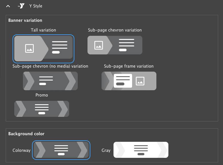


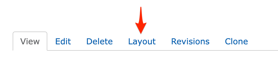
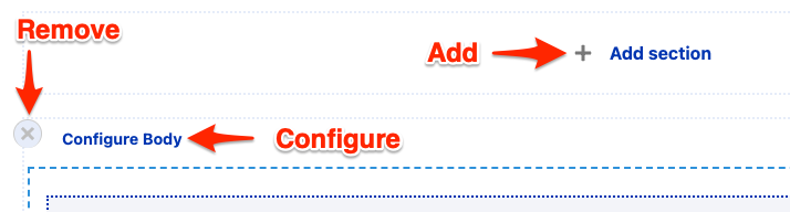
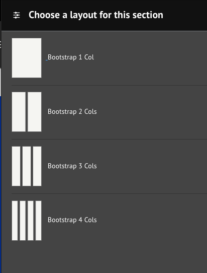

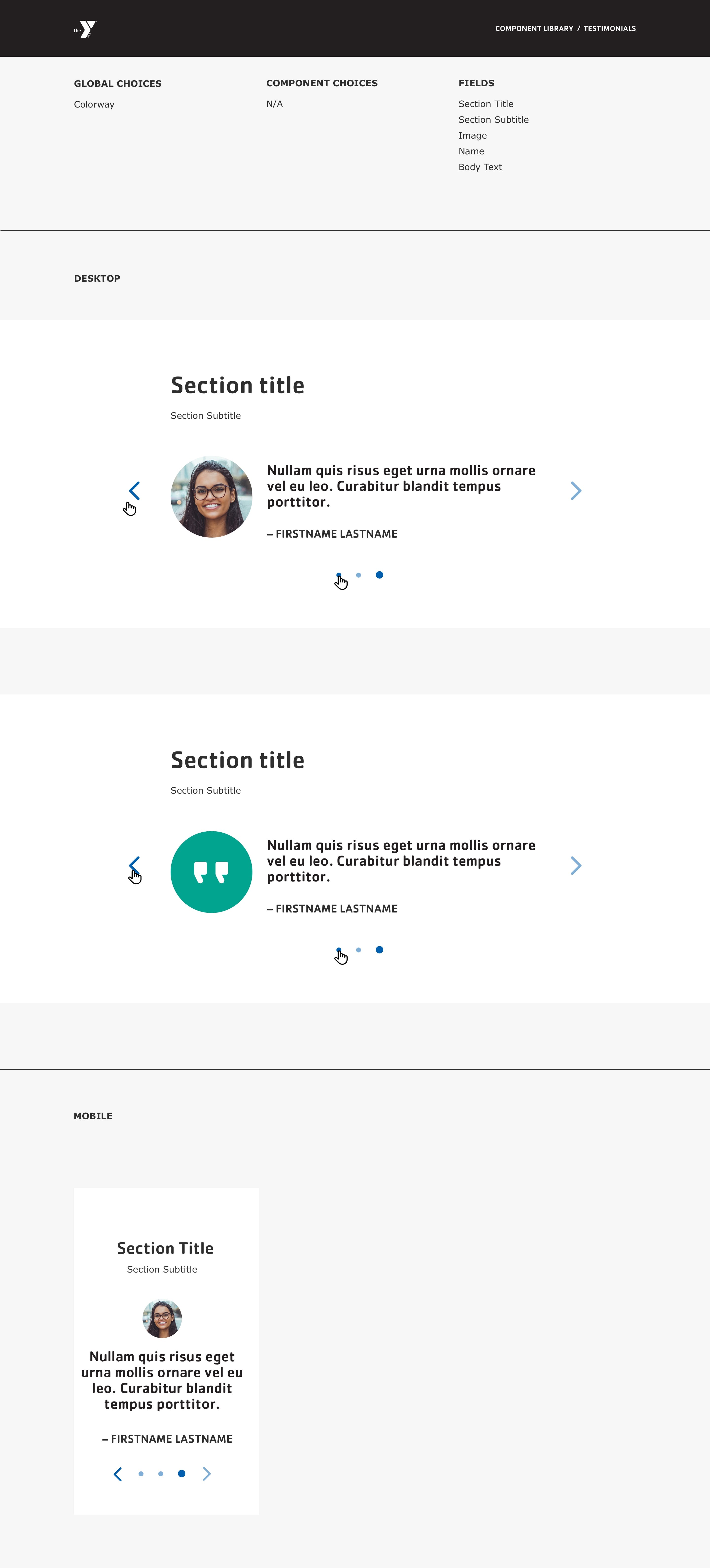
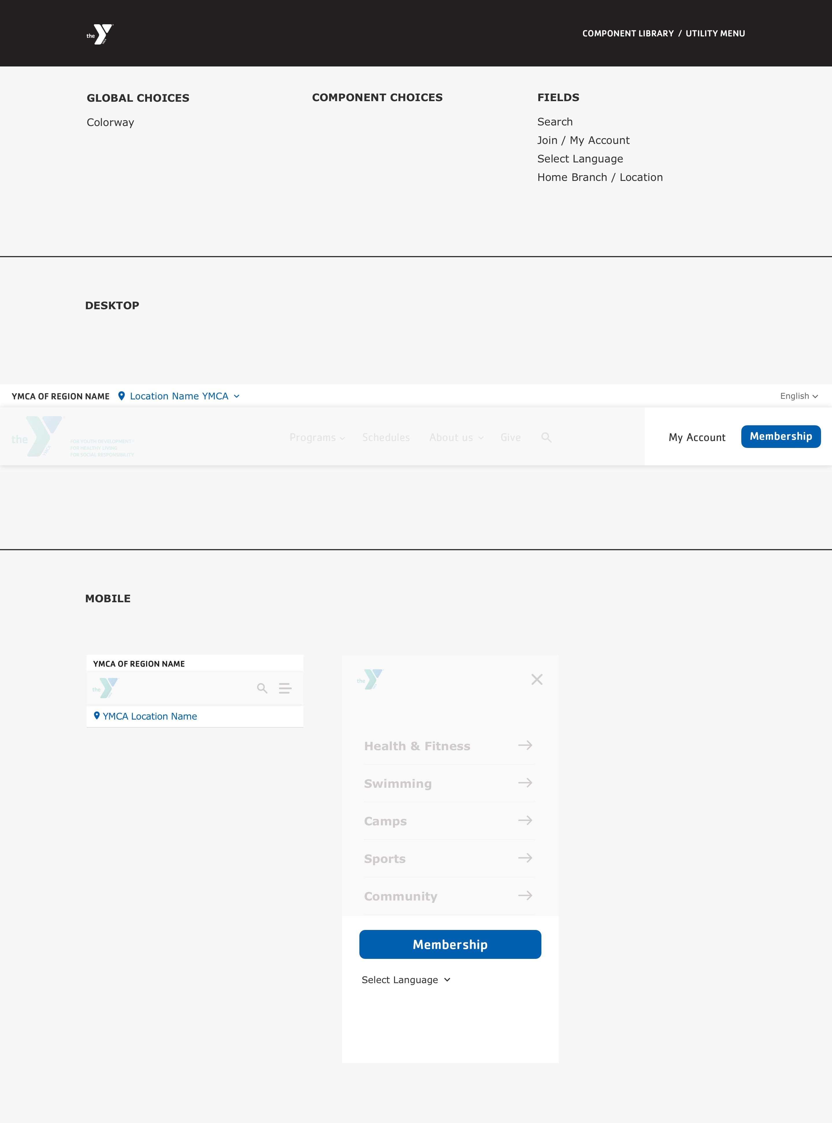
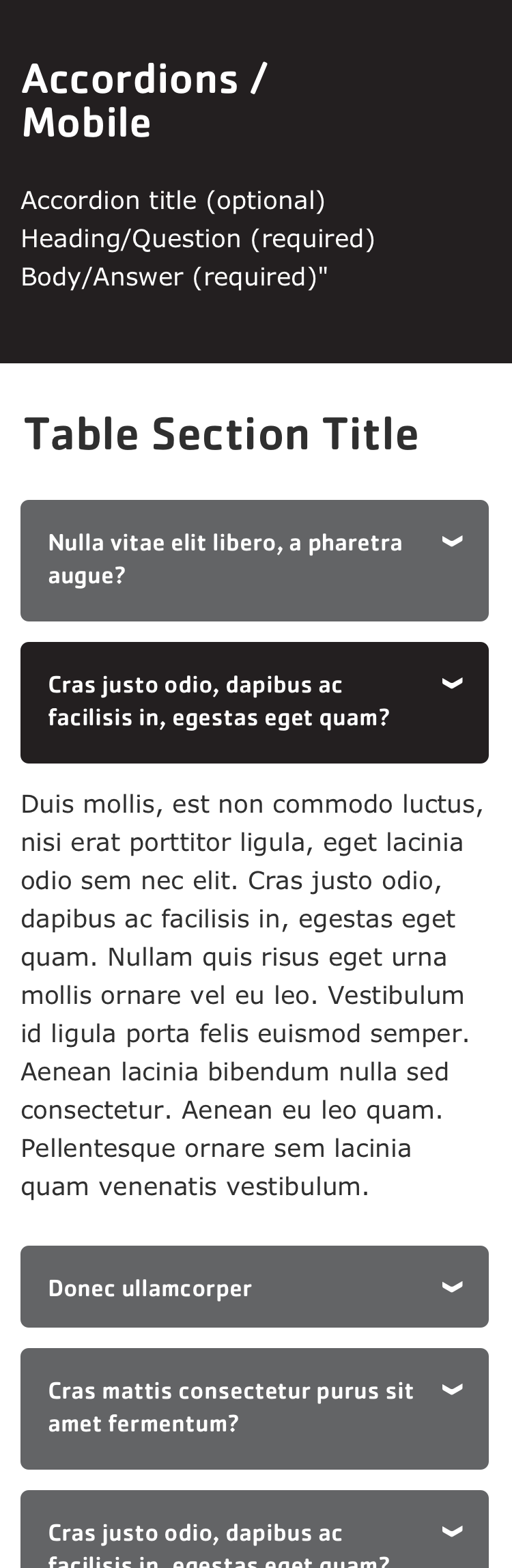
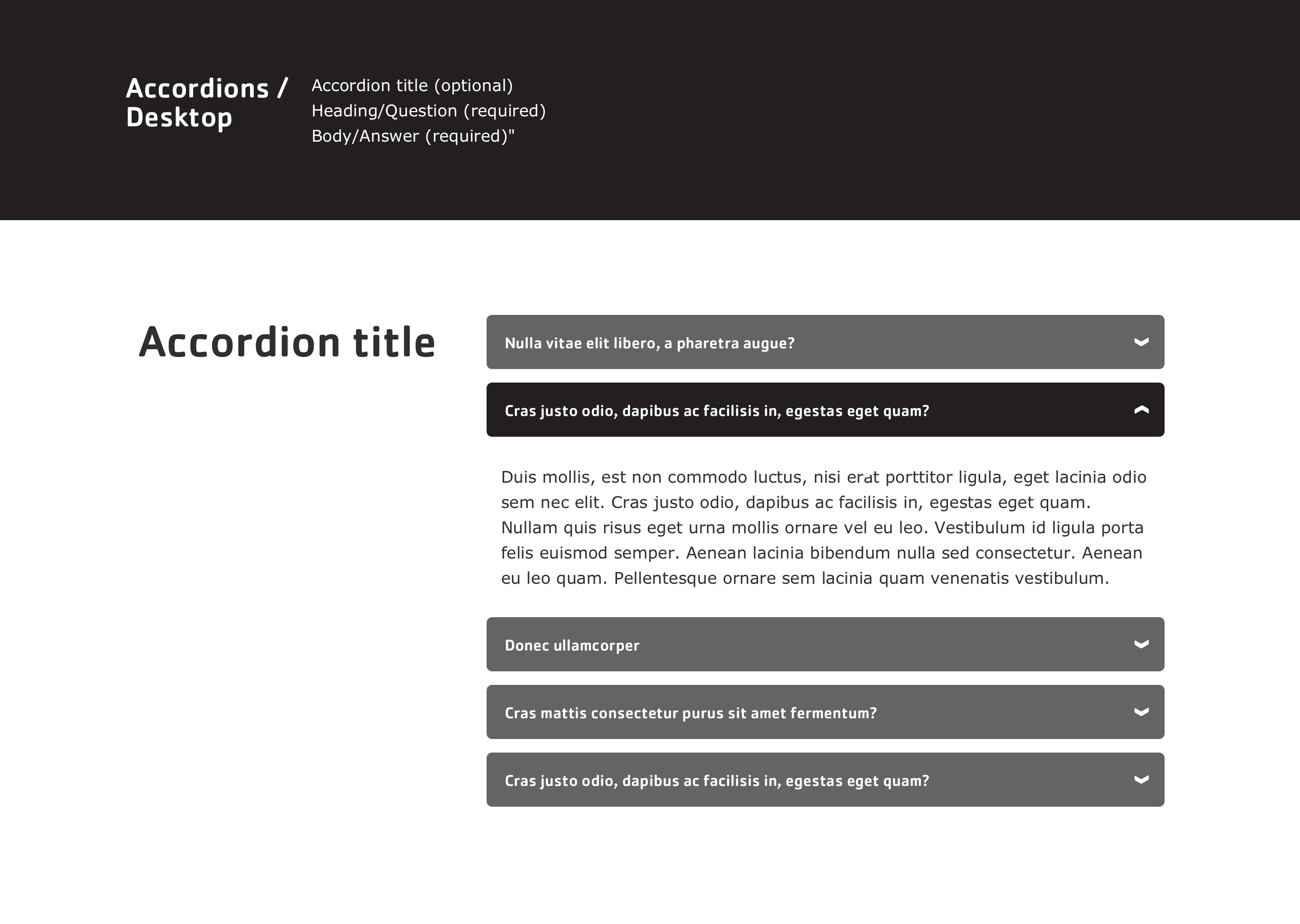


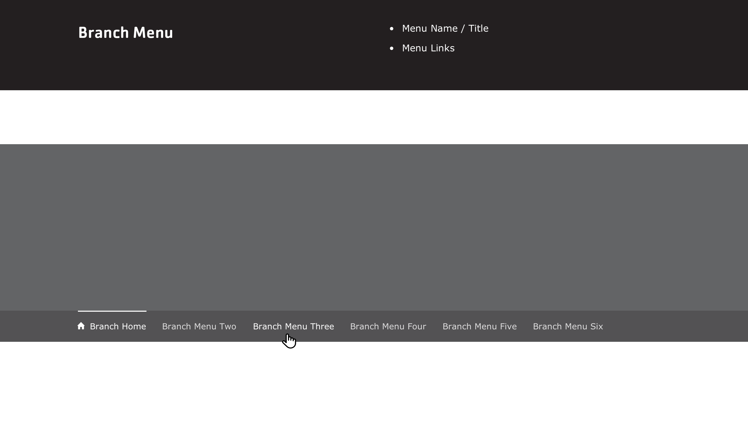

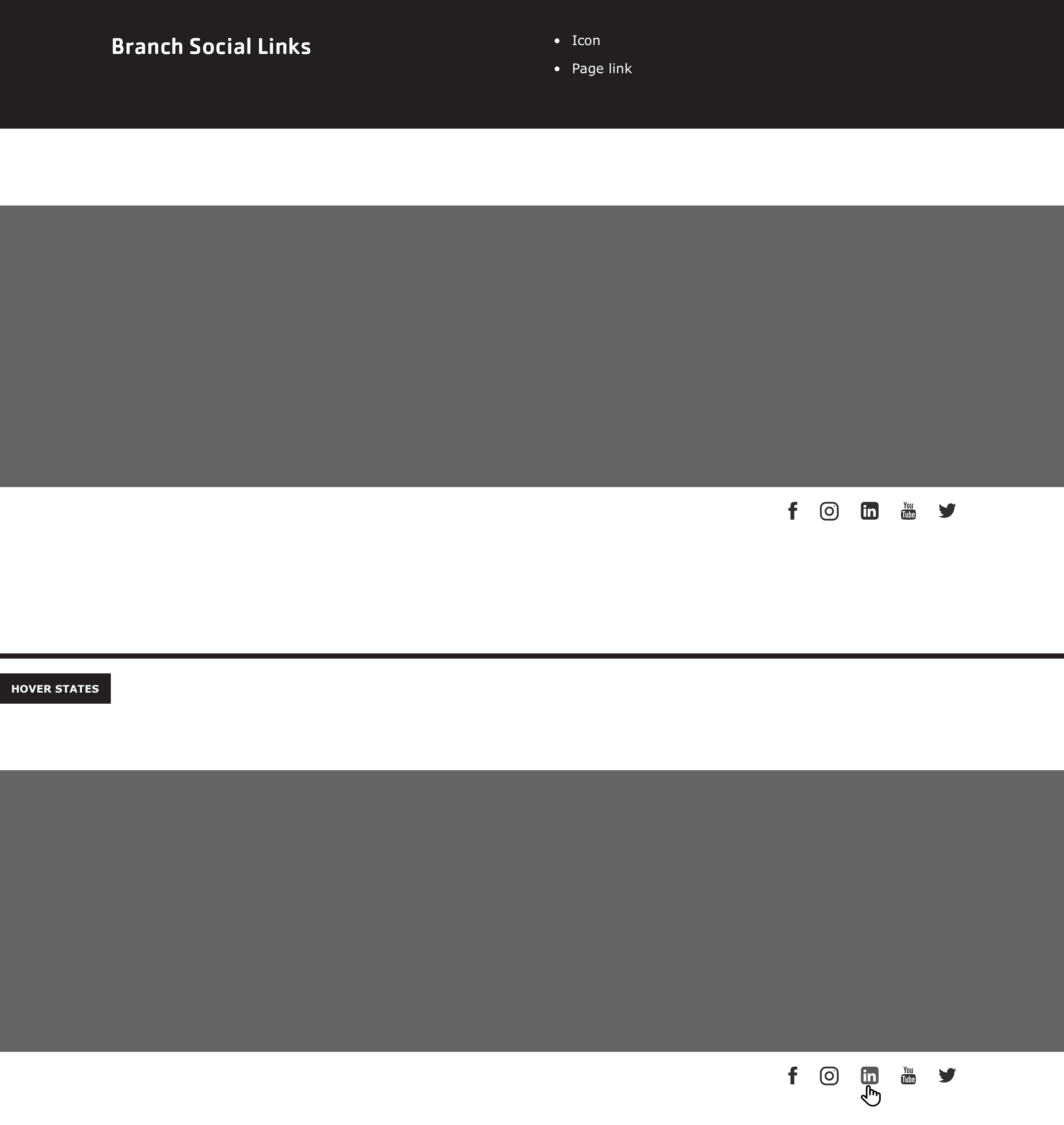

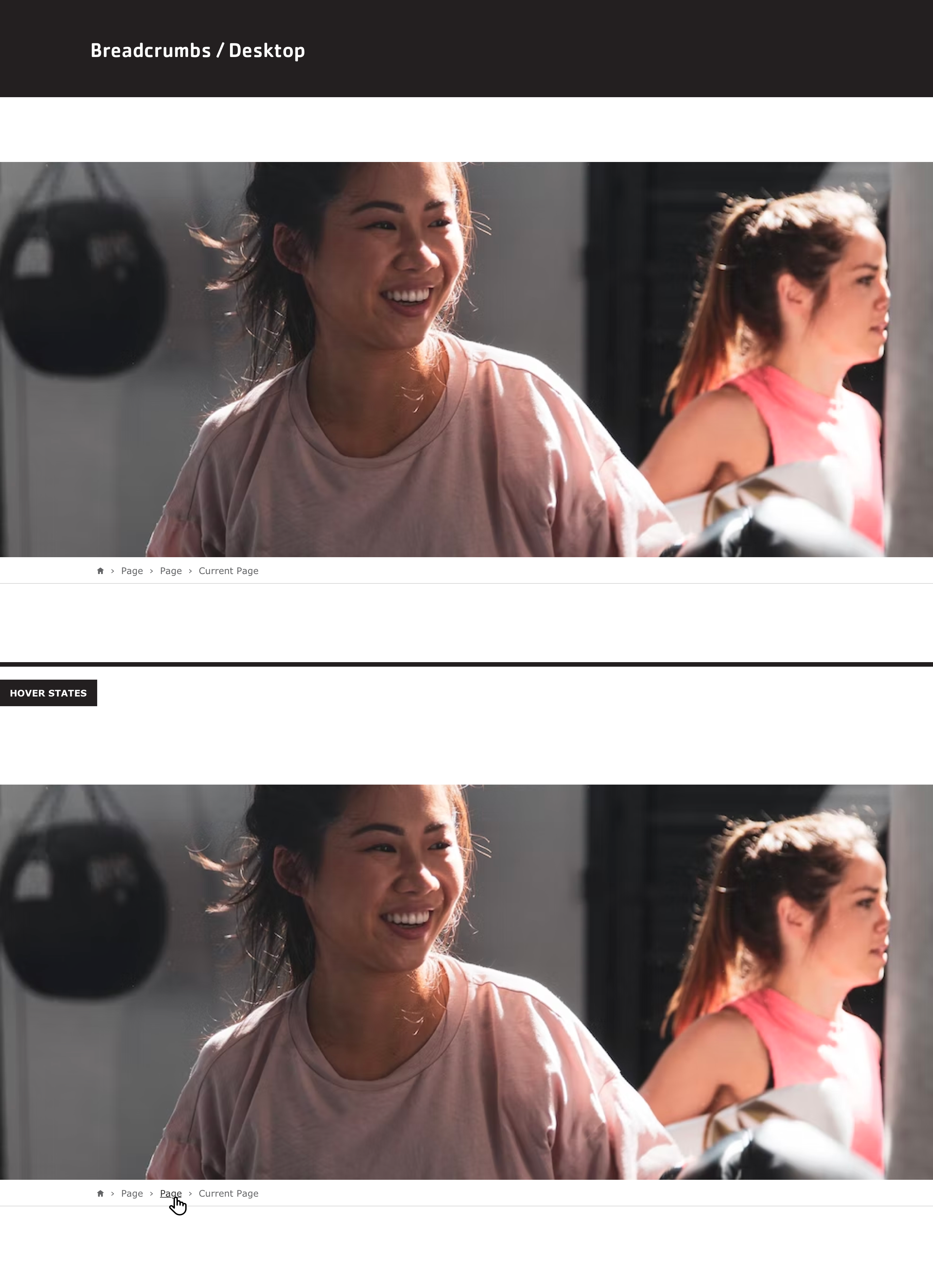
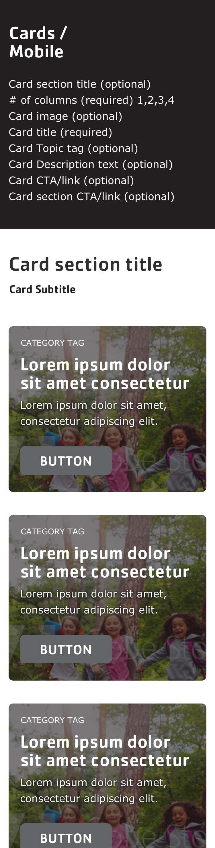
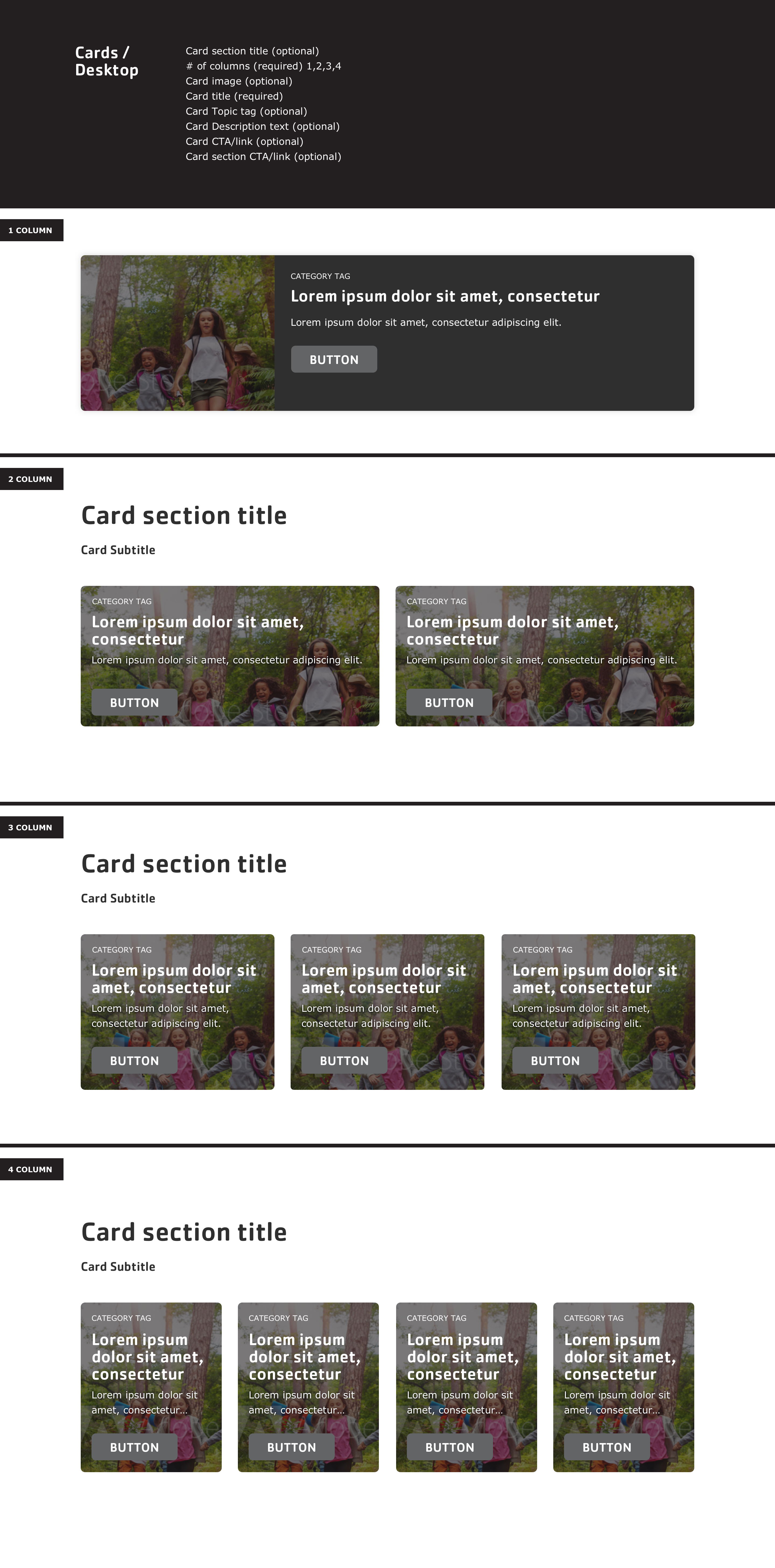
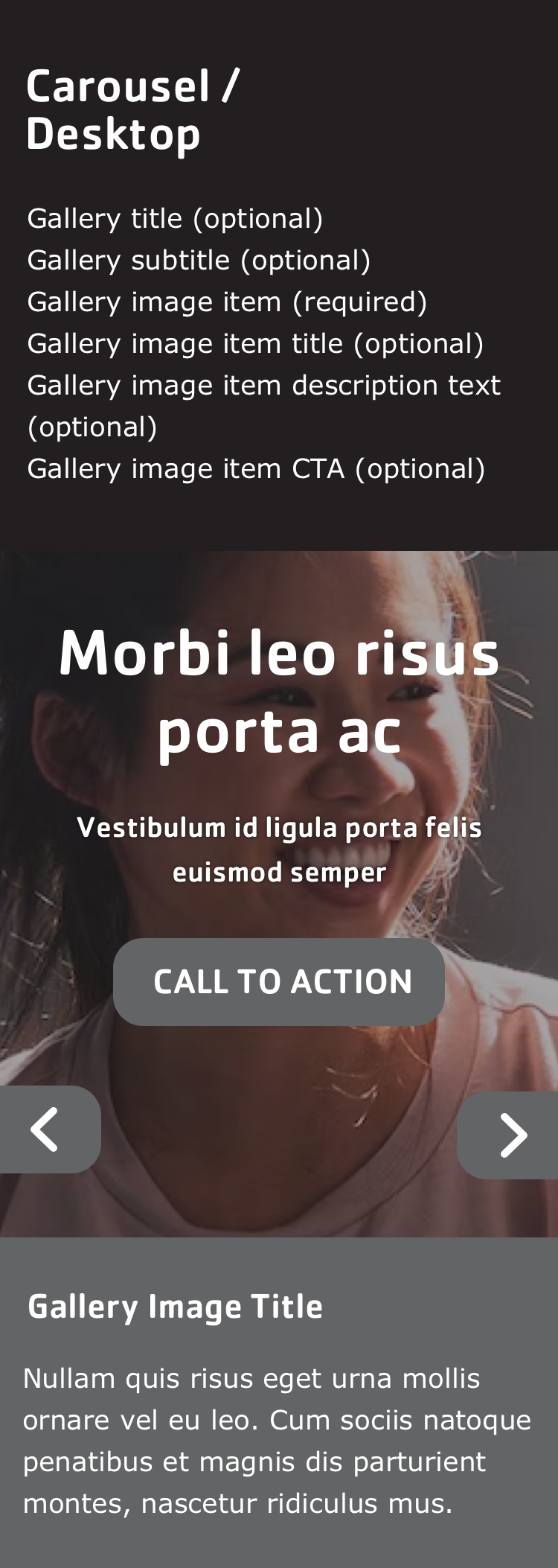
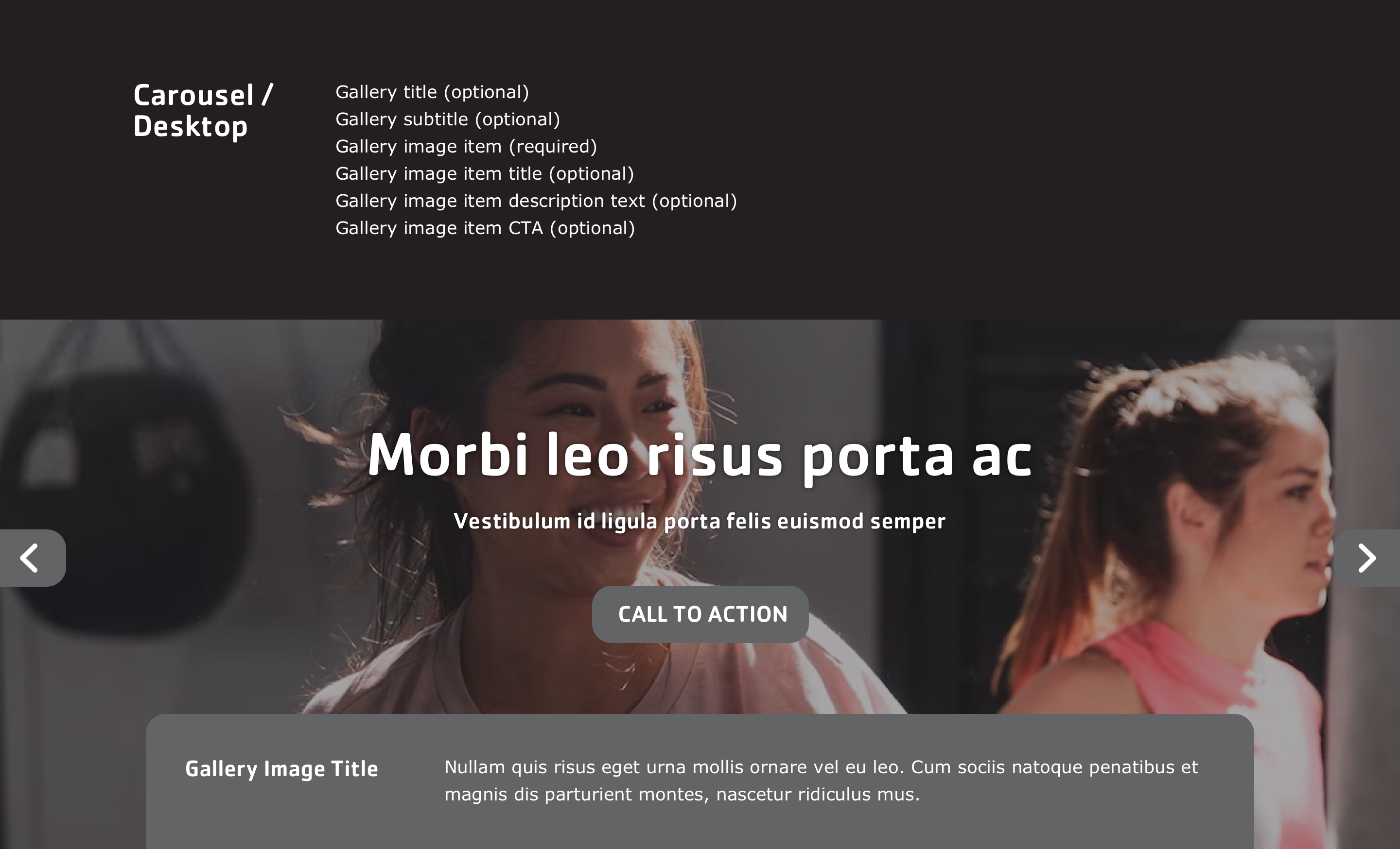

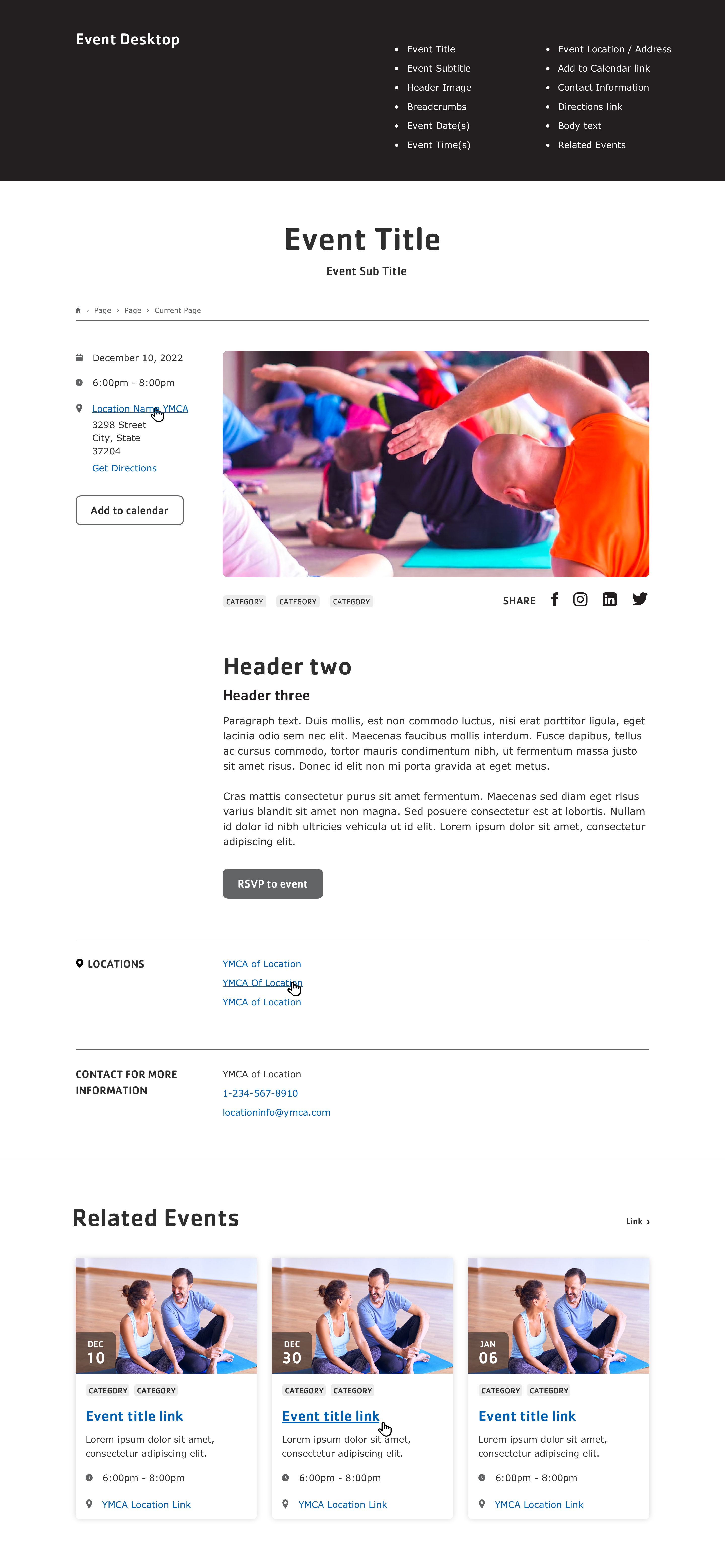
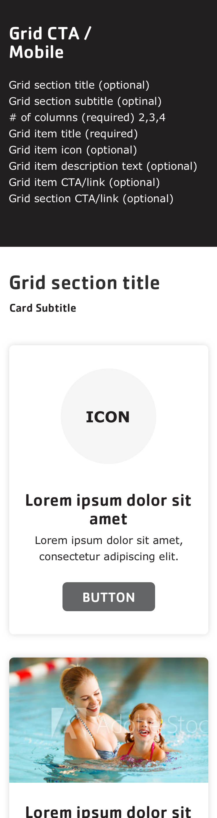

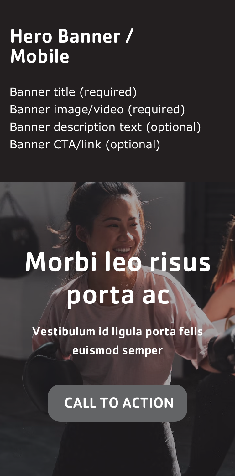
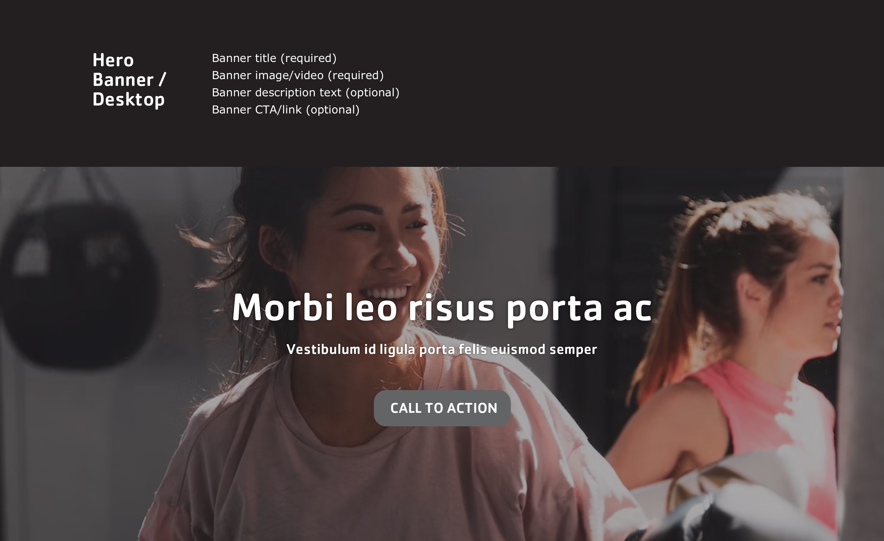
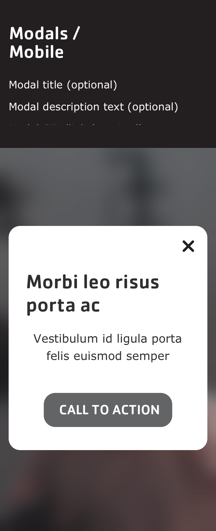
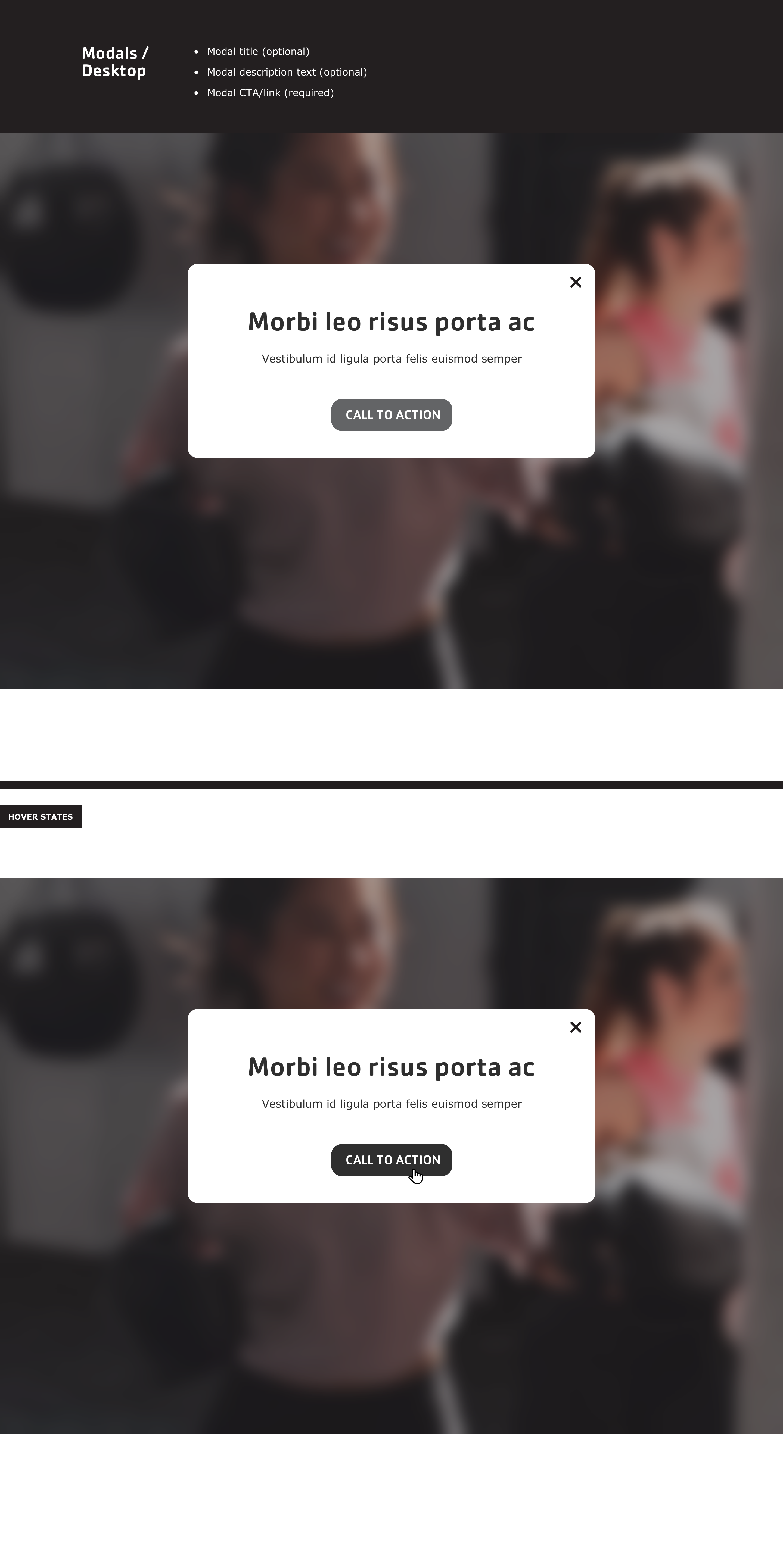

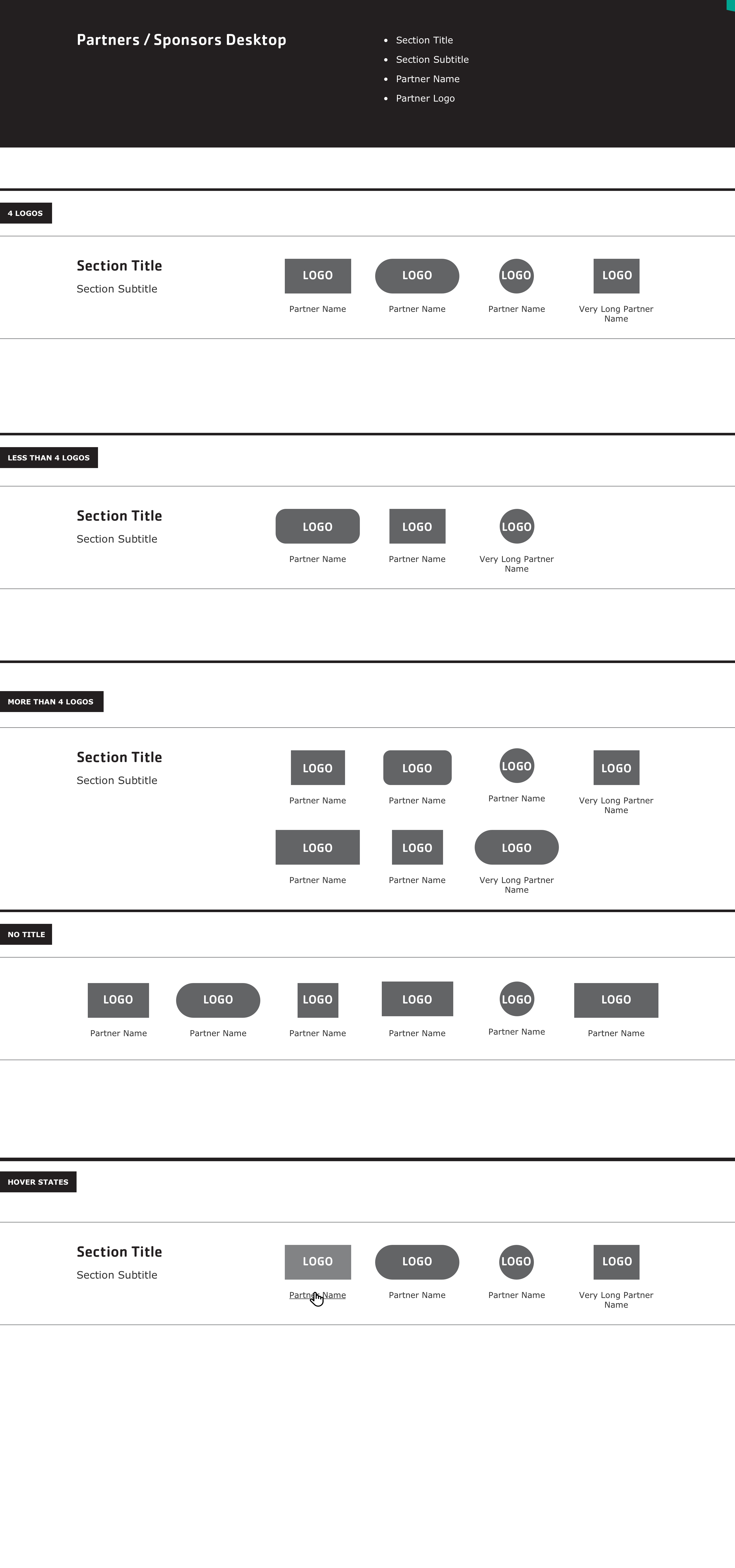
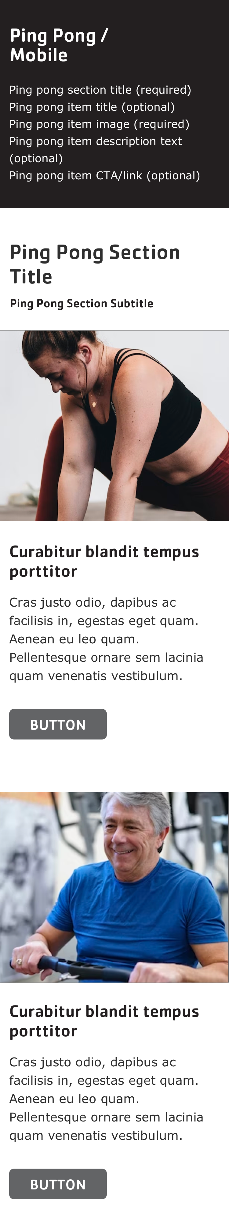
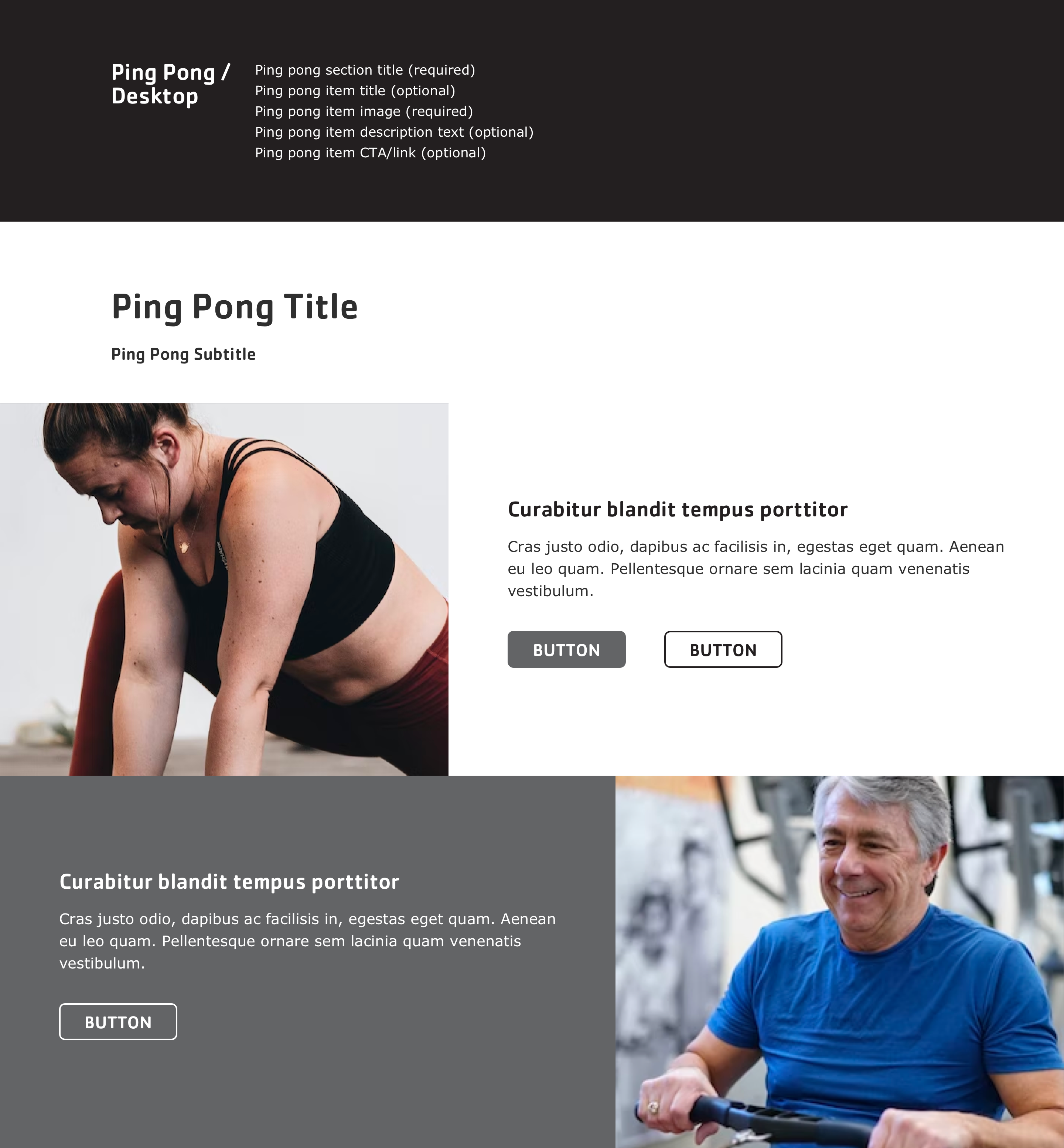

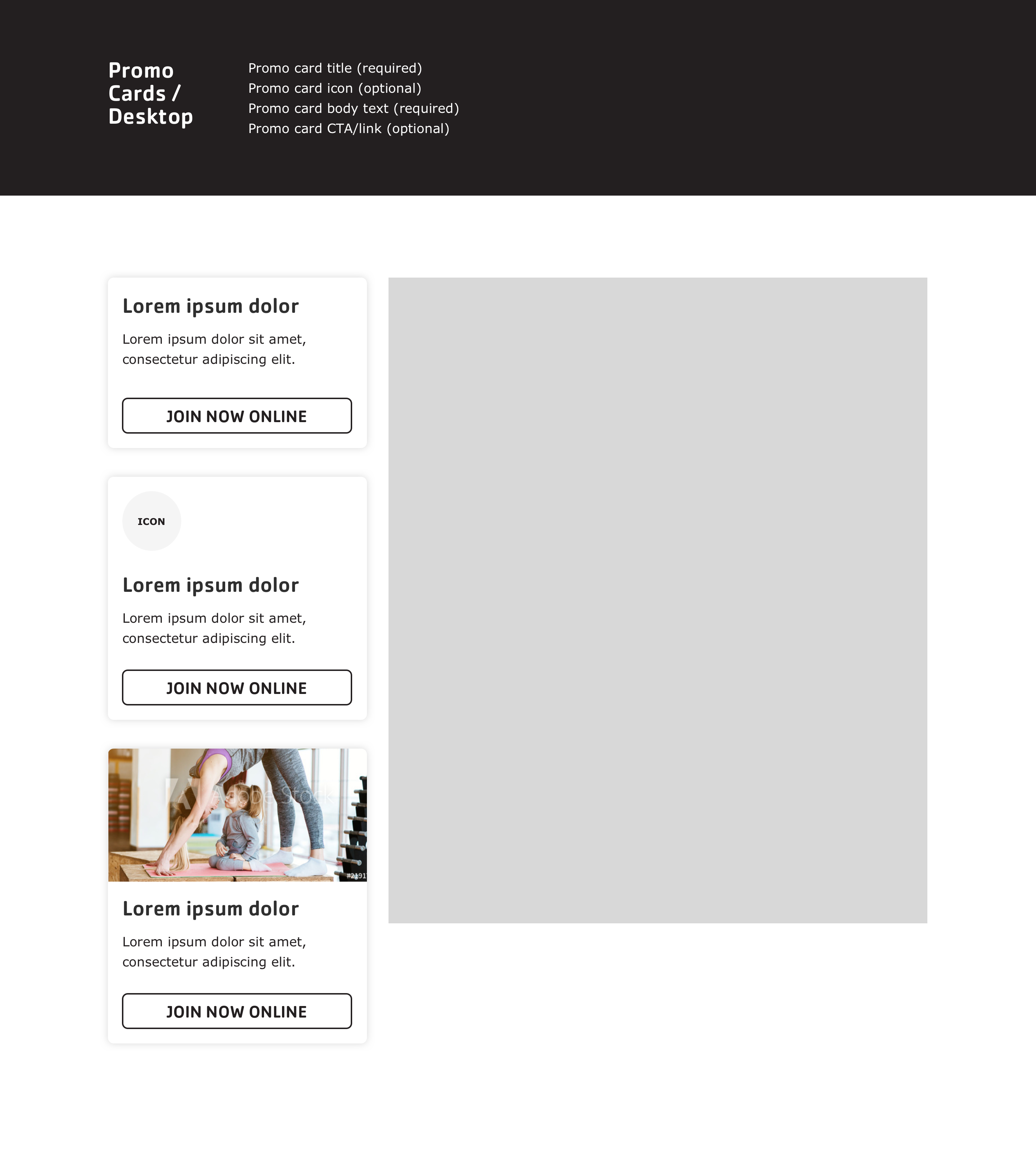
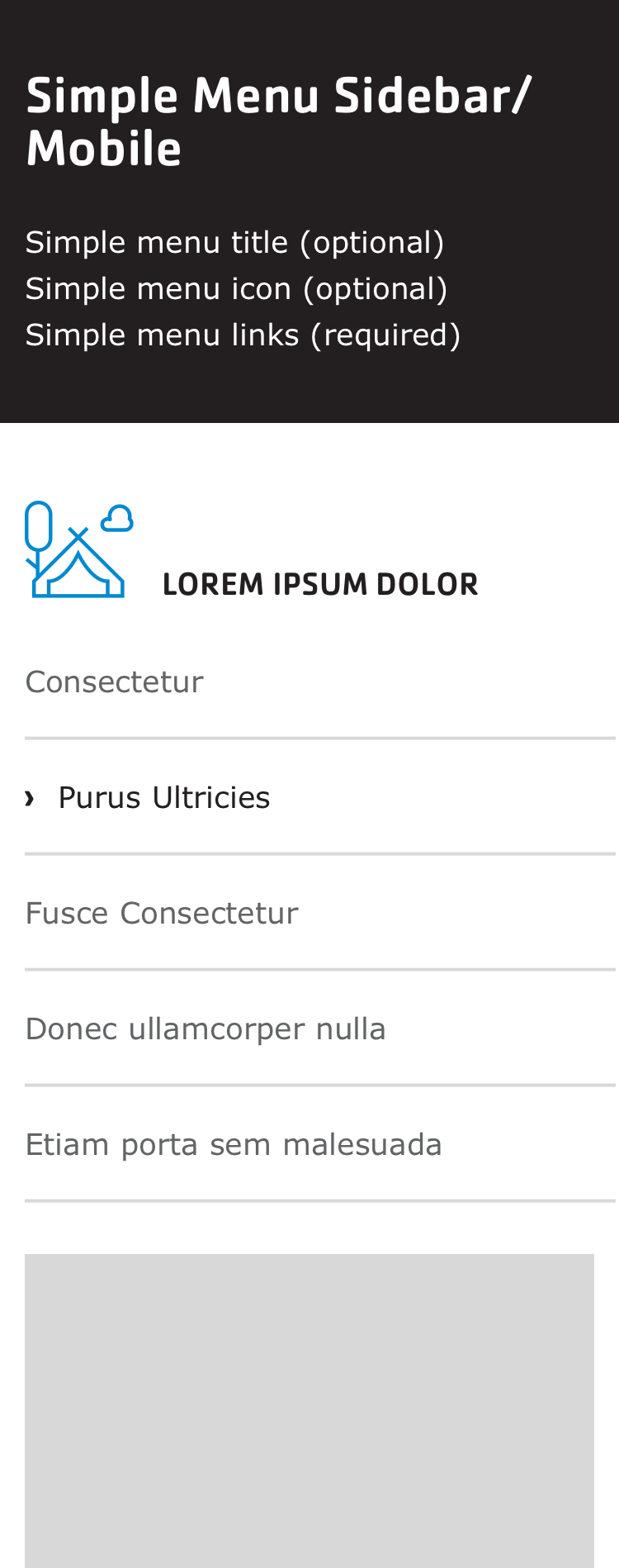
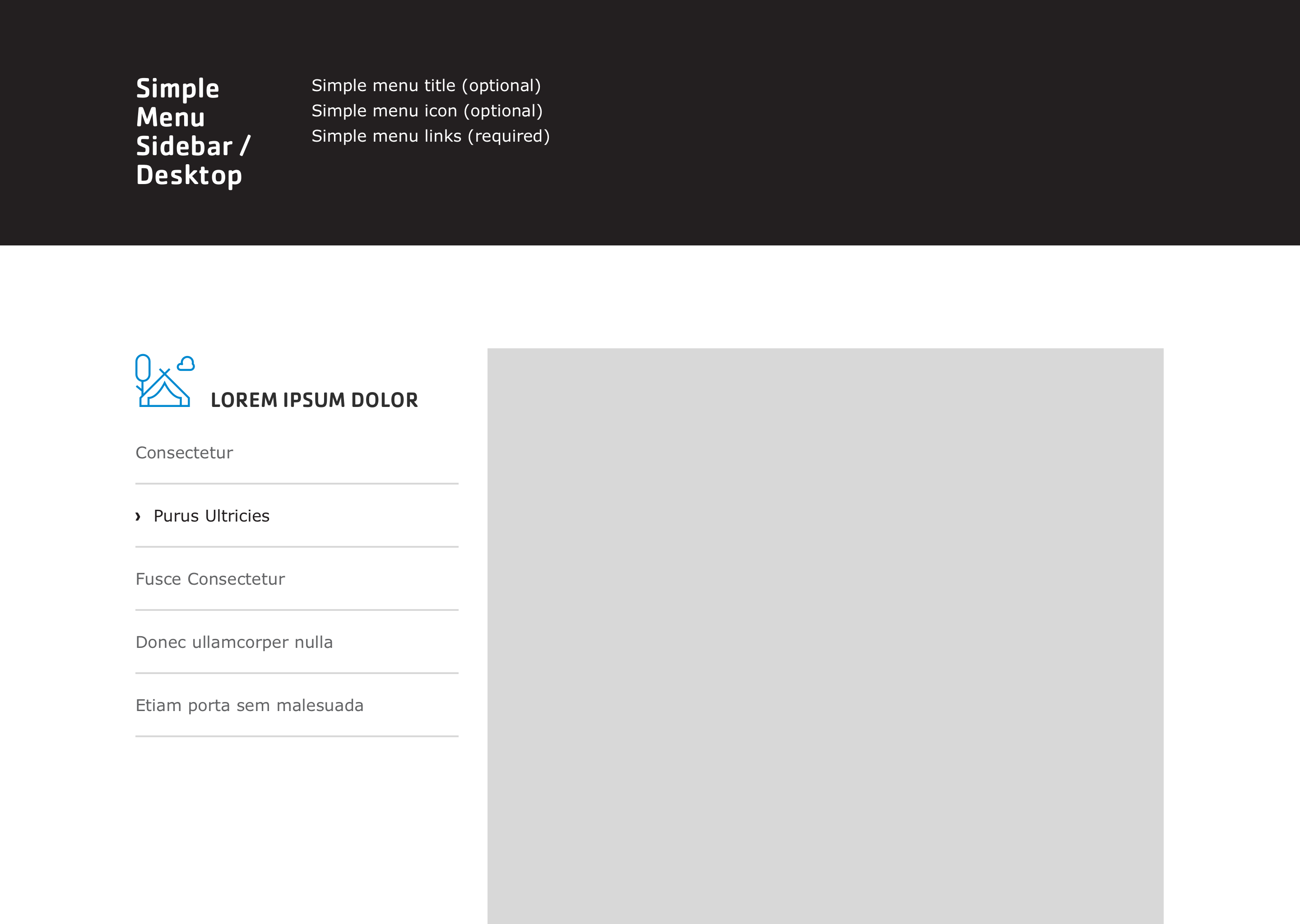
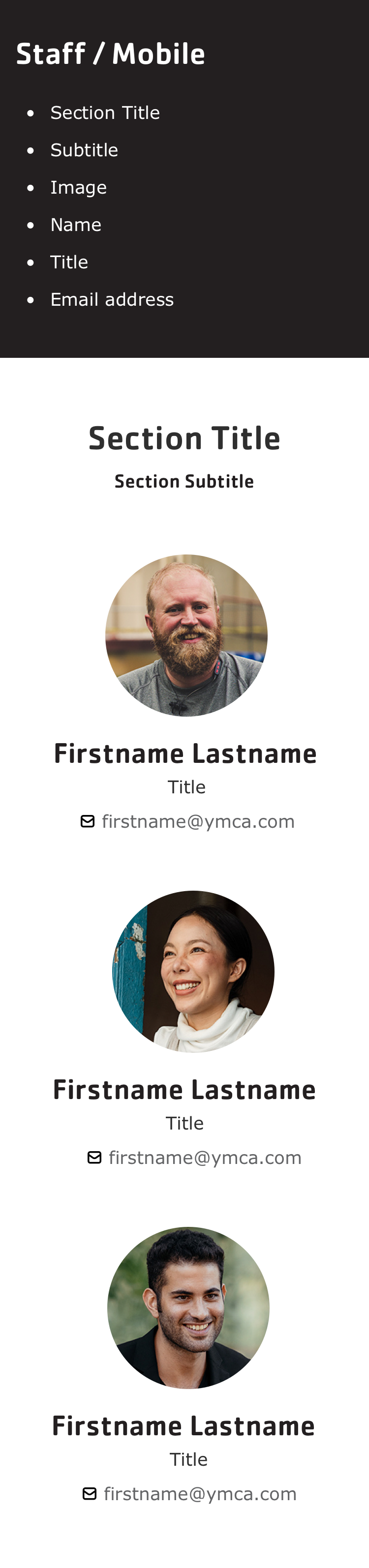
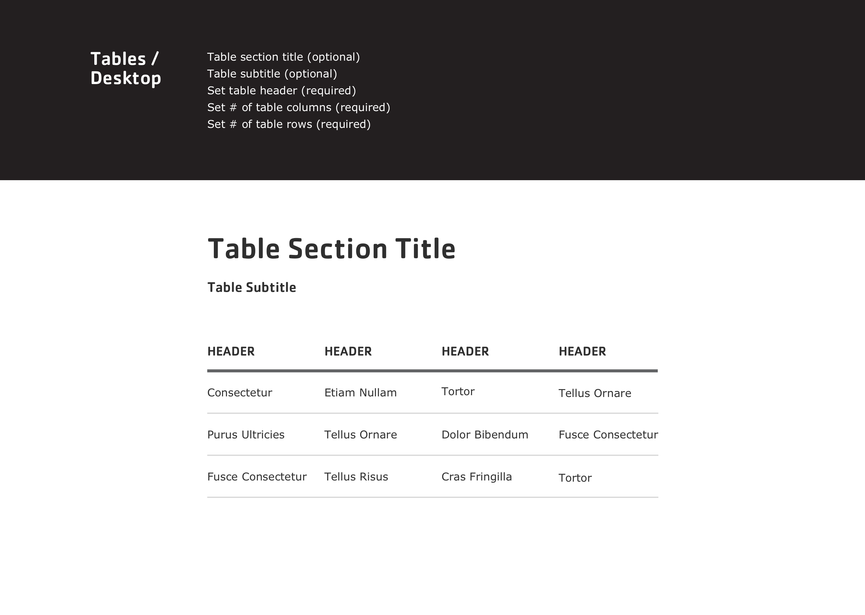
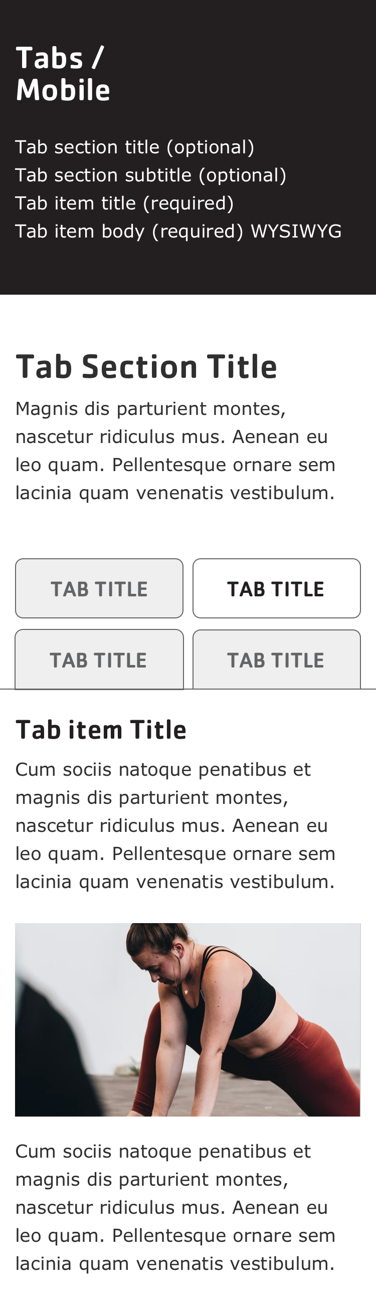

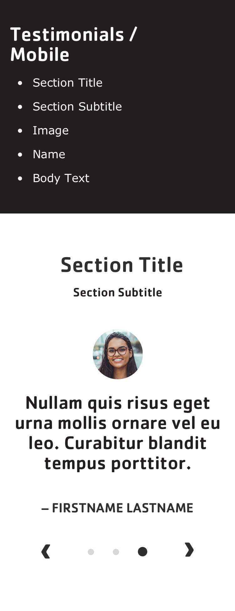
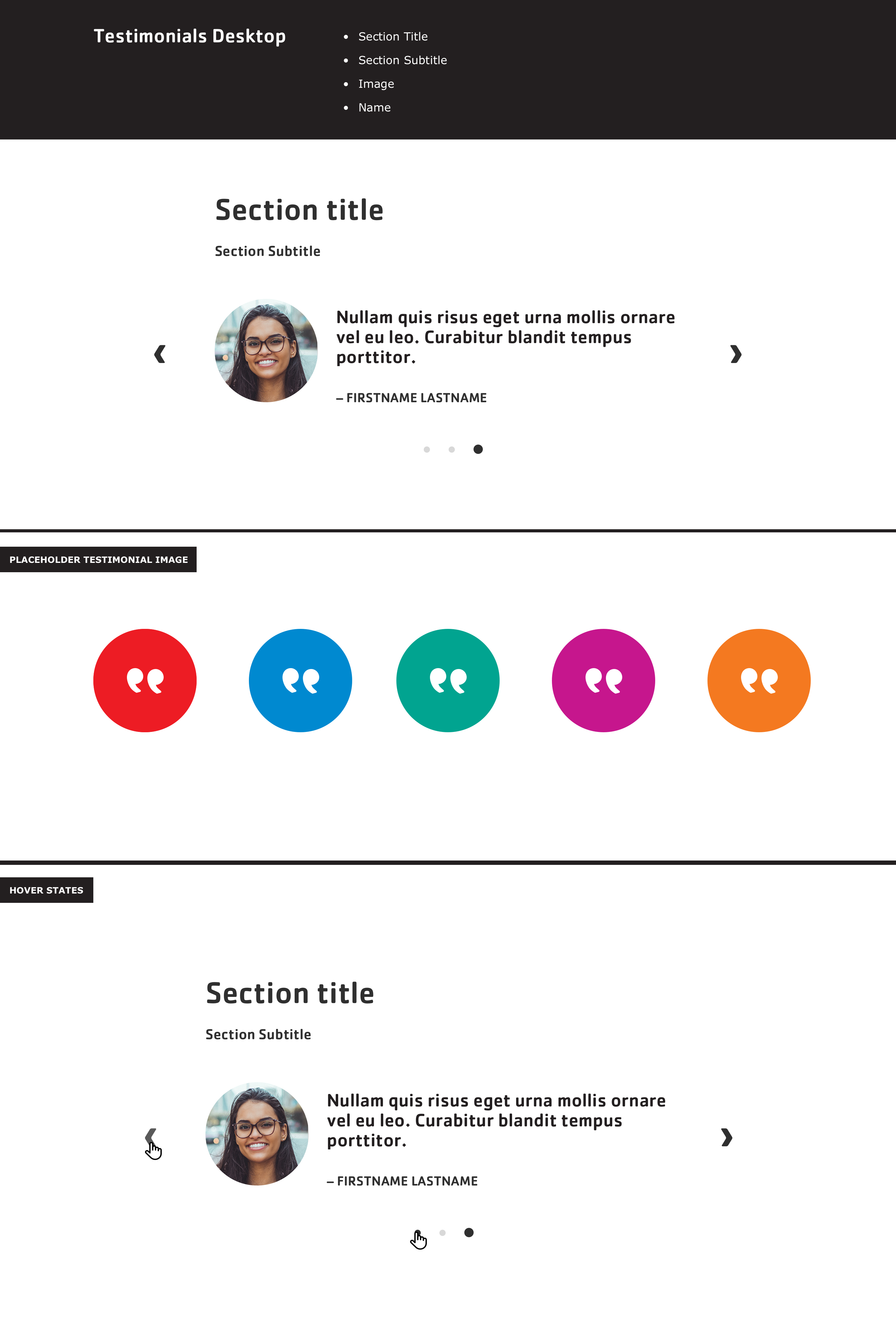
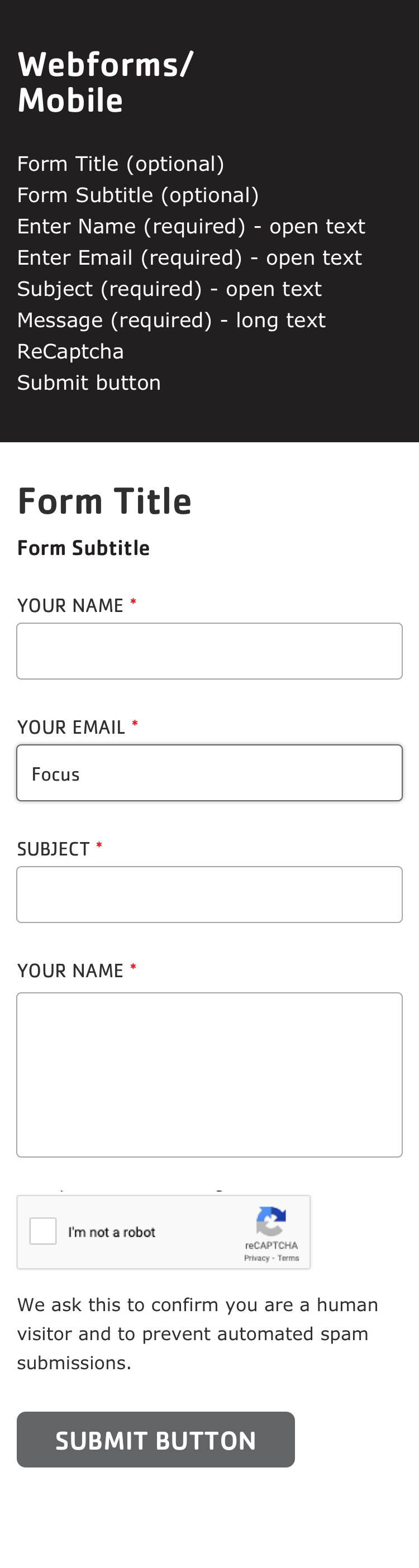
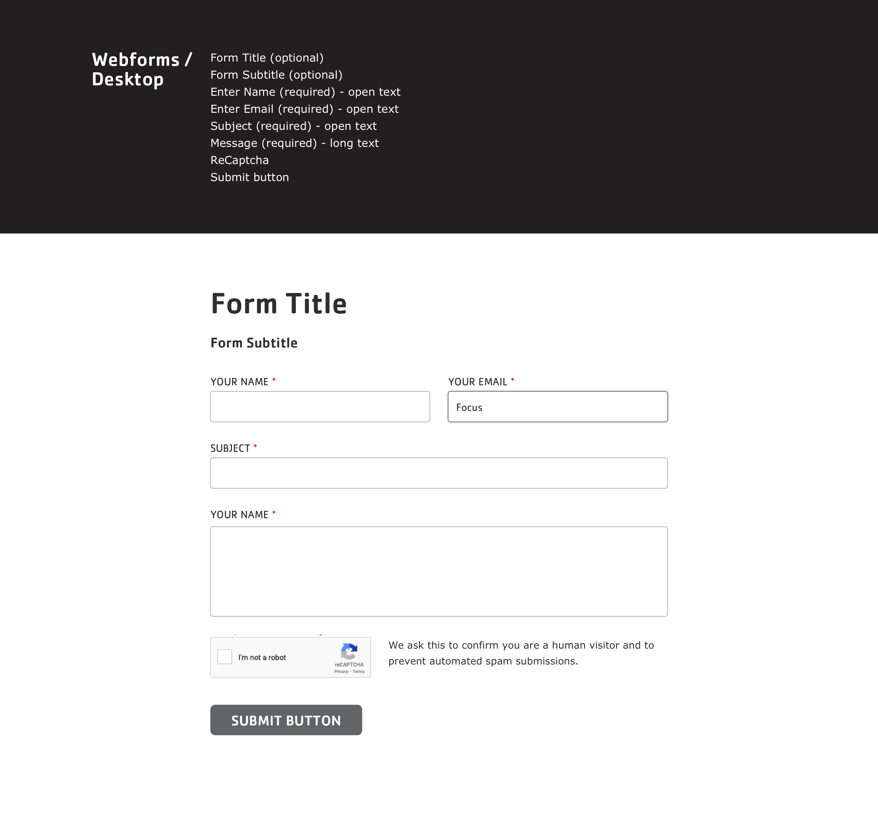
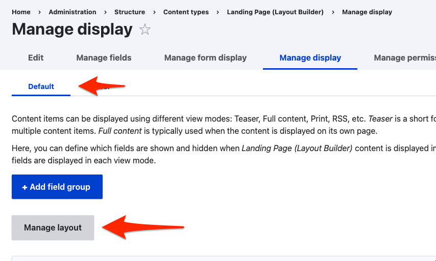
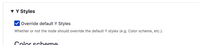


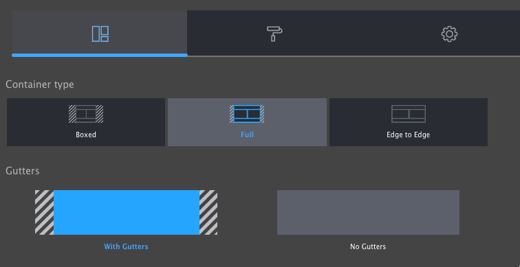
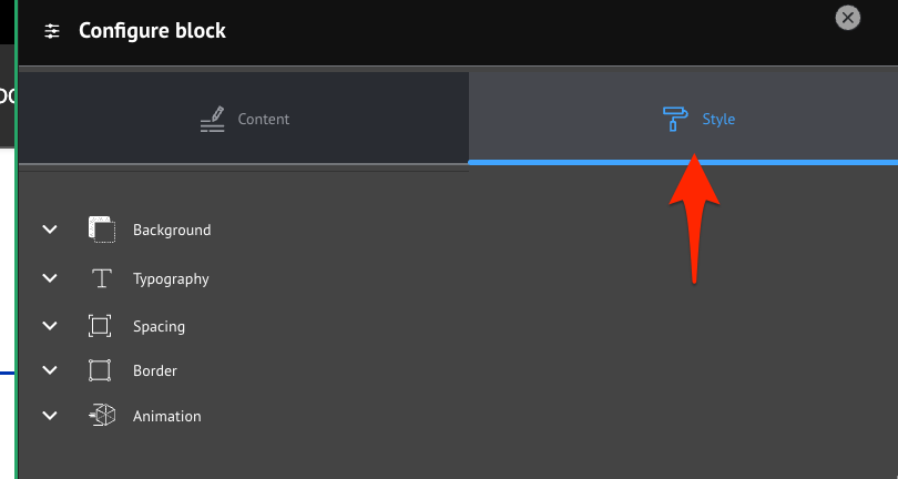
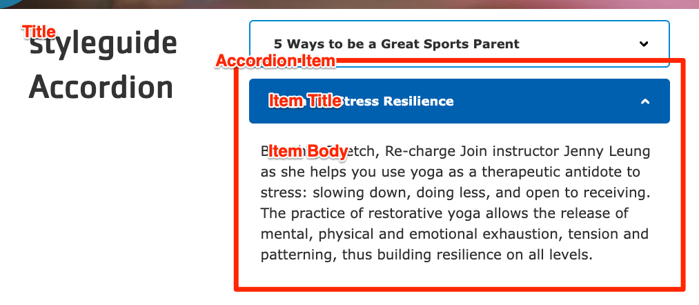
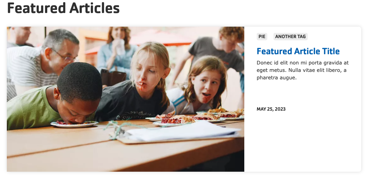
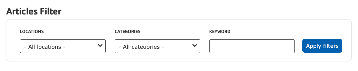
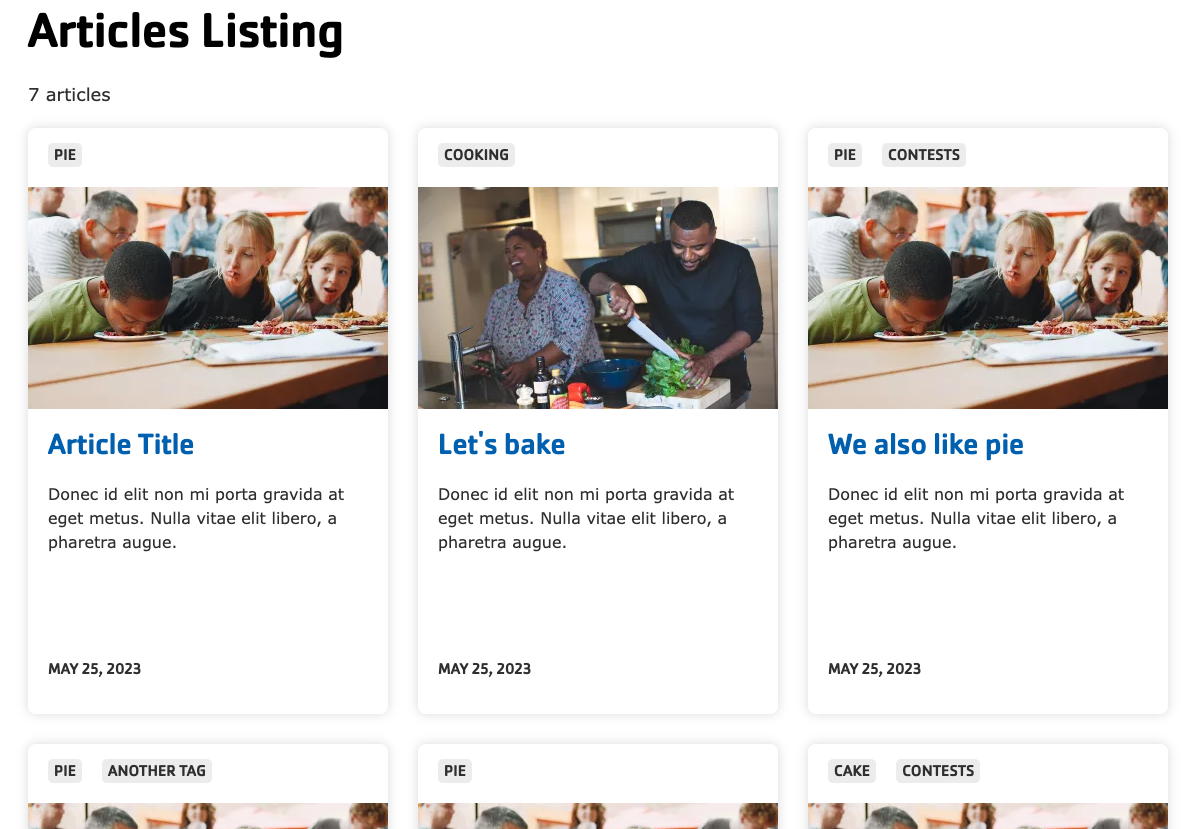


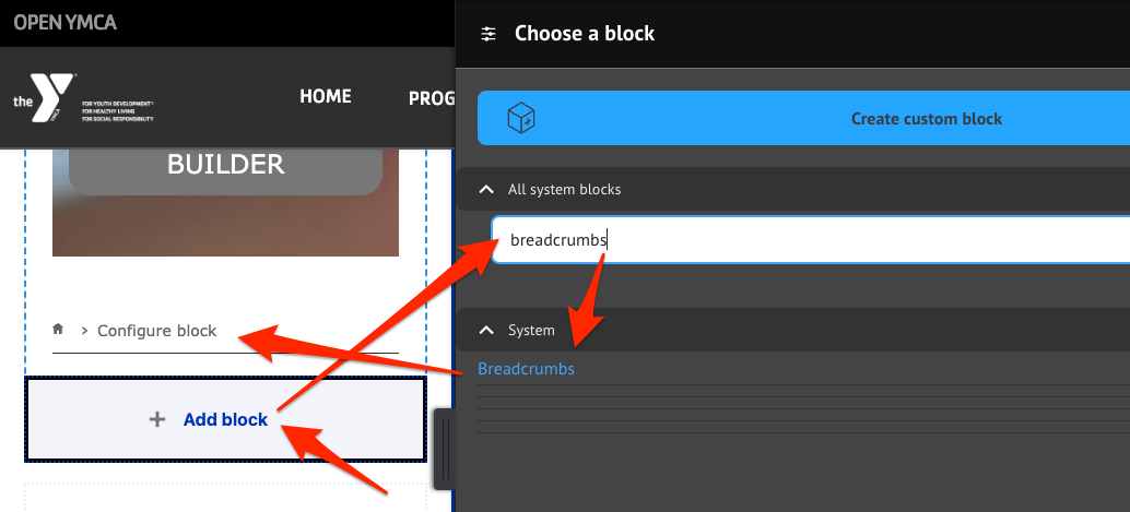
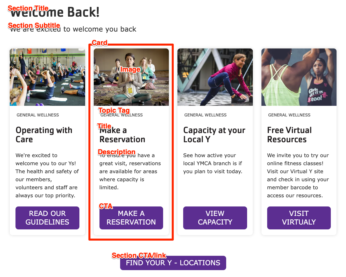

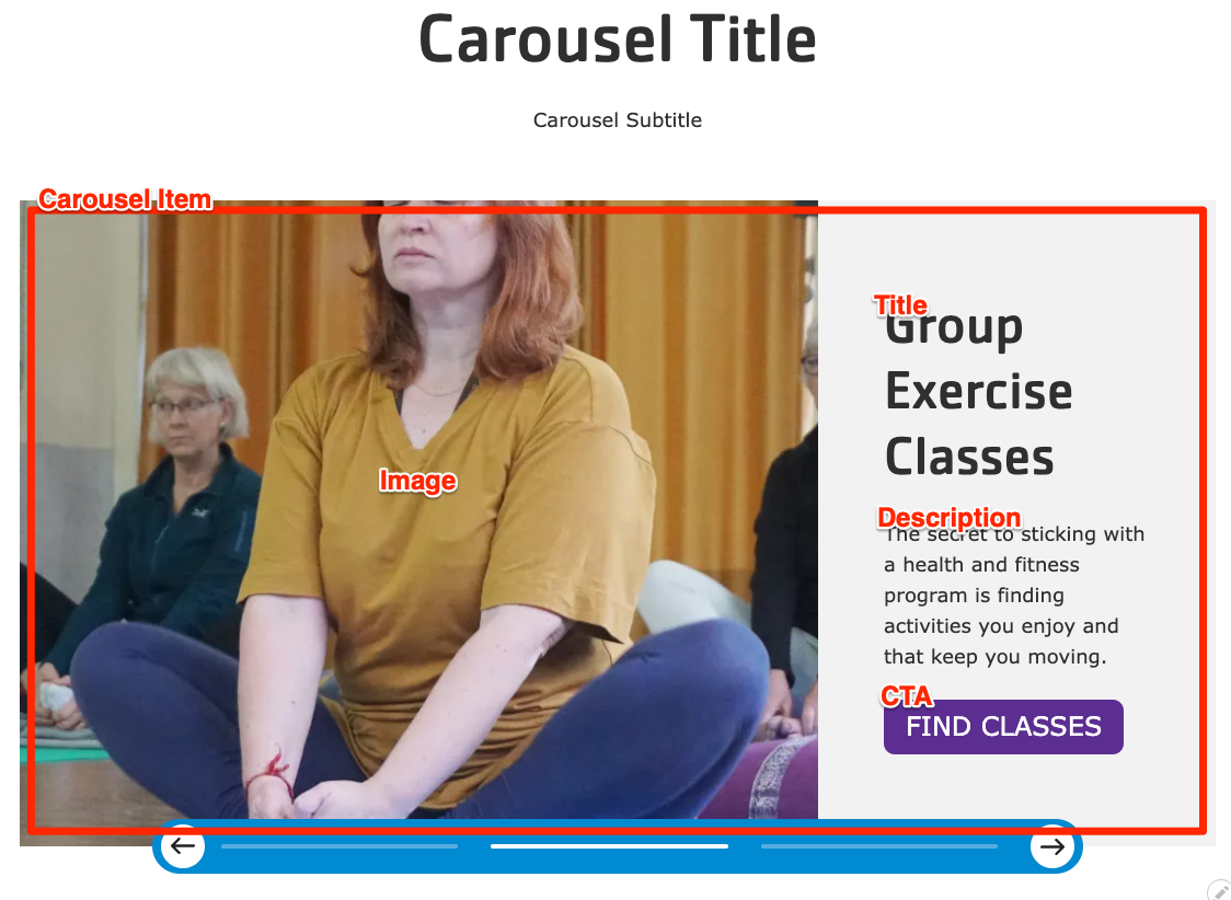
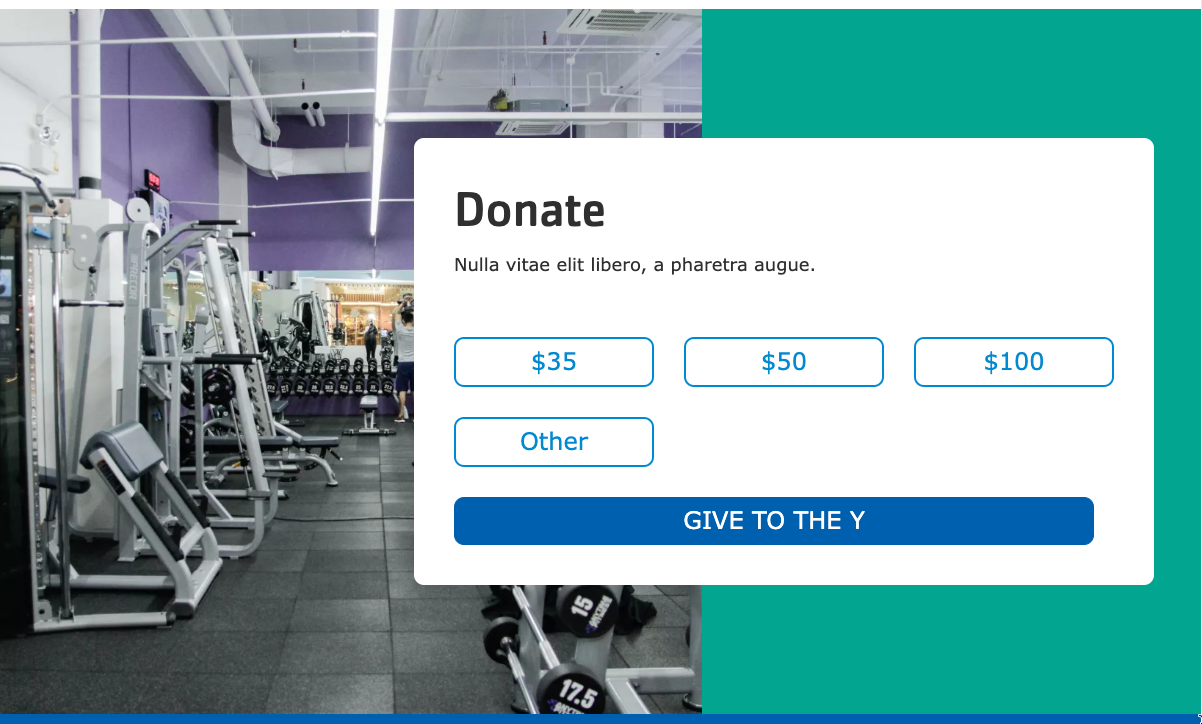

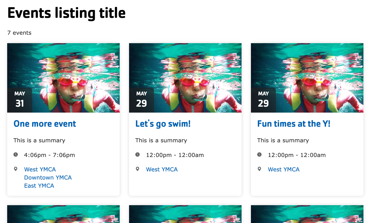
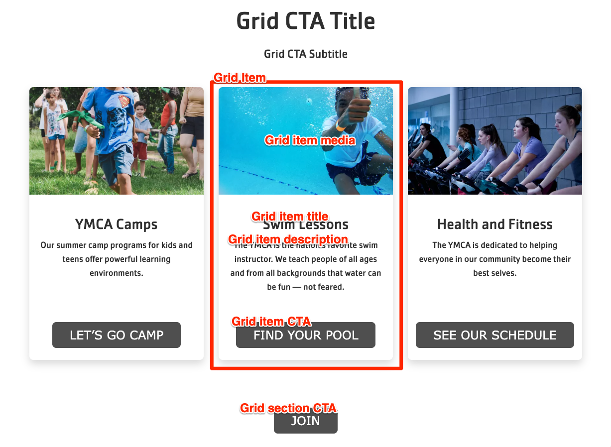
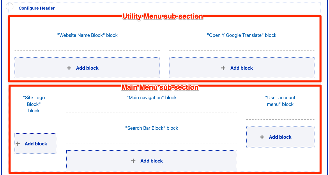
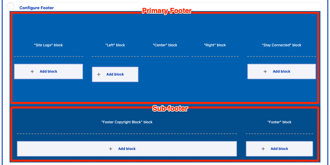
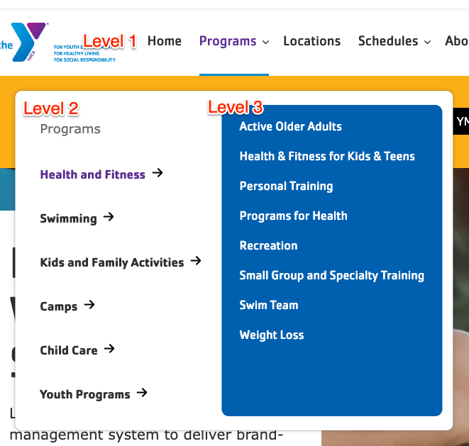
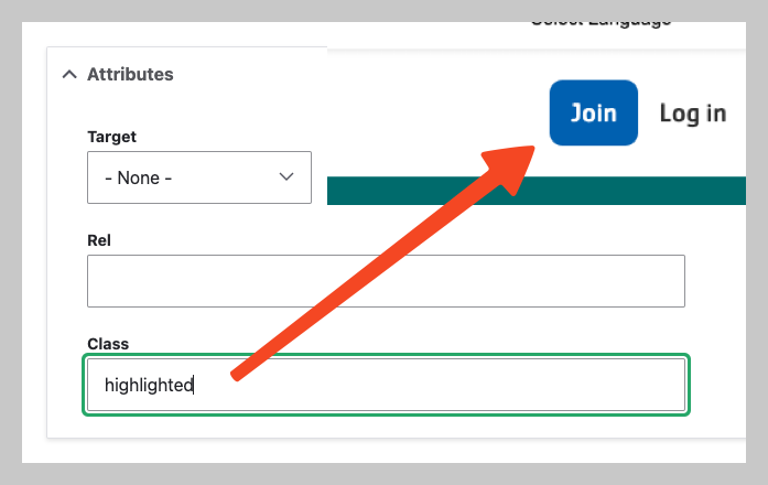
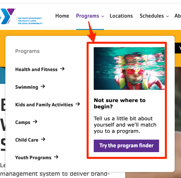
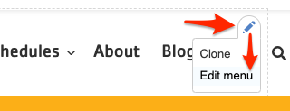
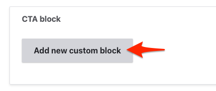
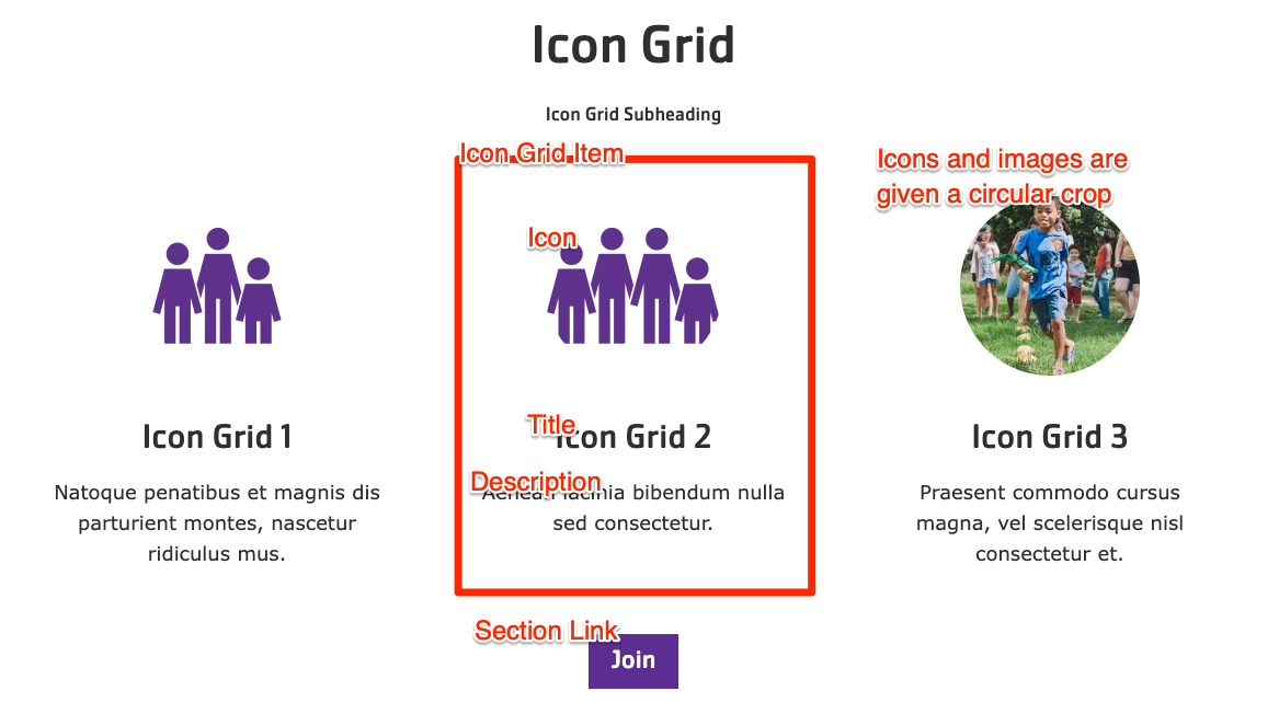
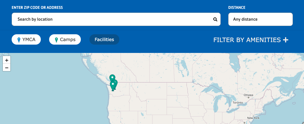
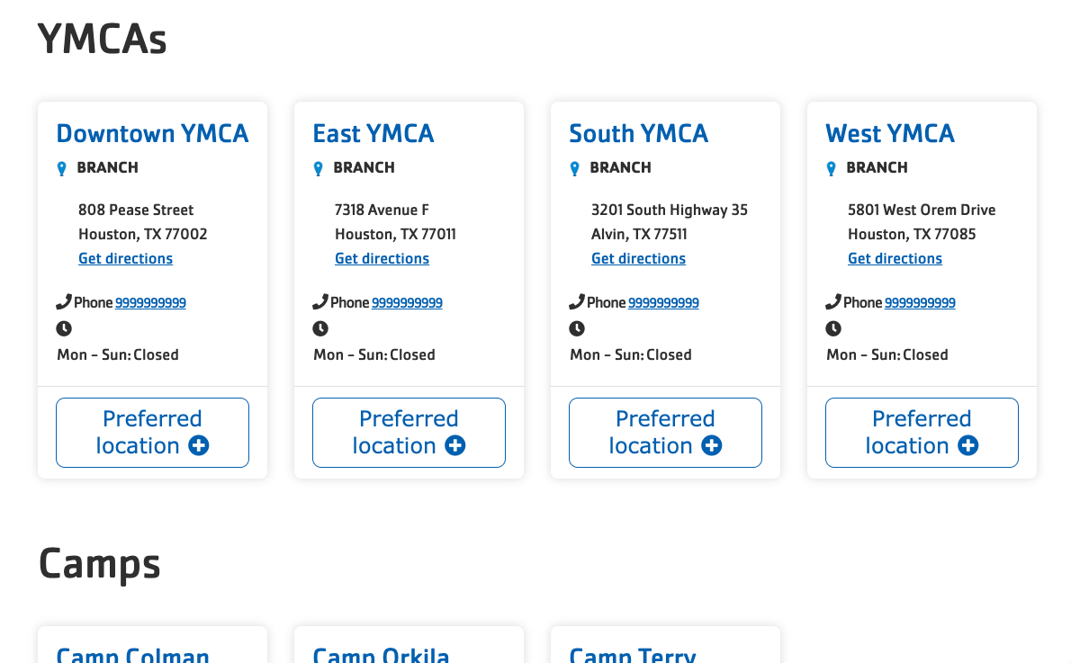
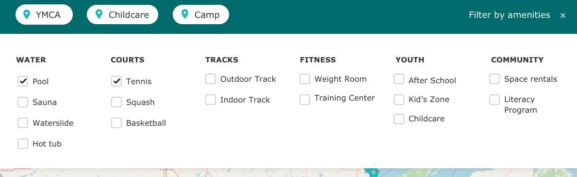
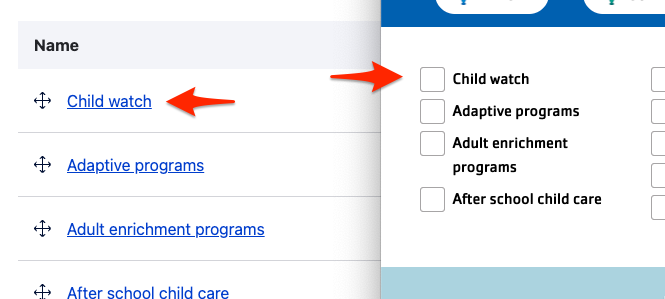
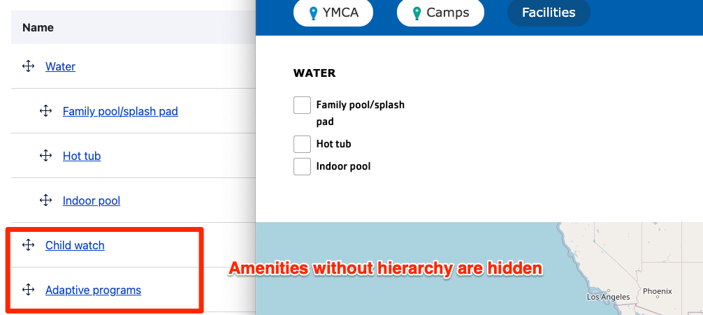
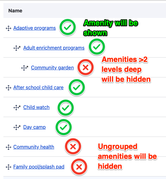
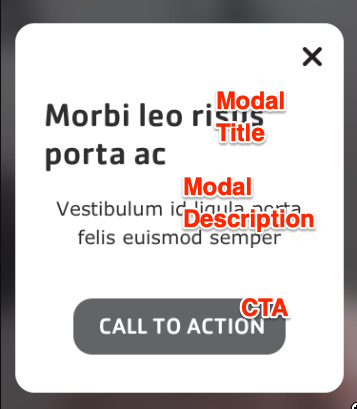
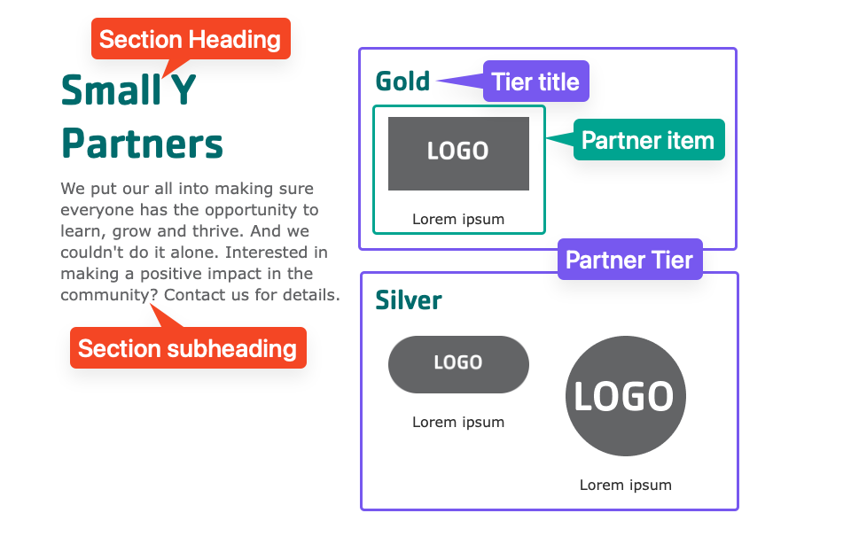

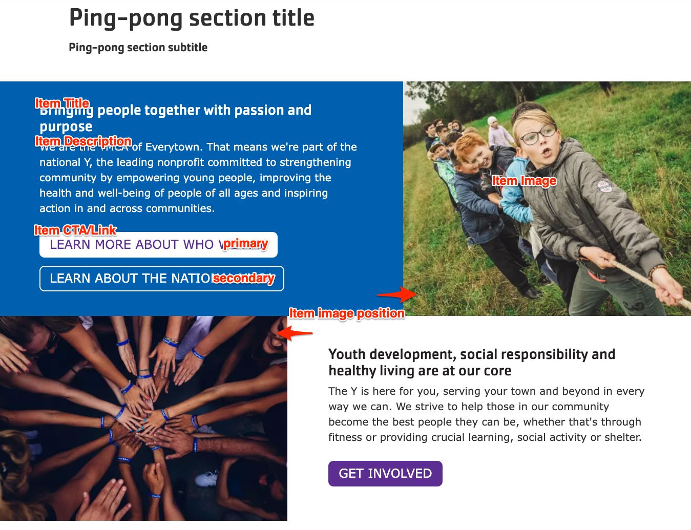

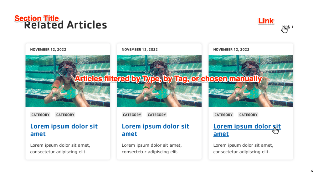
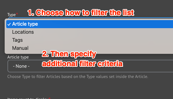
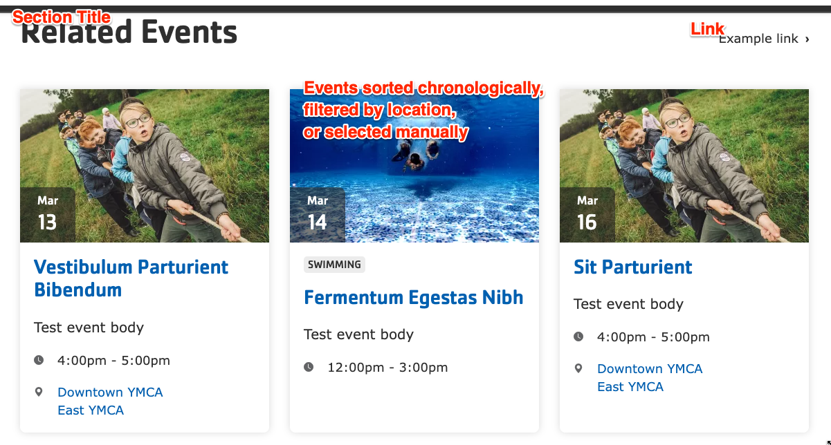
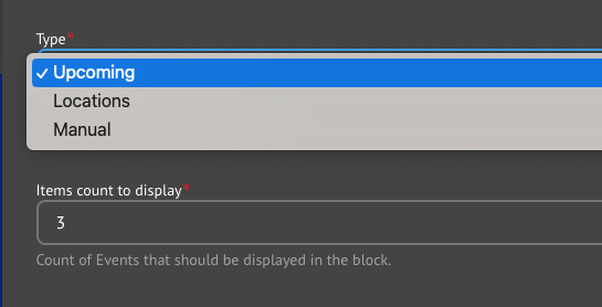
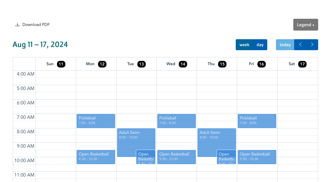
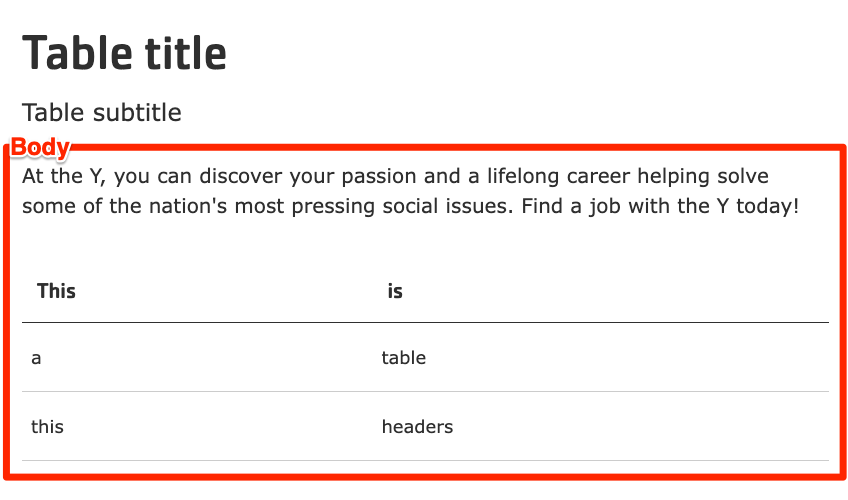
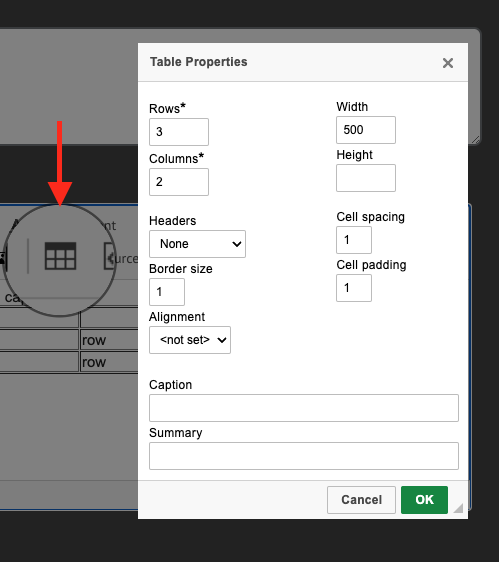
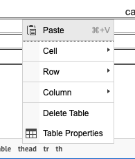
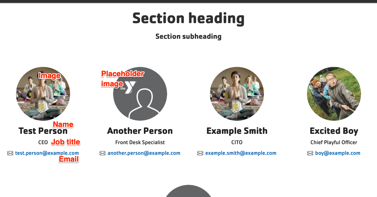

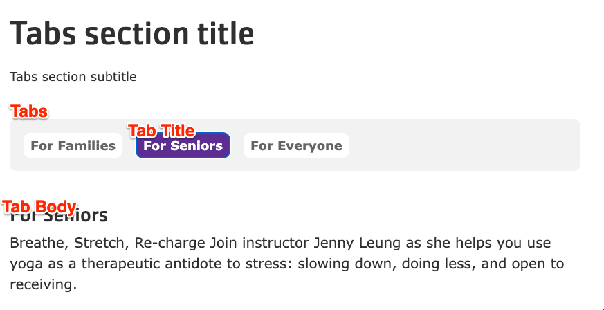
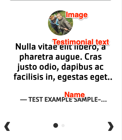
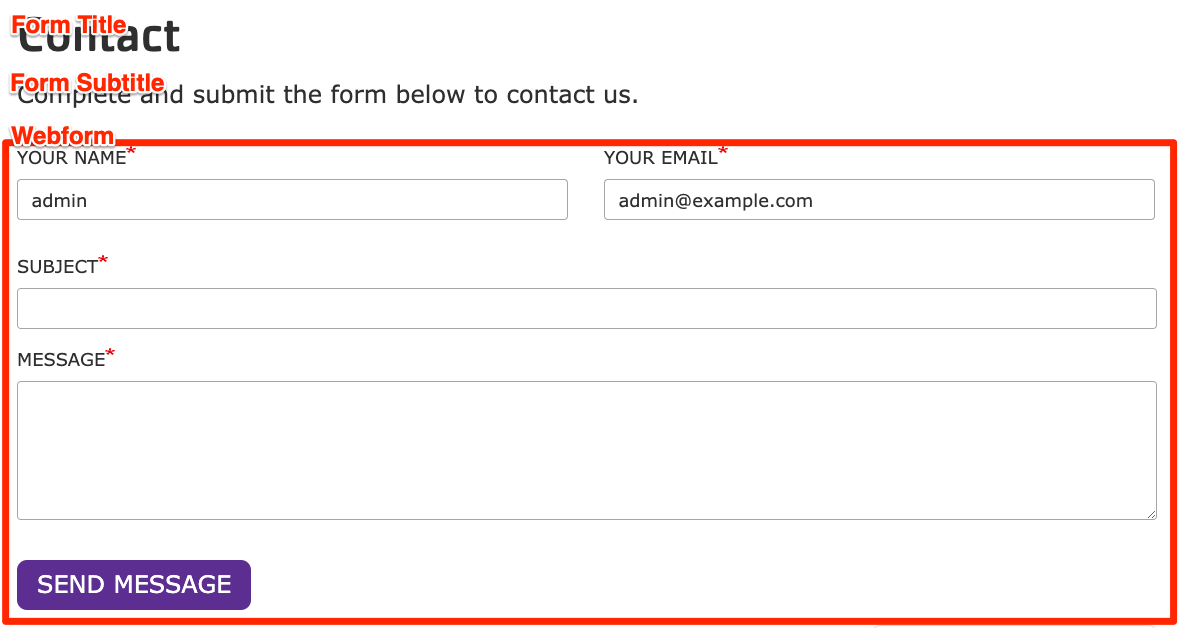
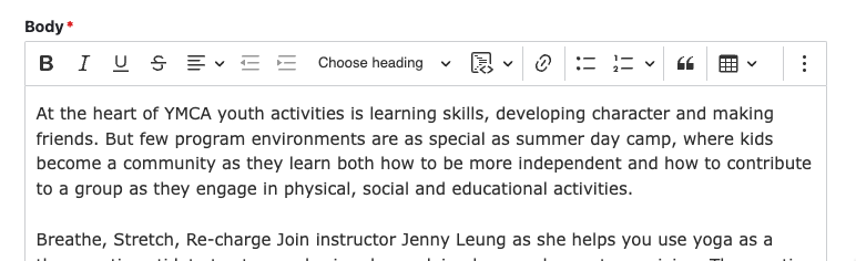
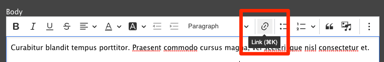
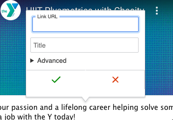
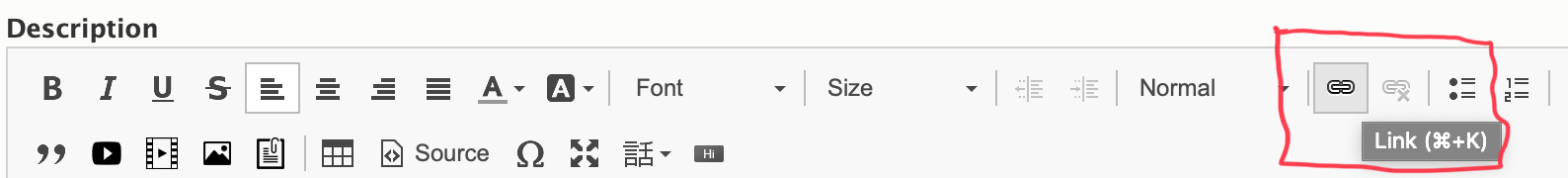
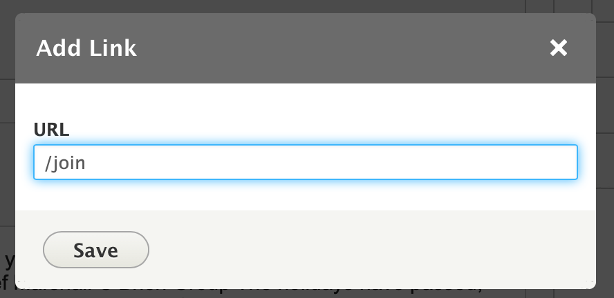
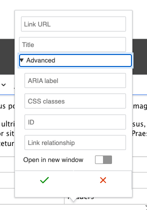
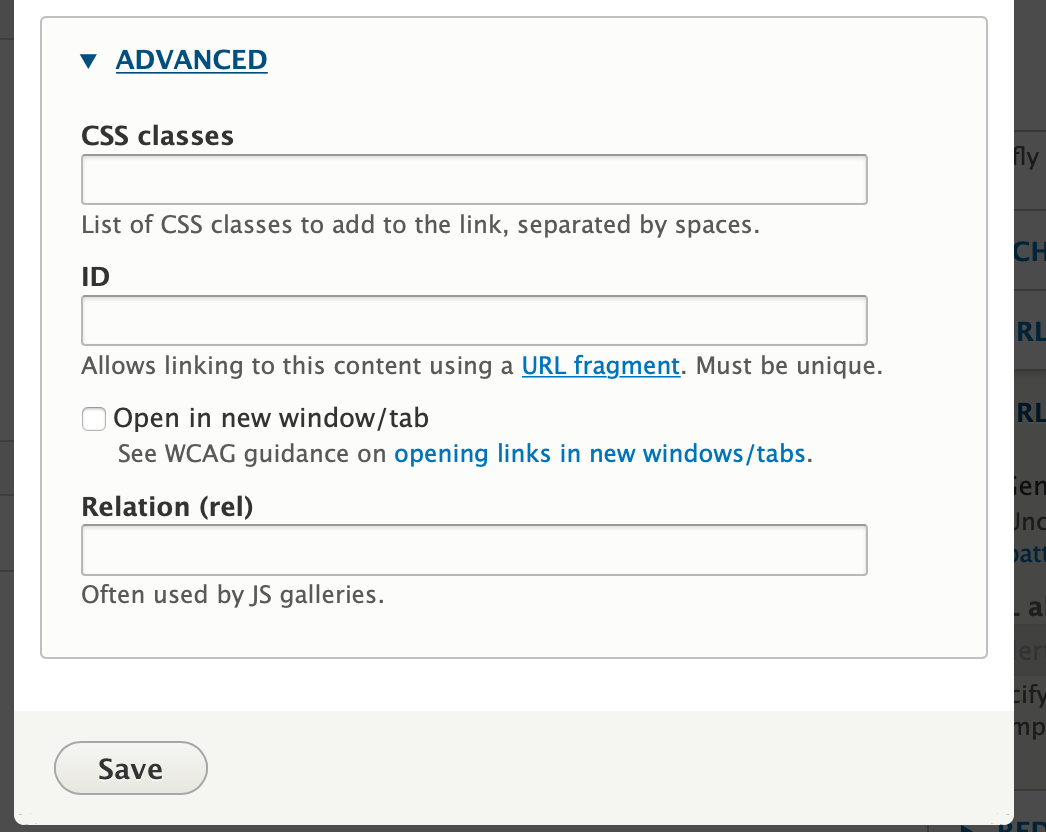
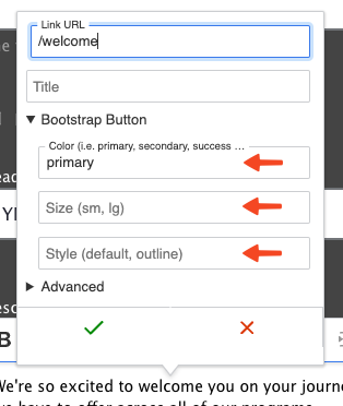

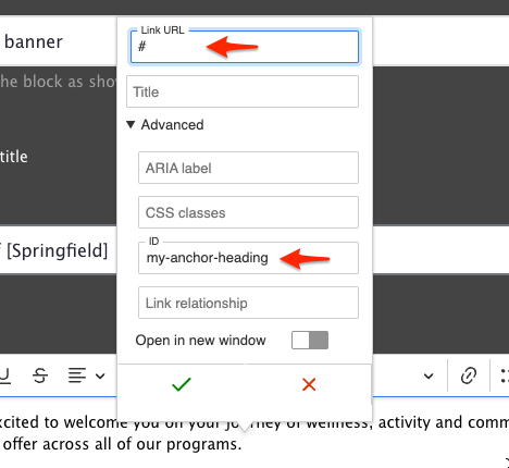
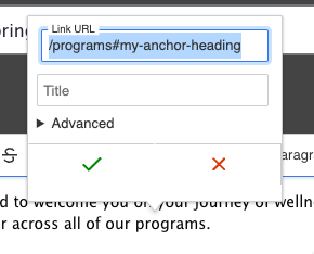
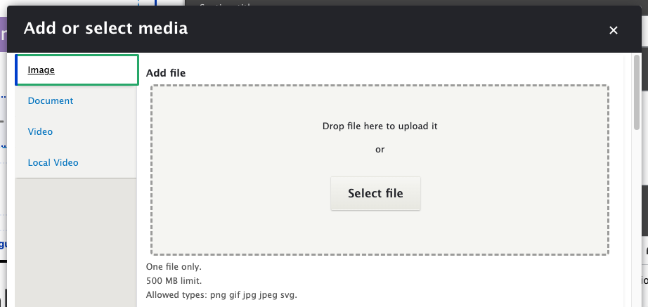
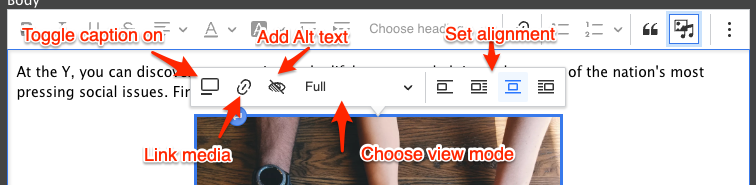

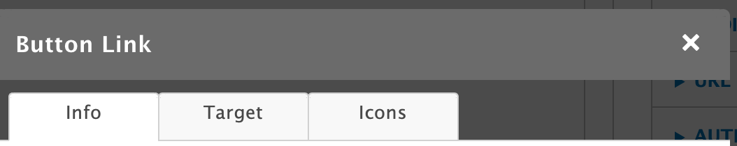
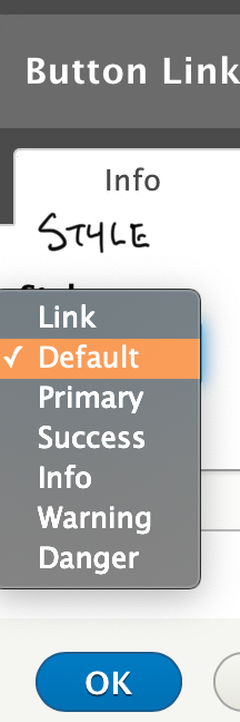
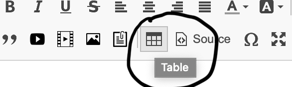
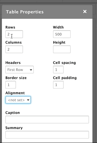
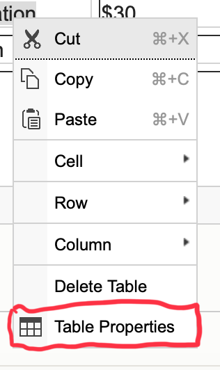
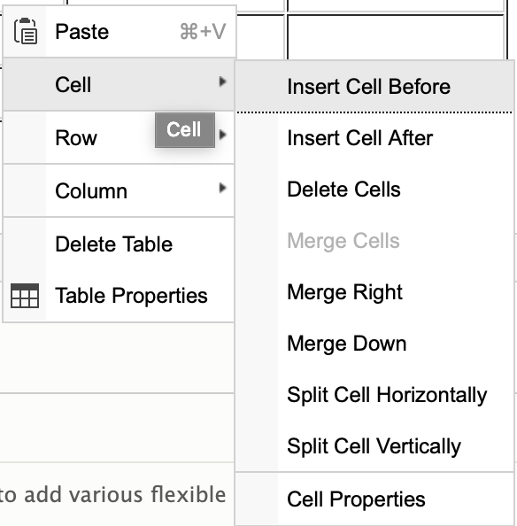
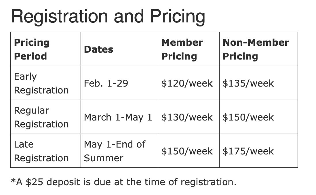
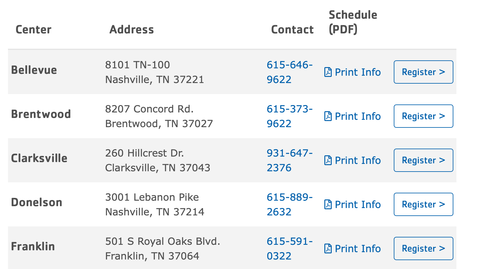


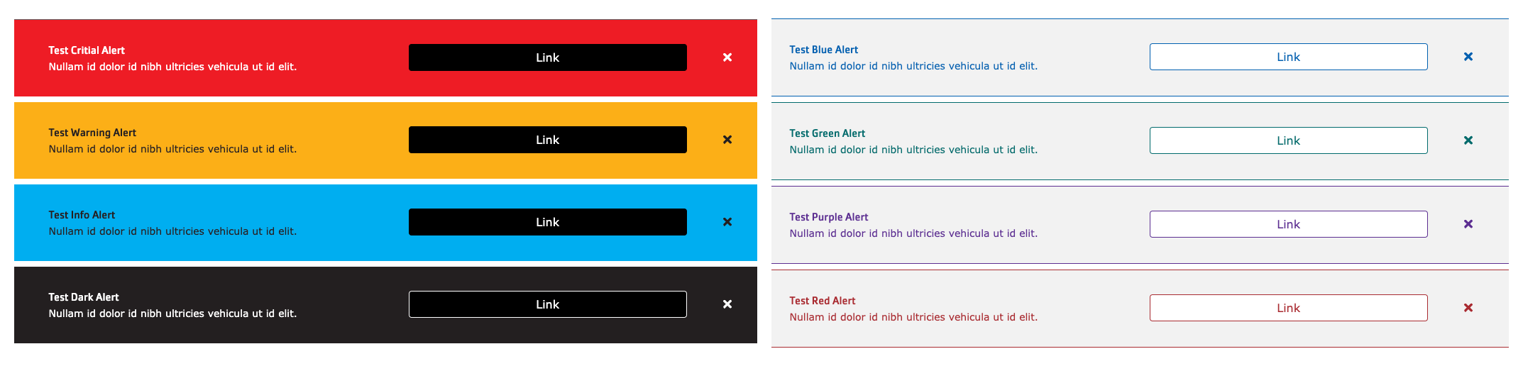
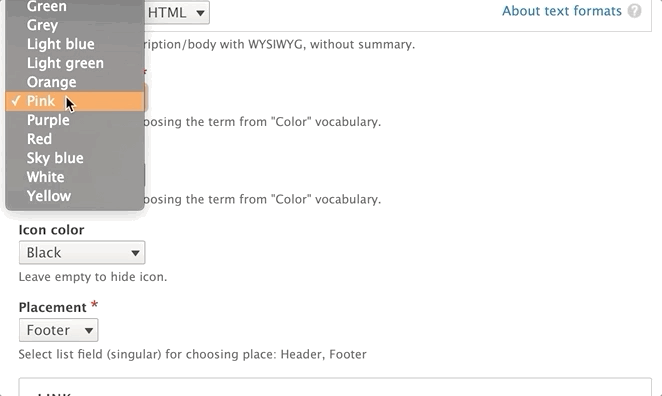
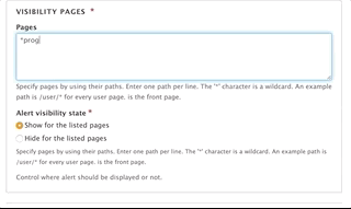
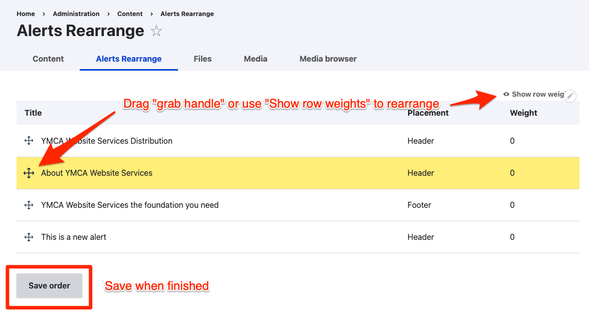
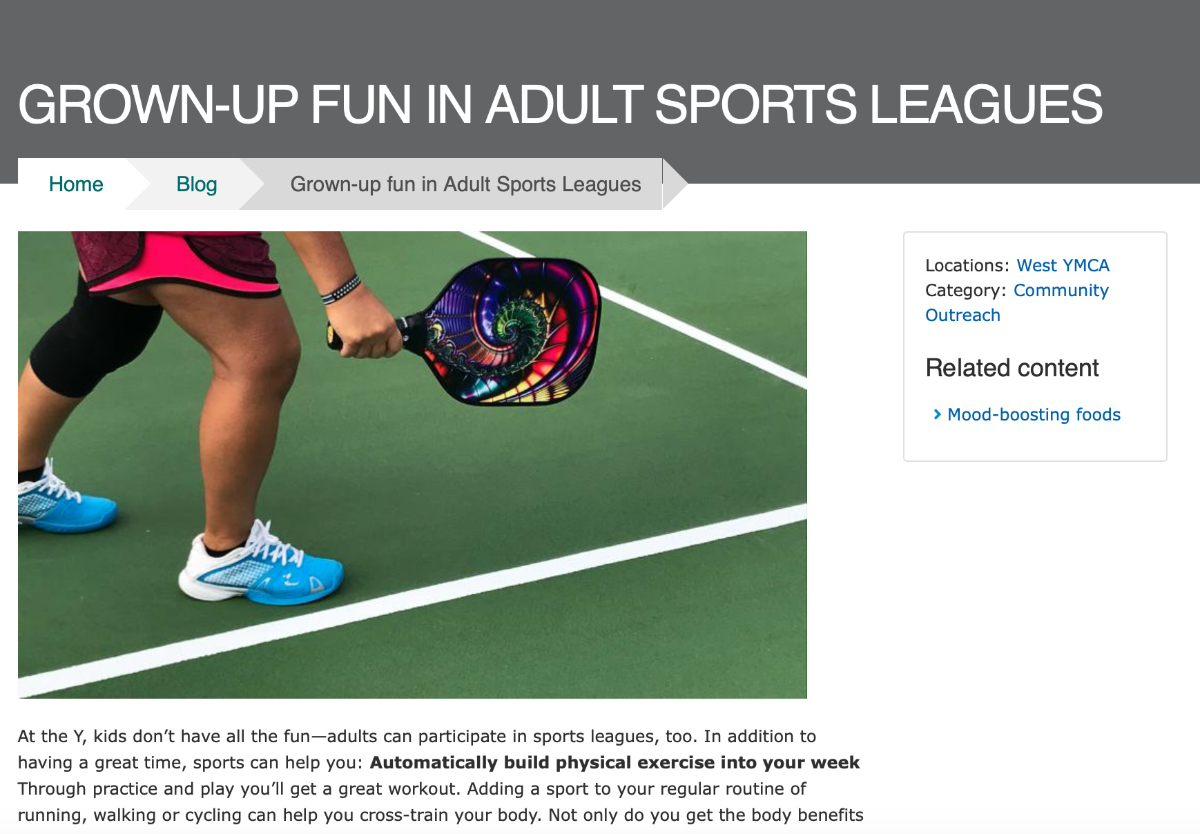
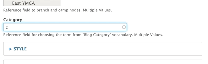
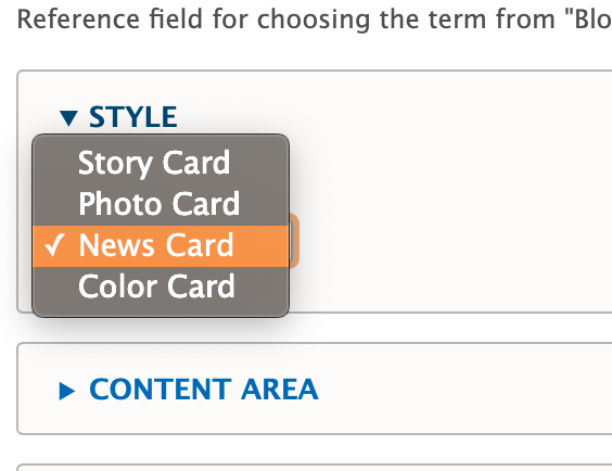


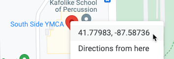
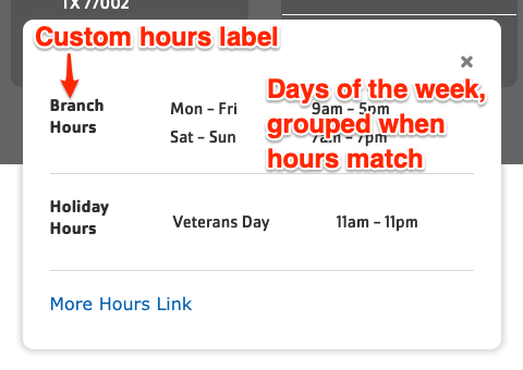
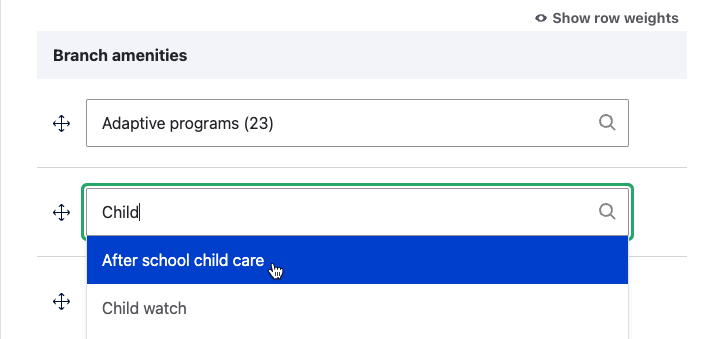
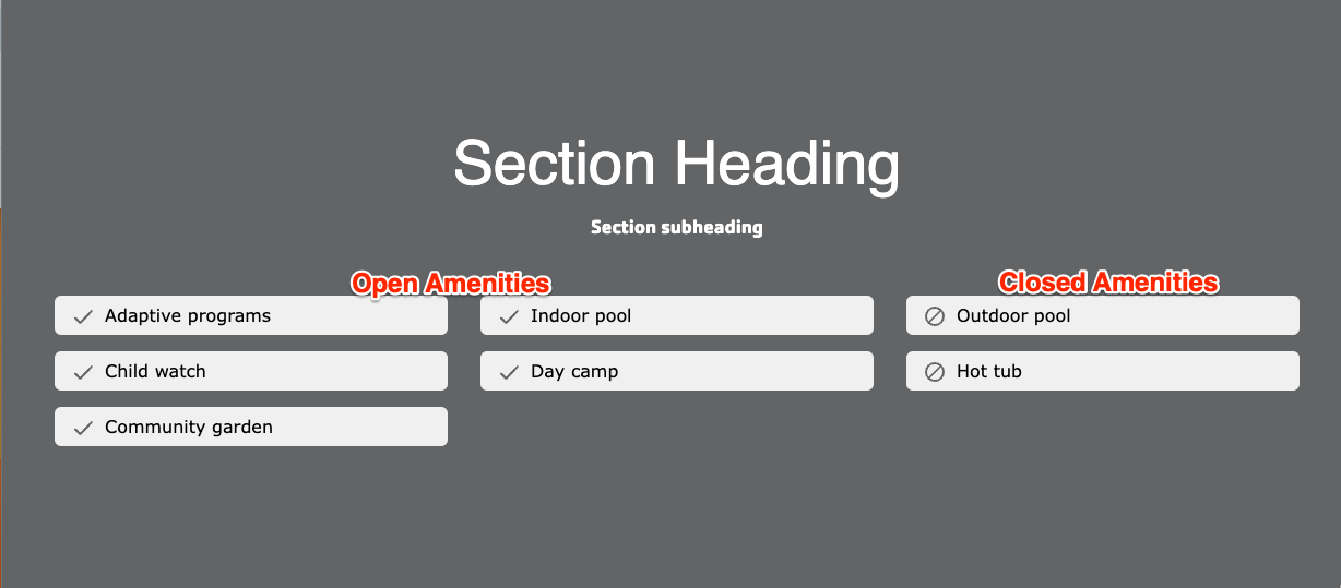

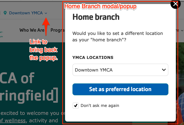
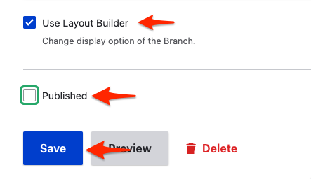

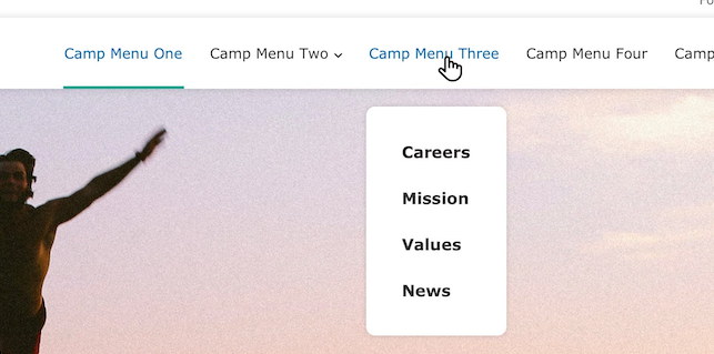
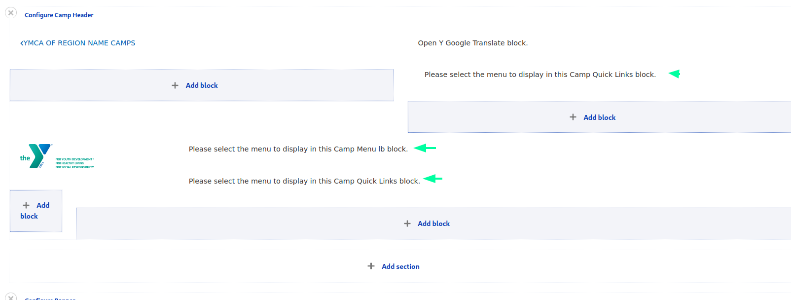
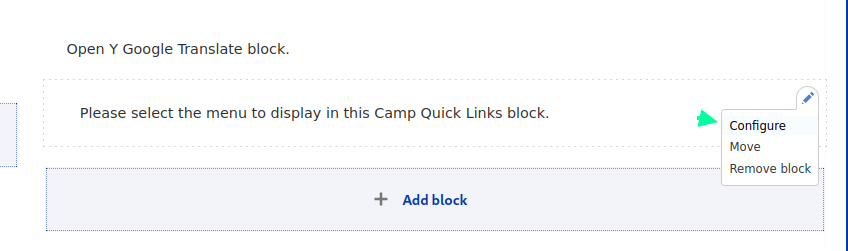
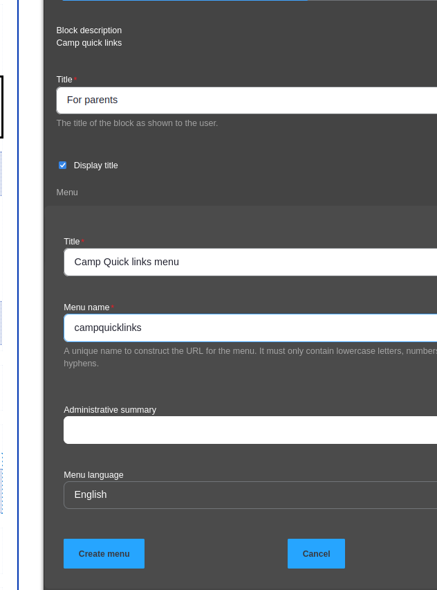
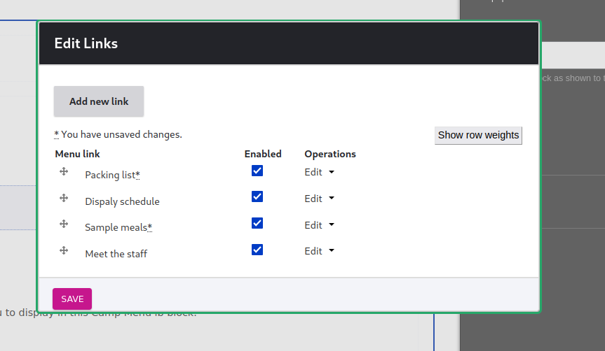
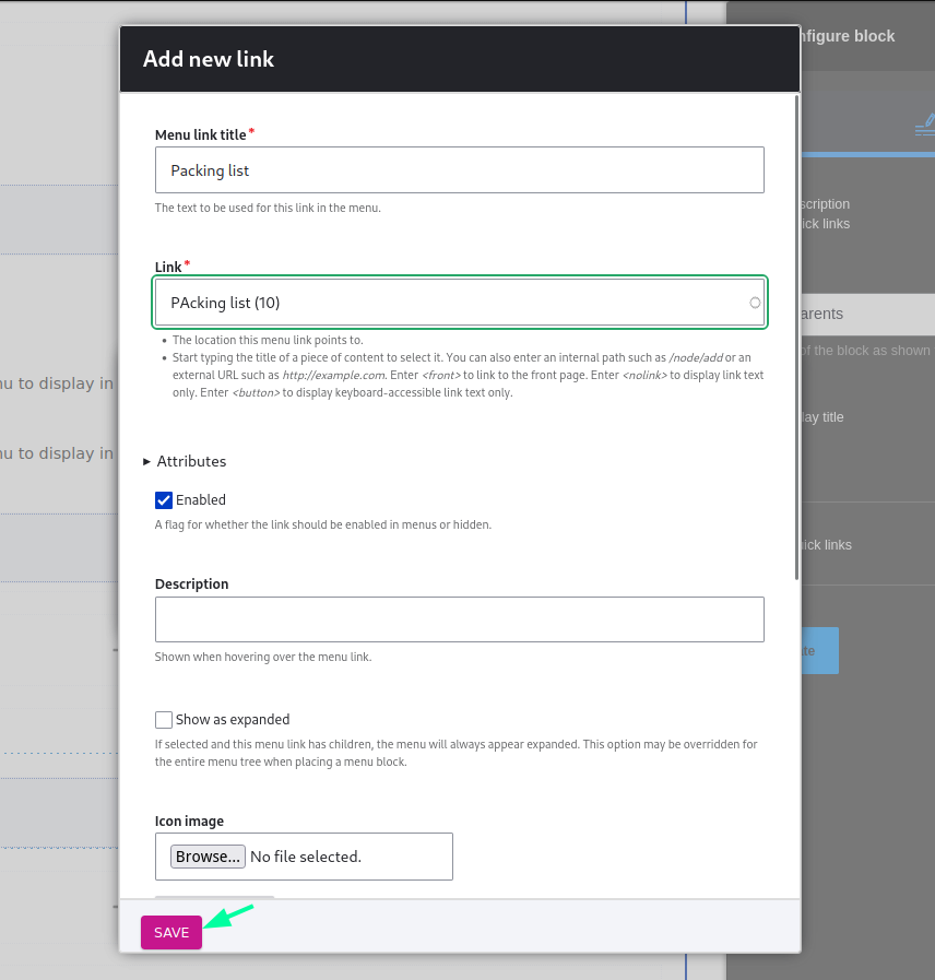
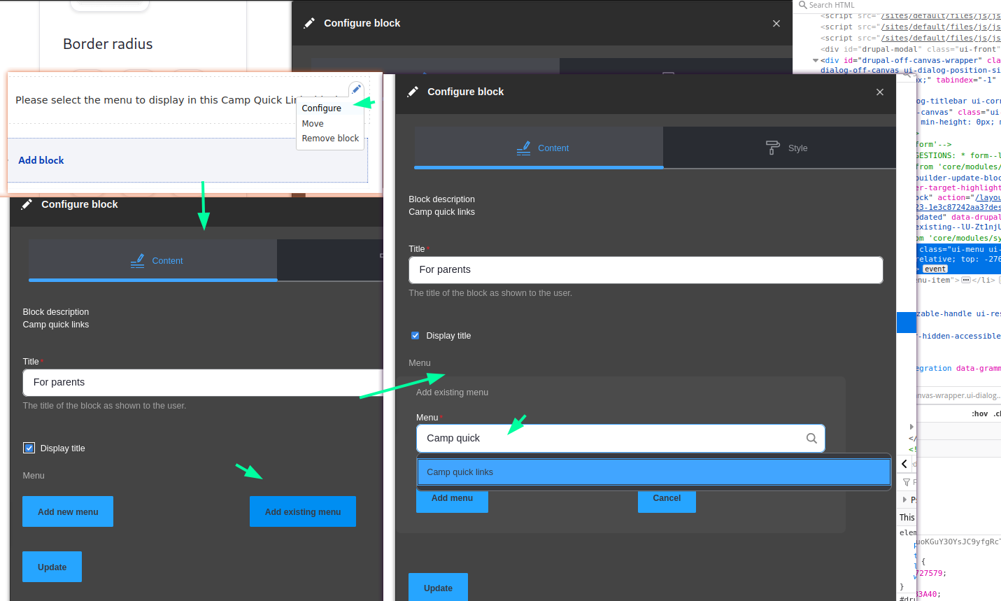
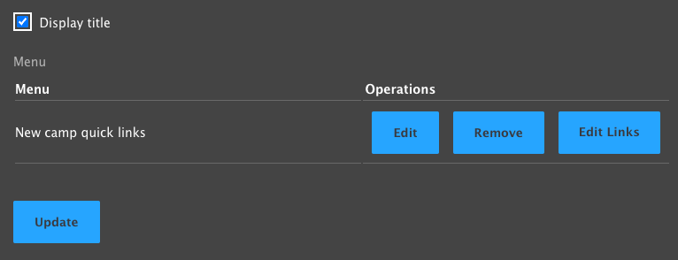
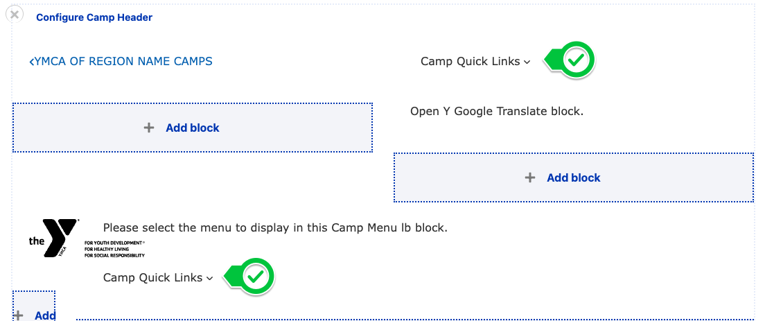
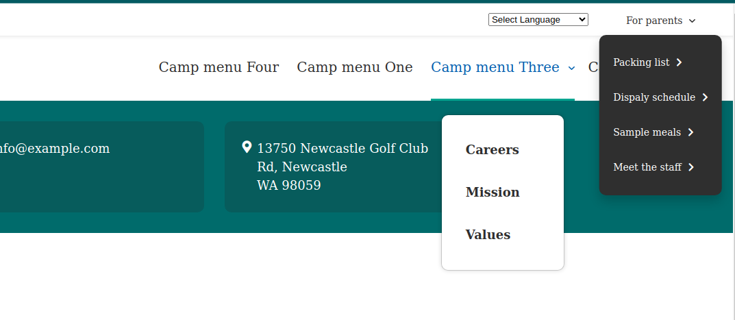
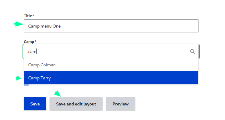
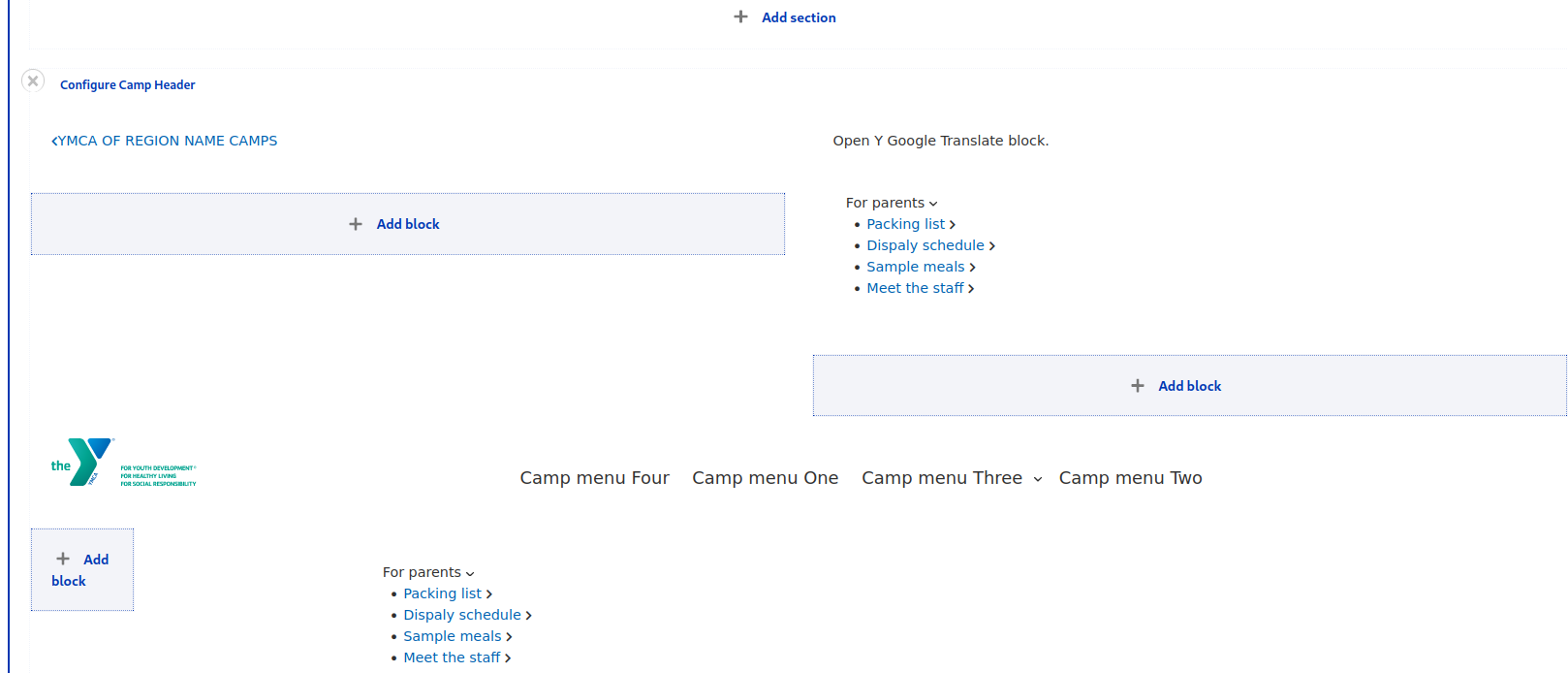
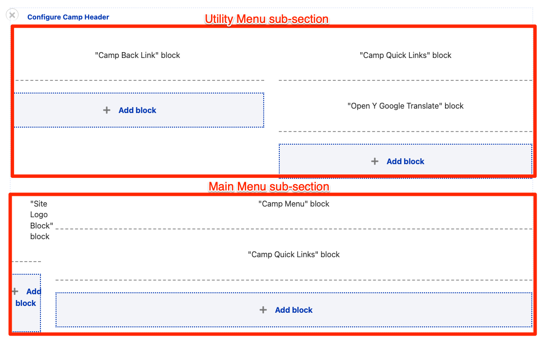
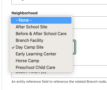
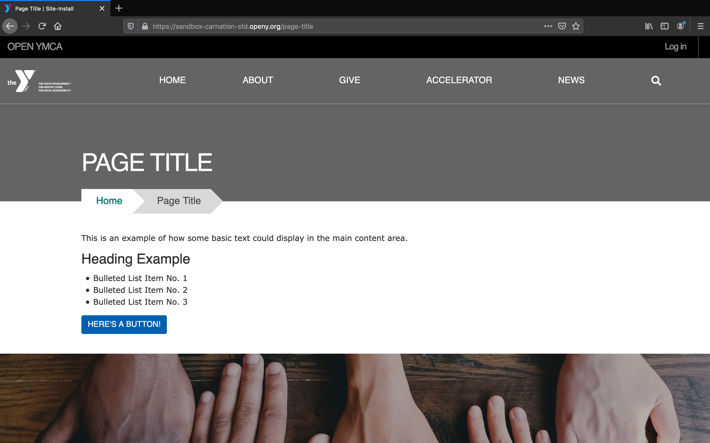
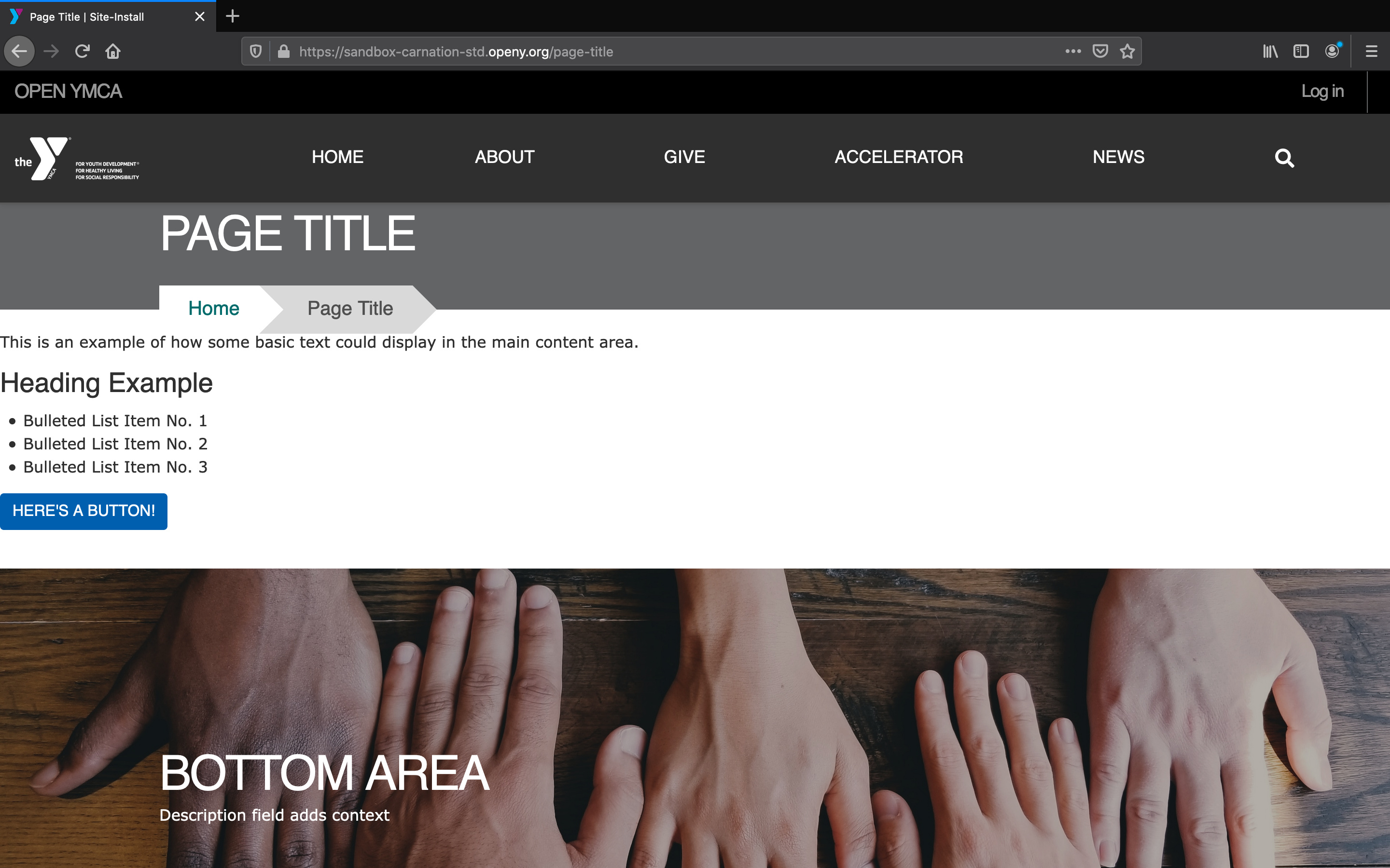
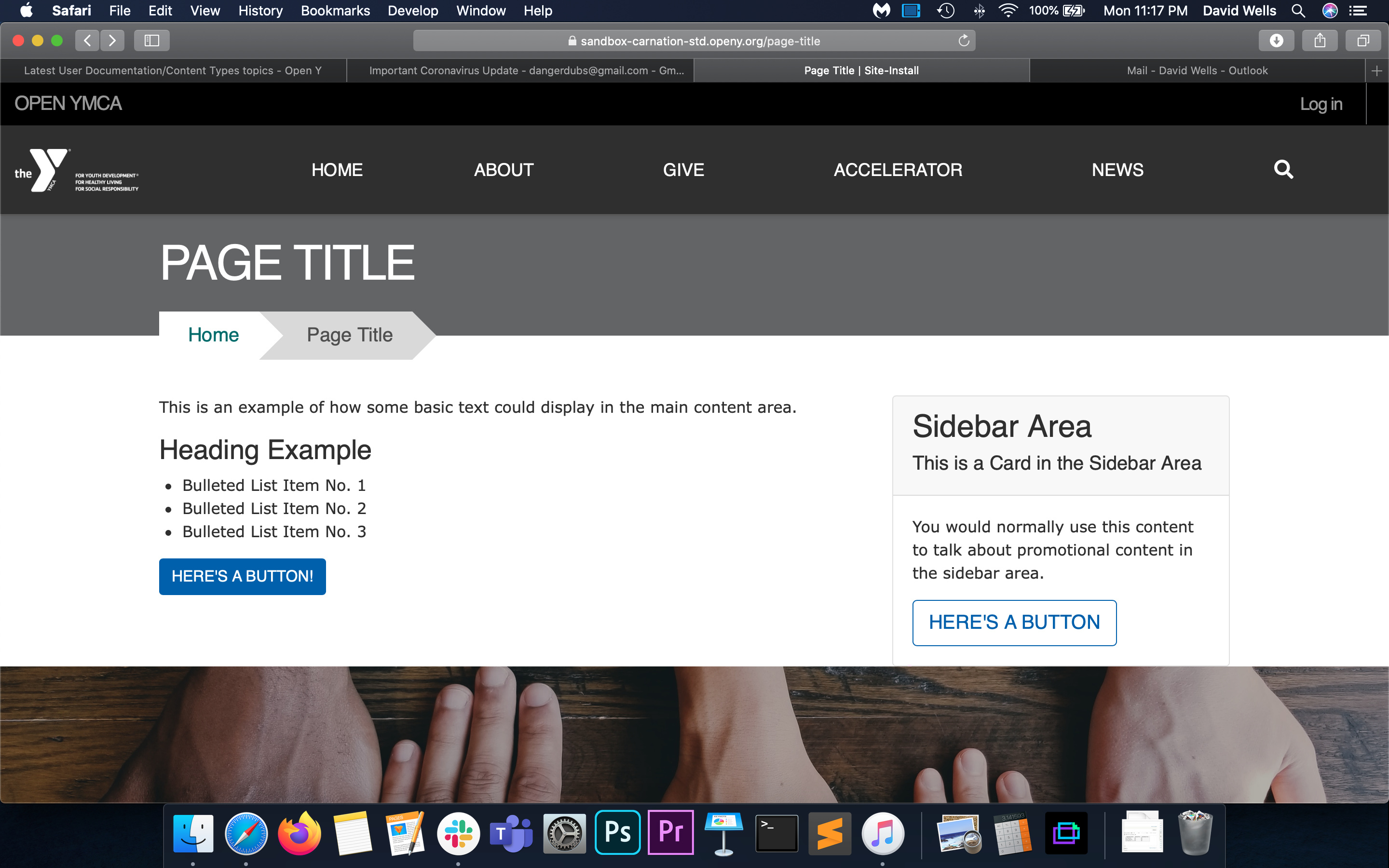
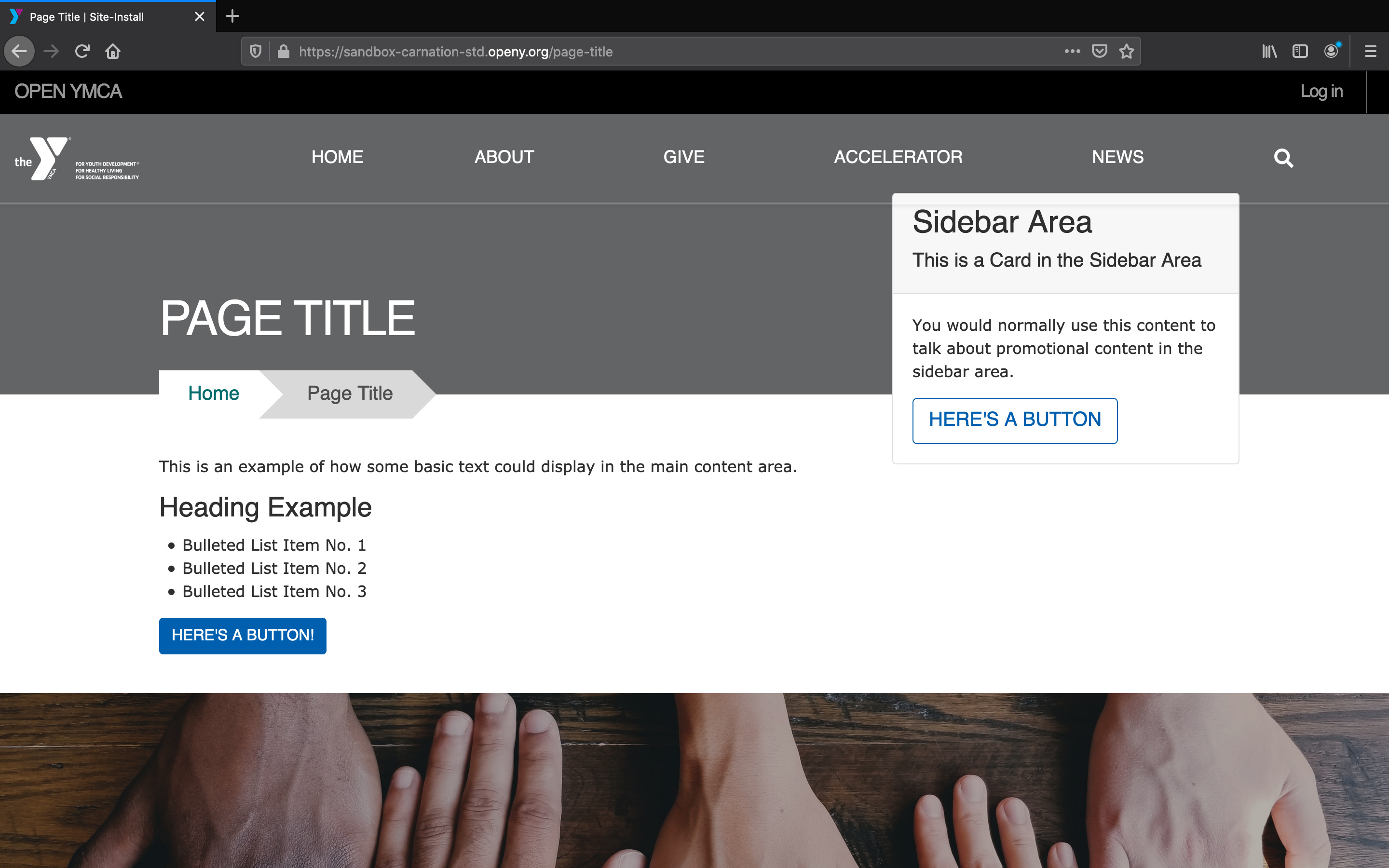
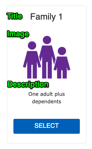
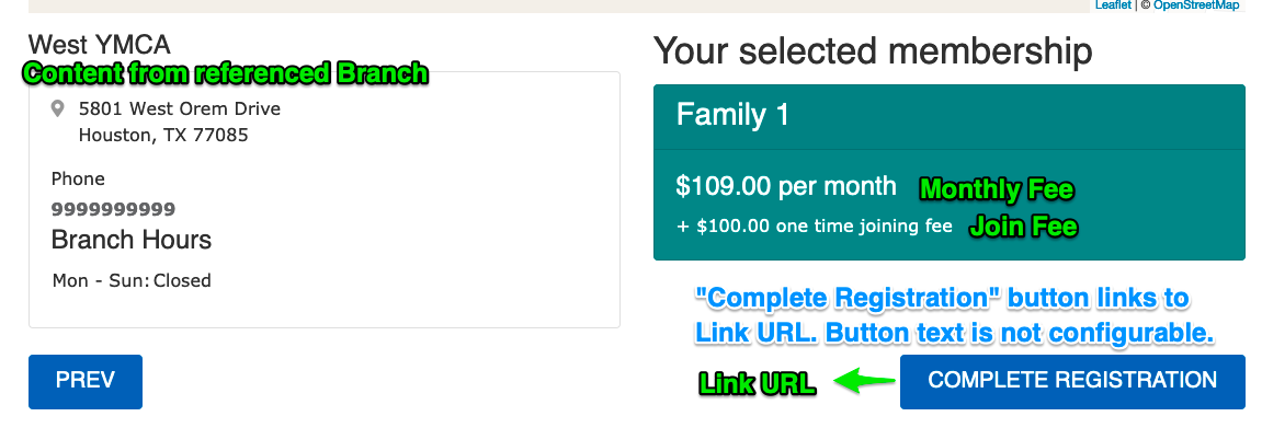
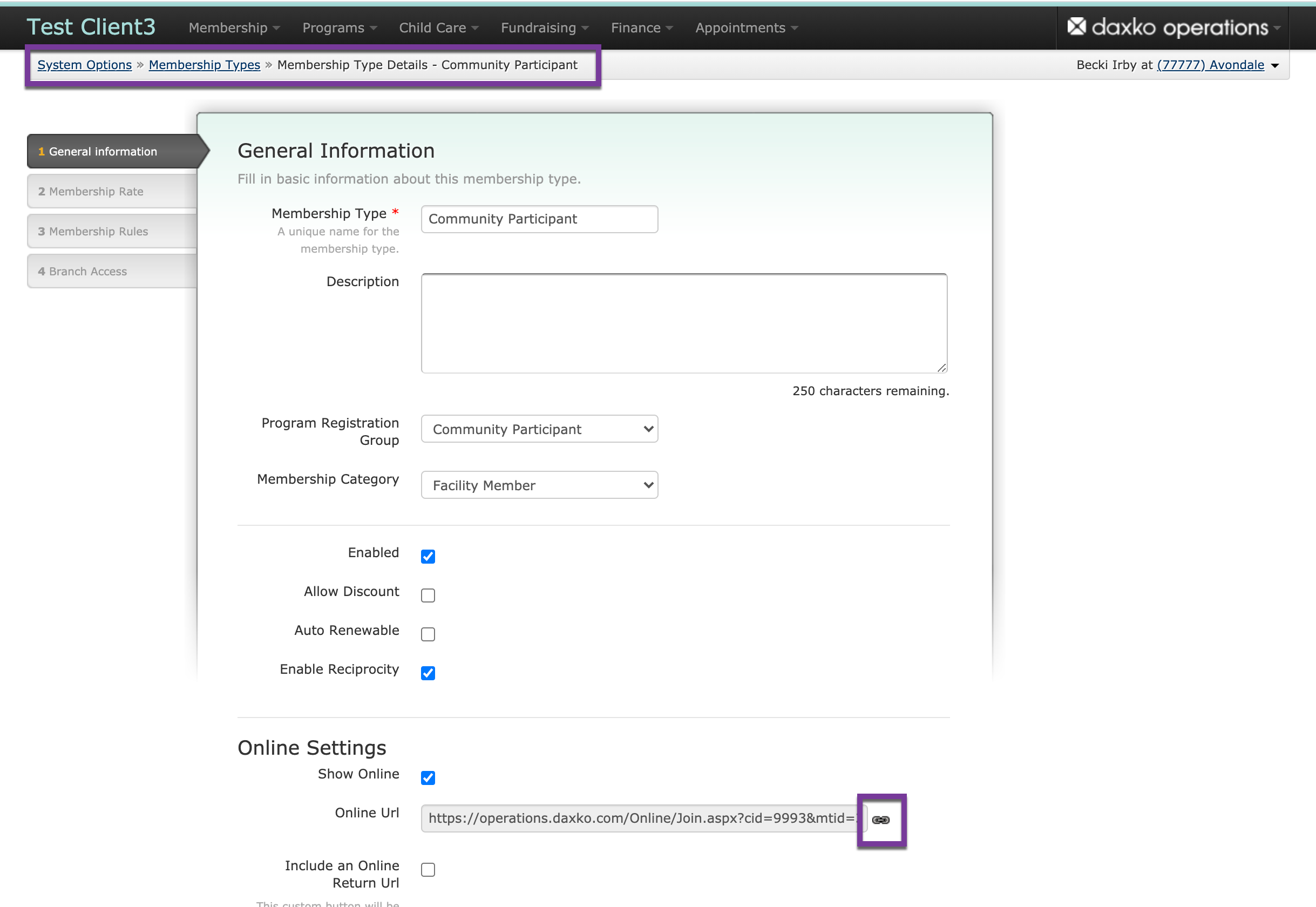
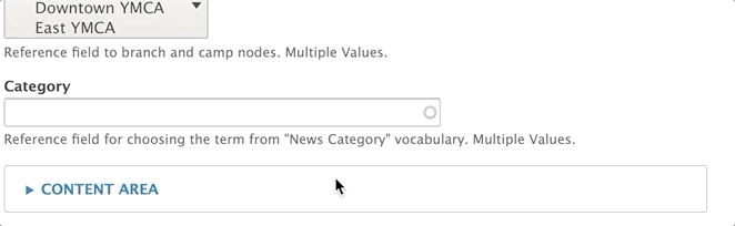
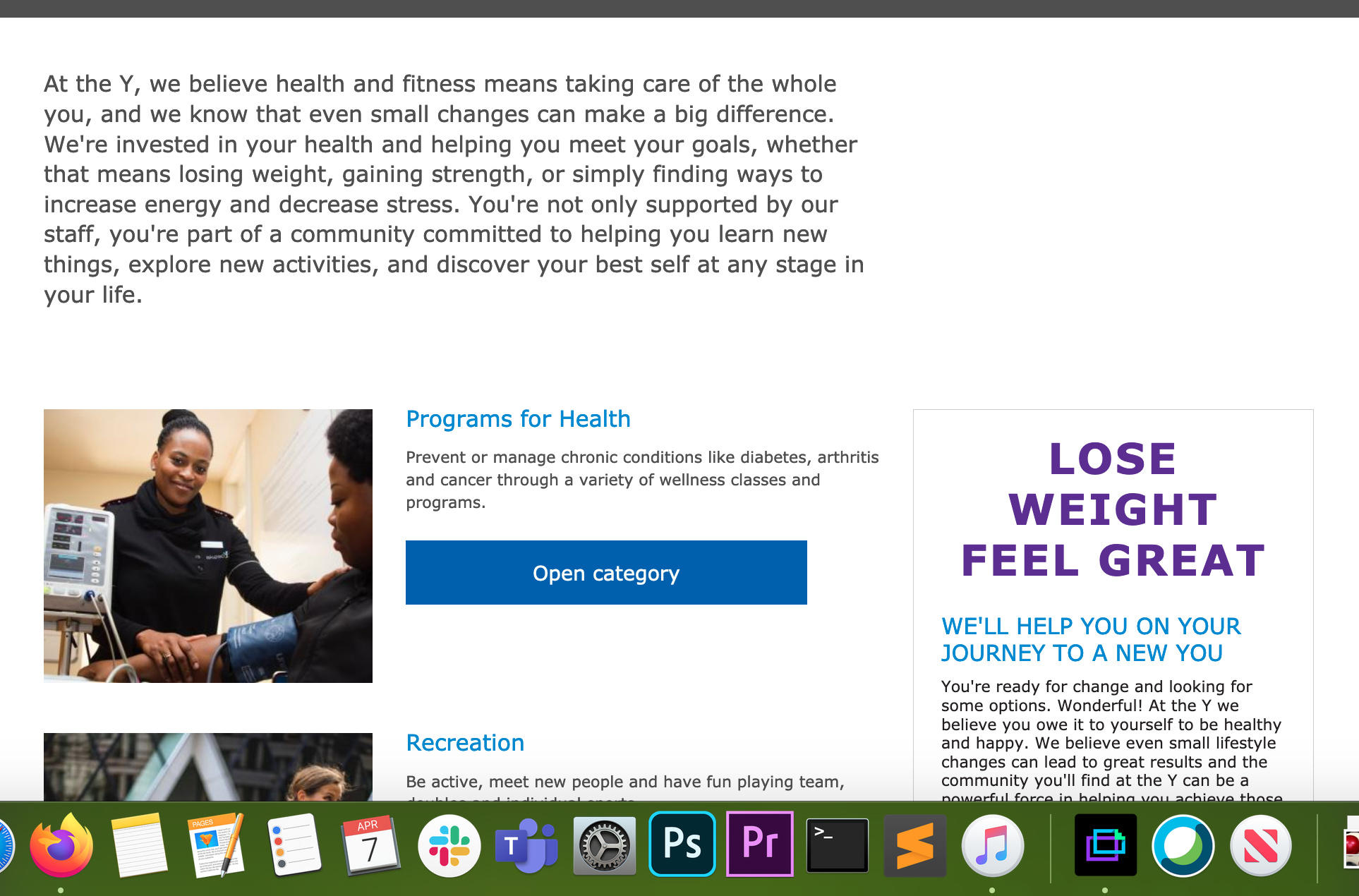
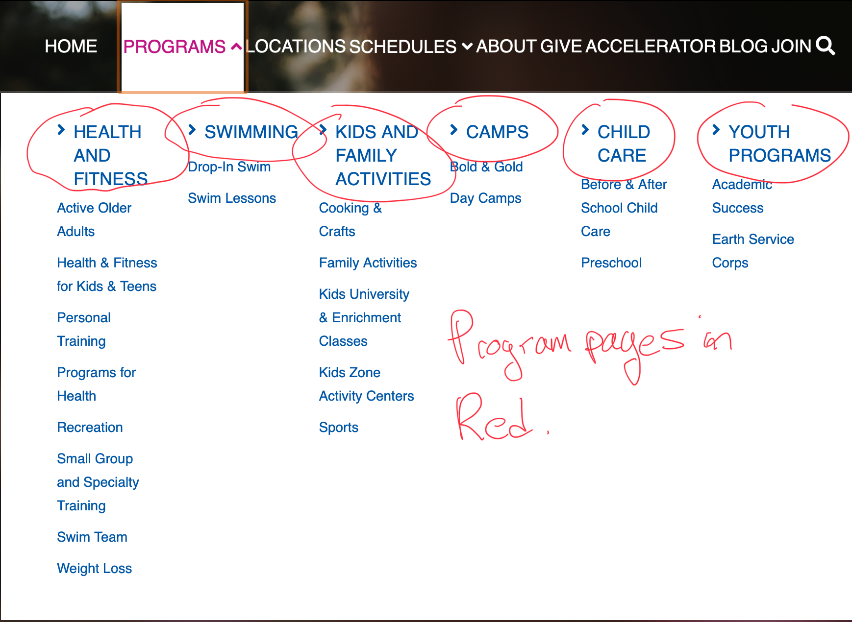
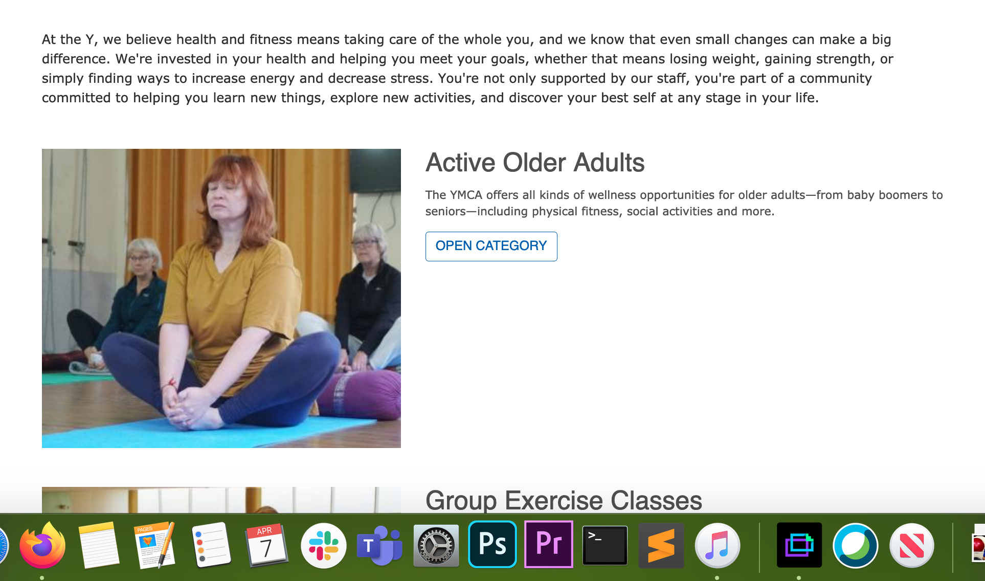
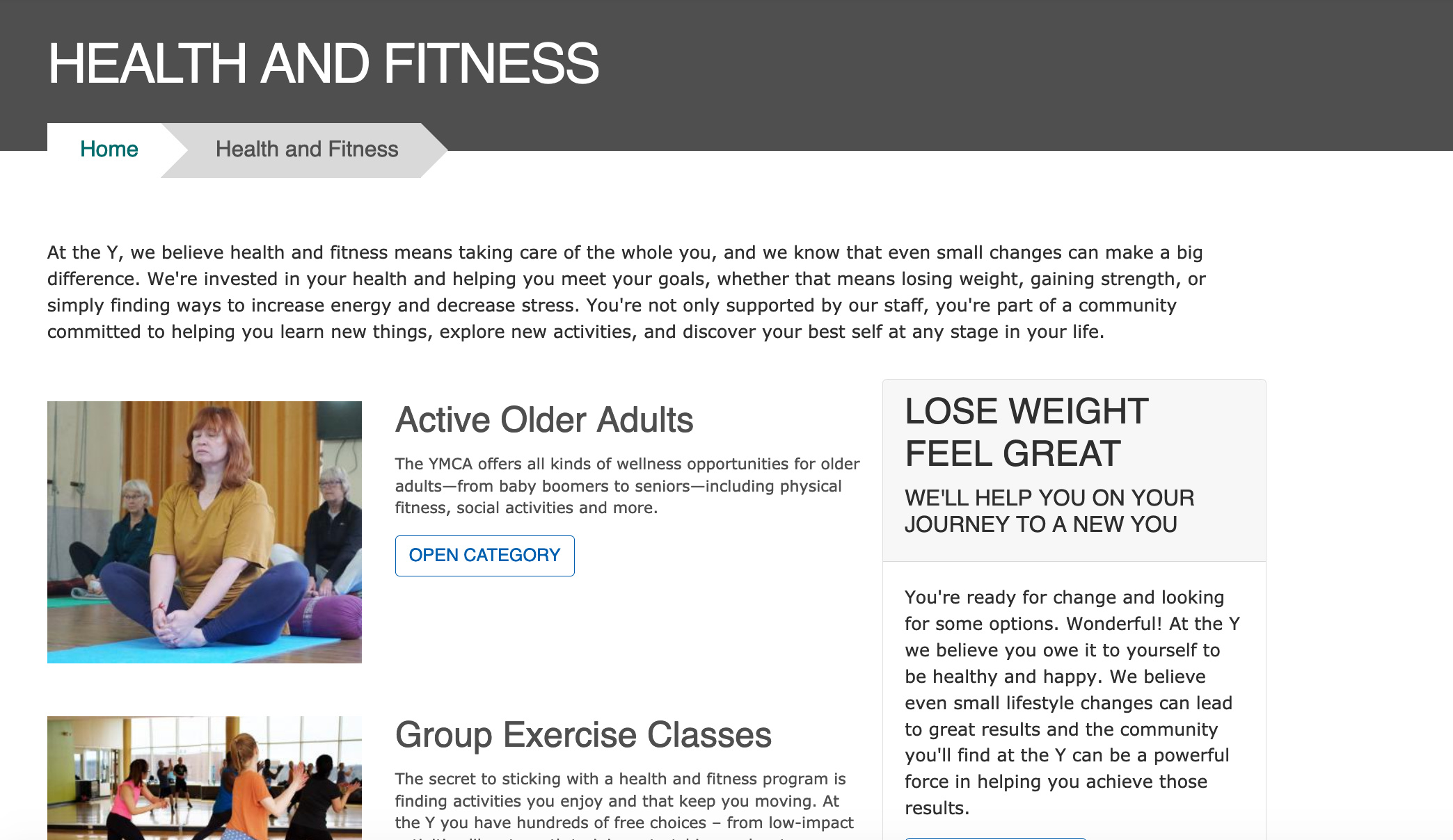
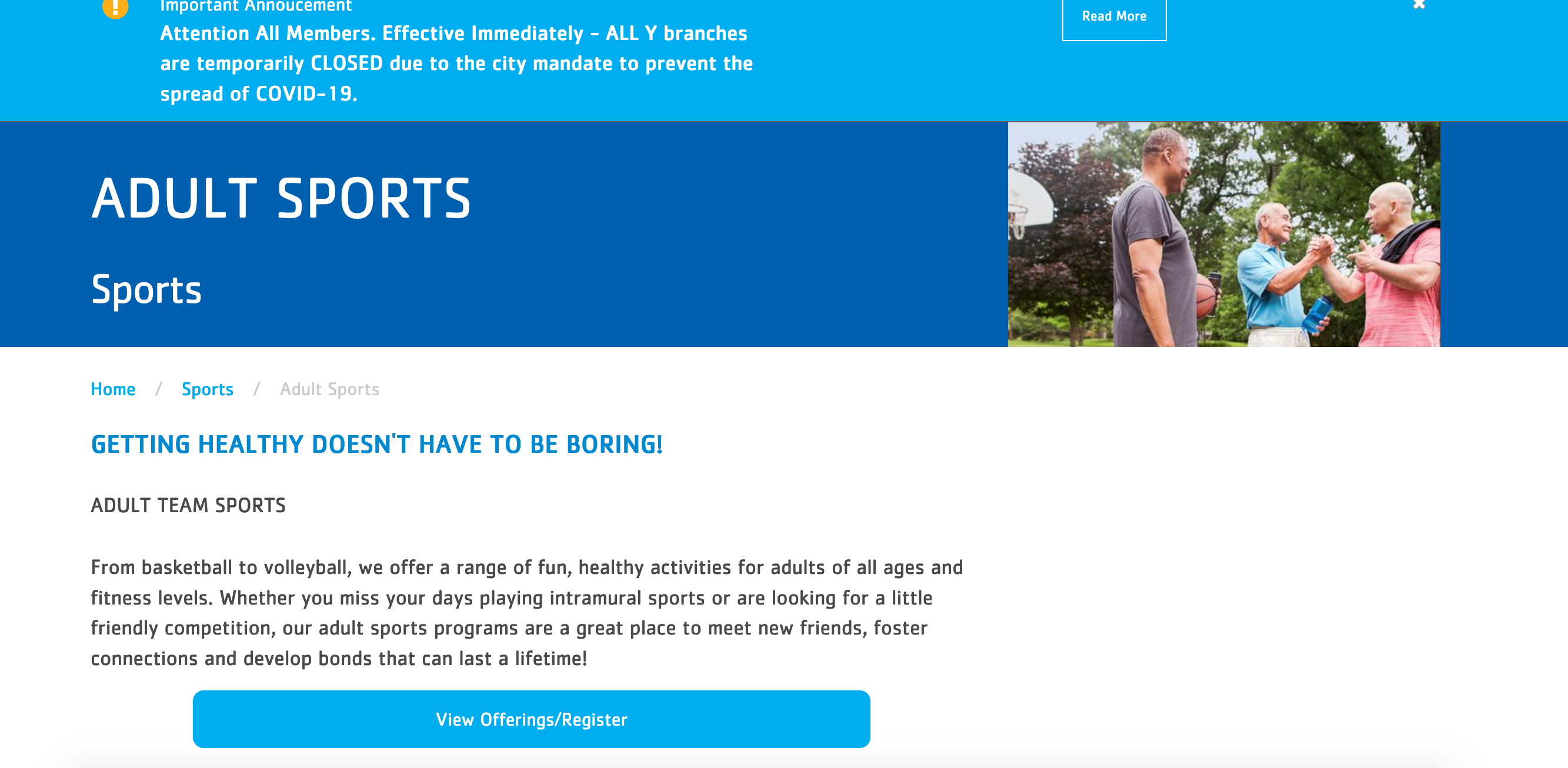
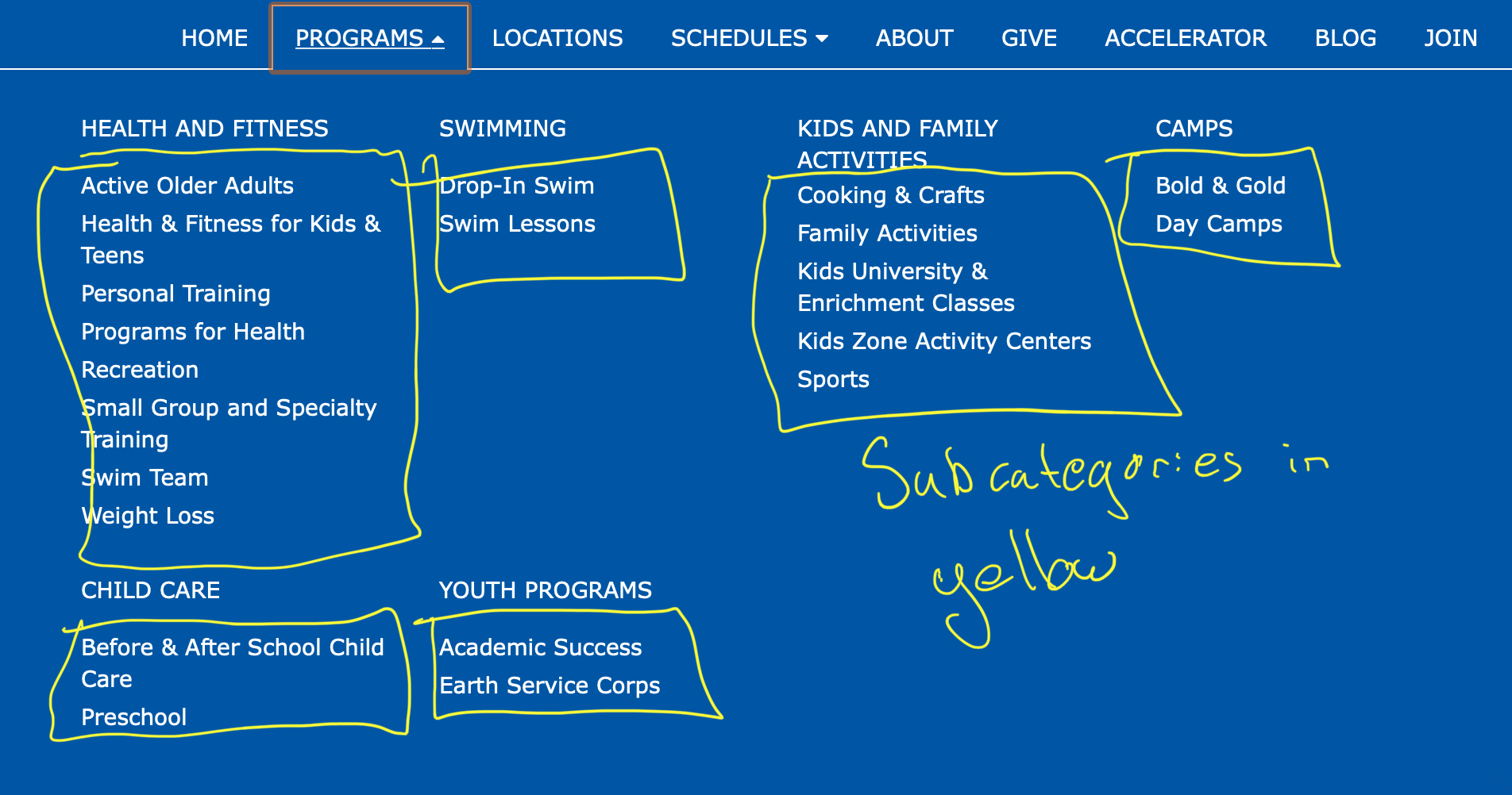
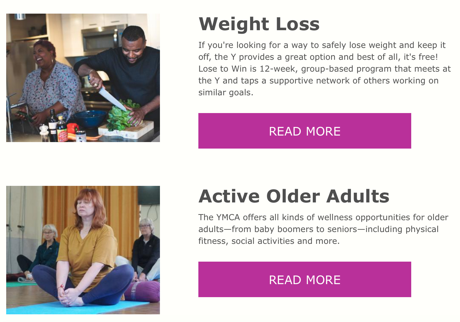
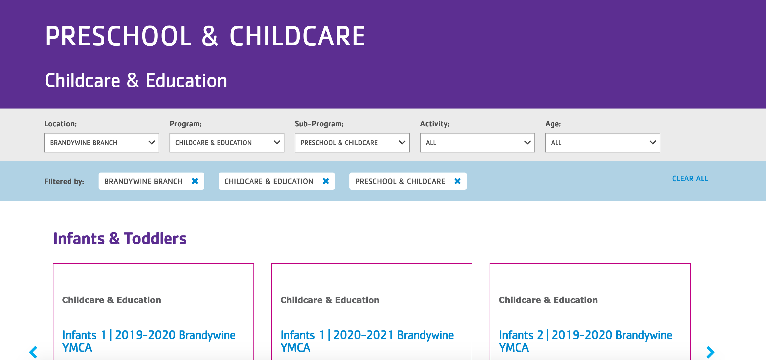
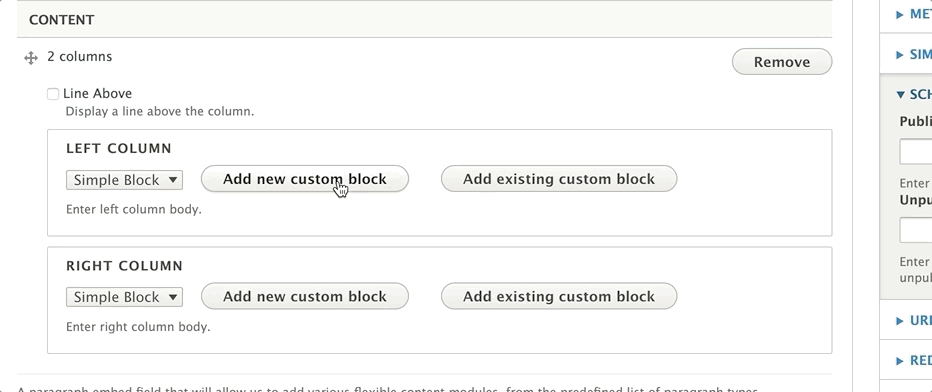

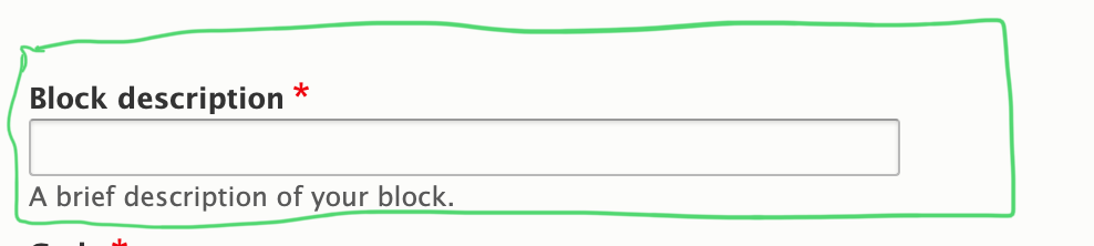
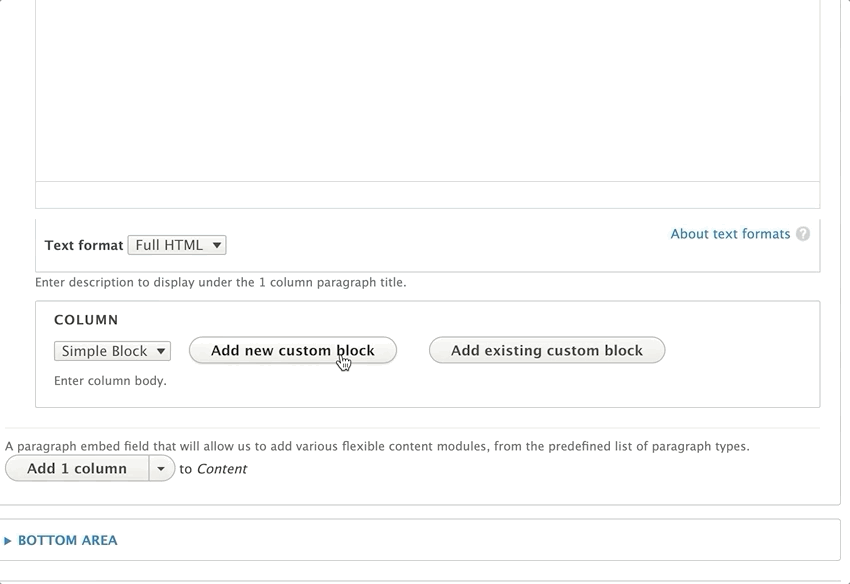

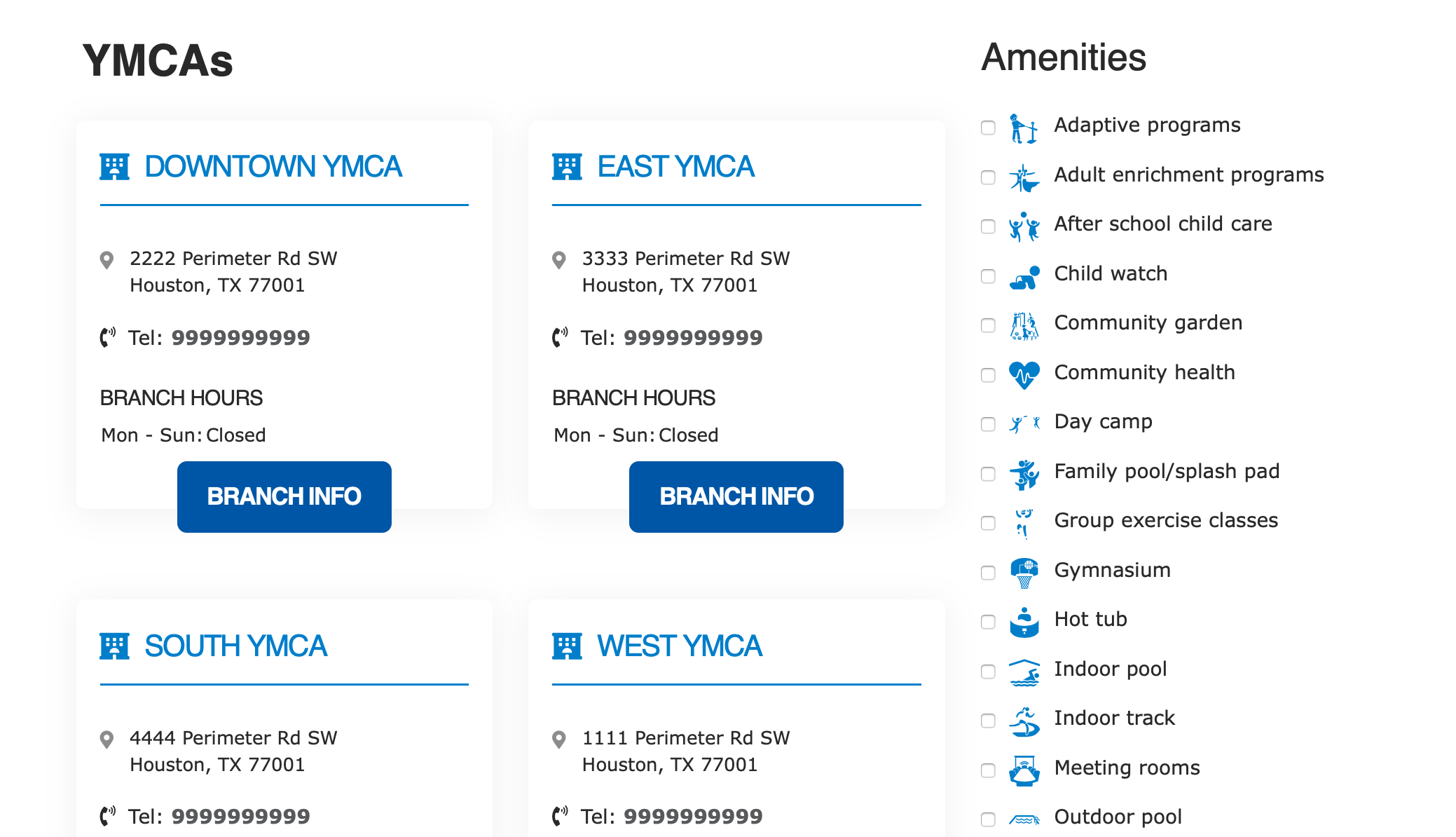


 .
.


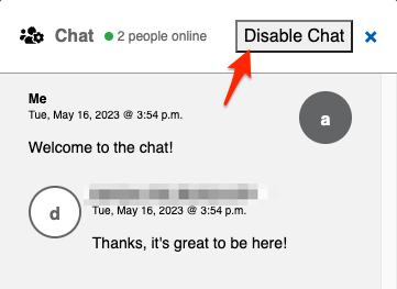


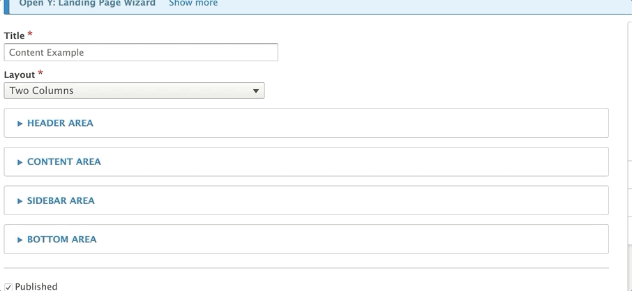
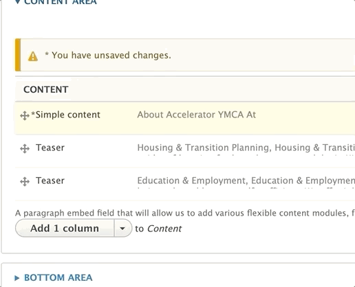


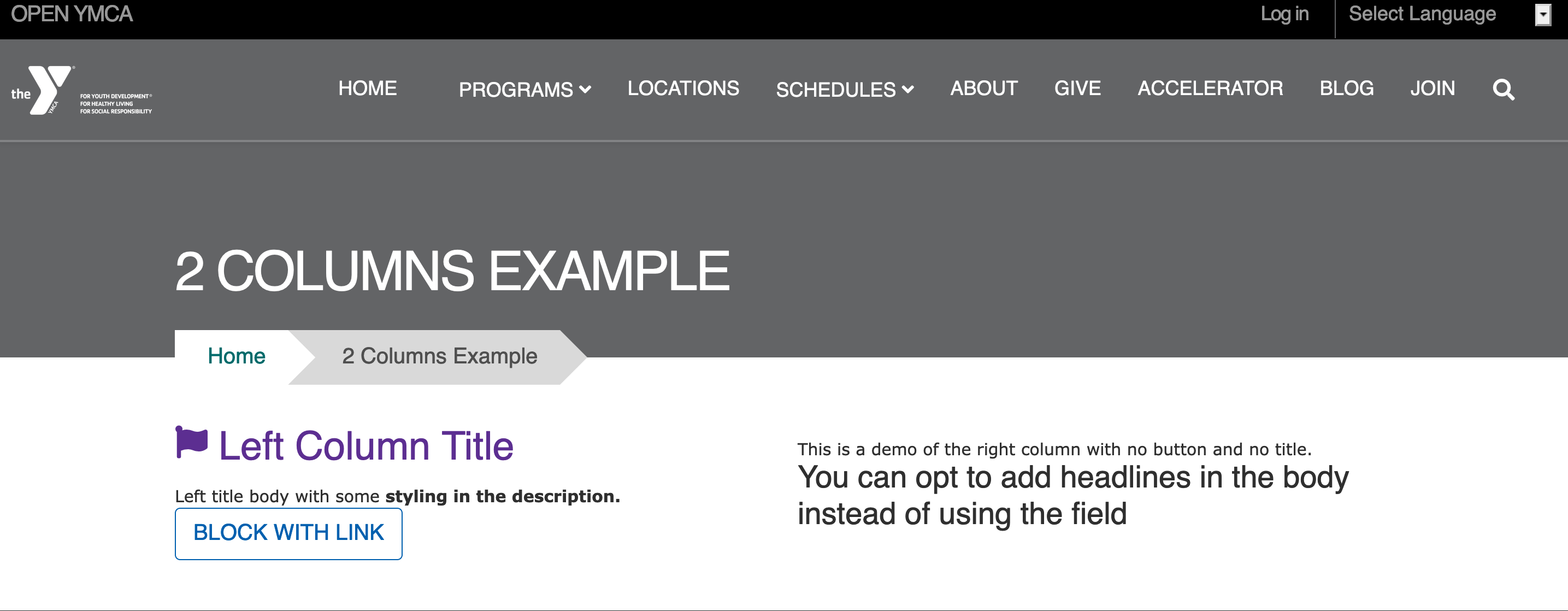
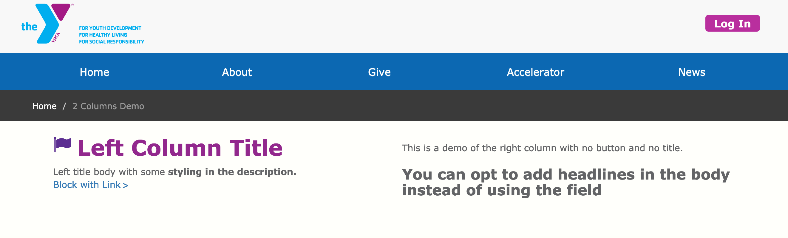
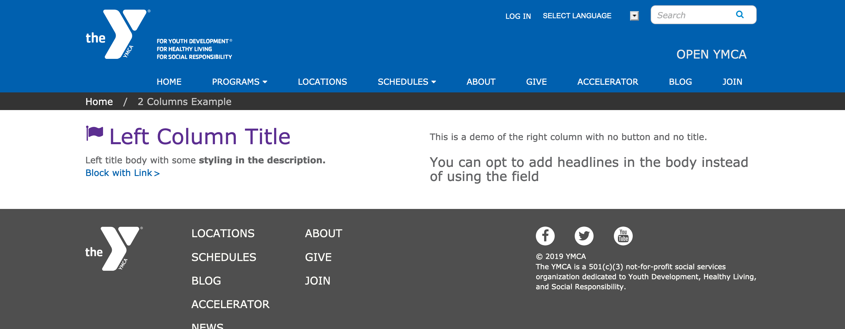
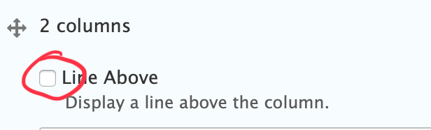
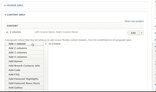
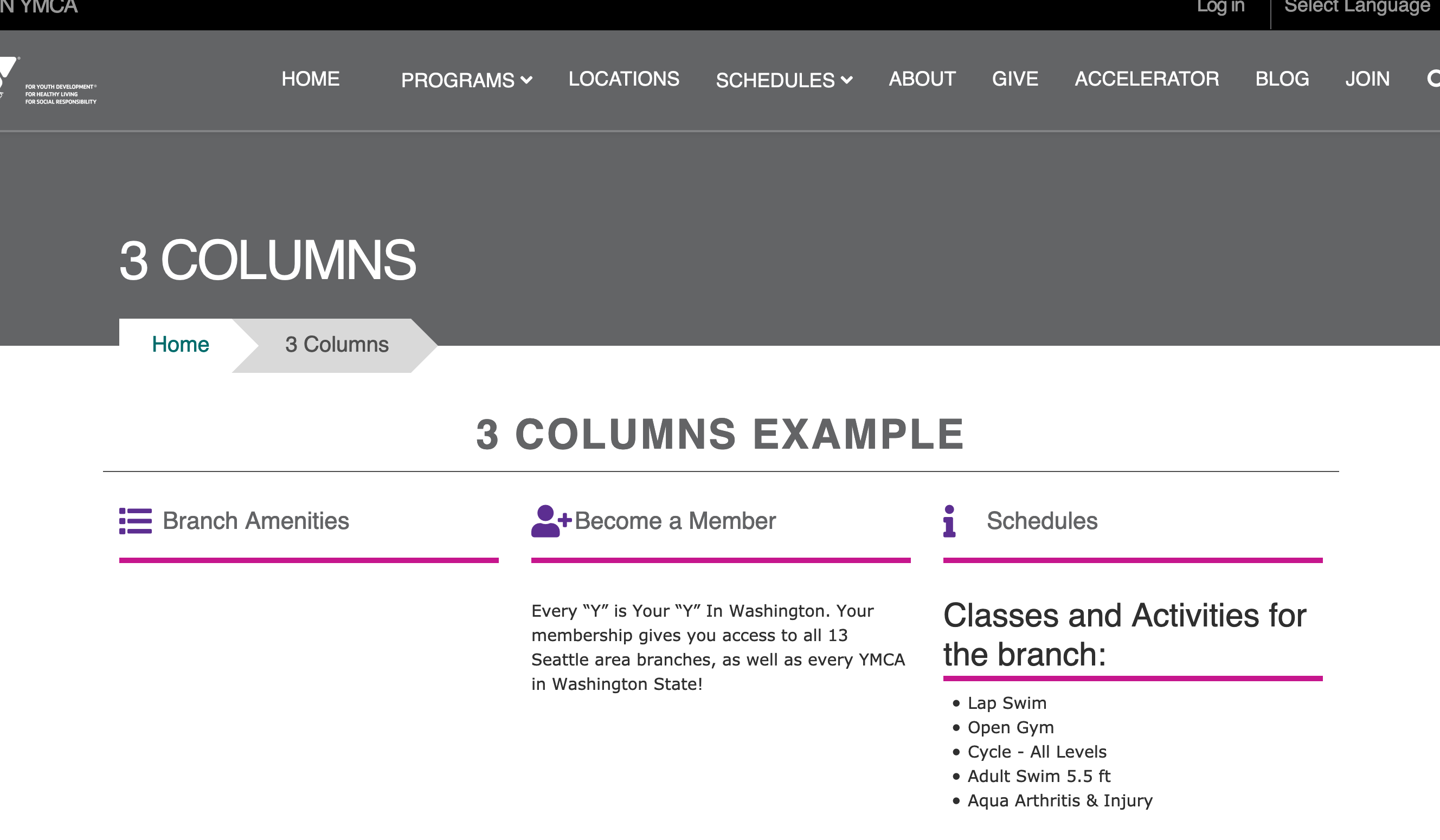
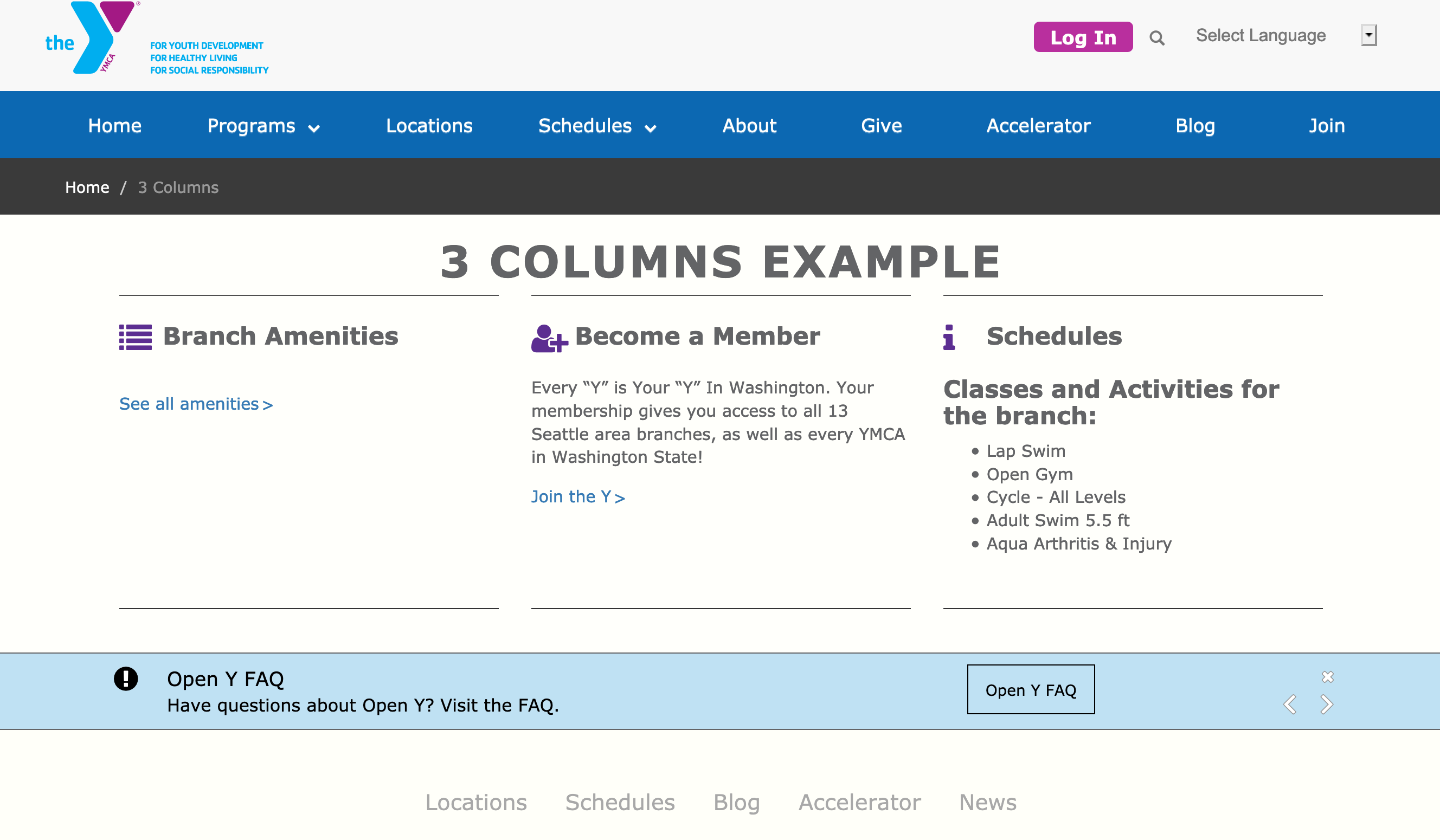
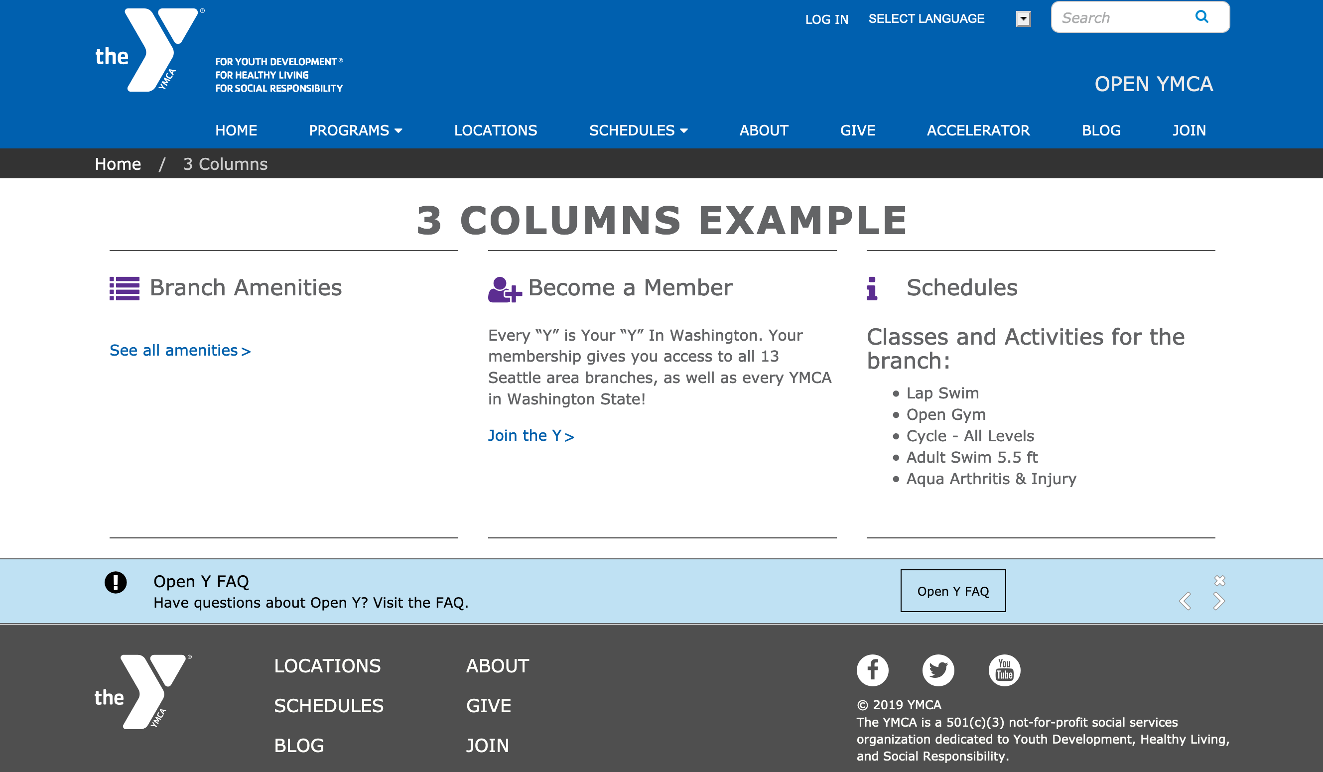
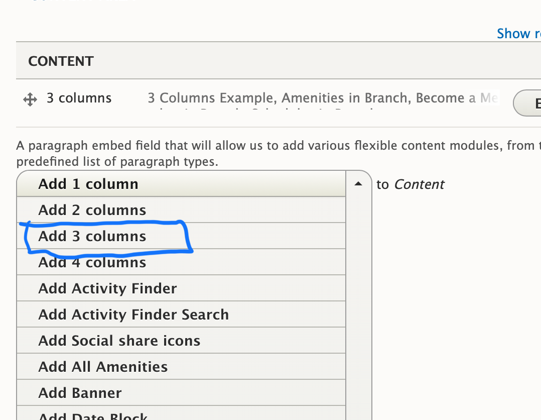
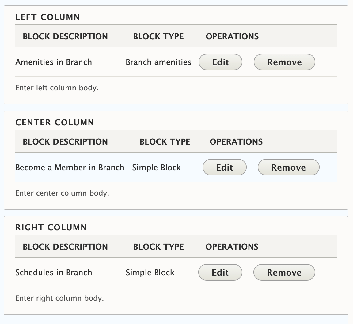
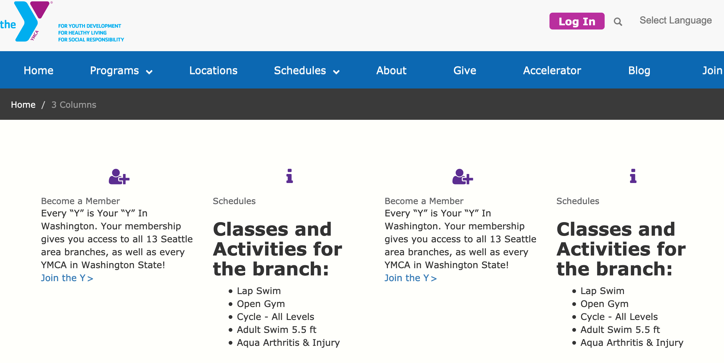


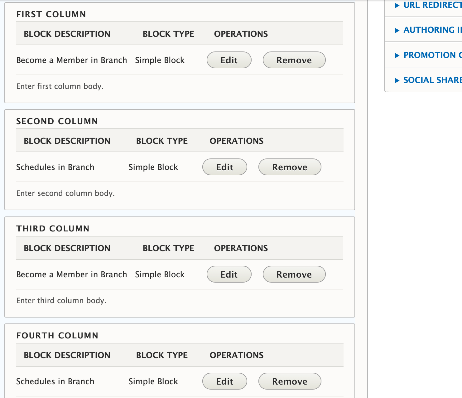
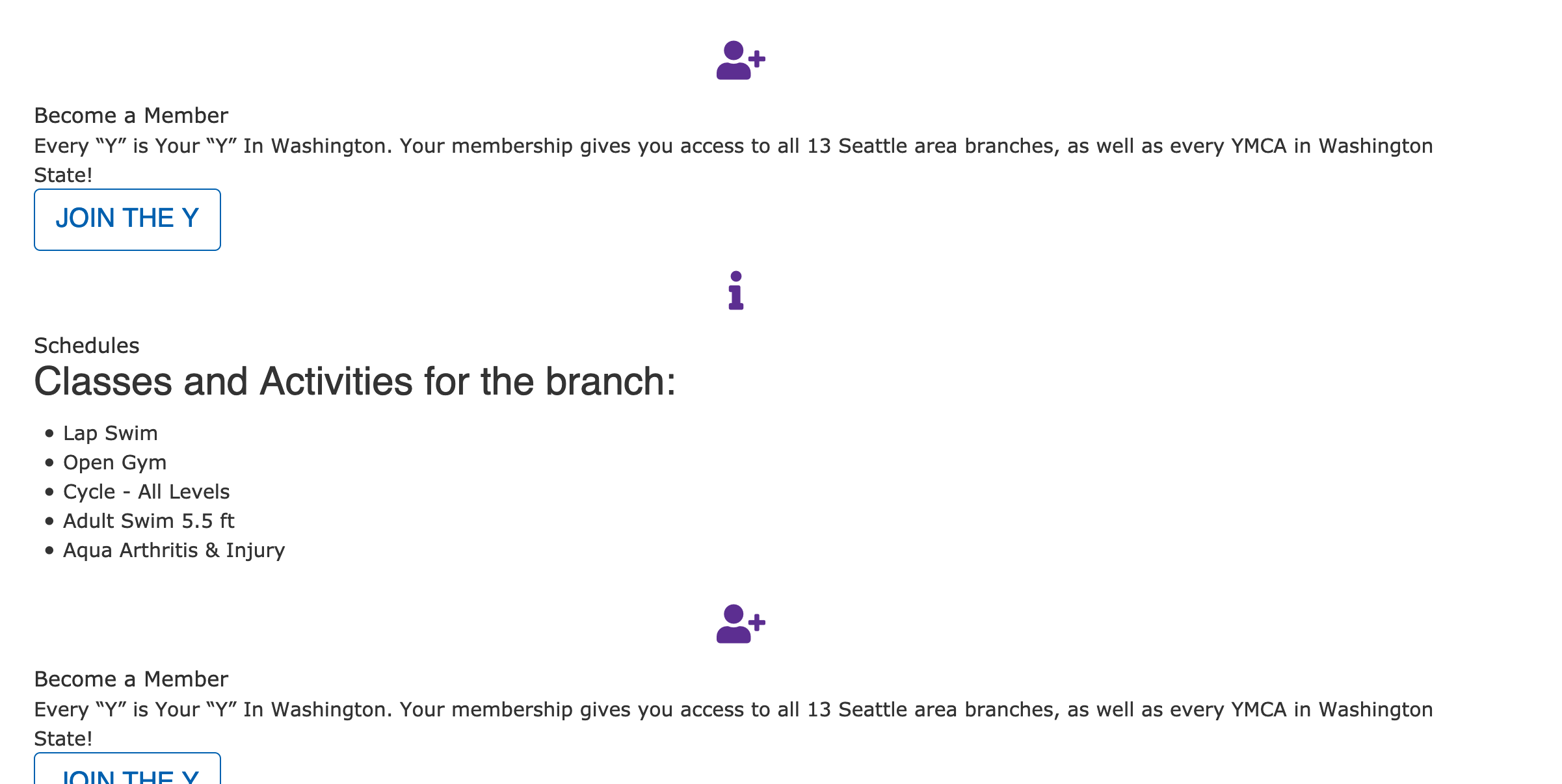
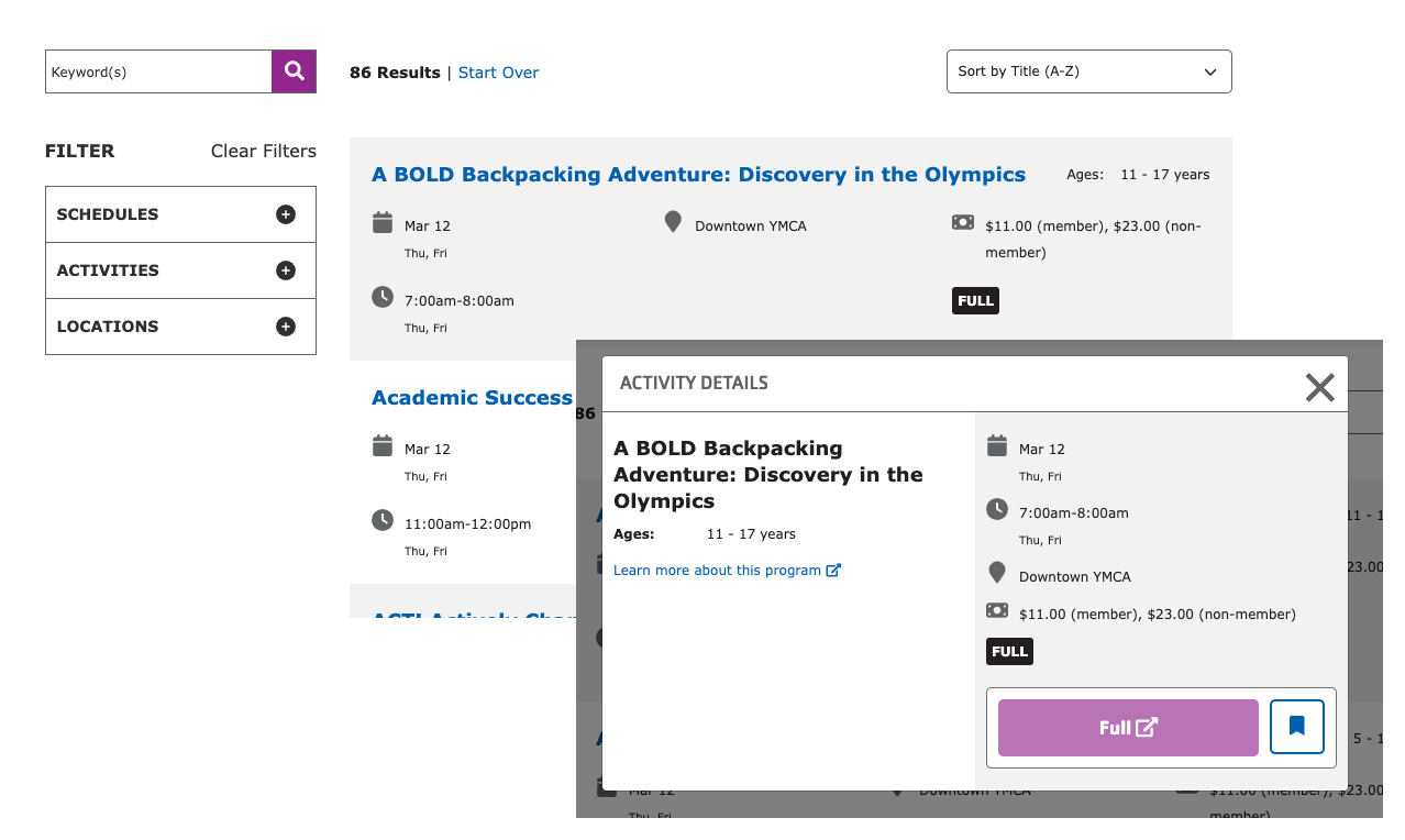
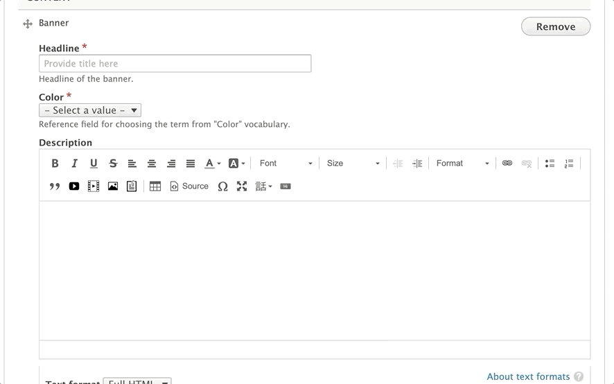
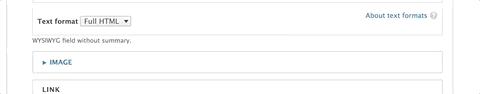
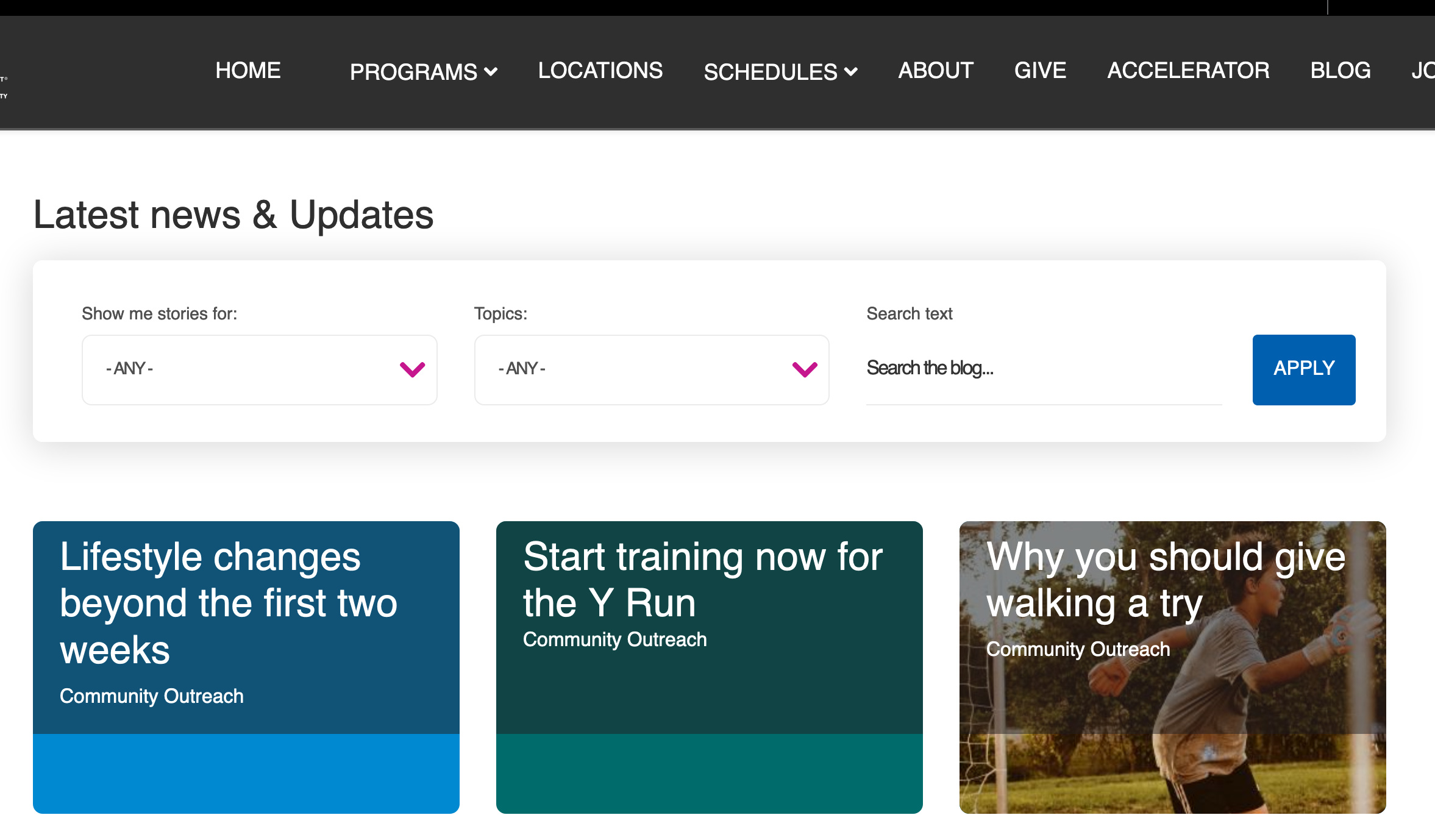
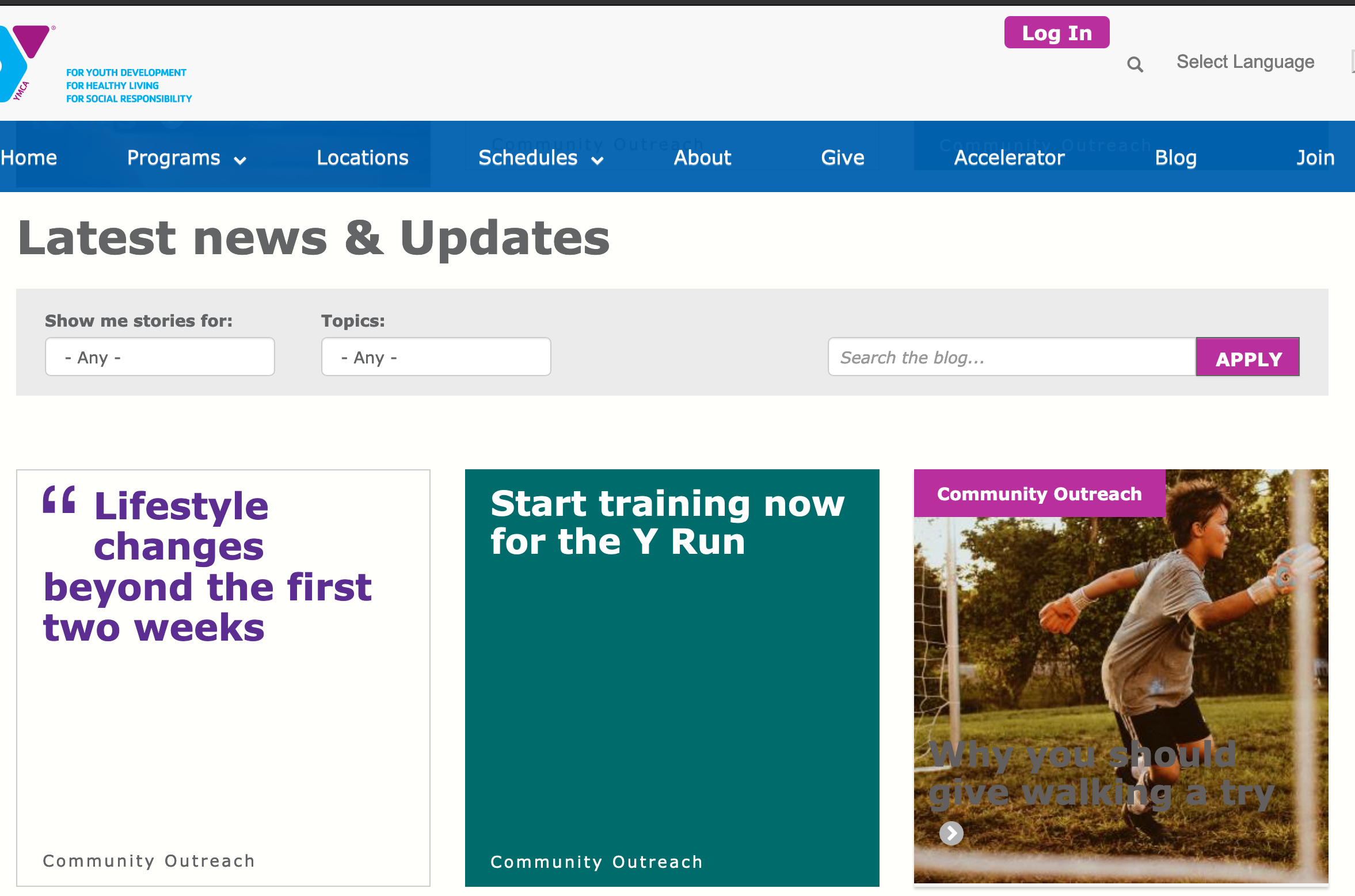
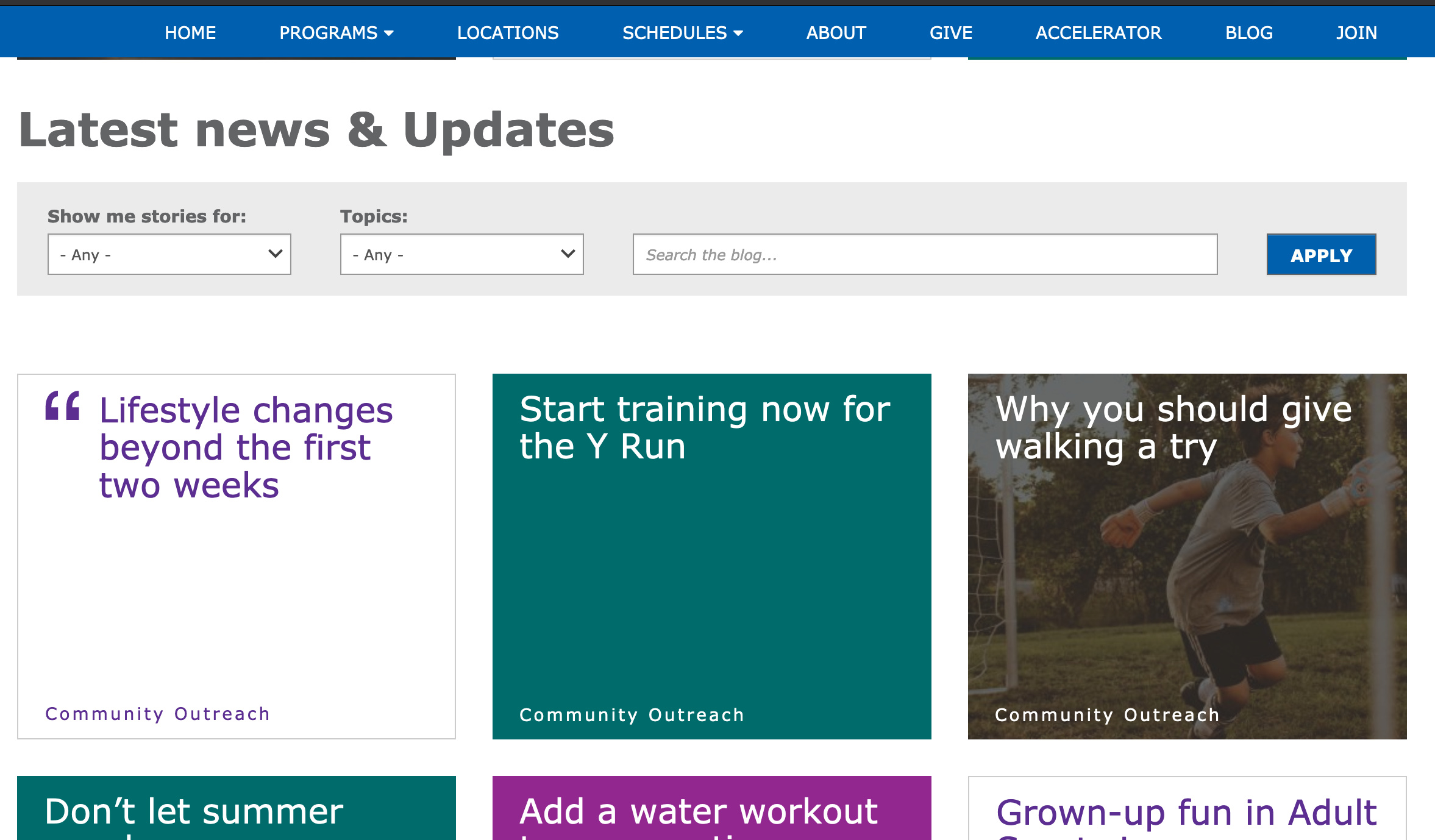


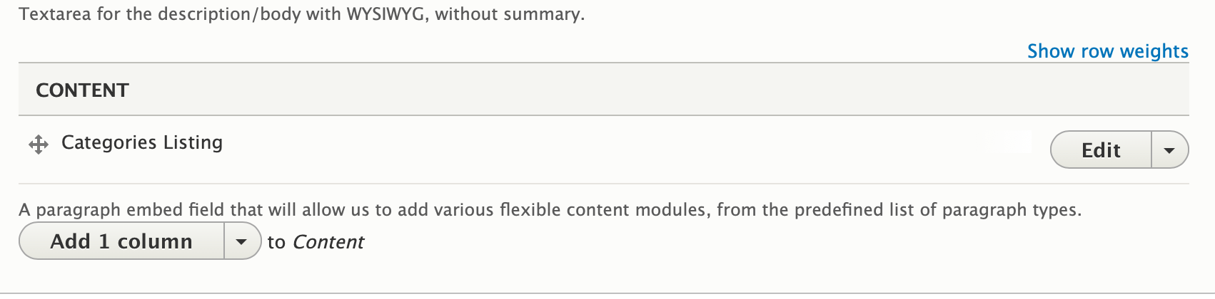
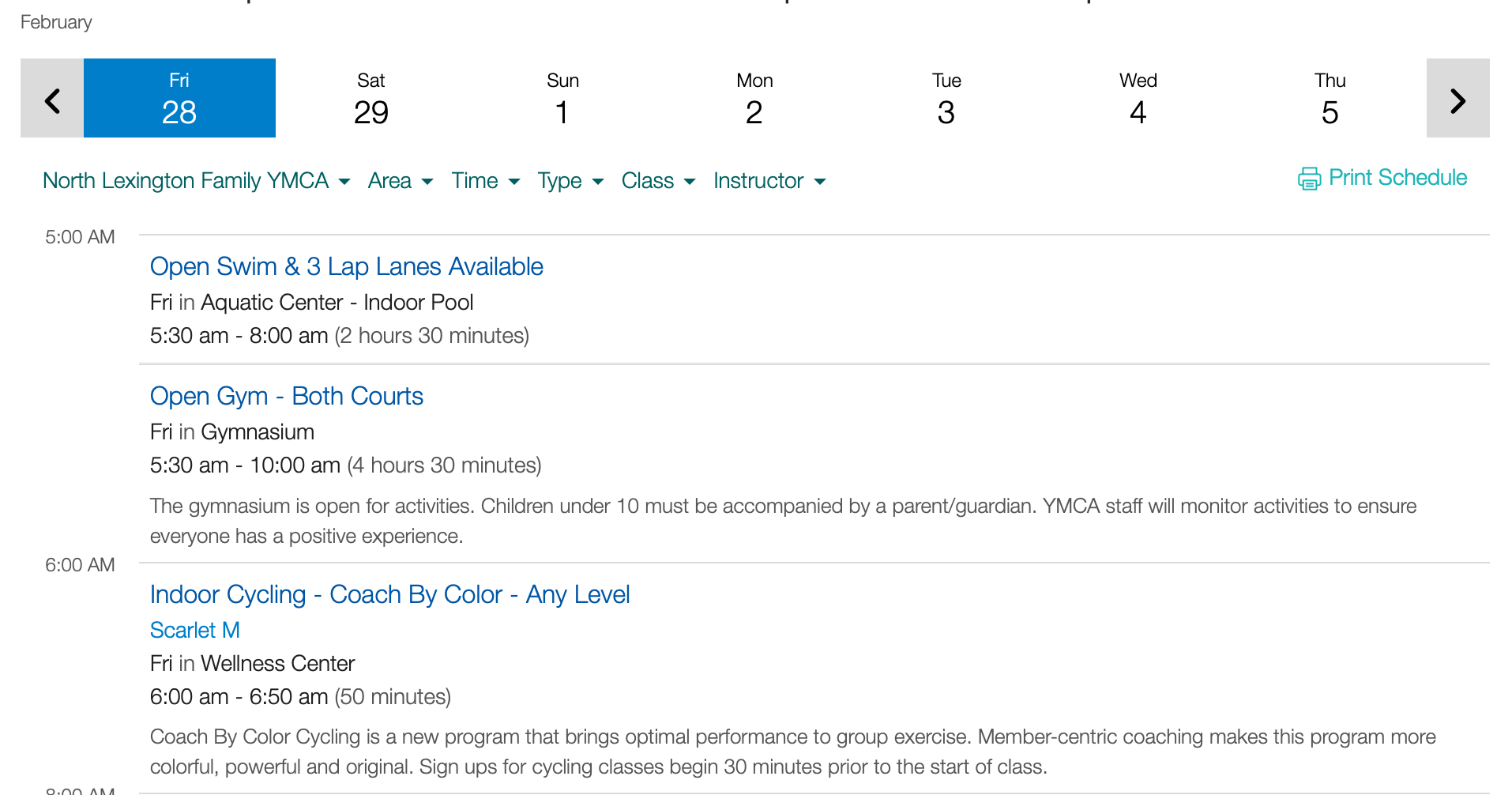
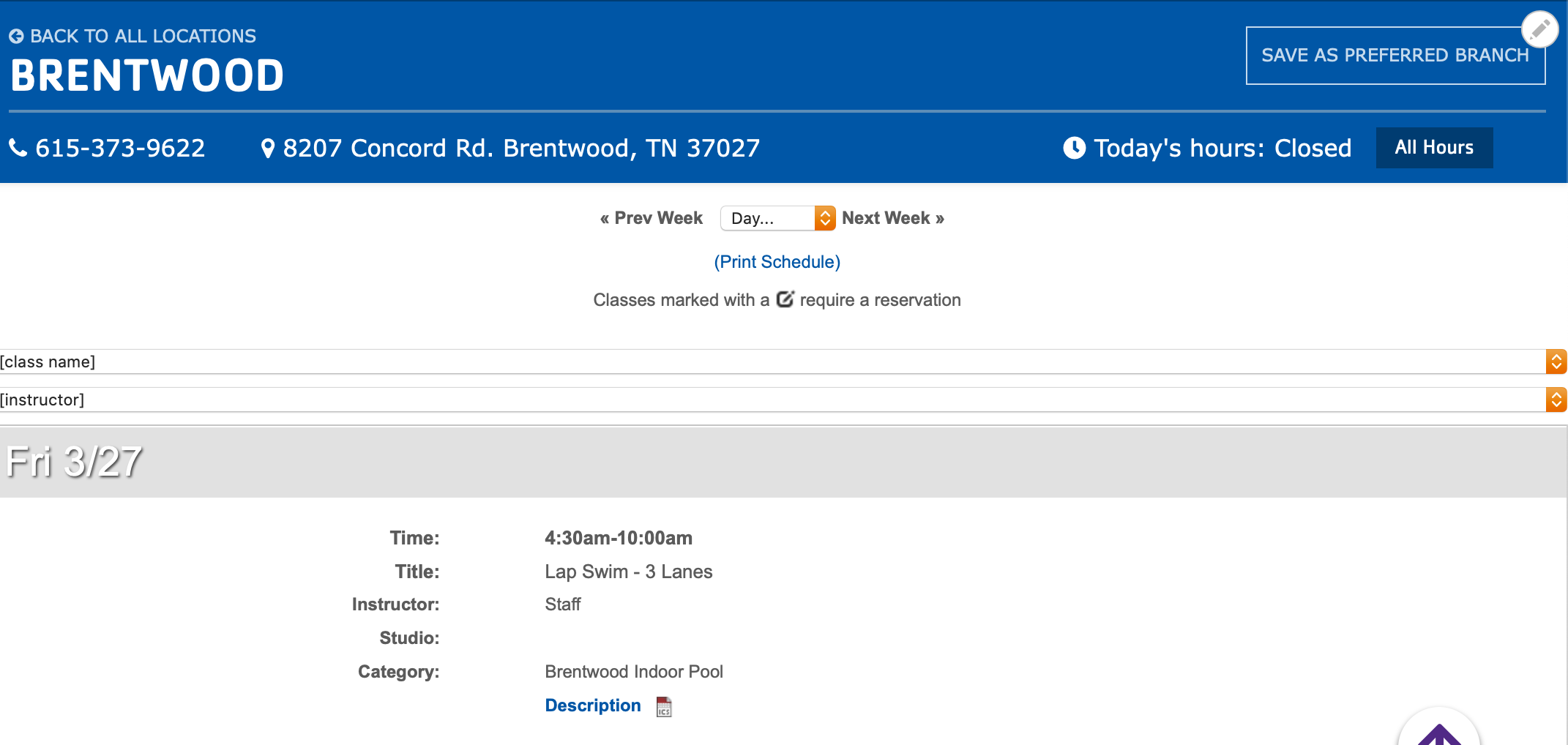
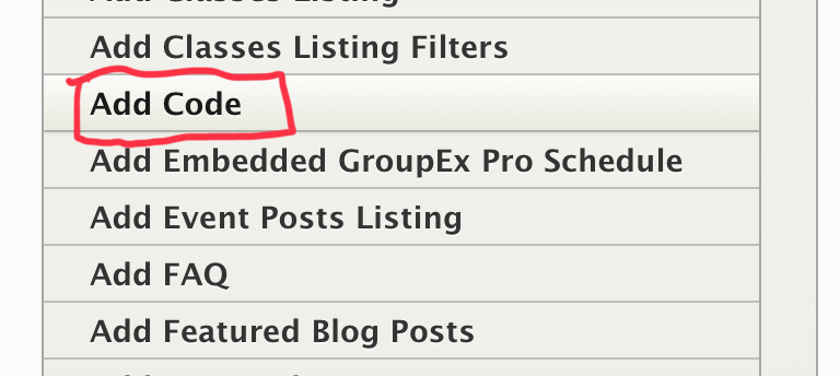
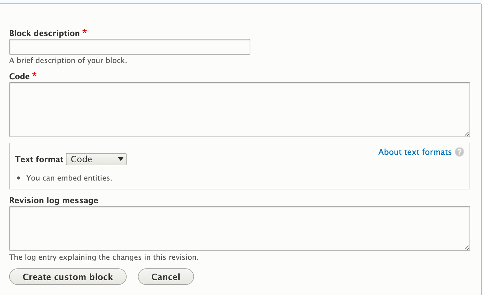
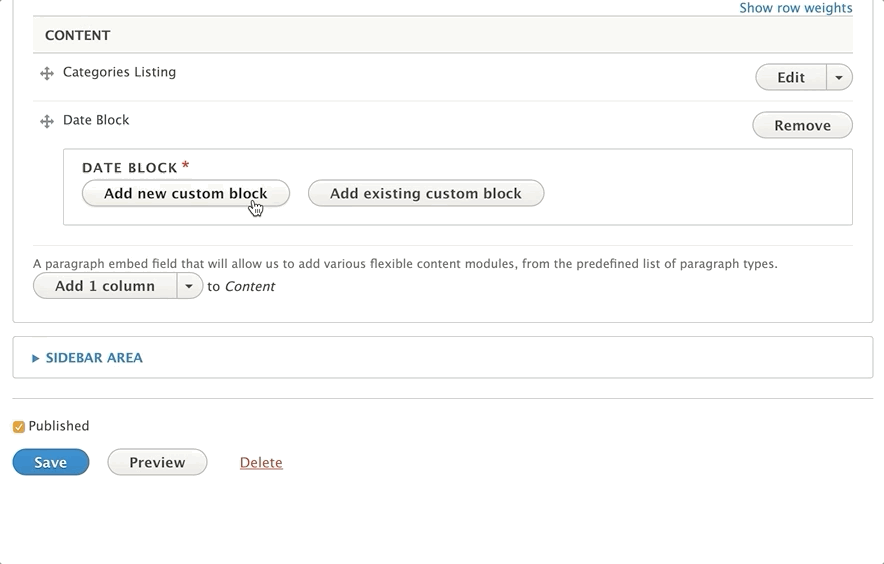
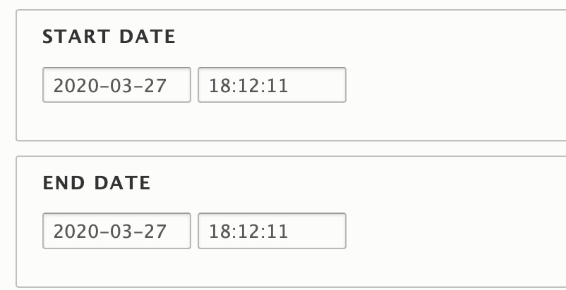
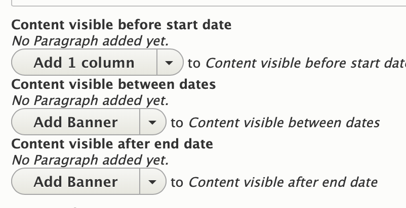
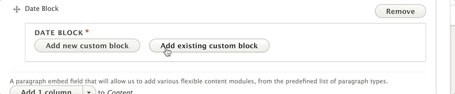
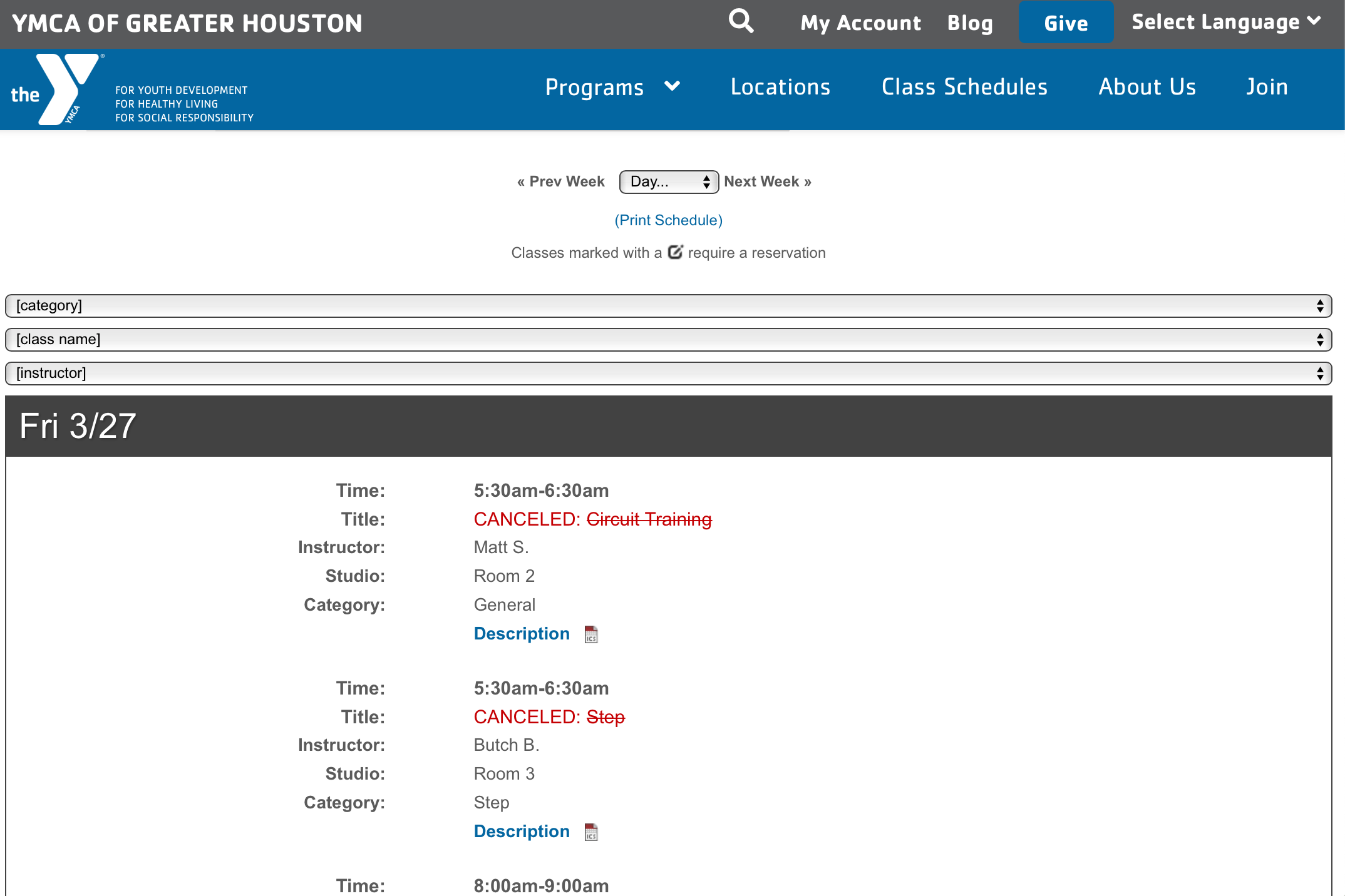
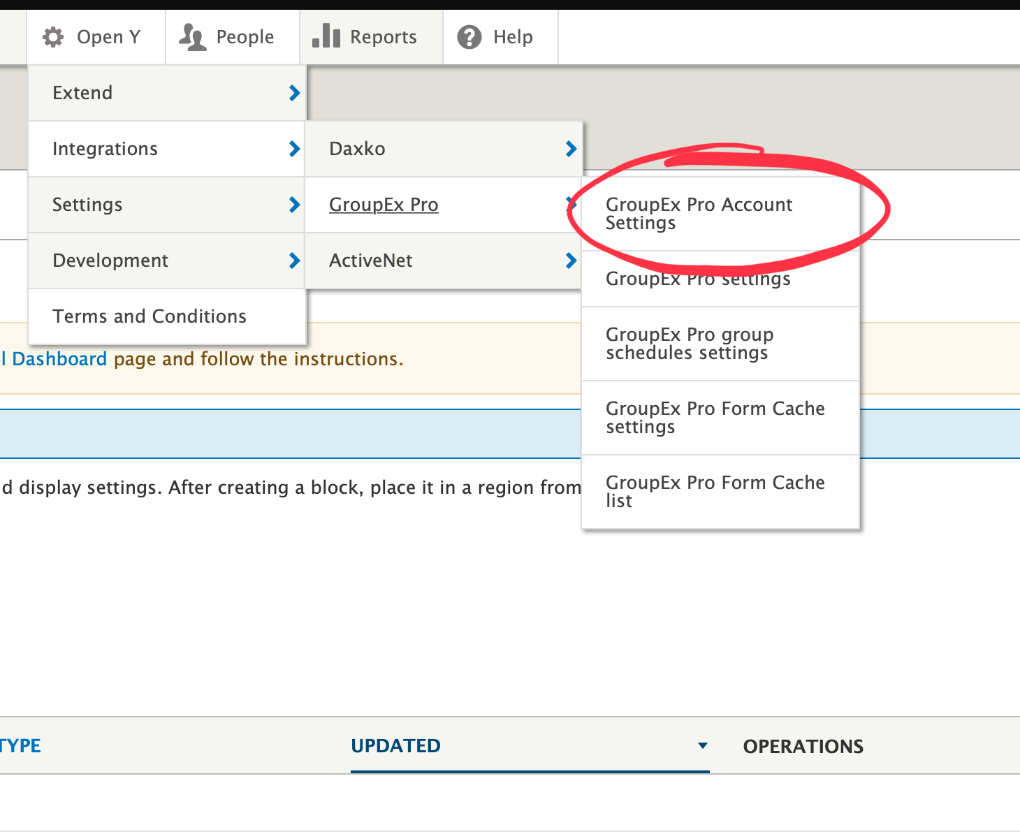


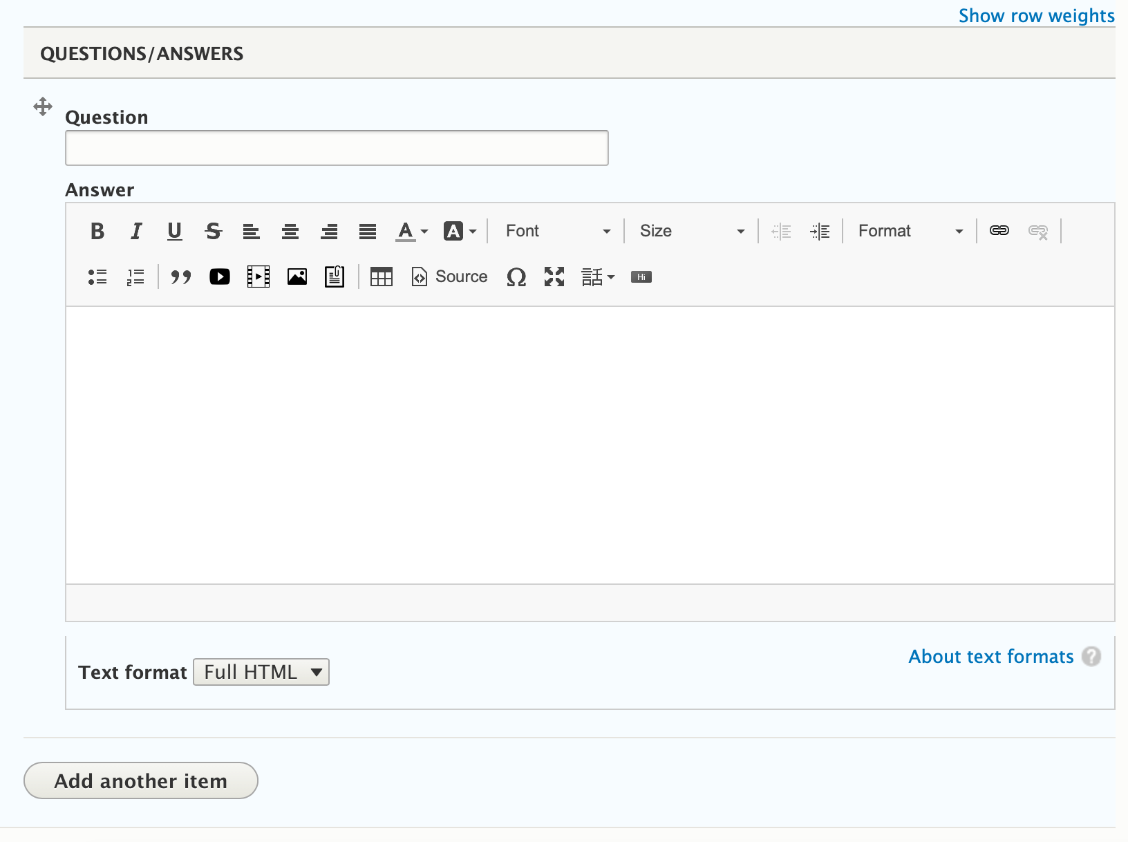

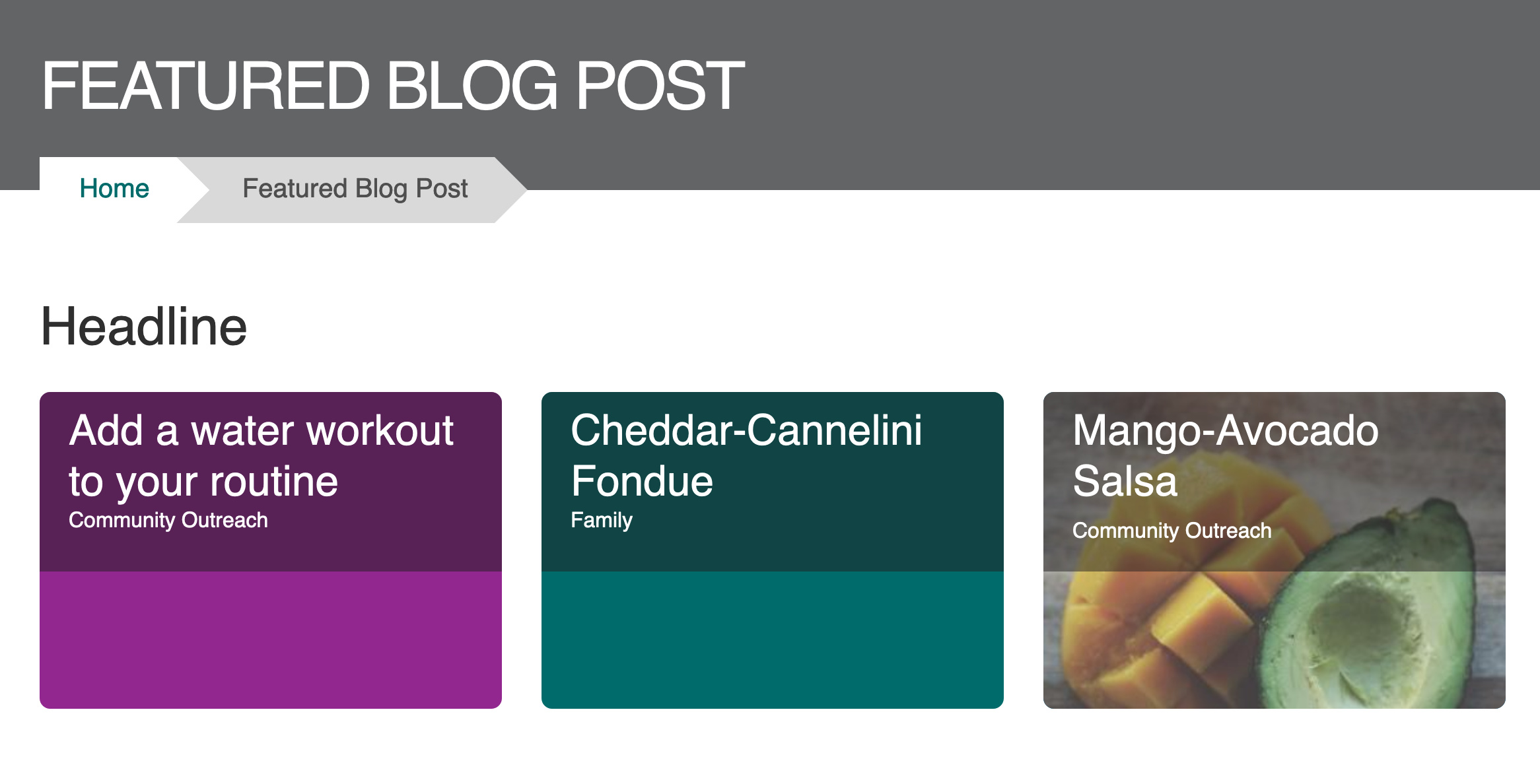
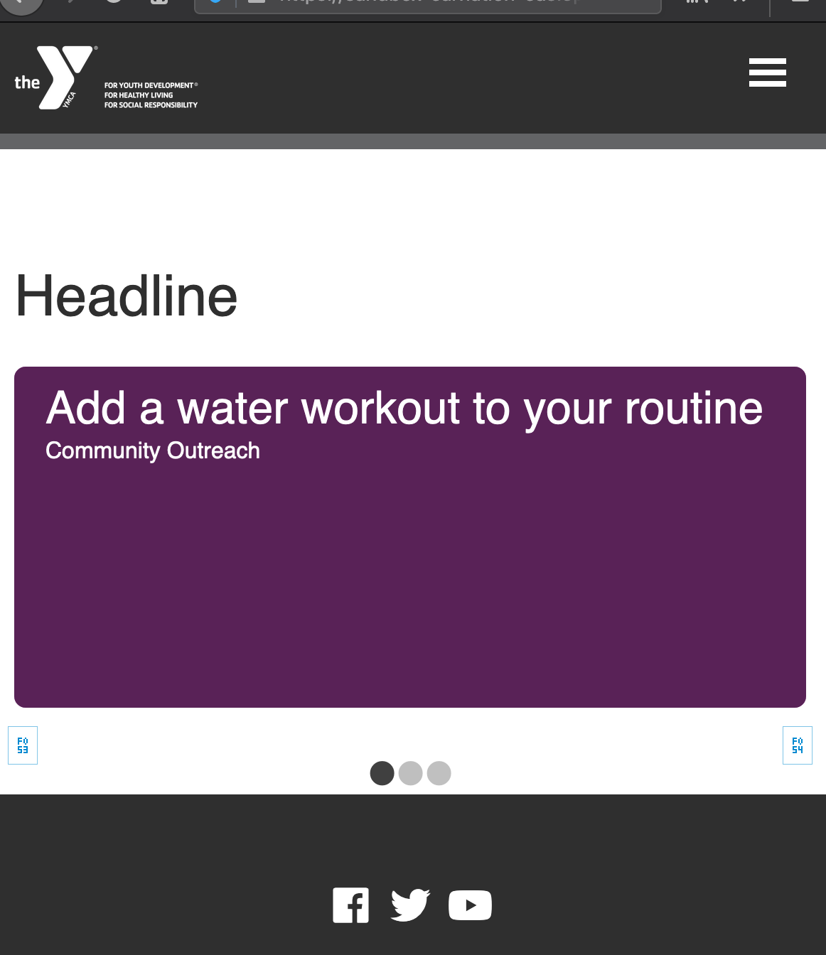
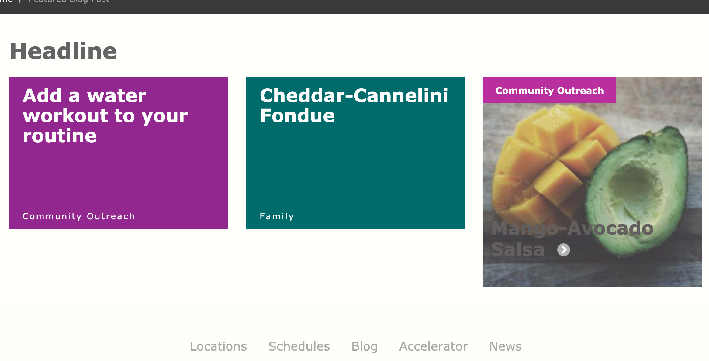
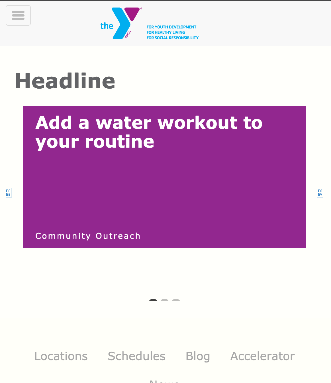
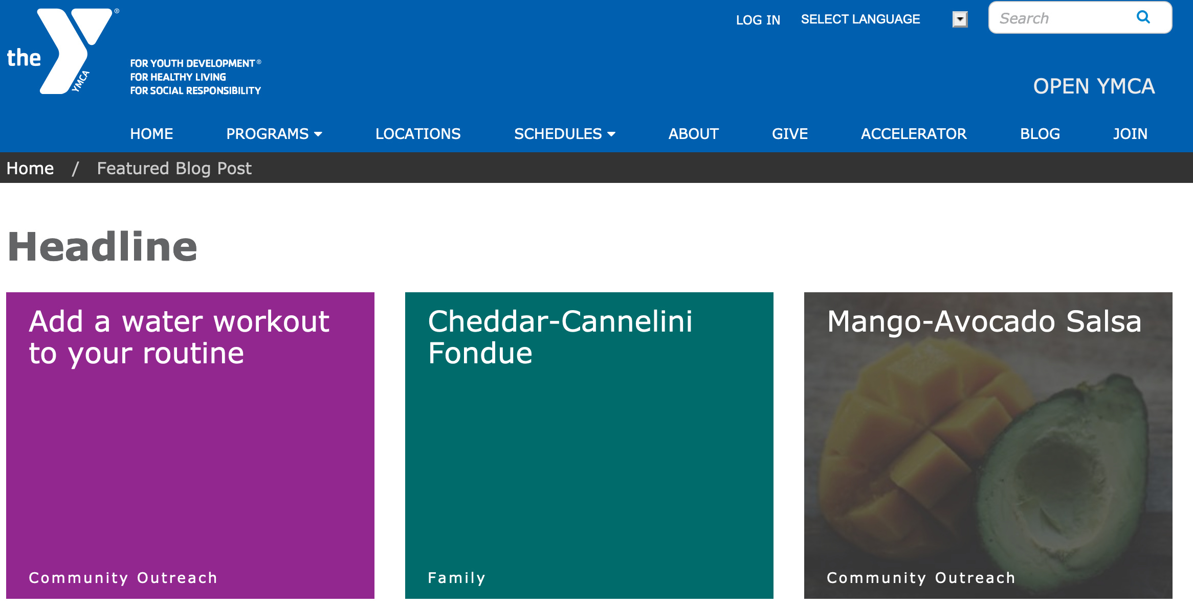
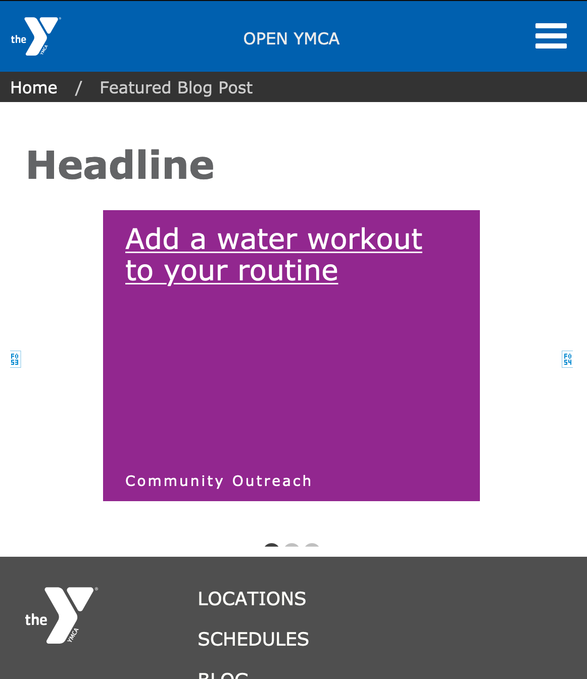
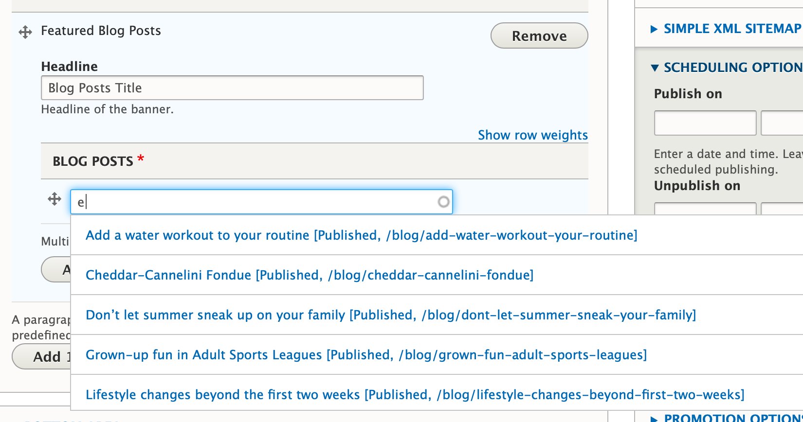
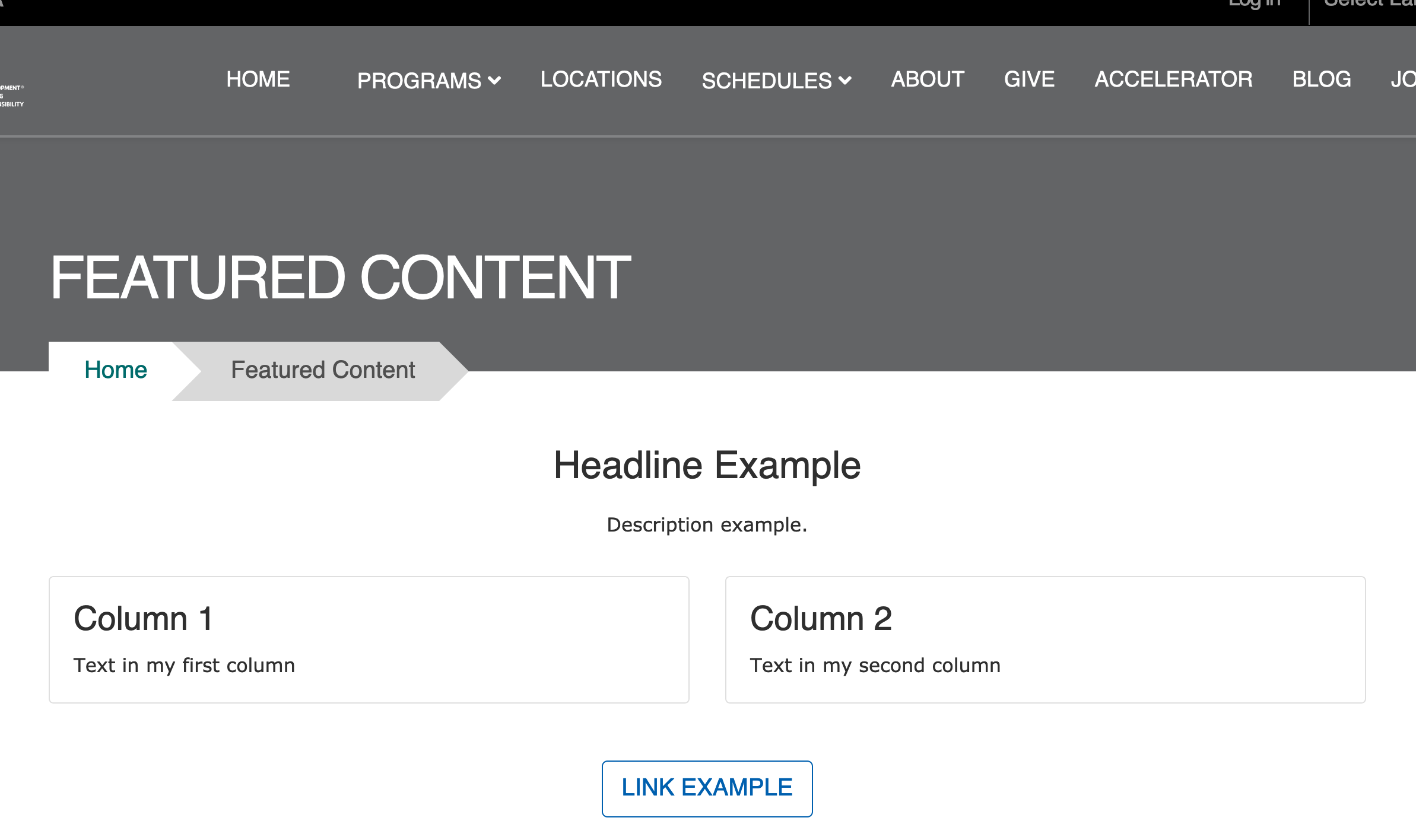
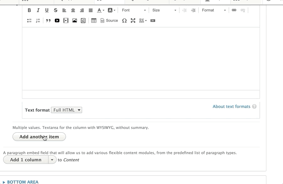
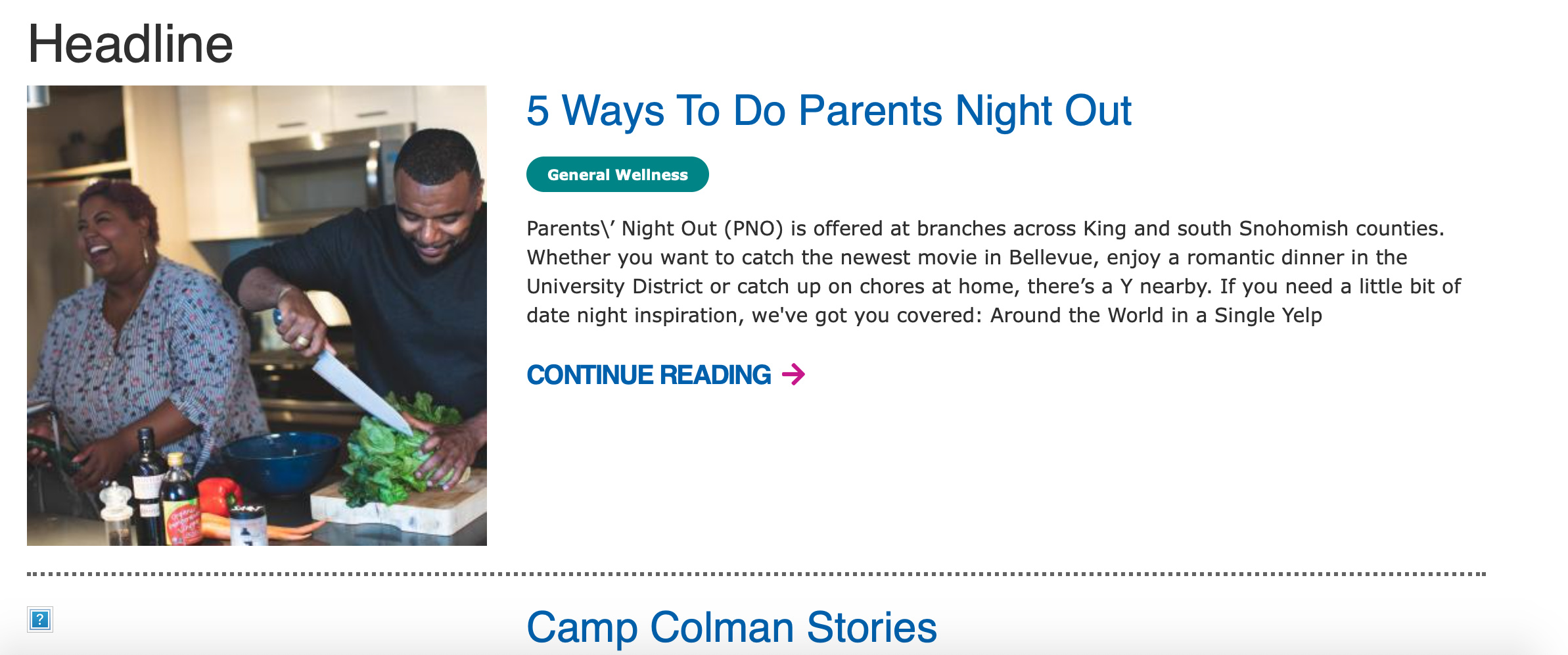

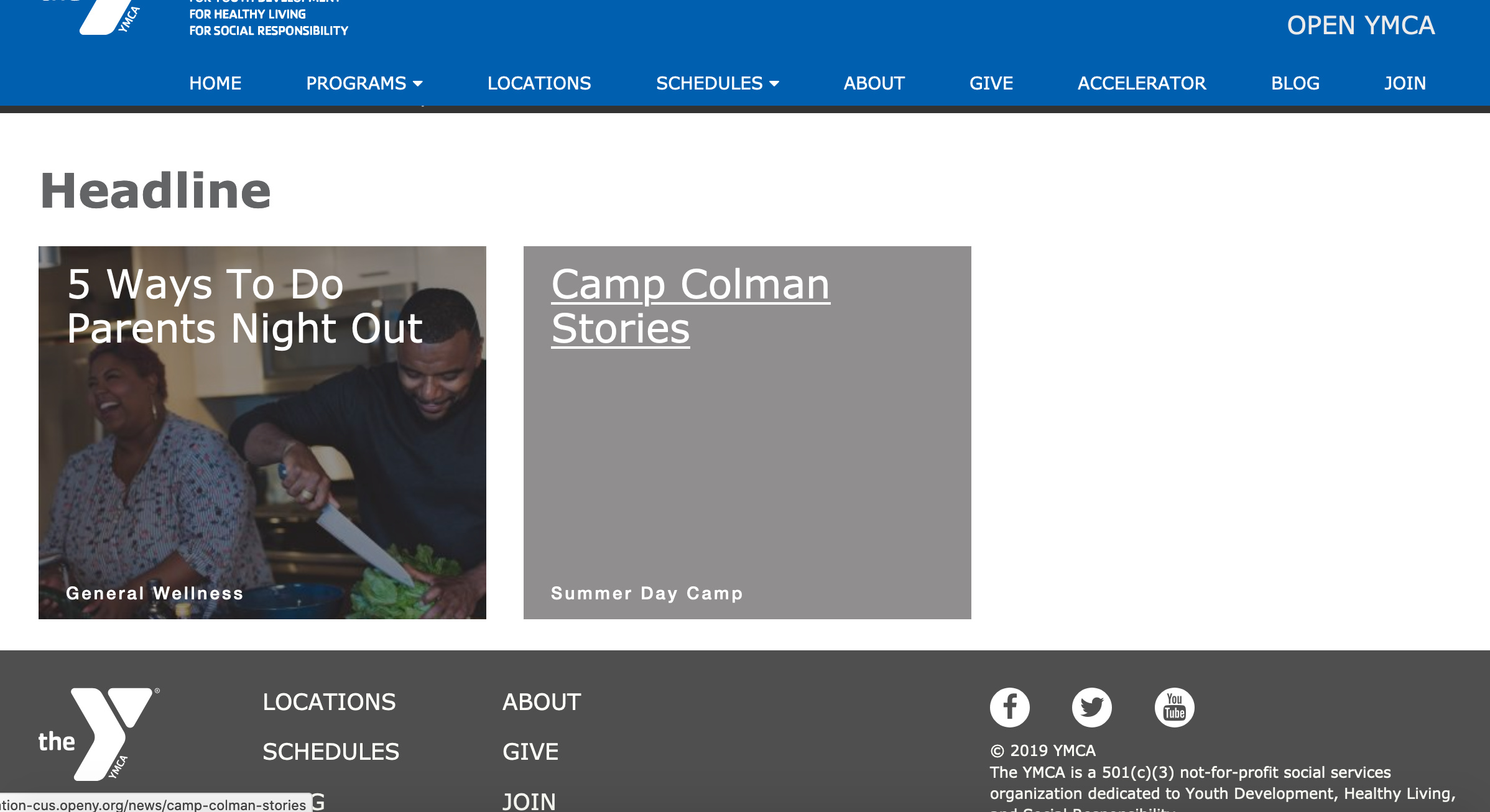
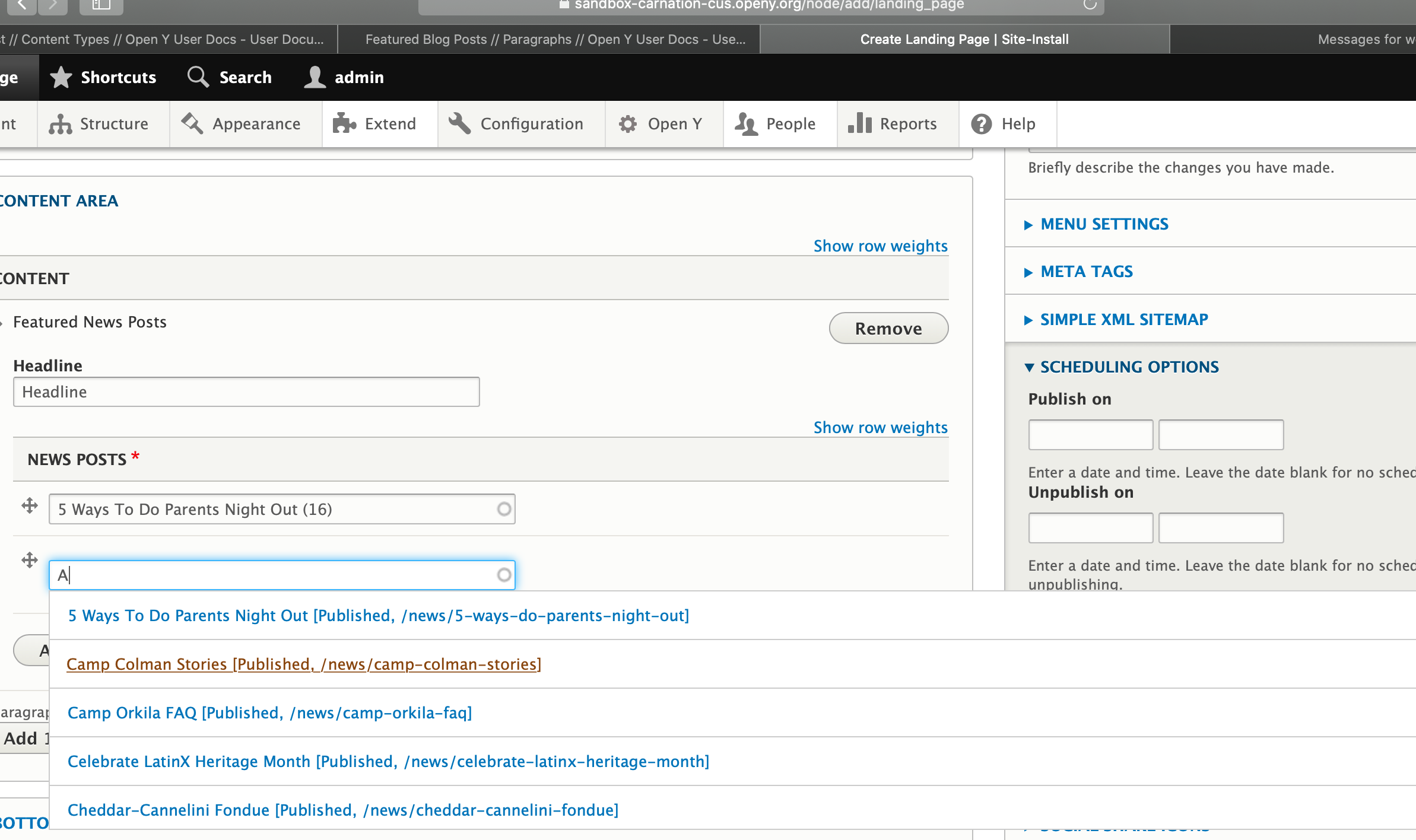
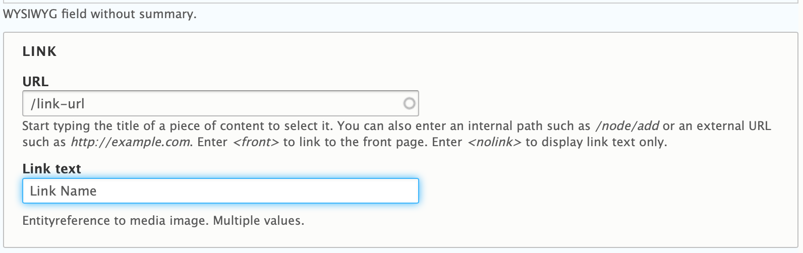
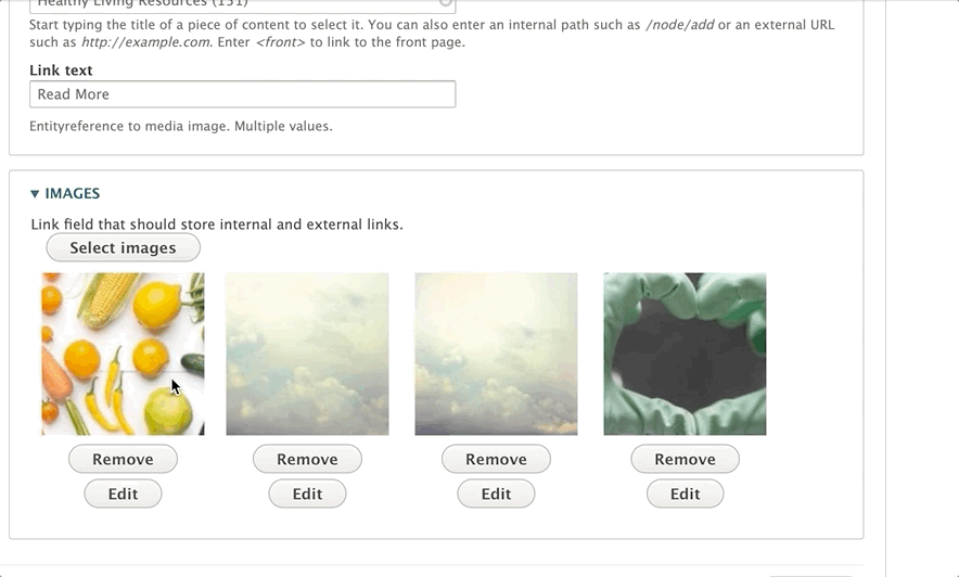
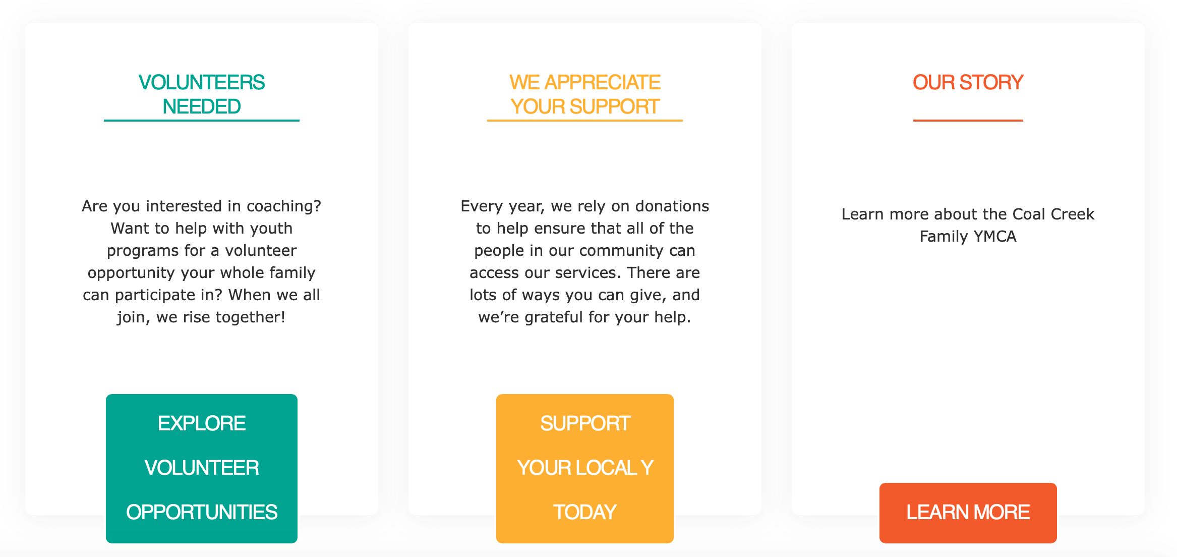
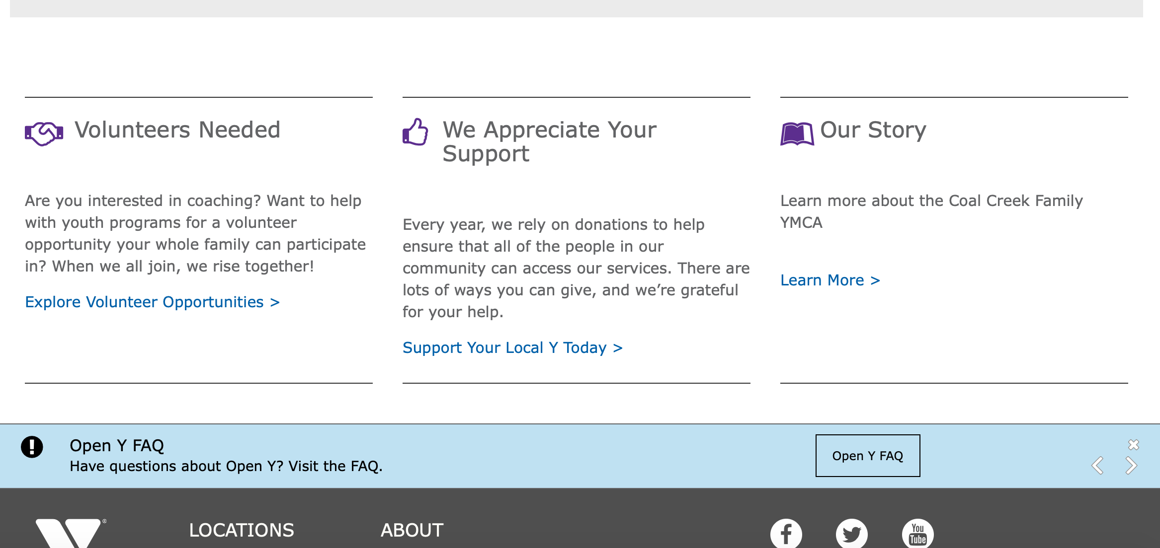

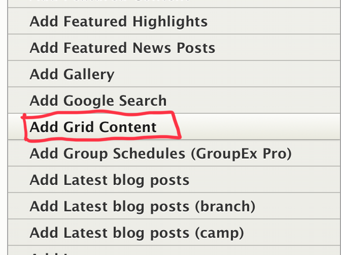
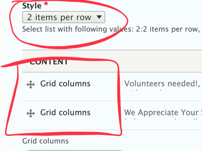
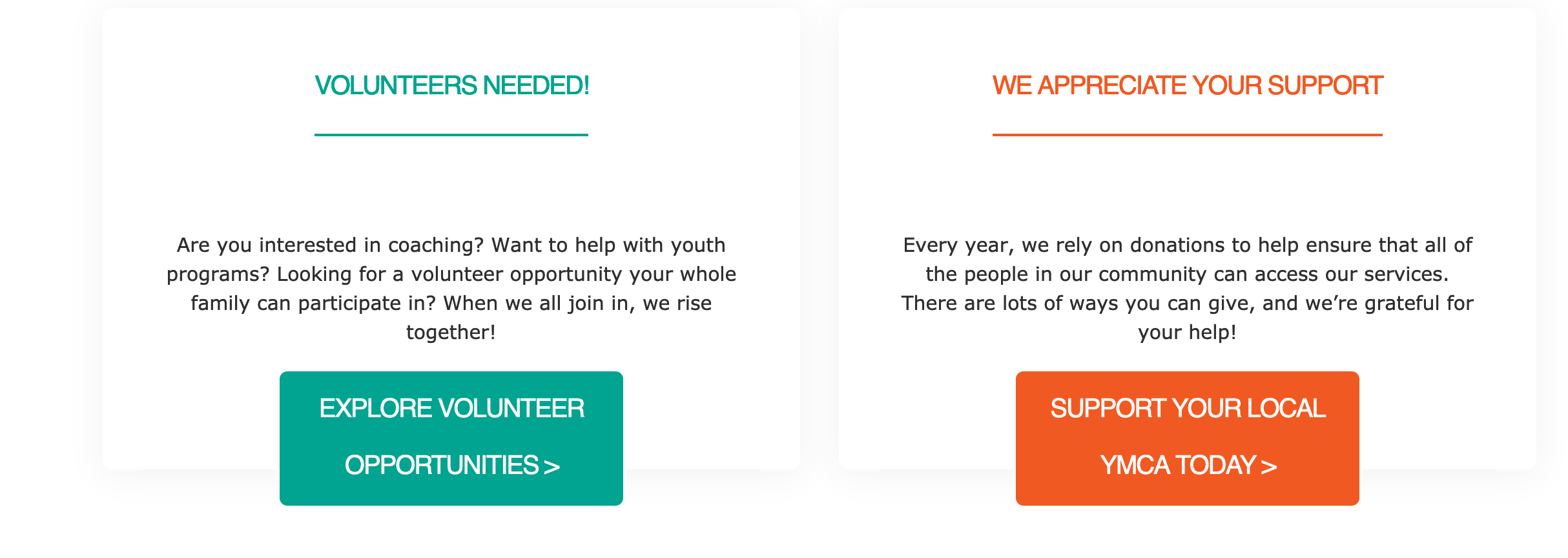
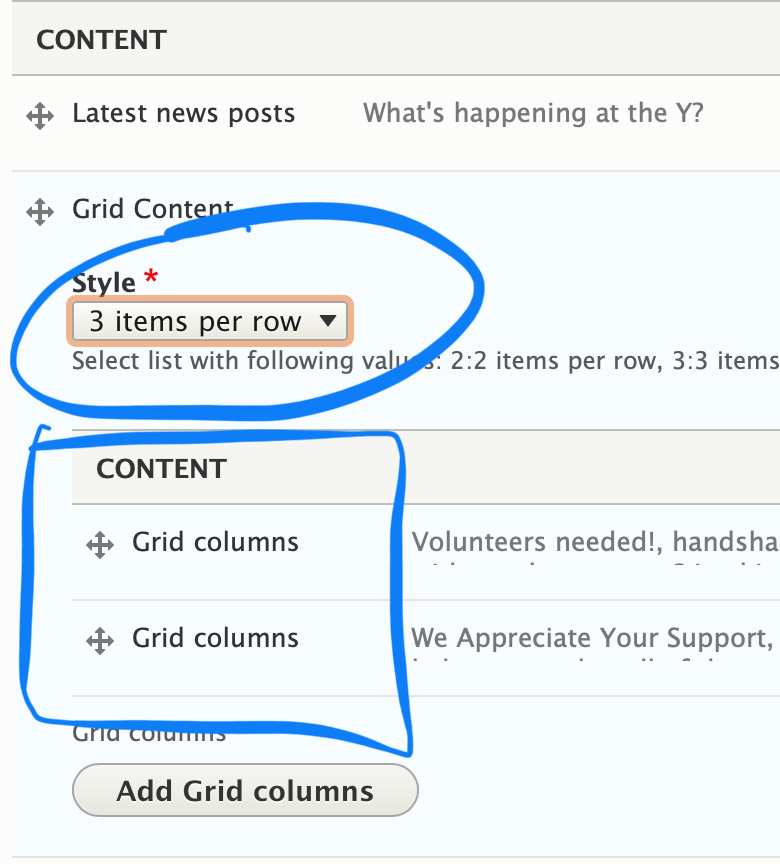
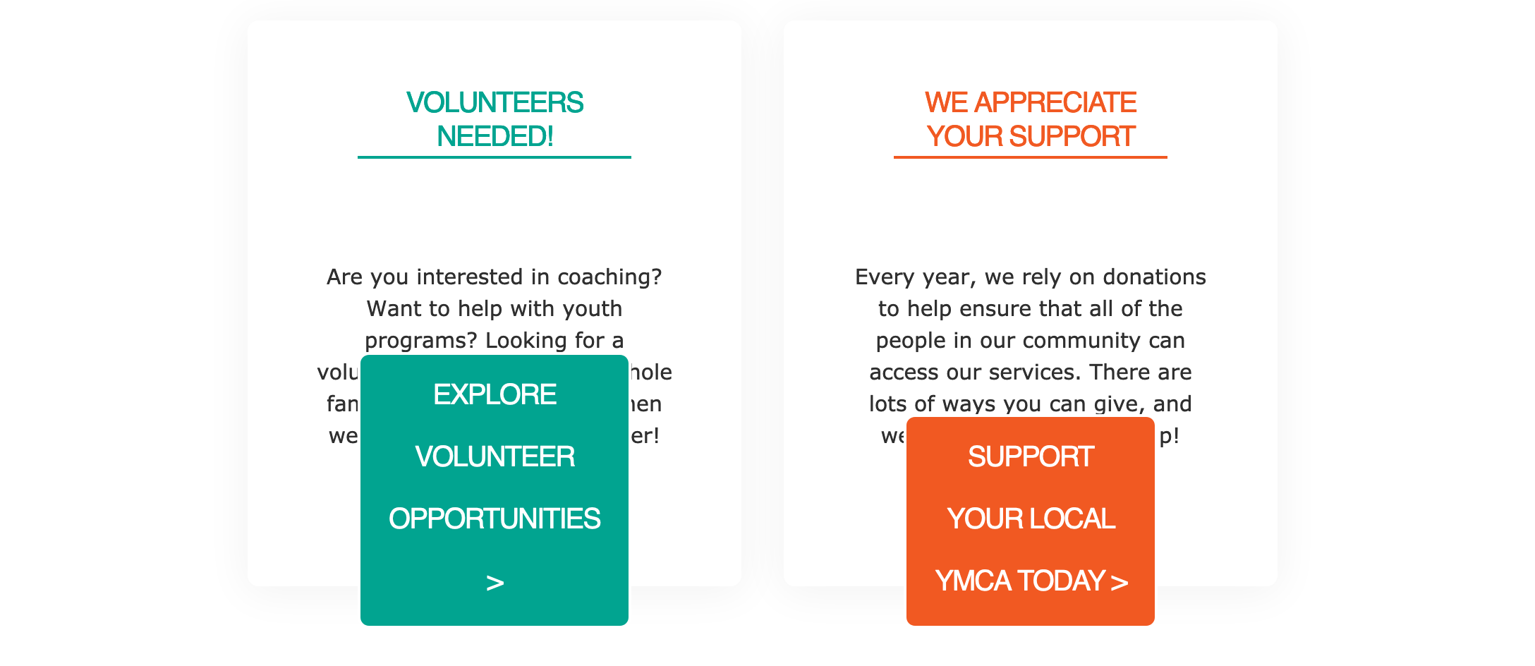
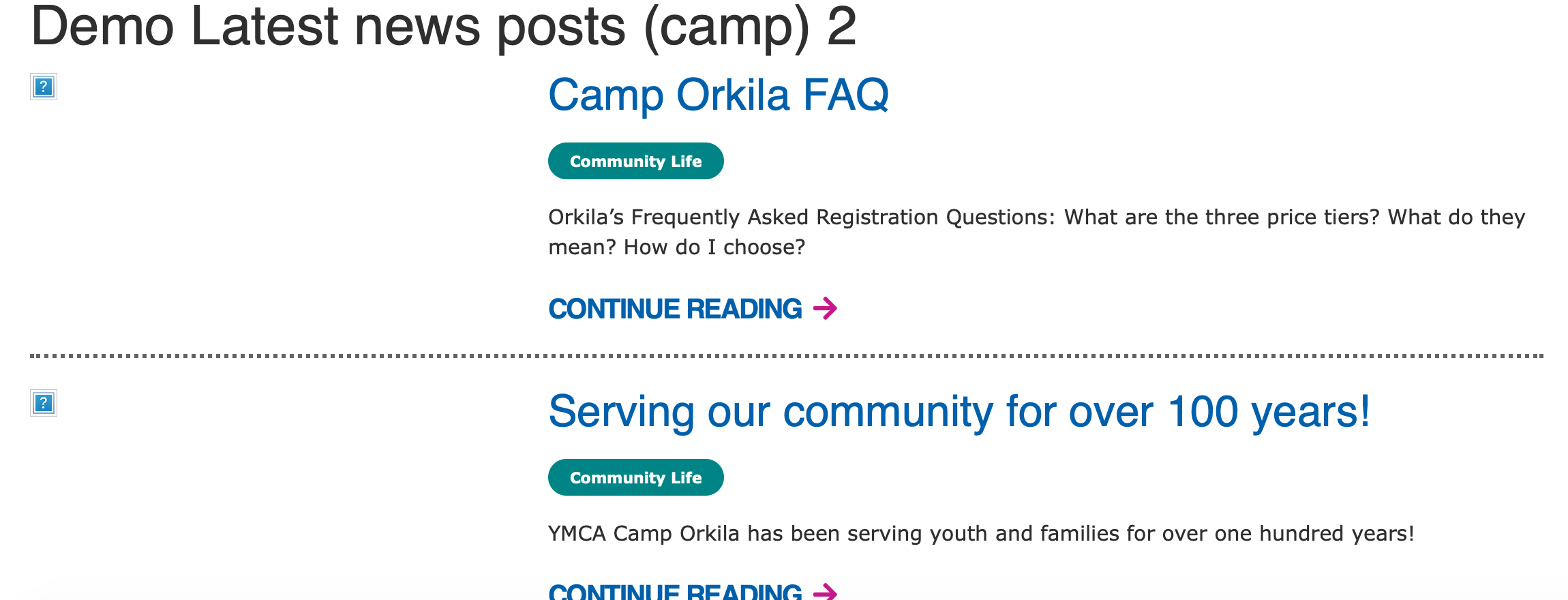


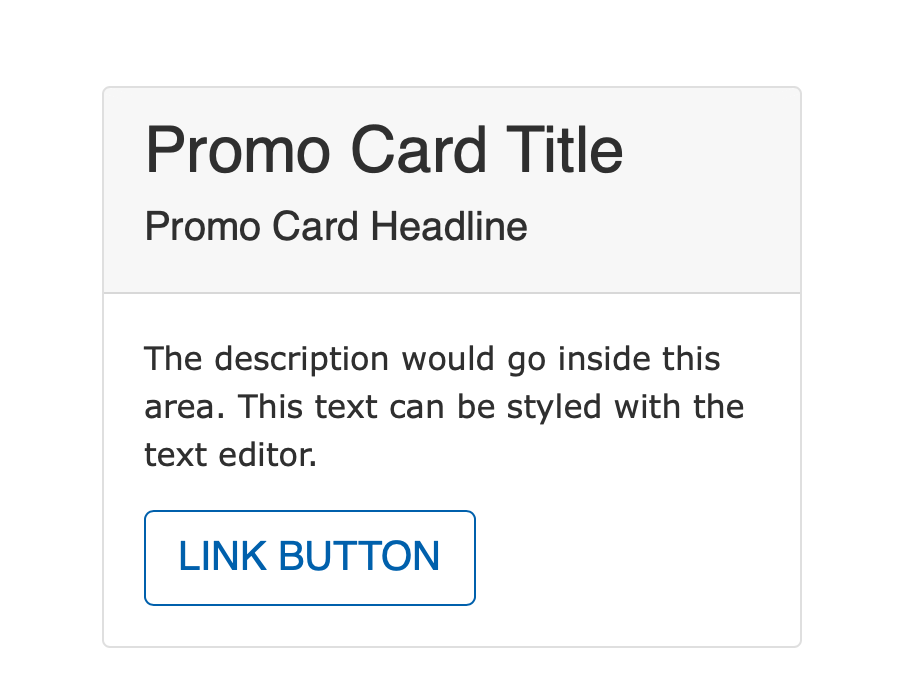


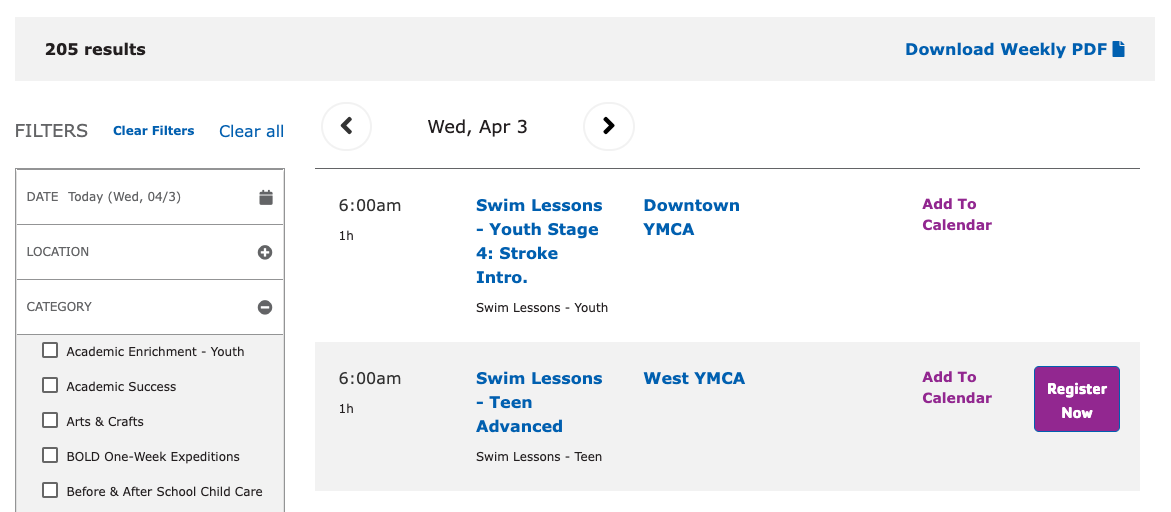

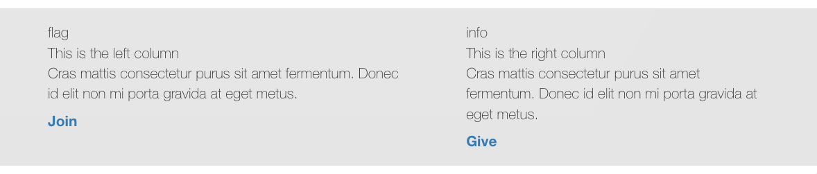
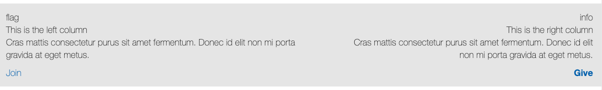
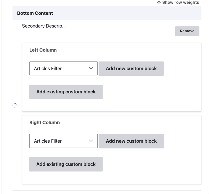

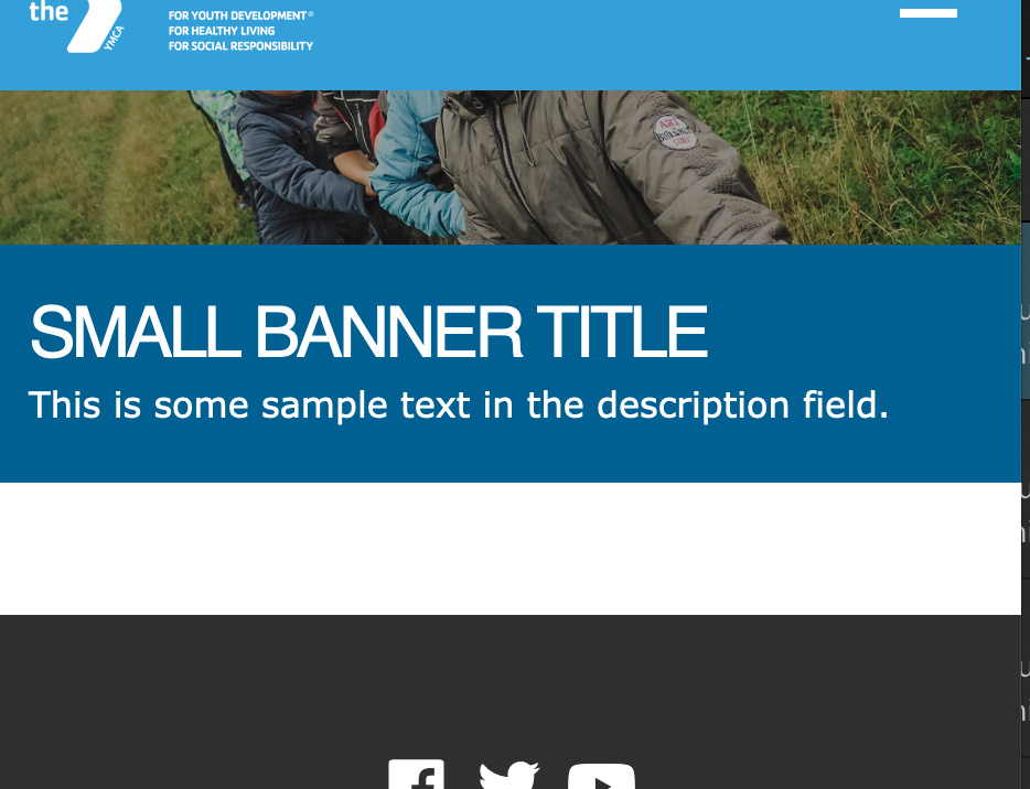


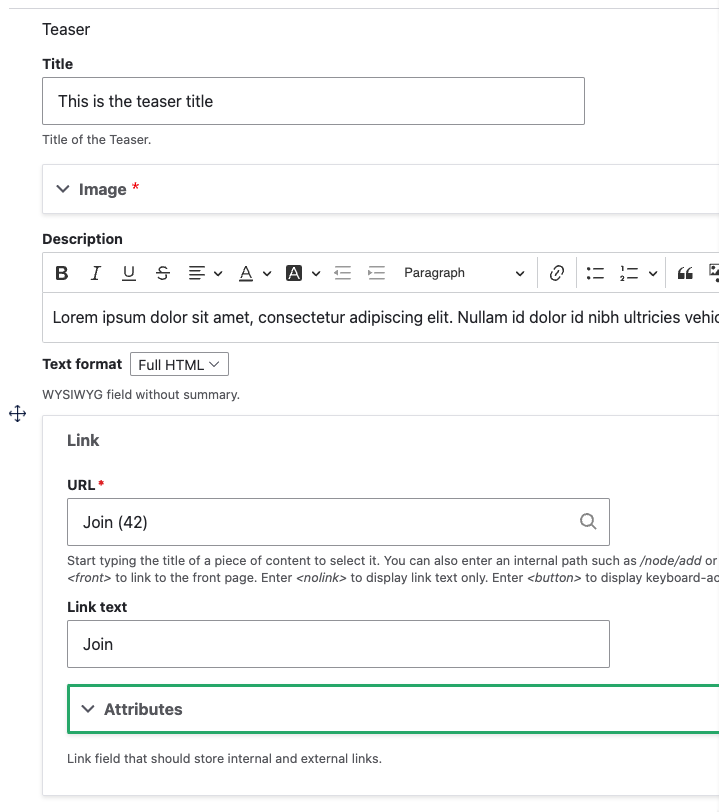
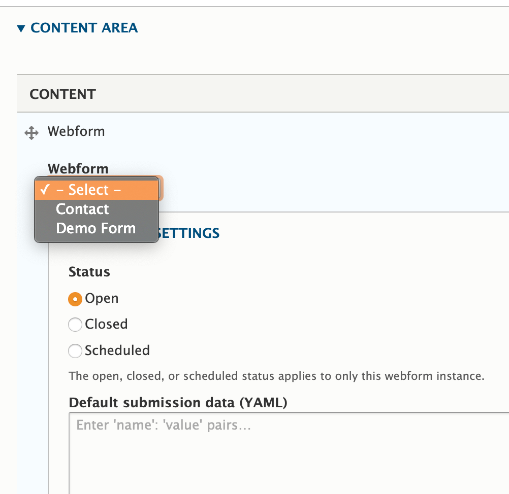
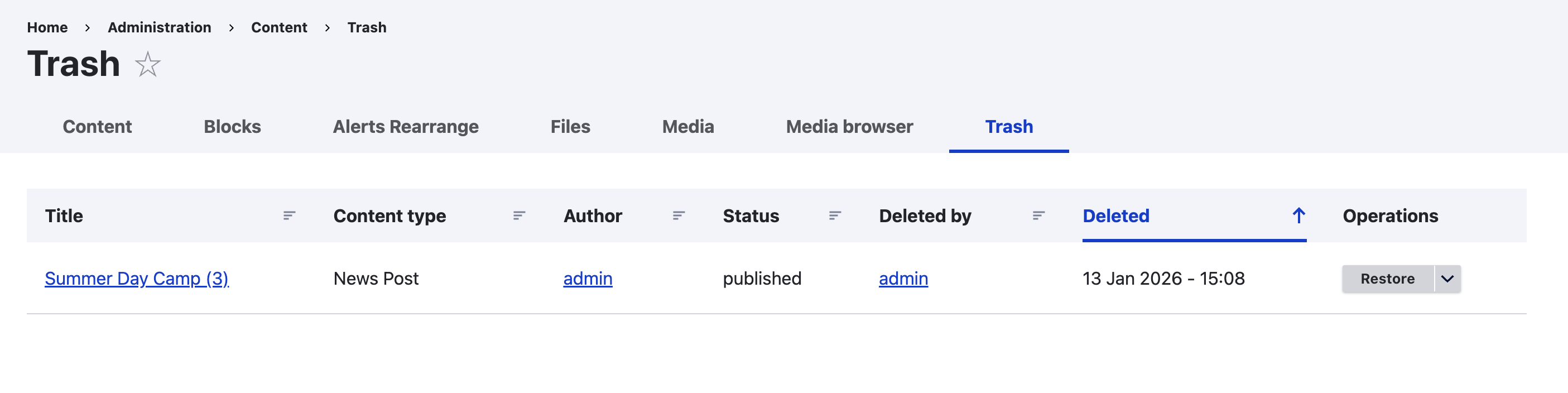
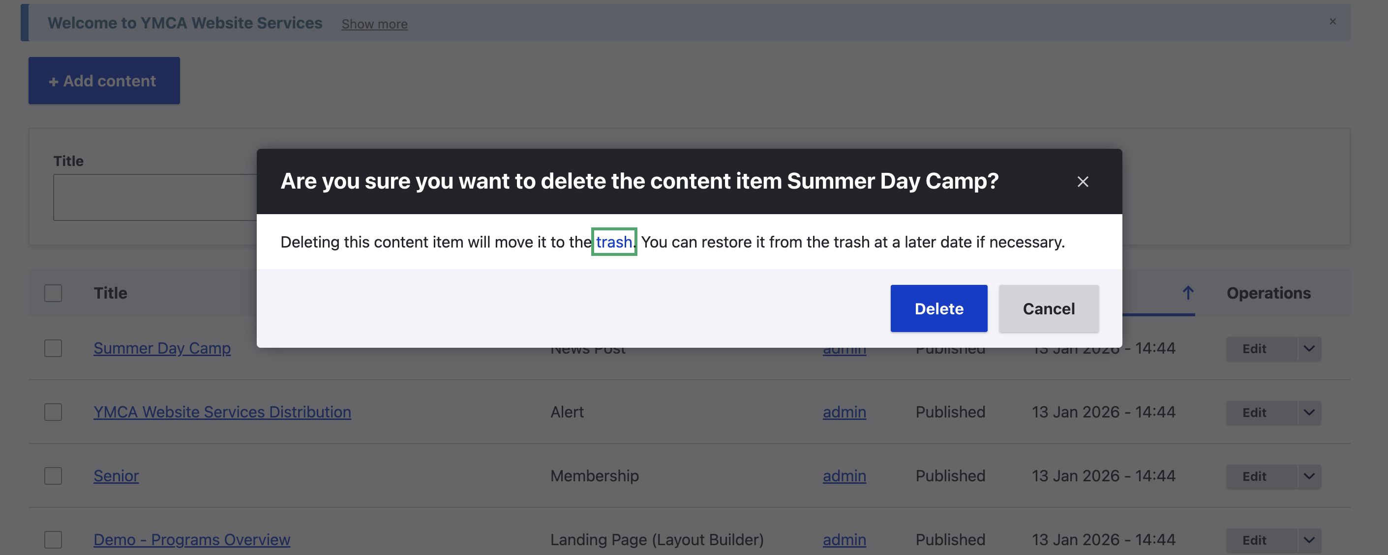
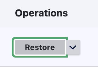
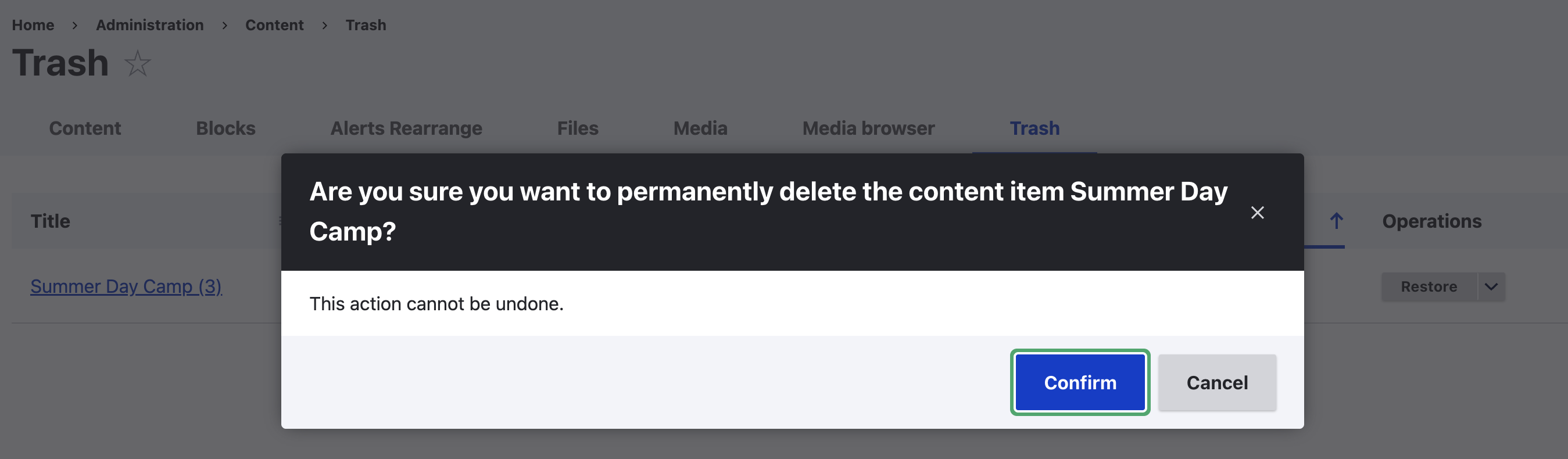
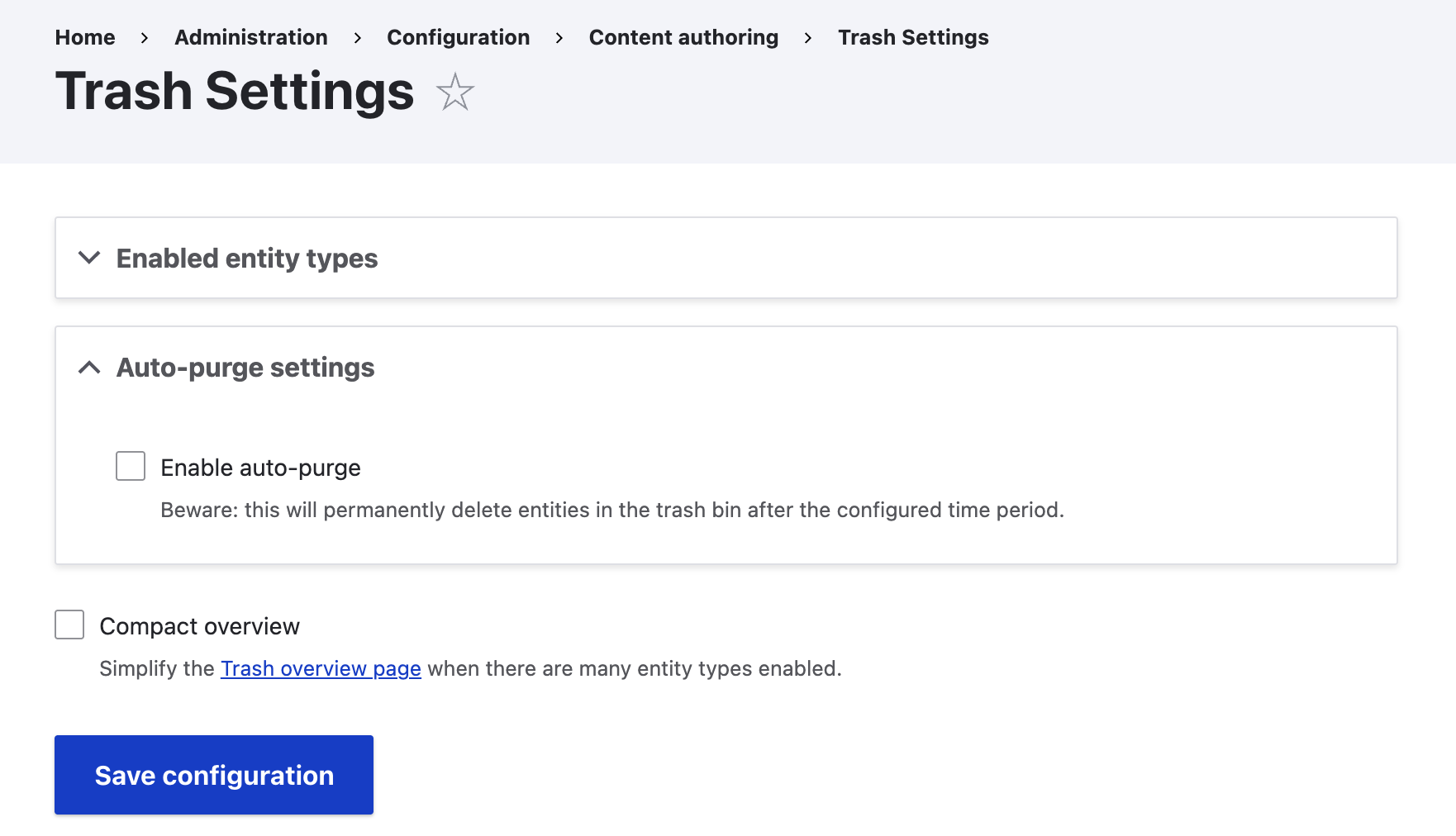


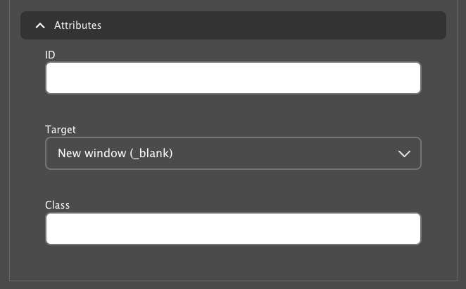


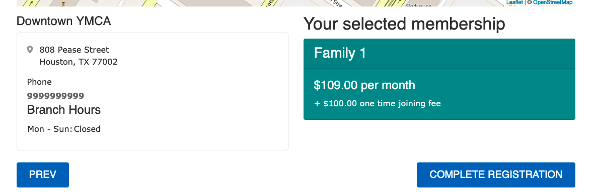
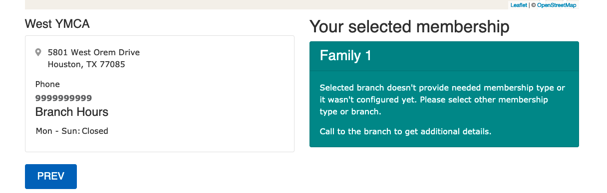
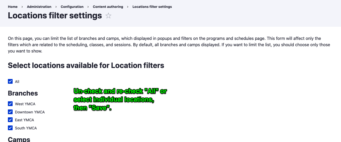
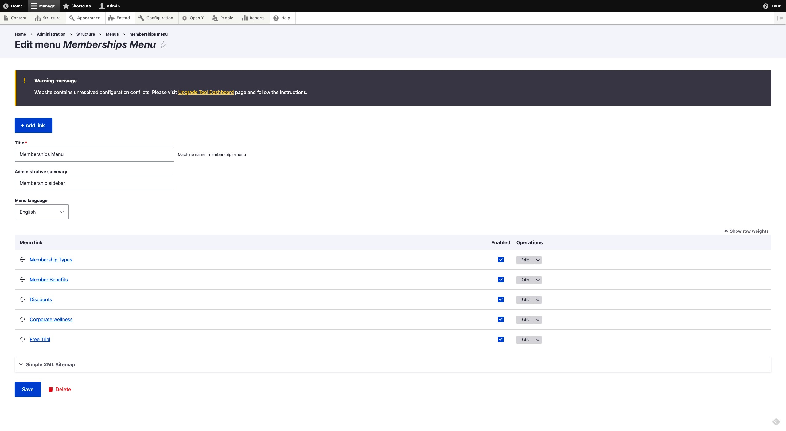
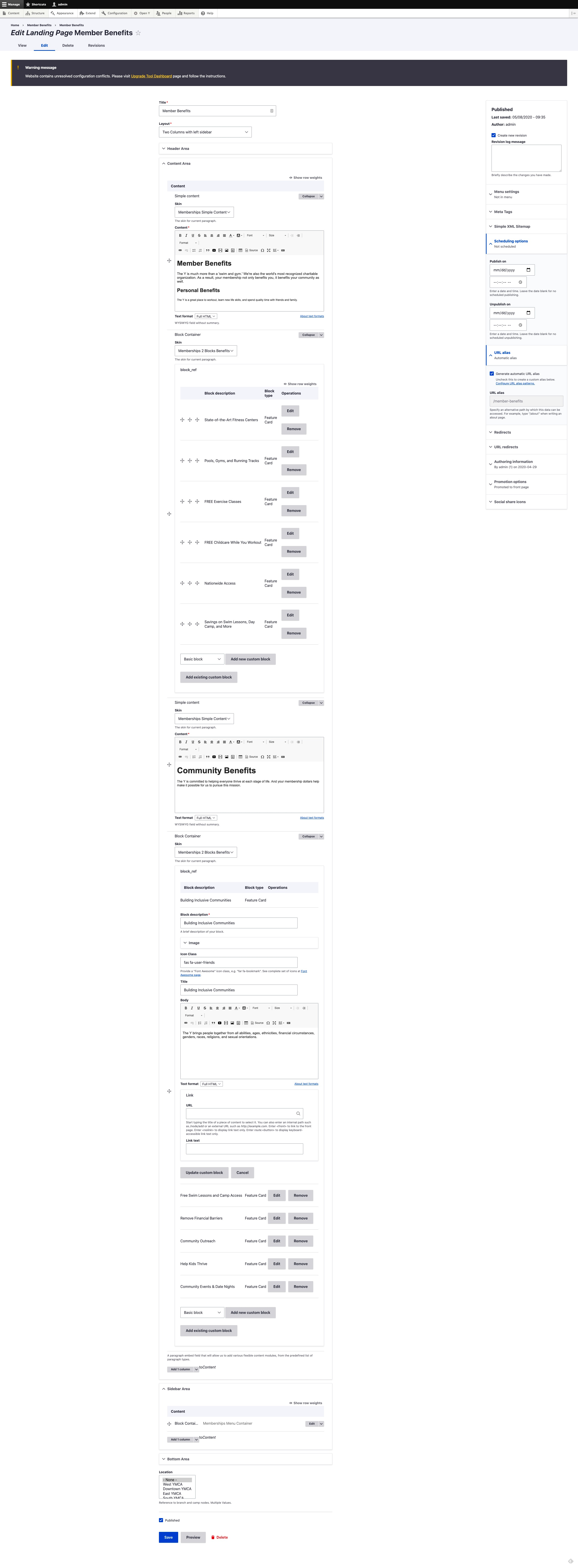
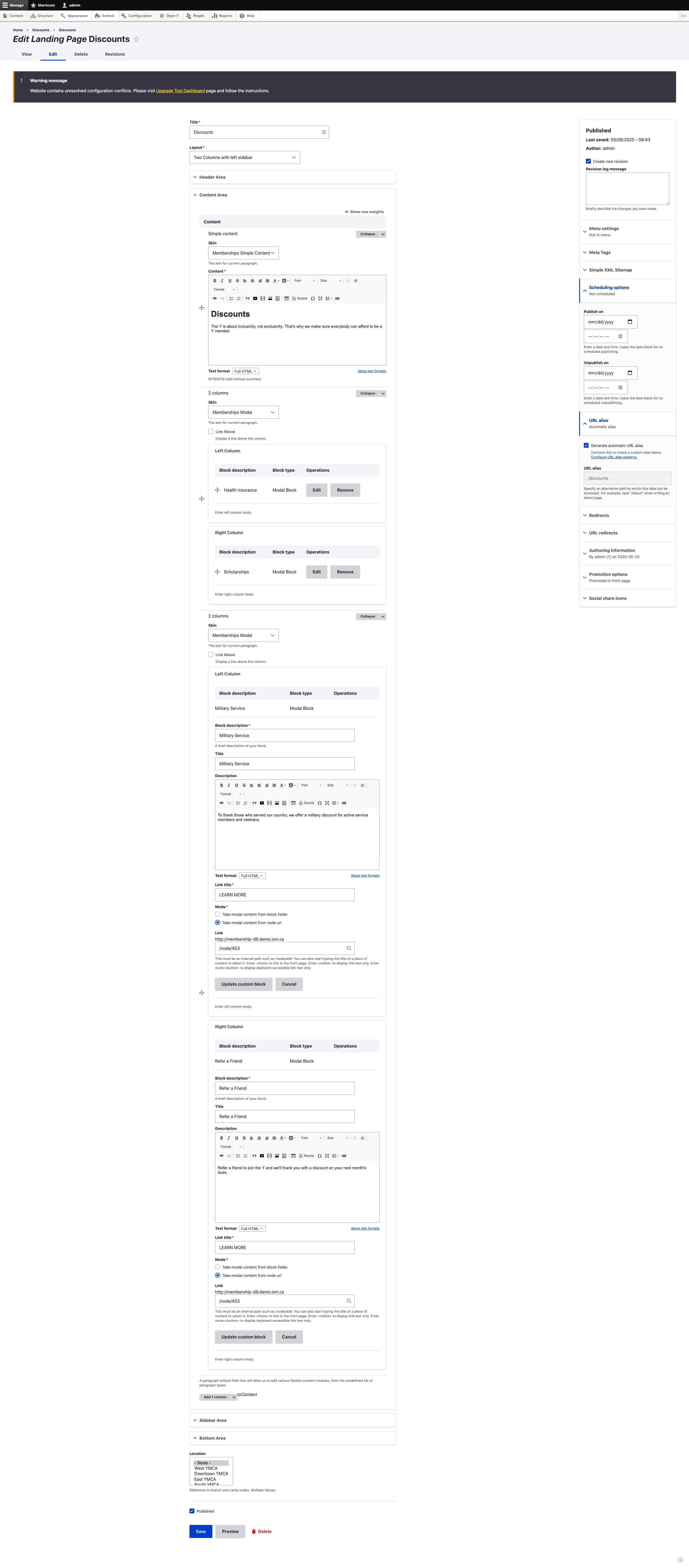
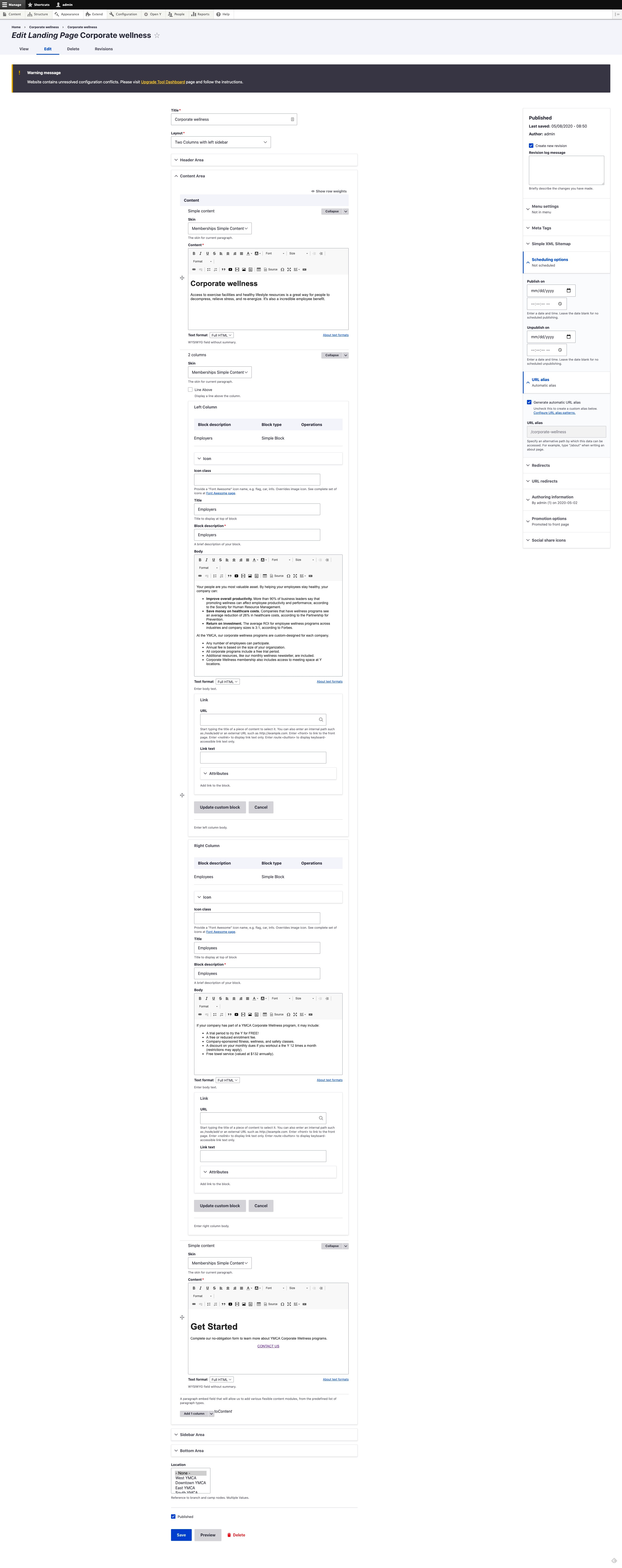
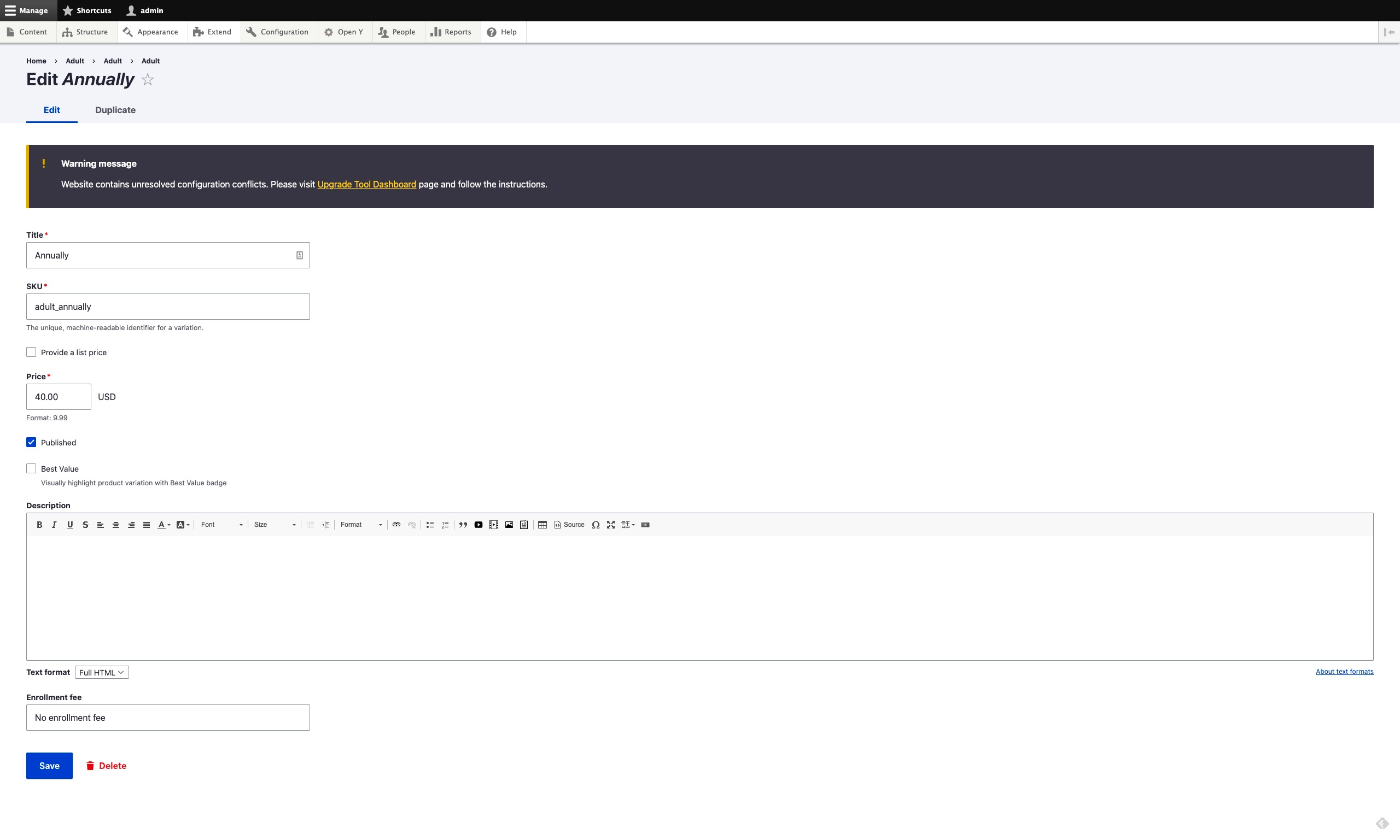
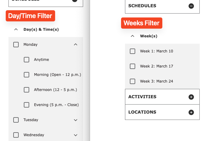
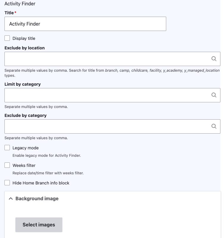
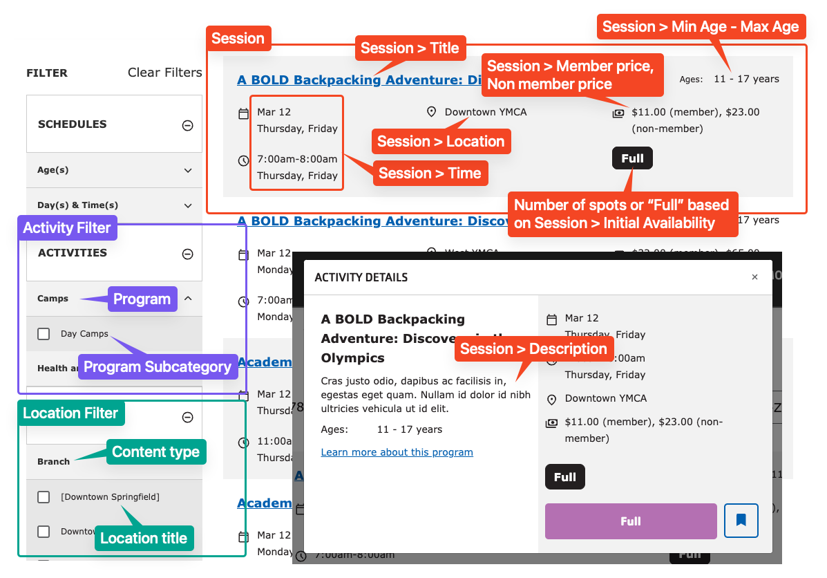
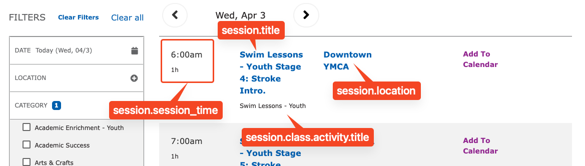
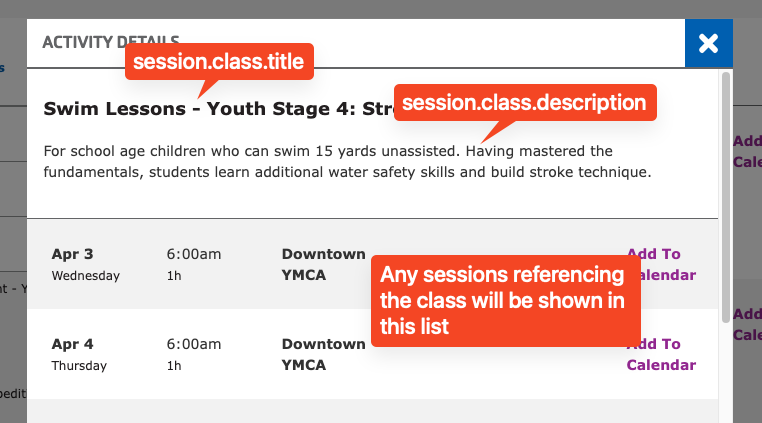
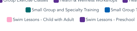
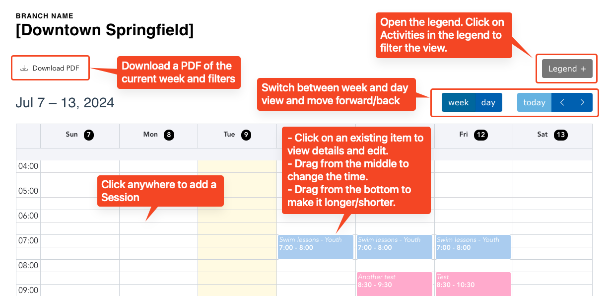
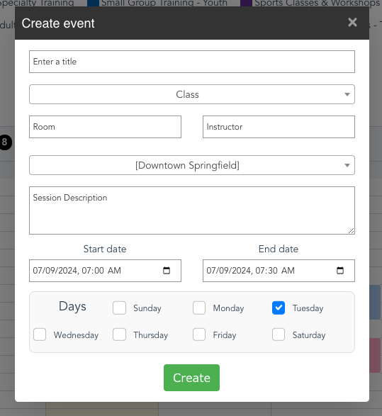
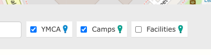
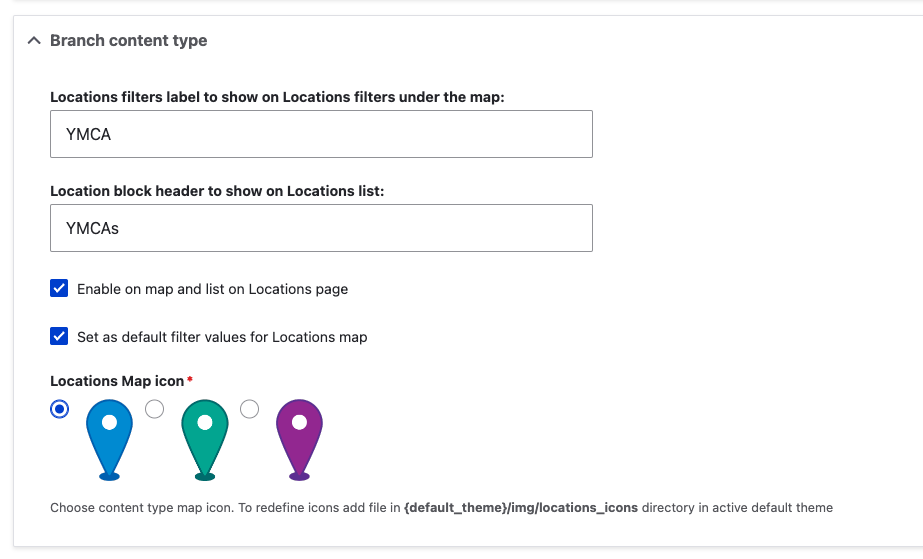


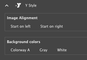


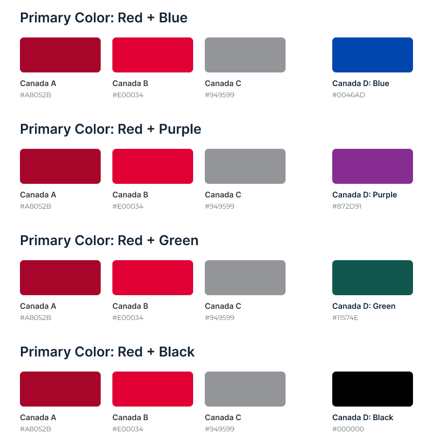
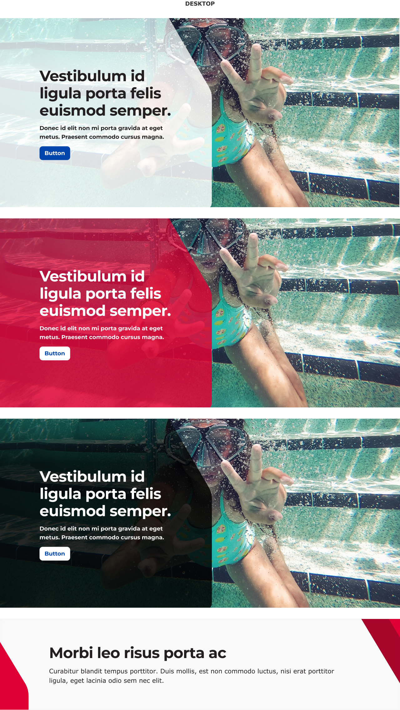
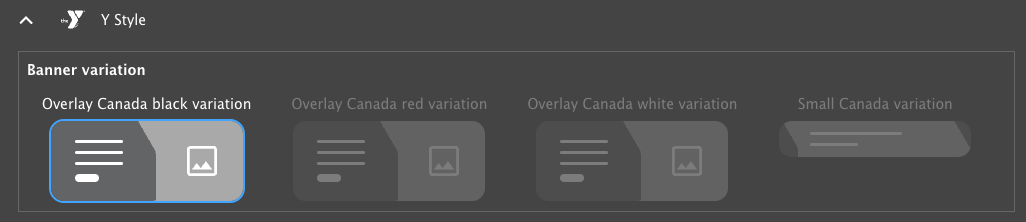
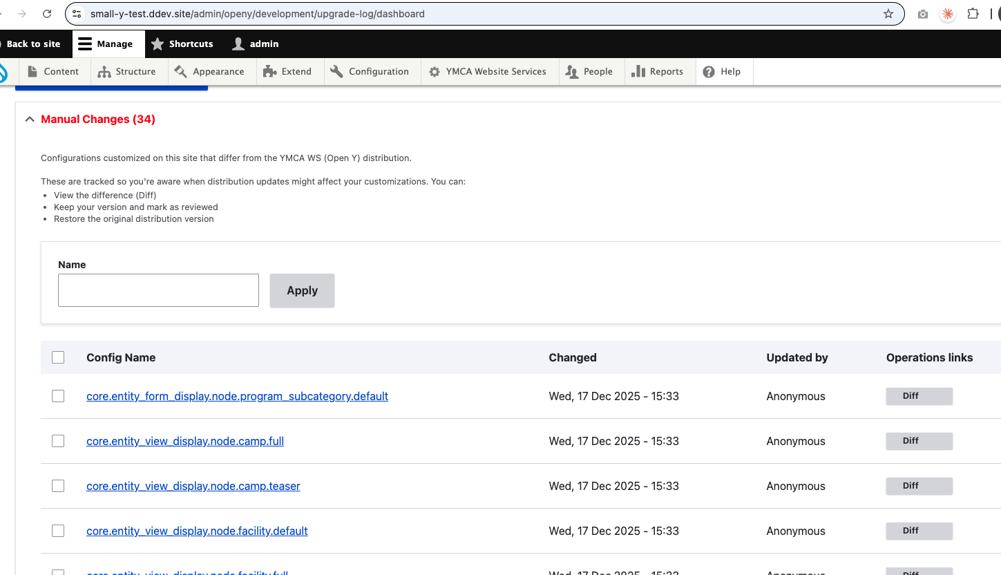
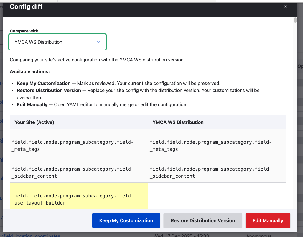
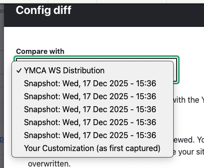
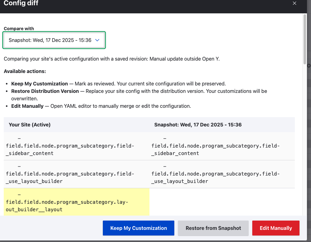

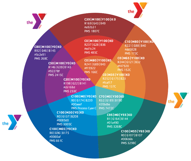
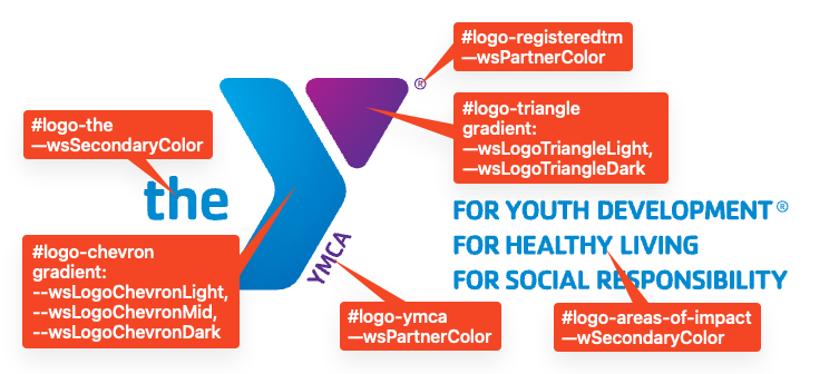


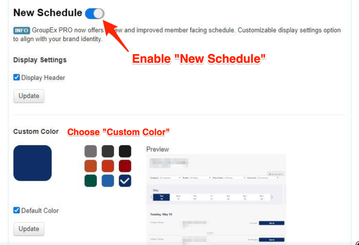


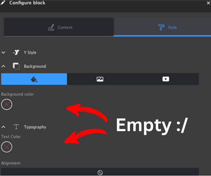


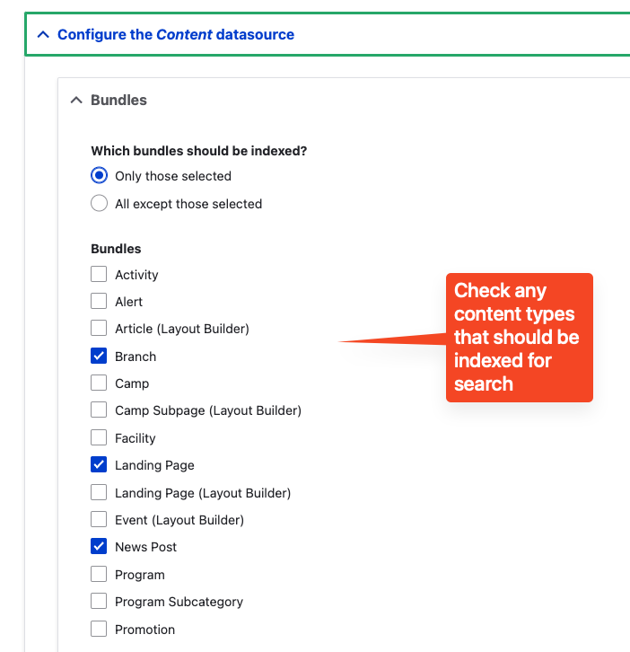


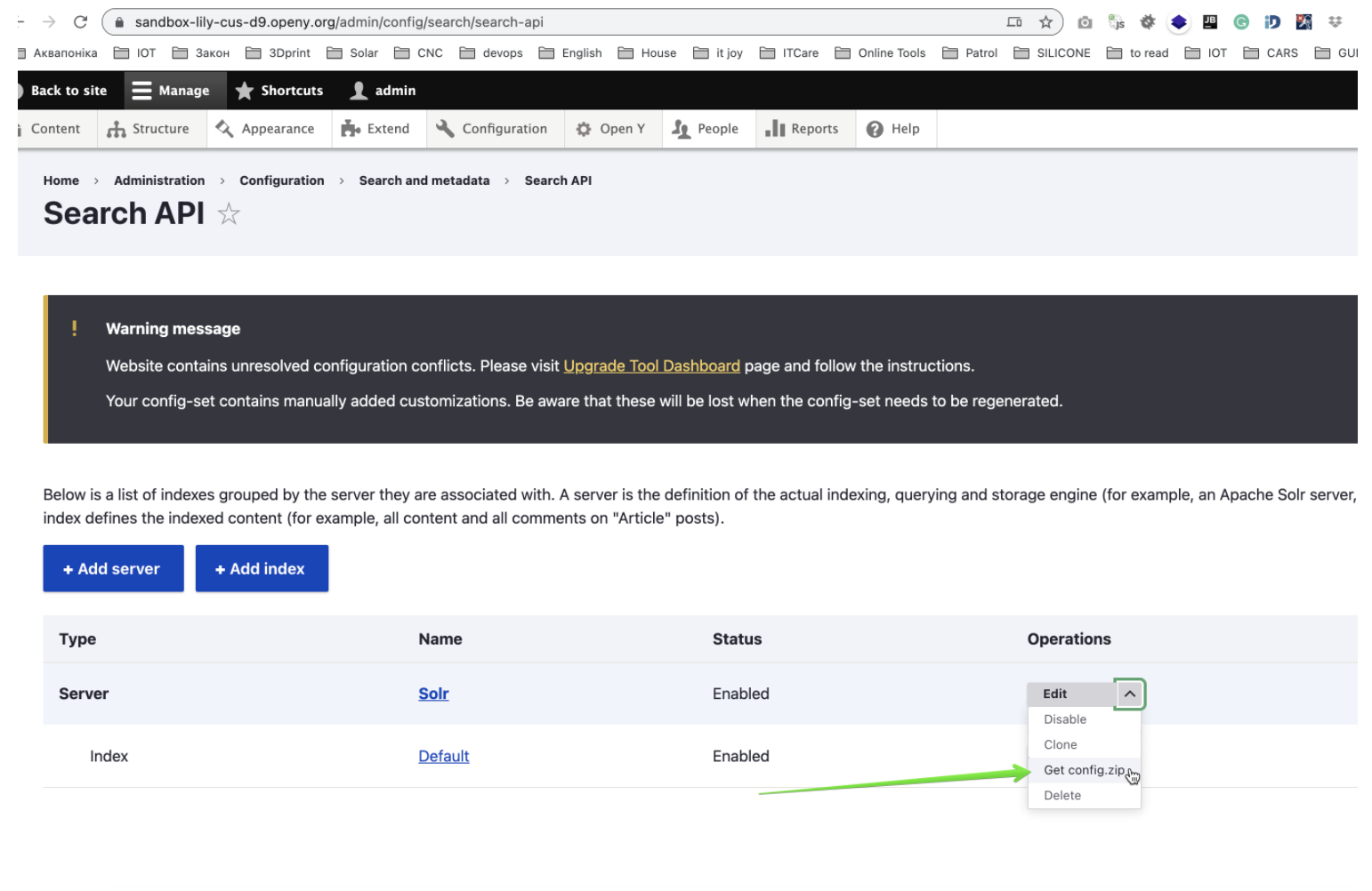
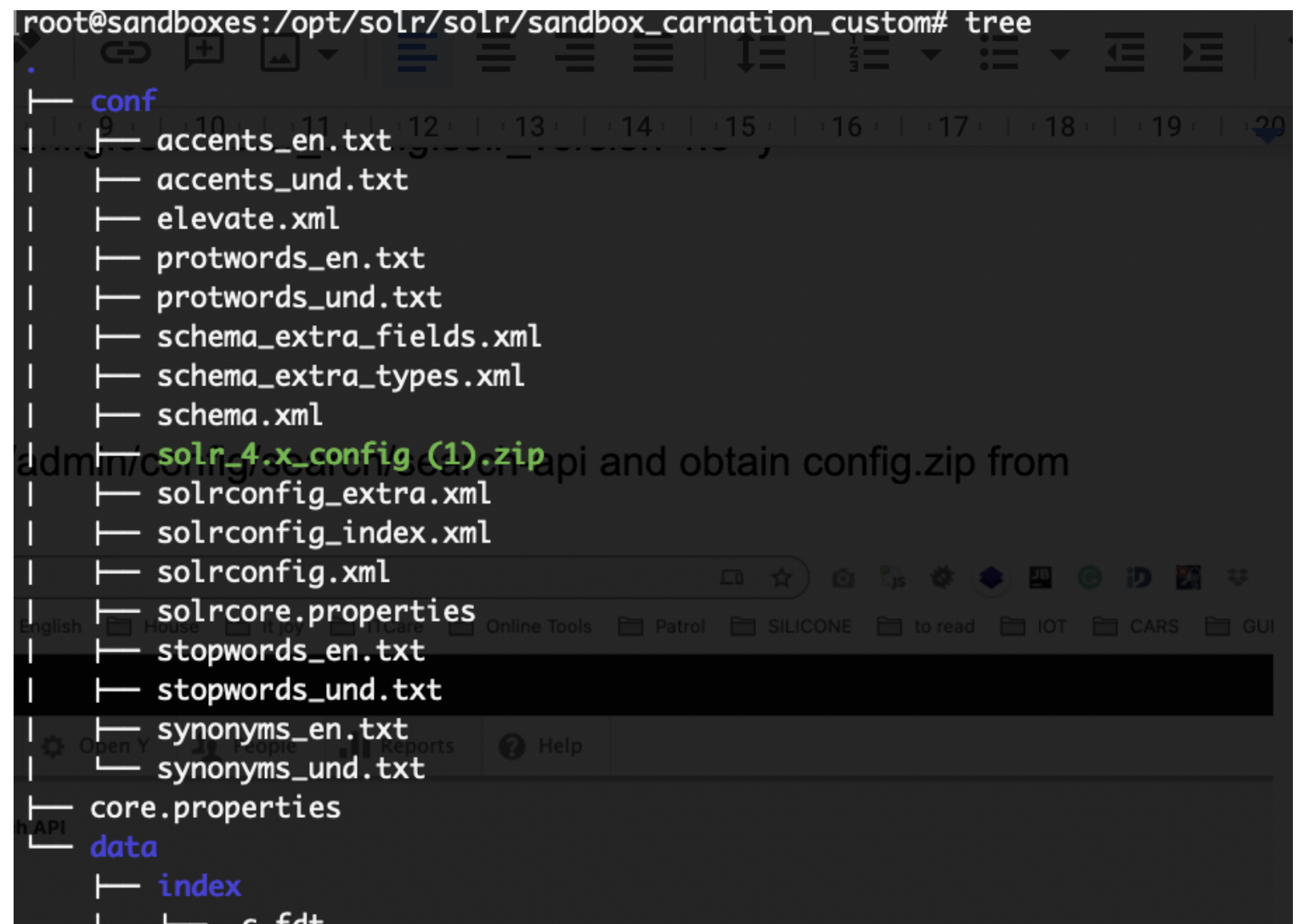
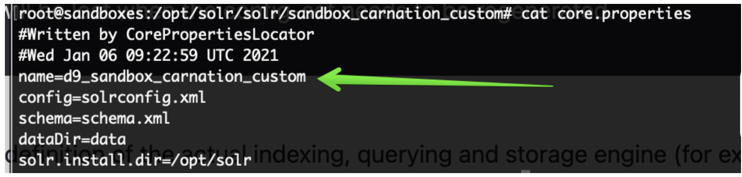

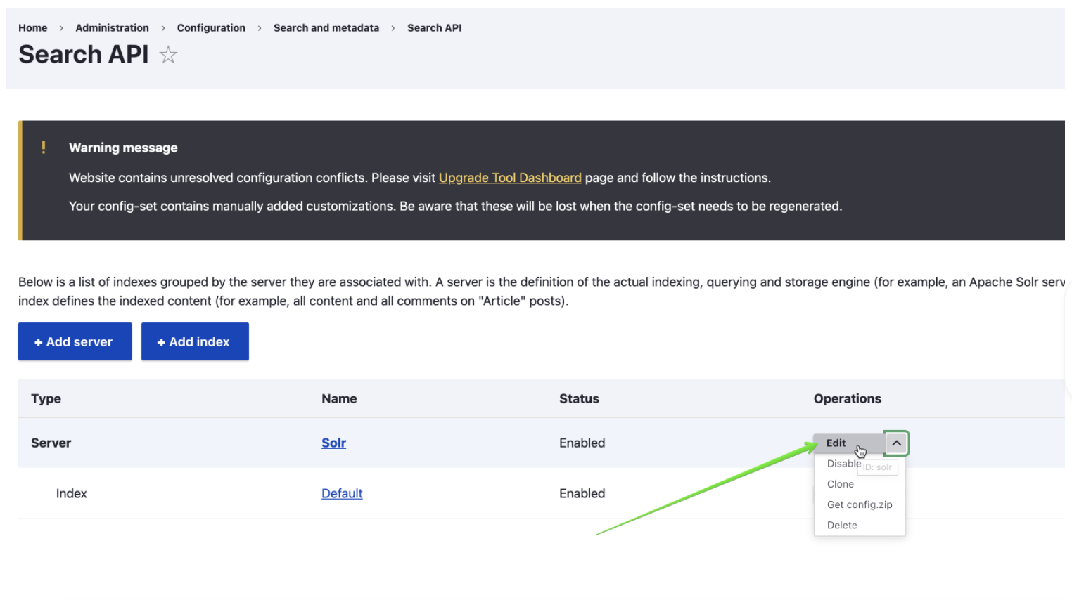
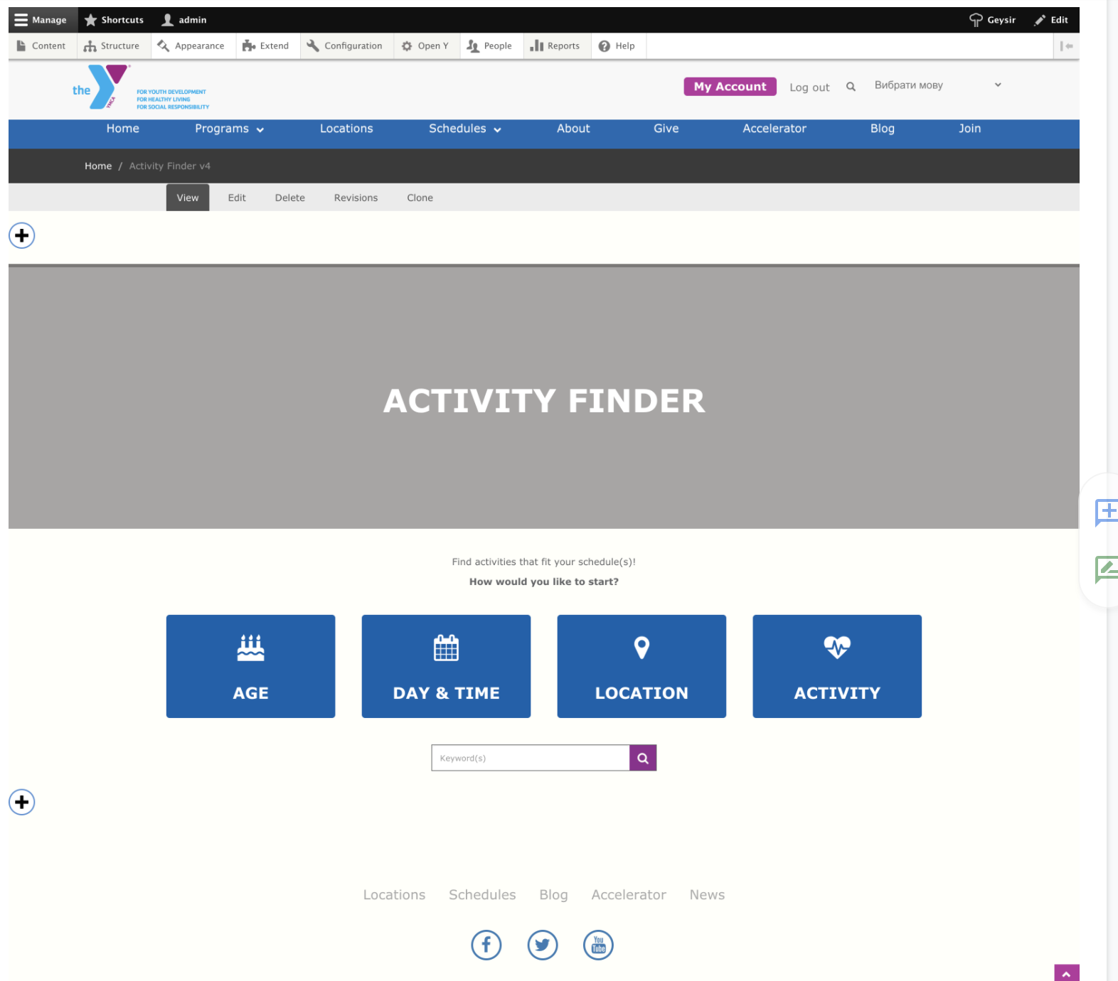
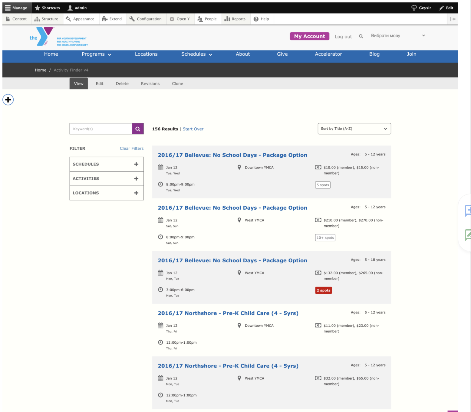
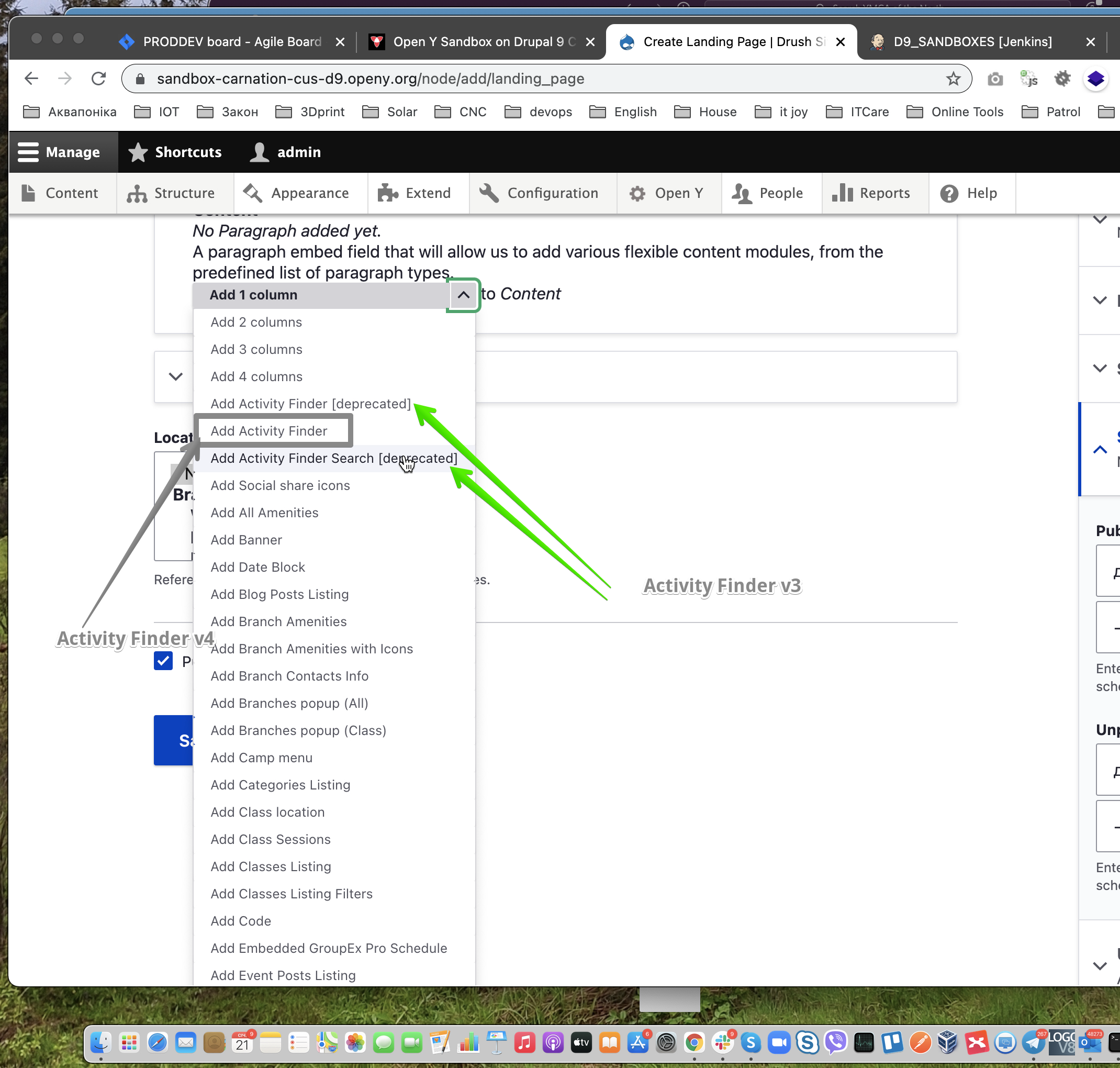
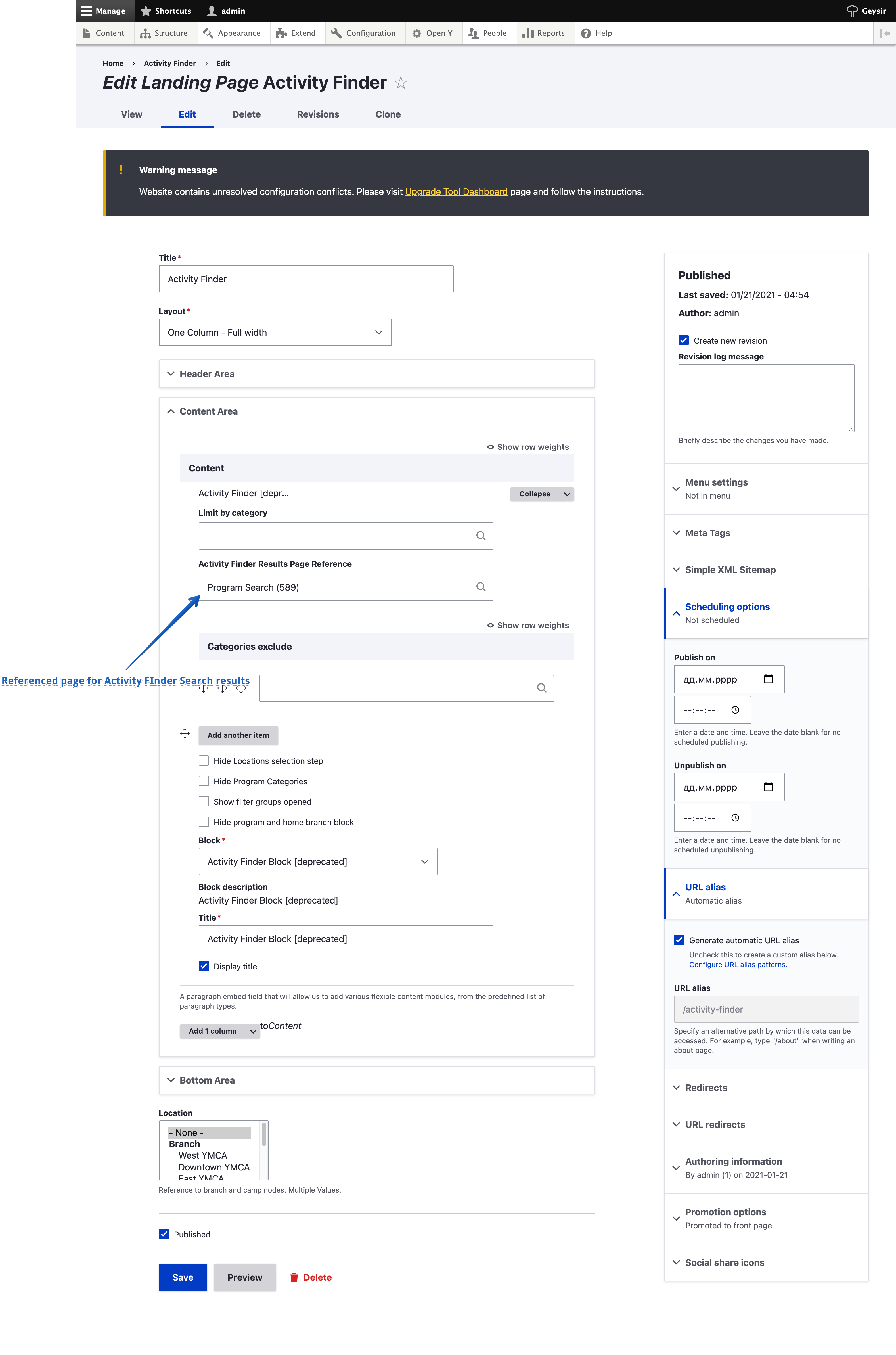 See
See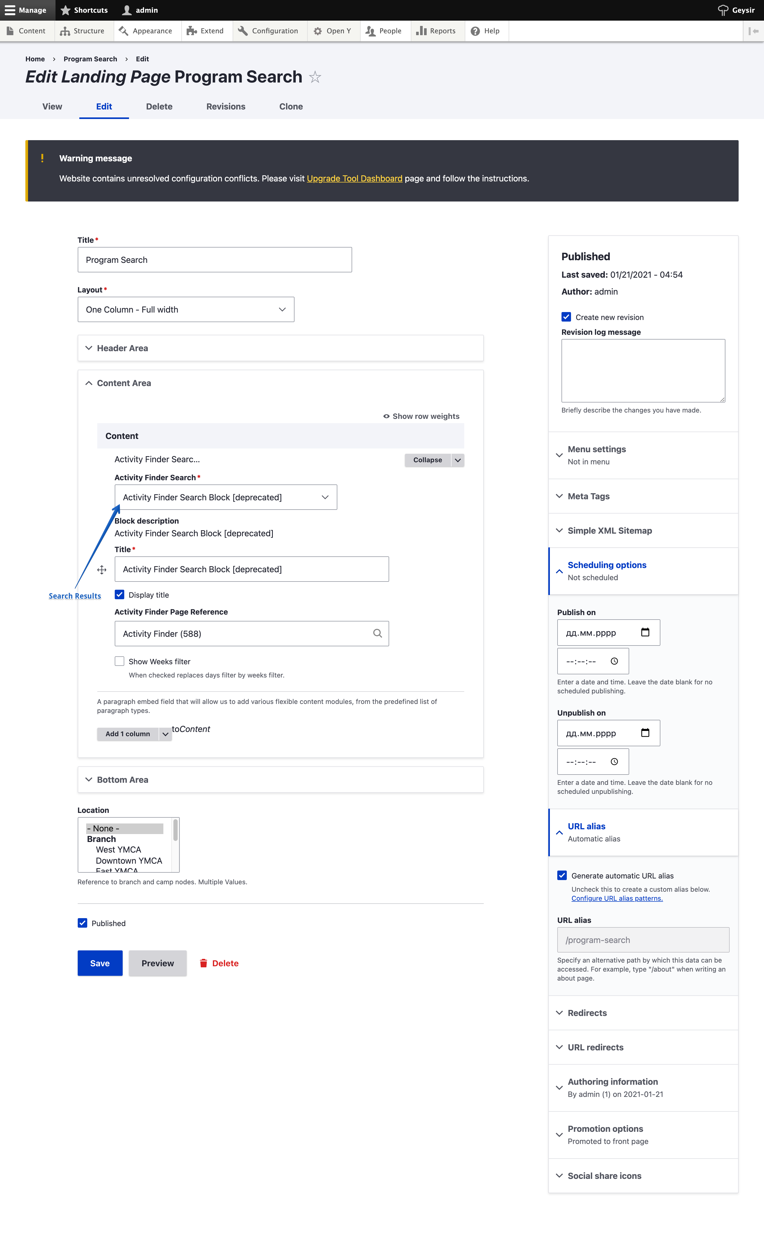 See
See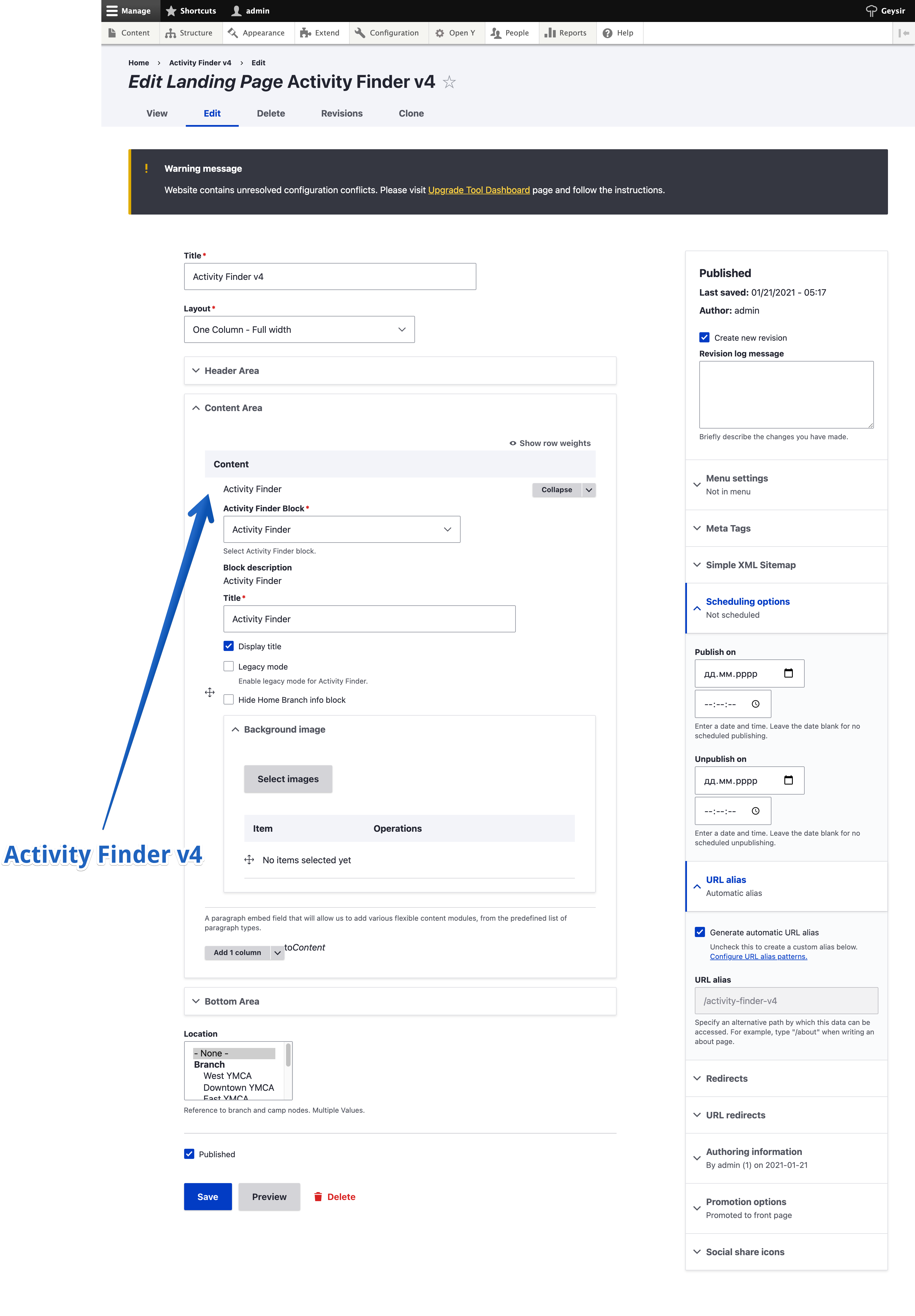 See sandbox
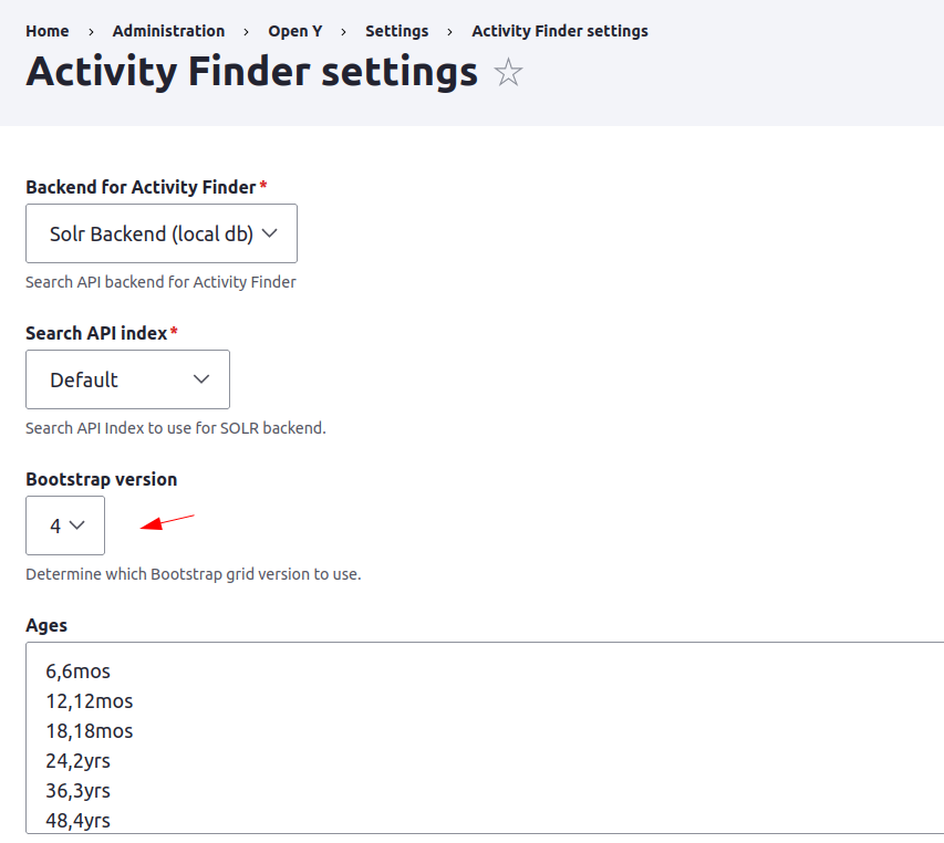
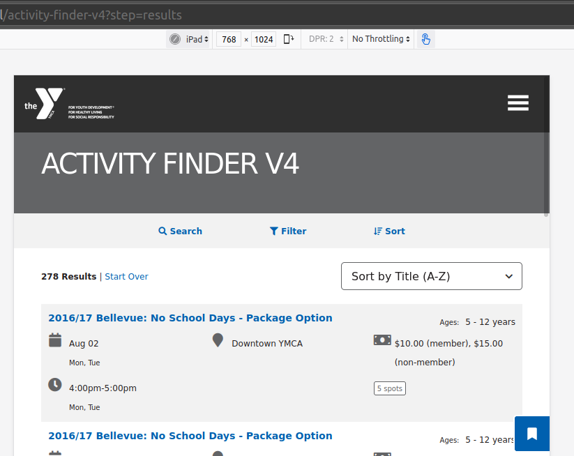


 The first portion,


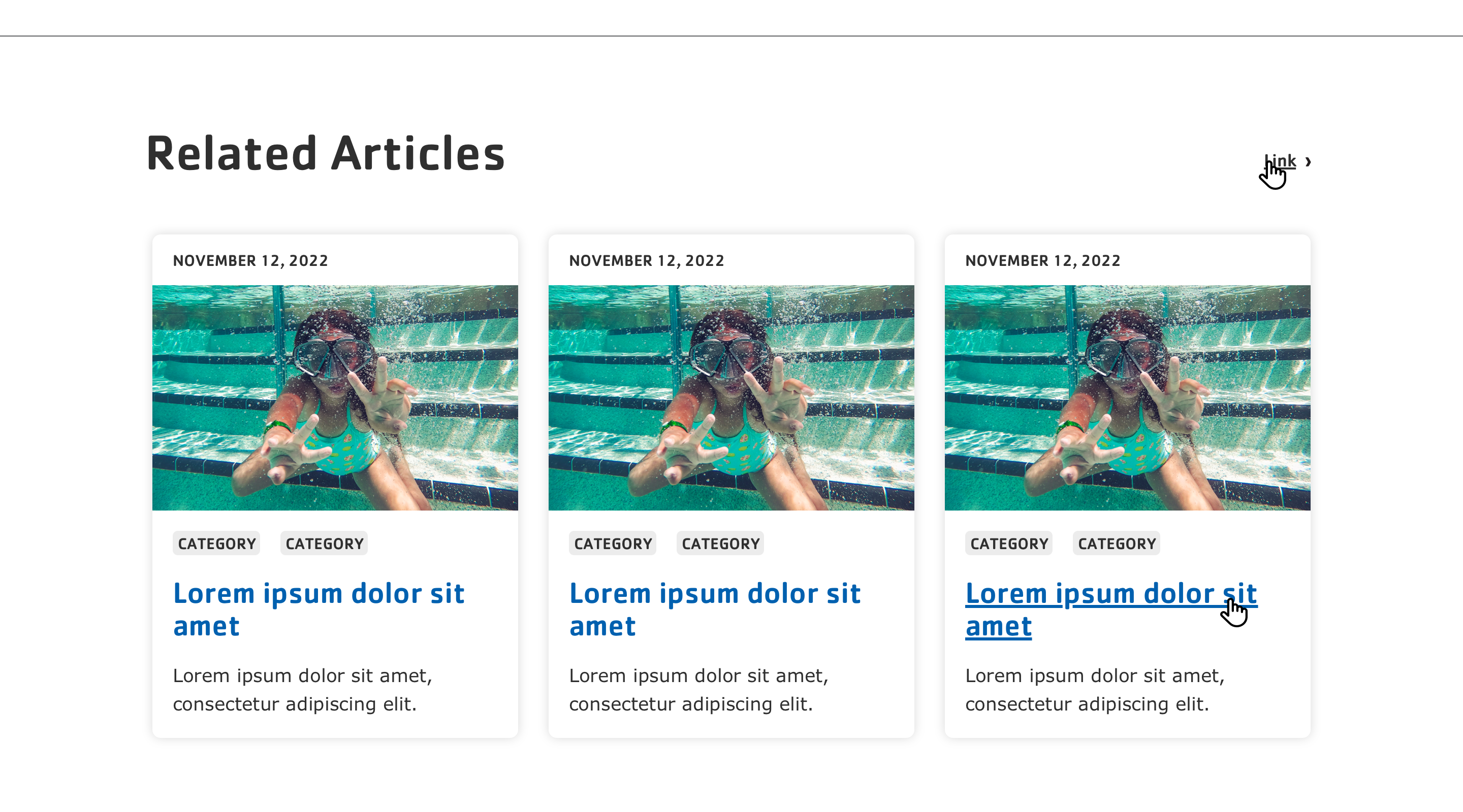
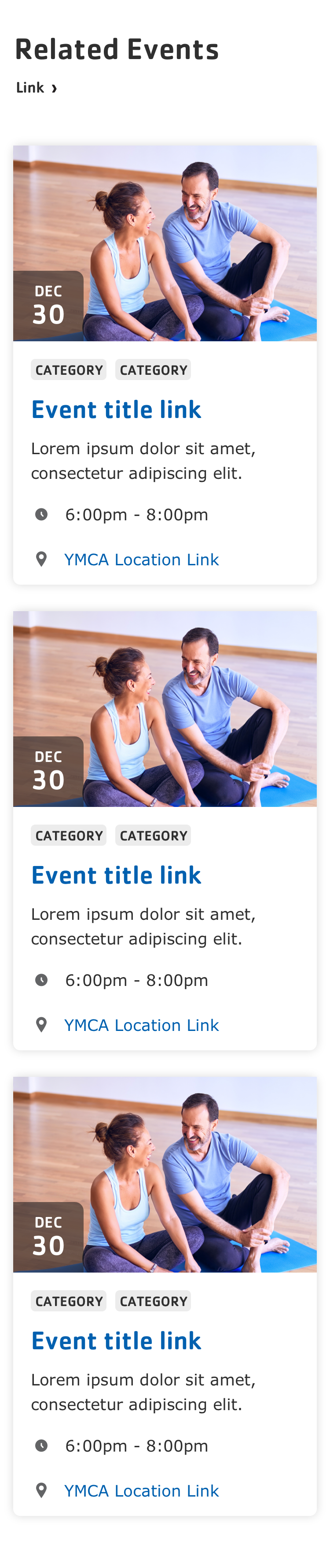
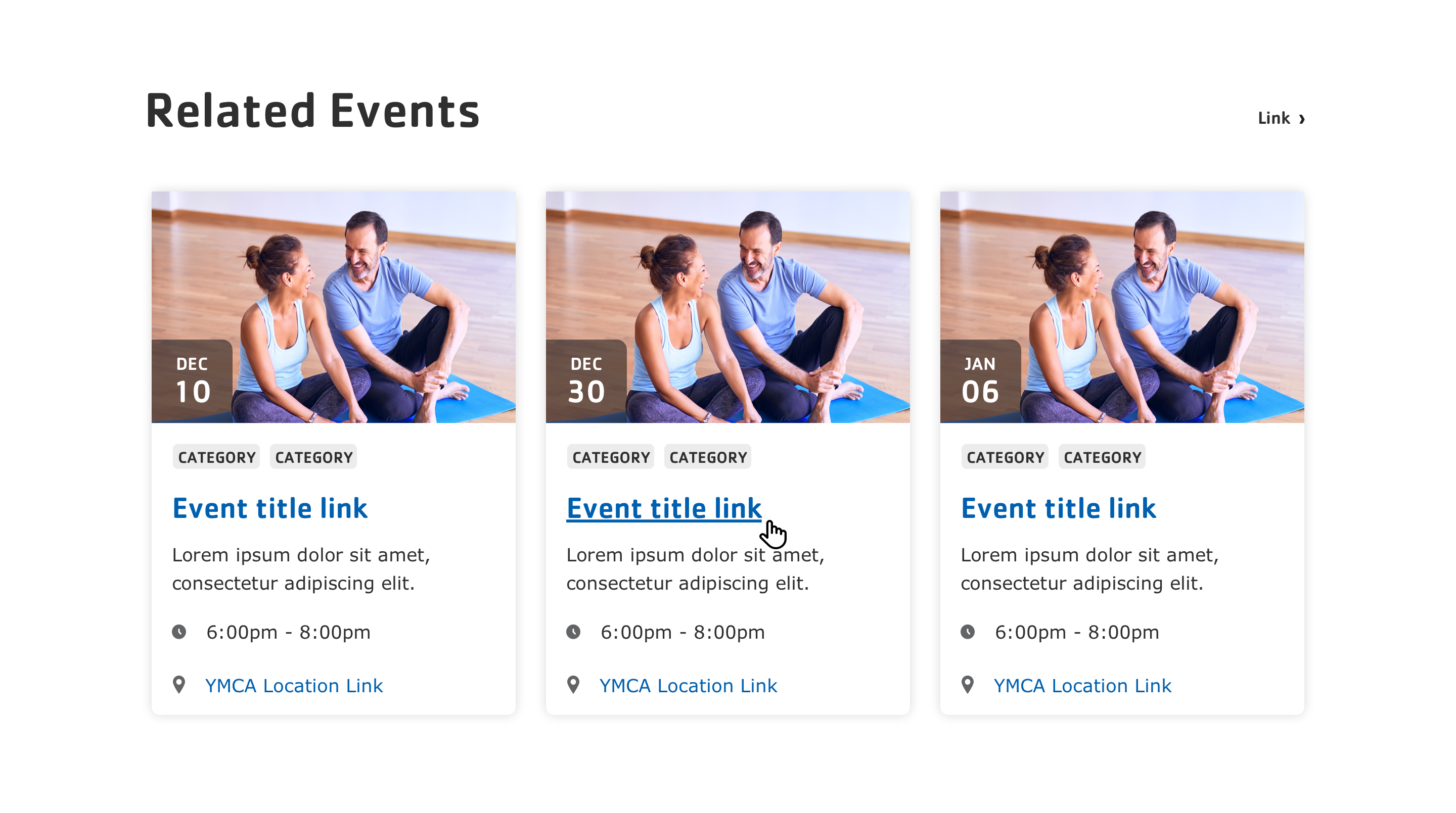