CSS Variables
Base variables
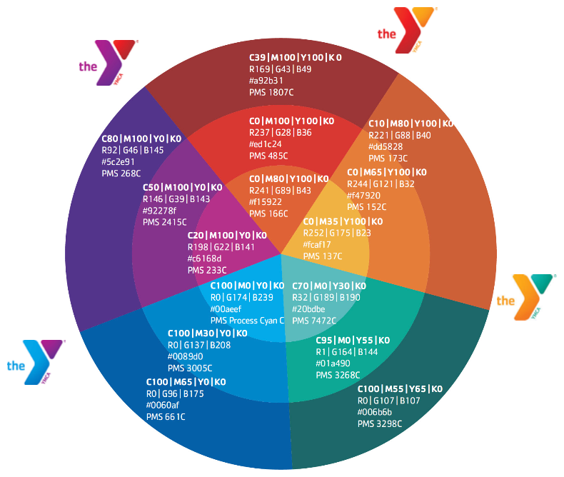
We start by defining a base set of colors based on the “Y Color Wheel and Neighbored Color Zones” from the “Websites & Platforms Style Guide”, available in the YMCA Brand Resource Center.
Note: RGB variable values are not complete color definitions and must be wrapped in
rgb{a}(), likebackground-color: rgb(var(--ylb-color-rgb-red-dark), 0.5);.
:root {
    --ylb-color-red-dark: #a92b31;
    --ylb-color-rgb-red-dark: 169, 43, 49;
    --ylb-color-red: #ed1c24;
    --ylb-color-rgb-red: 237, 28, 36;
    --ylb-color-red-light: #f15922;
    --ylb-color-rgb-red-light: 241, 89, 34;
    --ylb-color-orange-dark: #dd5828;
    --ylb-color-rgb-orange-dark: 221, 88, 40;
    --ylb-color-orange: #f47920;
    --ylb-color-rgb-orange: 244, 121, 32;
    --ylb-color-orange-light: #fcaf17;
    --ylb-color-rgb-orange-light: 252, 175, 23;
    --ylb-color-green-dark: #006b6b;
    --ylb-color-rgb-green-dark: 0, 107, 107;
    --ylb-color-green: #01a490;
    --ylb-color-rgb-green: 1, 164, 144;
    --ylb-color-green-light: #20bdbe;
    --ylb-color-rgb-green-light: 32, 189, 190;
    --ylb-color-blue-dark: #0060af;
    --ylb-color-rgb-blue-dark: 0, 96, 175;
    --ylb-color-blue: #0089d0;
    --ylb-color-rgb-blue: 0, 137, 208;
    --ylb-color-blue-light: #00aeef;
    --ylb-color-rgb-blue-light: 0, 174, 239;
    --ylb-color-purple-dark: #5c2e91;
    --ylb-color-rgb-purple-dark: 92, 46, 145;
    --ylb-color-purple: #92278f;
    --ylb-color-rgb-purple: 146, 39, 143;
    --ylb-color-purple-light: #c6168d;
    --ylb-color-rgb-purple-light: 198, 22, 141;
    --ylb-color-white: #FFFFFF;
    --ylb-color-rgb-white: 255, 255, 255;
    --ylb-color-light-grey-1: #f2f2f2;
    --ylb-color-rgb-light-grey-1: 242, 242, 242;
    --ylb-color-light-grey-2: #e7e7e7;
    --ylb-color-rgb-light-grey-2: 231, 231, 231;
    --ylb-color-light-grey-3: #cccccc;
    --ylb-color-rgb-light-grey-3: 204, 204, 204;
    --ylb-color-grey-1: #636466;
    --ylb-color-rgb-grey-1: 99, 100, 102;
    --ylb-color-grey-2: #4F4F4F;
    --ylb-color-rgb-grey-2: 79, 79, 79;
    --ylb-color-grey-3: #3F4042;
    --ylb-color-rgb-grey-3: 63, 64, 66;
    --ylb-color-dark-grey-1: #2F2F2F;
    --ylb-color-rgb-dark-grey-1: 47, 47, 47;
    --ylb-color-dark-grey-2: #231F20;
    --ylb-color-rgb-dark-grey-2: 35, 31, 32;
    --ylb-color-black: #000000;
    --ylb-color-rgb-black: 0, 0, 0;
}
Colorway variables
Each colorway begins with four initial colors, derived from the above color wheel:
- PrimaryColor
- SecondaryColor
- TertiaryColor
- PartnerColor
All page elements should be composed of these four variables, with “primary/secondary/tertiary” providing complimentary colors and “partner” providing a complimentary option for buttons or other calls to action.
Each variable is prefixed with ws. RGB versions of these four options are provided for use with rgba() styles.
Additionally, 5 variables are used to more specifically define the gradients in the Y logo:
- LogoChevronDark
- LogoChevronMid
- LogoChevronLight
- LogoTriangleDark
- LogoTriangleLight
These variables should not be used in page components outside the logo. The Canadian Y logo does not change colors, and therefore these extra colors are not needed for Canadian colorways.
All together, these variables make up a colorway:
--wsPrimaryColor
--wsPrimaryColorRGB
--wsSecondaryColor
--wsSecondaryColorRGB
--wsTertiaryColor
--wsTertiaryColorRGB
--wsPartnerColor
--wsPartnerColorRGB
--wsLogoChevronDark
--wsLogoChevronMid
--wsLogoChevronLight
--wsLogoTriangleDark
--wsLogoTriangleLight
These variables should reference base variables, or other colors provided. Once combined, the full colorway definition should look like this:
:root {
  --wsPrimaryColor: var(--ylb-color-blue-dark);
  --wsPrimaryColorRGB: var(--ylb-color-rgb-blue-dark);
  --wsSecondaryColor: var(--ylb-color-blue);
  --wsSecondaryColorRGB: var(--ylb-color-rgb-blue);
  --wsTertiaryColor: var(--ylb-color-blue-light);
  --wsTertiaryColorRGB: var(--ylb-color-rgb-blue-light);
  --wsPartnerColor: var(--ylb-color-purple-dark);
  --wsPartnerColorRGB: var(--ylb-color-rgb-purple-dark);
  --wsLogoChevronDark: var(--ylb-color-blue-dark);
  --wsLogoChevronMid: var(--ylb-color-blue);
  --wsLogoChevronLight: var(--ylb-color-blue-light);
  --wsLogoTriangleDark: var(--ylb-color-purple-dark);
  --wsLogoTriangleLight: var(--ylb-color-purple-light);
}
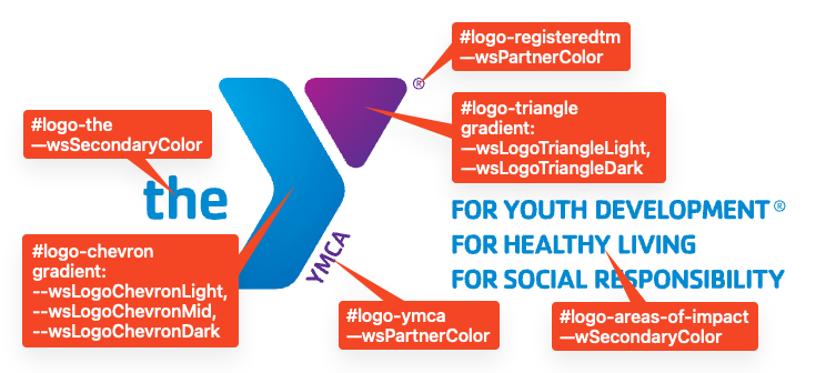
Logo Colors
In order to provide consistency across colorways and reduce code duplication, the logo has been decomposed into 6 sections:
- “the”
- “chevron”
- “ymca”
- “triangle”
- “registeredtm”
- “areas-of-impact”
The “chevron” and “triangle” components are composed of radialGradient elements which leverage the additional wsLogo variables defined above. The other components use the existing colorway variables. Each component is a path with an id and the color defined in a fill.
#logo-theuses--wsSecondaryColor#logo-chevronuses a gradient composed of (from top to bottom)--wsLogoChevronLight,--wsLogoChevronMid, and--wsLogoChevronDark#logo-ymcauses--wsPartnerColor#logo-triangleuses a gradient composed of (from left to right)--wsLogoTriangleLightand--wsLogoTriangleDark#logo-registeredtm uses–wsPartnerColor`#logo-areas-of-interestuses--wsSecondaryColor
Y Styles
Each “Y Styles” option enables a different library, as seen in y_lb.ws_style_option.yml. Those libraries can be overridden by a custom theme if necessary.