Ready to build amazing content? Start with the
Block Library and explore what’s possible! 🚀
1 - Layout Builder
Build beautiful, flexible pages with Layout Builder’s drag-and-drop interface.
Layout Builder is a powerful new page-building addition to your YMCA website.
Drupal’s Layout Builder allows content editors and site builders to easily and quickly create visual layouts for displaying content. Users can customize how content is arranged on a single page, across types of content, or even create custom landing pages with an easy-to-use drag-and-drop interface.
YMCA Website Services 9.2.12 introduces a new Content Type: Landing Page (Layout Builder). This new page will allow you to build pages using Sections with different Layouts that contain Custom Blocks. Please contact your development partner if you need assistance updating the latest version.
Creating a new page
To use Layout Builder, you’ll first have to create a new page:
Choose any Layout Builder-enabled content type, or start with a basic
Landing Page
Go to Content > Add Content > The Content Type.
Once you’ve saved, you will see an empty page. Click the Layout tab to enter Layout Builder or go directly there with Save and edit layout.
Updating an existing page
Navigate to the page you’d like to update, then click the Layout tab, like above.
Once you are in the Layout editor, you can create, edit, rearrange, and delete sections and blocks while viewing the page in a what-you-see-is-what-you-get preview mode.
Saving and publishing
Changes to the page are not displayed to site viewers until you Save Layout on the page and Publish it.
When in the Layout editor, you will have these options at the top of the page:
Save Layout will save your changes and return you to the main page view.
Save and edit layout will save your changes and keep you in Layout Builder.
Discard Changes
Revert to Defaults will reset your page to the default empty layout.
After saving your changes, be sure your page is published:
Click the Edit tab.
Check Published.
Save the page.
Fundamentals
In Layout Builder, you will see the page divided up into Sections and Blocks. Your page may already be populated with some sections to get you started building, and you can change or edit those to fit your page.
Sections
Sections create the structure of the page and contain blocks. You can drag and drop blocks between sections, but you cannot move sections themselves—you can only create sections above or below existing sections.
You can remove sections by clicking the small “X” link at the top left of the section. Click on “Configure ” to edit the section layout and other options.
Layouts
Layouts define the structure of a section. YMCA Website Services comes with 1-, 2-, 3-, and 4-column layouts, and each layout has additional configuration options once it’s created. See
advanced options for more details.
The Content Editing Pane—the sidebar where you edit blocks —can sometimes be too small to get all of your content in there nicely. Simply drag anywhere on its left border to expand the pane.
Rearrange blocks easily
When rearranging large blocks on the page it can often be challenging to drag them around. To make this easier, uncheck Show content preview at the top of the page. This will substitute the “WYSIWYG” preview for block titles, making the content much more compact.
The distribution has shipped with two versions of Layout Builder component designs. The first-generation “Pre-release” designs were shipped with version
9.2.12 (December 2022) and
9.2.13 (March 2023). The revised and feature-complete “Design System” designs shipped with the June 2023 release.
Based on the YMCA Brand Guide, the distribution contains four “colorways” that allow content editors to apply accessible, brand-compliant styles to all components on a Layout Builder-based page.
Each of these components is available on
Layout Builder pages via the Create custom block selector.
Component
Design
Accordion
Amenities
Article List
(Hero) Banner
Branch Hours
Branch Menu
Branch Preferred Branch
Branch Social Links
Breadcrumbs
Camp Menu
Camp Video Banner
Card
Card - Column Variations
Carousel
Donate
Event List
Forms
Global Footer
Global Header
Grid Content
Icon Grid
Icons and Logos
Locations
Menu and Search
Modal
Ping Pong
Promo Cards
Side Menu
Sponsors
Staff
Statistics
Table (Simple Content)
Tabs
Testimonials
Utility Menu
Pre-release
View the designs
Component
Mobile
Desktop
Accordion
Article (/News /Blog /Press Release)
Branch
Branch Amenities
Branch Hours
Branch Menu
Branch Social Links
Breadcrumbs
Cards
Carousels
Event
Grid Content
Hero Banner
Modals
Modals
Partners (/Sponsors)
Ping Pong
Promo Cards
Simple Menu
Staff
Statistics
Tables
Tabs
Testimonials
Webforms
1.2 - Advanced Options
Configuration for Layout Builder Sections and Blocks.
A huge amount of configuration is available with Layout Builder components using the contributed
Layout Builder Blocks module, which is included with the distribution. In addition to those configuration options, we provide an extra layer of “Y Styles” that help site builders customize their sites in an accessible and brand-compliant manner.
Y Styles
These options provide customizations of Layout Builder-enabled pages at the Content Type, Page, and Component(/Block) level. As of the 11.3.1.0 release, Y Styles support has been expanded to additional content types beyond Landing Pages.
Styles inherit from content types, to pages, to components. Some styles can also be overridden at each level - block styles can override page styles, which can override content type styles.
flowchart
  classDef ct fill:#5C2E9133;
  classDef page fill:#92278F33;
  classDef block fill:#C6168D33;
  subgraph ct[Content Type]
    direction LR
    subgraph page[Page]
      direction LR
      subgraph block[Block]
        blockStyles[Block Styles]
      end
      pageStyles[Page Styles]
    end
    ctStyles[Content Type Styles]
  end
  blockStyles -- override --> pageStyles
  pageStyles -- override --> ctStyles
  class ct ct
  class page page
  class block block
Content Type styles
Note: This configuration may not be accessible to all content editors. Ask an administrator for assistance if necessary.
The default values for page-level Y Styles options are set in the Content Type display options.
To access them:
Go to Admin > Structure > Content types > Landing Page (Layout Builder) (or another LB-enabled content type) > Manage display
Ensure you’re acting on the Default display, then click Manage layout.
Expand the Y Styles section
Choose your default configuration options. These will set the defaults for every new node of this Content Type. Existing content will not be effected.
Click Save layout
Page styles
Every Layout Builder-enabled page that you create will allow you to override the default settings. All of these settings will affect all items on a page, unless they are overridden at the component level.
Edit the Layout on a page
Expand the Y Styles section
Choose your configuration options.
Color scheme:The color scheme of all components on the page. Choose from four brand-compliant and accessible options:
Blue/Purple
Green/Blue
Purple/Red
Red/Orange
Border radius:The curvature of container corners.
0px (square)
10px (small curve)
20px (larger curve)
Border style:The style of container borders.
No border
1px border
Drop shadow
Text/Button alignment:The vertical placement of elements in containers.
Left
Center
Button position:Where buttons sit in containers.
Inside container
Overlapping container
Button fill:How buttons are colored.
Filled by default, outlined on hover
Outlined by default, filled on hover
Click Save layout
Y Block styles
Some blocks have additional styles that can be configured per-block. For these blocks (e.g. Banner, Cards), look for the Y Styles section in the
block styles section and set the options accordingly.
Banner
Variant:Choose from five designs.
Standard
Overlay
Chevron
Frame
Small - This variant hides all but the title and description and does not use an image background.
Button fill: Override the page-level styles.
Card
Variant:Choose from four designs.
Standard
Overlay
Chevron
Color
Border style: Override the page-level styles.
Text/Button alignment: Override the page-level styles.
Button position: Override the page-level styles.
Button fill: Override the page-level styles.
Section styles
When creating or editing a Section you have the option of configuring Layout, Style, and Settings.
Support for these options is a work in progress and may require involvement of your development partner. Feel free to experiment with the options. Be sure to follow proper brand guidelines and accessibility practices.
Layout styles
In this section you can control the container of the Section.
Container type
Boxed: Section is narrower than the header of the page. Good for text-heavy layouts.
Full: Section extends to the edges of the main content container.
Edge to Edge: Section extends to the edges of the page. Good for full-width components like Banners and Ping-Pong blocks.
Gutters
With Gutters: Section has left and right padding. Good for most non-full-width containers.
Without Gutters: Section has no left and right padding. Best for Edge to Edge containers.
Block styles
When creating or configuring a block you have the option of opening the Style tab to access additional style options including:
background,
typography,
spacing,
borders, and
animation.
Support for these options is a work in progress and may require involvement of your development partner. Feel free to experiment with the options. Be sure to follow proper brand guidelines and accessibility practices.
After you have completed setting the Style options, click back to Content and Save or Update to commit your changes.
1.3 - Block Library
Browse all available Layout Builder blocks organized by category.
Browse all available Layout Builder blocks by category. Click any block to see detailed documentation and examples.
Using Blocks
Blocks contain the content of your pages, while Sections provide the structure.
To add a block to your page:
Click Add Block in any section
Choose Create Custom Block
Select the block type you want from the categories below
Configure the block settings
Save your changes
Hero & Banner Blocks
Full-width promotional components for making a strong first impression.
Scroll to the location on the page where you want to add a block
Click Add block
In the sidebar, click Create custom block
Choose the block to add.
Fill in the content fields:
Title (required): Displayed if Display title is checked, otherwise this is for administrative use.
Accordion Item: Add as many items as you like using the *Add Accordion Item or Add new custom block button. When you are finished adding or editing each item, be sure to click Create/Update tab or Create/Update custom block to finalize the item. Each item contains:
Heading (required): The heading that will be used to expand/contract the accordion.
The Breadcrumbs block may not show the correct path while editing the page layout, but it will display properly for viewers.
Caching
As of the 11.3.1.0 release, breadcrumb caching has been improved. Previously, breadcrumbs were set with max-age=0, which prevented them from being cached and could negatively impact page performance. This has been fixed so that breadcrumbs are now properly cached along with the rest of the page.
1.9 - Cards
Flexible card-style components that allow up to 4 cards to display across the page depending on the chosen layout.
The Cards block is similar to the
Grid CTA block, but has more fields and places the image behind the item content.
Scroll to the location on the page where you want to add a block
Click Add block
In the sidebar, click Create custom block
Choose the block to add.
Fill in the content fields:
Title (required): Never displayed, even if “Display Title” is checked. For administrative use only.
Section heading: Displayed as a heading above the cards.
Section subheading: Displayed below the heading.
Section link: A link button displayed below the list of cards.
# of columns: Allows 1- to 4-columns of cards.
Card items: Add up to 4. When you are finished adding or editing each item, be sure to click Create/Update tab or Create/Update custom block to finalize the item. Each card has:
Heading (required)
Image: Chose from the library or add a new image to be displayed behind the card text.
Description: A full text editor to add card content.
Link: A link at the bottom of the card.
As of the December 2024 release, Card links can use
link attributes.
Topic Tag: This is displayed at the top of the card and can be used to group cards visually.
This block comes with
multiple styles. To choose an alternative style:
Click on the Style tab at the top of the Block Add/Update form.
Scroll to the location on the page where you want to add a block
Click Add block
In the sidebar, click Create custom block
Choose the block to add.
Fill in the content fields:
Title (required): Never displayed, even if “Display Title” is checked. For administrative use only.
Carousel heading: Displayed as a heading above the carousel.
Carousel subheading: Displayed below the heading.
Carousel Item: Add as many items as you like using the Add Carousel Item or Add new custom block button. When you are finished adding or editing each item, be sure to click Create/Update tab or Create/Update custom block to finalize the item. Each item contains:
The Y Layout Builder - Donate (lb_donate) and YMCA Website Services Donation Embed Form (y_donate) modules work together allow content editors to add an embedded donation form to the site and create a separate call to action to direct users there.
Embedded form
To get started:
Enable the YMCA Website Services Donation Embed Form (y_donate) module at Administration > Extend.
Select the Layout Tab of a Layout Builder-enabled page.
Select Add block on the page, then search or scroll to find Donation Form Embed Block.
Select the form type and enter the form ID from your donation provider.
Troubleshooting
If your embedded form does not work in your non-production environment you may need to add a domain to the allow-list either on the provider-side or in your site’s Content Security Policy.
If your provider is not listed you can add the form by selecting the Code Custom Block and then pasting in your code. Alternatively you can work with your development partner to
add a new donation provider.
Scroll to the location on the page where you want to add a block
Click Add block
In the sidebar, click Create custom block
Choose the block to add.
Fill in the content fields:
Title (required): Never displayed, even if “Display Title” is checked. For administrative use only.
Section heading: Displayed as a heading above the items.
Section subheading: Displayed below the heading.
Giving amounts: Any number of buttons with donation amounts. An “Other” button will always be displayed after all of these buttons.
Amount label: The amount to be displayed, with the currency sign, like “$50”.
Form Element ID: Usually a 4-digit number found on the donation backend. You may need to find this on the donation platform side or in the browser inspector.
Donation page link: A link to be displayed below the buttons.
URL: In order for the buttons to work properly, this must link to the page where the embedded donation form is embedded.
Link text: The text to be displayed.
Background image: Chose from the library or add a new image to be displayed behind the text.
Scroll to the location on the page where you want to add a block
Click Add block
In the sidebar, click Create custom block
Choose the block to add.
Fill in the content fields:
Title (required): Never displayed, even if “Display Title” is checked. For administrative use only.
Section heading: Displayed as a heading above the cards.
Section subheading: Displayed below the heading.
Grid CTA section link: A link button displayed below the list of items.
# of columns: Allows 2- to 4-columns of items.
Grid Item: Add up to 4. When you are finished adding or editing each item, be sure to click Create/Update tab or Create/Update custom block to finalize the item. Each item has:
Heading (required)
Description: A full text editor to add item content.
Media: Chose from the library or add a new image or icon to be displayed above the item text.
The header and footer on Layout Builder pages is composed of many complimentary blocks. The Header and Footer are special Sections that are pre-populated on each Layout Builder-enabled content type. If the Header or Footer do not already exist in your content, you can add them on your own.
Header Section
If a Header section does not already exist, add a new Section and choose the WS Header Layout. Then, add the following blocks by selecting Add block and then using the search box under All system blocks:
Utility Menu area
Left
Website Name Block
Right
Open Y Google Translate Block
Utility Menu
Main Menu area
Left
Site Logo Block
Center
Main navigation
Search Bar Block
Right
User account menu
Each block has some specific configuration recommendations:
Website Name Block
Configuration
Uncheck Display title.
Content
The Site Name is found under Configuration > System > Basic site settings.
Open Y Google Translate Block
Configuration
Uncheck Display title.
Content
The contents of this block are not configurable, but it may be omitted or removed if your site does not provide translation uses another translation method.
Utility Menu
The option to add a Utility Menu was added in the December 2024 release. This menu is intended to give content editors an additional space for adding links in the top right of the header.
Configuration
Uncheck Display title.
Menu levels controls which and how many levels of menu are displayed. The Utility menu styles are designed for a single level of links.
Content
Menu items can be managed under Structure > Menus > Utility Menu.
Site Logo Block
Configuration
Title (required): Never displayed, even if “Display Title” is checked. For administrative use only.
WS Site Logo: Choose which logo is displayed in the block.
Theme logo uses the logo defined by the active theme, in the Appearance > Settings > (The active theme).
Colorway logo uses a dynamic SVG that responds to the configured YMCA colorway. This option is recommended for the Header.
White logo uses a flat white logo. This option is recommended for the Footer.
Hide tagline in WS logo: (Added in the December 2024 release.) Check to hide the tagline (areas of impact) in the logo.
The areas of impact must appear on a website, but it is at the YMCA’s discretion whether to include them as the trademarked graphic paired with the logo or as a way of telling the story of our positive impact.
If you choose to hide the Areas of Impact in the logo, we recommend you include them elsewhere on the page.
Main navigation
The main navigation supports displaying up to three levels of menu items. When adding items, be sure to check Show as expanded for any parent item that should be expandable.
Menu levels controls which and how many levels of menu are displayed. We recommend using the default configuration.
Content
Menu items can be managed under Structure > Menus > Main navigation.
Tips
Refer to the Drupal User Guide for more information about
managing menus.
We recommend you limit the main menu to 6 items or fewer when using Layout Builder, as additional items can cause the menu to be wider than the supported area. Additional menu items can be added to the footer, if needed.
Search Bar Block
Configuration
Uncheck Display title.
Content
The contents of this block are not configurable.
User account menu
Configuration
Uncheck Display title.
Menu levels controls which and how many levels of menu are displayed. We recommend using the default configuration.
Content
Menu items can be managed under Structure > Menus > User account.
To show items with a button style, add the highlighted to the menu item under Attributes > Class. Use highlighted outline for a reversed, secondary button style.
On mobile devices, only highlighted (and highlighted outline) items from this menu will display.
Footer Section
If a Footer section does not already exist, add a new Section and choose the WS Footer Layout. Then, add the following blocks by selecting Add block and then using the search box under All system blocks:
Primary Footer
Site Logo
Footer Menu Left
Footer Menu Center
Footer Menu Right
Footer Social
Sub-footer
Copyright
Footer Menu
Site Logo
See above. The “white logo” is recommended for the footer.
Footer Menu Left, Center, Right
Each of these three blocks references a menu. The three menus can be used to split footer links across multiple columns.
Configuration
Display title: Uncheck to hide the title, or turn the menu title on to give each column a title.
Menu levels controls which and how many levels of menu are displayed. We recommend using the default configuration.
Content
Menu items can be managed under Structure > Menus > Footer Menu Left, Footer Menu Center, or Footer Menu Right.
Prior to Drupal 10.1, blocks can be found under Structure > Block layout > Custom block library
Find the Footer Copyright Block
Edit the block, then Save when finished.
Footer Menu
This menu is typically for a limited number of links such as “Privacy Policy” or “Terms of Use”.
Configuration
Uncheck Display title.
Menu levels controls which and how many levels of menu are displayed. We recommend using the default configuration.
Content
Menu items can be managed under Structure > Menus > Footer.
Main Menu CTA Block
The
Main navigation has an additional feature that allows for adding a nested call-to-action that takes the place of the third level of the menu.
To use it:
Go to Extend (admin/modules) and enable the Web Services Main Menu CTA Block module (y_lb_main_menu_cta_block).
Edit a top-level menu item (like “Programs” or “Schedules”) via one of these methods.
CTA blocks will only be displayed on first-level menu items. Blocks on all other levels will be ignored.
Click the in the Main Menu section, then choose Edit menu.
Go to Admin > Structure > Menus > Main navigation then Edit a link.
In the CTA block section, click Add new custom block.
Fill in the fields:
Expand the Media section and choose or upload an image
Add a short Heading
Add a short 1-2 sentence Description
Add a link and display text for the Menu CTA Link
Add a Block description for administrative purposes only
Click Create custom block to save the block.
Save the menu item.
Go back to a Layout Builder page with the menu and refresh. The menu CTA should now appear when the corresponding menu dropdown is open.
Menu CTA items will not appear on pages that use Paragraphs-based layout. CTAs also ony show on desktop and not mobile displays.
1.16 - Icon Grid
A simpler version of the Grid CTA component. Sets of content with a headline and description displayed in 2 to 4-item wide rows, with the option to include icons or images.
The Icon Grid block is similar to the
Cards and
Grid CTA blocks, but allows for more simpler items with a slightly more restricted design.
Scroll to the location on the page where you want to add a block
Click Add block
In the sidebar, click Create custom block
Choose the block to add.
Fill in the content fields:
Title (required): Never displayed, even if “Display Title” is checked. For administrative use only.
Section heading: Displayed as a heading above the cards.
Section subheading: Displayed below the heading.
Icon Grid section link: A link button displayed below the list of items.
# of columns: Allows 2- to 4-columns of items.
Grid Icon Items: Add up to 4. Each item has:
Title (required)
Description: A full text editor to add item content.
Icon: Chose from the library or add a new image or icon to be displayed above the item text. Circular icons are recommended. All icon/images will be displayed with a circular crop.
The Location Finder block provides search, filters, a map, and a listing your YMCA locations.
Amenities filters
Location Finder also now supports hierarchical amenities. That means you can arrange your list of amenities into categories instead of a simple alphabetical list.
The Amenities taxonomy is managed at Administration > Structure > Taxonomy > Amenities. See
Taxonomy, Vocabularies, and Terms for more info on managing Vocabularies.
Single-level amenities
If you leave the Amenities terms in a flat list on their configuration page, the Location Finder filters will display according to their configured weights. Drag terms up or down in the list to rearrange them in the filters.
Hierarchical (parent/child) amenities
Y’s with many amenities may choose to group them in categories. Once any Amenities term is nested, the Location Finder filters switch to a hierarchical display.
To nest terms:
Go to the Amenities administration page at Administration > Structure > Taxonomy > Amenities.
Add term to create new parent terms if necessary.
Use the drag handle [✥] to arrange terms into nested groups.
NOTE:
Any terms more than two levels deep will be ignored. (That is, parents and children will be displayed, grandchildren will not.)
When nesting is enabled, any amenities that are not grouped will be hidden from the filter list.
Using Location Finder
The Location Finder block is best placed in an edge-to-edge Section with no gutters.
To use the block:
Click the Layout tab at the top of your page
Scroll to the location on the page where you want to add a block
Click Add block
In the sidebar, click Create custom block
Choose the block to add.
Fill in the content fields:
Title (required): Never displayed, even if “Display Title” is checked. For administrative use only.
Scroll to the location on the page where you want to add a block
Click Add block
In the sidebar, click Create custom block
Choose the block to add.
Note:
The position on the page does not matter for the Modal block. It will always display as a popup in the center of the page and be completely hidden when dismissed.
Fill in the content fields:
Title (required): Never displayed, even if “Display Title” is checked. For administrative use only.
Modal title: The displayed title of the popup.
Modal description: The text displayed in the body of the popup.
Modal CTA/Link (required): A link at the bottom of the popup.
Modal Dismissible: If “Yes” the modal will be shown to the user once on first load. If “No” the modal will be shown on every page load.
Scroll to the location on the page where you want to add a block
Click Add block
In the sidebar, click Create custom block
Choose the block to add.
Fill in the content fields:
Title (required): Never displayed, even if “Display Title” is checked. For administrative use only.
Section heading: Displayed as a heading above the items.
Section subheading: Displayed below the heading.
Partner tier: Click Create content block to add a new Partner tier. Add unlimited tiers. (Added in the December 2024 release. Prior to that, all partners were displayed in a single group.)
Block description: For administrative use only.
Partner’s Tier: The title of the tier (like “Platinum”, “Gold”, etc.). Leave this empty if you don’t want to display a tier title.
Partner items: Click Add new custom block to add a new Partner item, or Add existing custom block to reuse an existing item. Items can be reused across pages. Add unlimited items. Each item has:
Heading: The name of the partner.
Image: The logo or image.
Link: An internal or external link.
After filling in the fields for an item, click Create custom block to save the item.
Scroll to the location on the page where you want to add a block
Click Add block
In the sidebar, click Create custom block
Choose the block to add.
Fill in the content fields:
Title (required): Never displayed, even if “Display Title” is checked. For administrative use only.
Card title: The displayed title of the promo card.
Body: A full text editor to add card content.
Icon/Image: Chose from the library or add a new icon or image to be displayed above the card text. Images will be treated differently depending on their type. If using an icon, we recommend uploading it in SVG format:
JPG/PNG images will be cropped to a roughly 3:2 proportion rectangle
Scroll to the location on the page where you want to add a block
Click Add block
In the sidebar, click Create custom block
Choose the block to add.
Fill in the content fields:
Title (required): Never displayed, even if “Display Title” is checked. For administrative use only.
Section title (required): The section title.
Link: An optional link to be displayed near the title.
Type: Select how you would like to choose the related events in the block. Each type has different options:
Upcoming: Show upcoming events sorted by date.
Locations: Use the Locations field to filter Related Events.
Choose one or more Branch Locations to filter the list of Events.
Manual: Directly specify the Events to be listed.
Use the autocomplete field to add one or more Events to be displayed.
Items count to display: The maximum number of items to display in the list: 3, 6, 9, or 12.
Note:
Related Events will always be sorted by the Event Date unless Manual filtering is selected, in which case events are displayed in the order in which they appear in the configuration.
It may display in the preview, but the current page will not display in the list of Related Events once published.
The Simple Schedule pulls content that is added via the
Simple Schedules module, along with other Sessions on the site. Be sure to set up your schedules before adding this block to your site.
Title (required): Never displayed, even if Display Title is checked. For administrative use only.
Section title: Displayed as a heading above the item.
Section subtitle: Displayed below the heading.
Body: A full text editor to add tables or other content to the page.
To add a table in the editor, click the Table icon, then configure the table options in the popup.
To edit an existing table properties, right click in the table and then choose an option from the menu.
As of the 11.3.1.0 release, global table styles are applied automatically to tables created in CKEditor, providing consistent styling across all Layout Builder content types.
Scroll to the location on the page where you want to add a block
Click Add block
In the sidebar, click Create custom block
Choose the block to add.
Fill in the content fields:
Title (required): Never displayed, even if “Display Title” is checked. For administrative use only.
Section heading: Displayed as a heading above the items.
Section subheading: Displayed below the heading.
Staff items: Click Add new custom block to add a new Staff item, Add existing custom block to reuse an existing item from another block, or click Duplicate to reuse an entry from the same block. Items can be reused across pages. Add unlimited items. Each item has:
Image
First name (required)
Last name (required)
Job title (required)
Email
After filling in the fields for an item, click Create custom block to save the item.
Scroll to the location on the page where you want to add a block
Click Add block
In the sidebar, click Create custom block
Choose the block to add.
Fill in the content fields:
Title (required): Never displayed, even if “Display Title” is checked. For administrative use only.
Section heading: Displayed as a heading above the item.
Section subheading: Displayed below the heading.
Media: Chose from the library or add a new image to be displayed to the left of the statistics.
Section link: Add a link below the statistics items.
Statistics items: Add as many items as you like using the Add Statistics Item or Add new custom block button. When you are finished adding or editing each item, be sure to click Create/Update tab or Create/Update custom block to finalize the item. Each item contains:
Number value: The number value for the statistic. Can include a prefix ("$100") and/or suffix ("$100M").
Scroll to the location on the page where you want to add a block
Click Add block
In the sidebar, click Create custom block
Choose the block to add.
Fill in the content fields:
Title (required): Never displayed, even if “Display Title” is checked. For administrative use only.
Section heading: Displayed as a heading above the item.
Section subheading: Displayed below the heading.
Tab Item: Add as many Tabs as you like using the Add Tab or Add new custom block button (depending on your version). When you are finished adding or editing each item, be sure to click Create/Update tab or Create/Update custom block to finalize the item. Each item contains:
Heading: The heading that will be used to select the tab.
Scroll to the location on the page where you want to add a block
Click Add block
In the sidebar, click Create custom block
Choose the block to add.
Fill in the content fields:
Title (required): Never displayed, even if “Display Title” is checked. For administrative use only.
Section title: Displayed as a heading above the cards.
Section subtitle: Displayed below the heading.
Item: Click Add new custom block to add a new Testimonial item, or Add existing custom block to reuse an existing item. Testimonial items can be reused across pages. Add up to 4 items. Each item has:
Block Description: A label for the Testimonial for administrative use only.
Name: The attribution of the testimonial. May get trimmed on mobile after about 20 characters.
Testimonial text: The body of the testimonial. May get trimmed on mobile after about 70 characters.
Image: An image related to the testimonial. Will use a placeholder image if not used.
After filling in the fields for an item, click Create custom block to save the item.
Some fields in YMCA Website Services allow you to format your text with a WYSIWYG (What Your See Is What You Get) editor.
This tool allows you the flexibility to format content however you want within a certain container or area.
Bundled with the Drupal core and the distribution,
CKEditor provides a number of different buttons for styling and formatting, as well as a Source editor if you are so inclined to edit HTML directly.
CKEditor has been
upgraded to version 5 as of Drupal 10, and is a big improvement over CKEditor 4 — the linking experience is much smoother, uploading images is much faster, and more.
For more info on CKEditor 5, check out these resources (not all features may be implemented in the distribution):
Links are simple in YMCA Website Services - just highlight your text and click the link icon (🔗) or type Ctrl / Cmd + K. Once the pop-up appears, type your URL into the field and click Save.
In the Advanced options of the link dialog, you can add attributes to links, including a label, HTML ID, and CSS classes. You can also opt to have your link open in a new window/tab.
The
Button editor that existed in the prior version of the text editor (CKEditor 4) has
changed with CKEditor 5 and Drupal 10. Content editors can now add button classes alongside the Advanced Link Options.
We recommend only using custom buttons in large text blocks, like the
Table or
Code blocks.
Open the Advanced Options.
Add the button classes for Color, Size, and Style (see
Button Classes). Be sure to add the btn prefix. Your complete CSS Classes might be something like btn btn-primary.
Button styles in the editor may not match the displayed styles.
Any time you are making a button, your CSS classes should begin with btn . That sets up the default button styles.
Then, choose a button style, like btn-primary or btn-light.
Button styles should generally not be combined.
Some Bootstrap styles may be overridden by our theme.
The btn-primary style will use the selected colorway for its color, but all other options may use other colors that are not brand compliant.
The CSS classes field should have at least two space-separated items when you’re finished, like btn btn-primary.
It’s best to experiment with styles and make sure to check that your button displays as expected before saving the page.
Anchor links
If you’re building a long landing page, you may want to be able to link users directly to a specific section of the page. We do this using an “anchor” link or “in-page”
URI fragment.
The process involves two steps:
Adding the in-page anchor.
Creating a link to the anchor.
Adding an anchor
An anchor is any piece of content—anything from a heading to a tiny space—that has an id in its code. The easiest way to add this is by creating a small hidden link at the beginning of the section in which you’d like to link to.
Edit the section where you want to add the anchor
Add an empty space at the end of the first line of the section
Select just the space, then click the 🔗 button in the editor toolbar.
In the Link popup, set the URL to #
Expand the Advanced options and set the ID field to your anchor. It should be short and contain only lowercase letters and dashes, like thank-you or adding-an-anchor.
Click Save in the Link popup, then save the page.
Once you’ve saved the page, you can test the anchor out by appending a # then the id to your page URL. For instance, this section’s URL with anchor is:
If you enter that URL in your browser, it should take you directly to the anchor in the page.
Linking to the anchor
To link to the anchor, we create a regular link and then add the anchor:
Create an in-page link as you usually would, either with a Link field or the Text Editor.
Instead of referencing the page with autocomplete (if it’s available), use the “relative path” of the page—that is, everything after the domain. For instance, when linking to this page in a site, you could use /docs/user-documentation/text-editor/adding-links.
Add the anchor ID after the path, so that your complete link looks like /docs/user-documentation/text-editor/adding-links#adding-an-anchor.
Save the page.
Now, your internal link should take users to the exact location in the page that you’ve specified.
TIP: If your anchor doesn’t quite go where you expect, or the section is hidden by your navigation when you use the link, try moving the anchor to the end of the previous section instead of the start of the section you’re trying to anchor to, that way users will end up with the right section of the page in view.
Linking tips
For links on your website, don’t use the full URL. Delete everything beginning with the / after your .com, .org, etc.
For example, for ymca.org/about, you would choose /about. This is called the relative path, and it will help your analytics tracking.
For links on other websites, grab the full URL, including the https://.
For example, for example.org/about, you would choose https://example.org/about.
For email links, add "mailto:example@example.org."
To update/change a link, click on the link text then click the link icon or use the popup options (in CKEditor 5).
To remove a link, highlight the link text and click the unlink icon.
provides an autocomplete interface for internal and external linking in rich-text editors. Linkit supports nodes, users, taxonomy terms, files, comments and basic support for all types of entities that define a canonical link template.
Once your site is updated to use CKEditor 5 you will see a new Insert Media button that unifies the processes for embedding Images, Documents, and Videos.
Add or select media
To get started, click Insert Media in the CKEditor toolbar (or try the ⋮ button if it’s hidden). You will be presented with the Add or select media dialog.
Choose the media type (Image, Document, etc.) that you would like to embed from the list on the left.
Add or upload your media:
If you are adding new media:
If given the option, drag and drop the item from your filesystem to the dialog, or click Select File.
For Video (via YouTube or Vimeo), add the video directly via Admin > Content > MediaAdd Media > Video before opening the dialog.
If you are reusing media that exists on the site, scroll down and search for the item, then click the checkbox to select it.
Choose Insert selected to embed the chosen media.
Customizing your media
Once your media has been inserted into the field, you can hover over the media to choose from a variety of options.
Toggle caption on
Displays a Caption area below your image. Once toggled, type your caption below the image.
Link media
Allows the media to be linked. See
Adding Links for more information.
Allows you to select the size of the image. Typically you might choose “Full”, “Half”, or “Thumbnail”. Options may vary depending on site configuration.
Alignment
Choose how to align the media:
Break text
Align left and wrap text
Align center and break text
Align right and wrap text
Moving your media
Click and drag anywhere on the inserted media to relocate it in the WYSIWYG area.
Use the ⮐ button at the top or bottom of the media to insert a paragraph before or after it.
Deleting your media
Click to select the media, then type Delete to remove it.
2.3 - Basic Text Formatting
Choose any of the options for your text below by clicking on the icon/performing the keyboard shortcut indicated. To format text you’ve previously typed, highlight the text and then click on the button in the editor. Many formatting options also have
keyboard shortcuts.
Source - View or edit the source code of the content. Be aware that some HTML tags may be stripped out due to Drupal’s Text Format rules. Click About text formats below the editor to learn more.
Special characters - Insert mathematical operators, currency symbols, punctuation, or graphic symbols not typically accessible from the keyboard.
Language - Mark specific sections of the content as different languages so that browsers and screen readers can correctly interpret them.
More info.
Bold Text - Ctrl+B (Windows) or Command(⌘)+B (Mac) or clicking/unclicking the B icon
Italics - Ctrl+I (Windows) or Command(⌘)+I (Mac) or clicking/unclicking the I icon
Underline - Ctrl+U (Windows) or Command(⌘)+U (Mac)or clicking/unclicking the U icon
Strikethrough - Clicking/unclicking the S icon
Alignment controls - Left, Center, Right, and Justify.
Font Color - A small grid of swatches you can apply to your text. Overrides the default font-color
Text Background color (not recommended)
Font (should remain Cachet or Verdana to conform to YMCA brand standards)
Font Size - A dropdown to select the size of your text. Measured in points, not pixels. Overrides the default font size for your text, including styles and format.
Indent - Add one or more indents to your copy. Also, have the option to undo the indent.
Format - A dropdown list of text formats you can apply to your content. Helps to create sections. Comes out-of-the-box with six heading formats.
Most Ys will not use the “Formatted” format, which styles text like HTML code.
Bulleted/Numbered lists - Click the numbered or bulleted list icon to create a list. You can create indented bullets by hitting your tab key or clicking on the indent icon
2.4 - Building Buttons
This document applies to the legacy WYSIWYG editor, CKEditor 4. See the
Using Button Classes for updated instructions.
As an alternate to using the link tool, you can easily create buttons with YMCA Website Services using the button editor. When you click on the button icon, it will open a pop-up.
You can also edit a button you’ve created previously by clicking on the link in the text editor.
There are three tabs for creating your button: an info tab, a target tab, and an icon tab.
Info Tab
This screen gives you basic options to style your link or button. On the top left “Style Option,” you will have several options to style your button or output it as a link.
The link option will allow you to embed your link text in line with a paragraph.
In Carnation (current theme), the button options all output different colors.
Note: For legacy sites using Lily or Rose themes (deprecated in Drupal 11), button styling may differ.
Button Guide Example:
@mlefler From the YMCA of Lincoln, NE,
built this guide to provide examples of possible styles for buttons. Ask your developer partner to provide you a style guide for your site.
The top right “Size” dropdown four options for your button size. If you chose “Link” style option, the Size option will not affect your link.
Add the text for your link/button in the bottom left. Enter your link in the URL field on the bottom right.
For links on your website, don’t use the full URL. Highlight everything beginning with the / after your .com, .org, etc.
For example, for example.org/about, you would choose /about. This is called the relative path, and it will help your analytics tracking.
For links on other websites, grab the full URL, including the https://.
For example, for example.org/about, you should choose https://example.org/about.
For email links, add mailto:example@exampleymca.org.
This tab gives you the ability to change the behavior of your link. By default, all links will have a “not set” behavior, which means the link will open in the same active tab. The other options include…
You can add icons to your buttons or links in the icons tab. On the right, you will have fields that integrate with the Font Awesome library. To have an icon show up on the left, use the Left Icon text field. For the right, use the Right Icon text field.
Example: For a Right Chevron, type fa-chevron-right.
Note: The left field makes reference to the Bootstrap Glyphicons library. As of this documentation, this icon library has been deprecated, and the Glyphicons fields will not work in YMCA Website Services.
Because the button embed is an open-source tool developed by a third party, these fields will go away once the code’s maintainer updates the code.
2.5 - Building Tables
Display contact information, pricing tables, and more using flexible, responsive tables.
Tables in CKEditor 5
The table editor has been drastically improved in CKEditor 5 and is described in detail
in their documentation.
As of the 11.3.1.0 release, global table styles are applied automatically to tables created in CKEditor across all Layout Builder content types, providing consistent and responsive table presentation without additional configuration.
Adding a New Table
To add a table, click on the table icon. A popup will appear with your initial setup options:
Set the number of rows and columns by typing numbers into those fields
The headers field dropdown gives you options to create a header column, row, or both.
This will count toward the total number of rows/columns in your table, so if you select four rows and have a header row, you will have three rows beneath that header.
Set the width and height in the top right text fields.
If you add no unit, the number you enter will default to pixels.
The fields also support percentages (such as 100%). We recommend percentages when you’re putting table in paragraphs other than simple content.
Style your table with the border size, cell size, and cell padding fields
Like the Height and Width fields, units default to pixels.
Align the values inside your cells using the Alignment dropdown.
Add a caption to your table using the Caption field
Captions will display above the table in Lily and Rose.
Captions display below the table in Carnation.
The summary field provides a brief description for your table for screen readers and accessibility devices. It does not print out visible text.
Editing the Table
To edit a table after you’ve built one, right click on the table. To access the basic table options, click on “Table Properties.”
You can also double-click inside a table cell.
Adding Rows/Columns
To add a row or column, right-click and go to either “Row” or “Column” in the options that appear. You can insert a row or column before or after the current row/column.
Deleting Rows/Columns
Both the row and column options allow you to delete from the right-click options as well. Just right-click > Row or Column > Delete Row OR Delete Column.
To delete multiple rows or column, just highlight the rows or columns you want to delete.
Formatting Individual Cells/Groups of Cells
The “Cell” option from the right-click menu gives you same options as Row and Column, including inserting cells and deleting cells. You can also merge cells or split cells as you would in an excel table by selecting those options from the right-click menu.
However, there is another option called “Cell Properties” that allows you to style your cells as well. Just right-click > Cell > Cell Properties.
This opens a dialogue box similar to the table properties. You can set the width/height for your cell (pixels only for height; pixels or percentages for your width) in the fields on the left.
Farther down on the left, you can choose from a dropdown whether or not to wrap the text in a cell.
You can also use dropdowns to set your vertical and horizontal alignments for your cells.
On the bottom right, you can set your border and background colors for your cells. These field support hexadecimal (#FFF) and rgba (256,256,256,1.0) color formats.
Finally, you can edit your cells to “span” two or more rows or columns. For example, if you have a header cell you want to span two columns, you can set the “Columns Span” field to 2.
If you would like to apply these styling options to multiple cells, just highlight the cells you want to edit and Right-Click > Cell > Cell Properties.
Table Examples
To see an example of what a table might look like on your site, open the “Source” tab on your text editor and insert the HTML. You can then edit the content inside using the WYSIWYG text editor.
// Pricing Table
<h2>Registration and Pricing</h2><tablealign="left"border="1"cellpadding="5"cellspacing="1"style="width: 500px;"><caption>*A $25 deposit is due at the time of registration.</caption><thead><tr><thscope="col">Pricing Period</th><thscope="col">Dates</th><thscope="col">Member Pricing</th><thscope="col">Non-Member Pricing</th></tr></thead><tbody><tr><td>Early Registration</td><td>Feb. 1-29</td><td>$120/week</td><td>$135/week</td></tr><tr><td>Regular Registration</td><td>March 1-May 1</td><td>$130/week</td><td>$150/week</td></tr><tr><td>Late Registration</td><td>May 1-End of Summer</td><td>$150/week</td><td>$175/week</td></tr></tbody></table>
// Camp Locations
<style>//Toachievethefulleffectofthistable,insertthisstyletagabovethetableorinsertitintotheCSSEditormodule./* margin fix for h6 embedded inside table */td>h6{margin-bottom:0;}/* Fix for mobile table -> issue seems to be related to aggregate CSS file */.field-answertr,.field-answertd,.paragraph--type--simple-contenttr,.paragraph--type--simple-contenttd{display:block!important;border:none;}.field-answertd,.paragraph--type--simple-contenttd{padding:.75rem.31rem;text-align:left;vertical-align:middle;}.field-answertr,.paragraph--type--simple-contenttr{padding:.625rem0;}.field-answerthead,.paragraph--type--simple-contentthead{display:none;}@media(min-width:992px){.field-answertr,.paragraph--type--simple-contenttr{display:table-row!important;}.field-answertd,.paragraph--type--simple-contenttd{display:table-cell!important;}.field-answerthead,.paragraph--type--simple-contentthead{display:table-header-group;}}</style><divclass="table-responsive"><tablealign="left"cellpadding="10"cellspacing="10"class="w-100 table table-striped"><thead><tr><thscope="col"><h5>Center</h5></th><thscope="col"><h5>Address</h5></th><thscope="col"><h5>Contact</h5></th><thscope="col"><h5>Schedule (PDF)</h5></th><thscope="col"> </th></tr></thead><tbody><tr><td><h5>Bellevue</h5></td><td>8101 TN-100<br/> Nashville, TN 37221</td><td><ahref="tel:615-646-9622">615-646-9622</a></td><td><p><ahref="/sites/default/files/2020-01/dycmp-20-dycmp-pdf-bellevue-menu.pdf"><iclass="far fa-file-pdf"> </i>Print Info</a></p></td><td><strong><aclass="btn btn-outline-primary"href="https://operations.daxko.com/Online/4002/ProgramsV2/Search.mvc?program_id=TMP8151&location_ids=B58&category_ids=TAG12062">Register ></a></strong></td></tr><tr><td><h5>Brentwood</h5></td><td>8207 Concord Rd.<br/> Brentwood, TN 37027</td><td><ahref="tel:615-373-9622">615-373-9622</a></td><td><ahref="/sites/default/files/2020-01/dycmp-20-dycmp-pdf-brentwood-menu.pdf"><iclass="far fa-file-pdf"> </i>Print Info</a></td><td><strong><aclass="btn btn-outline-primary"href="https://operations.daxko.com/Online/4002/ProgramsV2/Search.mvc?program_id=TMP8151&location_ids=B45&category_ids=TAG12062">Register ></a></strong></td></tr><tr><td><h5>Clarksville</h5></td><td>260 Hillcrest Dr.<br/> Clarksville, TN 37043</td><td><ahref="tel:931-647-2376">931-647-2376</a></td><td><ahref="/sites/default/files/2020-01/dycmp-20-dycmp-pdf-clarksville-menu.pdf"><iclass="far fa-file-pdf"> </i>Print Info</a></td><td><strong><aclass="btn btn-outline-primary"href="https://operations.daxko.com/Online/4002/ProgramsV2/Search.mvc?program_id=TMP8151&location_ids=B54&category_ids=TAG12062">Register ></a></strong></td></tr><tr><td><h5>Donelson</h5></td><td>3001 Lebanon Pike<br/> Nashville, TN 37214</td><td><ahref="tel:615-889-2632">615-889-2632</a></td><td><ahref="/sites/default/files/2020-01/dycmp-20-dycmp-pdf-donelson-menu.pdf"><iclass="far fa-file-pdf"> </i>Print Info</a></td><td><strong><aclass="btn btn-outline-primary"href="https://operations.daxko.com/Online/4002/ProgramsV2/Search.mvc?program_id=TMP8151&location_ids=B41&category_ids=TAG12062">Register ></a></strong></td></tr><tr><td><h5><a>Franklin</a></h5></td><td>501 S Royal Oaks Blvd.<br/> Franklin, TN 37064</td><td><ahref="tel:615-591-0322">615-591-0322</a></td><td><ahref="/sites/default/files/2020-01/dycmp-20-dycmp-pdf-franklin-menu.pdf"><iclass="far fa-file-pdf"> </i>Print Info</a></td><td><strong><aclass="btn btn-outline-primary"href="https://operations.daxko.com/Online/4002/ProgramsV2/Search.mvc?program_id=TMP8151&location_ids=B53&category_ids=TAG12062">Register ></a></strong></td></tr></tbody></table>
2.6 - CKEditor 4: Adding and Embedding Videos
This document applies to the legacy WYSIWYG editor, CKEditor 4. See
Adding Media for updated instructions.
Adding/Embedding Videos with the YMCA Website Services Text Editor
YMCA Website Services allows you to upload and embed images directly into a block of text, either from your computer or from the YMCA Website Services media library and browser.
Adding Videos
To add an video, click on the video button in the text editor toolbar.
Make sure you’re on the “Add Video” tab.
Next, name your video and paste the URL into the
Hit “Save” to go through to the next step.
Adding Videos from the Media Library
To add an image from the library, click on the image icon in the text editor toolbar.
Next, click on the tab that says “All Images”
Name your image, tag it, and write your alt description.
Hit “Save” to go through to the next step.
Sizing and Floating Your Video
After you save your video to the media library, a dialogue box will appear, giving you some additional options for embedding it inline.
Entity Name simply refers to the name of your video, which you provided on the previous screen.
Display as allows you to change the size of the video display without the size of the original video.* By default, YMCA Website Services comes with Full, Half, and Link display modes
Full means your video fills the area where it’s inserted
Half mean the video is half the size of its area.
Link outputs the video as a simple link.
Link to wraps the image in a link so that when users click on it, it goes to another page.
Align allows you to float a video to the center or either side of the page.
Caption outputs a caption below.
When you’re ready to embed the video, just click “Embed.” You can also click the back button on the bottom to choose a different video.
*If you want to make changes to the video you just embedded after you’ve added it, double click on the icon, and the “Embed media” dialogue will appear.
2.7 - CKEditor 4: Adding Images
This document applies to the legacy WYSIWYG editor, CKEditor 4. See
Adding Media for updated instructions.
Adding Images with the YMCA Website Services Text Editor
YMCA Website Services allows you to upload and embed images directly into a block of text, either from your computer or from the YMCA Website Services media library and browser.
Uploading Images
To add an image, click on the image button in the text editor toolbar.
Make sure you’re on the “Upload Images” tab.
Next, either drag your image into the upload area or click the button to select an image from your library.
Name your image, tag it, and write your alt description.
Hit “Save” to go through to the next step.
Adding Images from the Media Library
To add an image from the library, click on the image icon in the text editor toolbar.
Next, click on the tab that says “All Images”
Name your image, tag it, and write your alt description.
Hit “Save” to go through to the next step.
Sizing and Floating Your Images
After you save your image to the media library, a dialogue box will appear, giving you some additional options for embedding your image inline.
Entity Name simply refers to the name of your image, which you provided on the previous screen.
Display as allows you to change the size of the image display without the size of the original image.* By default, YMCA Website Services comes with Full, Half, and Link display modes
Full means your image fills the area where it’s inserted
Half mean the picture is half the size of its area.
Link outputs the image as a simple link to the picture.
Link to wraps the image in a link so that when users click on it, it goes to another page.
Align allows you to float an image to the center or either side of the page.
Caption outputs a caption below the image.
When you’re ready to embed the image, just click “Embed.” You can also click the back button on the bottom to choose a different image.
If you want to make changes to the image you just embedded after you’ve added it, double click on the icon, and the “Embed media” dialogue will appear.
This document applies to the legacy WYSIWYG editor, CKEditor 4. See
Adding Media for updated instructions.
YMCA Website Services allows you to upload and embed documents directly into a block of text, either from your computer or from the YMCA Website Services media library and browser.
Adding Documents
To add a document, click on the document button in the text editor toolbar.
Make sure you’re on the “Add Document” tab.
Next, name your document and paste the URL into the
Hit “Save” to go through to the next step.
Adding Documents from the Media Library
To add a document from the library, click on the document icon in the text editor toolbar.
Next, click on the tab that says “All Document”
Name your document, tag it, and write your alt description.
Hit “Save” to go through to the next step.
Sizing and Floating Your Document
After you save your document to the media library, a dialogue box will appear, giving you some additional options for embedding it inline.
Entity Name simply refers to the name of your document, which you provided on the previous screen.
Display as allows you to change the size of the document display without the size of the original video.* By default, YMCA Website Services comes with Full, Half, and Link display modes
Full means your document fills the area where it’s inserted
Half mean the document is half the size of its area.
Link outputs the document as a simple link.
Link to wraps the document in a link so that when users click on it, it goes to another page.
Align allows you to float a document to the center or either side of the page.
Caption outputs a caption below.
When you’re ready to embed the document, just click “Embed.” You can also click the back button on the bottom to choose a different document.
*If you want to make changes to the document you just embedded after you’ve added it, double click on the icon, and the “Embed media” dialogue will appear.
3 - Page/Content Types
YMCA Website Services features many different kinds of pages, or content types. Choosing the right content type will ensure your collect the right information and allow you the flexibility to create layouts.
A content type is a reusable container for content. Content types have a common structure and purpose. They support site architecture and make content presentation consistent. This helps people find what they need.
There are two different kinds of Content Types in the distribution:
Standalone types are content that is displayed directly to users, like Landing Pages and Branches. They may also be displayed in views or other groupings.
Helper types are content that is never displayed on its own to users. It is displayed in aggregate or as part of a supporting application like Activity Finder or Membership Calculator.
Most sites will be built using a combination of these content types. The right content type for your content will depend on how it will be used and displayed. Landing Pages will often make up the bulk of your site, but you may also need to create Events, Articles, Branches, and other content types to support your site’s goals.
Which Content Type Should I Use?
Before you begin building your site, you should have a good idea of what kind of content you will be creating. Consider conducting a
content audit to understand what content you have and what content you need to create.
Once you begin building your site, you will most likely start building Landing Pages. These are the most flexible content type and can be used for a wide variety of content.
Location pages like Branches and Camps are also important to build out, as they will be used to promote each individual location.
Finally, you can create supporting content types like Events and Articles to provide more timely information to your users.
Content Types Library
Browse all available content types by category. Click any type to see detailed documentation and field specifications.
Layout Builder Content Types (Current)
Recommended: These modern content types use drag-and-drop Layout Builder for maximum flexibility. All new sites should use these.
Modern, flexible content types built for the Layout Builder page building system.
Dual Support: Branch and Camp content types support both Layout Builder and Paragraphs, giving you flexibility in how you build your content. They appear in both sections below.
Note: These content types use the older Paragraphs system or structured fields. Consider using Layout Builder alternatives for new content when available.
These content types use Paragraphs components or structured field configurations instead of Layout Builder.
Ready to modernize your site? If you’re using legacy Paragraphs content types (Landing Page, Blog Post, News Post), you can migrate to modern Layout Builder versions for a better editing experience.
Migration Guide Available: We've created a comprehensive guide covering manual recreation, automated migration, and hybrid approaches. Choose the best strategy for your site size and resources.
Content audit tools to assess your migration scope
Three migration approaches (manual, automated, hybrid)
Step-by-step manual migration process
Paragraph to Layout Builder block mapping table
Troubleshooting common issues
Decision framework to choose the right approach
Quick decision guide:
< 100 pages: Manual recreation recommended (15-30 min per page)
100-500 pages: Manual or phased migration (spread over 3-6 months)
500+ pages: Consider automated migration or phased approach
3.1 - Article (Layout Builder)
Create news articles, blog posts, and press releases with flexible Layout Builder layouts.
The Article (Layout Builder) content type is the modern, flexible way to publish news, blog posts, and press releases on your YMCA website. It combines all news-related content into a single content type with drag-and-drop Layout Builder capabilities.
✅ News articles - Organization announcements, community news, press coverage
✅ Blog posts - Staff stories, member spotlights, program highlights
✅ Press releases - Official statements, media announcements
✅ Timely content - Date-based content that needs publishing workflow
✅ Categorized content - Content that needs tags/categories for organization
###Do NOT Use Article (LB) for:
❌ Static pages - Use Landing Page (Layout Builder) instead
❌ Event listings - Use Event (Layout Builder) for date/time-specific events
❌ Program information - Use Program or Program Subcategory content types
Article Types Explained
Article (LB) includes three types to help you organize content:
Blog
Best for: Personal stories, staff perspectives, member journeys, program highlights
Example uses:
“Meet Our New Aquatics Director”
“5 Tips for Staying Active This Winter”
“Member Spotlight: Sarah’s Weight Loss Journey”
Display: Typically shown on /blog page or blog listing views
News
Best for: Organization announcements, community news, updates
Example uses:
“New Youth Center Opens Next Month”
“YMCA Breaks Ground on Expansion Project”
“Summer Camp Registration Now Open”
Display: Typically shown on /news page or news listing views
Press Release
Best for: Official statements, media announcements, formal communications
Example uses:
“YMCA Announces Partnership with Local Schools”
“YMCA Responds to Community Needs During Crisis”
“Annual Report Shows Record Membership Growth”
Display: Typically shown on /press page or press release archives
Pro Tip: The type you select determines where the article appears in Views-based listings. Choose the type that matches how you want to organize your site.
Creating an Article
Step 1: Add New Article
Navigate to Admin > Content > Add Content
Select Article (Layout Builder)
You’ll see the Article creation form
Step 2: Fill in Required Fields
Title (Required)
The headline of your article. This appears at the top of the page and in listing views.
Best practices:
Keep under 60-70 characters (Google truncates longer titles)
Front-load important keywords
Be specific and descriptive
Use active voice
Examples:
✅ “Youth Soccer Program Adds Saturday Classes”
✅ “5 Benefits of Family Swim Lessons”
❌ “Program Update” (too vague)
❌ “The YMCA is excited to announce that we are expanding our youth soccer program with new Saturday classes starting in March” (too long)
Subtitle (Optional)
Additional context or supporting detail for the title.
Best practices:
Use to add context without cluttering the title
Keep to 1-2 short sentences
Appears below title in article header
Example:
Title: “New Childcare Center Opening”
Subtitle: “State-of-the-art facility will serve 100 families starting September 1”
Type (Required)
Select Blog, News, or Press Release based on content purpose (see Article Types above).
Header Image (Required for most themes)
Featured image displayed at the top of the article and in listing views.
Best practices:
Size: 1920x1080px recommended (16:9 aspect ratio)
File size: Under 500KB (compress with TinyPNG or similar)
Format: JPG or WebP for photos, PNG for graphics
Alt text: Always include descriptive alt text for accessibility
Content: High-quality, relevant image that reflects article topic
Image tips:
Use real photos of your YMCA when possible (authentic > stock photos)
Ensure faces are visible and in-focus for people-focused stories
Avoid text-heavy images (text may not scale on mobile)
Check image looks good when cropped to square (for some listing views)
Tags (Recommended)
Categories/topics for organizing and filtering articles.
Best practices:
Number: Choose 1-3 relevant tags per article
Consistency: Use existing tags when possible (avoid creating duplicates)
Broad topics: Think categories, not keywords
User-focused: Use terms your audience would search for
Example tag structure:
Program areas: Youth Programs, Aquatics, Wellness, Childcare
Content types: Member Stories, Staff Updates, Community News
Seasonal: Summer Camp, Holiday Hours, Back to School
Paragraph length: 2-3 sentences per paragraph (easier to scan)
Subheadings: Use H2 and H3 headings to break up long content
Length: 300-800 words for most articles (longer for in-depth content)
Links: Link to related programs, registration pages, other articles
Lists: Use bulleted or numbered lists for scannable content
Bold: Use sparingly to highlight key points
Structure template:
Lead paragraph: Hook + key information (who, what, when, where, why)
Body paragraphs: Details, quotes, context
Call to action: What should readers do next?
Example structure:
[LEAD] The YMCA is launching a new Saturday morning youth soccer program starting March 15. The program will serve ages 5-12 and includes skill development, teamwork, and fun games.

[H2] Program Details

The eight-week program runs every Saturday from 9-10:30am at Miller Park. Sessions are divided by age group...

[H2] How to Register

Registration opens February 1. Visit our Activity Finder or call (555) 123-4567...
Locations (Optional)
Associate the article with specific Branch pages.
When to use:
Article is specific to one branch location
You want the article to appear on the Branch page’s “News” section
Local community stories
Example: Article about “Westside YMCA Pool Renovation” should be tagged with Westside YMCA location.
Published Date (Required)
The date displayed on the article (defaults to today).
Best practices:
Use actual publication date for news
Can backdate for archival content
Determines sorting order in listing views
Visible to readers on article page
Step 3: Configure Layout (Optional)
After saving, click Layout tab to add Layout Builder sections and blocks.
If your site has SEO modules enabled (Meta tags, Pathauto):
Meta title: Auto-generated from article title (usually fine)
Meta description: 150-160 characters summarizing article
URL alias: Auto-generated from title (e.g., /news/youth-soccer-program-adds-saturday-classes)
Pro Tip: Write meta description in your own words - don’t just copy first sentence of article.
Step 5: Preview and Publish
Click Save to create draft
Click Preview to see how article looks
Check mobile responsive display
Verify all links work
Check Published checkbox
Click Save to publish live
Article Workflow Best Practices
Publishing Frequency
Recommended publishing schedule:
Small YMCAs: 1-2 articles per month minimum
Medium YMCAs: 2-3 articles per month (weekly is ideal)
Large YMCAs: 3-4 articles per week for consistent engagement
Why consistency matters:
Keeps website fresh and updated
Improves SEO (search engines favor regularly updated sites)
Engages members and community
Provides shareable content for social media
Content Planning
Topic clusters approach:
Identify 3-5 main topic areas (e.g., Youth Programs, Healthy Living, Community Impact)
Create pillar content - Comprehensive overview pages for each topic
Write supporting articles - Specific stories that link back to pillar pages
Example cluster:
Pillar: “Youth Programs at Our YMCA” (Landing Page)
Length: 150-160 characters for desktop, 120 for mobile
Include: Primary keyword and call to action
Purpose: Convince searchers to click your result
Avoid: Duplicate descriptions (each article should be unique)
Image Optimization
Alt text: Describe image content (helpful for screen readers and SEO)
File names: Use descriptive names (youth-soccer-team.jpg not IMG_1234.jpg)
Compression: Keep under 500KB without sacrificing quality
Dimensions: 1920x1080px standard (optimized versions created automatically)
Internal Linking
Link to related content: Other articles, program pages, registration
Anchor text: Use descriptive link text (“youth soccer program” not “click here”)
Quantity: 2-5 internal links per article is good
Context: Links should add value and make sense in context
Structured Data (Advanced)
If your site has Schema.org structured data enabled, articles automatically include:
Article headline
Publication date
Author information
Featured image
Organization details
This helps search engines display rich snippets (enhanced search results with images and metadata).
Common Mistakes to Avoid
❌ Mistake 1: Not Using Tags
Problem: Articles can’t be filtered or organized
Solution: Always select 1-3 relevant tags
❌ Mistake 2: Missing Header Images
Problem: Articles look incomplete in listing views
Solution: Always upload a header image before publishing
❌ Mistake 3: Walls of Text
Problem: Long paragraphs are hard to read, especially on mobile
Solution: Keep paragraphs to 2-3 sentences, use subheadings
❌ Mistake 4: Vague Titles
Problem: “Program Update” doesn’t tell readers what the article is about
Solution: Be specific: “Youth Soccer Program Adds Saturday Classes”
❌ Mistake 5: No Call to Action
Problem: Readers don’t know what to do next
Solution: End with clear CTA (register, learn more, contact us)
❌ Mistake 6: Ignoring Mobile
Problem: Article looks great on desktop but broken on mobile
Solution: Always preview on mobile before publishing
❌ Mistake 7: Publishing Without Review
Problem: Typos, broken links, missing information
Solution: Use draft workflow, have second person review before publishing
Use Cases & Examples
Use Case 1: Member Spotlight Blog Post
Title: “Member Spotlight: How Sarah Lost 50 Pounds at the Y”
Type: Blog
Tags: Member Stories, Wellness & Fitness
Header Image: Photo of Sarah (with permission)
Body:
Lead: Sarah’s transformation story
Middle: Her routine, challenges, support from staff
End: Call to action to join wellness programs
Layout additions:
Related Articles block (link to other member stories)
Cards block (link to wellness programs)
Use Case 2: Program Announcement News Article
Title: “Summer Day Camp Registration Opens March 1”
Type: News
Tags: Youth Programs, Summer Camp
Header Image: Kids at camp from previous summer
Body:
Lead: Key dates and registration information
Middle: Camp schedule, activities, pricing
End: How to register
Layout additions:
Button block (Register Now CTA)
Accordion block (FAQs about camp)
Use Case 3: Press Release
Title: “YMCA Partners with School District for After-School Programs”
Type: Press Release
Tags: Community Impact, Youth Programs
Header Image: Partnership signing photo
Body:
Lead: Partnership announcement, key details
Middle: Program benefits, quotes from partners
End: Contact information for media inquiries
Layout additions:
Simple layout (press releases typically don’t need extra blocks)
Article vs. Landing Page: Which to Use?
Criteria
Use Article (LB)
Use Landing Page (LB)
Timely content
✅ News, announcements, time-sensitive
❌ Evergreen, static information
Publishing date
✅ Needs visible date
❌ No date needed
Organization
✅ Needs tags/categories
❌ Doesn’t need categorization
Display
✅ In news/blog listing views
❌ Standalone page
Lifespan
✅ Temporary (archived after time)
❌ Permanent (updated as needed)
Examples
News, blog posts, press releases
About Us, program pages, static content
Simple rule: If it’s news or has a date, use Article. If it’s evergreen, use Landing Page.
Happy publishing! Articles are one of the best ways to keep your YMCA website fresh, engage your community, and showcase the great work you do. 📰
3.2 - Camp Subpage (Layout Builder)
Create flexible camp microsite pages for activities, schedules, packing lists, and registration information.
The Camp Subpage (Layout Builder) content type allows you to build comprehensive camp microsites with flexible, drag-and-drop pages for activities, schedules, packing lists, registration, and more.
❌ Main camp location page - Use Camp content type for the primary camp landing page
❌ Branch day camps - Use Program Subcategory or Landing Page (LB) instead
❌ Event-specific pages - Use Event (Layout Builder) for time-specific camp events
Camp Subpage vs. Other Content Types
Criteria
Use Camp Subpage (LB)
Use Camp
Use Program Subcategory
Purpose
Internal microsite pages
Main camp landing page
Branch day camp programs
Parent page
Requires Camp page
Standalone
Requires Program page
Menus
Inherits camp menus
Creates camp menus
Uses site navigation
Location
Outdoor camp facilities
Outdoor camp locations
Branch facilities
Examples
Activities, schedules, packing lists
Camp Widjiwagan homepage
Summer Day Camp
Simple rule: Camp Subpage is for additional pages within a camp microsite. Camp is the main landing page. Program Subcategory is for branch-based day camps.
Creating a Camp Subpage
Prerequisites
Before creating Camp Subpages, you must:
Create a parent Camp page - Navigate to Admin > Content > Add Content > Camp
Set up Camp menus - Configure Camp Menu and Camp Quick Links on the parent Camp page
Enable Layout Builder on Camp page - Check “Use Layout Builder” on the Camp page
Happy camping! Camp Subpages help you create rich, informative microsites that give parents confidence and get campers excited. 🏕️
3.3 - Event (Layout Builder)
Create engaging event pages with flexible Layout Builder layouts for community events, fundraisers, programs, and activities.
The Event (Layout Builder) content type is the modern way to create event pages for your YMCA’s community programs, fundraisers, classes, workshops, and special activities. It combines structured event data (date, time, location) with flexible drag-and-drop Layout Builder capabilities.
Registration info: How to register, deadlines, cost, what’s included
Logistics: Parking, what to bring, accessibility, contact info
Call to action: Register now, RSVP, learn more
Example structure:
[LEAD] Join us for Family Fun Day on Saturday, May 15 from 10am-2pm at our Main Street YMCA. This free community event features activities for all ages, healthy snacks, and prize giveaways!

[H2] Event Schedule

10:00am - Welcome & Opening Activities
10:30am - Kids Fitness Challenge
11:00am - Family Yoga Session
11:30am - Healthy Cooking Demo
12:00pm - Lunch & Prize Drawings
1:00pm - Open Swim (weather permitting)

[H2] What to Bring

- Comfortable clothes for activities
- Water bottle (refill stations available)
- Sunscreen for outdoor activities
- Towel and swimsuit (optional)

[H2] Registration

Free for all community members! No registration required, but RSVP helps us plan: [RSVP Button]

Questions? Call (555) 123-4567 or email events@exampleymca.org
Locations (Optional)
Associate the event with specific Branch pages.
When to use:
Event is hosted at or affiliated with a Branch
You want event to appear on Branch page “Upcoming Events” section
Local community events specific to one location
Example: “Youth Basketball Tournament” at Westside YMCA should be tagged with Westside YMCA location.
Step 3: Configure Layout (Optional)
After saving, click Layout tab to add Layout Builder sections and blocks.
Common Event layouts:
Community Event Layout:
Header image + event details (auto-generated from fields)
Simple Content - Event description and schedule
Cards - Activities or highlights
Related Events - Other upcoming events
Button - Registration/RSVP link
Fundraising Event Layout:
Banner - Hero image with registration CTA
Simple Content - Event purpose and impact
Cards - Sponsorship levels or giving options
Testimonials - Past participant quotes (if available)
If your site has SEO modules enabled (Meta tags, Pathauto):
Meta title: Auto-generated from event title (usually fine)
Meta description: 150-160 characters summarizing event
Include: Event type, date, location, key benefit
Example: “Join our free Family Fun Day on May 15 at Main Street YMCA. Activities for all ages, healthy snacks, and prizes. RSVP today!”
URL alias: Auto-generated from title (e.g., /events/family-fun-day-may-15)
Pro Tip: Include location and date in URL if event recurs annually (/events/2025-charity-5k)
Step 5: Preview and Publish
Click Save to create draft
Click Preview to see how event looks
Check mobile responsive display
Verify date/time/location display correctly
Test registration/RSVP links
Check Published checkbox
Click Save to publish live
Event Planning Best Practices
Publishing Timeline
Recommended event publishing schedule:
Event Type
Publish Timeline
Update Frequency
Major fundraisers
3-6 months ahead
Weekly updates leading up to event
Community events
1-3 months ahead
Bi-weekly updates
Workshops/classes
1-2 months ahead
Update as spots fill
Recurring events
Create once, update quarterly
Update for schedule changes
Time-sensitive
ASAP + promote heavily
Daily updates last week
Why timing matters:
SEO: Google needs 1-2 months to rank event pages
Planning: People plan community events 1-3 months in advance
Promotion: Allows time for email, social media, partner outreach
Event Information Hierarchy
Make these details impossible to miss:
Date & Time - Large, prominent display
Location - Full address + parking/directions
Cost - Free, ticket price, or registration fee
Registration - How to RSVP or sign up
Use visual cues:
Icons for date 📅, location 📍, cost 💵
Bold text for critical deadlines
Contrasting button color for registration CTA
Alert boxes for important notices (“Space limited!”)
Event Content Updates
Pre-Event:
Add event page 1-3 months ahead (depending on event type)
Update with speaker/activity details as confirmed
Add countdown or “limited spots” notice 2 weeks before
Final reminder updates 1 week before (parking, what to bring)
Day-Of Event:
Post live updates if multi-day event (conference, camp)
Share photos/videos in real-time (social media)
Update any schedule changes immediately
Post-Event:
Add photo gallery within 1 week
Include testimonials/quotes from attendees
Add “Thank you” message or event recap
Link to “Next Year” or similar future event
Use for promotion of next year’s event
Registration & Ticketing
Registration details to include:
How to register: Button/link to external system (Daxko, Eventbrite) or webform
Deadline: “Register by May 1” with countdown if possible
Cost breakdown: Early bird, regular, group rates
What’s included: Meals, materials, t-shirt, swag
Cancellation policy: Refunds, transfers, no-shows
Ticket tiers (if applicable):
Early Bird - Discount for registering 1+ months ahead
Regular - Standard pricing
Group Rate - Discounts for families, teams, groups of 5+
VIP/Premium - Exclusive access, better seats, extra perks
Example ticket display:
[Cards block with 3 cards]

EARLY BIRD
$25 per person
Register by April 1
✓ Event admission
✓ Free t-shirt
✓ Healthy lunch

REGULAR
$35 per person
Register by May 10
✓ Event admission
✓ Free t-shirt
✓ Healthy lunch

GROUP RATE
$25 per person
Groups of 5+
✓ Event admission
✓ Free t-shirts
✓ Healthy lunch
✓ Reserved seating
Dietary: List food options (vegetarian, gluten-free, allergens)
Language: Offer translation or interpretation if available
Contact: Provide accessibility coordinator contact for questions
Example:
Accessibility: Our facility is fully wheelchair accessible with elevator access to all floors. Reserved accessible parking available. ASL interpretation available upon request (contact by May 1). Dietary restrictions accommodated - note in registration form.
Common Event Patterns
Community Event
Purpose: Free or low-cost event to build community engagement
Example:
“Join our Annual Charity 5K Run on June 10 at Riverside Park. Raise funds for youth programs while getting fit. All ages welcome. Register today!”
Schema Markup (Structured Data)
If your site has Schema.org markup enabled, events automatically include:
Event name and description
Start date, end date, and time
Location (name, address, coordinates)
Organizer (YMCA organization)
Ticket/pricing information
Event image
This helps search engines display rich snippets (enhanced search results with date, location, price).
Local SEO
Location keywords: Include city/neighborhood in title or body
Google My Business: Event may sync to GMB if integration enabled
Local directories: Submit event to community calendars, partner sites
Geotagging: Ensure location coordinates accurate for map display
Common Mistakes to Avoid
❌ Mistake 1: Buried Date/Time/Location
Problem: Users can’t quickly find essential event details
Solution: Display date, time, location prominently at top of page (event fields auto-display)
❌ Mistake 2: No Clear Registration Path
Problem: People want to attend but don’t know how to sign up
Solution: Registration CTA above the fold + in event body + at bottom of page
❌ Mistake 3: Outdated Event Information
Problem: Event details change but page isn’t updated
Solution: Calendar reminder to review event pages weekly leading up to event
❌ Mistake 4: Generic Stock Photos
Problem: Event looks inauthentic, low engagement
Solution: Use real photos from past events or real YMCA location photos
❌ Mistake 5: Missing Parking/Logistics
Problem: Attendees arrive late or can’t find venue
Solution: Include parking info, public transit, entrance directions
❌ Mistake 6: No Post-Event Follow-Up
Problem: Missed opportunity to engage attendees for future events
Solution: Update page with photos, thank you message, link to next event
❌ Mistake 7: Not Archiving Past Events
Problem: Old events clutter listings, confuse users
Solution: Unpublish events 1 week after end date (or keep for next year’s promotion)
Troubleshooting
Event Not Appearing in Event Listings
Problem: Published event doesn’t show on /events page or Branch page
Solutions:
Verify Published checkbox is checked
Check Event Date is not in the past (some views filter old events)
If Branch-specific, verify Locations field includes the Branch
Happy event planning! Well-designed event pages drive registrations, build community, and showcase the great work your YMCA does. 📅
3.4 - Landing Page (Layout Builder)
Create flexible, high-converting landing pages with drag-and-drop Layout Builder for programs, campaigns, storytelling, and conversions.
The Landing Page (Layout Builder) content type is the foundation of your YMCA website. It’s the most flexible, powerful content type for creating program pages, campaign pages, storytelling pages, and any content that doesn’t fit other specialized content types. With drag-and-drop Layout Builder, you can create unique, conversion-focused pages without coding.
✅ Resource pages - Guides, toolkits, FAQs, support resources
✅ Static pages - Evergreen content that doesn’t change frequently
Do NOT Use Landing Page (LB) for:
❌ News/blogs - Use Article (Layout Builder) for dated, categorized content
❌ Events - Use Event (Layout Builder) for date/time-specific events
❌ Branch pages - Use Branch content type for location pages
❌ Camp microsites - Use Camp and Camp Subpage content types
Landing Page vs. Other Content Types
Criteria
Use Landing Page (LB)
Use Article (LB)
Use Event (LB)
Purpose
Evergreen pages, programs, campaigns
News, blogs, press releases
Date/time-specific events
Date display
No date needed
Visible publish date
Event date/time prominent
Organization
By topic/category in menu
By tags, date archives
By date, location, tags
Lifespan
Permanent (updated as needed)
Temporary (archived after time)
Temporary (after event date)
Examples
About Us, Programs, Membership
News article, blog post
Charity 5K, workshop
Simple rule: If it’s evergreen and doesn’t have a date, use Landing Page. If it’s news/dated, use Article. If it’s an event with specific date/time, use Event.
Creating a Landing Page
Step 1: Add New Landing Page
Navigate to Admin > Content > Add Content
Select Landing Page (Layout Builder)
You’ll see the Landing Page creation form
Step 2: Fill in Required Fields
Title (Required)
The page name used internally and for SEO (not automatically displayed on page).
Best practices:
Descriptive and keyword-rich
Match URL alias (e.g., “Youth Programs” → /youth-programs)
Keep under 60 characters for search display
Manually add title to page using Banner block or heading
Examples:
✅ “Youth Programs at the YMCA”
✅ “Aquatics & Swimming Lessons”
✅ “Join the Y - Membership Information”
✅ “About Our YMCA”
❌ “Page 1” (not descriptive)
❌ “Youth” (too vague for SEO)
Important: Title field is NOT automatically displayed on the page. Add your visible title using:
Banner block (hero image with title overlay)
Simple Content block with H1 heading
Heading block (if available in your theme)
Metadata (Recommended)
Meta Description (Recommended):
150-160 characters summarizing page content
Include primary keyword and benefit
Appears in search results below title
Compelling preview that encourages clicks
Example:
“Discover youth sports, swim lessons, and after-school programs at [Your Y]. Safe, fun, and inclusive programs for ages 5-18. Learn more and register today!”
Meta Image (Recommended):
Image used for social media sharing (Facebook, LinkedIn, etc.)
[Banner Section - edge-to-edge]
- Banner Block
  - Background image: Hero image (1920x1080px)
  - Headline: "Transform Your Life at the Y"
  - Subheading: "Programs for every age, every goal, every family"
  - CTA Button: "Find Your Program" → /programs
[2-Column Section]

Left Column:
- Image Block: Photo of member/participant

Right Column:
- Simple Content Block
  H2: "Meet Sarah: How the Y Changed My Life"
  Quote: "The Y's swim program gave my daughter confidence..."
  - Sarah, YMCA Member
Social Proof Pattern:
[Simple Content Block]
H2: What Our Members Say

[Testimonial Carousel Block] (if available)
- Testimonial 1
- Testimonial 2
- Testimonial 3

[Simple Content Block - Stats]
"Join 150,000+ members nationwide"
[Icons with numbers: 1,200 programs | 500 locations | 75 years serving]
Call-to-Action Strategy
CTA Placement Best Practices (2025):
1. Above-the-fold CTA - Primary action in hero section
Best for: Pages with clear single action (Join, Donate, Register)
Button or prominent link in banner
2. Mid-page CTA - After building value and trust
Best for: Pages that need explanation first (programs, membership)
After describing benefits, before testimonials
3. End-of-page CTA - Final conversion opportunity
Best for: All landing pages (reinforce primary action)
Can be same as hero CTA or complementary (e.g., “Questions? Contact Us”)
4. Sticky/Floating CTA - Always visible as user scrolls
Best for: Mobile-first design, complex pages
Sticky button block or sticky header CTA
Example CTA progression:
Hero: "Join the Y Today" [Primary CTA]
↓
Mid-page (after benefits): "Find Your Membership" [CTA with options]
↓
Mid-page (after testimonials): "Experience the Y - Free Guest Pass" [Alternative CTA]
↓
Footer: "Questions? We're Here to Help" [Support CTA]
CTA Design Tips:
Color: High contrast with background (YMCA red #E31E24 pops on white/gray)
Size: Minimum 44x44px tappable area (mobile-friendly)
Schedule & Pricing - Table or accordion (by age group)
Who Should Join? - Target audience descriptions
Instructor/Staff - Bios with photos (builds trust)
FAQs - Accordion block (common questions)
Testimonials - Member quotes with photos
CTA - Register or learn more
Block layout example:
[Banner] Hero with "Transform Your Child Through Youth Sports"
[Body - Simple Content] Program overview
[Body - Cards] Benefits: Teamwork, Fitness, Fun, Character Building
[Body - Table] Schedule by age group (5-7, 8-10, 11-13)
[Body - Accordion] FAQs (What to bring, Cost, Skill level, etc.)
[Body - Cards] Testimonials with photos
[Body - Button] "Register Your Child Today"
Membership Landing Page
Purpose: Convert visitors to members, highlight benefits and value
Membership Types - Cards with pricing tiers (Individual, Family, Senior)
What’s Included - Checklist or icons (facilities, programs, discounts)
Financial Assistance - Sliding scale, scholarships available
Member Stories - Testimonials from real members
Tour CTA - “Schedule a Free Tour” button
Final CTA - “Join the Y Today”
Pricing display example:
[3-Column Cards Block]

INDIVIDUAL
$49/month
✓ Unlimited facility access
✓ Group fitness classes
✓ Member discounts
[Join Now Button]

FAMILY
$89/month
✓ 2 adults + children under 18
✓ All Individual benefits
✓ Family programming
[Join Now Button]

SENIOR (65+)
$39/month
✓ All facility access
✓ Senior programs
✓ Wellness support
[Join Now Button]
Conversion tips:
Show value, not just price ("$1.63/day" vs “$49/month”)
Address objections in FAQ (cost, commitment, intimidation)
Offer trial or guest pass (“Try us free for 7 days”)
Include financial assistance info (remove cost barrier)
Campaign Landing Page
Purpose: Drive specific campaign action (donate, volunteer, participate)
Recommended structure:
Hero - Campaign theme with urgent CTA
The Problem - What issue you’re addressing
Our Solution - How the Y helps (your programs/impact)
Your Impact - What donation/participation achieves
“$50 = 1 child in swim lessons for a month”
Giving Levels - Cards with donation tiers
Donor Stories - Why others give (testimonials)
Urgency - Countdown, matching gift, limited time
Multiple CTAs - Donate, volunteer, share
Impact storytelling example:
[2-Column Section]

Left: Image of child in swim lesson

Right:
H2: "Every Child Deserves to Swim Safely"

"Last year, drowning was the leading cause of death for children ages 1-4. Your donation gives kids like Emma the swimming skills to stay safe—and the confidence to thrive.

$25 = 1 swim lesson
$100 = 4 lessons (one month)
$500 = Full semester for one child

[Donate Now Button]
Campaign best practices:
Urgency: Deadline, matching gift, or goal tracker
Specificity: Concrete impact, not vague “support our work”
Emotion: Real stories, real photos (with permission)
Social proof: “$45K raised by 180 donors - join them!”
Multiple ways to help: Donate, volunteer, share on social
Our Story - History, founding, growth (brief timeline)
Our Mission - What we do, who we serve, why we exist
Our Impact - Stats, outcomes, testimonials
Our People - Leadership team, staff highlights
Community Partners - Logos, collaboration stories
Join Our Story - CTA to get involved
Mission communication example:
[Full-Width Banner]
Background: Community photo
Headline: "Strengthening Community for 75 Years"
Subheading: "At the Y, we believe everyone deserves the opportunity to learn, grow, and thrive."

[Body - Simple Content]
H2: Our Mission
"To put Christian principles into practice through programs that build healthy spirit, mind, and body for all."

[3-Column Stats]
150,000 members served
1,200 programs offered
$2M in financial assistance

[Impact Story]
[Photo] + "Meet Carlos: How the Y changed his family's life..."
Storytelling best practices:
Authentic images: Real photos from your YMCA (not stock)
Specific stories: Names, faces, concrete outcomes
“You” language: “You can help change lives” (not “We change lives”)
Emotional connection: Show impact on real people
Clear CTA: How visitors can join your mission
Advanced Layout Builder Techniques
Multi-Column Layouts
When to use columns:
Compare options side-by-side (membership tiers, program levels)
Feature + image layouts (text left, image right)
Icon grids (3-4 columns of icon + text)
Column best practices:
2 columns: 60/40 or 50/50 split (text/image or equal)
3 columns: Cards, statistics, feature lists
4 columns: Icons, small features, partner logos
Mobile: All columns stack vertically on mobile (test!)
Example:
[2-Column Section: 60/40]

Left (60%):
- Simple Content
  H2: "Aquatics Programs for All Ages"
  Paragraph describing programs
  - Bullet list of offerings
  [Register Now Button]

Right (40%):
- Image Block
  Photo of swim lessons (vertical orientation works best)
Happy building! Landing Page (Layout Builder) is your most powerful tool for creating high-converting, mission-driven pages that engage your community and drive results. 🚀
3.5 - Activity, Class, and Session
Format data from third parties (e.g. Daxko, Personify, or ActiveNet), for display in Activity Finder.
Content editors rarely, if ever, enter information directly into these content types on a day-to-day basis. However, it is important to know how they work and how they relate to manually-entered content.
Example - Swim Lessons
Swimming and Aquatics (Program Page, manually entered)
Youth Group Swim Lessons (Activity, mapped from CRM or custom automation)
Stage 3 (Class, mapped from CRM)
Monday/Wednesday/Friday 9:30-10 a.m. at Franklin Family YMCA (Session, mapped from CRM)
Note: This is an example only. Depending on your CRM and any customizations you make, your setup for Swim Lessons or any program may look different that the example listed above.
Activity
Often used as the top-level filter in Activity Finder and Repeat Schedules, Activity consists of three fields:
Title: The name of the Activity (and the filter in Activity Finder).
Program subcategory: An entity reference to or tag for a
Program Subcategory. Maps the Activity to higher-levels of user-entered content.
*Description: A description for the Activity. Usually pulled from a description in a CRM through an API.
Class
A narrower selection of Program Offerings. Not an individual instance, but a smaller selection of instances.
Classes have three ields that map into Activity Finder and Repeat Schedules: a description, a title and entity reference/tag to an Activity.
Class also contains Areas for content editors to add paragraphs; however, depending on how your CRM and the number of programs your Y runs, it may not be practical use these fields.
Session
An individual program offering. Contains fields for pricing, session date/time, instructor, ages and a registration link. This are the individual rows/instances in Repeat Schedules and
Activity Finder.
3.6 - Alert
Displays timely information in a thin banner across your site, just below the header or above the footer.
Unlike most content types in YMCA Website Services, you don’t use Alert to create pages. Instead, Alerts display as a rendered entity or a section of content on other pages.
Alerts also don’t use Paragraphs or Layout Builder. By design, the layout of Alerts are rigid; however, the text editor and the color options listed below allow content editors some flexibility.
When Should You Use an Alert?
Timely updates for centers, such as when your hours change or facilities close.
Marketing promotions, such as for membership campaigns or even promotions.
How to Use an Alert
Go to Admin > Content > Add Content > Alert (/node/add/alert).
Title: Displays as the headline for your alert.
Description: The main body of your alert. Sentences should be short and minimally styled in this section. Uses
the Text Editor.
Alert Style: Choose from the Classic Alert style which enables the Color Fields below or a set of styles that are pre-configured for you to match the YMCA colorways.
Urgent options use a colored background with dark or light text.
Info options use a grey background with colored text.
Color Fields: These three dropdown fields control different aspects of color in your alert. All three dropdowns reference the
color vocabulary.
Background Color: The color of your alert.
Text Color: Stick to using either black or white for accessibility.
Icon Color: Changes the appearance of the icon to the left of the title.
Link: Adds a button with a call to action to the alert on the right. The button color defaults to black.
Placement: Choose “Header” to show your alert above your main content or “Footer” to show below your main content.
Setting visibility
Visibility pages: This is where you control where the alert displays on your site. In the large text field, you write the relative path of the pages where you want this to appear or not appear. Enter each path on a new line. Each path should start with a slash, /.
You also have the option to use an asterisk character * as a wildcard so you don’t have to enter a large number of relative paths. For example, if you wanted to add an alert to a /health-and-fitness section, you would enter /health-and-fitness* in the text area.
What is a relative path?
A relative path is the part of your URL after your domain name.
At https://example.com/community, for example, the domain name is example.com, while the relative path is /community.
Using the Alert visibility state radio buttons at the bottom, you can either show or hide your alert from the page paths listed in the text area above.
Location: This field provides additional flexibility for controlling where the Alert will display. Selecting a Location from this field will display the alert on the Location page and any related page (blog posts, news, landing pages) that has the corresponding Location selected.
Rearranging alerts
Alerts can be rearranged to control the order in which they display if multiple appear on a page. The Alerts Rearrange page can be accessed via its link on the Content page or at Admin > Content > Alerts Rearrange (/admin/content/alerts-rearrange). The link might not appear in the Admin menu prior to version 10.3.1.
To rearrange alerts:
Go to the Alerts Rearrange page
Rearrange alerts with the drag handle () or the “Show row weights” option.
Save order when finished.
Alert visibility examples
Figuring out exactly how to show an alert on the right pages can be a challenge. The Visibility pages, Alert visibility state, and Location selectors work together to control where an alert is displayed. Here are some tips on how to get just what you want.
Related to a location
To show an alert only on a single Location page:
Visibility pages: add the path to the Location, like /locations/downtown-ymca
Alert visibility state: “Show for the listed pages”
Location: “None”
To show an alert on a location and any related pages:
Visibility pages:
Alert visibility state:
Location: select the Location, or select more than one using Shift or Command/Ctrl.
“Related pages” in this case means any page with a specific location selected in its Location field.
On groups of pages
The wildcard * can be used to specify any page in a section of the site.
To show an alert on every page on the site:
Visibility pages: *
Alert visibility state: “Show for the listed pages”
Location: “None”
To show an alert on every swimming page:
Visibility pages: /programs/swimming*
Alert visibility state: “Show for the listed pages”
Location: “None”
The position of the * wildcard is important. Consider /programs/swimming* versus /programs/swimming/*:
Show for /programs/swimming*:
✅/programs/swimming
✅/programs/swimming/drop-in
✅/programs/swimming/swim-lessons
Show for /programs/swimming/*:
❌/programs/swimming
✅/programs/swimming/drop-in
✅/programs/swimming/swim-lessons
On the home page
You can use / OR <front> to show an alert on the home page. <front> is a special token and should always be listed on its own line.
Visibility pages: / OR <front>
Alert visibility state: “Show for the listed pages”
Location: “None”
With exceptions
Sometimes you want to show an alert on all pages except a few. Maybe you have an alert for a fundraising campaign but don’t want to show it on the “Join” or the “Give” page. The Hide for the listed pages option can help in this case.
To show an alert on all pages except “Join” and “Give”:
Visibility pages:
/join
/give
Alert visibility state: “Hide for the listed pages”
Location: “None”
3.7 - Blog Post (Paragraphs)
Legacy Paragraphs-based blog content. Migrate to Article (Layout Builder) for modern blog/news functionality.
Legacy Content Type
This is a legacy Paragraphs-based content type. For new blog posts and news, use Article (Layout Builder) instead.
Why migrate? Article (Layout Builder) offers:
✅ Unified content type for blogs, news, and press releases
Blog posts in YMCA Website Services allow you the flexibility to both create simple posts using only the text editor and more robust layouts with paragraphs.
When Should I Use a Blog Post?
When you decide to use a blog post
depends greatly on your Association’s content strategy. However, blog posts are designed so you can post timely pages and list them throughout your site. Examples of blogs may include:
Member Stories
Workouts and Recipes
Updates about a Center/Branch
Promotions and Contests
Press Releases
How Do I Use a Blog Post?
There are three fields that appear above the accordion tabs below:
Locations: An option select for you to tag a post with one or more locations (Camp or Branch). Use Ctrl+Click (Windows) or Cmd⌘+Click (Mac) to select multiple locations.
Each time you create a new Branch Page or Camp Page it populates into the locations field automatically
Category: An entity reference to
the Blog Category vocabulary. Type in the name of the category and select from the options that appear, or create a new category/term by typing in a new one.
Style
This dropdown changes the style of the post’s card when it appears in a listing format. This dropdown does not affect any layouts on the page.
Story Card
Carnation
Lily
Photo Card
Carnation
Lily
News Card
Color Card
When choosing color card, you are presented with two styling options in dropdowns. Both are entity references to
the Color vocabulary:
Background color: Changes the color of the card.
Text color: Changes the color of the text. It’s recommended you only use white or black.
Carnation
Lily
Content Area
The content area is the main body of your page. You can use the default fields entered below for a simple block post or build a more robust layout using paragraphs.
Description:
Using the text editor, you can enter anything from a brief summary to the entire body of your text.
Sidebar Area
The sidebar area also allows you embed paragraphs below a section that links to the centers tagged in the post, the categories and a Related Content field that allows you to promote other Blog Posts by tagging them with the autocomplete widget.
Layouts
While you have the option to build layouts in blog posts using paragraphs, all blog posts are strictly two-column layouts. The Content Area displays on the left while the Sidebar Area displays on the right.
3.8 - Branch
One of the first places members go when they visit a Y website is to their local Y’s page.
Branch pages contain multiple data fields that work together to help members find the right location, hours, and amenities that fit their needs.
Title (required): This is the name of your branch which will display as your page title and the title on the location card. If your branch has a longer formal name we recommend using the shorter, more common name for readability.
Neighborhood: An optional reference to specify which neighborhood your Y is located in. Start typing and select from the list. To add a new neighborhood, add it to the “Area” vocabulary under Structure > Taxonomy (see
Taxonomy).
Coming Soon: This flag indicates a newly opening branch on the Locations page.
Temporary URL: Overrides the “Branch info” link on the Locations page, allowing you to link to a different internal or external page.
Contact Info
Address: The physical address of your location. Be sure to include all address fields.
Branch Coordinates (required): This field pins your branch on the locations map.
To copy the coordinates, left-click on the latitude and longitude.
Paste the lat, long into one of the fields, then cut and paste to separate them.
Phone (required): The main phone line for your branch. Will be displayed as it is entered and linked to allow mobile users to tap to call.
Fax: Optional.
Email: We recommend you use a main contact email, such as info@example.com, rather than the email for an individual staff member.
Directions: By default, a link with directions is auto-generated using the Address field. Use this field to substitute your own directions link.
Branch Hours
Add the main hours for your facility. These are displayed in the header and on the Locations page.
Custom hours label: The title that is displayed in the “All hours” dropdown. Clearing this field will hide the section from the Branch page.
Mon, Tue, …: Add the hours for each day of the current week.
Most formatting like <open time> <separator> <end time> should work, but we recommend something like 7am-5pm
Leaving a day empty will show the hours as “Closed” but you can enter any other text as well, like “Wednesday: ‘Temporarily closed’”
Branch Holiday Hours: Add special hours for any upcoming holidays. These will be displayed on the site when the holiday is less than two weeks away. Add as many holiday entries as you like.
Holiday Title: The displayed title of the holiday.
Holiday Hours: The displayed hours for the holiday.
Date: The date of the holiday. When this day is in the current week …
More Hours Link: A link to show additional location hours information, like another page or a PDF.
Header Area
This section is not displayed when “Use Layout Builder” is selected.
There is no image field for the Branch content type, so you will need to add one of the following paragraphs to add an image and title at the top of your page:
Type in and select which amenities are available or not available at your branch using the autocomplete field.
If you embed a Branch Amenities with the Icons paragraph or Branch Amenities block on your page, the amenities will be displayed in your content. The Amenities will also serve as filters for branches on your locations page.
If you don’t see an option available or would like to rename a branch amenity, go to Structure > Taxonomy > Amenities. See
Taxonomy for more info.
Menu
The Branch Menu is a single-level sub-menu that displays within a branch page (and sub-pages) that allows users to drill down to additional content specific to that branch. The Branch Menu always shows “Branch Home” as its first link.
Menu links: A list of menu links to be displayed in the menu. Allows unlimited items but we recommend a maximum of 6-8 depending on the Link text length.
Maximum Links (Added in y_branch_menu 1.1.1): A numeric field that allows you to limit how many menu links are displayed in the branch menu block.
Accepts values between 1 and 50
Defaults to 10 links if not set
Can be configured per-block instance for maximum flexibility
This enhancement was added to the BranchMenuBlock configuration form, allowing administrators to customize link display without code modifications.
Customizing with Layout Builder
Beginning in
Website Services 9.2.13 content editors have the option of customizing the Branch page with
Layout Builder. You can migrate from using Paragraphs to using Layout Builder on a branch-by-branch basis to ease the transition.
The Use Layout Builder checkbox on the Branch edit page non-destructively switches between Paragraphs and Layout Builder. If the checkbox does not appear, ensure the Y Branch (y_branch) module is installed at Admin > Extend (/admin/modules).
Layout Builder Blocks
Branch pages have several specialized components that utilize the structured data (fields) that already exist on your branch page in newly designed Layout Builder Blocks.
In addition to using many of the standard Layout Builder components, Branch pages also use several components that display the fields described above.
These blocks are available via All system blocks in Layout Builder:
Branch Hours: Combines the branch title, contact information, hours, and more into a dynamic page header.
Can be placed on a Landing Page to show the Branch Menu for a specific branch. Choose a branch in the Location field. This can be useful if you are creating sub-pages for a branch.
Added in the December 2024 release.
Maximum Links field (Added in y_branch_menu 1.1.1, January 2026):
Allows you to limit the number of menu links displayed (1-50)
Defaults to 10 links
Configured in the block settings when adding or editing a Branch Menu block
Each block instance can have its own link limit for custom layouts
One additional component is available that requires additional information:
This feature allows users to select a single branch location as their home / preferred branch so that they can easily access branch-specific content across the site.
The Home Branch selector popup will appear to users who arrive at the site and:
are new to the site,
have not selected a Home Branch, and
have not checked the “Do not ask me again” checkbox in the modal.
Users can select a Home Branch by:
choosing a branch from the modal popup,
using the “Set Preferred Branch” link in the Utility menu,
choosing “My preferred branch” on a Branch page or in
Location Finder.
Users can remove a Home Branch by:
summoning the popup with the down arrow next to the set branch in the Utility menu, or
unchecking “My preferred branch” on a Branch page or in Location Finder.
Selecting a home branch will:
add a link to the Branch’s home page to the user’s utility menu,
show the Branch as the Home Branch on Branch Pages and Location Finder, and
populate the Branch options in other sections of the site like the
Membership Apps and
Schedules (coming soon).
Disabling the Home Branch Selector
If you want to completely remove the Home Branch selector from your site you will need to disable it via the command line. DO NOT disable the module via the admin UI as this will result in an error.
drush pmu ws_home_branch openy_home_branch
Migrating to Layout Builder
Migrating Branches to Layout Builder involves recreating some content on the page. The process is similar to
building a new Landing Page with Layout Builder but with a lot of the work done for you!
Once you are ready to migrate a Branch:
Either clone the page or open it in a separate tab so that it’s easier to compare content.
Prepare the Branch for Layout Builder:
Edit the Branch,
Add links in the Menu section if you’d like,
click Use Layout Builder,
if you’d like, uncheck Published while you migrate to hide the page temporarily, then
Save.
Your Branch will now display a set of default blocks: Hours (and header), Menu, Social Links, and Amenities.
From here, you can
use Layout Builder to move your old content from Paragraphs into Blocks. Review the
full list of designs or the
list of components if you need help deciding how to place things. Your old content will still be available to reference in the Edit tab in the old Header/Content/Footer sections.
When you’re finished, Save the layout and Publish the Branch!
3.9 - Camp
Physical locations where outdoor camp programming takes place.
While
YMCA Branches may offer some form of summer day camp, they differ from facilities that primarily host programs related to outdoor camps. The Camp content type also enables editors to create sub-sites or “microsites” using a separate menu structure.
If you are an independent YMCA camp or you’re an Association with one or more locations dedicated to outdoor camp, the Camp Content Type serves well as a landing page for those locations.
What about Branch Day Camps?
There are several considerations for Branches that host Day Camps in the center:
The Branch content type is intended to be the home page for branches.
Adding a Branch listing and a Camp listing for the same physical location creates duplicate listings for your center and could have search implications.
Camp pages don’t have fields for operating hours or amenities.
Branch Day Camps, unlike outdoor camps, tend to be listed in the same CRM as other branch-based programs, and therefore could integrate into Activity Finder, provided the CRM’s compatibility.
Title (required): This is the name of your branch, which will display as your page title and the title in the location card.
There is no separate field for the full name of your facility (e.g., Joe C. Davis YMCA Outdoor Center) versus the common name (Camp Widjiwagan). The best practice would be to use the shorter, more common name for readability.
Menu Links (required): Add in the URL or name of the content you want to link your
Camp Menu to (you must use the Camp Menu paragraph for this to work). This field is not used with Layout Builder.Read more about Camp Menu ⇒
Contact Info
Address (required): The physical address of your location. Be sure to include all address fields.
Camp coordinates (required): This field pins your camp on the locations map.
See
Branch for details on how to find your camp coordinates.
Phone (required): The main phone line for your branch. Will be displayed as it is entered and linked to allow mobile users to tap to call.
Fax: Optional.
Email: We recommend you use a main contact email, such as info@example.com, rather than the email for an individual staff member.
Directions: By default, a link with directions is auto-generated using the Address field. Use this field to substitute your own directions link.
Header Area
There is no image field for the Camp content type, so you will need to add one of the following paragraphs to add an image and title at the top of your page:
Beginning in Website Services 9.3, content editors have the option of customizing the Camp page with
Layout Builder. You can migrate from using Paragraphs to using Layout Builder on a camp-by-camp basis in order to ease the transition.
The Use Layout Builder checkbox on the Camp edit page non-destructively switches between Paragraphs and Layout Builder. If the checkbox does not appear, ensure the Y Camp (y_camp) module is installed at Admin > Extend (/admin/modules).
Camp Menus
The Camp page is often used as a landing page for a microsite with additional information - schedules, packing lists, and other camp-specific pages.
We have two camp-specific menus that help build this structure.
Camp Menus allow you to provide a two-level menu in the header of each Camp page and subpage.
Camp Quick Links provide a single-level utility menu for additional camp information.
Camp Quick Links
After setting Use Layout Builder for your Camp page, navigate to the Layout tab. You need to configure the Camp Quick Links in two blocks in order for them to properly display on desktop and tablet/mobile.
Configure the first block
In the Configure Camp Header section, you will see placeholders for each of the menu blocks that say Please select the menu to display in this Camp Quick Links block.
Using the on the first Camp Quick Links block, click Configure.
In this menu, you can create a new menu or add an existing one that you’ve made in the Menus administration (/admin/structure/menu). To create a new menu, fill in these fields:
Title (required) - the title of the Quick Links menu to be displayed in the Utility Navigation.
Display title - must be checked in order for the Quick links to display properly.
Click Add new menu, then set up the new menu:
Menu Title (required) - the administrative name of the menu. Like Camp Coleman Quick Links.
Menu Name (required) - the machine name of the menu, using only lowercase letters, numbers, and hyphens. Like camp-coleman-quick-links.
Administrative summary - is optional and only used in the menu admin.
Click Create menu, then click Edit links to add items to the menu.
In the Edit links popup you can add and reorder links in the menu.
For each new link:
Click Add new link
Menu link title is the text displayed.
Link is the internal page or external url that the link points to.
Enabled allows you to temporarily hide a menu item.
Show as expanded should be checked for any parent items. There is no harm in always checking this.
Other fields can be ignored.
Save when you are finished.
Use the drag handles to rearrange or nest menu items.
Note: Parent items must have Show as expanded checked in order to display child items.
When you are finished adding and rearranging menu links, Save.
Finally, save all the changes with Update.
Configure the second block
Find the second place that says Please select the menu to display in this Camp Quick Links block in the Header Section.
Using the on this block, click Configure.
As before, configure the block:
Add the same Title as the first block.
Ensure Display title is checked.
Click Add existing menu then start typing the name of the menu you created in the previous block and select it in the autocomplete dropdown.
Click Add menu to save the selection.
Once the existing menu has been added, you will see the Edit, Remove, and Edit Links options. Once you see those, you can Update to save these changes.
Once you have completed the process you will see your Quick Links menu displayed in two sections of the Header. This will ensure that the menu is displayed properly across all displays.
Camp Menu
Find the final placeholder that says ... Camp Menu ...
Configure the block.
Create a new menu or choose an existing one using
the steps above.
Update, then Save Layout at the top of the page.
Now your Camp page is populated with all of its menus!
Camp Landing Pages
The Camp Subpage (formerly “Camp Landing Page”) content type allows you to create internal pages for your camp section or microsite. Once you’ve created the parent Camp page, you are ready to creat additional Camp Subpage pages.
Go to Content > Add Content > Camp Subpage
Set the Title
In the Camp field, begin typing the name of the Camp page that will be the parent page, then select the item from the autocomplete dropdown.
Click Save and edit layout.
You will now see the Layout Builder editor with the menus from your Camp page pre-populated in the layout.
Add additional content using
Layout Builder, then click Save layout
Note: The menu references on Camp Subpages are copied to the header when the page is created. Any updates to those menus (new items, reordering) will be reflected on all subpages, but later changes to the blocks (removing the menu altogether, changing the linked menu) will need to be made on both Camp and Camp Landing Page pages separately.
Camp Subpage are not automatically added to the Camp Menu of their corresponding Camp. Be sure to add the newly created Camp Subpage to the Camp Menu so that it’s properly linked.
Layout Builder Blocks
Camp pages have a number of specialized components that utilize the structured data (fields) that already exist on your branch page in newly designed Layout Builder Blocks.
In addition to using many of the standard
Layout Builder components, Camp pages also use a number of components that display fields described above.
Camp Info Block
The Camp Info Block is automatically added to the Body section of each Camp page. It displays content from the Contact Info section. It can be rearranged on the page but is not otherwise configurable.
Camp Header Layout
When you create a new Camp page or switch an existing one to use Layout Builder, it will come with a pre-set Camp Header Section, which enables the configuration steps above. If you find some of those blocks are missing, you can restore them manually.
To completely start over, use the x to the left of Configure Camp Header to delete the section. Add a new Section and choose the WS Camp Header layout. Then, add the following blocks by selecting Add block in the corresponding region.
The default configuration for a the Camp Header block should be:
Utility Menu
Left
All system blocks > Camp blocks > Camp Back Link
Right
Create custom block > Camp Quick Links
All system blocks > OpenY > Open Y Google Translate (optional)
Main Menu
Left
All system blocks > Common blocks > Site Logo Block
Right
Create custom block > Camp menu
Create custom block > Camp quick links
3.10 - Facility
Locations that house YMCA programming outside of a Branch.
The Facility content type is used for locations where programming might take place that are not a full YMCA Branch. This might be a childcare facility, a shared-use space, or an office.
Designs:
Facilities share their design with the
Branch content type.
Title (required): This is the name of your branch, which will display as your page title and the title in the location card.
Neighborhood: If it is used, select an item from the Neighborhood
Taxonomy.
Type: Choose from a predefined list of types.
Facility Branch - Using autocomplete, select the
Branch that this facility is associated with.
Contact Info
Address: The physical address of your location. Be sure to include all address fields.
If you do not set an address (or clear the address by resetting Country to “- None -”) then the facility will display the address of its associated Branch. (Added in version 10.3.1, December 2023.)
Facility coordinates (required): This field pins your facility on the locations map.
See
Branch for details on how to find your facility coordinates.
Phone (required): The main phone line for your facility. Will be displayed as it is entered and linked to allow mobile users to tap to call.
Fax: Optional.
Email: We recommend you use a main contact email, such as info@example.com, rather than the email for an individual staff member.
Directions: By default, a link with directions is auto-generated using the Address field. Use this field to substitute your own directions link.
Facility Hours: Set the hours for the Facility. (Added in version 10.3.1, December 2023.)
This field follows the same rules as Address - if it is empty, the associated Branch hours will be displayed.
See
Branch Hours for details on how to set the Facility Hours.
Sidebar area
For aside pieces of content, such as side navigations, promotional cards and content related to the main part of your page.
Content
These sections are not displayed when “Use Layout Builder” is selected.
Use
Paragraphs to add content to your Facility page.
Sidebar Area
Content Area
Customizing with Layout Builder
Beginning in
Website Services 10.3.0 content editors have the option of customizing the Facility page with
Layout Builder. You can migrate from using Paragraphs to using Layout Builder on a facility-by-facility basis in order to ease the transition.
The Use Layout Builder checkbox on the Facility edit page non-destructively switches between Paragraphs and Layout Builder. If the checkbox does not appear, ensure the Y Facility (y_facility) module is installed at Admin > Extend (/admin/modules).
This is what you will see in your admin portal as your content’s name. it will also show as the page title in the Header unless you add a paragraph in the Header Area.
Layout (Required)
Landing Pages come with four basic layouts for desktop. For mobile, all layouts display in a single column, with the Sidebar Area stacking below the Content Area.
One Column Layout
One Column (Full Width)
Two Columns
Two Columns (Fixed Sidebar)
Paragraph Areas
You can use any number of
Paragraphs in these fields.
Header Area: Used for inserting banners, small banners and galleries. Date blocks are also great in this area for scheduled content.
Content Area: The main body of your content.
Sidebar Area(Two Column Layouts Only): For aside pieces of content, such as side navigations, promotional cards and content related to the main part of your page.
Bottom Area: Add an anchoring element to your page, such as a promotional banner or webform.
3.12 - Membership Content Type
Membership items are the building blocks of the Membership Calculator and are only displayed within the Membership Calculator Paragraph.
Title: The title of the membership type to be displayed on the first step of the Membership Calculator.
Description: A short description to be displayed on the first step of the Membership Calculator.
Image: A reusable image field to be displayed on the first step of the Membership Calculator.
Membership Info
The Membership Info Paragraph lists detailed membership information per location. Add one “Membership Info” section for each location that your membership applies to. If a location does not offer a membership type, you can leave it out.
Location: A reference to an already-existing
Branch. If the branch does not exist, you’ll need to create it first.
Link:
URL: The link a member should be taken to to sign up for this membership at this location. See below for tips on finding this URL.
Link Text: This field is not used.
Join Fee: Dollar value for how much someone has to pay to join.
Monthly Rate: Dollar value for the monthly fee of the membership.
Finding your registration link
Every membership management system will have different ways of linking in for members to complete their registration. Here are a few we know about. If you have tips for a MMS not listed here, feel free to leave them in the comments.
Daxko Operations
Navigate to: Membership > Membership Types > Edit > Online Settings. This provides the deep link to the specific membership types.
3.13 - News Post (Paragraphs)
Legacy Paragraphs-based news content. Migrate to Article (Layout Builder) for modern blog/news functionality.
Legacy Content Type
This is a legacy Paragraphs-based content type. For new news posts and blogs, use Article (Layout Builder) instead.
Why migrate? Article (Layout Builder) offers:
✅ Unified content type for blogs, news, and press releases
News posts in YMCA Website Services allow you the flexibility to both create simple posts using only the text editor and more robust layouts with paragraphs.
When Should I Use a News Post?
When you decide to use a news post
depends greatly on your Association’s content strategy. However, news posts are designed so you can post timely pages and list them throughout your site. Examples of news posts may include:
Member Stories
Workouts and Recipes
Updates about a Center/Branch
Promotions and Contests
Press Releases
How Do I Use a News Post?
There are three fields that appear above the accordion tabs below:
Title: The name of the news post. Displays in the header area on your news post and in
a list view of news posts.
Locations: An option select for you to tag a post with one or more locations (Camp or Branch). Use Ctrl+Click (Windows) or Cmd⌘+Click (Mac) to select multiple locations.
Each time you create a new
Branch Page or
Camp Page, that location’s name populates into the locations field automatically
Category: An entity reference to
the News Category vocabulary. Type in the name of the category and select from the options that appear, or create a new category/term by typing in a new one.
Content Area
The content area is the main body of your page. You can use the default fields entered below for a simple block post or build a more robust layout using paragraphs.
Image: Displays above your description and inside a News Post listing. Not required. Uses the
Media Library and image field.
Description:
Using the text editor, you can enter anything from a brief summary to the entire body of your text.
Sidebar Area
The sidebar area also allows you embed paragraphs below a section that links to the centers tagged in the post, the categories and a Related Content field that allows you to promote other News Posts by tagging them with the autocomplete widget.
Layouts
While you have the option to build layouts in news posts using paragraphs, all news posts are strictly two-column layouts. The Content Area displays on the left while the Sidebar Area displays on the right.
Other Settings
In the right column, make sure the “promoted to front page” item is checked, so it will appear in any listings.
3.14 - Program
A generic category page for program offerings.
The Program content type is a high-level page that directs people to more specific program offerings.
An example of a Program in YMCA Website Services would be a Swimming & Aquatics page that directs people to more specific offerings, such as swim lessons or clinics.
When Should I Use a Program?
Programs are pages that should link to more specific offering pages. Most often in YMCA Website Services sites, they are the main program pages in an YMCA Website Services mega menu setup.
How to Use Program
Header Area
Icon: An image field that displays an icon (jpg/png) inline with the title.
Image: An optional image field for a picture to display in the header.
Color: A background color for the header.
Paragraph Section: Area to enter paragraphs in the Header, such as a Gallery, Small Banner or Microsites menu. Paragraphs entered in this area replace the image/background color
Standard Title with Light Blue
Standard Title with Purple
Small Banner
Content Area
Description: Displays above the main body of your content and serves as a tease for your Program page when it’s displayed as part of a list on another page. Minimal styling and short lengths are recommended.
Content: The main body of your content. Use paragraphs to build your page layout. Designed to integrate
with the Categories Listing paragraph, but that is not required.
Sidebar Area
For aside pieces of content, such as side navigations, promotional cards and content related to the main part of your page.
Layouts
Similar to landing pages, Program pages are designed for flexible layouts, with a couple key differences:
There is no layout dropdown. How your content displays depends on your theme.
Lily/Rose will always display Programs in a two-column layout in desktop.
Carnation will display desktop in One Column without content in the Sidebar Area and in Two Columns with content in the Sidebar Area.
Carnation: Without Content in the Sidebar
Carnation: Desktop With Content in the Sidebar
The Description field always displays above the paragraphs you enter.
There is no bottom area for you to add an anchoring element.
Customizing with Layout Builder
Beginning in
Website Services 10.3.1.1 content editors have the option of customizing the Program page with
Layout Builder. You can migrate from using Paragraphs to using Layout Builder on a program-by-program basis to ease the transition.
The Use Layout Builder checkbox on the Program edit page non-destructively switches between Paragraphs and Layout Builder. If the checkbox does not appear, ensure the Y Program (y_program) module is installed at Admin > Extend (/admin/modules).
Layout Builder Blocks
Program pages can take advantage of the
Categories Listing block to list child Program Subcategory pages. To add the block:
Click the Layout tab at the top of your page.
Scroll to the location on the page where you want to add the block (usually the Body section).
Click Add block.
In the sidebar, expand All system blocks.
Search for “Categories Listing” or scroll to Lists (Views) > Categories Listing.
Click on Categories Listing.
Check Override title to add a title to the block.
Click Add block.
NOTE: As of version 10.3.1.1 (December 2023) the Categories Listing block styles have not been updated to be in line with the
Design System. They will be updated as of the March 2024 release. Keep an eye on
y_program releases for details.
Subcategory pages refine broad Programs into more concrete options.
A subset of a
Program, Program Subcategory pages list different types of program offerings, grouped into
Activities.
Whereas a Program page would describe a Y’s Health & Fitness offerings in general, a Program Subcategory would break that down into subcategories such as …
Personal Training
Group Exercise Classes
Pilates
When Should I Use Subcategory?
Most Ys have opted to use Program pages as the top-level categories in their Programs mega menu. Subcategories are then the items underneath each category.
Subcategories, likewise, appear as horizontal cards on Program pages.
How Do I Use the Program Subcategory Content Type?
Start by adding a Title for your Program Subcategory and tag it with a Program.
The Program tag will pull your Program Subcategory in as a horizontal card on a Program page. You can only tag a Subcategory with one Program.
Header Area
Image: Using an image field, select an image from the Media Library. Displays in the header and as a thumbnail in
Categories Listing.
Color: A dropdown to select a background color for your header.
-> Note: The background color does not display on desktop in Carnation unless you do not have an image selected.
You have the option to add paragraphs in the Header Area. However, these paragraphs display below the below the image and title you enter above.
For example, if you add a banner in the Header Area, it will display below the title and image entered in those Header Area fields.
Subcategory was originally designed to work with the Classes Listing Filters paragraph in the Header Area and the Classes Listing paragraph in the Content Area.
With the integration of Activity Finder into YMCA Website Services, Classes Listing and Classes Listing Filters are becoming less popular among YMCA Website Services sites.
Content Area
The Content Area includes a Description that displays full-width just below the Header Area.
When your Subcategory is showed in a Categories Listing on a Program page, the Description is the text inside the card.
You can embed content inside the Content Area, all of which will display below the Description.
YMCA of Greater Brandywine Example
Sidebar Area
The Sidebar Area will change the layout of the page into two columns once you enter content.
Beginning in
Website Services 10.3.1.1 content editors have the option of customizing the Program Subcategory page with
Layout Builder. You can migrate from using Paragraphs to using Layout Builder on a program-by-program basis to ease the transition.
The Use Layout Builder checkbox on the Program Subcategory edit page non-destructively switches between Paragraphs and Layout Builder. If the checkbox does not appear, ensure the Y Program Subcategory (y_program_subcategory) module is installed at Admin > Extend (/admin/modules).
Layout Builder Blocks
Program Subcategory pages do not utilize any specialized blocks. See
Layout Builder for the list of all components.
Flexible content that can be inserted into components as advertisements.
Promotions are timed pieces of content that allow content editors the flexibility to create a single item that can be placed in multiple locations on the site, without having to duplicate or manage content in multiple locations.
Version 1 of the Promotion functionality was released in
version 10.3.1.1 (December 2023). This version supports swapping promos into:
Activity Finder
by enabling the ws_promotion_activity_finder module.
Cards
by enabling the ws_promotion_cards module.
Modals
by enabling the ws_promotion_modal module.
Creating a Promo
Go to Admin > Content > Add Content > Promotion (/node/add/promo)
Fill in the content fields:
Title (required)
Subtitle
Description: The body text of the promo.
Image (required): Choose an existing image from the library or upload a new one.
CTA/link: Add a call to action to your promo.
Promotion Category: Choose one item from the Activities
Taxonomy to link the promo with related components (see below).
Promotion Priority: Set how often the promo will appear. This setting will only have an effect if multiple promotions can appear on a page.
Visibility pages: This field is not yet in use.
Use the Scheduling options section in the sidebar to set a Publish on and Unpublish on time for your Promo (this requires cron to be running on your server - check with your hosting partner).
Placing a Promo
Version 1
In version 1, creating a Promotion and setting it as Published will automatically enable the promo in any available components (corresponding to the modules enabled above).
To filter a component to only a certain set of Promotions, edit a Layout Builder block and set the new Promotion Category field.
If Promotion Categoryis not set on a block, then the block will be overridden by any available (published) promo.
If Promotion Categoryis set on a block, then the block will be overridden by only matching promos that have the same category set.
4 - Blocks
Blocks allow content editors to reuse sections of content across multiple pages.
How to Use Blocks
A block works like this - you choose a paragraph, and that paragraph asks you to create a block. You write a section of content inside that block.
You can now embed that block on another page simply by typing its name and click on it from a list of results.
Site-wide Blocks
While you will not need to edit these that often, blocks can also be added and configured on a site-wide level using the Block Layout. These blocks contain certain features that are considered “Global”, such as your Menus.
Themes are created with a set of Regions where certain section of content, or Blocks, can be placed. On a day-to-day basis, these regions are static in YMCA Website Services.
To view your site’s regions, head over to Structure > Block Layout and click on Demonstrate block regions. It is not recommended to change the configuration in your Block Layout.
To change layouts in individual pieces of content, editors and website managers typically use Paragraphs or Layout Builder.
Paragraphs that support blocks will have two buttons - Add New Custom Block and Add Existing Custom Block.
Adding a new custom block will allow you to retrieve it later on another page. When you go to retrieve a block, you will choose the Existing Custom Block option, type the Block Description in the search field, and choose from one of the options that appear.
Block Descriptions
Standard across all block types is the block description field, which serves as the name for your block. Use this description field to help identify your block when you are embedding it onto a page.
Block Types
YMCA Website Services not only allows you to use blocks, but it supports different types of blocks for different types of content.
Basic Block
A basic block gives you a
basic text editor and that’s it. This is great for embedding descriptions on cards across multiple pages.
Simple Block
The block type you will likely use most often is the simple block. A simple block gives you a
basic text editor and that’s it. This is great for embedding descriptions on cards across multiple pages.
This unformatted block allows you to use any type of HTML tag, great for for embedding scripts and iframes onto multiple pages. This block also allows more flexibility for technically-inclined content editors.
Group pieces of related content together for tagging, filtering, sorting and grouping.
The Taxonomy feature in YMCA Website Services creates organized lists of categories, which allow you to group content, tag media items, and create standard options for dropdown fields in your content.
Each list is called a Vocabulary, while each item in your list is called a Term. Terms comprise a Term Name and any additional data/settings for that particular vocabulary (see below in Vocabularies in YMCA Website Services for details).
How to Edit Vocabulary Lists
Go to Structure > Taxonomy. When you find the Vocabulary you want to edit, click List Terms.
You can rearrange your terms by hovering your mouse over the cross icon and dragging them. This will determine the order in which they appear. By default these are alphabetical.
Moving a term to the right will “nest” it underneath another term, making it a “child” to that term.
Adding/Editing Terms
Click on Edit to make changes to an existing item or Add Term to add a new one.
On the next page, you can add a Name for your vocabulary and an optional Description.
Below those two fields, you can add the additional information unique to your vocabulary.
Term Example - Grey Color
The Color Vocabulary provides a standard list of color options across your website, such as in a background color for your header.
To change your shade of grey, you would go to Structure > Taxonomy > Color > Grey.
Below the name of your Grey term, you’ll find a color widget where you can change your standard shade of Grey across your site.
In this example, you can change the color of the Grey term in the Color Vocabulary using a Color widget.
Vocabularies
Because Vocabularies are lists of categories, how they will show up depends on which Vocabulary you use.
Amenities
Used for tagging
branches with amenities. Amenities display on a branch page and as a filter on a locations page.
Color
As mentioned above, Color is a list of colors you can use across your site, primarily in your page headers,
small banners,
galleries and
banners.
Blog/News Category
These taxonomies tag blog/news posts. Categories display in the sidebar and as filters in your
Blog Post Listing and
News Posts Listing paragraphs, respectively.
Media Tags
Creates tags for filtering and organizing Images, Documents, and Videos in the Media Library.
Your YMCA website has the ability to upload media (images, documents, videos) in bulk (since
9.2.12 - December 2022).
You can batch/bulk upload from Admin > Content > Media (/admin/content/media). After uploading media, it will be available from the Media Library in any component on your site.
Go to Admin > Content > Media (/admin/content/media)
Click Upload media in bulk
Choose your media type
Drag or choose the media to upload
Fill in the required fields in the resulting form.
7 - Webforms
Beyond just a basic contact form, Drupal’s robust webforms features allow you to build interactive webforms with logic-based questions, built-in animation fields and a submissions manager.
Because this is one of the most well-documented applications in the Drupal community, we recommend using the documentation provided by the maintainer of the Webforms module, Jacob Rockowitz.
Virtual YMCA allows members and other authorized users to enjoy exclusive content for their local Y.
After members login to your website, they can browse a diverse selection of gated content—on-demand videos, written content, and live events—from any device of their choosing.
Below are links to various videos and documents, depending on how you prefer to learn, on how to do some of the most basic set up and management of your new Virtual Y environment.
8.1 - Building Blocks & Basics
Virtual YMCA is based on Open Y and was originally built as an extension for Open Y sites.
Virtual YMCA uses the same content editing tools as Open Y, except what you get out-of-the-box will be different than in Open Y.
Content Types
Virtual YMCA comes with four content types behind the login that are exclusive to members.
Virtual Y Video
Bring the Y to your members when they’re away. Provide on-demand classes, activities for kids, and other video content. Great for health seekers, families and Active Older Adults.
Bring your popular classes to your members live! Best for live events with little to no interaction with the audience.
Add Live Streams individually or on a recurring basis. They differ from Virtual Events in that the video will be embedded within the Virtual Y site.
Integrates with: YouTube and Vimeo
Virtual Events
Bring group fitness and other live events to your member with live, virtual events. Great for class with interaction with Y instructors and personal/small group training.
Add Virtual Events individually or on a recurring basis. They differ from Live Streams in that the user will be directed to an external video link.
Integrates with: Any URL/link, including GoToMeeting, Google Meet, Microsoft Teams, Zoom, IG Live and Facebook
Blog Posts
Do your members want to work out on their own but don’t know which workout they want to choose? Use written content to provide members workouts, recipes, or activities.
Add Virtual Y Blog Posts can be added via the standard Add Content list or menu.
No integrations required.
8.2 - Authentication Providers
The options available to associations to gate your content is dependent on your Customer Management System. Currently the following options may be used to gate content within the Virtual Y website.
Personify
Single Sign On (SSO)
You may require members to log into their account within the Personify CRM system.
Daxko
Single Sign On (SSO)
You may require members to log into their account within the Daxko CRM system.
Note, Daxko API access is required. Daxko charges an API usage fee.
Barcode Validation
You may require members to enter their bar code before accessing the site. Virtual Y will validate the barcode with Daxko prior to granting access.
You may require members to log into their account within the ReClique CORE CRM system.
CSV File Uploads
CSV Upload without email verification
An association may upload a membership CSV file indicating what members may access the gated content. Members provide their email address and the Virtual Y site will validate a match before granting access.
CSV Upload with email verification
An association may upload a membership CSV file indicating what members may access the gated content. Members provide their email address and the Virtual Y site will require members access their email and click a link to gain access to the gated content.
8.2.1 - Daxko Barcode Authentication
Open Y Gated Content (Virtual Y)
release 0.13 includes a new authentication provider to support Daxko Virtual Areas. This will allow associations using Daxko to set up Virtual Area that enable members to access Virtual Y content using only their member barcode!
Instructions for setting up Virtual Areas are in
Daxko’s documentation. If you need assistance configuring Virtual Areas, Daxko’s support team can assist you in setup:
support@daxko.com
Configuration
Enable Daxko Barcode Virtual YMCA integration
OPTIONAL (but highly recommended): configure reCaptcha settings at /admin/config/people/captcha/recaptcha.
Add your validation secret and form url and check help messages at /admin/openy/virtual-ymca/gc-auth-settings/provider/daxkobarcode.
Save your settings.
Set Daxko Barcode as your main authorization plugin at the Virtual YMCA settings: /admin/openy/openy-gc-auth/settings.
Once enabled, the module enables granular configuration to messages that users will receive on the page. It allows changing “Barcode” to something different, like “Member ID”, and allows adding help text to assist members in finding their ID. It also allows for global help text to direct members to help channels in case they’re unable to log in.
Once the module is enabled, members will be presented with the appropriately titled field to log in to Virtual Y.
Upon success the user will be logged in to Virtual Y. Upon failure the failure state will be returned along with a help message provided by the association.
Notes
Members with a Balance Due
Anyone with a balance due in Daxko doesn’t have access to Virtual Y [via Daxko Barcode]. A lot of the accounts with balances are families with memberships who receive state scholarships for child care. The balance in Daxko is the portion the state pays, so it’s a bit of a “fake” balance. Any way for us to allow any ACTIVE member to use [Virtual Y], regardless if they have a balance or not?
The fix:
There’s a setting on the Daxko Operations virtual area at Membership > Virtual Area > Virtual Y > Edit that you can check/uncheck for “Block access when balance due.” You can uncheck that and it should let the member access the virtual area.
8.2.2 - ReClique SSO Configuration
The ReClique Core API enables check-in access by specifying member Email address. Following are the steps necessary to fully configure the ReClique Provider.
Acquire ReClique Core API Access
To get started, you will need to do the following activities in the ReClique CORE portal, while logged in as a YMCA super admin user:
Locate and note your YMCA association’s YMCA ID, known within the ReClique CORE documentation as the “Association Slug”.
Create a separate user for executing the ReClique CORE authentication API, and grant this user API level access
In detail:
Log into the ReClique Core portal using a user with YMCA super administrator role.
Click “Profile” in the top-right corner of the CORE portal.
The YMCA ID is the non-numeric part of the “Association Slug” in front of the numeric user id. Please note this value for use in the Verification URL. In this example, the text midtn is this association slug value, and is what is needed for the YMCA ID.
Click “Users” from the navigation menu (Users > Add New User)
Select the “+ Add User / Staff” button.
Create a stand-alone user for the purpose of executing API calls only. A suggested name is virtual_y, but any suitable name can be used.
Assign this user the API Access role by selecting “Use Core API” in the Other list of role options.
Configure the Virtual Y ReClique Provider
For the Virtual Y site to communicate with the ReClique Core API, you’ll need to configure the ReClique provider. Configuring the ReClique provider is quick and easy.
Navigate to the Gated Content Auth Setting Page at Manage > Virtual Y > Virtual YMCA Settings > GC Auth Settings
The GC Auth Settings page, when loaded, will look like the following:
Find the ReClique Provider option and click the Edit Action
Enter Your ReClique Provider Settings.
The ReClique Provider configuration page allows specification of permission mappings, the settings for accessing the ReClique CORE authentication API, and Email Verification settings.
Specify Permission Mappings
This is used for User Segmentation. User Segmentation will allow YMCAs to segment content to particular Virtual Y roles based on membership types. Refer to documentation from the Open Y Community for more information about
Setting up user segmentation.
Add ReClique CORE API settings
Here, you’ll add the values needed to connect to the ReClique Core API.
Field
Value
Verification URL
The API endpoint provided by ReClique to verify member logins. It takes the form https://{Y_ID}.recliquecore.com/ api/v1/members/virtual_y/?Email= (This is the Production verification URL)
Authentication login
The login for the dedicated user created with ‘Use Core API’ access in the ReClique Core portal.
Authentication password
The password for the dedicated user created with ‘Use Core API’ access in the ReClique Core portal.
ID field text
The text to be displayed on the Virtual Y login form. Default value is “Enter your Email:”
Specify the Email Verification options
This will enable a one-time login link to be sent to the member’s email for verification. Here, you can configure the length of time the login link will last before needing to generate another, email verification text, and message displayed to the member with instructions on how to proceed with logging into the Virtual Y site.
Specify the Verification Message
This is the message the member will see when logging in if they are Inactive. The phone number must be added at the very least.
After configuring the ReClique provider, click “Save”.
From the GC Auth Settings page, make sure only “ReClique Provider” is selected and click, “Save”.
Your ReClique Provider is now fully configured and is ready for use.
To test, logout from the admin portal. You should now see, from the Home Page, your new login form configured ready to accept input.
If a valid Email Address is entered and the member is Active, the member will be allowed access to your gated content (videos, blog post, virtual meetings).
8.3 - Video Support & Hosting
Virtual Y supports embedded videos from the following sources. The supported source is dependent on the content type:
(On-demand) Video
YouTube
Vimeo
Live Stream
YouTube
Vimeo
Virtual Meeting
As a “Join” button
any external link, including Facebook
Zoom meetings (embedding is no longer supported)
Video Provider Specifics
Each video provider has its benefits. We’ve provided this list to help you decide where to start.
YouTube videos that are smaller than 1280x720px (aka “720p”) may not display a thumbnail properly in Virtual Y. If you upload a large (greater than 1280×720px) thumbnail via YouTube’s video editor that should resolve this issue on Virtual Y (until
this issue is resolved).
Setting up a
Brand account for your Y is a good first step to using YouTube for your videos.
The requirements for embedding YouTube Live Streams may change often. Previously this has either required having more than 1000 subscribers on your channel, turning on “Monetization”, etc. It may, at times, be more expedient to use Vimeo for Live Streaming.
Upload and bandwidth limits based on account type.
Truly gated videos with
domain-level privacy. Domain restrictions are NOT RECOMMENDED if you plan on sharing your content with other Y’s using Virtual Y’s “Shared Content” feature.
In order to facilitate content sharing, we recommend using the Hide this video from vimeo .com privacy option combined with Enable people to embed this video on any site.
Review all of Vimeo’s privacy options.
Most associations have been buying the
“Premium” level to get access to unlimited live streaming.
Vimeo private videos do not allow thumbnails to be generated for your site. If you use private videos on Vimeo you’ll need to upload a thumbnail using the Teaser Image field on the content
.
Facebook
Facebook is not recommended for Virtual Y content, as any meeting there will also be listed publicly.
If you choose to host virtual meetings on Facebook, they will need to be publicly listed, otherwise it is not possible to create a direct link to the event. To get the link to a public video:
Click the three dots on the bottom right of the video.
Select “Copy Link”
Zoom
A few notes:
If you are creating a recurring Virtual Meeting, please be sure your Zoom meeting recurrence matches the recurrence on the Virtual Y meeting.
If your Zoom meeting requires a password, we recommend generating a link with the password embedded in it. This usually looks something like ?pwd=... in the link. Please review
Zoom’s updated security settings for more information.
Through many tests we determined that Zoom embeds are not reliable and support for that feature has been disabled. Zoom links now display as a “Join” button which should make for a much smoother user experience.
8.4 - Go-live Checklist
Here are some things you should check before you go live with your Virtual Y site:
Ensure that you’ve disabled links to those sections in your Main Navigation.
Review and click through Main Navigation and
Footer links to ensure they’re all valid.
Visit /admin/content and ensure any demo content is deleted or unpublished.
Visit Virtual Y > Event Series and ensure any demo content is deleted.
Ensure that Virtual Y content is displaying as you expect.
If some content is not displaying, check to ensure all fields are filled in (the Description field is not required but can sometimes prevent content from displaying if left empty).
Review your Authentication
Review and test your Virtual Y Auth provider.
If you’re using the Daxko Barcode provider, ensure you’ve set the Message for login failures at Virtual Y > Virtual YMCA Settings > GC Auth Settings > Edit Daxko barcode provider.
Final clean-up
If you’re using it, ensure you’ve set up Google Tag at Configuration > Services > Google Tag (/admin/config/services/google_tag) with your GA4 measurement ID.
If you’re using any basic authentication to protect the site before it goes live (what Y Cloud calls “Site Lock”), ask your hosting partner to turn it off.
If you’d like to share content with other Ys, review
Shared Content and initiate a connection to the Open Y Shared Content server
8.5 - FAQs
For up to the minute conversations and info on Virtual Y and its content, join us in the YUSA Slack.
Request access to Slack
Join the
#virtual_ymca Slack channel to where you can talk with other Y associations, the YMCA Website Services team, and partners on how to quickly get your Virtual Y experience launched.
The Virtual Y code is free, but using it is not. Your costs come with having a developer configure Virtual Y as well as from hosting. Time estimate: <30 hours if you stick close to the default implementation and don’t make customizations. The more you deviate, the higher the cost. Costs will include:
Implementation
CRM SSO integration
Domain name and hosting
Training and support (will vary based on team’s comfort working with Drupal)
I’m not on YMCA Website Services
Can I use it if I’m not on YMCA Website Services? Yes!
Our website is built in WordPress. Will Virtual YMCA integrate with WordPress?
Virtual Y is built on YMCA Website Services (Drupal). You would build a stand-alone instance of Virtual Y (see agency partner next steps) that could be linked to from your current site. You can work with an agency of your choice or talk with one of our core partners if your current partner does not develop on Drupal. Time estimate is <30 hours if you stick close to the distribution and don’t customize.
What is my next step for Virtual Y if I’m not on YMCA Website Services?
Have a conversation with your current developer or contact one of our featured partners. You may work with your current web developer if they know Drupal. If not, one of our partners or Y-USA will likely be more economical.
How does my internal developer or agency use Virtual Y?
Here are the Agency Partner/Internal Developer Steps:
The login is the same as for the standard YMCA Website Services sandboxes so
let us know if you need that information.
Committed to VY - Initial Technical Set-Up
I already have an YMCA Website Services site, do I need to upgrade to get Virtual Y?
Nope, unless you’re more than a couple of upgrades behind. Our incredible developer team established a structure to allow Ys to obtain Virtual Y without undergoing a full site upgrade, saving both time and $$$. If it has been 12+ months since your last upgrade, we recommend you proceed to keep your site current with the latest features and security. This will reduce future upgrade costs (it’s more expensive to update a site that is multiple versions behind) and help prepare you for Drupal 9, which was released in February 2021.
If your CRM is not listed, we have a workaround solution where you can upload a CSV file of your active members’ email addresses into your Virtual Y site to grant your Virtual Y visitors access to your content. As long as you can export a basic spreadsheet of your active members, your data is likely compatible with Virtual Y.
Will there be impacts to the domain?
There should not be any impact from your domain if you already use YMCA Website Services. If you do not use YMCA Website Services, you can create a subdomain of your choosing, such as virtualy.yourassociationname.org where virtualy is the subdomain.
What Web Browsers are compatible with Virtual Y?
Virtual Y supports the most recent versions of all modern web browsers such as
Edge,
Firefox,
Chrome,
Safari, and
Opera
Internet Explorer 11 and earlier are not supported due to the inability of that browser to play videos from services such as
https://youtube.com. Here is
YouTube’s official statement on not supporting Internet Explorer.
Setting up Google Analytics for Virtual Y (web) - Note: As of version 11.3.1.0, the google_analytics module has been replaced by google_tag. Configure tracking at Admin > Configuration > Services > Google Tag (/admin/config/services/google_tag).
Committed to VY - Content Editors
Does Virtual Y come with content?
There is demo content for you to test with, but you need to create and post your own content via the platforms mentioned in the next question. Some Ys have shared their content for all to use.
Which platforms can I use to host my content for Virtual Y?
Virtual Y works* with:
YouTube - hosted and livestream
Vimeo - hosted and livestream
Zoom - livestream
Zoom, GoToMeeting and Teams - video conferences
Blogs - any content you post
*Note: “Works with” means technically functional. Each video provider service, such as YouTube, manages their own terms of use, which will guide what’s okay and what’s not.
For Vimeo, is a specific account level needed to host videos to stream/pass through Virtual Y?
Many associations have been buying the Premium level to get access to unlimited livestreaming. Again, the YMCA Website Services Team has no control over Vimeo’s terms of use, and Vimeo’s terms of use are subject to change at any point without prior notice.
Can we keep our YouTube videos unlisted on our channel but still have them play in our Virtual Y?
Yes.
Can we use Facebook video links?
No. Due to restrictions/limitations enforced by Facebook, private videos or videos from a private group cannot be embedded on an external (non-Facebook) site. This means the only option would be to use publicly-facing Facebook Live video within Virtual Y, which can be seen by anyone on Facebook, not just your members. This weakens the case for paying for exclusive access to Virtual Y as a member, and YMCA associations were not interested in YMCA Website Services pursuing this type of Facebook integration.
Can I host Les Mills classes on our Y’s YouTube channel?
Unfortunately, Les Mills licensing does not cover recording the class for rebroadcasting.
Can we use Y360 videos?
Y360 videos are owned exclusively by Y360 and then licensed by Ys. A Y would need to obtain explicit permission from them for usage within Virtual Y. Additionally, YMCA Website Services would first have to build a new integration to accept those videos as on-demand content, because Y360 uses a video hosting service other than YouTube or Vimeo.
Music Licensing
How does music licensing work with this platform?
Music licensing copyrights and restrictions originate with the video platform used (e.g., YouTube, Vimeo) so you need to follow those guidelines. Be very careful to investigate whether the music you use within your branches is OK on livestream workouts.
I’m a live-streaming novice. How do I learn about it?
We’ve got your back. It’s technically possible to do a reasonably good stream with just a smartphone camera. Some associations have opted to invest in more professional technology.
I just heard Y-USA is building a Virtual Y platform. What if I’m already building this with a developer?
Virtual Y is open source software built by the YMCA Website Services. Because this software is open source, it is free for any YMCA to download and use. The Y-USA’s Y Cloud platform uses the Virtual Y module as a plug-and-play standalone micro-site that YMCA Website Services created. Y-USA’s Y Cloud provides Virtual Y as Software-as-a-Service (SaaS) that includes hosting, maintenance and general support of the Virtual Y stand-alone microsite for a low monthly fee. Y-USA provides this as an opt-in option to any YMCA that may be interested. For any further questions, you can contact Y-USA at
ycloud@ymca.net
What’s the difference between Y-USA’s work on Virtual Y and what other partners are doing?
There is no significant customer-facing difference between Y-USA’s Virtual Y SaaS solution, and other partners’ hosting solutions. The functionality should work as expected in both deployment models.
Marketing
Will there be an opportunity for shared content?
Yes. Cross-association content sharing is available now, both for use and for you to contribute your content.
Do associations have access to analytics for Virtual Y?
Yes, there is a tracking log within the admin menu that displays when a user logs in, as well as which pieces of content they view. This allows you to gauge what is most popular with your members. The information can be sorted and exported for ease of use.
Will there be a marketing toolkit?
Ys are responsible for marketing virtual offerings. We encourage associations to share helpful tips on what marketing tactics have worked best for them on the
YMCA Website Services message board, and YMCA Website Services Slack
Enable direct, secure, scheduled person-to-person calls inside your Virtual Y site.
This module is distributed as part of the YCMA Virtual Experience Platform (Virtual Y). Review
the README for more technical information.
Initial configuration
Go to Admin > Extend (/admin/modules) and enable the Virtual Y 1on1 Meeting (openy_gc_personal_training) module.
Go to Admin > Virtual Y > 1on1 Meeting > Settings (/admin/virtual-y/personal_training/settings) and put signals.cibox.tools:8091 as the Signaling PRL.
Go to Admin > People (/admin/people) and add the Virtual YMCA Editor role to the user profile of any users who will create meetings.
NOTE: The admin user will also need to have this role set.
Also at Admin > People (/admin/people), add the Virtual trainer role to at least one user.
If you are starting a new site, log in as a Virtual Y member at least once.
Go to Admin > Virtual Y > 1on1 Meeting (/admin/virtual-y/personal_training) and you should be able to see a dashboard with links to add a 1on1 meeting.
If you receive an Access denied error, be sure to check that you have the Virtual YMCA Editor role as noted in 3.
The community-maintained server, signals.cibox.tools, will work for most sites at small to medium levels of 1-on-1 traffic. If you are planning to scale up this service you may need to maintain a separate
Open Y Sites: Go to Content. Click the Blue “Add Content” button. Select “Virtual Y Video.”
Standalone Virtual Y sites: Go to Virtual Y -> Videos -> Add Video
You can also add a new Video from the main Content tab.
Add a Title for your video and a description. These will display below the video.
Use the Media tab to select your video. Click “Select videos.”
New Videos – The default option.
Name your video the same as your content.
Copy and paste your video URL into the Video URL field
This field currently supports Vimeo and YouTube.
You can use the main url in your browser’s site tab. You don’t need any code or special embed URLs.
All other fields (Media Tags, Directory, Revision Log Message, URL Alias) can usually be ignored.
Previously Uploaded Videos – If you’ve uploaded a video before and you’re reusing it, you can go to the “Select Videos” tab and choose the video you wish to embed.
Select a Level for your Video if applicable (such as for an on-demand class).
You can add/edit the default levels by going to Structure -> Taxonomy -> Virtual YMCA Level -> List terms.
Type in the Instructor name, if applicable.
Choose a category for your video by typing it in and selecting from the dropdown. One category per video.
If your video includes the use of equipment (such as exercise equipment for a workout video), type in the name of your equipment and select from the list. To add another piece of equipment, click “Add another item.”
You can configure the available equipment to choose from by going to Structure -> Taxonomy -> Virtual YMCA Equipment -> List terms.
Add your video’s length in seconds in the “Duration” field.”
To feature your video on the Virtual Y homepage, click the featured box.
Click the blue Save button to save the document.
8.8 - How to change the Login page photo
Please follow these steps if you wish to customize the photo users will see when they log into the Virtual Y site.
For updating the image before the user logs in…
Log into site as Site Owner
Manage > Content (click directly on Content, not one of its sub-menus)
In the grid, find “Virtual YMCA Login” and click the Edit button for that row.
Expand the “Header Area”
Click the “Edit” button next in the Banner row.
Expand the “Image” section, and where the current image is and click the Remove button underneath the image (not Edit).
Re-expand the “Image” section, and click the “Select Images” button.
If the desired image is not already in the system, click the Upload images link to add that picture.
If the image is already in the system, select that image and click “Select media”.
Scroll down to the bottom of the page and click Save.
If you wish to also modify the image the user sees after they log in, repeat the above steps, but substitute in step #3 “Virtual YMCA” in place of “Virtual YMCA Login”.
8.9 - Image Guidelines
Virtual Y uses Drupal’s
Image Styles concept to “allow you to upload a single image but display it in several ways.” Because of this, there are not specific image dimensions required for images in your Virtual Y site.
We can, however, provide guidance on what images work best for the image styles being used on the site:
Use high-resolution images if possible, but compress them using a tool like
TinyJPG to make sure they are no more than 1-2MB.
Use landscape-orientation images with a 4:3 or 16:9 ratio. These are common formats so often no cropping is necessary.
Square images are NOT recommended, as they are often cropped in unexpected ways.
Images are sometimes cropped from the top and bottom, so ensure faces or other focal points are in the vertical center of the image.
8.10 - Live Chat
Enable group chat functionality on your live stream events.
This module is distributed as part of the YCMA Virtual Experience Platform (Virtual Y). Review
the openy_gc_livechat README for more technical information.
Initial configuration
Go to Admin > Extend (/admin/modules) and enable the Virtual Y Livechat (openy_gc_livechat) module.
Go to Admin > Virtual Y > Virtual YMCA Settings > Livechat Settings (/admin/openy/virtual-ymca/gc-livechat-settings). Review the settings, and modify if necessary.
Go to Admin > People > Roles > Add role (/admin/people/roles/add) and add a role entitled Virtual Trainer if it does not exist.
Assign this role to any user who should have the ability to disable chat.
NOTE: The admin user will also need to have this role set.
Joining a Live Chat
Visit any Live Stream event. At the time that the event starts, a Live Chat button will appear below the video.
The button will not be visible before the event start time. To allow attendees to join before the meeting, set the start time to a few minutes before your actual start.
All participants can enter the chat, set their name, and chat throughout the entire Live Stream event.
Moderating a Live Chat
At any point during a chat session, users with the Virtual Trainer role have the ability to disable the chat using the Disable Chat button.
Users will see a message saying “Instructor disabled chat for users”
Chat can be restarted using the Restart Livechat button on the event page, next to the chat icon.
Disabling chat will remove the history of that chat from the server.
Chat History
Each Livestream saves its history for a certain amount of time.
The default is 30 days and can be configured in the Live Chat Settings (/admin/openy/virtual-ymca/gc-livechat-settings).
Chat history is saved and can be viewed at Admin > Virtual Y > Virtual Meeting Chat Logs (/admin/virtual-y/chats).
Troubleshooting
If the chat button is not appearing or the dialog displays “Chat is not available” or “Chat is not working at the moment” you will need to check with your development partner to ensure the
Livechat service is properly configured on your server.
8.11 - Logging
Introduced in
Virtual Y 0.7, the “Open Y Virtual YMCA Log” module generates logs to record user behavior on Virtual Y sites.
To enable the module, visit the Extend page on your site, or ask your partner for assistance.
Once the Log module is enabled, you’ll see two new items in the Virtual Y menu:
Logs
The Virtual Y Logs page displays searchable and filterable individual user activity. Additionally individual log items can be removed.
Activities that are currently being tracked include:
User log in
User views content
The Open Y team is working to add additional logging functionality as they gather requirements. If you have additional logging requirements for your reporting, please
contact the YMCA Website Services team with as much detail about your requirements as possible.
Logs Archives
As of
Virtual Y 1.1, log archives can be generated on-demand via Virtual Y > Logs > Export Log Records
While logging begins immediately, (prior to VY 1.1) log archives should appear on the first day of the month following when logging is enabled. Log archives will be available as .gz files. The archive stores data indefinitely, but the log itself then deletes out the previous month’s info out of the database to start collecting data for the current month.
Virtual Y > Logs stores ONLY the current month’s records
Virtual Y > Logs > Logs Archives keeps monthly archives indefinitely, in the format virtual-y-logs-2021-01.csv.gz
The log archive process depends on Drupal’s cron task, so you’ll need to ensure that cron is running periodically on your site.
To extract files on Mac:
The system’s Archive Utility should work to extract files. If that fails…
(Easy) Download
Keka or
The Unarchiver, install, and use it to extract the file.
(Advanced) Open a Terminal window and navigate to the directory where the zip is, then run gunzip my_log_file.csv.gz
Your Virtual Y log archives may include times in the created column that look like 1606839555. This is a format called “Unix epoch time”. You can convert it to a human-readable format in a few ways:
Use the formula =(A1/86400)+DATE(1970,1,1), substituting the correct cell for A1
Right-click on the column, select “Format Cells”, then choose a Date format.
8.12 - Managing Footer LInks
Your standalone Virtual Y site may have a block with social media links at the bottom of the page. These links can be customized for many social media services.
Getting to the block editor
Your site may have a “Quick Edit” icon (a tiny pencil) that pops up when you hover over the section with the links. If so, click the pencil, then Edit.
OR
If you don’t see the Quick Edit option, you can navigate to the block editor at Structure > Block Layout > Custom Block Library > Edit Footer Social Block
Editing the block
On in the Block editor you will see a Content field with links to your social media sites.
Adding a link
Add a new item to the bulleted list.
Select the text.
Click the link icon.
Editing links
Select text to link or double-click on an existing link
In URL add the link to the social media site
Edit the Title to something more descriptive
Open the Advanced section and update the CSS classes to select the correct icon. Be sure to copy the entire code below
Released in 0.12, Virtual Y’s Shared Content module allows Y’s to share their content with other associations/branches and to pull shared content to use on their own site.
Requirements
Open Y Gated Content Module
While Shared Content is supported in Open Y Gated Content >=0.12, we recommend that you use
version 1.0 or greater for the best support.
Hosted Videos
Any YouTube video that works in Virtual Y will be sharable.
Vimeo videos that use the “Only on sites I choose” privacy setting should not be shared. Please review the
Vimeo Privacy Settings Overview for full details. If you plan to share content on Vimeo, we recommend:
Who can watch? - “People with the private link” OR “Hide this video on vimeo.com”
Where can this be embedded? - “Anywhere”
Getting Started
To start sharing content, you need to get your site ready.
Enable the modules
On the Drupal Extend page (/admin/modules), enable Virtual Y Shared Content. If your site is hosted on a managed hosting environment, this step is either already done for you or will need to be done by your hosting partner.
Accept any other required modules if asked.
Connect your site to the Open Y server
In order to share content, you’ll first need to register your site with the Open Y shared content server:
Go to Virtual Y > Shared Content > Source Servers (/admin/virtual-y/shared-content/server)
Use the List additional actions arrow (▾) under Operations then Edit
On the following page, simply Save the form. Once you’ve saved the form and your site is able to contact the server, the Source Token will be populated.
New connection requests are curlreviewed periodically and are approved by the Open Y team to prevent abuse. Please allow up to two business days for approval, or email
ycloud@ymca.net with the URL of your site to request approval.
Fetching Shared Content
Once you are connected to the server you may, at any point, Fetch content from the server:
Go to Virtual Y > Shared Content > Source Servers (/admin/virtual-y/shared-content/server)
Fetch content from the Open Y server.
Your site will fetch Virtual Y blog posts and Virtual Y Videos from the server. In each list you may:
Preview content using the button on the right.
Check the box to the left of any content you’d like to use on your site.
Fetch to my site to download the new content.
As of Virtual Y 1.6.1 (released in December 2021) the fetched content list will show items in different states:
Bold items are new to the server since your last visit.
Greyed out items have already been added to your site.
Also in VY 1.6.1, content can be fetched directly from the preview.
Publishing Shared Content
You can share your own content to other Y’s in the Movement too!
Create your Video or Blog post as usual.
To share a single item:
expand the Shared Content options on the sidebar of the content edit page,
then check “Available to share”.
To share multiple items, visit the Content list (/admin/content) then:
Check the Update this item checkbox.
In the Action dropdown, select Share to Virtual Y.
Use the Apply to selected items button.
FAQ
Why can’t another Y see my shared content?
New connection requests are reviewed periodically and are approved by the Open Y team to prevent abuse. Please allow up to two business days for approval, or email
ycloud@ymca.net with the URL of your site to request approval.
Can I share content before my site is live?
If your site is in a “pre-live” mode and is somehow restricted from being publicly accessible (sometimes called “Site Lock” or “HTTP Auth”) you will not be able to share content. Please wait until your site is live to share content.
8.14 - Software Requirements
Open Y Sites
Open Y version 2.0 or newer.
The ability to install Virtual YMCA modules
Virtual Y Standalone Site
Hosting
Tech stack required
Ubuntu Server (local or Cloud environment) with 2CPU and 2GB of RAM minimum.
Server configured with LAMP stack (Linux/Apache/MySQL/PHP).
Digital Ocean – Cost-effective. For self-installs.
OneEach Technologies – Mid-range. For Ys with developer partners.
Acquia/Pantheon/Platform.sh – Enterprise. For large YMCAs.
SSL (Security Certificate)
Security certificate that authenticates that you own your website. Displays lock icon in user’s web browser. Required by most modern browsers. SSLs are widely available for a large number of reputable providers.
Domain Name (Website Address)
Only required for standalone Y sites . Can be set up with its own unique web address (i.e.,virtualymcatn.org), a unique directory within your existing site (ymcamidtn.org/virtual) or as a subdomain of your existing site (virtual.ymcamidtn.org).
Requirements for each of these setups is unique. Contact your developer partner or the Open Y community for help with your setup.
Sign-In Integration
CRMs with Full Integration
Daxko
Personify
Salesforce (Coming Soon)
Other CRMs
Upload a .csv file of emails to your server to use the manual sign-in experience.
8.15 - User Segmentation
User segmentation is a feature within Virtual Y that can help you separate your users into different categories. This can allow you to diversify your 2021 membership strategy or break out your Virtual Y content into different categories (fitness, wellness, family enrichment, etc.).
Set Up User Segmentation
On your Drupal toolbar, hover over Virtual Y, and click Virtual YMCA Settings.
Click over to the tab labeled AUTH settings. You will see a list of authentication method options. If you do not see the desired authentication method, you will have to install it from the Extend menu.
Click Edit on the desired authentication method you will be using. User segmentation will be set up in the field labeled Permissions Mapping at the top of this page.
Within the membership field, carefully type in or paste the name of a membership type in your CRM that should be allowed to access Virtual Y. Then, in the dropdown, select what level of access should be granted to users with that membership type.
Continue adding all accepted membership types by clicking the Add one more button until all accepted membership types are listed.
If you want to remove a membership type: Delete the membership name from the field and select None as the Virtual Y role. Then, scroll to the bottom of the page and click the blue Save button. The empty line should disappear from your mapping list.
Add a New Role
You may desire to add additional roles beyond the default 3 that are included in Virtual Y. We recommend including no more than 5 roles, as the level of fragmentation and content management upkeep becomes difficult to sustain beyond that number.
If you are not familiar with Drupal roles, it is recommended you reach out to your agency partner to help you customize your Virtual Y roles.
Click People in the Drupal toolbar
Select the Roles tab at the top of the page
Click the Add Role blue button
Enter in your new role name in the field.
Note: the Machine Name for your role must begin with virtual_y_ or else it will not be included in the permissions mapping table. You can achieve this by either naming your official role “Virtual Y [Desired Role Name]” or by clicking the small Edit button link next to the Machine Name and editing the text.
9 - Paragraphs (Legacy)
⚠️ DEPRECATED: Paragraphs are legacy components. New sites should use Layout Builder. See migration guide below.
⚠️ Deprecated Feature
Paragraphs are legacy components. All new YMCA websites should use
Layout Builder instead. Existing sites using Paragraphs will continue to work, but we strongly recommend migrating to Layout Builder for better performance, maintainability, and access to new features.
For Small Y sites: The
Small Y template exclusively uses Layout Builder.
YMCA Website Services content editors use paragraphs to create unique layouts for their pages. Each paragraph is a section of content that comes with its own styling, functionality, and fields.
You can add a paragraph onto a page when you see the paragraphs dropdown field. These paragraphs will typically be inside one of the four main “Areas” inside a content type:
Header Area - Used for adding images and page titles
Content Area - Where your main content goes
Sidebar Area - Where you put related information, such as promotions and links to other content.
Bottom Area - The “anchoring” elements of your page, such as a call to action.
Not all content types use all four regions. For example, a content type use its fields to put content inside the Sidebar Area, while another may have a sidebar area but use its Image field instead of a Header Area
Two Ways to Add Paragraphs
Content editors have two ways to add paragraphs onto a page - inline editor and admin portal.
Admin Portal
To add a paragraph into an Area, open that area and select a paragraph from the dropdown. The button will usually be labeled with “Add [First Paragraph in List]” (the first paragraph in the list depends on the content type/area), and there will be some helper text above.
The video below provides an example of the functionality of paragraphs; however, the specific layouts demoed are not YMCA Website Services layouts.
Inline Editor
If you’ve upgraded to YMCA Website Services 2.4 or later, you can add a paragraph from the front-end by clicking on the Plus icon in a given region and selecting a paragraph from the pop-up window.
Note: Not all paragraphs are available for inline editing yet. More paragraphs will be added to the inline content editor in later releases
Rearranging Paragraphs
Sometimes you have one layout in your head and it doesn’t look as good when you add it to your page. You can easily move around your sections by clicking on the cross icon to the left of your paragraphs. Drag around your paragraphs to rearrange.
Editing Paragraphs
Need to fix a typo? Click the edit button next to each paragraph to open it back up and make edits.
Deleting Paragraphs
Maybe you didn’t need that section. Don’t worry: you can easily delete a paragraph by clicking on the remove option from the dropdown next to where it says “Edit.”
Choosing the Right Paragraph Type
YMCA Website Services comes with more than 50 paragraph types, and depending on your partner’s customizations, you may have even more. This documentation will focus the types that come out of the box with YMCA Website Services and how to use them.
9.1 - 1 Column
Embeds a single column of content into an container, with an option to embed reusable content.
Examples
Rose - Without Block
Rose - With Block
Carnation - With Custom Block
Areas 1 Column Should Be Used
Content Area
Sidebar Area
Bottom Area
How to Use 1 Column
After selecting “1 Column” from the paragraphs dropdown, you will notice paragraph title field, a checkbox, and a required description.
Paragraph title adds an all-caps heading at the top of your paragraph. This is optional.
The checkbox adds dual horizontal rules. Check this only if you’re planning on using the paragraph title
Description (required) - Adds simple text
through a text editor. Font color defaults to purple in Lily and Rose.
Custom Block Feature
While the paragraph be used only with the fields above, 1 column also supports custom blocks of content. For this paragraph type, it’s recommended that users stick with “Simple block” types.
When adding your custom block, use the font-awesome icon class instead of the custom icon image field. In Carnation, the image option tends to get too large.
Content editors who want to edit this CSS can ask their developers to install the
CSS Editor module and edit their styles directly from the User Interface.
There is an optional checkbox to display a horizontal rule above the two columns.
If you want to add multiple rows of content with 2 columns, add a new 2 columns paragraph for each set of two you want (e.g., if you have five blocks of content, add three 2 columns paragraphs).
If you want to add multiple rows of content with 3 columns, add a new 3 columns paragraph for each set of two you want (e.g., if you have seven blocks of content, add three 3 columns paragraphs).
Adding Headers to Individual Blocks
Out of the box, the Title field in each custom block renders as plain text. To work around this, add your headers in the text editor.
See Advanced below for details about how to fix this with CSS.
If you want to add multiple rows of content with 4 columns, add a new 4 columns paragraph for each set of two you want (e.g., if you have seven blocks of content, add two 4 columns paragraphs).
In all three themes currently in YMCA Website Services, the Title field displays in a font-size and color nearly identical to the body copy. To override, target .field-sb-title.
Carnation -> Columns stack in desktop
In order for this to work in Carnation, the .wrapper containing the column elements needs to be changed to .row; otherwise, each of the four columns expands to the full width of the Area it’s embedded in.
This paragraph type requires an integration into a CRM. See
Program Activity Framework for a list of existing integrations. Any other CRM will require custom developer work.
How you use these paragraphs will depend on how your Association has structured its program data on the CRM and on how you decide to get people to program results.
To start, add the Activity Finder Paragraph or Block to a page.
This paragraph provides similar functionality to the" “Location filter by amenities”, and is no longer recommended for use by the YMCA Website Services Core Team.
What It Does: Shows a list of branches with icons indicating, at a glance, which amenities are available at each branch. Includes a checkbox field to filter branches by amenities.
Areas Where it Should Be Used:
Content Area
Bottom Area
How to Use It
After selecting “All Amenities” from the paragraphs list, you can change the title that displays above the search checkboxes by entering text in the Title field.
Styling will differ greatly based on the theme. Use of this paragraph in Rose is not recommended.
Add large, full width images to the top of your page, along with a title, optional description and optional link.
How to Use a Banner
In the Header Area of your content, select “Add Banner” from the dropdown. Then, fill out the following fields:
Title (required): This field adds a headline to your banner. The placement of the title will depend on your theme and customization, but it will typically appear as large, all-caps text.
Color (required): The background color for your banner. You typically will not see this color in Lily or Carnation, but in Rose, it will display behind your text. Choose from the list of available options.
Description (optional): Displays beneath your Title. You have the option to style your text using the text editor, but it’s not as consistent as other places where you typically see the editor.
Recommendation -> Just enter basic text and don’t do anything beyond basic styling, such as bold or underline.
Image:
Use the image library to embed an image. You can upload a new image from your computer or reuse an existing image from your library. The image field is optional, but recommended.
For recommended image sizes for your YMCA Website Services site, talk to your agency partner.
How to add/edit images >
Link/Button: Add a URL and a link to the button on the page. The button on your banner cannot be styled without custom CSS/code.
Using link/button fields ⇒
Note: If you know a little CSS, you can have your agency partner
install the CSS Editormodule, and you can target .btn.banner-btn to change the default button.
To add additional links to your menu, click on the Add Another Item button.
Once you’re done adding your menu links, scroll down to the Header Area and add “Camp Menu.” Click save.
Note - While it is technically possible to position the camp menu above your banner image, it is not recommended. The camp menu busts in desktop on Carnation, and in all themes it can be hard to distinguish the camp menu from your main navigation.
Mobile Considerations for Camp Menu
When a user views your camp menu in mobile, the menu doesn’t collapse; it merely shrinks. Menu items either disappear or wrap onto a new line if they do not fit the space.
It’s recommended you limit your menu items to no more than 3 or 4 unless you opt to customize.
This paragraph can only used on programs pages that have
subcategories tied to them. If a program has no subcategories tied to it or if it’s used on another content type, it will not work.
When you add your block, you will see a blank, unformatted text field. Type your HTML text into this field.
To use code, you must add HTML tags.
Hard returns will be ignored, and text will be printed out in one long string.
Code will not highlight or color-code your HTML.
There is an option to change to a “Full HTML” text editor, which will allow you to make use of the default text editor; however, using this will strip “faulty” HTML out of your block and may prevent you from using certain tags.
Once you’re done, click the button that either says Add custom block or Update custom block, depending on the option you had selected at first.
Schedule different sections to show or hide on your pages.
Areas It Should Be Used
Header Area
Content Area
Sidebar Area
Bottom Area
How To Use Date Block
Pick Add Date Block from the list of paragraphs in the dropdown. You will see two options: add a new custom block or add an existing custom block.
Add New Custom Block
If you’re using Date Block for the first time or creating a new date block, choose the Add New Custom Block option.
Enter a label for your date block in the block description field. If and when you’d like to reuse this section on multiple pages, this is what you’ll use to search for it.
Below the block description field, you will enter a start date and an end date for your block. This schedules content in your date block to publish and unpublish, just like with a content type.
Below this you can add in paragraphs to display Before, During and After your scheduled dates. Add paragraphs into these fields as you normally would.
If you don’t want content to display before, during or after your time period, leave it blank.
Hit “Create custom block” to add your block.
Add Existing Custom Block
To reuse a date block you’ve previously created, click the “Add Existing Custom Block” button.” Enter the description of your block into the autocomplete field. Select your block from the options to drop it in.
Editing a Date Block
To edit your block, click “edit” next to the paragraph. You will need to click another “edit” button when the name of your date block appears.
Make your changes inside the block and, when you’re done, click “Update Custom Block.”
Making any changes to a date block will change it on every page where it has been added.
Select the number of columns you would like to have in each row using the style dropdown.
Carnation: Due to the card styling in Carnation, this field does not limit the number of cards that will display in a single row. A recommended workaround is to add multiple rows of featured content or
use the Grid Content paragraph type.
Advanced users: You can clear the confusion for content editors in Carnation by making the style field an optional field and hiding it in the form display in the UI.
Additionally, you can limit the number of columns to four in the Featured Content’s paragraph settings.
Finally, add content for each column of content using the text editor. To add additional columns click the “Add Another Item” button.
Lily/Rose: Adding more columns than what you selected in the “Style” dropdown will create additional rows. Aligning each column’s content is not recommended unless you are not using any other field.
Below the link field, you will add your images. Click on the Add images button to select the pictures for your gallery. You can upload an image to the media library, or select multiple images from your library.
Once you’ve uploaded/selected your images, click that blue Add images button at the bottom.
To order your images, hover your mouse over the thumbnail in the “Images” section, and then drag them to reorder. You will see a cross-arrow icon when you’re dragging them around, similar to what you see when you reorder paragraphs.
To delete a photo from the gallery, click the delete button below the image.
Description - A standard text editor field. Because of how each grid content item styles, it’s recommended that the text in this field be shorter than 200 characters.
Embed a listing of blog posts with optional filtering by Camp/Branch.
These three paragraphs embed a listing of blog posts, sorted by the most recent, in a card design.
Latest Blog Posts shows all the most recent blog posts across your entire site.
Latest Blog Posts (Branch) filters your most recent blog posts by the branch the paragraph is embedded on (for example, if on a Downtown YMCA page, only Downtown YMCA blog posts will show up). Placed on a non-branch page, only the headline will show up.
Latest Blog Posts (Camp) filters blog posts by the branch the paragraph is embedded on (for example, if on a Camp Widjiwagan page, only Camp Widjiwagan YMCA blog posts will show up). Placed on a non-camp page, only the headline will show up.
Areas it Should Be Used
Content Area
Bottom Area
How to Use Latest Blog Posts
From the paragraphs dropdown, add Latest Blog Posts, Latest Blog Posts (Branch) or Latest Blog Posts (Camp). Enter a header title for the section in the text field and hit save.
Unlike the related
Blog Posts Listing, this paragraph does not include filters for searching blog posts.
Embed a listing of News Posts with optional filtering by Camp/Branch.
These three paragraphs embed a listing of News posts, sorted by the most recent, in a row/listing design
Latest News Posts shows all the most recent news posts across your entire site.
Latest News Posts (Branch) filters news posts by the branch the paragraph is embedded on (for example, if on a Downtown YMCA page, only Downtown YMCA news posts will show up). Placed on a non-branch page, only the headline will show up.
Latest News Posts (Camp) filters News posts by the branch the paragraph is embedded on (for example, if on a Camp Widjiwagan page, only Camp Widjiwagan YMCA News posts will show up). Placed on a non-camp page, only the headline will show up.
Examples
Carnation
Rose
Areas it Should Be Used
Content Area
Bottom Area
How to Use Latest News Posts
From the paragraphs dropdown, add the “Latest News Posts.” Enter a header title for the section in the text field and hit save.
Add an anchoring element to the bottom of a page, similar to a small banner. Best for promotional offers.
Example
Areas Where It Can Be Used
Bottom Area
How to Use Limited Time Offer
Go to the Bottom Area and select Limited Time Offer. Fill in the Title field for your main headline, and if you would like to add a subheader below the title field use the field below.
Display programs in a schedule view with an optional PDF export.
Sometimes called “Group Exercise” or “Group Schedules”, the Repeat Schedules block provides a similar view to Activity Finder, but focused more on recurring, often drop-in classes.
Add a bottom area element with two columns of reusable content for anchoring a page.
Note: This element does not work properly in Carnation and is considered deprecated.
Example
Carnation
Lily
Rose
Areas it Should Be Used
Bottom Area
How to Use Secondary Description and Sidebar
Insert the paragraph from the dropdown into the Bottom Area.
You will have two fields to insert blocks - a Left Column and a Right Column. Select from one of four different custom block types, and either add a new custom block or reuse an existing block type.
Note: In Carnation, stacking multiple sections of simple content on top of one another will not create enough space for users to distinguish between sections.
To create this space, add a pair of hard returns or a horizontal rule at the bottom of your text.
A wide, short image with fields for a title, background color, description and image.
Examples
Carnation (Current Theme)
Desktop
Mobile
Note: Examples for Lily and Rose themes (deprecated in Drupal 11) have been removed. The Carnation theme is the recommended and supported theme for all new YMCA Website Services installations.
Areas it Can be Used
Header Area
Content Area (1 column only)
Bottom Area
How to Use a Small Banner
Select Add Small Banner from the paragraphs dropdown. Then, fill out the following fields:
Title (required): This field adds a headline to your banner. The placement of the title will depend on your theme and customization, but it will typically appear as large, all-caps text.
Color (required): The background color for your banner. In Carnation, you will not see the background color unless you choose not to add an image.
Description (optional): Displays beneath your Title. You have the option to style your text using the text editor, but it’s not as consistent as other places where you typically see the editor.
Image: Use the image library to embed an image. You can upload a new image from your computer or reuse an existing image from your library. The image field is optional, but recommended.
For recommended image sizes for your YMCA Website Services site, talk to your agency partner.
*Note: Unlike
the Banner, Small Banners don’t come with a specific Link field for buttons without customization.
Add a simple card to the sidebar with a title, headline and call to action.
This Paragraph works best in Lily and Rose.
Areas it Can Be Used
Sidebar Area
How to Use It
In the sidebar area on a piece of content, select “Story Card.” Add a Title and Headline. The Title will be larger than the Headline and display above the Headline.
Add your link in the link field below. Unlike most paragraph types, the link field does not create a button or standalone link; the entire card becomes the link. The link text is required; however, it will not stand out a like typical call to action.
To work around this, add a > or another special character to indicate to users they are clicking on a link.
Recommendations for use with Carnation
While this component is available to use in Carnation, it is not themed with a border as in Lily or Rose. The best practice is to use this paragraph sparingly and only in the following content types:
Facility
Event
This Paragraph works best in Lily and Rose. In Carnation, the Story Card works best inside the News Post, Event, and Blog Post paragraphs.
Advanced
Note: In the headline area on Lily and Rose, a large quotation mark will display to the left of your headline. This can be easily disabled using the following CSS:
Add a wide feature with an image, text, and a call to action.
Example
Carnation
Lily
Rose
Areas it should be used
Content area
How to use Teaser
Insert the paragraph from the dropdown into the Content Area.
Fill out the content fields:
Title
Image - select an image from the image library or upload a new one
Description - add a description using the
Text Editor.
Link - add an internal or external link
Save the page to view your Teaser.
9.33 - Webform
Add an existing Webform to a page.
Areas it Should be used
Content Area
Sidebar Area
Bottom Region
How to Use Webform
Prerequisite: You must have your web form created before embedding onto a page. While you can continue to revise and edit your form, using this paragraph will NOT create a webform for you.
Once you’ve selected Webform from the paragraphs dropdown, select the name of the webform you want to embed onto your page.
Next, you will have the option to open, close or schedule your open/close dates for your webform.
Ignore the “Default submission pairs” field, unless you’re
a YAML wizard and want to have some default values for certain fields in case your users forget to fill them out.
The Trash module provides a safety net for content management by implementing soft delete functionality. Instead of permanently deleting content, it moves deleted items to a trash bin where they can be reviewed, restored, or permanently removed later.
What is the Trash Module?
As of the 11.3.1.0 release, the Trash module is enabled by default on new YMCA Website Services installations.
The Trash module adds a trash bin for content entities in your YMCA Website Services site. When editors delete content, it isn’t immediately removed from the database. Instead, it’s moved to a trash storage area where it remains until either:
An administrator permanently deletes (purges) it
The automatic cleanup process removes it after the retention period expires
This feature helps prevent accidental data loss and provides an opportunity to recover content that was deleted by mistake.
Key Features
Soft Delete: Content is hidden rather than permanently removed
Restore Capability: Deleted content can be fully restored with all data intact
Trash View: Dedicated interface to view and manage all trashed content
Permanent Purge: Option to permanently delete content when needed
Automatic Cleanup: Configure automatic purging of old trashed items
Entity Support: Works with nodes (content), media, taxonomy terms, and other entities
Permissions: Granular control over who can restore and purge content
Accessing the Trash
To view deleted content:
Log in to your site with appropriate permissions
Navigate to Content > Trash in the admin menu
Or go directly to /admin/content/trash
The trash view shows all deleted content with:
Content title
Content type
Deletion date
Action buttons (Restore, Purge)
Deleting Content
When you delete content using the normal “Delete” button:
The content is moved to trash (not permanently deleted)
The content disappears from normal content listings
The content is hidden from the website
The content appears in the Trash view
Nothing changes in how you delete content - the Trash module works automatically in the background.
Restoring Content
To restore deleted content:
Navigate to Content > Trash (/admin/content/trash)
Locate the content you want to restore
Click the Restore button in the Operations column
Confirm the restoration in the popup
Once restored:
Content returns to the normal content listing
All field values remain intact
Content becomes visible on the website again
Revision history is preserved
Permanently Deleting Content (Purge)
To permanently delete content from the trash:
Navigate to Content > Trash (/admin/content/trash)
Locate the content you want to purge
Click the dropdown arrow next to the “Restore” button
Select Purge from the dropdown
Confirm the purge operation
⚠️ Warning: Purging permanently removes content from the database. This action cannot be undone.
Bulk Operations
You can perform actions on multiple items at once:
Navigate to the Trash view
Check the boxes next to items you want to process
Select an action from the bulk operations dropdown:
Restore selected items
Purge selected items
Click “Apply” to execute the action
Confirm the operation
Permissions
The Trash module provides role-based access control:
Content Contributors
Can view the trash
Can restore deleted content
Site Administrators
Can view the trash
Can restore deleted content
Can permanently purge content
To configure permissions:
Go to People > Permissions (/admin/people/permissions)
Find “Trash module” permissions
Assign appropriate permissions to roles
Configuration
To configure the Trash module:
Navigate to Configuration > Content authoring > Trash (/admin/config/content/trash)
Configure the following settings:
Entity Type Selection
Enable trash support for specific entity types:
Content (nodes) - Enabled by default
Media entities
Taxonomy terms
Other content entities
Retention Period
Set how long content remains in trash before automatic purging:
Default: 30 days
Can be customized based on your organization’s needs
Set to 0 to disable automatic purging
Automatic Purging
Configure automatic cleanup via cron:
Runs periodically to check for expired items
Items older than the retention period are permanently deleted
Can be triggered manually via Drush: drush trash:purge-expired
Content Preview
When viewing trashed content:
Click the content title in the Trash view to preview
Trashed items display with a reddish background
This visual indicator helps identify content that’s in trash
Important Notes
What Gets Preserved
When content is trashed:
✓ All field values
✓ Metadata (author, date created, etc.)
✓ Entity relationships
✓ Revisions
✓ Moderation states (if using Content Moderation)
Limitations
Trash is not a replacement for regular backups
Trashed content doesn’t appear in entity usage reports
Some custom code may need updates to work with trashed entities
Best Practices
Set an appropriate retention period for your organization
Regularly review trashed content before automatic purging
Train content editors on restore procedures
Maintain regular database backups as a safety net
Troubleshooting
Content Not Appearing in Trash
Problem: Deleted content doesn’t appear in the trash view
Solutions:
Check that the entity type is enabled in Trash configuration
Verify you have permission to view the trash
Check if content was purged before you looked
Cannot Restore Content
Problem: Restore button doesn’t work or produces an error
Solutions:
Verify you have restore permissions
Check if there are any conflicts with existing content
Review the error logs at /admin/reports/dblog
Trash View is Empty
Problem: The trash view shows “No entity types enabled”
Solutions:
Go to /admin/config/content/trash
Enable at least one entity type (usually “Content”)
The fields on the next page marked with a red asterisk are required. To save your new piece of content, you must fill out the required fields.
If this is a page that you do not want to be published, deselect the checkbox at the bottom left titled “Published.” This will mark it as a draft.
To save your new content, click the blue “Save” button at the bottom of the page.
Search for a Piece of Content
You can find a piece of content you want to edit two ways: using the front-end (what your user sees) or using the “Content” administration page.
If you’re navigating your site and you’re logged in, you will see the following options on the pages you have access to edit:
View
Edit
Revisions
Delete
You can edit a piece of content by clicking the “Edit” tab on that page.
To use the administration page, go to the top left button in your administration toolbar and select “Content.” This will take you to a page where you can search for content (particularly useful if you’re not sure where it is).
The text field on the left is a search field. Type in your content’s title to search.
If you’d like to narrow down the results, you can filter the results by
Content type
Published Status
Language
Click the edit button on the right side of the row to make changes.
If you’re in the results of your search, still not sure which piece of content is the correct one, you can click on the title of the content in the left side of each results to view it.
Deleting Content
You can delete a content three ways:
By clicking the Delete tab when you visit any page
By selecting the Delete tab when you’re editing any page.
By choosing Delete from the Dropdown on the results page.
You can also delete “in bulk” by ticking the checkmarks next to multiple rows of content on the content results page, selecting “Delete content” from the dropdown above the results table, and then clicking the “Apply to Selected” items.
This should only be done if you’re sure of which content you’re selecting to delete.
How to Use Open Y Fields
Each content type will have different fields based on the information you need to enter, but they will generally fall into one of the following categories.
Unformatted/“String” Text
These are one-line text boxes, such as page titles. Simply enter text into the box.
Unformatted Textbox
A larger box that allows for line breaks/hard returns/paragraphs. As with the string text field, enter text in this box. These fields will typically allow you to enter longer amounts of text.
Dropdowns/Radio Buttons
Select one of the options provided. Occasionally, you’ll have to click a button to apply or submit your selection.
Multiselect Fields
Like a dropdown, but you can select multiple options by holding Control (Windows) or Command (Mac) and clicking on two or more selections.
WYSIWYG/Formatted Text Editor
A textbox that styles your text visually and allows you add links and embed different types of media.
Appears like a text field, but with a little circle off the right. Used for searching content, blocks or taxonomy terms on your website.
Type in what you wish to enter, and then select from one of the optional results that appear below. Results will narrow as you type.
Links/Button Fields
These will typically appear as a single box with two fields inside. They add a link onto a page, often as a button. The URL field is your link, which the Link Text is your call to action.’
The URL field supports both relative URLs for links on your site (e.g., /join for http://myymca.org/join) and full URLs for links on other sites (e.g., http://someotherymca.org/join).
You can also search for the title of a piece of content on your website and select a piece of content like in any other autocomplete field.
Link Attributes
Some link fields contain an additional Attributes section. You can add attributes to your link by expanding the Attributes section. This will allow you to add a ID, Target, or Class to your link.
ID - This is used to identify the link in the page’s HTML and can be targeted by anchor links. More on
anchor/jump links.
Target - This is used to determine how the link will open. You can choose from “New Window_blank” or “Same Window _self”.
Class - This is used to apply a CSS class to the link. This can be used to style the link in a specific way.
Image Fields/Image Library
You can add, edit and upload images any time you see a tab with Image in the title. To use the Media Library, click the Add media button in the image field.
You can clone content using the “Clone” button on many pages…
or on the Content list in the site administration.
Once you choose to clone a piece of content you will be presented with a complex screen asking which entities you would like to clone. In general, you can leave all of the checkboxes as they are. Changing the options could result in unintended consequences.
Scroll to the bottom of the checkbox options, choose Take ownership if you would like your user to own the new content, then Save.
12 - Demo Content
The distribution comes with demo content to help kick-start your site building.
Two sets of demo content are available for the distribution:
These modules also contain significant boilerplate migration code that a developer would need to migrate content from an older Drupal site or different CMS into the distribution.
Guide prospective members through the join process.
The distribution has two methods for informing visitors of membership options and driving them to the member management system for sign-up
13.1 - Membership Calculator
This simple application provides an interactive “membership wizard” with location and pricing options to attract members. It is the default membership experience.
The Membership Calculator is bundled with the distribution in the
openy_calc module.
As of August 2024, the Membership Calculator has
an updated design with improved functionality and user experience. The improved design will also respond to the selected
colorway and page styles.
Configuring the Calculator
The Membership Calculator uses
Membership content items. Those will need to be created in order for the Membership Calculator to function.
First, create a Membership node for each membership type your Branch or Association offers. Then, inside each Membership node, add a Membership Info Paragraph with the details of that membership at each of your Locations.
The Membership Calculator is a three-step process:
Membership Type
Primary Location
Summary
Membership Type
This step lists the Title, Image, and Description of each published Member node.
Primary Location
This step provides a map with radio buttons for the member to select their primary location. Every location listed in the YMCA Website Services Location Filter Settings (see Troubleshooting section below) is listed.
Summary
This page provides a link for the member to continue their registration, or a message indicating the selected membership is not provided at the selected location.
Location Filtering
As of version 10.4.0.0, the Membership Calculator automatically excludes unpublished Branch locations from the location selector and pricing calculations.
Impact:
Only published Branch content appears in the Primary Location step
Pricing calculations only include rates from published locations
Unpublished branches (e.g., temporarily closed for renovations) won’t appear in the calculator
To control location visibility:
Navigate to Content > Locations (/admin/content?type=branch)
Publish or Unpublish Branch locations as needed
Changes take effect immediately (may require cache clear: drush cr)
On some sites, the second step of the Membership Calculator may not show any locations. In order to resolve this, visit Administration > YMCA Website Services > Settings > YMCA Website Services Location Filter Settings and ensure that any Branches you want to use in the location search are checked.
13.2 - Membership Framework
This application is built on Drupal Commerce and provides advanced options for building a membership journey.
The Membership Framework is distributed in the
openy_memberships repository and must be
added and installed on top of the base distribution. We recommend working with your development partner if you wish to go this route.
Block_ref: choose “Paragraph container” with “Memberships Menu Container” title
Sidebar Area: add “Simple content” with “Memberships Button” skin and link to builder in content:
<p><a class="btn btn-primary" href="/membership-builder"><span class="text">JOIN THE Y</span></a></p>
Sidebar Area: add “Sidebar Menu” with “Memberships Sidebar Menu” skin to create your Memberships Menu with these items:
Membership Types
Member Benefits
Discounts
Corporate wellness
Free Trial
Sidebar Area: add “Block container” with “Memberships Feature card” skin. Use “Feature Card” block type with any content allowed in this block
Save the landing page
Membership Types
Go to /node/add/landing_page
Title: Membership Types
Layout: Two Columns with left sidebar
Header Area: add “Small banner” paragraph and fill the fields
Content Area:
add “Simple content” paragraph with “Membership Simple Content” skin and text
add “Membership Types Listing” with “Membership Types” skin
Sidebar Area: follow the same steps for “Membership Builder” page
Save the landing page
Member Benefits
Go to /node/add/landing_page
Title: Membership Types
Layout: Two Columns with left sidebar
Header Area: add “Small banner” paragraph and fill the fields
Content Area: fill the area with content. An example is shown in the next screenshot
Sidebar Area: follow the same steps for “Membership Builder” page
Save the landing page
Discounts
Go to /node/add/landing_page
Title: Corporate wellness
Layout: Two Columns with left sidebar
Header Area: add “Small banner” paragraph and fill the fields
Content Area: fill the area with content. An example is shown in the next screenshot
Sidebar Area: follow the same steps for “Membership Builder” page
Save the landing page
Corporate Wellness
Go to /node/add/landing_page
Title: Corporate wellness
Layout: Two Columns with left sidebar
Header Area: add “Small banner” paragraph and fill the fields
Content Area: fill the area with content. An example is shown in the next screenshot
Sidebar Area: follow the same steps for “Membership Builder” page
Save the landing page
Free Trial
Go to /node/add/landing_page
Title: Free Trial
Layout: Two Columns with left sidebar
Header Area: add “Small banner” paragraph and fill the fields
Content Area: add “Simple content” with a description
Content Area: add ”Webform” with “Memberships Free Trial Webform” skin and “Memberships Free Trial” webform
Sidebar Area: follow the same steps for “Membership Builder” page
2. Membership Products:
Go to /admin/commerce/products
Click on + Add product, then choose Membership
You’ll see these fields:
Title
Description
Add-ons (used in specific cases, skip for default setup)
Total Available
Subfields:
Related Add-on (skip for default functionality)
Age groups (select age groups, usually Adults, Youth, Seniors)
Total Available (number of people allowed for age group selected above for the membership product. You can add multiple groups by clicking “Add another item” for Family memberships)
Total Free (designed for cases where extra people are allowed in the membership, but with an additional fee. Fill with the same value as Total Available for default functionality)
Branches in the product (use if a membership is specific to a branch. If “None” is selected, the membership will appear for all branches)
A typical setup is shown in the following screenshot
Click on the “Save and add variations” button (or go to the “Variations” tab if editing a previously created product)
A typical setup for variations of a membership is shown in the following screenshot
14 - Schedules
The distribution provides two separate applications for managing schedules at your YMCA.
Out-of-the-box, YMCA Website Services’s Activity Finder integrates with
Daxko,
ActiveNet, and
Personify. Configuring these integrations is mostly user-friendly, but often is supported by a partner development team. Any other CRM will require custom developer work.
When you add the Activity Finder block to a page, you have a number of options. These are in addition to the configuration at Admin > YMCA Website Services > Settings > Activity Finder Settings (/admin/openy/settings/activity-finder). See
the Activity Finder module README for more information.
Location & Category Filters - Restrict this block to show sessions from only certain Locations or Categories. ‘Limit’ will show only the specified options. ‘Exclude’ will remove the specified options. Generally you should choose either Exclude or Limit, not both.
Limit by location - Only show sessions at specific locations in the results.
Exclude by location - Remove sessions at specific locations from the results.
Limit by category - Only show sessions related to specific Program Subcategories in the results.
Exclude by category - Remove sessions related to specific Program Subcategories from the results.
Legacy mode - Shows some data as it was in the previous version of Activity Finder (v3):
Disables bookmark functionality on the results screen.
Doesn’t display the age indicator in the result card of activities.
Changes the days + times wizard step. Displays only days of week, but not times of each day (doesn’t support DaysTimes filter)
Weeks filter - Changes the Day/Time filter to use custom defined Week filters.
This requires setting the Weeks configuration in the Activity Finder settings (/admin/openy/settings/activity-finder).
Note: Only sessions that have “Camp” in the title or room fields will return for this filter.
Additional filters - These filters are off by default, but can be enabled in the Block Configuration.
Start Month - Filters based on the month in the Session Time field.
In Membership - Shows Sessions that have In membership checked.
Duration - The length of the Session. This is configurable in the Activity Finder settings (/admin/openy/settings/activity-finder) and defaults to:
Single day
Multi-day (up to 5 days)
Weekly (up to 3 weeks)
Monthly (up to 5 weeks)
Season (up to 12 weeks)
School year (~9 months)
Full year
Hide Home Branch info block - Disables functionality related to the user’s selected home branch.
Background image - An image that’s displayed in the background of the banner above Activity Finder.
Schedules - Filters by a number of facets, which are configurable in the Block Configuration or Activity Finder settings.
Age(s) - Filters based on the Min Age and Max Age. Age ranges are configurable in the Activity Finder settings (/admin/openy/settings/activity-finder).
Day(s) & Time(s) - Filters by the time of date on specific days of the week. This filter has no configuration.
Weeks - Replaces date/time filter when Weeks filter is selected in the Block Configuration. See configuration requirements above.
Activities - Program Subcategory filters grouped by Program.
Locations - Location filters grouped by Content type.
The filtered results in the Activity Finder app are a list of Sessions that meet the given filter criteria.
Each row of results contains:
The Session Title.
The Session Time, which contains a date, days of the week, and times.
The Session Location
The Session Min/Max Age
The Member Price and Non-member price
An indication of the number of spots available, from the Initial Availability field.
Clicking on the row will bring up a pop-up with further details:
The Session Description
A “Learn more” link and “Register” button which both go to the URL in the Session Registration Link field.
Additional topics
Allowing UTM codes in Activity Finder
UTM codes can be used to track the effectiveness of marketing campaigns. Activity Finder uses query strings as filters, but as of
version 4.2.0 it will also maintain UTM codes in the URL.
Activity Finder begins with a number of preset arguments, and those can be modified at Admin > YMCA Website Services > Settings > Activity Finder Settings (/admin/openy/settings/activity-finder) in the Allowed Query Arguments field.
Once those settings are saved, you can visit an Activity Finder page with UTM codes attached, for example:
and see that the codes are maintained as the filters are changed.
14.2 - Group Schedules
Displays daily group exercise classes with filters and a PDF download.
Sometimes called “Group Exercise” or “Group Schedules”, the Repeat Schedules block provides a similar view to Activity Finder, but focuses on recurring, often drop-in classes. You can see
an example of this on our sandbox site.
As of August 2024, the Schedules have
an updated design with improved functionality and user experience. The improved design will also respond to the selected
colorway and page styles.
Available with openy_repeat2.2.0 and above via the Repeat (Group) Schedules (lb_repeat_schedules) module.
Block configuration
After you add the Paragraph or Block to a page, configure the options:
PDF Schedule link - a link to a manually generated PDF as an alternative to the automatically generated one.
Clear All link - where the user is directed when they use the “Clear all” link.
Limit by category - choose categories with autocomplete to only show certain categories.
Filters - choose the filters that show up in the sidebar.
Limit by Location - choose a location to only show events from that location.
Display instructor
Display end time
Categories Exclude - exclude any programs that are tagged with specific categories.
PDF only view - only show the PDF link and not the schedule.
Front-end
Data from Sessions, Classes, and Activities are all used to form the Repeat Schedules. Here’s what shows up where. Fields are noted with their relationships, so session.class.activity.title means “the title of the Activity referenced by the Class referenced by the Session”.
Fields used in the table view:
Fields used in the popup view:
14.3 - Simple Schedules
The “PEF Schedules” module allows Ys to create and manage schedules with a simple, calendar-based view.
flowchart LR
    subgraph "PEF Relationships"
        direction LR
        Session -- requires --> Class
        Class -- references --> Activity
        Activity -- references --> PS
        PS -- requires --> Program
        PS["Program Subcategory"]
    end
You will need to create at least a Class and Activity to start adding events to the calendar. Go to Admin > Content > Add Content (/node/add) to start adding items.
If you have preexisting content for any of these content types you can use them here. You may first need to configure the Activity Color for existing Activities.
Activity colors
PEF Schedules adds a new Color field to Activities which is used to style the categories on the calendar.
The Color field takes a hex value (#XXXXXX where X is a hexadecimal character (0-9, a-f)). We recommend using colors from the
Brand Standard Color Wheel. The default color is configurable in the Calendar Settings. We recommend selecting dark tones from the color wheel. as the item titles are displayed with white text.
Calendar settings
Settings for the calendar are configurable at Admin > YMCA Website Services > Settings > Schedules calendar settings (admin/openy/settings/schedules-calendar).
Options include:
Slot settings - These relate to creating events on the calendar.
Slot Duration - The default length of each time slot.
Snap Duration - The default granularity to which events “snap” when clicking and dragging on the calendar.
Slot Label Interval - The interval between time labels on the calendar’s time axis.
Time Settings - These help make the calendar display more relevant to your user’s needs.
Min Time - The earliest time that is visible on the calendar view.
Max Time - The latest time that is visible on the calendar view.
Manage schedules
Once everything is configured, you can start managing schedules. See a list of available schedules at Admin >
Content > Schedules Calendar (admin/openy/branch-schedules). Click on one of the options to open the editable schedule.
When in the schedule, you can:
Click Download PDF to download a PDF of the current display.
Click Legend to open the legend, then click items in the legend to filter the view.
Use the Week/Day buttons to filter and change the view or page between weeks/days.
Click anywhere in the calendar to add a session.
Click on an existing item to view its details and edit.
Drag from the middle of an item to change its time.
Drag from the bottom of an item to change its duration.
Create sessions
When creating a session from the schedule, you’ll see a simplified version of the Add Session (/node/add/session) form.
Enter a Title (required).
Select a Class from the dropdown (required).
Enter a Room and/or Instructor (optional).
Choose a Location (required).
Add a Session Description (optional).
Set a Start date/time and End date/time (required). The time values will determine when on each day the session happens. The dates will determine the start and end of its recurrence if it happens across multiple days.
Set the Days on which the Session recurs during the duration of the dates set above (required).
Display schedules
Once content is added to the schedule, you have several options for showing it to users:
All items added via the Simple Schedule will be shown in
Activity Finder or
Group Schedules. Follow the directions on those pages to configure the respective components and add them to a page.
Download the schedule PDF and upload it somewhere on your site.

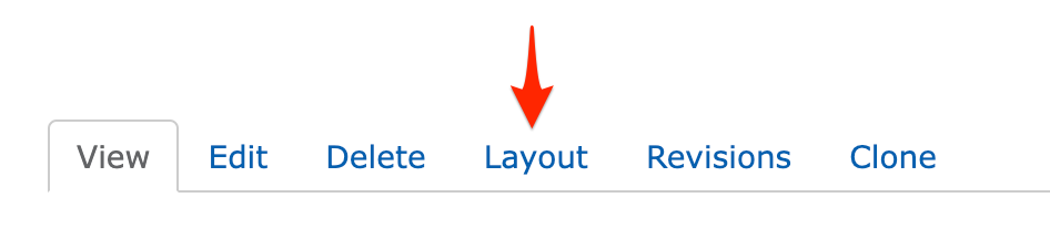
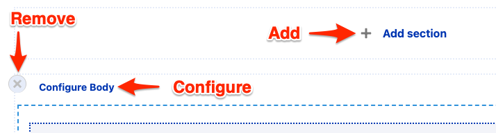
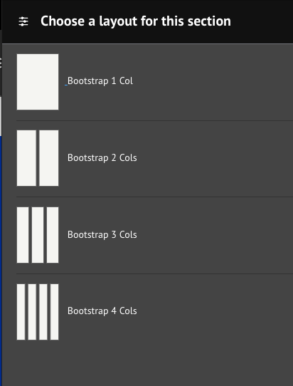
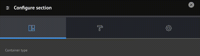


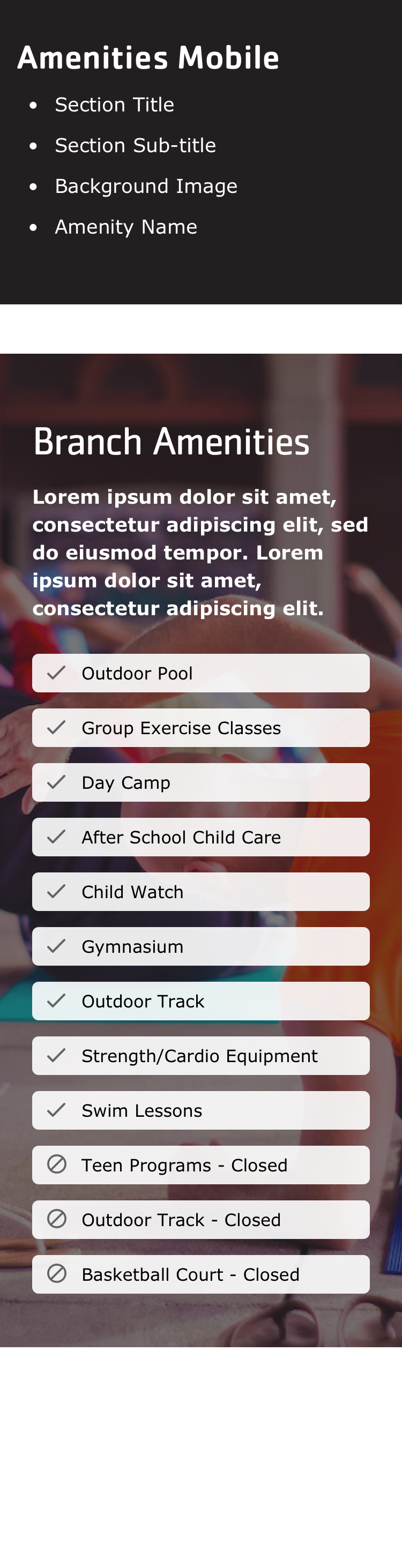

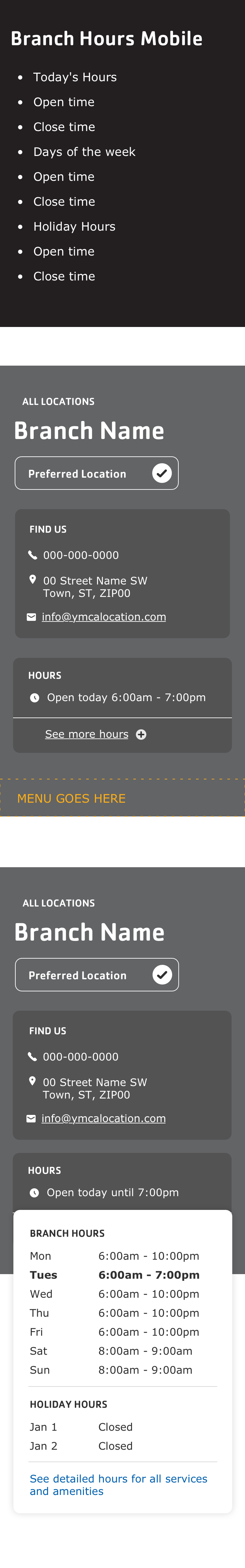

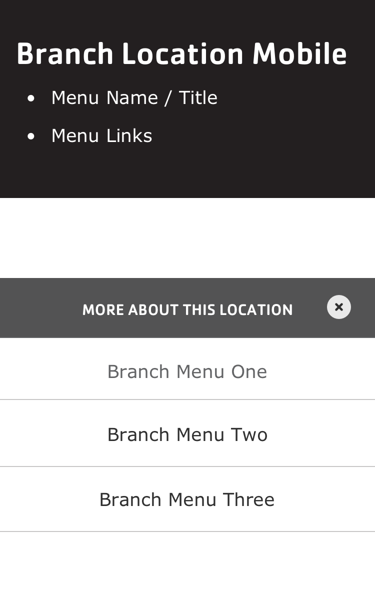
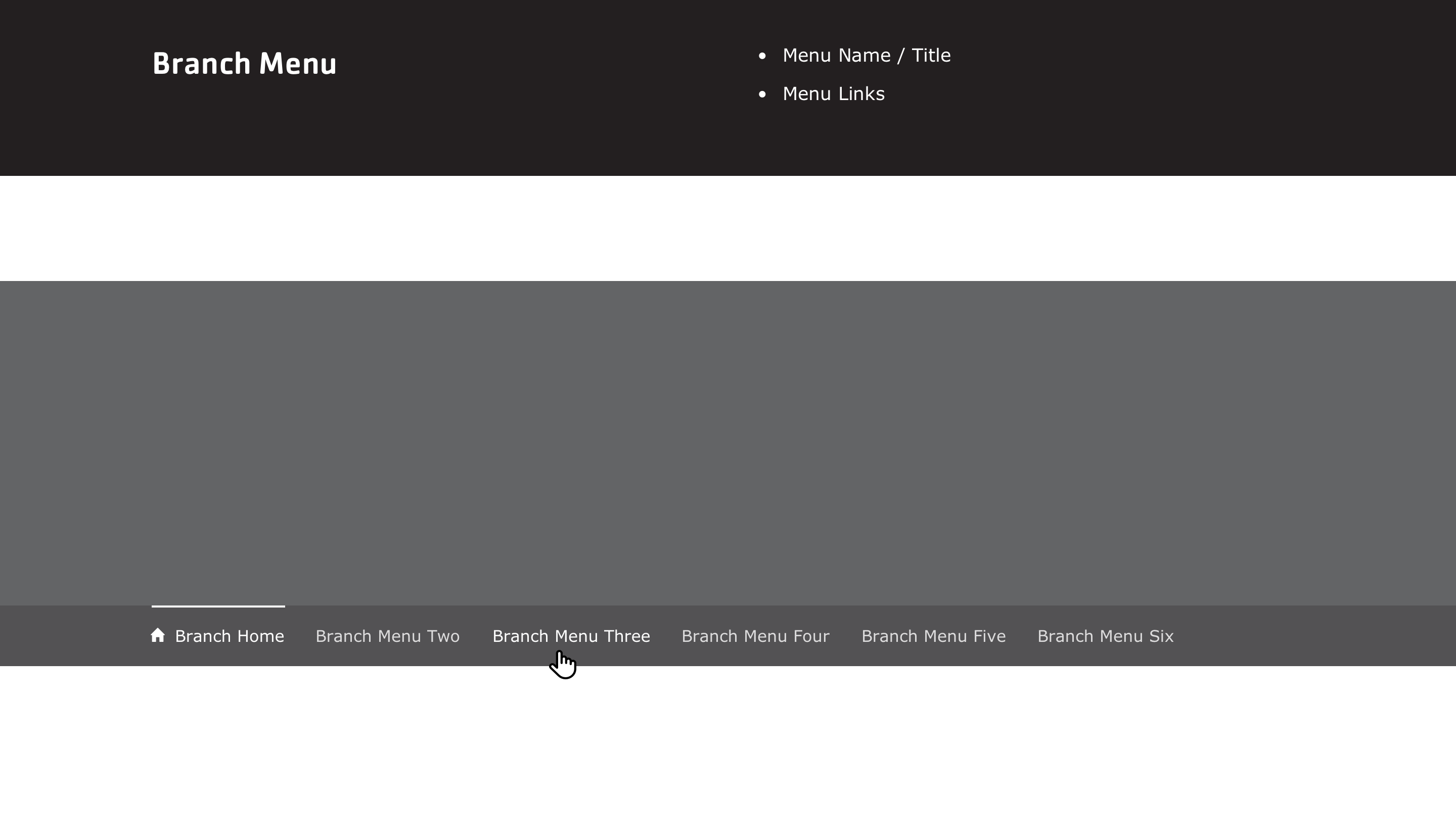

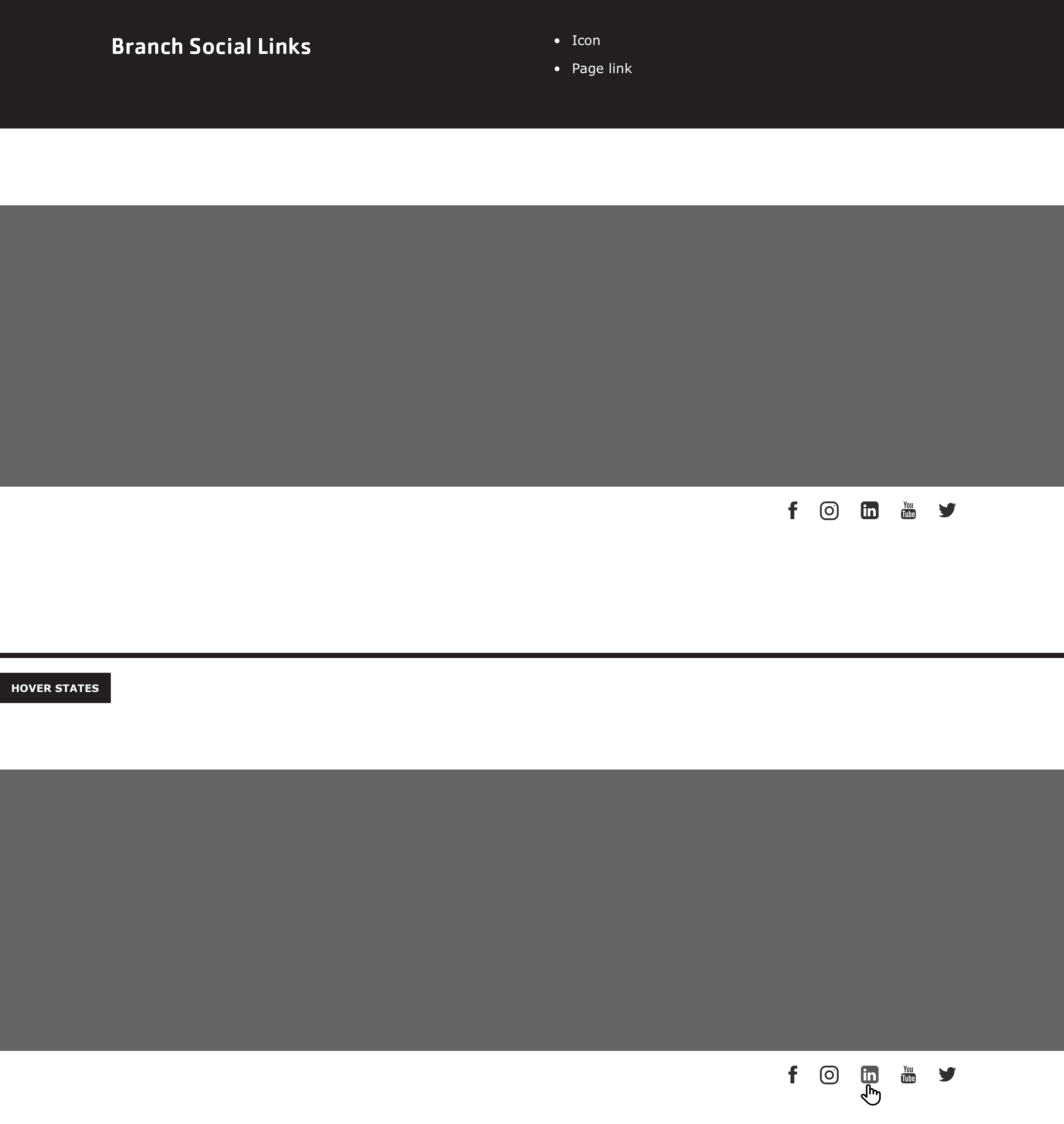
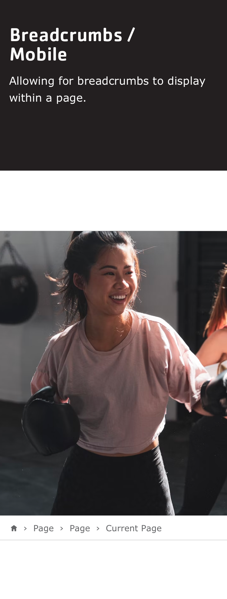
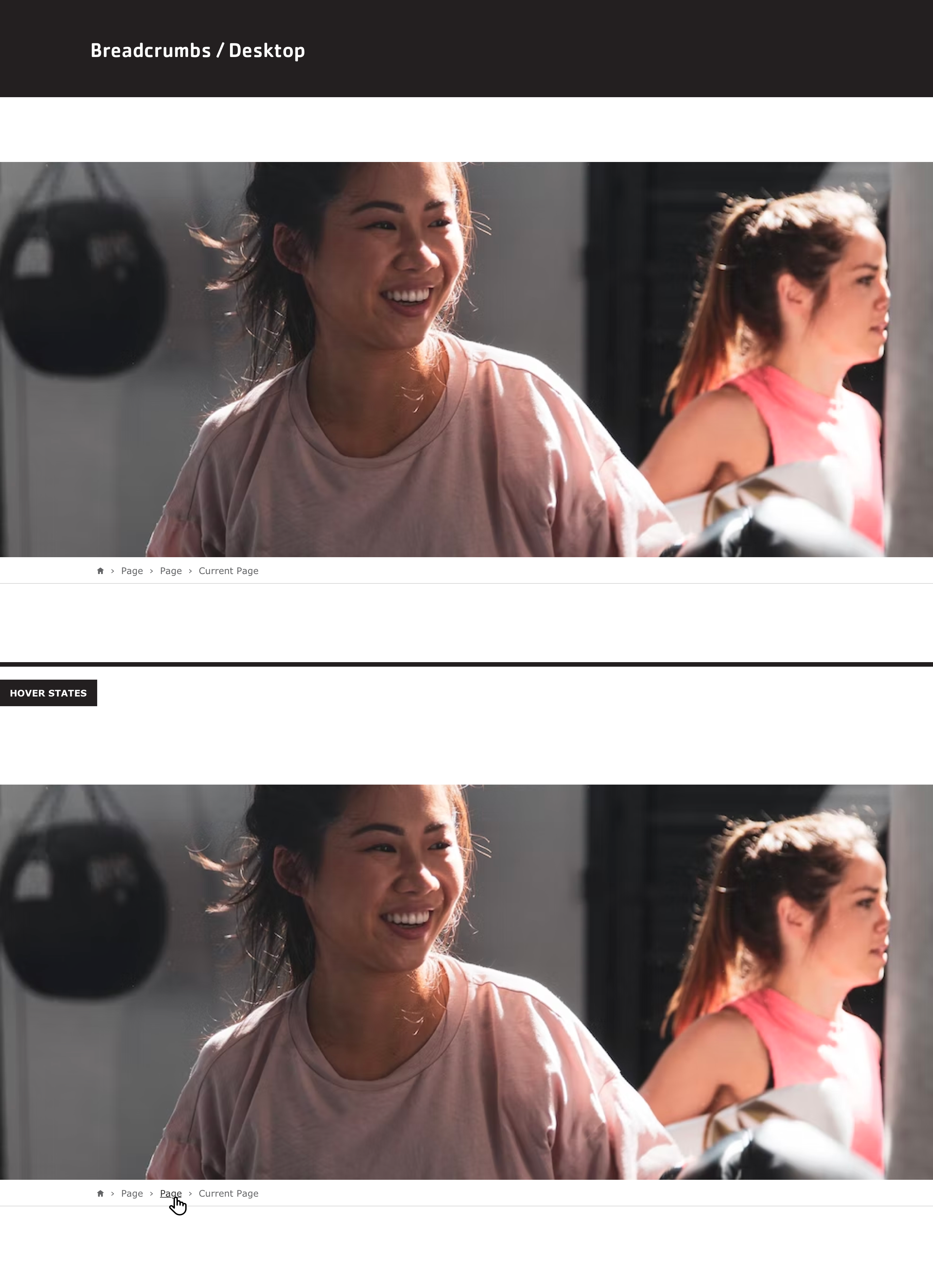
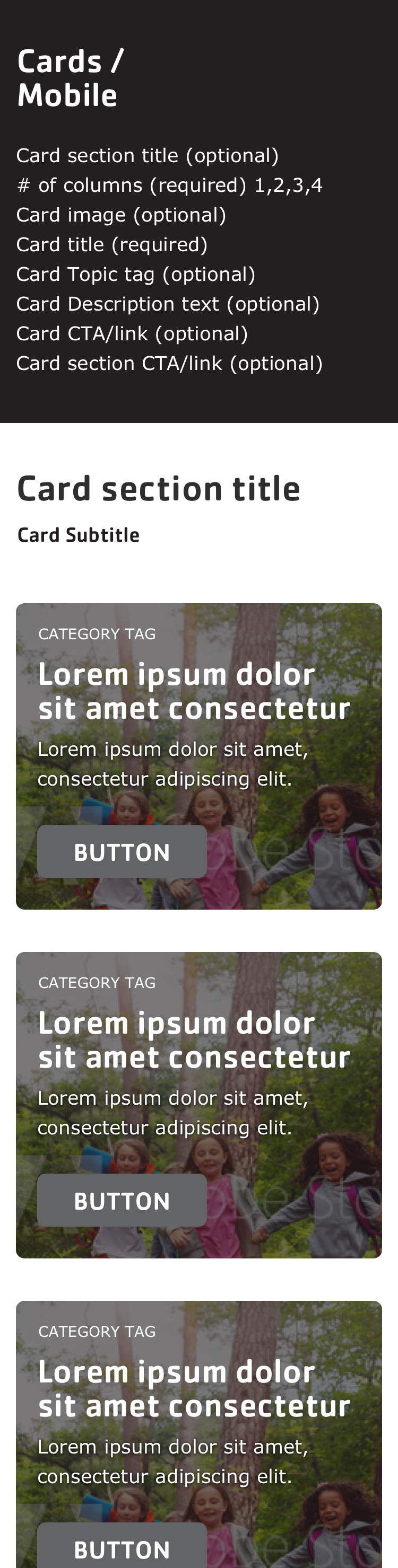
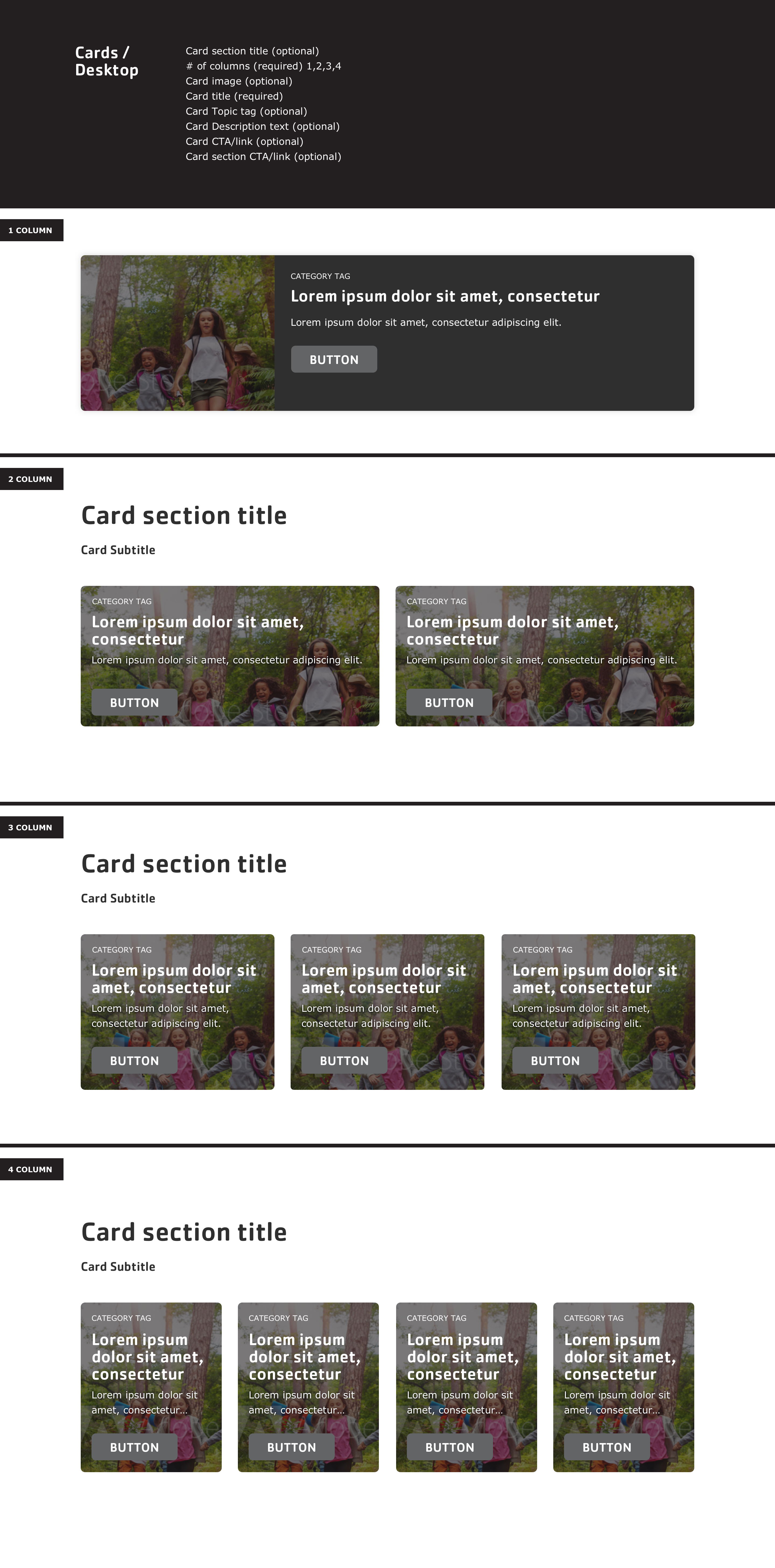
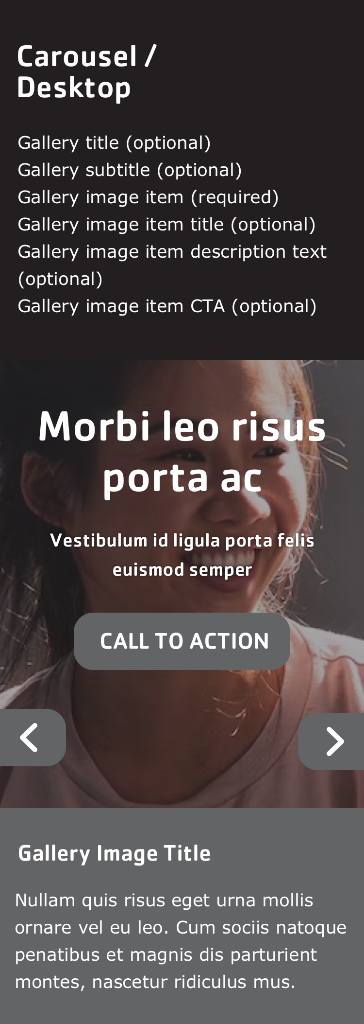
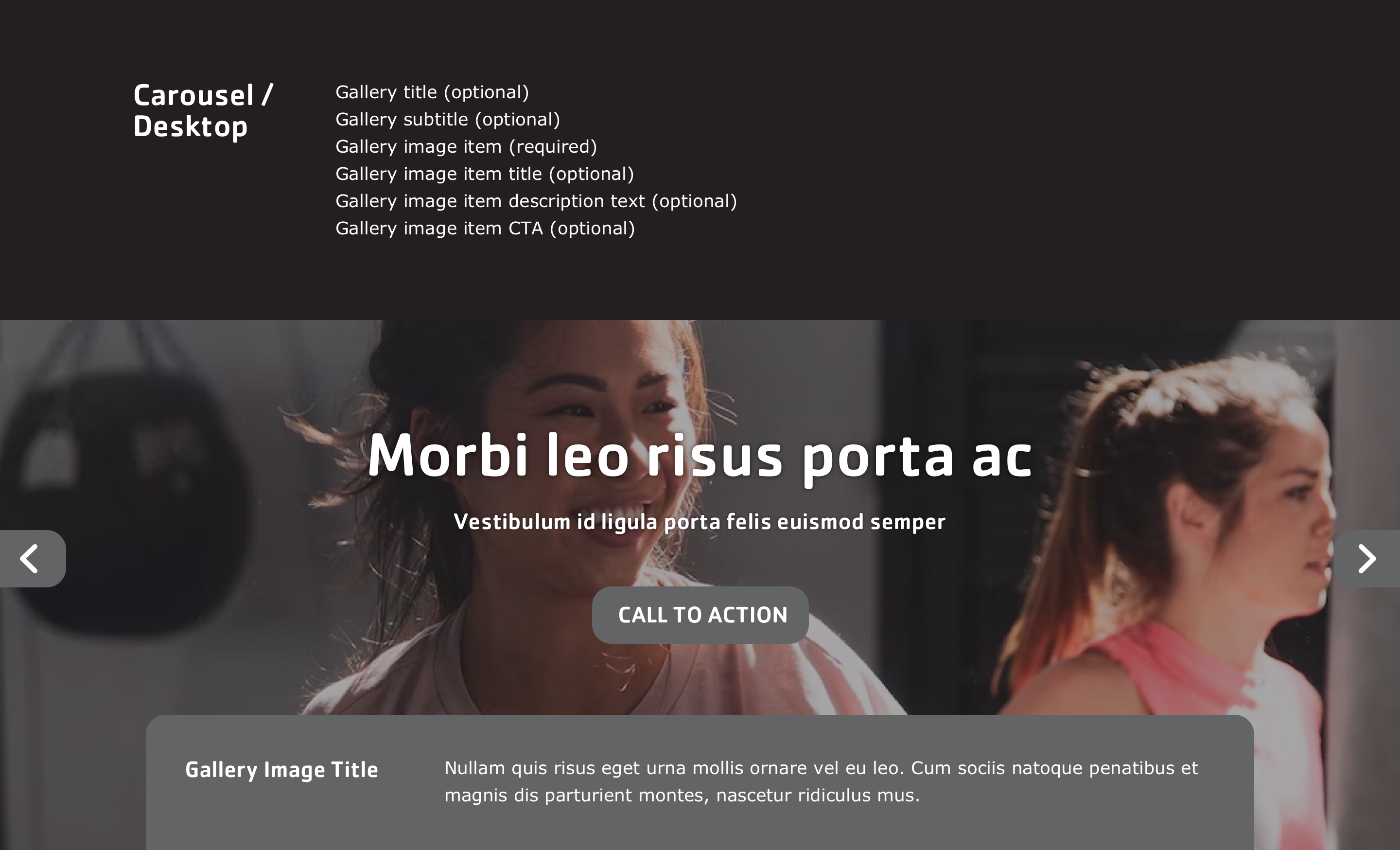

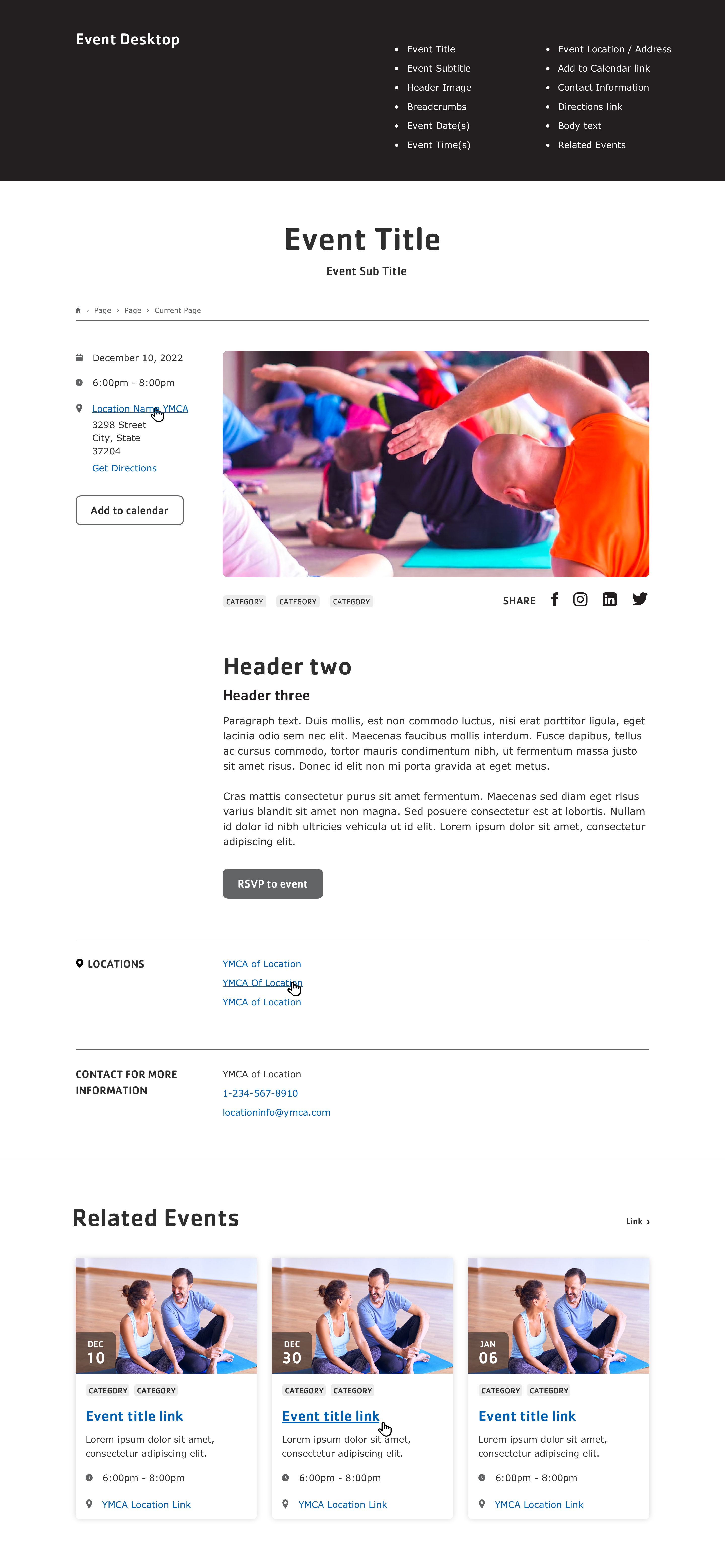
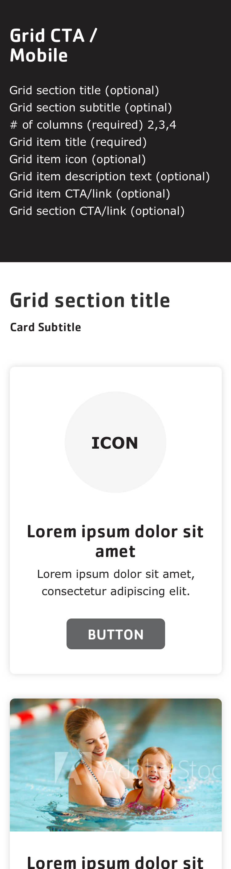

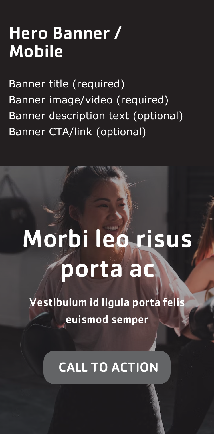
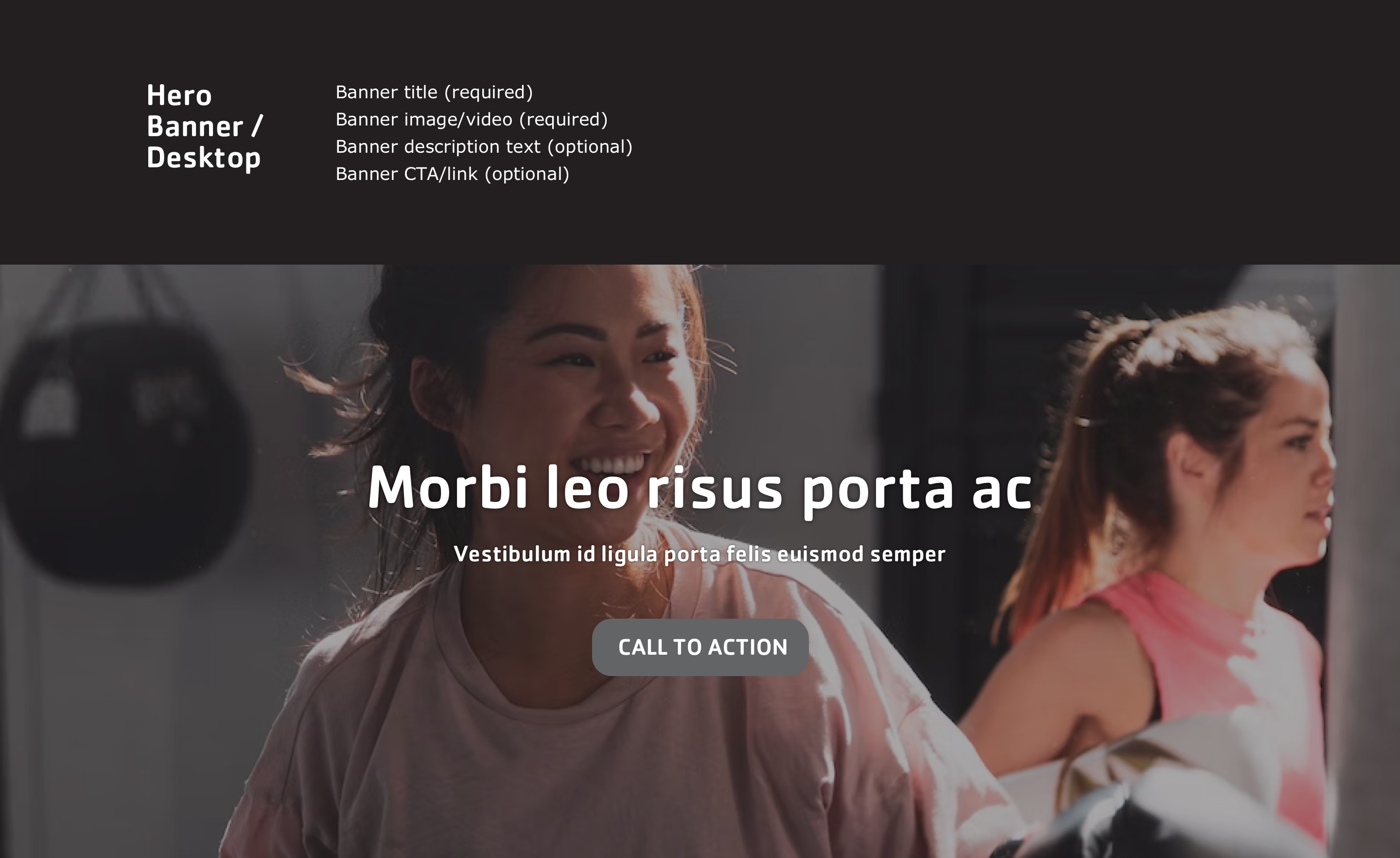
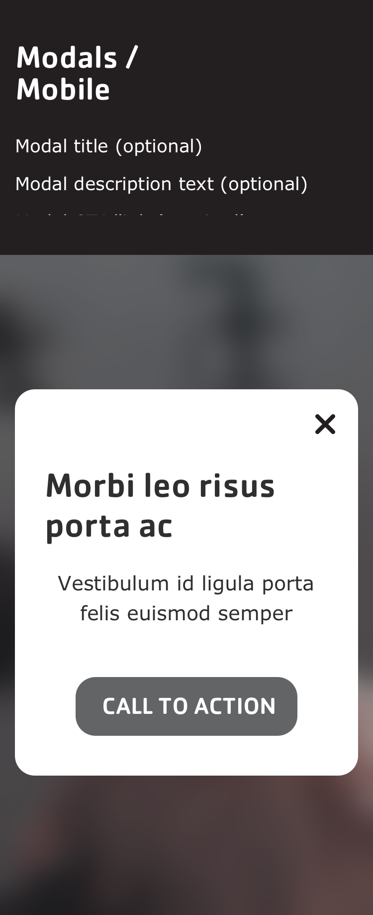
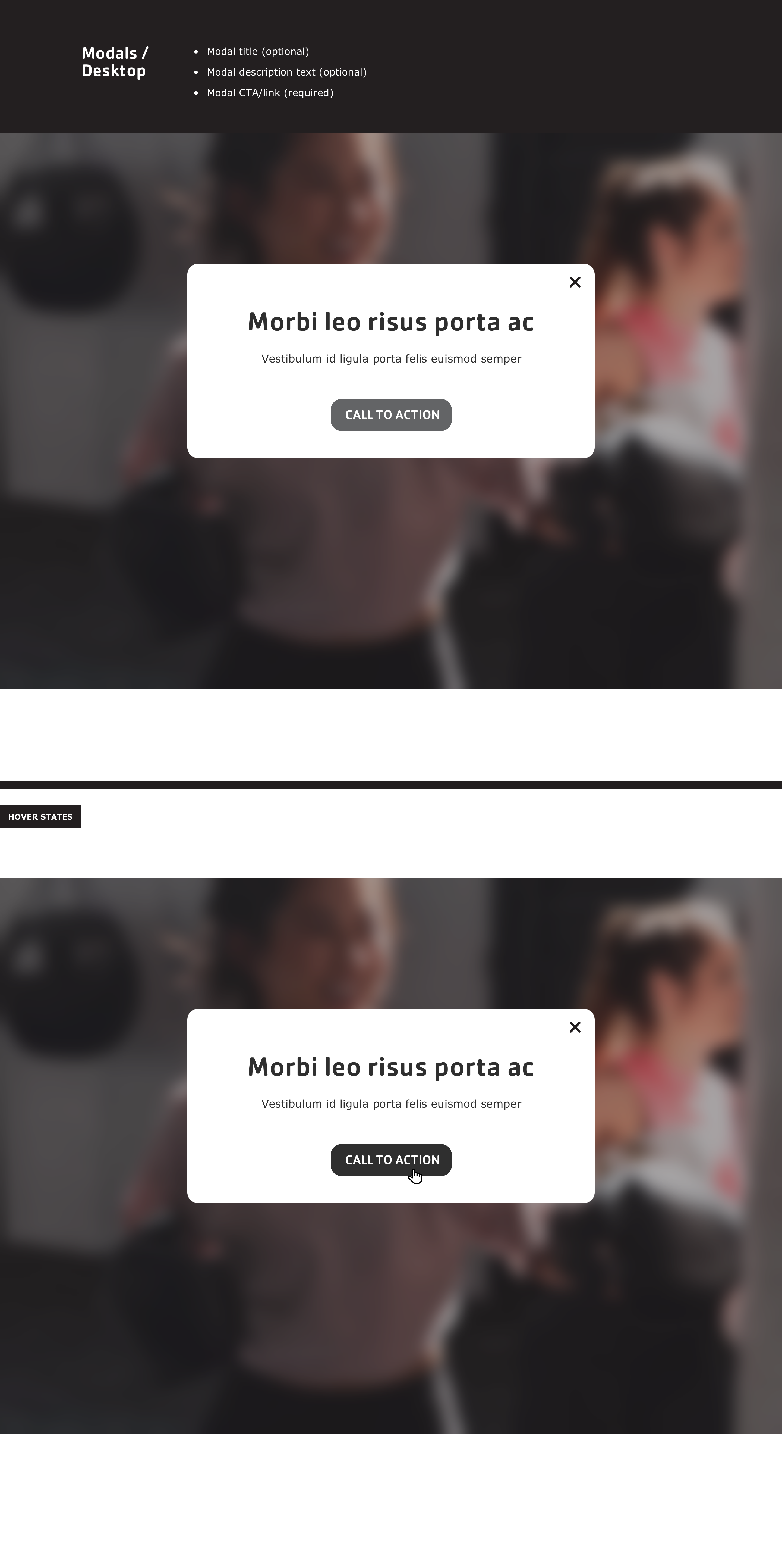
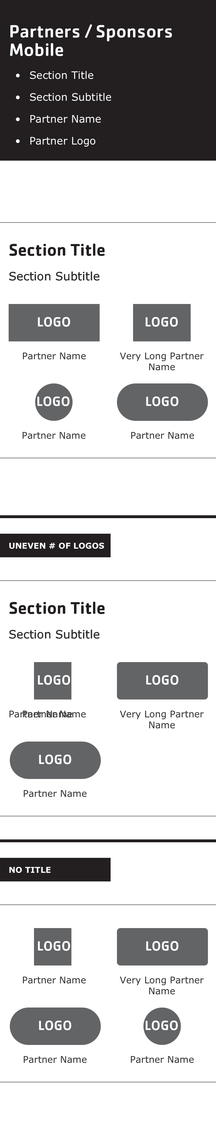
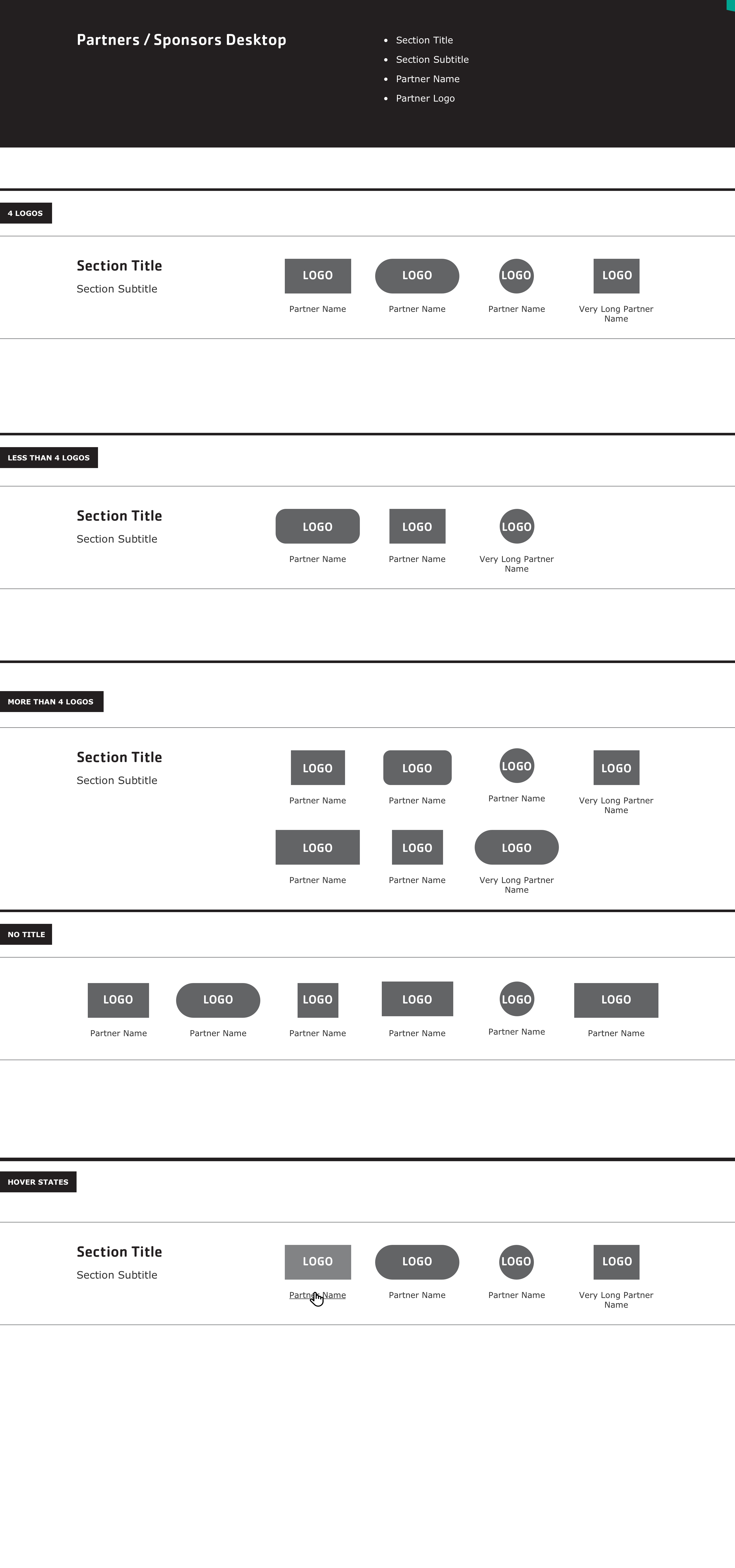
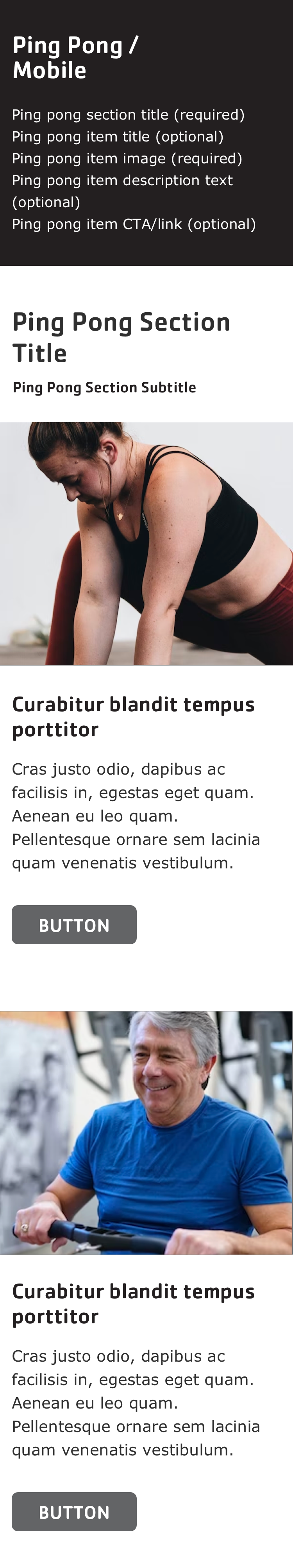
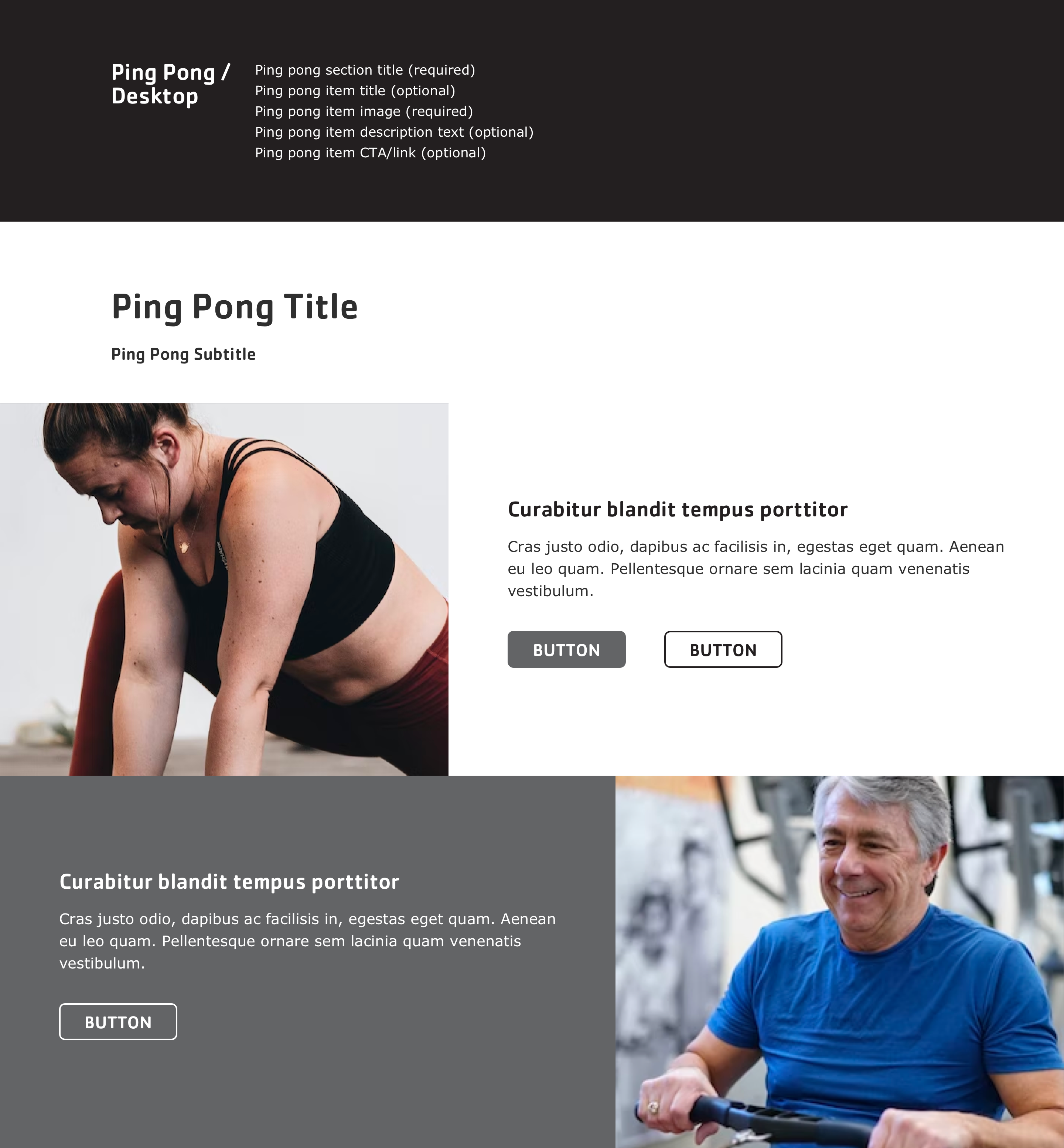
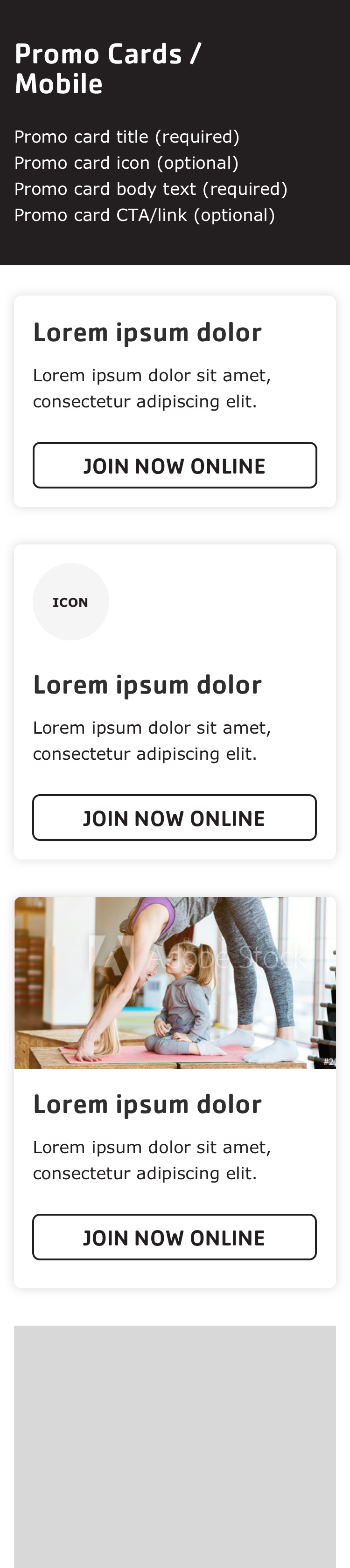
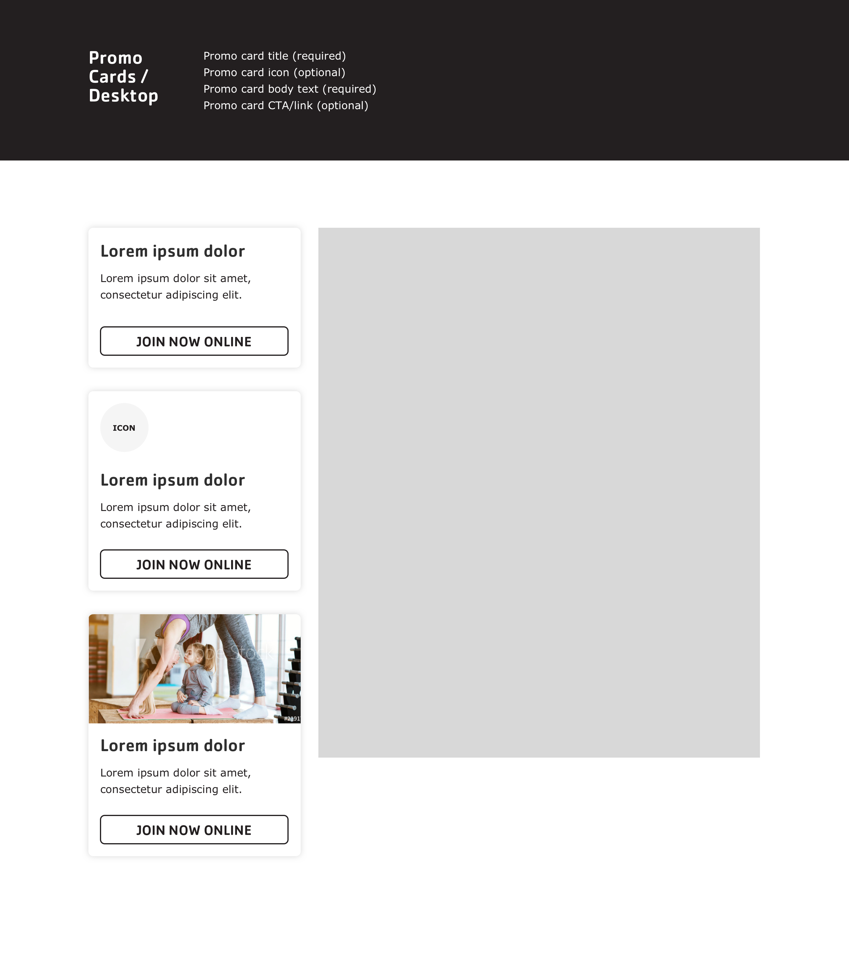
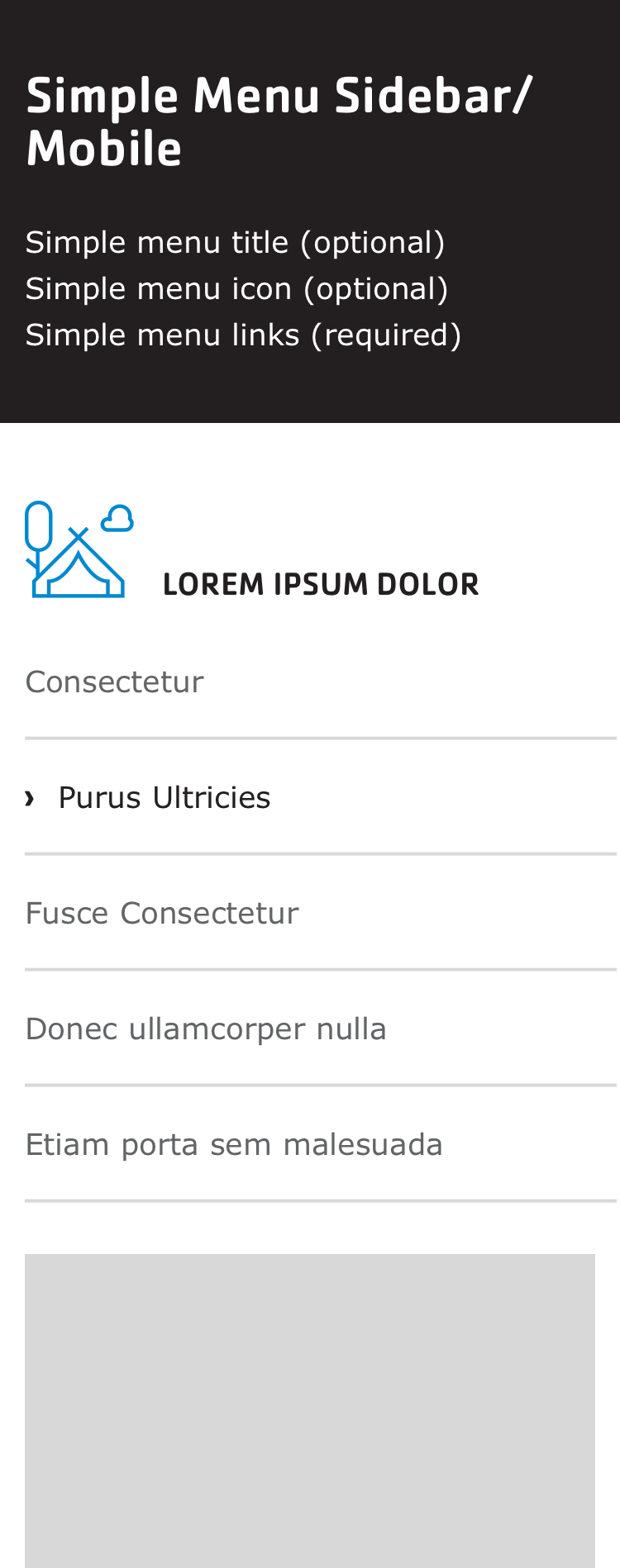
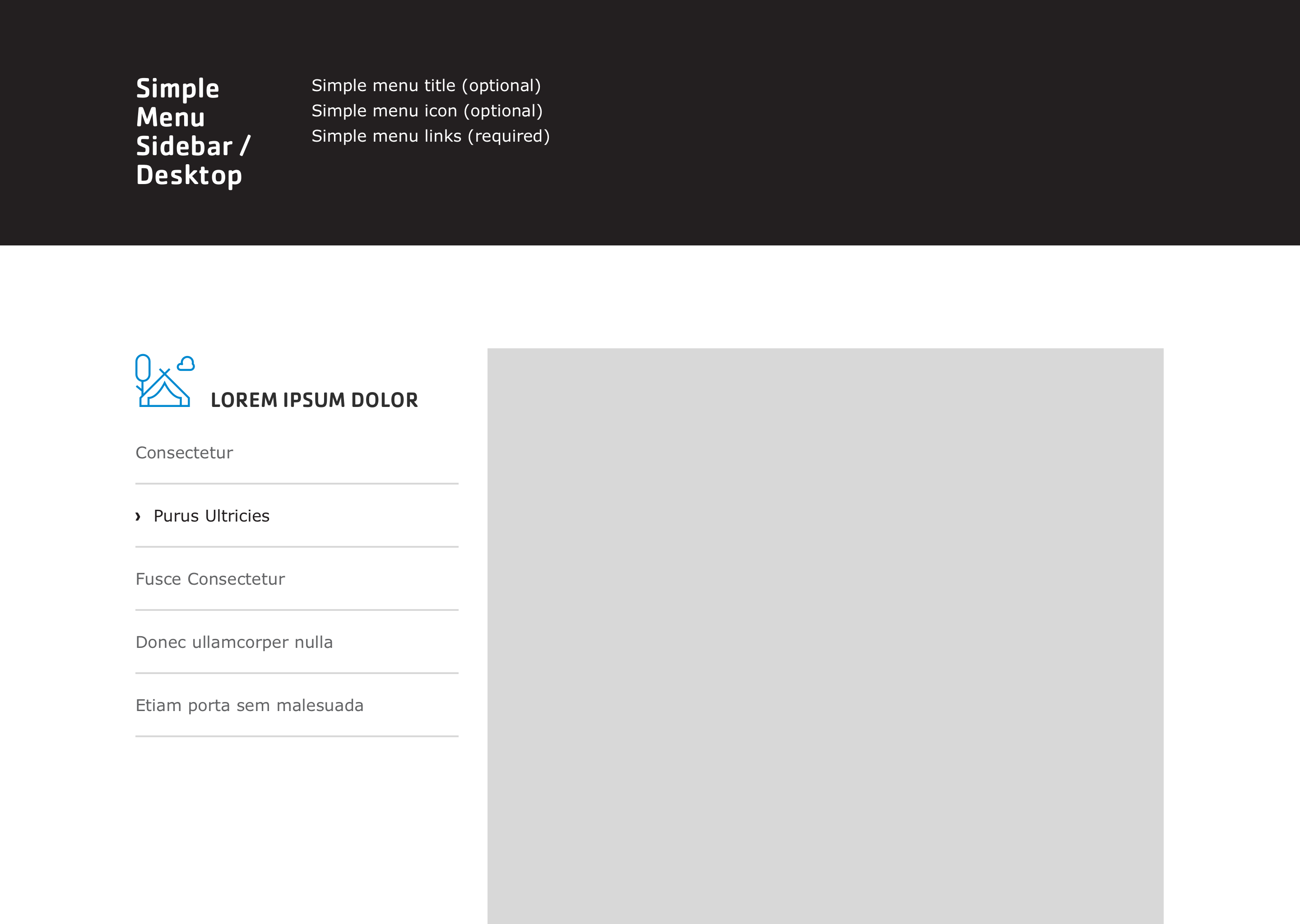
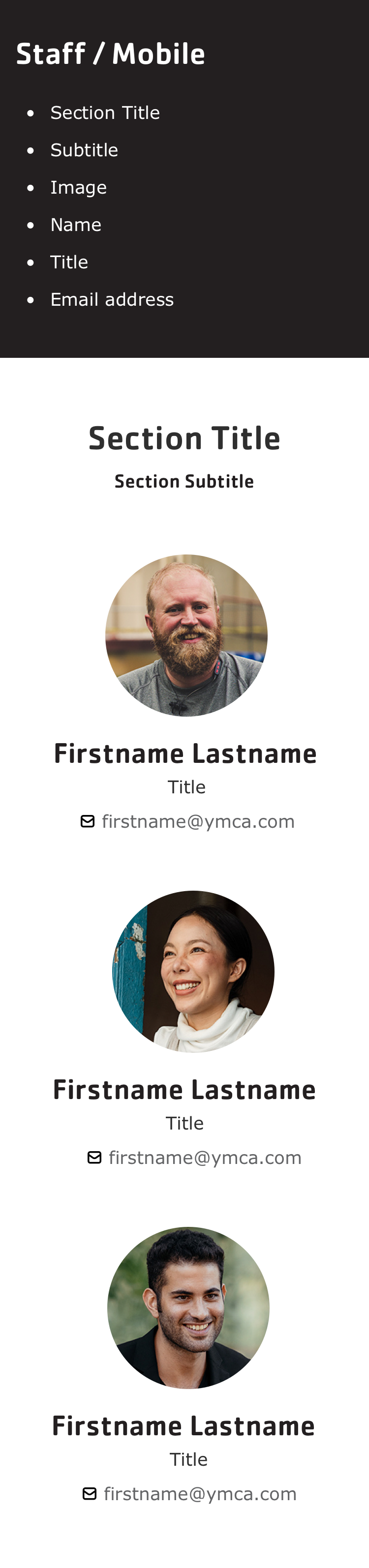
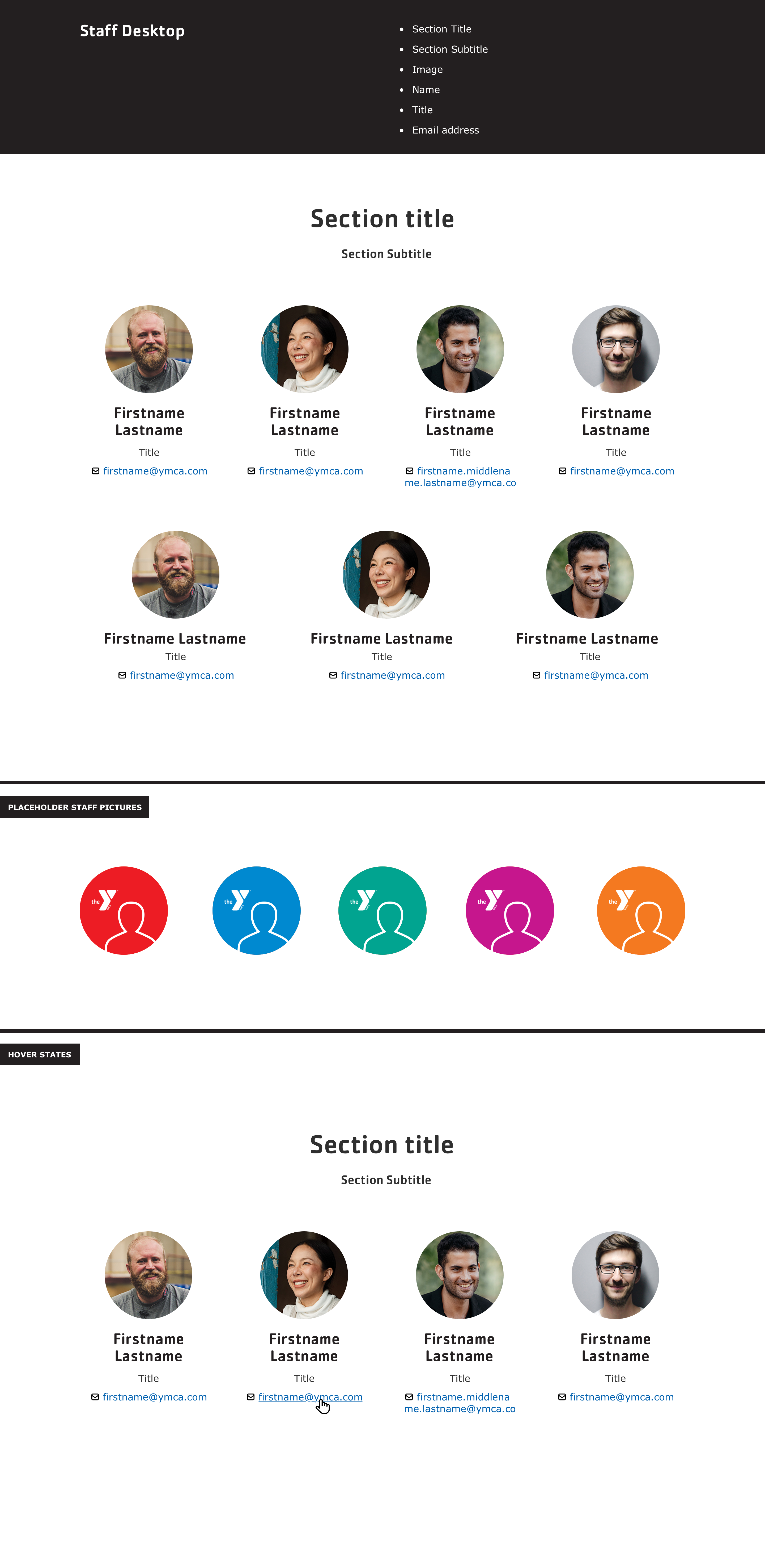
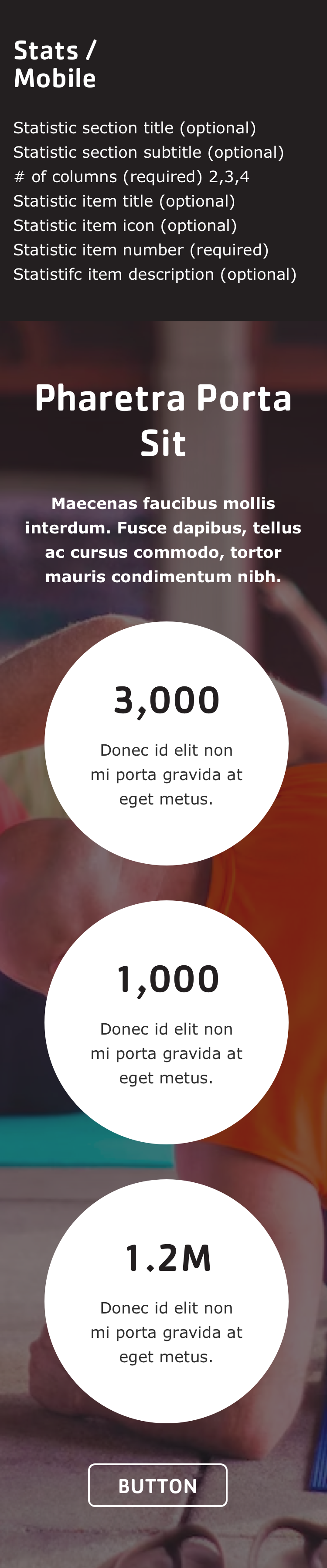

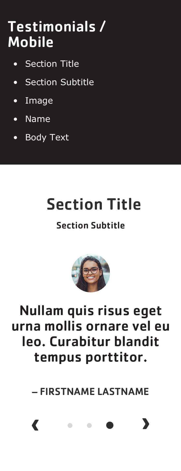
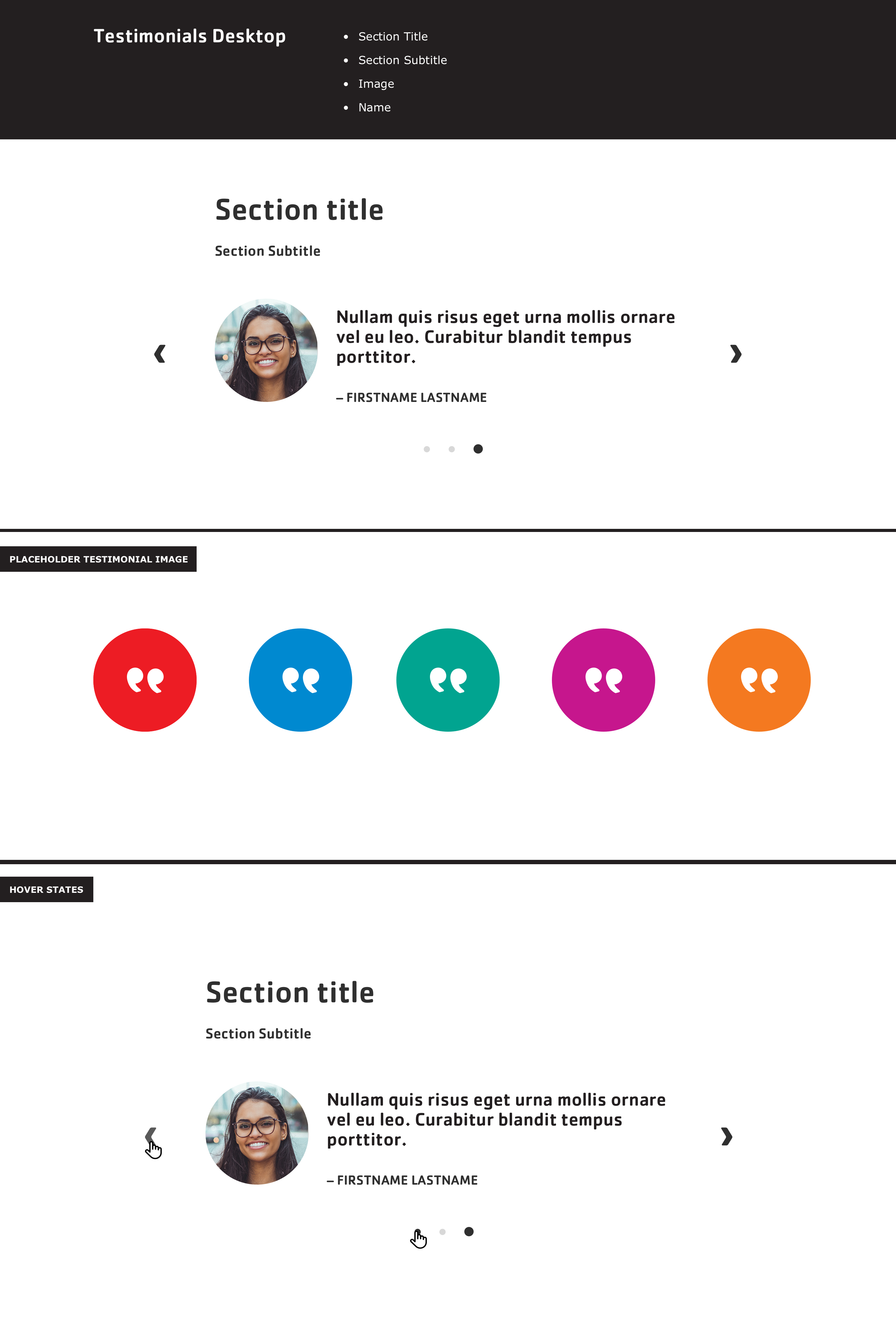
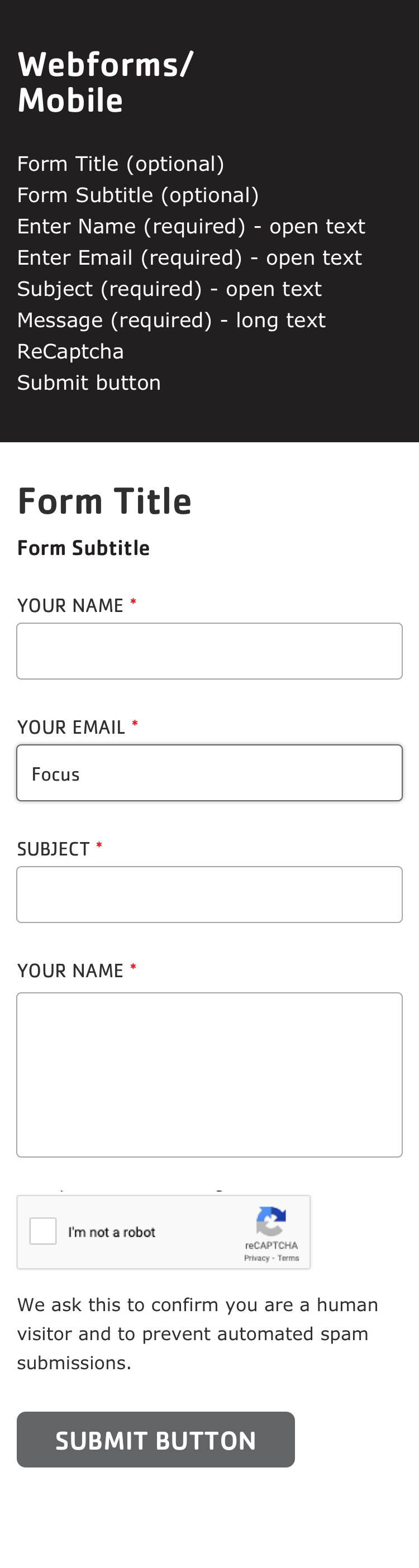
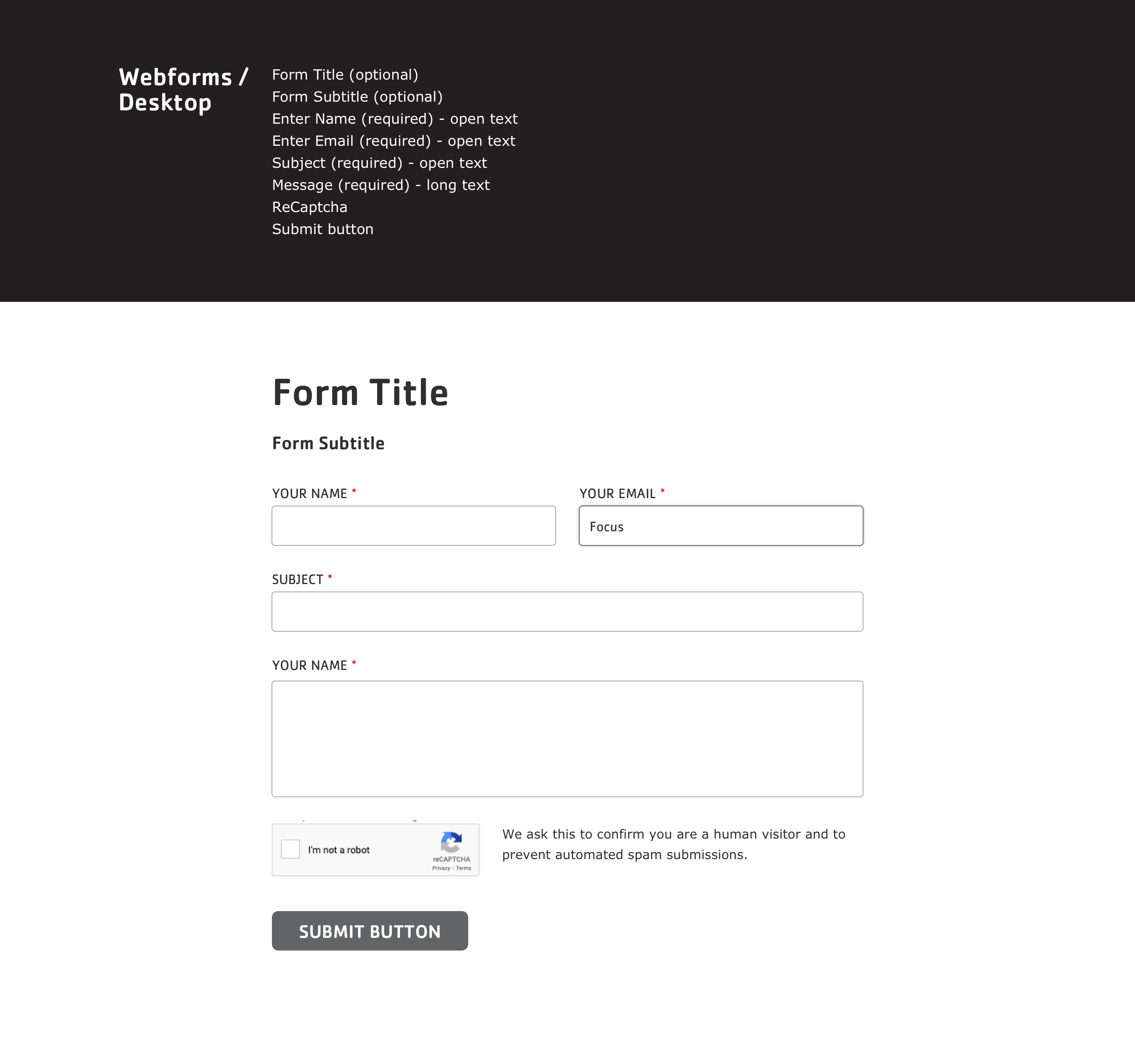
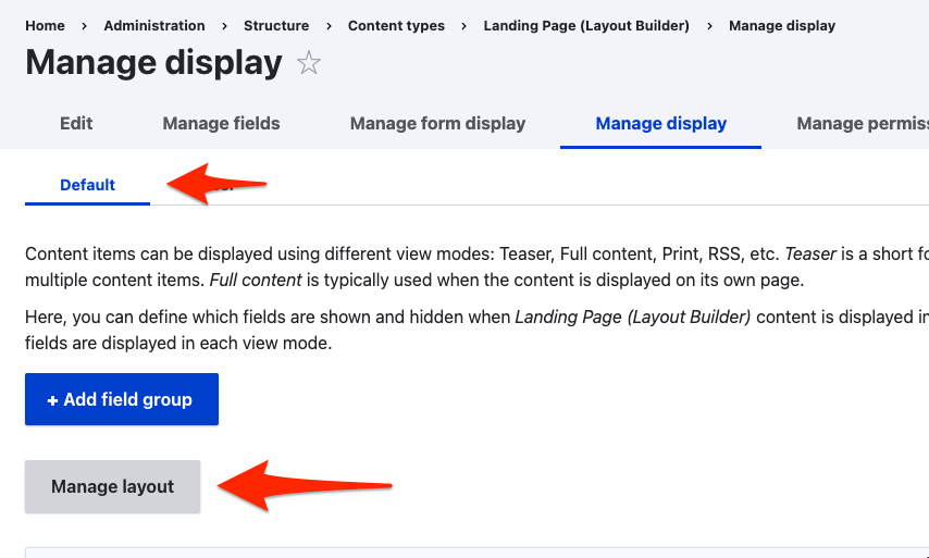
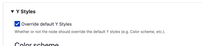
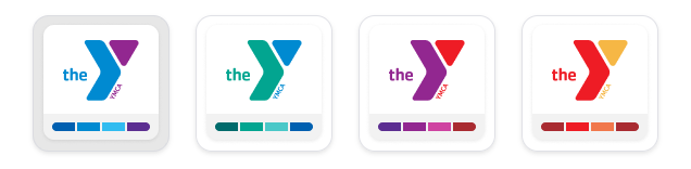
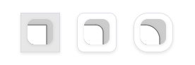


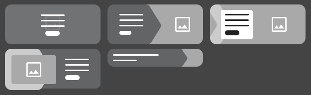
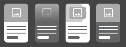

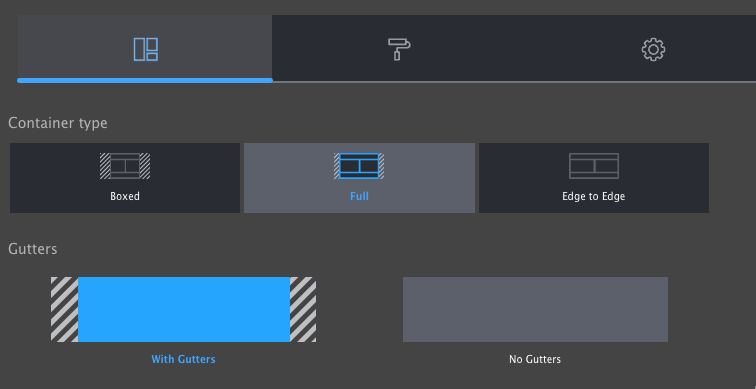
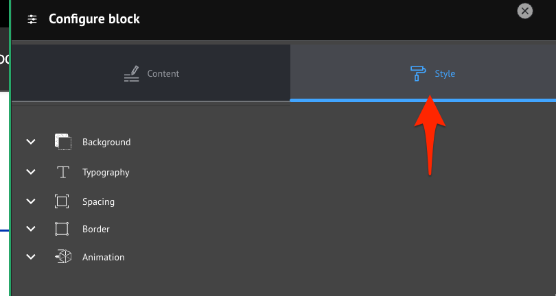
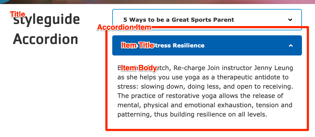
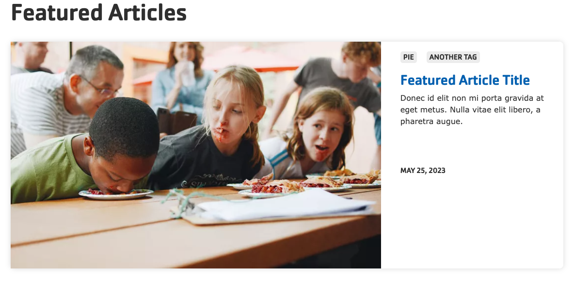
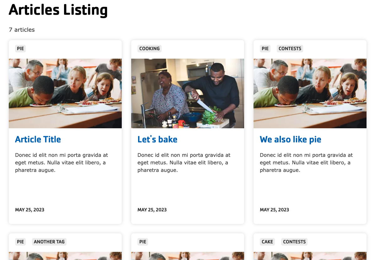
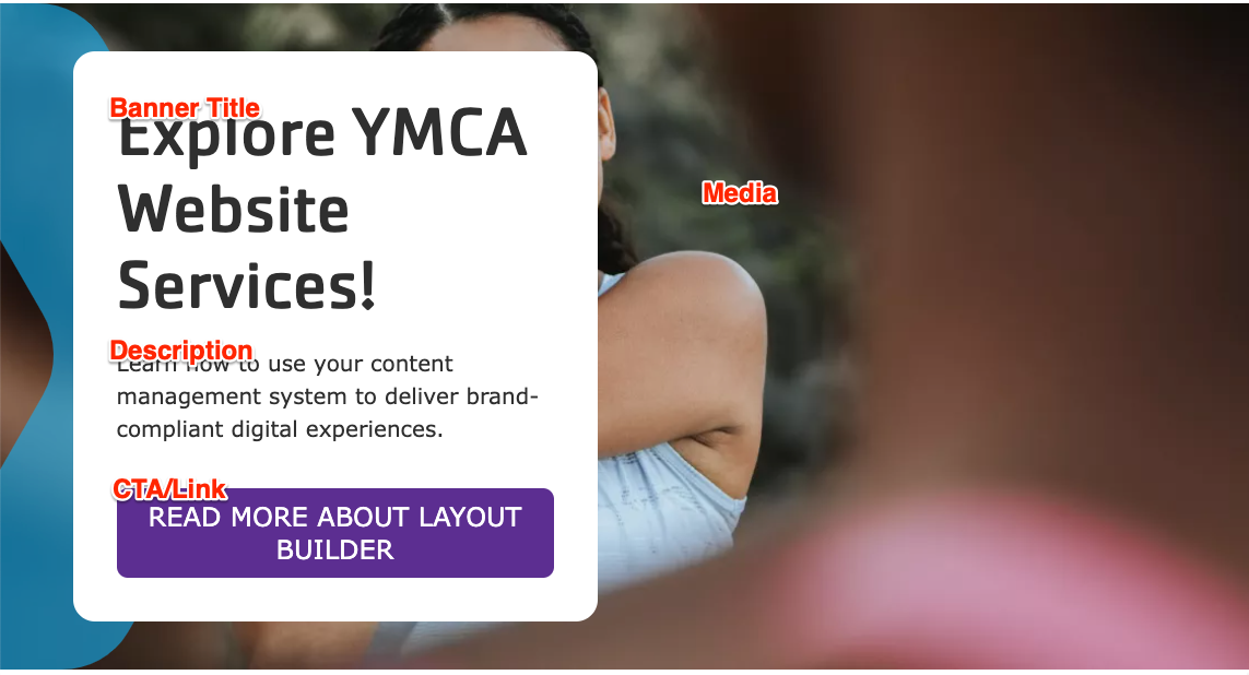

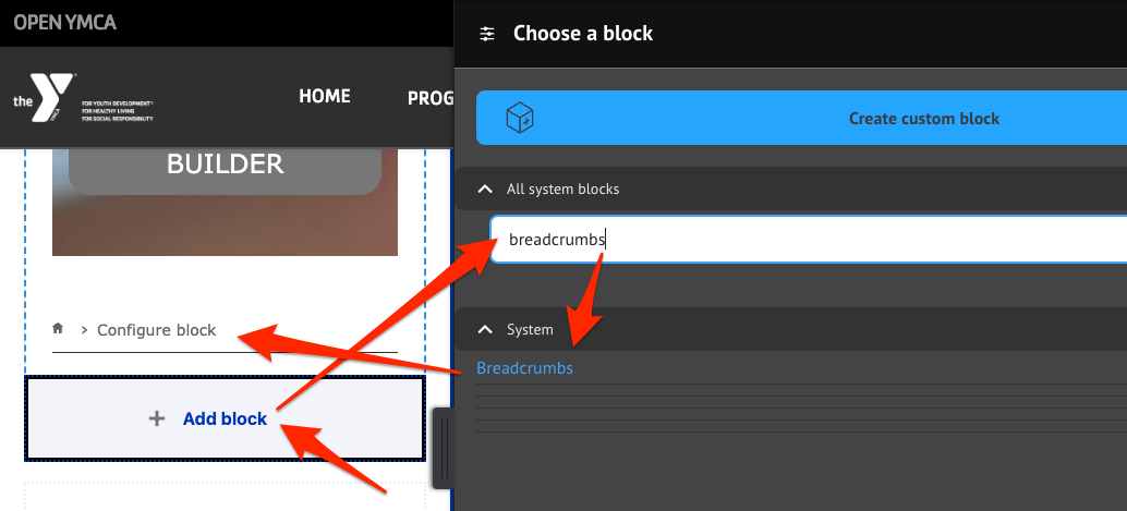
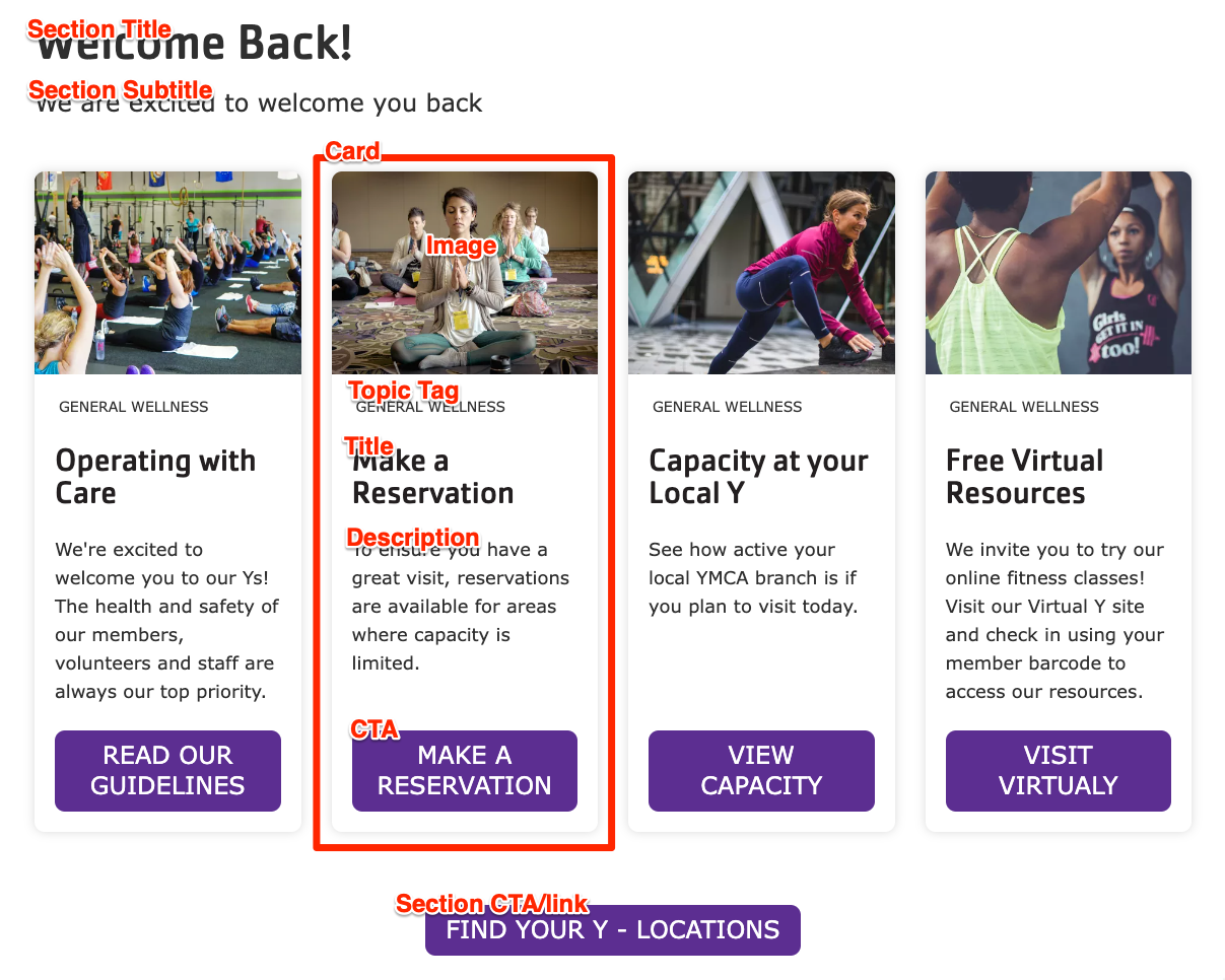

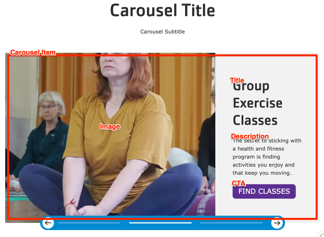
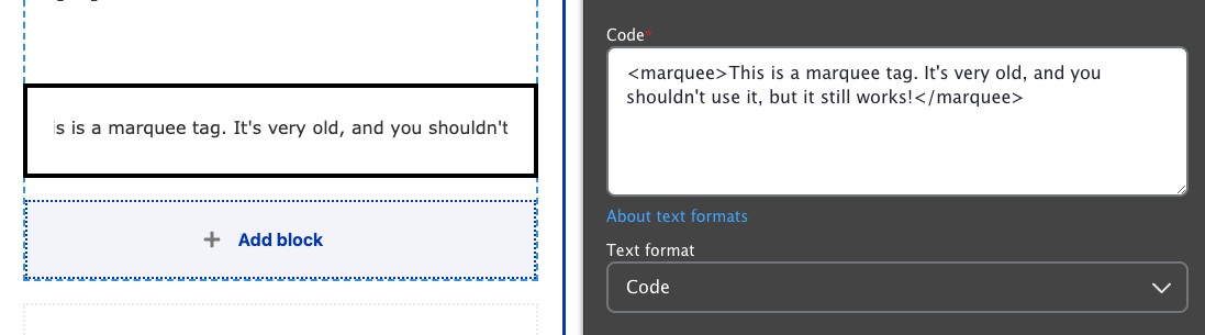
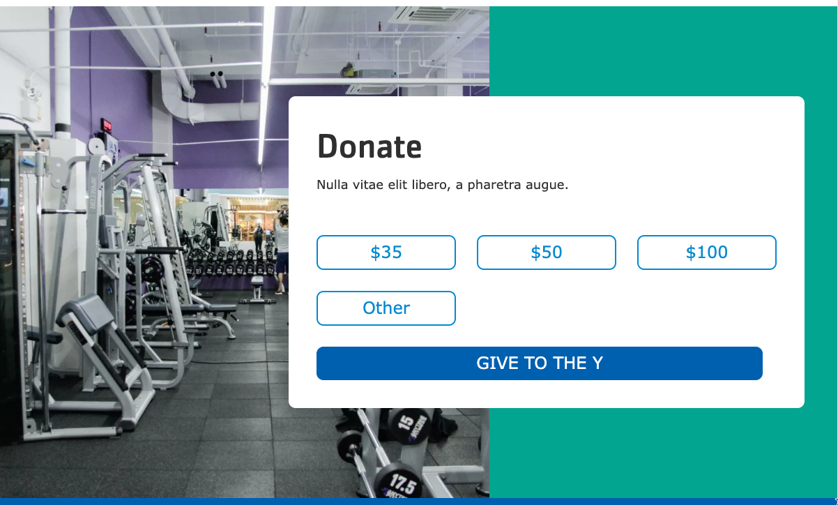
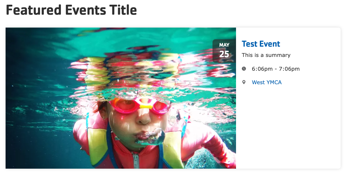
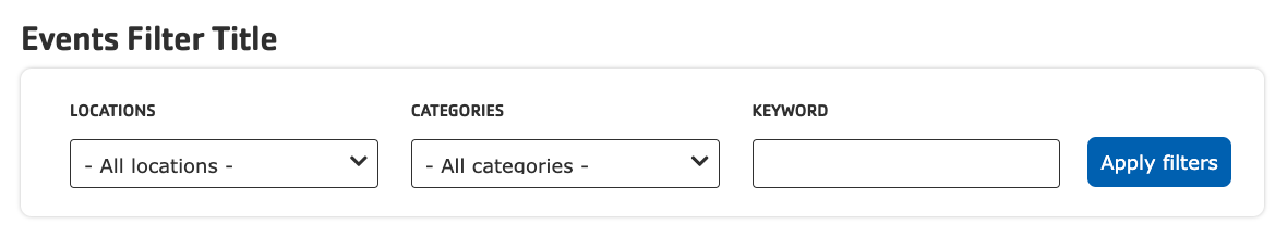
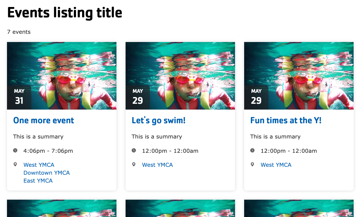
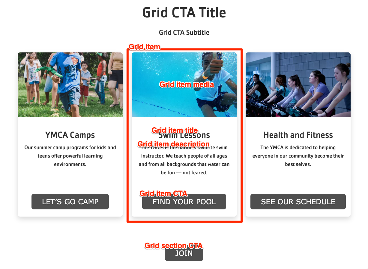
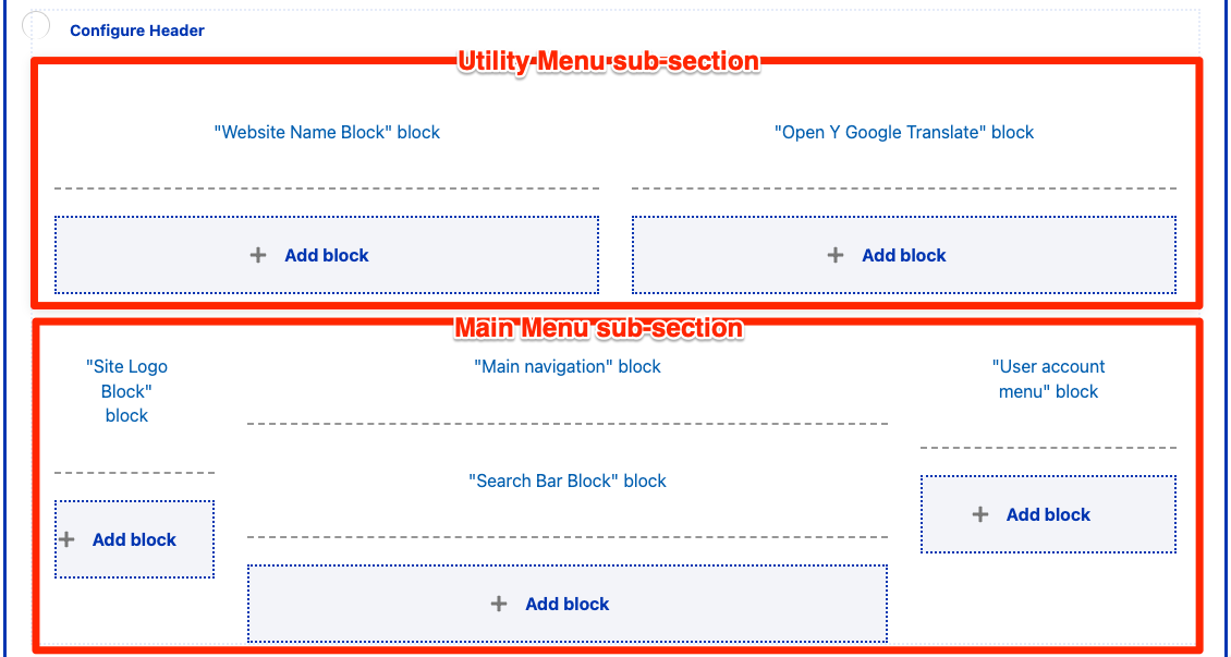
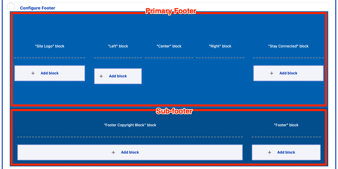
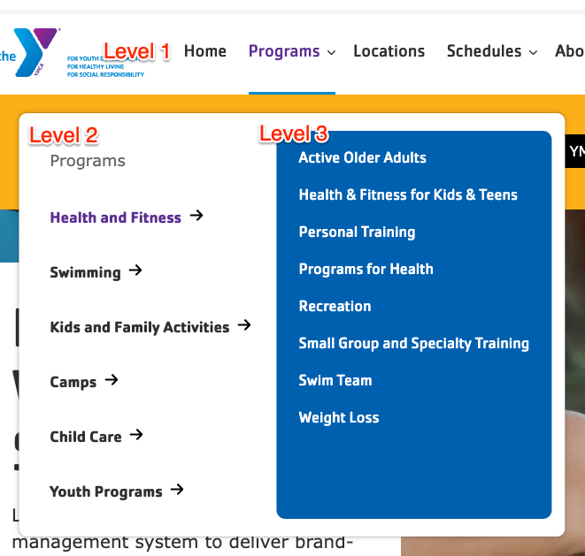
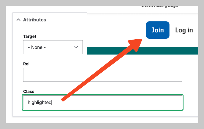
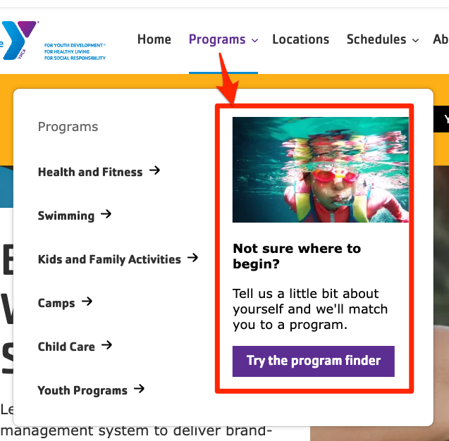
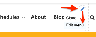
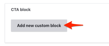
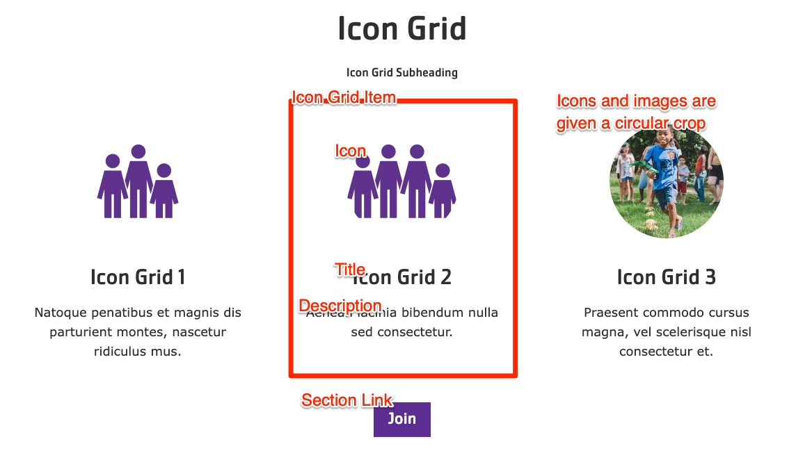
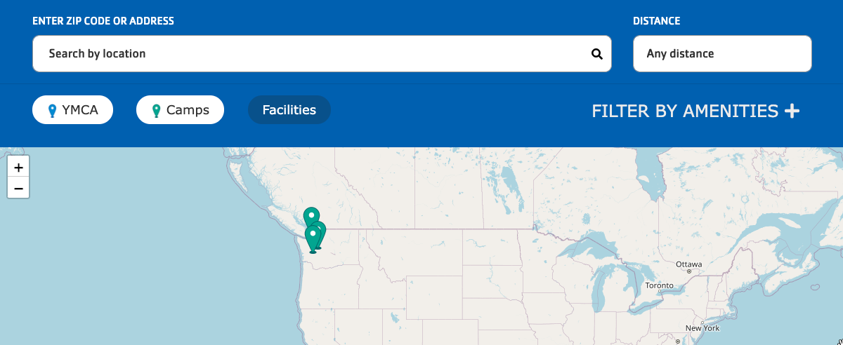
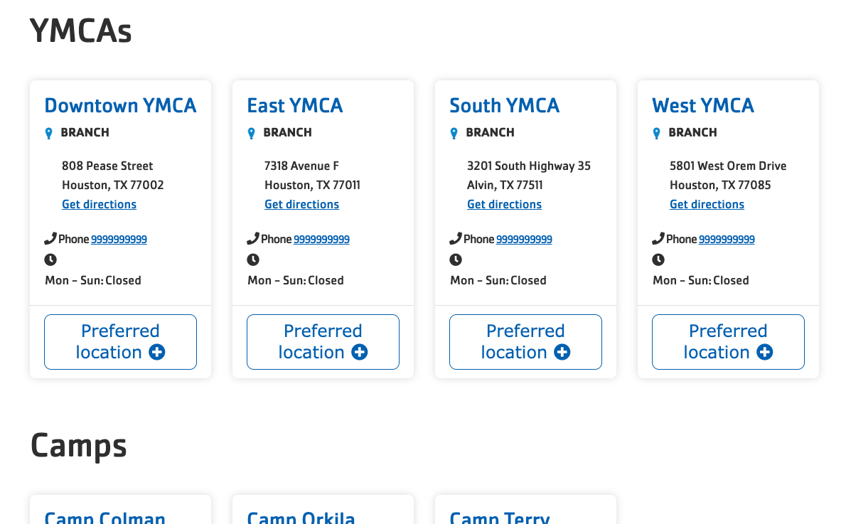
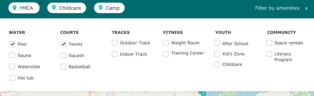
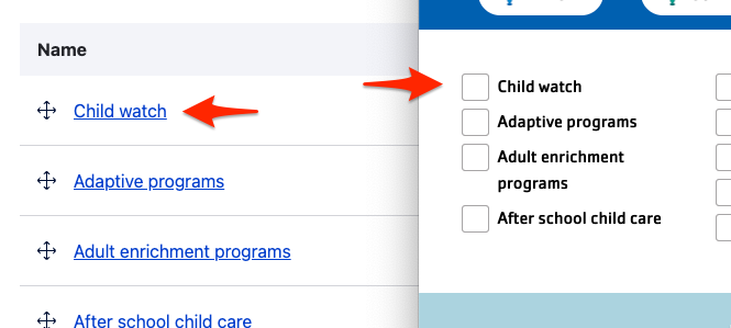
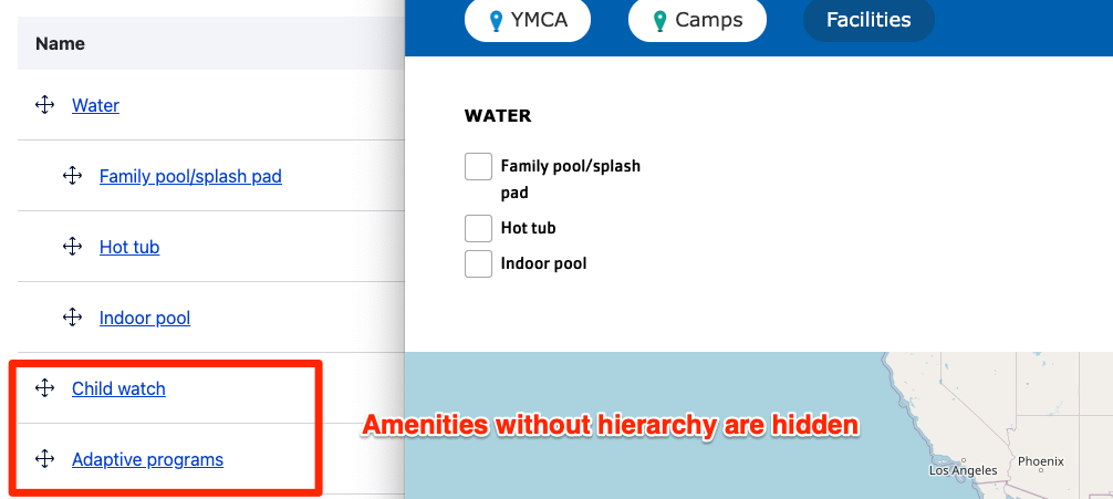
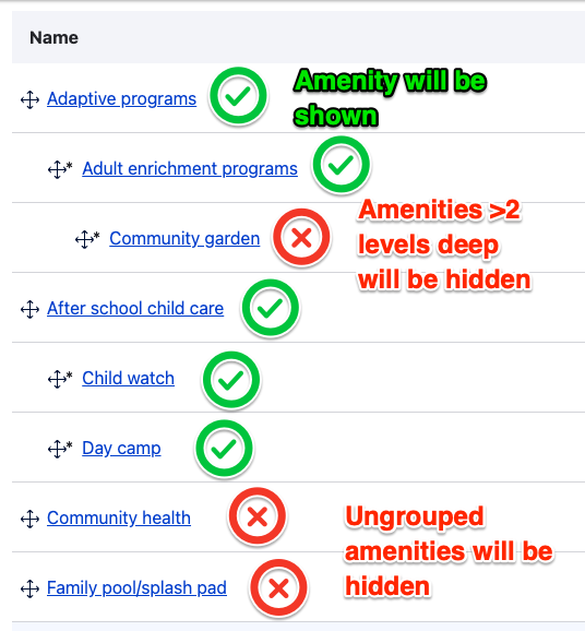
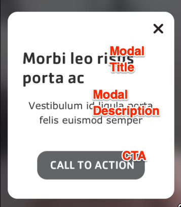
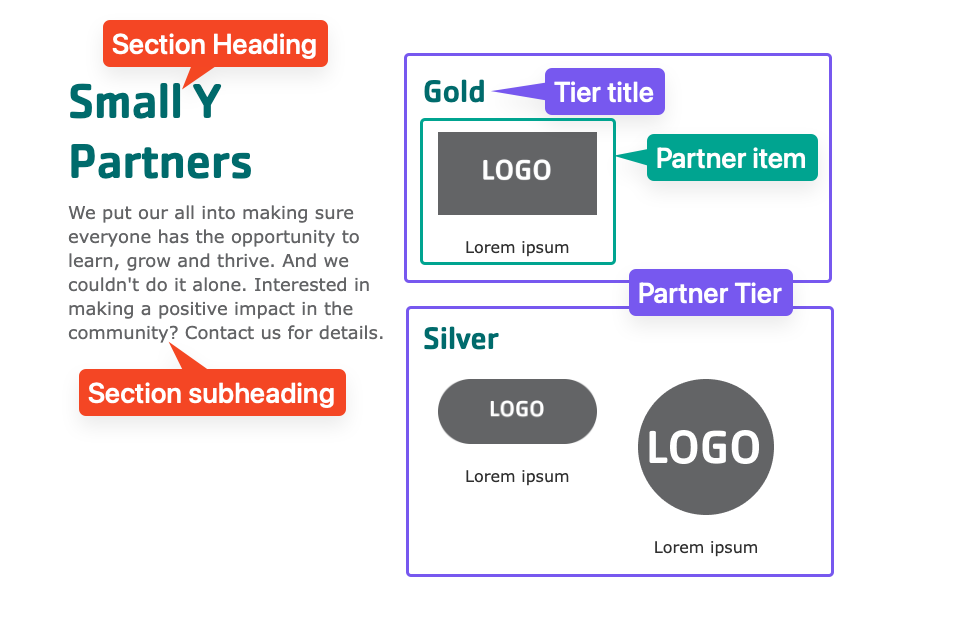
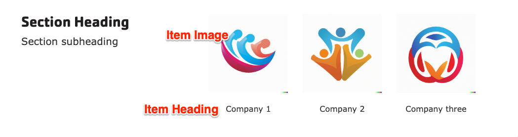
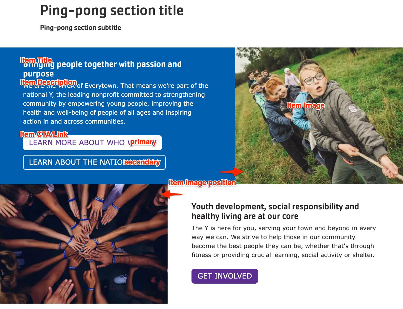
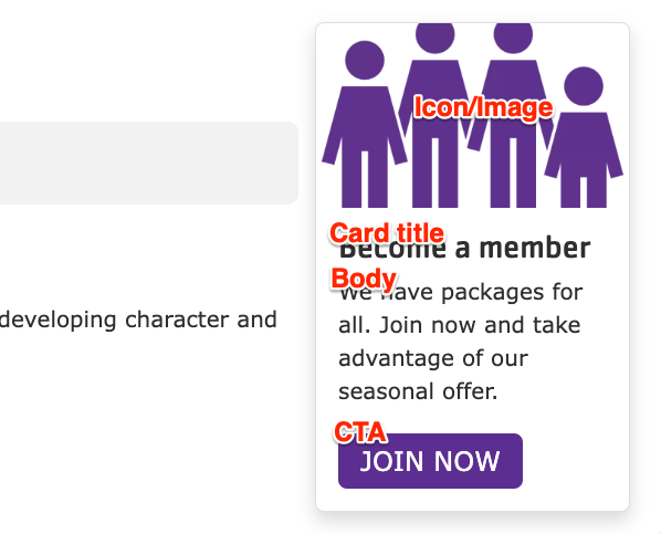
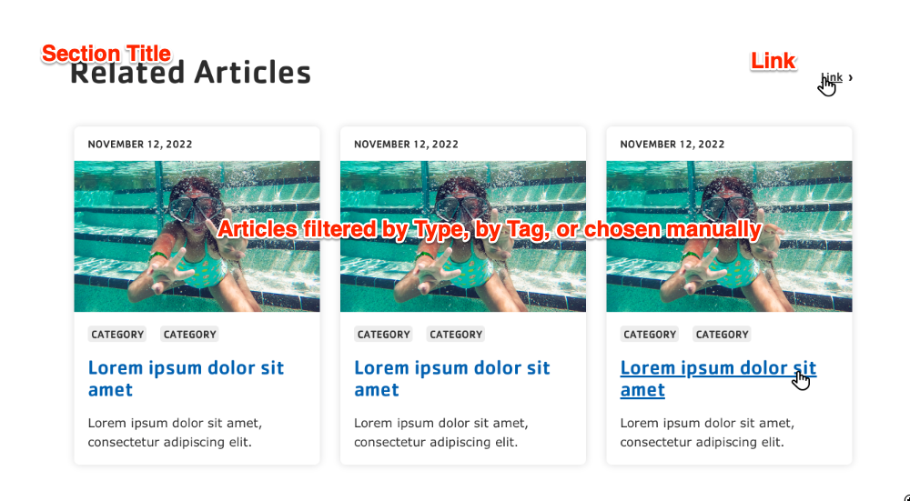
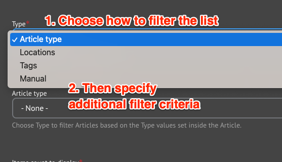
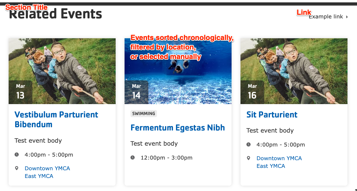
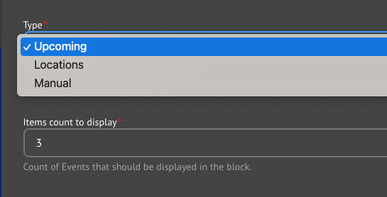
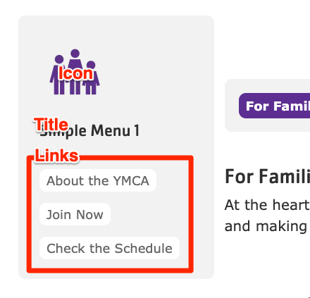
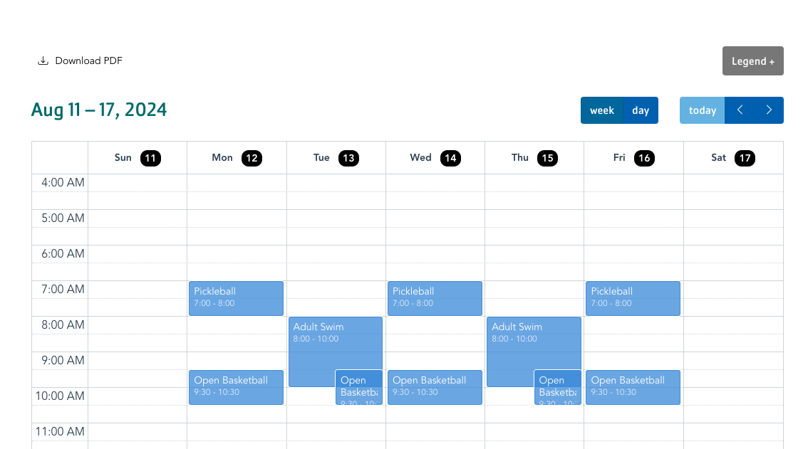
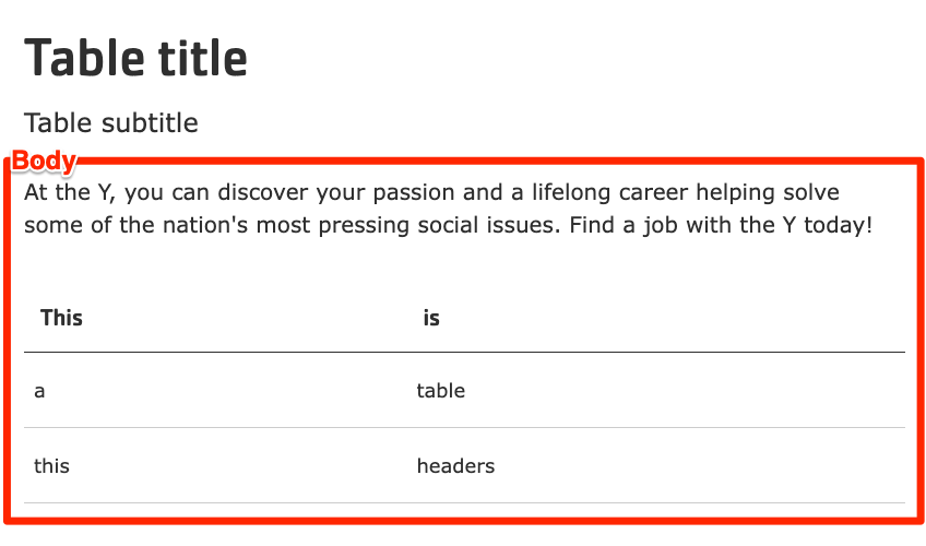
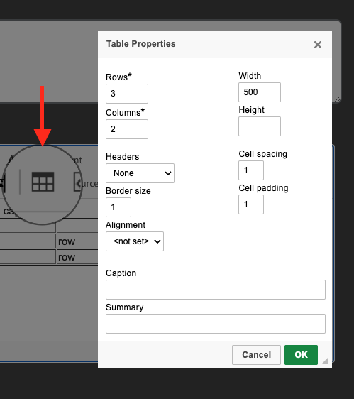
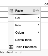
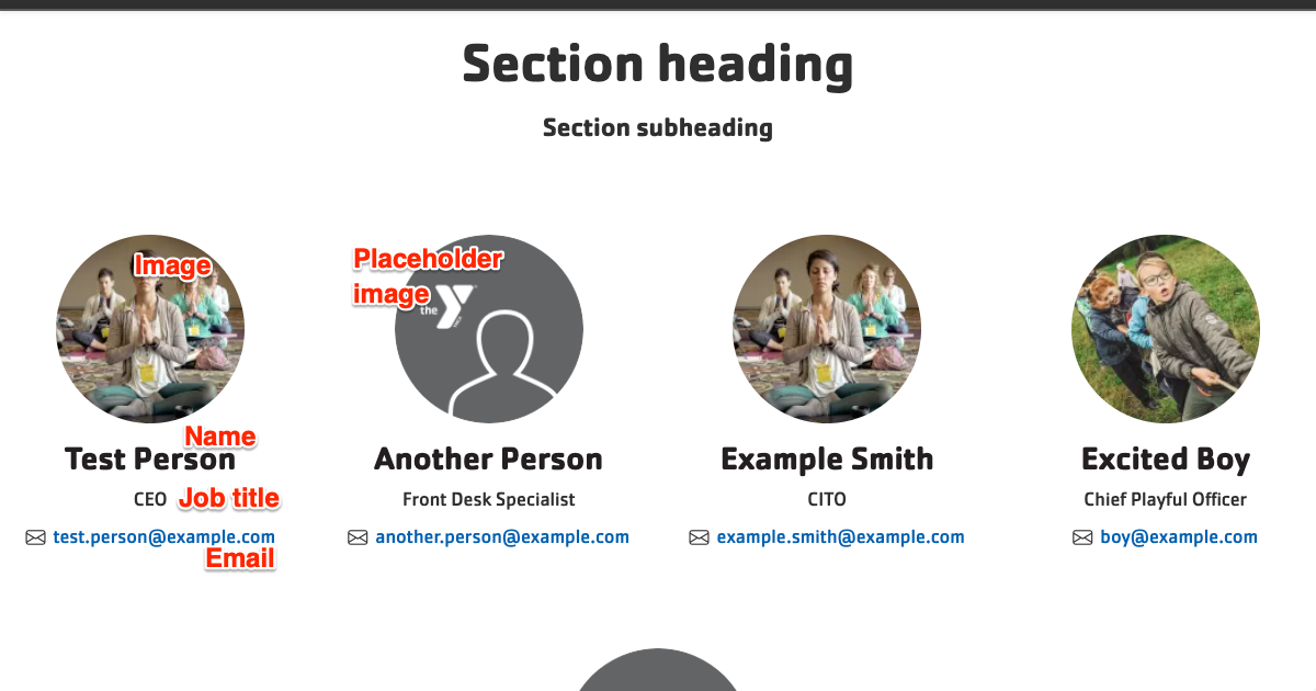
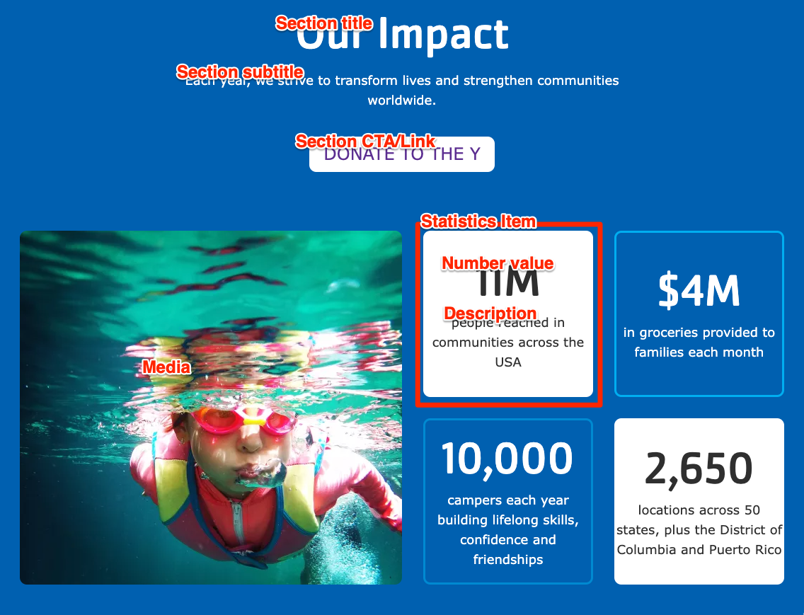
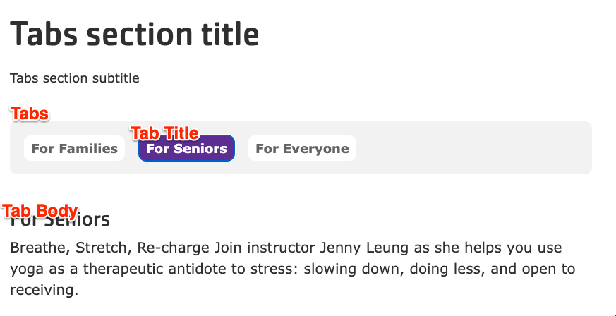
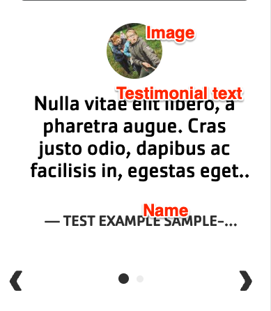
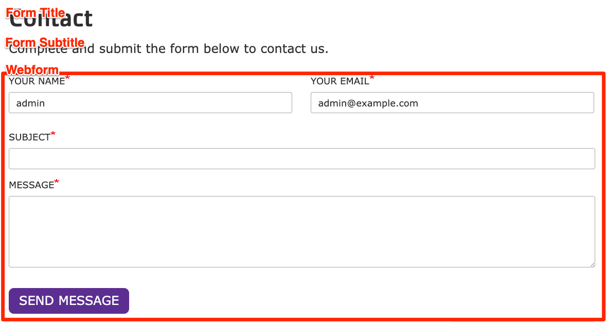
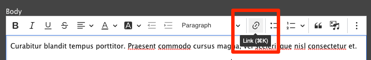
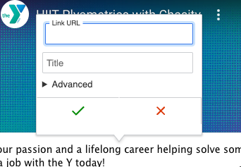
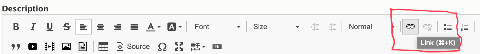
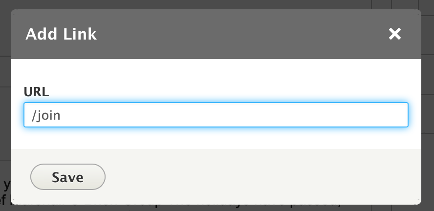
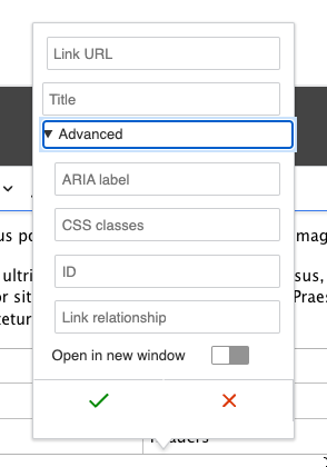
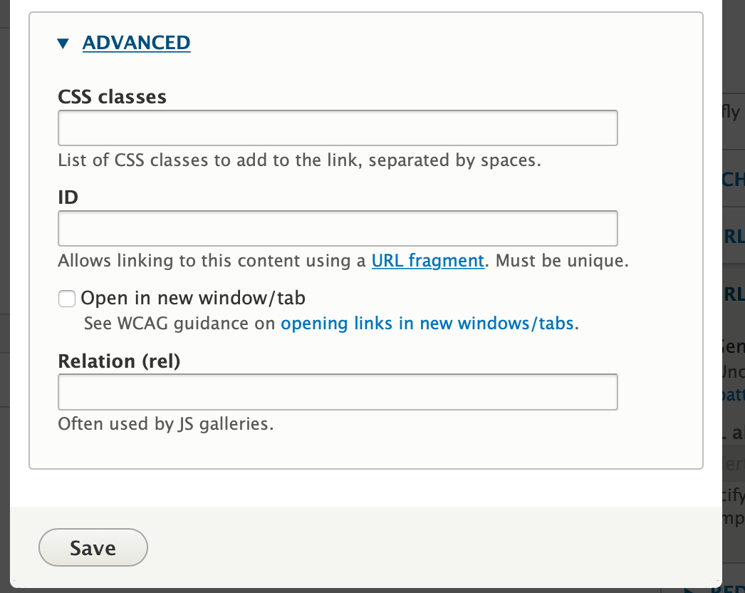
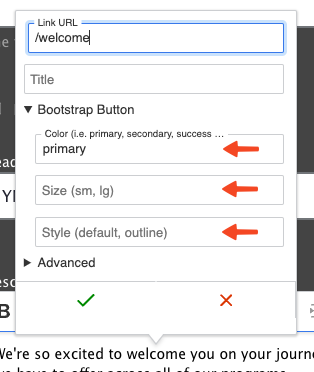
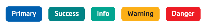
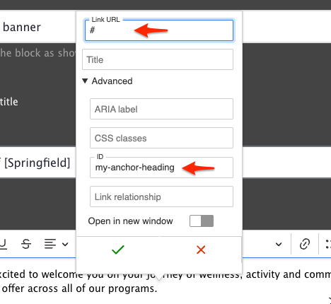
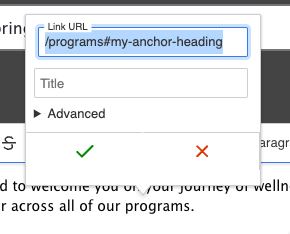
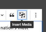
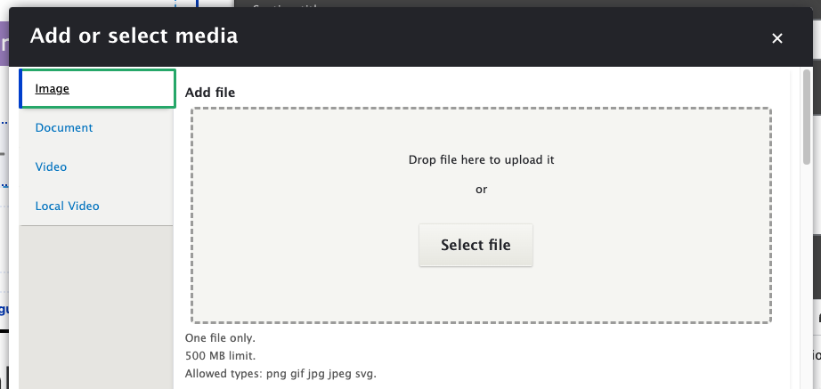
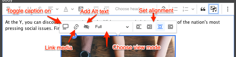

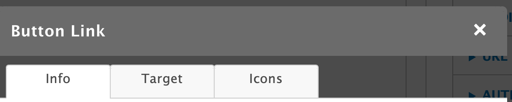
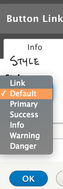
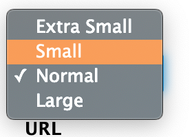
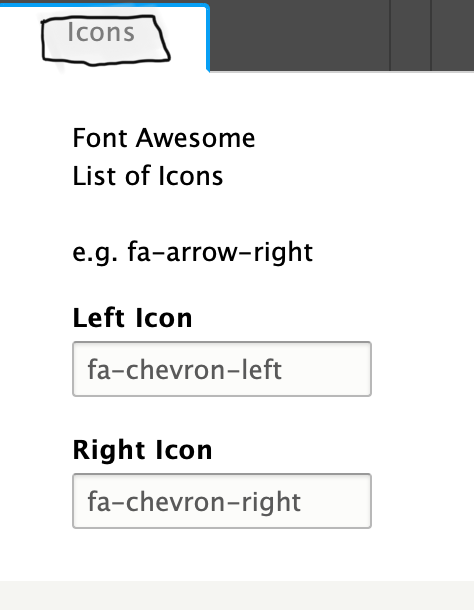
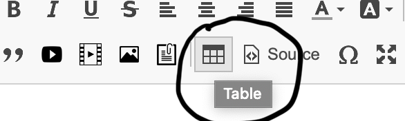
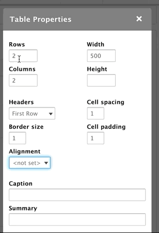
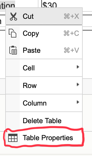
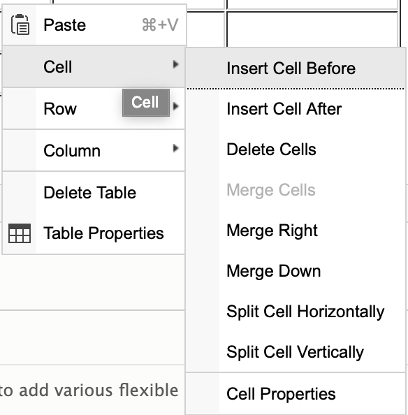
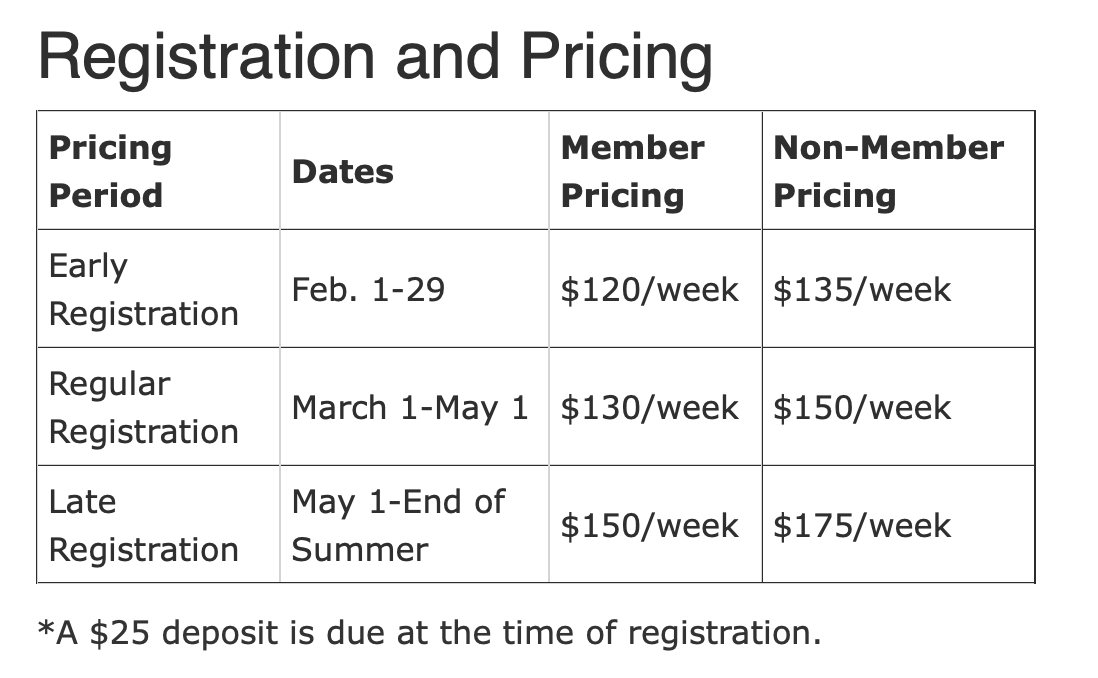
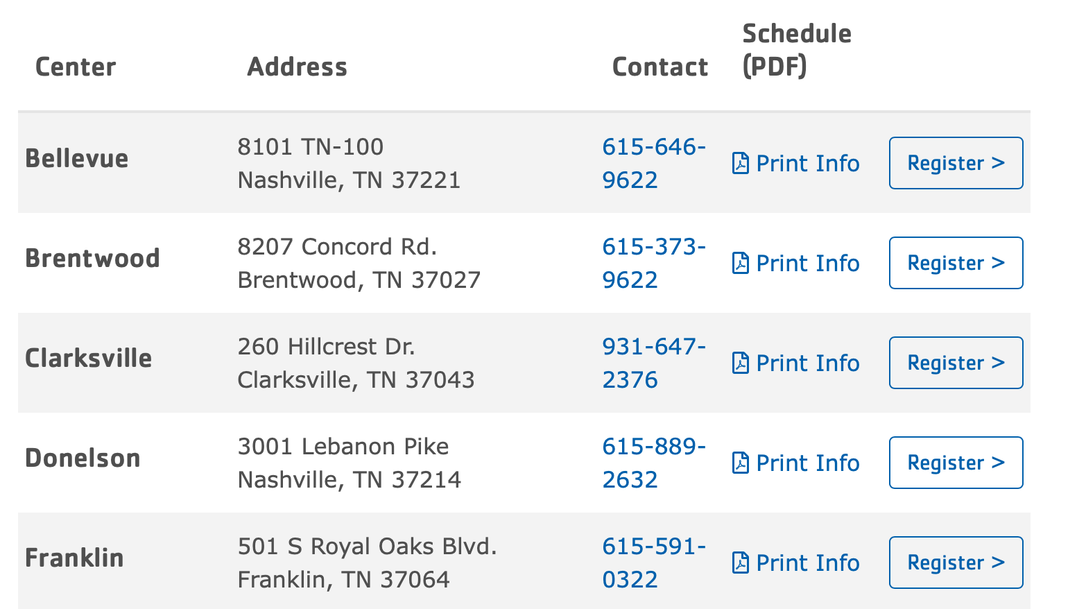


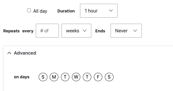

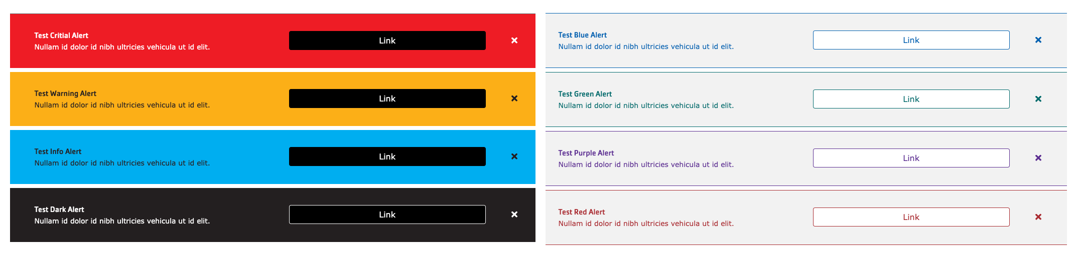
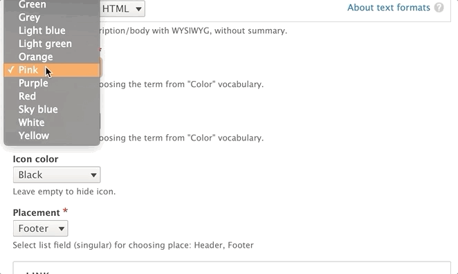
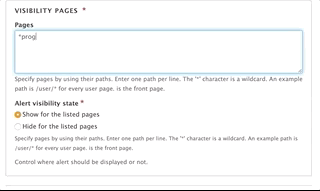
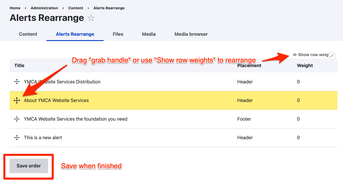
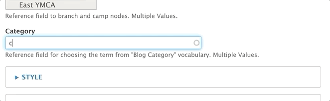
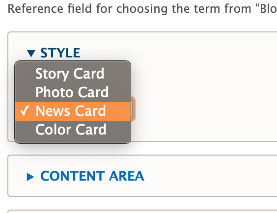
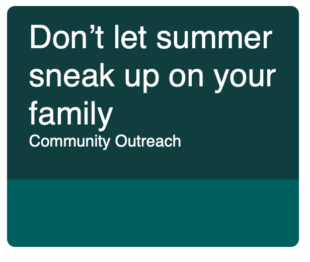
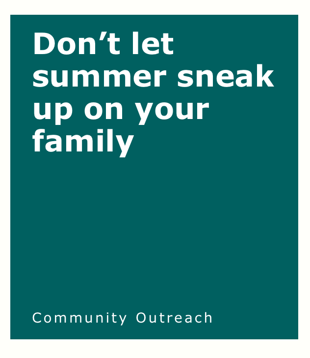
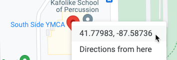
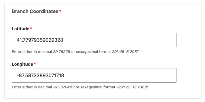
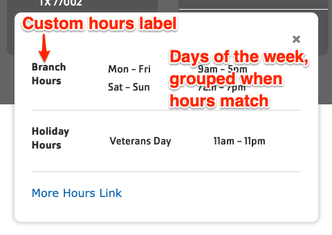
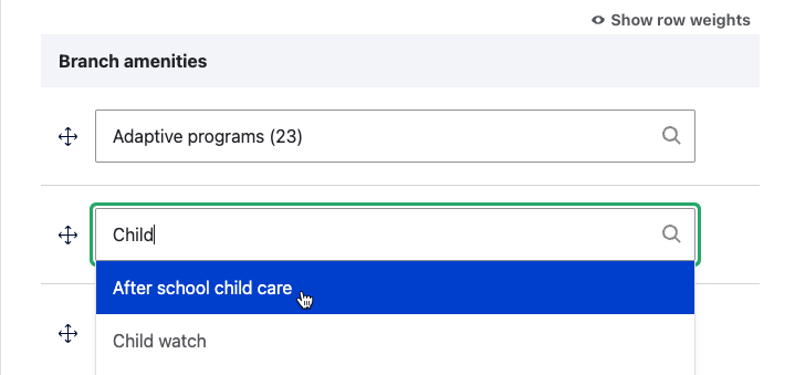
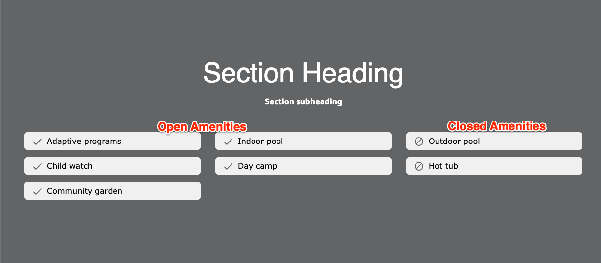
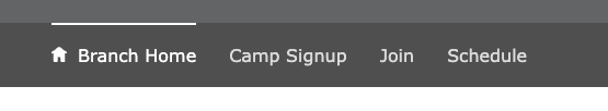
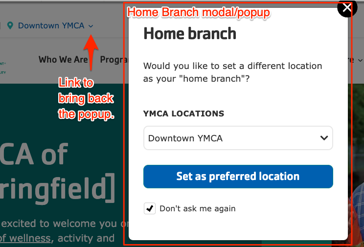
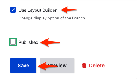

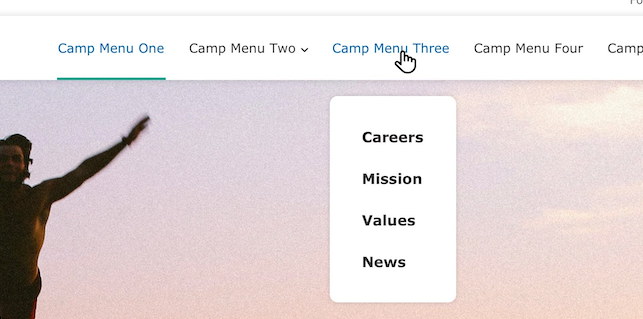
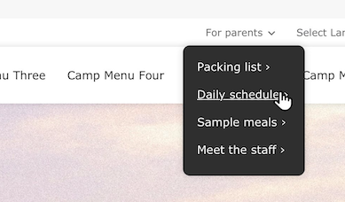
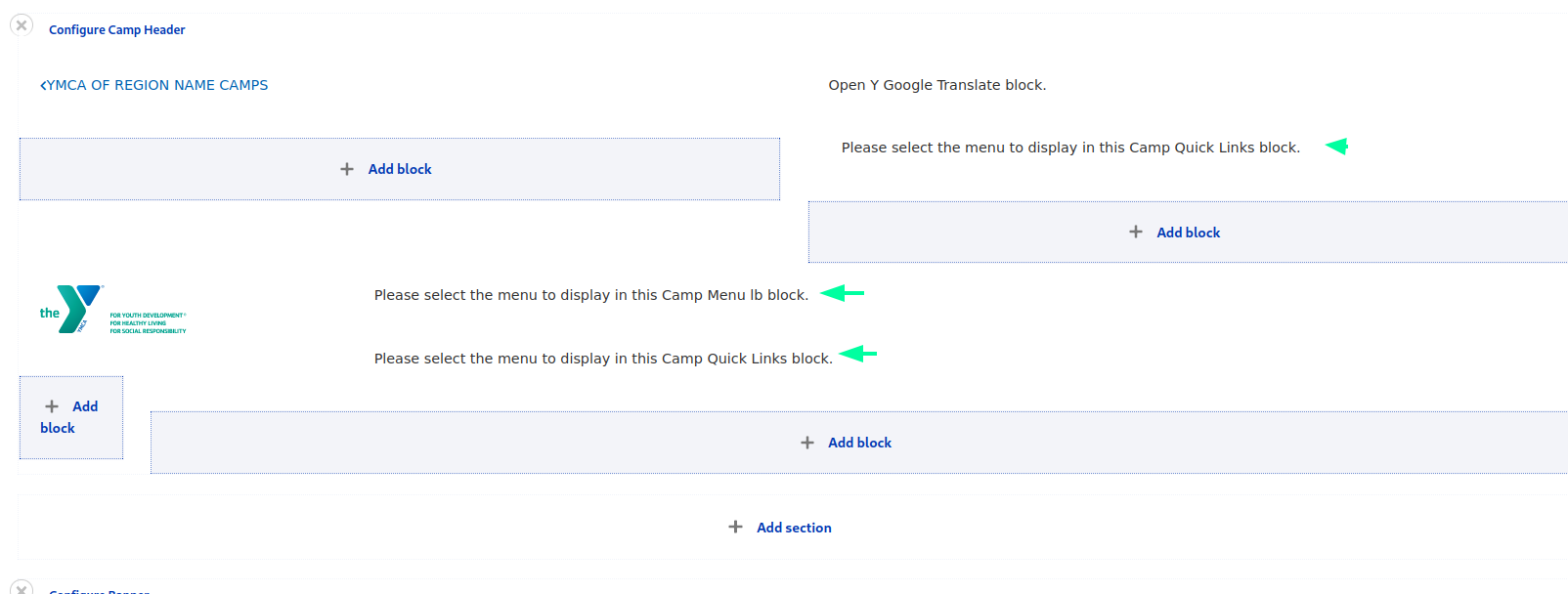
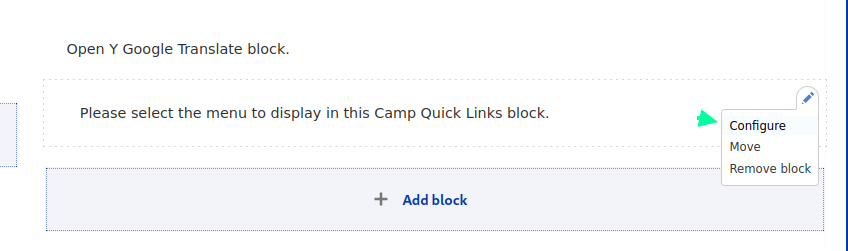
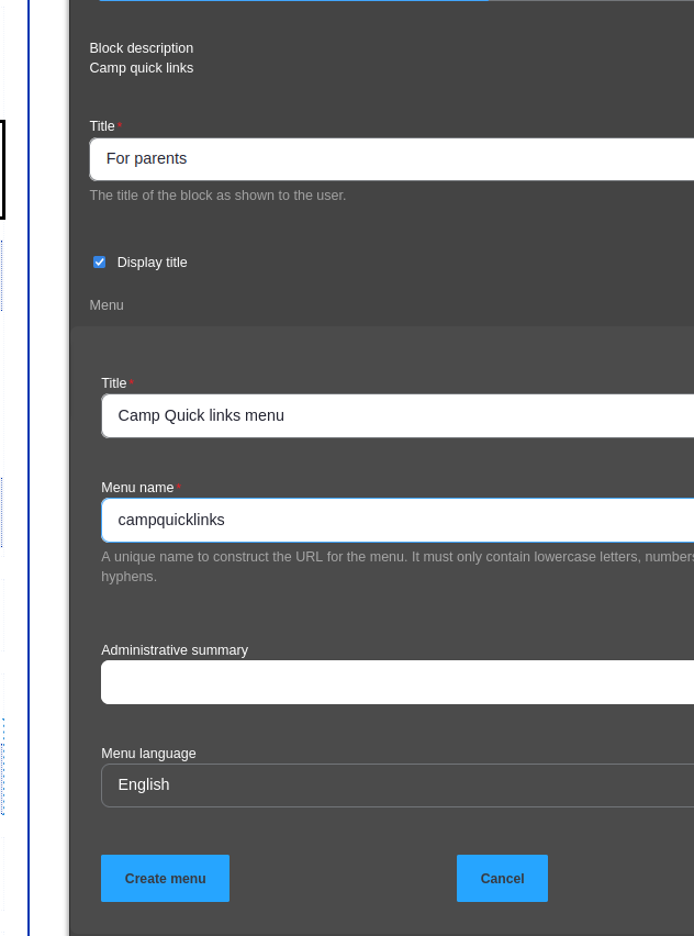
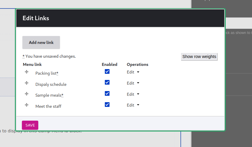
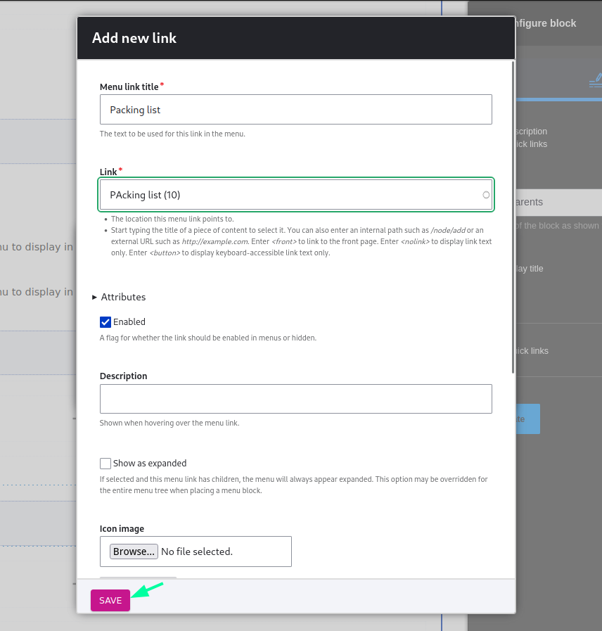
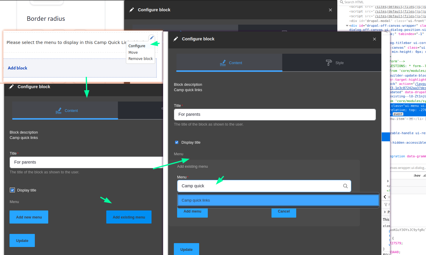
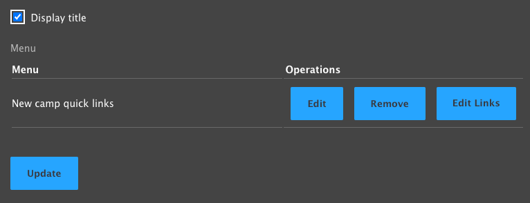
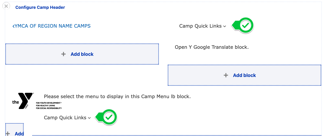
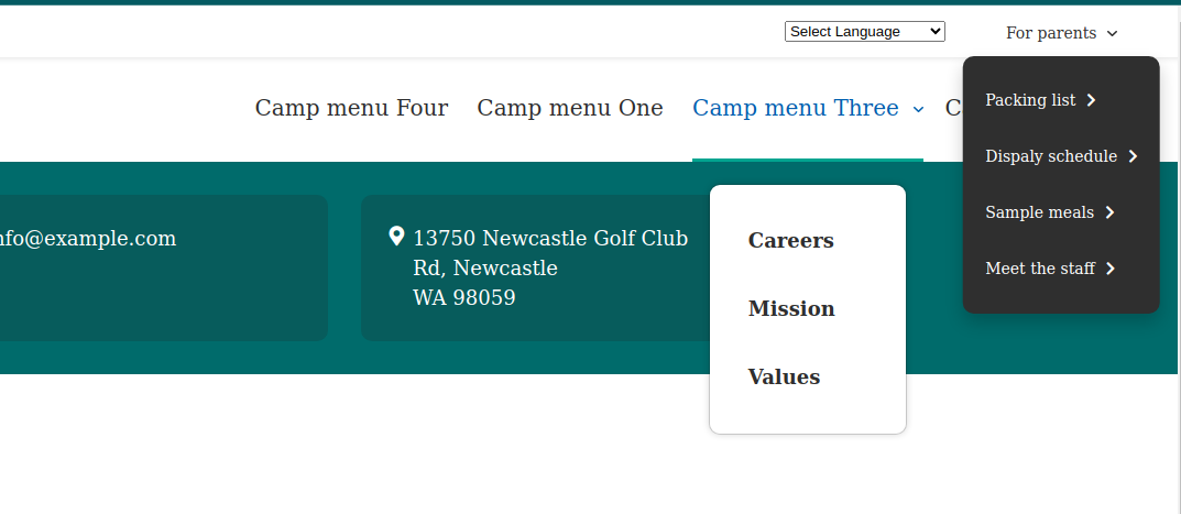
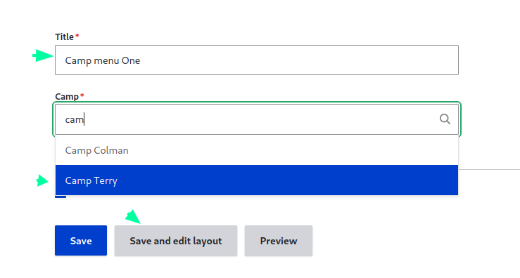
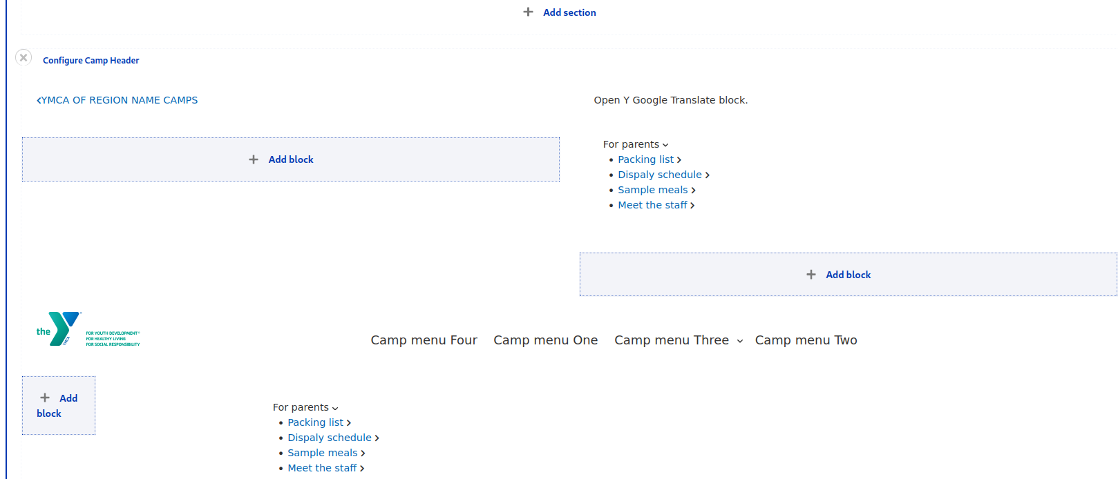
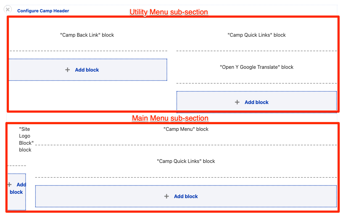
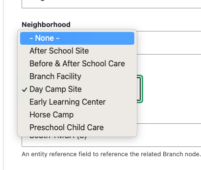
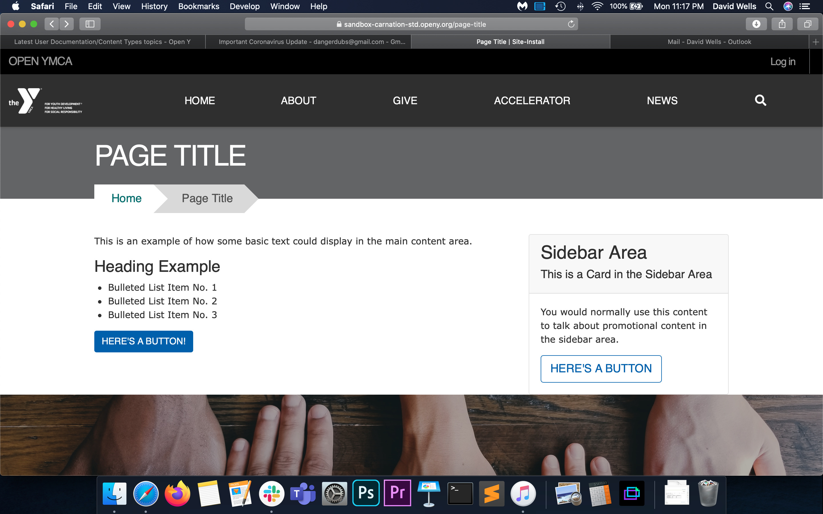
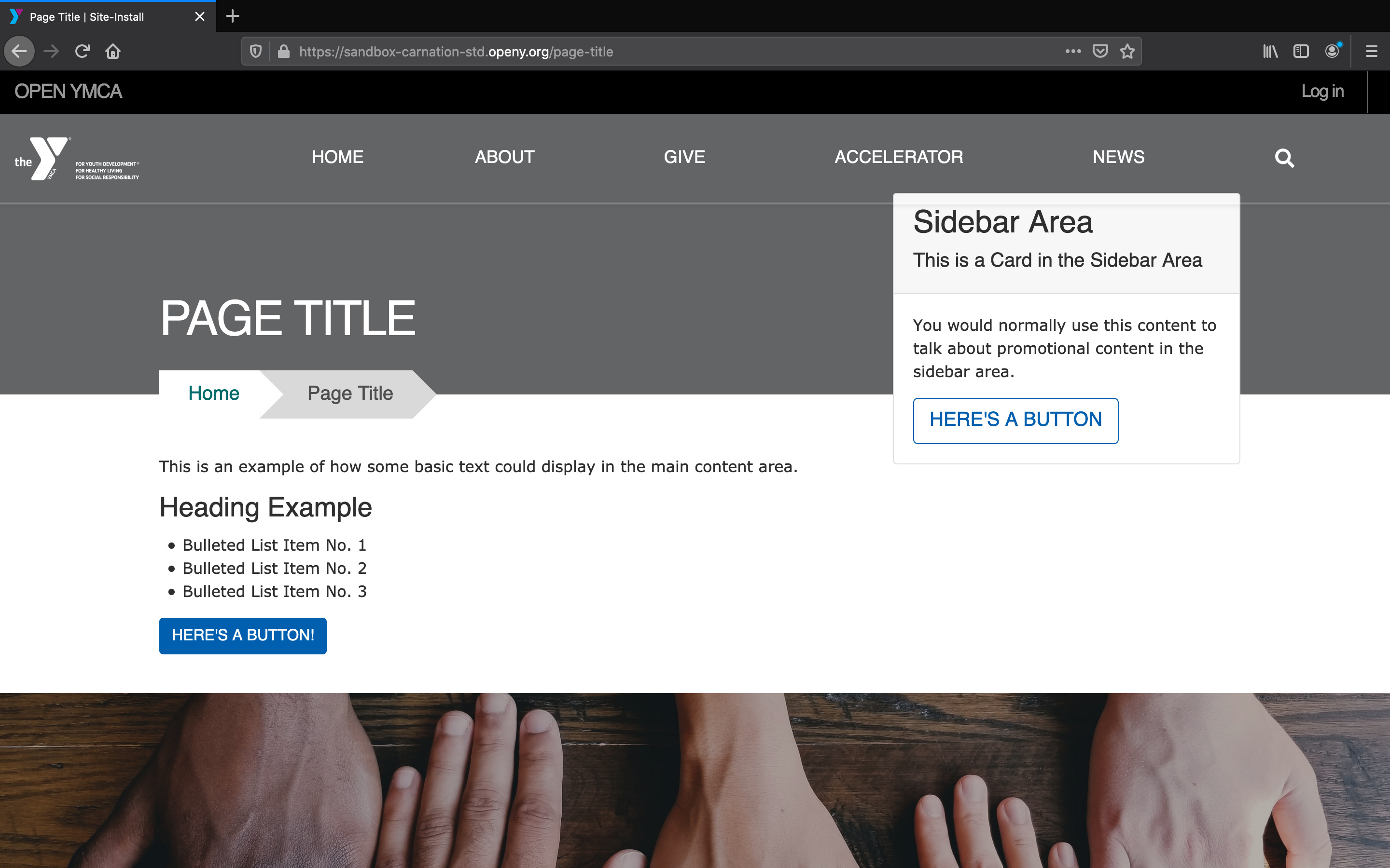
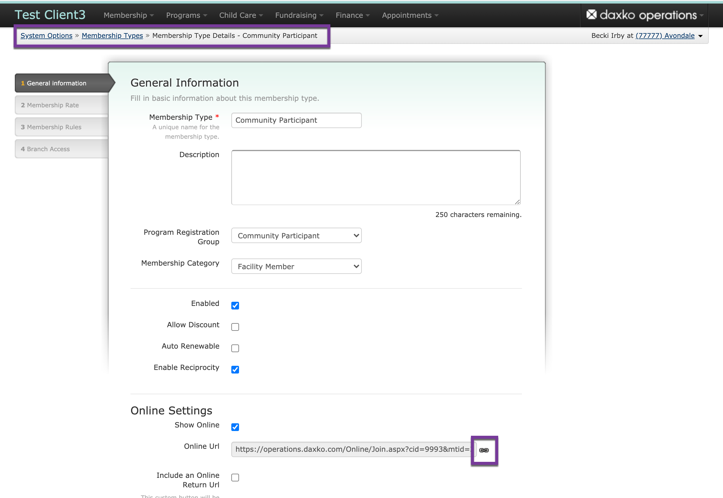
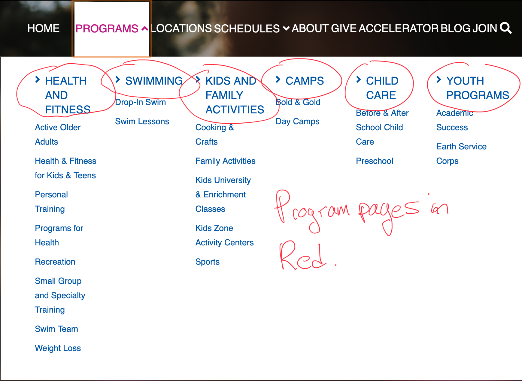
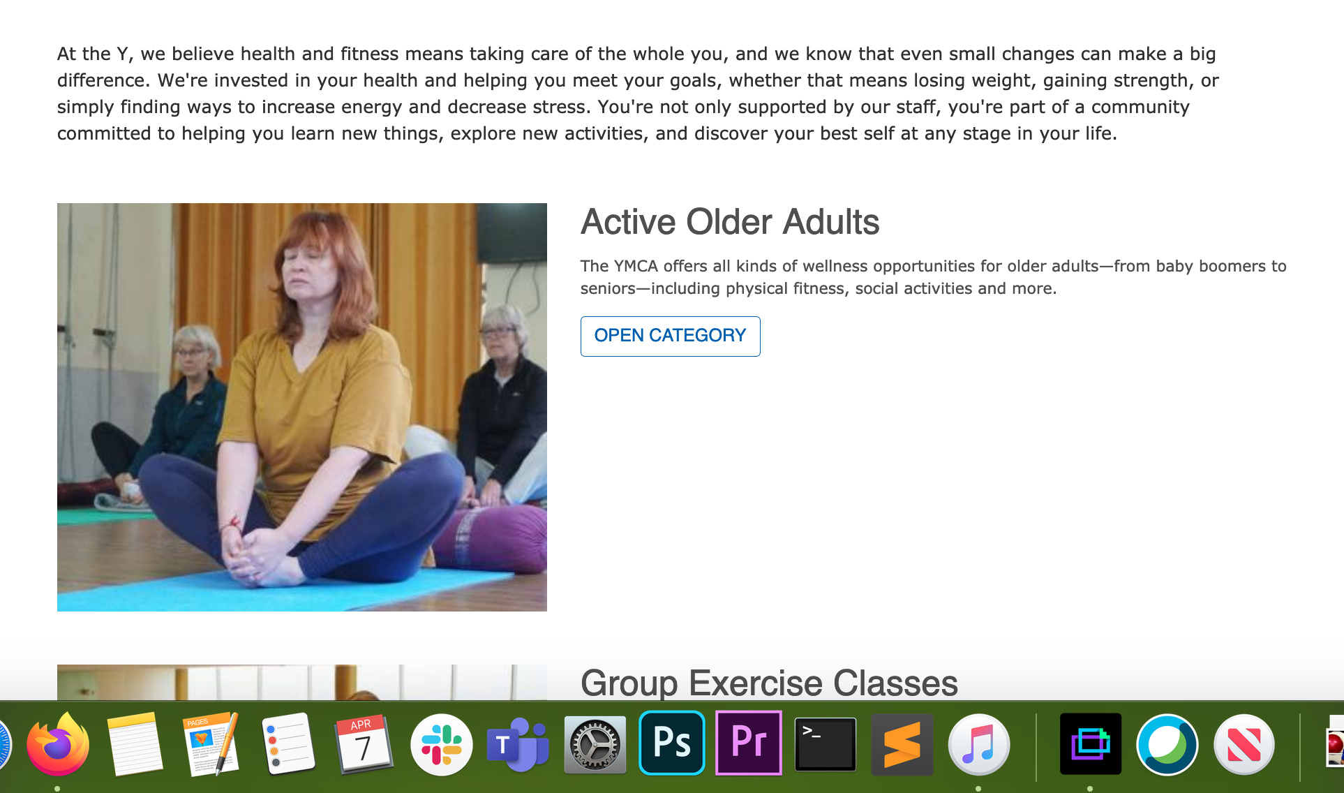
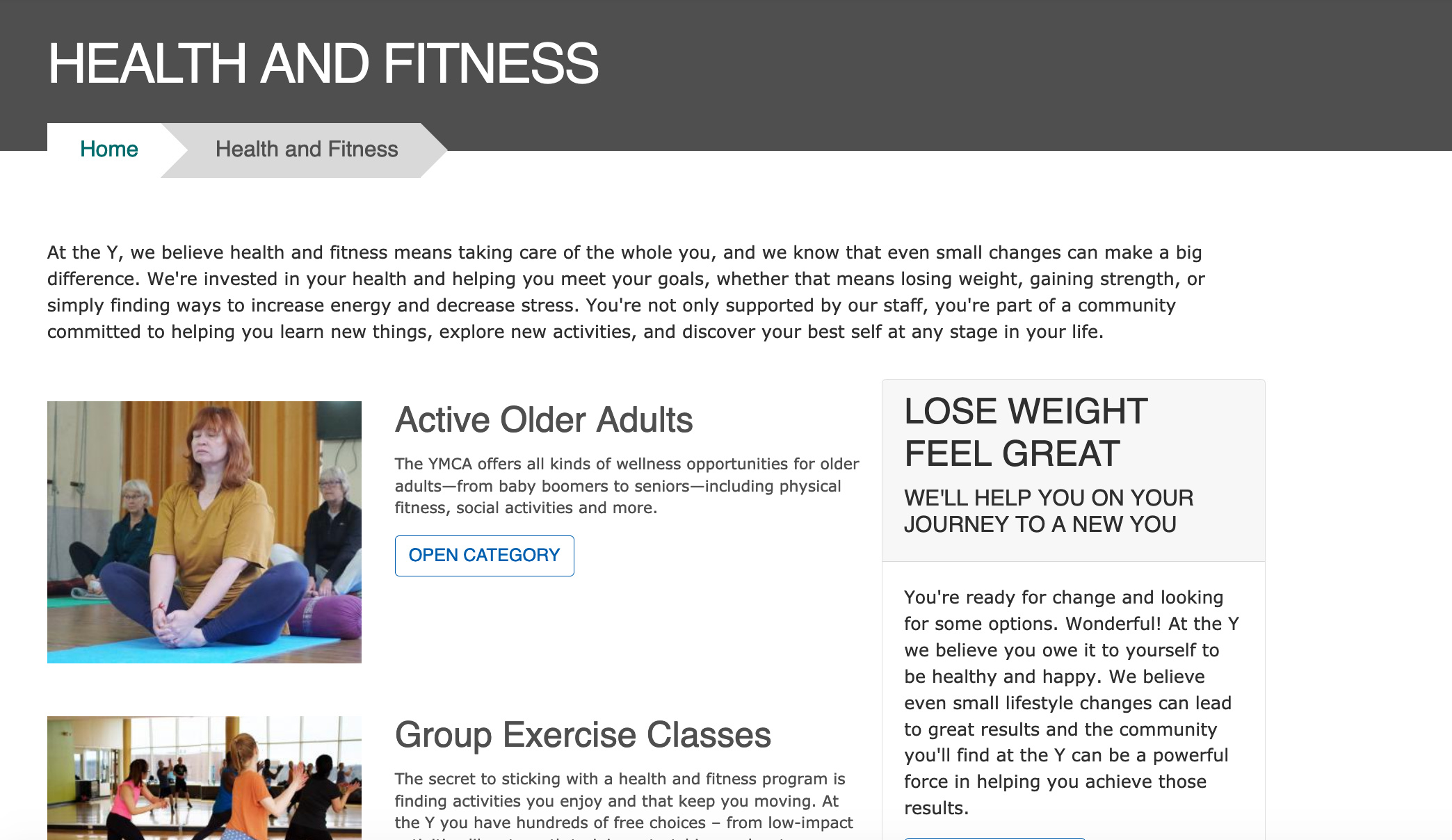
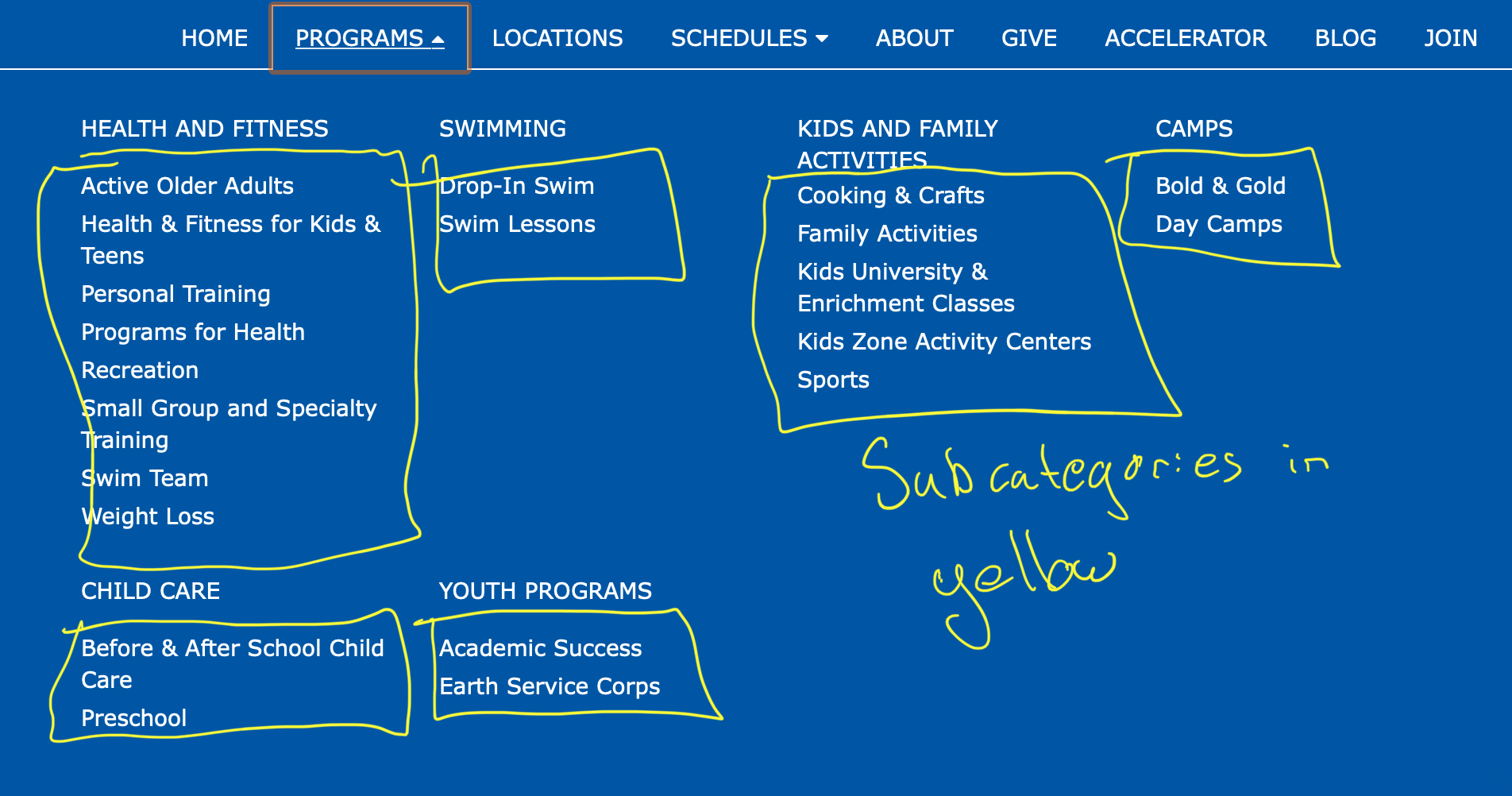
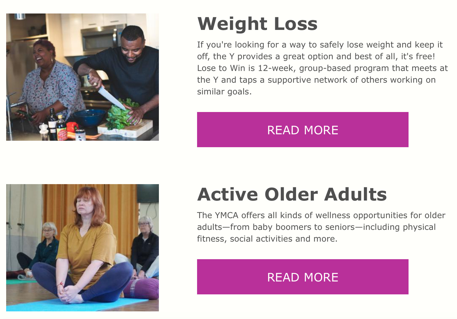
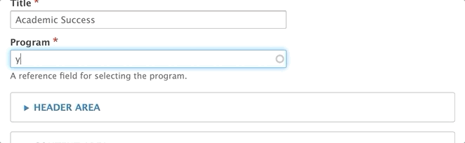
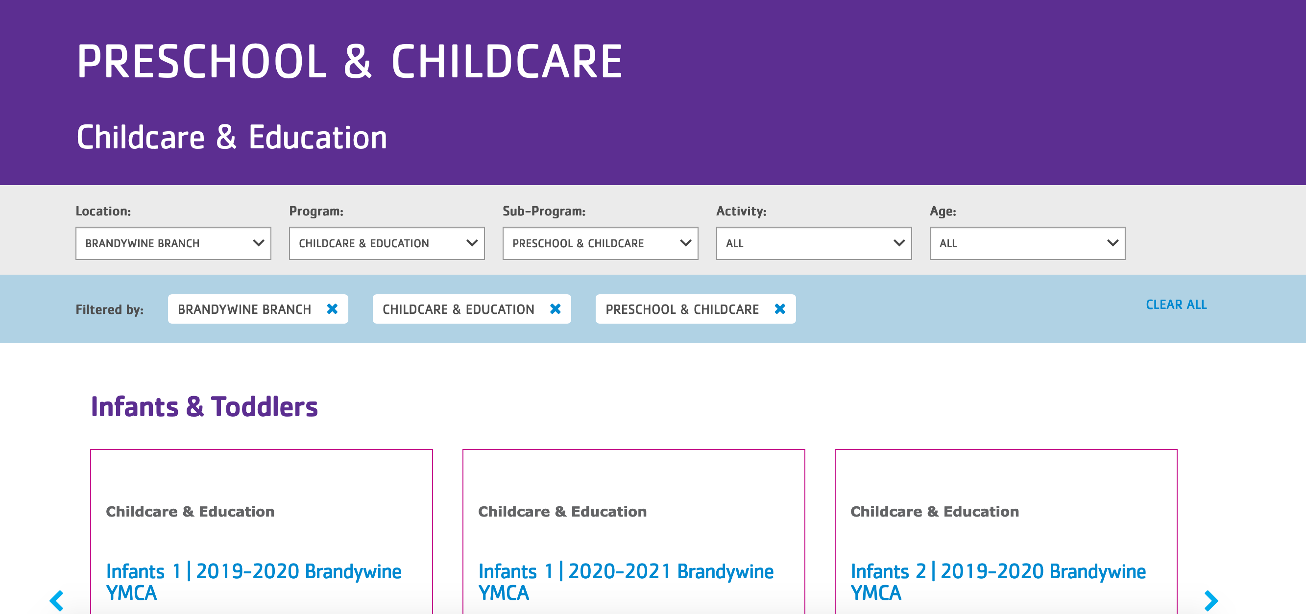
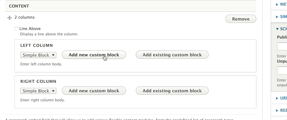

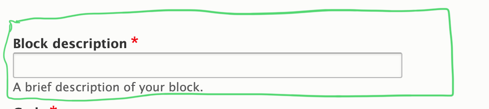
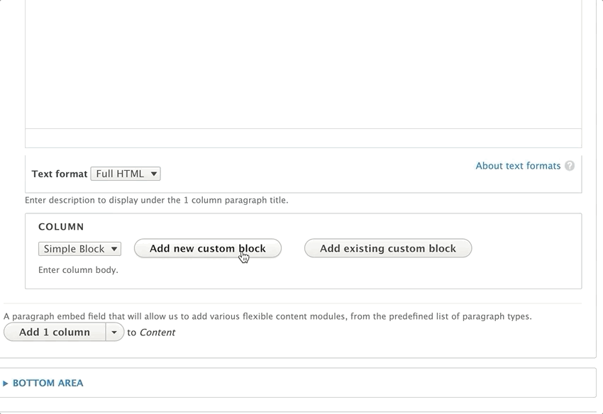
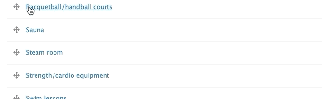
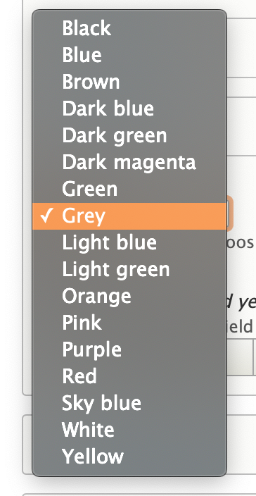
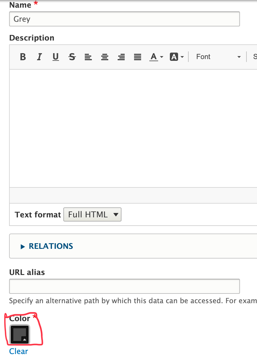
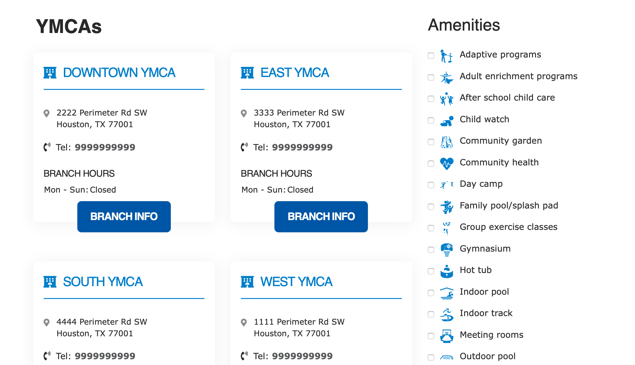
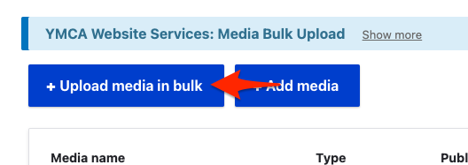


 .
.


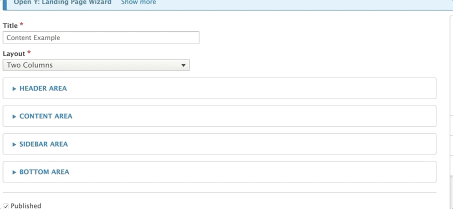
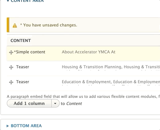
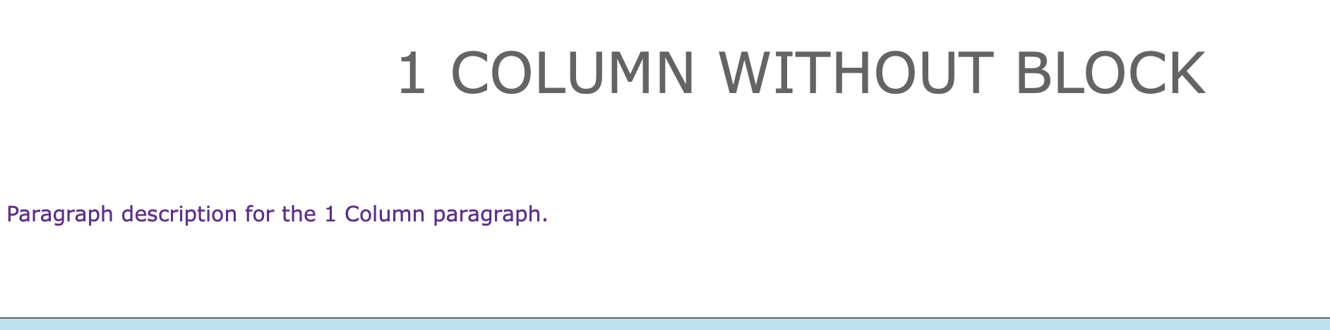
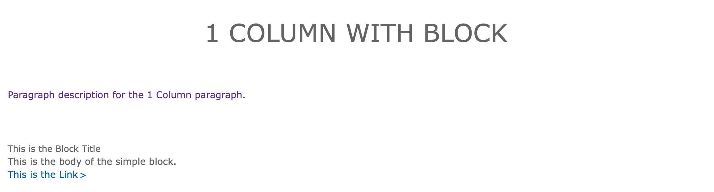
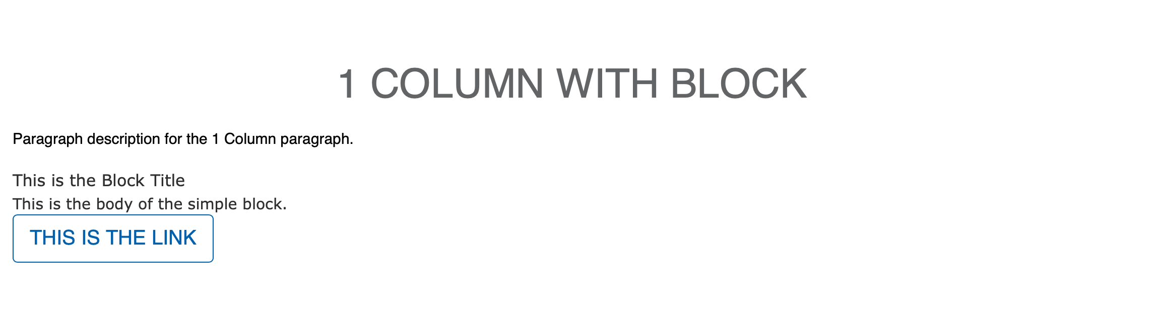
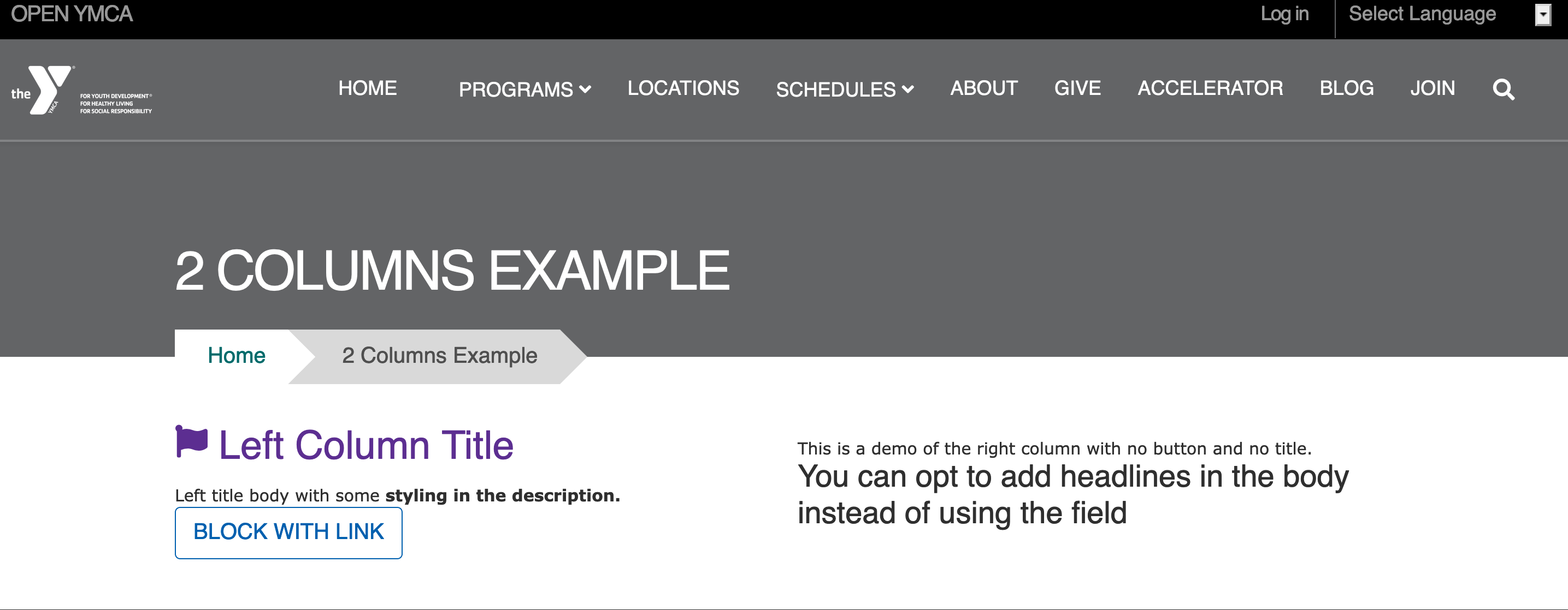
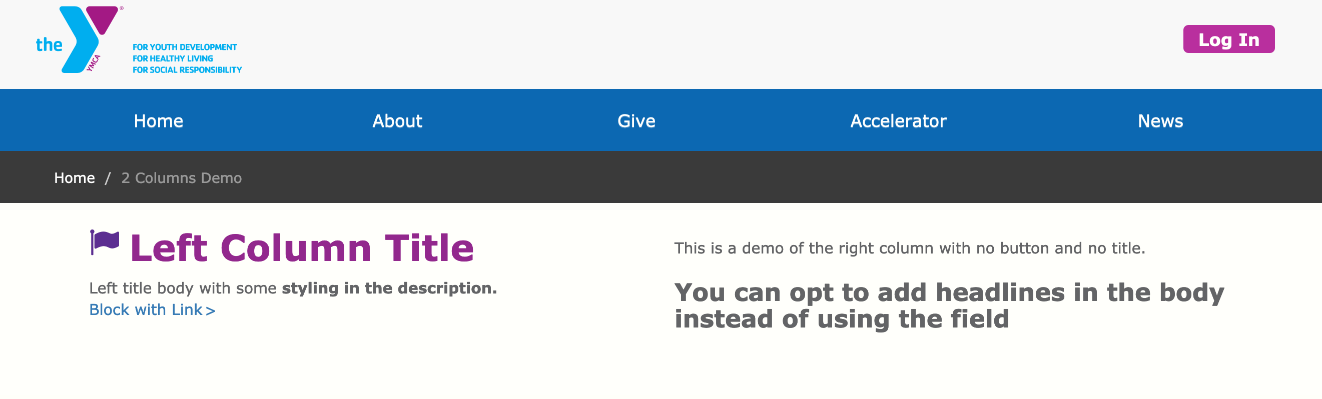
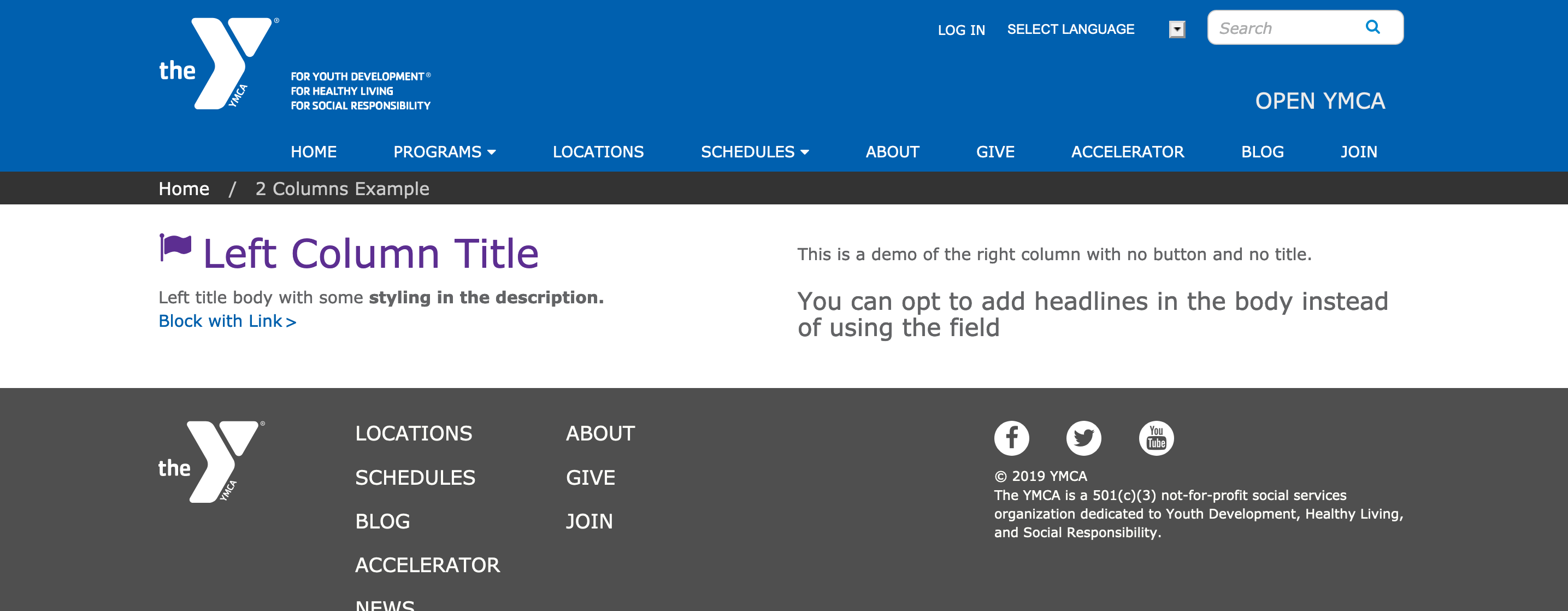
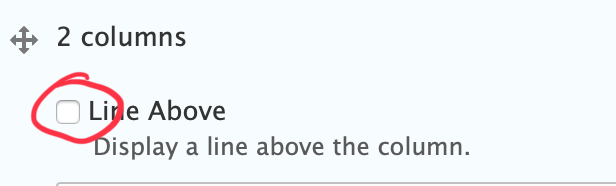
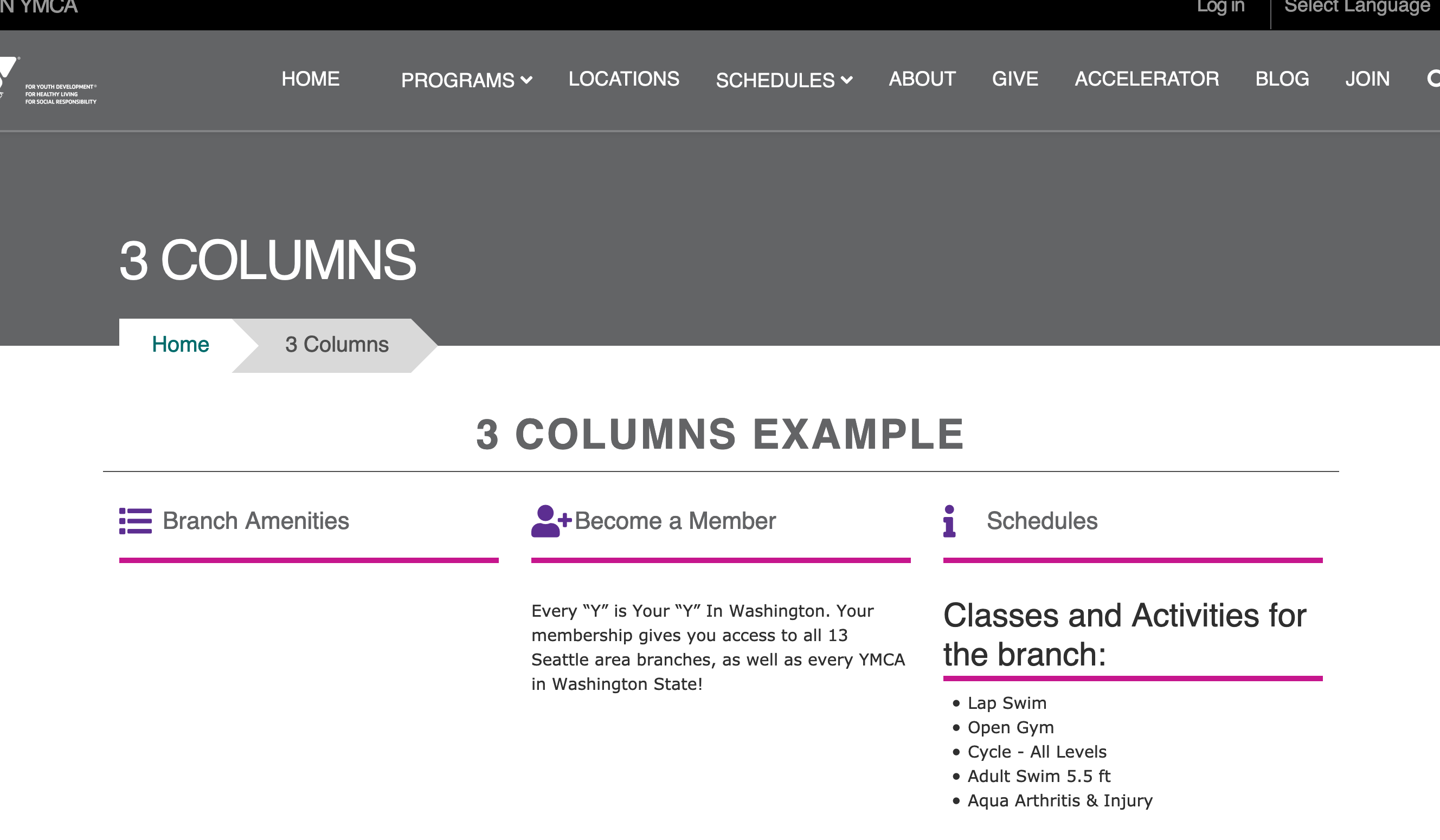
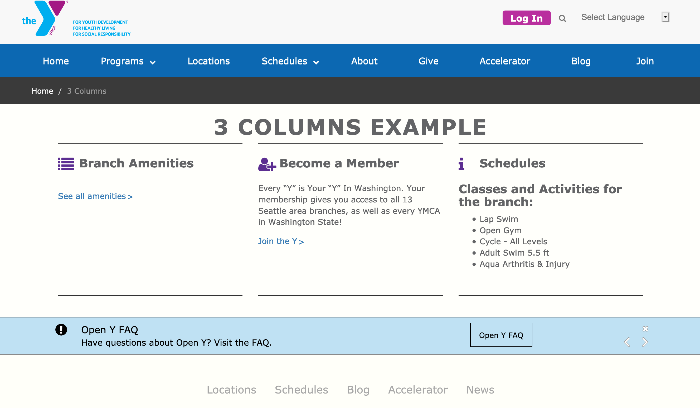
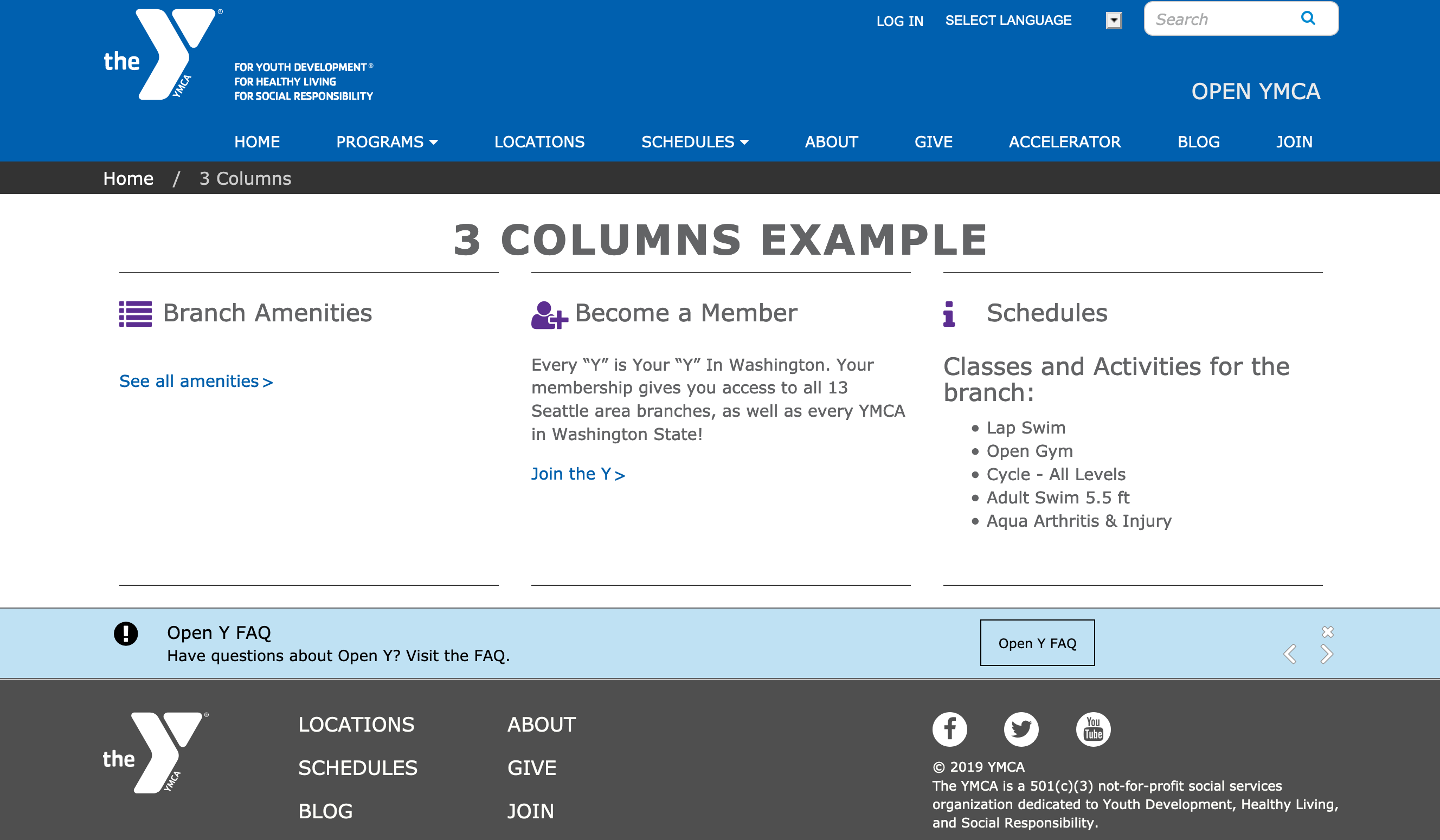
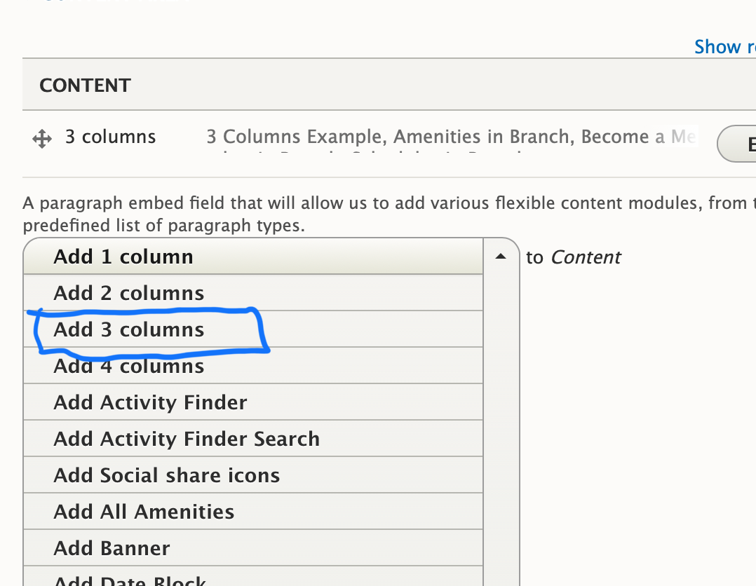
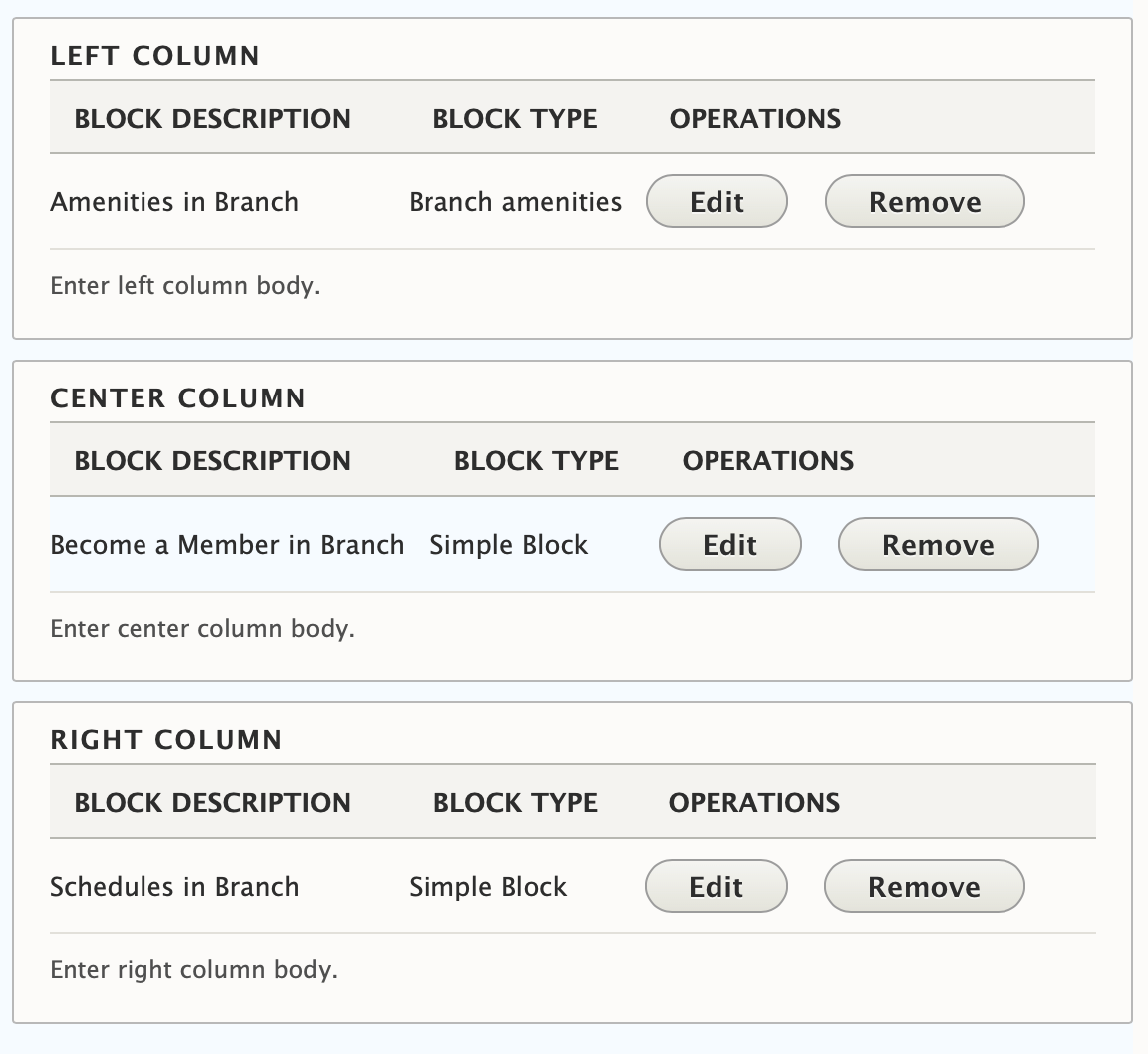
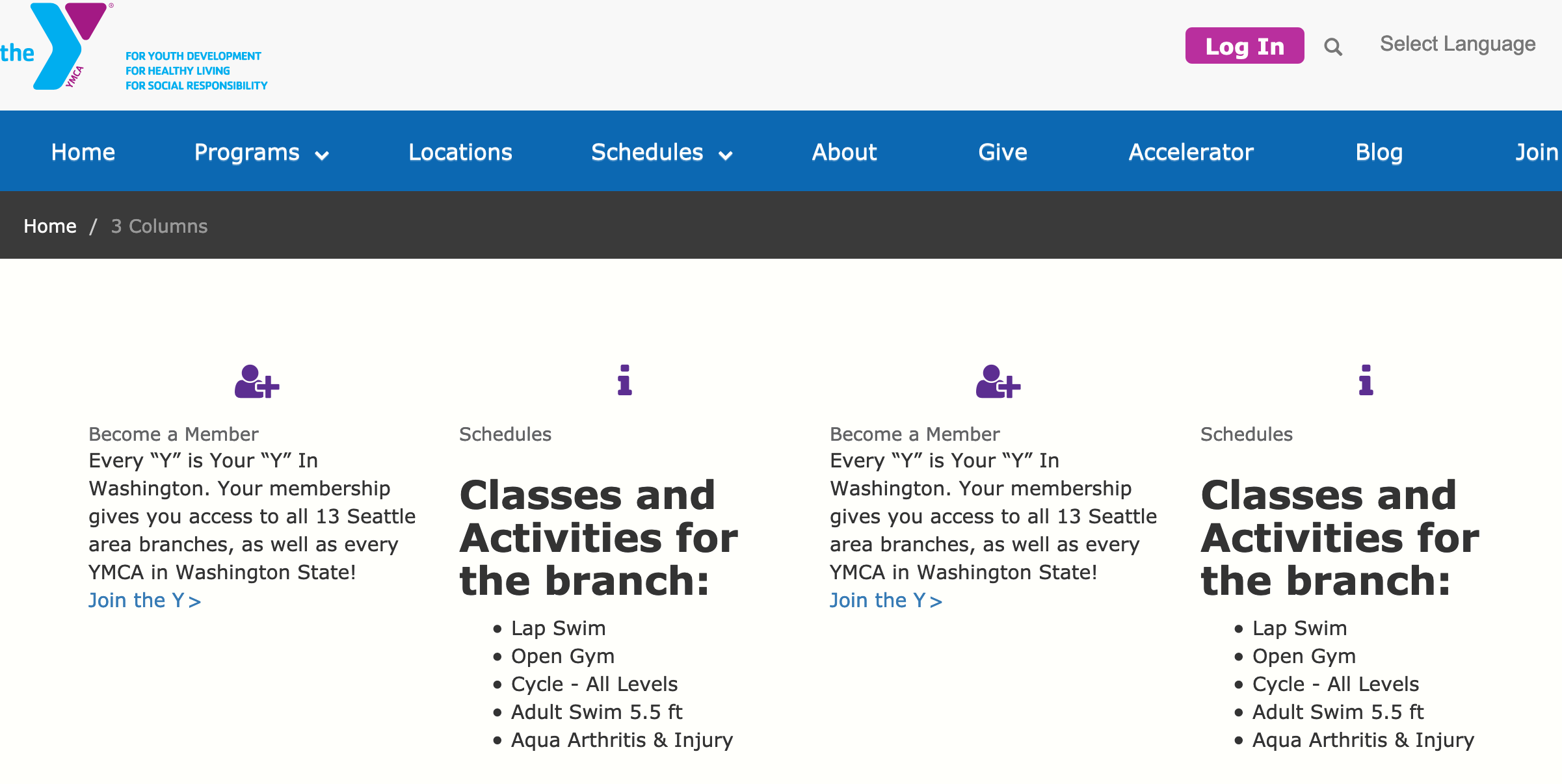
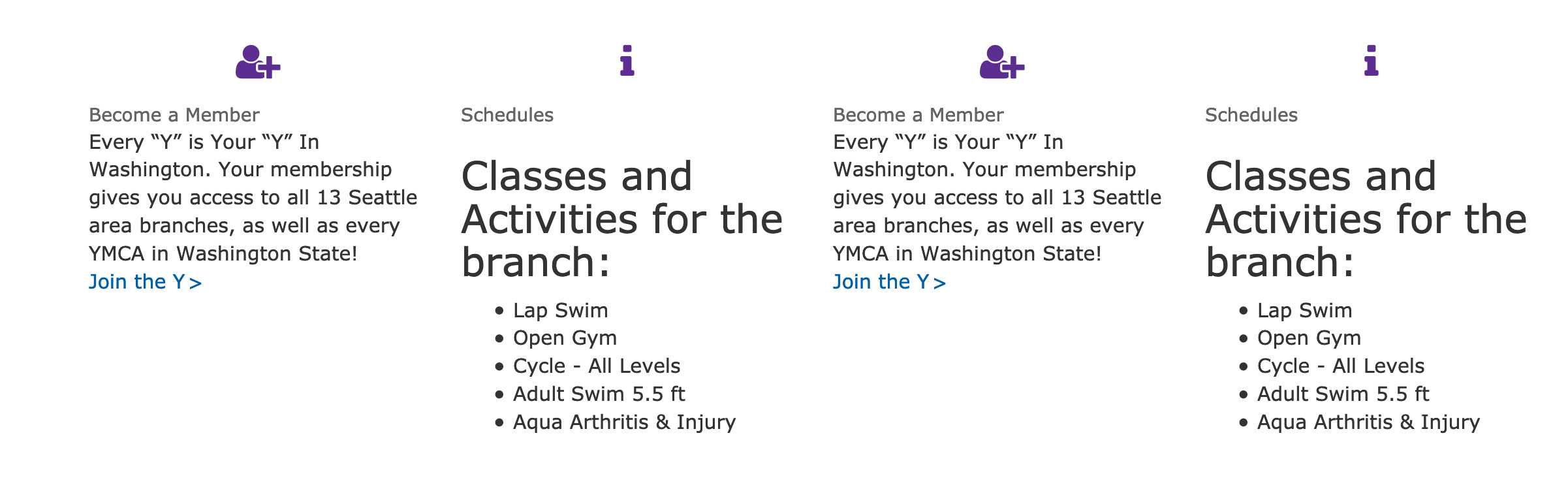
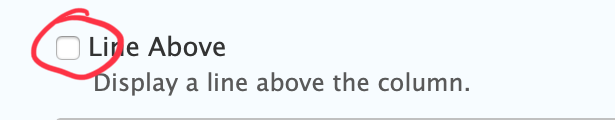
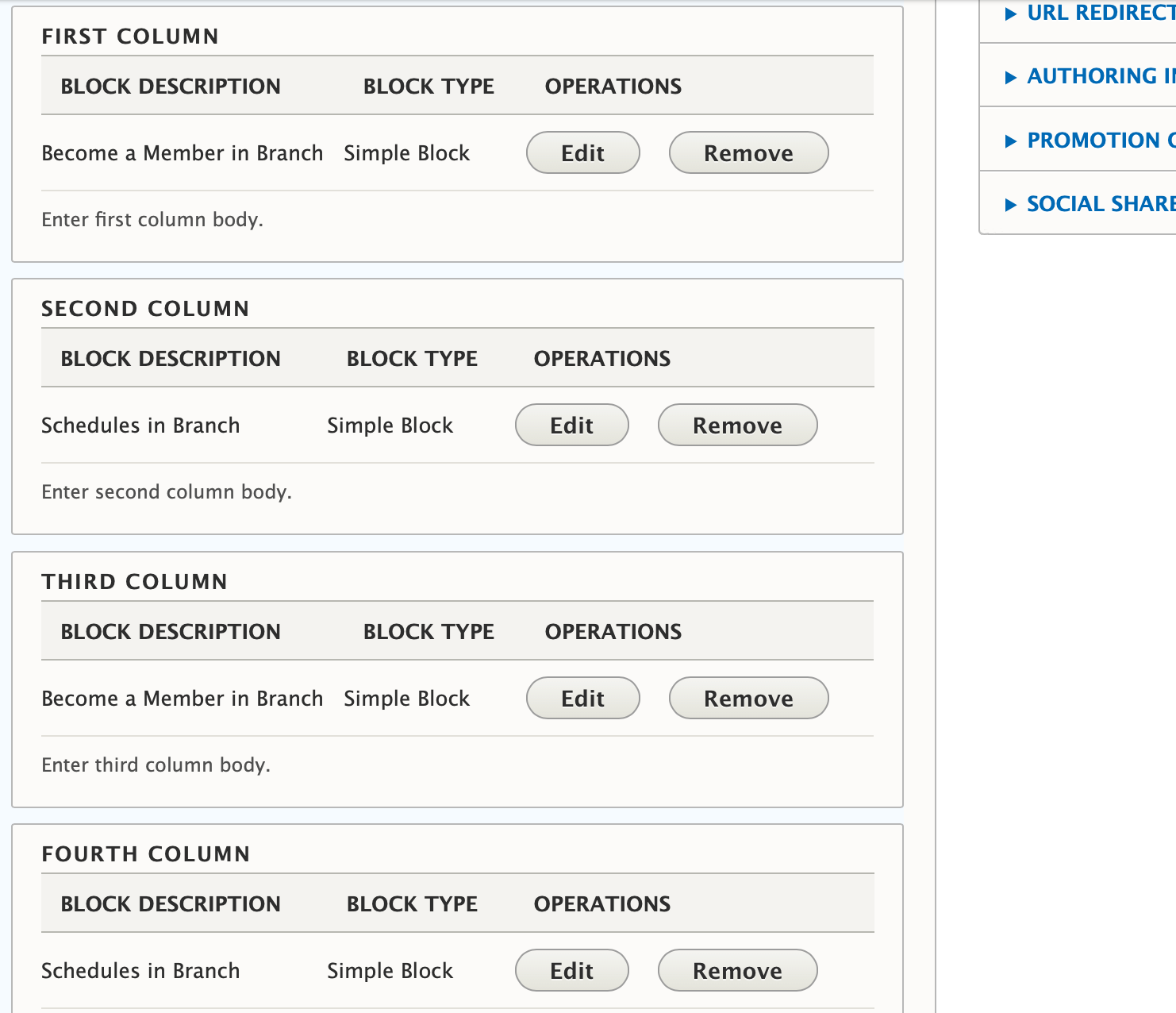
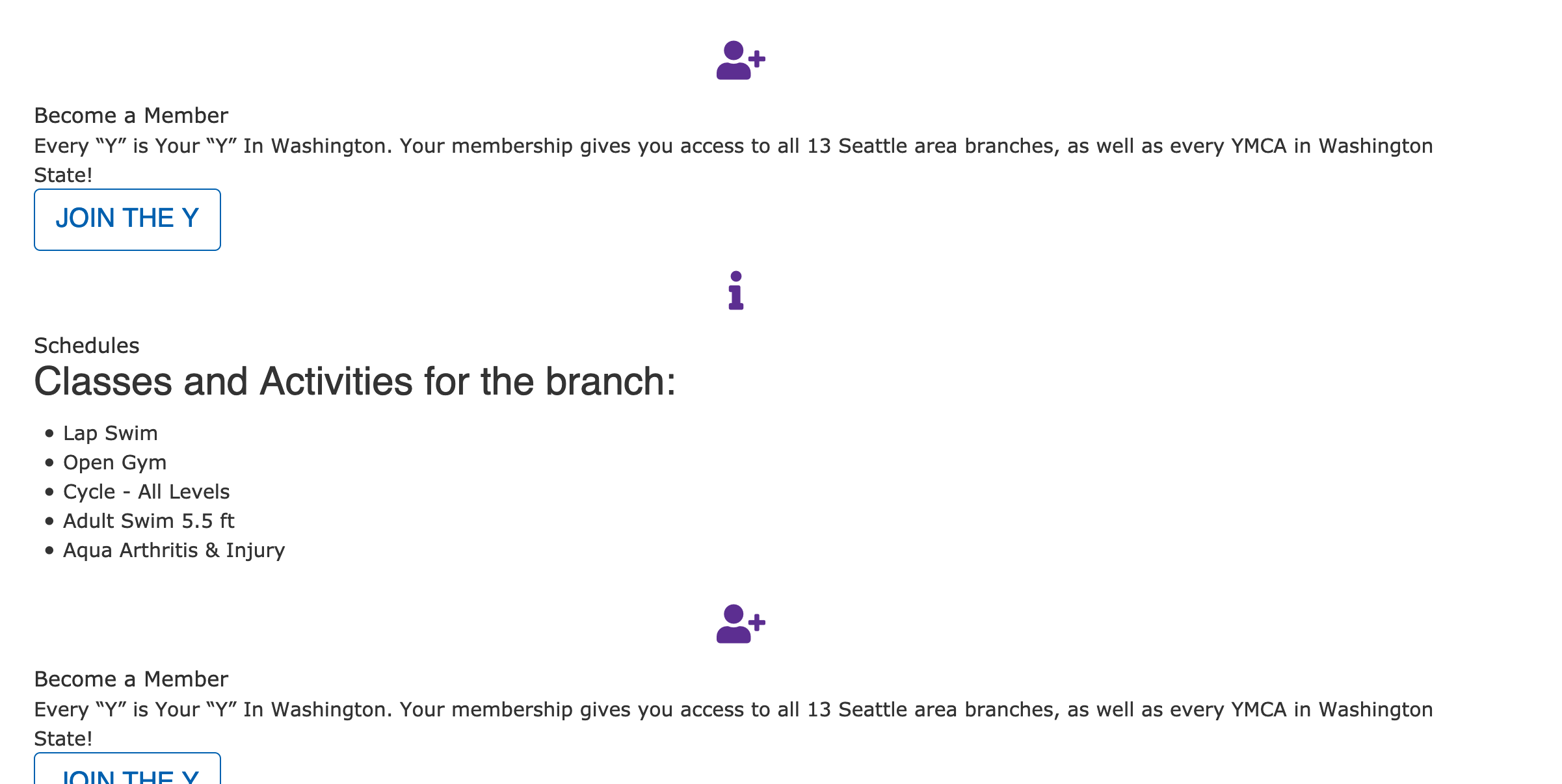
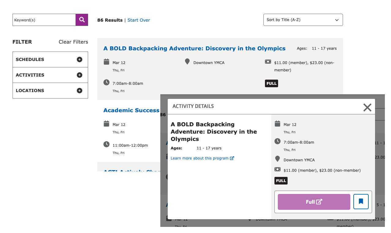
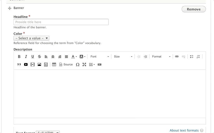
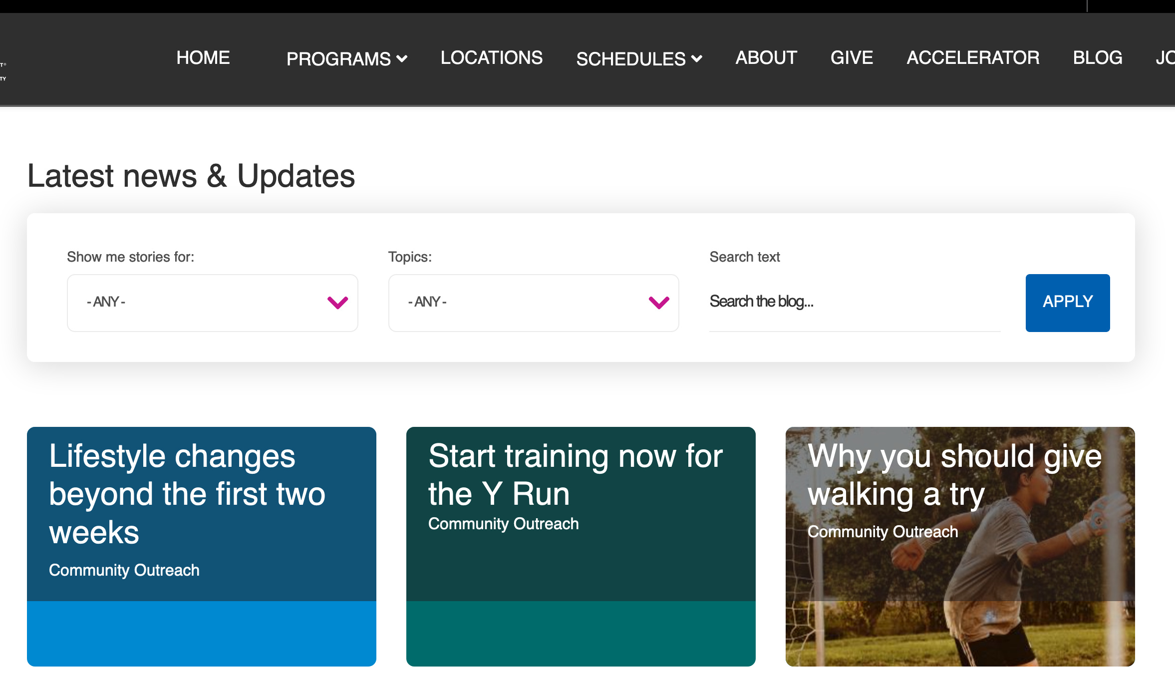
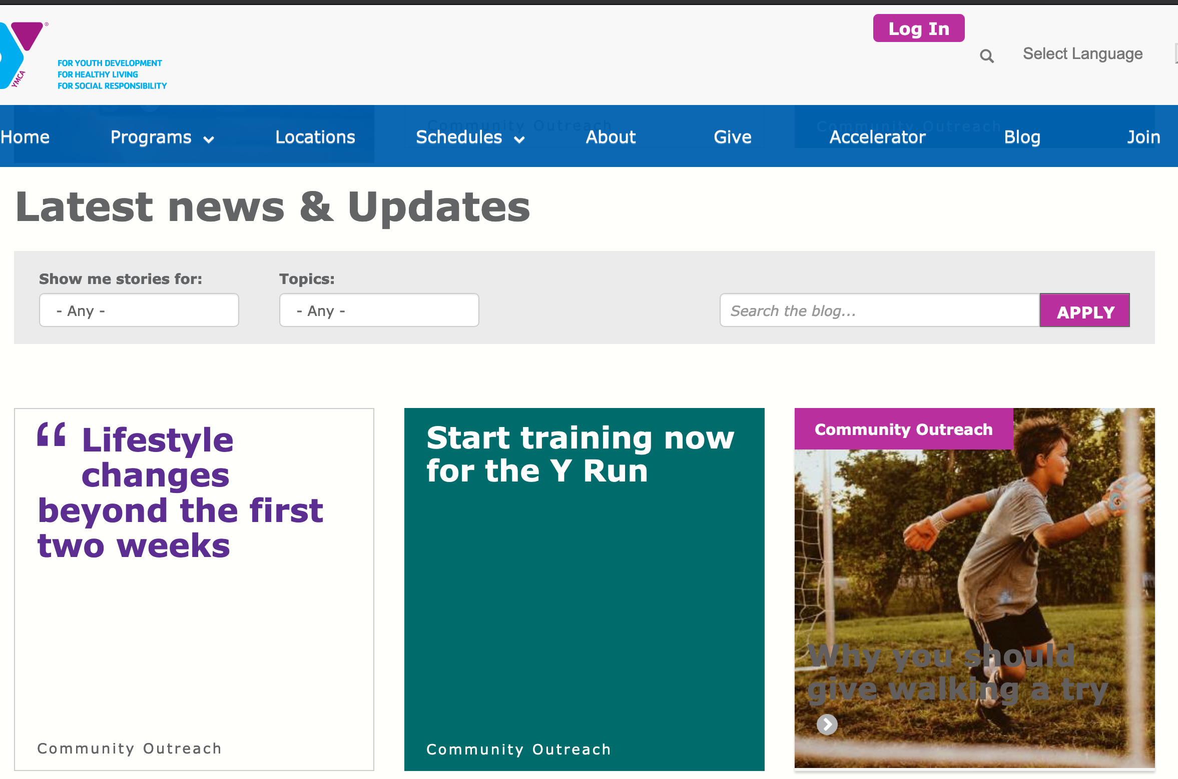
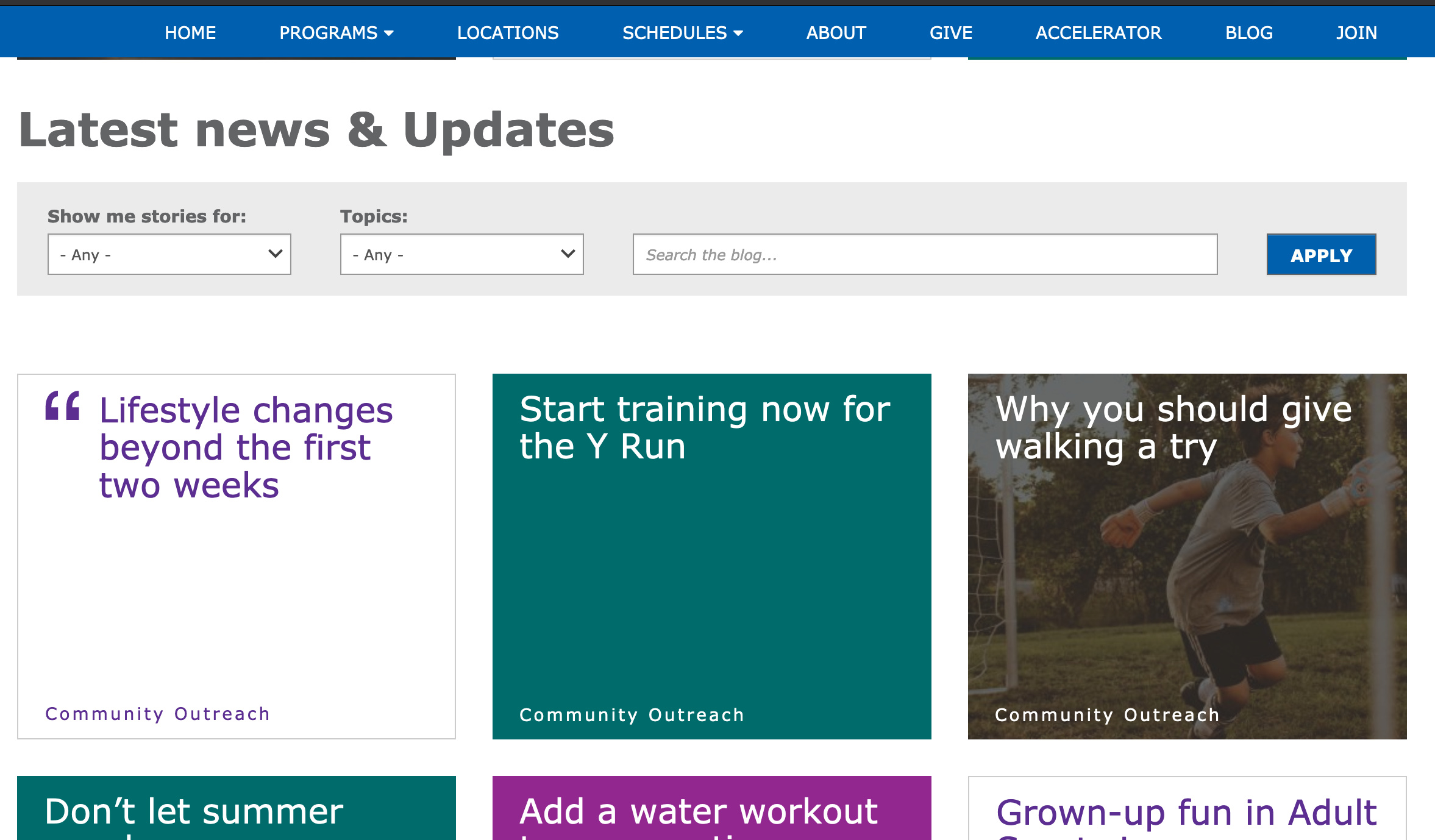
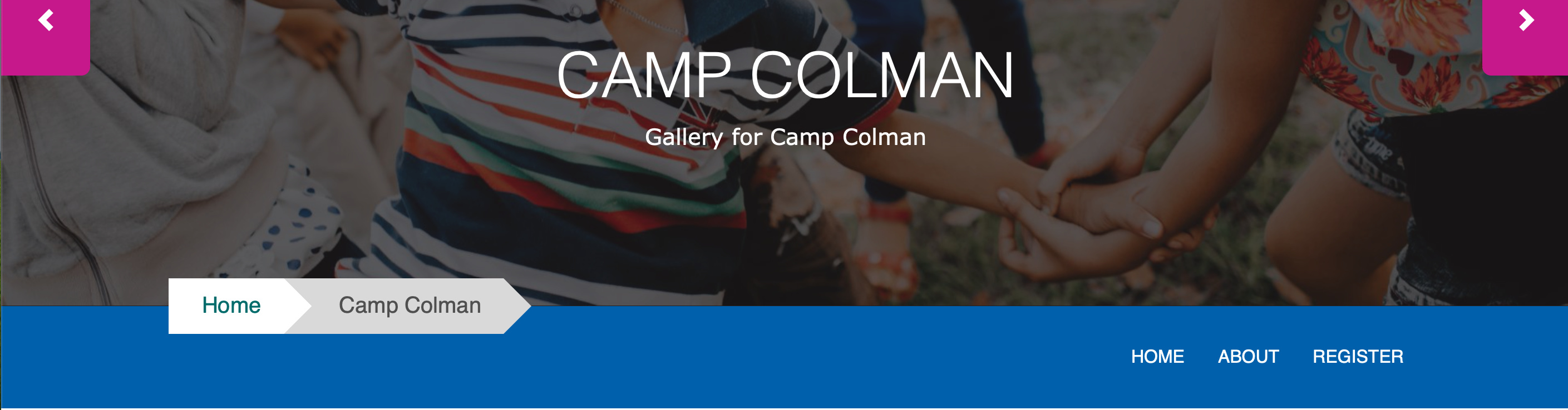
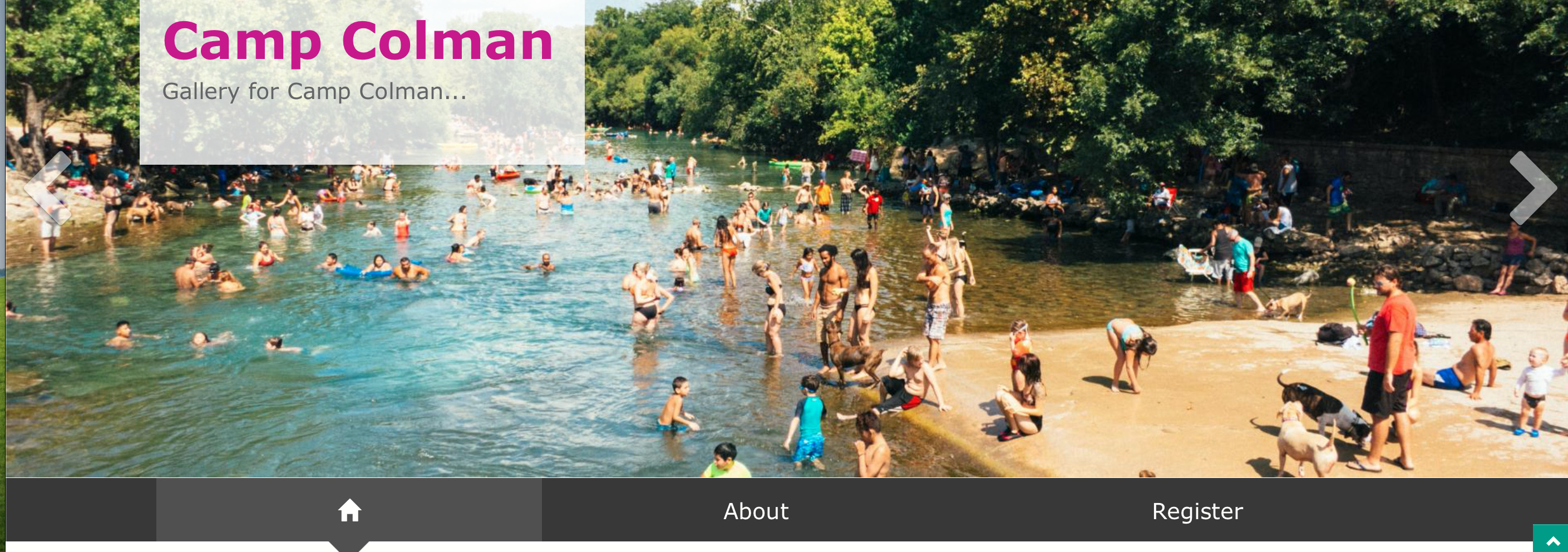
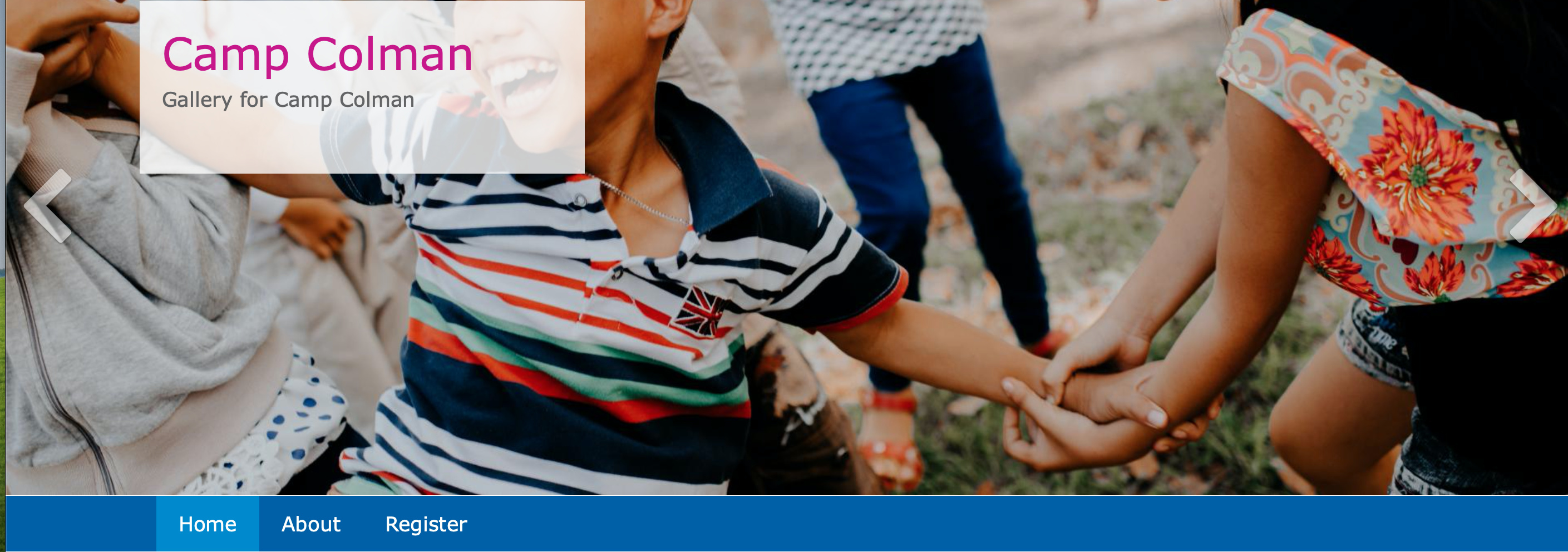
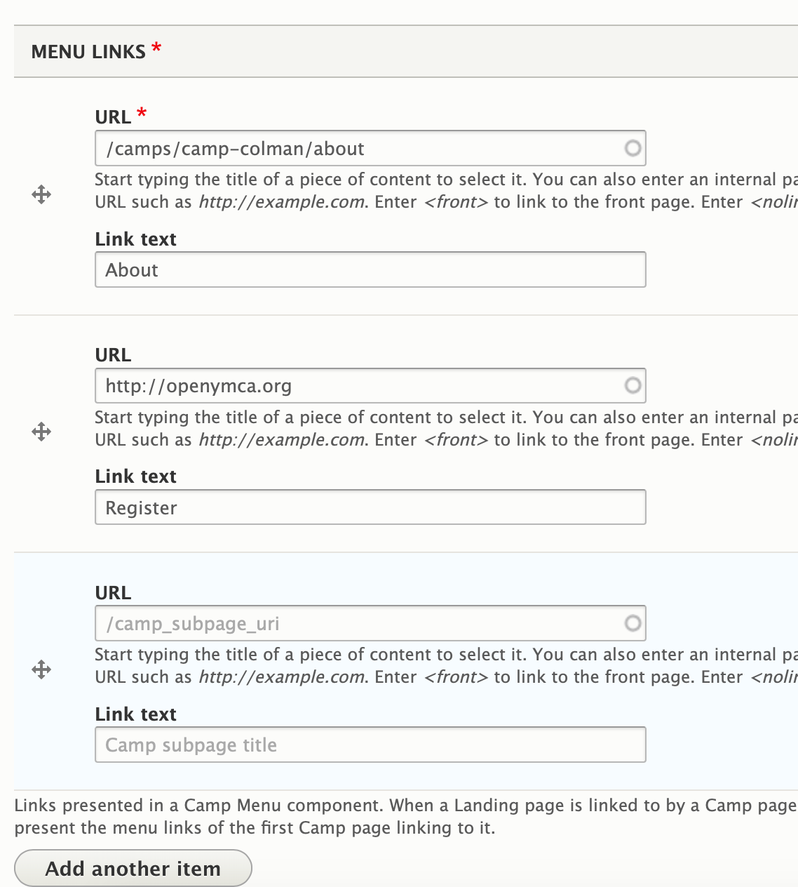
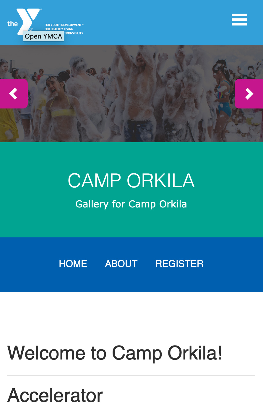
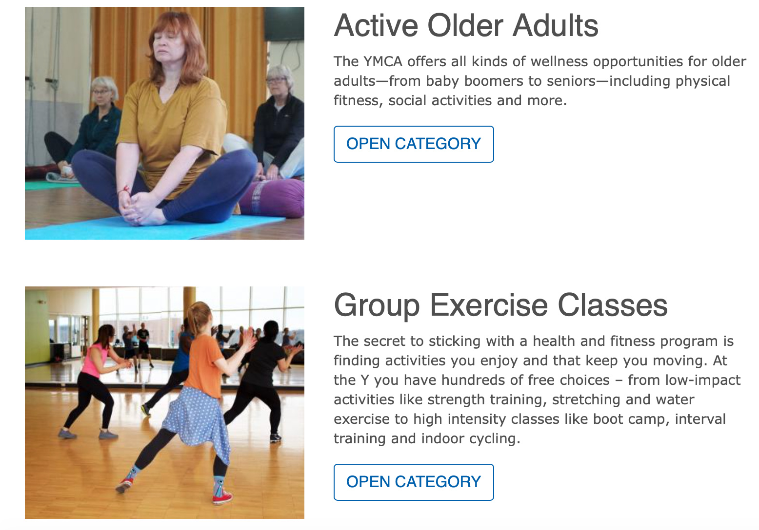
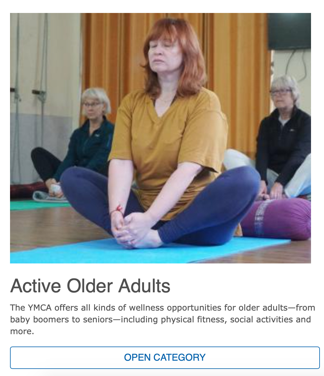

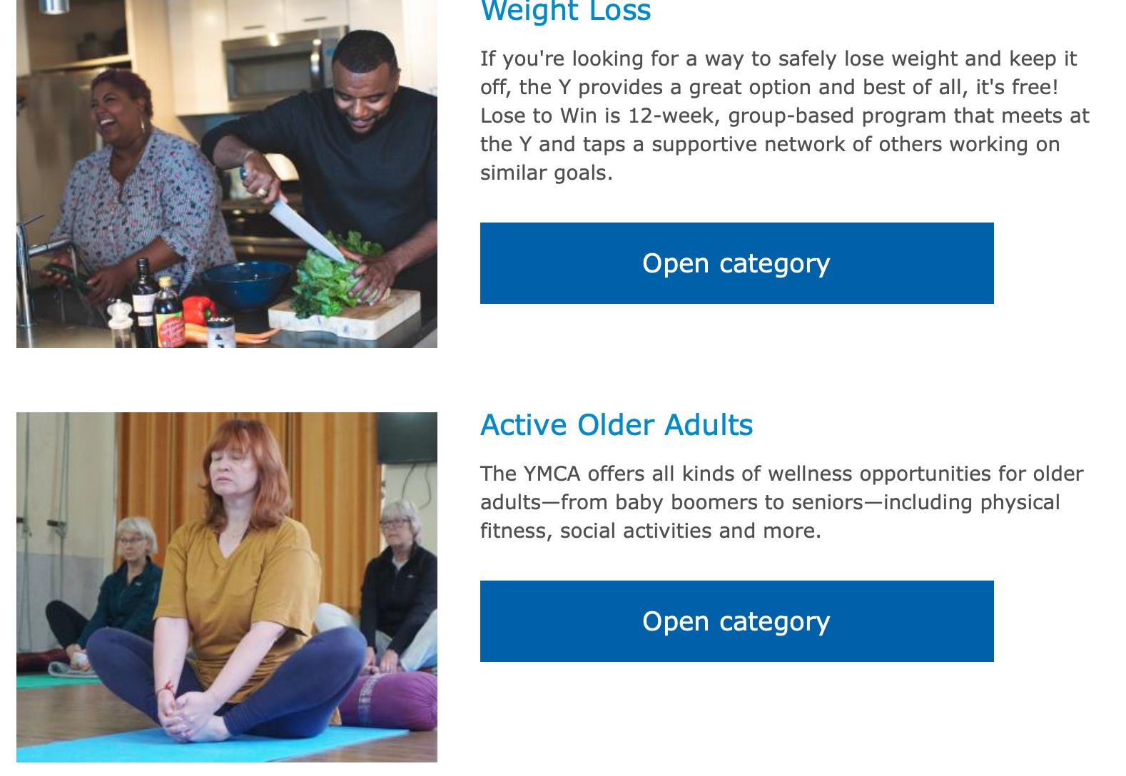
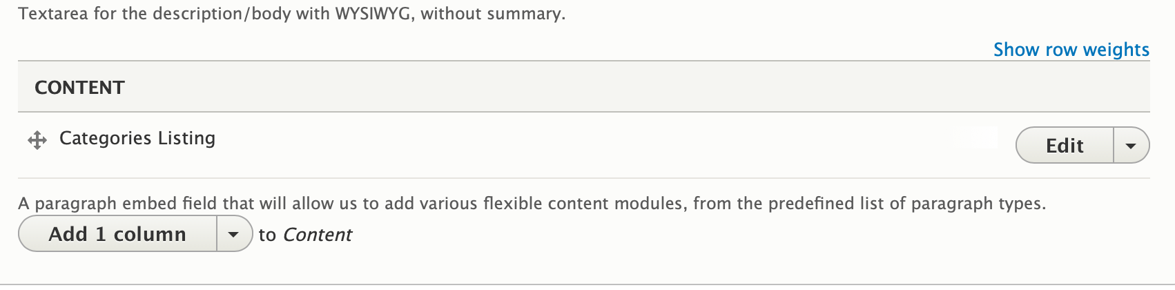
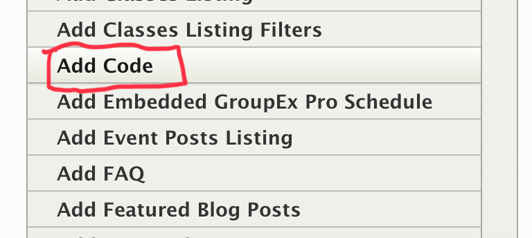
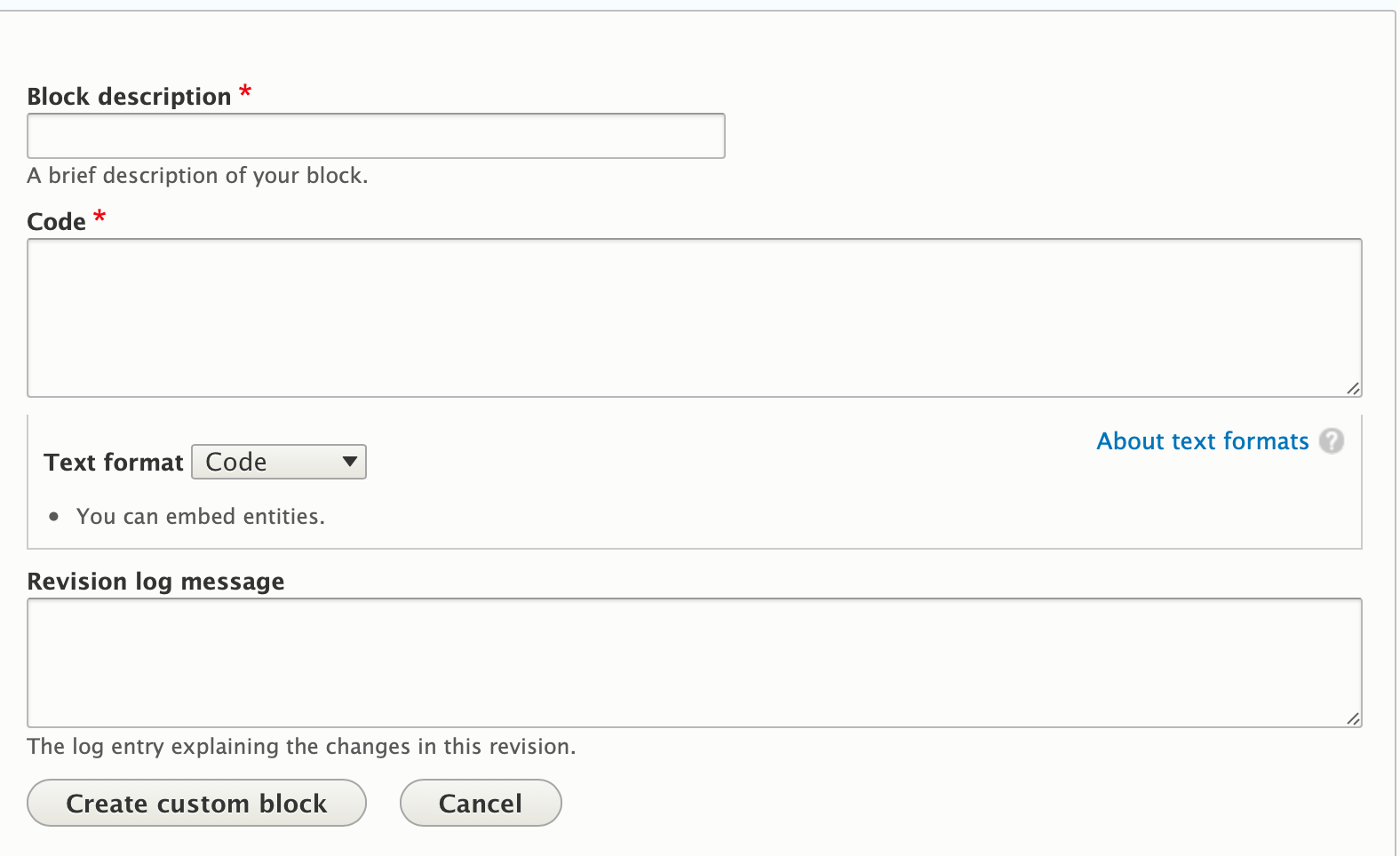
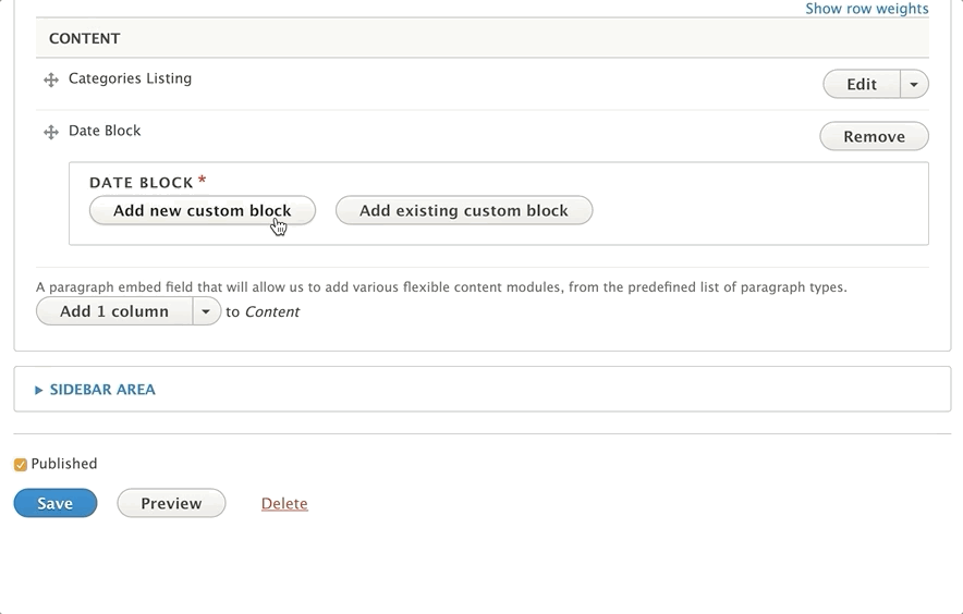
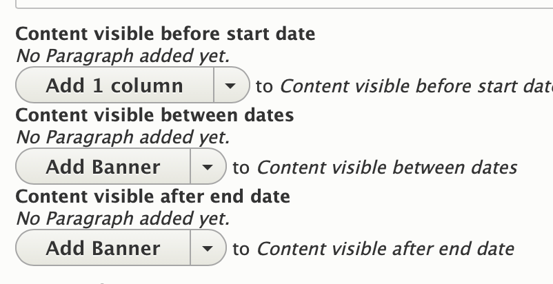
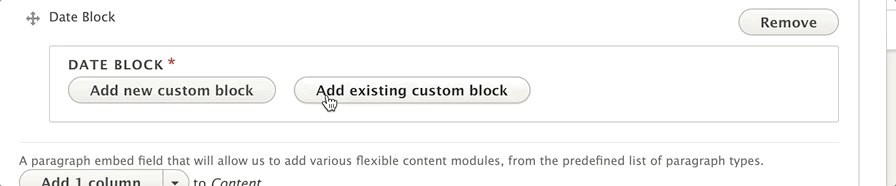
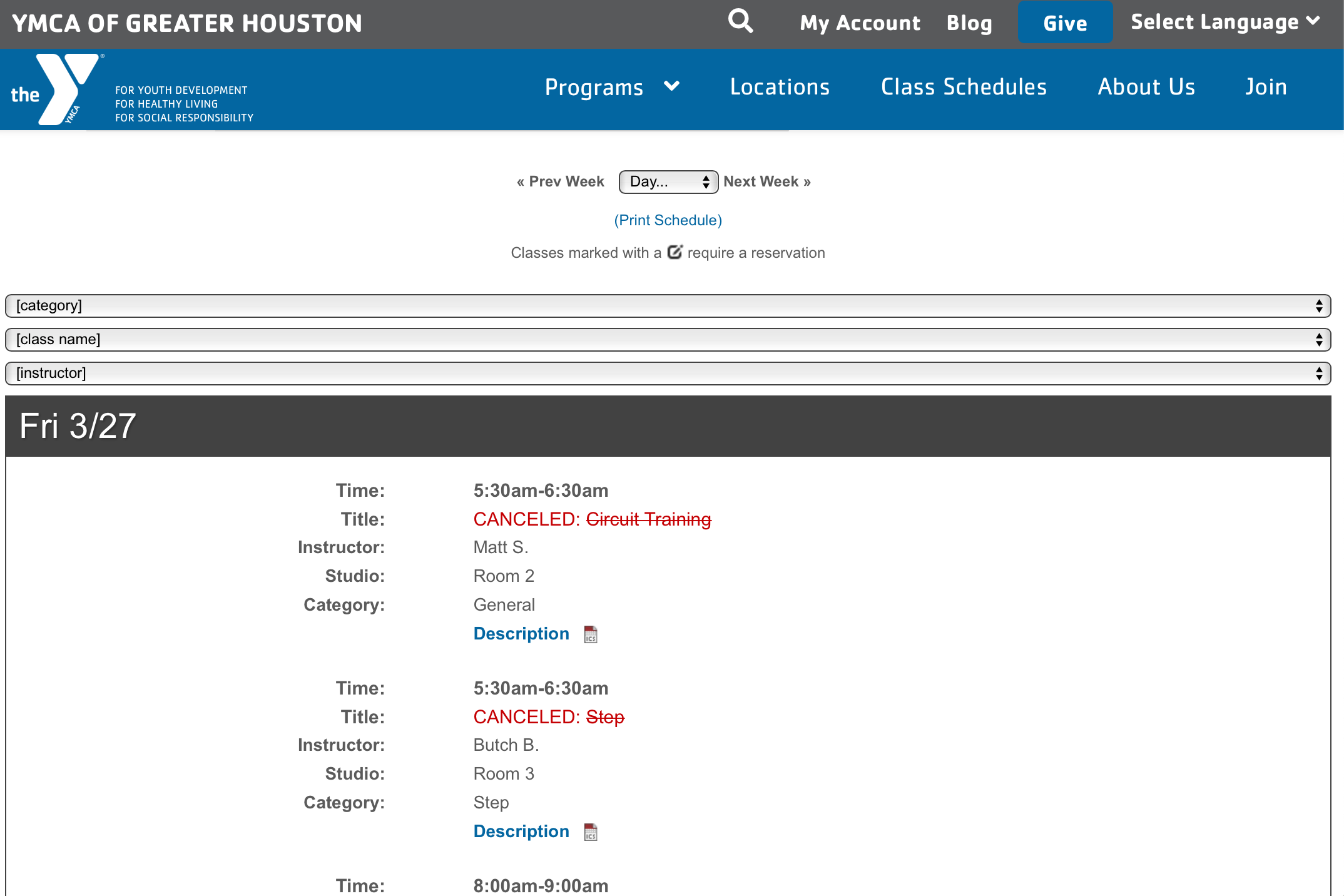
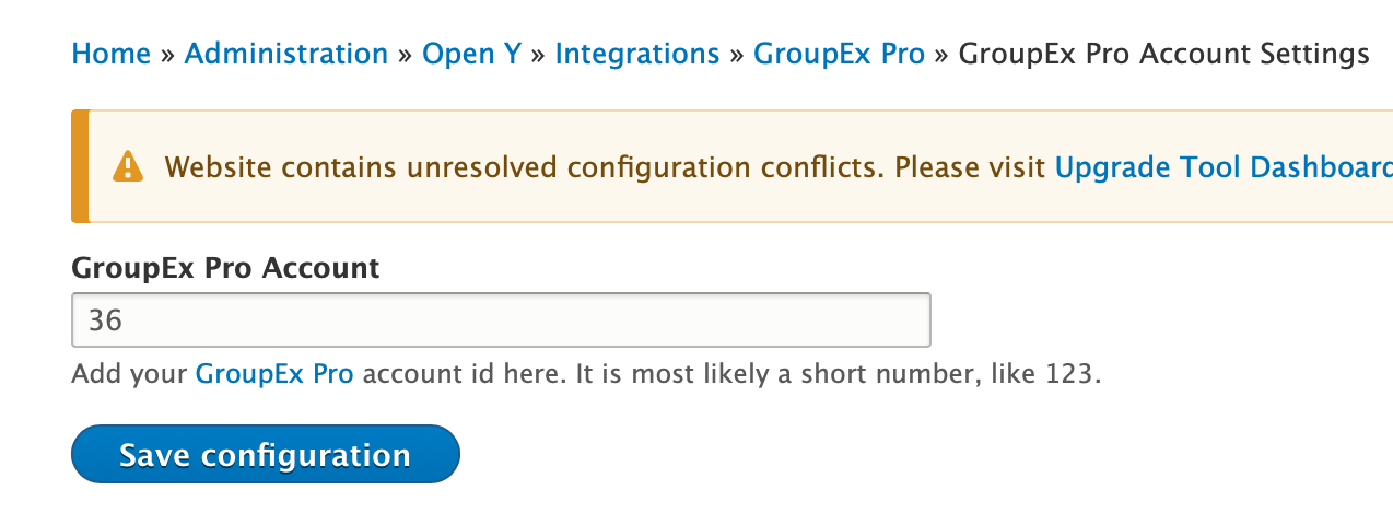

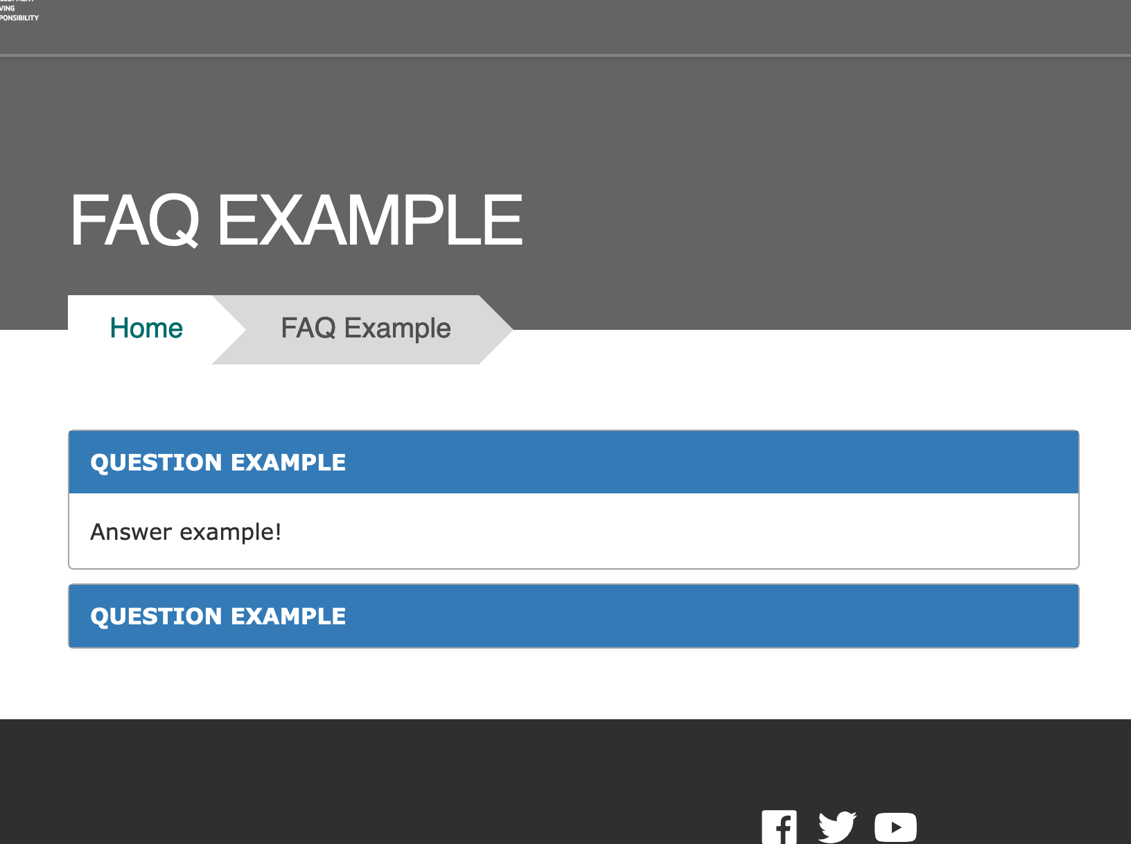
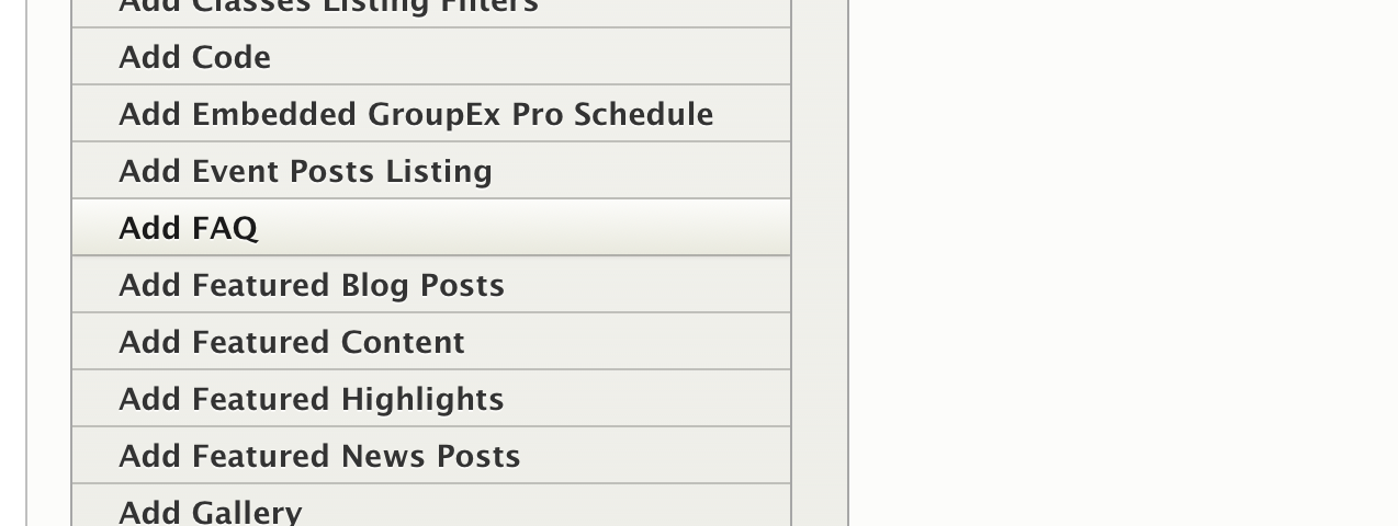
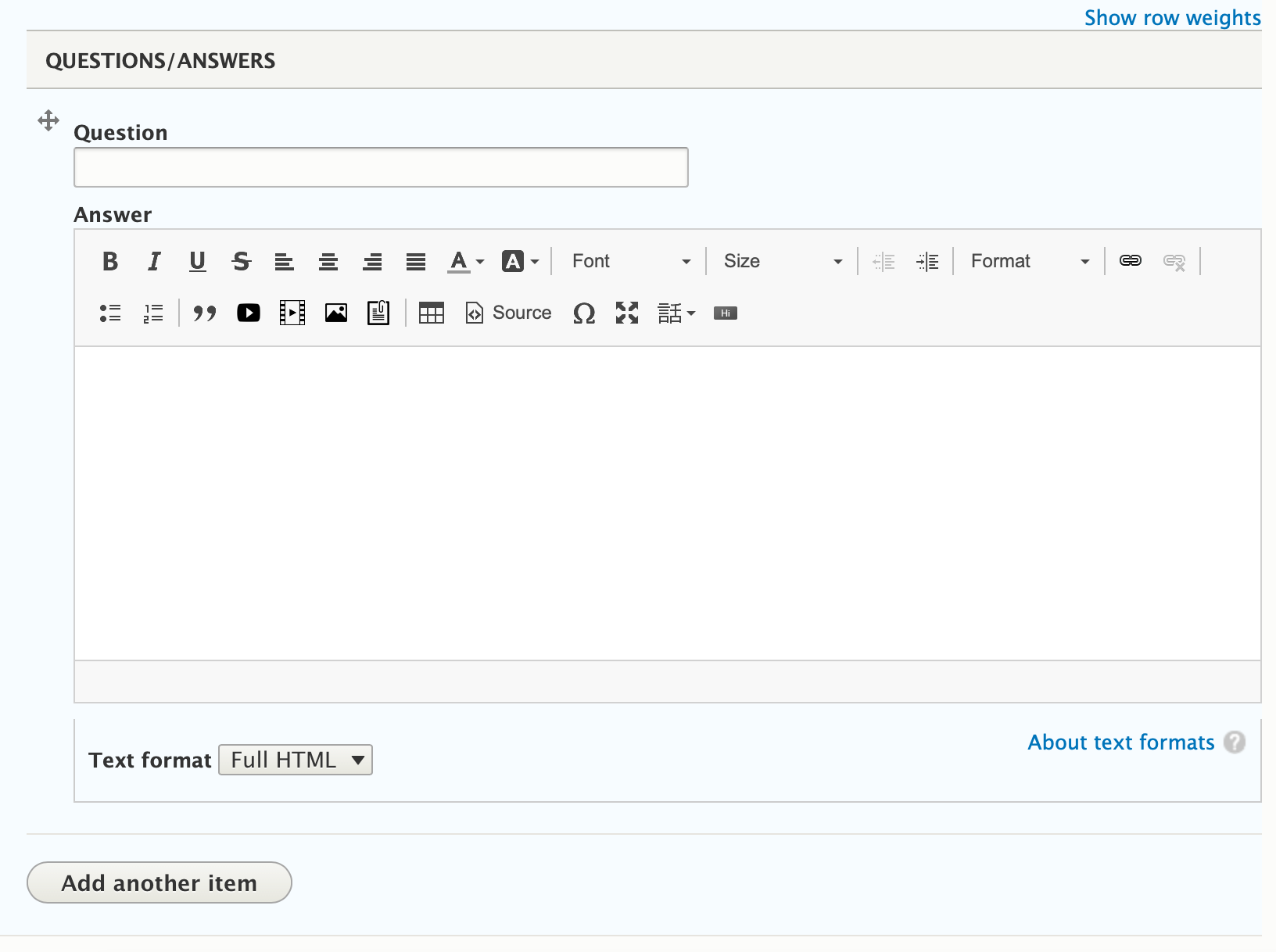
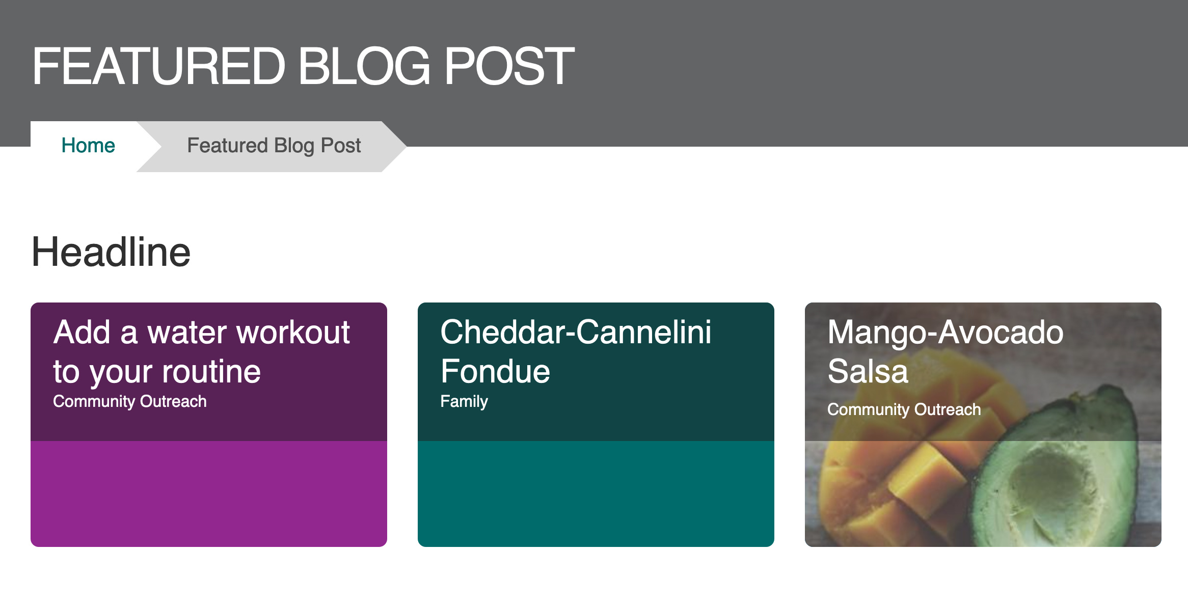
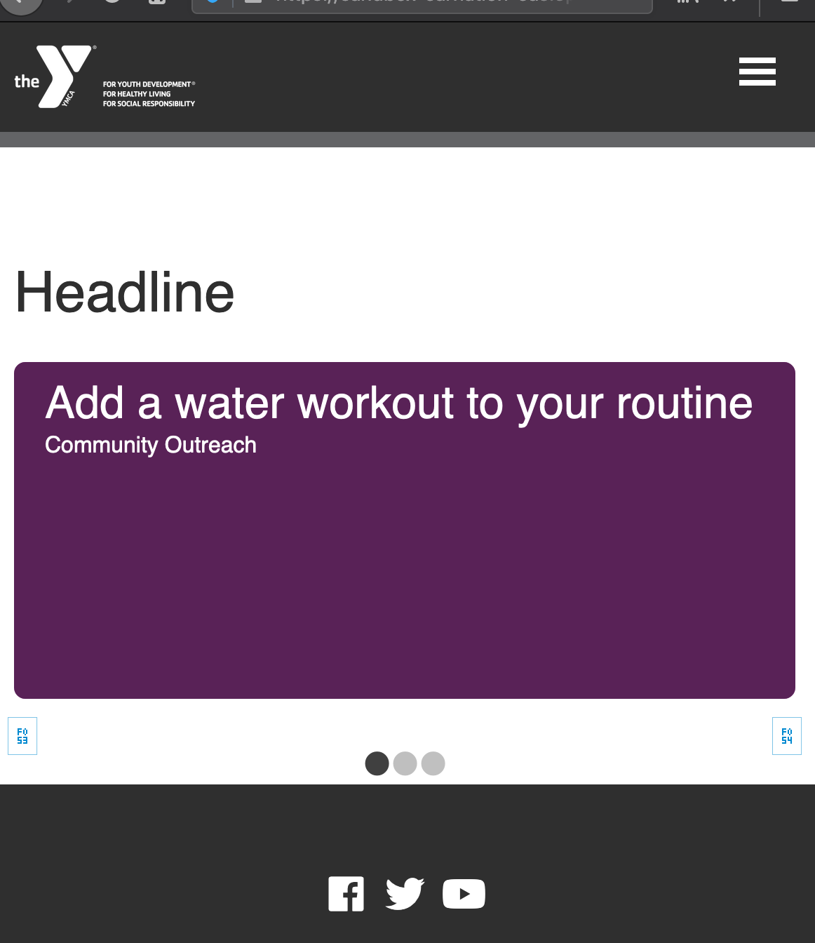
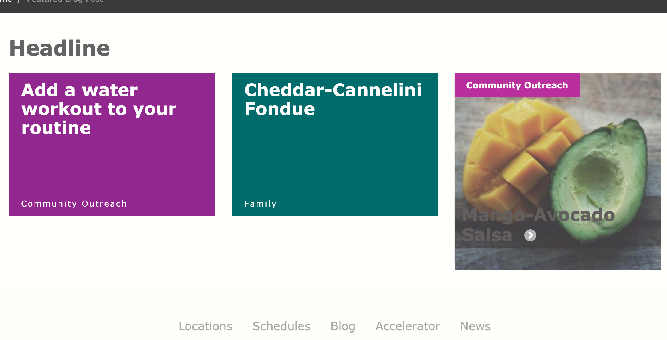
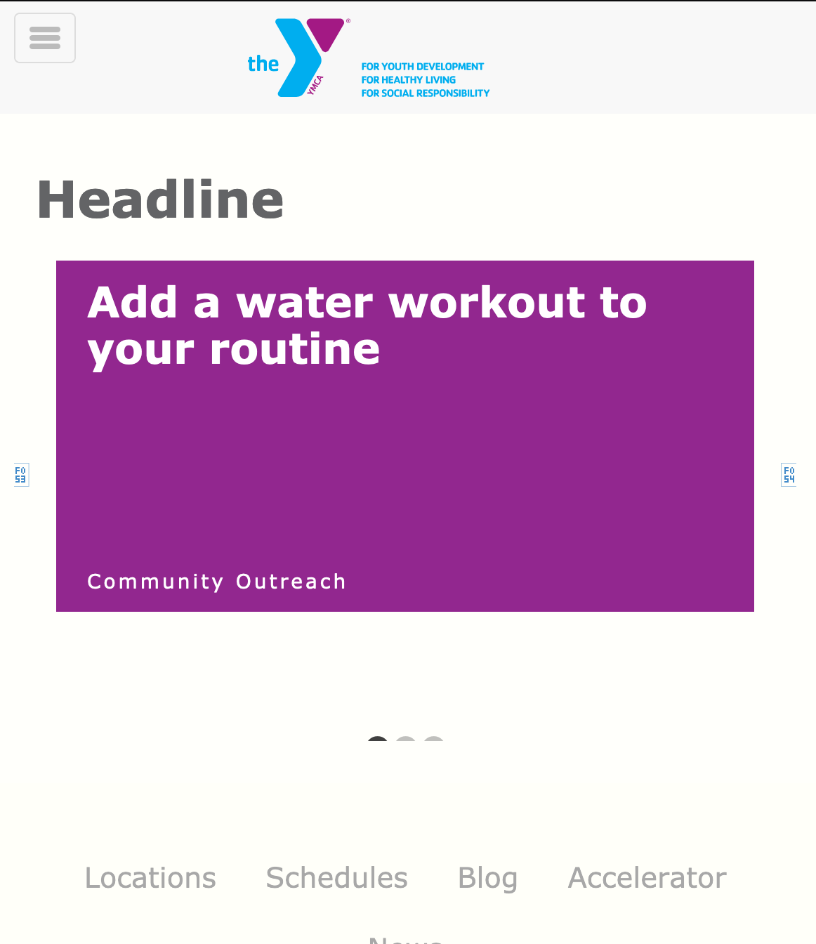
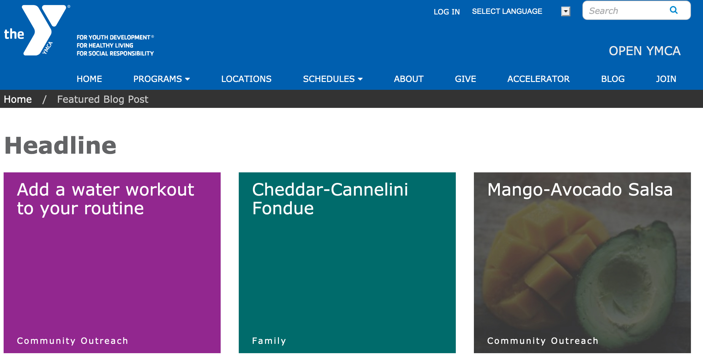
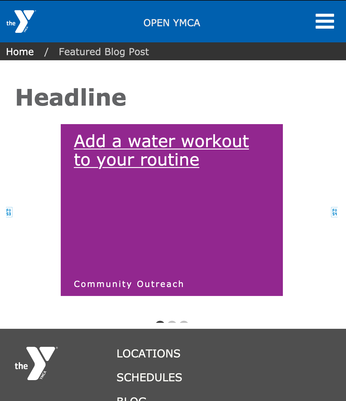
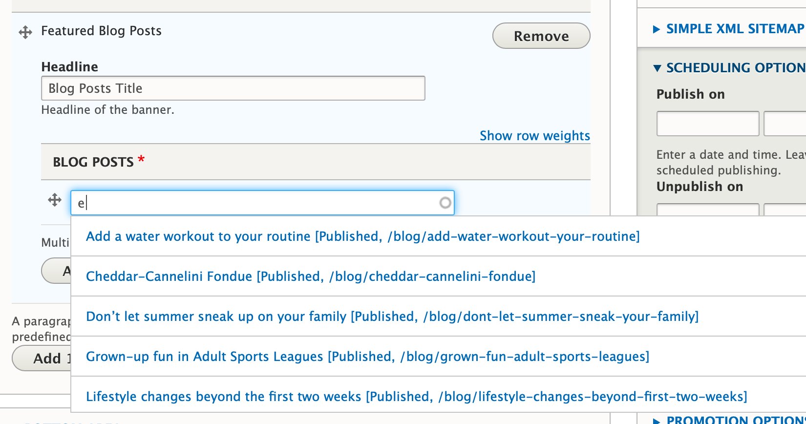
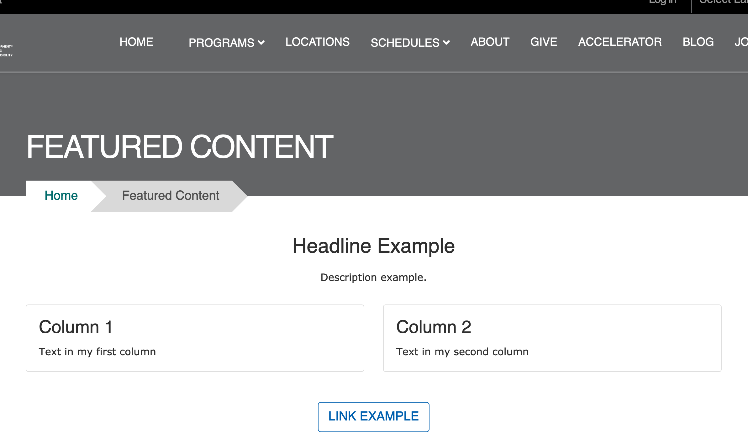
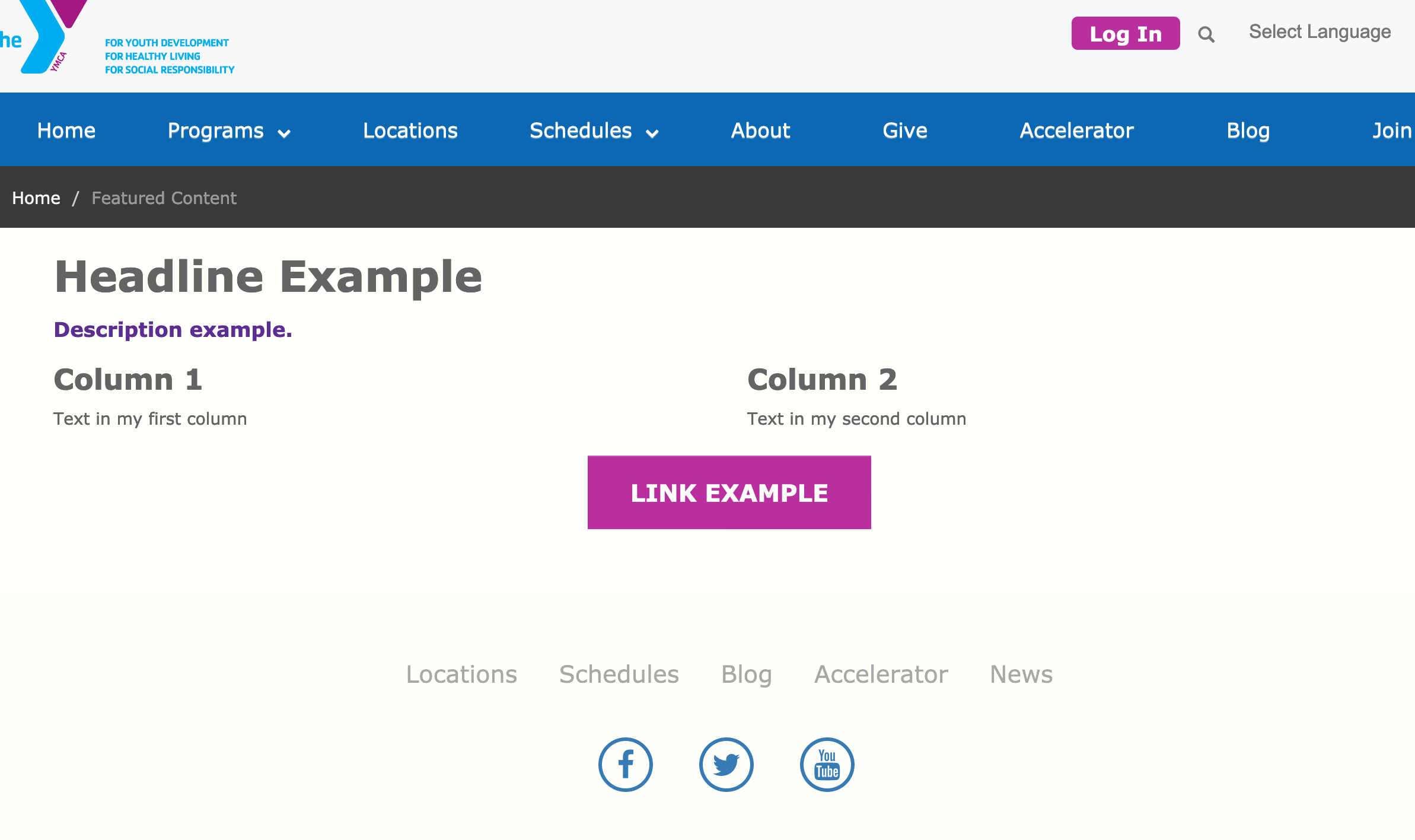
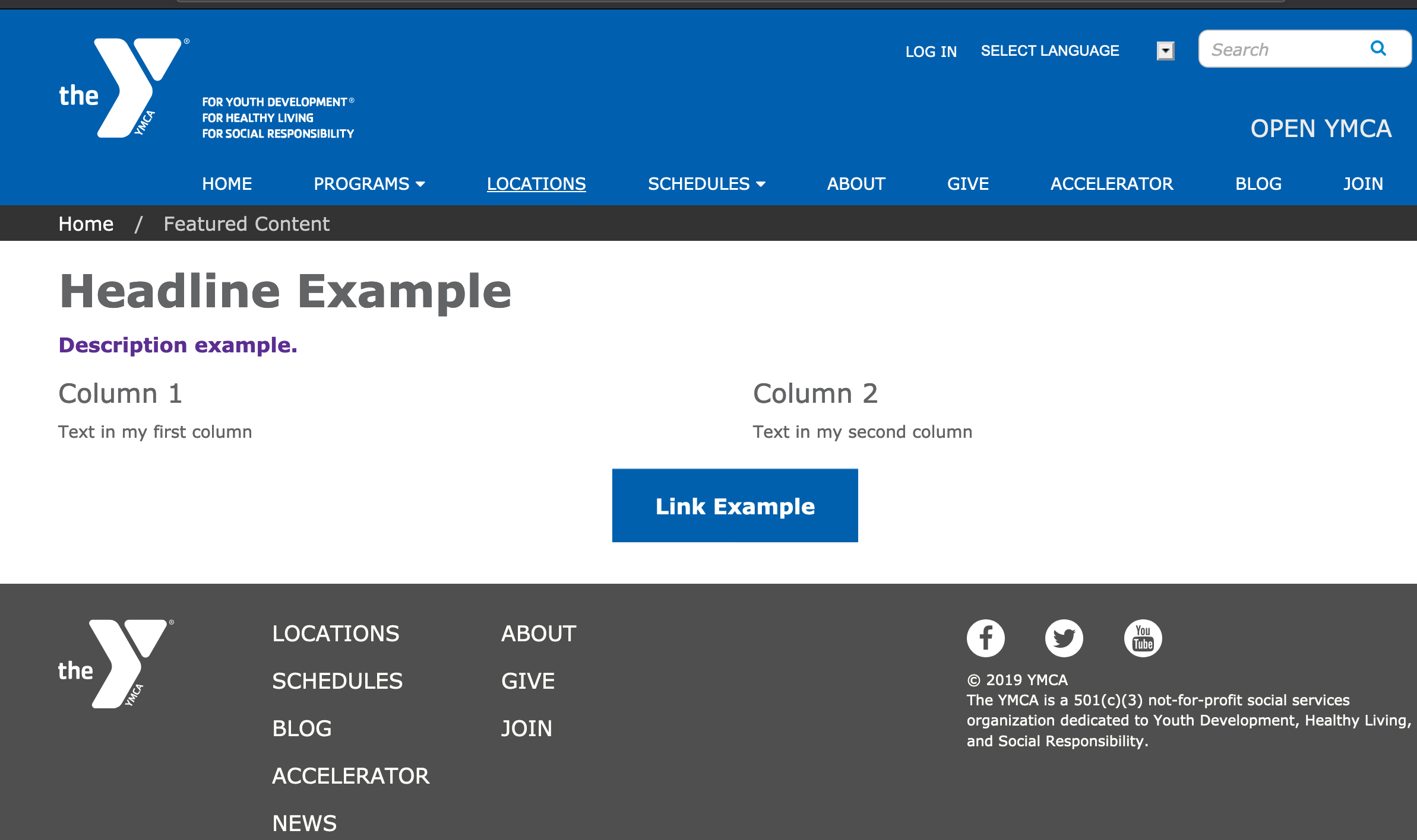
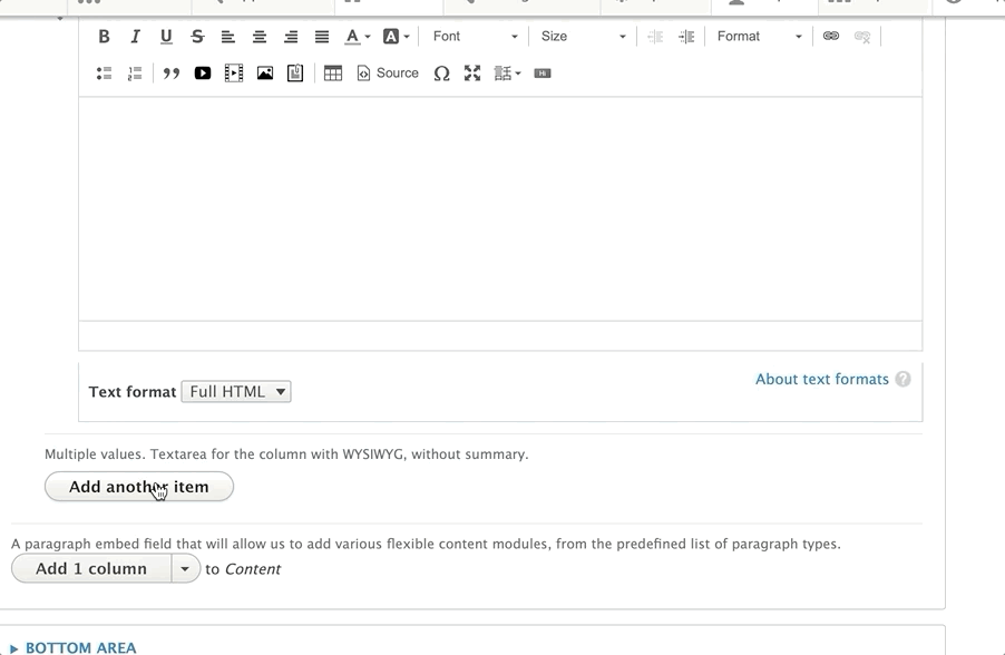
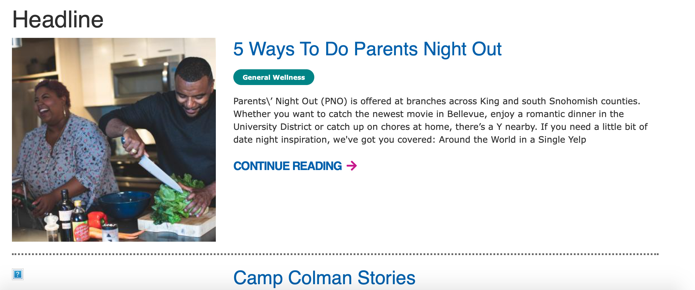
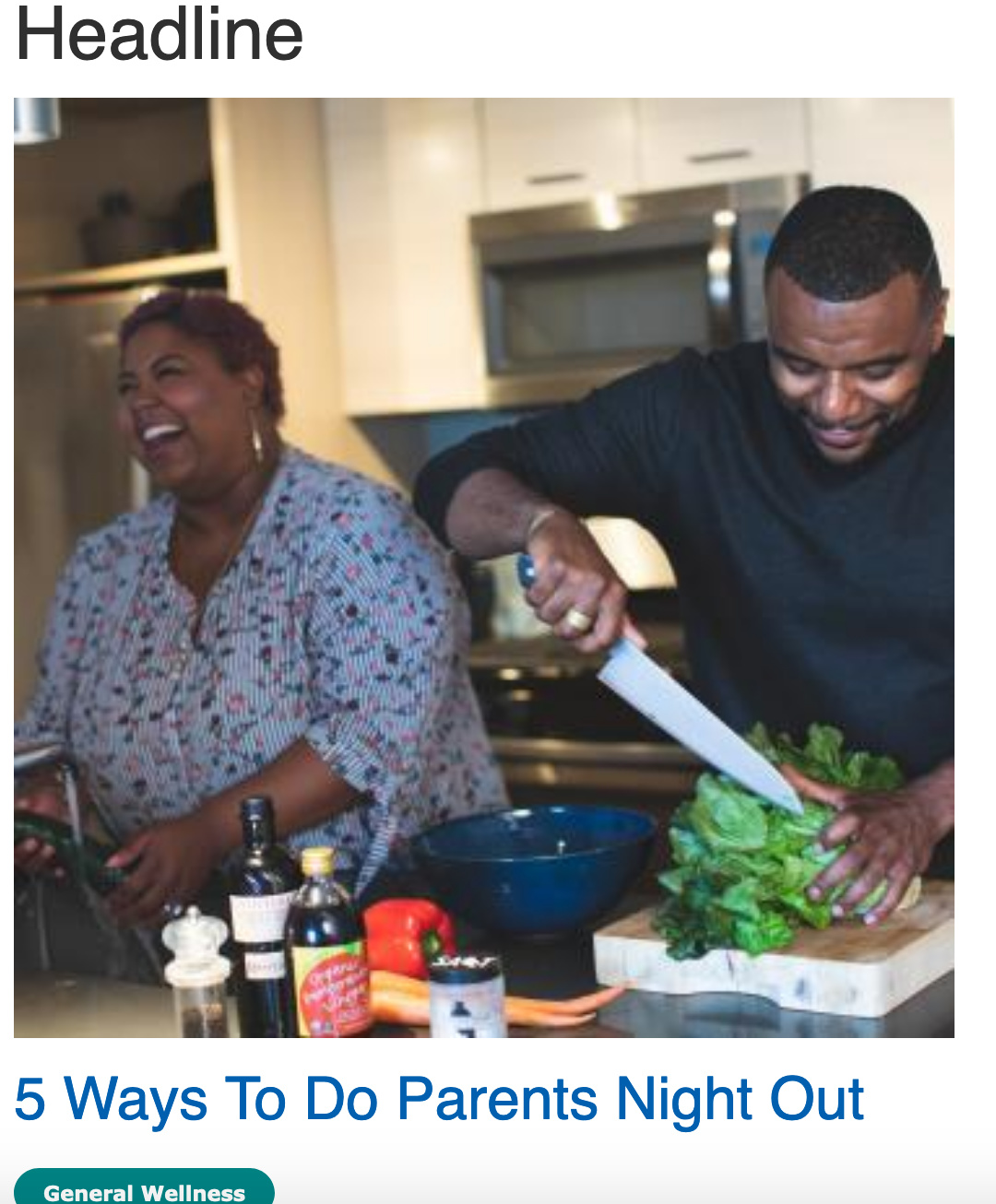
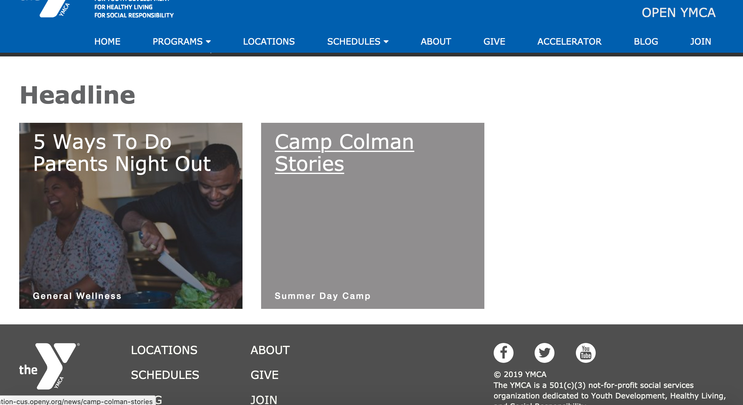
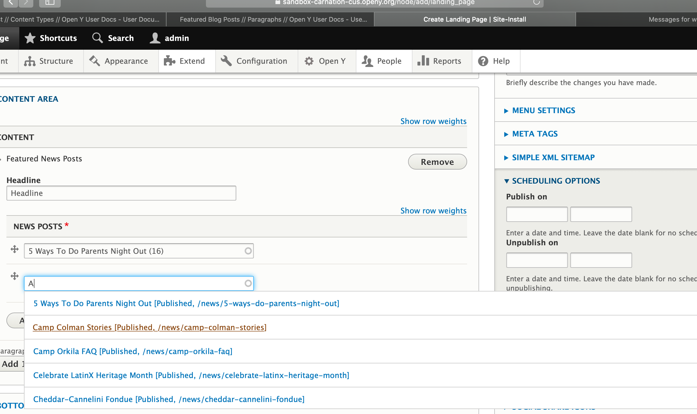
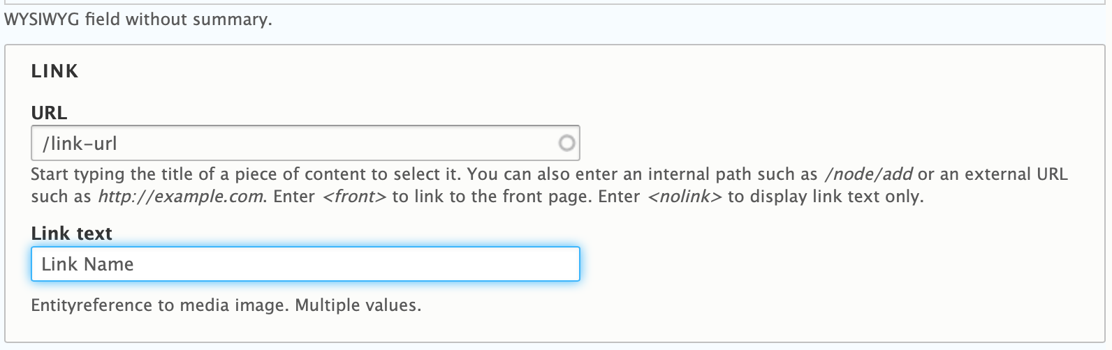
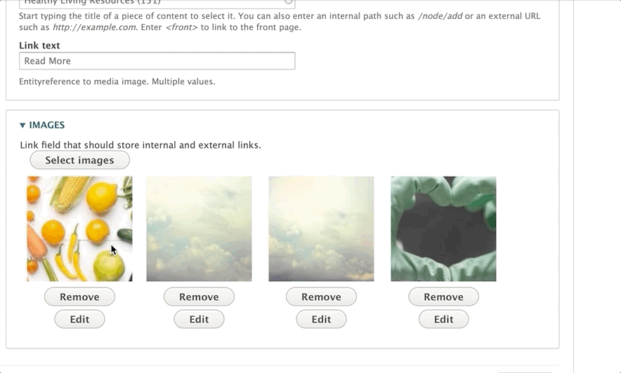
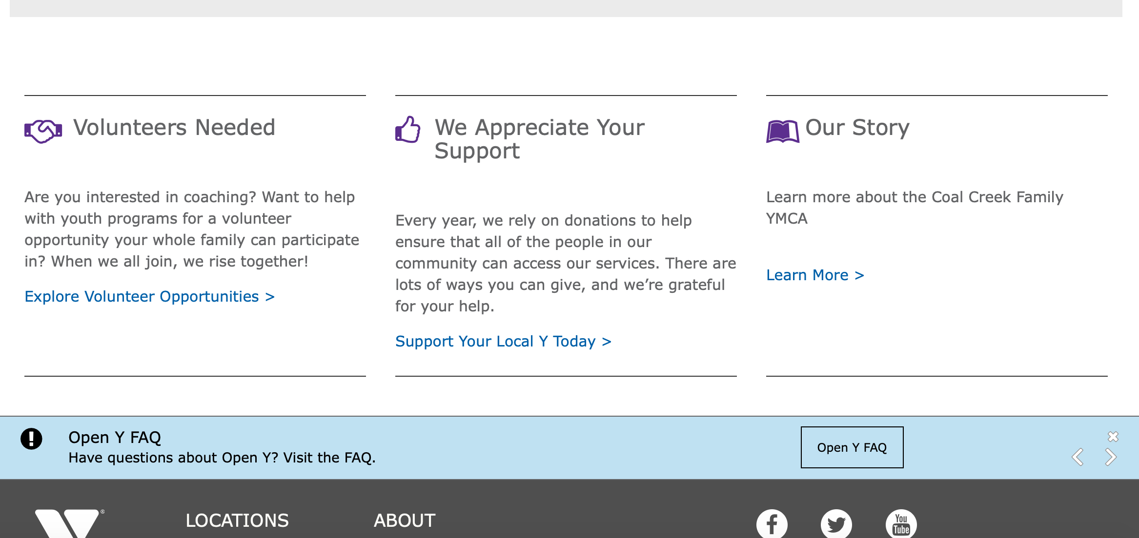
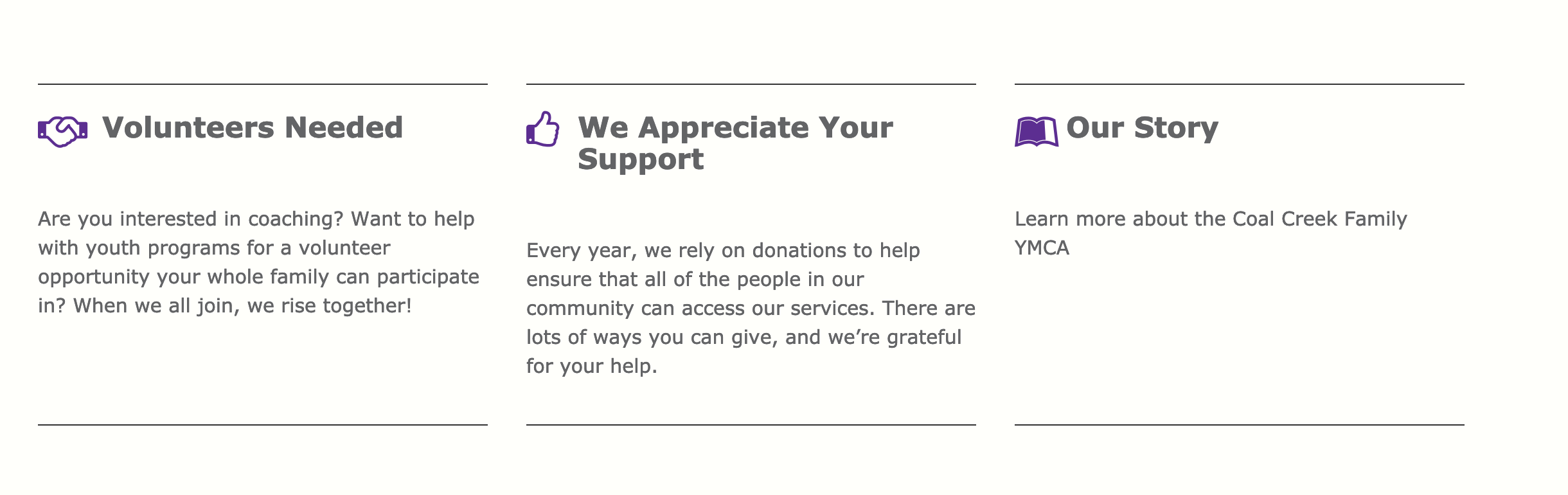
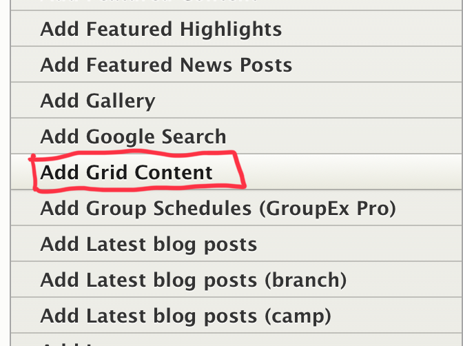
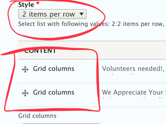
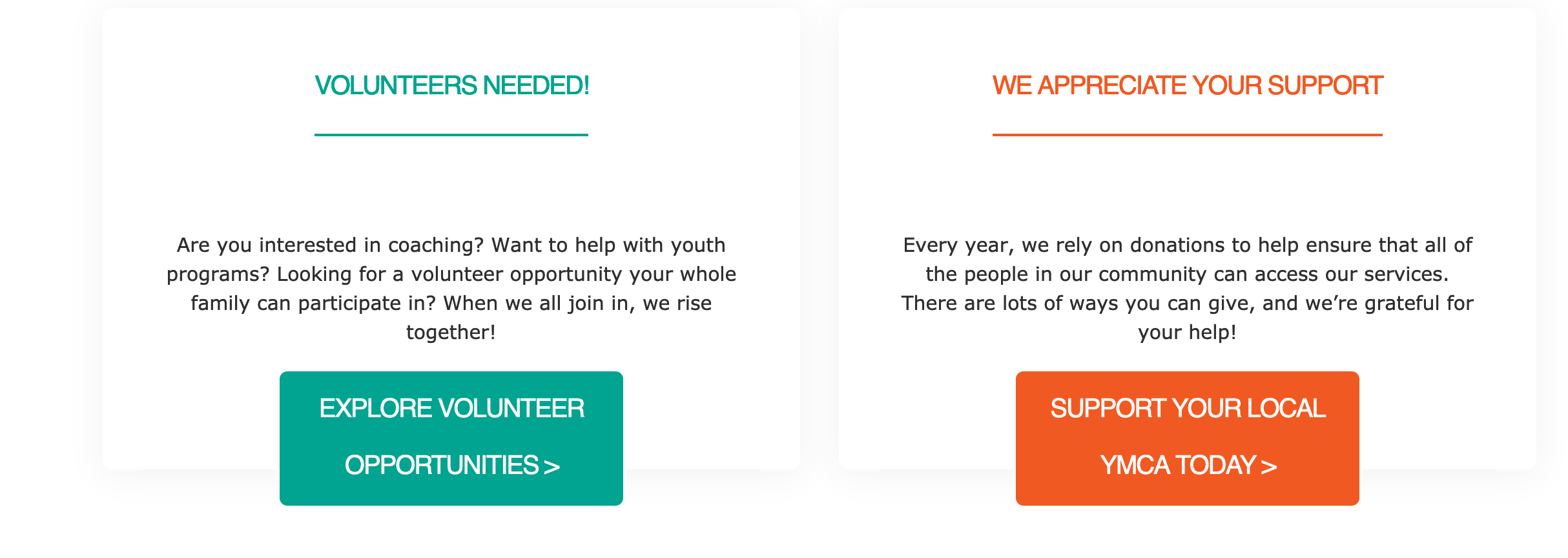
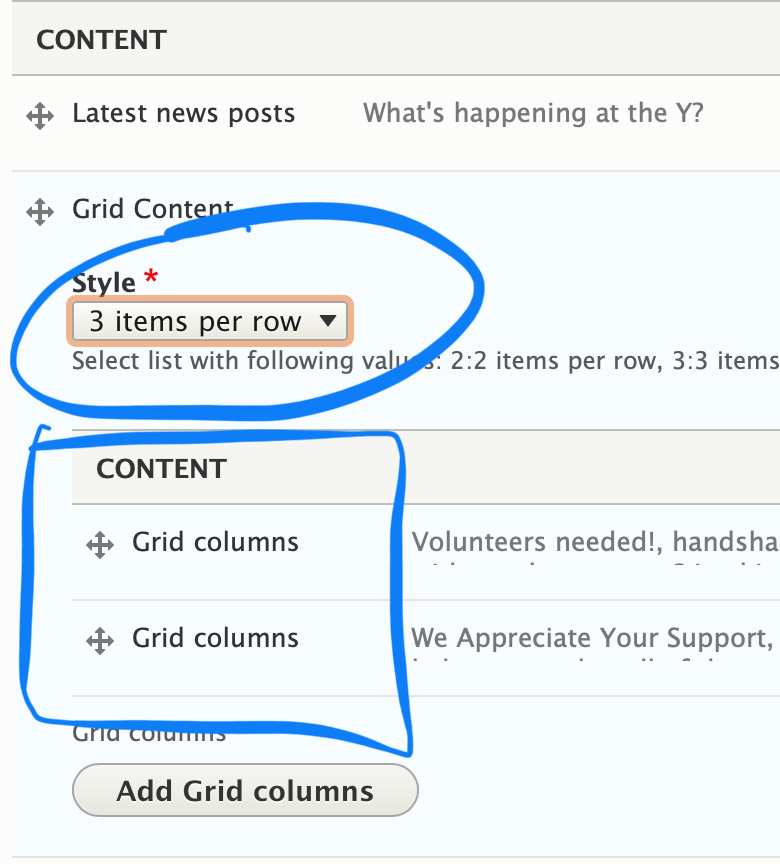
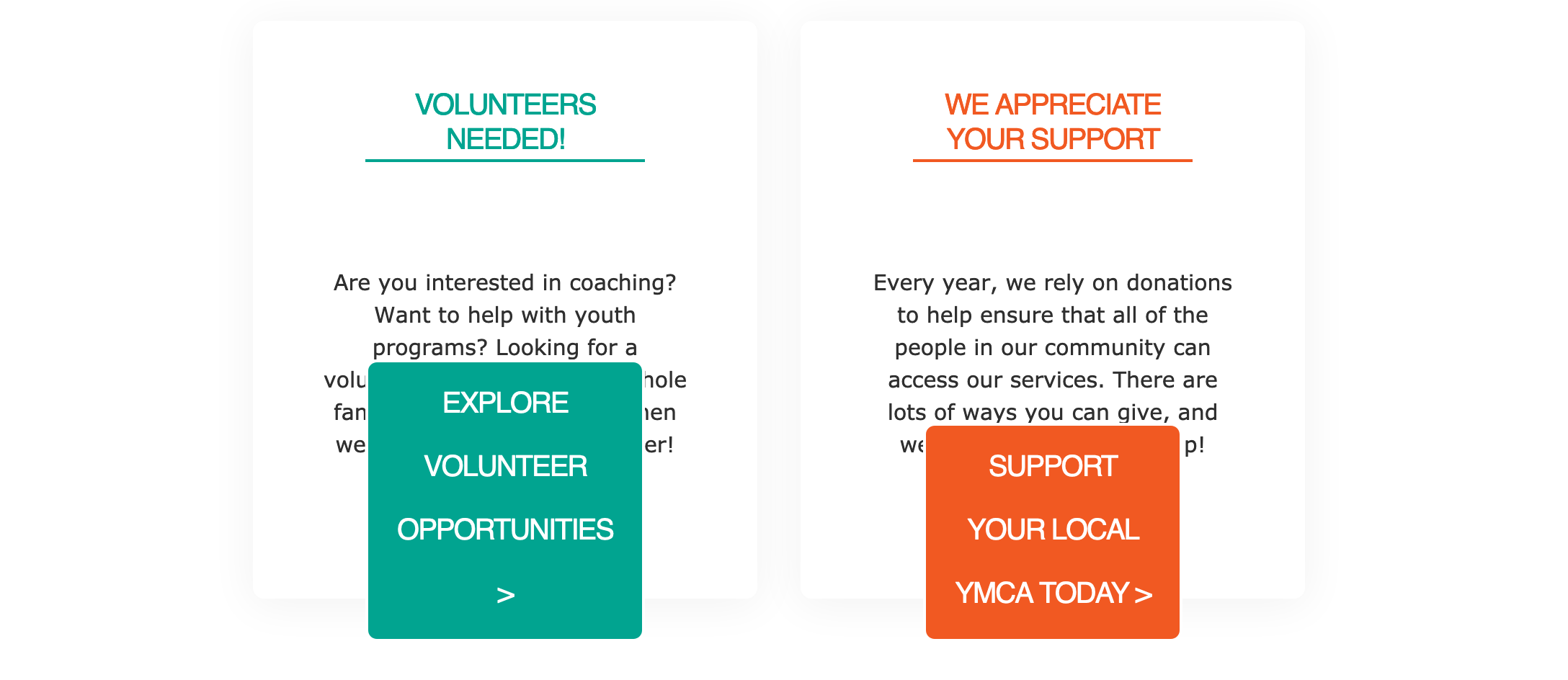
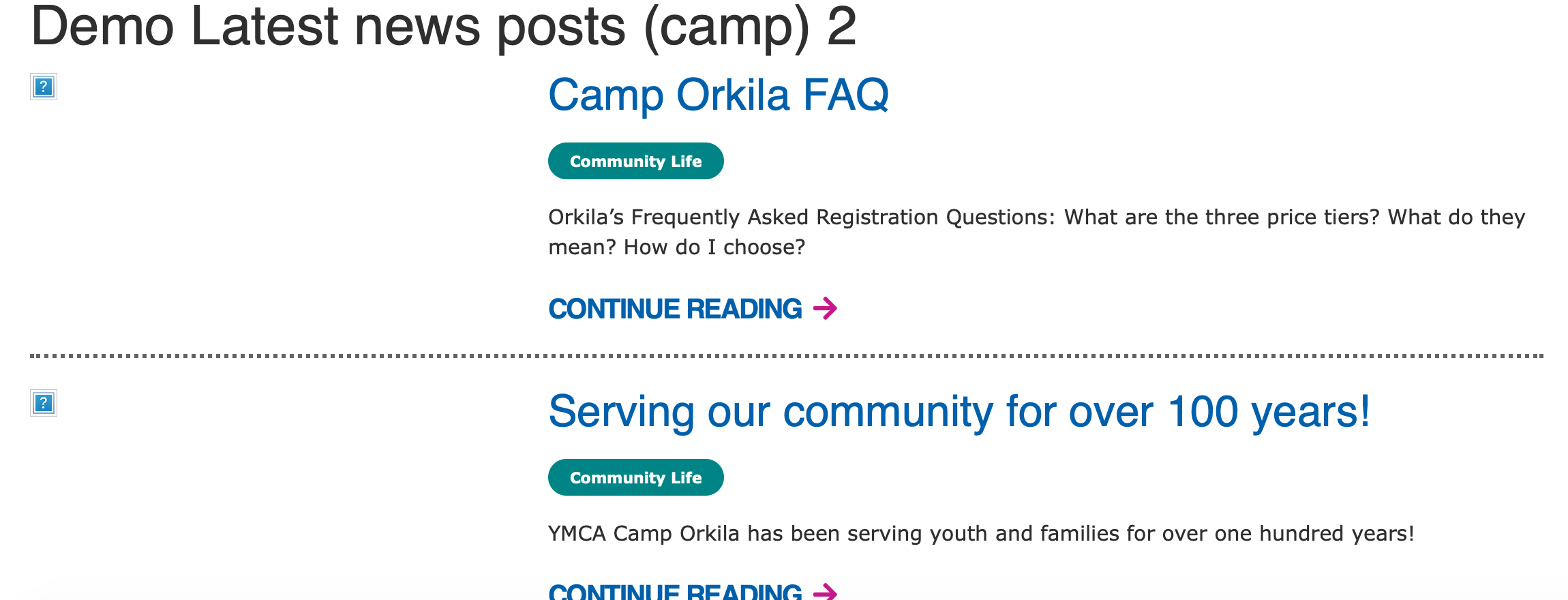
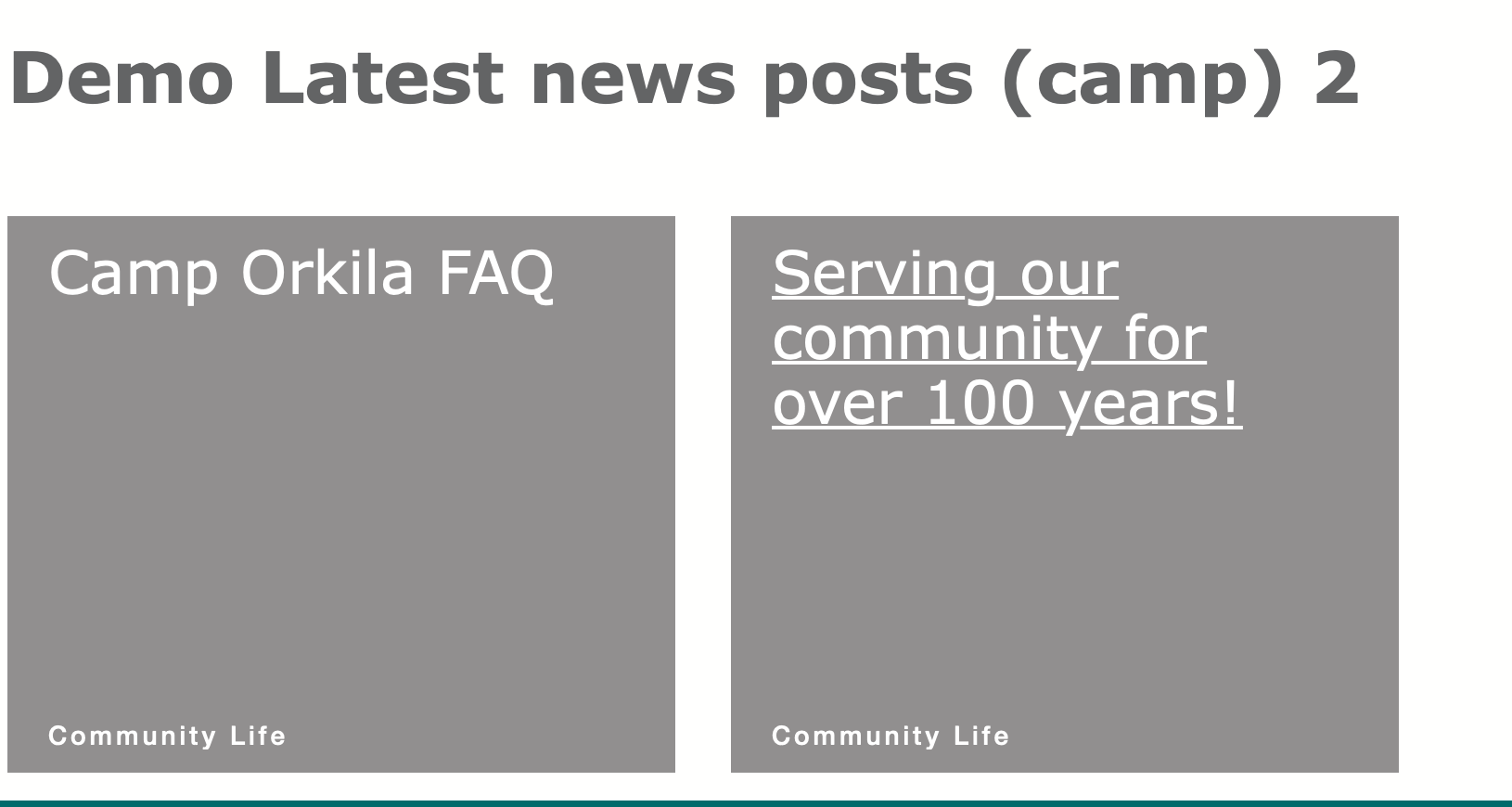

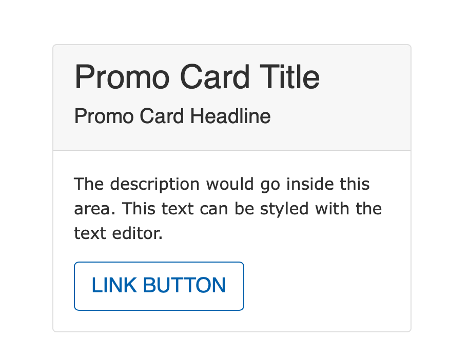
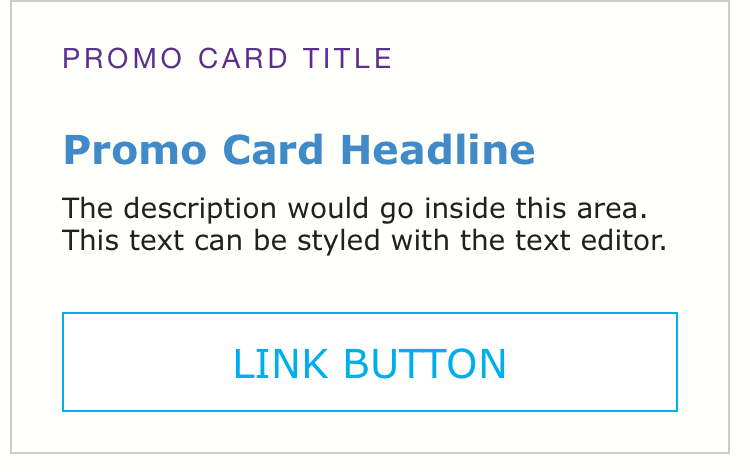
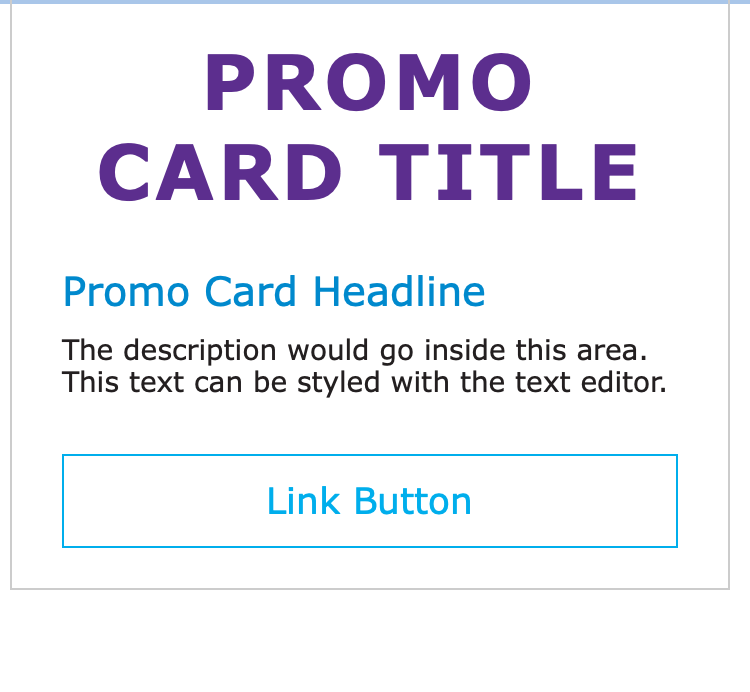
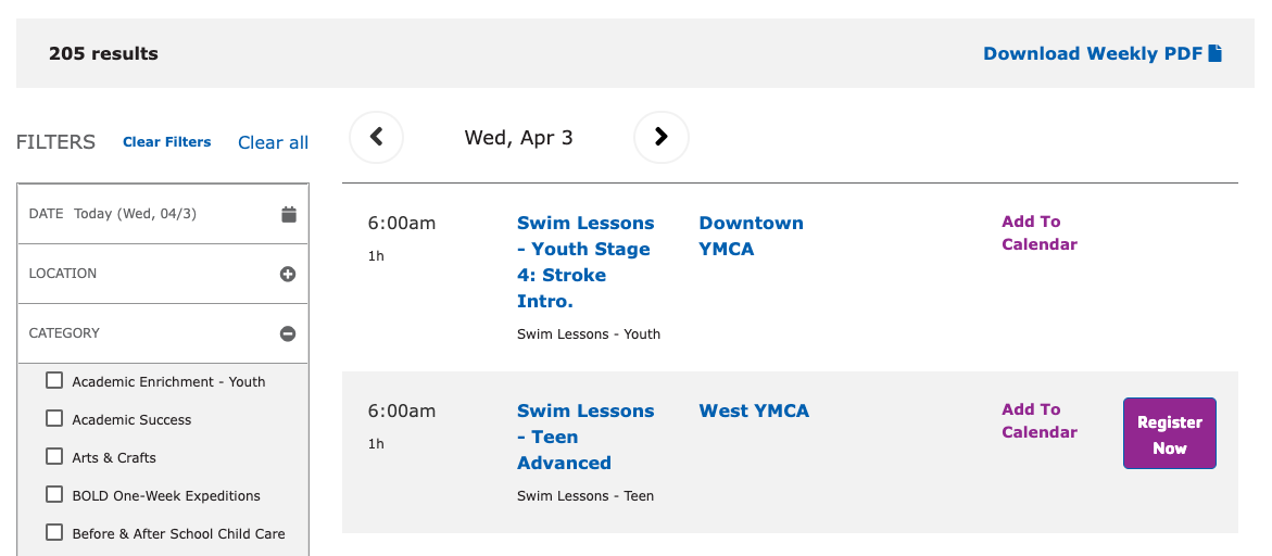
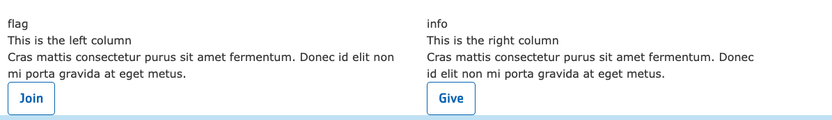
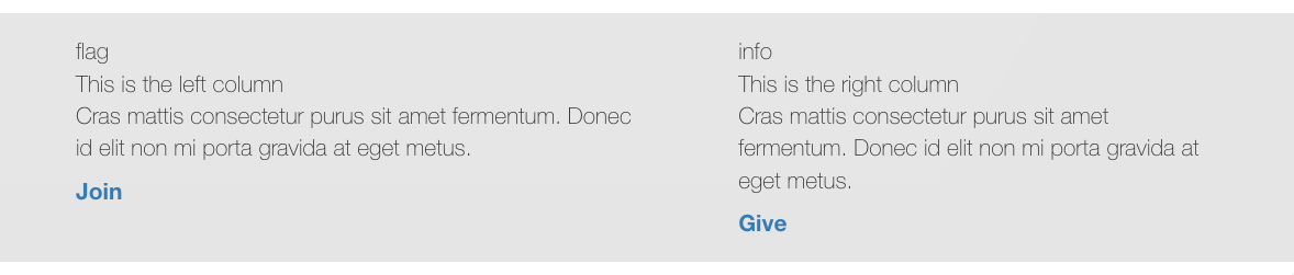
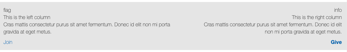
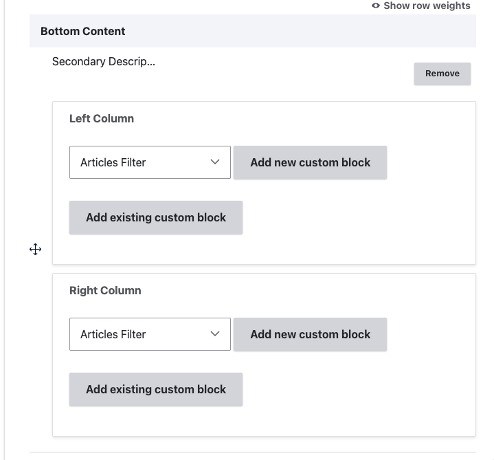
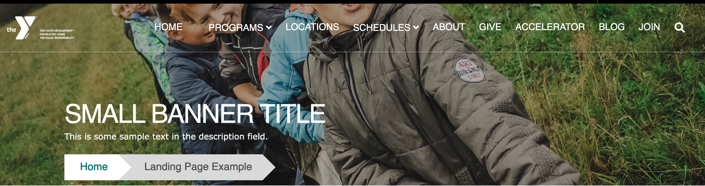
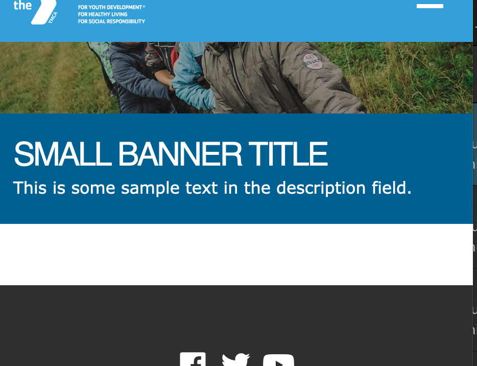
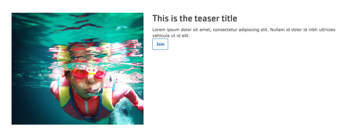


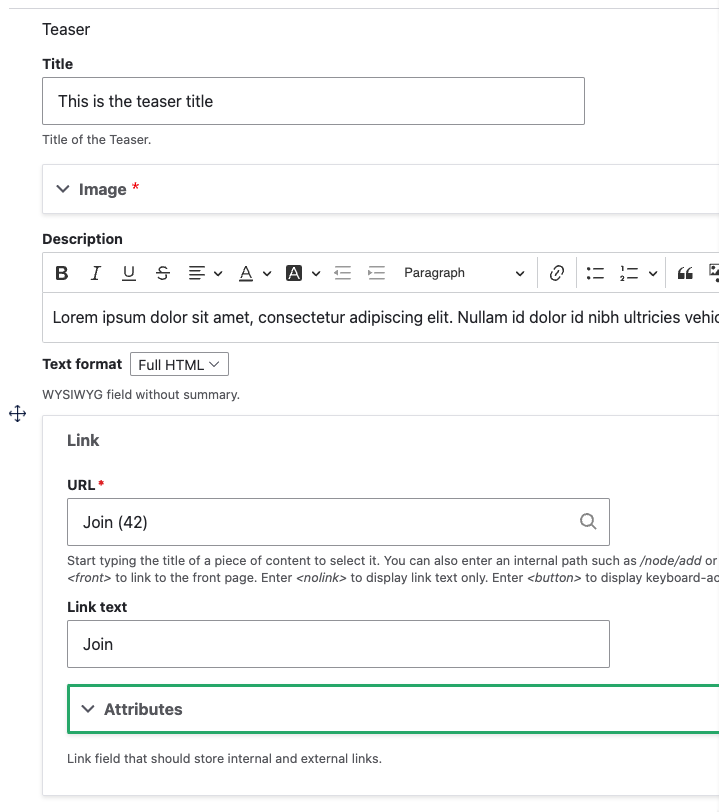
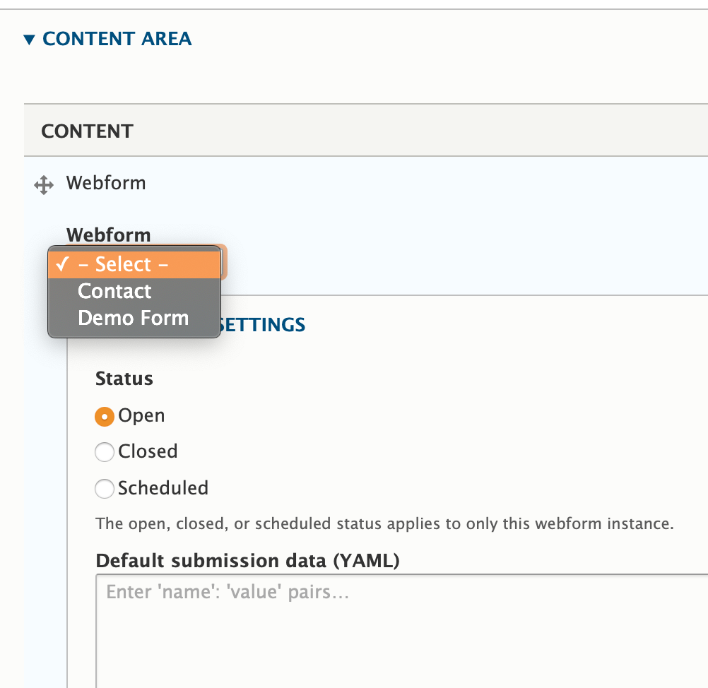
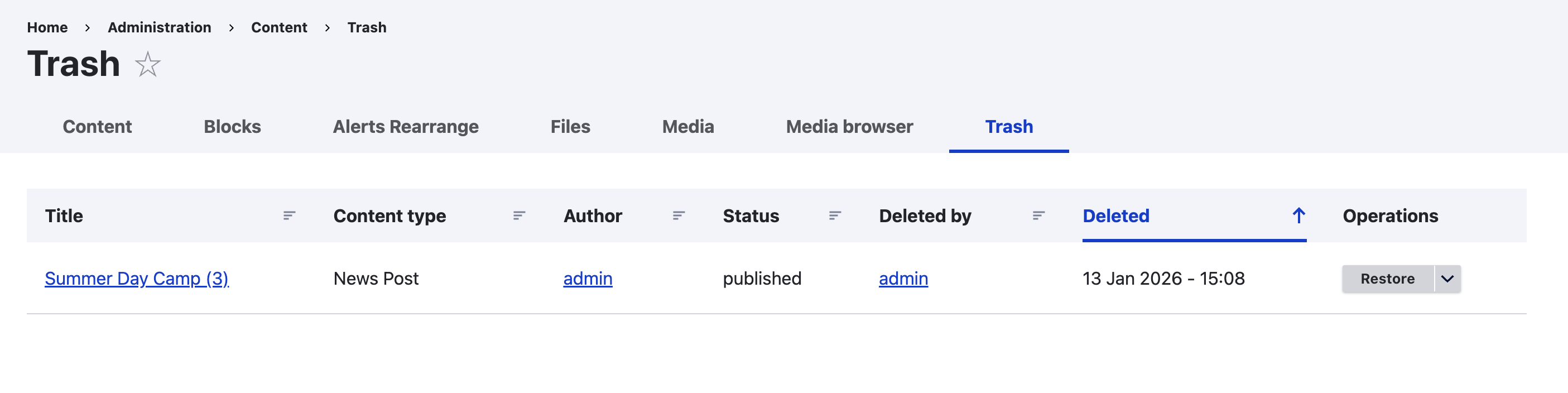
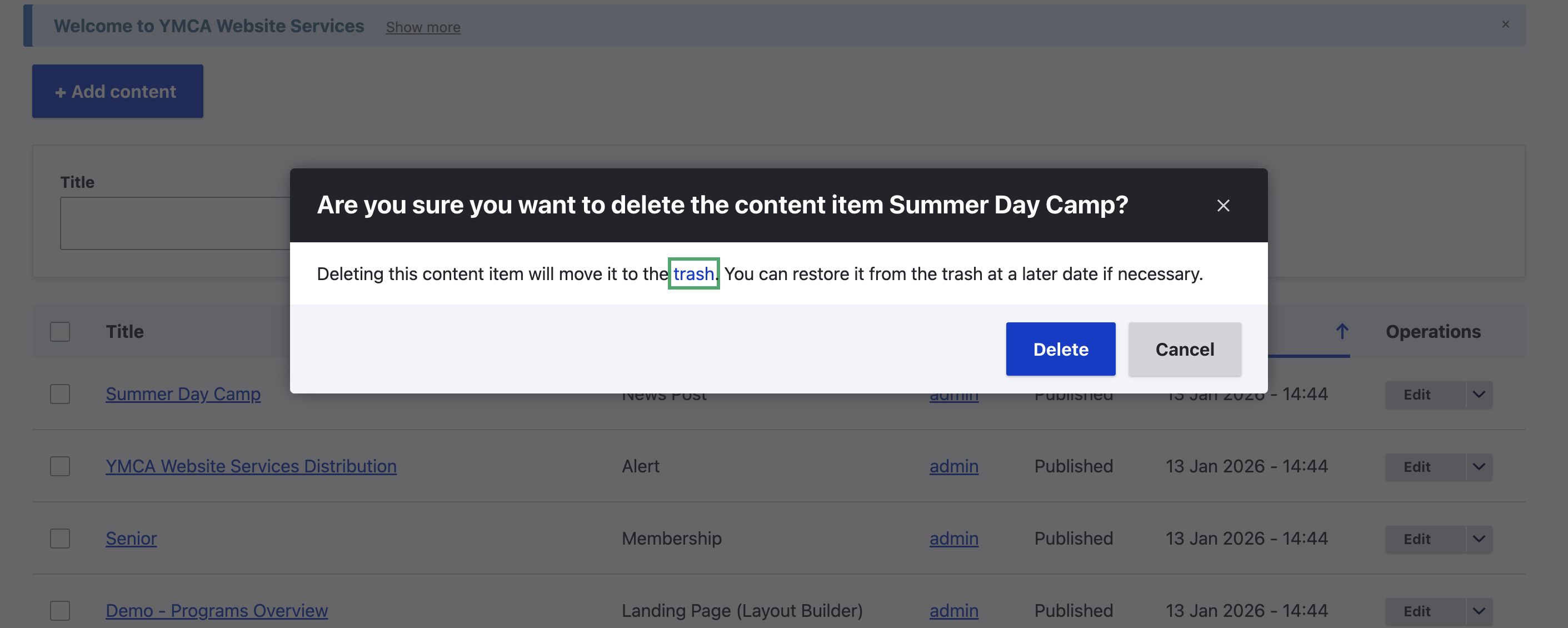
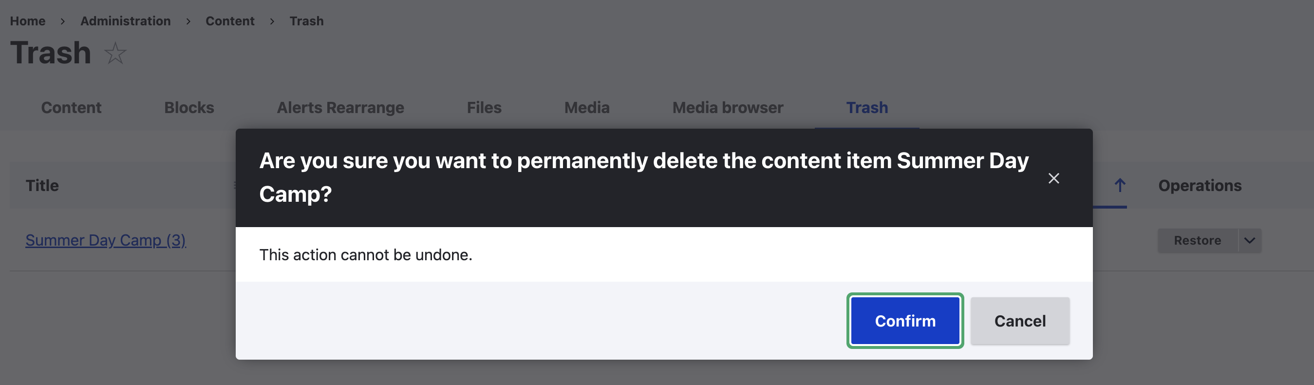
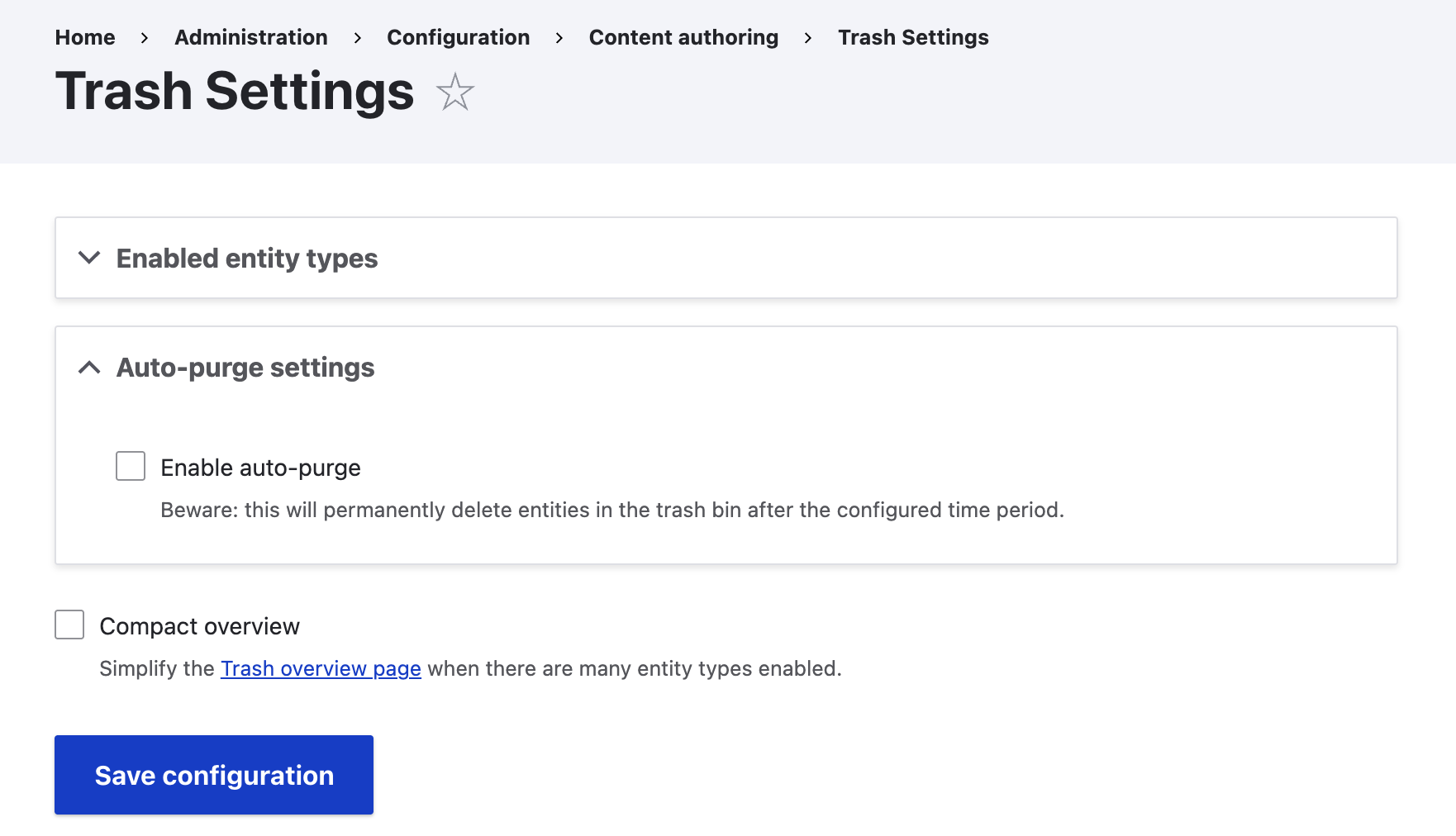


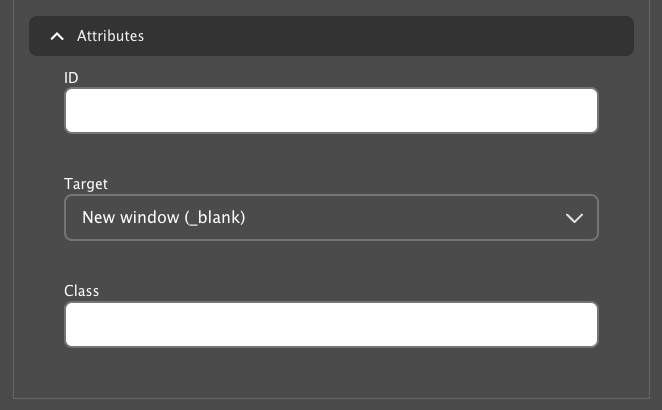


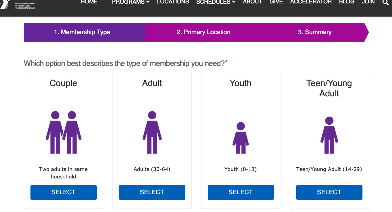
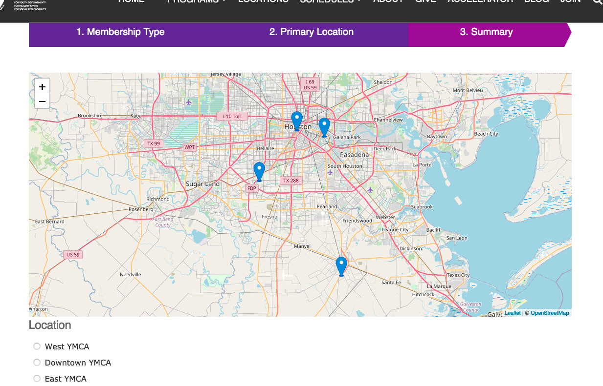
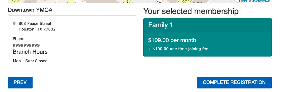
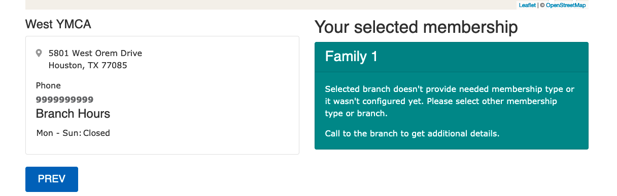
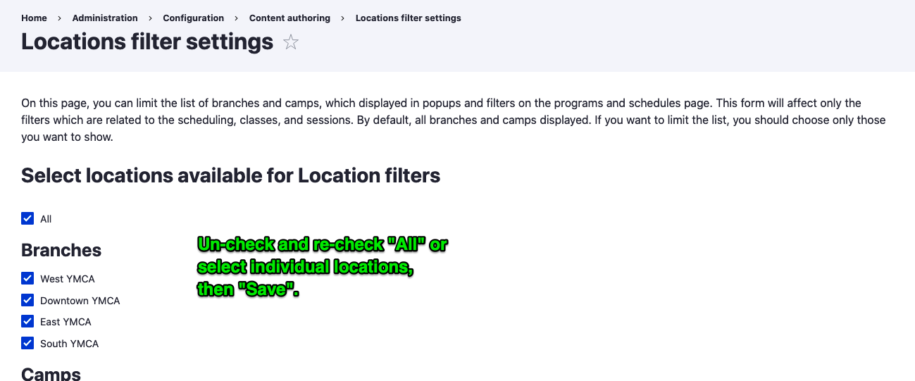
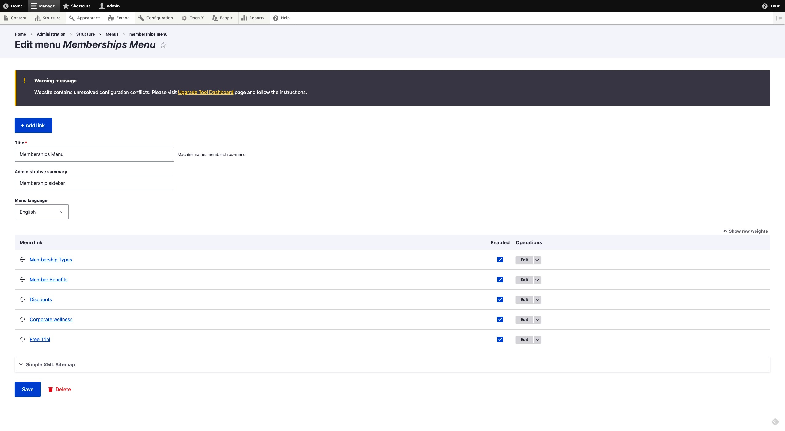
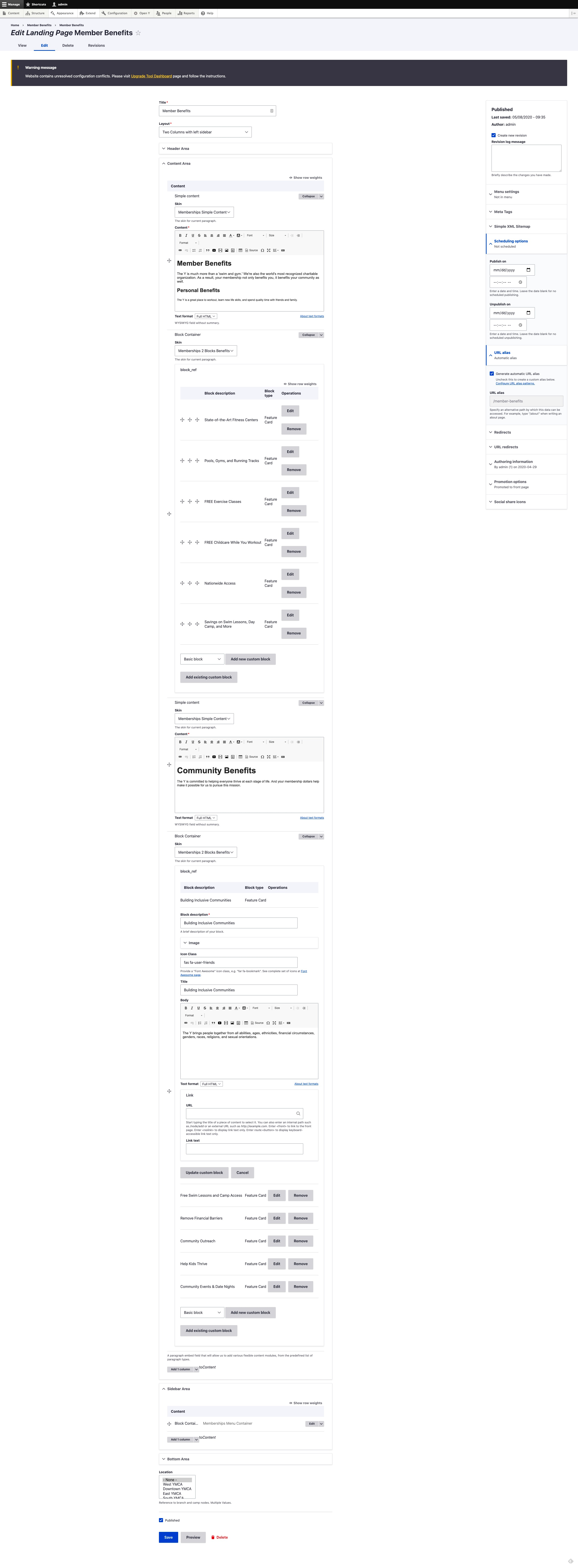
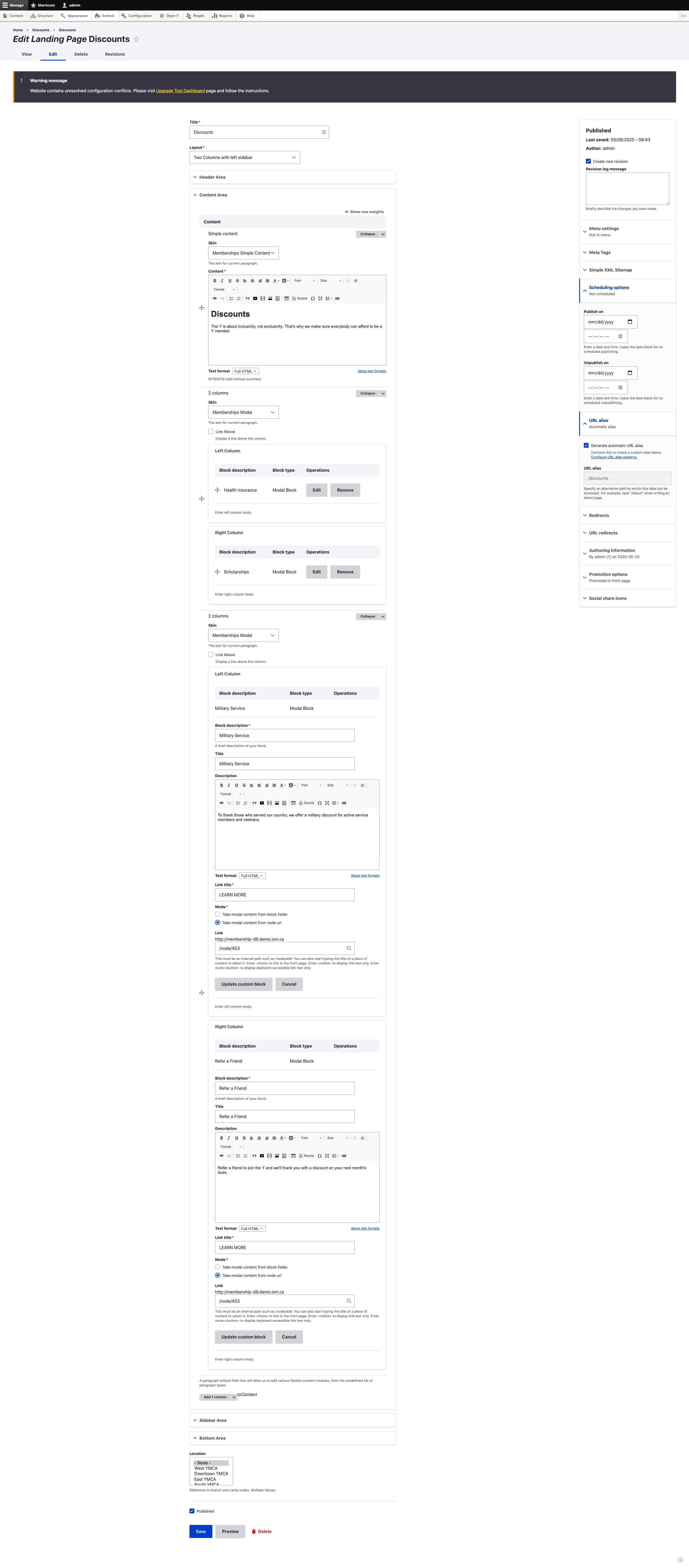
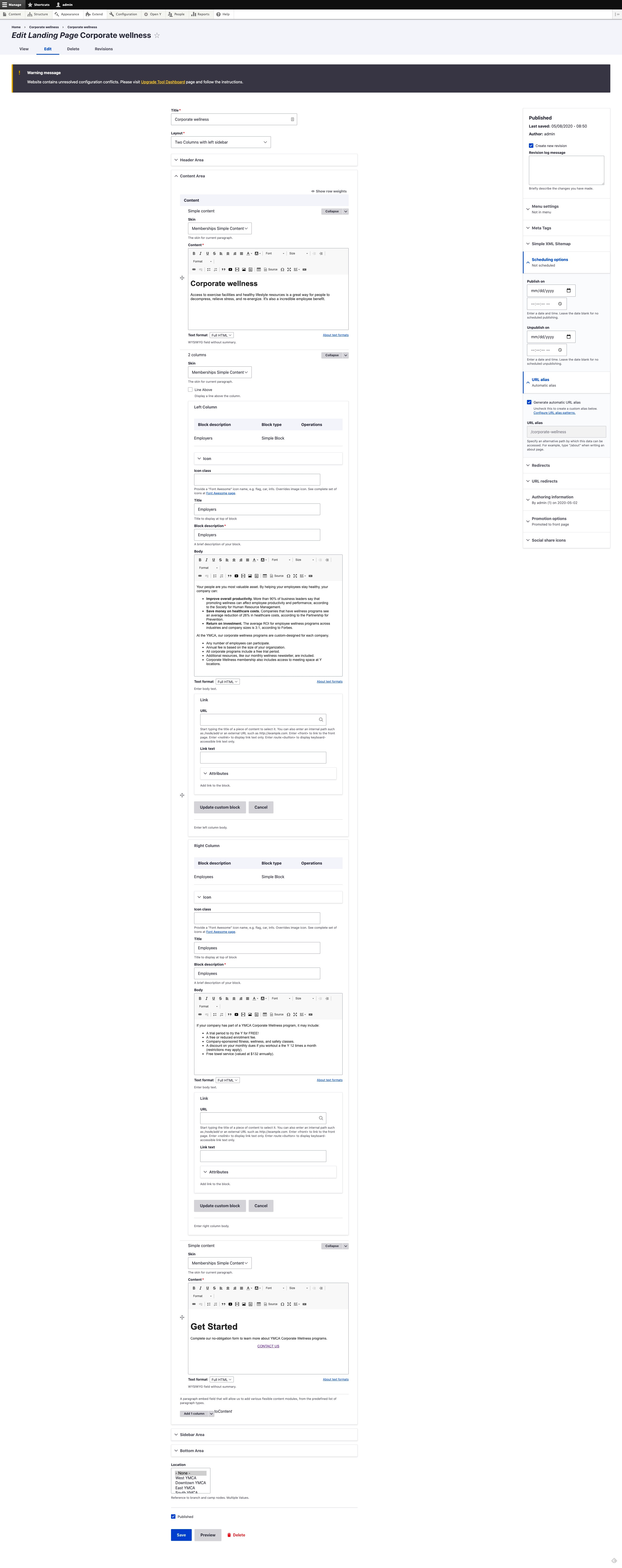
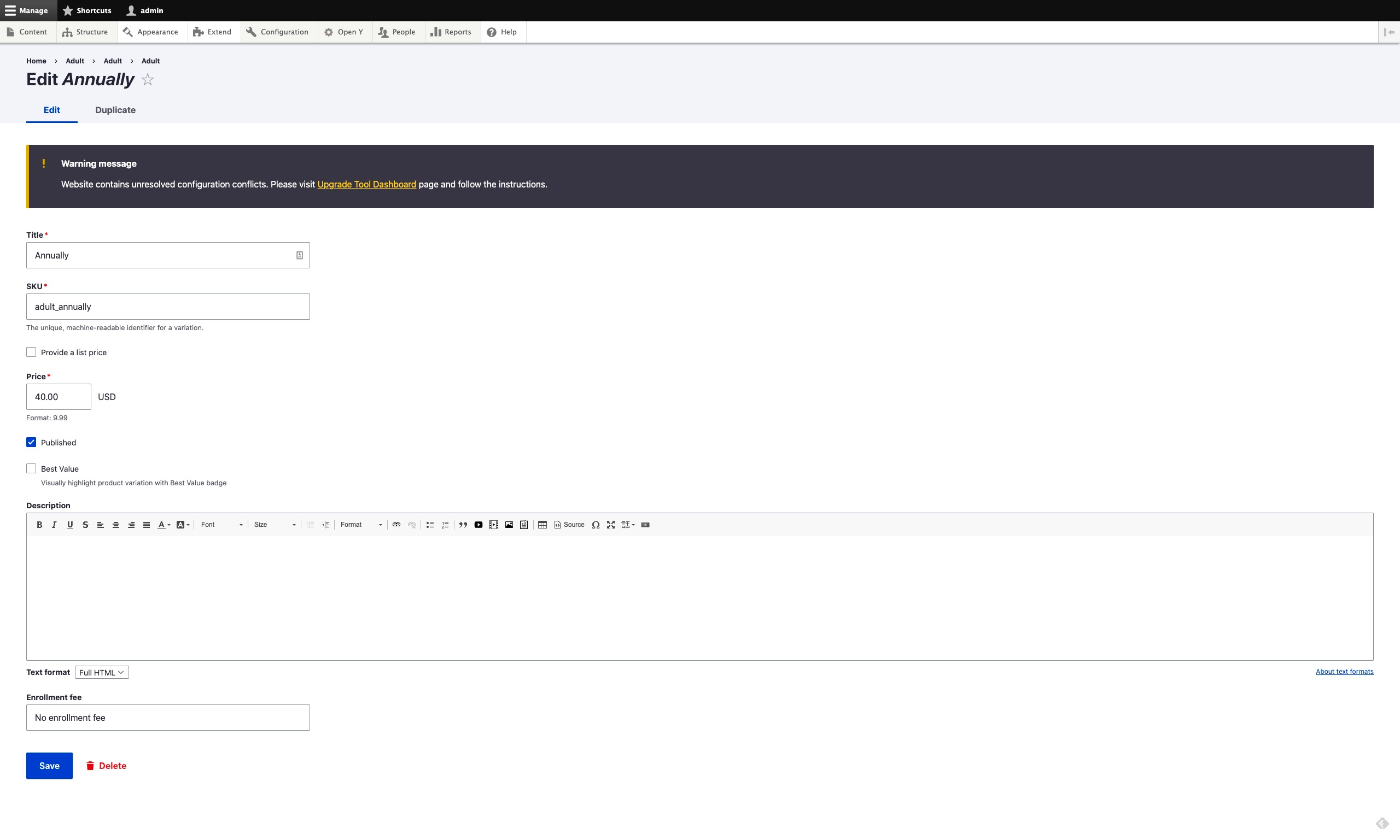
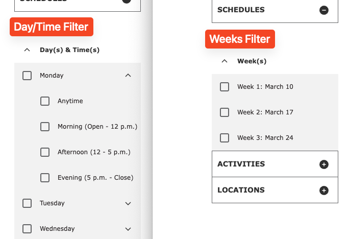
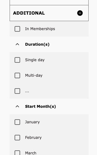
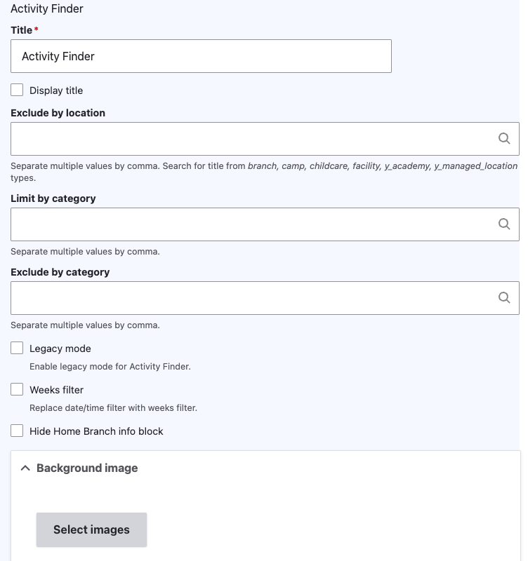
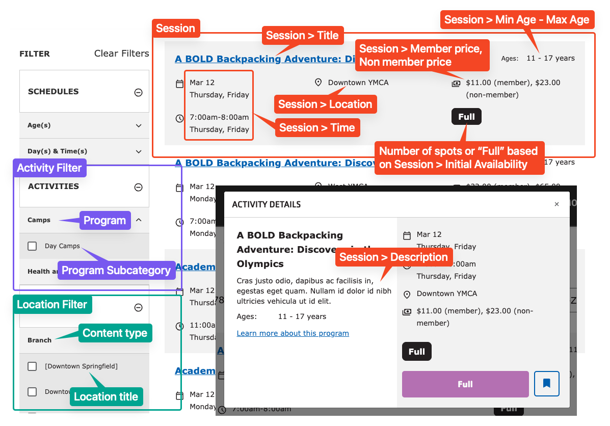
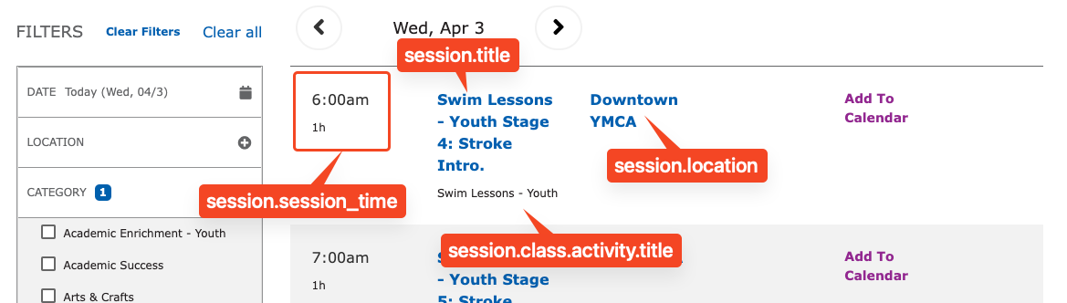
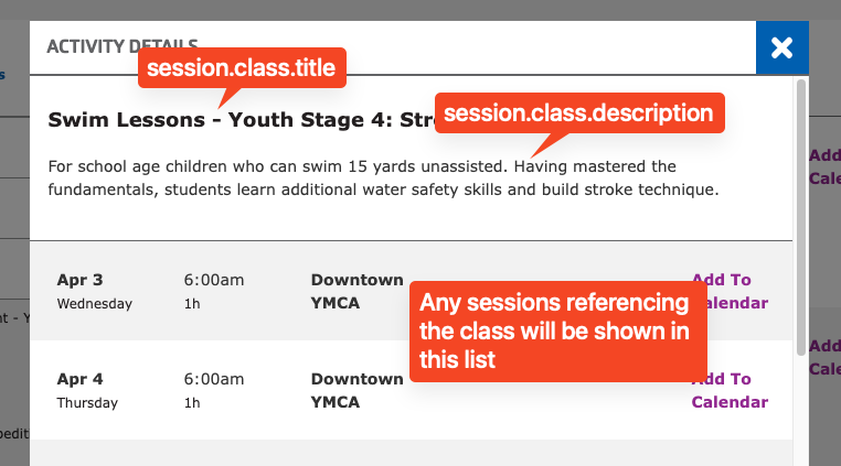
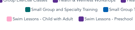
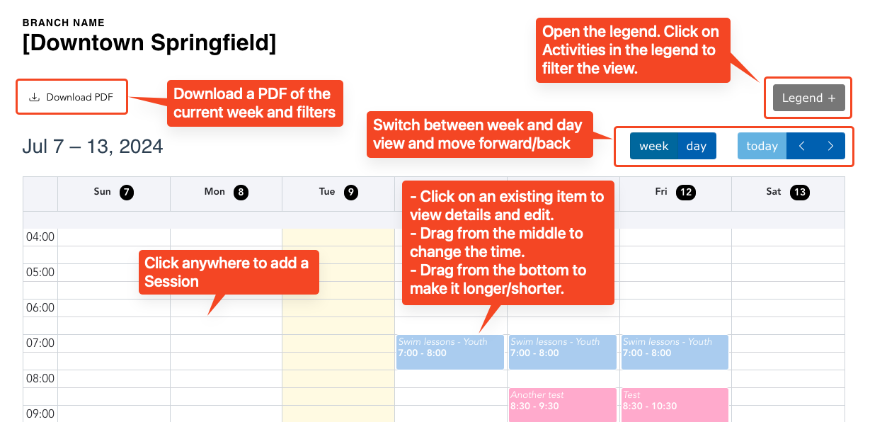
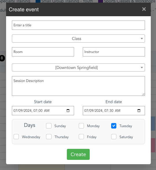
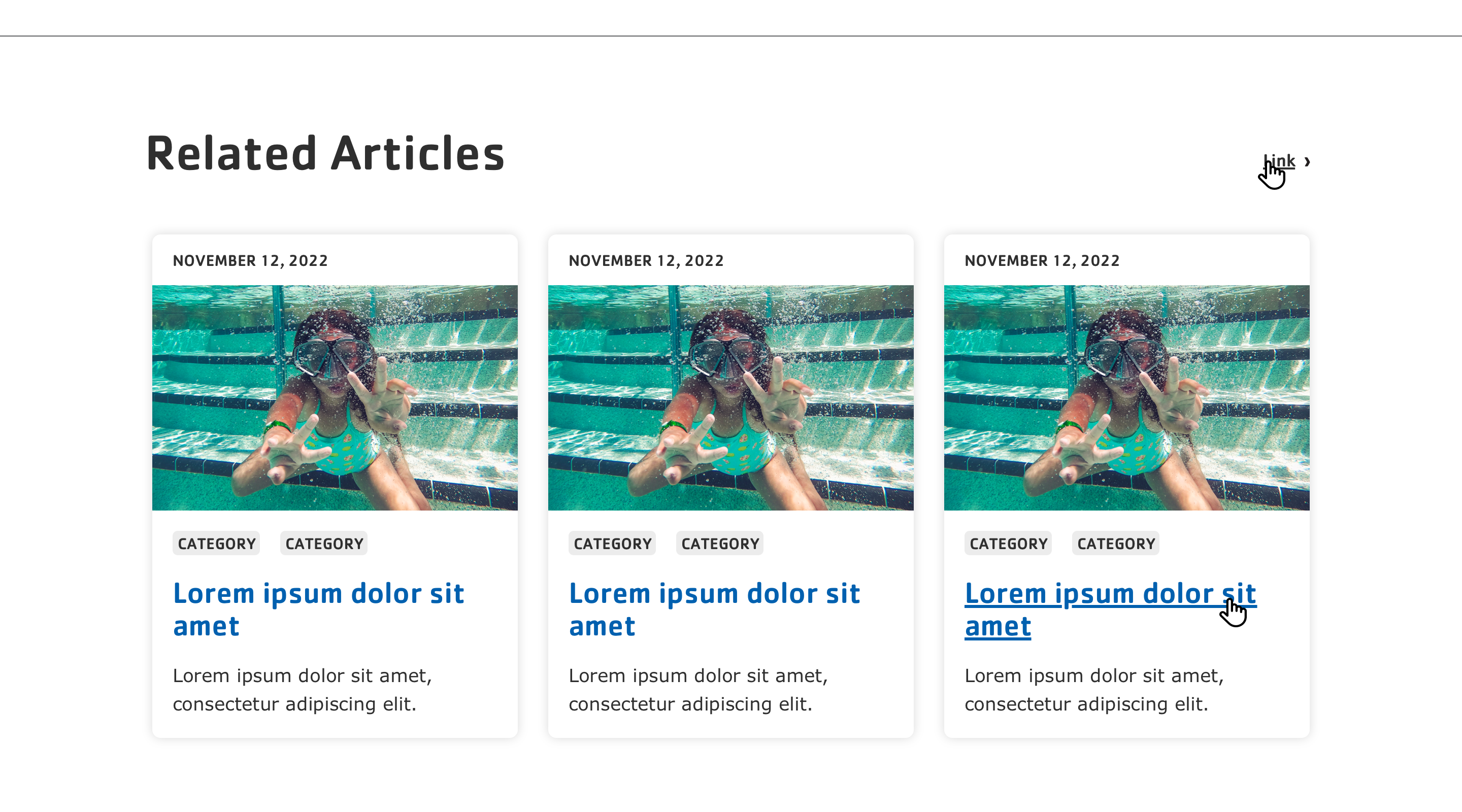
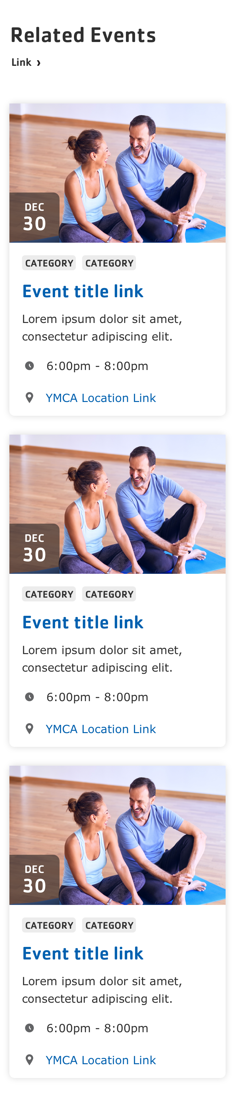
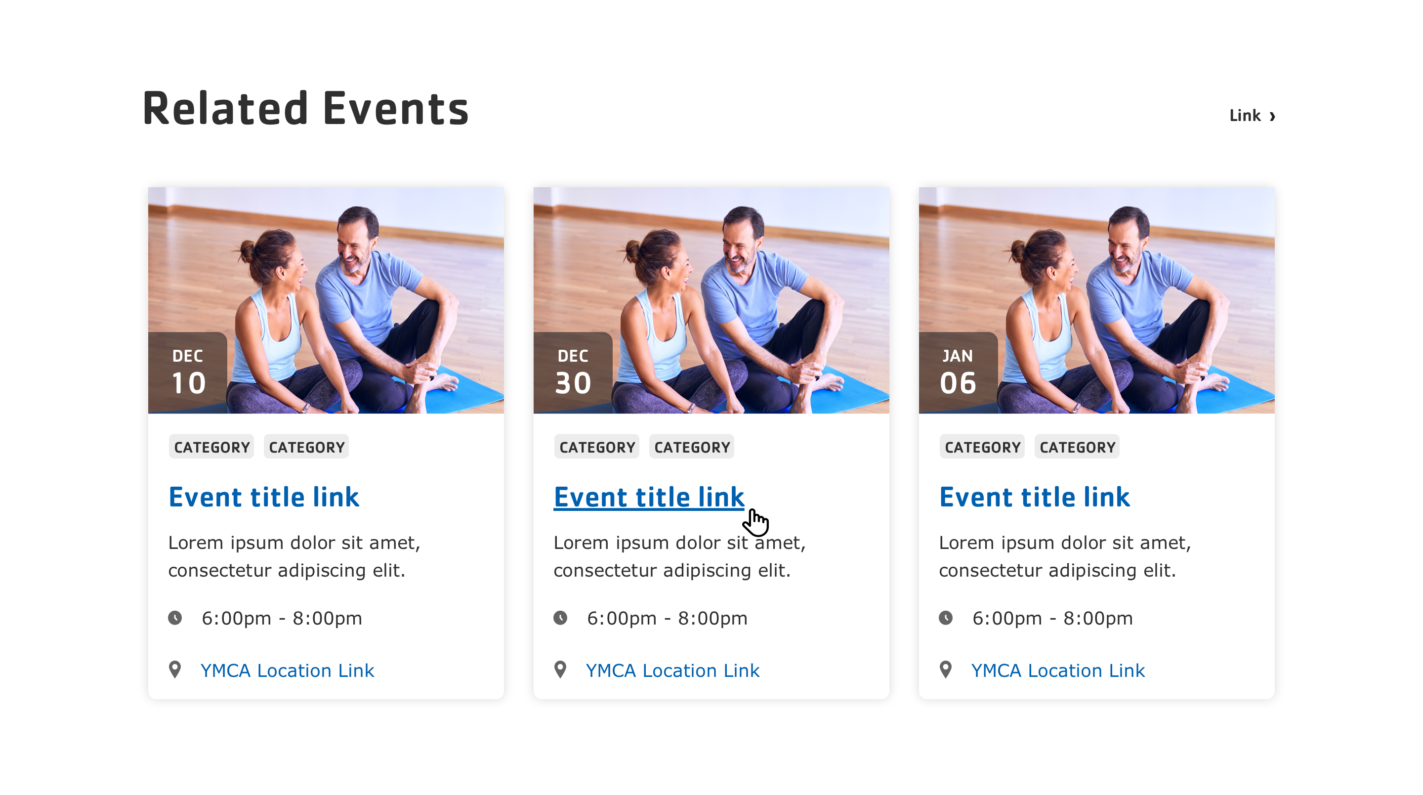