YMCA Website Services features many different kinds of pages, or content types. Choosing the right content type will ensure your collect the right information and allow you the flexibility to create layouts.
A content type is a reusable container for content. Content types have a common structure and purpose. They support site architecture and make content presentation consistent. This helps people find what they need.
There are two different kinds of Content Types in the distribution:
Standalone types are content that is displayed directly to users, like Landing Pages and Branches. They may also be displayed in views or other groupings.
Helper types are content that is never displayed on its own to users. It is displayed in aggregate or as part of a supporting application like Activity Finder or Membership Calculator.
Most sites will be built using a combination of these content types. The right content type for your content will depend on how it will be used and displayed. Landing Pages will often make up the bulk of your site, but you may also need to create Events, Articles, Branches, and other content types to support your site’s goals.
Which Content Type Should I Use?
Before you begin building your site, you should have a good idea of what kind of content you will be creating. Consider conducting a
content audit to understand what content you have and what content you need to create.
Once you begin building your site, you will most likely start building Landing Pages. These are the most flexible content type and can be used for a wide variety of content.
Location pages like Branches and Camps are also important to build out, as they will be used to promote each individual location.
Finally, you can create supporting content types like Events and Articles to provide more timely information to your users.
Content Types Library
Browse all available content types by category. Click any type to see detailed documentation and field specifications.
Layout Builder Content Types (Current)
Recommended: These modern content types use drag-and-drop Layout Builder for maximum flexibility. All new sites should use these.
Modern, flexible content types built for the Layout Builder page building system.
Dual Support: Branch and Camp content types support both Layout Builder and Paragraphs, giving you flexibility in how you build your content. They appear in both sections below.
Note: These content types use the older Paragraphs system or structured fields. Consider using Layout Builder alternatives for new content when available.
These content types use Paragraphs components or structured field configurations instead of Layout Builder.
Ready to modernize your site? If you’re using legacy Paragraphs content types (Landing Page, Blog Post, News Post), you can migrate to modern Layout Builder versions for a better editing experience.
Migration Guide Available: We've created a comprehensive guide covering manual recreation, automated migration, and hybrid approaches. Choose the best strategy for your site size and resources.
Content audit tools to assess your migration scope
Three migration approaches (manual, automated, hybrid)
Step-by-step manual migration process
Paragraph to Layout Builder block mapping table
Troubleshooting common issues
Decision framework to choose the right approach
Quick decision guide:
< 100 pages: Manual recreation recommended (15-30 min per page)
100-500 pages: Manual or phased migration (spread over 3-6 months)
500+ pages: Consider automated migration or phased approach
1 - Article (Layout Builder)
Create news articles, blog posts, and press releases with flexible Layout Builder layouts.
The Article (Layout Builder) content type is the modern, flexible way to publish news, blog posts, and press releases on your YMCA website. It combines all news-related content into a single content type with drag-and-drop Layout Builder capabilities.
✅ News articles - Organization announcements, community news, press coverage
✅ Blog posts - Staff stories, member spotlights, program highlights
✅ Press releases - Official statements, media announcements
✅ Timely content - Date-based content that needs publishing workflow
✅ Categorized content - Content that needs tags/categories for organization
###Do NOT Use Article (LB) for:
❌ Static pages - Use Landing Page (Layout Builder) instead
❌ Event listings - Use Event (Layout Builder) for date/time-specific events
❌ Program information - Use Program or Program Subcategory content types
Article Types Explained
Article (LB) includes three types to help you organize content:
Blog
Best for: Personal stories, staff perspectives, member journeys, program highlights
Example uses:
“Meet Our New Aquatics Director”
“5 Tips for Staying Active This Winter”
“Member Spotlight: Sarah’s Weight Loss Journey”
Display: Typically shown on /blog page or blog listing views
News
Best for: Organization announcements, community news, updates
Example uses:
“New Youth Center Opens Next Month”
“YMCA Breaks Ground on Expansion Project”
“Summer Camp Registration Now Open”
Display: Typically shown on /news page or news listing views
Press Release
Best for: Official statements, media announcements, formal communications
Example uses:
“YMCA Announces Partnership with Local Schools”
“YMCA Responds to Community Needs During Crisis”
“Annual Report Shows Record Membership Growth”
Display: Typically shown on /press page or press release archives
Pro Tip: The type you select determines where the article appears in Views-based listings. Choose the type that matches how you want to organize your site.
Creating an Article
Step 1: Add New Article
Navigate to Admin > Content > Add Content
Select Article (Layout Builder)
You’ll see the Article creation form
Step 2: Fill in Required Fields
Title (Required)
The headline of your article. This appears at the top of the page and in listing views.
Best practices:
Keep under 60-70 characters (Google truncates longer titles)
Front-load important keywords
Be specific and descriptive
Use active voice
Examples:
✅ “Youth Soccer Program Adds Saturday Classes”
✅ “5 Benefits of Family Swim Lessons”
❌ “Program Update” (too vague)
❌ “The YMCA is excited to announce that we are expanding our youth soccer program with new Saturday classes starting in March” (too long)
Subtitle (Optional)
Additional context or supporting detail for the title.
Best practices:
Use to add context without cluttering the title
Keep to 1-2 short sentences
Appears below title in article header
Example:
Title: “New Childcare Center Opening”
Subtitle: “State-of-the-art facility will serve 100 families starting September 1”
Type (Required)
Select Blog, News, or Press Release based on content purpose (see Article Types above).
Header Image (Required for most themes)
Featured image displayed at the top of the article and in listing views.
Best practices:
Size: 1920x1080px recommended (16:9 aspect ratio)
File size: Under 500KB (compress with TinyPNG or similar)
Format: JPG or WebP for photos, PNG for graphics
Alt text: Always include descriptive alt text for accessibility
Content: High-quality, relevant image that reflects article topic
Image tips:
Use real photos of your YMCA when possible (authentic > stock photos)
Ensure faces are visible and in-focus for people-focused stories
Avoid text-heavy images (text may not scale on mobile)
Check image looks good when cropped to square (for some listing views)
Tags (Recommended)
Categories/topics for organizing and filtering articles.
Best practices:
Number: Choose 1-3 relevant tags per article
Consistency: Use existing tags when possible (avoid creating duplicates)
Broad topics: Think categories, not keywords
User-focused: Use terms your audience would search for
Example tag structure:
Program areas: Youth Programs, Aquatics, Wellness, Childcare
Content types: Member Stories, Staff Updates, Community News
Seasonal: Summer Camp, Holiday Hours, Back to School
Paragraph length: 2-3 sentences per paragraph (easier to scan)
Subheadings: Use H2 and H3 headings to break up long content
Length: 300-800 words for most articles (longer for in-depth content)
Links: Link to related programs, registration pages, other articles
Lists: Use bulleted or numbered lists for scannable content
Bold: Use sparingly to highlight key points
Structure template:
Lead paragraph: Hook + key information (who, what, when, where, why)
Body paragraphs: Details, quotes, context
Call to action: What should readers do next?
Example structure:
[LEAD] The YMCA is launching a new Saturday morning youth soccer program starting March 15. The program will serve ages 5-12 and includes skill development, teamwork, and fun games.

[H2] Program Details

The eight-week program runs every Saturday from 9-10:30am at Miller Park. Sessions are divided by age group...

[H2] How to Register

Registration opens February 1. Visit our Activity Finder or call (555) 123-4567...
Locations (Optional)
Associate the article with specific Branch pages.
When to use:
Article is specific to one branch location
You want the article to appear on the Branch page’s “News” section
Local community stories
Example: Article about “Westside YMCA Pool Renovation” should be tagged with Westside YMCA location.
Published Date (Required)
The date displayed on the article (defaults to today).
Best practices:
Use actual publication date for news
Can backdate for archival content
Determines sorting order in listing views
Visible to readers on article page
Step 3: Configure Layout (Optional)
After saving, click Layout tab to add Layout Builder sections and blocks.
If your site has SEO modules enabled (Meta tags, Pathauto):
Meta title: Auto-generated from article title (usually fine)
Meta description: 150-160 characters summarizing article
URL alias: Auto-generated from title (e.g., /news/youth-soccer-program-adds-saturday-classes)
Pro Tip: Write meta description in your own words - don’t just copy first sentence of article.
Step 5: Preview and Publish
Click Save to create draft
Click Preview to see how article looks
Check mobile responsive display
Verify all links work
Check Published checkbox
Click Save to publish live
Article Workflow Best Practices
Publishing Frequency
Recommended publishing schedule:
Small YMCAs: 1-2 articles per month minimum
Medium YMCAs: 2-3 articles per month (weekly is ideal)
Large YMCAs: 3-4 articles per week for consistent engagement
Why consistency matters:
Keeps website fresh and updated
Improves SEO (search engines favor regularly updated sites)
Engages members and community
Provides shareable content for social media
Content Planning
Topic clusters approach:
Identify 3-5 main topic areas (e.g., Youth Programs, Healthy Living, Community Impact)
Create pillar content - Comprehensive overview pages for each topic
Write supporting articles - Specific stories that link back to pillar pages
Example cluster:
Pillar: “Youth Programs at Our YMCA” (Landing Page)
Length: 150-160 characters for desktop, 120 for mobile
Include: Primary keyword and call to action
Purpose: Convince searchers to click your result
Avoid: Duplicate descriptions (each article should be unique)
Image Optimization
Alt text: Describe image content (helpful for screen readers and SEO)
File names: Use descriptive names (youth-soccer-team.jpg not IMG_1234.jpg)
Compression: Keep under 500KB without sacrificing quality
Dimensions: 1920x1080px standard (optimized versions created automatically)
Internal Linking
Link to related content: Other articles, program pages, registration
Anchor text: Use descriptive link text (“youth soccer program” not “click here”)
Quantity: 2-5 internal links per article is good
Context: Links should add value and make sense in context
Structured Data (Advanced)
If your site has Schema.org structured data enabled, articles automatically include:
Article headline
Publication date
Author information
Featured image
Organization details
This helps search engines display rich snippets (enhanced search results with images and metadata).
Common Mistakes to Avoid
❌ Mistake 1: Not Using Tags
Problem: Articles can’t be filtered or organized
Solution: Always select 1-3 relevant tags
❌ Mistake 2: Missing Header Images
Problem: Articles look incomplete in listing views
Solution: Always upload a header image before publishing
❌ Mistake 3: Walls of Text
Problem: Long paragraphs are hard to read, especially on mobile
Solution: Keep paragraphs to 2-3 sentences, use subheadings
❌ Mistake 4: Vague Titles
Problem: “Program Update” doesn’t tell readers what the article is about
Solution: Be specific: “Youth Soccer Program Adds Saturday Classes”
❌ Mistake 5: No Call to Action
Problem: Readers don’t know what to do next
Solution: End with clear CTA (register, learn more, contact us)
❌ Mistake 6: Ignoring Mobile
Problem: Article looks great on desktop but broken on mobile
Solution: Always preview on mobile before publishing
❌ Mistake 7: Publishing Without Review
Problem: Typos, broken links, missing information
Solution: Use draft workflow, have second person review before publishing
Use Cases & Examples
Use Case 1: Member Spotlight Blog Post
Title: “Member Spotlight: How Sarah Lost 50 Pounds at the Y”
Type: Blog
Tags: Member Stories, Wellness & Fitness
Header Image: Photo of Sarah (with permission)
Body:
Lead: Sarah’s transformation story
Middle: Her routine, challenges, support from staff
End: Call to action to join wellness programs
Layout additions:
Related Articles block (link to other member stories)
Cards block (link to wellness programs)
Use Case 2: Program Announcement News Article
Title: “Summer Day Camp Registration Opens March 1”
Type: News
Tags: Youth Programs, Summer Camp
Header Image: Kids at camp from previous summer
Body:
Lead: Key dates and registration information
Middle: Camp schedule, activities, pricing
End: How to register
Layout additions:
Button block (Register Now CTA)
Accordion block (FAQs about camp)
Use Case 3: Press Release
Title: “YMCA Partners with School District for After-School Programs”
Type: Press Release
Tags: Community Impact, Youth Programs
Header Image: Partnership signing photo
Body:
Lead: Partnership announcement, key details
Middle: Program benefits, quotes from partners
End: Contact information for media inquiries
Layout additions:
Simple layout (press releases typically don’t need extra blocks)
Article vs. Landing Page: Which to Use?
Criteria
Use Article (LB)
Use Landing Page (LB)
Timely content
✅ News, announcements, time-sensitive
❌ Evergreen, static information
Publishing date
✅ Needs visible date
❌ No date needed
Organization
✅ Needs tags/categories
❌ Doesn’t need categorization
Display
✅ In news/blog listing views
❌ Standalone page
Lifespan
✅ Temporary (archived after time)
❌ Permanent (updated as needed)
Examples
News, blog posts, press releases
About Us, program pages, static content
Simple rule: If it’s news or has a date, use Article. If it’s evergreen, use Landing Page.
Happy publishing! Articles are one of the best ways to keep your YMCA website fresh, engage your community, and showcase the great work you do. 📰
2 - Camp Subpage (Layout Builder)
Create flexible camp microsite pages for activities, schedules, packing lists, and registration information.
The Camp Subpage (Layout Builder) content type allows you to build comprehensive camp microsites with flexible, drag-and-drop pages for activities, schedules, packing lists, registration, and more.
❌ Main camp location page - Use Camp content type for the primary camp landing page
❌ Branch day camps - Use Program Subcategory or Landing Page (LB) instead
❌ Event-specific pages - Use Event (Layout Builder) for time-specific camp events
Camp Subpage vs. Other Content Types
Criteria
Use Camp Subpage (LB)
Use Camp
Use Program Subcategory
Purpose
Internal microsite pages
Main camp landing page
Branch day camp programs
Parent page
Requires Camp page
Standalone
Requires Program page
Menus
Inherits camp menus
Creates camp menus
Uses site navigation
Location
Outdoor camp facilities
Outdoor camp locations
Branch facilities
Examples
Activities, schedules, packing lists
Camp Widjiwagan homepage
Summer Day Camp
Simple rule: Camp Subpage is for additional pages within a camp microsite. Camp is the main landing page. Program Subcategory is for branch-based day camps.
Creating a Camp Subpage
Prerequisites
Before creating Camp Subpages, you must:
Create a parent Camp page - Navigate to Admin > Content > Add Content > Camp
Set up Camp menus - Configure Camp Menu and Camp Quick Links on the parent Camp page
Enable Layout Builder on Camp page - Check “Use Layout Builder” on the Camp page
Happy camping! Camp Subpages help you create rich, informative microsites that give parents confidence and get campers excited. 🏕️
3 - Event (Layout Builder)
Create engaging event pages with flexible Layout Builder layouts for community events, fundraisers, programs, and activities.
The Event (Layout Builder) content type is the modern way to create event pages for your YMCA’s community programs, fundraisers, classes, workshops, and special activities. It combines structured event data (date, time, location) with flexible drag-and-drop Layout Builder capabilities.
Registration info: How to register, deadlines, cost, what’s included
Logistics: Parking, what to bring, accessibility, contact info
Call to action: Register now, RSVP, learn more
Example structure:
[LEAD] Join us for Family Fun Day on Saturday, May 15 from 10am-2pm at our Main Street YMCA. This free community event features activities for all ages, healthy snacks, and prize giveaways!

[H2] Event Schedule

10:00am - Welcome & Opening Activities
10:30am - Kids Fitness Challenge
11:00am - Family Yoga Session
11:30am - Healthy Cooking Demo
12:00pm - Lunch & Prize Drawings
1:00pm - Open Swim (weather permitting)

[H2] What to Bring

- Comfortable clothes for activities
- Water bottle (refill stations available)
- Sunscreen for outdoor activities
- Towel and swimsuit (optional)

[H2] Registration

Free for all community members! No registration required, but RSVP helps us plan: [RSVP Button]

Questions? Call (555) 123-4567 or email events@exampleymca.org
Locations (Optional)
Associate the event with specific Branch pages.
When to use:
Event is hosted at or affiliated with a Branch
You want event to appear on Branch page “Upcoming Events” section
Local community events specific to one location
Example: “Youth Basketball Tournament” at Westside YMCA should be tagged with Westside YMCA location.
Step 3: Configure Layout (Optional)
After saving, click Layout tab to add Layout Builder sections and blocks.
Common Event layouts:
Community Event Layout:
Header image + event details (auto-generated from fields)
Simple Content - Event description and schedule
Cards - Activities or highlights
Related Events - Other upcoming events
Button - Registration/RSVP link
Fundraising Event Layout:
Banner - Hero image with registration CTA
Simple Content - Event purpose and impact
Cards - Sponsorship levels or giving options
Testimonials - Past participant quotes (if available)
If your site has SEO modules enabled (Meta tags, Pathauto):
Meta title: Auto-generated from event title (usually fine)
Meta description: 150-160 characters summarizing event
Include: Event type, date, location, key benefit
Example: “Join our free Family Fun Day on May 15 at Main Street YMCA. Activities for all ages, healthy snacks, and prizes. RSVP today!”
URL alias: Auto-generated from title (e.g., /events/family-fun-day-may-15)
Pro Tip: Include location and date in URL if event recurs annually (/events/2025-charity-5k)
Step 5: Preview and Publish
Click Save to create draft
Click Preview to see how event looks
Check mobile responsive display
Verify date/time/location display correctly
Test registration/RSVP links
Check Published checkbox
Click Save to publish live
Event Planning Best Practices
Publishing Timeline
Recommended event publishing schedule:
Event Type
Publish Timeline
Update Frequency
Major fundraisers
3-6 months ahead
Weekly updates leading up to event
Community events
1-3 months ahead
Bi-weekly updates
Workshops/classes
1-2 months ahead
Update as spots fill
Recurring events
Create once, update quarterly
Update for schedule changes
Time-sensitive
ASAP + promote heavily
Daily updates last week
Why timing matters:
SEO: Google needs 1-2 months to rank event pages
Planning: People plan community events 1-3 months in advance
Promotion: Allows time for email, social media, partner outreach
Event Information Hierarchy
Make these details impossible to miss:
Date & Time - Large, prominent display
Location - Full address + parking/directions
Cost - Free, ticket price, or registration fee
Registration - How to RSVP or sign up
Use visual cues:
Icons for date 📅, location 📍, cost 💵
Bold text for critical deadlines
Contrasting button color for registration CTA
Alert boxes for important notices (“Space limited!”)
Event Content Updates
Pre-Event:
Add event page 1-3 months ahead (depending on event type)
Update with speaker/activity details as confirmed
Add countdown or “limited spots” notice 2 weeks before
Final reminder updates 1 week before (parking, what to bring)
Day-Of Event:
Post live updates if multi-day event (conference, camp)
Share photos/videos in real-time (social media)
Update any schedule changes immediately
Post-Event:
Add photo gallery within 1 week
Include testimonials/quotes from attendees
Add “Thank you” message or event recap
Link to “Next Year” or similar future event
Use for promotion of next year’s event
Registration & Ticketing
Registration details to include:
How to register: Button/link to external system (Daxko, Eventbrite) or webform
Deadline: “Register by May 1” with countdown if possible
Cost breakdown: Early bird, regular, group rates
What’s included: Meals, materials, t-shirt, swag
Cancellation policy: Refunds, transfers, no-shows
Ticket tiers (if applicable):
Early Bird - Discount for registering 1+ months ahead
Regular - Standard pricing
Group Rate - Discounts for families, teams, groups of 5+
VIP/Premium - Exclusive access, better seats, extra perks
Example ticket display:
[Cards block with 3 cards]

EARLY BIRD
$25 per person
Register by April 1
✓ Event admission
✓ Free t-shirt
✓ Healthy lunch

REGULAR
$35 per person
Register by May 10
✓ Event admission
✓ Free t-shirt
✓ Healthy lunch

GROUP RATE
$25 per person
Groups of 5+
✓ Event admission
✓ Free t-shirts
✓ Healthy lunch
✓ Reserved seating
Dietary: List food options (vegetarian, gluten-free, allergens)
Language: Offer translation or interpretation if available
Contact: Provide accessibility coordinator contact for questions
Example:
Accessibility: Our facility is fully wheelchair accessible with elevator access to all floors. Reserved accessible parking available. ASL interpretation available upon request (contact by May 1). Dietary restrictions accommodated - note in registration form.
Common Event Patterns
Community Event
Purpose: Free or low-cost event to build community engagement
Example:
“Join our Annual Charity 5K Run on June 10 at Riverside Park. Raise funds for youth programs while getting fit. All ages welcome. Register today!”
Schema Markup (Structured Data)
If your site has Schema.org markup enabled, events automatically include:
Event name and description
Start date, end date, and time
Location (name, address, coordinates)
Organizer (YMCA organization)
Ticket/pricing information
Event image
This helps search engines display rich snippets (enhanced search results with date, location, price).
Local SEO
Location keywords: Include city/neighborhood in title or body
Google My Business: Event may sync to GMB if integration enabled
Local directories: Submit event to community calendars, partner sites
Geotagging: Ensure location coordinates accurate for map display
Common Mistakes to Avoid
❌ Mistake 1: Buried Date/Time/Location
Problem: Users can’t quickly find essential event details
Solution: Display date, time, location prominently at top of page (event fields auto-display)
❌ Mistake 2: No Clear Registration Path
Problem: People want to attend but don’t know how to sign up
Solution: Registration CTA above the fold + in event body + at bottom of page
❌ Mistake 3: Outdated Event Information
Problem: Event details change but page isn’t updated
Solution: Calendar reminder to review event pages weekly leading up to event
❌ Mistake 4: Generic Stock Photos
Problem: Event looks inauthentic, low engagement
Solution: Use real photos from past events or real YMCA location photos
❌ Mistake 5: Missing Parking/Logistics
Problem: Attendees arrive late or can’t find venue
Solution: Include parking info, public transit, entrance directions
❌ Mistake 6: No Post-Event Follow-Up
Problem: Missed opportunity to engage attendees for future events
Solution: Update page with photos, thank you message, link to next event
❌ Mistake 7: Not Archiving Past Events
Problem: Old events clutter listings, confuse users
Solution: Unpublish events 1 week after end date (or keep for next year’s promotion)
Troubleshooting
Event Not Appearing in Event Listings
Problem: Published event doesn’t show on /events page or Branch page
Solutions:
Verify Published checkbox is checked
Check Event Date is not in the past (some views filter old events)
If Branch-specific, verify Locations field includes the Branch
Happy event planning! Well-designed event pages drive registrations, build community, and showcase the great work your YMCA does. 📅
4 - Landing Page (Layout Builder)
Create flexible, high-converting landing pages with drag-and-drop Layout Builder for programs, campaigns, storytelling, and conversions.
The Landing Page (Layout Builder) content type is the foundation of your YMCA website. It’s the most flexible, powerful content type for creating program pages, campaign pages, storytelling pages, and any content that doesn’t fit other specialized content types. With drag-and-drop Layout Builder, you can create unique, conversion-focused pages without coding.
✅ Resource pages - Guides, toolkits, FAQs, support resources
✅ Static pages - Evergreen content that doesn’t change frequently
Do NOT Use Landing Page (LB) for:
❌ News/blogs - Use Article (Layout Builder) for dated, categorized content
❌ Events - Use Event (Layout Builder) for date/time-specific events
❌ Branch pages - Use Branch content type for location pages
❌ Camp microsites - Use Camp and Camp Subpage content types
Landing Page vs. Other Content Types
Criteria
Use Landing Page (LB)
Use Article (LB)
Use Event (LB)
Purpose
Evergreen pages, programs, campaigns
News, blogs, press releases
Date/time-specific events
Date display
No date needed
Visible publish date
Event date/time prominent
Organization
By topic/category in menu
By tags, date archives
By date, location, tags
Lifespan
Permanent (updated as needed)
Temporary (archived after time)
Temporary (after event date)
Examples
About Us, Programs, Membership
News article, blog post
Charity 5K, workshop
Simple rule: If it’s evergreen and doesn’t have a date, use Landing Page. If it’s news/dated, use Article. If it’s an event with specific date/time, use Event.
Creating a Landing Page
Step 1: Add New Landing Page
Navigate to Admin > Content > Add Content
Select Landing Page (Layout Builder)
You’ll see the Landing Page creation form
Step 2: Fill in Required Fields
Title (Required)
The page name used internally and for SEO (not automatically displayed on page).
Best practices:
Descriptive and keyword-rich
Match URL alias (e.g., “Youth Programs” → /youth-programs)
Keep under 60 characters for search display
Manually add title to page using Banner block or heading
Examples:
✅ “Youth Programs at the YMCA”
✅ “Aquatics & Swimming Lessons”
✅ “Join the Y - Membership Information”
✅ “About Our YMCA”
❌ “Page 1” (not descriptive)
❌ “Youth” (too vague for SEO)
Important: Title field is NOT automatically displayed on the page. Add your visible title using:
Banner block (hero image with title overlay)
Simple Content block with H1 heading
Heading block (if available in your theme)
Metadata (Recommended)
Meta Description (Recommended):
150-160 characters summarizing page content
Include primary keyword and benefit
Appears in search results below title
Compelling preview that encourages clicks
Example:
“Discover youth sports, swim lessons, and after-school programs at [Your Y]. Safe, fun, and inclusive programs for ages 5-18. Learn more and register today!”
Meta Image (Recommended):
Image used for social media sharing (Facebook, LinkedIn, etc.)
[Banner Section - edge-to-edge]
- Banner Block
  - Background image: Hero image (1920x1080px)
  - Headline: "Transform Your Life at the Y"
  - Subheading: "Programs for every age, every goal, every family"
  - CTA Button: "Find Your Program" → /programs
[2-Column Section]

Left Column:
- Image Block: Photo of member/participant

Right Column:
- Simple Content Block
  H2: "Meet Sarah: How the Y Changed My Life"
  Quote: "The Y's swim program gave my daughter confidence..."
  - Sarah, YMCA Member
Social Proof Pattern:
[Simple Content Block]
H2: What Our Members Say

[Testimonial Carousel Block] (if available)
- Testimonial 1
- Testimonial 2
- Testimonial 3

[Simple Content Block - Stats]
"Join 150,000+ members nationwide"
[Icons with numbers: 1,200 programs | 500 locations | 75 years serving]
Call-to-Action Strategy
CTA Placement Best Practices (2025):
1. Above-the-fold CTA - Primary action in hero section
Best for: Pages with clear single action (Join, Donate, Register)
Button or prominent link in banner
2. Mid-page CTA - After building value and trust
Best for: Pages that need explanation first (programs, membership)
After describing benefits, before testimonials
3. End-of-page CTA - Final conversion opportunity
Best for: All landing pages (reinforce primary action)
Can be same as hero CTA or complementary (e.g., “Questions? Contact Us”)
4. Sticky/Floating CTA - Always visible as user scrolls
Best for: Mobile-first design, complex pages
Sticky button block or sticky header CTA
Example CTA progression:
Hero: "Join the Y Today" [Primary CTA]
↓
Mid-page (after benefits): "Find Your Membership" [CTA with options]
↓
Mid-page (after testimonials): "Experience the Y - Free Guest Pass" [Alternative CTA]
↓
Footer: "Questions? We're Here to Help" [Support CTA]
CTA Design Tips:
Color: High contrast with background (YMCA red #E31E24 pops on white/gray)
Size: Minimum 44x44px tappable area (mobile-friendly)
Schedule & Pricing - Table or accordion (by age group)
Who Should Join? - Target audience descriptions
Instructor/Staff - Bios with photos (builds trust)
FAQs - Accordion block (common questions)
Testimonials - Member quotes with photos
CTA - Register or learn more
Block layout example:
[Banner] Hero with "Transform Your Child Through Youth Sports"
[Body - Simple Content] Program overview
[Body - Cards] Benefits: Teamwork, Fitness, Fun, Character Building
[Body - Table] Schedule by age group (5-7, 8-10, 11-13)
[Body - Accordion] FAQs (What to bring, Cost, Skill level, etc.)
[Body - Cards] Testimonials with photos
[Body - Button] "Register Your Child Today"
Membership Landing Page
Purpose: Convert visitors to members, highlight benefits and value
Membership Types - Cards with pricing tiers (Individual, Family, Senior)
What’s Included - Checklist or icons (facilities, programs, discounts)
Financial Assistance - Sliding scale, scholarships available
Member Stories - Testimonials from real members
Tour CTA - “Schedule a Free Tour” button
Final CTA - “Join the Y Today”
Pricing display example:
[3-Column Cards Block]

INDIVIDUAL
$49/month
✓ Unlimited facility access
✓ Group fitness classes
✓ Member discounts
[Join Now Button]

FAMILY
$89/month
✓ 2 adults + children under 18
✓ All Individual benefits
✓ Family programming
[Join Now Button]

SENIOR (65+)
$39/month
✓ All facility access
✓ Senior programs
✓ Wellness support
[Join Now Button]
Conversion tips:
Show value, not just price ("$1.63/day" vs “$49/month”)
Address objections in FAQ (cost, commitment, intimidation)
Offer trial or guest pass (“Try us free for 7 days”)
Include financial assistance info (remove cost barrier)
Campaign Landing Page
Purpose: Drive specific campaign action (donate, volunteer, participate)
Recommended structure:
Hero - Campaign theme with urgent CTA
The Problem - What issue you’re addressing
Our Solution - How the Y helps (your programs/impact)
Your Impact - What donation/participation achieves
“$50 = 1 child in swim lessons for a month”
Giving Levels - Cards with donation tiers
Donor Stories - Why others give (testimonials)
Urgency - Countdown, matching gift, limited time
Multiple CTAs - Donate, volunteer, share
Impact storytelling example:
[2-Column Section]

Left: Image of child in swim lesson

Right:
H2: "Every Child Deserves to Swim Safely"

"Last year, drowning was the leading cause of death for children ages 1-4. Your donation gives kids like Emma the swimming skills to stay safe—and the confidence to thrive.

$25 = 1 swim lesson
$100 = 4 lessons (one month)
$500 = Full semester for one child

[Donate Now Button]
Campaign best practices:
Urgency: Deadline, matching gift, or goal tracker
Specificity: Concrete impact, not vague “support our work”
Emotion: Real stories, real photos (with permission)
Social proof: “$45K raised by 180 donors - join them!”
Multiple ways to help: Donate, volunteer, share on social
Our Story - History, founding, growth (brief timeline)
Our Mission - What we do, who we serve, why we exist
Our Impact - Stats, outcomes, testimonials
Our People - Leadership team, staff highlights
Community Partners - Logos, collaboration stories
Join Our Story - CTA to get involved
Mission communication example:
[Full-Width Banner]
Background: Community photo
Headline: "Strengthening Community for 75 Years"
Subheading: "At the Y, we believe everyone deserves the opportunity to learn, grow, and thrive."

[Body - Simple Content]
H2: Our Mission
"To put Christian principles into practice through programs that build healthy spirit, mind, and body for all."

[3-Column Stats]
150,000 members served
1,200 programs offered
$2M in financial assistance

[Impact Story]
[Photo] + "Meet Carlos: How the Y changed his family's life..."
Storytelling best practices:
Authentic images: Real photos from your YMCA (not stock)
Specific stories: Names, faces, concrete outcomes
“You” language: “You can help change lives” (not “We change lives”)
Emotional connection: Show impact on real people
Clear CTA: How visitors can join your mission
Advanced Layout Builder Techniques
Multi-Column Layouts
When to use columns:
Compare options side-by-side (membership tiers, program levels)
Feature + image layouts (text left, image right)
Icon grids (3-4 columns of icon + text)
Column best practices:
2 columns: 60/40 or 50/50 split (text/image or equal)
3 columns: Cards, statistics, feature lists
4 columns: Icons, small features, partner logos
Mobile: All columns stack vertically on mobile (test!)
Example:
[2-Column Section: 60/40]

Left (60%):
- Simple Content
  H2: "Aquatics Programs for All Ages"
  Paragraph describing programs
  - Bullet list of offerings
  [Register Now Button]

Right (40%):
- Image Block
  Photo of swim lessons (vertical orientation works best)
Happy building! Landing Page (Layout Builder) is your most powerful tool for creating high-converting, mission-driven pages that engage your community and drive results. 🚀
5 - Activity, Class, and Session
Format data from third parties (e.g. Daxko, Personify, or ActiveNet), for display in Activity Finder.
Content editors rarely, if ever, enter information directly into these content types on a day-to-day basis. However, it is important to know how they work and how they relate to manually-entered content.
Example - Swim Lessons
Swimming and Aquatics (Program Page, manually entered)
Youth Group Swim Lessons (Activity, mapped from CRM or custom automation)
Stage 3 (Class, mapped from CRM)
Monday/Wednesday/Friday 9:30-10 a.m. at Franklin Family YMCA (Session, mapped from CRM)
Note: This is an example only. Depending on your CRM and any customizations you make, your setup for Swim Lessons or any program may look different that the example listed above.
Activity
Often used as the top-level filter in Activity Finder and Repeat Schedules, Activity consists of three fields:
Title: The name of the Activity (and the filter in Activity Finder).
Program subcategory: An entity reference to or tag for a
Program Subcategory. Maps the Activity to higher-levels of user-entered content.
*Description: A description for the Activity. Usually pulled from a description in a CRM through an API.
Class
A narrower selection of Program Offerings. Not an individual instance, but a smaller selection of instances.
Classes have three ields that map into Activity Finder and Repeat Schedules: a description, a title and entity reference/tag to an Activity.
Class also contains Areas for content editors to add paragraphs; however, depending on how your CRM and the number of programs your Y runs, it may not be practical use these fields.
Session
An individual program offering. Contains fields for pricing, session date/time, instructor, ages and a registration link. This are the individual rows/instances in Repeat Schedules and
Activity Finder.
6 - Alert
Displays timely information in a thin banner across your site, just below the header or above the footer.
Unlike most content types in YMCA Website Services, you don’t use Alert to create pages. Instead, Alerts display as a rendered entity or a section of content on other pages.
Alerts also don’t use Paragraphs or Layout Builder. By design, the layout of Alerts are rigid; however, the text editor and the color options listed below allow content editors some flexibility.
When Should You Use an Alert?
Timely updates for centers, such as when your hours change or facilities close.
Marketing promotions, such as for membership campaigns or even promotions.
How to Use an Alert
Go to Admin > Content > Add Content > Alert (/node/add/alert).
Title: Displays as the headline for your alert.
Description: The main body of your alert. Sentences should be short and minimally styled in this section. Uses
the Text Editor.
Alert Style: Choose from the Classic Alert style which enables the Color Fields below or a set of styles that are pre-configured for you to match the YMCA colorways.
Urgent options use a colored background with dark or light text.
Info options use a grey background with colored text.
Color Fields: These three dropdown fields control different aspects of color in your alert. All three dropdowns reference the
color vocabulary.
Background Color: The color of your alert.
Text Color: Stick to using either black or white for accessibility.
Icon Color: Changes the appearance of the icon to the left of the title.
Link: Adds a button with a call to action to the alert on the right. The button color defaults to black.
Placement: Choose “Header” to show your alert above your main content or “Footer” to show below your main content.
Setting visibility
Visibility pages: This is where you control where the alert displays on your site. In the large text field, you write the relative path of the pages where you want this to appear or not appear. Enter each path on a new line. Each path should start with a slash, /.
You also have the option to use an asterisk character * as a wildcard so you don’t have to enter a large number of relative paths. For example, if you wanted to add an alert to a /health-and-fitness section, you would enter /health-and-fitness* in the text area.
What is a relative path?
A relative path is the part of your URL after your domain name.
At https://example.com/community, for example, the domain name is example.com, while the relative path is /community.
Using the Alert visibility state radio buttons at the bottom, you can either show or hide your alert from the page paths listed in the text area above.
Location: This field provides additional flexibility for controlling where the Alert will display. Selecting a Location from this field will display the alert on the Location page and any related page (blog posts, news, landing pages) that has the corresponding Location selected.
Rearranging alerts
Alerts can be rearranged to control the order in which they display if multiple appear on a page. The Alerts Rearrange page can be accessed via its link on the Content page or at Admin > Content > Alerts Rearrange (/admin/content/alerts-rearrange). The link might not appear in the Admin menu prior to version 10.3.1.
To rearrange alerts:
Go to the Alerts Rearrange page
Rearrange alerts with the drag handle () or the “Show row weights” option.
Save order when finished.
Alert visibility examples
Figuring out exactly how to show an alert on the right pages can be a challenge. The Visibility pages, Alert visibility state, and Location selectors work together to control where an alert is displayed. Here are some tips on how to get just what you want.
Related to a location
To show an alert only on a single Location page:
Visibility pages: add the path to the Location, like /locations/downtown-ymca
Alert visibility state: “Show for the listed pages”
Location: “None”
To show an alert on a location and any related pages:
Visibility pages:
Alert visibility state:
Location: select the Location, or select more than one using Shift or Command/Ctrl.
“Related pages” in this case means any page with a specific location selected in its Location field.
On groups of pages
The wildcard * can be used to specify any page in a section of the site.
To show an alert on every page on the site:
Visibility pages: *
Alert visibility state: “Show for the listed pages”
Location: “None”
To show an alert on every swimming page:
Visibility pages: /programs/swimming*
Alert visibility state: “Show for the listed pages”
Location: “None”
The position of the * wildcard is important. Consider /programs/swimming* versus /programs/swimming/*:
Show for /programs/swimming*:
✅/programs/swimming
✅/programs/swimming/drop-in
✅/programs/swimming/swim-lessons
Show for /programs/swimming/*:
❌/programs/swimming
✅/programs/swimming/drop-in
✅/programs/swimming/swim-lessons
On the home page
You can use / OR <front> to show an alert on the home page. <front> is a special token and should always be listed on its own line.
Visibility pages: / OR <front>
Alert visibility state: “Show for the listed pages”
Location: “None”
With exceptions
Sometimes you want to show an alert on all pages except a few. Maybe you have an alert for a fundraising campaign but don’t want to show it on the “Join” or the “Give” page. The Hide for the listed pages option can help in this case.
To show an alert on all pages except “Join” and “Give”:
Visibility pages:
/join
/give
Alert visibility state: “Hide for the listed pages”
Location: “None”
7 - Blog Post (Paragraphs)
Legacy Paragraphs-based blog content. Migrate to Article (Layout Builder) for modern blog/news functionality.
Legacy Content Type
This is a legacy Paragraphs-based content type. For new blog posts and news, use Article (Layout Builder) instead.
Why migrate? Article (Layout Builder) offers:
✅ Unified content type for blogs, news, and press releases
Blog posts in YMCA Website Services allow you the flexibility to both create simple posts using only the text editor and more robust layouts with paragraphs.
When Should I Use a Blog Post?
When you decide to use a blog post
depends greatly on your Association’s content strategy. However, blog posts are designed so you can post timely pages and list them throughout your site. Examples of blogs may include:
Member Stories
Workouts and Recipes
Updates about a Center/Branch
Promotions and Contests
Press Releases
How Do I Use a Blog Post?
There are three fields that appear above the accordion tabs below:
Locations: An option select for you to tag a post with one or more locations (Camp or Branch). Use Ctrl+Click (Windows) or Cmd⌘+Click (Mac) to select multiple locations.
Each time you create a new Branch Page or Camp Page it populates into the locations field automatically
Category: An entity reference to
the Blog Category vocabulary. Type in the name of the category and select from the options that appear, or create a new category/term by typing in a new one.
Style
This dropdown changes the style of the post’s card when it appears in a listing format. This dropdown does not affect any layouts on the page.
Story Card
Carnation
Lily
Photo Card
Carnation
Lily
News Card
Color Card
When choosing color card, you are presented with two styling options in dropdowns. Both are entity references to
the Color vocabulary:
Background color: Changes the color of the card.
Text color: Changes the color of the text. It’s recommended you only use white or black.
Carnation
Lily
Content Area
The content area is the main body of your page. You can use the default fields entered below for a simple block post or build a more robust layout using paragraphs.
Description:
Using the text editor, you can enter anything from a brief summary to the entire body of your text.
Sidebar Area
The sidebar area also allows you embed paragraphs below a section that links to the centers tagged in the post, the categories and a Related Content field that allows you to promote other Blog Posts by tagging them with the autocomplete widget.
Layouts
While you have the option to build layouts in blog posts using paragraphs, all blog posts are strictly two-column layouts. The Content Area displays on the left while the Sidebar Area displays on the right.
8 - Branch
One of the first places members go when they visit a Y website is to their local Y’s page.
Branch pages contain multiple data fields that work together to help members find the right location, hours, and amenities that fit their needs.
Title (required): This is the name of your branch which will display as your page title and the title on the location card. If your branch has a longer formal name we recommend using the shorter, more common name for readability.
Neighborhood: An optional reference to specify which neighborhood your Y is located in. Start typing and select from the list. To add a new neighborhood, add it to the “Area” vocabulary under Structure > Taxonomy (see
Taxonomy).
Coming Soon: This flag indicates a newly opening branch on the Locations page.
Temporary URL: Overrides the “Branch info” link on the Locations page, allowing you to link to a different internal or external page.
Contact Info
Address: The physical address of your location. Be sure to include all address fields.
Branch Coordinates (required): This field pins your branch on the locations map.
To copy the coordinates, left-click on the latitude and longitude.
Paste the lat, long into one of the fields, then cut and paste to separate them.
Phone (required): The main phone line for your branch. Will be displayed as it is entered and linked to allow mobile users to tap to call.
Fax: Optional.
Email: We recommend you use a main contact email, such as info@example.com, rather than the email for an individual staff member.
Directions: By default, a link with directions is auto-generated using the Address field. Use this field to substitute your own directions link.
Branch Hours
Add the main hours for your facility. These are displayed in the header and on the Locations page.
Custom hours label: The title that is displayed in the “All hours” dropdown. Clearing this field will hide the section from the Branch page.
Mon, Tue, …: Add the hours for each day of the current week.
Most formatting like <open time> <separator> <end time> should work, but we recommend something like 7am-5pm
Leaving a day empty will show the hours as “Closed” but you can enter any other text as well, like “Wednesday: ‘Temporarily closed’”
Branch Holiday Hours: Add special hours for any upcoming holidays. These will be displayed on the site when the holiday is less than two weeks away. Add as many holiday entries as you like.
Holiday Title: The displayed title of the holiday.
Holiday Hours: The displayed hours for the holiday.
Date: The date of the holiday. When this day is in the current week …
More Hours Link: A link to show additional location hours information, like another page or a PDF.
Header Area
This section is not displayed when “Use Layout Builder” is selected.
There is no image field for the Branch content type, so you will need to add one of the following paragraphs to add an image and title at the top of your page:
Type in and select which amenities are available or not available at your branch using the autocomplete field.
If you embed a Branch Amenities with the Icons paragraph or Branch Amenities block on your page, the amenities will be displayed in your content. The Amenities will also serve as filters for branches on your locations page.
If you don’t see an option available or would like to rename a branch amenity, go to Structure > Taxonomy > Amenities. See
Taxonomy for more info.
Menu
The Branch Menu is a single-level sub-menu that displays within a branch page (and sub-pages) that allows users to drill down to additional content specific to that branch. The Branch Menu always shows “Branch Home” as its first link.
Menu links: A list of menu links to be displayed in the menu. Allows unlimited items but we recommend a maximum of 6-8 depending on the Link text length.
Maximum Links (Added in y_branch_menu 1.1.1): A numeric field that allows you to limit how many menu links are displayed in the branch menu block.
Accepts values between 1 and 50
Defaults to 10 links if not set
Can be configured per-block instance for maximum flexibility
This enhancement was added to the BranchMenuBlock configuration form, allowing administrators to customize link display without code modifications.
Customizing with Layout Builder
Beginning in
Website Services 9.2.13 content editors have the option of customizing the Branch page with
Layout Builder. You can migrate from using Paragraphs to using Layout Builder on a branch-by-branch basis to ease the transition.
The Use Layout Builder checkbox on the Branch edit page non-destructively switches between Paragraphs and Layout Builder. If the checkbox does not appear, ensure the Y Branch (y_branch) module is installed at Admin > Extend (/admin/modules).
Layout Builder Blocks
Branch pages have several specialized components that utilize the structured data (fields) that already exist on your branch page in newly designed Layout Builder Blocks.
In addition to using many of the standard Layout Builder components, Branch pages also use several components that display the fields described above.
These blocks are available via All system blocks in Layout Builder:
Branch Hours: Combines the branch title, contact information, hours, and more into a dynamic page header.
Can be placed on a Landing Page to show the Branch Menu for a specific branch. Choose a branch in the Location field. This can be useful if you are creating sub-pages for a branch.
Added in the December 2024 release.
Maximum Links field (Added in y_branch_menu 1.1.1, January 2026):
Allows you to limit the number of menu links displayed (1-50)
Defaults to 10 links
Configured in the block settings when adding or editing a Branch Menu block
Each block instance can have its own link limit for custom layouts
One additional component is available that requires additional information:
This feature allows users to select a single branch location as their home / preferred branch so that they can easily access branch-specific content across the site.
The Home Branch selector popup will appear to users who arrive at the site and:
are new to the site,
have not selected a Home Branch, and
have not checked the “Do not ask me again” checkbox in the modal.
Users can select a Home Branch by:
choosing a branch from the modal popup,
using the “Set Preferred Branch” link in the Utility menu,
choosing “My preferred branch” on a Branch page or in
Location Finder.
Users can remove a Home Branch by:
summoning the popup with the down arrow next to the set branch in the Utility menu, or
unchecking “My preferred branch” on a Branch page or in Location Finder.
Selecting a home branch will:
add a link to the Branch’s home page to the user’s utility menu,
show the Branch as the Home Branch on Branch Pages and Location Finder, and
populate the Branch options in other sections of the site like the
Membership Apps and
Schedules (coming soon).
Disabling the Home Branch Selector
If you want to completely remove the Home Branch selector from your site you will need to disable it via the command line. DO NOT disable the module via the admin UI as this will result in an error.
drush pmu ws_home_branch openy_home_branch
Migrating to Layout Builder
Migrating Branches to Layout Builder involves recreating some content on the page. The process is similar to
building a new Landing Page with Layout Builder but with a lot of the work done for you!
Once you are ready to migrate a Branch:
Either clone the page or open it in a separate tab so that it’s easier to compare content.
Prepare the Branch for Layout Builder:
Edit the Branch,
Add links in the Menu section if you’d like,
click Use Layout Builder,
if you’d like, uncheck Published while you migrate to hide the page temporarily, then
Save.
Your Branch will now display a set of default blocks: Hours (and header), Menu, Social Links, and Amenities.
From here, you can
use Layout Builder to move your old content from Paragraphs into Blocks. Review the
full list of designs or the
list of components if you need help deciding how to place things. Your old content will still be available to reference in the Edit tab in the old Header/Content/Footer sections.
When you’re finished, Save the layout and Publish the Branch!
9 - Camp
Physical locations where outdoor camp programming takes place.
While
YMCA Branches may offer some form of summer day camp, they differ from facilities that primarily host programs related to outdoor camps. The Camp content type also enables editors to create sub-sites or “microsites” using a separate menu structure.
If you are an independent YMCA camp or you’re an Association with one or more locations dedicated to outdoor camp, the Camp Content Type serves well as a landing page for those locations.
What about Branch Day Camps?
There are several considerations for Branches that host Day Camps in the center:
The Branch content type is intended to be the home page for branches.
Adding a Branch listing and a Camp listing for the same physical location creates duplicate listings for your center and could have search implications.
Camp pages don’t have fields for operating hours or amenities.
Branch Day Camps, unlike outdoor camps, tend to be listed in the same CRM as other branch-based programs, and therefore could integrate into Activity Finder, provided the CRM’s compatibility.
Title (required): This is the name of your branch, which will display as your page title and the title in the location card.
There is no separate field for the full name of your facility (e.g., Joe C. Davis YMCA Outdoor Center) versus the common name (Camp Widjiwagan). The best practice would be to use the shorter, more common name for readability.
Menu Links (required): Add in the URL or name of the content you want to link your
Camp Menu to (you must use the Camp Menu paragraph for this to work). This field is not used with Layout Builder.Read more about Camp Menu ⇒
Contact Info
Address (required): The physical address of your location. Be sure to include all address fields.
Camp coordinates (required): This field pins your camp on the locations map.
See
Branch for details on how to find your camp coordinates.
Phone (required): The main phone line for your branch. Will be displayed as it is entered and linked to allow mobile users to tap to call.
Fax: Optional.
Email: We recommend you use a main contact email, such as info@example.com, rather than the email for an individual staff member.
Directions: By default, a link with directions is auto-generated using the Address field. Use this field to substitute your own directions link.
Header Area
There is no image field for the Camp content type, so you will need to add one of the following paragraphs to add an image and title at the top of your page:
Beginning in Website Services 9.3, content editors have the option of customizing the Camp page with
Layout Builder. You can migrate from using Paragraphs to using Layout Builder on a camp-by-camp basis in order to ease the transition.
The Use Layout Builder checkbox on the Camp edit page non-destructively switches between Paragraphs and Layout Builder. If the checkbox does not appear, ensure the Y Camp (y_camp) module is installed at Admin > Extend (/admin/modules).
Camp Menus
The Camp page is often used as a landing page for a microsite with additional information - schedules, packing lists, and other camp-specific pages.
We have two camp-specific menus that help build this structure.
Camp Menus allow you to provide a two-level menu in the header of each Camp page and subpage.
Camp Quick Links provide a single-level utility menu for additional camp information.
Camp Quick Links
After setting Use Layout Builder for your Camp page, navigate to the Layout tab. You need to configure the Camp Quick Links in two blocks in order for them to properly display on desktop and tablet/mobile.
Configure the first block
In the Configure Camp Header section, you will see placeholders for each of the menu blocks that say Please select the menu to display in this Camp Quick Links block.
Using the on the first Camp Quick Links block, click Configure.
In this menu, you can create a new menu or add an existing one that you’ve made in the Menus administration (/admin/structure/menu). To create a new menu, fill in these fields:
Title (required) - the title of the Quick Links menu to be displayed in the Utility Navigation.
Display title - must be checked in order for the Quick links to display properly.
Click Add new menu, then set up the new menu:
Menu Title (required) - the administrative name of the menu. Like Camp Coleman Quick Links.
Menu Name (required) - the machine name of the menu, using only lowercase letters, numbers, and hyphens. Like camp-coleman-quick-links.
Administrative summary - is optional and only used in the menu admin.
Click Create menu, then click Edit links to add items to the menu.
In the Edit links popup you can add and reorder links in the menu.
For each new link:
Click Add new link
Menu link title is the text displayed.
Link is the internal page or external url that the link points to.
Enabled allows you to temporarily hide a menu item.
Show as expanded should be checked for any parent items. There is no harm in always checking this.
Other fields can be ignored.
Save when you are finished.
Use the drag handles to rearrange or nest menu items.
Note: Parent items must have Show as expanded checked in order to display child items.
When you are finished adding and rearranging menu links, Save.
Finally, save all the changes with Update.
Configure the second block
Find the second place that says Please select the menu to display in this Camp Quick Links block in the Header Section.
Using the on this block, click Configure.
As before, configure the block:
Add the same Title as the first block.
Ensure Display title is checked.
Click Add existing menu then start typing the name of the menu you created in the previous block and select it in the autocomplete dropdown.
Click Add menu to save the selection.
Once the existing menu has been added, you will see the Edit, Remove, and Edit Links options. Once you see those, you can Update to save these changes.
Once you have completed the process you will see your Quick Links menu displayed in two sections of the Header. This will ensure that the menu is displayed properly across all displays.
Camp Menu
Find the final placeholder that says ... Camp Menu ...
Configure the block.
Create a new menu or choose an existing one using
the steps above.
Update, then Save Layout at the top of the page.
Now your Camp page is populated with all of its menus!
Camp Landing Pages
The Camp Subpage (formerly “Camp Landing Page”) content type allows you to create internal pages for your camp section or microsite. Once you’ve created the parent Camp page, you are ready to creat additional Camp Subpage pages.
Go to Content > Add Content > Camp Subpage
Set the Title
In the Camp field, begin typing the name of the Camp page that will be the parent page, then select the item from the autocomplete dropdown.
Click Save and edit layout.
You will now see the Layout Builder editor with the menus from your Camp page pre-populated in the layout.
Add additional content using
Layout Builder, then click Save layout
Note: The menu references on Camp Subpages are copied to the header when the page is created. Any updates to those menus (new items, reordering) will be reflected on all subpages, but later changes to the blocks (removing the menu altogether, changing the linked menu) will need to be made on both Camp and Camp Landing Page pages separately.
Camp Subpage are not automatically added to the Camp Menu of their corresponding Camp. Be sure to add the newly created Camp Subpage to the Camp Menu so that it’s properly linked.
Layout Builder Blocks
Camp pages have a number of specialized components that utilize the structured data (fields) that already exist on your branch page in newly designed Layout Builder Blocks.
In addition to using many of the standard
Layout Builder components, Camp pages also use a number of components that display fields described above.
Camp Info Block
The Camp Info Block is automatically added to the Body section of each Camp page. It displays content from the Contact Info section. It can be rearranged on the page but is not otherwise configurable.
Camp Header Layout
When you create a new Camp page or switch an existing one to use Layout Builder, it will come with a pre-set Camp Header Section, which enables the configuration steps above. If you find some of those blocks are missing, you can restore them manually.
To completely start over, use the x to the left of Configure Camp Header to delete the section. Add a new Section and choose the WS Camp Header layout. Then, add the following blocks by selecting Add block in the corresponding region.
The default configuration for a the Camp Header block should be:
Utility Menu
Left
All system blocks > Camp blocks > Camp Back Link
Right
Create custom block > Camp Quick Links
All system blocks > OpenY > Open Y Google Translate (optional)
Main Menu
Left
All system blocks > Common blocks > Site Logo Block
Right
Create custom block > Camp menu
Create custom block > Camp quick links
10 - Facility
Locations that house YMCA programming outside of a Branch.
The Facility content type is used for locations where programming might take place that are not a full YMCA Branch. This might be a childcare facility, a shared-use space, or an office.
Designs:
Facilities share their design with the
Branch content type.
Title (required): This is the name of your branch, which will display as your page title and the title in the location card.
Neighborhood: If it is used, select an item from the Neighborhood
Taxonomy.
Type: Choose from a predefined list of types.
Facility Branch - Using autocomplete, select the
Branch that this facility is associated with.
Contact Info
Address: The physical address of your location. Be sure to include all address fields.
If you do not set an address (or clear the address by resetting Country to “- None -”) then the facility will display the address of its associated Branch. (Added in version 10.3.1, December 2023.)
Facility coordinates (required): This field pins your facility on the locations map.
See
Branch for details on how to find your facility coordinates.
Phone (required): The main phone line for your facility. Will be displayed as it is entered and linked to allow mobile users to tap to call.
Fax: Optional.
Email: We recommend you use a main contact email, such as info@example.com, rather than the email for an individual staff member.
Directions: By default, a link with directions is auto-generated using the Address field. Use this field to substitute your own directions link.
Facility Hours: Set the hours for the Facility. (Added in version 10.3.1, December 2023.)
This field follows the same rules as Address - if it is empty, the associated Branch hours will be displayed.
See
Branch Hours for details on how to set the Facility Hours.
Sidebar area
For aside pieces of content, such as side navigations, promotional cards and content related to the main part of your page.
Content
These sections are not displayed when “Use Layout Builder” is selected.
Use
Paragraphs to add content to your Facility page.
Sidebar Area
Content Area
Customizing with Layout Builder
Beginning in
Website Services 10.3.0 content editors have the option of customizing the Facility page with
Layout Builder. You can migrate from using Paragraphs to using Layout Builder on a facility-by-facility basis in order to ease the transition.
The Use Layout Builder checkbox on the Facility edit page non-destructively switches between Paragraphs and Layout Builder. If the checkbox does not appear, ensure the Y Facility (y_facility) module is installed at Admin > Extend (/admin/modules).
This is what you will see in your admin portal as your content’s name. it will also show as the page title in the Header unless you add a paragraph in the Header Area.
Layout (Required)
Landing Pages come with four basic layouts for desktop. For mobile, all layouts display in a single column, with the Sidebar Area stacking below the Content Area.
One Column Layout
One Column (Full Width)
Two Columns
Two Columns (Fixed Sidebar)
Paragraph Areas
You can use any number of
Paragraphs in these fields.
Header Area: Used for inserting banners, small banners and galleries. Date blocks are also great in this area for scheduled content.
Content Area: The main body of your content.
Sidebar Area(Two Column Layouts Only): For aside pieces of content, such as side navigations, promotional cards and content related to the main part of your page.
Bottom Area: Add an anchoring element to your page, such as a promotional banner or webform.
12 - Membership Content Type
Membership items are the building blocks of the Membership Calculator and are only displayed within the Membership Calculator Paragraph.
Title: The title of the membership type to be displayed on the first step of the Membership Calculator.
Description: A short description to be displayed on the first step of the Membership Calculator.
Image: A reusable image field to be displayed on the first step of the Membership Calculator.
Membership Info
The Membership Info Paragraph lists detailed membership information per location. Add one “Membership Info” section for each location that your membership applies to. If a location does not offer a membership type, you can leave it out.
Location: A reference to an already-existing
Branch. If the branch does not exist, you’ll need to create it first.
Link:
URL: The link a member should be taken to to sign up for this membership at this location. See below for tips on finding this URL.
Link Text: This field is not used.
Join Fee: Dollar value for how much someone has to pay to join.
Monthly Rate: Dollar value for the monthly fee of the membership.
Finding your registration link
Every membership management system will have different ways of linking in for members to complete their registration. Here are a few we know about. If you have tips for a MMS not listed here, feel free to leave them in the comments.
Daxko Operations
Navigate to: Membership > Membership Types > Edit > Online Settings. This provides the deep link to the specific membership types.
13 - News Post (Paragraphs)
Legacy Paragraphs-based news content. Migrate to Article (Layout Builder) for modern blog/news functionality.
Legacy Content Type
This is a legacy Paragraphs-based content type. For new news posts and blogs, use Article (Layout Builder) instead.
Why migrate? Article (Layout Builder) offers:
✅ Unified content type for blogs, news, and press releases
News posts in YMCA Website Services allow you the flexibility to both create simple posts using only the text editor and more robust layouts with paragraphs.
When Should I Use a News Post?
When you decide to use a news post
depends greatly on your Association’s content strategy. However, news posts are designed so you can post timely pages and list them throughout your site. Examples of news posts may include:
Member Stories
Workouts and Recipes
Updates about a Center/Branch
Promotions and Contests
Press Releases
How Do I Use a News Post?
There are three fields that appear above the accordion tabs below:
Title: The name of the news post. Displays in the header area on your news post and in
a list view of news posts.
Locations: An option select for you to tag a post with one or more locations (Camp or Branch). Use Ctrl+Click (Windows) or Cmd⌘+Click (Mac) to select multiple locations.
Each time you create a new
Branch Page or
Camp Page, that location’s name populates into the locations field automatically
Category: An entity reference to
the News Category vocabulary. Type in the name of the category and select from the options that appear, or create a new category/term by typing in a new one.
Content Area
The content area is the main body of your page. You can use the default fields entered below for a simple block post or build a more robust layout using paragraphs.
Image: Displays above your description and inside a News Post listing. Not required. Uses the
Media Library and image field.
Description:
Using the text editor, you can enter anything from a brief summary to the entire body of your text.
Sidebar Area
The sidebar area also allows you embed paragraphs below a section that links to the centers tagged in the post, the categories and a Related Content field that allows you to promote other News Posts by tagging them with the autocomplete widget.
Layouts
While you have the option to build layouts in news posts using paragraphs, all news posts are strictly two-column layouts. The Content Area displays on the left while the Sidebar Area displays on the right.
Other Settings
In the right column, make sure the “promoted to front page” item is checked, so it will appear in any listings.
14 - Program
A generic category page for program offerings.
The Program content type is a high-level page that directs people to more specific program offerings.
An example of a Program in YMCA Website Services would be a Swimming & Aquatics page that directs people to more specific offerings, such as swim lessons or clinics.
When Should I Use a Program?
Programs are pages that should link to more specific offering pages. Most often in YMCA Website Services sites, they are the main program pages in an YMCA Website Services mega menu setup.
How to Use Program
Header Area
Icon: An image field that displays an icon (jpg/png) inline with the title.
Image: An optional image field for a picture to display in the header.
Color: A background color for the header.
Paragraph Section: Area to enter paragraphs in the Header, such as a Gallery, Small Banner or Microsites menu. Paragraphs entered in this area replace the image/background color
Standard Title with Light Blue
Standard Title with Purple
Small Banner
Content Area
Description: Displays above the main body of your content and serves as a tease for your Program page when it’s displayed as part of a list on another page. Minimal styling and short lengths are recommended.
Content: The main body of your content. Use paragraphs to build your page layout. Designed to integrate
with the Categories Listing paragraph, but that is not required.
Sidebar Area
For aside pieces of content, such as side navigations, promotional cards and content related to the main part of your page.
Layouts
Similar to landing pages, Program pages are designed for flexible layouts, with a couple key differences:
There is no layout dropdown. How your content displays depends on your theme.
Lily/Rose will always display Programs in a two-column layout in desktop.
Carnation will display desktop in One Column without content in the Sidebar Area and in Two Columns with content in the Sidebar Area.
Carnation: Without Content in the Sidebar
Carnation: Desktop With Content in the Sidebar
The Description field always displays above the paragraphs you enter.
There is no bottom area for you to add an anchoring element.
Customizing with Layout Builder
Beginning in
Website Services 10.3.1.1 content editors have the option of customizing the Program page with
Layout Builder. You can migrate from using Paragraphs to using Layout Builder on a program-by-program basis to ease the transition.
The Use Layout Builder checkbox on the Program edit page non-destructively switches between Paragraphs and Layout Builder. If the checkbox does not appear, ensure the Y Program (y_program) module is installed at Admin > Extend (/admin/modules).
Layout Builder Blocks
Program pages can take advantage of the
Categories Listing block to list child Program Subcategory pages. To add the block:
Click the Layout tab at the top of your page.
Scroll to the location on the page where you want to add the block (usually the Body section).
Click Add block.
In the sidebar, expand All system blocks.
Search for “Categories Listing” or scroll to Lists (Views) > Categories Listing.
Click on Categories Listing.
Check Override title to add a title to the block.
Click Add block.
NOTE: As of version 10.3.1.1 (December 2023) the Categories Listing block styles have not been updated to be in line with the
Design System. They will be updated as of the March 2024 release. Keep an eye on
y_program releases for details.
Subcategory pages refine broad Programs into more concrete options.
A subset of a
Program, Program Subcategory pages list different types of program offerings, grouped into
Activities.
Whereas a Program page would describe a Y’s Health & Fitness offerings in general, a Program Subcategory would break that down into subcategories such as …
Personal Training
Group Exercise Classes
Pilates
When Should I Use Subcategory?
Most Ys have opted to use Program pages as the top-level categories in their Programs mega menu. Subcategories are then the items underneath each category.
Subcategories, likewise, appear as horizontal cards on Program pages.
How Do I Use the Program Subcategory Content Type?
Start by adding a Title for your Program Subcategory and tag it with a Program.
The Program tag will pull your Program Subcategory in as a horizontal card on a Program page. You can only tag a Subcategory with one Program.
Header Area
Image: Using an image field, select an image from the Media Library. Displays in the header and as a thumbnail in
Categories Listing.
Color: A dropdown to select a background color for your header.
-> Note: The background color does not display on desktop in Carnation unless you do not have an image selected.
You have the option to add paragraphs in the Header Area. However, these paragraphs display below the below the image and title you enter above.
For example, if you add a banner in the Header Area, it will display below the title and image entered in those Header Area fields.
Subcategory was originally designed to work with the Classes Listing Filters paragraph in the Header Area and the Classes Listing paragraph in the Content Area.
With the integration of Activity Finder into YMCA Website Services, Classes Listing and Classes Listing Filters are becoming less popular among YMCA Website Services sites.
Content Area
The Content Area includes a Description that displays full-width just below the Header Area.
When your Subcategory is showed in a Categories Listing on a Program page, the Description is the text inside the card.
You can embed content inside the Content Area, all of which will display below the Description.
YMCA of Greater Brandywine Example
Sidebar Area
The Sidebar Area will change the layout of the page into two columns once you enter content.
Beginning in
Website Services 10.3.1.1 content editors have the option of customizing the Program Subcategory page with
Layout Builder. You can migrate from using Paragraphs to using Layout Builder on a program-by-program basis to ease the transition.
The Use Layout Builder checkbox on the Program Subcategory edit page non-destructively switches between Paragraphs and Layout Builder. If the checkbox does not appear, ensure the Y Program Subcategory (y_program_subcategory) module is installed at Admin > Extend (/admin/modules).
Layout Builder Blocks
Program Subcategory pages do not utilize any specialized blocks. See
Layout Builder for the list of all components.
Flexible content that can be inserted into components as advertisements.
Promotions are timed pieces of content that allow content editors the flexibility to create a single item that can be placed in multiple locations on the site, without having to duplicate or manage content in multiple locations.
Version 1 of the Promotion functionality was released in
version 10.3.1.1 (December 2023). This version supports swapping promos into:
Activity Finder
by enabling the ws_promotion_activity_finder module.
Cards
by enabling the ws_promotion_cards module.
Modals
by enabling the ws_promotion_modal module.
Creating a Promo
Go to Admin > Content > Add Content > Promotion (/node/add/promo)
Fill in the content fields:
Title (required)
Subtitle
Description: The body text of the promo.
Image (required): Choose an existing image from the library or upload a new one.
CTA/link: Add a call to action to your promo.
Promotion Category: Choose one item from the Activities
Taxonomy to link the promo with related components (see below).
Promotion Priority: Set how often the promo will appear. This setting will only have an effect if multiple promotions can appear on a page.
Visibility pages: This field is not yet in use.
Use the Scheduling options section in the sidebar to set a Publish on and Unpublish on time for your Promo (this requires cron to be running on your server - check with your hosting partner).
Placing a Promo
Version 1
In version 1, creating a Promotion and setting it as Published will automatically enable the promo in any available components (corresponding to the modules enabled above).
To filter a component to only a certain set of Promotions, edit a Layout Builder block and set the new Promotion Category field.
If Promotion Categoryis not set on a block, then the block will be overridden by any available (published) promo.
If Promotion Categoryis set on a block, then the block will be overridden by only matching promos that have the same category set.


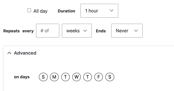

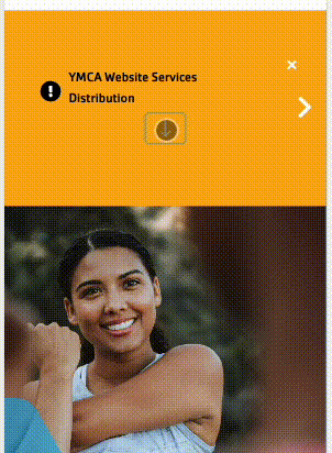
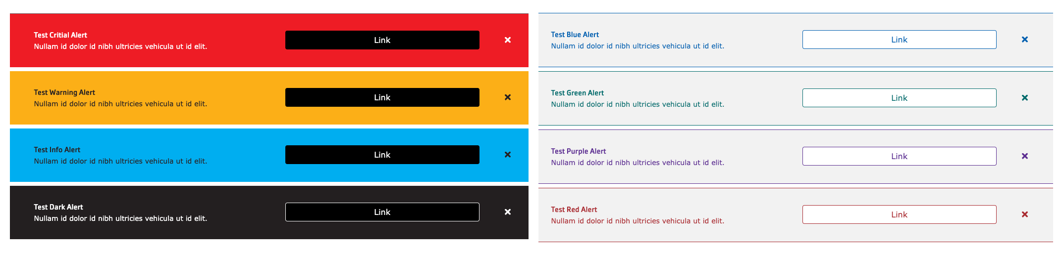
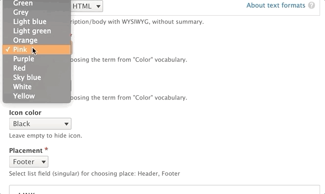
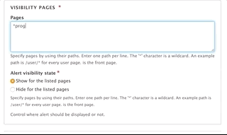
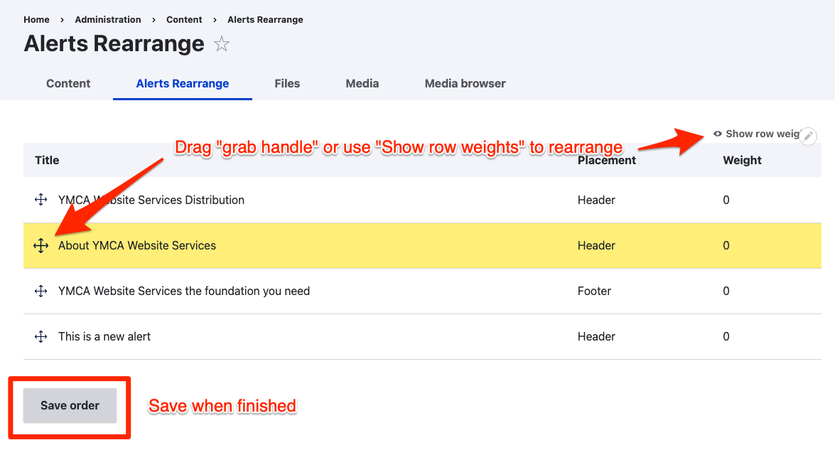
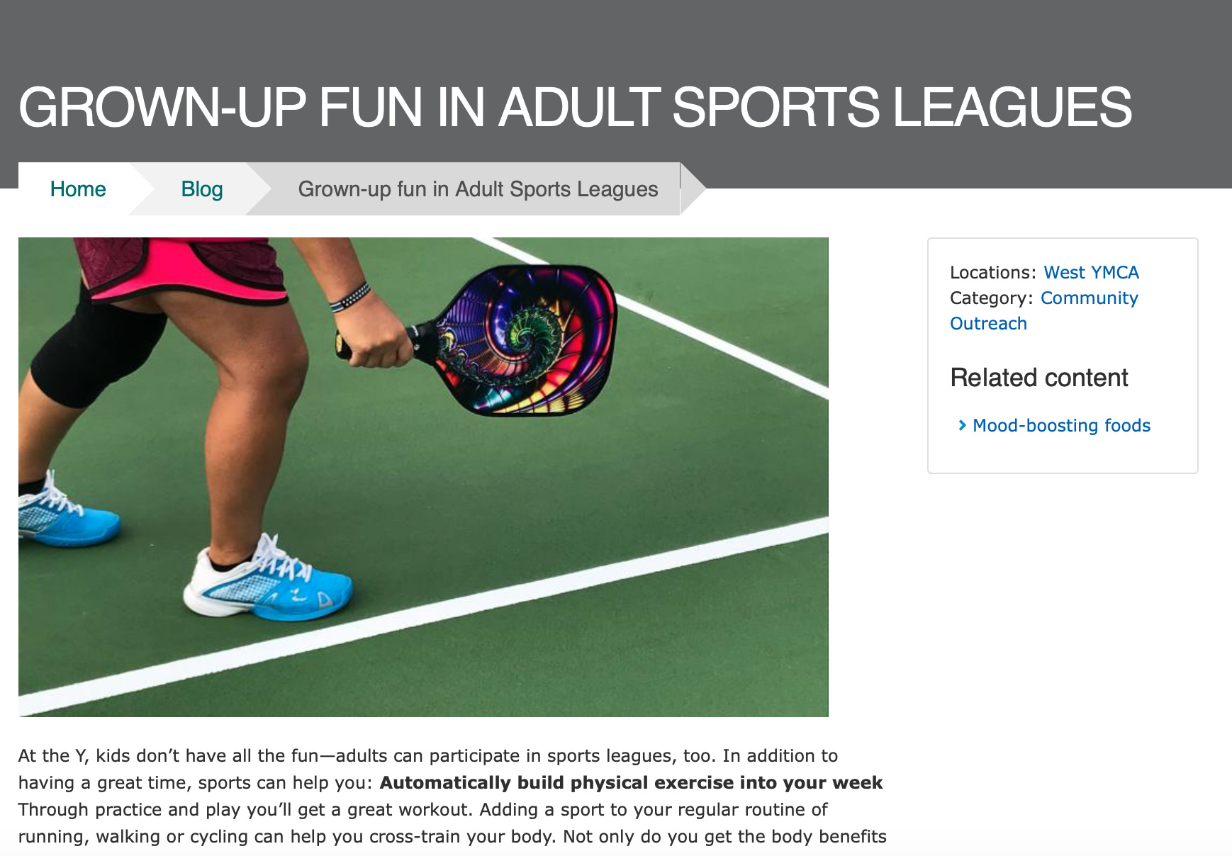
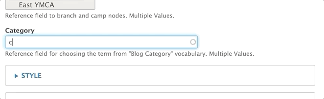
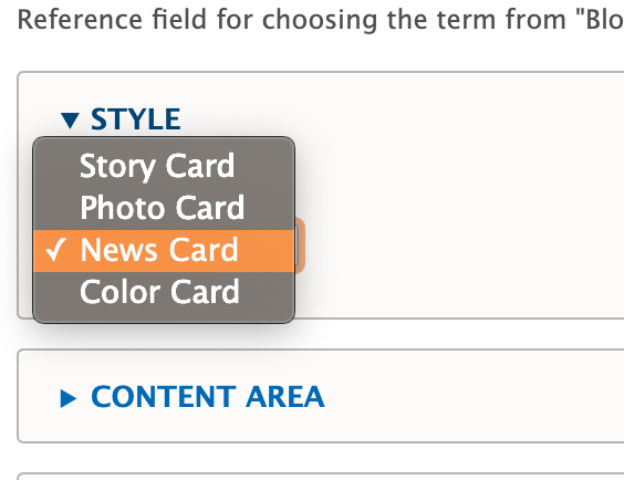
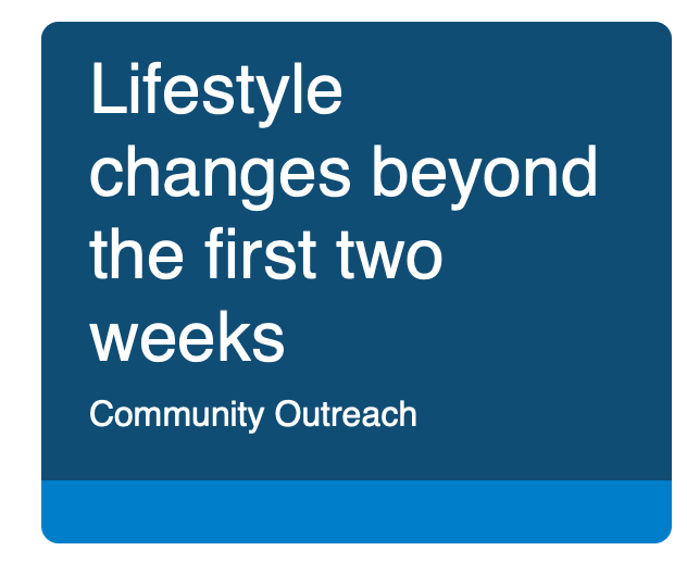
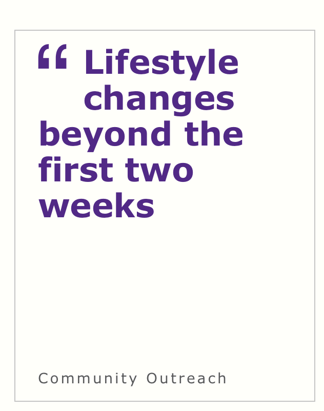
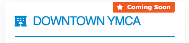
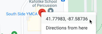
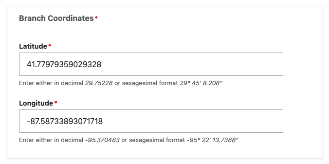
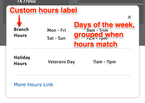
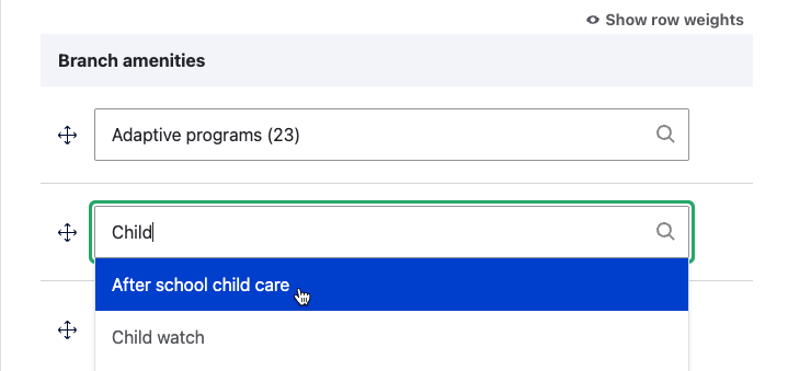
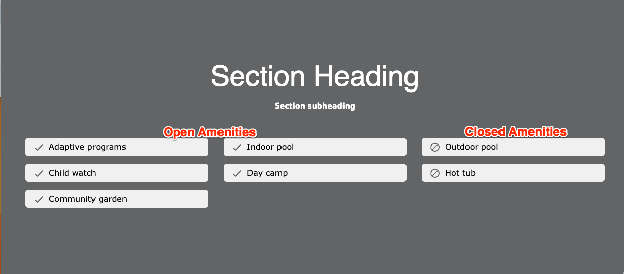
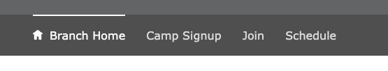
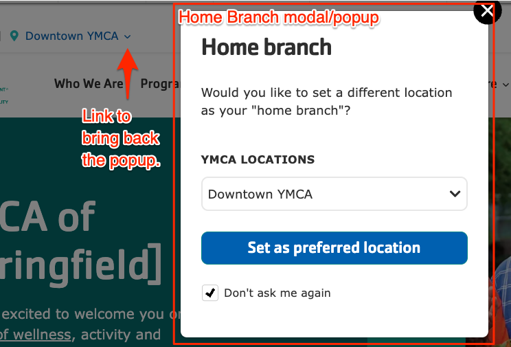
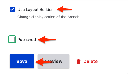
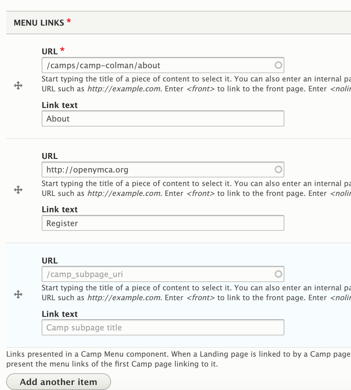
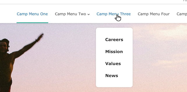
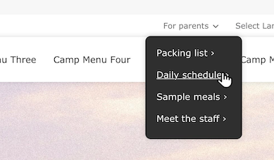
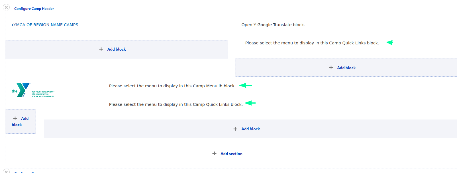
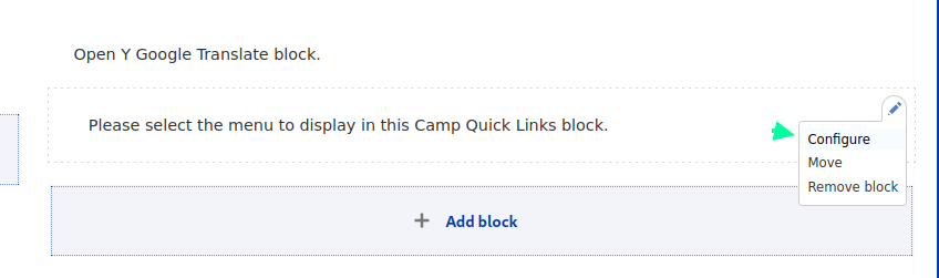
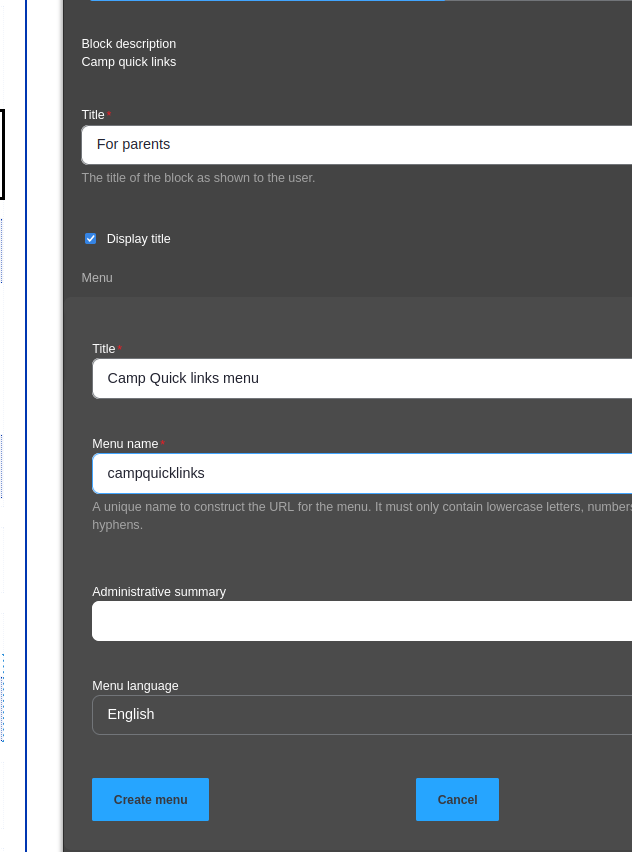
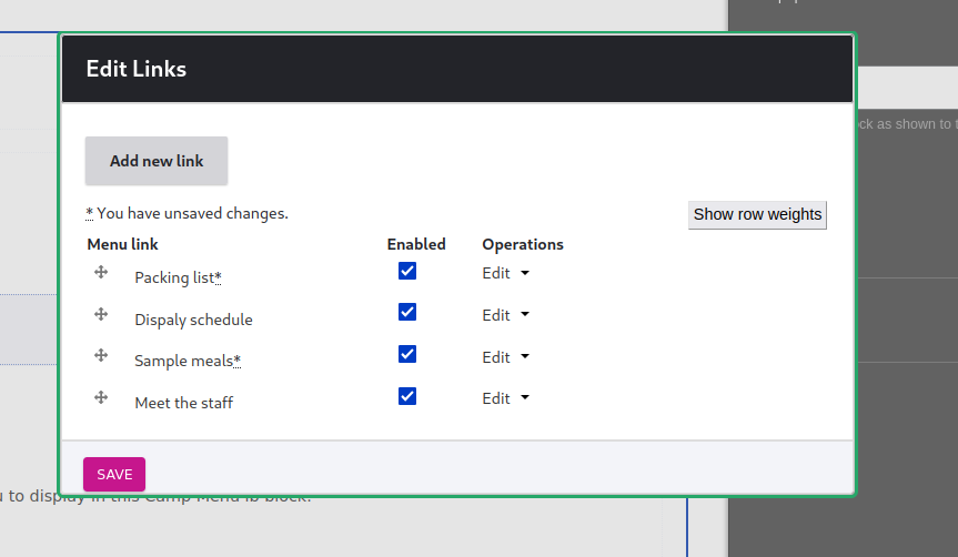
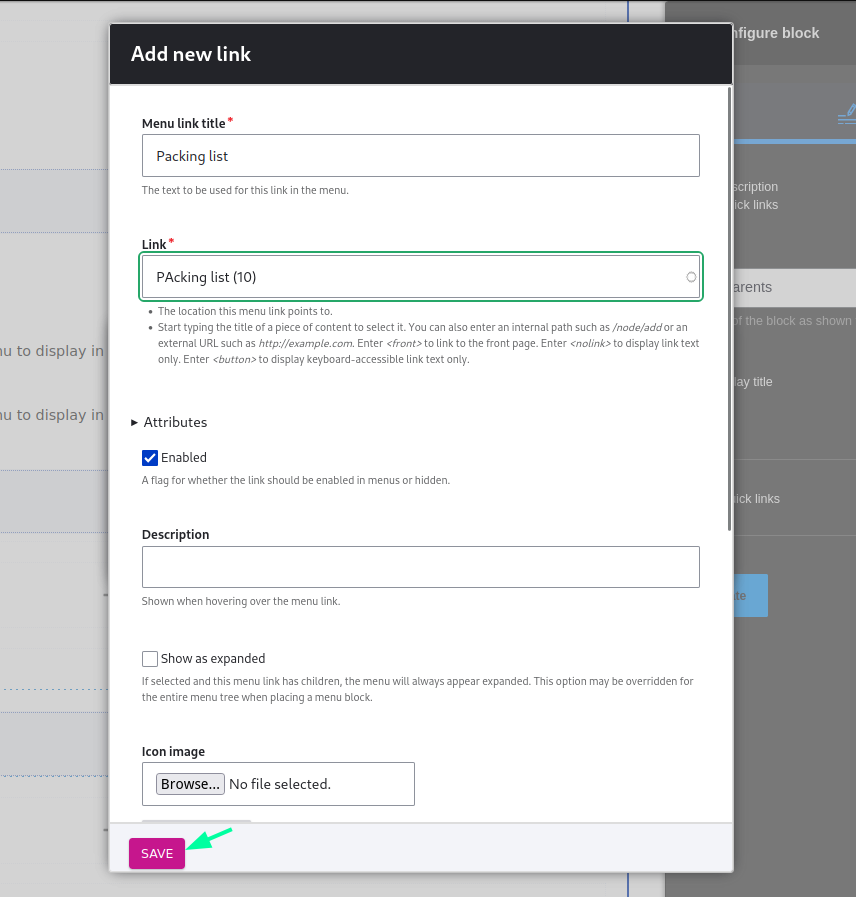
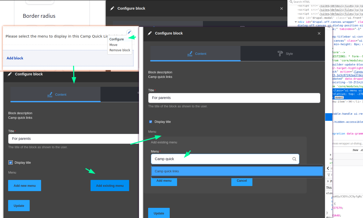
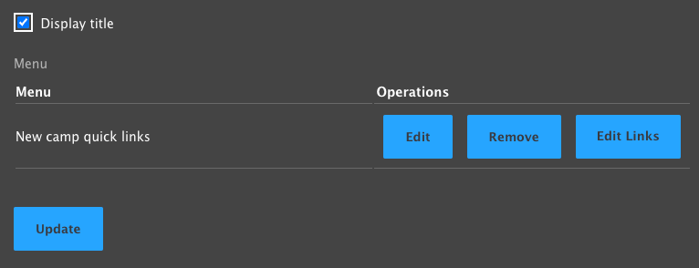
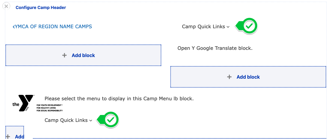
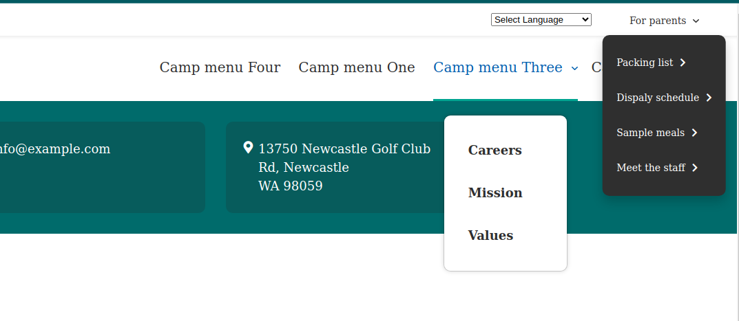
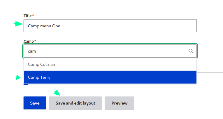
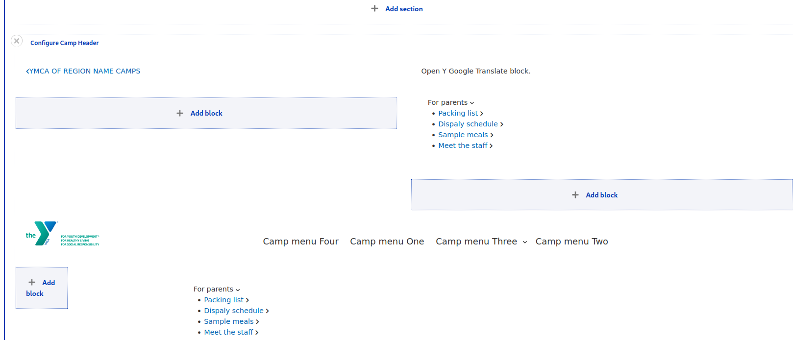
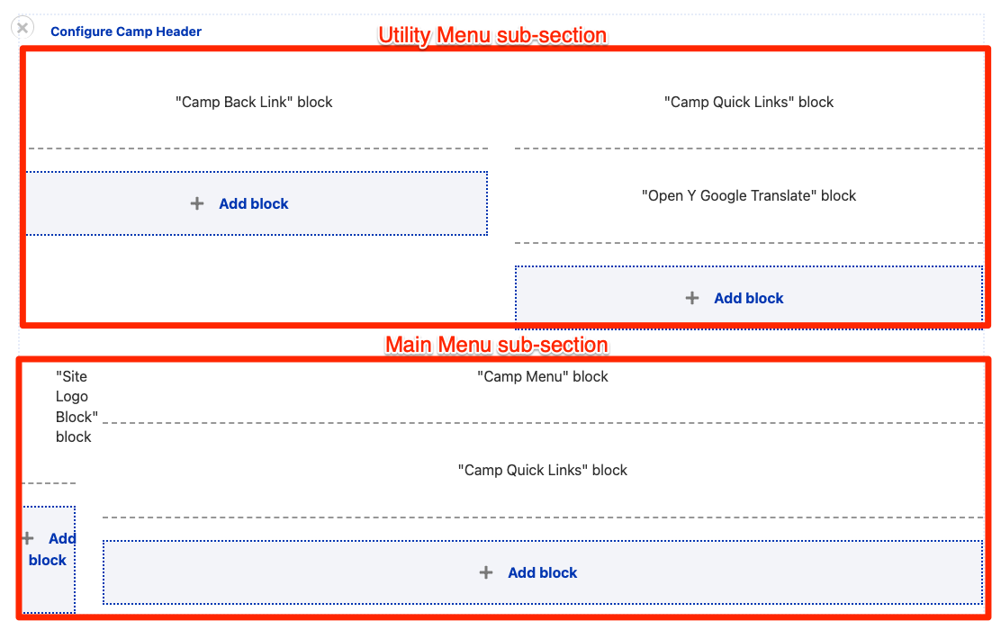
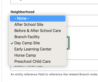
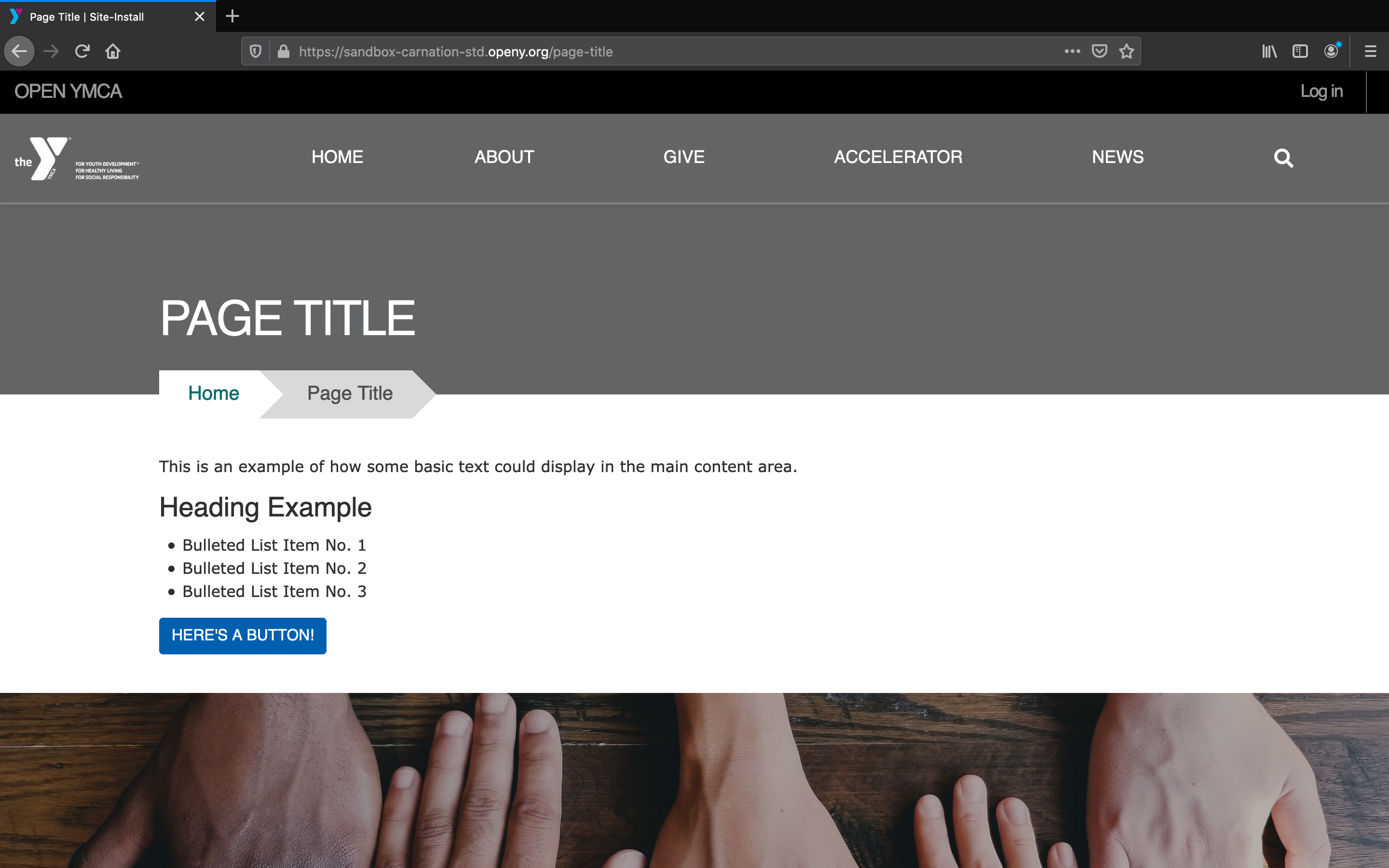
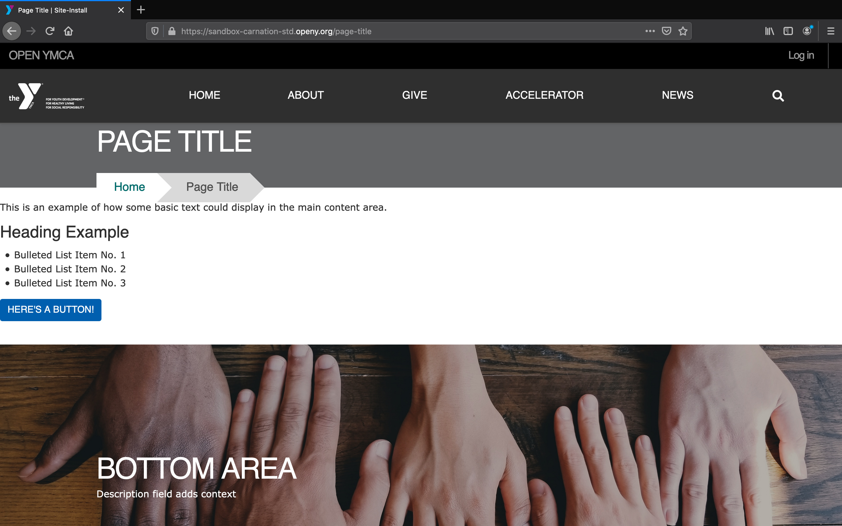
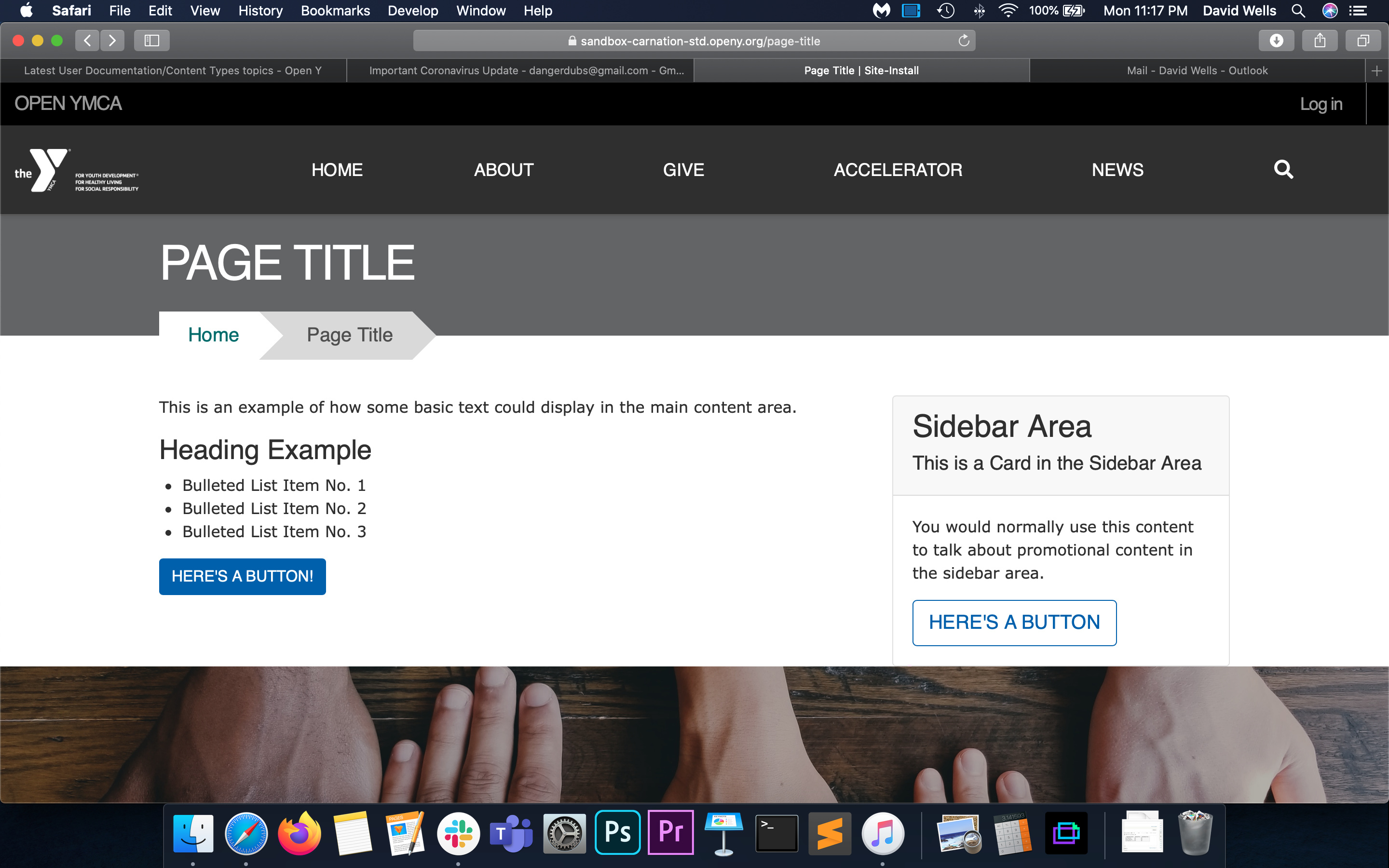
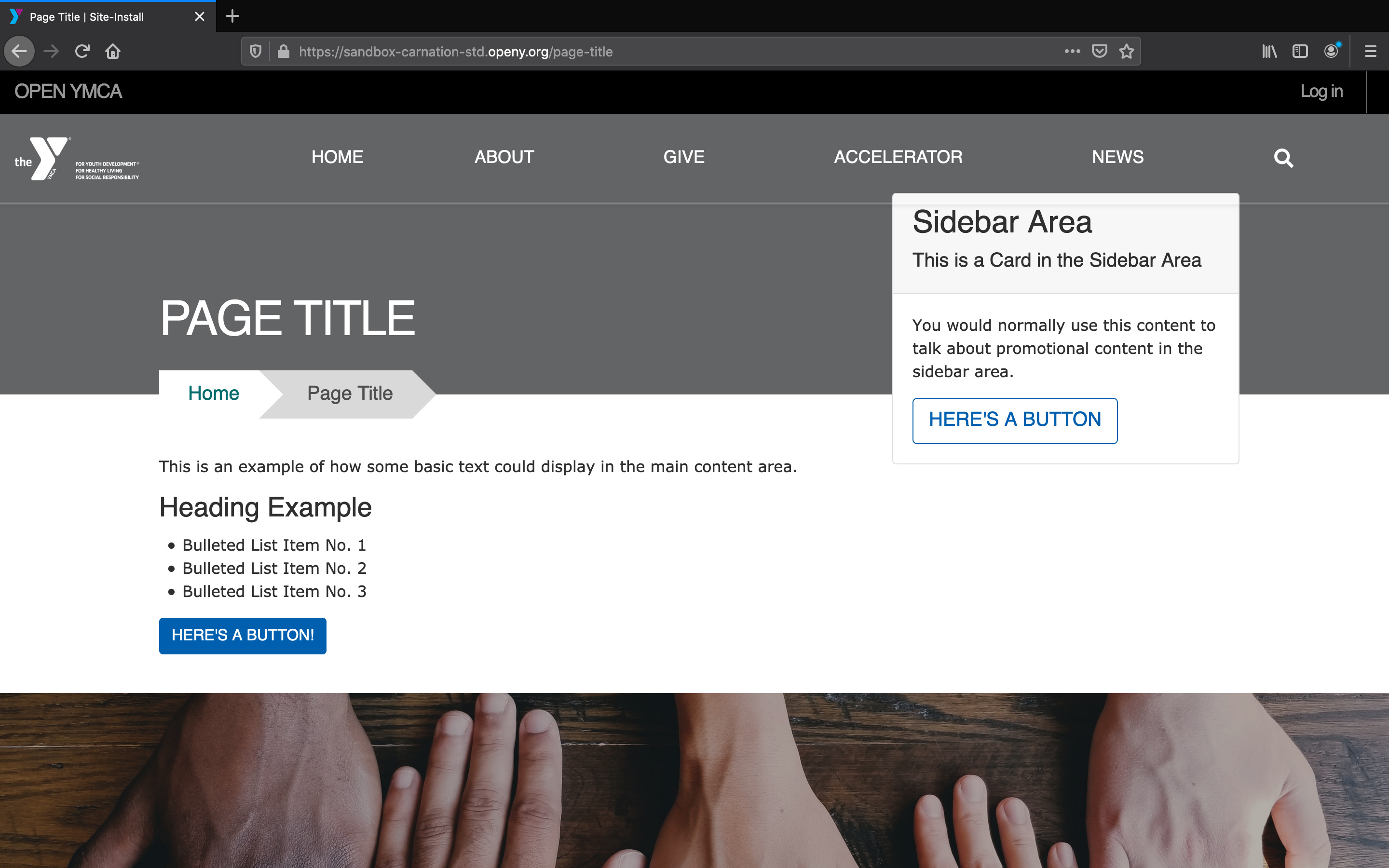
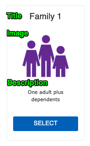
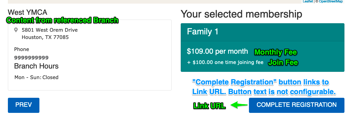
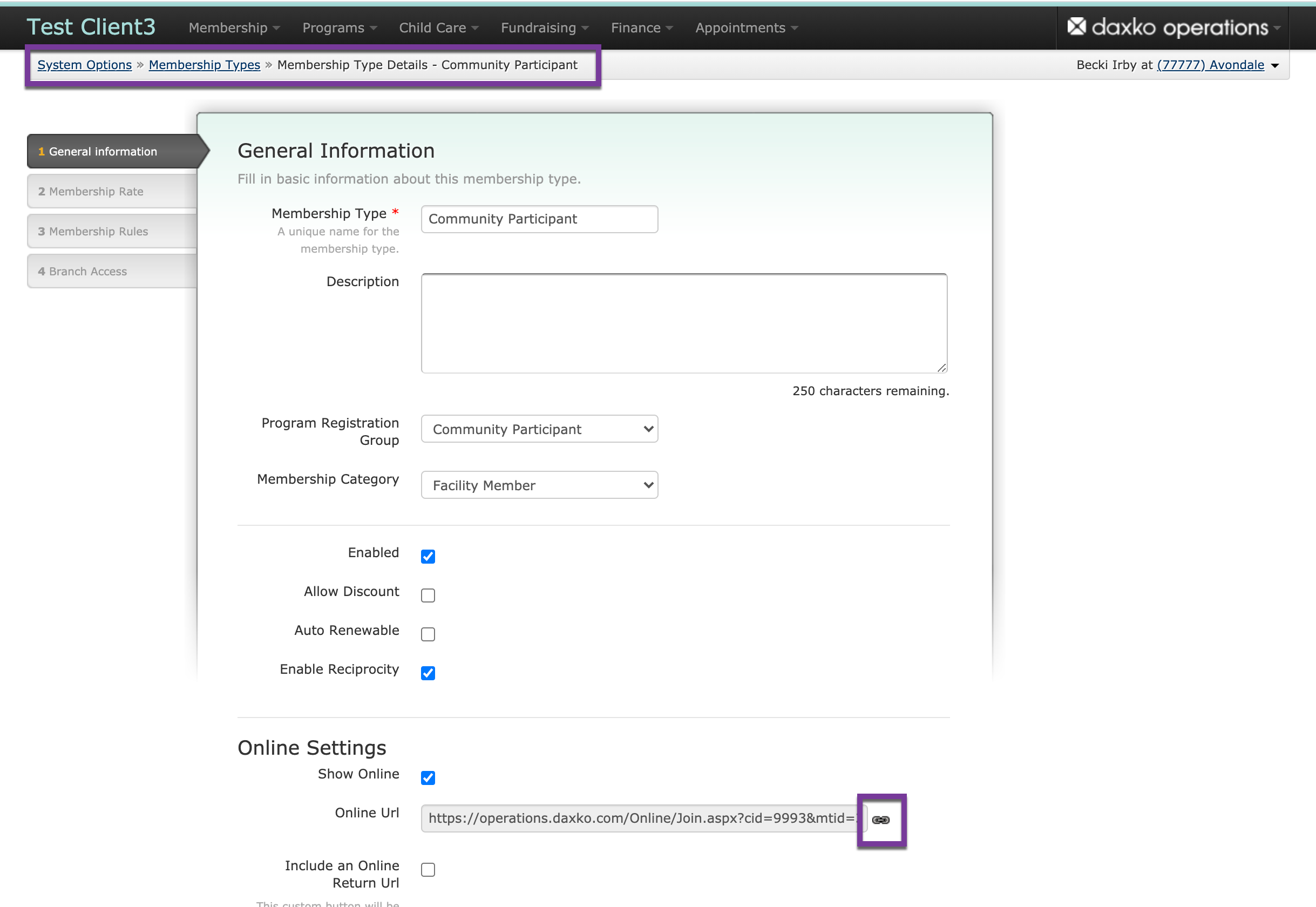
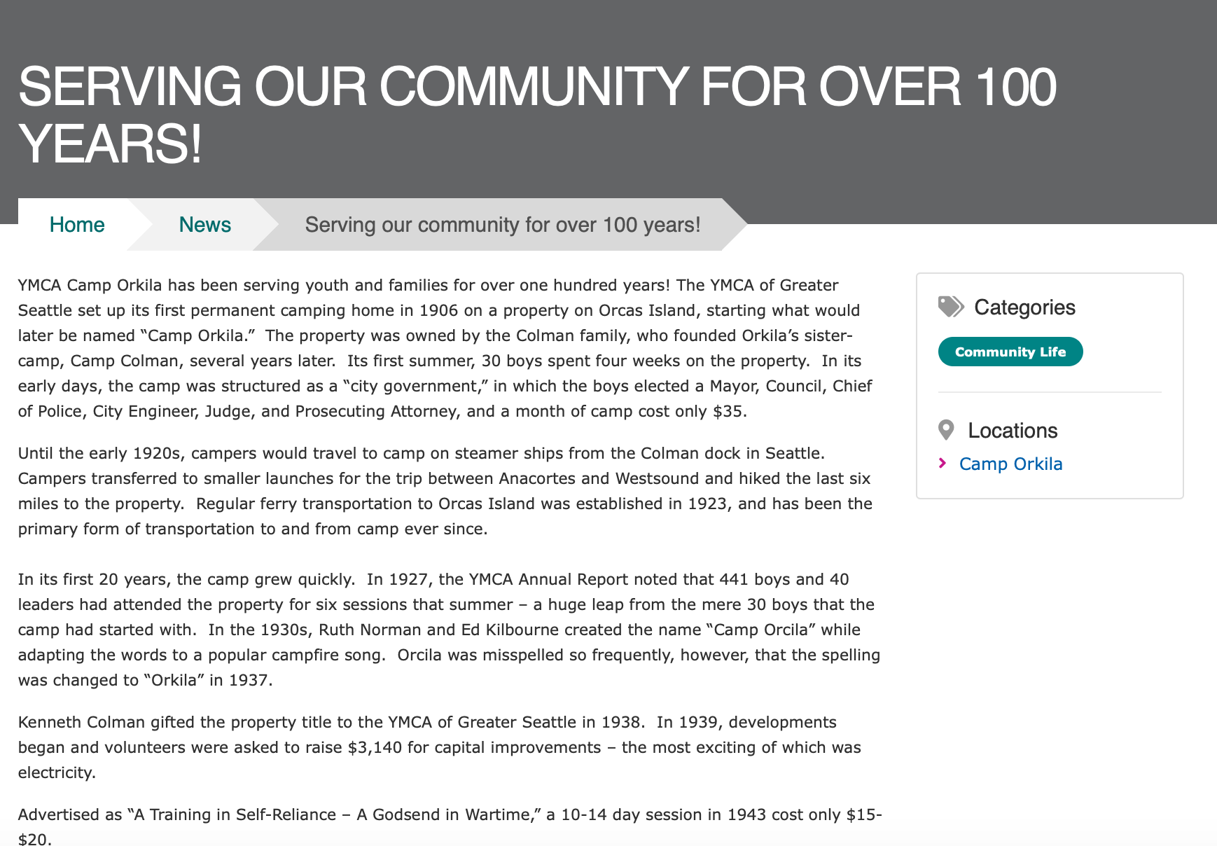
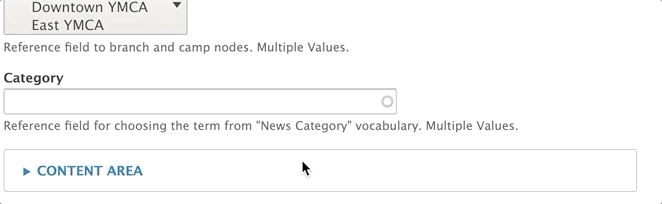
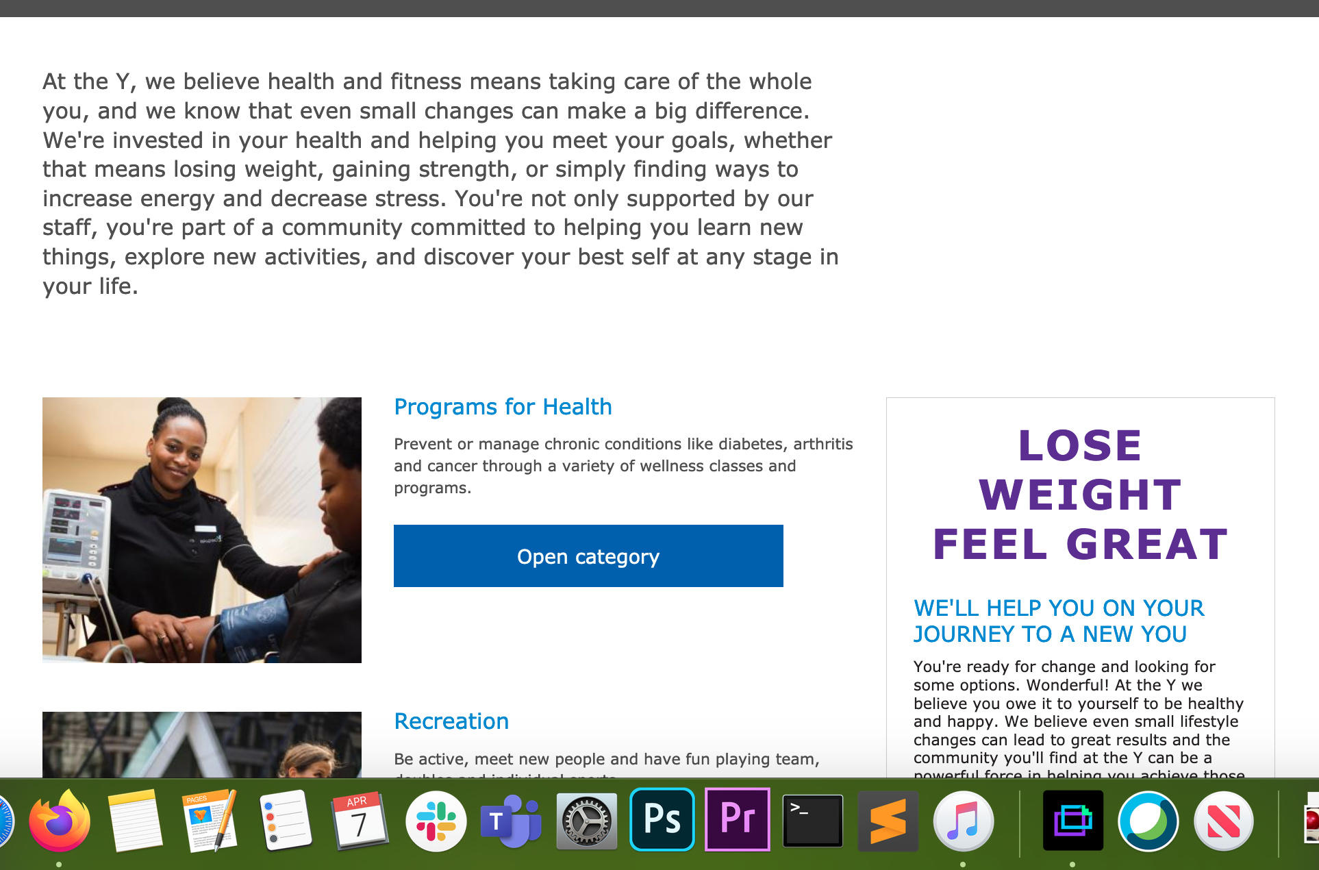
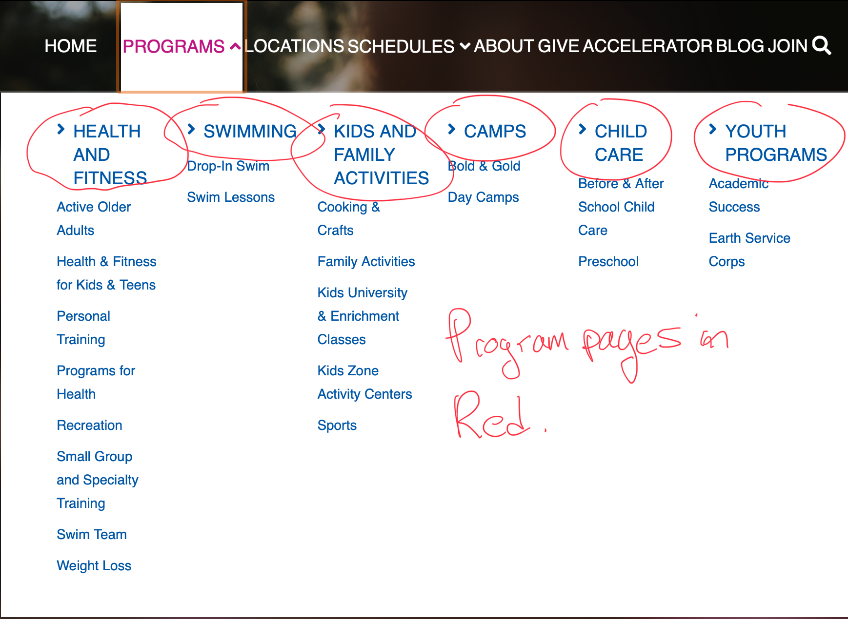
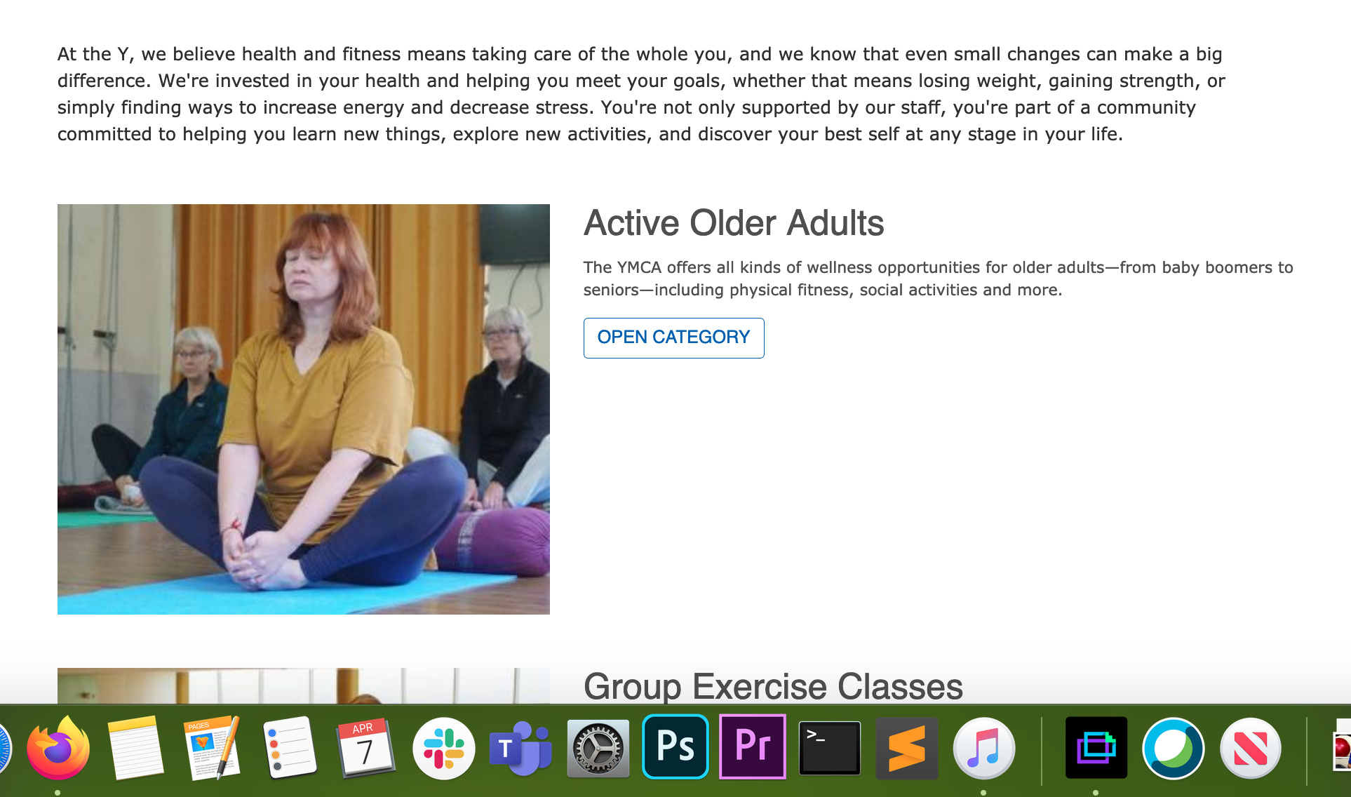
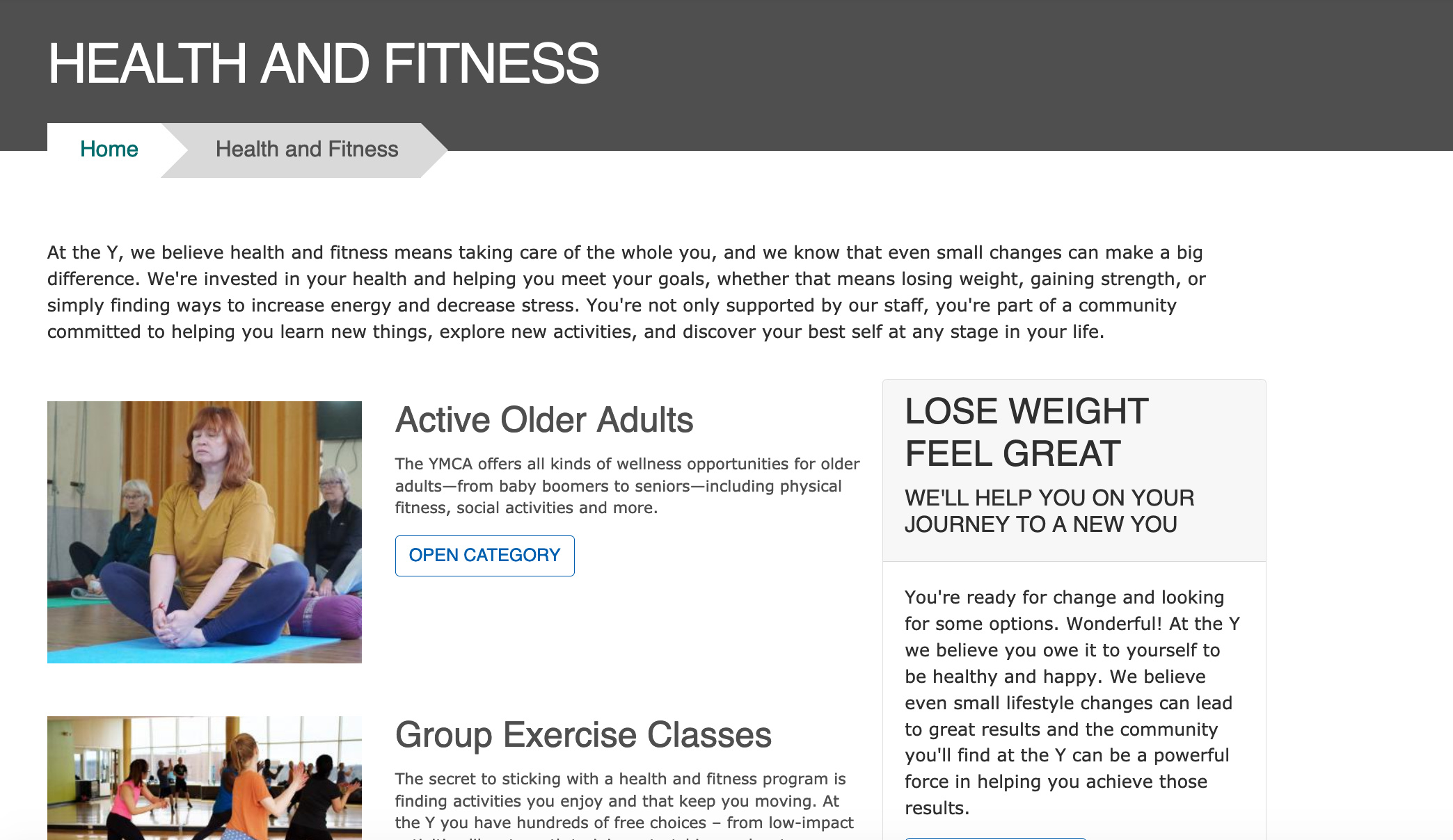
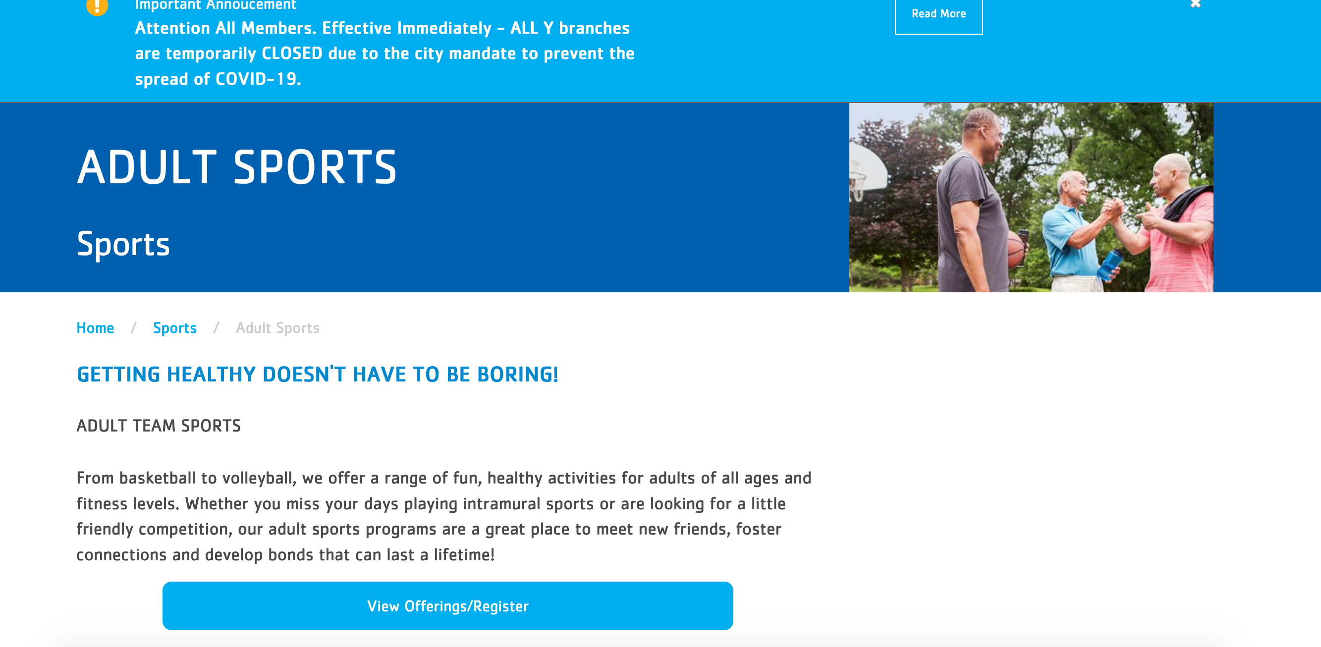
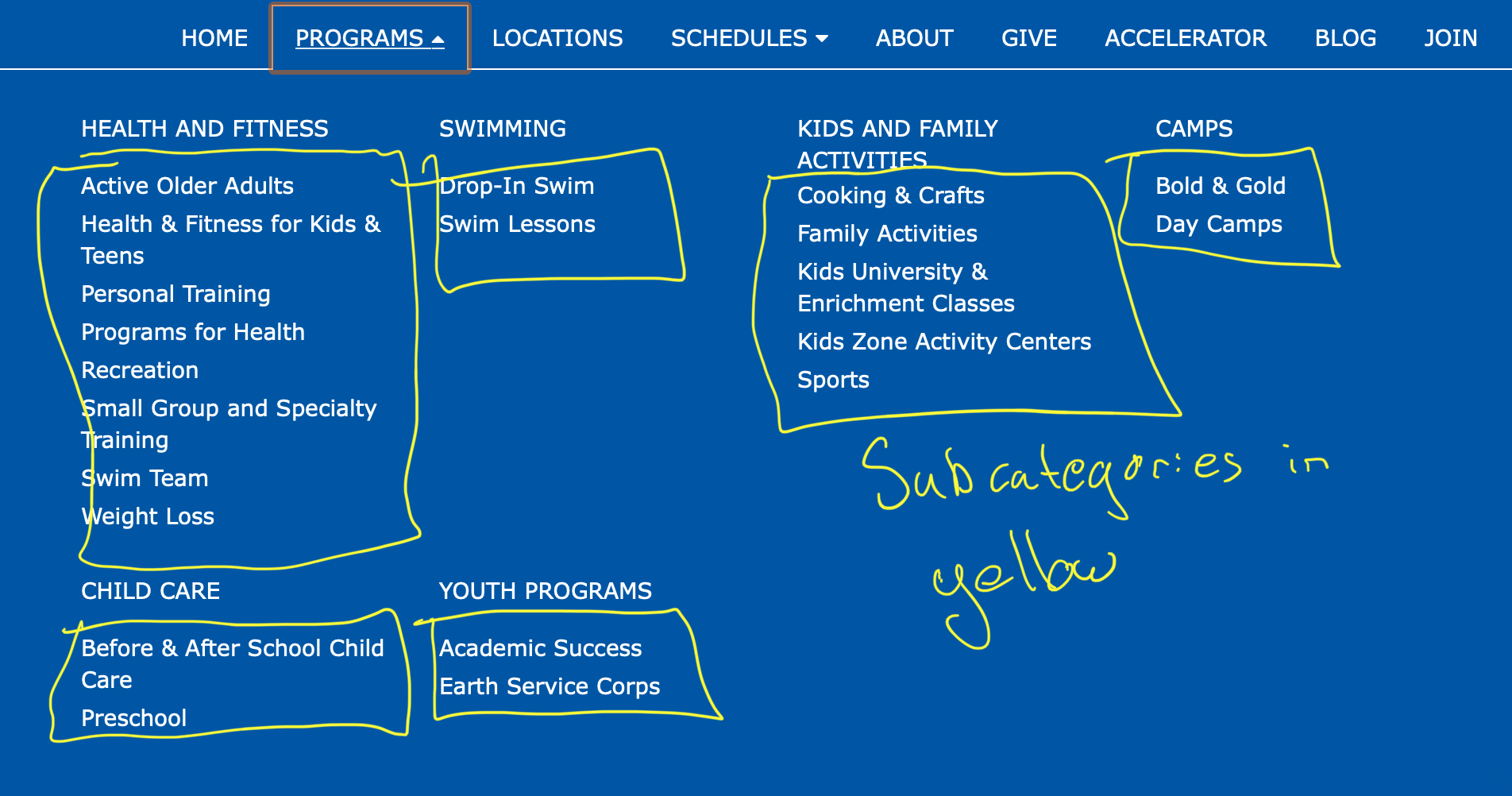
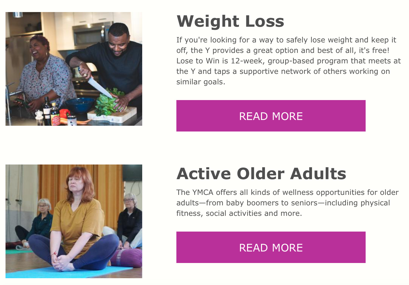
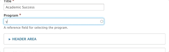
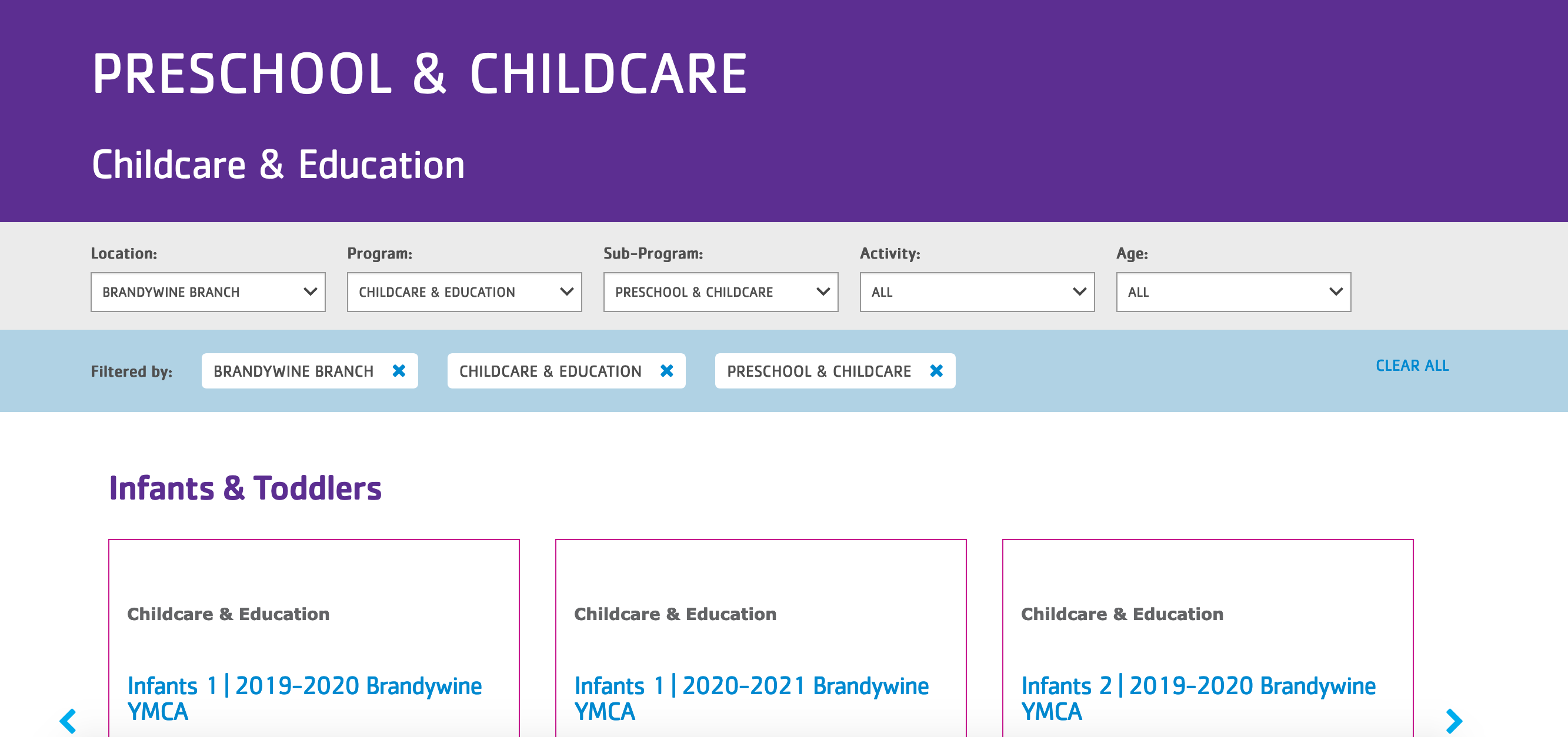
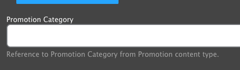
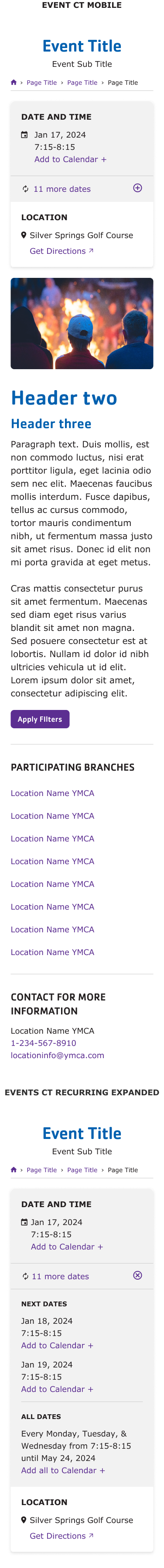
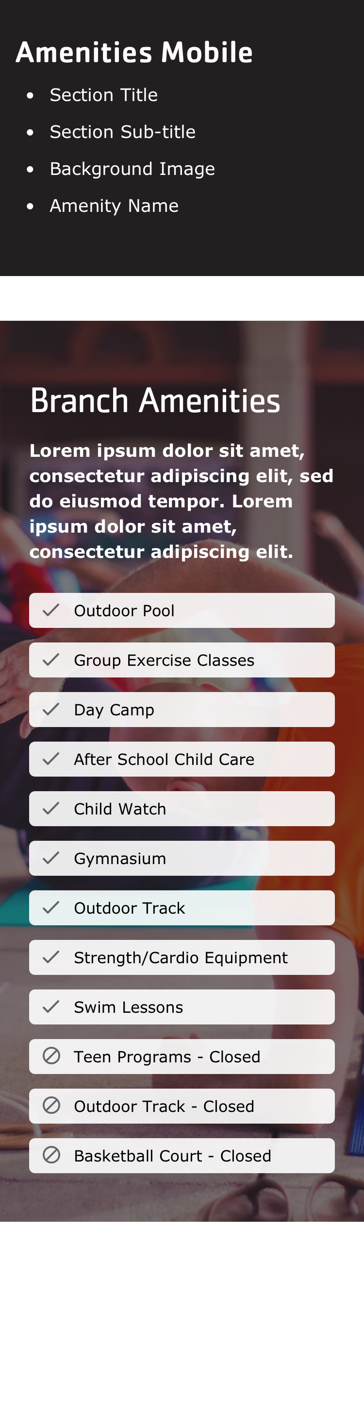
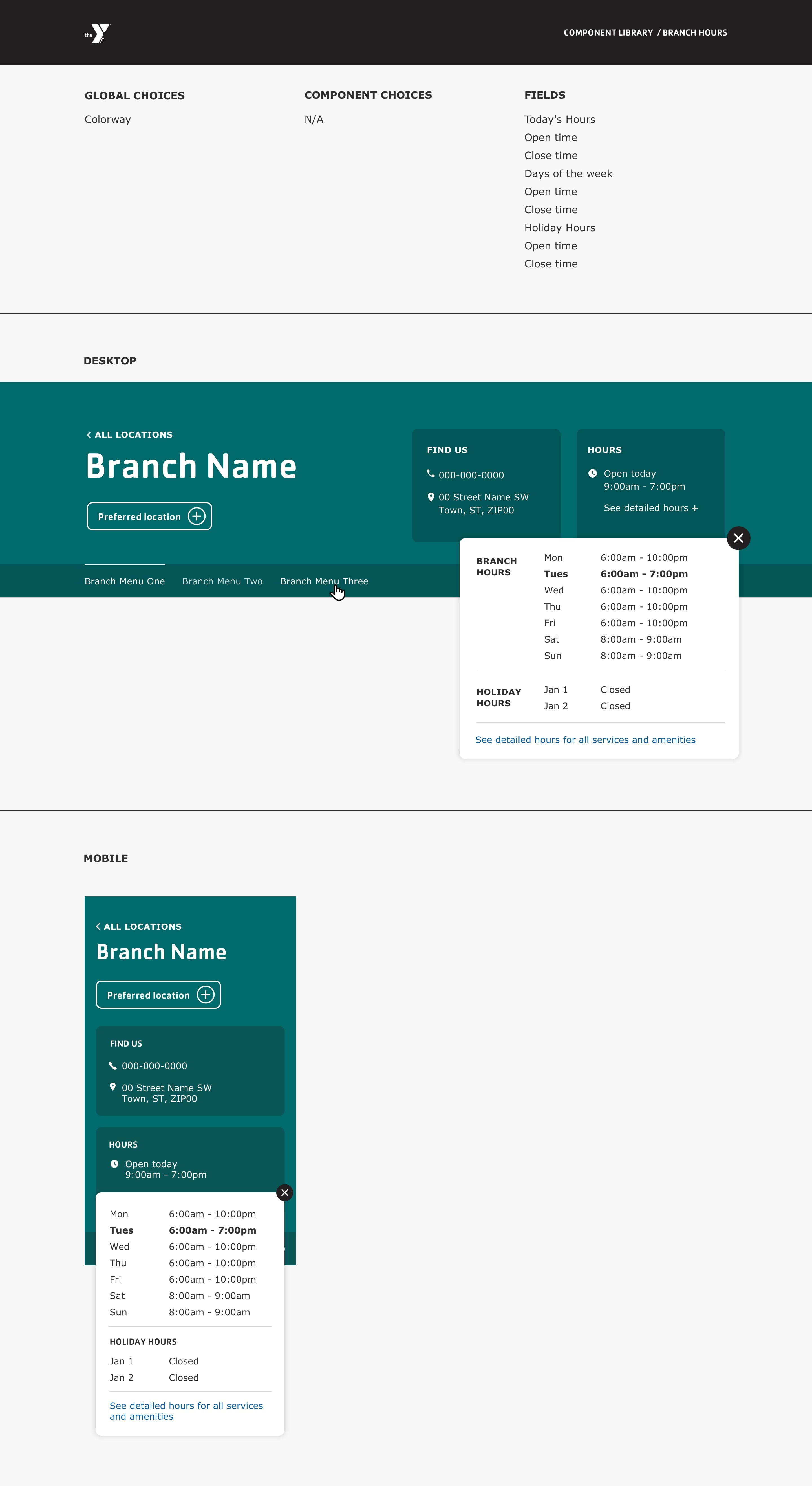
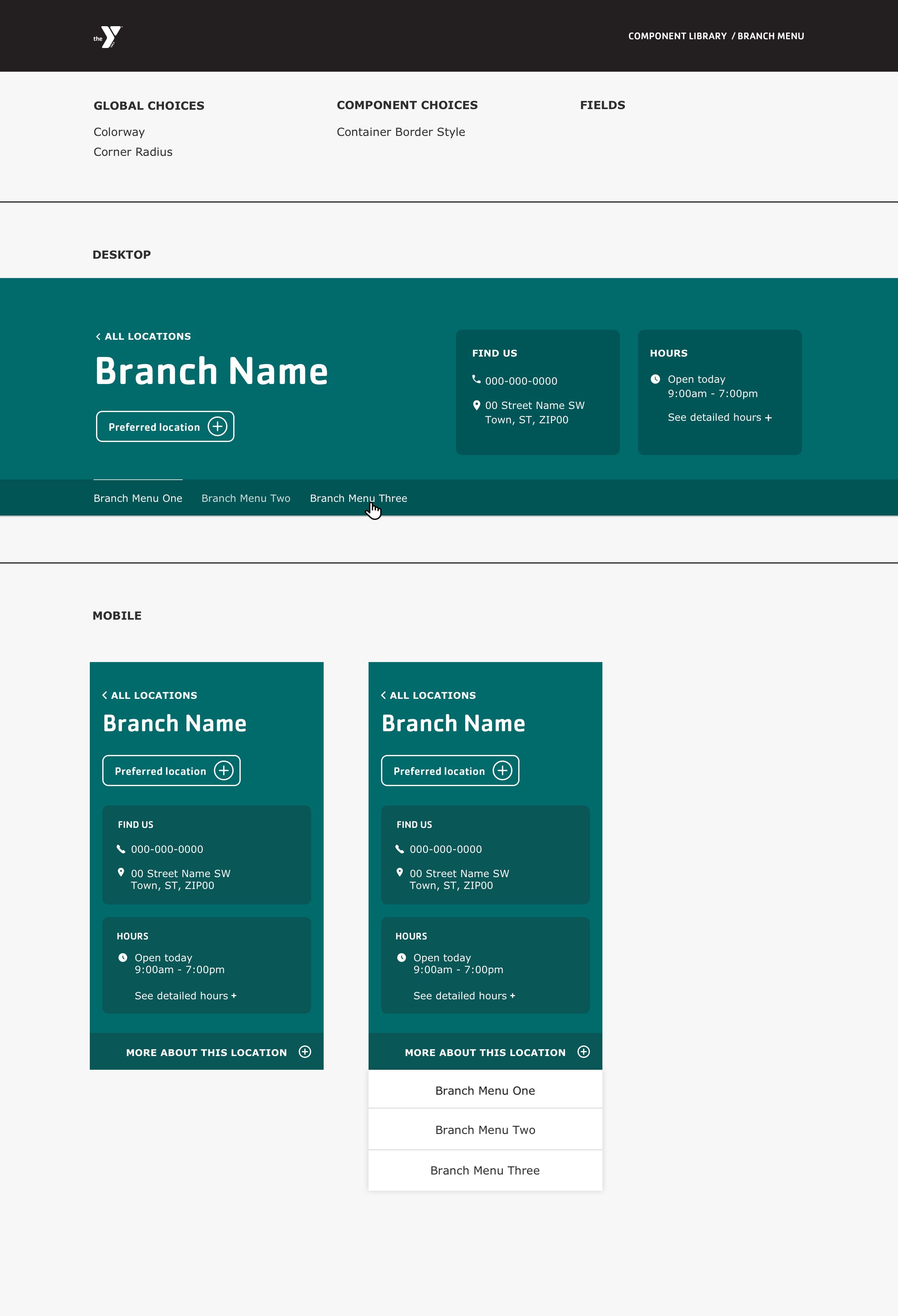
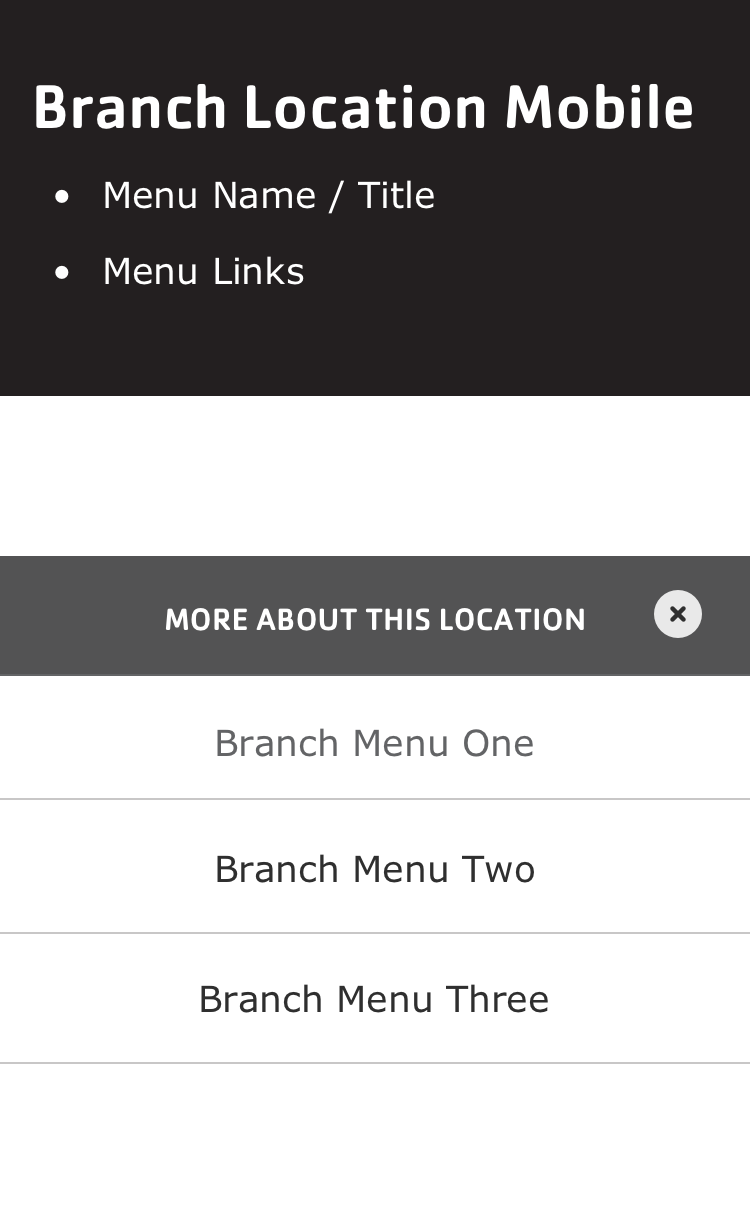