Designs
An overview of all custom Layout Builder blocks.
Layout Builder is a powerful new page-building addition to your YMCA website.
Drupal’s Layout Builder allows content editors and site builders to easily and quickly create visual layouts for displaying content. Users can customize how content is arranged on a single page, across types of content, or even create custom landing pages with an easy-to-use drag-and-drop interface.
YMCA Website Services 9.2.12 introduces a new Content Type: Landing Page (Layout Builder). This new page will allow you to build pages using Sections with different Layouts that contain Custom Blocks. Please contact your development partner if you need assistance updating the latest version.
To use Layout Builder, you’ll first have to create a new page:
Once you’ve saved, you will see an empty page. Click the Layout tab to enter Layout Builder or go directly there with Save and edit layout.
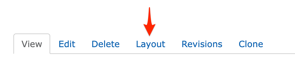
Navigate to the page you’d like to update, then click the Layout tab, like above.
Once you are in the Layout editor, you can create, edit, rearrange, and delete sections and blocks while viewing the page in a what-you-see-is-what-you-get preview mode.
Changes to the page are not displayed to site viewers until you Save Layout on the page and Publish it.
When in the Layout editor, you will have these options at the top of the page:
After saving your changes, be sure your page is published:
In Layout Builder, you will see the page divided up into Sections and Blocks. Your page may already be populated with some sections to get you started building, and you can change or edit those to fit your page.
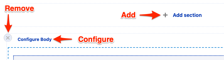
Sections create the structure of the page and contain blocks. You can drag and drop blocks between sections, but you cannot move sections themselves—you can only create sections above or below existing sections.
You can remove sections by clicking the small “X” link at the top left of the section. Click on “Configure
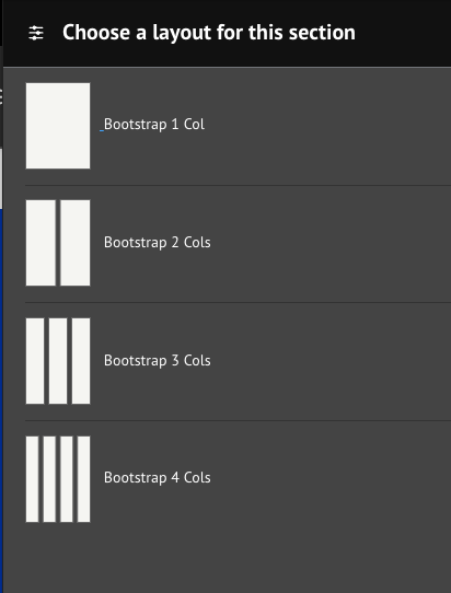
Layouts define the structure of a section. YMCA Website Services comes with 1-, 2-, 3-, and 4-column layouts, and each layout has additional configuration options once it’s created. See advanced options for more details.
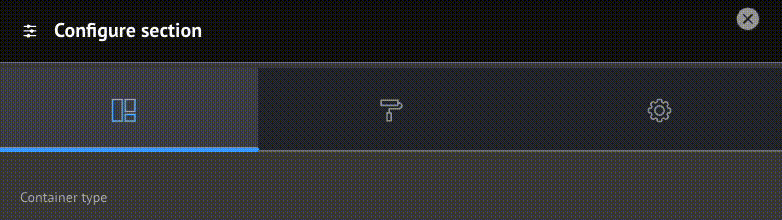
Some options in this configuration may not yet be fully supported.
While Sections contain the page’s structure, Blocks contain its content.
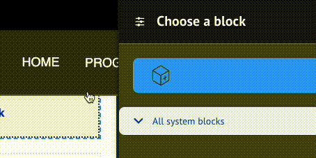
To create a block, click Add Block in any section of the page, then Create Custom Block.

Your YMCA website has a wide array of blocks to choose from.
Explore 30+ Layout Builder blocks organized by category. Find banners, cards, grids, views, testimonials, schedules, and more.
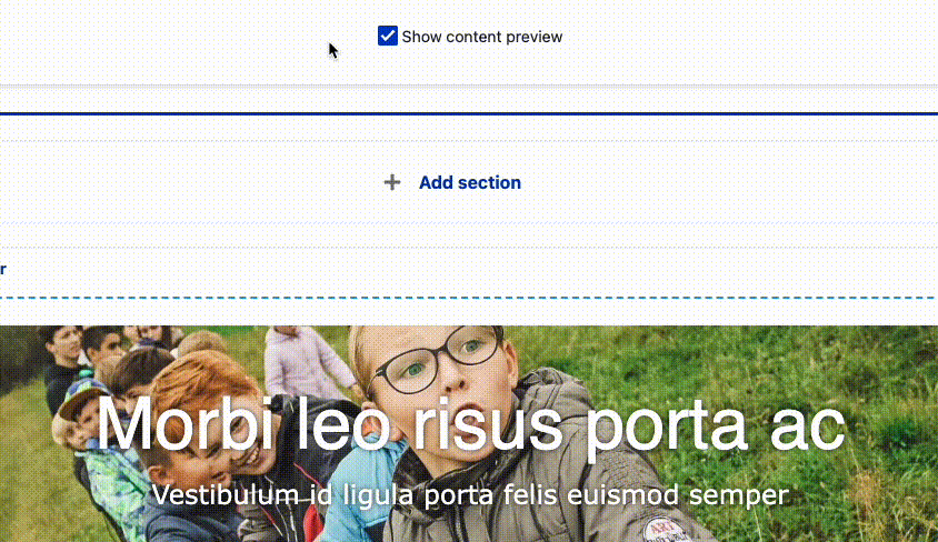
The Content Editing Pane—the sidebar where you edit blocks —can sometimes be too small to get all of your content in there nicely. Simply drag anywhere on its left border to expand the pane.
When rearranging large blocks on the page it can often be challenging to drag them around. To make this easier, uncheck Show content preview at the top of the page. This will substitute the “WYSIWYG” preview for block titles, making the content much more compact.
If you run into a problem, get in touch.
Content on this page is adapted from Drupal.org and Western Washington University
An overview of all custom Layout Builder blocks.
Configuration for Layout Builder Sections and Blocks.
Browse all available Layout Builder blocks organized by category.
Expandable pairs of question/answer or header/section fields.
Place the Activity Finder application in a Layout Builder page.
Components to feature, filter, and list articles using Layout Builder.
A full-width, almost full-height display with a header, description, and call to action overlaid on an image. Also known as “Hero Banner”.
Secondary navigation that allows users to understand where they are located within a site.
Flexible card-style components that allow up to 4 cards to display across the page depending on the chosen layout.
A full-width gallery with multiple sets of a header, description, and call to action overlaid on top of an image.
Embed unfiltered HTML code in a page.
A call to action with donation buttons linking to an embedded form.
Components to feature, filter, and list events using Layout Builder.
Sets of content with a headline, description, and link displayed in 2 to 4-item wide rows, with the option to include icons or images.
Many blocks come together to create a configurable header and footer for Layout Builder pages.
A simpler version of the Grid CTA component. Sets of content with a headline and description displayed in 2 to 4-item wide rows, with the option to include icons or images.
A set of components to view and search YMCA locations.
A simple pop-up dialog that is triggered when a page loads.
Component for displaying logos / info of partners or sponsors within a page using Layout Builder.
Usually paired sets of full-width page components that include media, header, description, and call to action arranged horizontally.
A title, headline, description, and link that usually display in the right or left sidebar.
Component for displaying related articles within an Article node page and within other pages (i.e. landing pages) using Layout Builder.
Component for displaying related events within an event node page and within other pages using layout builder.
Place the Repeat Schedules application in a Layout Builder page.
A simple 1-level sidebar menu that can display in either the right or left sidebar area.
A calendar-based schedule.
Allows users to add simple content and responsive tables within a page.
Component for displaying simple staff member info cards (with image, name, title) within a page using Layout Builder.
Infographic-like display that highlights relevant statistics to users.
Gives users the ability to switch page views by selecting in-page tabs.
Component for displaying short testimonials or quotes from Y members in an interactive carousel-style format.
Embed an existing webform on a page.