Layout Builder is a powerful new page-building addition to your YMCA website.
Drupal’s Layout Builder allows content editors and site builders to easily and quickly create visual layouts for displaying content. Users can customize how content is arranged on a single page, across types of content, or even create custom landing pages with an easy-to-use drag-and-drop interface.
YMCA Website Services 9.2.12 introduces a new Content Type: Landing Page (Layout Builder). This new page will allow you to build pages using Sections with different Layouts that contain Custom Blocks. Please contact your development partner if you need assistance updating the latest version.
Creating a new page
To use Layout Builder, you’ll first have to create a new page:
Choose any Layout Builder-enabled content type, or start with a basic
Landing Page
Go to Content > Add Content > The Content Type.
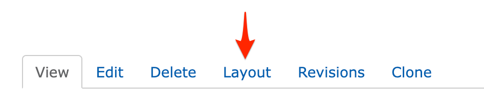
Once you’ve saved, you will see an empty page. Click the Layout tab to enter Layout Builder or go directly there with Save and edit layout.
Updating an existing page
Navigate to the page you’d like to update, then click the Layout tab, like above.
Once you are in the Layout editor, you can create, edit, rearrange, and delete sections and blocks while viewing the page in a what-you-see-is-what-you-get preview mode.
Saving and publishing
Changes to the page are not displayed to site viewers until you Save Layout on the page and Publish it.
When in the Layout editor, you will have these options at the top of the page:
Save Layout will save your changes and return you to the main page view.
Save and edit layout will save your changes and keep you in Layout Builder.
Discard Changes
Revert to Defaults will reset your page to the default empty layout.
After saving your changes, be sure your page is published:
Click the Edit tab.
Check Published.
Save the page.
Fundamentals
In Layout Builder, you will see the page divided up into Sections and Blocks. Your page may already be populated with some sections to get you started building, and you can change or edit those to fit your page.
Sections
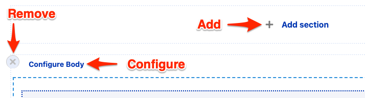
Sections create the structure of the page and contain blocks. You can drag and drop blocks between sections, but you cannot move sections themselves—you can only create sections above or below existing sections.
You can remove sections by clicking the small “X” link at the top left of the section. Click on “Configure ” to edit the section layout and other options.
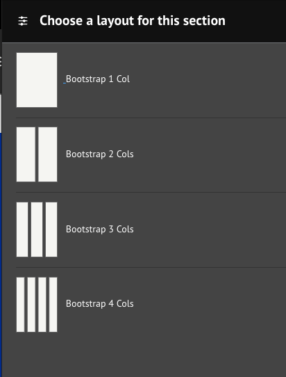
Layouts
Layouts define the structure of a section. YMCA Website Services comes with 1-, 2-, 3-, and 4-column layouts, and each layout has additional configuration options once it’s created. See
advanced options for more details.
The Content Editing Pane—the sidebar where you edit blocks —can sometimes be too small to get all of your content in there nicely. Simply drag anywhere on its left border to expand the pane.
Rearrange blocks easily
When rearranging large blocks on the page it can often be challenging to drag them around. To make this easier, uncheck Show content preview at the top of the page. This will substitute the “WYSIWYG” preview for block titles, making the content much more compact.
The distribution has shipped with two versions of Layout Builder component designs. The first-generation “Pre-release” designs were shipped with version
9.2.12 (December 2022) and
9.2.13 (March 2023). The revised and feature-complete “Design System” designs shipped with the June 2023 release.
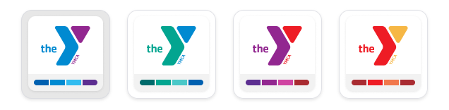
Based on the YMCA Brand Guide, the distribution contains four “colorways” that allow content editors to apply accessible, brand-compliant styles to all components on a Layout Builder-based page.
Each of these components is available on
Layout Builder pages via the Create custom block selector.
Component
Design
Accordion
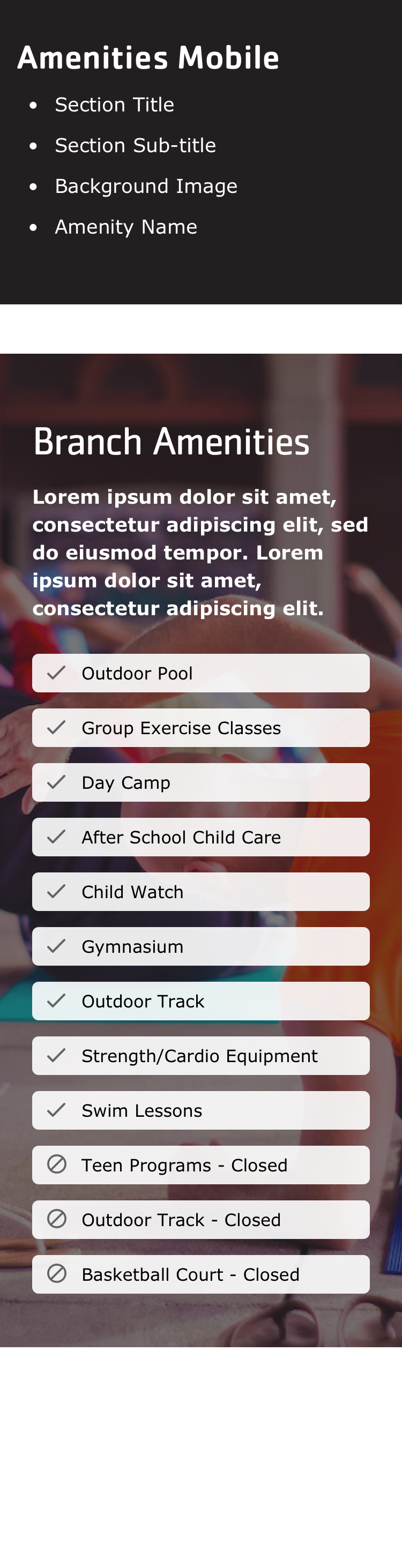
Amenities
Article List
(Hero) Banner
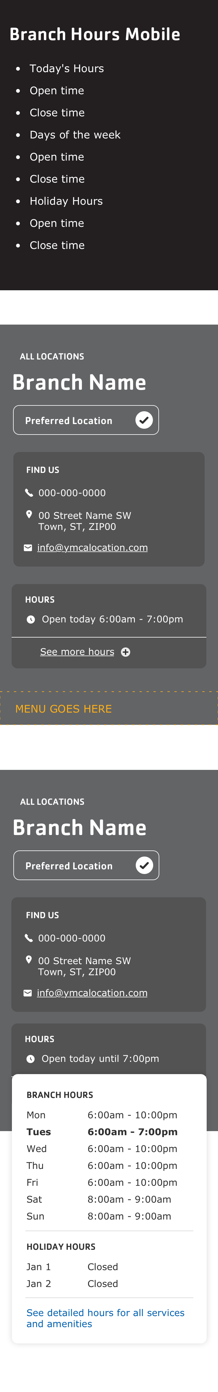
Branch Hours
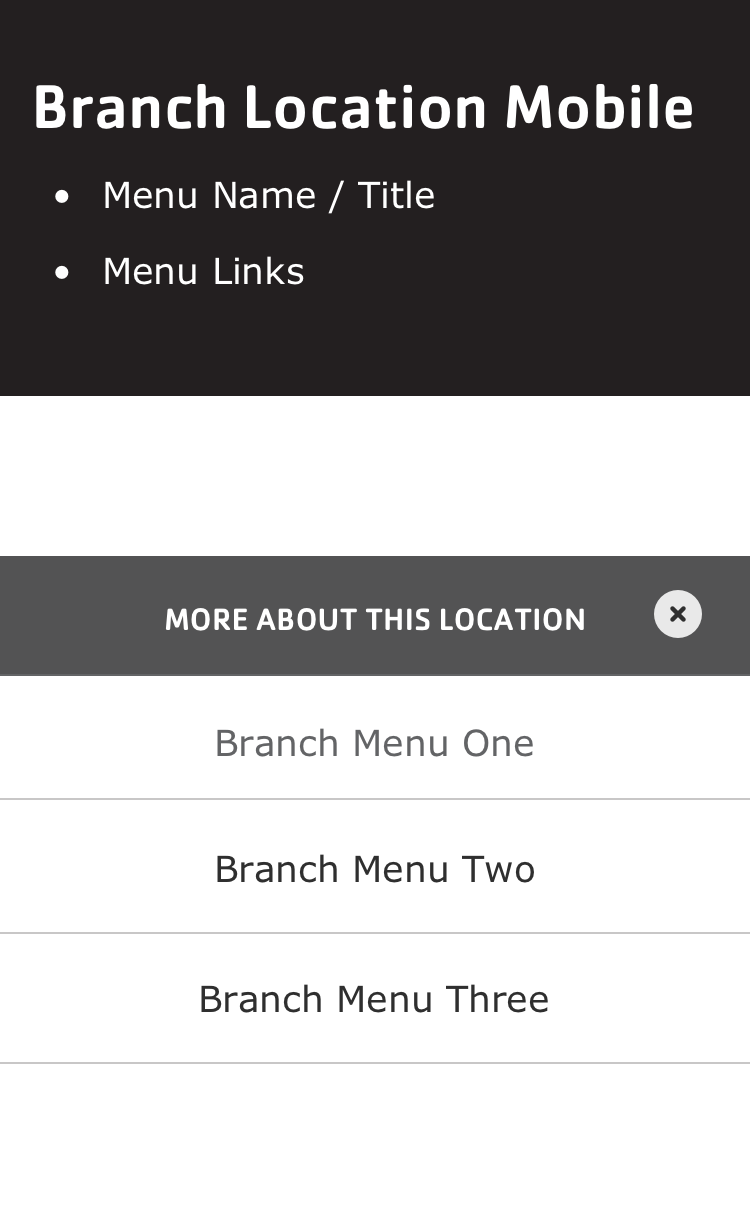
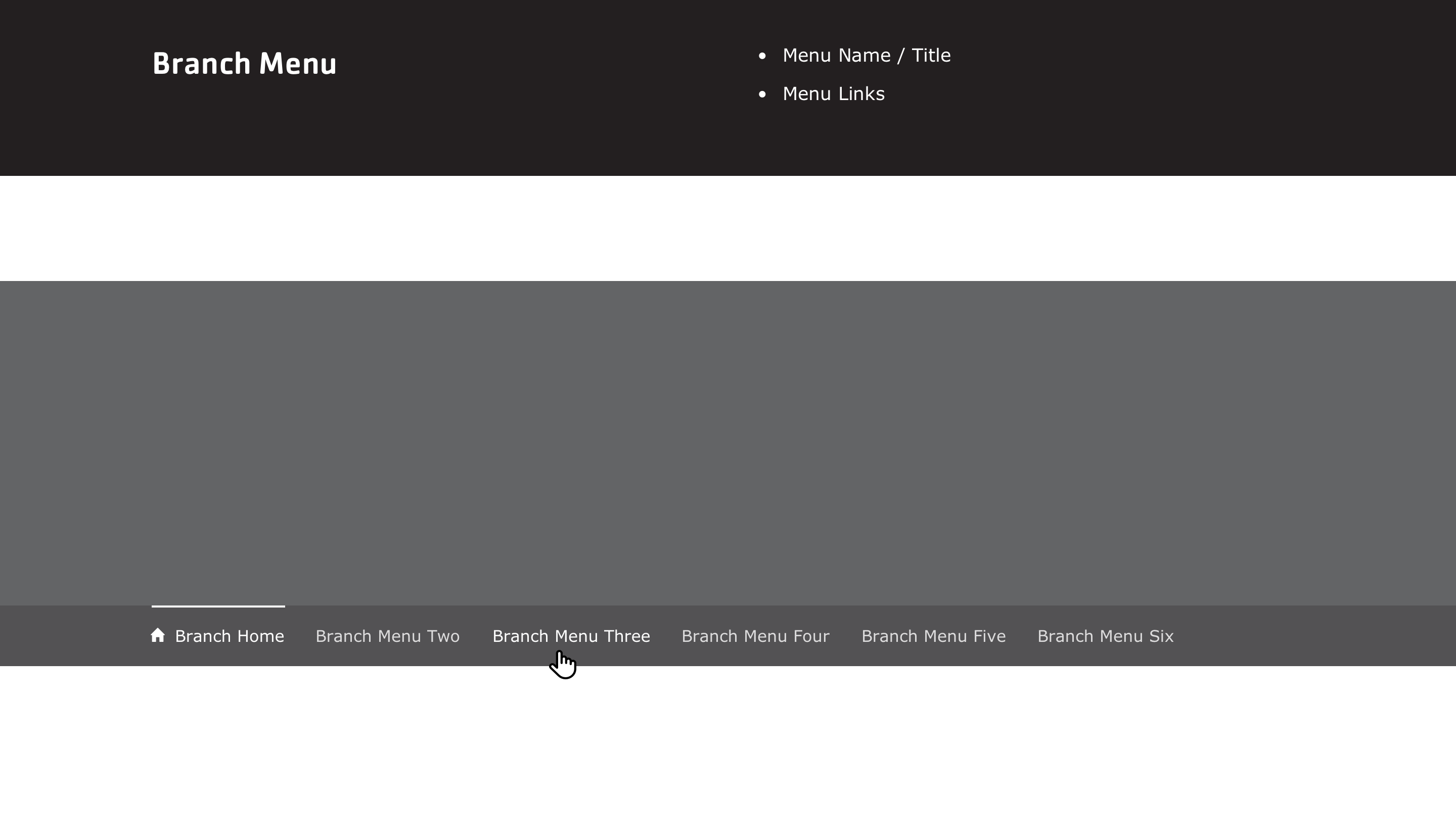
Branch Menu
Branch Preferred Branch
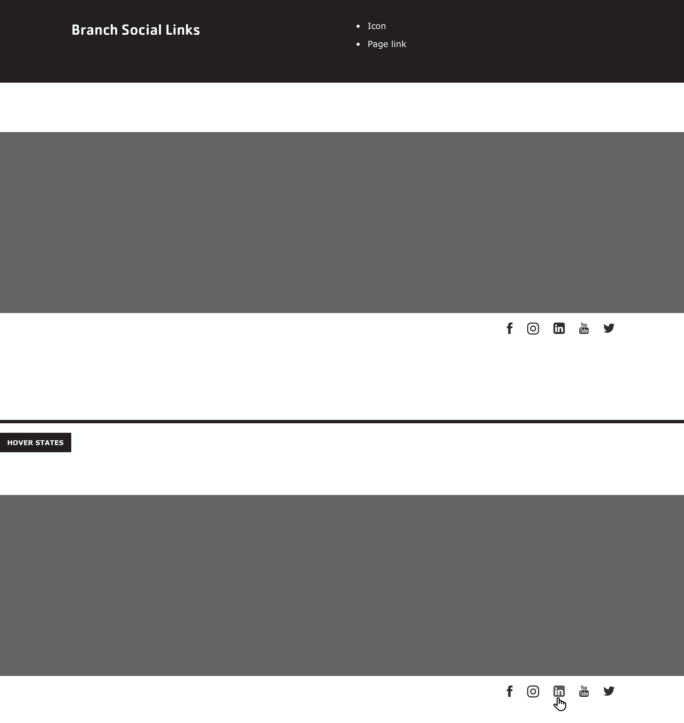
Branch Social Links
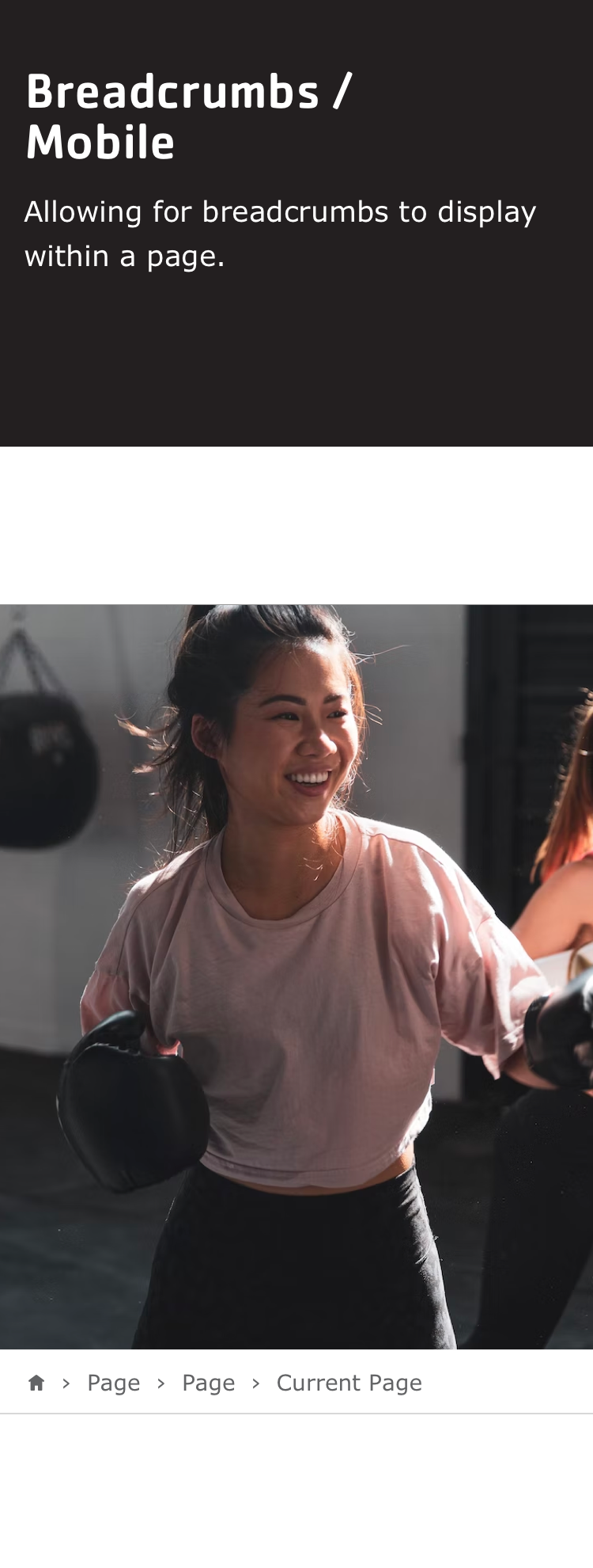
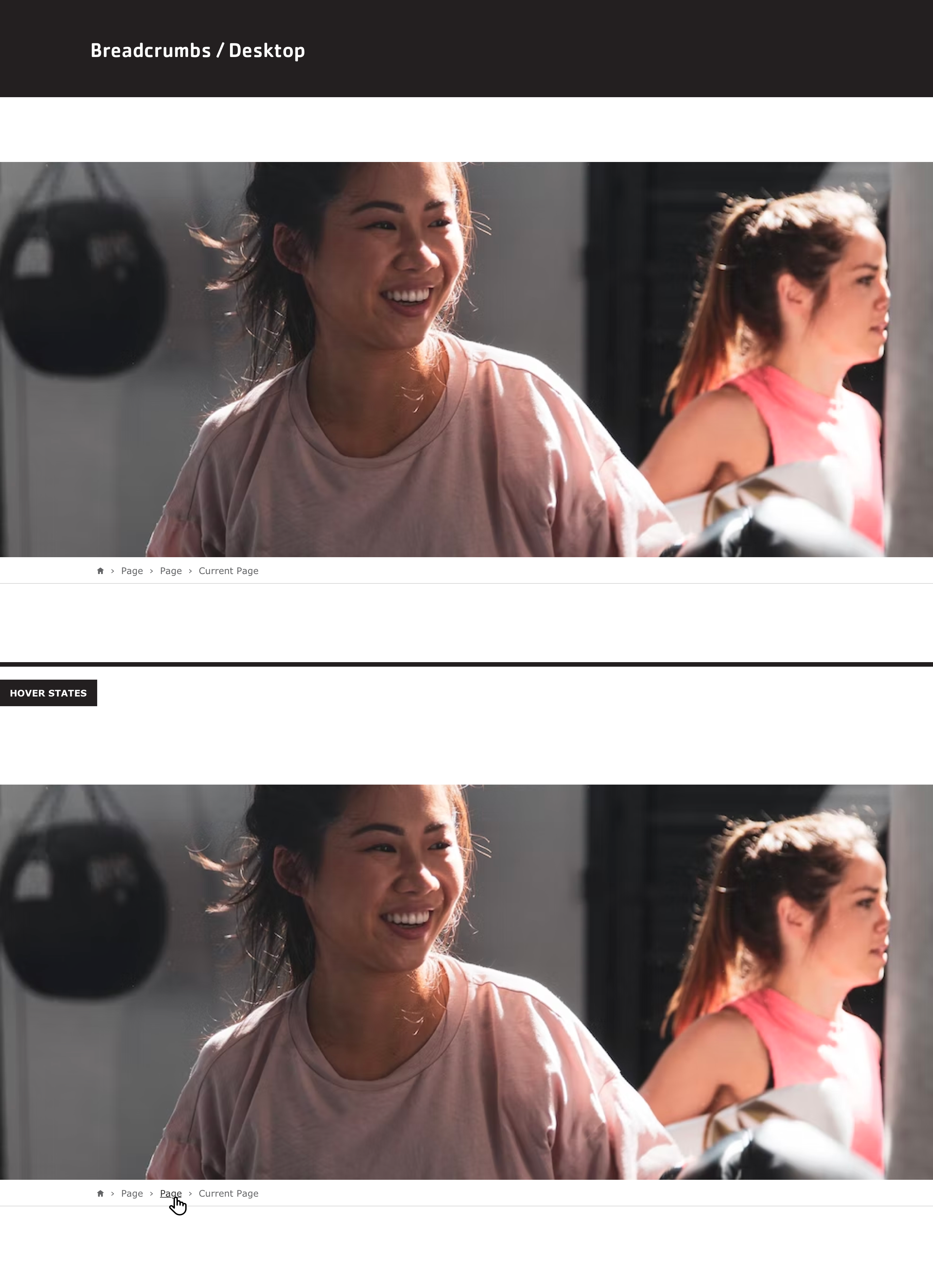
Breadcrumbs
Camp Menu
Camp Video Banner
Card
Card - Column Variations
Carousel
Donate
Event List
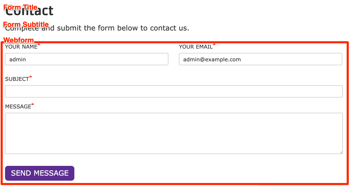
Forms
Global Footer
Global Header
Grid Content
Icon Grid
Icons and Logos
Locations
Menu and Search
Modal
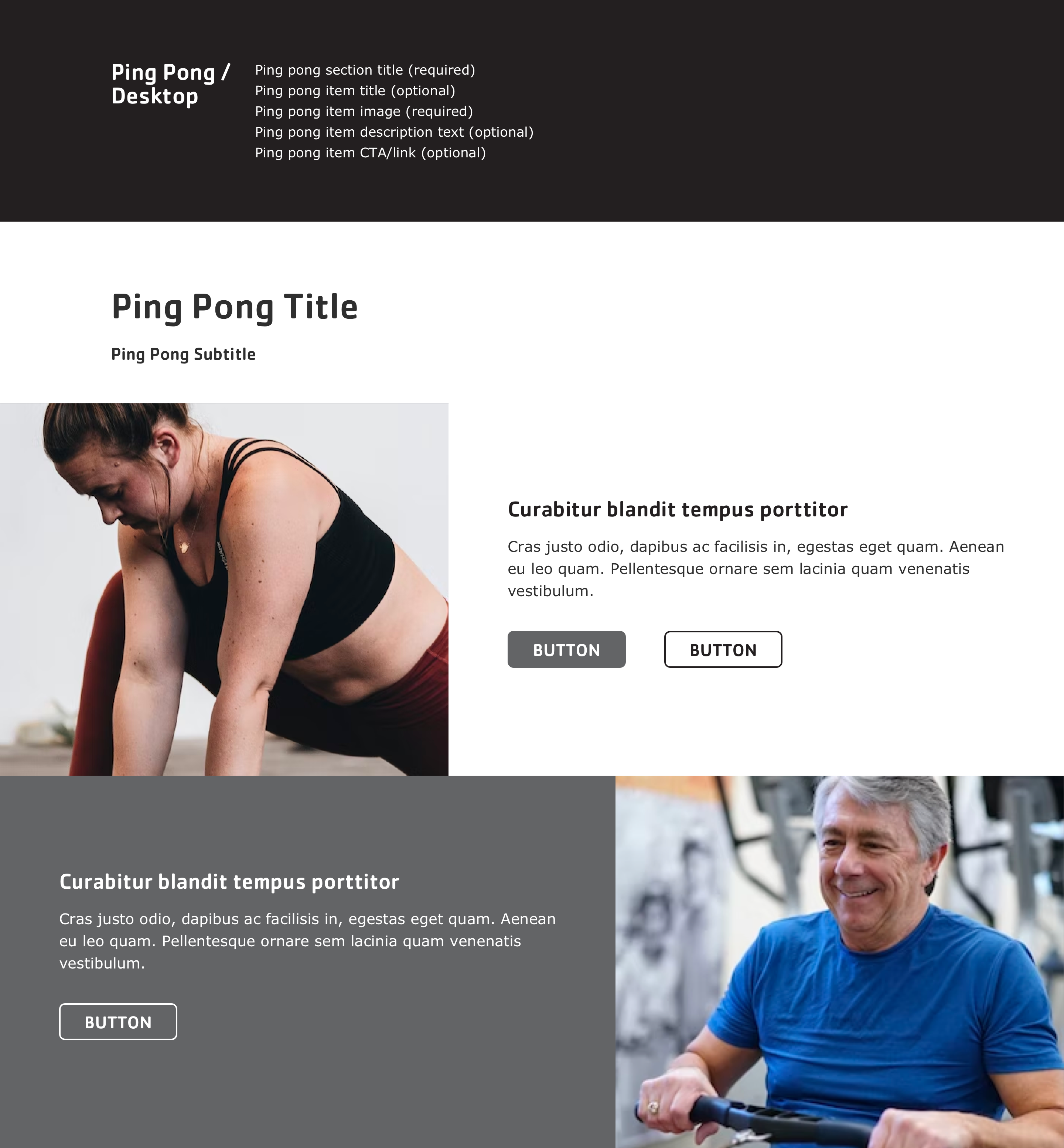
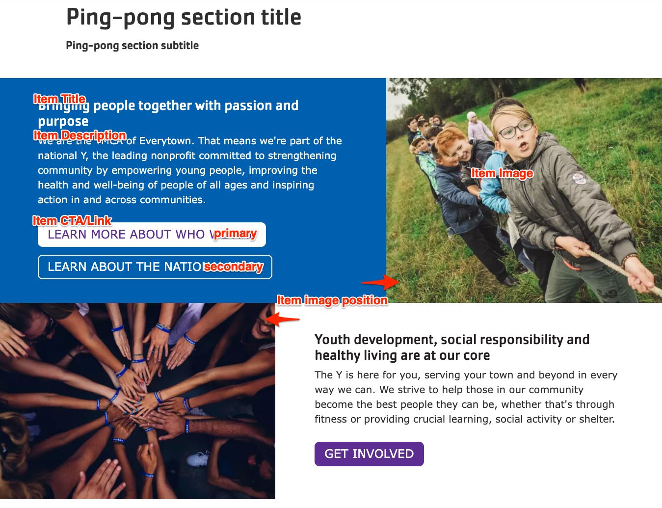
Ping Pong
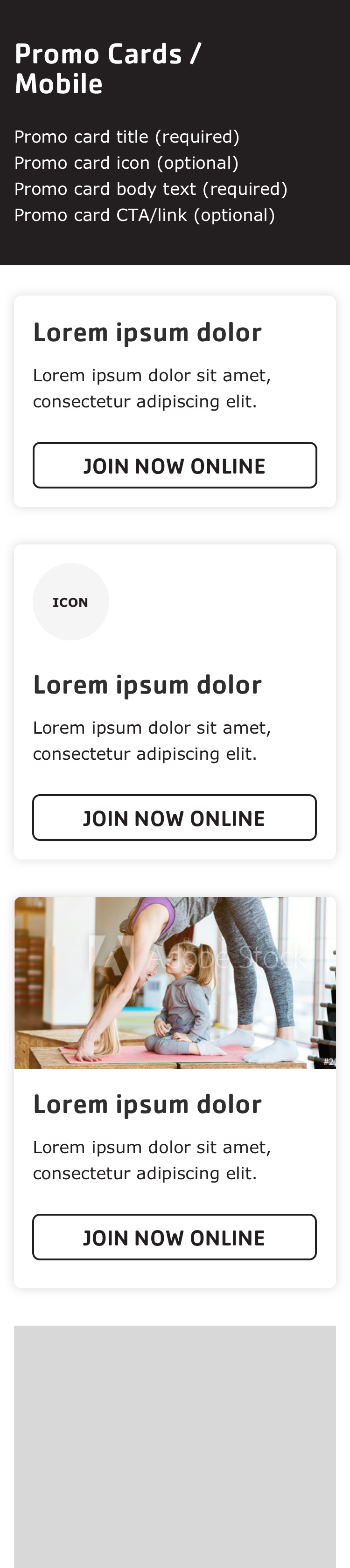
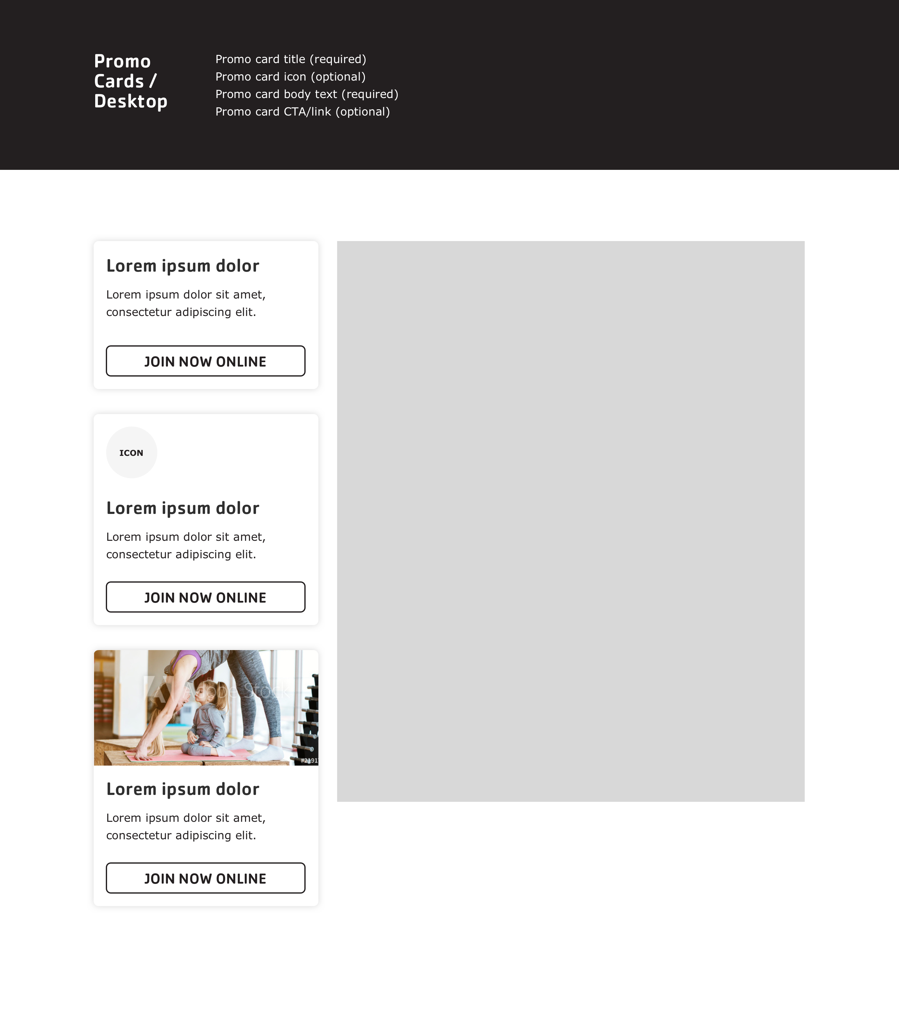
Promo Cards
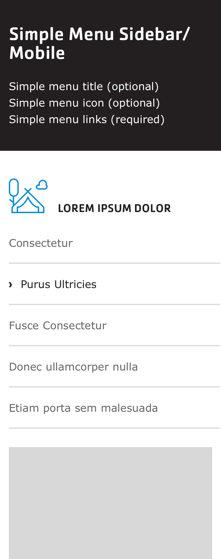
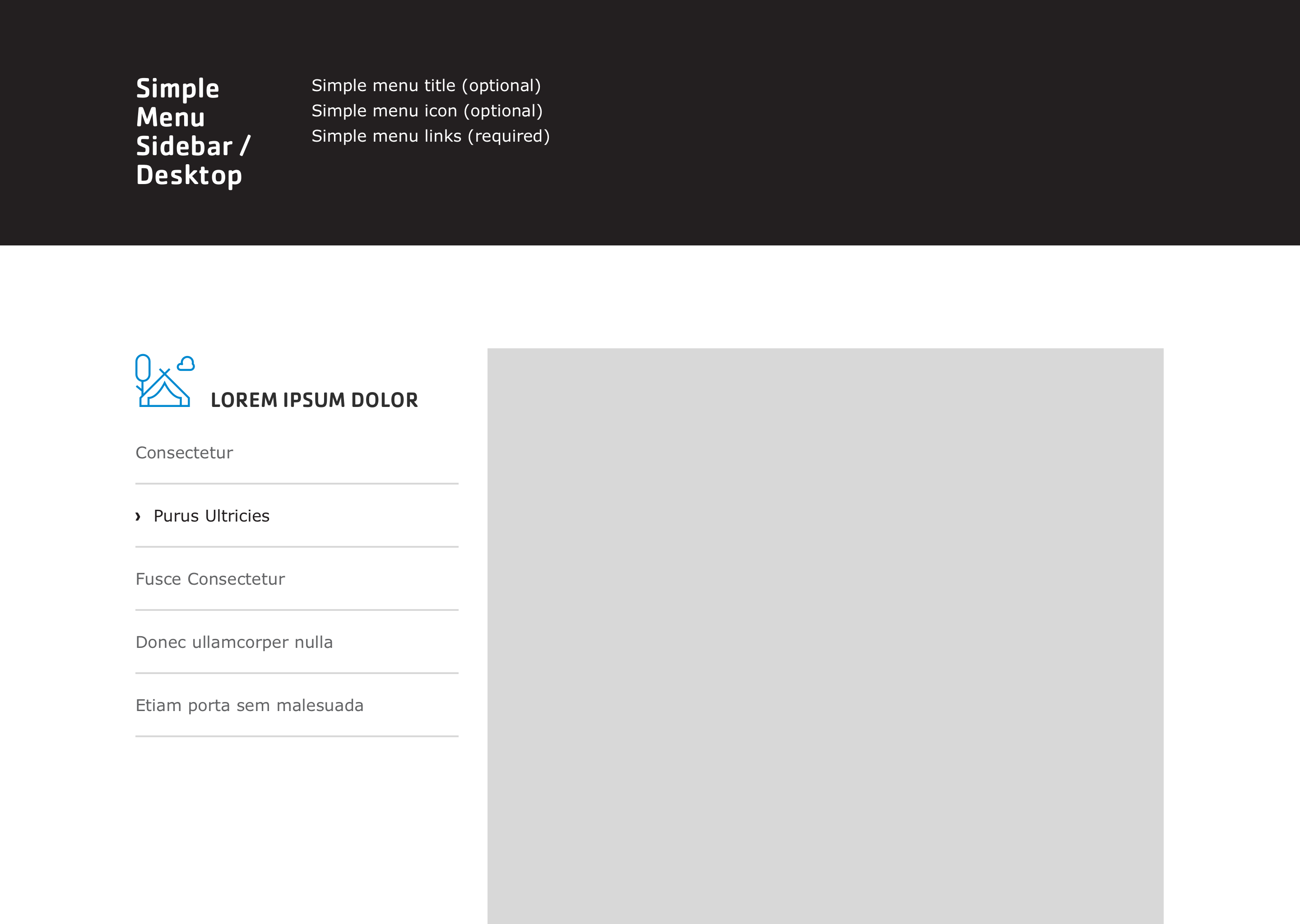
Side Menu
Sponsors
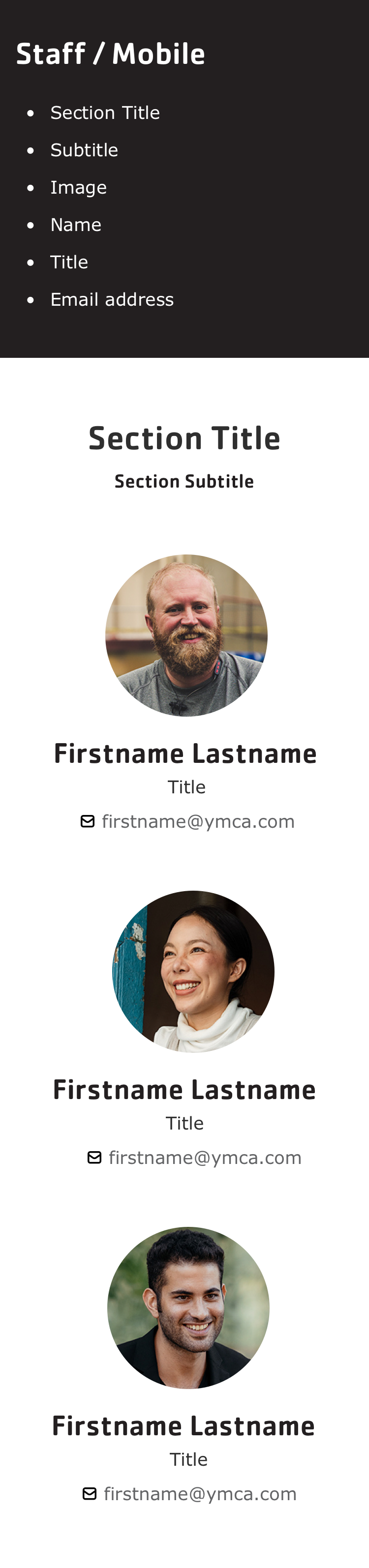
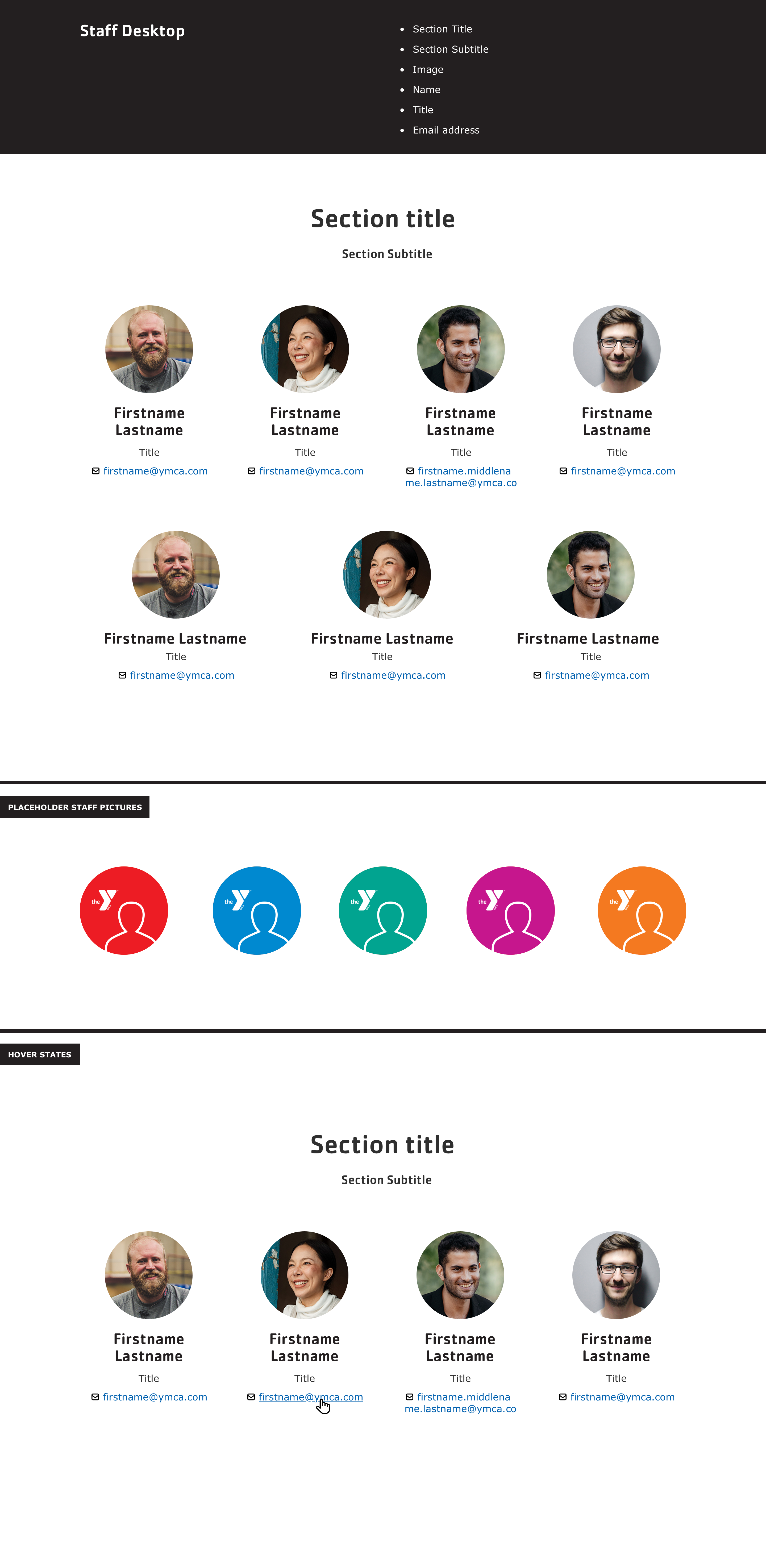
Staff
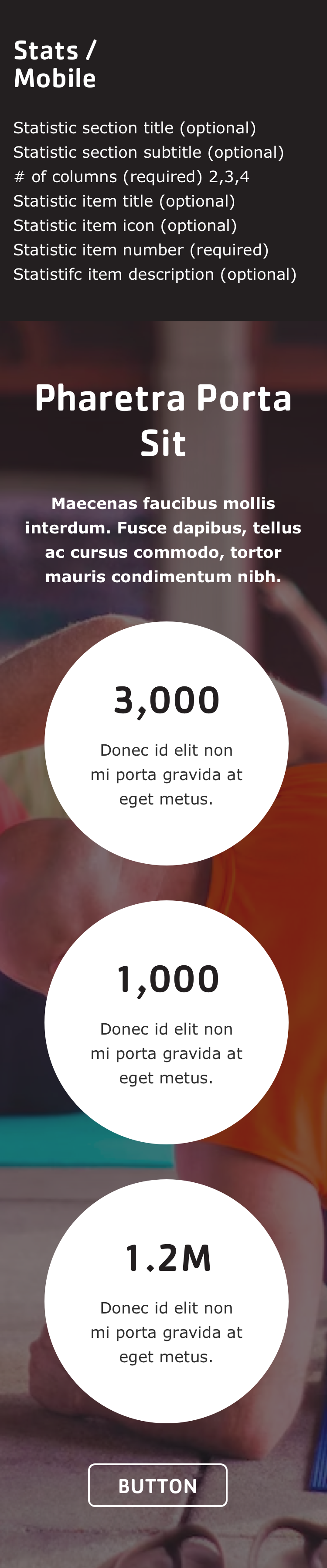
Statistics
Table (Simple Content)
Tabs
Testimonials
Utility Menu
Pre-release
View the designs
Component
Mobile
Desktop
Accordion
Article (/News /Blog /Press Release)
Branch
Branch Amenities
Branch Hours
Branch Menu
Branch Social Links
Breadcrumbs
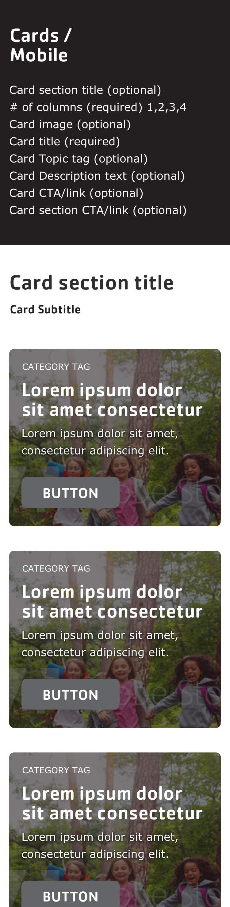
Cards
Carousels
Event
Grid Content
Hero Banner
Modals
Modals
Partners (/Sponsors)
Ping Pong
Promo Cards
Simple Menu
Staff
Statistics
Tables
Tabs
Testimonials
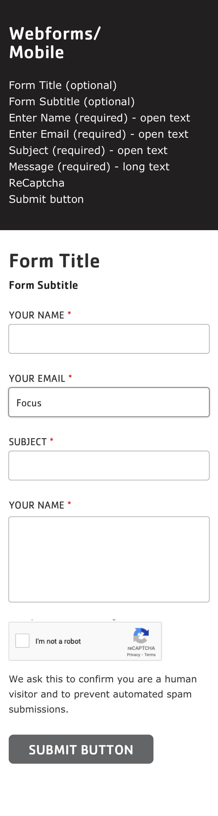
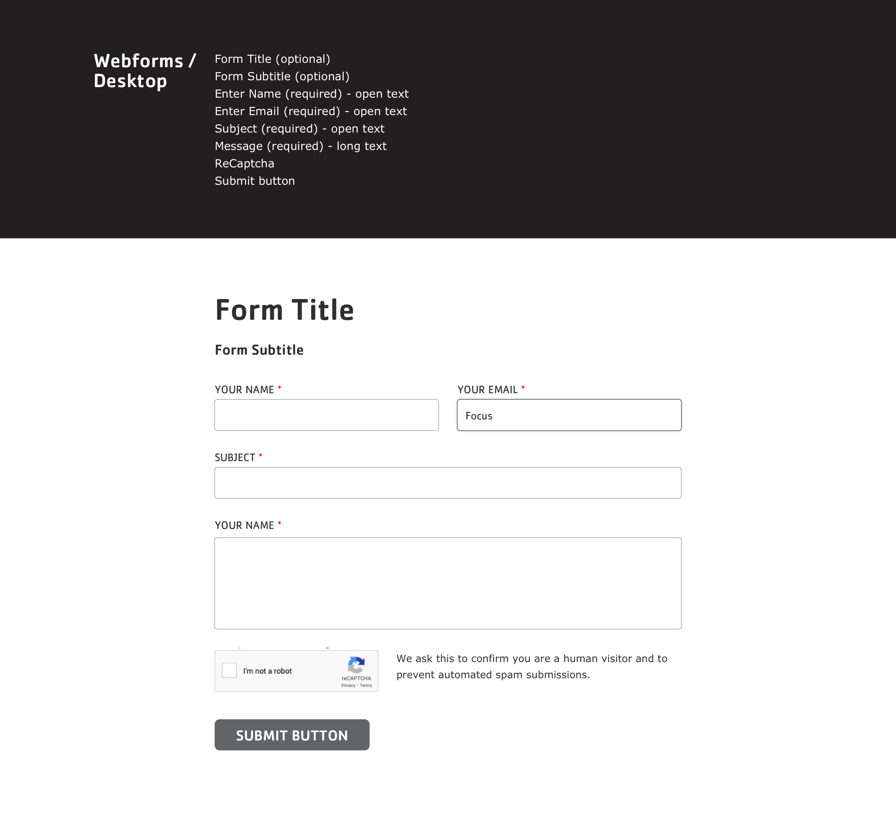
Webforms
2 - Advanced Options
Configuration for Layout Builder Sections and Blocks.
A huge amount of configuration is available with Layout Builder components using the contributed
Layout Builder Blocks module, which is included with the distribution. In addition to those configuration options, we provide an extra layer of “Y Styles” that help site builders customize their sites in an accessible and brand-compliant manner.
Y Styles
These options provide customizations of Layout Builder-enabled pages at the Content Type, Page, and Component(/Block) level. As of the 11.3.1.0 release, Y Styles support has been expanded to additional content types beyond Landing Pages.
Styles inherit from content types, to pages, to components. Some styles can also be overridden at each level - block styles can override page styles, which can override content type styles.
flowchart
  classDef ct fill:#5C2E9133;
  classDef page fill:#92278F33;
  classDef block fill:#C6168D33;
  subgraph ct[Content Type]
    direction LR
    subgraph page[Page]
      direction LR
      subgraph block[Block]
        blockStyles[Block Styles]
      end
      pageStyles[Page Styles]
    end
    ctStyles[Content Type Styles]
  end
  blockStyles -- override --> pageStyles
  pageStyles -- override --> ctStyles
  class ct ct
  class page page
  class block block
Content Type styles
Note: This configuration may not be accessible to all content editors. Ask an administrator for assistance if necessary.
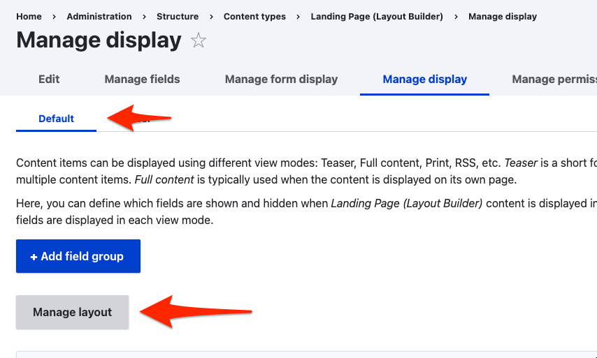
The default values for page-level Y Styles options are set in the Content Type display options.
To access them:
Go to Admin > Structure > Content types > Landing Page (Layout Builder) (or another LB-enabled content type) > Manage display
Ensure you’re acting on the Default display, then click Manage layout.
Expand the Y Styles section
Choose your default configuration options. These will set the defaults for every new node of this Content Type. Existing content will not be effected.
Click Save layout
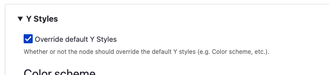
Page styles
Every Layout Builder-enabled page that you create will allow you to override the default settings. All of these settings will affect all items on a page, unless they are overridden at the component level.
Edit the Layout on a page
Expand the Y Styles section
Choose your configuration options.
Color scheme:The color scheme of all components on the page. Choose from four brand-compliant and accessible options:
Blue/Purple
Green/Blue
Purple/Red
Red/Orange
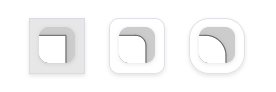
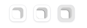
Border radius:The curvature of container corners.
0px (square)
10px (small curve)
20px (larger curve)
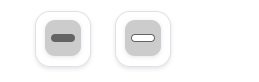
Border style:The style of container borders.
No border
1px border
Drop shadow
Text/Button alignment:The vertical placement of elements in containers.
Left
Center
Button position:Where buttons sit in containers.
Inside container
Overlapping container
Button fill:How buttons are colored.
Filled by default, outlined on hover
Outlined by default, filled on hover
Click Save layout
Y Block styles
Some blocks have additional styles that can be configured per-block. For these blocks (e.g. Banner, Cards), look for the Y Styles section in the
block styles section and set the options accordingly.
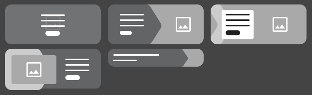
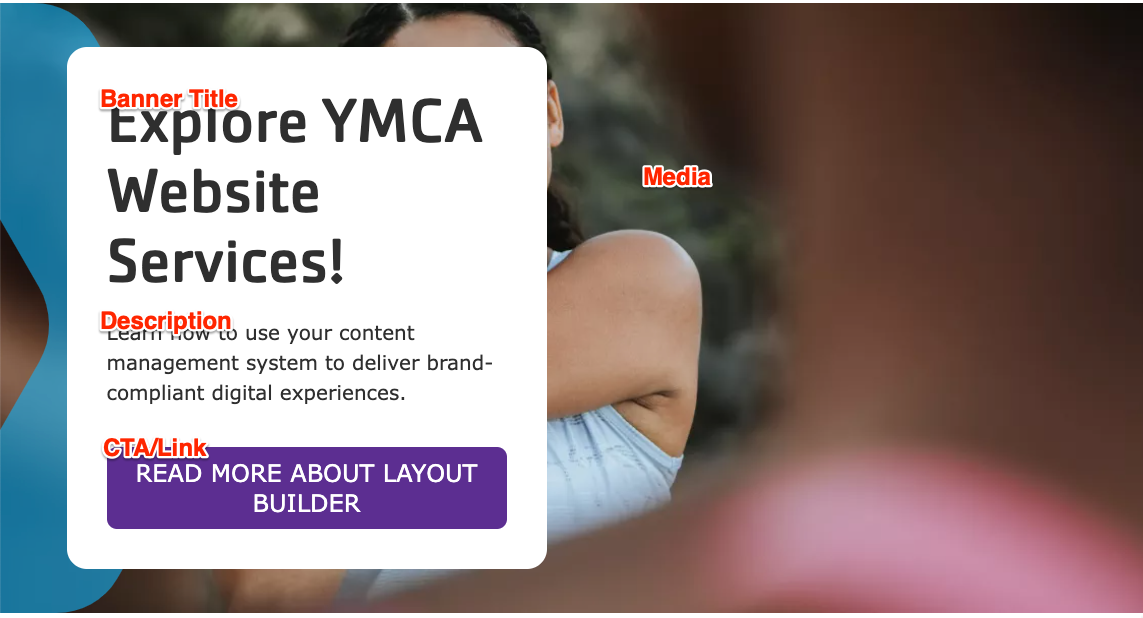
Banner
Variant:Choose from five designs.
Standard
Overlay
Chevron
Frame
Small - This variant hides all but the title and description and does not use an image background.
Button fill: Override the page-level styles.
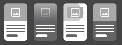
Card
Variant:Choose from four designs.
Standard
Overlay
Chevron
Color
Border style: Override the page-level styles.
Text/Button alignment: Override the page-level styles.
Button position: Override the page-level styles.
Button fill: Override the page-level styles.
Section styles
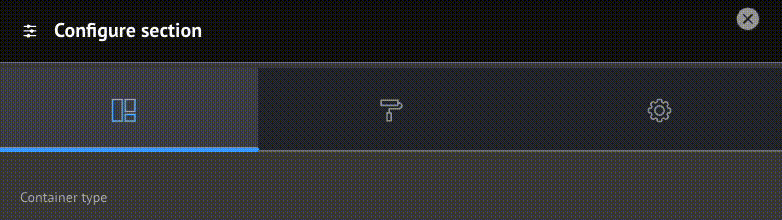
When creating or editing a Section you have the option of configuring Layout, Style, and Settings.
Support for these options is a work in progress and may require involvement of your development partner. Feel free to experiment with the options. Be sure to follow proper brand guidelines and accessibility practices.
Layout styles
In this section you can control the container of the Section.
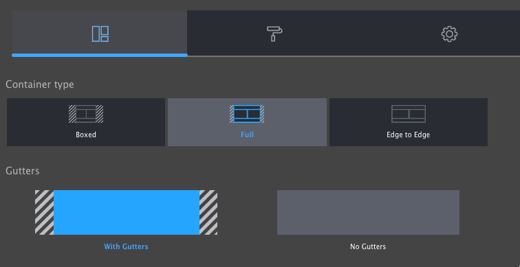
Container type
Boxed: Section is narrower than the header of the page. Good for text-heavy layouts.
Full: Section extends to the edges of the main content container.
Edge to Edge: Section extends to the edges of the page. Good for full-width components like Banners and Ping-Pong blocks.
Gutters
With Gutters: Section has left and right padding. Good for most non-full-width containers.
Without Gutters: Section has no left and right padding. Best for Edge to Edge containers.
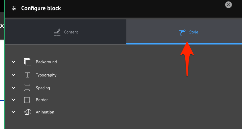
Block styles
When creating or configuring a block you have the option of opening the Style tab to access additional style options including:
background,
typography,
spacing,
borders, and
animation.
Support for these options is a work in progress and may require involvement of your development partner. Feel free to experiment with the options. Be sure to follow proper brand guidelines and accessibility practices.
After you have completed setting the Style options, click back to Content and Save or Update to commit your changes.
3 - Block Library
Browse all available Layout Builder blocks organized by category.
Browse all available Layout Builder blocks by category. Click any block to see detailed documentation and examples.
Using Blocks
Blocks contain the content of your pages, while Sections provide the structure.
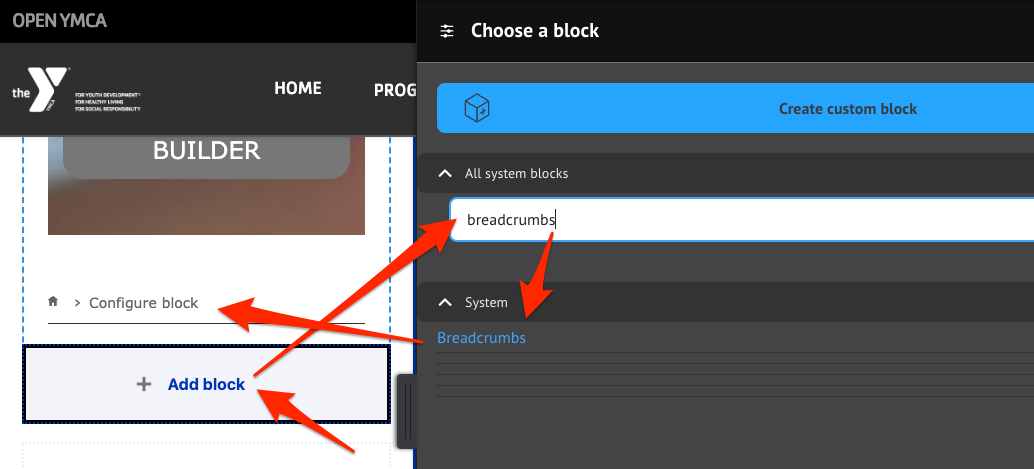
To add a block to your page:
Click Add Block in any section
Choose Create Custom Block
Select the block type you want from the categories below
Configure the block settings
Save your changes
Hero & Banner Blocks
Full-width promotional components for making a strong first impression.
Scroll to the location on the page where you want to add a block
Click Add block
In the sidebar, click Create custom block
Choose the block to add.
Fill in the content fields:
Title (required): Displayed if Display title is checked, otherwise this is for administrative use.
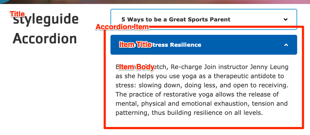
Accordion Item: Add as many items as you like using the *Add Accordion Item or Add new custom block button. When you are finished adding or editing each item, be sure to click Create/Update tab or Create/Update custom block to finalize the item. Each item contains:
Heading (required): The heading that will be used to expand/contract the accordion.
The Breadcrumbs block may not show the correct path while editing the page layout, but it will display properly for viewers.
Caching
As of the 11.3.1.0 release, breadcrumb caching has been improved. Previously, breadcrumbs were set with max-age=0, which prevented them from being cached and could negatively impact page performance. This has been fixed so that breadcrumbs are now properly cached along with the rest of the page.
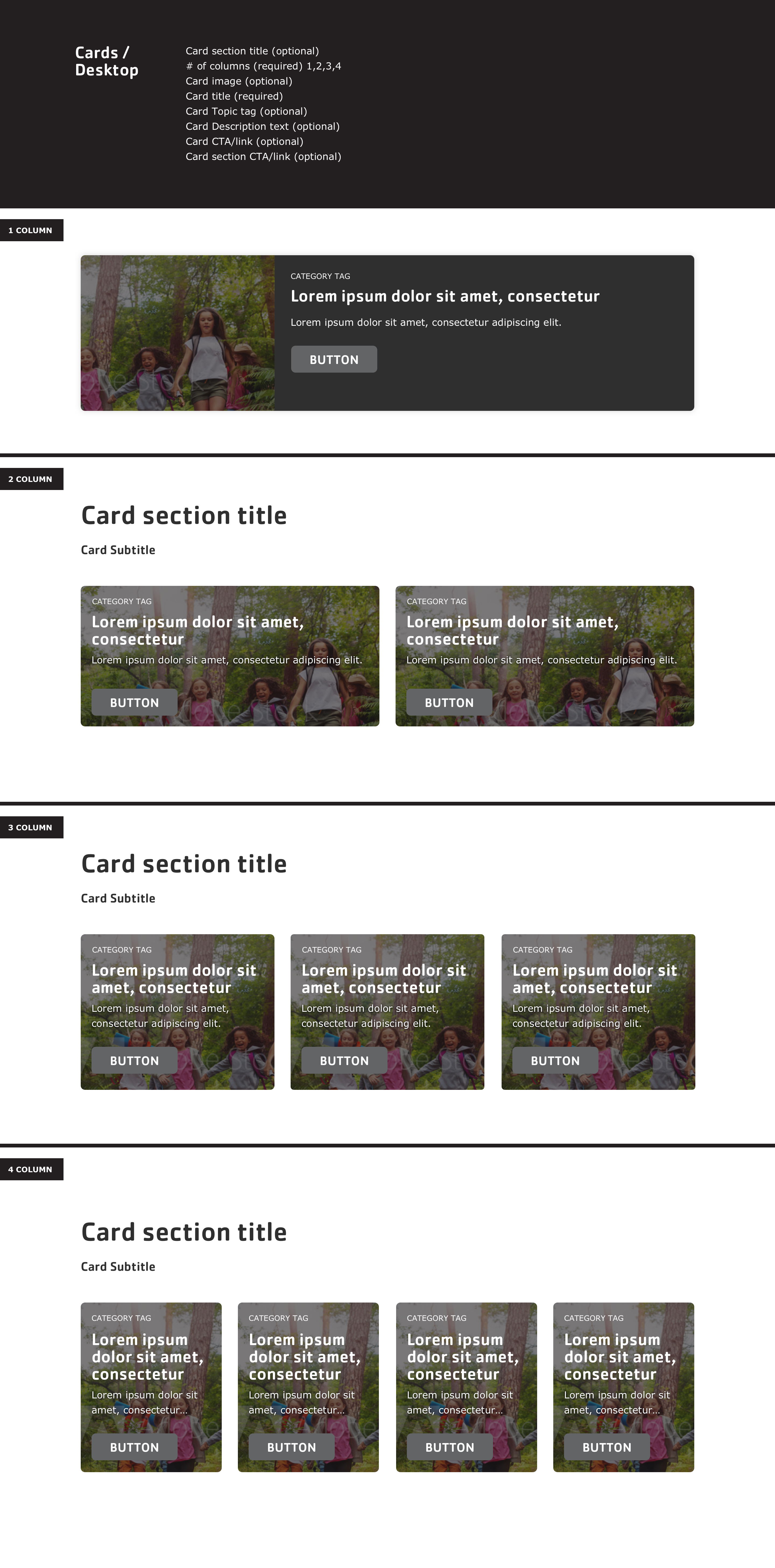
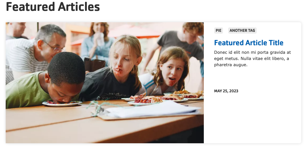
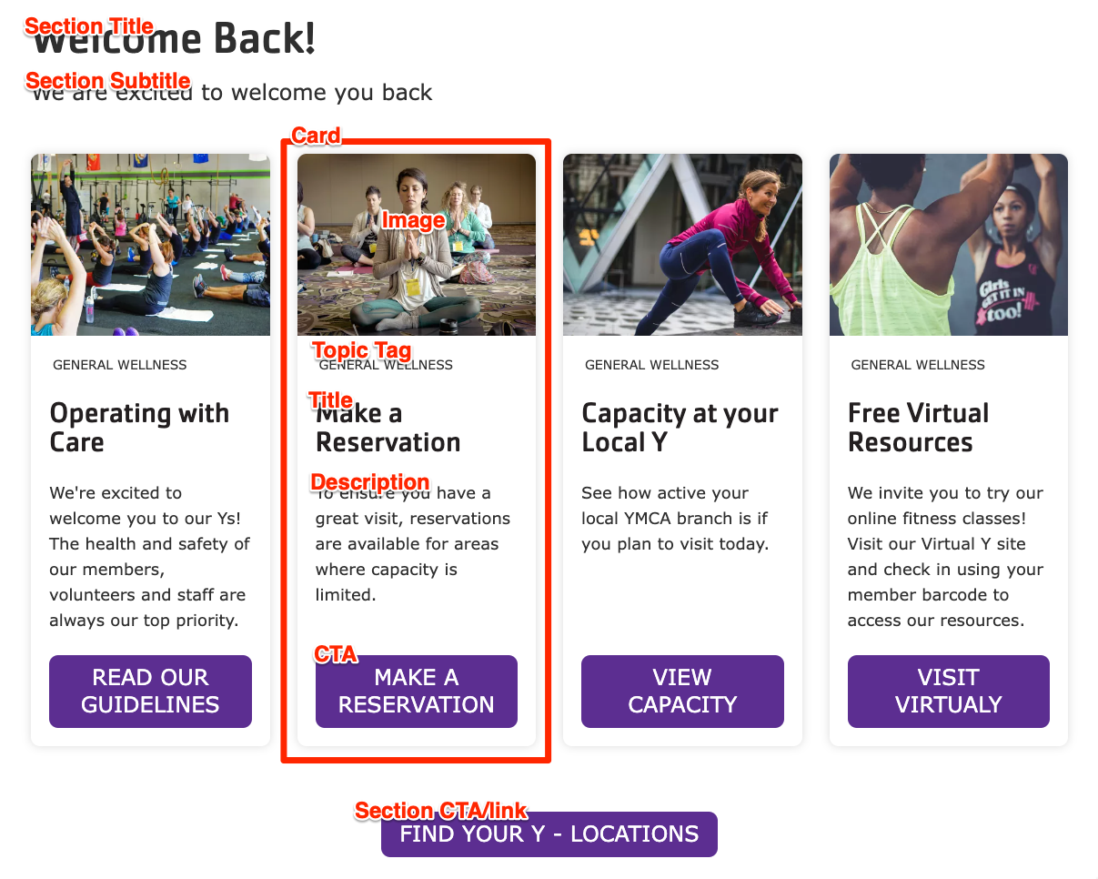
9 - Cards
Flexible card-style components that allow up to 4 cards to display across the page depending on the chosen layout.
The Cards block is similar to the
Grid CTA block, but has more fields and places the image behind the item content.
Scroll to the location on the page where you want to add a block
Click Add block
In the sidebar, click Create custom block
Choose the block to add.
Fill in the content fields:
Title (required): Never displayed, even if “Display Title” is checked. For administrative use only.
Section heading: Displayed as a heading above the cards.
Section subheading: Displayed below the heading.
Section link: A link button displayed below the list of cards.
# of columns: Allows 1- to 4-columns of cards.
Card items: Add up to 4. When you are finished adding or editing each item, be sure to click Create/Update tab or Create/Update custom block to finalize the item. Each card has:
Heading (required)
Image: Chose from the library or add a new image to be displayed behind the card text.
Description: A full text editor to add card content.
Link: A link at the bottom of the card.
As of the December 2024 release, Card links can use
link attributes.
Topic Tag: This is displayed at the top of the card and can be used to group cards visually.
This block comes with
multiple styles. To choose an alternative style:
Click on the Style tab at the top of the Block Add/Update form.
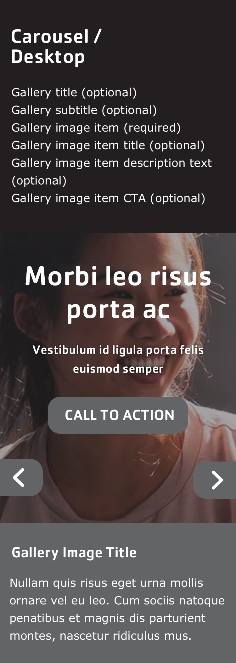
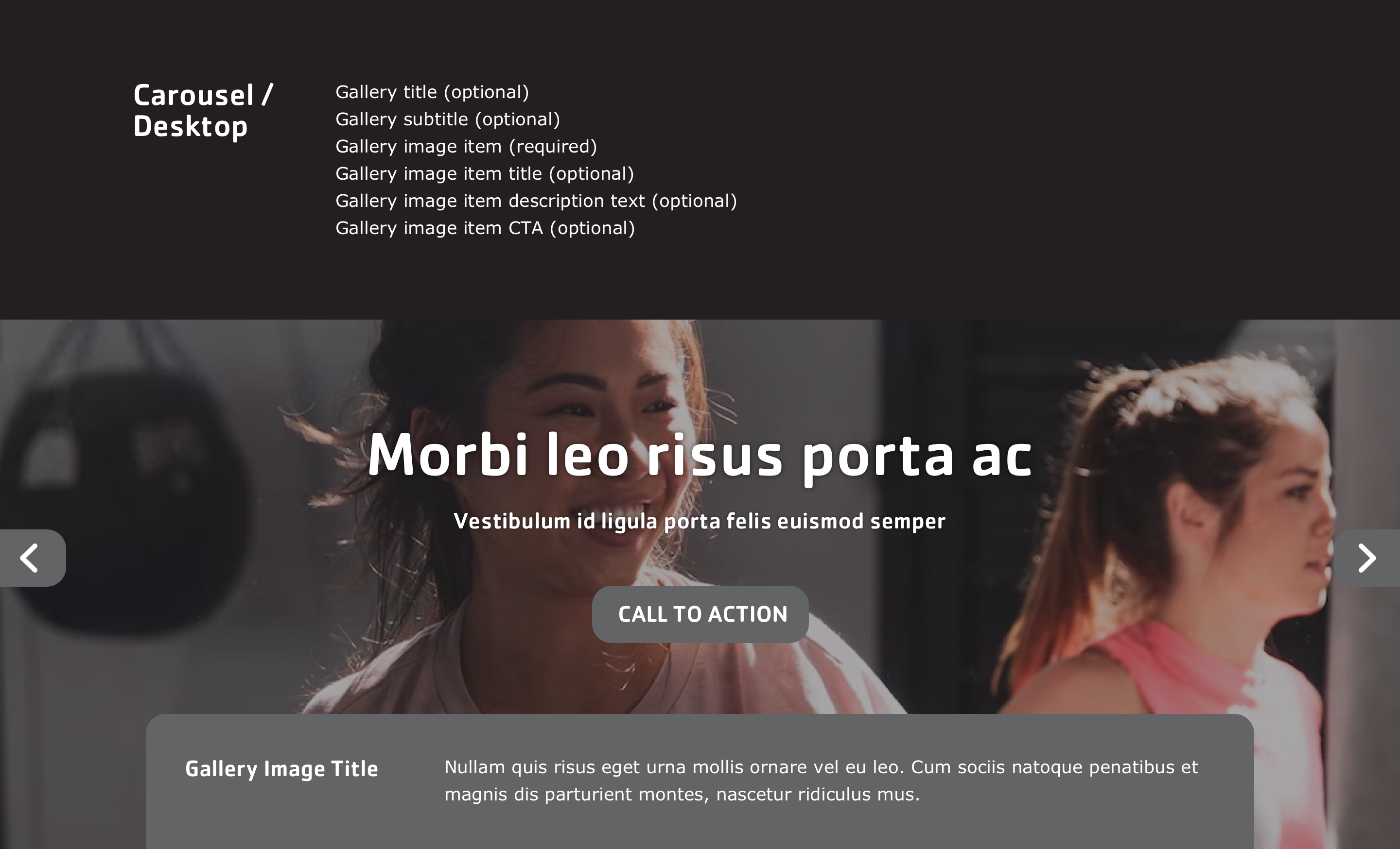
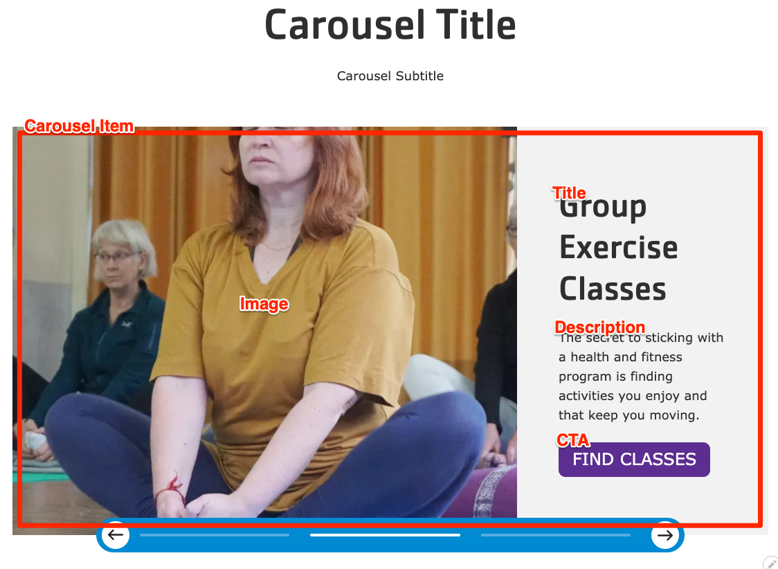
Scroll to the location on the page where you want to add a block
Click Add block
In the sidebar, click Create custom block
Choose the block to add.
Fill in the content fields:
Title (required): Never displayed, even if “Display Title” is checked. For administrative use only.
Carousel heading: Displayed as a heading above the carousel.
Carousel subheading: Displayed below the heading.
Carousel Item: Add as many items as you like using the Add Carousel Item or Add new custom block button. When you are finished adding or editing each item, be sure to click Create/Update tab or Create/Update custom block to finalize the item. Each item contains:
The Y Layout Builder - Donate (lb_donate) and YMCA Website Services Donation Embed Form (y_donate) modules work together allow content editors to add an embedded donation form to the site and create a separate call to action to direct users there.
Embedded form
To get started:
Enable the YMCA Website Services Donation Embed Form (y_donate) module at Administration > Extend.
Select the Layout Tab of a Layout Builder-enabled page.
Select Add block on the page, then search or scroll to find Donation Form Embed Block.
Select the form type and enter the form ID from your donation provider.
Troubleshooting
If your embedded form does not work in your non-production environment you may need to add a domain to the allow-list either on the provider-side or in your site’s Content Security Policy.
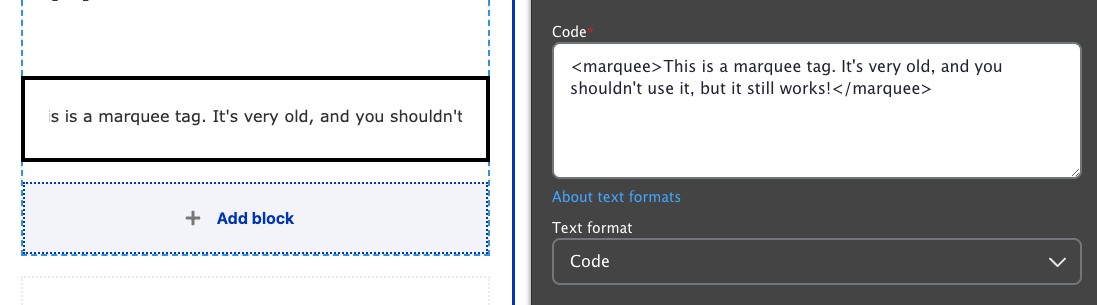
If your provider is not listed you can add the form by selecting the Code Custom Block and then pasting in your code. Alternatively you can work with your development partner to
add a new donation provider.
Scroll to the location on the page where you want to add a block
Click Add block
In the sidebar, click Create custom block
Choose the block to add.
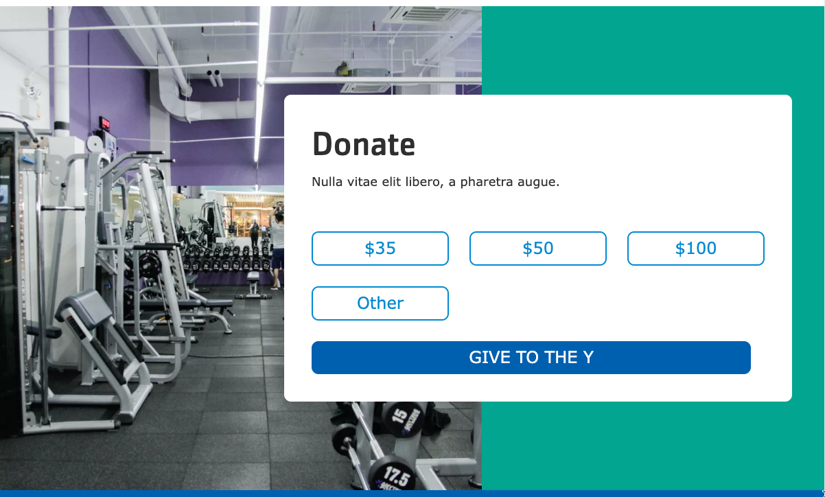
Fill in the content fields:
Title (required): Never displayed, even if “Display Title” is checked. For administrative use only.
Section heading: Displayed as a heading above the items.
Section subheading: Displayed below the heading.
Giving amounts: Any number of buttons with donation amounts. An “Other” button will always be displayed after all of these buttons.
Amount label: The amount to be displayed, with the currency sign, like “$50”.
Form Element ID: Usually a 4-digit number found on the donation backend. You may need to find this on the donation platform side or in the browser inspector.
Donation page link: A link to be displayed below the buttons.
URL: In order for the buttons to work properly, this must link to the page where the embedded donation form is embedded.
Link text: The text to be displayed.
Background image: Chose from the library or add a new image to be displayed behind the text.
Scroll to the location on the page where you want to add a block
Click Add block
In the sidebar, click Create custom block
Choose the block to add.
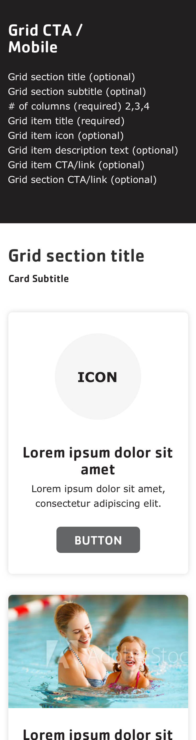
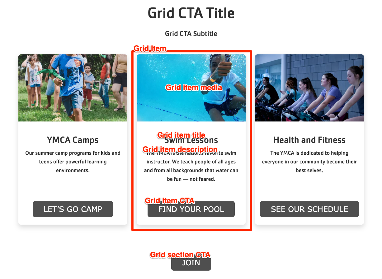
Fill in the content fields:
Title (required): Never displayed, even if “Display Title” is checked. For administrative use only.
Section heading: Displayed as a heading above the cards.
Section subheading: Displayed below the heading.
Grid CTA section link: A link button displayed below the list of items.
# of columns: Allows 2- to 4-columns of items.
Grid Item: Add up to 4. When you are finished adding or editing each item, be sure to click Create/Update tab or Create/Update custom block to finalize the item. Each item has:
Heading (required)
Description: A full text editor to add item content.
Media: Chose from the library or add a new image or icon to be displayed above the item text.
The header and footer on Layout Builder pages is composed of many complimentary blocks. The Header and Footer are special Sections that are pre-populated on each Layout Builder-enabled content type. If the Header or Footer do not already exist in your content, you can add them on your own.
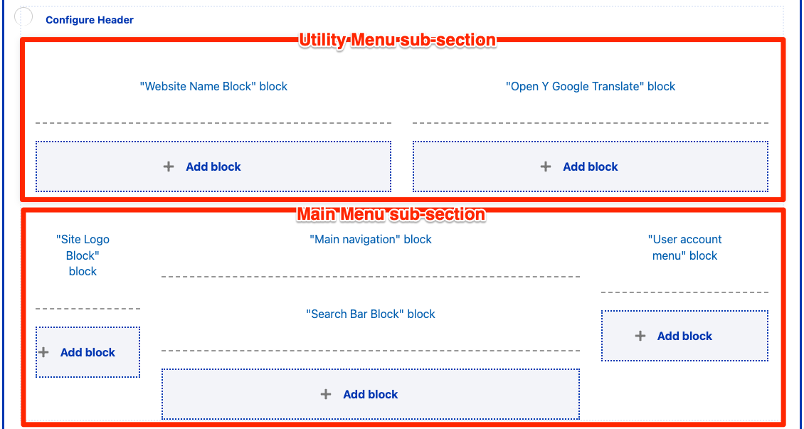
Header Section
If a Header section does not already exist, add a new Section and choose the WS Header Layout. Then, add the following blocks by selecting Add block and then using the search box under All system blocks:
Utility Menu area
Left
Website Name Block
Right
Open Y Google Translate Block
Utility Menu
Main Menu area
Left
Site Logo Block
Center
Main navigation
Search Bar Block
Right
User account menu
Each block has some specific configuration recommendations:
Website Name Block
Configuration
Uncheck Display title.
Content
The Site Name is found under Configuration > System > Basic site settings.
Open Y Google Translate Block
Configuration
Uncheck Display title.
Content
The contents of this block are not configurable, but it may be omitted or removed if your site does not provide translation uses another translation method.
Utility Menu
The option to add a Utility Menu was added in the December 2024 release. This menu is intended to give content editors an additional space for adding links in the top right of the header.
Configuration
Uncheck Display title.
Menu levels controls which and how many levels of menu are displayed. The Utility menu styles are designed for a single level of links.
Content
Menu items can be managed under Structure > Menus > Utility Menu.
Site Logo Block
Configuration
Title (required): Never displayed, even if “Display Title” is checked. For administrative use only.
WS Site Logo: Choose which logo is displayed in the block.
Theme logo uses the logo defined by the active theme, in the Appearance > Settings > (The active theme).
Colorway logo uses a dynamic SVG that responds to the configured YMCA colorway. This option is recommended for the Header.
White logo uses a flat white logo. This option is recommended for the Footer.
Hide tagline in WS logo: (Added in the December 2024 release.) Check to hide the tagline (areas of impact) in the logo.
The areas of impact must appear on a website, but it is at the YMCA’s discretion whether to include them as the trademarked graphic paired with the logo or as a way of telling the story of our positive impact.
If you choose to hide the Areas of Impact in the logo, we recommend you include them elsewhere on the page.
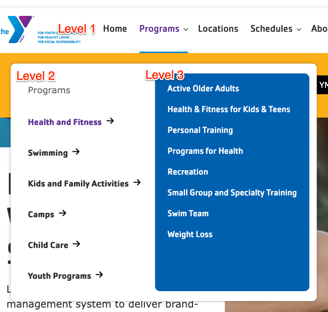
Main navigation
The main navigation supports displaying up to three levels of menu items. When adding items, be sure to check Show as expanded for any parent item that should be expandable.
Menu levels controls which and how many levels of menu are displayed. We recommend using the default configuration.
Content
Menu items can be managed under Structure > Menus > Main navigation.
Tips
Refer to the Drupal User Guide for more information about
managing menus.
We recommend you limit the main menu to 6 items or fewer when using Layout Builder, as additional items can cause the menu to be wider than the supported area. Additional menu items can be added to the footer, if needed.
Search Bar Block
Configuration
Uncheck Display title.
Content
The contents of this block are not configurable.
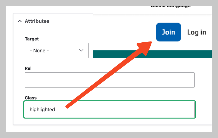
User account menu
Configuration
Uncheck Display title.
Menu levels controls which and how many levels of menu are displayed. We recommend using the default configuration.
Content
Menu items can be managed under Structure > Menus > User account.
To show items with a button style, add the highlighted to the menu item under Attributes > Class. Use highlighted outline for a reversed, secondary button style.
On mobile devices, only highlighted (and highlighted outline) items from this menu will display.
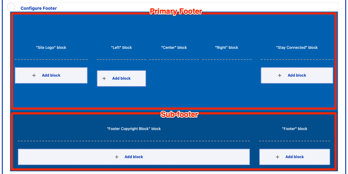
Footer Section
If a Footer section does not already exist, add a new Section and choose the WS Footer Layout. Then, add the following blocks by selecting Add block and then using the search box under All system blocks:
Primary Footer
Site Logo
Footer Menu Left
Footer Menu Center
Footer Menu Right
Footer Social
Sub-footer
Copyright
Footer Menu
Site Logo
See above. The “white logo” is recommended for the footer.
Footer Menu Left, Center, Right
Each of these three blocks references a menu. The three menus can be used to split footer links across multiple columns.
Configuration
Display title: Uncheck to hide the title, or turn the menu title on to give each column a title.
Menu levels controls which and how many levels of menu are displayed. We recommend using the default configuration.
Content
Menu items can be managed under Structure > Menus > Footer Menu Left, Footer Menu Center, or Footer Menu Right.
Prior to Drupal 10.1, blocks can be found under Structure > Block layout > Custom block library
Find the Footer Copyright Block
Edit the block, then Save when finished.
Footer Menu
This menu is typically for a limited number of links such as “Privacy Policy” or “Terms of Use”.
Configuration
Uncheck Display title.
Menu levels controls which and how many levels of menu are displayed. We recommend using the default configuration.
Content
Menu items can be managed under Structure > Menus > Footer.
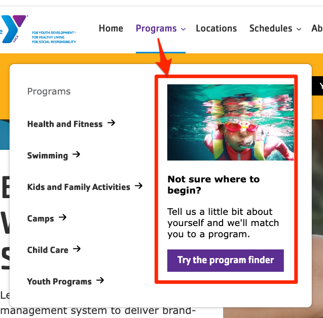
Main Menu CTA Block
The
Main navigation has an additional feature that allows for adding a nested call-to-action that takes the place of the third level of the menu.
To use it:
Go to Extend (admin/modules) and enable the Web Services Main Menu CTA Block module (y_lb_main_menu_cta_block).
Edit a top-level menu item (like “Programs” or “Schedules”) via one of these methods.
CTA blocks will only be displayed on first-level menu items. Blocks on all other levels will be ignored.
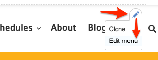
Click the in the Main Menu section, then choose Edit menu.
Go to Admin > Structure > Menus > Main navigation then Edit a link.
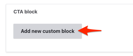
In the CTA block section, click Add new custom block.
Fill in the fields:
Expand the Media section and choose or upload an image
Add a short Heading
Add a short 1-2 sentence Description
Add a link and display text for the Menu CTA Link
Add a Block description for administrative purposes only
Click Create custom block to save the block.
Save the menu item.
Go back to a Layout Builder page with the menu and refresh. The menu CTA should now appear when the corresponding menu dropdown is open.
Menu CTA items will not appear on pages that use Paragraphs-based layout. CTAs also ony show on desktop and not mobile displays.
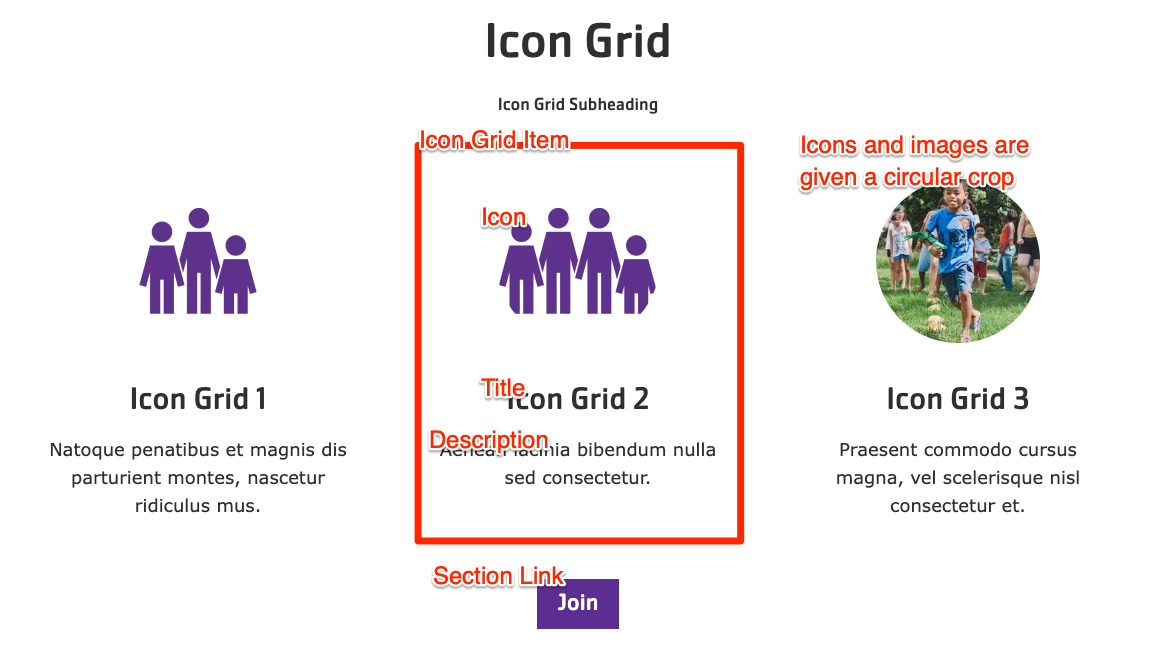
16 - Icon Grid
A simpler version of the Grid CTA component. Sets of content with a headline and description displayed in 2 to 4-item wide rows, with the option to include icons or images.
The Icon Grid block is similar to the
Cards and
Grid CTA blocks, but allows for more simpler items with a slightly more restricted design.
Scroll to the location on the page where you want to add a block
Click Add block
In the sidebar, click Create custom block
Choose the block to add.
Fill in the content fields:
Title (required): Never displayed, even if “Display Title” is checked. For administrative use only.
Section heading: Displayed as a heading above the cards.
Section subheading: Displayed below the heading.
Icon Grid section link: A link button displayed below the list of items.
# of columns: Allows 2- to 4-columns of items.
Grid Icon Items: Add up to 4. Each item has:
Title (required)
Description: A full text editor to add item content.
Icon: Chose from the library or add a new image or icon to be displayed above the item text. Circular icons are recommended. All icon/images will be displayed with a circular crop.
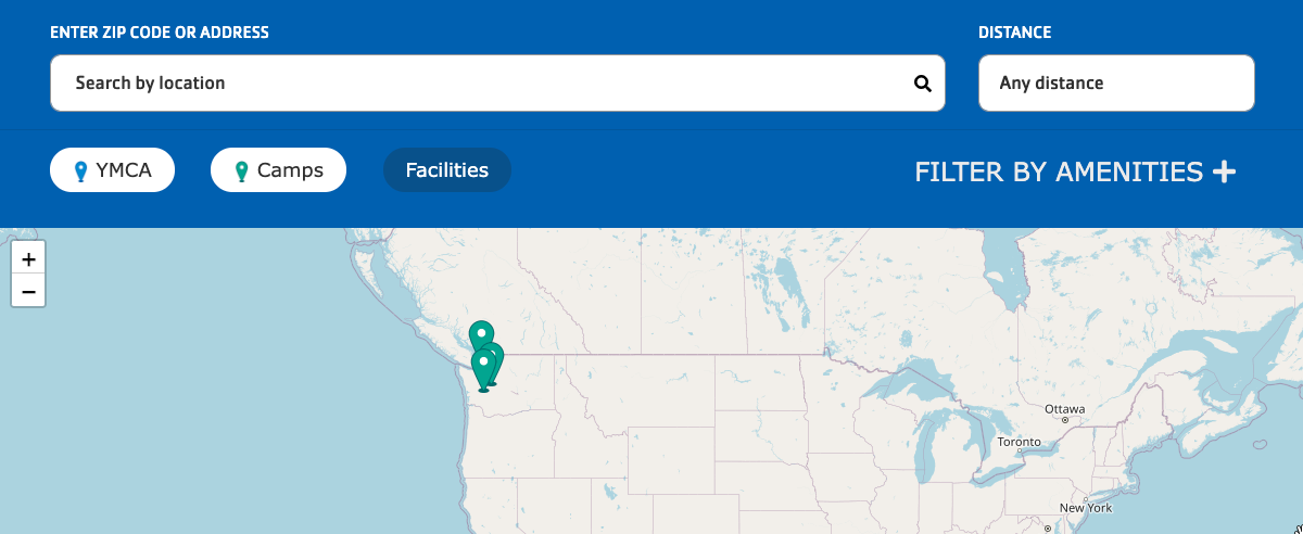
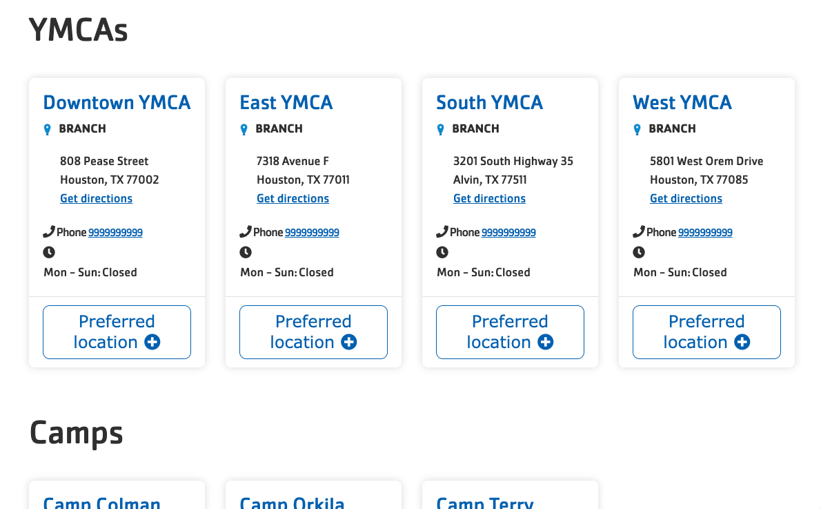
The Location Finder block provides search, filters, a map, and a listing your YMCA locations.
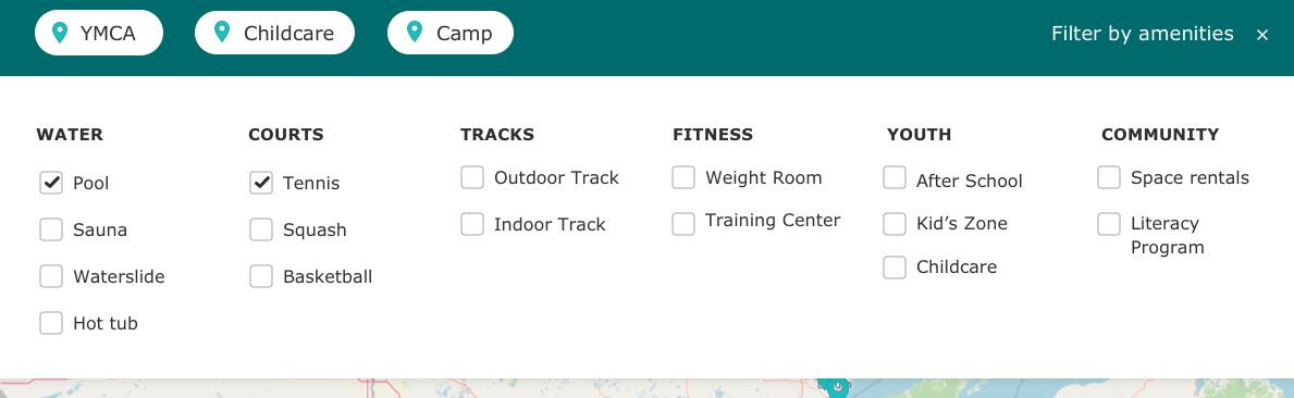
Amenities filters
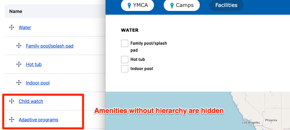
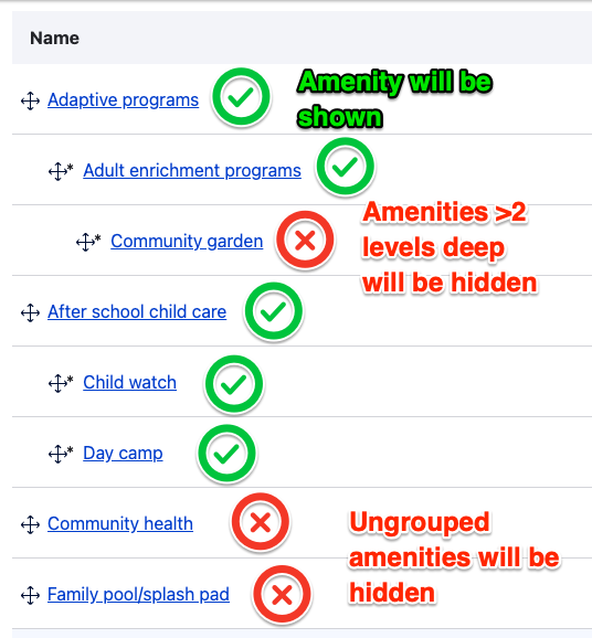
Location Finder also now supports hierarchical amenities. That means you can arrange your list of amenities into categories instead of a simple alphabetical list.
The Amenities taxonomy is managed at Administration > Structure > Taxonomy > Amenities. See
Taxonomy, Vocabularies, and Terms for more info on managing Vocabularies.
Single-level amenities
If you leave the Amenities terms in a flat list on their configuration page, the Location Finder filters will display according to their configured weights. Drag terms up or down in the list to rearrange them in the filters.
Hierarchical (parent/child) amenities
Y’s with many amenities may choose to group them in categories. Once any Amenities term is nested, the Location Finder filters switch to a hierarchical display.
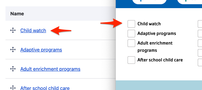
To nest terms:
Go to the Amenities administration page at Administration > Structure > Taxonomy > Amenities.
Add term to create new parent terms if necessary.
Use the drag handle [✥] to arrange terms into nested groups.
NOTE:
Any terms more than two levels deep will be ignored. (That is, parents and children will be displayed, grandchildren will not.)
When nesting is enabled, any amenities that are not grouped will be hidden from the filter list.
Using Location Finder
The Location Finder block is best placed in an edge-to-edge Section with no gutters.
To use the block:
Click the Layout tab at the top of your page
Scroll to the location on the page where you want to add a block
Click Add block
In the sidebar, click Create custom block
Choose the block to add.
Fill in the content fields:
Title (required): Never displayed, even if “Display Title” is checked. For administrative use only.
Scroll to the location on the page where you want to add a block
Click Add block
In the sidebar, click Create custom block
Choose the block to add.
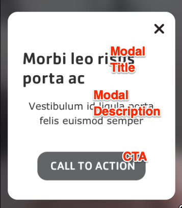
Note:
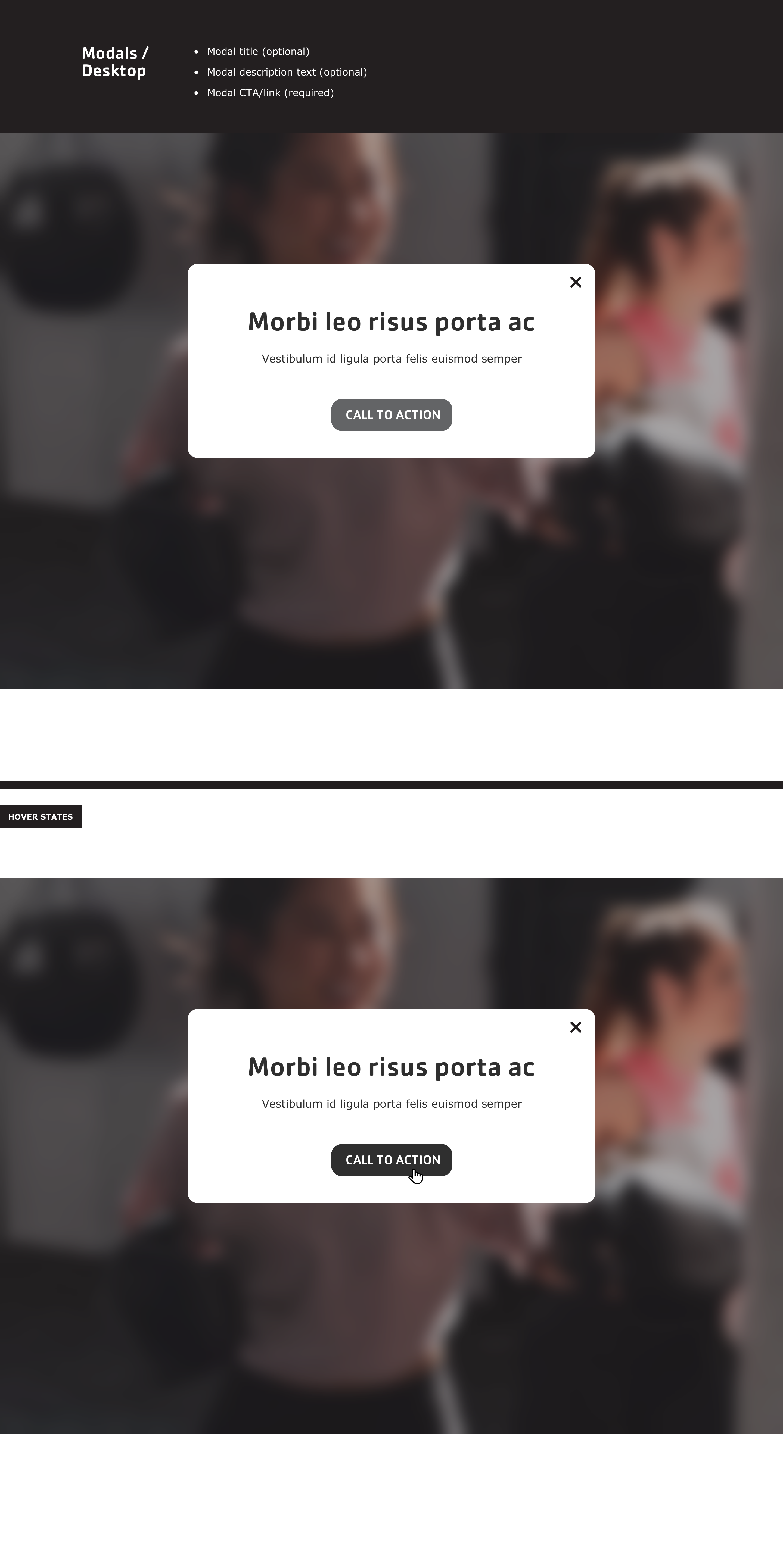
The position on the page does not matter for the Modal block. It will always display as a popup in the center of the page and be completely hidden when dismissed.
Fill in the content fields:
Title (required): Never displayed, even if “Display Title” is checked. For administrative use only.
Modal title: The displayed title of the popup.
Modal description: The text displayed in the body of the popup.
Modal CTA/Link (required): A link at the bottom of the popup.
Modal Dismissible: If “Yes” the modal will be shown to the user once on first load. If “No” the modal will be shown on every page load.
Scroll to the location on the page where you want to add a block
Click Add block
In the sidebar, click Create custom block
Choose the block to add.
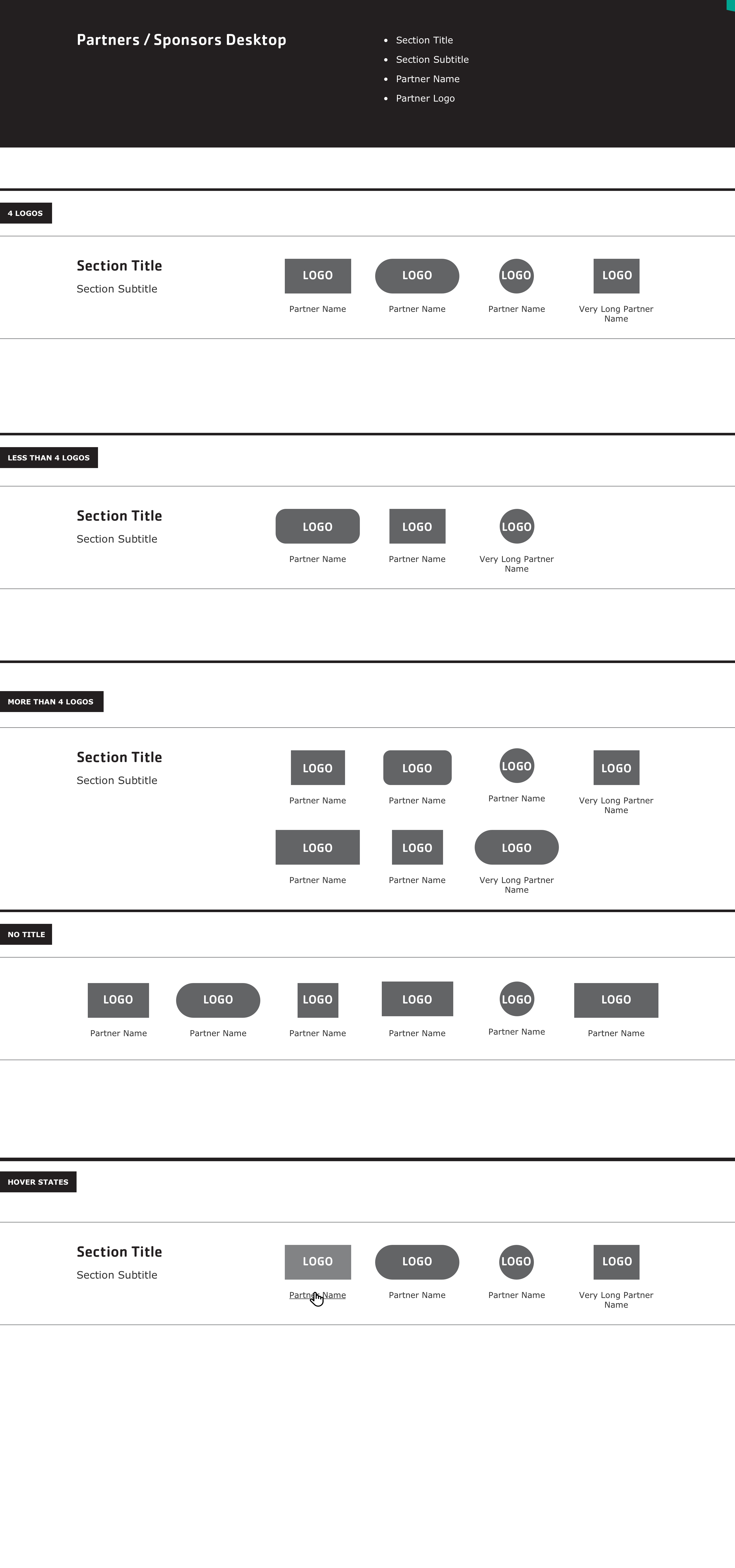
Fill in the content fields:
Title (required): Never displayed, even if “Display Title” is checked. For administrative use only.
Section heading: Displayed as a heading above the items.
Section subheading: Displayed below the heading.
Partner tier: Click Create content block to add a new Partner tier. Add unlimited tiers. (Added in the December 2024 release. Prior to that, all partners were displayed in a single group.)
Block description: For administrative use only.
Partner’s Tier: The title of the tier (like “Platinum”, “Gold”, etc.). Leave this empty if you don’t want to display a tier title.
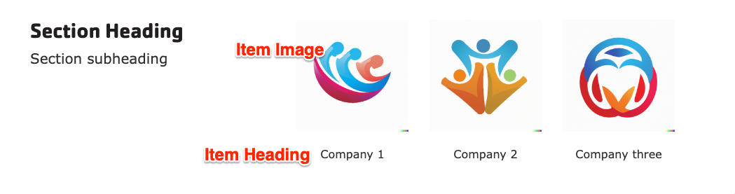
Partner items: Click Add new custom block to add a new Partner item, or Add existing custom block to reuse an existing item. Items can be reused across pages. Add unlimited items. Each item has:
Heading: The name of the partner.
Image: The logo or image.
Link: An internal or external link.
After filling in the fields for an item, click Create custom block to save the item.
Scroll to the location on the page where you want to add a block
Click Add block
In the sidebar, click Create custom block
Choose the block to add.
Fill in the content fields:
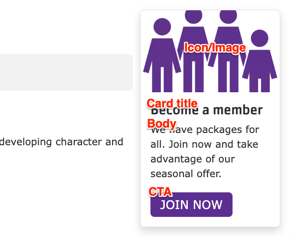
Title (required): Never displayed, even if “Display Title” is checked. For administrative use only.
Card title: The displayed title of the promo card.
Body: A full text editor to add card content.
Icon/Image: Chose from the library or add a new icon or image to be displayed above the card text. Images will be treated differently depending on their type. If using an icon, we recommend uploading it in SVG format:
JPG/PNG images will be cropped to a roughly 3:2 proportion rectangle
Scroll to the location on the page where you want to add a block
Click Add block
In the sidebar, click Create custom block
Choose the block to add.
Fill in the content fields:
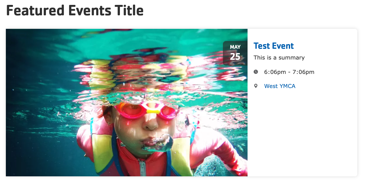
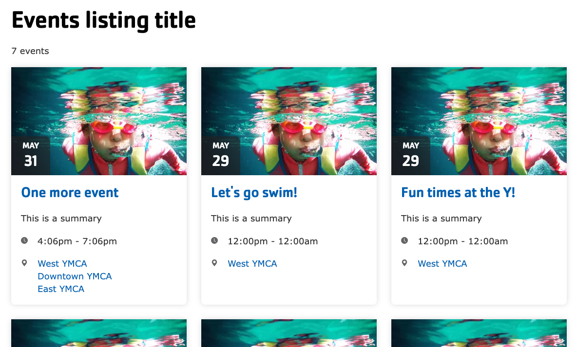
Title (required): Never displayed, even if “Display Title” is checked. For administrative use only.
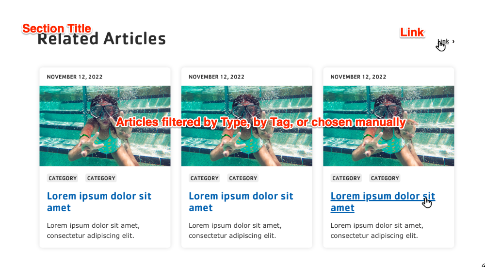
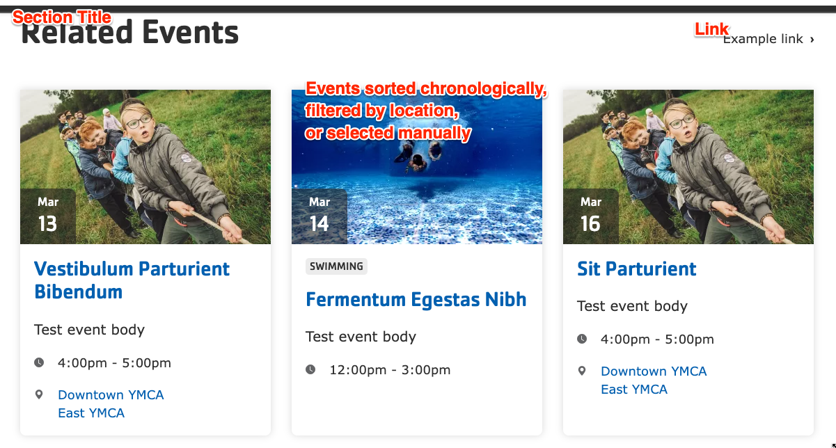
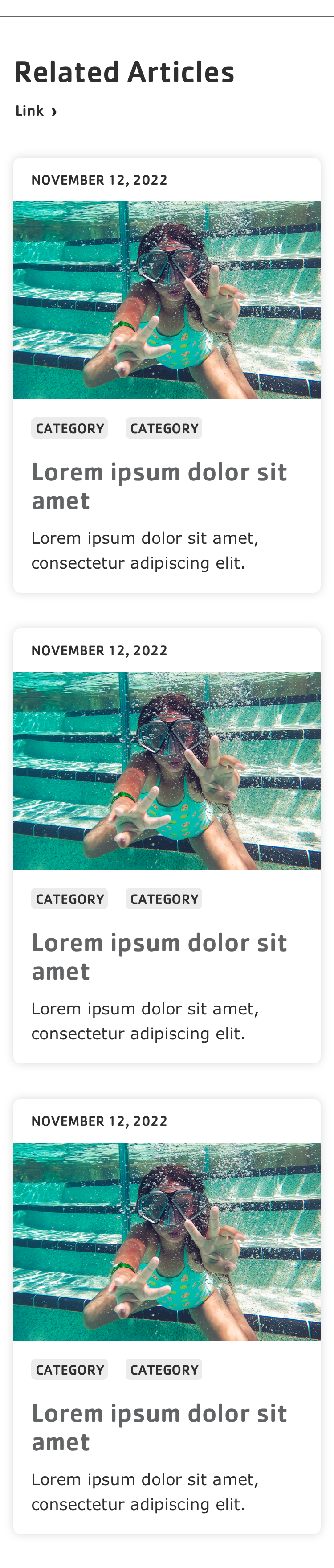
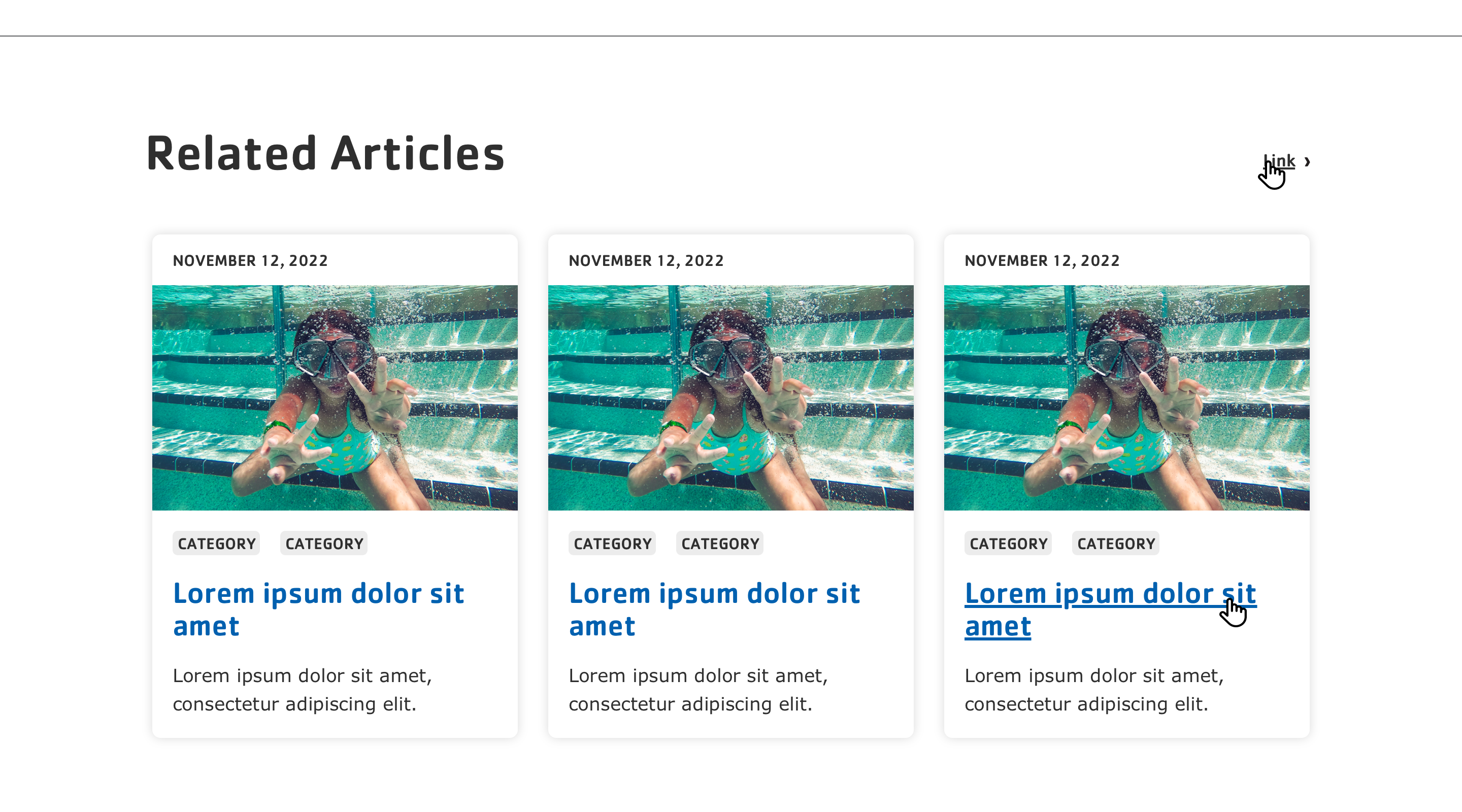
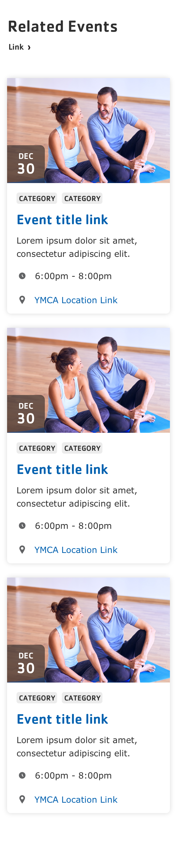
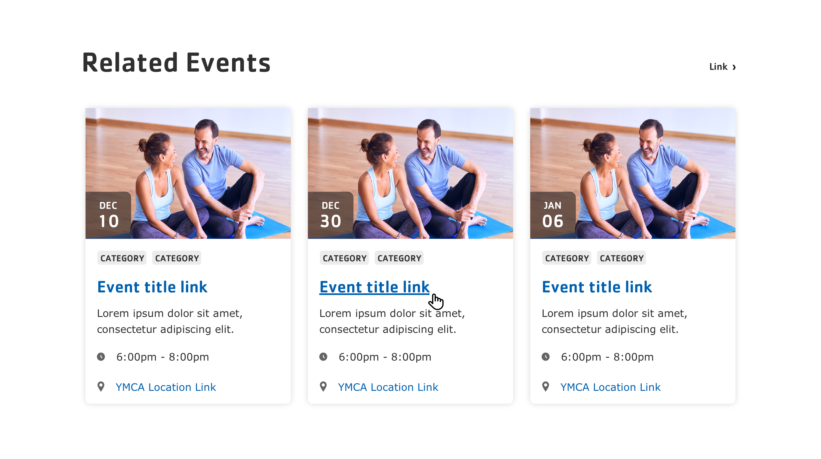
Section title (required): The section title.
Link: An optional link to be displayed near the title.
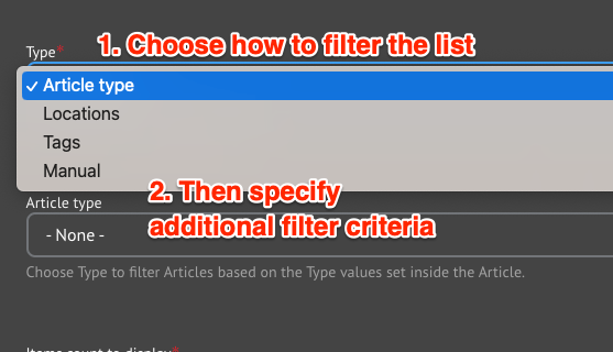
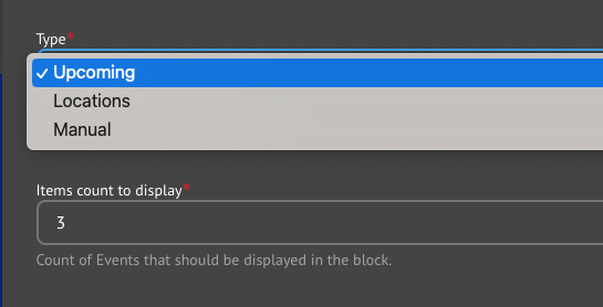
Type: Select how you would like to choose the related events in the block. Each type has different options:
Upcoming: Show upcoming events sorted by date.
Locations: Use the Locations field to filter Related Events.
Choose one or more Branch Locations to filter the list of Events.
Manual: Directly specify the Events to be listed.
Use the autocomplete field to add one or more Events to be displayed.
Items count to display: The maximum number of items to display in the list: 3, 6, 9, or 12.
Note:
Related Events will always be sorted by the Event Date unless Manual filtering is selected, in which case events are displayed in the order in which they appear in the configuration.
It may display in the preview, but the current page will not display in the list of Related Events once published.
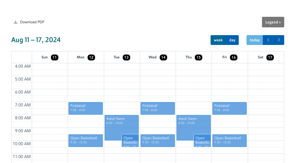
The Simple Schedule pulls content that is added via the
Simple Schedules module, along with other Sessions on the site. Be sure to set up your schedules before adding this block to your site.
Title (required): Never displayed, even if Display Title is checked. For administrative use only.
Section title: Displayed as a heading above the item.
Section subtitle: Displayed below the heading.
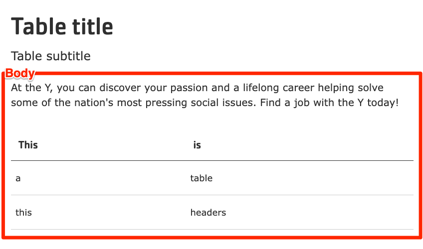
Body: A full text editor to add tables or other content to the page.
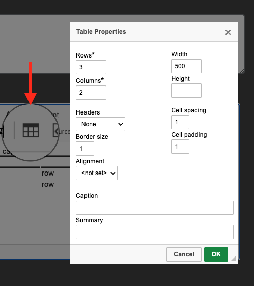
To add a table in the editor, click the Table icon, then configure the table options in the popup.
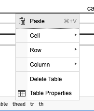
To edit an existing table properties, right click in the table and then choose an option from the menu.
As of the 11.3.1.0 release, global table styles are applied automatically to tables created in CKEditor, providing consistent styling across all Layout Builder content types.
Scroll to the location on the page where you want to add a block
Click Add block
In the sidebar, click Create custom block
Choose the block to add.
Fill in the content fields:
Title (required): Never displayed, even if “Display Title” is checked. For administrative use only.
Section heading: Displayed as a heading above the items.
Section subheading: Displayed below the heading.
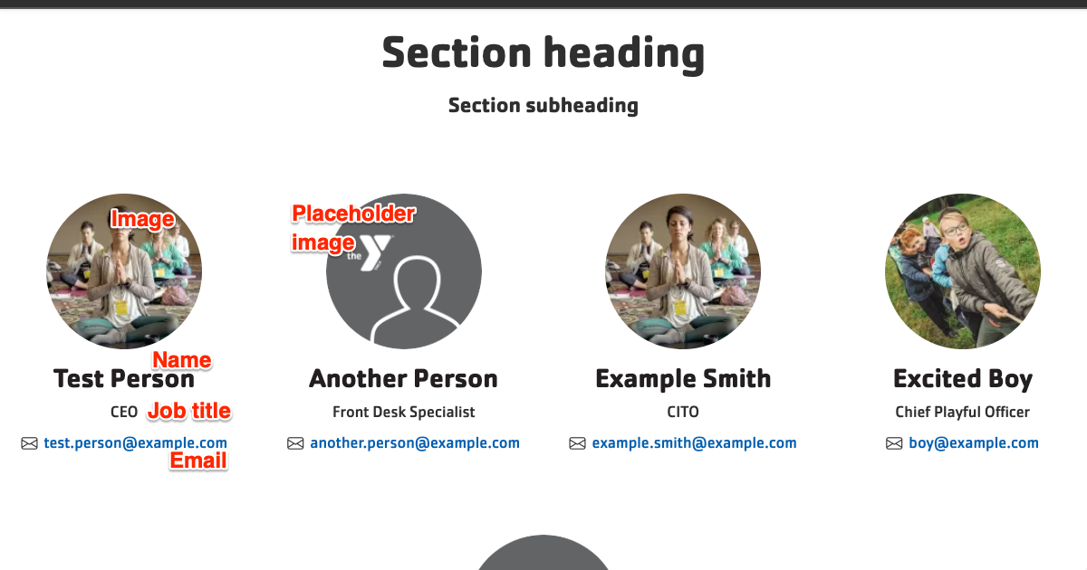
Staff items: Click Add new custom block to add a new Staff item, Add existing custom block to reuse an existing item from another block, or click Duplicate to reuse an entry from the same block. Items can be reused across pages. Add unlimited items. Each item has:
Image
First name (required)
Last name (required)
Job title (required)
Email
After filling in the fields for an item, click Create custom block to save the item.
Scroll to the location on the page where you want to add a block
Click Add block
In the sidebar, click Create custom block
Choose the block to add.
Fill in the content fields:
Title (required): Never displayed, even if “Display Title” is checked. For administrative use only.
Section heading: Displayed as a heading above the item.
Section subheading: Displayed below the heading.
Media: Chose from the library or add a new image to be displayed to the left of the statistics.
Section link: Add a link below the statistics items.
Statistics items: Add as many items as you like using the Add Statistics Item or Add new custom block button. When you are finished adding or editing each item, be sure to click Create/Update tab or Create/Update custom block to finalize the item. Each item contains:
Number value: The number value for the statistic. Can include a prefix ("$100") and/or suffix ("$100M").
Scroll to the location on the page where you want to add a block
Click Add block
In the sidebar, click Create custom block
Choose the block to add.
Fill in the content fields:
Title (required): Never displayed, even if “Display Title” is checked. For administrative use only.
Section heading: Displayed as a heading above the item.
Section subheading: Displayed below the heading.
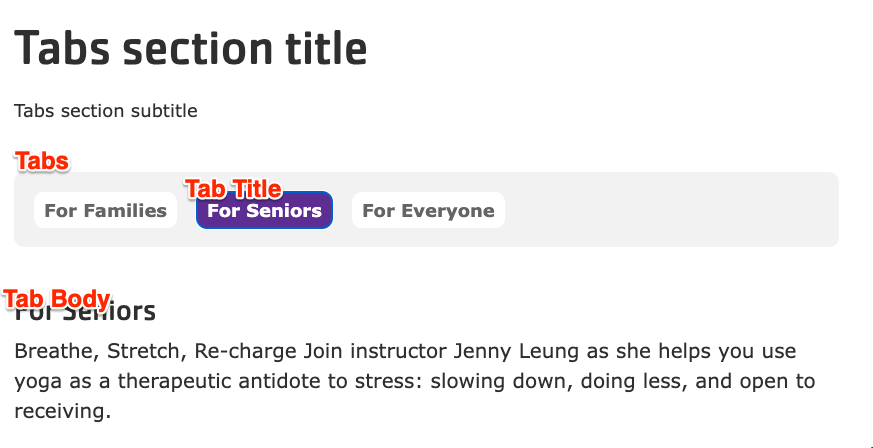
Tab Item: Add as many Tabs as you like using the Add Tab or Add new custom block button (depending on your version). When you are finished adding or editing each item, be sure to click Create/Update tab or Create/Update custom block to finalize the item. Each item contains:
Heading: The heading that will be used to select the tab.
Scroll to the location on the page where you want to add a block
Click Add block
In the sidebar, click Create custom block
Choose the block to add.
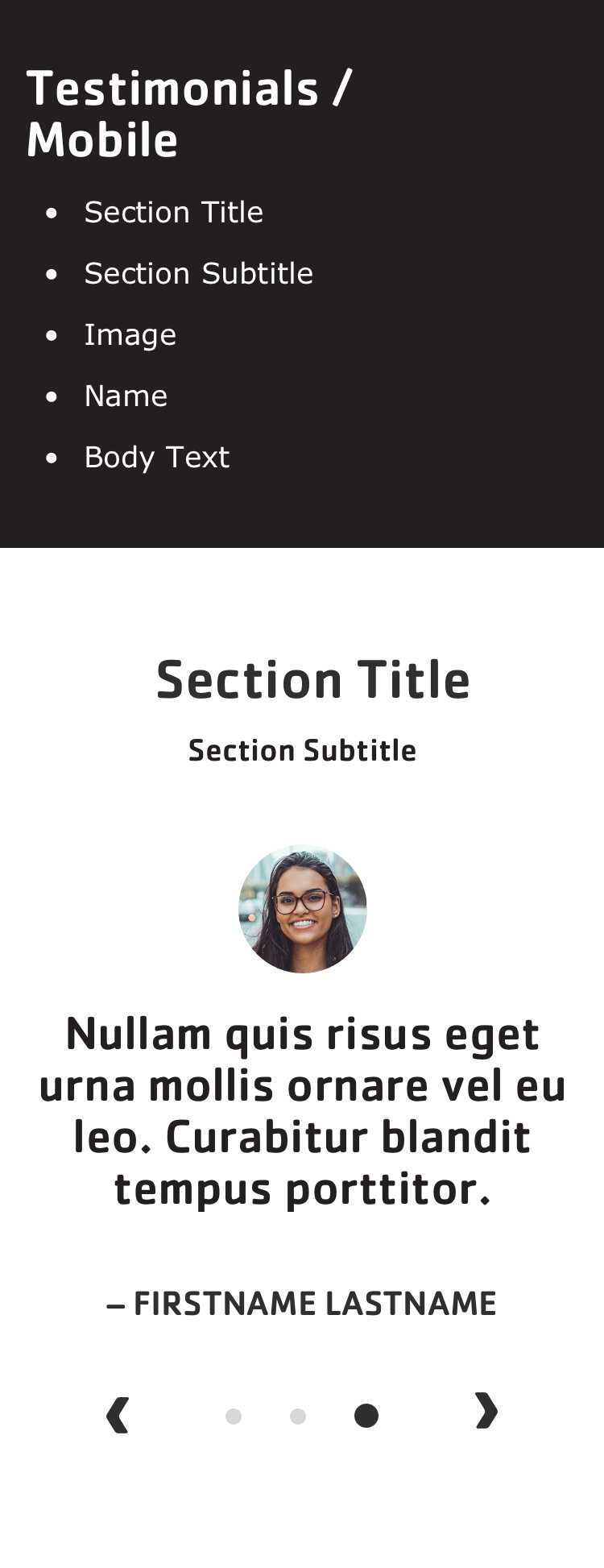
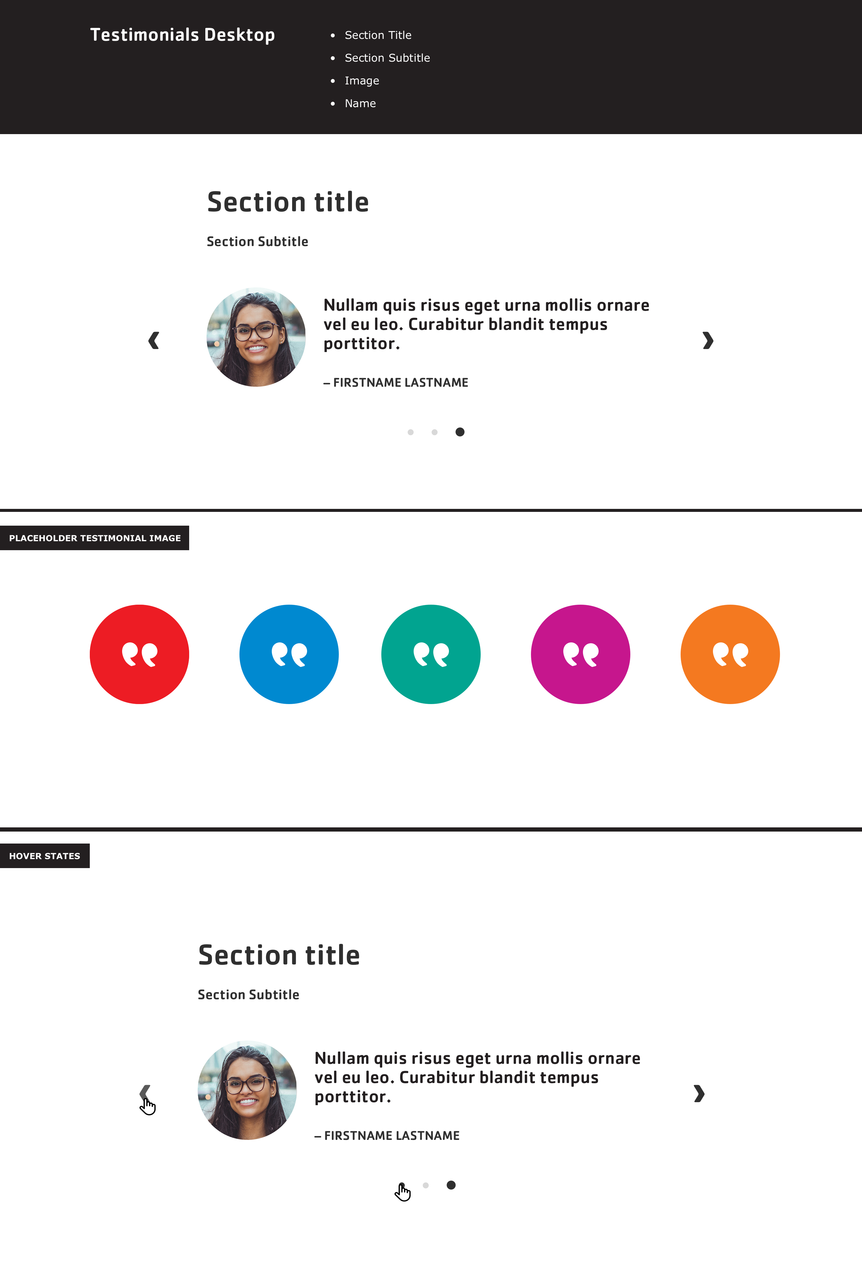
Fill in the content fields:
Title (required): Never displayed, even if “Display Title” is checked. For administrative use only.
Section title: Displayed as a heading above the cards.
Section subtitle: Displayed below the heading.
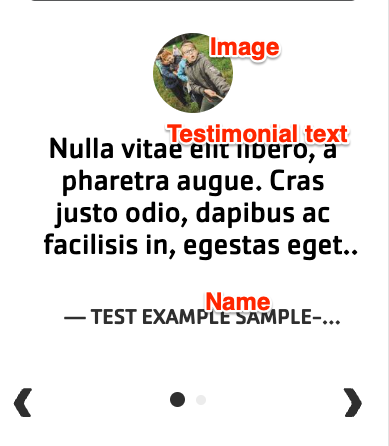
Item: Click Add new custom block to add a new Testimonial item, or Add existing custom block to reuse an existing item. Testimonial items can be reused across pages. Add up to 4 items. Each item has:
Block Description: A label for the Testimonial for administrative use only.
Name: The attribution of the testimonial. May get trimmed on mobile after about 20 characters.
Testimonial text: The body of the testimonial. May get trimmed on mobile after about 70 characters.
Image: An image related to the testimonial. Will use a placeholder image if not used.
After filling in the fields for an item, click Create custom block to save the item.


