Configuration for Layout Builder Sections and Blocks.
A huge amount of configuration is available with Layout Builder components using the contributed
Layout Builder Blocks module, which is included with the distribution. In addition to those configuration options, we provide an extra layer of “Y Styles” that help site builders customize their sites in an accessible and brand-compliant manner.
Y Styles
These options provide customizations of Layout Builder-enabled pages at the Content Type, Page, and Component(/Block) level. As of the 11.3.1.0 release, Y Styles support has been expanded to additional content types beyond Landing Pages.
Styles inherit from content types, to pages, to components. Some styles can also be overridden at each level - block styles can override page styles, which can override content type styles.
flowchart
  classDef ct fill:#5C2E9133;
  classDef page fill:#92278F33;
  classDef block fill:#C6168D33;
  subgraph ct[Content Type]
    direction LR
    subgraph page[Page]
      direction LR
      subgraph block[Block]
        blockStyles[Block Styles]
      end
      pageStyles[Page Styles]
    end
    ctStyles[Content Type Styles]
  end
  blockStyles -- override --> pageStyles
  pageStyles -- override --> ctStyles
  class ct ct
  class page page
  class block block
Content Type styles
Note: This configuration may not be accessible to all content editors. Ask an administrator for assistance if necessary.
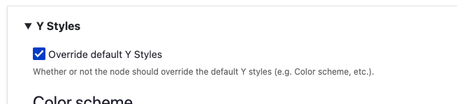
The default values for page-level Y Styles options are set in the Content Type display options.
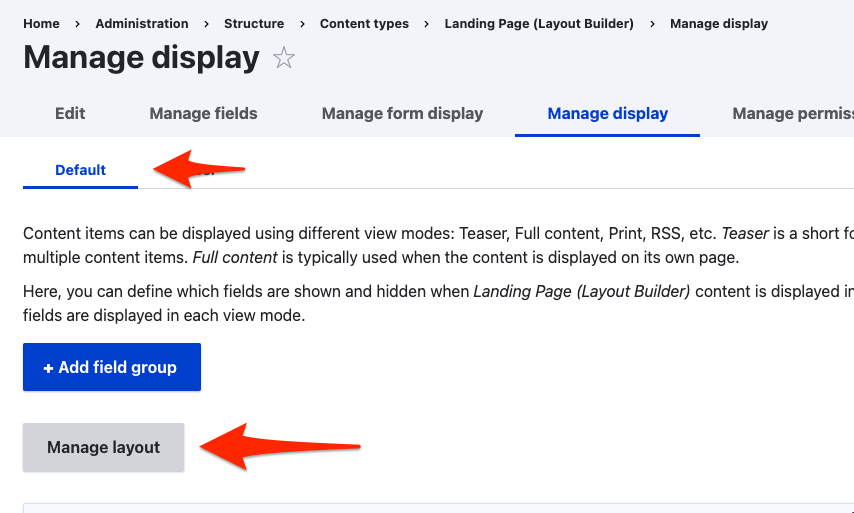
To access them:
Go to Admin > Structure > Content types > Landing Page (Layout Builder) (or another LB-enabled content type) > Manage display
Ensure you’re acting on the Default display, then click Manage layout.
Expand the Y Styles section
Choose your default configuration options. These will set the defaults for every new node of this Content Type. Existing content will not be effected.
Click Save layout
Page styles
Every Layout Builder-enabled page that you create will allow you to override the default settings. All of these settings will affect all items on a page, unless they are overridden at the component level.
Edit the Layout on a page
Expand the Y Styles section
Choose your configuration options.
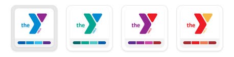
Color scheme:The color scheme of all components on the page. Choose from four brand-compliant and accessible options:
Blue/Purple
Green/Blue
Purple/Red
Red/Orange
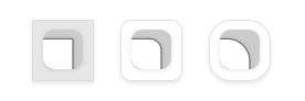
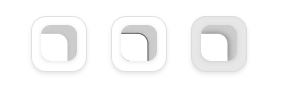
Border radius:The curvature of container corners.
0px (square)
10px (small curve)
20px (larger curve)
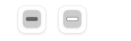
Border style:The style of container borders.
No border
1px border
Drop shadow
Text/Button alignment:The vertical placement of elements in containers.
Left
Center
Button position:Where buttons sit in containers.
Inside container
Overlapping container
Button fill:How buttons are colored.
Filled by default, outlined on hover
Outlined by default, filled on hover
Click Save layout
Y Block styles
Some blocks have additional styles that can be configured per-block. For these blocks (e.g. Banner, Cards), look for the Y Styles section in the
block styles section and set the options accordingly.
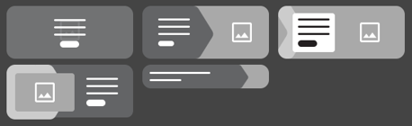
Banner
Variant:Choose from five designs.
Standard
Overlay
Chevron
Frame
Small - This variant hides all but the title and description and does not use an image background.
Button fill: Override the page-level styles.
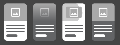
Card
Variant:Choose from four designs.
Standard
Overlay
Chevron
Color
Border style: Override the page-level styles.
Text/Button alignment: Override the page-level styles.
Button position: Override the page-level styles.
Button fill: Override the page-level styles.
Section styles
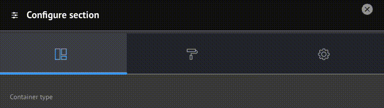
When creating or editing a Section you have the option of configuring Layout, Style, and Settings.
Support for these options is a work in progress and may require involvement of your development partner. Feel free to experiment with the options. Be sure to follow proper brand guidelines and accessibility practices.
Layout styles
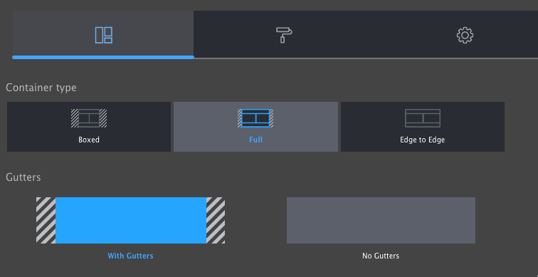
In this section you can control the container of the Section.
Container type
Boxed: Section is narrower than the header of the page. Good for text-heavy layouts.
Full: Section extends to the edges of the main content container.
Edge to Edge: Section extends to the edges of the page. Good for full-width components like Banners and Ping-Pong blocks.
Gutters
With Gutters: Section has left and right padding. Good for most non-full-width containers.
Without Gutters: Section has no left and right padding. Best for Edge to Edge containers.
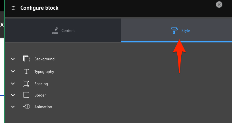
Block styles
When creating or configuring a block you have the option of opening the Style tab to access additional style options including:
background,
typography,
spacing,
borders, and
animation.
Support for these options is a work in progress and may require involvement of your development partner. Feel free to experiment with the options. Be sure to follow proper brand guidelines and accessibility practices.
After you have completed setting the Style options, click back to Content and Save or Update to commit your changes.