Designs:
- Design System
- Pre-release: Mobile | Desktop
To use the block:
- Click the Layout tab at the top of your page
- Scroll to the location on the page where you want to add a block
- Click Add block
- In the sidebar, click Create custom block
- Choose the block to add.
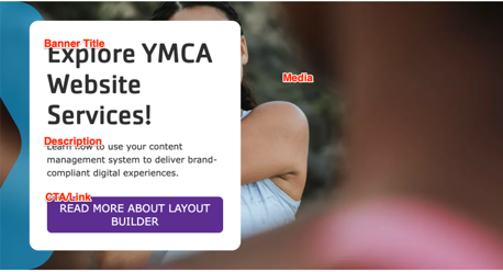
Fill in the content fields:
- Title (required): Never displayed, even if “Display Title” is checked. For administrative use only.
- Banner Title (required): A heading to display on the banner.
- Description: A full text editor to add banner content.
- Media: Chose from the library or add a new image or icon to be displayed behind the banner text.
- CTA/Link: A link at the bottom of the banner text.
This block comes with multiple styles. To choose an alternative style:
- Click on the Style tab at the top of the Block Add/Update form.
- Expand the Y Style section.
- Choose from the available variations.
- Go back to the Content tab.

Then save the block:
- Click Add block in the editing pane.
- Save and publish your changes.
