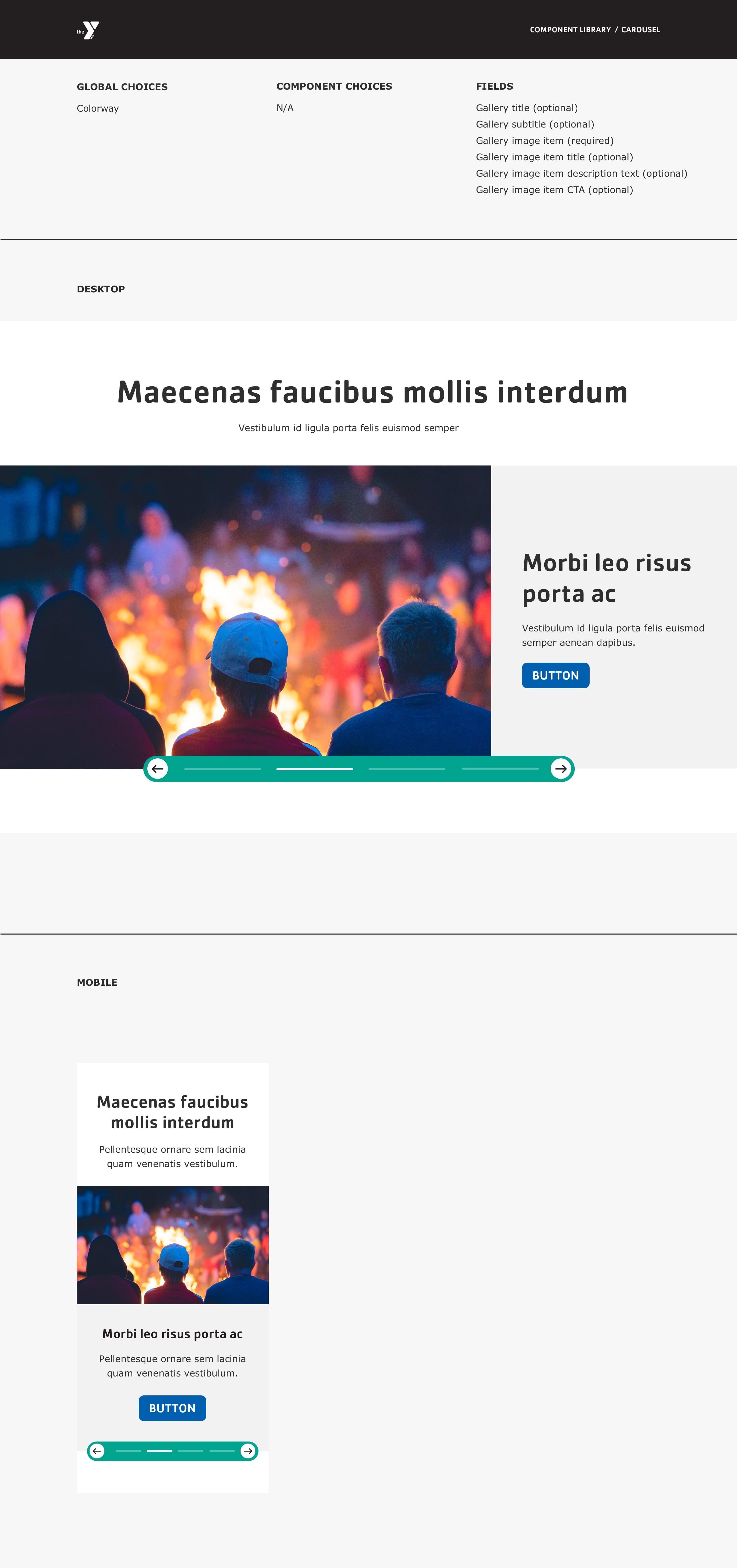
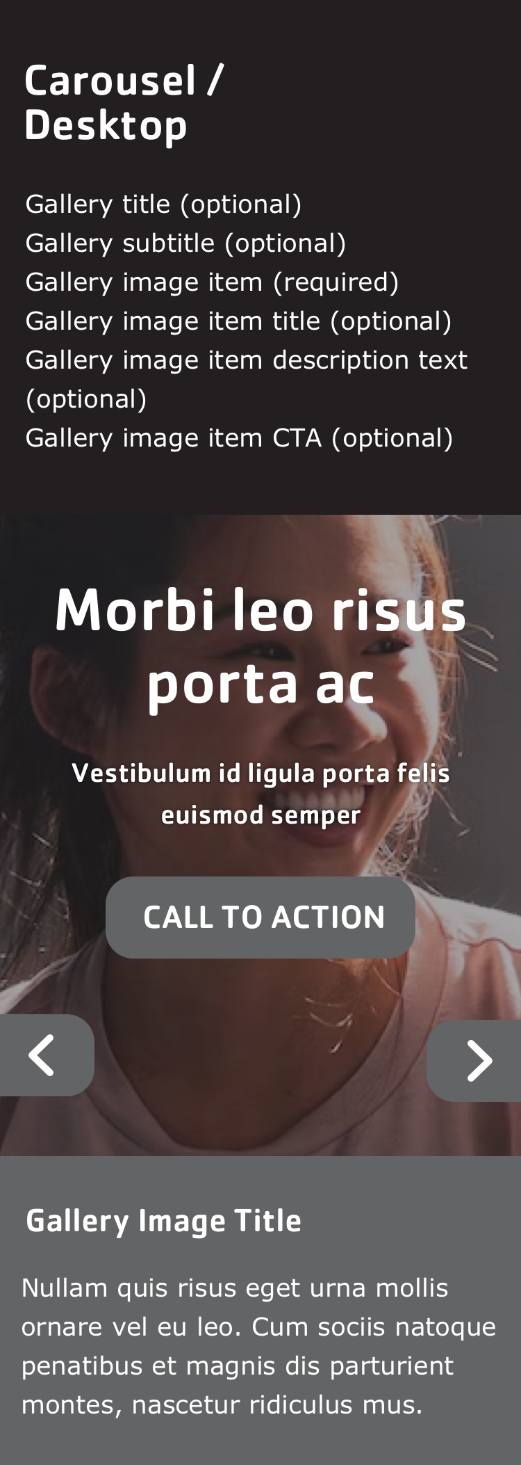
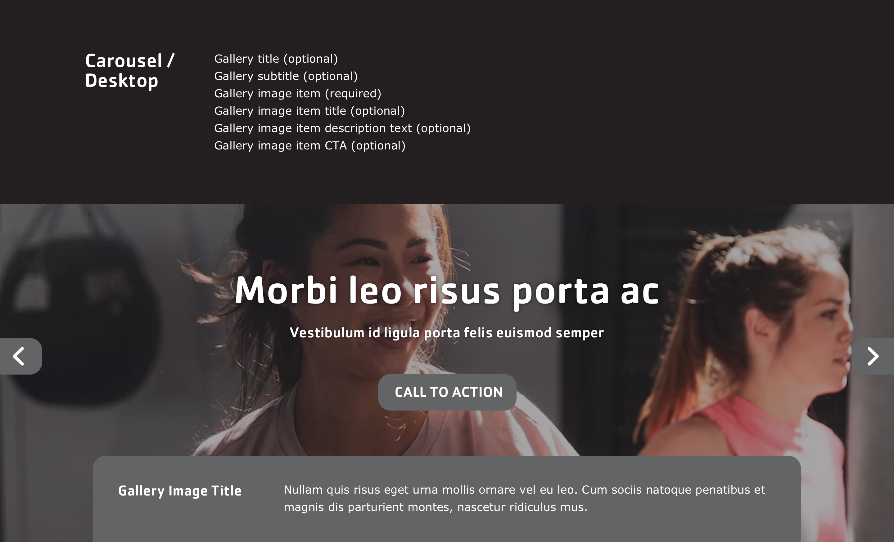
Designs:
- Design System
- Pre-release: Mobile | Desktop
To use the block:
- Click the Layout tab at the top of your page
- Scroll to the location on the page where you want to add a block
- Click Add block
- In the sidebar, click Create custom block
- Choose the block to add.
Fill in the content fields:
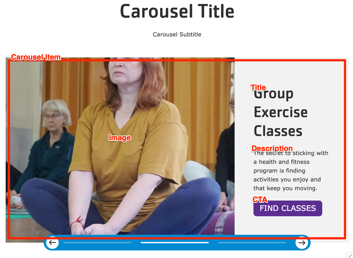
- Title (required): Never displayed, even if “Display Title” is checked. For administrative use only.
- Carousel heading: Displayed as a heading above the carousel.
- Carousel subheading: Displayed below the heading.
- Carousel Item: Add as many items as you like using the Add Carousel Item or Add new custom block button. When you are finished adding or editing each item, be sure to click Create/Update tab or Create/Update custom block to finalize the item. Each item contains:
- Heading
- Image: Chose from the library or add a new image.
- Description
- Link: A link at the bottom of the carousel item.
Then save the block:
- Click Add block in the editing pane.
- Save and publish your changes.