Header/Footer
Designs:
- Utility Menu Mobile & Desktop
- Menu & Search Mobile & Desktop
- Header Mobile & Desktop
- Footer Mobile & Desktop
The header and footer on Layout Builder pages is composed of many complimentary blocks. The Header and Footer are special Sections that are pre-populated on each Layout Builder-enabled content type. If the Header or Footer do not already exist in your content, you can add them on your own.
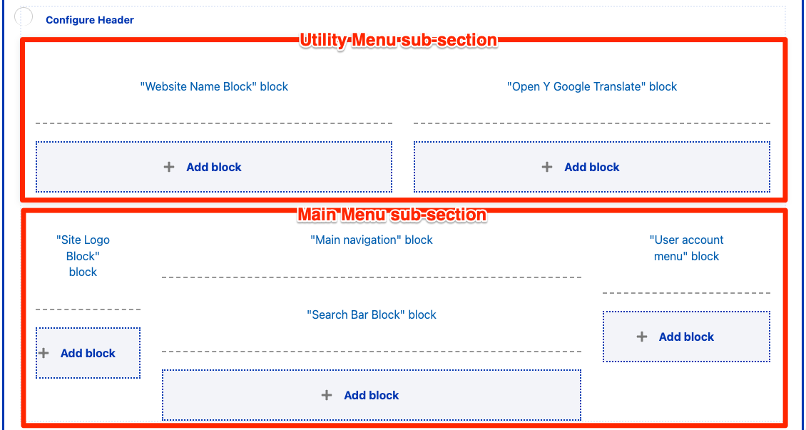
Header Section
If a Header section does not already exist, add a new Section and choose the WS Header Layout. Then, add the following blocks by selecting Add block and then using the search box under All system blocks:
- Utility Menu area
- Left
- Website Name Block
- Right
- Open Y Google Translate Block
- Utility Menu
- Left
- Main Menu area
- Left
- Site Logo Block
- Center
- Main navigation
- Search Bar Block
- Right
- User account menu
- Left
Each block has some specific configuration recommendations:
Website Name Block
Configuration
- Uncheck Display title.
Content
- The Site Name is found under Configuration > System > Basic site settings.
Open Y Google Translate Block
Configuration
- Uncheck Display title.
Content
- The contents of this block are not configurable, but it may be omitted or removed if your site does not provide translation uses another translation method.
Utility Menu
The option to add a Utility Menu was added in the December 2024 release. This menu is intended to give content editors an additional space for adding links in the top right of the header.
Configuration
- Uncheck Display title.
- Menu levels controls which and how many levels of menu are displayed. The Utility menu styles are designed for a single level of links.
Content
- Menu items can be managed under Structure > Menus > Utility Menu.
Site Logo Block
Configuration
- Title (required): Never displayed, even if “Display Title” is checked. For administrative use only.
- WS Site Logo: Choose which logo is displayed in the block.
- Theme logo uses the logo defined by the active theme, in the Appearance > Settings > (The active theme).
- Colorway logo uses a dynamic SVG that responds to the configured YMCA colorway. This option is recommended for the Header.
- White logo uses a flat white logo. This option is recommended for the Footer.
- Hide tagline in WS logo: (Added in the December 2024 release.) Check to hide the tagline (areas of impact) in the logo.
Areas of impact usage
As per the Brand Graphics Guide (requires Y login):
The areas of impact must appear on a website, but it is at the YMCA’s discretion whether to include them as the trademarked graphic paired with the logo or as a way of telling the story of our positive impact.
If you choose to hide the Areas of Impact in the logo, we recommend you include them elsewhere on the page.
Main navigation
The main navigation supports displaying up to three levels of menu items. When adding items, be sure to check Show as expanded for any parent item that should be expandable.
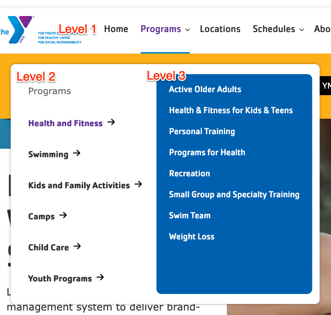
The main navigation also supports an optional nested CTA block.
Configuration
- Uncheck Display title.
- Menu levels controls which and how many levels of menu are displayed. We recommend using the default configuration.
Content
- Menu items can be managed under Structure > Menus > Main navigation.
Tips
- Refer to the Drupal User Guide for more information about managing menus.
- We recommend you limit the main menu to 6 items or fewer when using Layout Builder, as additional items can cause the menu to be wider than the supported area. Additional menu items can be added to the footer, if needed.
Search Bar Block
Configuration
- Uncheck Display title.
Content
- The contents of this block are not configurable.
User account menu
Configuration
- Uncheck Display title.
- Menu levels controls which and how many levels of menu are displayed. We recommend using the default configuration.
Content
- Menu items can be managed under Structure > Menus > User account.
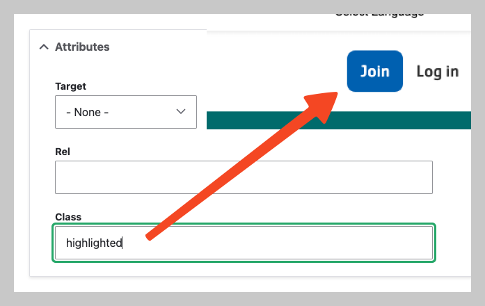
- To show items with a button style, add the
highlightedto the menu item under Attributes > Class. Usehighlighted outlinefor a reversed, secondary button style.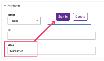
- On mobile devices, only
highlighted(andhighlighted outline) items from this menu will display.
- On mobile devices, only
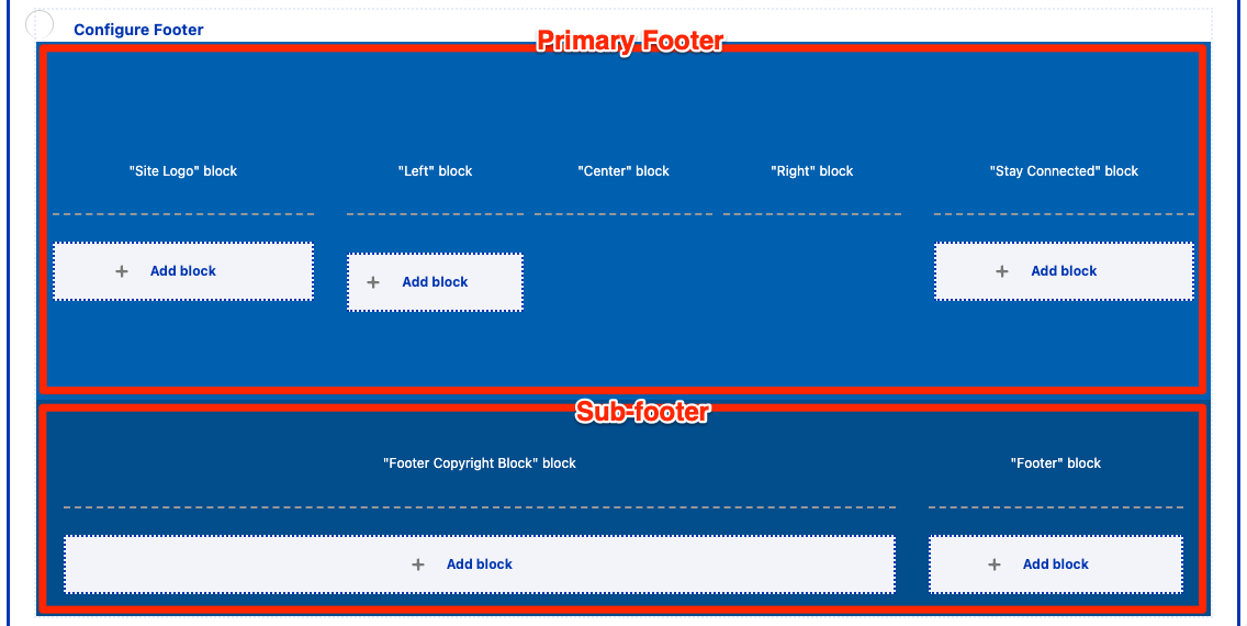
Footer Section
If a Footer section does not already exist, add a new Section and choose the WS Footer Layout. Then, add the following blocks by selecting Add block and then using the search box under All system blocks:
- Primary Footer
- Site Logo
- Footer Menu Left
- Footer Menu Center
- Footer Menu Right
- Footer Social
- Sub-footer
- Copyright
- Footer Menu
Site Logo
See above. The “white logo” is recommended for the footer.
Footer Menu Left, Center, Right
Each of these three blocks references a menu. The three menus can be used to split footer links across multiple columns.
Configuration
- Display title: Uncheck to hide the title, or turn the menu title on to give each column a title.
- Menu levels controls which and how many levels of menu are displayed. We recommend using the default configuration.
Content
- Menu items can be managed under Structure > Menus > Footer Menu Left, Footer Menu Center, or Footer Menu Right.
Footer Social
Configuration
- Display title: It’s up to you.
Content
- Edit the Footer Social Block to modify this block.
Copyright
Configuration
- Uncheck Display title.
Content
- Go to Content > Blocks
- Prior to Drupal 10.1, blocks can be found under Structure > Block layout > Custom block library
- Find the Footer Copyright Block
- Edit the block, then Save when finished.
Footer Menu
This menu is typically for a limited number of links such as “Privacy Policy” or “Terms of Use”.
Configuration
- Uncheck Display title.
- Menu levels controls which and how many levels of menu are displayed. We recommend using the default configuration.
Content
- Menu items can be managed under Structure > Menus > Footer.
Main Menu CTA Block
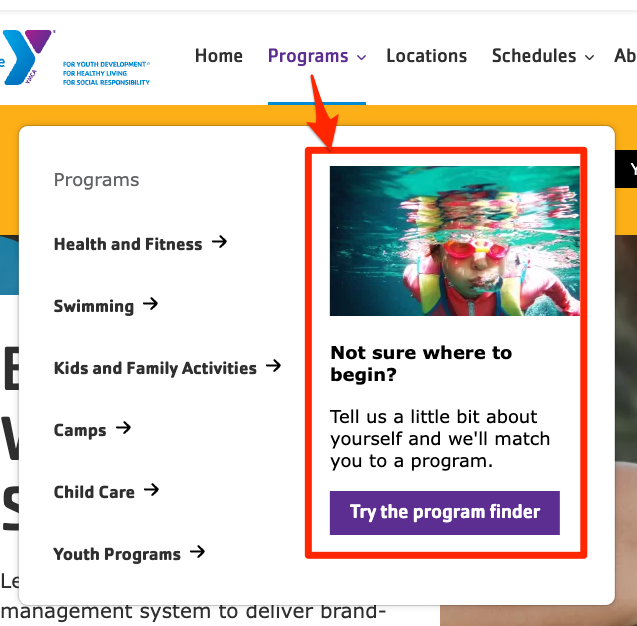
The Main navigation has an additional feature that allows for adding a nested call-to-action that takes the place of the third level of the menu.
To use it:
- Go to Extend (
admin/modules) and enable the Web Services Main Menu CTA Block module (y_lb_main_menu_cta_block). - Edit a top-level menu item (like “Programs” or “Schedules”) via one of these methods.
CTA blocks will only be displayed on first-level menu items. Blocks on all other levels will be ignored.
- Click the in the Main Menu section, then choose Edit menu.
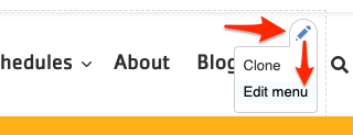
- Go to Admin > Structure > Menus > Main navigation then Edit a link.
- Click the in the Main Menu section, then choose Edit menu.
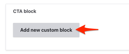
- In the CTA block section, click Add new custom block.

- Fill in the fields:
- Expand the Media section and choose or upload an image
- Add a short Heading
- Add a short 1-2 sentence Description
- Add a link and display text for the Menu CTA Link
- Add a Block description for administrative purposes only
- Click Create custom block to save the block.
- Save the menu item.
- Go back to a Layout Builder page with the menu and refresh. The menu CTA should now appear when the corresponding menu dropdown is open.

Menu CTA items will not appear on pages that use Paragraphs-based layout. CTAs also ony show on desktop and not mobile displays.