Icon Grid
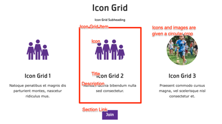
A simpler version of the Grid CTA component. Sets of content with a headline and description displayed in 2 to 4-item wide rows, with the option to include icons or images.
The Icon Grid block is similar to the Cards and Grid CTA blocks, but allows for more simpler items with a slightly more restricted design.
Designs:
To use the block:
- Click the Layout tab at the top of your page
- Scroll to the location on the page where you want to add a block
- Click Add block
- In the sidebar, click Create custom block
- Choose the block to add.
Fill in the content fields:
- Title (required): Never displayed, even if “Display Title” is checked. For administrative use only.
- Section heading: Displayed as a heading above the cards.
- Section subheading: Displayed below the heading.
- Icon Grid section link: A link button displayed below the list of items.
- # of columns: Allows 2- to 4-columns of items.
- Grid Icon Items: Add up to 4. Each item has:
- Title (required)
- Description: A full text editor to add item content.
- Icon: Chose from the library or add a new image or icon to be displayed above the item text. Circular icons are recommended. All icon/images will be displayed with a circular crop.
Then save the block:
- Click Add block in the editing pane.
- Save and publish your changes.
