Ping-Pong
Usually paired sets of full-width page components that include media, header, description, and call to action arranged horizontally.
Designs:
- Design System
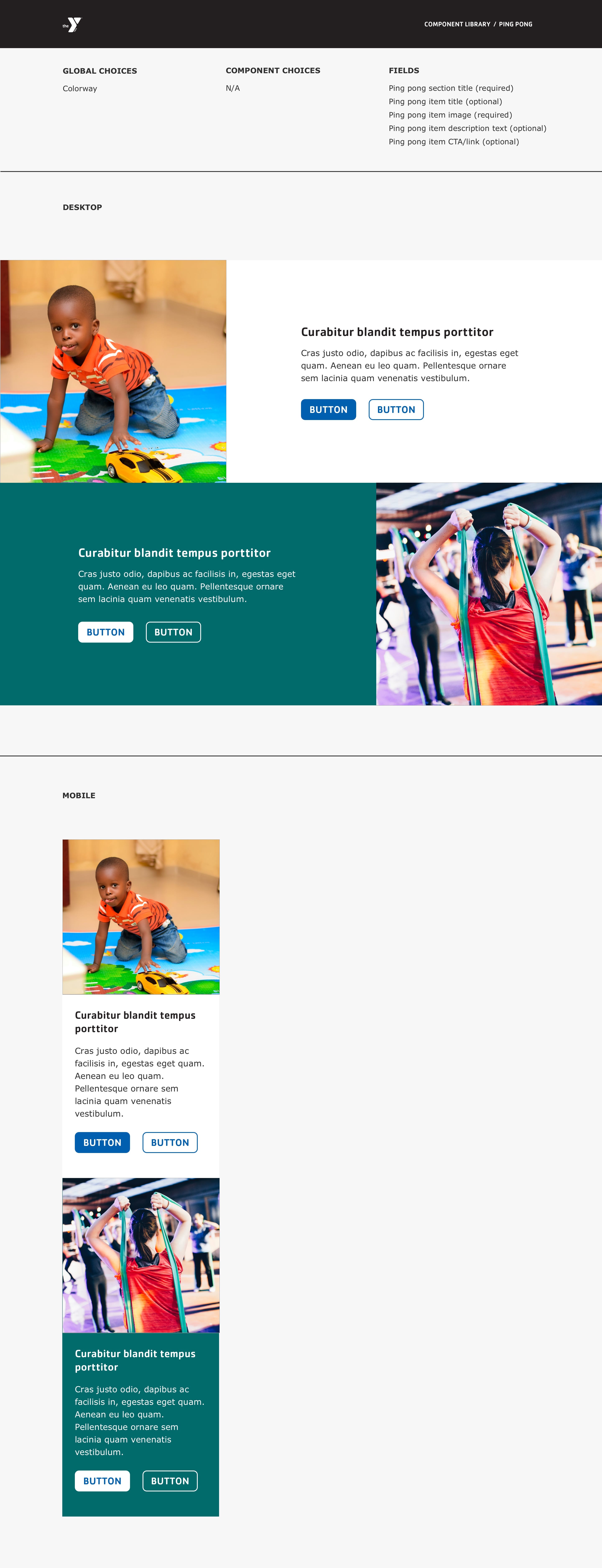
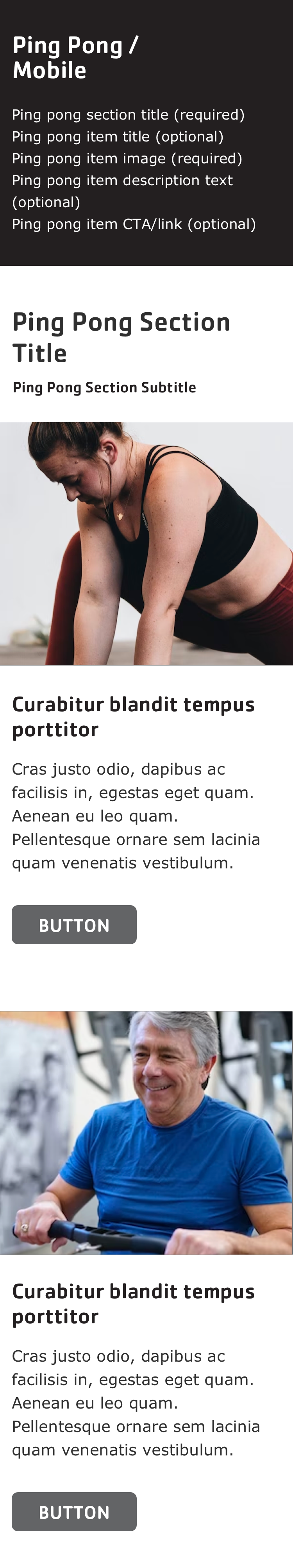
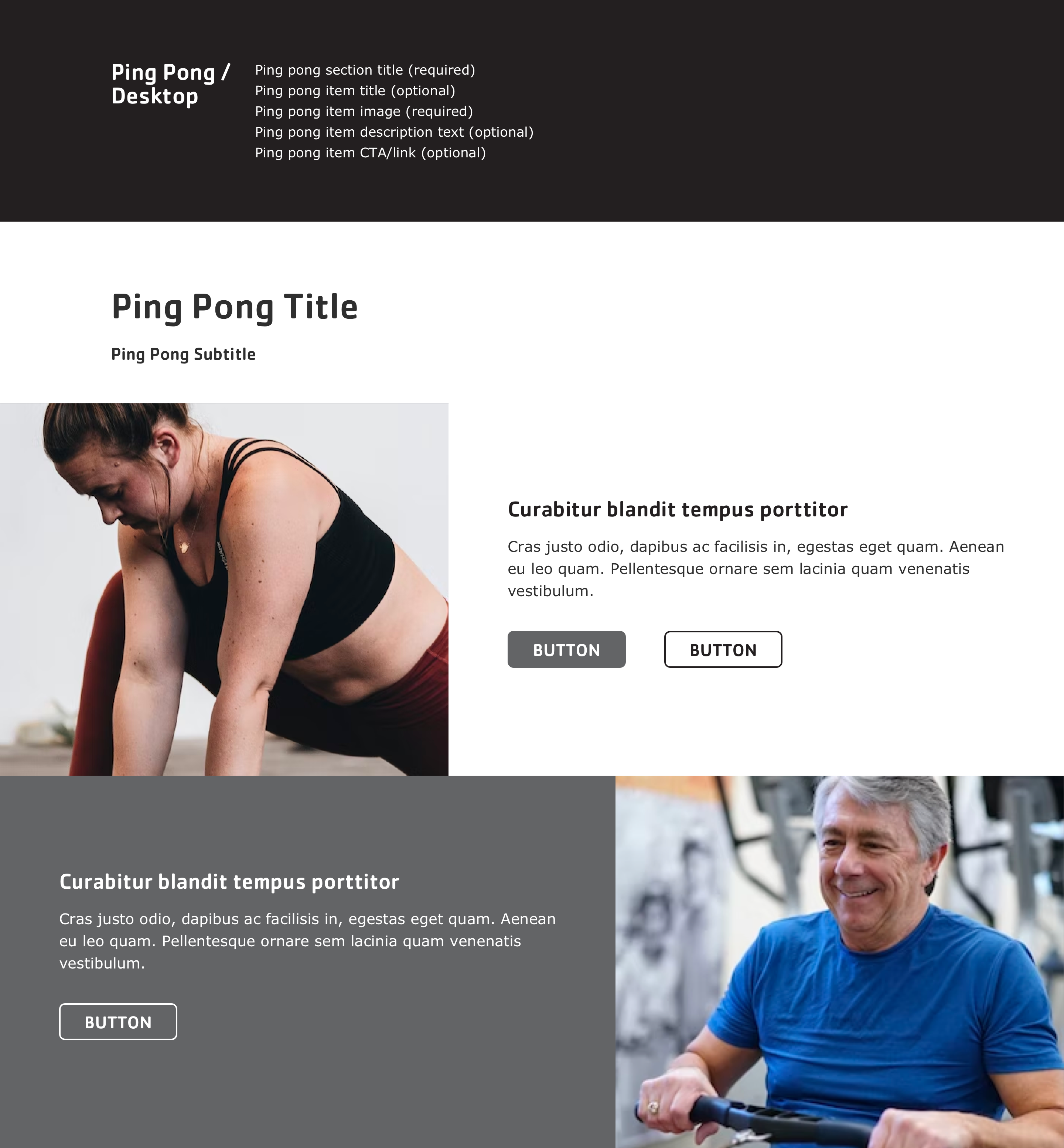
- Pre-release: Mobile | Desktop
To use the block:
- Click the Layout tab at the top of your page
- Scroll to the location on the page where you want to add a block
- Click Add block
- In the sidebar, click Create custom block
- Choose the block to add.
Fill in the content fields:
- Title (required): Never displayed, even if “Display Title” is checked. For administrative use only.
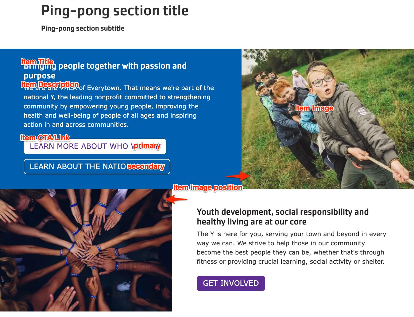
- Section title: Displayed as a heading above the item.
- Section subtitle: Displayed below the heading.
- Item title: Displayed at the top of the ping-pong block.
- Item description: Displayed below the title.
- Item image: Chose from the library or add a new image to be displayed opposite the text.
- Item image position: Places the image on the left/right side of the page in full-width (desktop) displays.
- Item CTA/Link: Add up to two links. The first will be displayed with “primary” (solid) styling, the second will be “secondary” (outline) styling.
- As of the December 2024 release, Ping-Pong links can use link attributes.
Then save the block:
- Click Add block in the editing pane.
- Save and publish your changes.