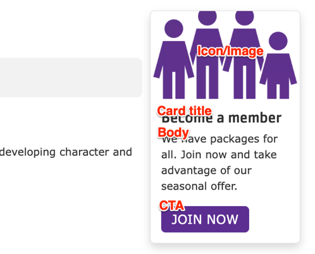
Promo Card
A title, headline, description, and link that usually display in the right or left sidebar.
Designs:
- Design System
- Pre-release: Mobile | Desktop
To use the block:
- Click the Layout tab at the top of your page
- Scroll to the location on the page where you want to add a block
- Click Add block
- In the sidebar, click Create custom block
- Choose the block to add.
Fill in the content fields:
- Title (required): Never displayed, even if “Display Title” is checked. For administrative use only.
- Card title: The displayed title of the promo card.
- Body: A full text editor to add card content.
- Icon/Image: Chose from the library or add a new icon or image to be displayed above the card text. Images will be treated differently depending on their type. If using an icon, we recommend uploading it in SVG format:
- JPG/PNG images will be cropped to a roughly 3:2 proportion rectangle
- SVG images will not be cropped
- CTA: A link at the bottom of the card.
Then save the block:
- Click Add block in the editing pane.
- Save and publish your changes.
