1 Column
Examples
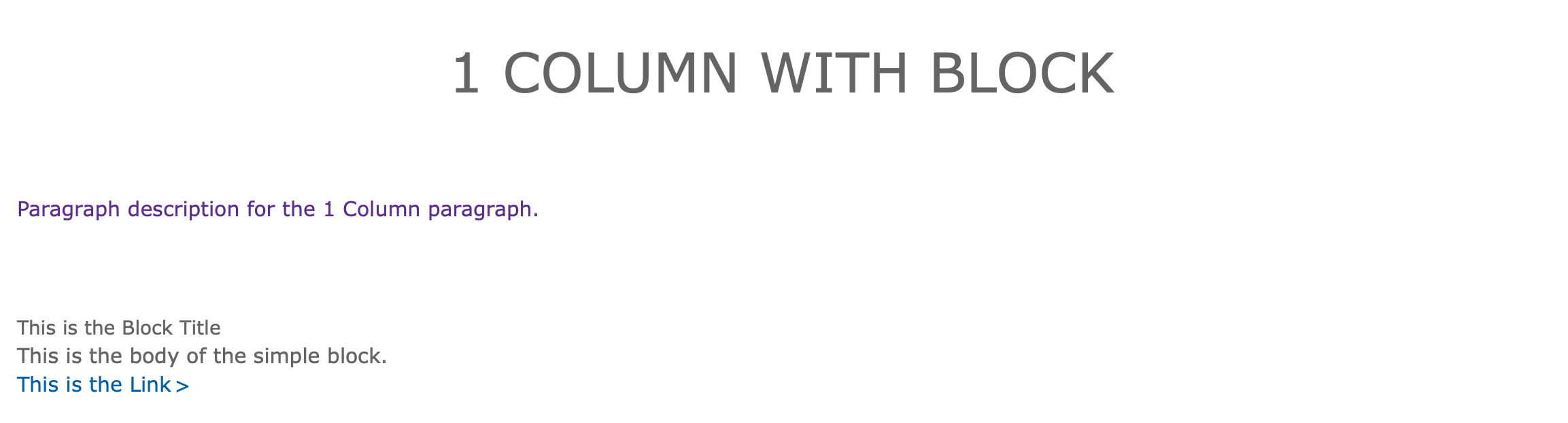
Rose - Without Block

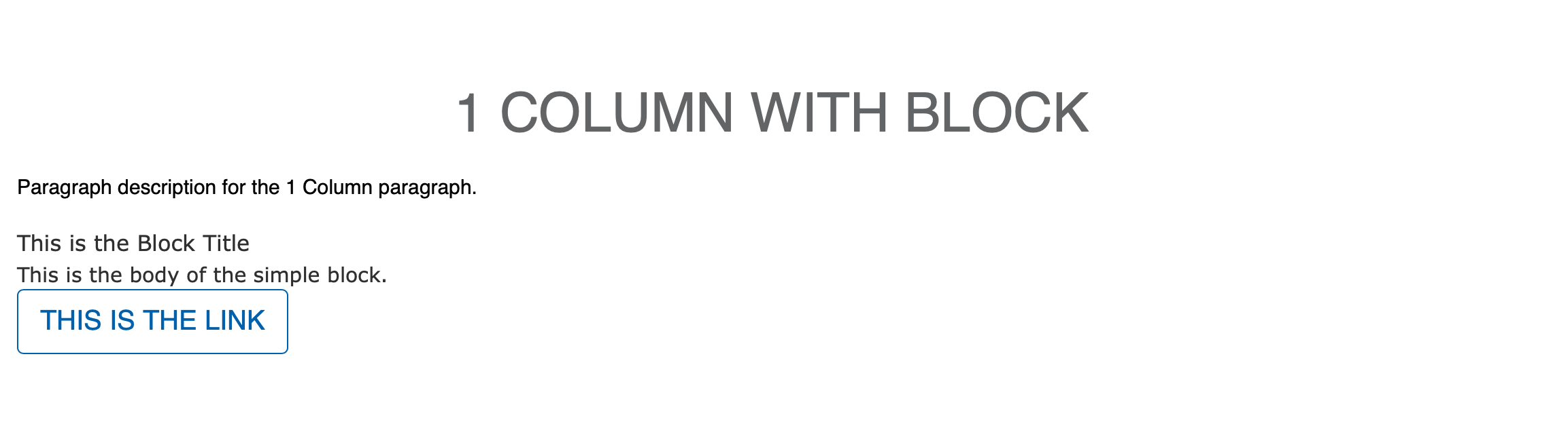
Rose - With Block
Carnation - With Custom Block
Areas 1 Column Should Be Used
- Content Area
- Sidebar Area
- Bottom Area
How to Use 1 Column
After selecting “1 Column” from the paragraphs dropdown, you will notice paragraph title field, a checkbox, and a required description.
- Paragraph title adds an all-caps heading at the top of your paragraph. This is optional.
- The checkbox adds dual horizontal rules. Check this only if you’re planning on using the paragraph title
- Description (required) - Adds simple text through a text editor. Font color defaults to purple in Lily and Rose.
Custom Block Feature
While the paragraph be used only with the fields above, 1 column also supports custom blocks of content. For this paragraph type, it’s recommended that users stick with “Simple block” types.
When adding your custom block, use the font-awesome icon class instead of the custom icon image field. In Carnation, the image option tends to get too large.
Learn more about custom blocks ⇒
Read about the Font Awesome icon library ⇒
Advanced
The purple font color for paragraph descriptions can be overridden in Lily and Rose by targeting .paragraph-1c-wrapper .field-prgf-1c-description.
Example:
.paragraph-1c-wrapper .field-prgf-1c-description {
color: inherit;
}
Content editors who want to edit this CSS can ask their developers to install the CSS Editor module and edit their styles directly from the User Interface.