4 Columns
Examples
This paragraph does not work out of the box in Carnation (see Advanced).
Content editors can use Grid Content or Featured Content paragraphs to achieve a similar layout.
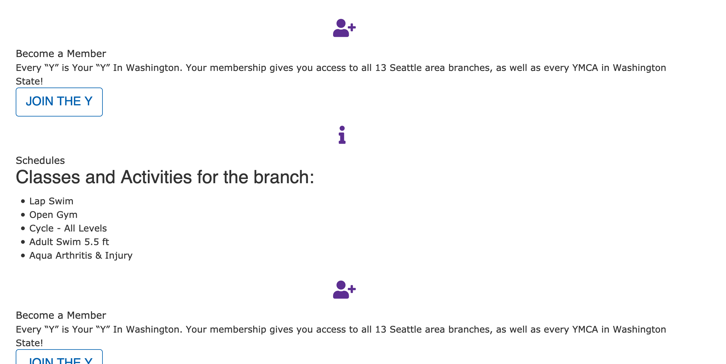
Lily
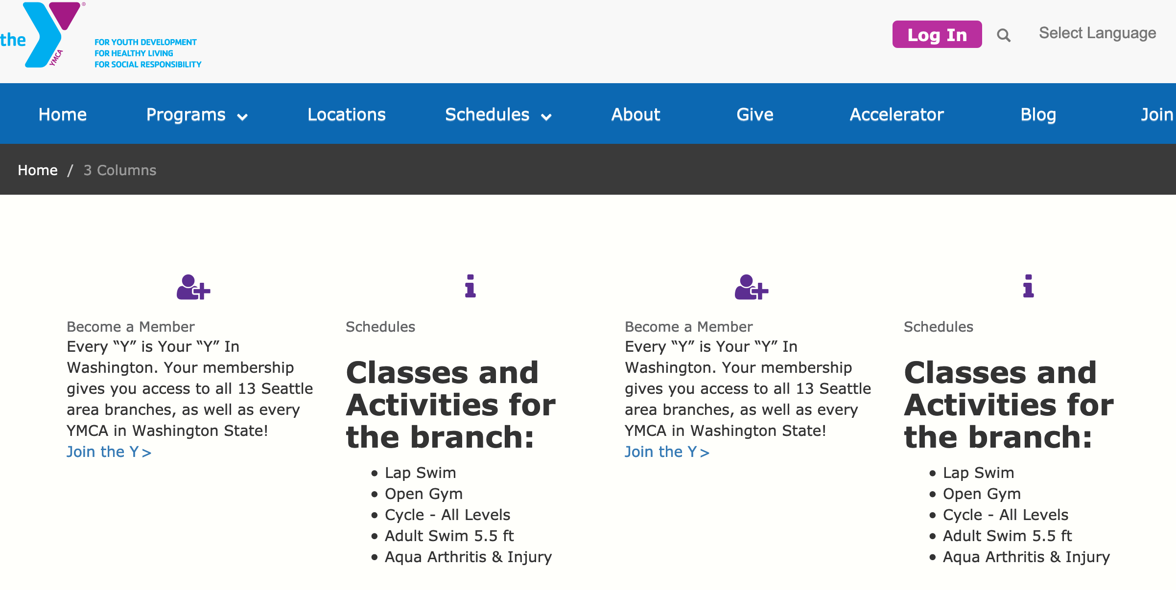
Rose
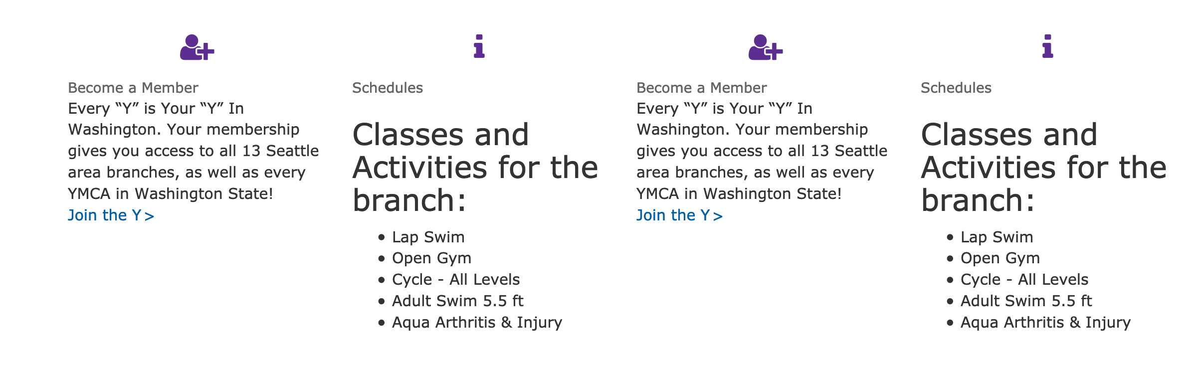
Areas it Can Be Used
- Content Area
- Bottom Area
How it Works
- Select 4 Columns from the Paragraphs dropdown
- Title: Optional large, all-caps title at the top
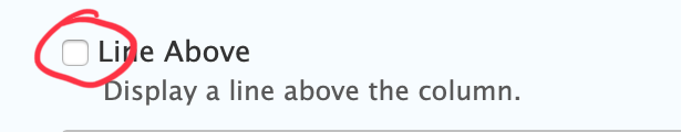
- Line Above: Adds a horizontal rule above each column.
- Description: A subheader/section description embedded below the title and above your titles. Uses the text editor for styling.
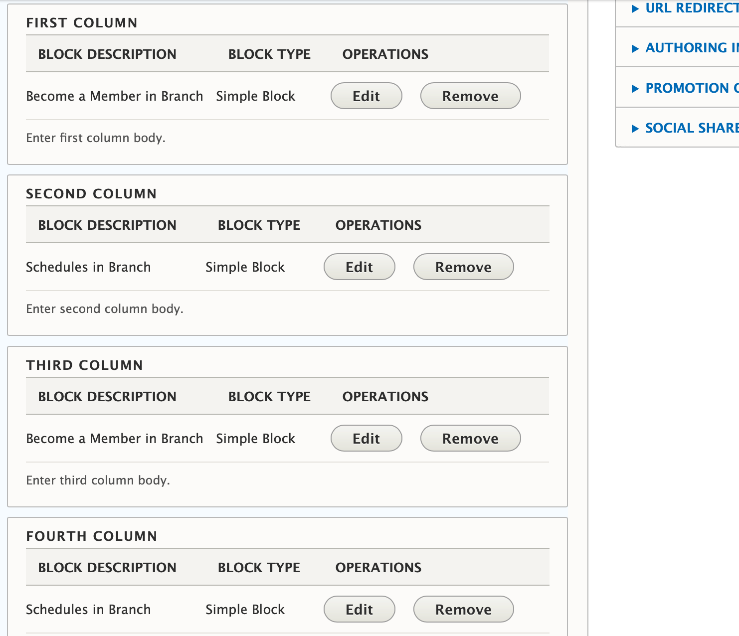
- Add custom blocks to the First Column, Second Column, Third Column, Fourth Column.
Learn more about custom blocks ⇒
Adding Headers to Individual Blocks Out of the box, the Title field in each custom block renders as plain text. To work around this, add your headers in the text editor.
See Advanced below for details about how to fix this with CSS.
If you want to add multiple rows of content with 4 columns, add a new 4 columns paragraph for each set of two you want (e.g., if you have seven blocks of content, add two 4 columns paragraphs).
Learn more about the link field ⇒
Advanced
Title Field Styling
In all three themes currently in YMCA Website Services, the Title field displays in a font-size and color nearly identical to the body copy. To override, target .field-sb-title.
Carnation -> Columns stack in desktop
In order for this to work in Carnation, the .wrapper containing the column elements needs to be changed to .row; otherwise, each of the four columns expands to the full width of the Area it’s embedded in.