Paragraphs are legacy components. All new YMCA websites should use
Layout Builder instead. Existing sites using Paragraphs will continue to work, but we strongly recommend migrating to Layout Builder for better performance, maintainability, and access to new features.
For Small Y sites: The
Small Y template exclusively uses Layout Builder.
YMCA Website Services content editors use paragraphs to create unique layouts for their pages. Each paragraph is a section of content that comes with its own styling, functionality, and fields.
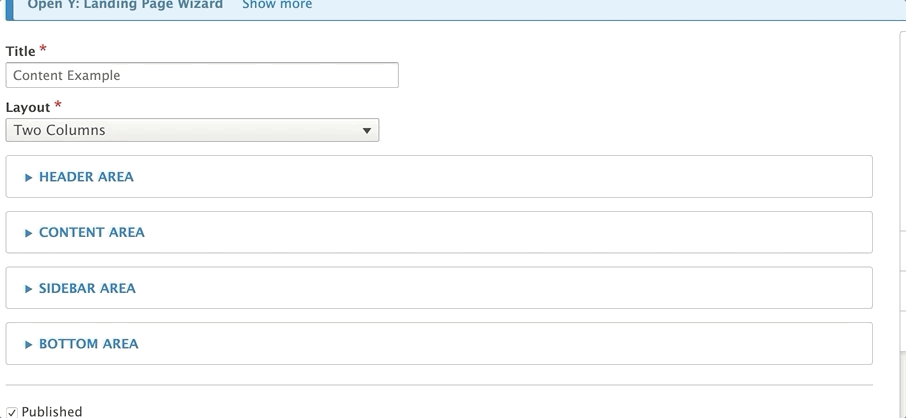
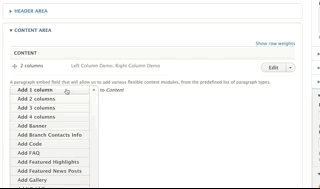
You can add a paragraph onto a page when you see the paragraphs dropdown field. These paragraphs will typically be inside one of the four main “Areas” inside a content type:
Header Area - Used for adding images and page titles
Content Area - Where your main content goes
Sidebar Area - Where you put related information, such as promotions and links to other content.
Bottom Area - The “anchoring” elements of your page, such as a call to action.
Not all content types use all four regions. For example, a content type use its fields to put content inside the Sidebar Area, while another may have a sidebar area but use its Image field instead of a Header Area
Two Ways to Add Paragraphs
Content editors have two ways to add paragraphs onto a page - inline editor and admin portal.
Admin Portal
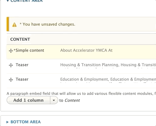
To add a paragraph into an Area, open that area and select a paragraph from the dropdown. The button will usually be labeled with “Add [First Paragraph in List]” (the first paragraph in the list depends on the content type/area), and there will be some helper text above.
The video below provides an example of the functionality of paragraphs; however, the specific layouts demoed are not YMCA Website Services layouts.
Inline Editor
If you’ve upgraded to YMCA Website Services 2.4 or later, you can add a paragraph from the front-end by clicking on the Plus icon in a given region and selecting a paragraph from the pop-up window.
Note: Not all paragraphs are available for inline editing yet. More paragraphs will be added to the inline content editor in later releases
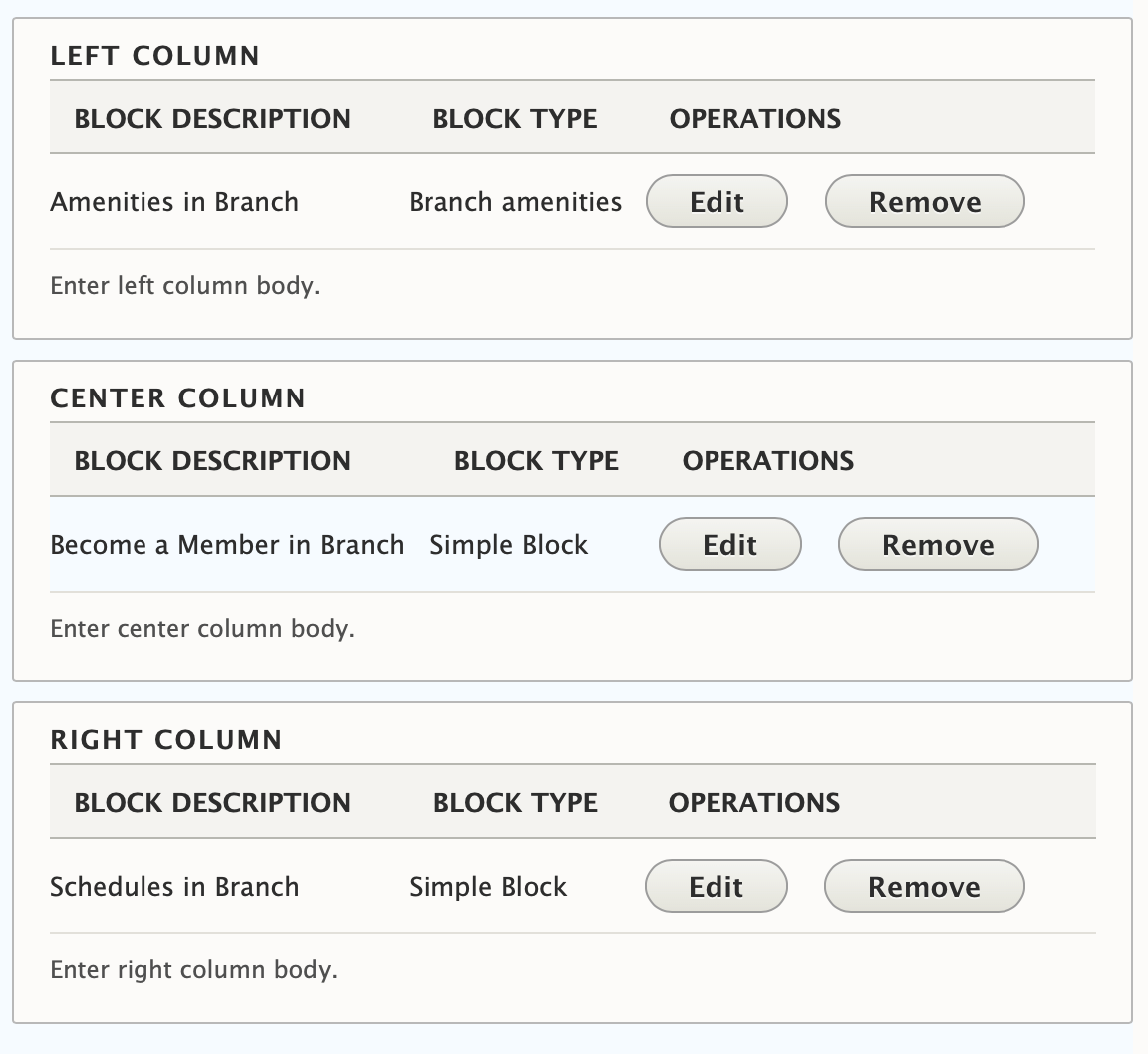
Rearranging Paragraphs
Sometimes you have one layout in your head and it doesn’t look as good when you add it to your page. You can easily move around your sections by clicking on the cross icon to the left of your paragraphs. Drag around your paragraphs to rearrange.
Editing Paragraphs
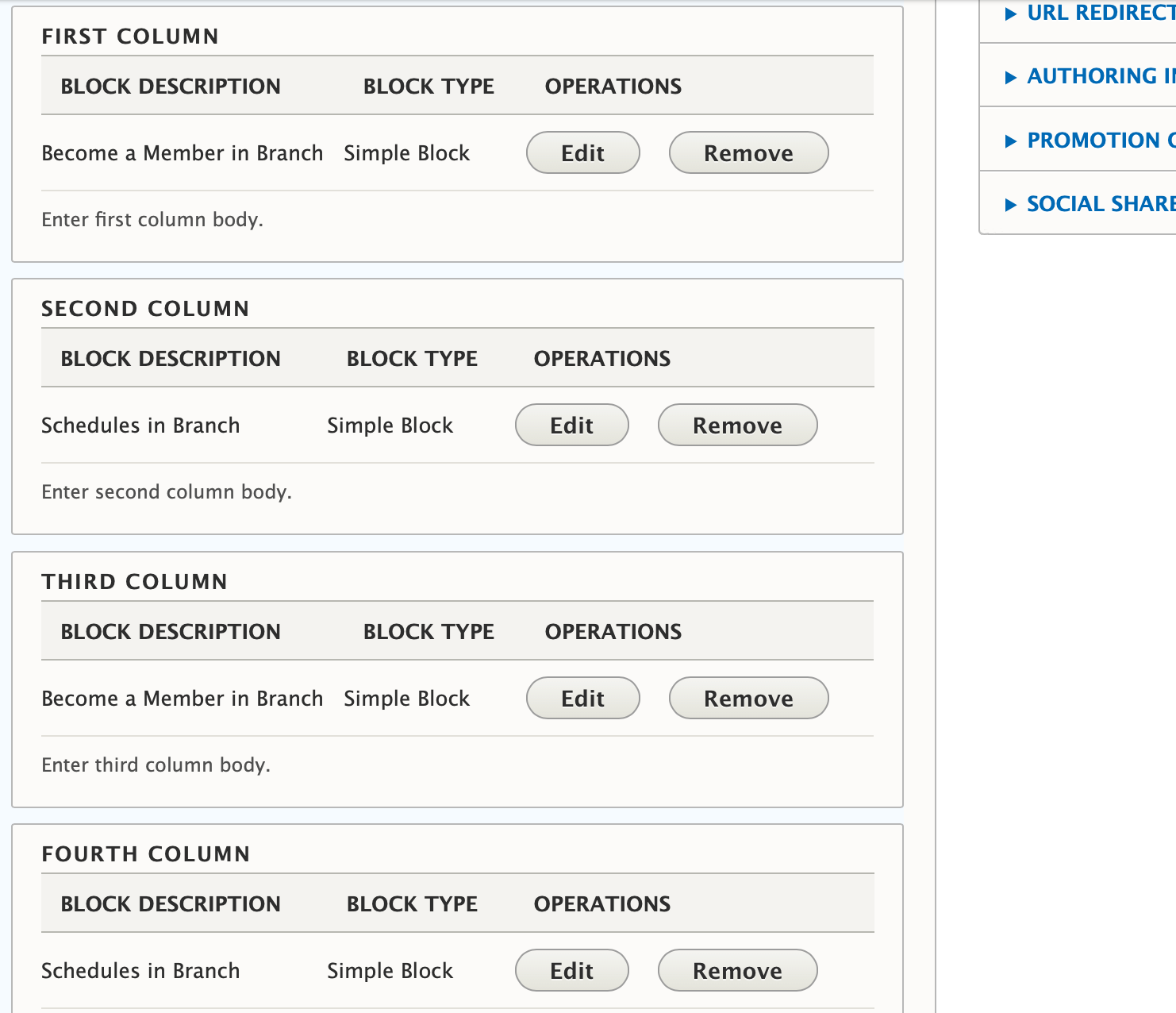
Need to fix a typo? Click the edit button next to each paragraph to open it back up and make edits.
Deleting Paragraphs
Maybe you didn’t need that section. Don’t worry: you can easily delete a paragraph by clicking on the remove option from the dropdown next to where it says “Edit.”
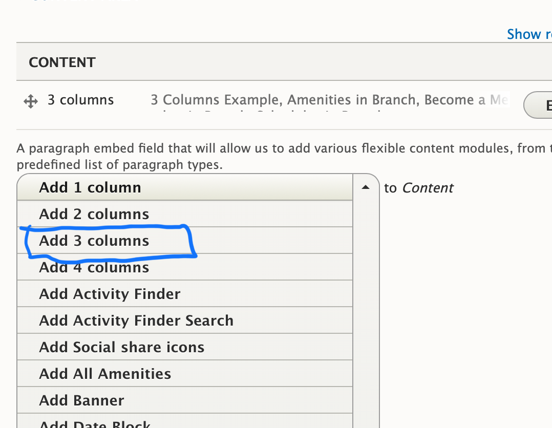
Choosing the Right Paragraph Type
YMCA Website Services comes with more than 50 paragraph types, and depending on your partner’s customizations, you may have even more. This documentation will focus the types that come out of the box with YMCA Website Services and how to use them.
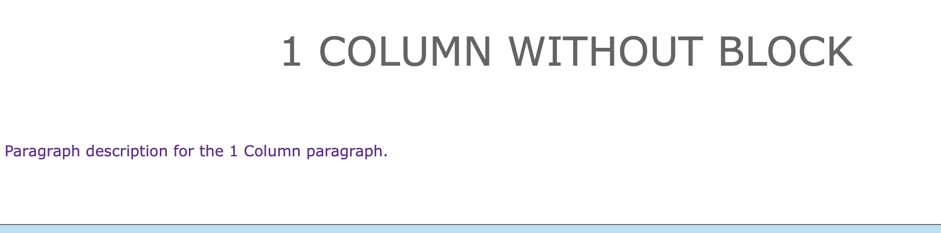
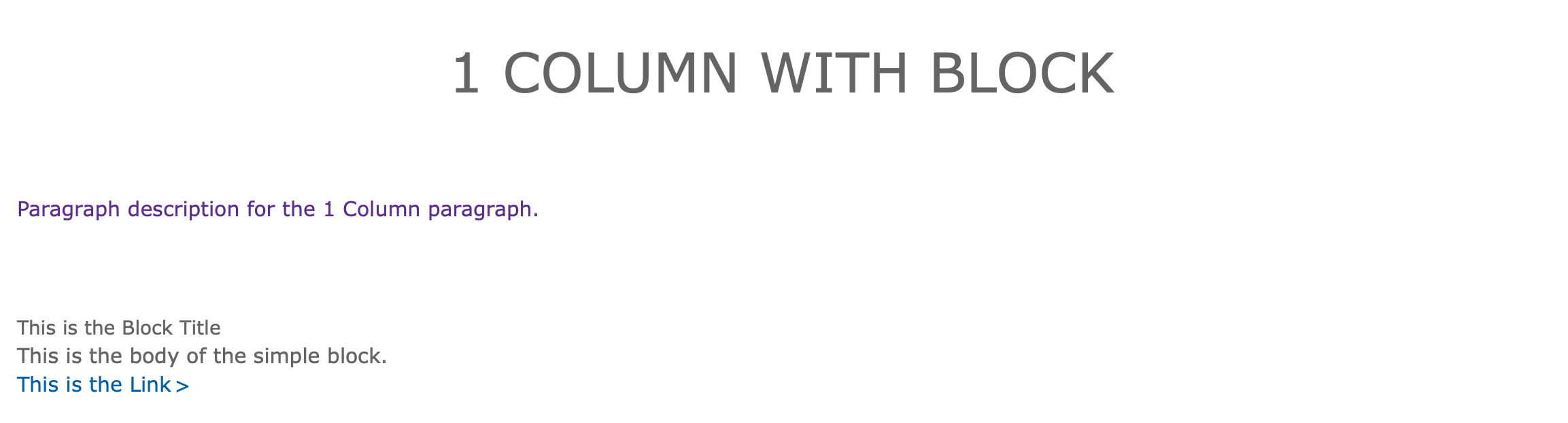
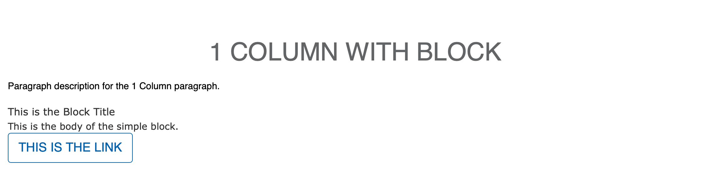
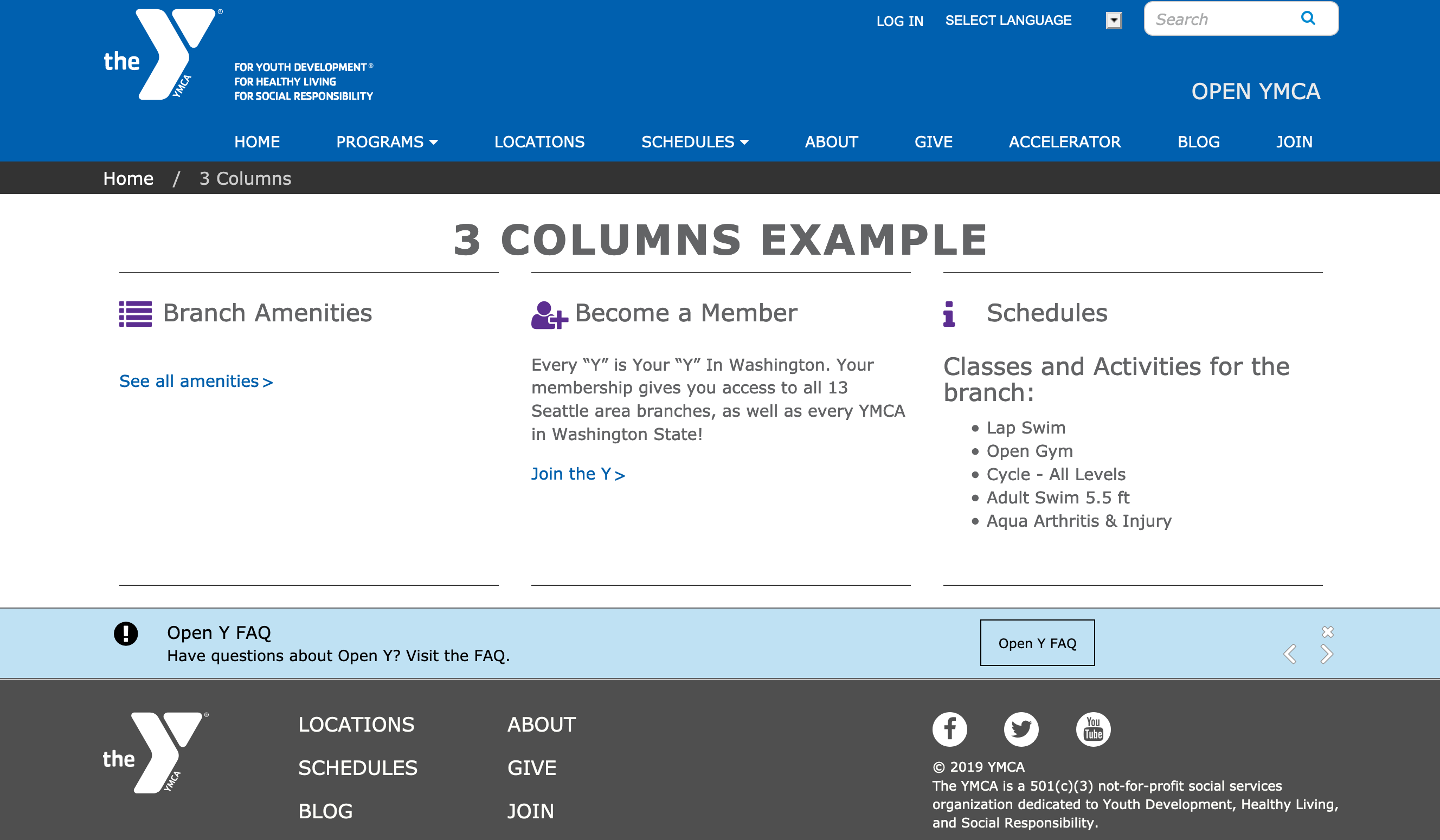
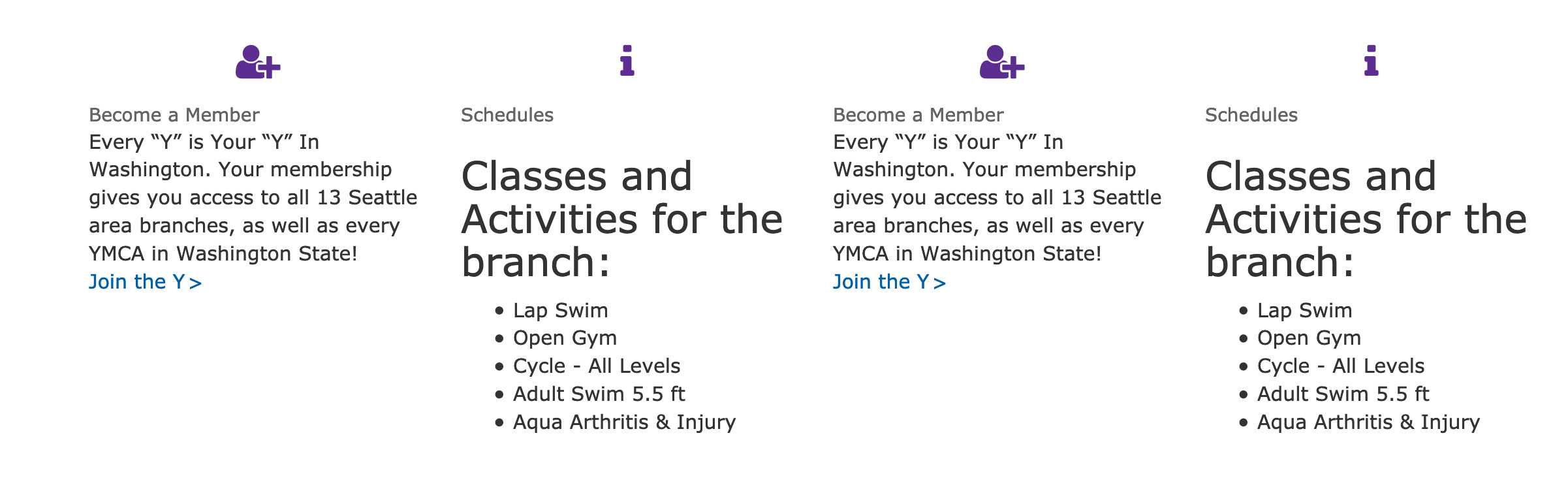
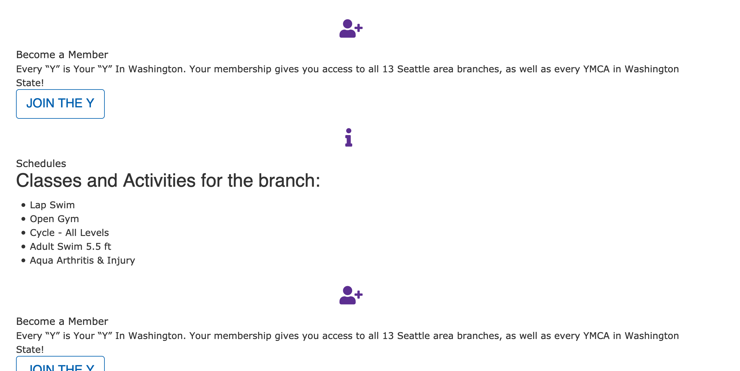
1 - 1 Column
Embeds a single column of content into an container, with an option to embed reusable content.
Examples
Rose - Without Block
Rose - With Block
Carnation - With Custom Block
Areas 1 Column Should Be Used
Content Area
Sidebar Area
Bottom Area
How to Use 1 Column
After selecting “1 Column” from the paragraphs dropdown, you will notice paragraph title field, a checkbox, and a required description.
Paragraph title adds an all-caps heading at the top of your paragraph. This is optional.
The checkbox adds dual horizontal rules. Check this only if you’re planning on using the paragraph title
Description (required) - Adds simple text
through a text editor. Font color defaults to purple in Lily and Rose.
Custom Block Feature
While the paragraph be used only with the fields above, 1 column also supports custom blocks of content. For this paragraph type, it’s recommended that users stick with “Simple block” types.
When adding your custom block, use the font-awesome icon class instead of the custom icon image field. In Carnation, the image option tends to get too large.
Content editors who want to edit this CSS can ask their developers to install the
CSS Editor module and edit their styles directly from the User Interface.
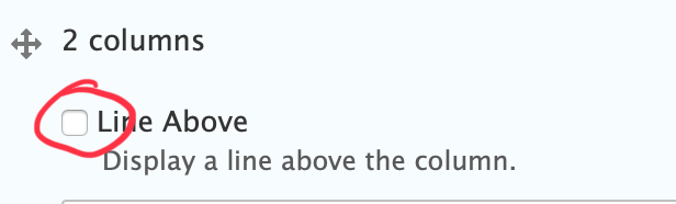
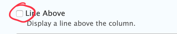
There is an optional checkbox to display a horizontal rule above the two columns.
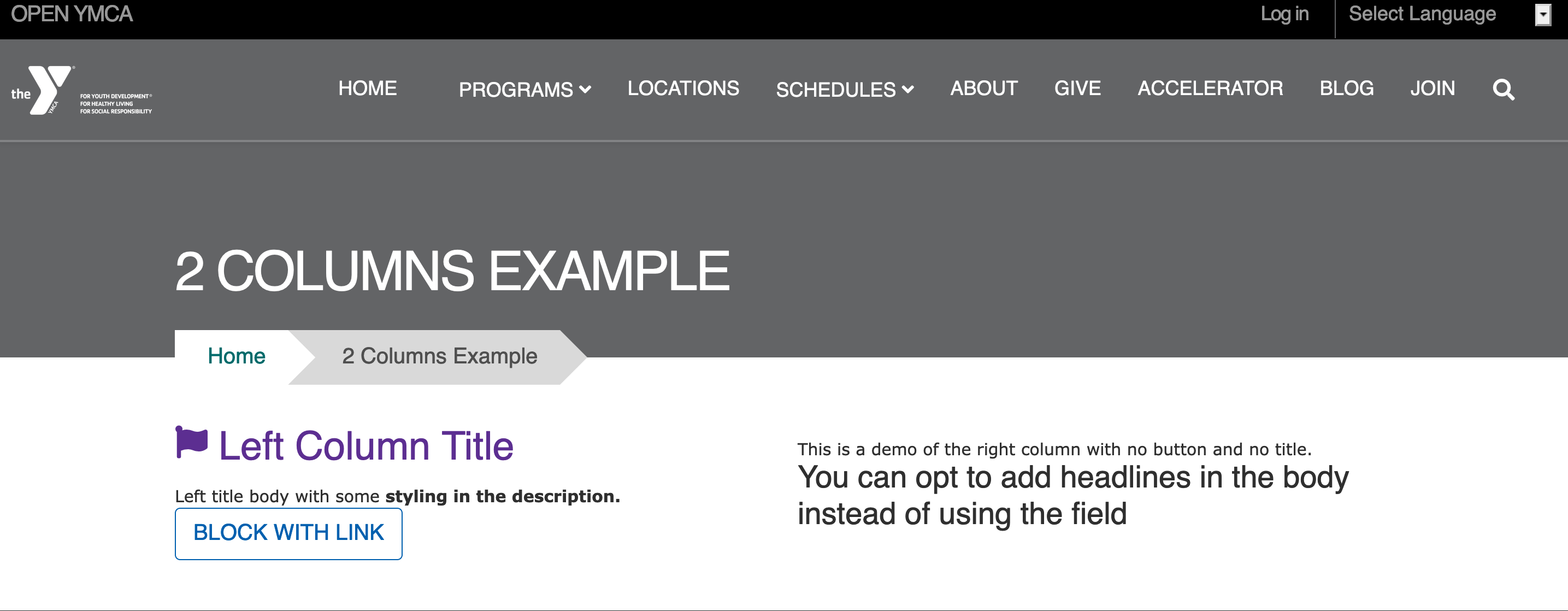
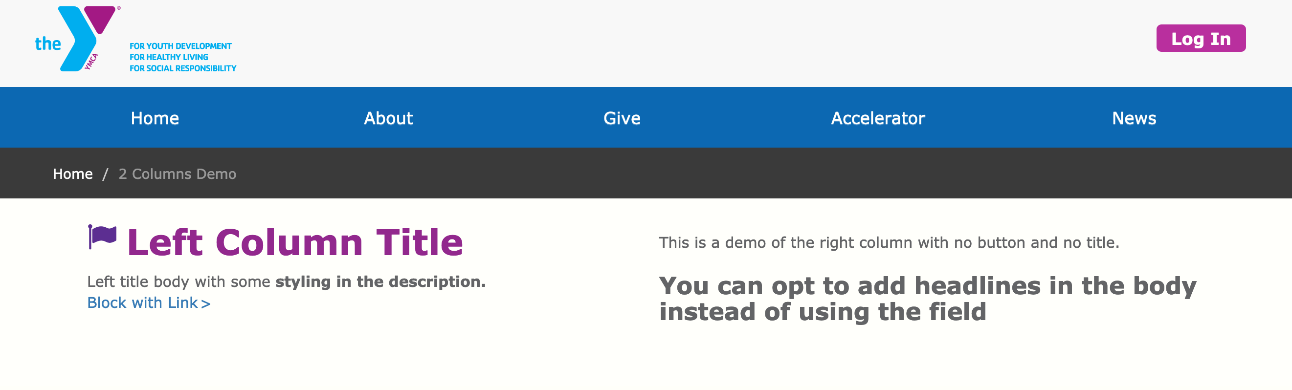
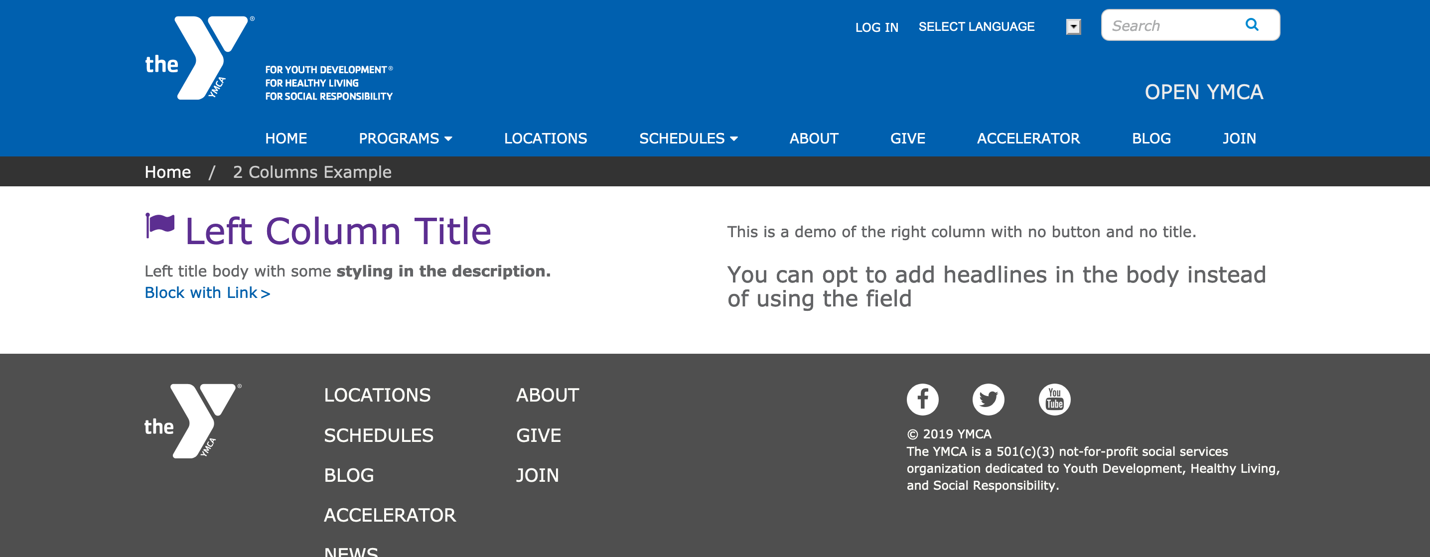
If you want to add multiple rows of content with 2 columns, add a new 2 columns paragraph for each set of two you want (e.g., if you have five blocks of content, add three 2 columns paragraphs).
If you want to add multiple rows of content with 3 columns, add a new 3 columns paragraph for each set of two you want (e.g., if you have seven blocks of content, add three 3 columns paragraphs).
Adding Headers to Individual Blocks
Out of the box, the Title field in each custom block renders as plain text. To work around this, add your headers in the text editor.
See Advanced below for details about how to fix this with CSS.
If you want to add multiple rows of content with 4 columns, add a new 4 columns paragraph for each set of two you want (e.g., if you have seven blocks of content, add two 4 columns paragraphs).
In all three themes currently in YMCA Website Services, the Title field displays in a font-size and color nearly identical to the body copy. To override, target .field-sb-title.
Carnation -> Columns stack in desktop
In order for this to work in Carnation, the .wrapper containing the column elements needs to be changed to .row; otherwise, each of the four columns expands to the full width of the Area it’s embedded in.
This paragraph type requires an integration into a CRM. See
Program Activity Framework for a list of existing integrations. Any other CRM will require custom developer work.
How you use these paragraphs will depend on how your Association has structured its program data on the CRM and on how you decide to get people to program results.
To start, add the Activity Finder Paragraph or Block to a page.
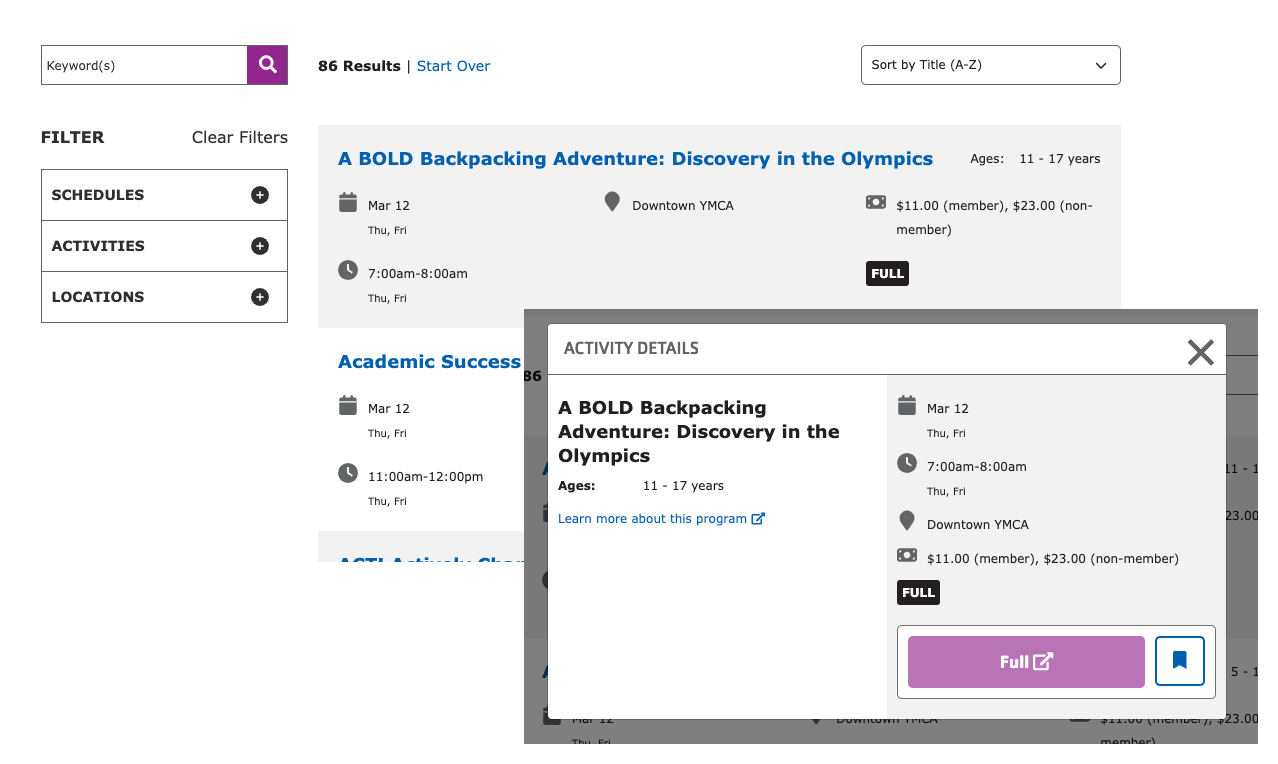
This paragraph provides similar functionality to the" “Location filter by amenities”, and is no longer recommended for use by the YMCA Website Services Core Team.
What It Does: Shows a list of branches with icons indicating, at a glance, which amenities are available at each branch. Includes a checkbox field to filter branches by amenities.
Areas Where it Should Be Used:
Content Area
Bottom Area
How to Use It
After selecting “All Amenities” from the paragraphs list, you can change the title that displays above the search checkboxes by entering text in the Title field.
Styling will differ greatly based on the theme. Use of this paragraph in Rose is not recommended.
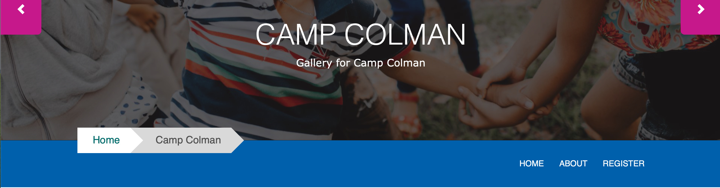
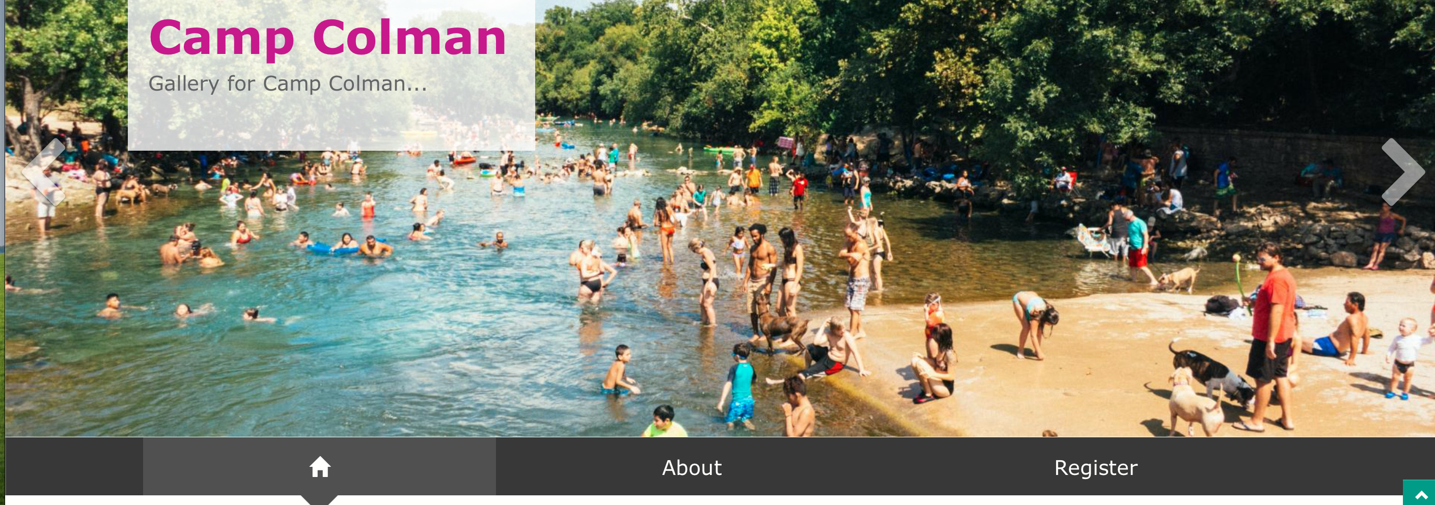
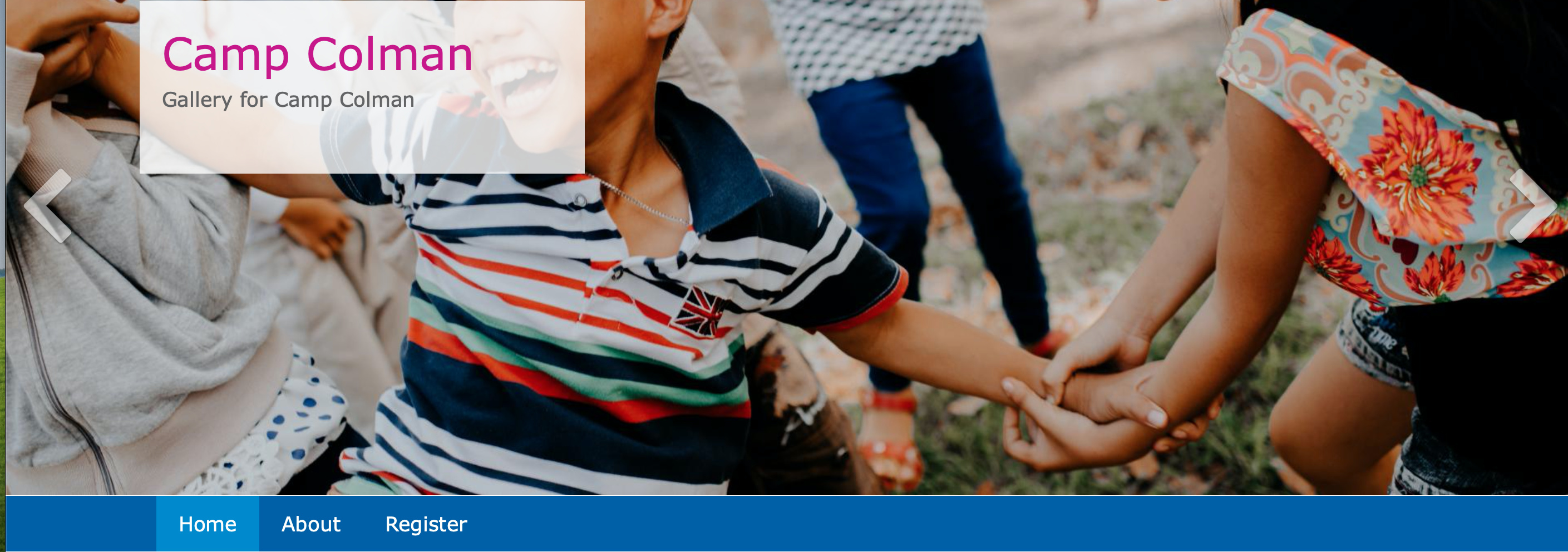
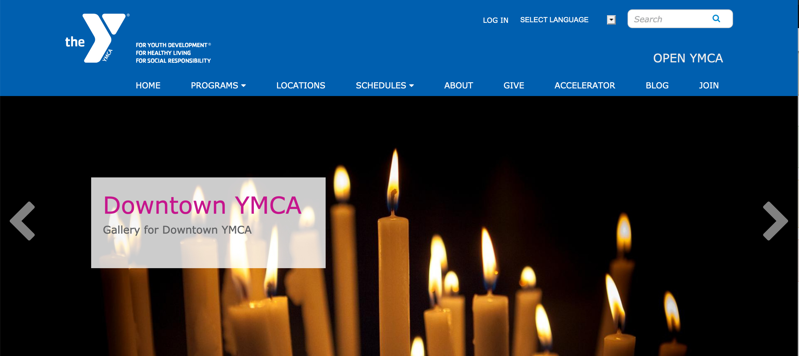
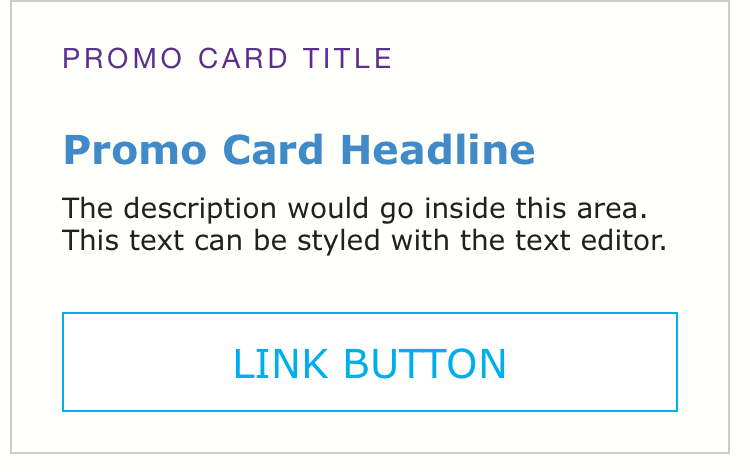
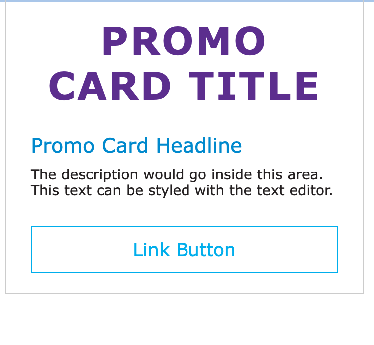
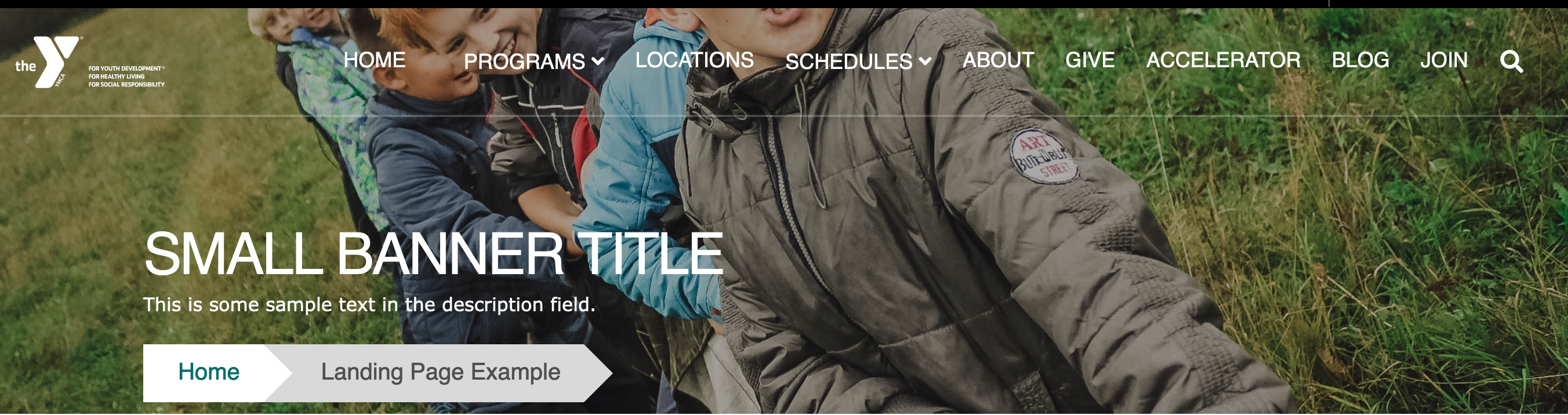
Add large, full width images to the top of your page, along with a title, optional description and optional link.
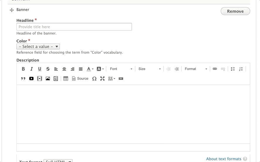
How to Use a Banner
In the Header Area of your content, select “Add Banner” from the dropdown. Then, fill out the following fields:
Title (required): This field adds a headline to your banner. The placement of the title will depend on your theme and customization, but it will typically appear as large, all-caps text.
Color (required): The background color for your banner. You typically will not see this color in Lily or Carnation, but in Rose, it will display behind your text. Choose from the list of available options.
Description (optional): Displays beneath your Title. You have the option to style your text using the text editor, but it’s not as consistent as other places where you typically see the editor.
Recommendation -> Just enter basic text and don’t do anything beyond basic styling, such as bold or underline.
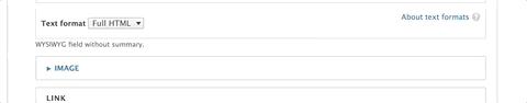
Image:
Use the image library to embed an image. You can upload a new image from your computer or reuse an existing image from your library. The image field is optional, but recommended.
For recommended image sizes for your YMCA Website Services site, talk to your agency partner.
How to add/edit images >
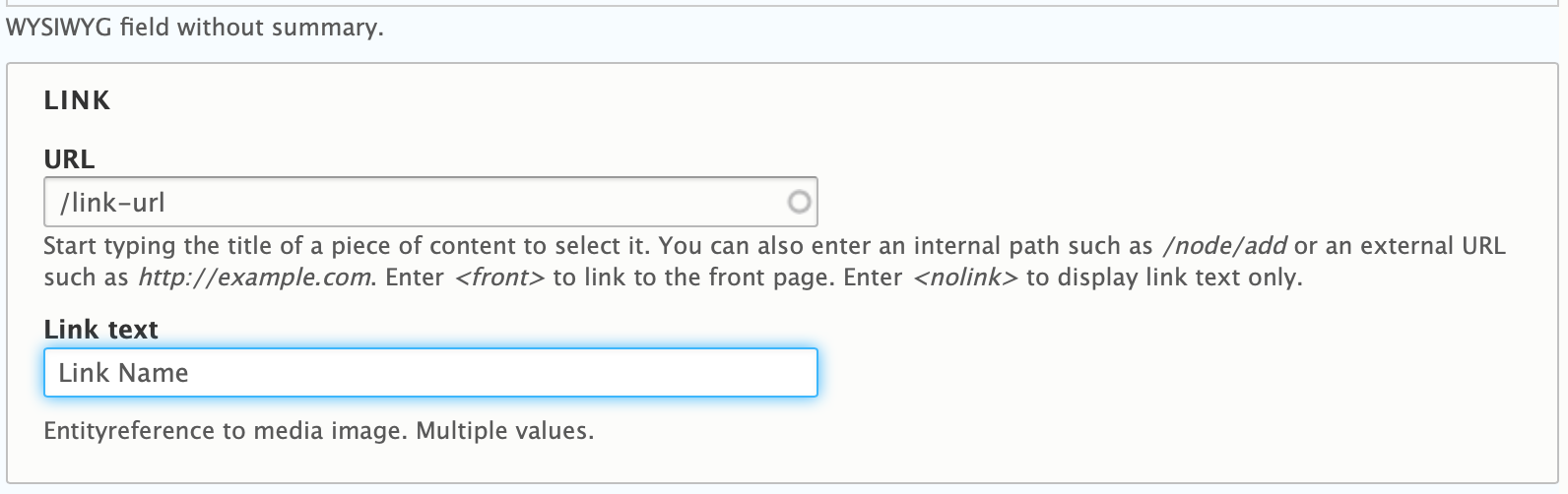
Link/Button: Add a URL and a link to the button on the page. The button on your banner cannot be styled without custom CSS/code.
Using link/button fields ⇒
Note: If you know a little CSS, you can have your agency partner
install the CSS Editormodule, and you can target .btn.banner-btn to change the default button.
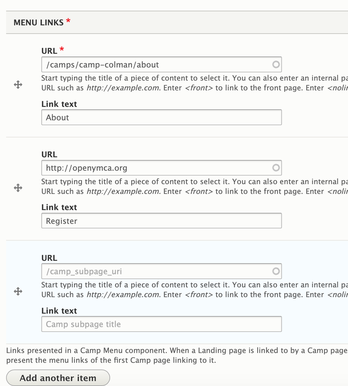
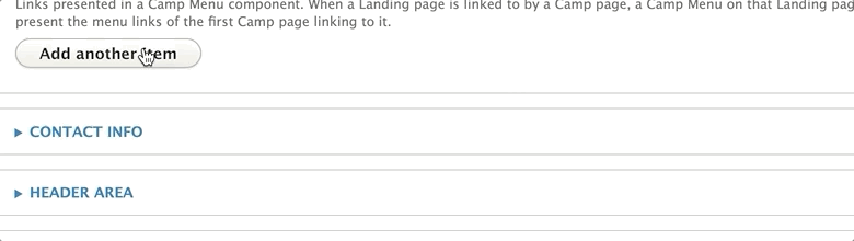
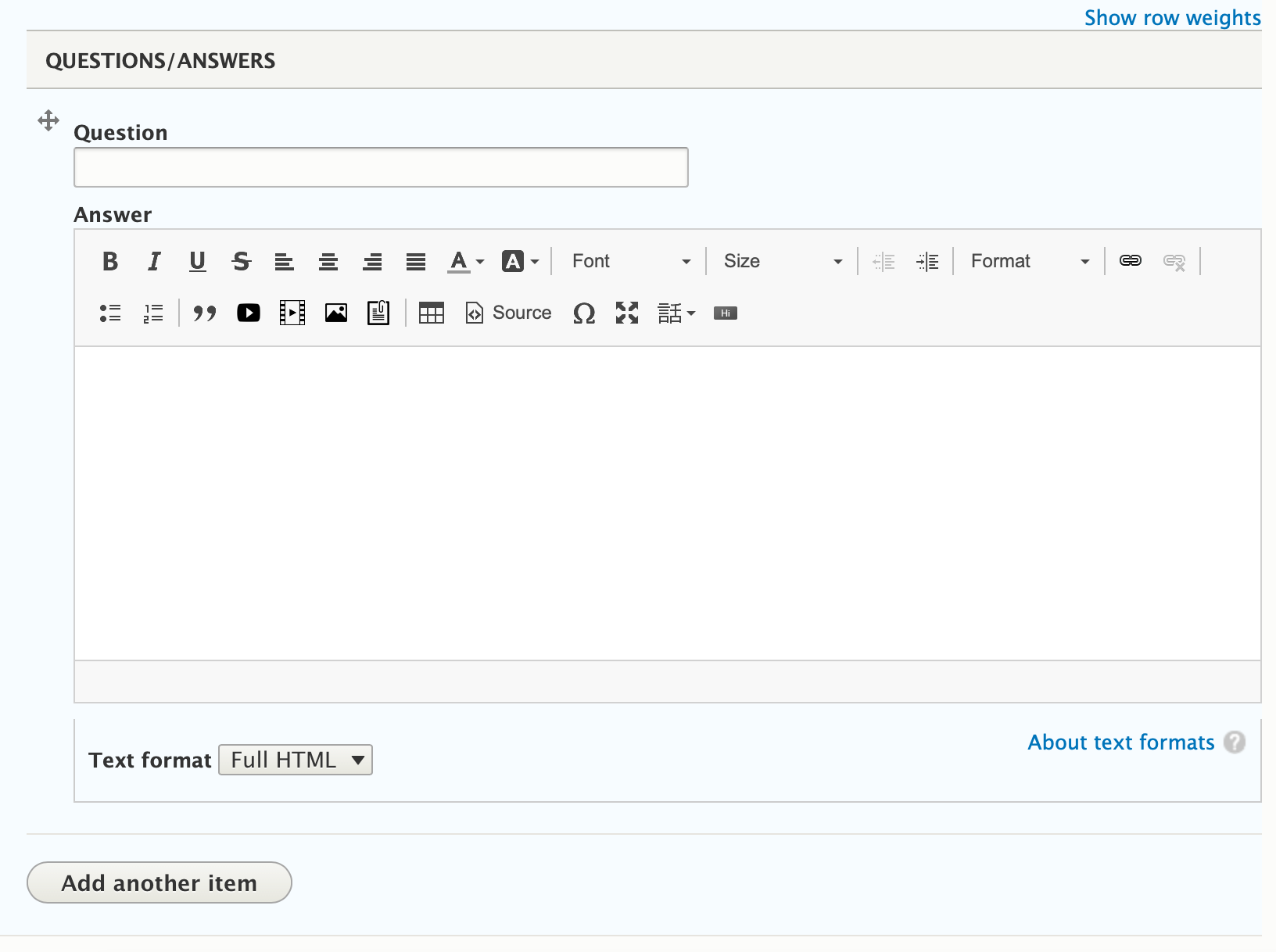
To add additional links to your menu, click on the Add Another Item button.
Once you’re done adding your menu links, scroll down to the Header Area and add “Camp Menu.” Click save.
Note - While it is technically possible to position the camp menu above your banner image, it is not recommended. The camp menu busts in desktop on Carnation, and in all themes it can be hard to distinguish the camp menu from your main navigation.
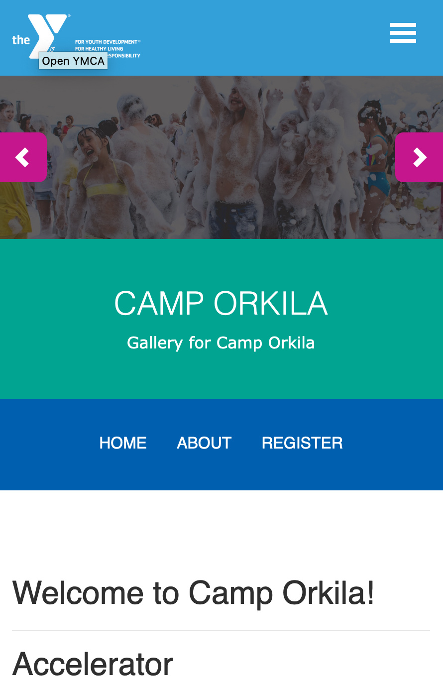
Mobile Considerations for Camp Menu
When a user views your camp menu in mobile, the menu doesn’t collapse; it merely shrinks. Menu items either disappear or wrap onto a new line if they do not fit the space.
It’s recommended you limit your menu items to no more than 3 or 4 unless you opt to customize.
This paragraph can only used on programs pages that have
subcategories tied to them. If a program has no subcategories tied to it or if it’s used on another content type, it will not work.
When you add your block, you will see a blank, unformatted text field. Type your HTML text into this field.
To use code, you must add HTML tags.
Hard returns will be ignored, and text will be printed out in one long string.
Code will not highlight or color-code your HTML.
There is an option to change to a “Full HTML” text editor, which will allow you to make use of the default text editor; however, using this will strip “faulty” HTML out of your block and may prevent you from using certain tags.
Once you’re done, click the button that either says Add custom block or Update custom block, depending on the option you had selected at first.
Schedule different sections to show or hide on your pages.
Areas It Should Be Used
Header Area
Content Area
Sidebar Area
Bottom Area
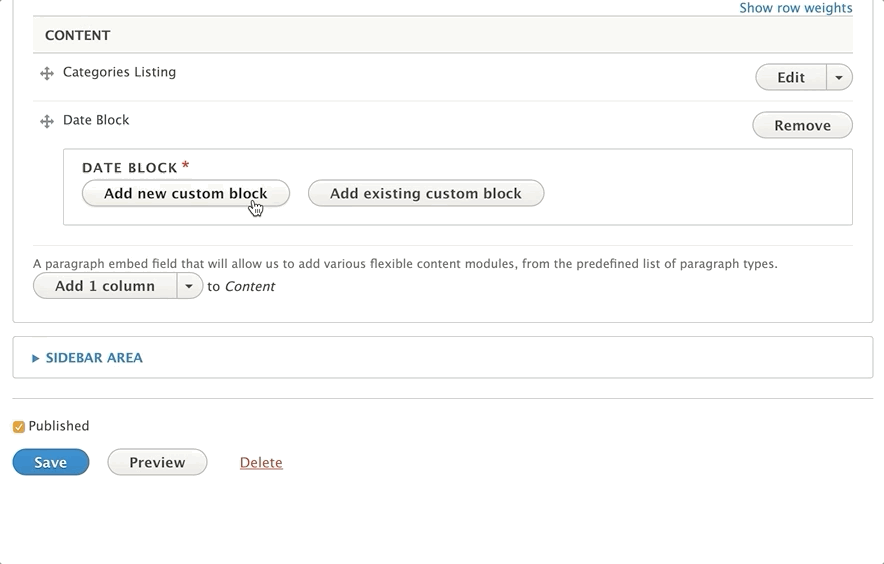
How To Use Date Block
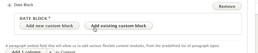
Pick Add Date Block from the list of paragraphs in the dropdown. You will see two options: add a new custom block or add an existing custom block.
Add New Custom Block
If you’re using Date Block for the first time or creating a new date block, choose the Add New Custom Block option.
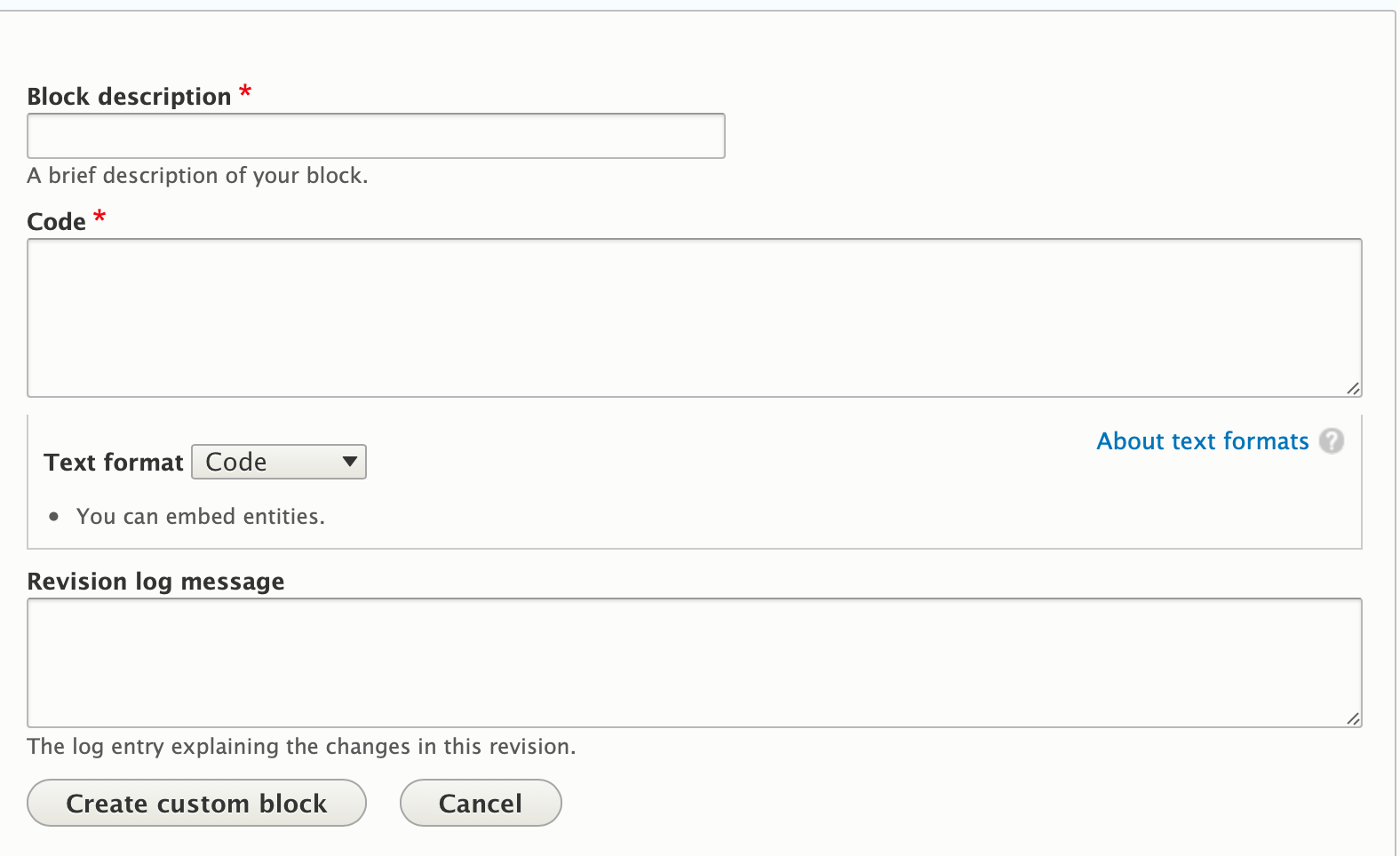
Enter a label for your date block in the block description field. If and when you’d like to reuse this section on multiple pages, this is what you’ll use to search for it.
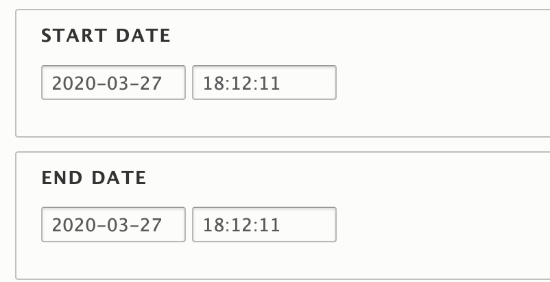
Below the block description field, you will enter a start date and an end date for your block. This schedules content in your date block to publish and unpublish, just like with a content type.
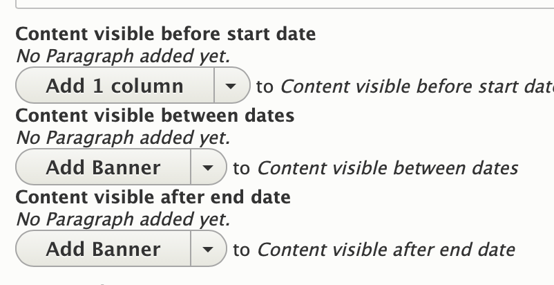
Below this you can add in paragraphs to display Before, During and After your scheduled dates. Add paragraphs into these fields as you normally would.
If you don’t want content to display before, during or after your time period, leave it blank.
Hit “Create custom block” to add your block.
Add Existing Custom Block
To reuse a date block you’ve previously created, click the “Add Existing Custom Block” button.” Enter the description of your block into the autocomplete field. Select your block from the options to drop it in.
Editing a Date Block
To edit your block, click “edit” next to the paragraph. You will need to click another “edit” button when the name of your date block appears.
Make your changes inside the block and, when you’re done, click “Update Custom Block.”
Making any changes to a date block will change it on every page where it has been added.
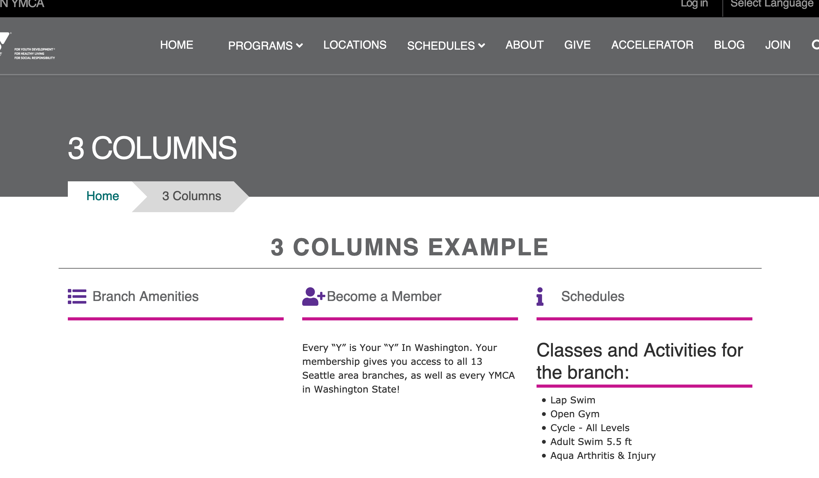
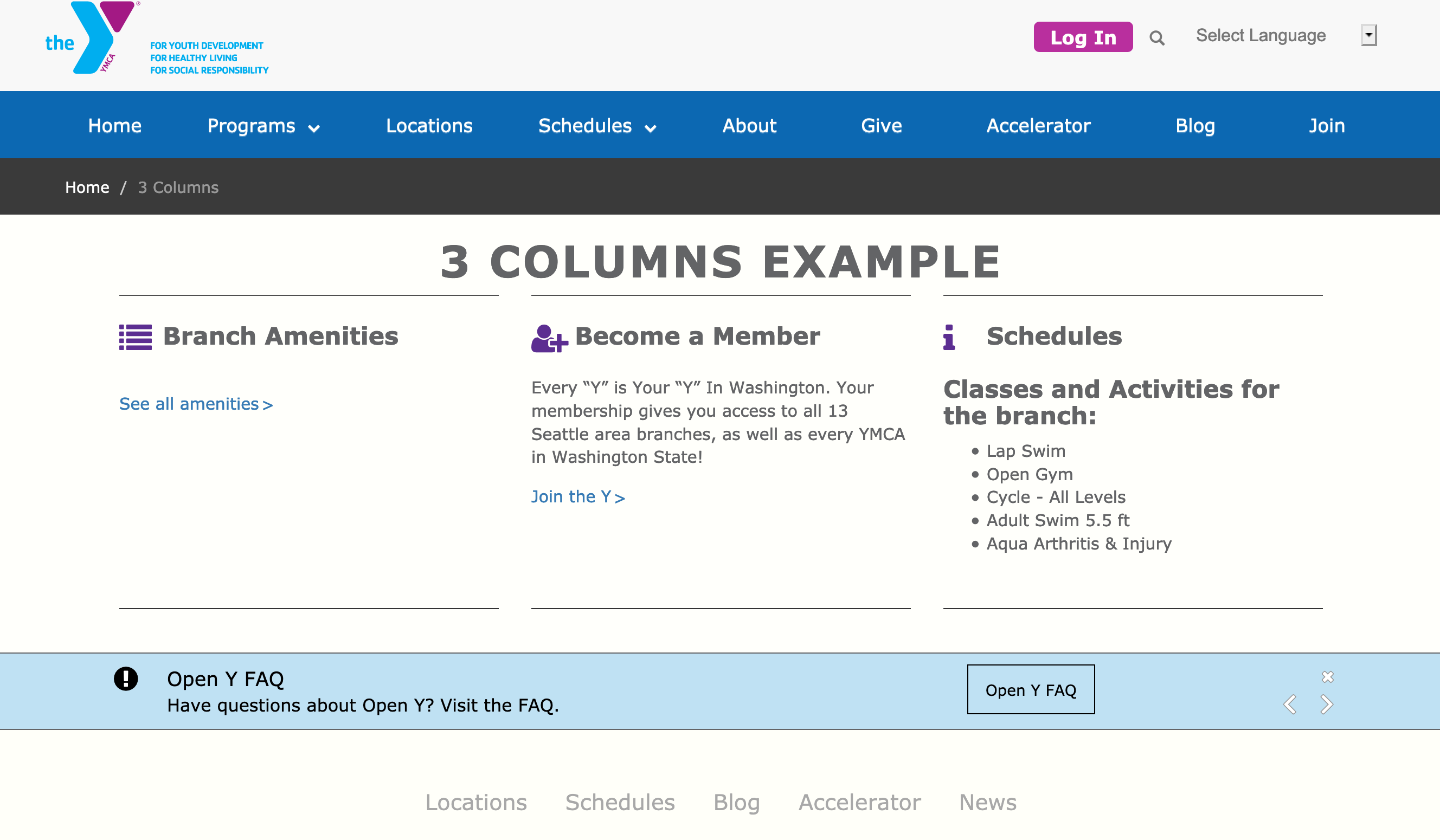
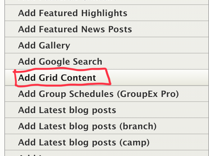
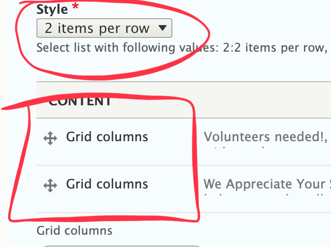
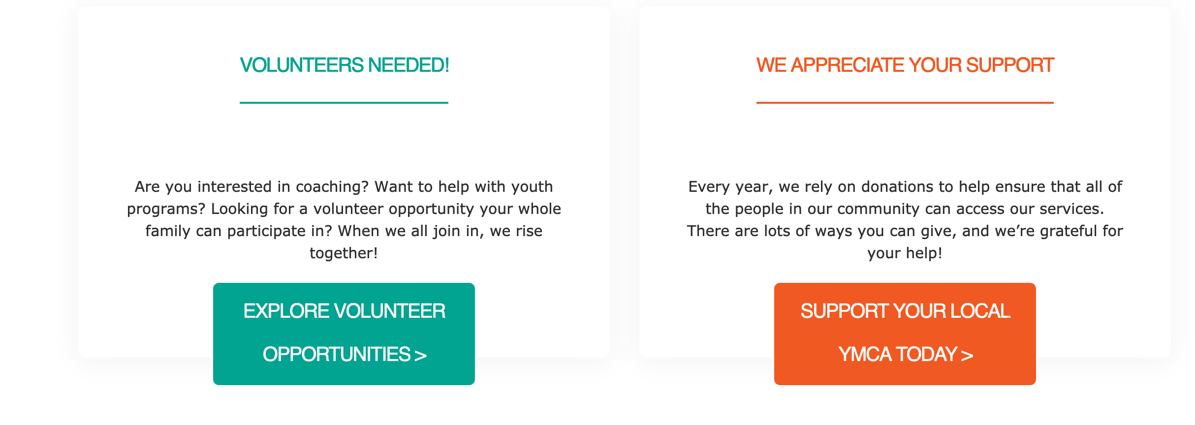
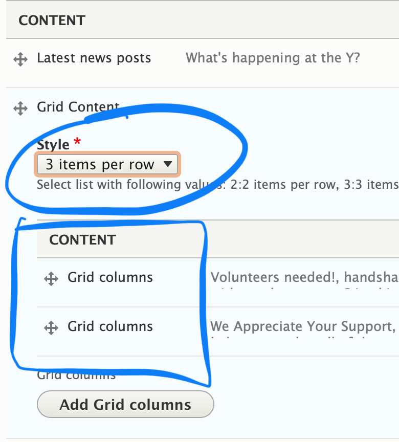
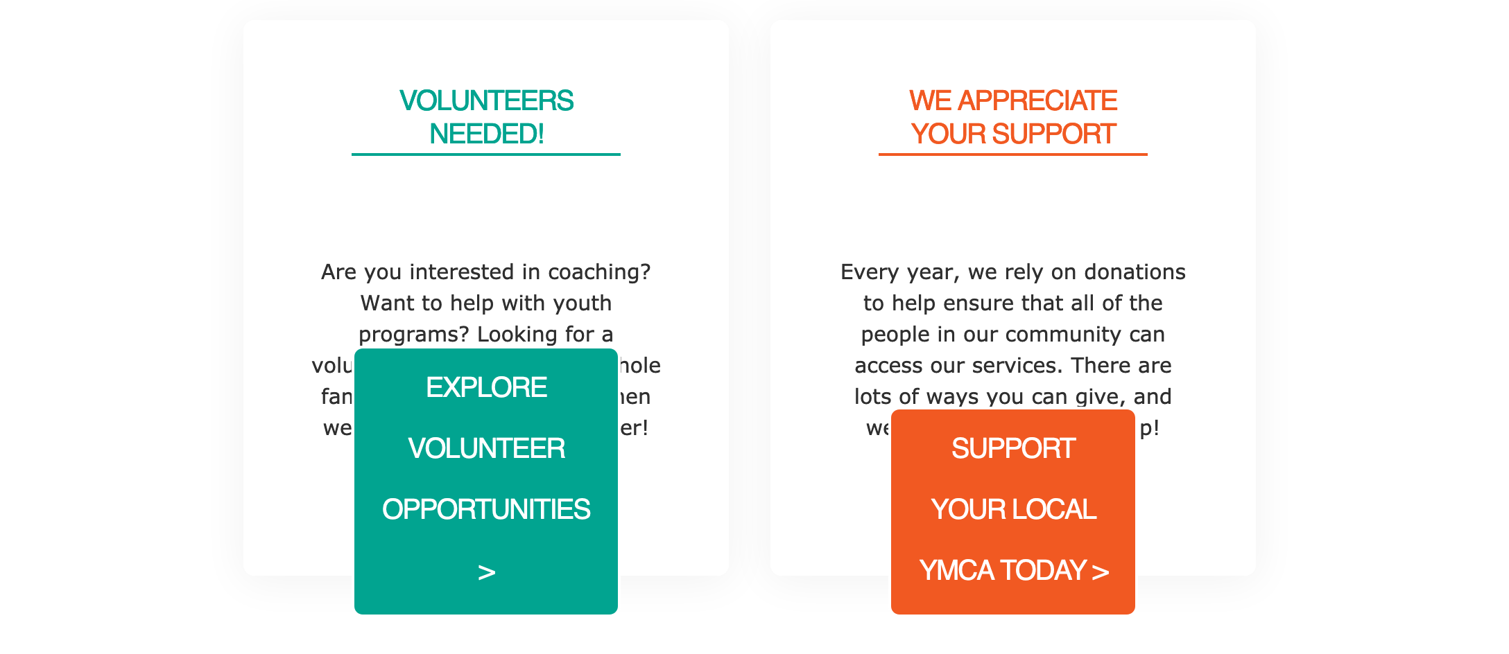
Select the number of columns you would like to have in each row using the style dropdown.
Carnation: Due to the card styling in Carnation, this field does not limit the number of cards that will display in a single row. A recommended workaround is to add multiple rows of featured content or
use the Grid Content paragraph type.
Advanced users: You can clear the confusion for content editors in Carnation by making the style field an optional field and hiding it in the form display in the UI.
Additionally, you can limit the number of columns to four in the Featured Content’s paragraph settings.
Finally, add content for each column of content using the text editor. To add additional columns click the “Add Another Item” button.
Lily/Rose: Adding more columns than what you selected in the “Style” dropdown will create additional rows. Aligning each column’s content is not recommended unless you are not using any other field.
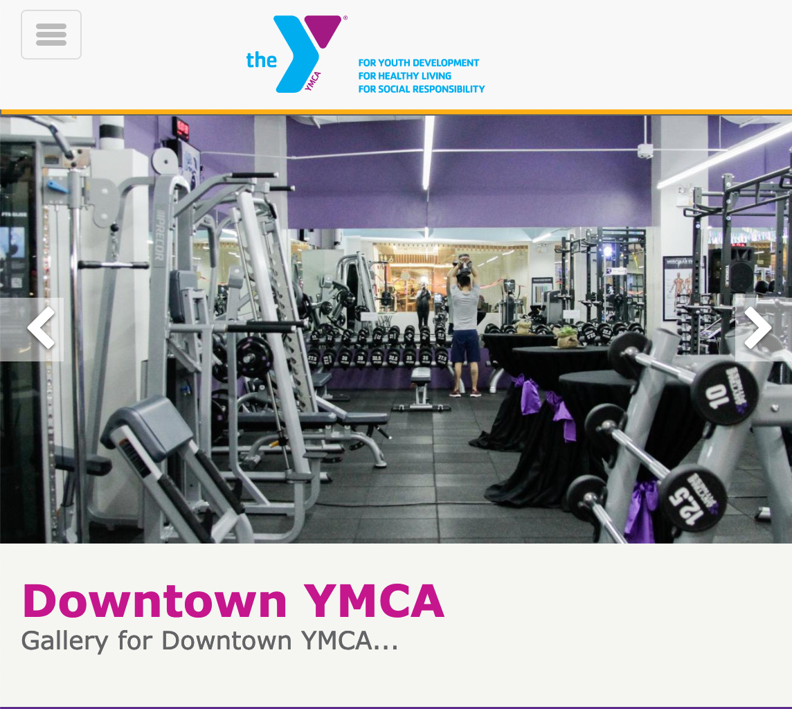
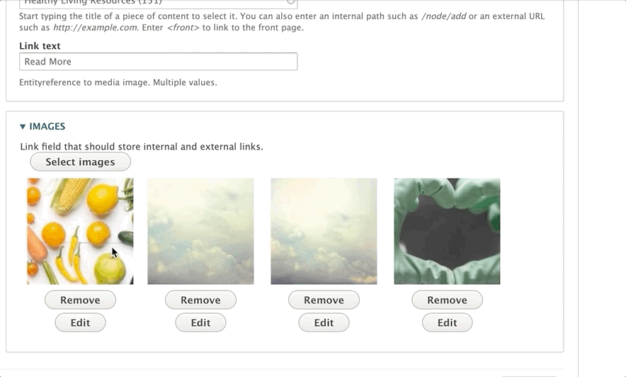
Below the link field, you will add your images. Click on the Add images button to select the pictures for your gallery. You can upload an image to the media library, or select multiple images from your library.
Once you’ve uploaded/selected your images, click that blue Add images button at the bottom.
To order your images, hover your mouse over the thumbnail in the “Images” section, and then drag them to reorder. You will see a cross-arrow icon when you’re dragging them around, similar to what you see when you reorder paragraphs.
To delete a photo from the gallery, click the delete button below the image.
Description - A standard text editor field. Because of how each grid content item styles, it’s recommended that the text in this field be shorter than 200 characters.
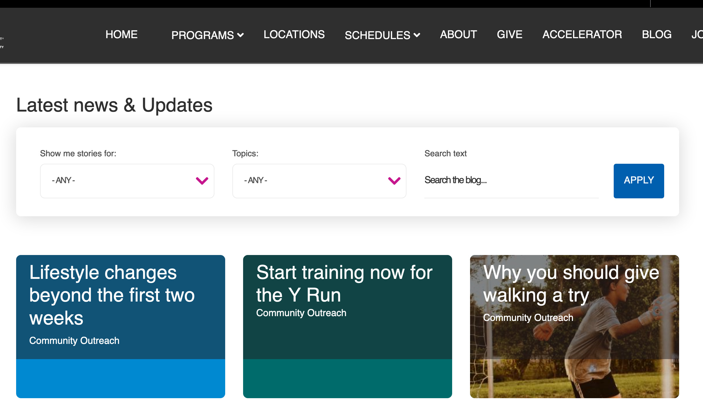
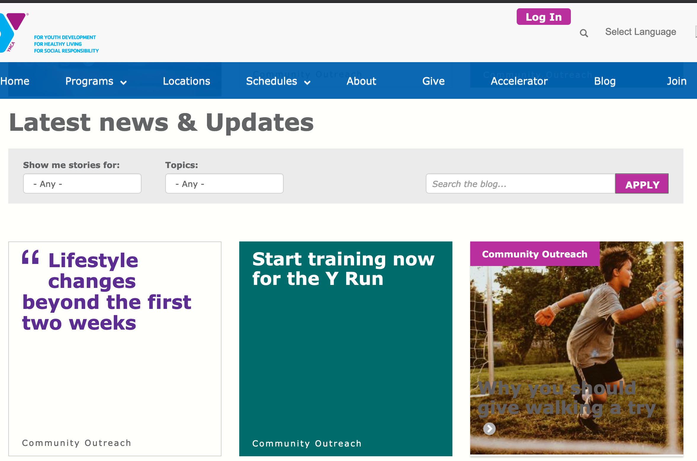
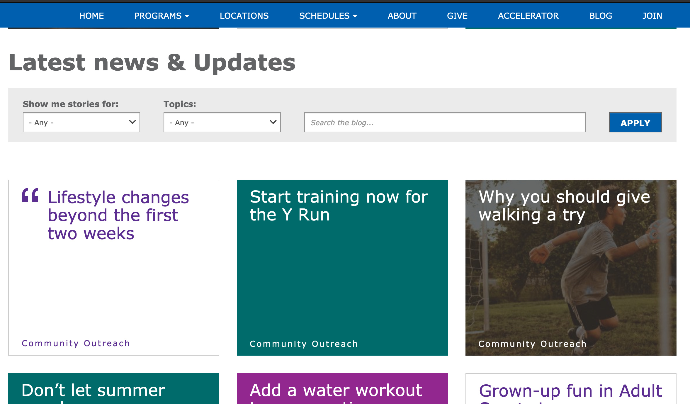
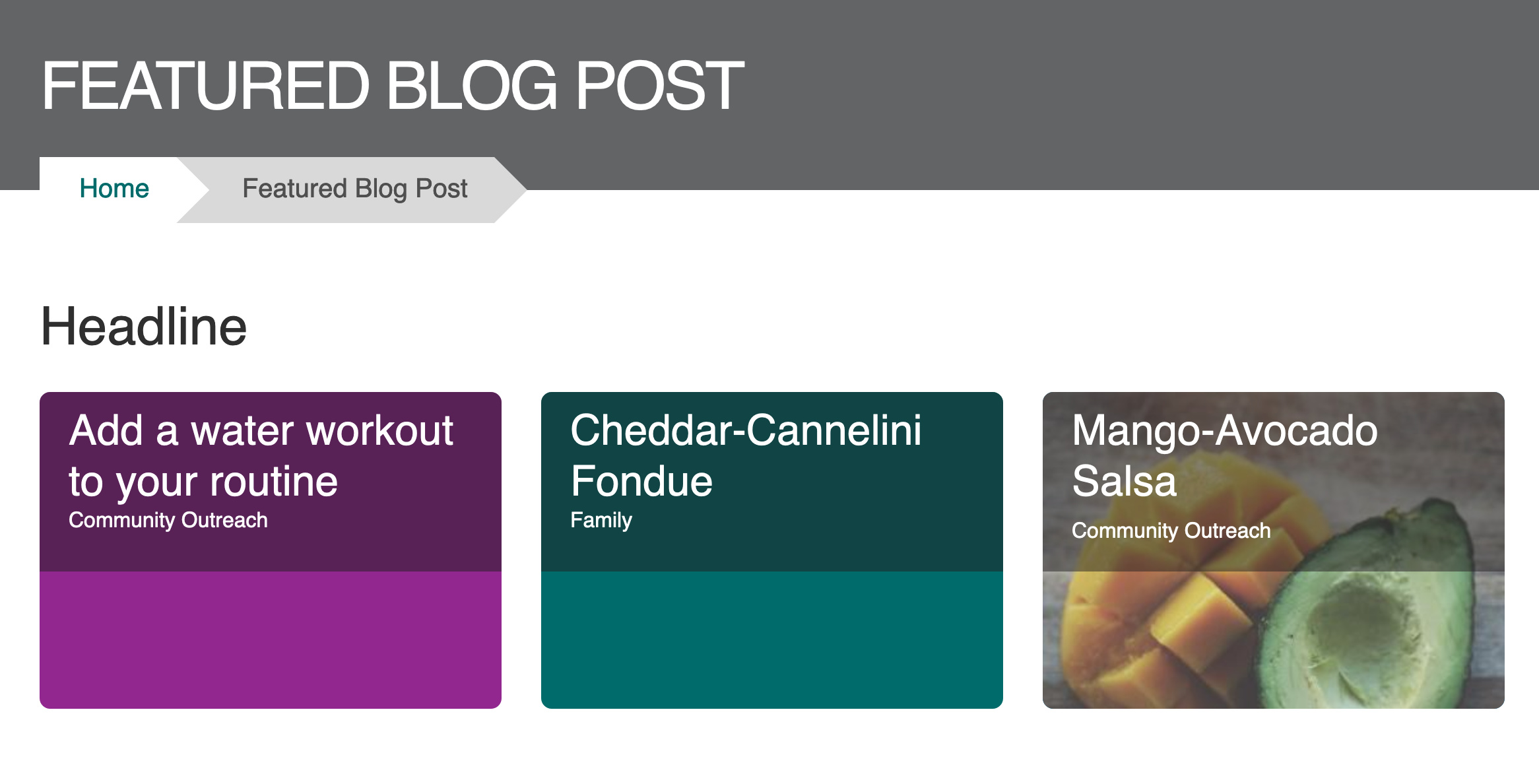
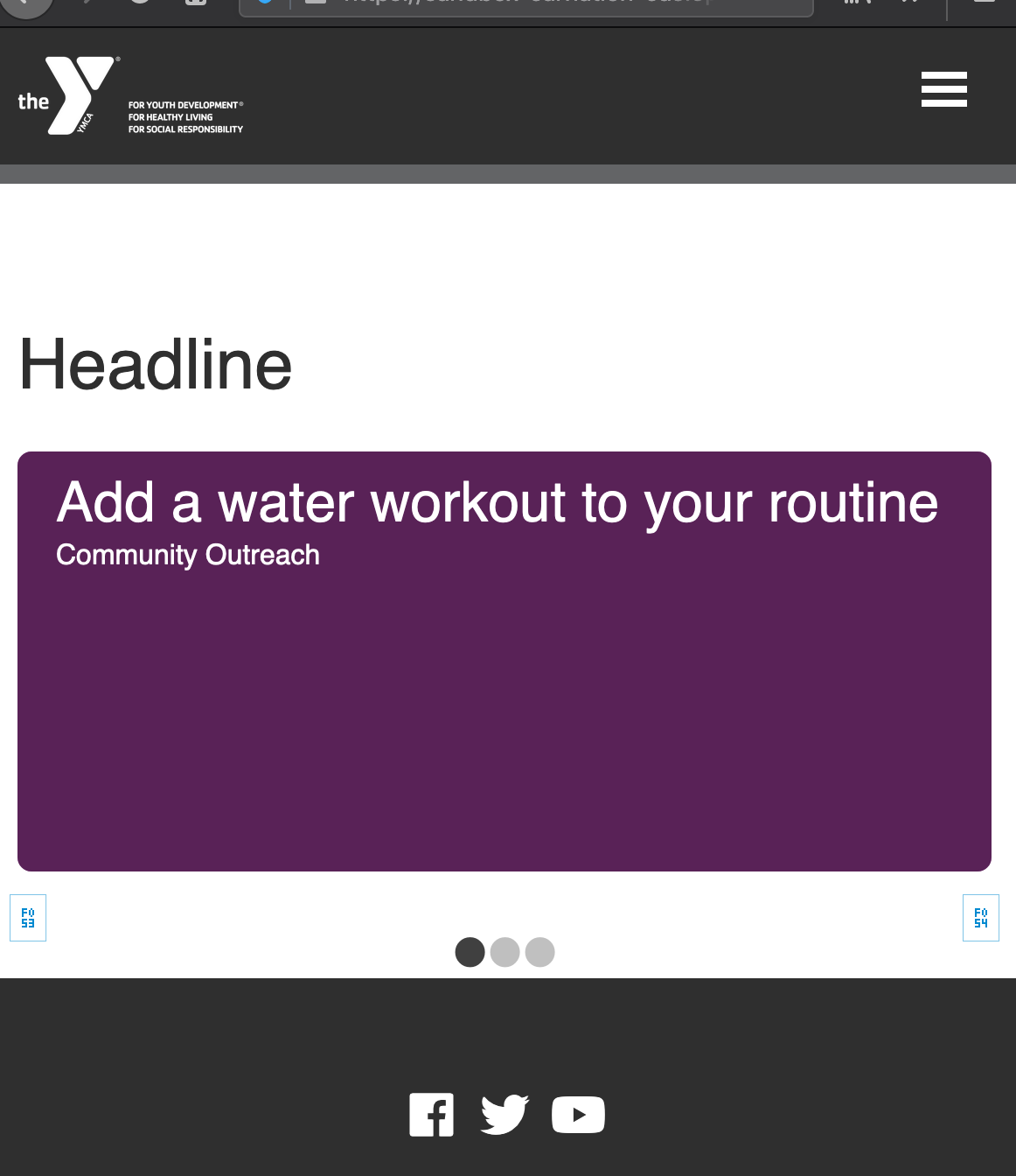
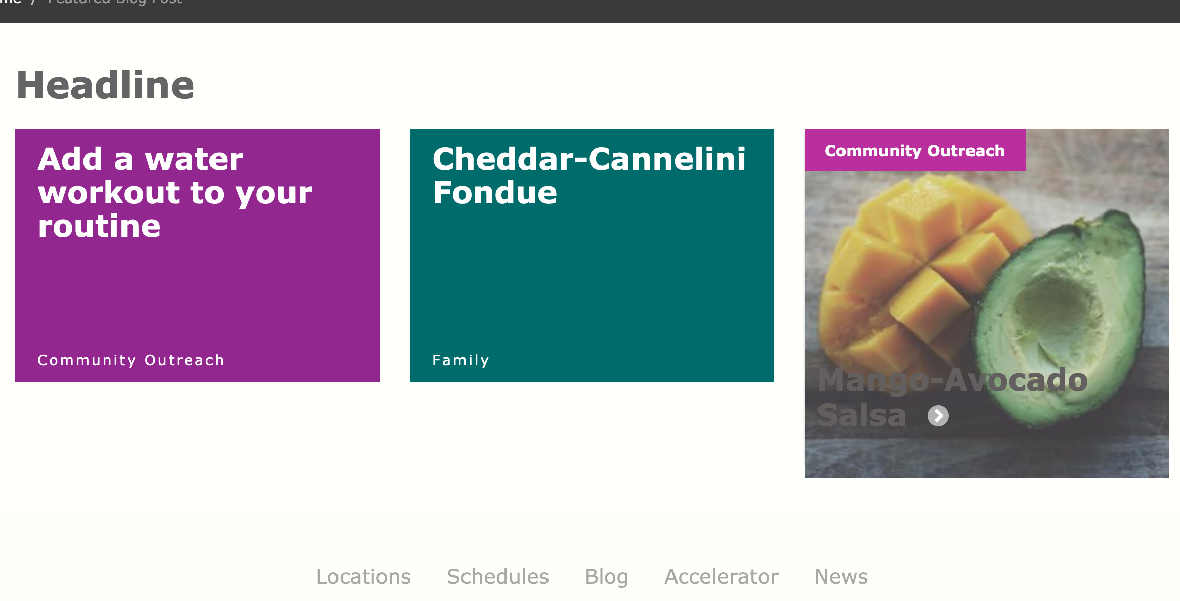
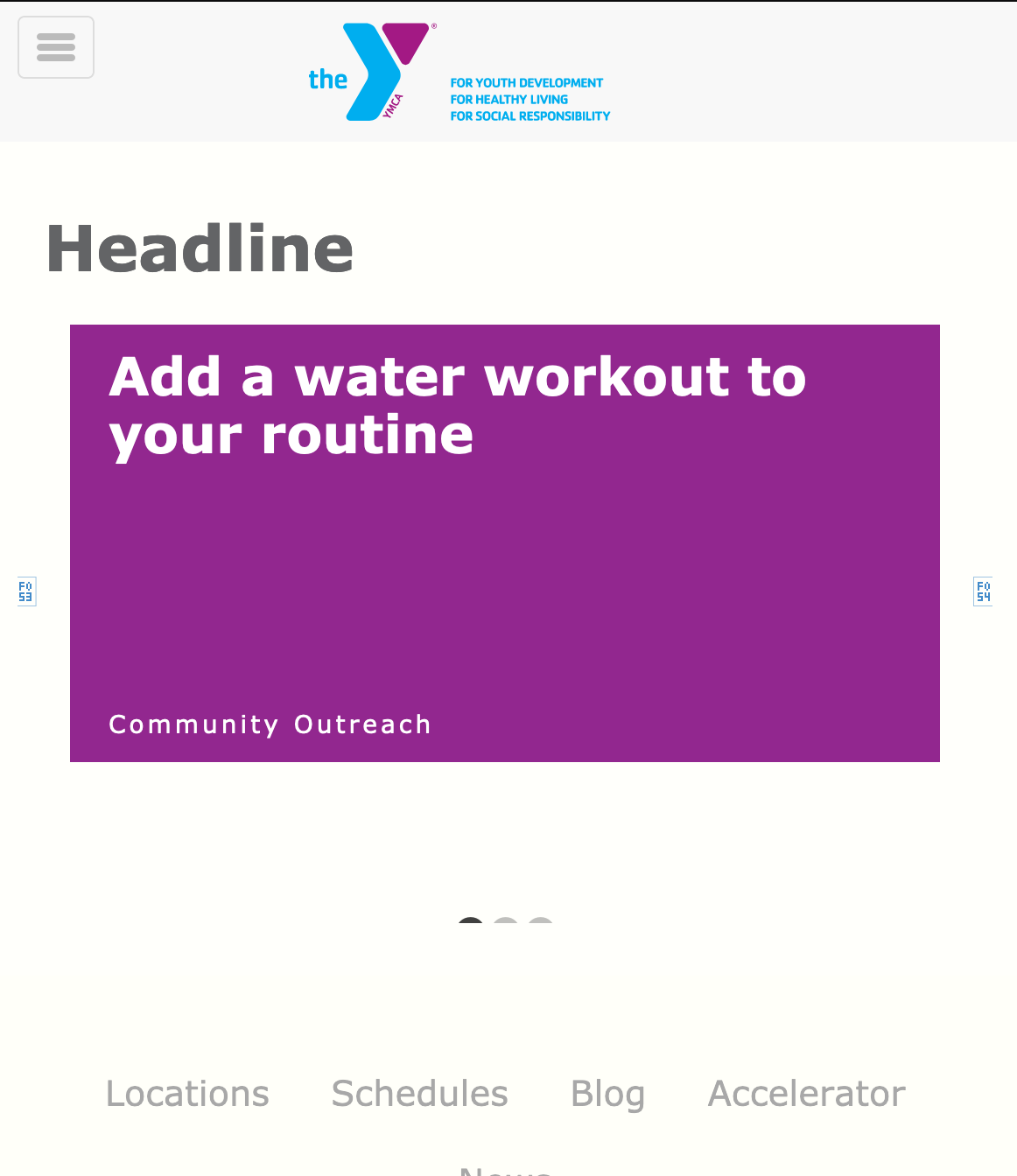
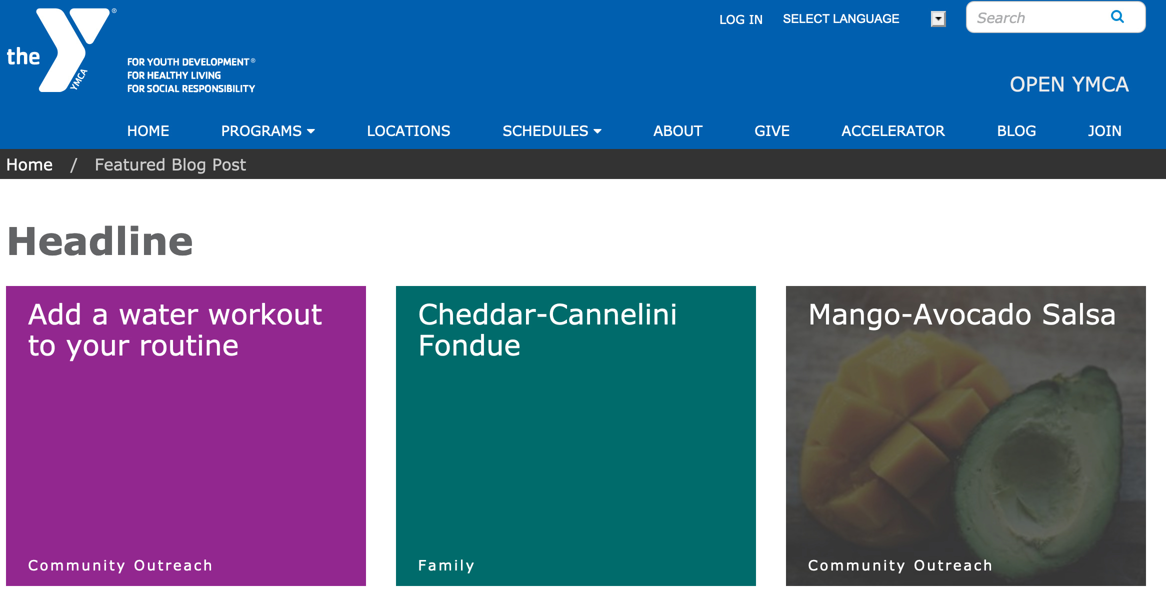
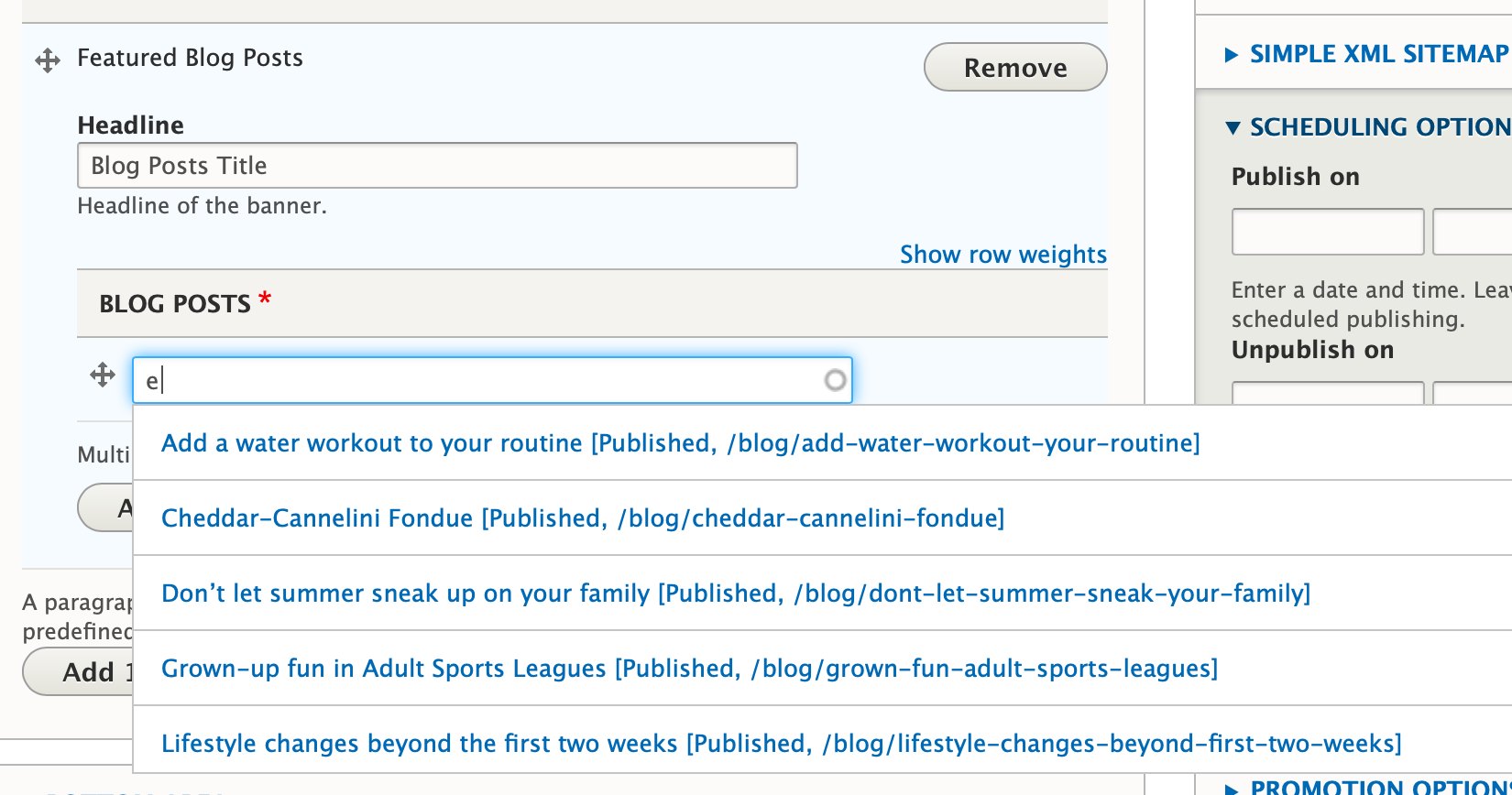
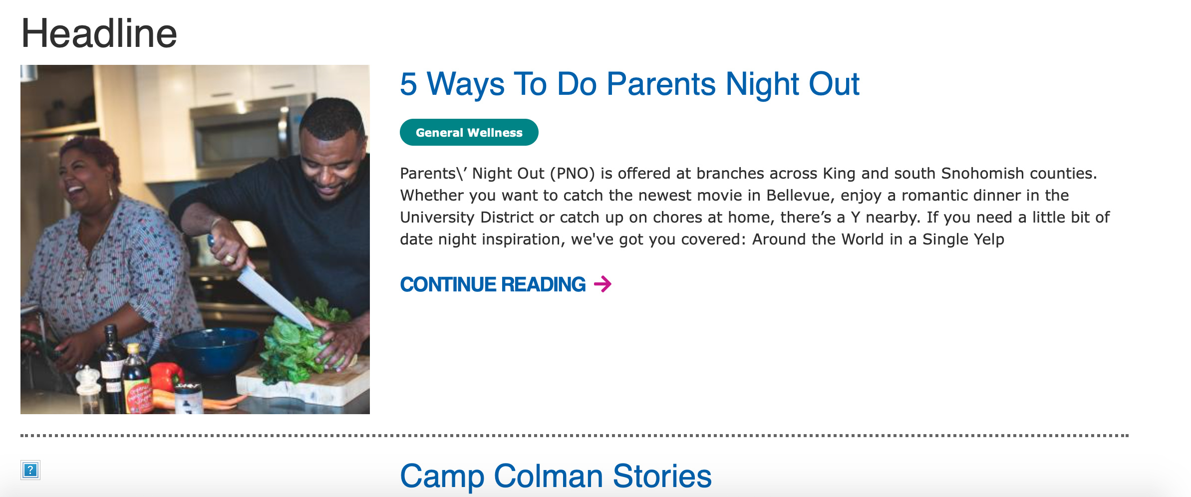
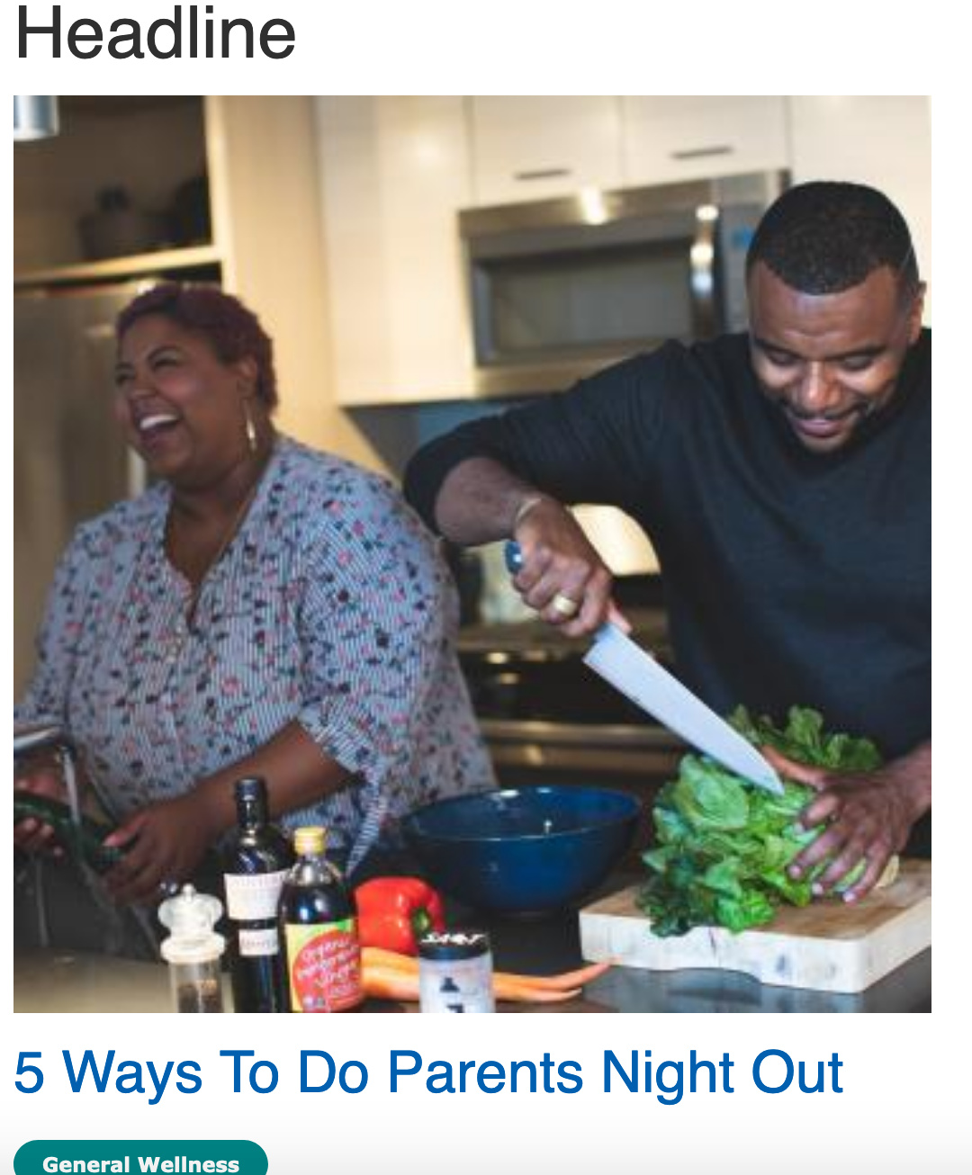
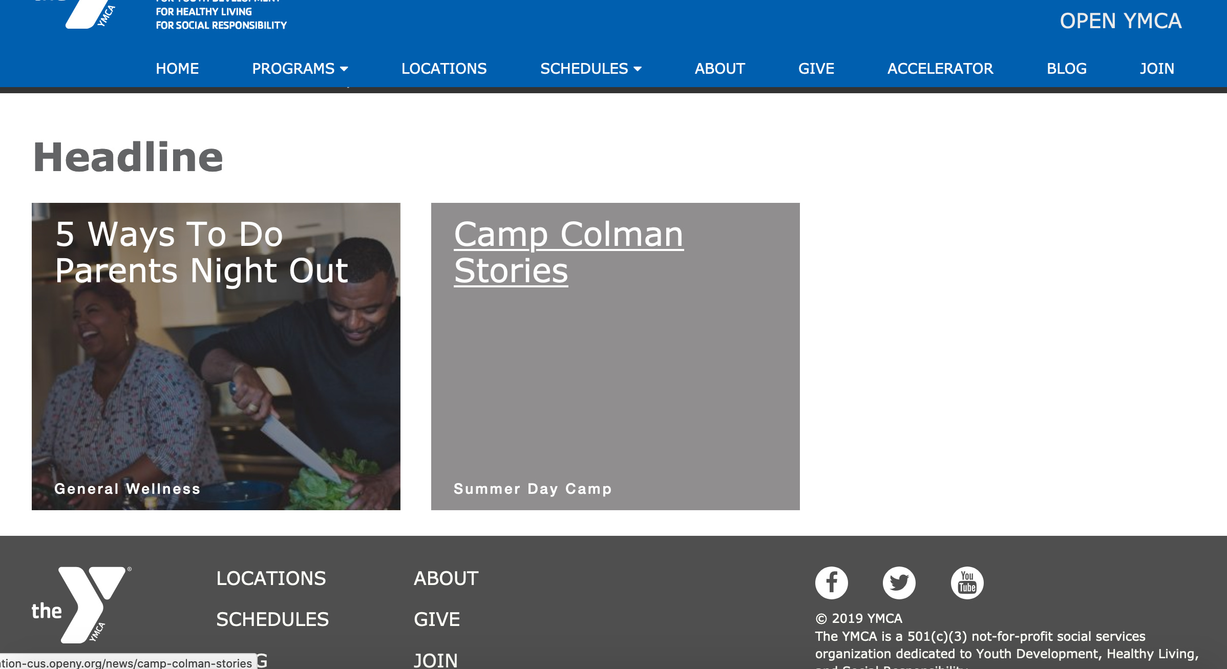
Embed a listing of blog posts with optional filtering by Camp/Branch.
These three paragraphs embed a listing of blog posts, sorted by the most recent, in a card design.
Latest Blog Posts shows all the most recent blog posts across your entire site.
Latest Blog Posts (Branch) filters your most recent blog posts by the branch the paragraph is embedded on (for example, if on a Downtown YMCA page, only Downtown YMCA blog posts will show up). Placed on a non-branch page, only the headline will show up.
Latest Blog Posts (Camp) filters blog posts by the branch the paragraph is embedded on (for example, if on a Camp Widjiwagan page, only Camp Widjiwagan YMCA blog posts will show up). Placed on a non-camp page, only the headline will show up.
Areas it Should Be Used
Content Area
Bottom Area
How to Use Latest Blog Posts
From the paragraphs dropdown, add Latest Blog Posts, Latest Blog Posts (Branch) or Latest Blog Posts (Camp). Enter a header title for the section in the text field and hit save.
Unlike the related
Blog Posts Listing, this paragraph does not include filters for searching blog posts.
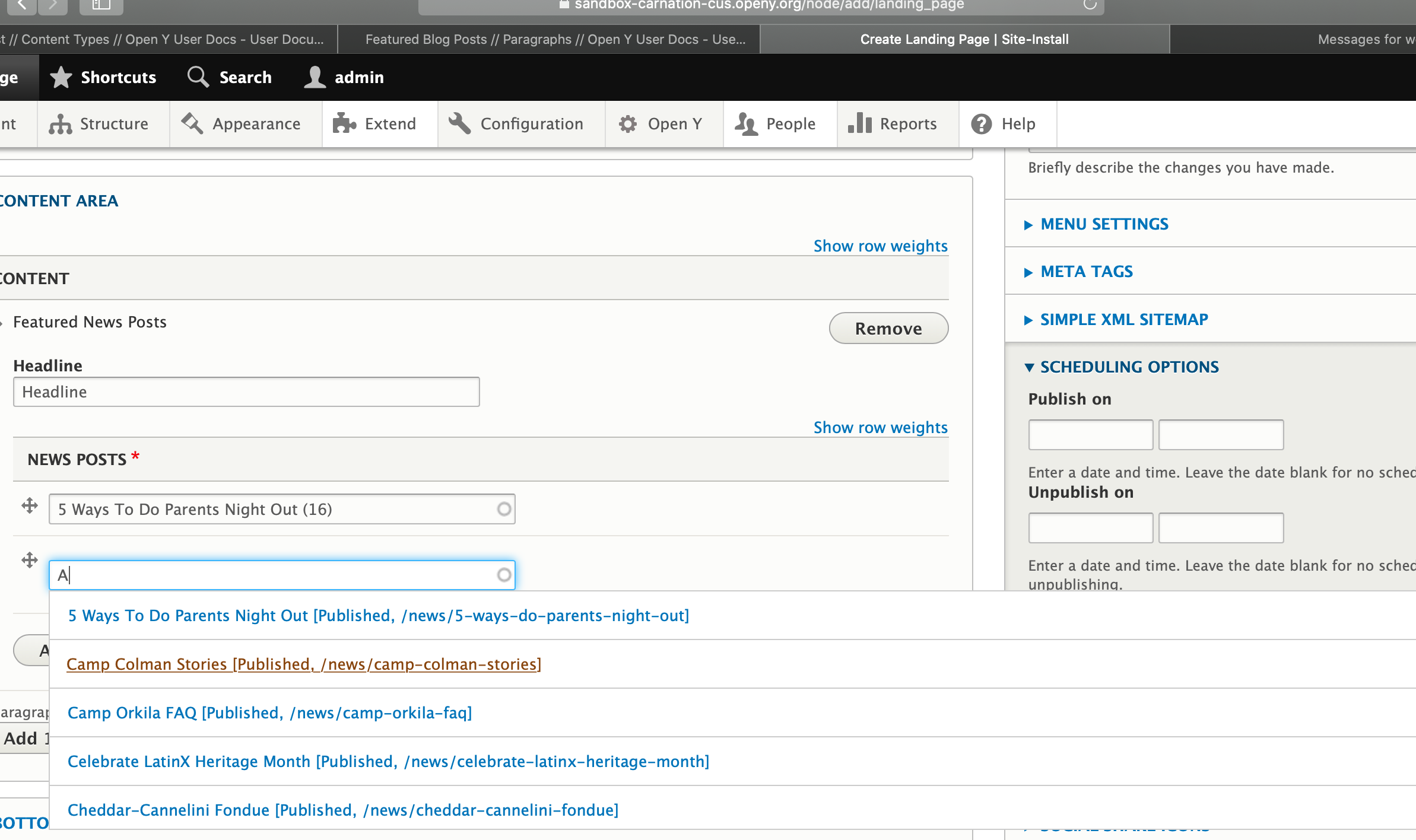
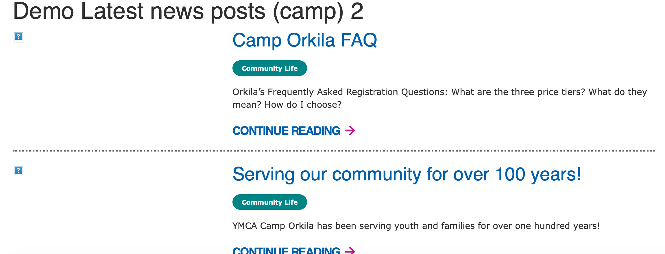
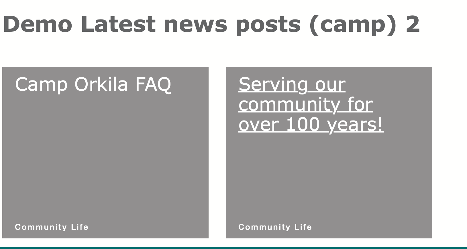
Embed a listing of News Posts with optional filtering by Camp/Branch.
These three paragraphs embed a listing of News posts, sorted by the most recent, in a row/listing design
Latest News Posts shows all the most recent news posts across your entire site.
Latest News Posts (Branch) filters news posts by the branch the paragraph is embedded on (for example, if on a Downtown YMCA page, only Downtown YMCA news posts will show up). Placed on a non-branch page, only the headline will show up.
Latest News Posts (Camp) filters News posts by the branch the paragraph is embedded on (for example, if on a Camp Widjiwagan page, only Camp Widjiwagan YMCA News posts will show up). Placed on a non-camp page, only the headline will show up.
Examples
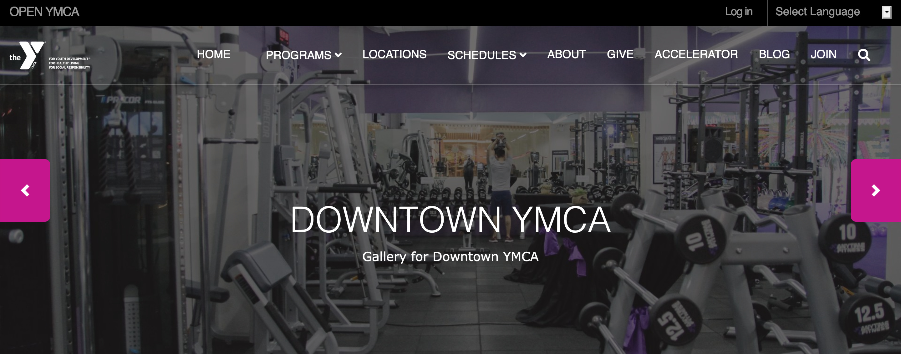
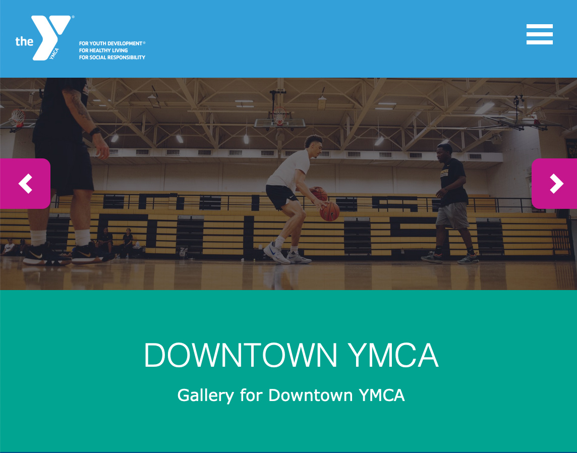
Carnation
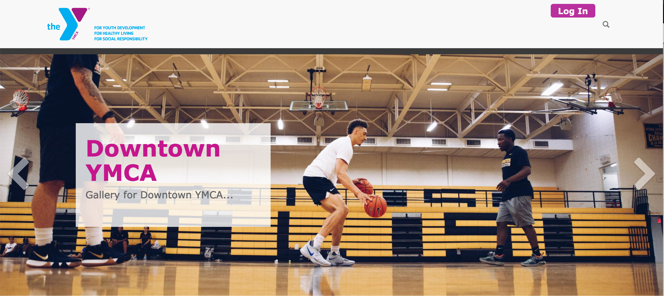
Rose
Areas it Should Be Used
Content Area
Bottom Area
How to Use Latest News Posts
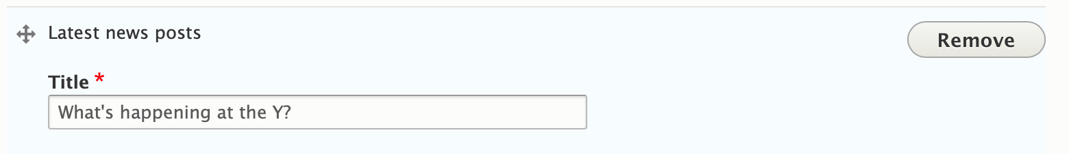
From the paragraphs dropdown, add the “Latest News Posts.” Enter a header title for the section in the text field and hit save.
Add an anchoring element to the bottom of a page, similar to a small banner. Best for promotional offers.
Example
Areas Where It Can Be Used
Bottom Area
How to Use Limited Time Offer
Go to the Bottom Area and select Limited Time Offer. Fill in the Title field for your main headline, and if you would like to add a subheader below the title field use the field below.
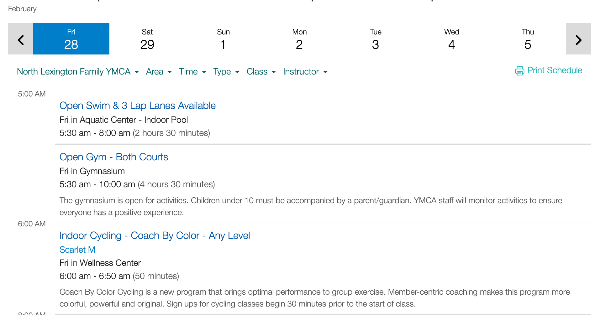
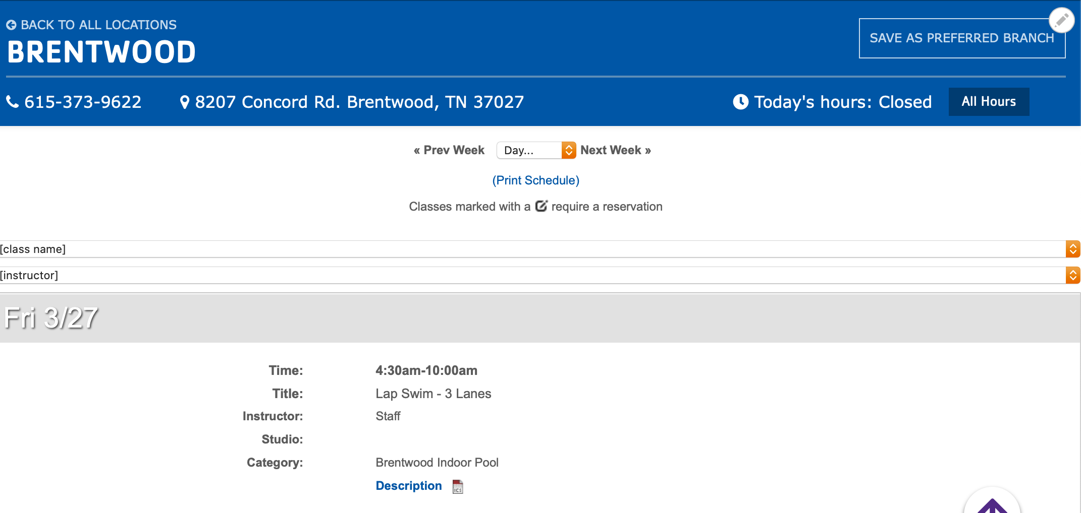
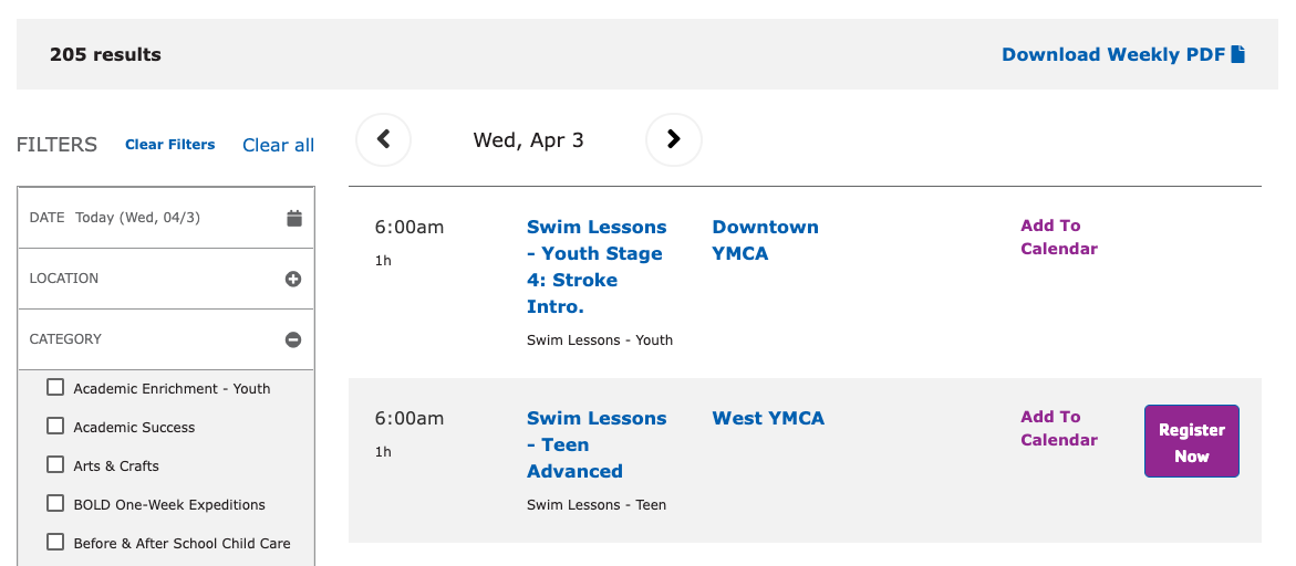
Display programs in a schedule view with an optional PDF export.
Sometimes called “Group Exercise” or “Group Schedules”, the Repeat Schedules block provides a similar view to Activity Finder, but focused more on recurring, often drop-in classes.
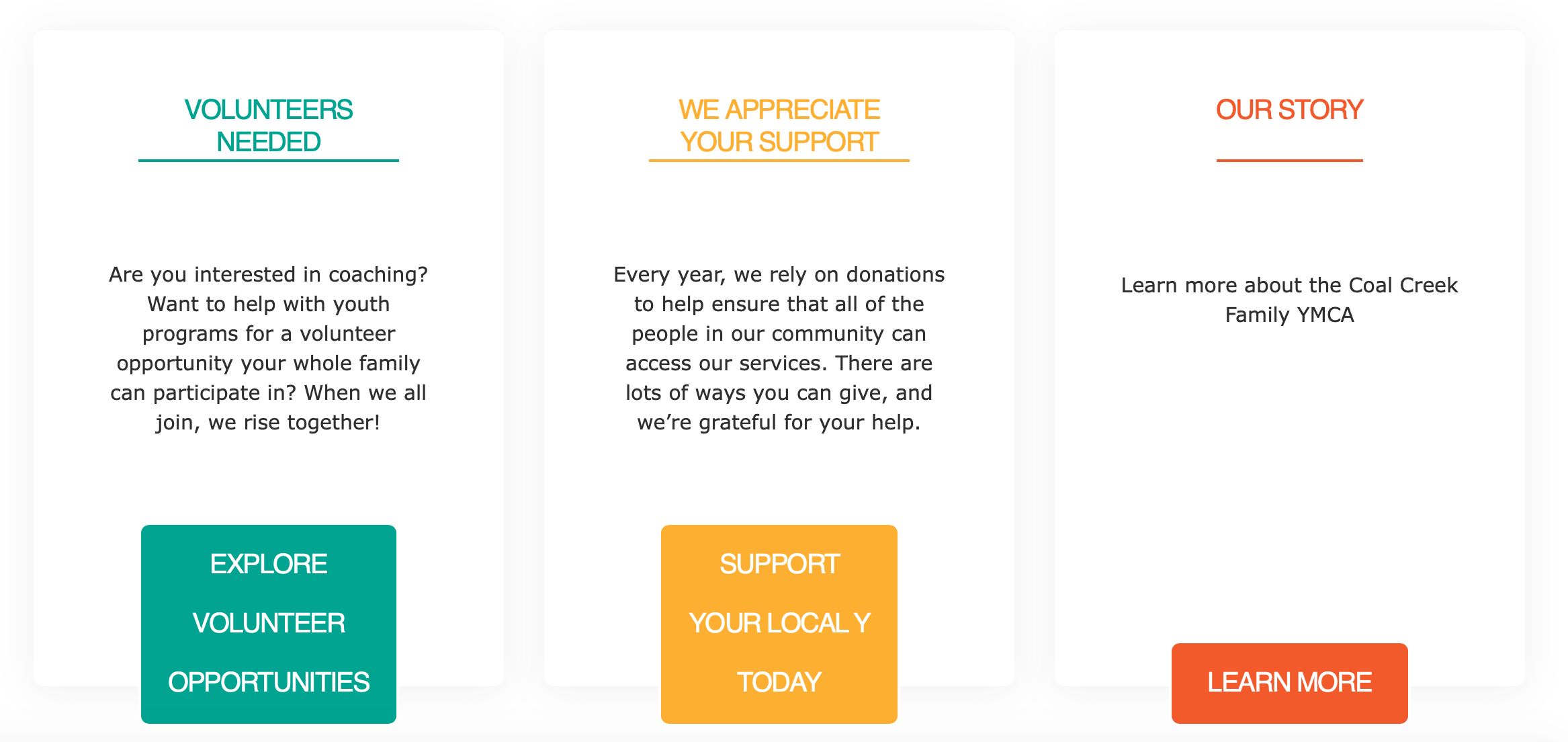
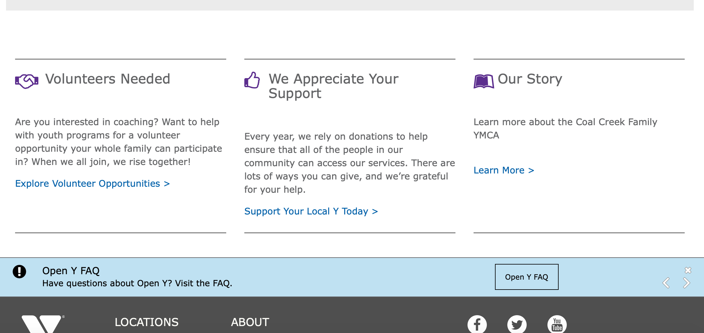
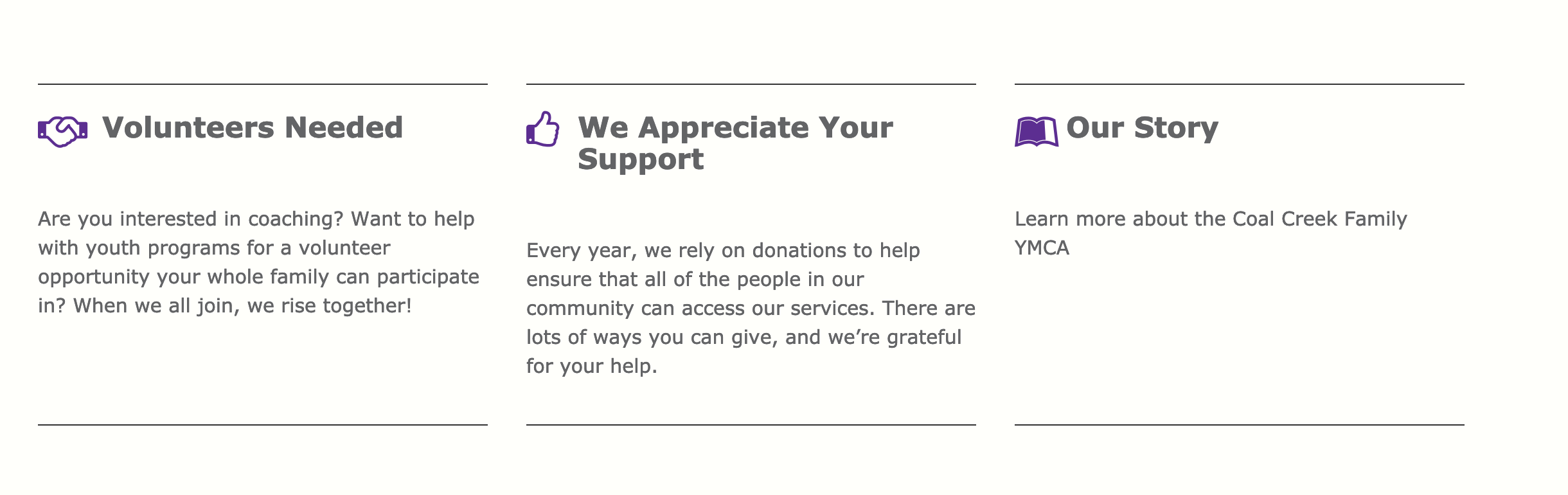
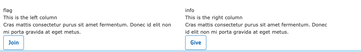
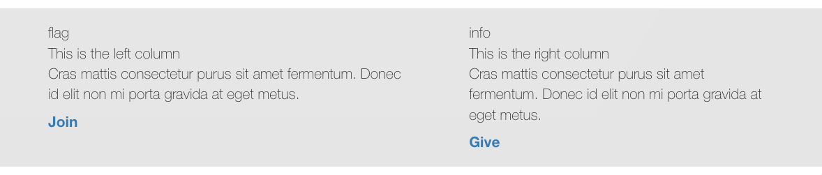
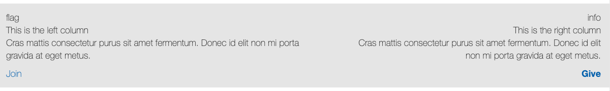
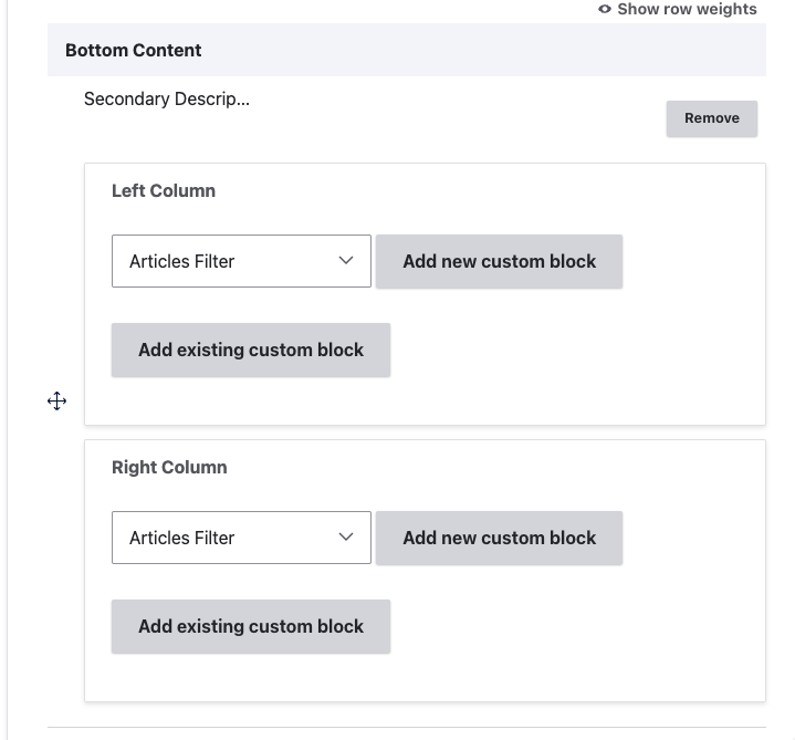
Add a bottom area element with two columns of reusable content for anchoring a page.
Note: This element does not work properly in Carnation and is considered deprecated.
Example
Carnation
Lily
Rose
Areas it Should Be Used
Bottom Area
How to Use Secondary Description and Sidebar
Insert the paragraph from the dropdown into the Bottom Area.
You will have two fields to insert blocks - a Left Column and a Right Column. Select from one of four different custom block types, and either add a new custom block or reuse an existing block type.
Note: In Carnation, stacking multiple sections of simple content on top of one another will not create enough space for users to distinguish between sections.
To create this space, add a pair of hard returns or a horizontal rule at the bottom of your text.
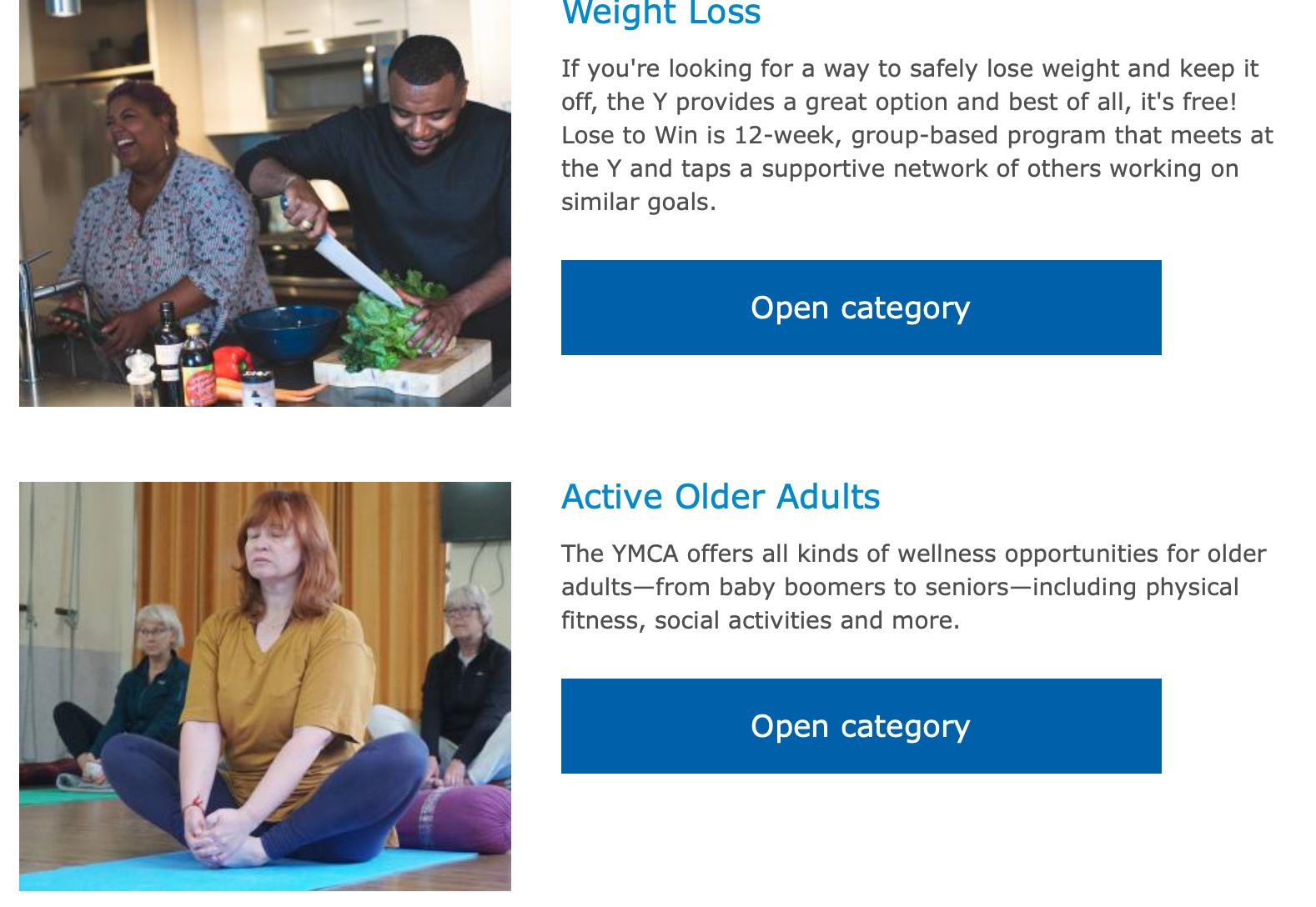
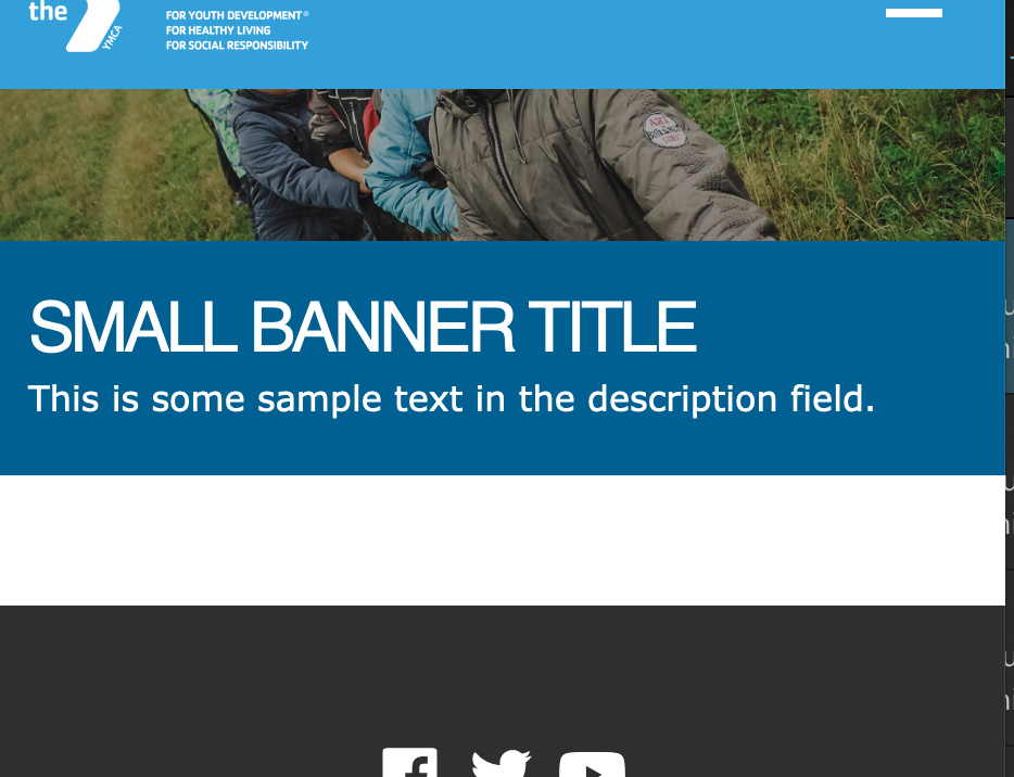
A wide, short image with fields for a title, background color, description and image.
Examples
Carnation (Current Theme)
Desktop
Mobile
Note: Examples for Lily and Rose themes (deprecated in Drupal 11) have been removed. The Carnation theme is the recommended and supported theme for all new YMCA Website Services installations.
Areas it Can be Used
Header Area
Content Area (1 column only)
Bottom Area
How to Use a Small Banner
Select Add Small Banner from the paragraphs dropdown. Then, fill out the following fields:
Title (required): This field adds a headline to your banner. The placement of the title will depend on your theme and customization, but it will typically appear as large, all-caps text.
Color (required): The background color for your banner. In Carnation, you will not see the background color unless you choose not to add an image.
Description (optional): Displays beneath your Title. You have the option to style your text using the text editor, but it’s not as consistent as other places where you typically see the editor.
Image: Use the image library to embed an image. You can upload a new image from your computer or reuse an existing image from your library. The image field is optional, but recommended.
For recommended image sizes for your YMCA Website Services site, talk to your agency partner.
*Note: Unlike
the Banner, Small Banners don’t come with a specific Link field for buttons without customization.
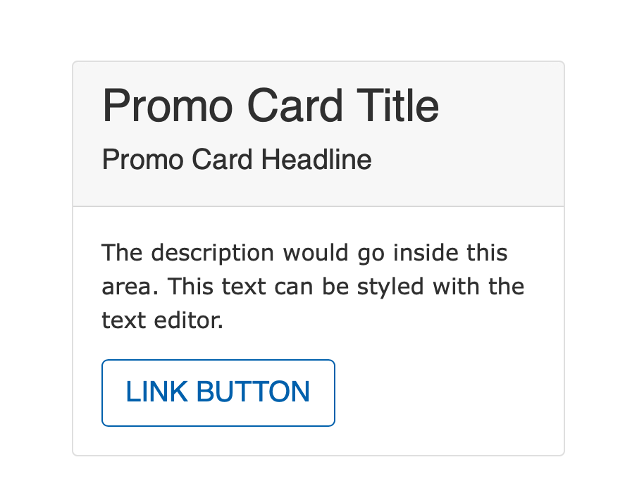
Add a simple card to the sidebar with a title, headline and call to action.
This Paragraph works best in Lily and Rose.
Areas it Can Be Used
Sidebar Area
How to Use It
In the sidebar area on a piece of content, select “Story Card.” Add a Title and Headline. The Title will be larger than the Headline and display above the Headline.
Add your link in the link field below. Unlike most paragraph types, the link field does not create a button or standalone link; the entire card becomes the link. The link text is required; however, it will not stand out a like typical call to action.
To work around this, add a > or another special character to indicate to users they are clicking on a link.
Recommendations for use with Carnation
While this component is available to use in Carnation, it is not themed with a border as in Lily or Rose. The best practice is to use this paragraph sparingly and only in the following content types:
Facility
Event
This Paragraph works best in Lily and Rose. In Carnation, the Story Card works best inside the News Post, Event, and Blog Post paragraphs.
Advanced
Note: In the headline area on Lily and Rose, a large quotation mark will display to the left of your headline. This can be easily disabled using the following CSS:
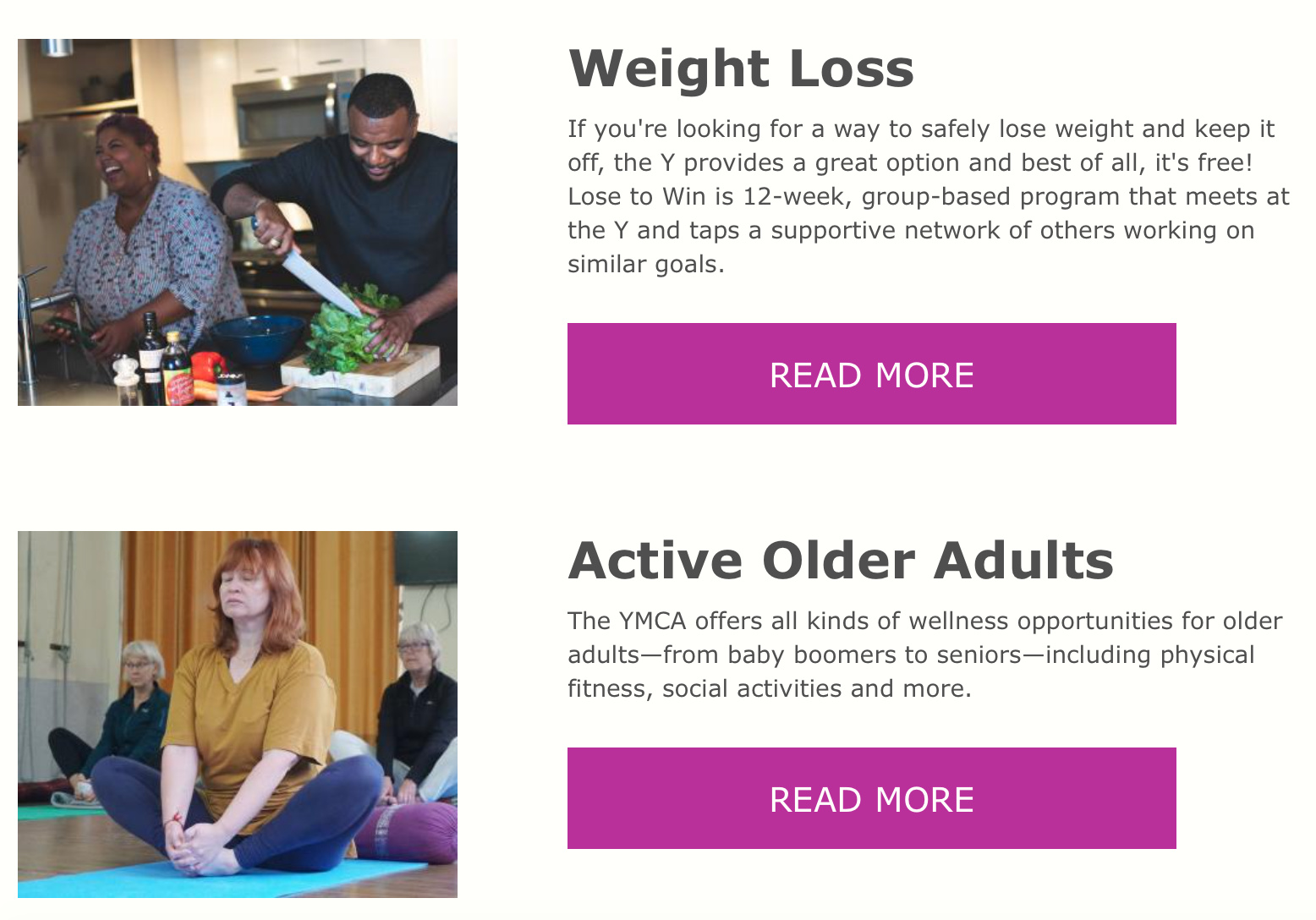
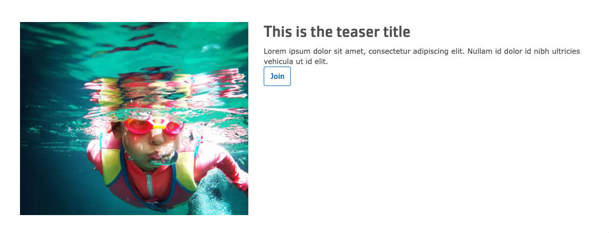
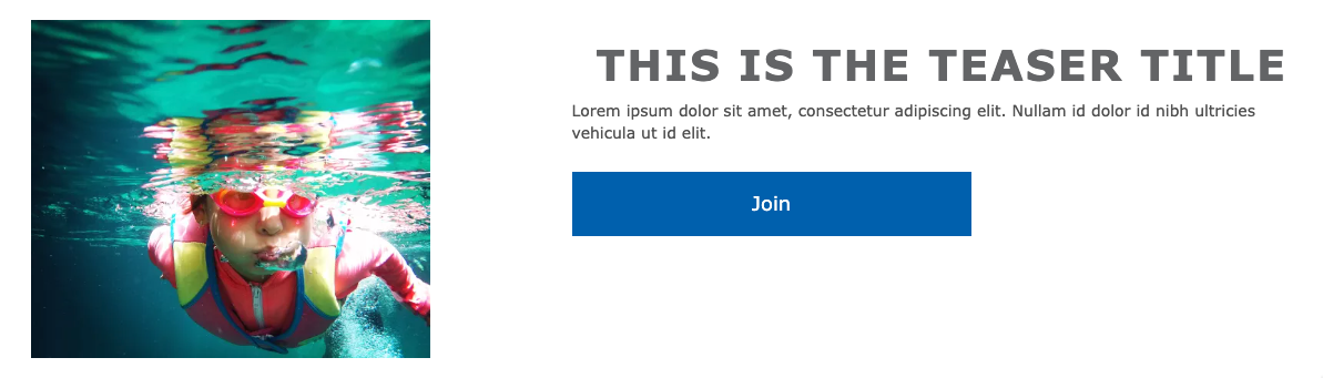
Add a wide feature with an image, text, and a call to action.
Example
Carnation
Lily
Rose
Areas it should be used
Content area
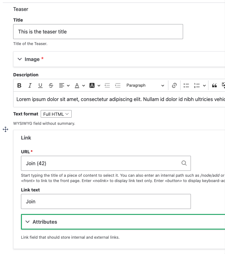
How to use Teaser
Insert the paragraph from the dropdown into the Content Area.
Fill out the content fields:
Title
Image - select an image from the image library or upload a new one
Description - add a description using the
Text Editor.
Link - add an internal or external link
Save the page to view your Teaser.
33 - Webform
Add an existing Webform to a page.
Areas it Should be used
Content Area
Sidebar Area
Bottom Region
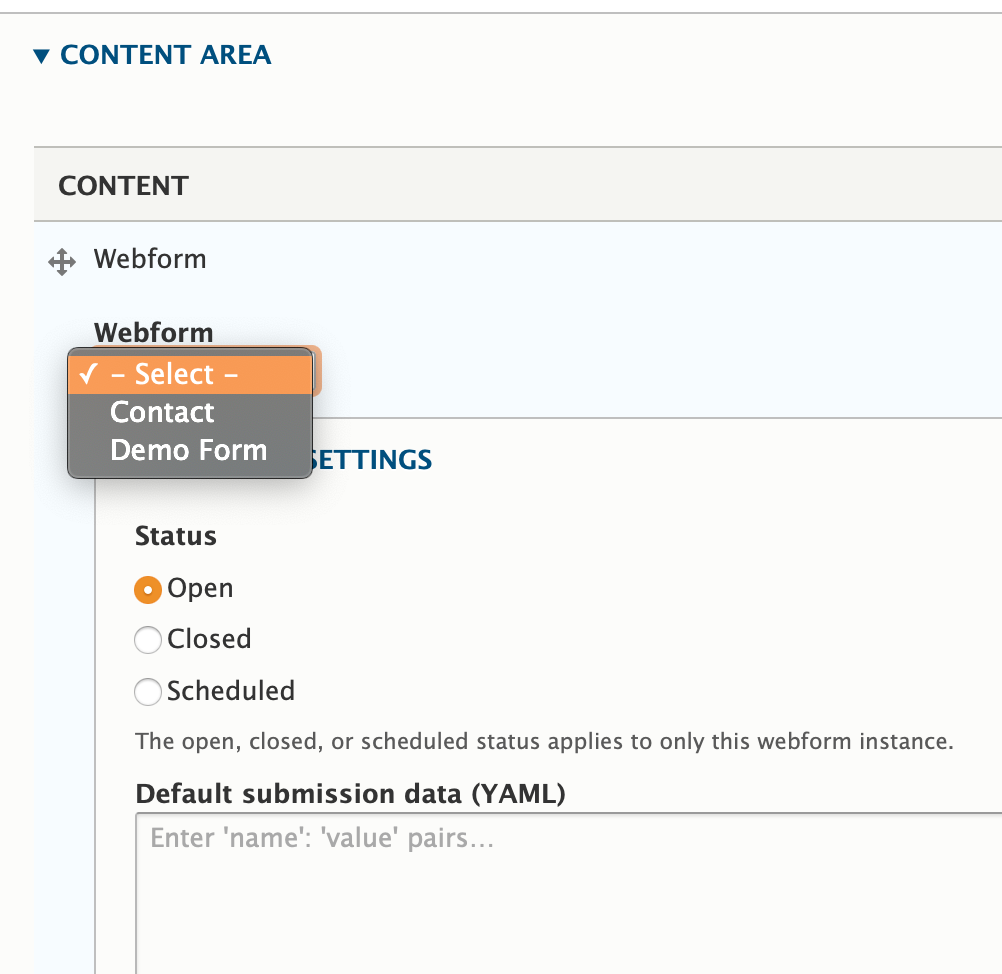
How to Use Webform
Prerequisite: You must have your web form created before embedding onto a page. While you can continue to revise and edit your form, using this paragraph will NOT create a webform for you.
Once you’ve selected Webform from the paragraphs dropdown, select the name of the webform you want to embed onto your page.
Next, you will have the option to open, close or schedule your open/close dates for your webform.
Ignore the “Default submission pairs” field, unless you’re
a YAML wizard and want to have some default values for certain fields in case your users forget to fill them out.