Examples
Carnation
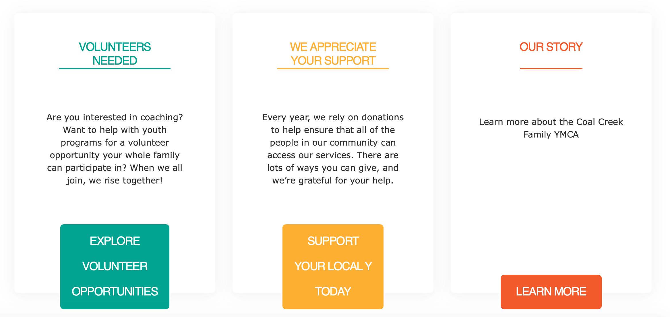
Lily
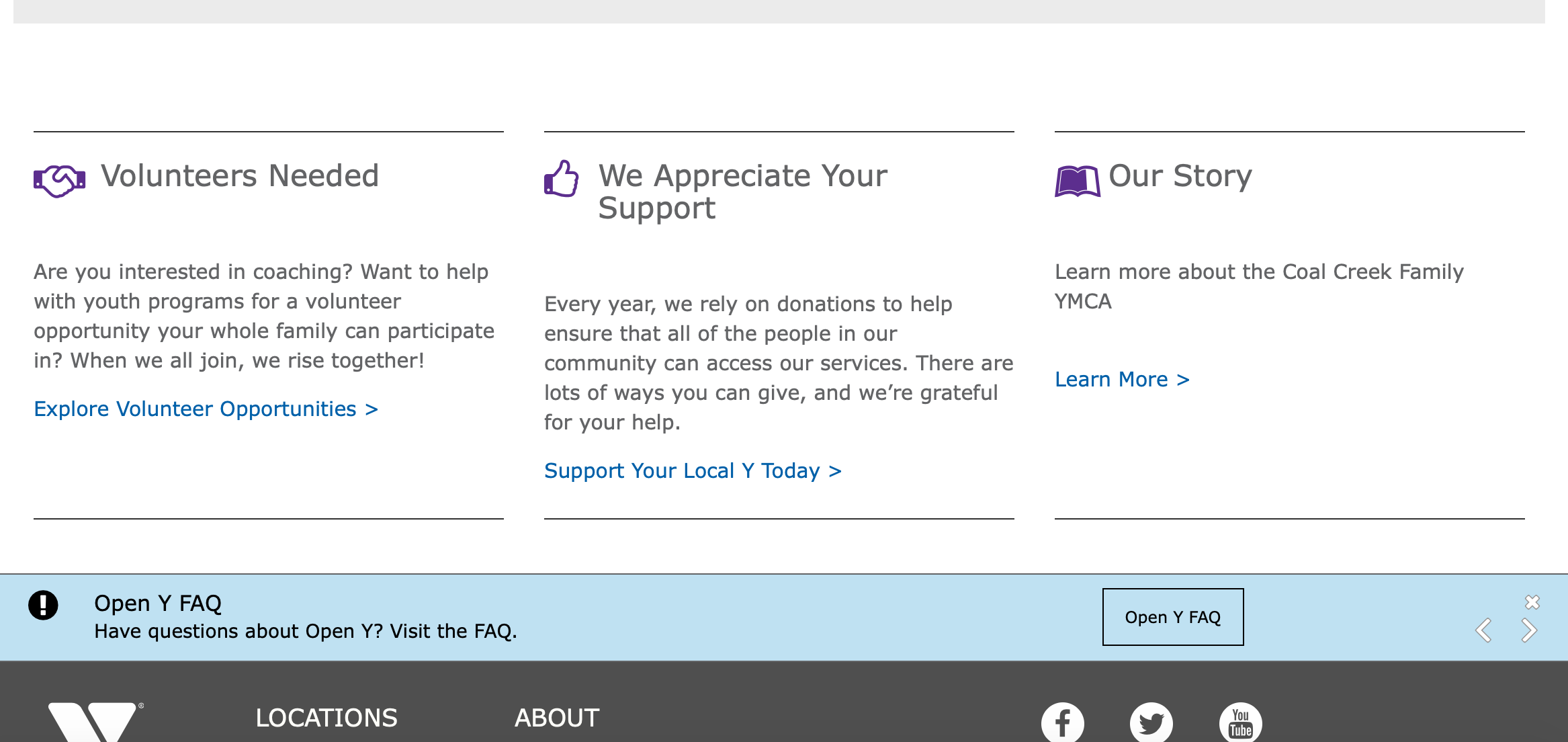
Rose
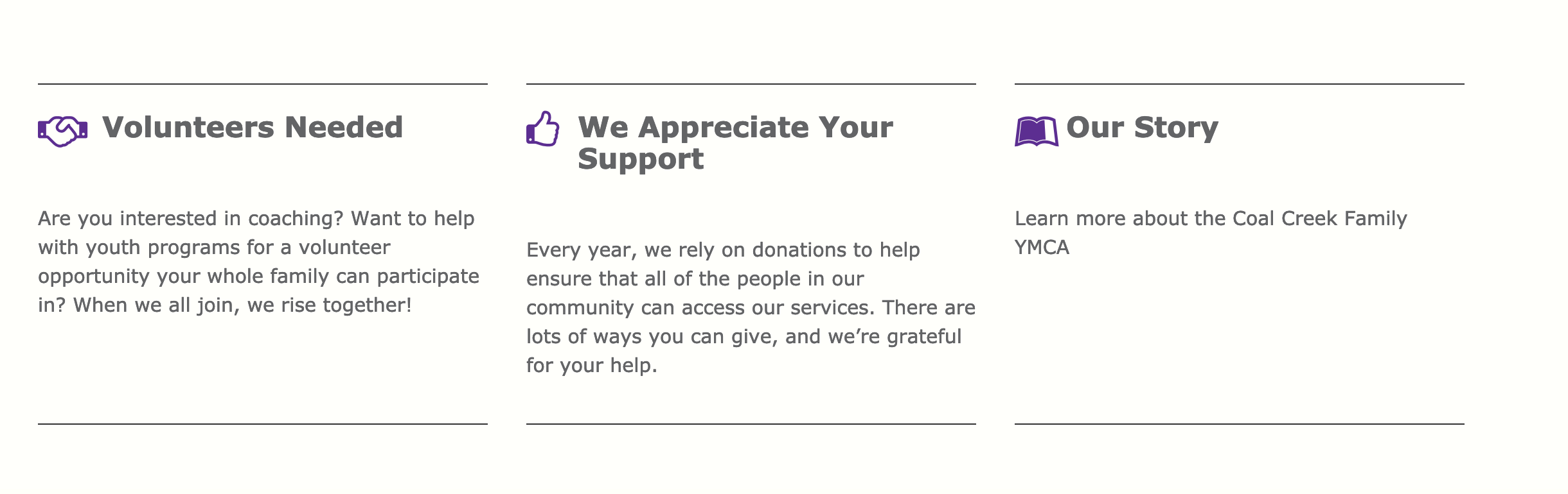
Areas It Should Be Used
- Content Area
- Bottom Area
How to Use Grid Content
Note on Grid Content: This paragraph’s style will vary greatly depending on your theme. The docs outline how to use the fields.
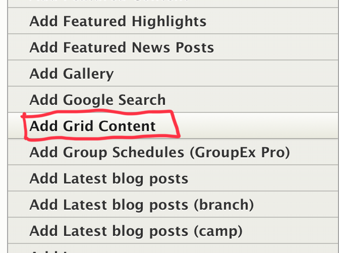
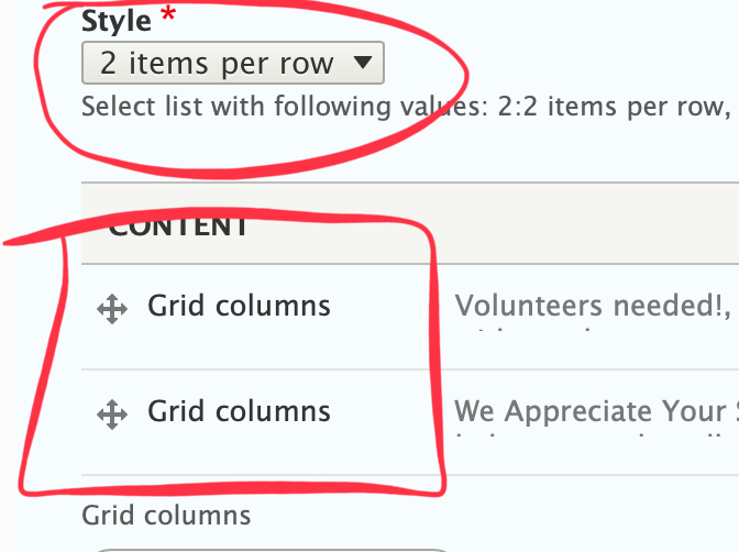
First, choose Grid Content from the Paragraphs dropdown. You will then see a dropdown with four options under Style:
- 2 items per row
- 3 items per row
- 4 items per row
Select a style to choose how wide you want each section to be; the more items per row, the narrower they will be.
Examples
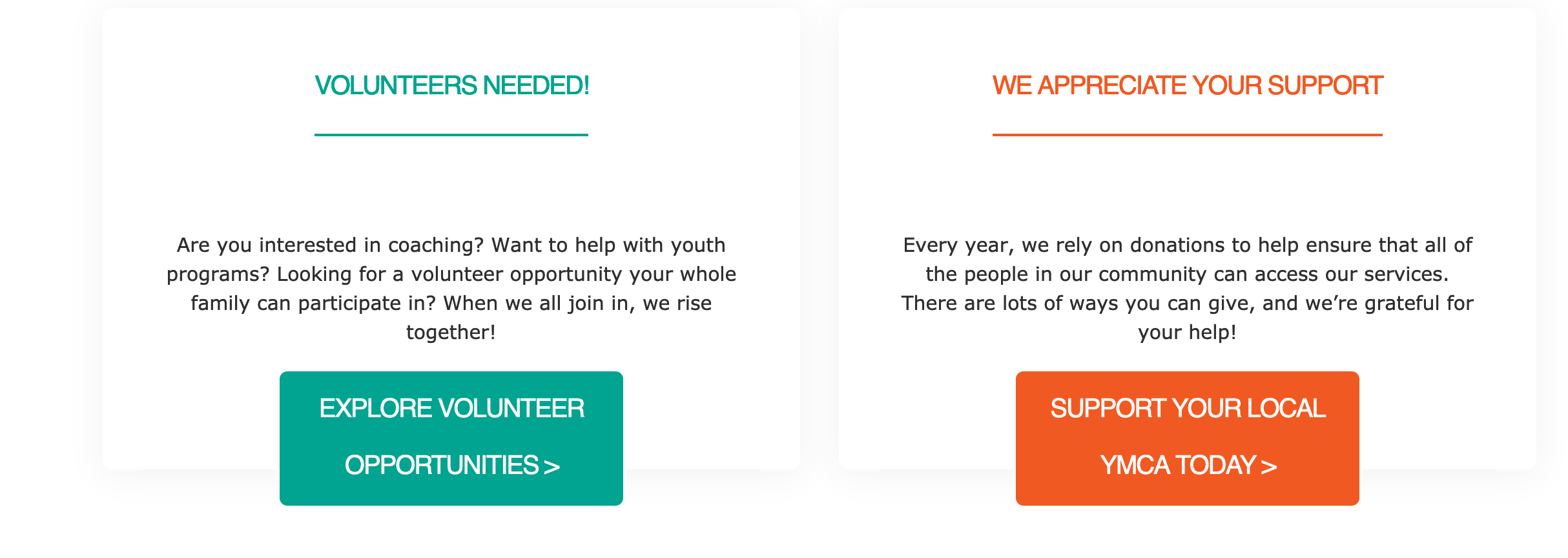
2 items per row w/ 2 Grid Columns
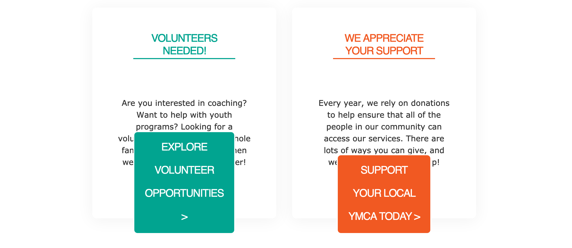
3 items per row w/ 2 grid columns
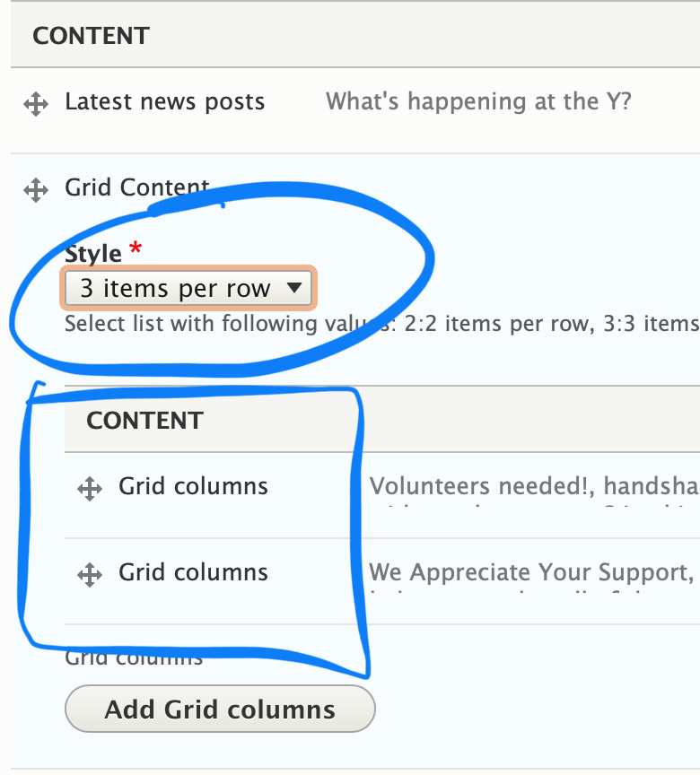
Next, you will see a button that says Add Grid Columns. This is where you will start adding your individual sections/cards.
For each item you add, you will have the following fields:
Headline (optional) - A title for your section. Will be larger/smaller depending on your selected style and theme
Icon (optional) - An image you can embed to display inline with your headline. Upload a new image or use one in your image library.
Icon Class - A font awesome icon CSS class. You can type in the name of the class, and YMCA Website Services will generate the icon.
Description - A standard text editor field. Because of how each grid content item styles, it’s recommended that the text in this field be shorter than 200 characters.
Link - Two fields to add a URL and a link. Depending on your theme, the link will style either as a basic link or as a button.
Note: If you add more items than your selected style, you will create a new row. For example:
- 2 items per row style, 3 items added -> two rows of content
- 3 items per row style, 5 items added -> two rows of content
- 4 items per row style, 9 items added -> three rows of content