Small Banner
Examples
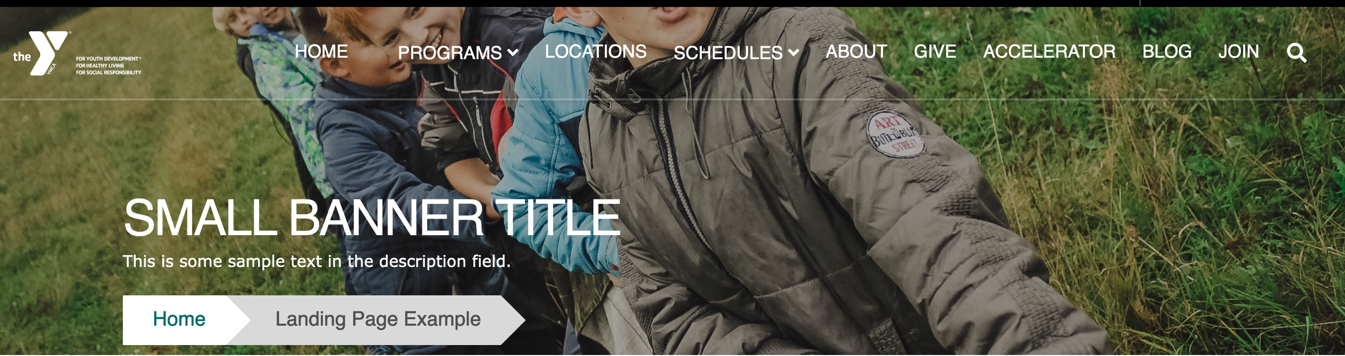
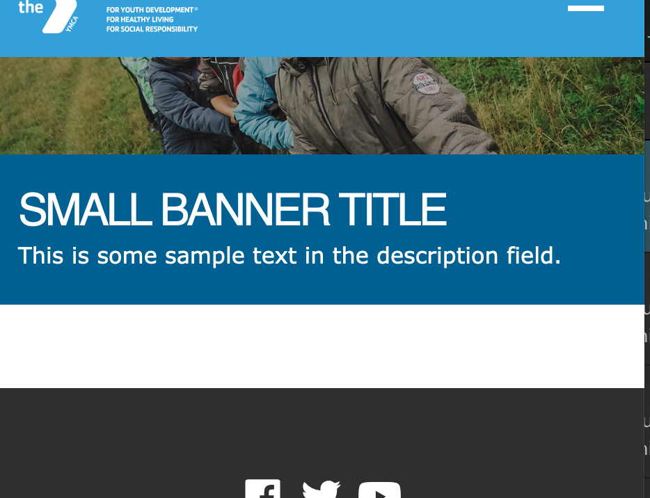
Carnation (Current Theme)
Desktop
Mobile
Areas it Can be Used
- Header Area
- Content Area (1 column only)
- Bottom Area
How to Use a Small Banner
Select Add Small Banner from the paragraphs dropdown. Then, fill out the following fields:
Title (required): This field adds a headline to your banner. The placement of the title will depend on your theme and customization, but it will typically appear as large, all-caps text.
Color (required): The background color for your banner. In Carnation, you will not see the background color unless you choose not to add an image.
Description (optional): Displays beneath your Title. You have the option to style your text using the text editor, but it’s not as consistent as other places where you typically see the editor.
Image: Use the image library to embed an image. You can upload a new image from your computer or reuse an existing image from your library. The image field is optional, but recommended. For recommended image sizes for your YMCA Website Services site, talk to your agency partner.
*Note: Unlike the Banner, Small Banners don’t come with a specific Link field for buttons without customization.
To add a button to a small banner, you can use the Text Editor button tool to create a button in your description field.