This tool allows you the flexibility to format content however you want within a certain container or area.
Bundled with the Drupal core and the distribution,
CKEditor provides a number of different buttons for styling and formatting, as well as a Source editor if you are so inclined to edit HTML directly.
CKEditor has been
upgraded to version 5 as of Drupal 10, and is a big improvement over CKEditor 4 — the linking experience is much smoother, uploading images is much faster, and more.
For more info on CKEditor 5, check out these resources (not all features may be implemented in the distribution):
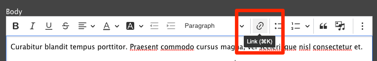
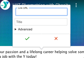
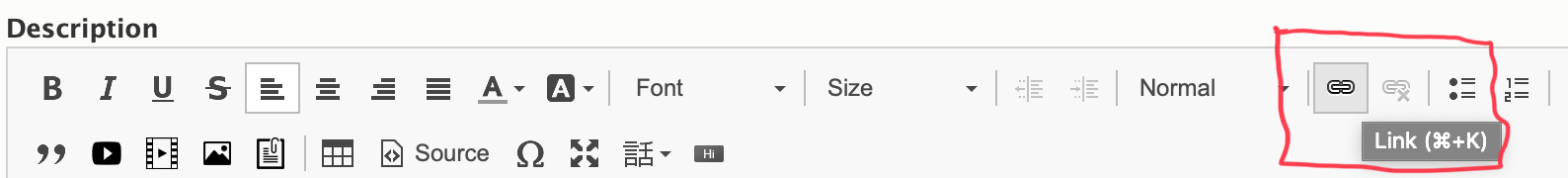
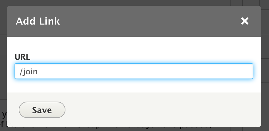
Links are simple in YMCA Website Services - just highlight your text and click the link icon (🔗) or type Ctrl / Cmd + K. Once the pop-up appears, type your URL into the field and click Save.
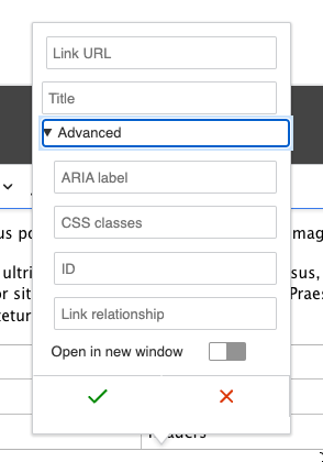
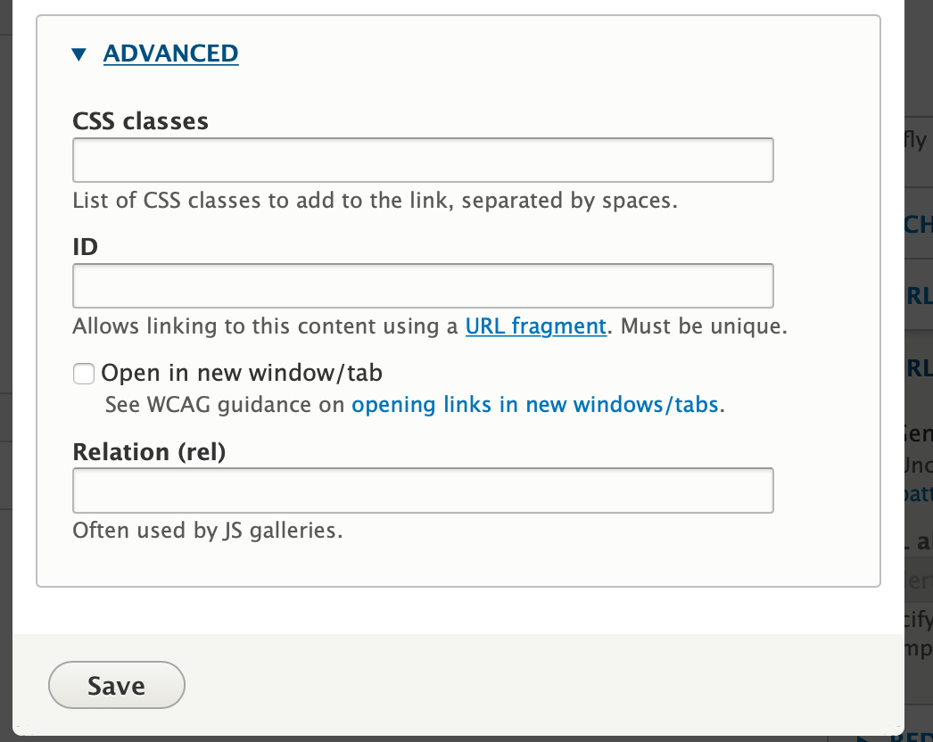
In the Advanced options of the link dialog, you can add attributes to links, including a label, HTML ID, and CSS classes. You can also opt to have your link open in a new window/tab.
The
Button editor that existed in the prior version of the text editor (CKEditor 4) has
changed with CKEditor 5 and Drupal 10. Content editors can now add button classes alongside the Advanced Link Options.
We recommend only using custom buttons in large text blocks, like the
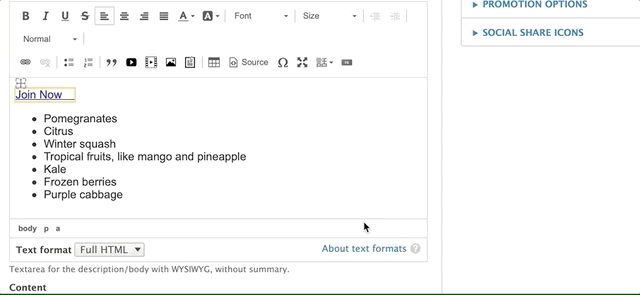
Table or
Code blocks.
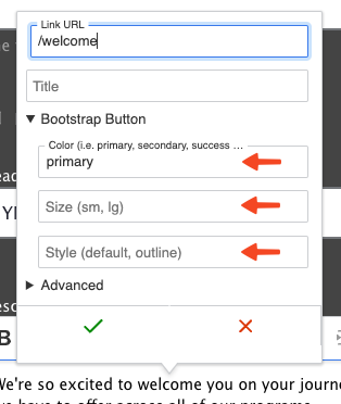
Open the Advanced Options.
Add the button classes for Color, Size, and Style (see
Button Classes). Be sure to add the btn prefix. Your complete CSS Classes might be something like btn btn-primary.
Button styles in the editor may not match the displayed styles.
Any time you are making a button, your CSS classes should begin with btn . That sets up the default button styles.
Then, choose a button style, like btn-primary or btn-light.
Button styles should generally not be combined.
Some Bootstrap styles may be overridden by our theme.
The btn-primary style will use the selected colorway for its color, but all other options may use other colors that are not brand compliant.
The CSS classes field should have at least two space-separated items when you’re finished, like btn btn-primary.
It’s best to experiment with styles and make sure to check that your button displays as expected before saving the page.
Anchor links
If you’re building a long landing page, you may want to be able to link users directly to a specific section of the page. We do this using an “anchor” link or “in-page”
URI fragment.
The process involves two steps:
Adding the in-page anchor.
Creating a link to the anchor.
Adding an anchor
An anchor is any piece of content—anything from a heading to a tiny space—that has an id in its code. The easiest way to add this is by creating a small hidden link at the beginning of the section in which you’d like to link to.
Edit the section where you want to add the anchor
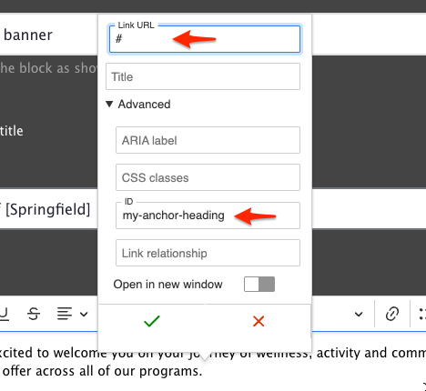
Add an empty space at the end of the first line of the section
Select just the space, then click the 🔗 button in the editor toolbar.
In the Link popup, set the URL to #
Expand the Advanced options and set the ID field to your anchor. It should be short and contain only lowercase letters and dashes, like thank-you or adding-an-anchor.
Click Save in the Link popup, then save the page.
Once you’ve saved the page, you can test the anchor out by appending a # then the id to your page URL. For instance, this section’s URL with anchor is:
If you enter that URL in your browser, it should take you directly to the anchor in the page.
Linking to the anchor
To link to the anchor, we create a regular link and then add the anchor:
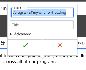
Create an in-page link as you usually would, either with a Link field or the Text Editor.
Instead of referencing the page with autocomplete (if it’s available), use the “relative path” of the page—that is, everything after the domain. For instance, when linking to this page in a site, you could use /docs/user-documentation/text-editor/adding-links.
Add the anchor ID after the path, so that your complete link looks like /docs/user-documentation/text-editor/adding-links#adding-an-anchor.
Save the page.
Now, your internal link should take users to the exact location in the page that you’ve specified.
TIP: If your anchor doesn’t quite go where you expect, or the section is hidden by your navigation when you use the link, try moving the anchor to the end of the previous section instead of the start of the section you’re trying to anchor to, that way users will end up with the right section of the page in view.
Linking tips
For links on your website, don’t use the full URL. Delete everything beginning with the / after your .com, .org, etc.
For example, for ymca.org/about, you would choose /about. This is called the relative path, and it will help your analytics tracking.
For links on other websites, grab the full URL, including the https://.
For example, for example.org/about, you would choose https://example.org/about.
For email links, add "mailto:example@example.org."
To update/change a link, click on the link text then click the link icon or use the popup options (in CKEditor 5).
To remove a link, highlight the link text and click the unlink icon.
provides an autocomplete interface for internal and external linking in rich-text editors. Linkit supports nodes, users, taxonomy terms, files, comments and basic support for all types of entities that define a canonical link template.
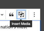
Once your site is updated to use CKEditor 5 you will see a new Insert Media button that unifies the processes for embedding Images, Documents, and Videos.
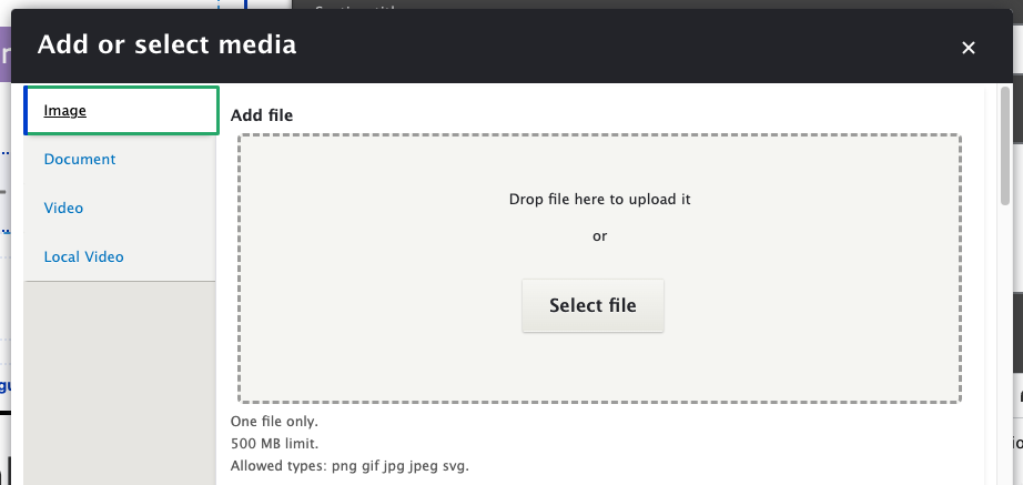
Add or select media
To get started, click Insert Media in the CKEditor toolbar (or try the ⋮ button if it’s hidden). You will be presented with the Add or select media dialog.
Choose the media type (Image, Document, etc.) that you would like to embed from the list on the left.
Add or upload your media:
If you are adding new media:
If given the option, drag and drop the item from your filesystem to the dialog, or click Select File.
For Video (via YouTube or Vimeo), add the video directly via Admin > Content > MediaAdd Media > Video before opening the dialog.
If you are reusing media that exists on the site, scroll down and search for the item, then click the checkbox to select it.
Choose Insert selected to embed the chosen media.
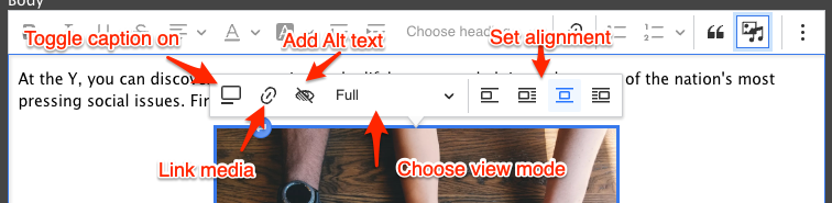
Customizing your media
Once your media has been inserted into the field, you can hover over the media to choose from a variety of options.
Toggle caption on
Displays a Caption area below your image. Once toggled, type your caption below the image.
Link media
Allows the media to be linked. See
Adding Links for more information.
Allows you to select the size of the image. Typically you might choose “Full”, “Half”, or “Thumbnail”. Options may vary depending on site configuration.
Alignment
Choose how to align the media:
Break text
Align left and wrap text
Align center and break text
Align right and wrap text
Moving your media
Click and drag anywhere on the inserted media to relocate it in the WYSIWYG area.
Use the ⮐ button at the top or bottom of the media to insert a paragraph before or after it.
Deleting your media
Click to select the media, then type Delete to remove it.
3 - Basic Text Formatting
Choose any of the options for your text below by clicking on the icon/performing the keyboard shortcut indicated. To format text you’ve previously typed, highlight the text and then click on the button in the editor. Many formatting options also have
keyboard shortcuts.
Source - View or edit the source code of the content. Be aware that some HTML tags may be stripped out due to Drupal’s Text Format rules. Click About text formats below the editor to learn more.
Special characters - Insert mathematical operators, currency symbols, punctuation, or graphic symbols not typically accessible from the keyboard.
Language - Mark specific sections of the content as different languages so that browsers and screen readers can correctly interpret them.
More info.
Bold Text - Ctrl+B (Windows) or Command(⌘)+B (Mac) or clicking/unclicking the B icon
Italics - Ctrl+I (Windows) or Command(⌘)+I (Mac) or clicking/unclicking the I icon
Underline - Ctrl+U (Windows) or Command(⌘)+U (Mac)or clicking/unclicking the U icon
Strikethrough - Clicking/unclicking the S icon
Alignment controls - Left, Center, Right, and Justify.
Font Color - A small grid of swatches you can apply to your text. Overrides the default font-color
Text Background color (not recommended)
Font (should remain Cachet or Verdana to conform to YMCA brand standards)
Font Size - A dropdown to select the size of your text. Measured in points, not pixels. Overrides the default font size for your text, including styles and format.
Indent - Add one or more indents to your copy. Also, have the option to undo the indent.
Format - A dropdown list of text formats you can apply to your content. Helps to create sections. Comes out-of-the-box with six heading formats.
Most Ys will not use the “Formatted” format, which styles text like HTML code.
Bulleted/Numbered lists - Click the numbered or bulleted list icon to create a list. You can create indented bullets by hitting your tab key or clicking on the indent icon
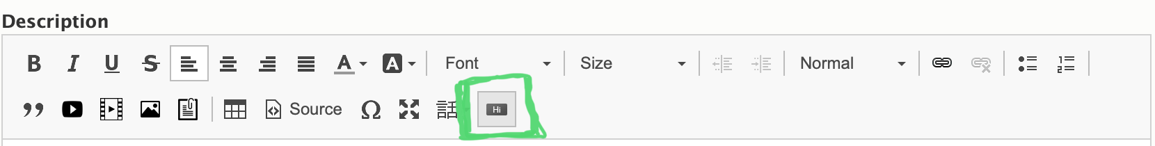
4 - Building Buttons
This document applies to the legacy WYSIWYG editor, CKEditor 4. See the
Using Button Classes for updated instructions.
As an alternate to using the link tool, you can easily create buttons with YMCA Website Services using the button editor. When you click on the button icon, it will open a pop-up.
You can also edit a button you’ve created previously by clicking on the link in the text editor.
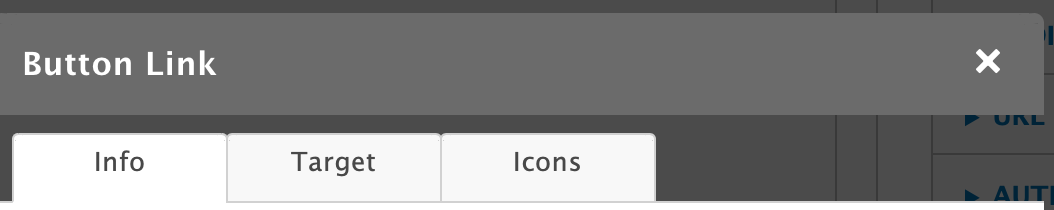
There are three tabs for creating your button: an info tab, a target tab, and an icon tab.
Info Tab
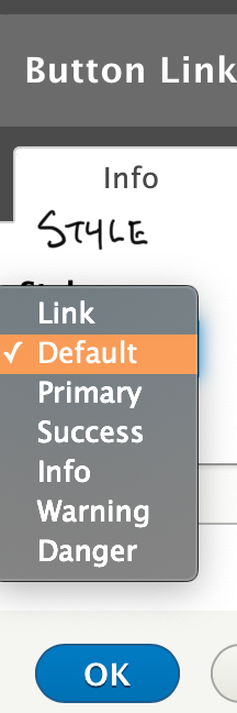
This screen gives you basic options to style your link or button. On the top left “Style Option,” you will have several options to style your button or output it as a link.
The link option will allow you to embed your link text in line with a paragraph.
In Carnation (current theme), the button options all output different colors.
Note: For legacy sites using Lily or Rose themes (deprecated in Drupal 11), button styling may differ.
Button Guide Example:
@mlefler From the YMCA of Lincoln, NE,
built this guide to provide examples of possible styles for buttons. Ask your developer partner to provide you a style guide for your site.
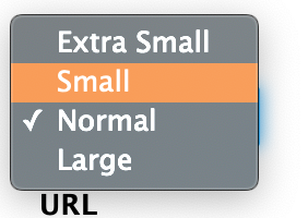
The top right “Size” dropdown four options for your button size. If you chose “Link” style option, the Size option will not affect your link.
Add the text for your link/button in the bottom left. Enter your link in the URL field on the bottom right.
For links on your website, don’t use the full URL. Highlight everything beginning with the / after your .com, .org, etc.
For example, for example.org/about, you would choose /about. This is called the relative path, and it will help your analytics tracking.
For links on other websites, grab the full URL, including the https://.
For example, for example.org/about, you should choose https://example.org/about.
For email links, add mailto:example@exampleymca.org.
This tab gives you the ability to change the behavior of your link. By default, all links will have a “not set” behavior, which means the link will open in the same active tab. The other options include…
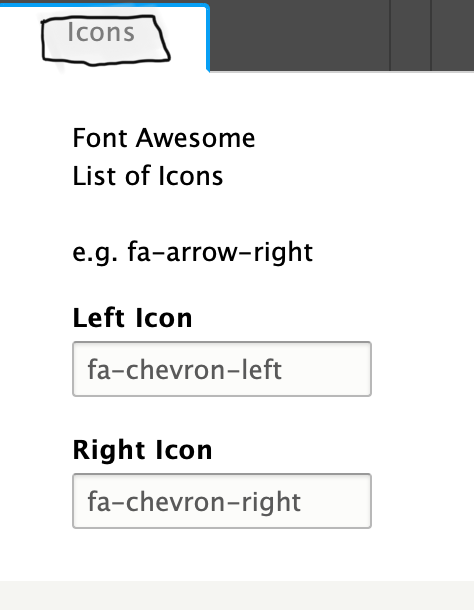
You can add icons to your buttons or links in the icons tab. On the right, you will have fields that integrate with the Font Awesome library. To have an icon show up on the left, use the Left Icon text field. For the right, use the Right Icon text field.
Example: For a Right Chevron, type fa-chevron-right.
Note: The left field makes reference to the Bootstrap Glyphicons library. As of this documentation, this icon library has been deprecated, and the Glyphicons fields will not work in YMCA Website Services.
Because the button embed is an open-source tool developed by a third party, these fields will go away once the code’s maintainer updates the code.
5 - Building Tables
Display contact information, pricing tables, and more using flexible, responsive tables.
Tables in CKEditor 5
The table editor has been drastically improved in CKEditor 5 and is described in detail
in their documentation.
As of the 11.3.1.0 release, global table styles are applied automatically to tables created in CKEditor across all Layout Builder content types, providing consistent and responsive table presentation without additional configuration.
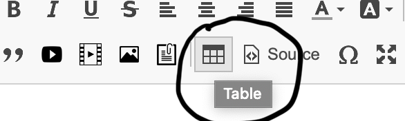
Adding a New Table
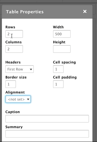
To add a table, click on the table icon. A popup will appear with your initial setup options:
Set the number of rows and columns by typing numbers into those fields
The headers field dropdown gives you options to create a header column, row, or both.
This will count toward the total number of rows/columns in your table, so if you select four rows and have a header row, you will have three rows beneath that header.
Set the width and height in the top right text fields.
If you add no unit, the number you enter will default to pixels.
The fields also support percentages (such as 100%). We recommend percentages when you’re putting table in paragraphs other than simple content.
Style your table with the border size, cell size, and cell padding fields
Like the Height and Width fields, units default to pixels.
Align the values inside your cells using the Alignment dropdown.
Add a caption to your table using the Caption field
Captions will display above the table in Lily and Rose.
Captions display below the table in Carnation.
The summary field provides a brief description for your table for screen readers and accessibility devices. It does not print out visible text.
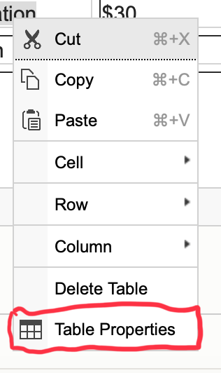
Editing the Table
To edit a table after you’ve built one, right click on the table. To access the basic table options, click on “Table Properties.”
You can also double-click inside a table cell.
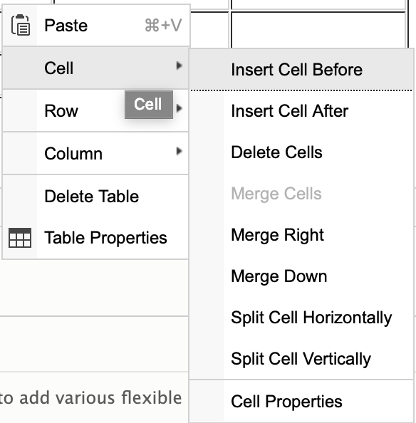
Adding Rows/Columns
To add a row or column, right-click and go to either “Row” or “Column” in the options that appear. You can insert a row or column before or after the current row/column.
Deleting Rows/Columns
Both the row and column options allow you to delete from the right-click options as well. Just right-click > Row or Column > Delete Row OR Delete Column.
To delete multiple rows or column, just highlight the rows or columns you want to delete.
Formatting Individual Cells/Groups of Cells
The “Cell” option from the right-click menu gives you same options as Row and Column, including inserting cells and deleting cells. You can also merge cells or split cells as you would in an excel table by selecting those options from the right-click menu.
However, there is another option called “Cell Properties” that allows you to style your cells as well. Just right-click > Cell > Cell Properties.
This opens a dialogue box similar to the table properties. You can set the width/height for your cell (pixels only for height; pixels or percentages for your width) in the fields on the left.
Farther down on the left, you can choose from a dropdown whether or not to wrap the text in a cell.
You can also use dropdowns to set your vertical and horizontal alignments for your cells.
On the bottom right, you can set your border and background colors for your cells. These field support hexadecimal (#FFF) and rgba (256,256,256,1.0) color formats.
Finally, you can edit your cells to “span” two or more rows or columns. For example, if you have a header cell you want to span two columns, you can set the “Columns Span” field to 2.
If you would like to apply these styling options to multiple cells, just highlight the cells you want to edit and Right-Click > Cell > Cell Properties.
Table Examples
To see an example of what a table might look like on your site, open the “Source” tab on your text editor and insert the HTML. You can then edit the content inside using the WYSIWYG text editor.
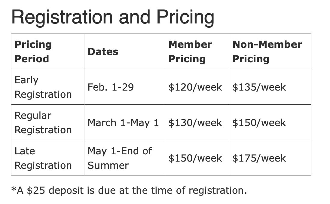
// Pricing Table
<h2>Registration and Pricing</h2><tablealign="left"border="1"cellpadding="5"cellspacing="1"style="width: 500px;"><caption>*A $25 deposit is due at the time of registration.</caption><thead><tr><thscope="col">Pricing Period</th><thscope="col">Dates</th><thscope="col">Member Pricing</th><thscope="col">Non-Member Pricing</th></tr></thead><tbody><tr><td>Early Registration</td><td>Feb. 1-29</td><td>$120/week</td><td>$135/week</td></tr><tr><td>Regular Registration</td><td>March 1-May 1</td><td>$130/week</td><td>$150/week</td></tr><tr><td>Late Registration</td><td>May 1-End of Summer</td><td>$150/week</td><td>$175/week</td></tr></tbody></table>
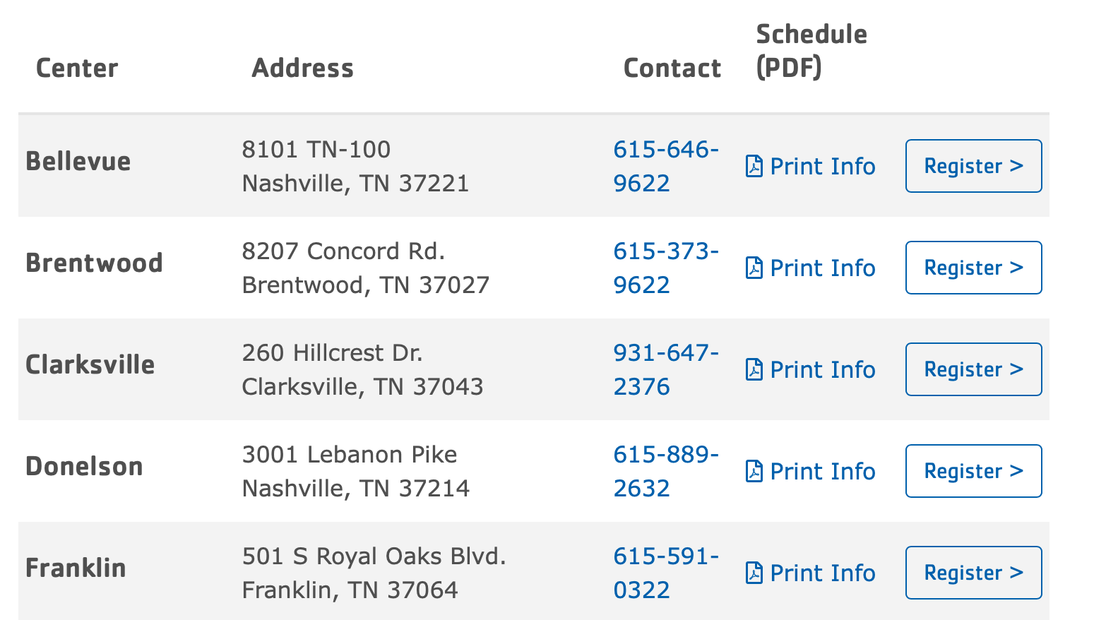
// Camp Locations
<style>//Toachievethefulleffectofthistable,insertthisstyletagabovethetableorinsertitintotheCSSEditormodule./* margin fix for h6 embedded inside table */td>h6{margin-bottom:0;}/* Fix for mobile table -> issue seems to be related to aggregate CSS file */.field-answertr,.field-answertd,.paragraph--type--simple-contenttr,.paragraph--type--simple-contenttd{display:block!important;border:none;}.field-answertd,.paragraph--type--simple-contenttd{padding:.75rem.31rem;text-align:left;vertical-align:middle;}.field-answertr,.paragraph--type--simple-contenttr{padding:.625rem0;}.field-answerthead,.paragraph--type--simple-contentthead{display:none;}@media(min-width:992px){.field-answertr,.paragraph--type--simple-contenttr{display:table-row!important;}.field-answertd,.paragraph--type--simple-contenttd{display:table-cell!important;}.field-answerthead,.paragraph--type--simple-contentthead{display:table-header-group;}}</style><divclass="table-responsive"><tablealign="left"cellpadding="10"cellspacing="10"class="w-100 table table-striped"><thead><tr><thscope="col"><h5>Center</h5></th><thscope="col"><h5>Address</h5></th><thscope="col"><h5>Contact</h5></th><thscope="col"><h5>Schedule (PDF)</h5></th><thscope="col"> </th></tr></thead><tbody><tr><td><h5>Bellevue</h5></td><td>8101 TN-100<br/> Nashville, TN 37221</td><td><ahref="tel:615-646-9622">615-646-9622</a></td><td><p><ahref="/sites/default/files/2020-01/dycmp-20-dycmp-pdf-bellevue-menu.pdf"><iclass="far fa-file-pdf"> </i>Print Info</a></p></td><td><strong><aclass="btn btn-outline-primary"href="https://operations.daxko.com/Online/4002/ProgramsV2/Search.mvc?program_id=TMP8151&location_ids=B58&category_ids=TAG12062">Register ></a></strong></td></tr><tr><td><h5>Brentwood</h5></td><td>8207 Concord Rd.<br/> Brentwood, TN 37027</td><td><ahref="tel:615-373-9622">615-373-9622</a></td><td><ahref="/sites/default/files/2020-01/dycmp-20-dycmp-pdf-brentwood-menu.pdf"><iclass="far fa-file-pdf"> </i>Print Info</a></td><td><strong><aclass="btn btn-outline-primary"href="https://operations.daxko.com/Online/4002/ProgramsV2/Search.mvc?program_id=TMP8151&location_ids=B45&category_ids=TAG12062">Register ></a></strong></td></tr><tr><td><h5>Clarksville</h5></td><td>260 Hillcrest Dr.<br/> Clarksville, TN 37043</td><td><ahref="tel:931-647-2376">931-647-2376</a></td><td><ahref="/sites/default/files/2020-01/dycmp-20-dycmp-pdf-clarksville-menu.pdf"><iclass="far fa-file-pdf"> </i>Print Info</a></td><td><strong><aclass="btn btn-outline-primary"href="https://operations.daxko.com/Online/4002/ProgramsV2/Search.mvc?program_id=TMP8151&location_ids=B54&category_ids=TAG12062">Register ></a></strong></td></tr><tr><td><h5>Donelson</h5></td><td>3001 Lebanon Pike<br/> Nashville, TN 37214</td><td><ahref="tel:615-889-2632">615-889-2632</a></td><td><ahref="/sites/default/files/2020-01/dycmp-20-dycmp-pdf-donelson-menu.pdf"><iclass="far fa-file-pdf"> </i>Print Info</a></td><td><strong><aclass="btn btn-outline-primary"href="https://operations.daxko.com/Online/4002/ProgramsV2/Search.mvc?program_id=TMP8151&location_ids=B41&category_ids=TAG12062">Register ></a></strong></td></tr><tr><td><h5><a>Franklin</a></h5></td><td>501 S Royal Oaks Blvd.<br/> Franklin, TN 37064</td><td><ahref="tel:615-591-0322">615-591-0322</a></td><td><ahref="/sites/default/files/2020-01/dycmp-20-dycmp-pdf-franklin-menu.pdf"><iclass="far fa-file-pdf"> </i>Print Info</a></td><td><strong><aclass="btn btn-outline-primary"href="https://operations.daxko.com/Online/4002/ProgramsV2/Search.mvc?program_id=TMP8151&location_ids=B53&category_ids=TAG12062">Register ></a></strong></td></tr></tbody></table>
6 - CKEditor 4: Adding and Embedding Videos
This document applies to the legacy WYSIWYG editor, CKEditor 4. See
Adding Media for updated instructions.
Adding/Embedding Videos with the YMCA Website Services Text Editor
YMCA Website Services allows you to upload and embed images directly into a block of text, either from your computer or from the YMCA Website Services media library and browser.
Adding Videos
To add an video, click on the video button in the text editor toolbar.
Make sure you’re on the “Add Video” tab.
Next, name your video and paste the URL into the
Hit “Save” to go through to the next step.
Adding Videos from the Media Library
To add an image from the library, click on the image icon in the text editor toolbar.
Next, click on the tab that says “All Images”
Name your image, tag it, and write your alt description.
Hit “Save” to go through to the next step.
Sizing and Floating Your Video
After you save your video to the media library, a dialogue box will appear, giving you some additional options for embedding it inline.
Entity Name simply refers to the name of your video, which you provided on the previous screen.
Display as allows you to change the size of the video display without the size of the original video.* By default, YMCA Website Services comes with Full, Half, and Link display modes
Full means your video fills the area where it’s inserted
Half mean the video is half the size of its area.
Link outputs the video as a simple link.
Link to wraps the image in a link so that when users click on it, it goes to another page.
Align allows you to float a video to the center or either side of the page.
Caption outputs a caption below.
When you’re ready to embed the video, just click “Embed.” You can also click the back button on the bottom to choose a different video.
*If you want to make changes to the video you just embedded after you’ve added it, double click on the icon, and the “Embed media” dialogue will appear.
7 - CKEditor 4: Adding Images
This document applies to the legacy WYSIWYG editor, CKEditor 4. See
Adding Media for updated instructions.
Adding Images with the YMCA Website Services Text Editor
YMCA Website Services allows you to upload and embed images directly into a block of text, either from your computer or from the YMCA Website Services media library and browser.
Uploading Images
To add an image, click on the image button in the text editor toolbar.
Make sure you’re on the “Upload Images” tab.
Next, either drag your image into the upload area or click the button to select an image from your library.
Name your image, tag it, and write your alt description.
Hit “Save” to go through to the next step.
Adding Images from the Media Library
To add an image from the library, click on the image icon in the text editor toolbar.
Next, click on the tab that says “All Images”
Name your image, tag it, and write your alt description.
Hit “Save” to go through to the next step.
Sizing and Floating Your Images
After you save your image to the media library, a dialogue box will appear, giving you some additional options for embedding your image inline.
Entity Name simply refers to the name of your image, which you provided on the previous screen.
Display as allows you to change the size of the image display without the size of the original image.* By default, YMCA Website Services comes with Full, Half, and Link display modes
Full means your image fills the area where it’s inserted
Half mean the picture is half the size of its area.
Link outputs the image as a simple link to the picture.
Link to wraps the image in a link so that when users click on it, it goes to another page.
Align allows you to float an image to the center or either side of the page.
Caption outputs a caption below the image.
When you’re ready to embed the image, just click “Embed.” You can also click the back button on the bottom to choose a different image.
If you want to make changes to the image you just embedded after you’ve added it, double click on the icon, and the “Embed media” dialogue will appear.
This document applies to the legacy WYSIWYG editor, CKEditor 4. See
Adding Media for updated instructions.
YMCA Website Services allows you to upload and embed documents directly into a block of text, either from your computer or from the YMCA Website Services media library and browser.
Adding Documents
To add a document, click on the document button in the text editor toolbar.
Make sure you’re on the “Add Document” tab.
Next, name your document and paste the URL into the
Hit “Save” to go through to the next step.
Adding Documents from the Media Library
To add a document from the library, click on the document icon in the text editor toolbar.
Next, click on the tab that says “All Document”
Name your document, tag it, and write your alt description.
Hit “Save” to go through to the next step.
Sizing and Floating Your Document
After you save your document to the media library, a dialogue box will appear, giving you some additional options for embedding it inline.
Entity Name simply refers to the name of your document, which you provided on the previous screen.
Display as allows you to change the size of the document display without the size of the original video.* By default, YMCA Website Services comes with Full, Half, and Link display modes
Full means your document fills the area where it’s inserted
Half mean the document is half the size of its area.
Link outputs the document as a simple link.
Link to wraps the document in a link so that when users click on it, it goes to another page.
Align allows you to float a document to the center or either side of the page.
Caption outputs a caption below.
When you’re ready to embed the document, just click “Embed.” You can also click the back button on the bottom to choose a different document.
*If you want to make changes to the document you just embedded after you’ve added it, double click on the icon, and the “Embed media” dialogue will appear.

